#0107: Original Ghost Rider

ORIGINAL GHOST RIDER

GHOST RIDER (TOYBIZ)

Time to take a jump back to the 90s and to ToyBiz’s powerhouse that was the 5 inch Marvel line.  Sure, they had the X-Men line, and the Spider-Man line, and they did a few waves of Hulk, Iron Man and Fantastic Four to tie in with the cartoons.  But they wanted to do more.  They wanted another character to devote a whole line to.  And seeing as it was the middle of the 90s and being oh-so-90s was the big thing to be, they needed someone who just bled 90s.  Someone who screamed “X-TREME!”  With chains, and leather jackets, and skulls!  And what do you know, Marvel had a character like that:  Ghost Rider!  And so, Ghost Rider was given his own toyline!  To ToyBiz’s credit, the Ghost Rider line is easily one of the highlights of the many toylines they produced in this time period.

Today, I’ll be looking at one of the variants of the main character from the line.

THE FIGURE ITSELF

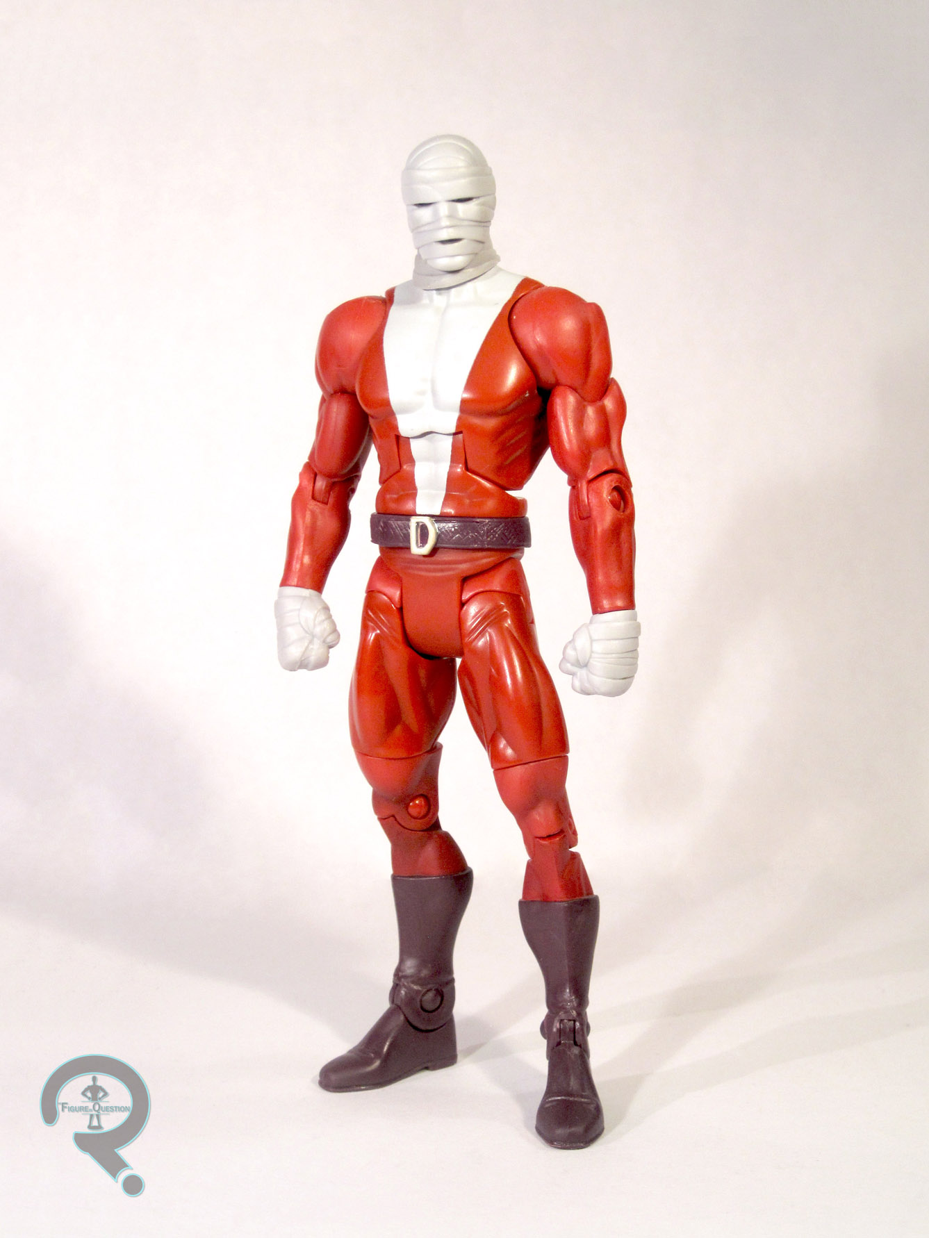
“Original Ghost Rider” as he was dubbed was released as part of the second (and last) wave of the Ghost Rider line.  In spite of the name, he’s actually based on the second Ghost Rider, Danny Ketch, who was the main Ghost Rider at the time.  I’ll be honest, the name makes no sense.  Like, at all.  So, I’m just gonna overlook it and just review the figure on its own merits.  Ghost Rider stands just over 5 inches tall and has 13 points of articulation.  For the record, that level of articulation was phenomenal for the time, which just goes to show ToyBiz’s commitment to the line, which was odd, given there wasn’t a Ghost Rider cartoon or anything.  The sculpt on GH is actually really good.  It’s quite detailed, and it’s well-proportioned for the time.   The figure’s covered in flames, that all look to be well handled, if perrhaps a bit odd looking, give that they’re opaque.  Originally, the figure had an action feature where, when you pressed a button on his back, the front of his chest would pop open, displaying his fiery torso.  However, the chest pieces didn’t stay on very well, and I lost mine over the years, leaving my Ghost Rider with a permanently exposed chest.  That sounds awkward.  The paint is pretty good, though some stuff, like the glow in the dark gimmick on the head, leaves the paint under-detailed, which is a bit of a disservice to the sculpt.  Ghost rider was originally packaged with a set of glow in the dark chains to be clipped onto him, but child-me seems to have lost that piece.

THE ME HALF OF THE EQUATION

Ghost Rider was part of a large subset of figures that were purchased for me by my dad what a nearby comicbook store called Ageless Heroes went out of business.  The store had a large stock of the various 90s 5 inch figures, and they were being sold for quite a discount.  I know this was my go to Ghost Rider for a while, and I really thought the chest thing was pretty cool.  Of course, I only bought Ghost Rider because I felt my Champions display needed him.   Yeah, I was that kid.  And for all of you who went “who are the champions?”, go look up Marvel’s Champions.  Be amazed at my obscure references!

#0106: Black Hand

BLACK HAND

GREEN LANTERN: REBIRTH (DC DIRECT)

I’ve mentioned before that I’m quite the Green Lantern fan.  Well, I’ll be frank, that doesn’t really extend to his villains.  Sure, I’m a fan of characters like Sinestro and the original Star Sapphire, and heck I’m even a pretty decent fan of characters like Sonar, Evil Star and Goldface.  But there are some Green Lantern villains I just plain don’t like.  Like, for instance, Hector Hammond, star villain of the 2011 Green Lantern movie.  My opinion of today’s character, Black Hand, is not as simple as the previously mentioned opinions.  No, he’s much more complex, and today’s figure just plays right into those mixed feelings.

THE FIGURE ITSELF

Black Hand was released as part of the first wave of DC Direct’s Green Lantern: Rebirth line, done to coincide with the comic event of the same name.  Hand himself only has a minor appearance in the actual Rebirth series, and he doesn’t look like this.  The figure here is actually based on Hand’s look in the re-launch GL book shortly after Rebirth.  While this is the look that would gain notoriety in Blackest Night and the like, it’s presence here seems to be solely because it was what Hand was wearing at the time, as the character would remain relatively obscure for a few more years.  Anyway, the figure stands a little over 6 inches tall, and features 11 points of articulation.  He looks to be built on a similar under-lying structure to that of the Hal Jordan figure released in this line.  The outer details are different, with Black Hand featuring a lot more details on his costume.  In particular, he’s got lots of wrinkles all over his costume.  What, does this guy not have an iron?  On his left arm, he’s got straps and buckles, I guess to “modernize” the character’s look.  The Right hand is the titular “black hand”, and is exposed in all its veiny goodness.  This guy also has a lot of rivets, which begs the question:  is his cosume actually riveted on to him?  That might explain the figure’s surly facial expression.  Black Hand is topped off by a non-removable rubber cape.  It’s a decent sculpt, but it can make the figure a bit top heavy.

THE ME HALF OF THE EQUATION

So, I’ve done my (mostly) non-biased review of the figure itself.  Now, onto the nitty-gritty, me part:  I absolutely, without a doubt in my mind, hate the modern Black Hand, and pretty much everything he’s been involved with.  I know, that’s a strong opinion, but I just haven’t liked what he’s been involved with.  Classic Black Hand had a pretty neat design, and while he was hokey as hell, that was a lot of fun.  A decent character.  But, hokey characters can’t be hokey anymore, so we wound up with this redo of the character, where he’s got leather straps, and wrinkles, a random lines all over the place, and looks like a zombie.  And, hey, “Black Hand” makes no sense, unless you spell it out for people by giving him a BLACK HAND!  Hey, MGM, I’ve got an idea for a Goldfinger remake.  Here’s the twist:  Goldfinger loses one of his fingers, and he has to replace it with one MADE OF GOLD!

I know what you’re thinking: If you hate the design so much, why do you have the figure?  Because I got him for a dollar.  And for a dollar I guess he’s alright.

#0105: Corporal Hicks vs Xenomorph Warrior

CORPORAL DWAYNE HICKS vs XENOMORPH WARRIOR

ALIENS (NECA)

Today I’ll be wrapping up my reviews of NECA’s Aliens line up to this point.  Fear not, though, as the second series and a two pack of Hudson and a Xenomorph Warrior should be on their way pretty soon.   So, that’ll be plenty of new reviews.

I’m looking at another of the two-packs NECA released to keep the line going.  This time it’s another figure of Corporal Hicks, facing off against and unfortunate Xenomorph.

THE FIGURES THEMSELVES

These two were released as one of the three two-packs put out to bridge the gap between the first and second series.  This one is just now hitting stores, so it should be relatively easy to find.

CORPORAL HICKS

First up, it’s the heroic Corporal Dwayne Hicks!  Hicks is based on the character’s appearance while in the depths of the alien hive, during the initial Xenomorph attack.  The key difference between this figure and the last one is the presence of his helmet, which he loses shortly after the battle in the hive, and his shoulder lamp, which was inexplicably absent from the initial release.  Hicks, like his previous figure, stands about 7 inches tall and has 30 points of articulation.  From the neck down, this figure is 100% reuse from the previous Hicks.  If you want the rundown, go here.  The head and helmet are the new pieces here.  The helmet is a welcome addition, as it was very obviously missing from both series 1 marines.  The helmet itself looks pretty good, but I feel it sits up too high on the head, which looks a bit silly.  Since the helmet’s already non-removable, NECA probably should have foregone the top of the hair entirely to allow the helmet to sit more naturally.  The head itself is fine, but the choice of expression.  While the screaming head is a fine choice for the upcoming Hudson figure, it doesn’t really fit Hicks, who’s only really seen screaming once in the film (Upon seeing the aliens in the air ducts, for those who are curious) and it’s about an hour after he’s lost the helmet.   Regardless, it’s a decent sculpt, and it does actually have a semi-decent likeness, even if it is an odd expression.  The paint seems to have a bit of a step down from the regular release, with a lot more noticeable slop, and a large black spot on my figure’s left shoulder, which is quite annoying.  Hicks is accessorized with his shotgun and appropriate holster, a pulse rifle, a welding torch, a shoulder lamp and a motion tracker.

XENOMORPH WARRIOR

Next, it’s the Xenomorph Warrior.  Now with more exploding!  Remember the other three Xenos I looked at?  Yep, this one’s pretty much the same, but with two new pieces, one of which does cost the figure 2 points of articulation.  Similar to Hicks, the Xeno is practically the same as the series 1 version from the neck down.   One small difference is the addition of a bullet hit on the upper torso, however, this looks to just be an additional piece glued in place.  The biggest difference, of course, is the head.  It’s sculpted to look like the alien just took something to the face, presumably a shot from Hicks’ shotgun.  It’s in the process of splattering acid blood everywhere, which is conveyed using translucent green plastic.  It’s a nice touch, and it looks really cool when set up properly.   The paint on this figure’s actually different than we’ve seen on any of the previous aliens.  This is our first glimpse at the film-lighting inspired blue accents, which will see a proper release on series 2’s Xenomorph Warrior.  Having seen the three options in person, blue may well be my favorite, but I’ll hold final judgment until I get the proper blue version in series 2.  Thankfully, the paint work here is much better than the series 1 Xeno, which is certainly a good thing.  Here’s hoping the rest of the Xenos continue the trend.

THE ME HALF OF THE EQUATION

Like the previous two-pack, I had not intended to pick this one up, but I saw a lone set at my TRU (I’m starting to think my TRU is just ordering a single one of each of these to lure me in), so I picked it up.  While I don’t feel it’s as good a set as the Genocide set due to a few quality issues, it’s pretty fun.  If you’ve yet to get Hicks, or you prefer he have his helmet, this might be the set for you.  Otherwise, it’s kind of the type of thing that only completists really pick up.  And apparently I’m a completist now.  Yay.

*Want to buy a Hicks vs. Xenomorph of your very own? Our sponsors over at All Time Toys currently have this set in-stock. Click here to check it out!

#0104: Aliens: Genocide

XENOMORPH WARRIOR (RED) vs XENOMORPH WARRIOR (BLACK)

ALIENS (NECA)

Today, I’ll be continuing my reviews of the most recent toyline to the greatest movie ever, NECA’s Aliens.

In anticipation of the second series in the line, I’ll be reviewing the figures so far.  With yesterday’s review of the basic Xenomorph Warrior, I wrapped up my reviews of the first series.  Today, I’ll start looking at the two-packs, released to hold us over until the second wave hits.

First up, it’s the “Genocide” two-pack, based not on the movie, but on one of the comics, wherein two different hives of Xenomorphs duke it out.

THE FIGURES THEMSELVES

These two figures were released as part of the first of three two packs released to bridge the gap between the first and second series.  They each depict a warrior from one of the two hives.

RED

First up, the more unique of the two figures, the Red Xenomorph.  Red here is meant to represent a Xeno from the second hive in the series.  Red is very similar in styling to a red ant.  Red is the exact same sculpt as the previous Xeno Warrior, so he stands about 8 inches tall and has 38 points of articulation.  I won’t discuss the sculpt again, since it hasn’t changed.  Unlike the previous Xenomorph, this one is molded in red with black accents.  The paint work is well done, and the details in the sculpt are really made to pop.  It’s cool to see this sculpt in a lighter color, because it means that you can really appreciate the work that went into it all the more.  Like the previous Xeno, Red’s only real accessory is the removable back-fin-thing that allows you to put the head back a bit.

BLACK

Second, it’s a figure that looks a lot like the one we’ve seen before.  And that’s because it practically is.  Like the first Xeno, this one depicts the creature as it was seen in Aliens.  The last figure attempted to go for the blown accenting present on the actual prop suits worn by the stunt actors in the film.  This time around, NECA went for something more in line with how the creature in the first film is shown.  The accenting here is done in silver and bronze.  This could have turned out basdly, but it’s been done with the necessary subtlety to pull it off very well.  The only difference between this figure and the series 1 version of the Xeno is the accent paint, but it’s the difference between a okay figure and an amazing one.

THE ME HALF OF THE EQUATION

I hadn’t planned on getting this set, preferring to just get the Xenos as they came along in the regular series.  However, I was walking through my local Toys R Us, and there they sat.  One lone set of them.  So, I decided, what the heck and picked them up.  I’m really glad I did.  I know I didn’t have much to say in this review, having just looked at essentially the same figure yesterday.  But these two were definitely worth the purchase.  The Red Xeno is a lot of fun, and adds some nice diversity to the shelf, and the Black Xeno is a much needed improvement to the basic Xeno Warrior.  If you’re just looking to get the basic Xeno, this set’s probably worth the plunge.  Just, whatever you do, do no, I repeat, DO NOT  try to read the comic book that this two pack was based on.  You’ll never get that time back.

#0103: Xenomorph Warrior

XENOMORPH WARRIOR

ALIENS (NECA)

Hey, remember how I love the movie Aliens?  You know what’s even better than an awesome movie?  An awesome movie with awesome toys!

NECA’s been more than happy to deliver on the cool toy front in the past, and now they’re doing it with Aliens.  The second series of their Aliens line is set to be released in the next month or so, and in anticipation of its release, I’ll be taking a look at the line so far.

Up today, it’s the first release of the titular creature, the Alien!

THE FIGURE ITSELF

The Alien, or as he’s referred to on the packaging, the Xenomorph Warrior, was released as part of the first series of NECA’s Aliens line.  The figure is based on the design of the Xenomorph in the second film in the ALIEN franchise.   The Xenomorph is made to be in scale with the 7 inch line, making the Xenomorph about 8 inches tall.  The figure features 38 points of articulation.  I believe that some parts of this sculpt were used on one of NECA’s previous Xenomorph figures, but I can’t be too sure, since I don’t have them all to compare.  So, I’ll be looking at this figure as if it were a brand new sculpt.  The sculpt on this figure is extremely impressive.  There’s a ton of fine details and lots of little layers that really ad to the figure.  The coolest thing about this figure is how massive it is in comparison to the rest of the figures in the line.  He really towers over the marines, and his articulation also allows him to get into some really deep stances.  The head is an incredible sculpt, and even has a working jaw to allow the use of the Xenomorph’s signature inner mouth, which slides out pretty easily.  While the sculpt is nothing short of amazing, the figure’s paint does leave a little to be desired.  There’s a bit of contention amongst Aliens fans regarding the proper coloring of the creatures.  While black is definitely the predominant color, whether it should be accented by brown, blue or silver depends on who you ask.  Silver is more faithful to the original movie, and the prop costumes in Aliens were accented using brown (to evoke a cockroach, according to Stan Winston), but they were lit so as to look blue in many scenes.  NECA plans on releasing the Alien in all possible colors, but for the first release they seem to have gone with the prop suit look.  Unfortunately, they seem to have gotten a little carried away, leading to the brown accent being a lot less of an accent.  It’s really heavy handed, and kinda makes it look like the Xenomorph’s been rolling around in the mud.  It doesn’t ruin the figure, but it does prevent it from being as good as it could be.  The Xenomorph features no accessories, though of his fins on his back is removable, in case you want to put the head back a bit more.

THE ME HALF OF THE EQUATION

Like the others in this wave, I preodered the Xenomorph as soon as I could.  While it’s not a perfect figure, it’s certainly a step in the right direction.  NECA seems to have acknowledged the issues present with this figure, and has addressed them on future releases of the Xenomorph.  At the end of the day, it’s still a great figure, even with its issues.  Any decent Aliens fan will probably end up with a few of the various xenomorphs from the line, so at worst, this guy can be placed behind some of the others, hiding some of his paint flaws.

#0102: Private Hudson

PRIVATE WILLIAM HUDSON

ALIENS (NECA)

Yesterday, I spoke of my love of the movie Aliens, and my excitement for NECA’s new line of figures from the movie.  In anticipation of the second series of the line, I’ll be doing reviews of the first wave.

Today’s figure is Private William Hudson, one of the lower ranking marines sent in to deal with the alien infestation of the colony on LV-424.

THE FIGURE ITSELF

Hudson was released in the first series of NECA’s Aliens line.  He’s based on the character’s appearance in the movie.   Specifically, he’s based on Hudson’s look in the scene right after the first attack on the Alien hive, right as he delivers his famous “Game Over, Man” line.  Hudson stands 7 inches tall and has the same 30 points of articulation as Hicks.  I’ve reviewed most of Hudson’s sculpt before, as he shares a good deal of parts with Hicks.  He has a newly sculpted head and arms, which is really all he needs.  His arms are similar to Hicks, but with his sleeves rolled down a little further, to make it accurate to how Hudson wore his uniform in the movie.  The left arm is also bandaged, so as to properly depict Hudson following the acid burns he receives during the hive attack.  The arms are nice, but the head on this figure is truly a thing of beauty.  They’ve sculpted Hudson to evoke his expression of panic when he delivers the “Game Over, Man” line.  It’s brilliant because it not only captures the expression well, but it also gets Bill Paxton’s likeness down perfectly.  The paint on Hudson is a bit better than the paint work on Hicks.  There’s far less slop, and the paint on the head shows off the head sculpt a bit better.  From some angles, Hudson can look a little cross-eyed, but it’s not very noticeable in person.  The detailing on the armor is up to the same level as the work on Hicks, with lots of those little details that really make the figure pop.  Hudson is accessorized with a pulse rifle, a welder, a motion tracker, and a shoulder lamp.  The rifle and welder are the same ones that were included with Hicks, but the shoulder lamp and motion tracker are new.  The motion tracker is really cool, and even features detailing on the screen showing the aliens moving towards him.  The shoulder lamp is well sculpted, but very difficult to get properly seated in the slot for it.

THE ME HALF OF THE EQUATION

As with Hicks, I preordered Hudson and the rest of series one as soon as possible.  While I was more excited for Hicks because he’s my favorite character, Hudson is hands down the best in the first wave.  The head sculpt on this guy really pushes the figure over the edge.  I was a bit disappointed with the difficulty of attaching the lamp, but that hardly ruins the figure itself.

#0101: Corporal Hicks

CORPORAL DWAYNE HICKS

ALIENS (NECA)

So, I don’t know if you, the readers, are aware, but the film Aliens is, in fact, the greatest movie ever made.  Everybody agrees.  No contest.  If you thought another movie was the greatest movie ever, you were sadly mistaken.  Because it’s Aliens.

Okay, I may have exaggerated a bit up there.  If you couldn’t tell from the hyperbole, Aliens is one of my favorite movies ever.  So naturally, as a toy collector, I should be all over the toys, right?  Except, more often than not the toys a) suck and b) only ever get the aliens themselves made.  I mean, the alien is a good design and all, but come on, the reason we love the movie isn’t the aliens, it’s the awesome characters fighting the aliens.  So, what good are the aliens if they’ve got nobody to fight?

So, I was quite excited when NECA announced that not only were they making an Aliens line, but Hicks and Hudson, two of the movies main characters where in the very first wave!  And they didn’t suck!  The first wave’s been out for a good long while now, and with the impending release of the second wave, I thought I’d give it a review.  Up first, oh so cool marine Corporal Dwayne Hicks!

THE FIGURE ITSELF

Corporal Hicks was released as part of the first wave of NECA’s Aliens line.  Obviously, he’s based on Hicks’s appearance in Aliens, but more specifically, he appears to be based on Hicks’s look shortly after the initial battle in the alien hive, after he loses his helmet, and before he dons the headset he wears for the rest of the movie.  Technically it’s a bit off, because he should still have his shoulder lamp at that point (yes, I’m that much of an Aliens geek), but I think it’s close enough.  Hicks stands about 7 inches tall and has 30 points of articulation.  The sculpt is quite well done.  They’ve sculpted his fatigues onto the underlying figure, and added the armor over top as a separate piece.  The detailing on the sculpt of the uniform is superbly detailed.  The armor is scratched and dented, and the fatigues are appropriately wrinkled.  All in all, it looks like the armor of an experienced marine, which is exactly how it should look.  I’ve heard complaints that the arms are too thin, and while I can see how they might seem that way on first glance, actually comparing the figure to Michael Biehn in the movie, they look about right.  Topping it all off, the head is pretty good.  It’s not as spot on as some of NECA’s work, but it’s easily the best Michael Biehn sculpt that’s been done.  The paint work ranges from decent to pretty darn good.   The head, especially the hairline has a little bit of slop, but nothing too major.  The skin tone is a bit too orange for my tastes.  The paint on the uniform is the best work on the figure.  Lots of little details, especially on the armor that could have been left off, but I’m very happy weren’t.  Hicks is decently accessorized.  He includes the standard pulse rifle, a welder, and his shotgun he kept handy for “close encounters” with its own case.  The welder plugs into his belt, and the shotgun can be slung easily.  The guns are both well sculpted, and fit very nicely into his hands.

THE ME HALF OF THE EQUATION

I preordered Hicks and the rest of series one as soon as I possibly could, because there was no way I was missing out on these guys.  I was super excited to get these guys, and Hicks was the figure I was most looking forward to.  While he’s not a perfect figure, he’s a darned good one, and I’m really glad to have him.

#0100: Captain America – Avengers Version

CAPTAIN AMERICA

THE AVENGERS (HOT TOYS)

Hey look!  100 reviews!  That’s not too shabby, is it?  Like with my 50th review, I’ll be doing another “Deluxe Review.”

For those of you that don’t know, Hot Toys is a toy company based in Hong Kong who are renowned for their almost life like 1/6 scale figures.  They cater strictly to those with a large amount of money to spend on such things, as each figure costs anywhere from $200 to $300 on average.  They tend to pick up the licenses for big block buster movies, and last year they released figures from The Avengers.

Today I’ll be looking at their take on Captain America from that film.

THE FIGURE ITSELF

So, like I mentioned before, this figure is based on Cap from the Avengers movie.  He was #174 in Hot Toys’ Movie Masterpiece Series.  The figure stands about 12 inches tall, and has a whole lot of articulation.  I don’t know exactly how much, as most of it is hidden by his costume.  So I’m gonna just go with a bunch.

Cap-AvengersCloseUp

THE HEAD IN QUESTION

I’ll look at the basic head here, and the extra head in the accessories section.    The basic head depicts Cap with his helmet/mask on.  The helmet appears to be a separately molded piece, but it’s not removable.    Sculpt wise, all the details look great.   I’m not sure that they’ve quite gotten Chris Evans’s likeness down, but they’ve came pretty damn close.  The helmet is pretty much a miniaturized version of the actual one from the film, with pretty much every little groove and detail included.  The under-the-helmet-hood is also well done, simulating the texture of the fabric impressively.  Paint is one of Hot Toys’ strong suits, and this figure doesn’t disappoint.  The level of detail and the lifelike quality is nothing short of amazing.  Viewed from the right angle, this figure could pass for a real person.

THE COSTUME IN QUESTION

This is kind of a new category for me, as the costume features few sculpted pieces and very little paint.  That isn’t to say he has no sculpted pieces.  He’s got his hands, boots, gauntlets, the chevrons on his shoulders, his belt buckle, and the star on his chest.  These are all fairly well executed, although, the boot and gauntlet sculpts may be a bit on the soft side, sculpt-wise.  All of the sculpted parts are painted quite well, with no slop or bleed over.

So, I’ve looked ate the sculpted parts, now I’ll move on to the rest of the figure’s costume, which is all cloth.  Cap’s costume is tailored specifically to fit his body, and is handled with two main pieces:  Shirt and Pants.  Most of his uniform is made from the same coarse blue fabric.  I find it’s a bit on the dark side for Cap’s look from the movie, but it isn’t too bad.  The costume is assembled from multiple layers, which really adds to the realism.

THE ACCESSORIES IN QUESTION

Cap comes with quite a hefty selection of accessories.  They are:

  • Unmasked Head
  • Pulled down Hood to display with the unmasked head
  • 7 spare hands
  • 2 shields: Regular and Battle-Damaged
  • Chitauri Arm Cannon
  • Display Stand

The alternate head is pretty good.  Once again, I’m not sure they’ve completely captured Evans, but it’s hard to tell given the choice of expression.  I don’t really know why they decided to go with an angry expression for the unmasked head, since that isn’t very characteristic of Cap in the movie, but I guess it looks okay if you’re going for more of a battle-damaged, end of the movie look.  The head switches out at the base of the neck, and does so with relative, which is nice because it means you don’t have to man handle you’re $200+ action figure.

The alternate head is complimented by a hood piece to replicate what Cap’s hood looked like when he pulled it down in the movie.  It’s pretty much just a piece of blue cloth.  It’s okay, but it has difficulty hanging properly, which can look a bit awkward.  It’s attached via two snaps that hook on the inside collar of the costume.  They’re unreliable, and don’t tend to hold well.  Overall, this is kind of an extraneous piece.  I’m glad they included it for those that want it, but it’s not something I ever plan to use.

Cap includes seven hands in addition to the relaxed pair he has on in the box.  The hands include: gripping(R and L), Pointing(R), splayed(R and L), and fists(R and L).  They’re all sculpted well, and offer a nice variety of gestures.

Cap’s most important accessories are his mighty shields.  He includes both a clean and polished one and a scuffed up, battle-worn one.  The clean one is vac-metallized, which is a decision I question, as it doesn’t really accurately depict what Cap’s shield looks like in the movies.  Also, if you’re unlucky, all to paint might start flaking off like some people have experienced, so there’s that.  I much prefer the BD shield, as I feel it looks more like the one Cap carries in the movie.

Cap also includes a Chitauri arm-cannon thing.  He takes one from one of the aliens during the movie’s climactic battle, so it fits.  It’s pretty cool, and can be plugged into Cap’s hand peg if you so desire.

Lastly, Cap includes a black display stand with his name and the Avengers logo on it.

THE ME HALF OF THE EQUATION

When Hot Toys announced their Avengers line, this was a figure I wasn’t going to buy.  I planned on getting the rest, and need to save the money for them.  Plus, I already had Cap from his solo film.  That should be enough for me, right?

Well, as you can see, no, it wasn’t.  I broke down and bought the figure because I really wanted that really cool Avengers set up, and First Avenger Cap just wouldn’t look right.  I’m glad I bought him in the end, but man I am such a push-over on these figures.

Cap-AvengersUnmasked

#0099: He-Ro

HE-RO

MASTERS OF THE UNIVERSE CLASSICS

So, I’ve looked at Mattel’s popular DC Universe Classics line a few times before on the site.  Based on the popularity of that line, Mattel decided to create a similar line based on their own in house property Masters of the Universe, handled by the Four Horsemen, the group of sculptors responsible for the amazing work present in DCUC.  They called the line Masters of the Universe Classics, and they used it to spear head the launch of their online store Matty Collector.  I’ll go into the wonderfulness of that store (read: sarcasm) in a bit.

Anyway, in addition to monthly releases on the webstore, they also have a yearly San Diego Comicon exclusive.  He-Ro is one of those.

Little backstory on He-Ro.  Towards the end of the original Masters of the Universe line, they had planned on rebranding the line “The Powers of Grayskull”, and moving the focus from He-Man to his distant ancestor He-Ro, a heroic sorcerer who had helped establish the Eternia we all knew and loved.  The line never took off, but a lone prototype of He-Ro was produced.  This figure is based on that.

THE FIGURE ITSELF

He-Ro was released as the 2009 San Diego Comicon exclusive for Masters of the Universe Classics.  He’s based on the unproduced He-Ro prototype from the 80s.  He stands about 7 inches tall and he has 24 points of articulation.  In a similar fashion to DC Universe Classics, MOTUC is built on the buck system.  However, MOTUC has two bucks: Male and Female*.  He-Ro is built on the male buck.  I hope that didn’t shock you.  In addition to the base body, He-Ro has a new head, lower arms, kilt-thingy, boots, and chest/cape combo.  These pieces are all well done, and have a lot of great little details.  The head has a bit of a young Arnold Schwarzenegger feel to it, which actually really works for the character.  The paint on the figure is well applied, no slop or bleed over.   I feel like he could possibly use a few accents to highlight some of the subtleties of the sculpt, but it’s not bad by any means.  He-Ro includes two accessories: a power sword and a staff thing.  The power sword is the same sword that’s been used many times over the course of the line, but this time molded in a clear, sparkly blue, which is cool if you’re into that sort of thing I suppose.  The staff is brand new, and can open up to show off the gem inside the top.  It was possible to get a green, red or purple gem.  I got purple.  So there…

THE ME HALF OF THE EQUATION

If you’ve read my DCUC reviews, you know I’m not the biggest fan of Matty Collector.  I also wasn’t a fan of the price tag associated with the figures.  They were selling for $20 a piece (at a time when DCUC were still under $15), and when you added in Matty’s outrageous shipping costs, you weren’t getting one of these without dropping at least $30.  Of course, the price mattered not, because the only way you could get the figures was to get onto Matty’s site at noon (eastern time) the day they went up and pray to God that you were able to get one within the less than 10 minutes the figure was in stock.  And to make matters worse, Matty wasn’t willing to up their bandwidth to allow for the increased traffic, so you’d get stuck in perpetual loading screens.

I was a moderate fan of Masters of the Universe, but all that was enough to make me say: “I’ll spend my money elsewhere.”

But then a funny thing happened.  Mattel decided to release a select few MOTUC figures in two packs with DCUC figures.  Perhaps this was my chance, I thought!  But then they arrived and they were $40 retail.  Which definitely killed my excitement.  But then, the Toys R Us near me went out of business (well actually it moved across the street, but they still sold all of their stock because…?) and I found a Skeletor & Lex Luthor two pack for $15.  For that price, they were worth it.  And Skeletor was actually a really cool figure!  So, I decided to track down a few more.  I found He-Ro at a nearby toy store called Alltime Toys, who had him for about $25, which was pricey, but not outrageous.  And here he is.  And wow this review is a lot longer than I was expecting it to be.

*Okay, so technically there’s a few variations on the male body to allow for, like, furry characters and stuff, but it’s the same underlying musculature, and I really liked my witty banter back there.  Yeah, it was witty!

#0098: Negative Man

NEGATIVE MAN

DC UNIVERSE CLASSICS

Ah, DC Universe Classics.  A line that left me with so much confusion.  The line led me to steadily hate everything Mattel did.  But on the same hand, it was the DC toy line I’d wanted since I was 4 or 5.  Not only did it have great versions of the big name characters and their supporting casts, but it also gave us characters we never thought we’d see released in a retail toy line in a million years.  I’ll be looking at Negative Man, one of those characters, today.

Negative Man, or more specifically Larry Trainor because Negative Man wasn’t actually his name, was a member of the wacky 60s super hero team the Doom Patrol.  The Doom Patrol weren’t your conventional super heroes, no, they were freaks and outcasts that the public had shunned.  They were led by a wheelchair bound man and they fought the Brotherhood of Evil.  No, I didn’t make that up.  They were totally the X-Men, only at DC.  Not a rip off, mind you.  They debuted the same year, and neither one was really a best seller.  But eventually X-Men became one of the bestselling comicbooks ever, and the Doom Patrol were mostly forgotten.  Sure they’ve had a few reboots, but none of them ever really captured the fun of the original series, and none of them ever really lasted all that long.

Anyway, Larry was a test pilot who was exposed to some strange energy that turned out to be the sentient being N-Man.  N-Man was trapped inside of Larry’s body, and could only be released in 60 second intervals, or Larry would die.  When N-Man was present in Larry’s body, Larry was radioactive, so he had to be wrapped in specially treated bandages to keep the radiation contained.  I’m gonna be honest, it was a pretty sweet concept!

THE FIGURE ITSELF

Larry was released as part of the 13th wave of DC Universe Classics.  Believe it or not, Larry’s actually had a few looks over the years.  Mattel has chosen to go with what is probably the character’s best known look, his red and purple number that he sported for the majority of the original series.  While I’m partial to his original green uniform, I think they picked the right costume.  He stands just shy of 6 ½ inches tall and he has 24 points of articulation.  DC Universe Classics operated on the buck system, meaning they had a set of differently sized bodies and the picked the one that best suited the character in order to save on tooling.  Larry is based on the medium build male buck, which works fine, since he’s not supposed to be a powerhouse.  I’ve heard arguments that he should have been on a skinnier body, but I think the medium build looks just fine.  In addition to the buck body, Larry has specially sculpted parts for his head, neck, hands, belt and boots.  The head, neck and hands are all bandaged, and they all look pretty cool.  They found a decent way of handling showing a face, without it looking too silly, which is a good thing.  The belt has a cool leather texture to it, which is one of those things that could have easily been left out, but I’m really glad wasn’t.  The boots are actually a reuse from the line’s Green Arrow figure, but if it’s a good part, use it.  The paint on Larry is all well applied, with no slop or bleed over.  There are several washes present to bring out the details in the sculpt.  In one area of disappointment, Larry includes no accessories apart from the requisite C-n-C piece.  It’s Trigon’s staff for those who care.  But, Larry himself gets nothing, not even a cool snap on Negative Man effect!  I guess they had to draw the line somewhere.

THE ME HALF OF THE EQUATION

In spite of DCUC’s spotty distribution, I actually found Larry in store with relative ease.  I was greatly excited by that, as he’s one of my favorite characters, and I’ve always wanted a figure of him.  This one did not disappoint.  Larry shows the DC Universe Classics line at its best.  Well distributed, well sculpted, cool obscure character.  He was just full of win!