#0678: Avengers #1 Boxed Set

HANK PYM, GOLDEN ARMOR IRON MAN, INCREDIBLE HULK, & WASP

MARVEL MINIMATES

AvengersFA1

The Avengers may be a hot commodity now, but about ten years ago, they were mostly unknown to the public at large. This meant that they were somewhat absent from the whole merchandising thing. When Marvel Minimates was launched, the Avengers were few and far between, with only a few of the mainstays showing up here and there. Fortunately, things started turning around, right around the release of the first Iron Man. With the announcement of the Avengers Initiative in that film’s stinger, people seemed to be on board for merchandise based around Earth’s Mightiest Heroes. DST met demand by offering a boxed set based on the team’s first appearance in Avengers #1.

THE FIGURES THEMSELVES

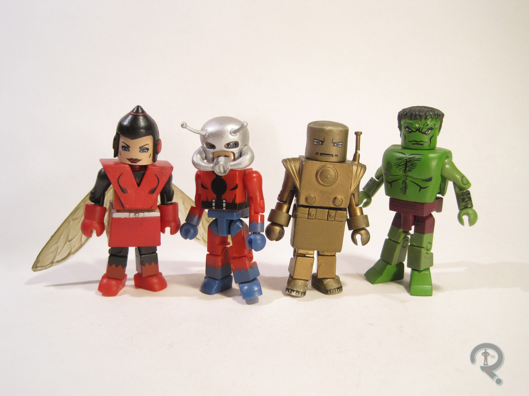
Hank Pym, Iron Man, Hulk, and Wasp were released as a boxed set in the fall of 2008, based around the first appearance of the team. Thor, the other founding member, was noticeably absent from the pack. He wouldn’t see another Minimate for another year, and his classic design wouldn’t be seen again for another year after that, which proved a bit frustrating for fans just getting into things with this set. This set also has the notoriety of being the final boxed set to be packed in a window-less box.

HANK PYM

AvengersFA3
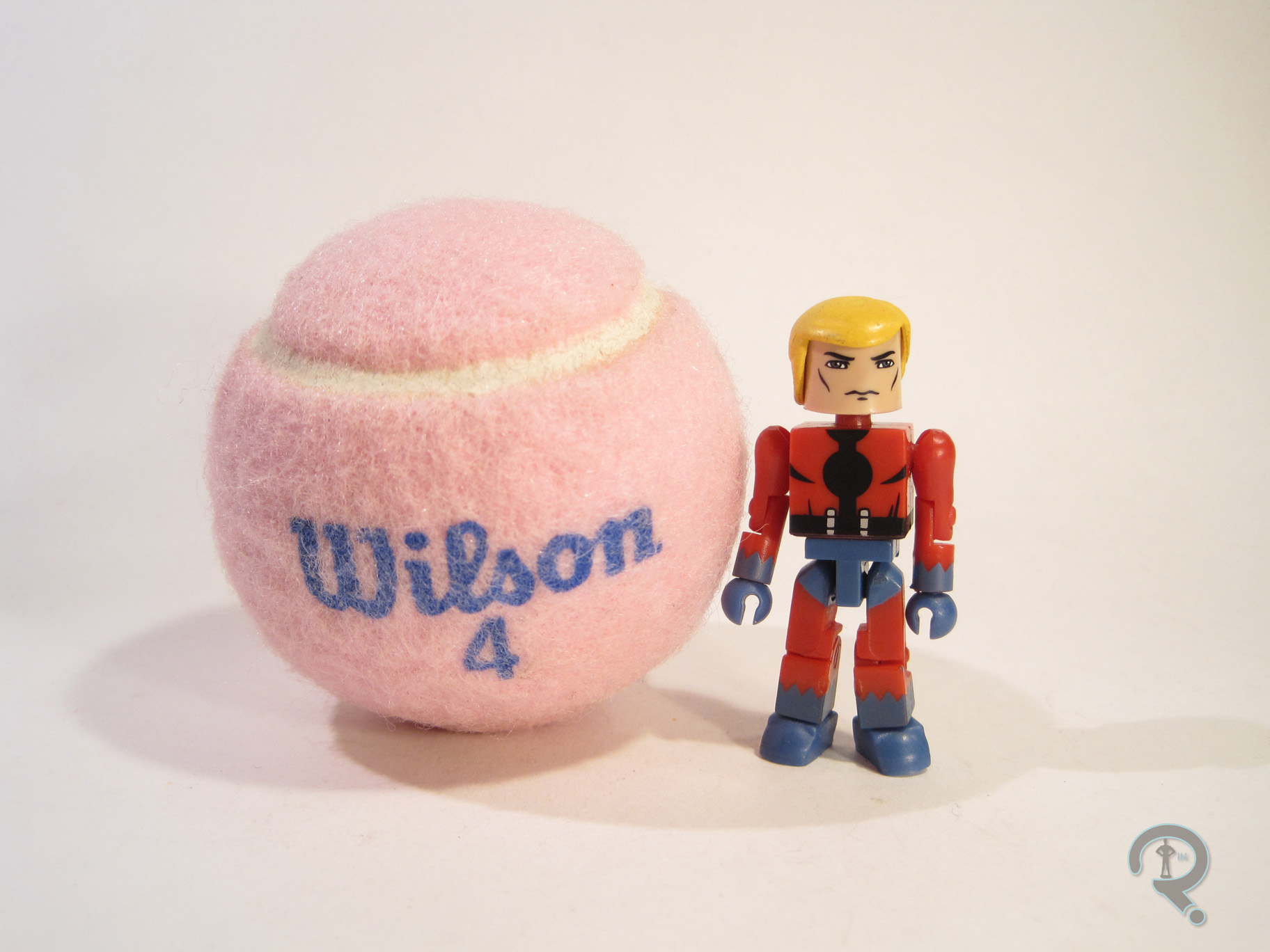
Henry Pym, man of many names, made his Minimate debut with this set. He had the option of being displayed as Ant-Man or Giant-Man, giving fans two of his identities in one fell swoop. Since this was an Avengers #1 boxed set, let’s consider Ant-Man the main look. The figure stands about 2 ½ inches tall and has the usual 14 points of articulation. He used the basic Minimate body, with an add-on for his helmet. The helmet was new to this figure, and was also used on the recent Best of Series 3 Ant-Man. It’s a very well sculpted piece, and it manages to capture the comic design of the helmet without looking too goofy. The paint on Hank is nice and bold; the colors are bright, and the line work is pretty clean. The face AvengersFA6
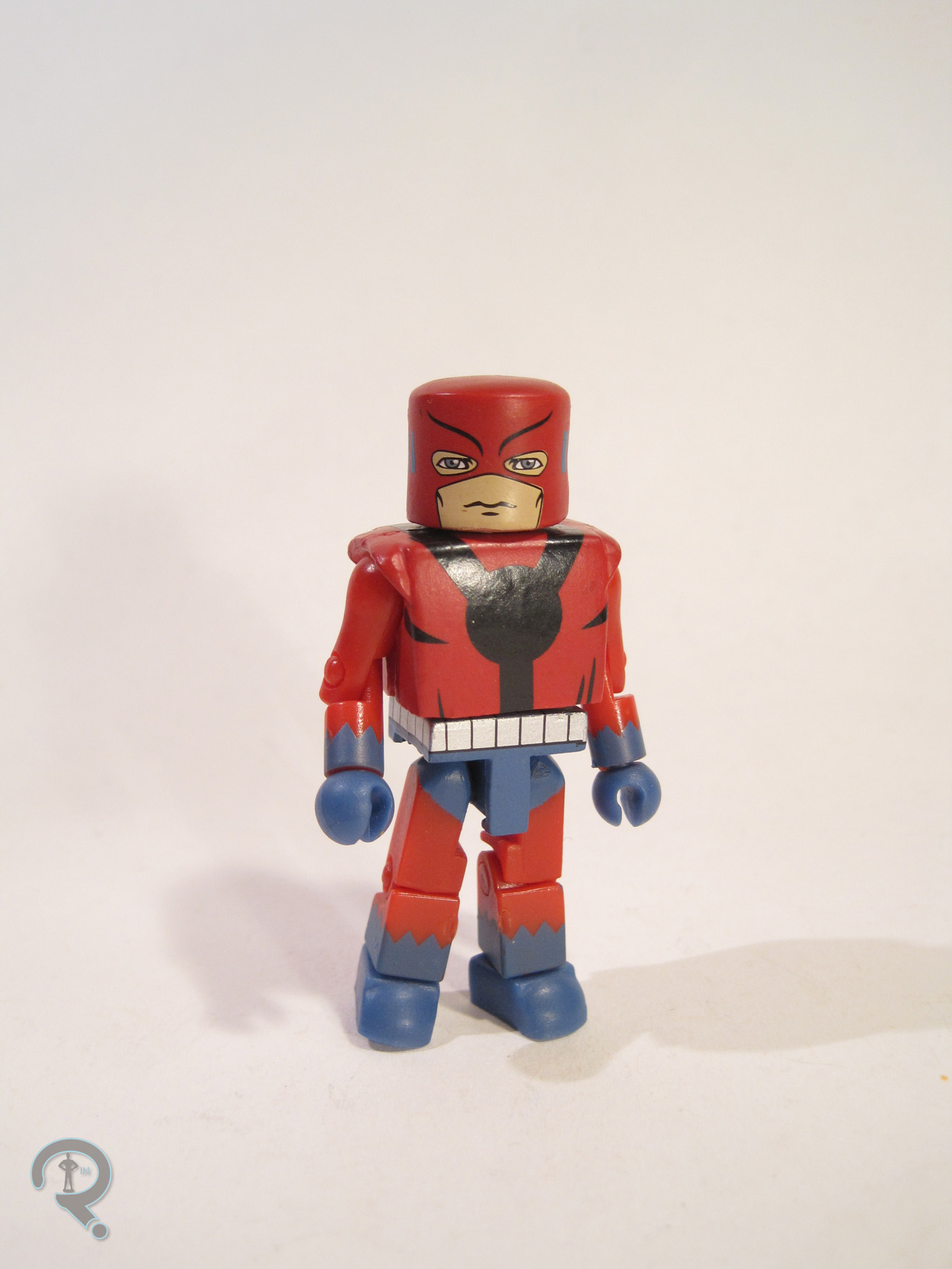
under the helmet looks maybe a bit too chiseled for Hank, but it’s not bad. Hank included a separate mask, torso cover, and waist cover to transform him into Giant-Man, as well as a spare hairpiece to allow him to be unmasked. The Giant-Man parts are alright, but not great. They bulk him up a lot, but don’t add any height, so he looks rather off. It’s clear they were trying their best, but he just doesn’t quite work right. The hair is perfectly fine; it’s a re-use from the classic Battlestar Galactica Starbuck, which seems odd for Hank stylistically, but it doesn’t look too bad once it’s in place.

GOLDEN ARMOR IRON MAN

AvengersFA7Iron Man was at the top of his game in 2008, so seeing him turn up in this set was pretty much a guarantee. This was his eighth Minimate that year alone! He presented here in his second armor, which was really just a repainted version of the Mark 1. It’s the armor he was wearing for the first two issues of Avengers, and it’s also a pretty memorable look for the guy. He was built on the usual body, with 5 add-ons: helmet, torso, skirt, and bracelets. The helmet and bracelets were both generic pieces, used on numerous figures around the same time. The torso and skirt pieces were re-used from the AFX exclusive First Appearance IM, released a few years before. That’s a pretty sensible re-use, since they were supposed to be the same armor in-universe. The IM-specific parts are nicely crafted. They don’t have tons of sculpted detail, but the look from the comics is captured well. Paint on this figure is kind of a mixed bag, mostly due to the fact that, in its current state, it really doesn’t represent how it AvengersFA2
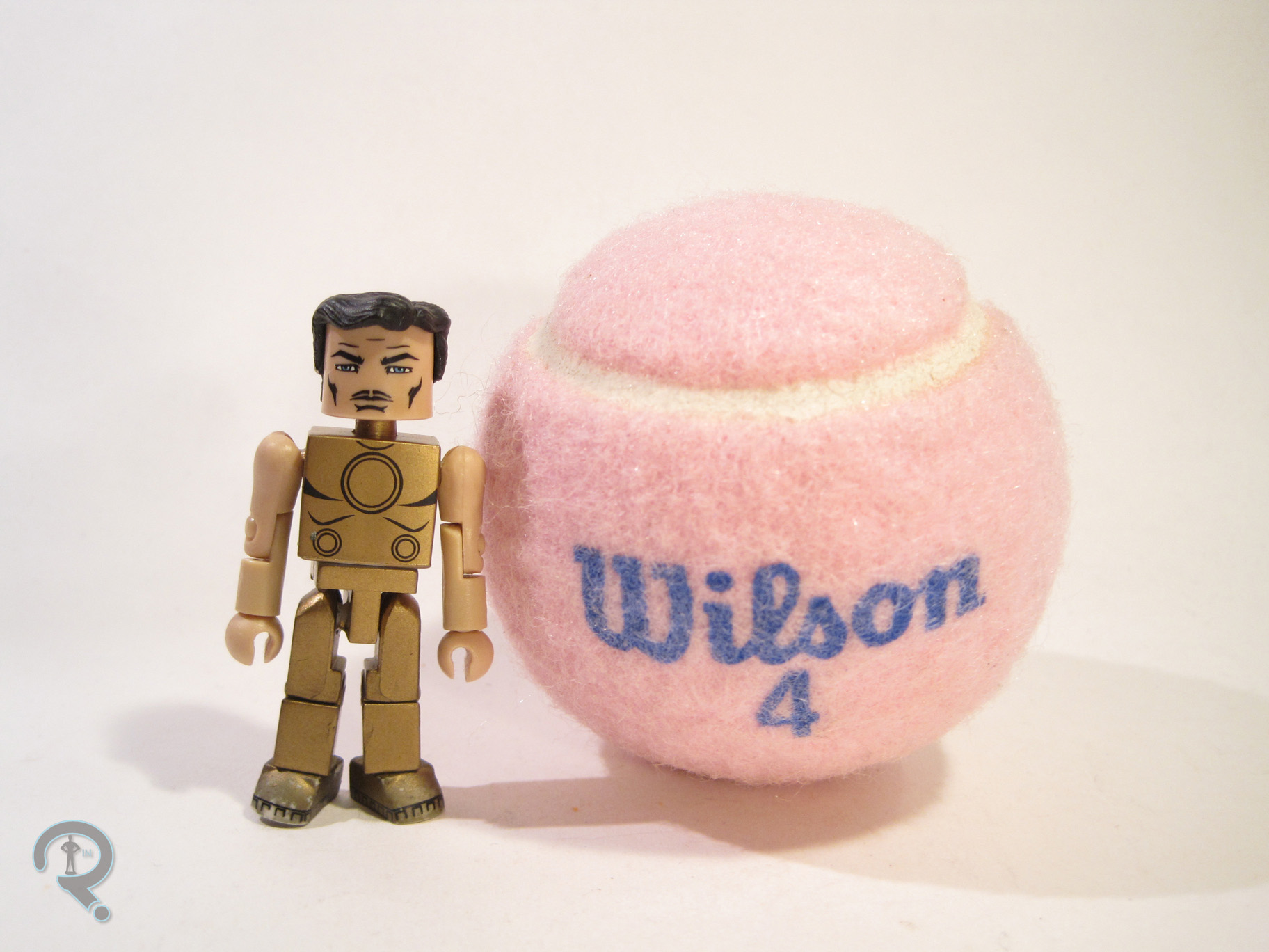
looked out of the box. The gold paint seems to have not adhered very well to the plastic, resulting in a rather chipped and tarnished looking figure, which is a bit of a disappointment. Subsequent gold-based figures have remedied the issue, but this one is left looking somewhat lackluster. On the plus side, the detail lines are all very well handled, especially on the underlying torso and face, which you don’t even see in the main set-up. Iron Man is packed with a spare hairpiece, for unmasked display, a hammer attachment for his hand, and a spare set of flesh-toned arms so that you can display Tony in re-charge mode.

INCREDIBLE HULK

AvengersFA5
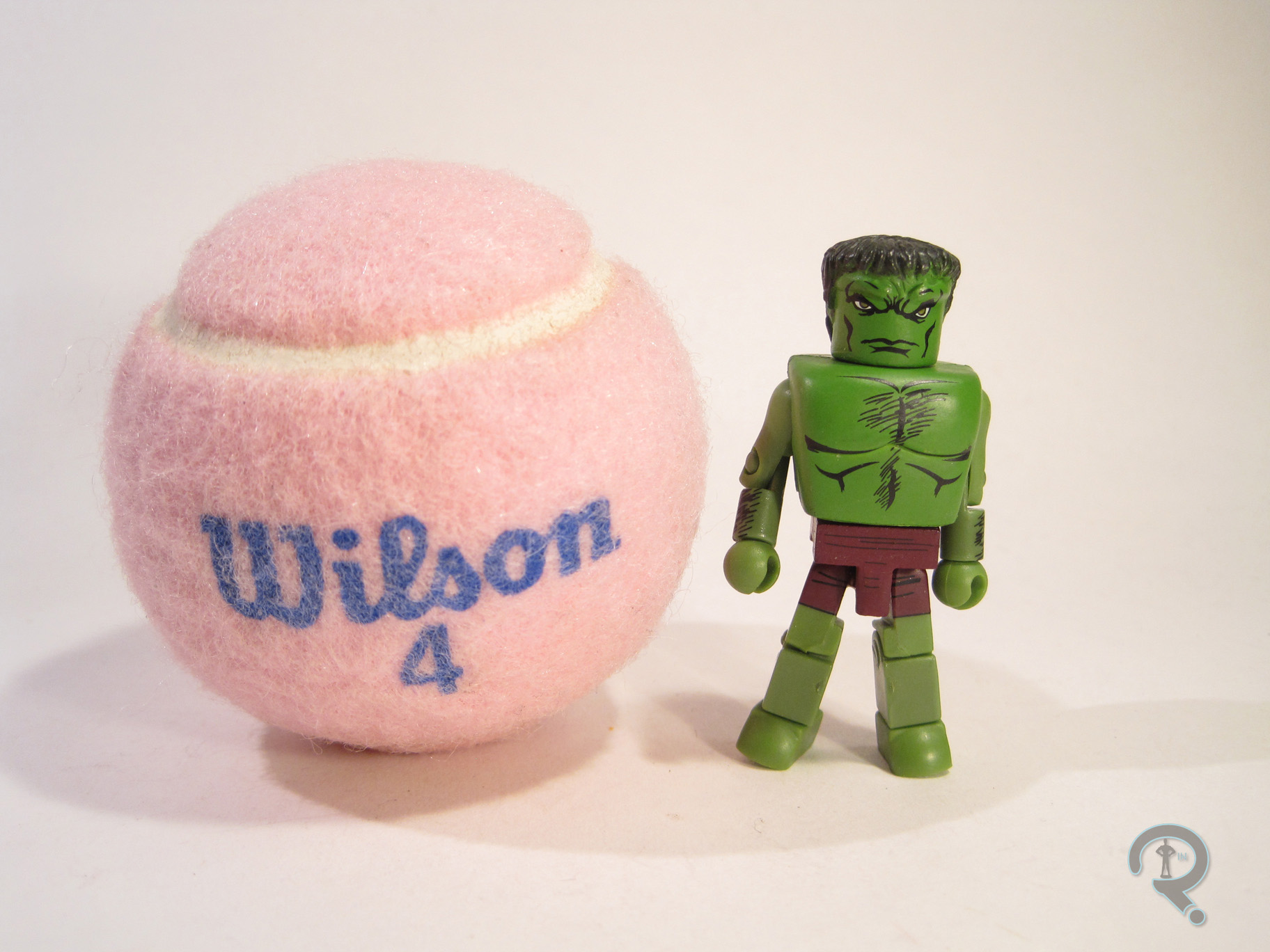
He may not have been quite as successful as Iron Man, but Hulk was pretty big in 2008 as well, making him another heavy hitter in this particular set. Hulk is presented here in his purple shorted look, which was rather short(heh!)-lived in the comics, but was the look Hulk had in the two issues this set is based upon. So, it’s an interesting enough variant of the character. The figure has a unique head sculpt, as well as add-ons for the torso, waist, and the infamous “duck feet.” The torso and waist pieces were both re-used from Series 20’s Abomination, and are both rather basic pieces. The head was only ever used on this figure, most likely due to the negative reaction it garnered from fans. It seems to try to capture the more Frankenstein’s Monster-inspired head of the early Kirby Hulk, but it comes out looking a bit lumpy. And then there’s the “duck feet.” They were one of Diamond’s first attempts at adding extra height to figures, and they built up a rather infamous reputation in the Minimate community, due to their general goofiness and lack of adherence to the usual Minimate style. Fortunately, Hulk included a spare set of regular feet, so no one was stuck with the weird ones. Hulk’s paint is decent enough. I think this might actually be my favorite shade of green for Hulk, and I do really like the Kirby inspired line work.

WASP

AvengersFA4
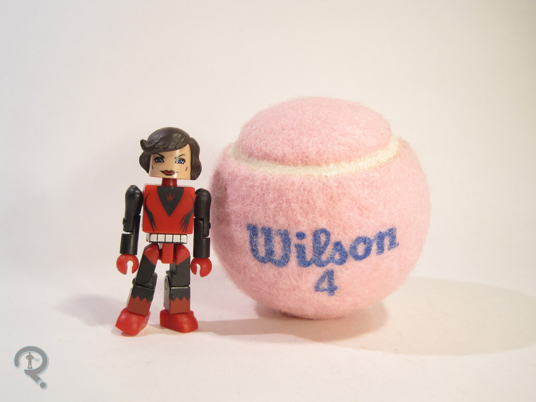
Wasp was another character that debuted in this set, though, unlike Hank Pym, she’s yet to actually get a follow up. Which is kind of a shame, since she’s had a boat-load of different costumes over the years. She’s presented here in her original costume, which has gotten a fair number of figures over the years. The figure makes use of 7 add-on pieces, used for her headgear, vest, gloves, skirt, and wings. The parts are a little on the bulky side, especially for Wasp, but they balance each other out pretty well, I guess. The skirt is a lot boxier than later pieces would be, which makes the whole figure look rather stiff. The wings are probably the best part of the sculpt, and they actually do a decent job of replicating the comic look. The paint on Wasp was pretty decent from a design standpoint. The line work is all pretty well laid out,AvengersFA8 
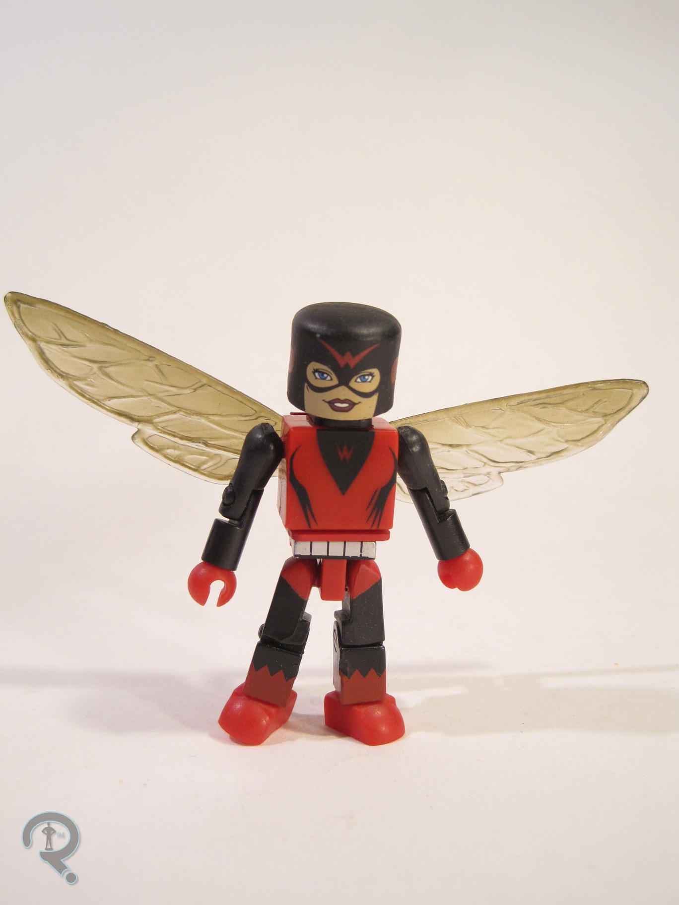
and everything. The real issue is in assembly. The figure was clearly assembled before fully drying, so several pieces, the wings in particular, were stuck, almost to the point of breaking. Wasp made out pretty well on the accessories front, including a spare hairpiece, a set of normal hands, an alternate mask, and an extra wing mount so that she can be displayed without the bulky vest piece.

THE ME HALF OF THE EQUATION

So, I actually ended getting a couple of this set when it was released, without even trying. I got one from my friend Lance, and then won another in a contest, and then eventually picked up a few more from Record and Tape Traders at super marked down prices. The set itself is pretty decent, if maybe a bit out of date when compared to more current stuff. Ant-Man and Wasp were definitely the stars here, and they both still hold up pretty decently.

#0677: Battle Ravaged Robot

BATTLE-RAVAGED ROBOT

LOST IN SPACE

RobotBR1

You know when you hear about a bad movie, for like a long time, and it just builds up this reputation of being so bad, and you think to yourself “it can’t really be that bad”? And then you watch it and it is indeed that bad? Yeah, that’s the Lost In Space movie from the 90s. To be fair, the movie isn’t completely without its merits. Among the positives are the end credits (and no, I’m not just saying that because they meant the movie was over. I actually like the end credits. They soothe me.) and the film’s take on the distinctive Lost In Space Robot. There were also some toys, which always excites me. Most of them were garbage, but some of the Robot toys didn’t suck. Let’s look at one of those!

THE FIGURE ITSELF

RobotBR2So, this is the Battle Ravaged Robot, from Trendmaster’s movie-based Lost In Space line. He was one of the two versions of the Robot released to go with the 5-inch scale human figures. The Robot is based on two separate looks from the film, all rolled up into one figure. As the name notes, he represents the Robot after he’s damaged while fighting the spider-things on the derelict ship, but that’s actually more of an alt look for the more show-inspired, second half of the movie look that is the figure’s default form. In his default set-up, the figure is about 4 inches tall and has 7 points of articulation. He also had wheels on the underside of his base, allowing him to roll, as well as legs that have weird spring-loaded feature to them. Also, the pincers on the larger arm are supposed to move via the very obvious lever on the side, but they really don’t. The main base of the figure, the legs, and the lower arms were all shared between this figure and the other Robot in the series, which seems sensible enough. They’re actually pretty well sculpted parts for the time. They have plenty of detailing, and they match up pretty well with the designs from the film. The figure also gets a unique “torso” piece, which features the joint for his more classically show-inspired head, as well as a socket to plug in his larger third arm. The head and arm are both just as nicely sculpted as the re-used parts and match up pretty well, so that’s good. Paint-wise, the figure is a little on the simple side, at least for the source material, but he’s not terribly handled. There’s a nice mix of greys and browns, with the occasional blue cropping up as well. The paint works reasonably well for the second iteration of the Robot. The figure is packed with a two-piece shell, allowing him to be “transformed” into the Battle Ravaged version of the Robot’s first iteration. This is a cool idea, but the execution ends up being a little off, mostly due to the color schemes of the two designs being different. It doesn’t look terrible, and, to their credit, they’ve added some brown damaged parts to the torso shell, so as to make it look like the brown-colored parts of the second Robot are just additional damage, but it doesn’t quite work. The figure also had a sound feature, but the batteries are long dead on mine, so I have no idea what sounds it would have made.

THE ME HALF OF THE EQUATION

I actually went and saw Lost In Space opening day. My dad and uncle had been big fans of the show growing up, so they took me and my cousin to see it. Truth be told, as a 6 year old, I didn’t mind the movie all that much. I really liked the Robot, so I ended up having a few of the toys of him, this one included. However, my original Battle Ravage Robot went missing, so I ended up getting this replacement from Yesterday’s Fun. He was the only LIS figure they had and I felt sort of bad for him. This figure definitely has some issues, and he comes from a pretty bad line, but he himself is actually a lot of fun. I’ve owned far worse.

RobotBR3

#0676: Captain Jack Harkness

CAPTAIN JACK HARKNESS

DOCTOR WHO

CapJack1

So, interestingly enough, before I got into Doctor Who, I actually gave the Who-niverse a try-out with the spin-off series, Torchwood. I liked the show well enough at first, but I decided it wasn’t for me when I got to the finale of the third series, Children of Earth. Just like the comic version of The Walking Dead, I found there are some storytelling techniques I just can’t move past. When I finally got around to watching Doctor Who proper, I was pleasantly surprised by how much I enjoyed Torchwood’s lead, Captain Jack Harkness, when he was given the chance to be a little more light-hearted than Torchwood had allowed.

THE FIGURE ITSELF

CapJack2Captain Jack was a special single release in the Doctor Who line. He was actually a re-issuing of the line’s first Captain Jack figure, which had become a little bit difficult to get a hold of in the years since its release. The figure depicts Jack in his gear from his second tenure on the show, during the Tennant run. It also happens to be the look he has for most of Torchwood. It’s a look with a lot of appearances, so it’s definitely a good representation of the character. The figure stands a little over 5 inches tall and has 16 points of articulation. Compared to some of the more recent figures from this line, he’s a bit lacking in movement; you aren’t going to get much more than a basic standing pose out of him. A fair bit of that comes from the somewhat restricting nature of his long coat, but even without that, the figure would still be a little stiff. Jack features a unique sculpt. It’s decent enough, over all. The proportions are mostly pretty good, aside from his somewhat alien looking fingers. Some of the areas, particularly the coat, are a little bit lacking in texturing, but that’s about the same, stylistically, as the other figures from this era, so he fits in pretty well. The likeness on the head sculpt seems like it’s pretty good, under the paint, but it’s hard to tell. As it is, it feels a little bit off. It’s still recognizably him, but not quite 100%. Also, the expression seems a little bland for Jack. I think a grin of some sort would be far more in character. So, what about that paint I was just touching on? Well, it’s best described as “adequate.” Not bad or anything; in fact, it’s remarkably clean. That being said, it just feels too smooth for a figure based on a real person. Also, it’s a bit thick in application, so things like the likeness on the face can be rather hard to make out. Jack includes a revolver, which is more than a lot of Doctor Who figures get, so that’s good.

THE ME HALF OF THE EQUATION

Jack here was one of a handful of things bought for me by my Super Awesome Girlfriend while we were at Yesterday’s Fun. After purchasing a rather sizeable selection of figures myself, she came out of the store and presented me with another bag full of things, Jack amongst them. Jack was the one major Tennant companion I was missing, so I’m glad to finally have one, even if he isn’t a perfect figure.

CapJack3

#0675: Recondo

RECONDO

G.I. JOE: SPY TROOPS

Recondo1

You can’t really run an effective action figure review site if you don’t occasionally touch on the original action figure, G.I. Joe. It’s been a fair few months since I last looked at anything Joe-related, so their probably overdue for another review, don’t you think? I’ll be taking another gander at the early 2000s re-launch of the line, which is really what got me hooked. Let’s look at Recondo, who was one of my favorites.

THE FIGURE ITSELF

Recondo2Recondo was released in the first series of G.I. Joe vs Cobra following the line’s re-branding under the G.I. Joe: Spy Troops heading in 2003. He was originally released in a two-pack with an Iron Grenadier, but he was also released as one of the Mission Disk single-pack figures, which is how I got mine. Recondo is one of the taller vs Cobra Joes, coming in at just shy of 4 inches tall. He featured 18 points of articulation, which was pretty impressive at the time (and still kind of is now!) Recondo got an all-new design for Spy Troops, which was a pretty radical departure from his vintage design. Now, I never owned the vintage Recondo, so this was my first exposure to the character. Due to that, I find myself liking this particular design a fair bit more than the original. That said, this design is a little more generic, and does ditch some of the original’s charm, so I can certainly see why people might have wanted a return to the classic design. The figure’s sculpt is very nicely handled, regardless of which design it represents. The proportions are some of the best the 00s line had to offer and his uniform has a ton of awesome little details put into it, especially on the torso, which houses a pistol, grenade, and several pouches for ammo. The paintwork is also pretty great on Recondo. Aside from a minor issue with his sleeves being fleshtoned at the elbows, everything is nice and clean and where it’s supposed to be. And, none of the things on the torso have been left unpainted, which is always a nice thing to see! Recondo was packed with a rifle, knife, and backpack, as well as the Mission Disk, which featured two episodes of the 80s cartoon and a few games.

THE ME HALF OF THE EQUATION

When the first series of Spy Troops two-packs were first announced, I knew I wanted the Recondo set. He just looked really cool. But, for whatever reason, I never got him (I got several of the other sets, though), and then he had mostly disappeared from stores. However, while on a mall outing with my Grandmother, I found Recondo and Wild Bill in their single-pack form at KB Toys. Man do I miss that place. Anyway, Recondo went on to be one of my favorite figures. I’m happy to see he’s held up pretty well!

#0674: The Putties

PUTTIES

IMAGINEXT POWER RANGERS

Putties1

Minions. Minions are what make the world go ‘round. No, not the little yellow guys in overalls (though they do seem to have infiltrated every facet of our lives…), just minions in general. All the best villains have a legion of near identical followers, who can do their bidding and serve as cannon fodder for our charming heroes. Darth Vader has the Stormtroopers; Shredder has the Foot Clan; Dr. Doom has the Doombots. Almost every iteration of Power Rangers has had its own set of faceless minions, starting way back in Mighty Morphing Power Rangers, with the clay warriors The Putties.

THE FIGURE ITSELF

Putties2The Putties were released in a pack of three figures as part of the first assortment of Imaginext Power Rangers figure packs. The pack is made up of three identical Putty figures. They’re based on the Putties’ Season 1 appearance, before they were retooled by Lord Zedd. The design is a little more streamlined than future designs would be, and it’s when the characters were the most prominent. The figures each stand 3 inches tall and feature 8 points of articulation. The sculpt is fairly basic, which is fitting for the Putties. The body sculpt is pretty standard; the proportions are on par with the rest of the Imaginext line, and the basic parts are nice and cleanly sculpted. The heads are more detail filled than the body; on the show, the putties faces were a bit slap-dash, so replicating them can be a bit of an issue. Imaginext has opted to refine them a bit, which looks decent enough. I only wish they’d done up their hands to match, as they did in the show. The paintwork on the figures is pretty simple, but done well enough. The figures are molded in a slightly metallic grey, which replicates the spandex costumes from the show pretty decently. They’ve got painted details for their belts and eyes, as well as the black marks on their chests. The paint is pretty clean overall, though there’s some variance to the chest markings between the three. The Putty pack includes no accessories, but three Putties cost the same as two Rangers, so I guess, in theory, one of the Putties is an accessory to the other two.

THE ME HALF OF THE EQUATION

The Putties are really what sold me on the Imaginext Power Rangers. The Figuarts versions of the Rangers are the be-all-end-all versions of the heroes, but Bandai has yet to make any movies toward Putties in that scale. So, for someone who wants a few Putties to bat around, there aren’t many options. Add in the rather low price-point of the Imaginext stuff and I’m definitely sold, at least on a few of the figures.

Putties3

#0673: Green Ranger & Pink Ranger

GREEN RANGER & PINK RANGER

IMAGINEXT POWER RANGERS

PinK&Green1

Man, I really didn’t think Power Rangers was a thing I’d ever get back into. Then all these toy companies had to go and start making all these cool Power Rangers toys, and I had to go and have no self-control when it comes to cool toys. What are you gonna do, right? I can definitely tell you that a few years ago I would have never imagined that I’d be buying Imaginext stuff. They’ve really stepped up their game, and, more importantly, they’ve started making a lot of things I want to buy. Like Mighty Morphin’ Power Rangers. They’ve just released a bunch of Rangers merchandise, including several of the Rangers’ individual Zords, a really cool combined Megazord, and several smaller figure packs, for those who aren’t quite ready to dive all in. I just picked up Green and Pink Rangers, so let’s see how they turned out.

THE FIGURES THEMSELVES

Green and Pink were released as a two-pack in the first assortment of Imaginext Power Rangers figure packs. They’re probably the most sensible pairing of the bunch (given that they were a couple in the show), and it looks like they’re both currently exclusive to this particular pack, though Kimberly’s already been slated for a release with her Zord, and I’m sure Tommy won’t be far behind.

GREEN RANGER

Pink&Green2The Green Ranger is the first identity of Tommy Oliver, the original Sixth Ranger, who would take on another four Ranger identities over the course of the various Ranger series. He was also portrayed by Jason David Frank, an actor of near legendary status in the Power Rangers community. So, the Green Ranger’s kind of a big deal. The figure stands 3 inches tall and has 8 points of articulation. Aside from the legs both being on the same joint (which still kinda baffles me) the movement is all pretty good, especially for a figure of this size and style. Tommy’s technically based on his appearance in Mighty Morphin’ Power Rangers, but there are a few changes, aside from the obvious stylistic ones. The Rangers in this set all appear to be an amalgam of sorts of their show and movie designs, taking the general design cues from the show, but also possessing the movie’s armored bodysuits and more detailed gloves and boots. It’s an interesting choice, doubly so on the Green Ranger, who was not in the movie. Also, there’s one glaring thing missing from this guy: his Dragon Shield! Yeah, he doesn’t have the extra armored bit that set him apart from the others, which is, admittedly, a bit odd. Sculpturally, Tommy uses the same body shared by all of the male Rangers in the line (so far, anyway). The proportions are slightly tweaked, so as to bring him in line with the rest of the Imaginext figures. The body has a lot more fine detail work than what I’ve seen before from Imaginext, and it’s certainly very impressive. Tommy also gets a unique head sculpt, which is a pretty good translation of his dragon-styled helmet, with the same level of detail as the body. The mouth is painted, rather than sculpted, but that keeps him more or less in line with the un-helmeted characters. As far as paint goes, the Green Ranger is handled pretty well, though he does make a few more deviations from the source material. For one thing, the gloves and boots are just straight white, as is the belt. One presumes this was done as a way of simplifying the designs just a bit. Interestingly, the other big change is not a simplification. For whatever reason, they’ve painted the ridges on the top of the helmet grey, presumably to set them apart from the rest of the helmet. However, on the show, that part of the helmet was just straight green. I’m not sure why they changed that particular thing, but it certainly doesn’t look bad, so I can’t really complain. The Green Ranger includes his Dragon Dagger, up-scaled a fair bit to meet safety standards. It’s nicely sculpted and pretty well painted, though it’s worth noting that the details on the blade are sculpted on the opposite side of the one they were painted onto, which is kinda funny.

PINK RANGER

Pink&Green3The Pink Ranger was actually one of the set’s main draws, at least initially, since it’s the only way to get her in the initial product release, and she is one of the original five, after all. Unlike Tommy, Kimberly would only be the Pink Ranger for one incarnation of the show, but she’s still the original, and that’s kind of important. The figure is a little under 3 inches tall and has the same 8 points of articulation as Tommy. She too is an amalgam of her show and movie designs, keeping the basic layout and the skirt from the show design, but still adding the stitching and armoring of the movie design. Due to the presence of the skirt (which the Yellow Ranger does not have), the Pink Ranger gets a mostly unique sculpt, apart from a re-used set of arms. Once again, the proportions have been slightly tweaked, so as to make her fit stylistically with the rest of the Imaginext line. I must admit, it’s refreshing to see one of these “kid-ified” lines not horribly under-sizing the female characters. It’s especially great when it comes to the Power Rangers, who should all be similarly sized. I’m not 100% sold on the head sculpt. It’s not bad, but it seems her helmet just didn’t translate as well to the style as the others. She kinda looks like one of those stereotypical aliens. Kimberly’s paintwork isn’t all that different from Tommy’s; it still lacks some of the extra details on the gloves, boots, and belt. She’s also missing the patch of white on the back of her helmet, which might actually be what’s throwing her head sculpt off for me. Also, the mouth on this one is mis-aligned, which makes her look a little wonky. She includes her Power Bow, which is once again up-scaled a bit for safety. She can’t really hold it, but it’s decently sculpted, and it includes clips so that you can assemble the Power Blaster if you get the other Rangers.

THE ME HALF OF THE EQUATION

I saw the various Imaginext Power Rangers stuff a few times before picking this set up, mostly due to this seemingly being the most difficult to obtain set. I wound up finding at a Target near a convention I was attending, and these two just really drew me in. The Green Ranger’s definitely the star here, even with his handful of inaccuracies, but both of these figures are just a lot of fun!

Pink&Green4

#0672: Bounty Hunter Chewbacca

BOUNTY HUNTER CHEWBACCA

STAR WARS: POWER OF THE FORCE II

ChewieBountyHunter1

My first introduction to Star Wars toys was courtesy of Kenner’s Power of the Force II line of figures. The interesting thing is that I came into the line during the second round of figures, so some of my initial versions of the main characters weren’t exactly standard issue. I’ve already discussed how Dagobah training Luke was my first figure in the line, and some of the other main characters followed a similar pattern. Chewbacca was one such character, which seems a little odd, since you wouldn’t think there would be a lot of potential Chewbacca variants. Well, faithful reader, feast your eyes on Bounty Hunter Chewbacca!

THE FIGURE ITSELF

ChewieBountyHunter2Bounty Hunter Chewbacca was part of the second year of Power of the Force II figures. He was released as part of a small subset of figures based on Shadows of the Empire, which is a story set between Empire and Jedi. In the story, Chewbacca has to take on the guise of well-known Wookie bounty hunter Snoova in order to infiltrate Imperial City. So, technically, this figure could pass for either character. This is only the third time that Chewbacca had made it into the 3 ¾ inch line, which is surprisingly low, given his prominence. The figure stands a little over 4 inches tall and has 6 points of articulation. As a Chewbacca variant, you might think that this figure would be heavy on reuse. However, that’s not the case, as the only shared part between this and the regular POTF2 Chewie is the left leg. Everything else is new to this guy, though the sculpt maintains more than a few similarities with the regular version. Chewbacca definitely has a slightly exaggerated style about him (as did most of the POTFII figures) but I think this is one of the few figures in the line that really couldn’t work without the slightly cartoony feel. The concept looks pretty nifty here, presented in all its over-complicated 90s glory, but placed on a more realistically proportioned body I dare say it would look downright silly. And being exaggerated certainly doesn’t mean the figure doesn’t have some great texturing. The armor in particular looks sufficiently worn and beaten. Someone had a lot of fun sculpting this guy. This version of Chewbacca also got some of the very best paintwork POTF2 had to offer. All of the base paint is cleanly applied, with minimal bleed over. He’s also got some pretty nice work on his fur, which, in story, has patches died to make him look more like Snoova. They could have just been solid blotches of color, but they’ve actually been worked in rather subtly, making them look like they’re actually died into his fur. Chewbacca was packed with a giant blaster and a sci-fi looking axe, which both just add to the 90s over-complication thing. They can both be held, or the axe can also be plugged into his back for storage.

THE ME HALF OF THE EQUATION

This guy was my very first Chewbacca figure. If I recall correctly, Chewie was one of the last main characters I got. I remember that my Grandmother took me to the store (Sears, I think) specifically because I had asked to get a Chewbacca figure. I seem to recall that both versions of Chewbacca were there, but I picked this one. Even then I knew what cool was! The one pictured is actually a replacement I picked up a few months ago, as the original got lost some ways back. I have to admit, I was ready to tear into this one for its absurdity when I first sat down to write this, but I’ve come out of the review with a rekindled love for this X-Treme little guy.

#0671: Ant-Man & Ant

ANT-MAN & ANT

MARVEL’S ANT-MAN (HASBRO)

AntMan&Ant1

Ant-Man was a pretty fun movie. It really was. Also, seeing as the main character’s whole gimmick is his size changing, toy makers get an excuse to release figures in just about any scale they want. Hasbro’s already pretty big on different scales, so they’ve done a little bit to exploit this, though not as much as you might think. So far, they’ve offered the main character in 3 ¾ inch, 6 inch, and 12 inch sizes. I already took a look at the 6 inch Marvel Legends figure (which was a little inaccurate) and now I’ve gotten the 3 ¾ inch-sized Ant-Man and Ant set, which I’ll be looking at today.

THE FIGURES THEMSELVES

These two are packed as a deluxe boxed item. The packaging is similar in style to Hasbro’s Marvel Legends Infinite Series, but the Marvel Legends brand isn’t mentioned on the packaging. He’s just billed under Marvel’s Ant-Man.

ANT-MAN

AntMan&Ant2Here we have the titular character, who’s kind of responsible for selling the set. The figure is 3 ¾ inches tall with 20 points of articulation. Movement is a little awkward, to be honest. His hip joints are a somewhat limited and he’s definitely held back by the lack of any torso or waist articulation. He has an all-new sculpt, which is based on his movie design. It’s similar in style to the ML figure, just shrunk down a bit. While that figure had a strange open-mouthed mask, this one has a more movie-accurate closed mouth design. It’s still not a perfect match for the movie design, but it’s pretty spot on to a lot of the earlier promotional art from the film, so it’s forgivably off. The sculpt of the body is well proportioned and features a nice bit of texture and detailing. The hands are in the same slightly odd pose as they were on the ML figure. I’m not sure what the deal is there, but they’re well sculpted hands at the very least. The paintwork on Ant-Man is cleanly handled; it’s a bit on the simpler side. It feels a bit lacking, especially when compared to the larger Ant-Man, but it looks decent enough. The red’s too bright, though, and his eyes should be a bit lighter. But, he’s not bad. Ant-Man includes no accessories, but he is packed with…

ANT

AntMan&Ant3…the Ant. One would assume that this is meant to be Ant-Hony, the ant that Scott rides in the movie, but he’s simply referred to as “Ant” in all references to him on the box. The figure is about 5 inches tall and 7 inches long, with 12 points of articulation. He’s a pretty big ant! The articulation is rather rudimentary, and it seems like they could have easily added a bit more movement if they’d wanted to, but it’s serviceable as is. All of the articulation is handled via ball and socket joints, which aren’t the sturdiest things. That means that Ant-Hony has a habit of falling apart on a frequent basis, which is more than a little annoying. From a sculpting standpoint, he’s another all new sculpt. It’s not a super-detailed sculpt or anything, but it does a respectable job of upscaling an ant. The main body has some decent texturing to it and the wings are patterned to match those on Wasp, which is certainly nice for consistency’s sake. The legs are all hollow on one side, which kind of kills a lot of the realism of the sculpt, but you can pose them so that the hollow portions are inward. Ant-Hony’s paintwork is actually pretty decent. There’s not a lot, but there’s more than you might think at first glance. The eyes are, obviously, different, but there’s also some fairly subtle red accents on the front legs and the head, which add a nice bit of variety and pairs him up well with the included Ant-Man. Like Ant-Man, Ant-Hony doesn’t have any accessories of his own.

THE ME HALF OF THE EQUATION

It’s Super Awesome Girlfriend’s fault again! We were at my local Toys R Us and they had just put out their shipment of this set. I wasn’t sure I was going to get it, but SAGF saw that Ant-Hony was included and told me I needed to get it. I’ve learned that arguing with her on such things is relatively pointless, so I went ahead and got it. The set isn’t anything out of the ordinary for Hasbro, but it’s entertaining enough, especially given that it’s the same cost as a Marvel Legend.

AntMan&Ant4

#0670: X-Ray Vision Superman

X-RAY VISION SUPERMAN

SUPERMAN: THE ANIMATED SERIES

XRaySupes1

Remeber last week when I looked at one of the wacky Superman variants from Kenner’s tie in line for the 90s cartoon?  Well, that one wasn’t even the tip of the iceberg.  At least he was somewhat passable as a basic Superman.  Today’s figure? Less so.  Without further ado, here’s X-Ray Vision Superman.

THE FIGURE ITSELF

XRaySupes2X-Ray Vision Superman was released as part of the fourth series of Kenner’s Superman: The Animated Series, the story of which I covered in Power Swing Superman’s review.  He’s another of the frivolous Superman variants designed to showcase Superman’s less obvious power set.  Yay?  The figure is 5 inches tall and he features 6 points of articulation.  He sports a unique sculpt.  It’s not quite show accurate, but it’s in line with the all of the other Animated Series figures, so at least it’s consistent.  It’s nowhere near as extreme in pose as Power Swing Superman, but he’s still a bit removed from a standard standing pose.  The most out there part is definitely the throwing arm, which is permanently outstretched and at a 90 degree angle.  That’s a bit on the awkward side, but it works okay with the accessories.  The rest of the sculpt is more standard fare: fairly simple musculature and decent enough proportions.  The head sculpt isn’t as good as the PS Superman, but that’s mostly due to the “action feature.”   What is this action feature?  Well, he’s got light piping, so as to light up his eyes and simulate his…X-Ray vision.  I think they may have gotten confused with his heat vision.  The paintwork is where the figure really gets wonky.  In lieu of the traditional Superman colors, this figure is primarily a red-orange-yellow gradient.  It’s a very warm look, which once again makes me think someone at Kenner kept mixing up heat vision and X-Ray vision when designing this guy.  That said, it’s a unique look, so I actually can’t complain.  The cape has been swapped to blue, I guess to break up the reds a bit.  Overall, the paint is pretty decently applied, with no real slop or anything and lots of nice, bold colors.  Superman is packed with a bundle of dynamite, as well as a safe to hide it in.  The safe is partially translucent, so as to demonstrate Superman’s power.

THE ME HALF OF THE EQUATION

Like his series-mate, I picked this Superman up from Yesterday’s Fun. He was another one of the wacky Supermen that had intrigued me all those years ago.  In fact, he has the notoriety of being the very last thing I bought on vacation.  He’s not quite as much fun as Power Swing, but he’s not too bad.  And, as an added bonus , paired up with Power Swing, you get a pretty decent Silver Age Superman Blue and Red.

XRaySupes3

#0669: Vision

VISION

MARVEL POP! ICONS

VisionPop1

Well, the summer is almost done, and we’ve more or less moved away from the movies that kicked off the summer movie season. It hit early, but Avengers: Age of Ultron remained one of my favorites throughout the summer. It may not have been perfect, but it was enough fun that I really didn’t care. One of my favorite parts of the movie was the live action debut of the Vision, who was a excessively cool. Unfortunately, he was absent from a lot of the early merchandise for a the movie, so there was a bit of a wait for toys. Funko was at the head of the charge, though, offering Vision in the first selection of their Pop! Figures from the movie.

THE FIGURE ITSELF

VisionPop2Vision is figure #71 in Funko’s Marvel Pop! Heroes line, which puts him in the same number sequence as the other Age of Ultron figures. Obviously, he’s based on Vision’s film appearance. This is the first time that Vision’s been done in the Pop! style, but here’s hoping a comic version’s not too far behind. The figure stands about 3 ½ inches tall. As a Marvel Pop!, he is legally a bobble head, not an action figure, so he has no actual articulation. You can reposition his head a bit if you really want to, but that’s really it. As far as the sculpt goes, Vision is pretty standard Pop! faire. Squared head, creepy round eyes, pointy nose, and no mouth. It’s a well-established formula, so it’s not surprising to see the figure stick to it. He also keeps the rather standard squatting pose, which is a tad disappointing after getting several Pop! figures that changed the pose up a bit. Of course, it’s far from the worst pose they could have chosen, so it doesn’t hold him back or anything. Moving past the basic Pop! stuff, it’s worth noting that the figure has some very nice texturing and fine detail work, especially on the body suit. He’s definitely one of the more detailed Pop! figures. The paint on Vision is a little off. The colors were clearly based on early designs of the character, as they’re far more washed out than those of the final design. The Hasbro 2 ½ inch figure had a similar issue, so it would seem that Marvel changed Vision’s colors after distributing materials to the licensees. Oh well. It’s not horribly off, just a little. On the plus side, the paint is all pretty cleanly applied, without a lot of the usual bleed over issues of the typical Funko product.

THE ME HALF OF THE EQUATION

Vision was another figure added to my collection by the insanely awesome Super Awesome Girlfriend. After seeing the movie, I had made mention of really wanting a Vision figure of some sort and lamented the fact that there really weren’t any available to buy. So, the next time she came to visit, she gave me this guy. The Marvel Pop! figures can sometimes be a slight letdown, due to the whole bobble-head thing, but Vision is actually pretty nifty. I’m happy to have him!