#0525: Stormtrooper

STORMTROOPER

STAR WARS: REBELS

StormtrooperRebels1

While Star Wars toys expand to the new exciting world of the 6 inch scale with Star Wars: The Black Series, the main 3 ¾ inch scale line of figures seem to be returning to their roots, more or less. Slightly simpler sculpts, less articulation, and just a general retro feel. What’s interesting is that this approach is actually being used on the more current material, specifically the characters from Star Wars: Rebels, the current SW cartoon. Hasbro’s offering several of the show’s regular characters, as well as a few Star Wars mainstays who have also appeared. So far, the only figure I’ve picked up is the basic Stormtrooper. Let’s see how he turned out!

THE FIGURE ITSELF

StormtrooperRebels2
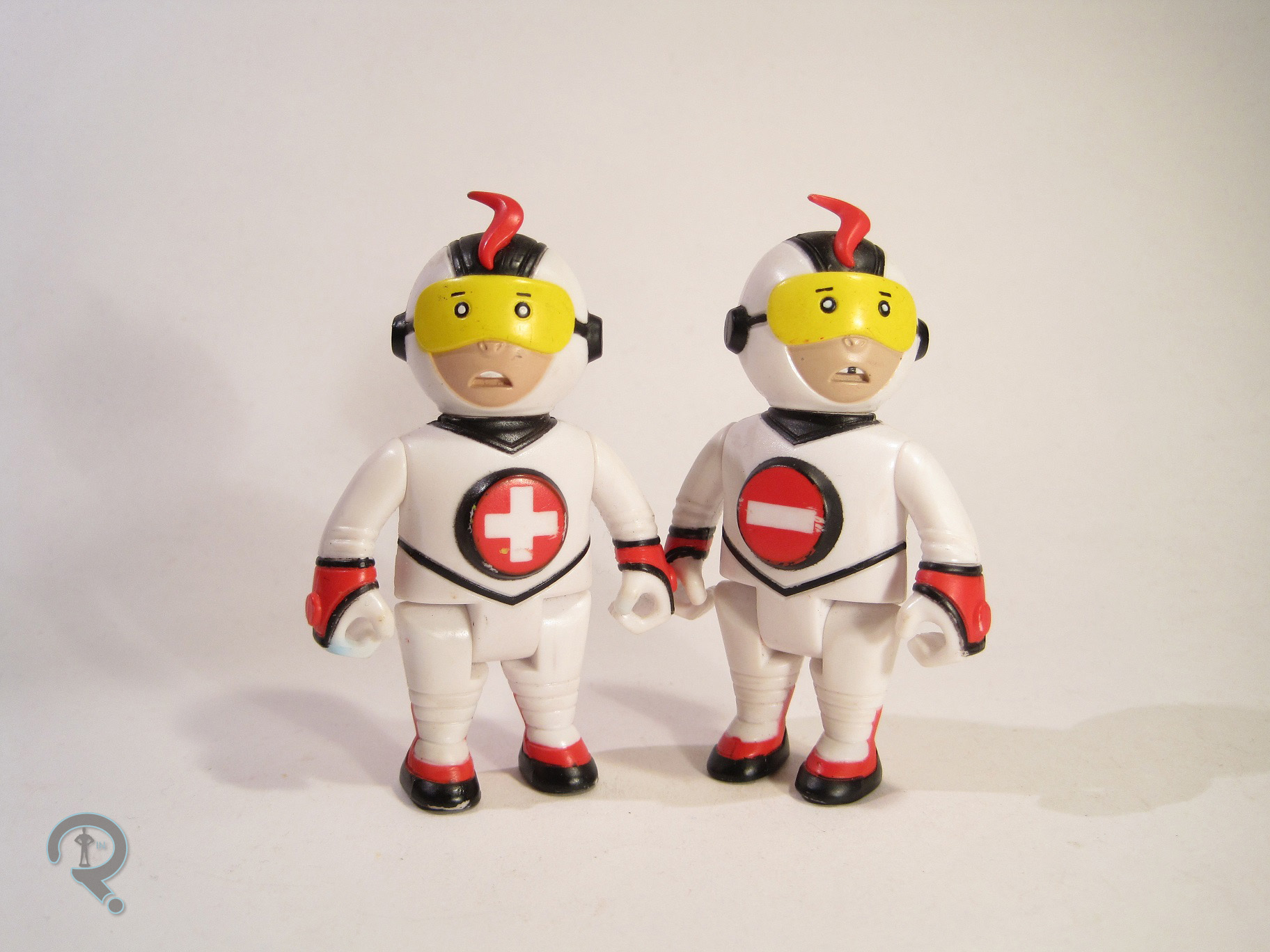
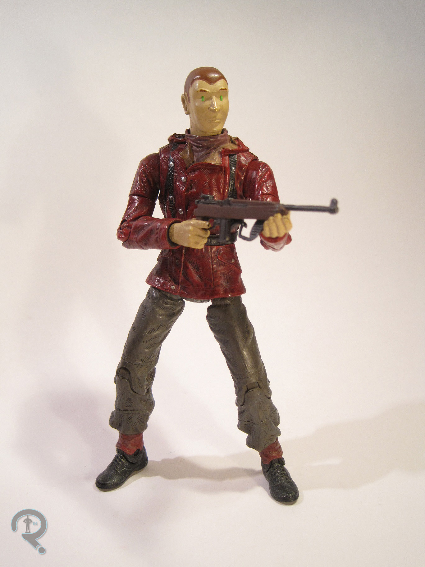
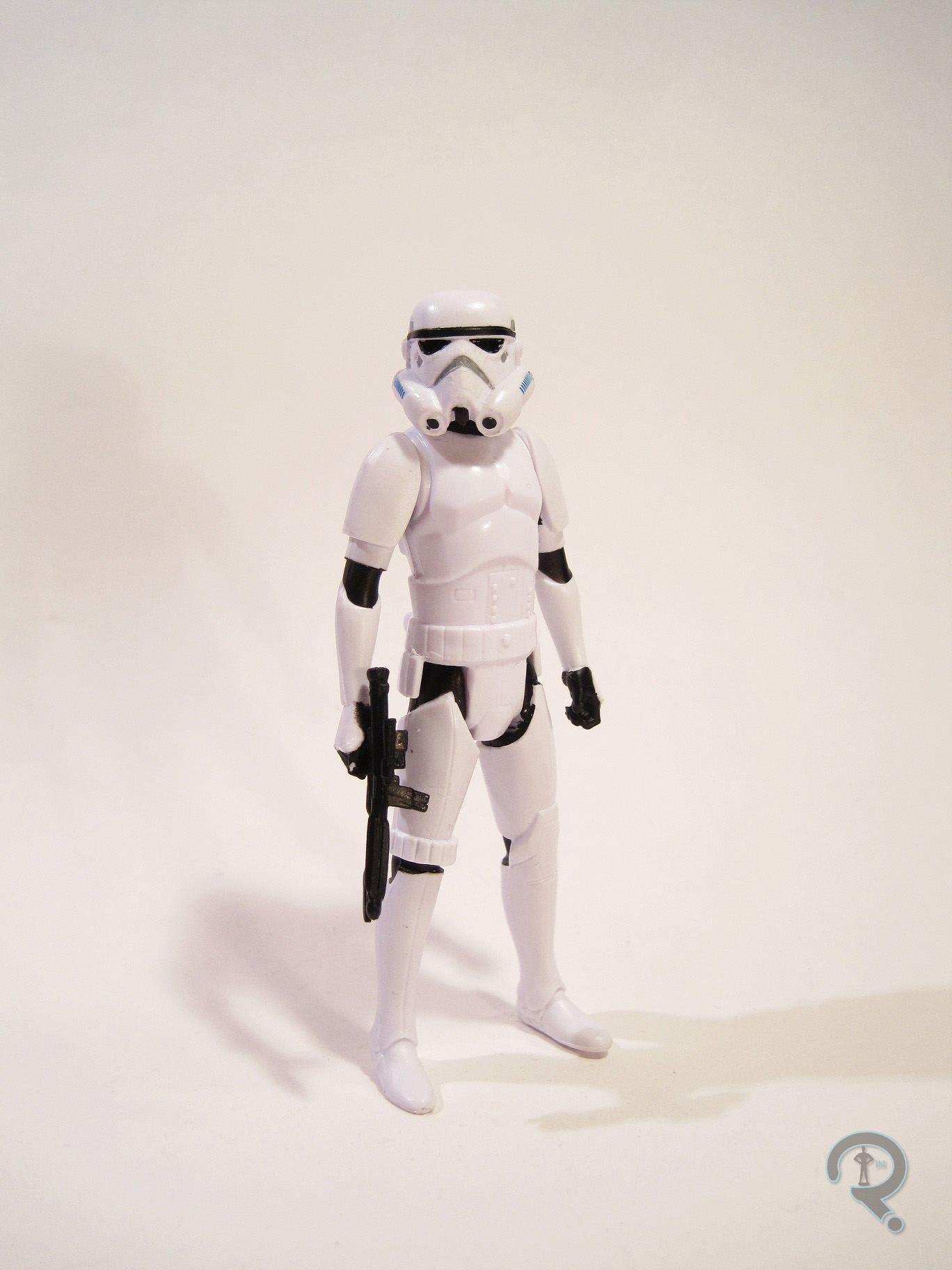
The Stormtrooper was released in the Star Wars: Rebels line two different ways: by himself, or packed with Garazeb Zeb Orrelios, one of the show’s original characters. Since I haven’t yet seen the show, I went for the solo version of the trooper. The Stormtrooper is about 3 ¾ inches tall, with 5, count ‘em 5, points of articulation. Given the limited articulation, the figure is really only good for one position. In this case, it’s just a basic standing pose. It’s very reminiscent of the vintage Star Wars figures in that respect. The Stormtrooper is based on his design from Star Wars: Rebels, which is, of course, just a slightly tweaked version of the traditional Stormtrooper. Most of the changes are on the helmet, which has been made a little more elongated and streamlined. In addition, the figure has a lankier animation-styled body. It’s a nice twist on a well-established design. The sculpt itself isn’t bad. It’s certainly simpler than a lot of figures, but the details are all properly placed and all the detail lines are nice and fairly sharp. The figure’s paintwork is kind of basic, though it does have some work I wasn’t expecting. The helmet gets the best detailing, with a whole three colors and some actual detail work beyond basic color placement. Everything there is clean and even, and the details are sharp, so that’s good. The rest of the body’s alright, but far from perfect. The legs have some really uneven coverage at the hips, and the arms have the same issue at the shoulders. Speaking of shoulders, the shoulders on the torso miss out on the proper black paint entirely; they just got left white. Given that the sculpt pretty clearly differentiates between the armor and the body, it’s pretty noticeable. The neck has paint on it, so it’s not like the torso just didn’t get paint. The Stormtrooper includes a standard blaster rifle. Since the figure’s limited to just a straight standing pose, the blaster has to be held in either one hand or the other (though, according to Super Awesome Girlfriend, the left hand is “wrong.” She’s such a handist.)

THE ME HALF OF THE EQUATION

I can’t really say why, but the Rebels Stormtrooper has just called to me ever since it was released. Of course, I was only able to find it in the two-pack with Garazeb, who I didn’t really feel the need to own, so I just put off buying the trooper. While stopping at a Toys R Us with Super Awesome Girlfriend (on the same trip where I found Gypsy and Romeo Blue) I saw that they had one individual Stormtrooper left. I decided against getting it, seeing as I was already buying two other figures. However, Super Awesome Girlfriend, being the horrible influence that she is, decided that I should have the figure anyway and bought it for me. This figure certainly isn’t on the same level as something like the Black Series version, but he just really resonates with me. I think it’s at least partly connected with the fact that the vintage Stormtrooper was the only version I owned growing up, and this figure definitely hits a lot of the same points. In many ways, this feels like a straight update on that figure. And I’m really okay with that.

#0524: Agents of SHIELD

AGENT COULSON, NICK FURY, & MARIA HILL

MARVEL LEGENDS INFINITE SERIES

AgentsOfShield1

After a few years of treading water and treating the line as second best, Hasbro has really turned things around with Marvel Legends. It seems the 6 inch scale is here to stay, and the 3 ¾ inch scale is on its way out (for Marvel, anyway). One of the things that helped Hasbro to build a successful line is partnering with big retail stores to offer exclusive figures, allowing them to up the number of characters released in a given year. So, let’s have a look at their latest exclusive set, the Agents of SHIELD set!

THE FIGURES THEMSELVES

This three-pack, consisting of Agent Coulson, Nick Fury, and Maria Hill, was released exclusively through Toys R Us (and eBay!) just in the last few weeks. Though the set is named “Agents of SHIELD” it’s not really based on the show (although all three characters present here have been on the show). All three of these figures present the characters as they were seen in 2012’s Avengers. So, these guys might be just a little late to the party, but we’ll let them slide.

AGENT COULSON

AgentsofShield2Yes, his first name is very definitely Agent. Coulson is really the main draw of this set, for a few reasons. First off, there’s that whole “Son of Coul,” most popular character in the MCU thing he’s got going for him. I don’t think anyone would have guessed that was going to happen to the bit part guy from the first Iron Man movie, but holy crap did it ever. The second, more toy-geek centric thing is that Coulson is also the first character to make use of Hasbro’s new suit body, which lots of people are excited about. Anyway, the figure is about 6 inches tall and he’s got 30 points of articulation. That’s a lot of articulation for a guy in a suit, but, aside from his elbows being a touch low, it works out really well. Coulson’s sculpt is all-new from head to toe. The suit body is definitely a strong sculpt. With something like a suit, finding a good balance between movement and sculpt can be tricky, but Hasbro’s done admirably here. The articulation all flows with the sculpt, and the sculpt maintains a great level of detail. The suit has all the proper fold, creases and even the stitching you’d expect from the real deal. He’s even got a proper crease at the front of his legs; Coulson does not let his pants go un-ironed! The hands feature a great level of detail, and work well with the included accessory, so that’s great too. Coulson has two head sculpts included: with or without sunglasses. He comes wearing the “without” head, which has a pretty decent likeness of Clark Gregg. It’s just a tiny bit off, but how much of that is sculpt and how much is paint is hard to tell. The “with” head is the same as the “without,” but with the addition of the sunglasses. The head ends up being the stronger of the two, and the likeness looks pretty much spot-on. As far as paintwork goes, Coulson ends up being mostly straightforward; the suit is molded in black, the shirt is molded in white, and the hands and head are molded in flesh-tone. The paint is mostly on the face and tie. The tie is pretty nicely done, with nice, clean, straight lines. The sunglass-ed head is pretty decent, but the one without has some slightly wonky eyes and eyebrows. Coulson comes packed with the extra head and, best of all, the Destroyer gun, which fits perfectly in the figure’s hands.

NICK FURY

AgentsofShield4Fury here is kind of the requisite “re-issue” of the set, sort of filling the same slot as Cap in the Avengers set. We’ve essentially seen this figure twice before, although there are a few small differences here and there. The figure is just a little taller (though not as much taller as he should be) than Coulson and features 31 points of articulation. Fury makes use of Hasbro’s trench coat body, which was originally sculpted for the Ultimate Nick Fury several years ago. It’s an okay looking body, but the poseability isn’t really up to par, especially when compared to newer offerings. A basic standing pose is fairly attainable, but the biggest issue is easily the shoulders, which can’t get any closer to his sides than about a 45 degree angle. Fury specifically makes use of the Red Skull version of this particular body, which had newly tooled hands and lower legs. The new pieces end up being rather detrimental to Fury. The feet were designed to shorten the body, robbing him of the appropriate height, and the hands have been designed to fit the more meglomaniacal Skull. In particular, his left hand, which was sculpted to hold the Cosmic Cube, makes little sense for Fury. Topping it all off is the head sculpt, which appears to be the same piece used on the version of the character from the Walmart-exclusive First Avenger line. It’s a decent piece, with a good likeness of Samuel L Jackson, so that’s good. The figure’s paint is fairly basic, but good nonetheless. He’s mostly just molded in black plastic, with a few small silver and shiny black details here and there to keep things interesting. The head does have a slightly crazy eye thing going on, but it’s not as bad as some Hasbro figures. Fury includes two small handguns, deco-ed to look like the “night-night” guns from Agents of SHIELD.

MARIA HILL

AgentsofShield5The other new piece of this set is Maria Hill. Hill’s comic incarnation got a figure a few years back, but this is the first time Hasbro’s tackled the MCU version. Hill is just shy of 6 inches tall and she sports 26 points of articulation. Like Fury, Hill seems a little on the short side, due to parts re-use. Hill’s sculpt makes use of the legs and upper arms from last year’s Black Widow figure, along with an all-new head, torso, lower arms, and hands. I really liked the Widow figure, but I think that was a “whole is better than the sum of the parts” situation. The individual parts don’t hold up quite as well, and the legs in particular just don’t work quite as well here. The new pieces are okay, but not fantastic. The torso is probably the best. It’s nicely proportioned and decently textured. The head is okay, but it’s too large, and it has some very strange proportions when viewed from any angle but head-on. The likeness isn’t too bad, but it feels more like a caricature of Colby Smolders than a proper likeness. The hands end up being the worst piece of the sculpt. The right’s not bad, but the left is in a fist for some reason, and it’s not even a well-sculpted fist at that. The paintwork on Hill is probably the best of the lot. There’s actually a fair bit of detail and layering. The logos on the shoulders are nice an sharp, and the head manages to avoid any of the wonky eye issues. Hill includes no accessories, which is really annoying. Fury has two guns, so you can give her one of those if you want, but there really should have been enough of those to go around.

THE ME HALF OF THE EQUATION

Well, feel free to take a guess as to where I acquired this Toys R Us exclusive set. Okay, I didn’t actually get this at a physical TRU location, I ordered it online. And I even had a pleasant experience. Shocking, isn’t it? I, like most people, bought this set for Coulson. For that purpose, the set lives up to expectations. Coulson is the star attraction here. He’s got the best pieces, the best likeness, and the best accessories. Fury ends up being the set’s weakest link, mostly due to the choice of body, and Hill falls somewhere in between the two, but probably closer to Fury than Coulson. All in all, it’s a decent set, and I can’t really ask for much more from Hasbro.

AgentsofShield3

#0523: Romeo Blue

ROMEO BLUE

PACIFIC RIM (NECA)

RomeoBlue1

One of the coolest things about Pacific Rim (apart from giant robots fighting giant monsters) was the rich history of the Jaeger program of which the film gave us a few brief glimpses. Jaegers defeated outside of the confines of the main story had just as much effort put into granting them a unique name, design, and fighting style as those who were front and center. After three series of figures, NECA’s Pacific Rim line had covered all of the Jaegers who had a notable role in the film, so NECA has turned to those more minor Jaegers of which we only get a few flashes. The first was Tacit Ronin, and the second is the subject of today’s review, Romeo Blue! Romeo is one of the more visible of the minor Jaegers, appearing in the opening montage’s parade scene, as well as a brief clip of a fight later. So, let’s see how the figure turned out!

THE FIGURE ITSELF

RomeoBlue2Romeo Blue is one of the two Jaegers in Series 5 of NECA’s Pacific Rim line. Romeo marks the 4th Mark 1 Jaeger that we’ve seen in the line, which makes them the prevailing mark of Jaeger by far. The figure stands about 7 inches tall and features 32 points of articulation (33 if you count the extending left forearm). That marks the most points of articulation we’ve seen on a Jaeger so far, by quite a bit, and the figure puts them to great use, which is always great to see. Romeo has a brand-new sculpt, based upon his appearance in the movie. Initial designs for the Jaeger showed him with a three-legged, tri-pod style design, but the final film went with a more conventional two-legged look, so that’s what we get here. Ultimately, it’s a little less unique, but it makes for a pretty great standard robot design. Romeo’s sculpt is pretty much on par with the last few series of Jaegers. Going by the character’s design sheet and his two brief appearances in the film, the sculpt is very accurate to the source material. It’s all properly geometric, and it manages to look like something that’s actually built out of machined parts. The front fin, which is probably one of the more distinctive pieces of Romeo’s design, is a separate piece, glued in place. The glue on mine didn’t quite hold, requiring me to apply a little of my own. However, that’s a very minor issue, and it was easily fixed. Like yesterday’s Gypsy, the sculpt is handled in such a way as to not interfere with the movement of the articulation, which makes Romeo a lot more poseable than his predecessors (such as Tacit Ronin). It also makes getting him in a standing position a whole lot easier, which is definitely a nice change. No more shelf-diving! Romeo had one of the more exciting color schemes in the movie, and the paintwork here does a pretty great job of rendering that. Generally speaking, the paint is applied cleanly and evenly. The colors are nice and bold, and he’s got that really great pearlescent finish that we’ve seen on the last few Jaegers. The blue is, perhaps, a little too turquoise, but that’s minor, and it still looks pretty great. Romeo includes no accessories, but that’s pretty standard for the line.

THE ME HALF OF THE EQUATION

When NECA first announced series 3 of Pacific Rim, and it featured Coyote Tango, my boy Tim and I were discussing the other possible Jaegers that could be made. The one the two of us were most anxious to see was good ol’ Romeo here. At the time, we never thought Romeo would actually show up in the line, given his limited screen time. So, I was thrilled beyond belief when NECA showed this guy in their Series 5 line-up. I ended up finding him at the same TRU where I picked up yesterday’s Gypsy, and I was super happy to get him. If I’m totally honest, he didn’t blow me away in the same way that Gypsy did. However, he’s still a fantastic figure, and he’s one of my favorite Jaeger figures so far!

RomeoBlue3

#0522: Gipsy Danger – Anchorage Attack

GIPSY DANGER – ANCHORAGE ATTACK

PACIFIC RIM (NECA)

GypsyDangerAnchorage1

Sometimes, a figure has obvious flaws. Things that you might like to see fixed on a future release. Sometimes, you buy a figure, and you think to yourself, “Wow, this figure is just fantastic. I really love this figure, and nothing can replace it.” And sometimes that stands. Other times, you’re dead wrong, in ways you just couldn’t imagine. Today’s review represents one of those times.

If you haven’t seen 2013’s Pacific Rim yet, I urge you to fix that as soon as possible. Unless you don’t like giant robots fighting giant monsters. In which case, you have my pity. Life must be so dull. NECA picked up the license to do the toys and released two series in rather quick succession, before doing a slight retool of the line with Series 3. Main Jaeger (aka fighting robot) Gipsy Danger has been a consistent fixture of the line. Today, I’ll be taking a look at NECA’s most recent version of the character.

THE FIGURE ITSELF

GypsyDangerAnchorage2Anchorage Attack Gipsy Danger was released as part of Series 5 of NECA’s Pacific Rim line. She’s the 4th Gipsy to see release and the second of the re-tooled Gipsies. Gipsy stands almost 7 ½ in height and even with the missing arm, she manages to have 21 points of articulation. She’s one arm down and she’s still got 4 more points of articulation than the first two Gipsy figures. Gipsy is based on her appearance following being damaged by Knifehead in the film’s opening fight scene. It’s a pivotal moment in the movie, illustrating the end of the “Golden Age of Jaegers,” while simultaneously giving the lead character a little bit of pathos. It also happens to be a look that Gipsy was seen sporting on a few of the posters for the movie, so it’s a rather key look. The figure uses the Hong Kong Attack Gipsy as a starting point, adding a new head, upper torso, left arm, and lower right arm. Simply put, this figure’s sculpt is nothing short of amazing. The small details are incredibly sharp and defined, the proportions are spot on, and not a single detail is out of place. At a small scale like this, it can be easy to lose some of the finer details (like on the first two Gipsies), but not here. This looks like a miniaturized version of the model in the movie. The new lower arm featuring the plasma cannon looks spot-on. That’s a piece that was worth the wait. In addition, the figure’s articulation has been worked in amazingly well. The figure features a great range of motion without sacrificing the sculpt. In general, this figure just feels really solid. More so than sculpts, paintwork was something that felt a little lacking on previous figures in the line. That’s changed almost completely here. There are a few small instances of bleed over, but in general the paint on this figure is clean and full of lots of layers of detail, making it look like the figure is really built out of iron. If I had one complaint, it would be that I’m not sure how well the bright orange ends on the damage work. From a normal distance, the work well to convey super-heated metal, however, they do just kind of look like orange dots up close. Still, they don’t really detract from the rest of the figure. And I can’t get over how cool that pearlescent finish looks. Gipsy is packed with a spare lower arm, so that she can be displayed sans-cannon. It’s nice to have the option, and it makes that poster look even easier to pull off!

THE ME HALF OF THE EQUATION

When NECA first announced that they would be re-working their Gipsy Danger sculpt, I was intrigued but uncertain. Seeing the Hong Kong Attack figure in the package, it didn’t seem that different from the Gipsy I already had, so I passed on it for other things. While seeing a friend’s play with Super Awesome Girlfriend last weekend, I came across a Toys R Us which had both Series 5 figures in stock. I knew I wanted Gipsy’s Series-mate Romeo Blue, and I figured this Gipsy looked different enough to warrant a purchase. Having actually taken one of the new Gipsy figures out and messed with it, I can see that passing on Hong Kong Attack was a mistake. Comparing this Gipsy to the Series 2 Gipsy is like comparing night and day. They look like they’re from two different lines. It’s rare for a toy company to top themselves on a figure this quickly, but NECA really shines on this figure. Holy crap, this figure is so cool!

GypsyDangerAnchorage3

#0521: Mas y Menos

MAS Y MENOS

TEEN TITANS GO! (BANDAI)

MasYMenos1

There’s sort of a tradition amongst the successful animated adaptations of comic properties of having a unique character, not from the comics. X-Men: The Animated Series had Morph, Superman: The Animated Series had Livewire, and Batman: The Animated Series actually had two pretty big ones with Renee Montoya and Harley Quinn. Teen Titans continued the tradition, not only with a number of villains unique to the show, but also with Titans East members Mas y Menos, a pair of Spanish-speaking twins who possessed super speed so long as they were touching. Now, there were a few things of note about the two of them. First of all, they never got any focus episode or anything, in contrast to the other members of Titans East. They just showed up with the fully formed team, with no real explanation. Second, they actually preceded the appearance of usual Titans speedster Kid Flash by over a season, which was certainly interesting. Anyway, they ended up with figures in Bandai’s Teen Titans Go! line, which I’ll be looking at today.

THE FIGURES THEMSELVES

MasYMenos2Mas and Menos were part of the 4th series of Bandai’s Teen Titans Go! line. They actually weren’t packed together; Mas came with Aqualad and Menos was packed with Wildebeast (reviewed here). Now, usually I try to review figures as they were released, but a) my Teen Titans Go! collection is scattered all over the place, and b) Mas y Menos are almost exactly the same figure, making two separate reviews seem a bit silly. Alright, so the figures are about 3 inches tall and they each have 5 points of articulation. So, remember how I give Bandai a hard time about the atrocious scale of this line pretty much every time I review it? Yeah, Mas y Menos are some of the worst offenders. In the show, they were supposed to be rather small. At 3 inches, they’re at most a half an inch shorter than the rest of the line, which isn’t really that much of a difference. And, they more or less keep the proportions from the show, making the figures look like they come from a different line entirely. When placed next to figures like Cyborg (or packed with Wildebeast) who are already too small, the result is really laughable. Okay, so the hilariously bad scale’s been addressed, but how is the sculpt looking past that? Well, from the front, it’s not bad. The internal proportions are pretty decent, and they do actually look a fair bit like the characters on the show. There are a few etched details, all of which are straight and clean. “Wait, Ethan,” you say, “Why do you specify ‘from the front’?” Well, hypothetical reader, that’s because viewing these figures from the side reveals that they’re like half the thickness they should be. It looks as if the poor twins got run over with a steamroller or something. Those poor kids! We’ve covered the scale, we’ve covered the sculpt, surely the paint can’t be that bad! Well, to be fair it isn’t. Or it wasn’t. It was well applied, it was fairly clean, and the colors were pretty well chosen. Why the past tense? Because, as I’m steadily learning, Bandai paint is the closest we’ll ever come to a physical manifestation of the past tense. Mas y Menos once had good paint, but it’s just sort of flaked off over time, not through rigorous play or poor storage, but just through exposure to that pesky air we seem to have so much of these days.

THE ME HALF OF THE EQUATION

Like so many of the Teen Titans Go! line, I was actually quite excited to get these figures. Titans East in particular were my favorite set of characters from the show, and these two were a key piece of that. Why wouldn’t I be excited for these figures? I think these two may have been what shattered the illusion of the line for me. After picking them and the rest of Series 4 up, I just kind of had this disinterest in getting the rest of the line. I wish I could say these figures hold some sort of redeeming quality, but literally the only thing in their favor is that they’re the only figures of these two ever made. And that’s disappointing. Thanks Bandai….

MasYMenos3

#0520: The Beast

THE BEAST

AVENGERS INFINITE

GreyBeast1

So, here’s a fact a few people reading probably don’t know: though he debuted and has been a prominent member of the X-Men, the first real bit of notoriety gained by Hank McCoy, aka the Beast, was his admission into the Avengers in Avengers #137. Since then, he’s kind of pin-balled back and forth between the two teams. Due to licensing and such with Fox, he’s generally paired up with the X-Men for merchandising, so most people think of him with them. I myself actually prefer him with the Avengers, but that’s just me. Anyway, Beast just wound up with not one but two new figures in Hasbro’s Avengers Infinite line, and I picked one of them up. Let’s see how he turned out.

THE FIGURE ITSELF

GreyBeast2Beast (or “Marvel’s Beast” as he’s listed on the package) was released in the 5th Series of Hasbro’s Avengers Infinite line. The packaging seems to be exclusively referring to this line as “Marvel Infinite” and the character selection is actually pretty sparse on true Avengers figures, but Hasbro seems pretty dead set that the actual name of the line is Avengers Infinite. They know best, so I’m just gonna trust them. The figure is roughly 4 inches tall, with 19 points of articulation. The figure lacks wrist and waist articulation, with is rather annoying, especially for a character like Beast. It seems Hasbro is trying to cut down articulation on the smaller line to save costs. Beast was available in two versions: Blue and Grey. At first it may seem like just a paint swap, but the figures are actually pretty different. If you couldn’t tell from the pictures, the one I’m looking at is the Grey Beast figure, which is the rarer of the two. The look is based upon Beast’s initial furry appearance, during his short solo series. By the time he appeared in Avengers, his fur color had been changed to blue, and he stuck with that. Over the years, Beast has become bulkier and more feral, but this sculpt takes him back to the basics. The sculpt is all-new to this figure (though many of the pieces are shared with his blue counterpart) and it’s quite well done. Beast is bigger than others in the line, but not gargantuan; he has the stocky strongman look that the character sported into the 80s or so. The proportions are all pretty much what they should be, something AI and its predecessor Marvel Universe have been known to struggle with in the past. The figure is coated almost from head to toe in a furry texture that is really well rendered and sells the characters beastly nature quite nicely. All of this is topped off by a head sculpt that is a near perfect translation of the “Classic Beast” style head. For all the expert work that was done on the sculpt, the paint is a bit sparse. The figure mostly relies on the molded grey, with some flat blue for the shorts, and a few black and dark grey details. Most of the paint is on the head; the eyes and mouth are pretty good, and the hair’s not bad. There’s a random spot of black on the chin, which I feel certain isn’t supposed to be there. The only other paint is on the forearms, where his hair is painted black. There isn’t really any transition work, so he just has the big black spots on his arms, with looks weird. Overall, the paint’s not atrocious, but it could definitely be better. Beast includes no accessories.

THE ME HALF OF THE EQUATION

I picked up Beast from Target. I was actually looking for some of the new Marvel Legends at the time, but I came across this guy and the rest of his series. I’ve been working on a MU Avengers display for a while, and being able to replace the existing Cat Beast with this guy was definitely nice. The figure really has some issues with paint, however the underlying sculpt is strong enough that it ends up saving the figure. And now I’m gonna sit here and wait for Hasbro to release this guy painted blue so that I can have a proper Classic Beast.

#0519: Toyman

TOYMAN

DC UNIVERSE CLASSICS

ToymanDCUC1

And here we have another DC Universe Classics review. Watch as the reviewer sets in on the figure. He first starts with the photograph, taking care not to frighten it away. Then, he sets out to write the review, making sure to avoid the dreaded “Mattel sucks” rant, for fear of scaring of the one or two viewers till reading after this, admittedly, very strange introduction. What does this have to do with toys? Not a thing! Okay, so for today’s review, let’s have a look at Toyman, a Superman foe who, ironically, hasn’t had many figures. How about that?

THE FIGURE ITSELF

ToymanDCUC2Toyman was released in the 18th Series of DC Universe Classics, a series commonly referred to as the “Super Friends” series. The line-up of the series featured four of the Super Friends-original “ethnic heroes,” as well as two unrelated figures, and Toyman here, who is based on the character’s rather unique appearance from the show. The figure stands about 6 ½ inches tall, and he sports 25 points of articulation. Toyman makes use of the tall skinny buck that Mattel implemented in the last five series of the line (after failing to do so several times before). It’s mostly the same body used on Creeper (reviewed here) though it’s a better fit for Toyman, who should be tall and thin, than it was for Creeper. The body is overall a pretty decent sculpt, but the arms and legs are a bit on the long side. The pelvic area is also really boxy, which looks odd in comparison to the rest of the sculpt. Also, the articulation is kind of a mixed bag. He’s one of the few figures to get double joints, but they’re only on his arms, not his legs, which feels odd. Adding to that the stiffness of the torso and the legs, and the arms just seem strange. In addition to the base body, Toyman has a brand-new head and an add-on for his shoulder piece. Both of these are pretty decent sculpts. I have to commend them on making the mask work in three dimensions, as I’m sure that wasn’t super easy. The face is really well done too; he looks pretty much exactly like the character did on the show, but done in such a way that he still fits very well with the rest of the line. Toyman’s paintwork is about par for the line. Everything is pretty much clean; there’s not really any slop to speak of. The line work is all pretty sharp, and the colors are all pretty bold. Best of all, the yellow doesn’t suck, which is always a good thing. Toyman included a spinning top, a yo-yo, and a piece of the Apache Chief Collect-N-Connect.

THE ME HALF OF THE EQUATION

I kinda passed on Series 18 when it was initially in stores. Not intentionally, or anything. It just kind of happened. I ended up finding Toyman, along with a fair number of other later series DCUCs, at Baltimore Comic Con. The dealer was offering a bulk deal, so my brother and I picked up 5 figures between us. Toyman was one of mine, and he was the one I wanted the most. I actually really like the goofy Super Friends design, and it’s the one I most associate with the character. I was bummed when DCD’s Super Friends line didn’t get to him, so I’m happy that he showed up here. The base body isn’t without it’s issues.

#0518: Rex Gannon

REX GANNON

SPECIAL FORCES (PLAN B TOYS)

RexGannon1

When I was younger, I was that rare kid who really wasn’t into video games all that much. In the last few years, that’s changed a bit (having a brother, a girlfriend, and a best friend who are all pretty into such things tends to have a slight influence), but games are still very much secondary to my other interests. That said, in my youth I was known to get addicted to the occasional online side-scroller game. One such game was The Indestructible Rex Gannon, where you played as the title character, who had to work his way through spike pits and evil guards. It was a pretty simple game, but I really enjoyed it. I was also thrilled to find out that the game’s site offered a figure of the titular hero. The figure was produced by the now-defunct Plan B Toys, who produced a few assortments of generic soldiers and firefighters before going under. So, let’s have a look at Rex.

THE FIGURE ITSELF

RexGannon2Rex was produced by Plan B Toys to be distributed through the Rex Gannon site. Officially, he’s part of their Special Forces line, but his more cartoonish head meant he never quite looked at home with the rest of the line. Rex is about 6 inches tall with 19 points of articulation. In the game, Rex is actually depicted in an orange jumpsuit. However, in order to keep the costs on the figure manageable, Rex had to make use of whatever pieces Plan B had in production at the time. So, Rex ends up being depicted here in a uniform that is rather similar to those worn by the enemy guards in the game, with the story being that he stole one for infiltration purposes. That’s pretty clever if you ask me. Ultimately, Rex ends up being a new head on the basic German Soldier body from Plan B’s World War II line. The head is a pretty decent sculpt. It manages to capture the look of Rex from the game pretty well. It’s certainly not the most detailed sculpt in the world, but all the important details are there. Rex definitely has a little bit of a Doc Savage look to him, which really fits that whole “Indestructible adventure hero” thing.  The body is a little outdated in a few spots, especially when it comes to the joints. That said, it’s pretty well proportioned (in fact, Plan B tended to bank on the more realistic proportions of their figures when compared to their contemporaries) and it’s incredibly well detailed. The body is absolutely loaded with texture work, and it looks pretty darn amazing for it. Each piece of clothing has been given its own texture, and the shoes even feature proper shoelace detailing. For something made by a smaller company over a decade ago, the detail on this is really amazing. Rex’s paintwork is pretty solidly handled as well. The basic paintwork is all pretty clean, with no bleed over or slop to speak of. The head has the cleanest work. The coolest part is definitely his bright green eyes, which stand out really well against the more drab colors elsewhere. The body also features a darker wash, which brings out the texture of the clothing very nicely. Rex included a handgun, a holster, a handful of pouches, and a machine gun, of which I’ve only actually managed to hold onto the machine gun.

THE ME HALF OF THE EQUATION

So, like I mentioned in the intro, I purchased Rex through the site which hosted the game. I actually found out about the figure and the game from my favorite toy news site at the time, Raving Toy Maniac. I recall that I only had enough money for either this figure or the Toyfare exclusive Jason Todd from Hush, and I chose this figure. Ultimately, Jason Todd ended up being the better long term investment, but I can’t say I ever felt like I made the wrong choice. When Rex arrived, his box had been personalized by his designer Jesse DeStasio, with a little profile of Rex and a note that read “Contains: One extremely pissed off Indestructible Man” written in silver sharpie on the side. That definitely made me feel pretty cool about my purchase. Rex is one of those figures that probably will go unnoticed by most people, but he’s tremendously fun. I had actually forgotten how much I enjoyed the figure until I pulled him back out for the review.

#0517: Boba Fett

BOBA FETT

FUNKO POP! 

BobaFettPop1

You know who has the license to everything? Funko. And when I say everything, I mean literally everything. That includes mega-toy-selling license Star Wars. What’s kind of funny is that Funko has separate deals for Star Wars, Marvel, and Disney, due to getting them before Disney bought the former two. Which means that Funko actually had the “full” Disney license before Disney did! Isn’t that kind of wacky? No? Maybe just vaguely interesting? I’ll settle for a solid “not boring.” Anyway, one of the earliest licenses to appear in Funko’s popular Pop! form was Star Wars. Today, I’ll be taking a look at the line’s version of everyone’s favorite bounty hunter who never actually does anything, Boba Fett.

THE FIGURE ITSELF

BobaFettPop2Boba Fett was figure #08 in Funko’s Pop! Star Wars line. He was one of the initial assortment of figures in the line, which isn’t all that surprising, given the character’s popularity. The figure is about 3 ½ inches tall. Like the Marvel Pop! figures, contractual issues meant that the Star Wars Pop!s couldn’t actually be “figures.” So, Boba here is actually a bobble head, with no real articulation. Like just about every other Pop! figure, Boba features a unique sculpt. The sculpt features some of the usual Pop! trademarks, such as the larger, slightly more squared-off head, and the more squat body. However, the helmet means he doesn’t have the usual Pop! face. The sculpt is fairly nicely detailed, though some of the details are a little on the soft side. It’s a bit more forgivable on Boba, since the bobble heads are made from slightly thinner plastic than regular Pop!s. All of the necessary elements of Boba’s design are present, simplified down a bit, but they’re all there. There’s no denying who this guy is meant to be. Boba’s paintwork is pretty decent work. Like most of Funko’s efforts, there are a few spots with bleed over, and one or two fuzzy lines. The colors are all pretty well chosen and well applied, so that’s cool. It’s worth noting that he’s based on Boba’s appearance in Return of the Jedi, which is indicated by his gauntlets being colored red. In a rare move for a Pop! figure, Boba included one accessory: a black display stand with the Star Wars logo. The figure doesn’t have any issues standing on his own, but it’s a cool touch nonetheless.

THE ME HALF OF THE EQUATION

So, umm, I’m pretty sure that I bought Boba from Target when these guys were first released. Amazingly, I don’t have a direct recollection of getting him. I think that I picked him up shortly after moving into my first college dorm room, so I may have been looking for stuff to populate my desk. I believe the last of the Robot Chicken: Star Wars specials had aired around that time, so I was on a little bit of a Boba Fett high. Anyway, Boba’s actually a pretty decent Pop! and ended up encouraging me to keep up with the style after I had been a little disappointed by the DC Pop!s. To date, he’s actually the only Pop! Star Wars figure I own (though I really do need to get that Biker Scout…).

#0516: Katma Tui

KATMA TUI

DC UNIVERSE CLASSICS

KatmaTuiDCUC1

Occasionally, the randomized list from which I pick the next review doesn’t seem quite as random as it should be. Right now, it seems like it’s in a DC Universe Classics sort of a mood. Which is alright, I guess. This does, however, mean that my typical re-hash of my issues with Mattel seems more than a little redundant. So, yay for the readers! No “Ethan hates Mattel” rant.  One of the things that the line definitely had a focus on (outside of re-creating Super Powers) was the Green Lantern side of the DC Universe. Since I’m a pretty big GL fan, I really didn’t have a problem with that. So, what do you get when you combine DCUC’s penchant for making somewhat obscure characters with a focus on Green Lantern stuff? You get Katma Tui, (gesundheit!) one of the earliest non-earth Green Lanterns. Katma was somewhat prominent in the GL books into the mid-80s, where she was paired up quite nicely with Earth GL John Stewart. Then she was killed off rather stupidly, and, in a rarity for comics characters, she actually stayed dead. Hence the obscurity. But, here she is, so let’s review the figure!

THE FIGURE ITSELF

KatmaTuiDCUC2Katma was released in the 11th Series of DC Universe Classics. The series marked the first real entrance of GL stuff; John Stewart was the anchor figure, Kilowog was the Collect-n-Connect, and there were also two GL villains (Shark and Cyborg Superman) featured. Katma mostly squeaked in by association. The figure is about 6 inches tall, with 25 points of articulation. Katma is based on her late 70s look, from when she was one of the main characters in Green Lantern Corps. It’s the way the character looked when she was at her best, and it’s more distinctive than the generic GL uniform she had before, so it’s a good choice of design. Sculpturally, Katma’s rather straight-forward, especially for a DCUC figure. She was built on the first female buck (the only one at the time) with a new head and right hand. The buck isn’t a bad body, though it isn’t without issues. The most glaring is how small the arms are in comparison with the rest of the figure. If they were just a little bulkier, they’d look a lot better. Other than that, the body’s pretty decently proportioned (an argument could be made that the legs are a touch too long. I’m a rather long-legged person, so I don’t notice that kind of thing very often). No insanely large breasts or impossibly small waist, which is always nice to see. The new pieces fair better than the re-use here. He hand is pretty standard, but still well sculpted. The head is easily the best piece of the figure. It’s a pretty much pitch-perfect recreation of how Katma’s been depicted in the comics. To a fan of the character, it’s pretty clear who it’s meant to be. The hair in particular is spot-on, both in shape and in the level of texture and detail present. The figure’s paintwork is decent, if maybe not outstanding. The work on the head is generally pretty clean, and they managed not to make her eyes look too wonky, so that’s good. The costume isn’t quite as good. The logo looks pretty sharp at least, but most of the transitions between the green and black areas of the figure are really soft, which doesn’t grant her the sharp look she should have. Also, this is probably more of a personal preference thing, but the green just feels too dark. Katma came armed with sword and shield constructs, as well as the torso of Kilowog.

THE ME HALF OF THE EQUATION

Like Green Arrow from the other day, Katma was a DCUC figure I was actually able to find at retail. My dad and I ended up coming across a pair of Katmas at our local TRU, which was pretty cool. If I’m honest, Katma’s not one of the most thrilling DCUCs produced. That said, she’s still a pretty solid figure, and I’m happy that the character was given the chance to get an action figure. My GL collection wouldn’t have been the same without her!