#4137: Raven

RAVEN

SUPER POWERS (McFARLANE)
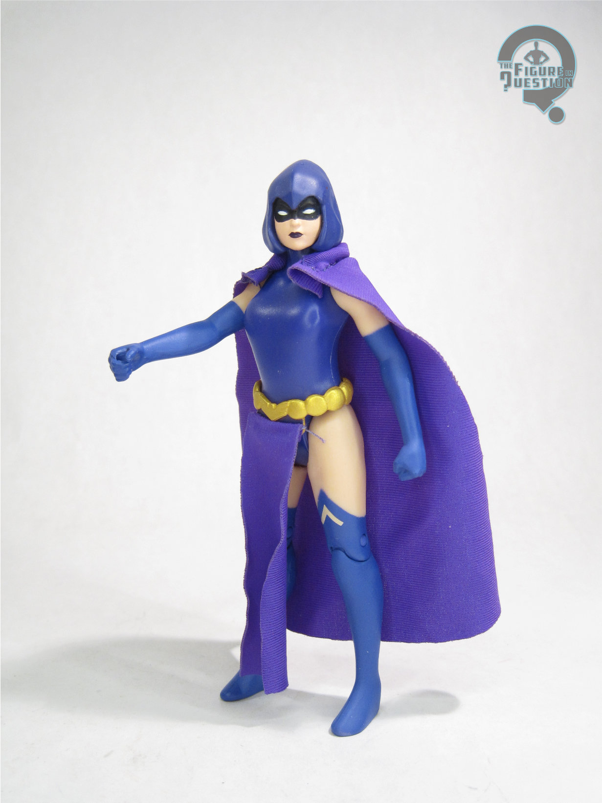
“A founding member of the New Teen Titans, Raven, the Daughter of Darkness, fights for a world to which she fears she can never truly belong.”

One of the three original creations added to the line-up when Teen Titans became New Teen Titans, Raven was actually the whole impetus of the team forming in the first place.  When the JLA turned down her request for help dealing with her demonic father’s arrival, she found a team of younger heroes to help her, and that’s how we got the New Teen Titans.  She’s been sort of a revolving door of good and bad over the years, as she’s dealt with her demonic parentage and its affects on her general well-being.  She had neither a figure nor a planned figure during the Kenner Super Powers days, and would eventually show up with the rest of the team during the early DC Direct days, with more figures following after the Teen Titans cartoon raised her profile.  These days, Raven figures aren’t quite a rarity, but it’s still cool when she gets one.  And now she’s got a Super Powers one, though not from Kenner.

THE FIGURE ITSELF
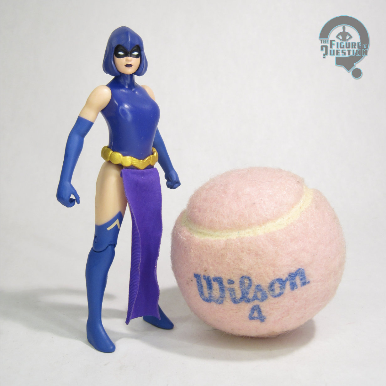
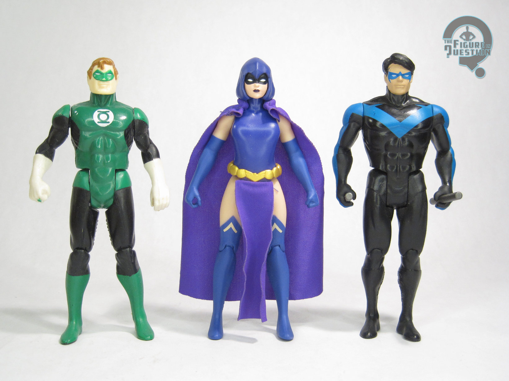
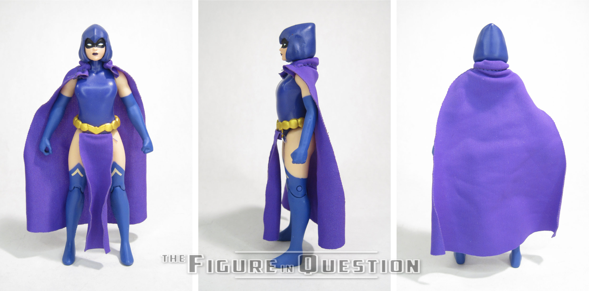
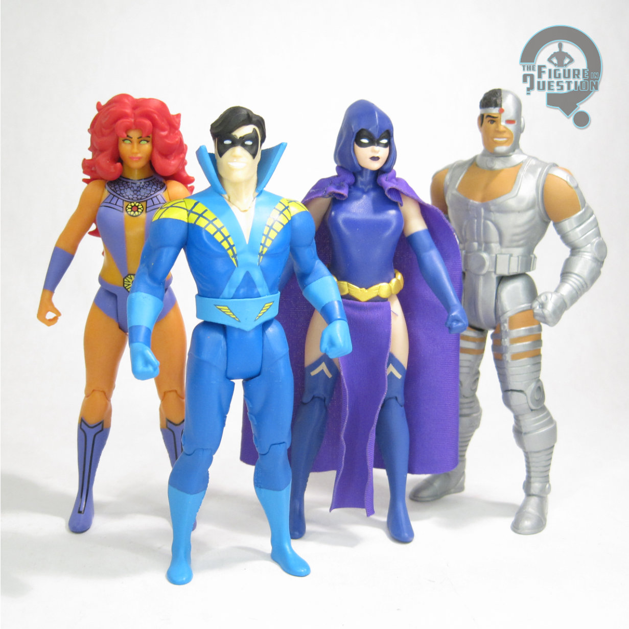
Raven is part of Series 14 of McFarlane’s Super Powers line, where she’s figure 69, the third of the six figures included numerically.  As with the rest of the assortment, she’s an Entertainment Earth exclusive, sold only as part of the full set of six.  While Starfire and Cyborg stuck to their original costume designs, Raven breaks from that.  She’s using her design from the 2008 Titans re-launch, which was more or less just a tweak on the 2003 Teen Titans re-launch design, itself a tweak on her original Perez look.  The main change-up on this particular design is the presence of a belt, something the character hadn’t really had until her cartoon design added it, and the comics followed suit with her “One Year Later” design after Infinite Crisis.  I’d wager a guess that this design was chosen for its closeness to the classic look, but also its inclusion of a belt, allowing for a point to attach her “skirt” piece.  I can’t say it’s a favorite look of mine, but I think piecing together the “why” of it at least makes me feel a little better about the choice.  The figure stands 4 5/8 inches tall and she has 7 points of articulation.  She’s predominantly using the standard female body introduced with the last round of figures, which makes sense.  It’s a good all purpose sort of sculpt, so I can’t fault it.  She gets a new head sculpt and…I don’t love it  The permanently attached hood is always a tricky shot, but I think it’s really the face beneath it that doesn’t work.  It just doesn’t look much like Raven, who’s typically been depicted as rather thin-faced, with more pronounced cheek bones.  This one’s very round faced, which doesn’t seem right for Raven, and really doesn’t work with the sculpted hood.  It just throws the whole thing off, and makes the hood seem really small by comparison.  Raven also gets a sculpted belt piece, and there’s a skirt attached to it.  Okay, so there’s a really thin piece of fabric hanging from the front of it.  Only the front, not the back, which is odd.  And, because it’s so thin, it’s already curling, which looks a bit silly.  There’s also a cloth cape piece, which is pretty much in line with the other cloth capes, so generally not terrible.  Her color work is fine but also has a fairly notable issue in that she’s just simply the wrong color.  In the comics, Raven’s usually a dark blue, and that’s true of this design as well.  But, for whatever reason (I’m assuming related to the cartoon, honestly), they made her purple, and I just don’t think it works as well, especially because the cape, the paint, and the molded plastic are all distinctly different shades, so nothing really matches.
THE ME HALF OF THE EQUATION

With Starfire’s inclusion, Raven’s a natural choice.  I’d be lying if I said I was excited for Raven, because I’m honestly not a huge Raven fan in the first place, but I can appreciate her importance.  I didn’t love the figure’s look when the prototypes were shown, but I was holding judgement until I had her in hand.  I honestly like her even less in hand.  She’s not awful, but she definitely feels a lot more like the earlier offerings in the line.  Odd costume choice, a head sculpt that feels out of place both for the character and line’s style in general, and poor decisions on the color palette make this one a weaker offering than the others around her.  I don’t hate her, and I’ll stick her on the shelf with the rest of the team without issue, but she definitely could have been better.
Flashback Friday Figure Addendum #0093: Tomar Re

TOMAR RE

GREEN LANTERN (MATTEL)

Hello and welcome to Friday!  It’s a great day for a Friday.  Or, at least, it’s Friday, which is, let’s face it, the day for Friday.  It’s also the Friday before the finale of Lanterns, and I marked the Friday before the premier with a throwback to a movie GL review, so I’m gonna mark the finale with another one of those.  So, let’s return back to one of my very favorite Green Lanterns, Tomar Re!

The 2011 Green Lantern was certainly not the greatest thing to be shown on the silver screen. That being said it’s far from the worst, and I personally found it to be about on par with the Tim Burton Batman films, which suited me just fine. One of the nice things about one of your favorite characters getting a movie is all the toys that are bound to be released to coincide. Sadly, while I found the Green Lantern movie to be inoffensive, the same can’t be said for the vast majority of the toys released for it. One of the few figures from the line I didn’t hate is Tomar Re, the subject of today’s review.

THE FIGURE ITSELF

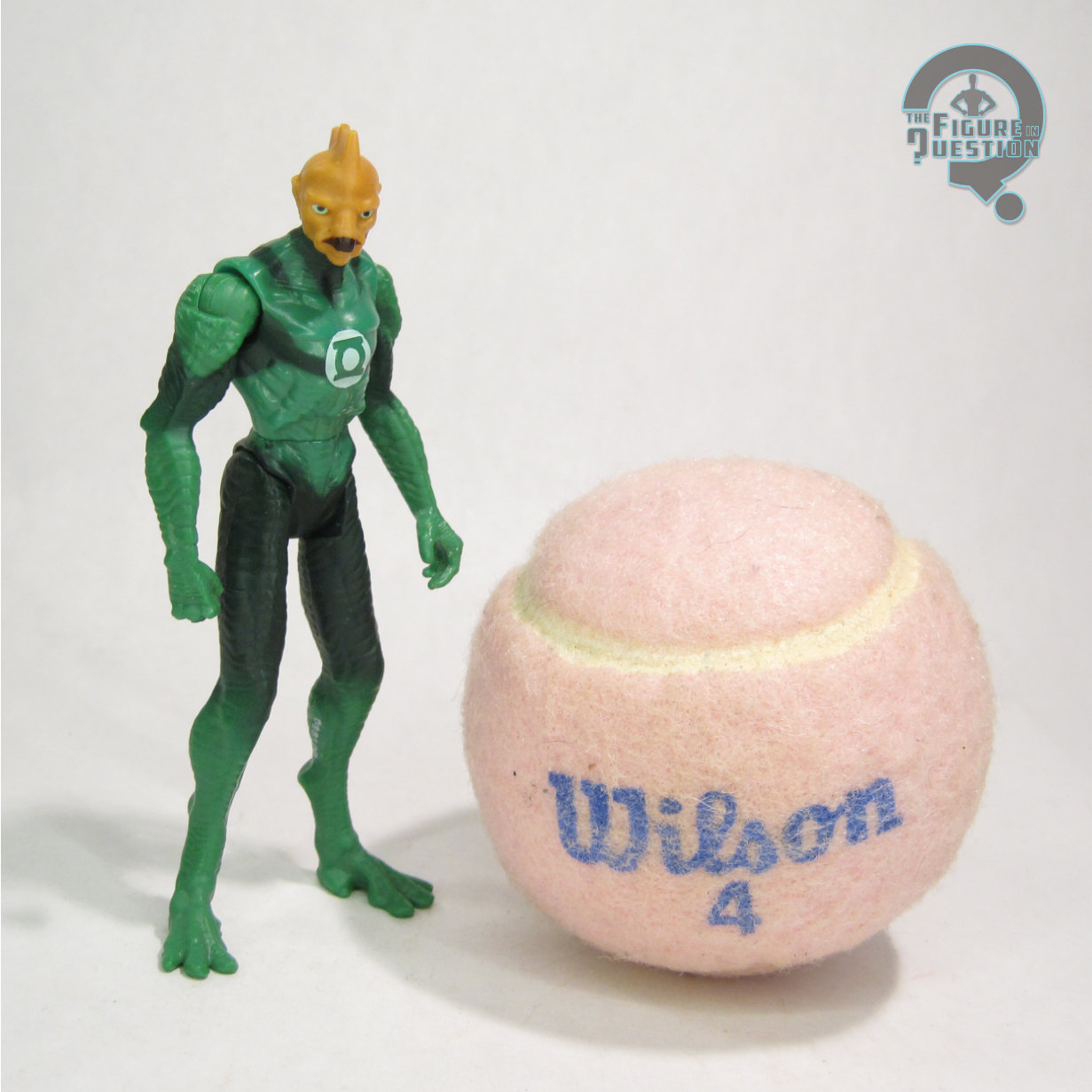
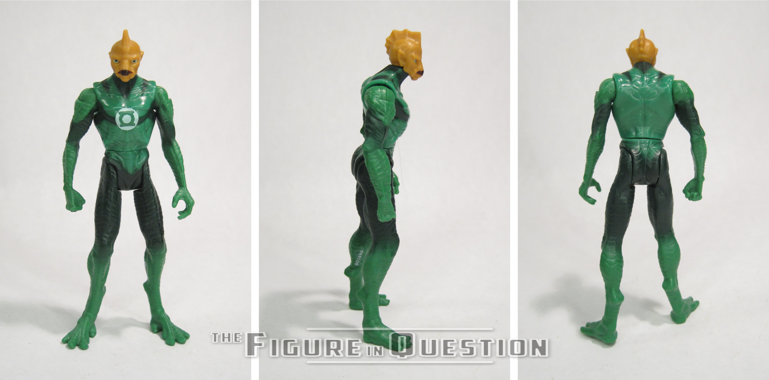
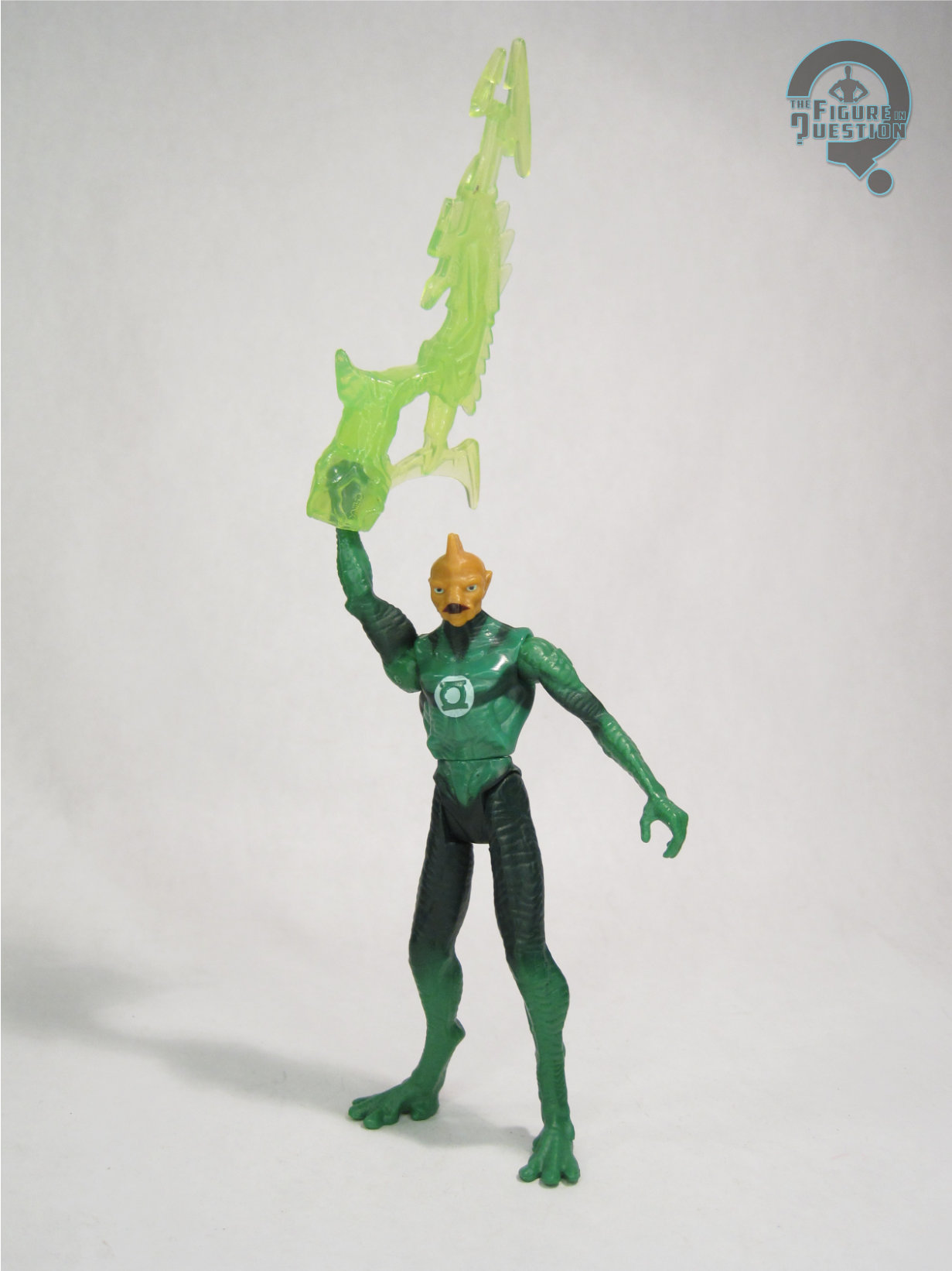
Tomar Re was technically part of the first series of Green Lantern figures, but he was not amongst the initial assortment of figures. I think he came in the second wave of product. The figure is about 3 ¾ inches tall and he features 8 points of articulation. The articulation is one of the most annoying parts of this line, because it was about 10 years out of date at the time of release. It’s completely useless for anything outside of a standing pose, and in some cases it couldn’t even do that. Case in point, Tomar’s right leg is slightly warped, and the articulation is such that standing is not a thing that happens. Tomar’s sculpt is fine. There was a deluxe Tomar in wonky colors that was released first, so technically this one’s a re-use of that one. There’s some okay texture work on the body, which is nice, I suppose. However, the head is rather smooth, and definitely too squat for the character. In fact, the whole body is off when compared to the on screen character. He’s just too bulky. Were this figure 10-15 years older, the scale might be excusable, but come on, Hasbro’s Battle Droids from 1999 looked better than this. The paintwork is rather vaguely handled. In some places, lines are very sharp, but in others, everything just sort of runs together. That’s sort of what they looked like in the movie, but it wasn’t this bad. He just ends up being a bit of a mush of colors. Tomar included a construct of some sort, but I threw all the constructs together, so I don’t remember which was his.
THE ME HALF OF THE EQUATION

I got Tomar from a Walmart near where I was vacationing the year these were released. This was notably two days AFTER I broke down and bought the wonky colored deluxe Tomar because I hadn’t been able to find this one. Yay. It’s hard to say much about this figure that isn’t negative. I honestly don’t hate it, and I really think it was one of the better small scale figures Mattel offered in this line, but that isn’t saying much. There’s a reason this line didn’t sell well, and it wasn’t the poor performance of the movie.

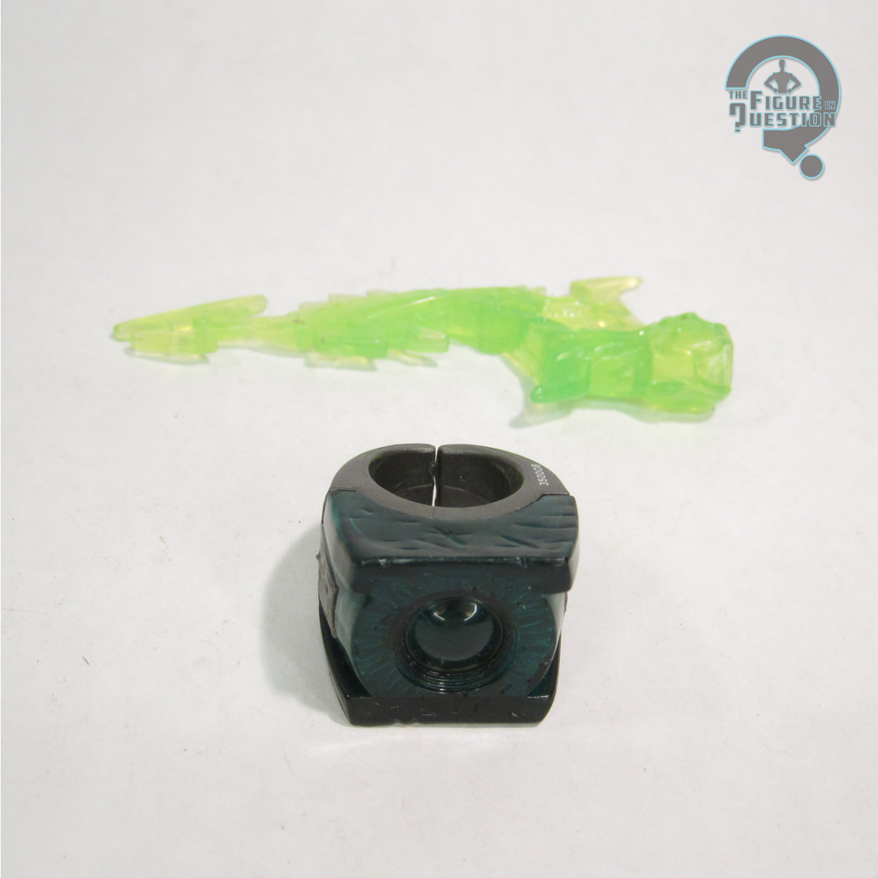
Tomar here ran about a month into my second year here on the site, and would have been one of my “pull from the randomized list” reviews, which I actually did quite a bit of at the time.  He was my third review from the movie line, and I was definitely wearing a bit thin on the line already.  I was pretty fresh off of its initial release, and the disappointment the line brought me was immense.  I think I maybe took that out on this figure in particular more than maybe others, which isn’t quite so fair, because, yes, he’s got the flaws of the rest of the line, but he ultimately holds up alright.  When I reviewed him, I noted that I had thrown all the constructs together and couldn’t recall which one was his.  Apparently, the idea of, oh, I don’t know, looking it up was a foreign one for past me.  It’s actually some sort of a harpoon launcher looking thing?  It’s weird, but not awful.  He also included one of those wearable rings that were super small.  Tomar Re is my favorite of the alien Green Lanterns, and also my favorite part of the 2011 movie, and I think maybe my high expectations came down on him in my original review.  Upon revisiting, he’s one of the figures from the line I don’t mind so much.  He’s even, dare I say, kind of fun.

#4133: Starfire

STARFIRE

SUPER POWERS (McFARLANE)

“As brilliant as the sun from which she derives her powers, Koriand’r of Tamaran has refused to let the torments she’s suffered crush her spirit.”

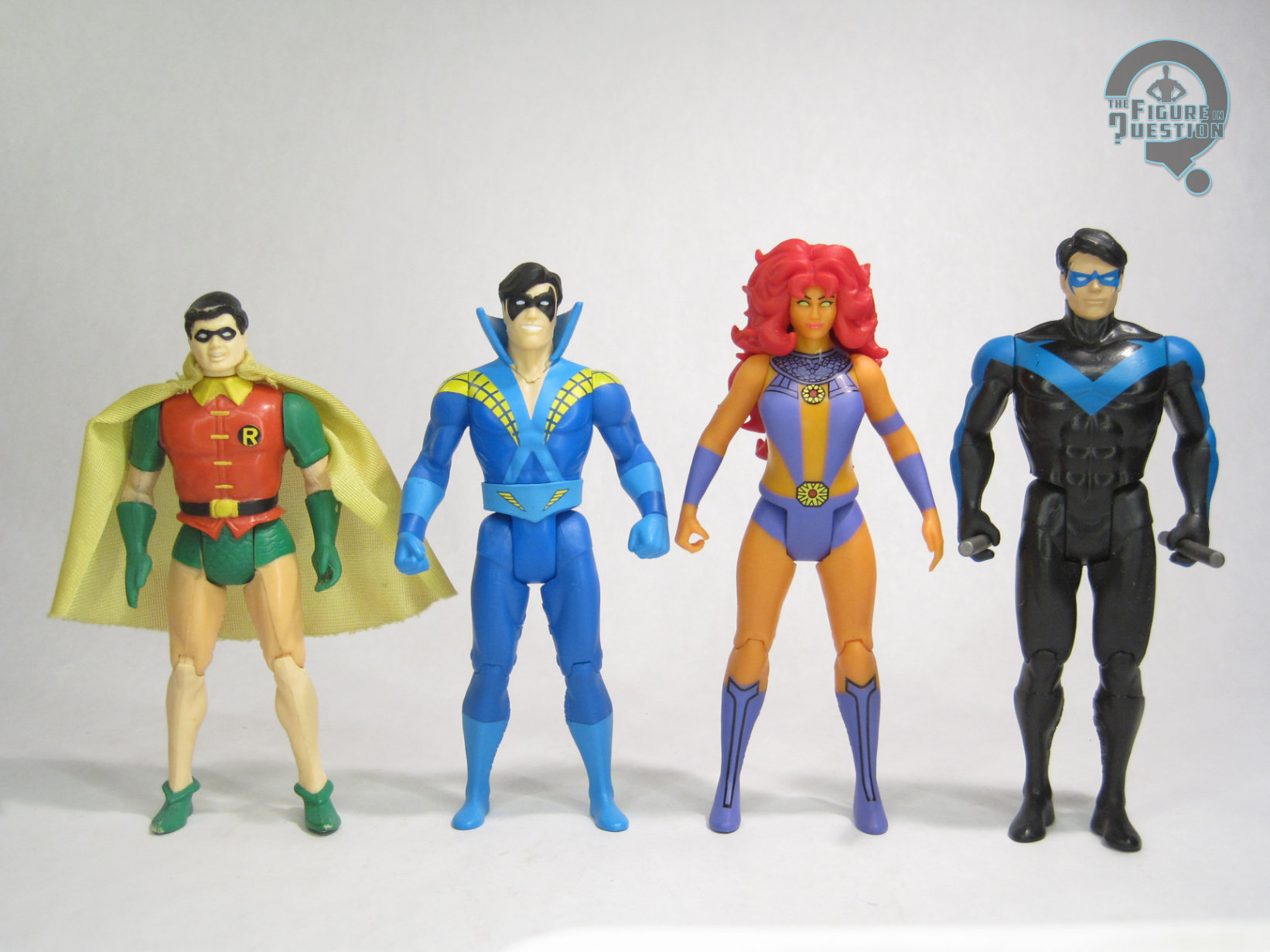
During the original Kenner Super Powers run, the line only just barely touched on the Teen Titans.  Obviously, Robin was there from the start, but he wouldn’t be joined by any additional members until Cyborg showed up at the very end of the line, in a notoriously difficult to get release.  Up til now, the McFarlane line has really just retreaded on the Titans, with an assortment of Dick Graysons, as well as an updated Cyborg, but, after four decades, we’re finally up to three whole Teen Titans, thanks to today’s figure, Koriand’r of Tamaran, aka Starfire!

THE FIGURE ITSELF

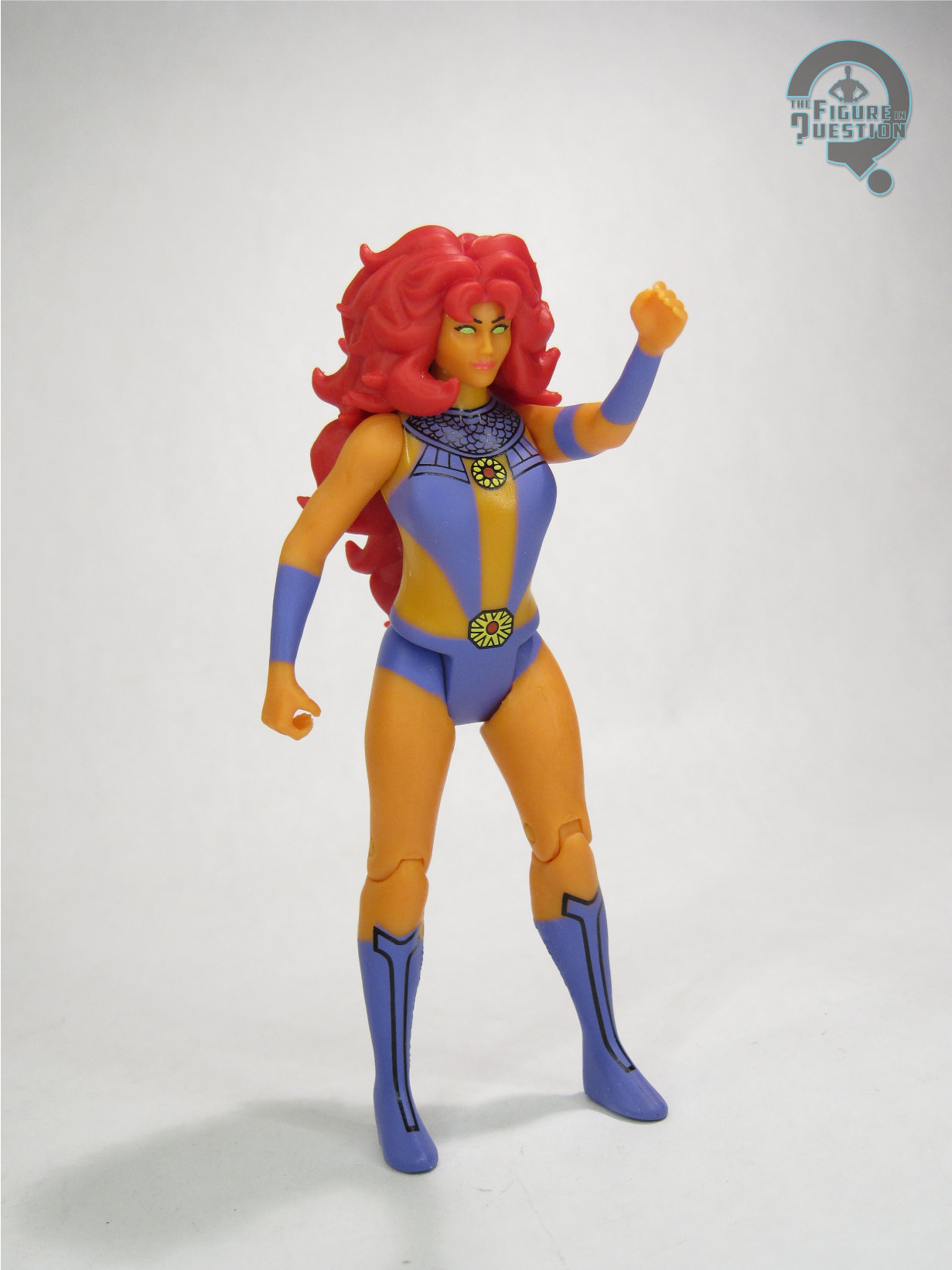
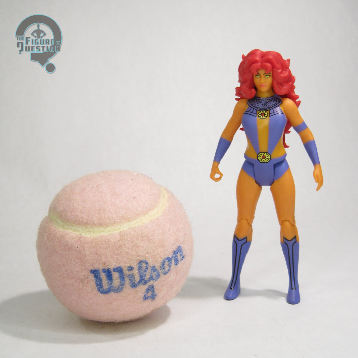
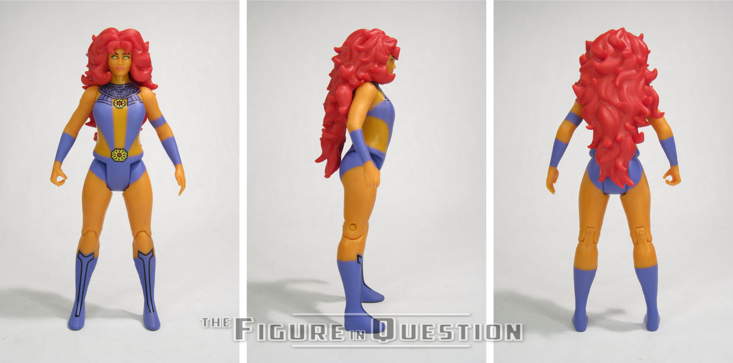
Starfire is the second figure in Series 14 of McFarlane’s Super Powers continuation, where she is numbered 68.  Though Starfire wasn’t amongst the figures planned for Kenner’s original line, she is nevertheless a rather spot-on choice of character for the line, as a central part of one of DC’s top books at the time.  She’s seen here sporting her original Perez design, which is likewise perfect for her inclusion in the line.  The figure stands just shy of 4 3/4 inches tall and she has 7 points of articulation.  The sizable hair somewhat restricts her neck movement, as well as making her *slightly* difficult to balance when standing.  Structurally, she’s using the new female base body built on the updated Wonder Woman mold, used thus far for both Supergirl and Power Girl.  She gets a new head sculpt, which is, honestly, one of the line’s nicest.  It feels very much authentic to how Kenner might have done the figure, with a sufficient amount of Perez’s style present, while still keeping her in line with the overall Garcia-Lopez stylings of the original run.  The hair is big and very present, but it’s got a nice dynamic flow about it, and looks like hair, while also being slightly simplified.  The base body is without any adornments or extra sculpted pieces, which isn’t really how Kenner would have done it (her outfit would have almost certainly been sculpted on), but is what we’ve come to expect from Kenner.  The use of the generic body means the torso is definitely meant to be clothed, so there’s no cleavage to speak of, which is sort of an issue when it comes to Kori’s classic design.  That being said, they’ve spaced her top in such a way that it’s not too obvious, and it’s certainly a better look than the DCUC Starfire, which had a similar issue.  Given the bank of parts they’re working with here, I think it works out alright.  The paint work does the heavy lifting on the outfit, and generally does it well.  I like the shades chosen for sure, and the line work is nice and clean.  I do sort of wish the line work covered all of the outfit, rather than just parts of it, though.

THE ME HALF OF THE EQUATION

Of the figures in this particular set, Starfire was probably at the top of my list.  Once it was confirmed that the EE waves would be adding a female base body into the mix, I was really hoping she might be one of them, so it was nice to see her crop up so quickly.  In a perfect world, she’d get a unique sculpt with her outfit as a proper raised element, but this works well in a pinch, and it really helps that the head sculpt is so nice.  She’s one of the McFarlane figures that really does slot in almost seamlessly with the original run.

#4129: Batman Beyond

BATMAN BEYOND

SUPER POWERS (McFARLANE)

“Batman Beyond – Decades into the future, Gotham City has evolved into Neo-Gotham, a metropolis of tremendous skyscrapers, flying cars, and sleek technology. In that brave new world, a new kind of Batman is required to keep the peace.”

Since Kenner’s Super Powers ended in 1986, the line was pretty locked into characters and concepts that already existed at that time, and in fact, just a little before then, what with the necessary timelines for toy production and all that.  The proposed waves that might have been carry things forward a little bit, but not by much, again, pretty well locking the idea into a specific timeline.  A continuation that picks up four decades later is, obviously, going to be in an interesting spot, since you’re trying to hold to an aesthetic from the ‘80s, but there’s been a lot of ground covered since then.  What do you do?  Well, the McFarlane approach, especially at the start, was just to do characters and looks that didn’t exist in the ‘80s when they felt like it.  It’s become far more restrained later in the line, but we do still get the occasional oddball, like today’s entry, Batman Beyond.  He’s a character first introduced in 1999, thirteen years after the vintage line ended…which is actually less than half the time between his introduction and his inclusion in McFarlane’s Super Powers, 27 years later.  Maybe vintage is just a little bit relative.  Let’s take a look at the figure.

THE FIGURE ITSELF

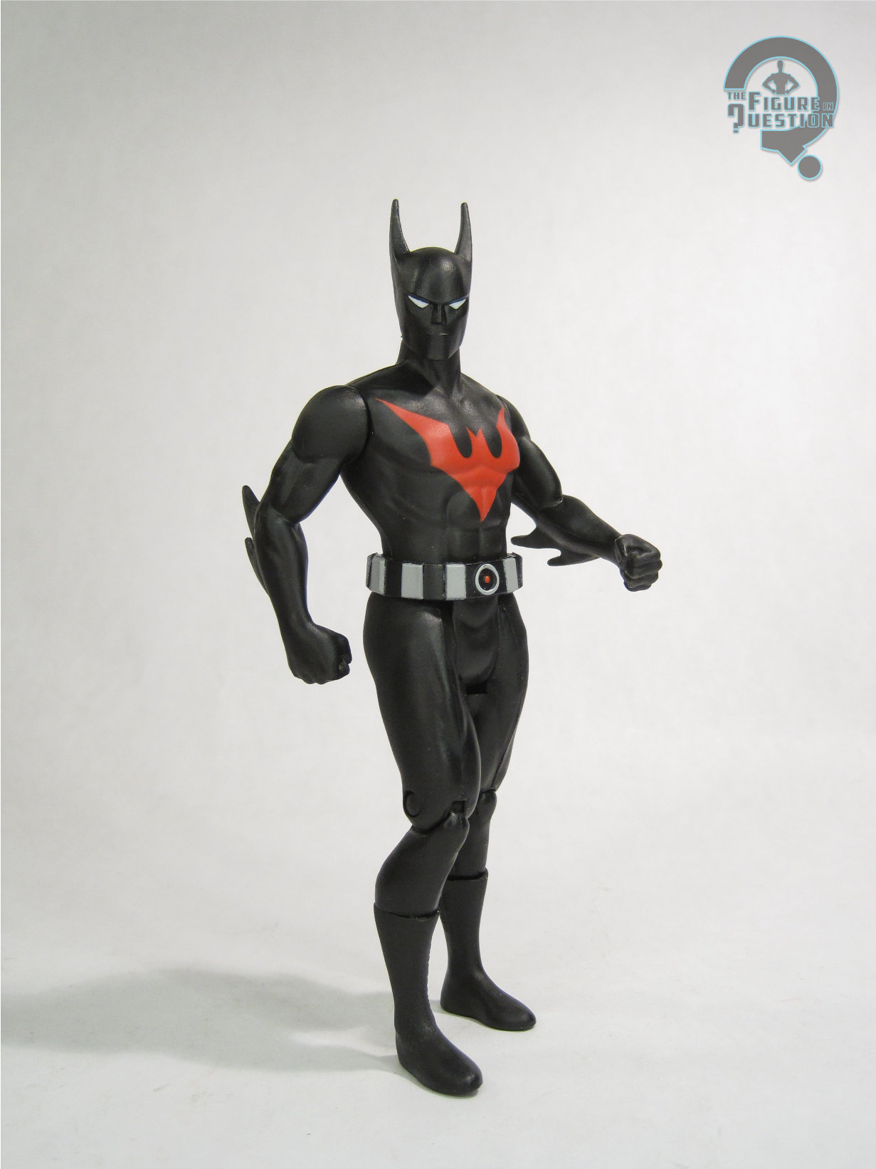
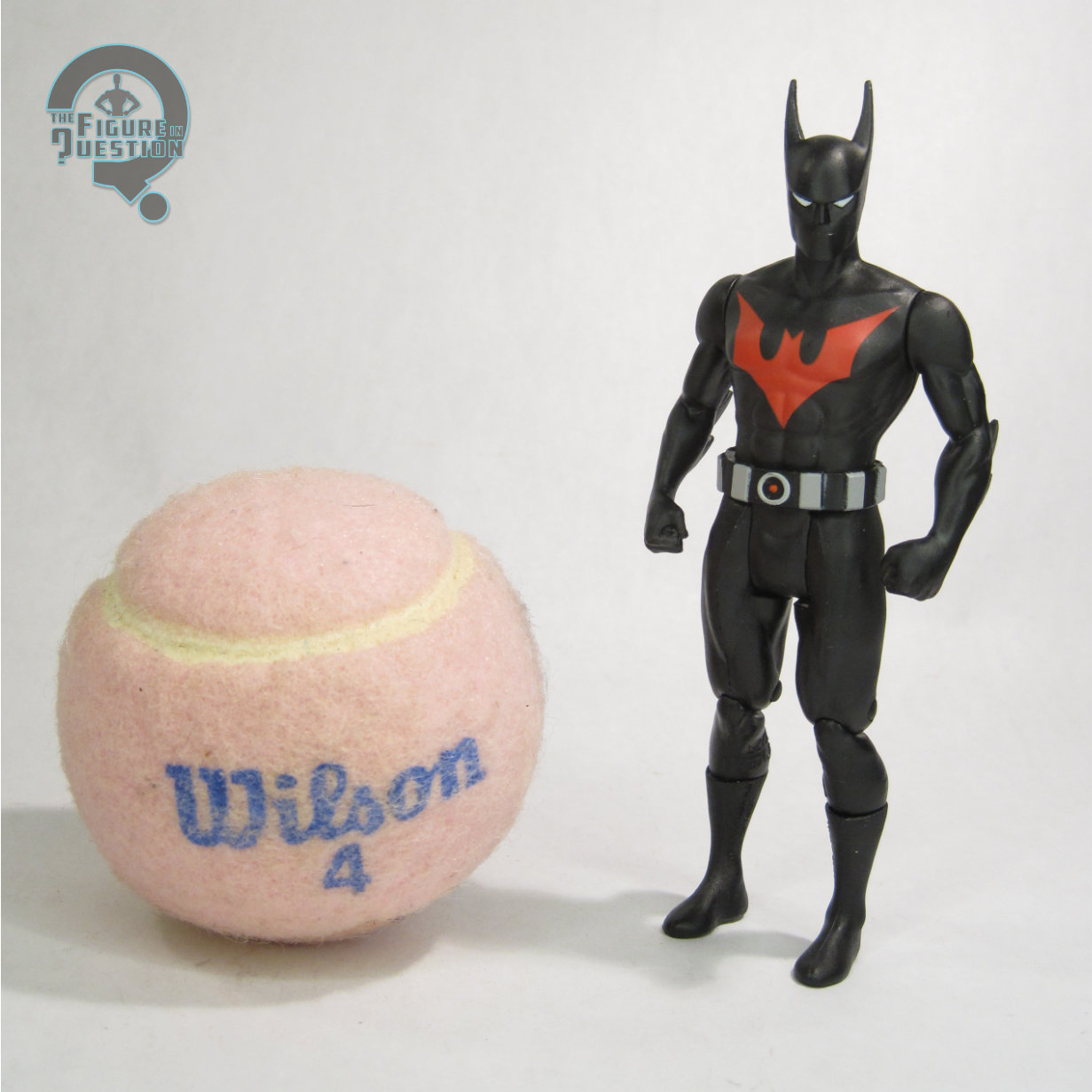
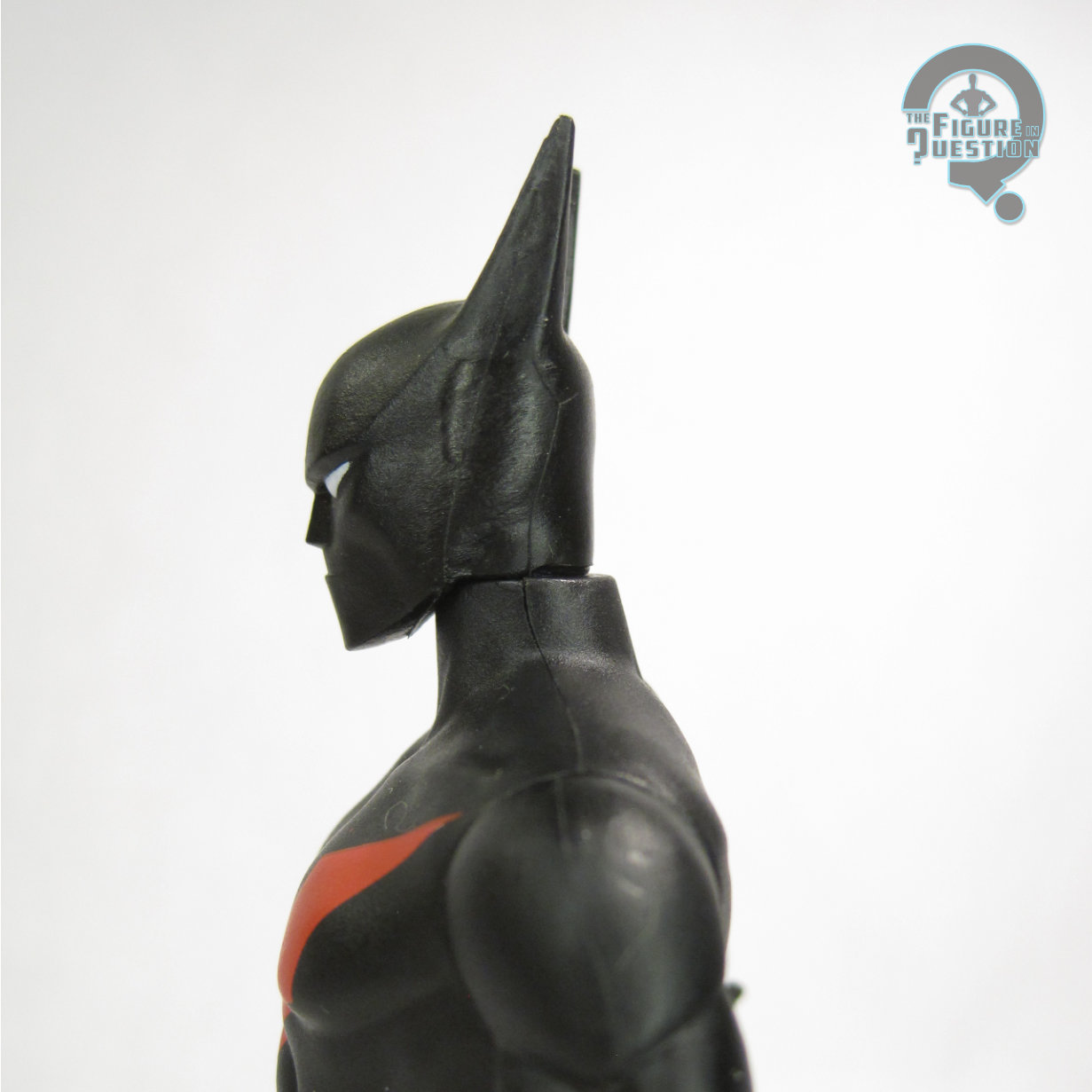
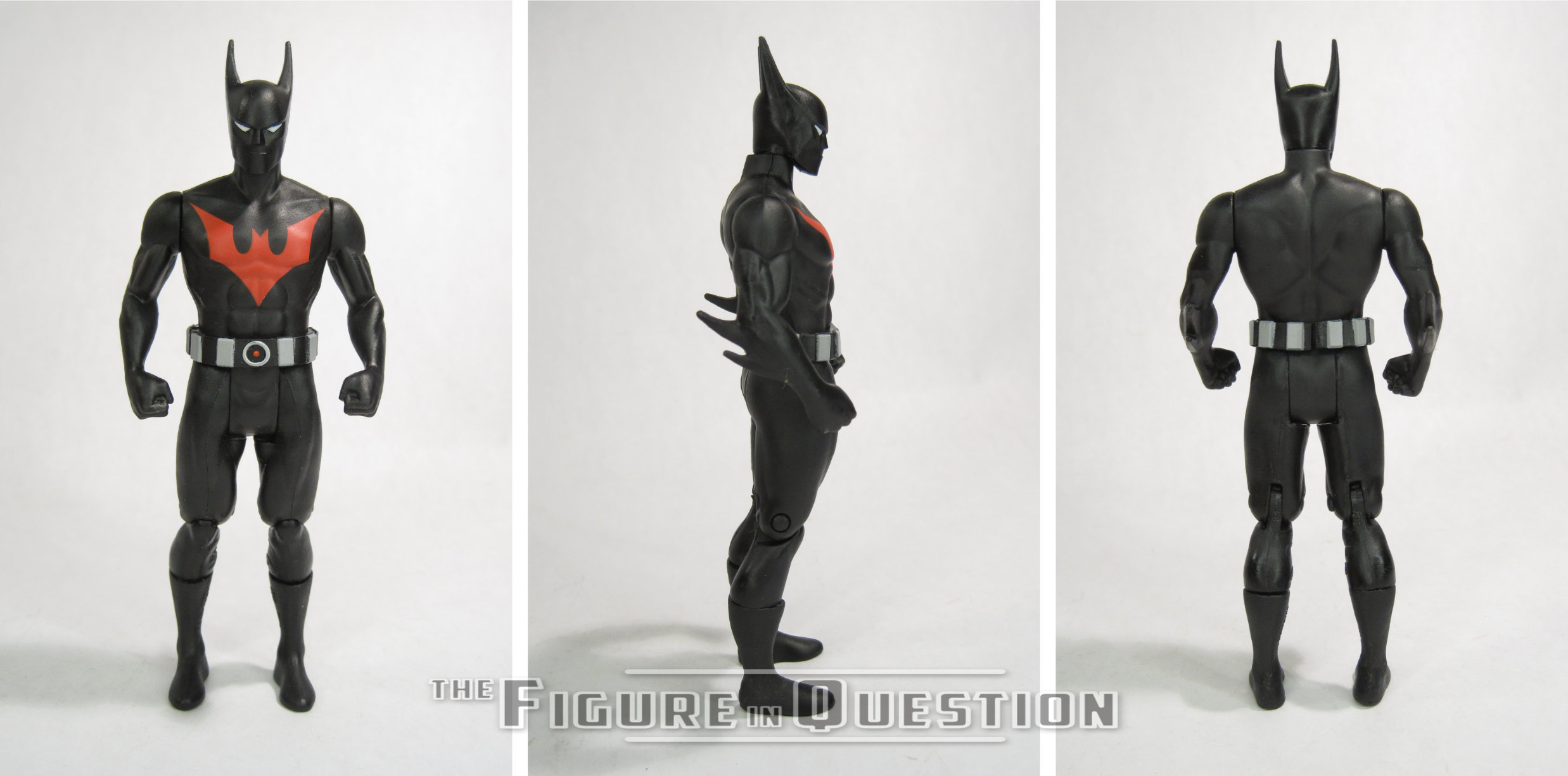
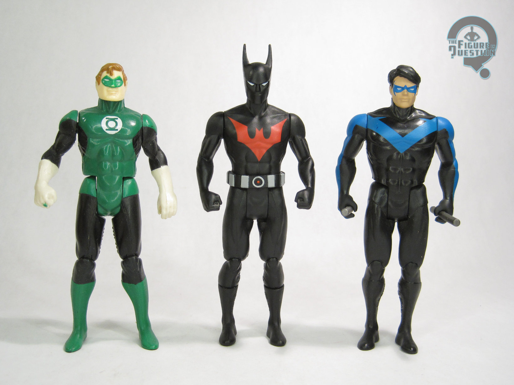
Batman Beyond is the first figure in Series 14 of McFarlane’s Super Powers.  He’s figure 67, which, I assure you, brought some amusement to my 10-year old.  Well, it’s possible it brought me more amusement bringing it up to him than it actually brought to him directly.  The figure stands 4 5/8 inches tall and he has 7 points of articulation.  Terry is built on the smaller male body, based on the Flash mold.  It’s a good fit for him, as he’s usually depicted as being a fair bit smaller than Bruce, more comparable to Dick Grayson, who used this base body in the last assortment.  He gets a new head, arms, and belt.  The head leans more into his animation model than it does the line’s overall aesthetic, but I feel that’s the right way to go; attempts at making more realistic versions of Terry’s masked face always look a little bit weird to me, and I don’t think the animated design is too far out of place to work with the rest of the line.  The only slightly odd part of the sculpt is the way it sits on the neck; it’s a bit too thin at the back, so there’s a notable gap where the neck from the body overhangs the head sculpt.  I have to wonder if this sculpt might be left over from some sort of more direct animated figure that got scrapped along the way.  The arms aren’t much different from the standard pieces, just adding the arm spikes at the back.  I’m a little surprised they did them at all, since they’re not super visible from the front, but I certainly don’t mind them.  Finishing out his distinctive silhouette is the belt piece, which is simple, but gets the job done.  Terry’s color work is generally simple, but the application of what paint is there is rather clean and adds some nice pop to the figure.  He’s sans accessories.  The solicitation mentions a cloth case, but I have to imagine that was a copy error, rather than an actual scrapped part.  I suppose a pair of cloth wings wouldn’t have been too out of place, but as it is, I think he’s fine without extras.

THE ME HALF OF THE EQUATION

When they teased the silhouettes of Series 14, I figured this guy out right away, which I think is actually a testament to how good a job they did getting down perhaps the most important part of Batman Beyond: the silhouette.  I can’t say Terry was on my list for characters to be added to this line, but I also can’t say I’m unhappy with the choice.  He’s hardly the most modern character included in Todd’s run with the line, and I think he translates really well to the aesthetic, resulting in a figure that was quite a pleasant surprise when this set arrived at my door.

Flashback Friday Figure Addendum #0091: Batgirl & Bane

BATGIRL & BANE

DC MINIMATES (DC DIRECT)

Well, it’s Friday again.  So, you know, there’s that.  Here it is.  We made it?  Yeah, let’s go with that.  Let’s try to liven stuff up a bit here, with a Flashback Friday Figure Addendum!  Today, we’re flashing back to some Minimates, but not just any Minimates, DC Minimates!  Let’s take a second look at Batgirl & Bane!

One of the great tragedies for many Minimates collectors was the cancellation of DC Direct’s DC Minimates after only eight series. Not only did the line present us with definitive versions of many of DC’s top characters, it also gave us some wacky side characters like Ambush Bug and Ma Hunkel, and it was the first Minimate line to push the envelope in terms of sculpting. However, the line was met with its fair share of difficulties, most notably hitting shelves when Minimates were at a low point and being gone just before they hit it big. Still, we got a decent 64 figure run, and that’s certainly better than nothing. Today I’ll be looking at two figures from the Batman side of things, Batgirl and Bane.

THE FIGURES THEMSELVES

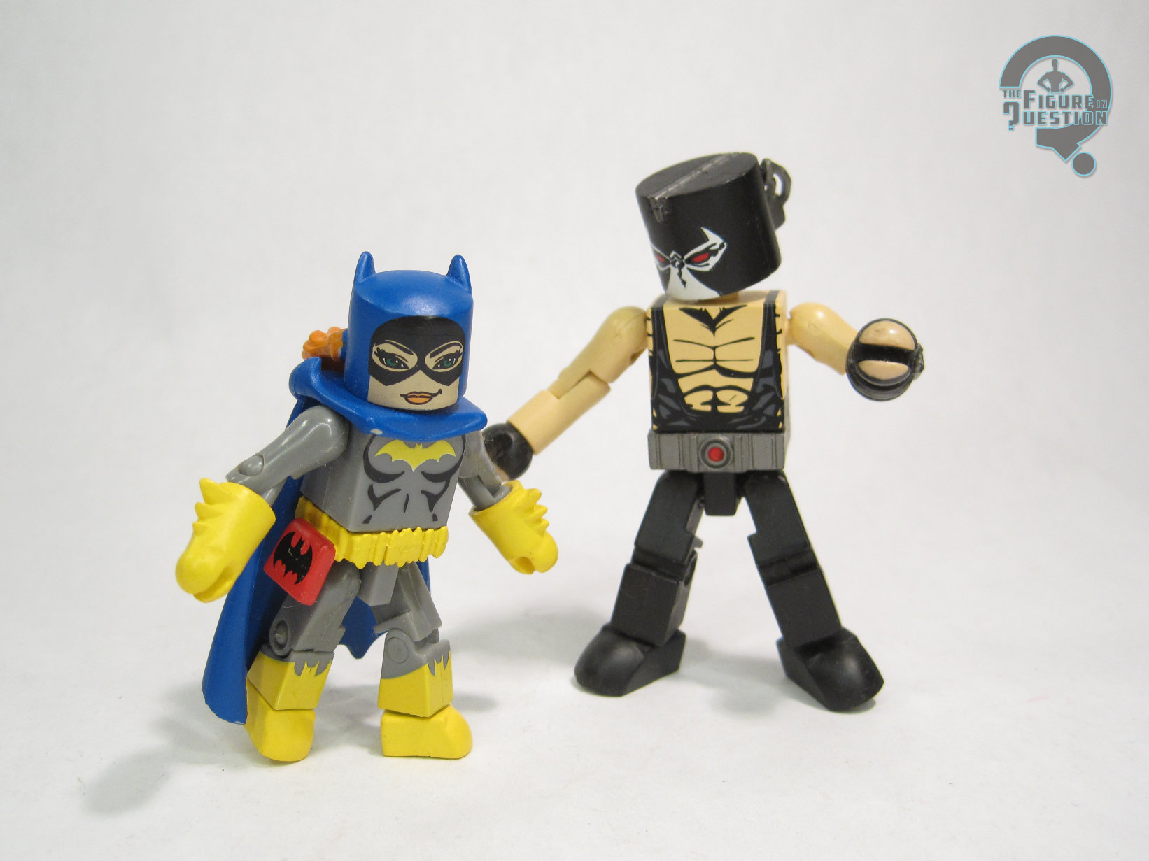
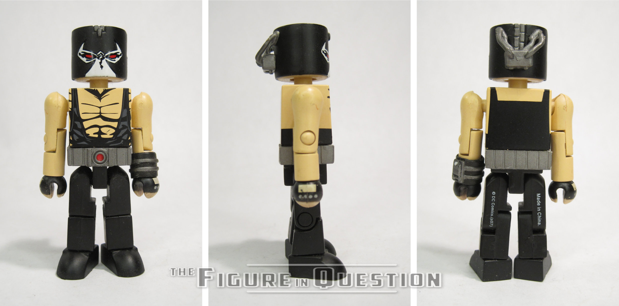
Batgirl and Bane were released as part of the fourth series of DC Minimates. They’re an odd pair, seing as the two have never actually met. Heck, they didn’t even exist at the same time! Anyway, they’re both Batman characters, I guess.

BATGIRL

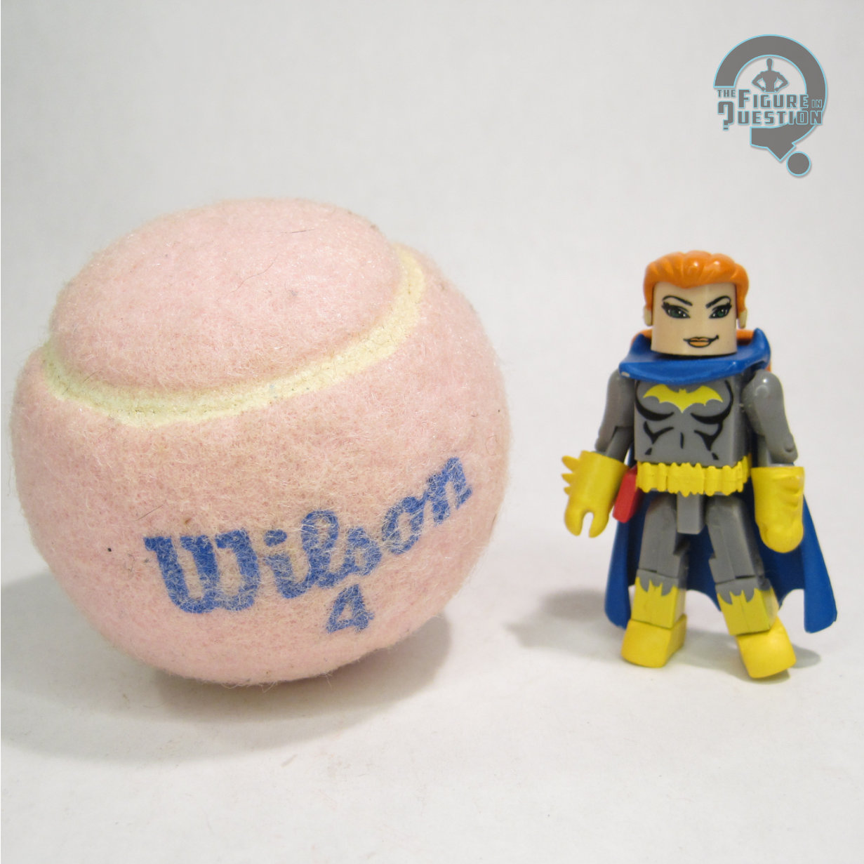
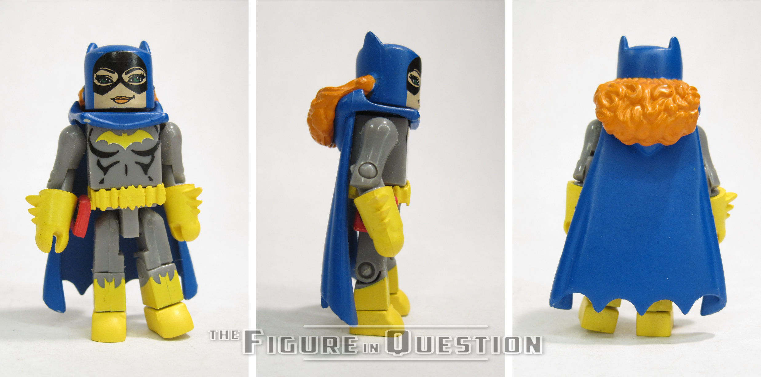
Batgirl is built on the basic Minimate body, so she stands about 2 ½ inches tall and features 14 points of articulation. She’s based on the Barbra Gordon version of the character, in her second costume. She features a sculpted mask, cape, belt and gloves. The cape and gloves were previously used on both the series one and series three Batmen, as well as being used before that in the DC C3 line. The mask and belt are new, so as to properly depict her exposed hair and more elaborate belt design. The paint work is pretty clean on Batgirl, with no real slop, and some very sharp line work on all the transitions. This set was released during the period of time when Minimates were using full slip over masks for everyone, even characters that only had half masks, so Batgirl got a full face mask. Some figures took advantage of this and gave the figure a different facial expression on the unmasked head. Sadly, Batgirl didn’t do this, which is a shame, as it would have the unmasked face be Barbra in full librarian mode. Batgirl includes a pair of bat-cuffs and a spare hair piece to display her unmasked.

BANE

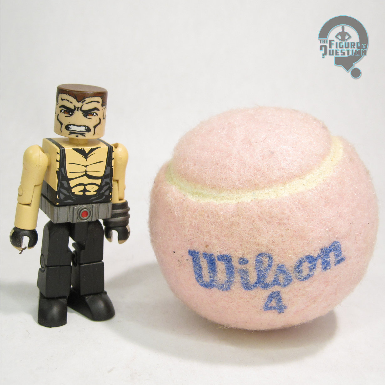
Bane demonstrates one of the unique traits of the DC Minimates line: use of the larger Minimate body. The body features the same articulation and relative proportions, but is about a half an inch taller than the basic body. So, DC used it for larger characters such as Bane here. Bane features three sculpted parts: mask, belt, and wrist gauntlet with tube that plugs into the mask. All of these pieces are new to Bane, mostly due to his use of the larger body. All of the pieces accurately capture Bane’s look from the comics, so kudos to them on that. The paint work is pretty good overall, though there a few issues. The shirt features black detailing with gray highlights, but on the edges of the torso, the gray highlights have been missed, leaving their spots flesh-toned. Also, the sides of the shirt don’t quite line up with the front. Finally, the mask, while well detailed, seems to sit a bit too low, which gives him an abnormally large head. Under the mask, there’s a fully detailed face with hair, which Is a nice touch I suppose, though I hardly see anyone displaying him this way.

THE ME HALF OF THE EQUATION

As with the rest of the DC Minimates line, I purchased these two as soon as they were released. While I think they’re both well done figures, I remember being disappointed in general by the lineup for Series Four, as well as baffled by the choice to pack these two together. It’s a cool set, but it’s hard to tell what audience they were aiming for, as the two figures present appeal to two different sensibilities.

This review was from my first year, at about the 3/4 mark for the year, and boy was that first year a heavy one for Minimates.  This was my 58th Minimate review, meaning almost a quarter of my reviews at the time were Minimates.  I mean, it makes sense, but it’s crazy to think about it these days, when they’re such a rarity.

I think the actual review holds up well for the most part, but I did make an error.  Batgirl did *not* include the bat cuffs, just the alternate hairpiece.  I didn’t have a photo of that, or of Bane’s alternate unmasked look, in the original review, so I’ve included those, as well as some turnarounds, because why not?

#4125: Robin

ROBIN

SUPER POWERS (McFARLANE)

“Robin was the sidekick of Batman and a member of the Justice Society Infinity”

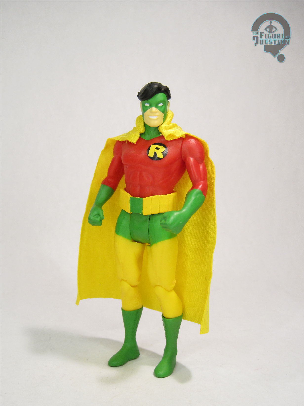
In 1961, Flash #123, a story titled “Flash of Two Worlds,” reintroduced the original Flash, Jay Garrick, by showing his exploits as having taken place on a parallel Earth to that of Barry Allen, the then current Flash.  The story’s success led to follow-ups, reviving other Golden Age DC heroes, and placing them on this newly created “Earth 2.”  Since Earth 2 had allowed the characters to age more or less in real time from where they’d been left off in the ‘40s, when the “original” Dick Grayson reappeared six years later in 1967, he wasn’t a teen sidekick anymore, but rather an adult member of the Justice Society.  But, where his Earth 1 counterpart would take up the monicker “Nightwing,” Earth 2 Dick maintained the “Robin” name.  While the Earth 1 Dick gets most of the toy coverage, Earth 2’s version gets a lot of coverage himself, and he’s even joined the Earth 1 version’s four Super Powers figures with one of his own.

THE FIGURE ITSELF

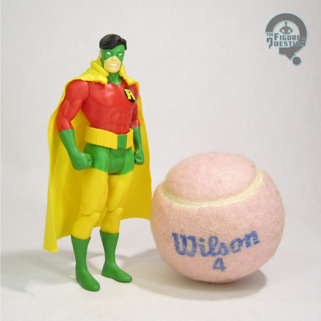
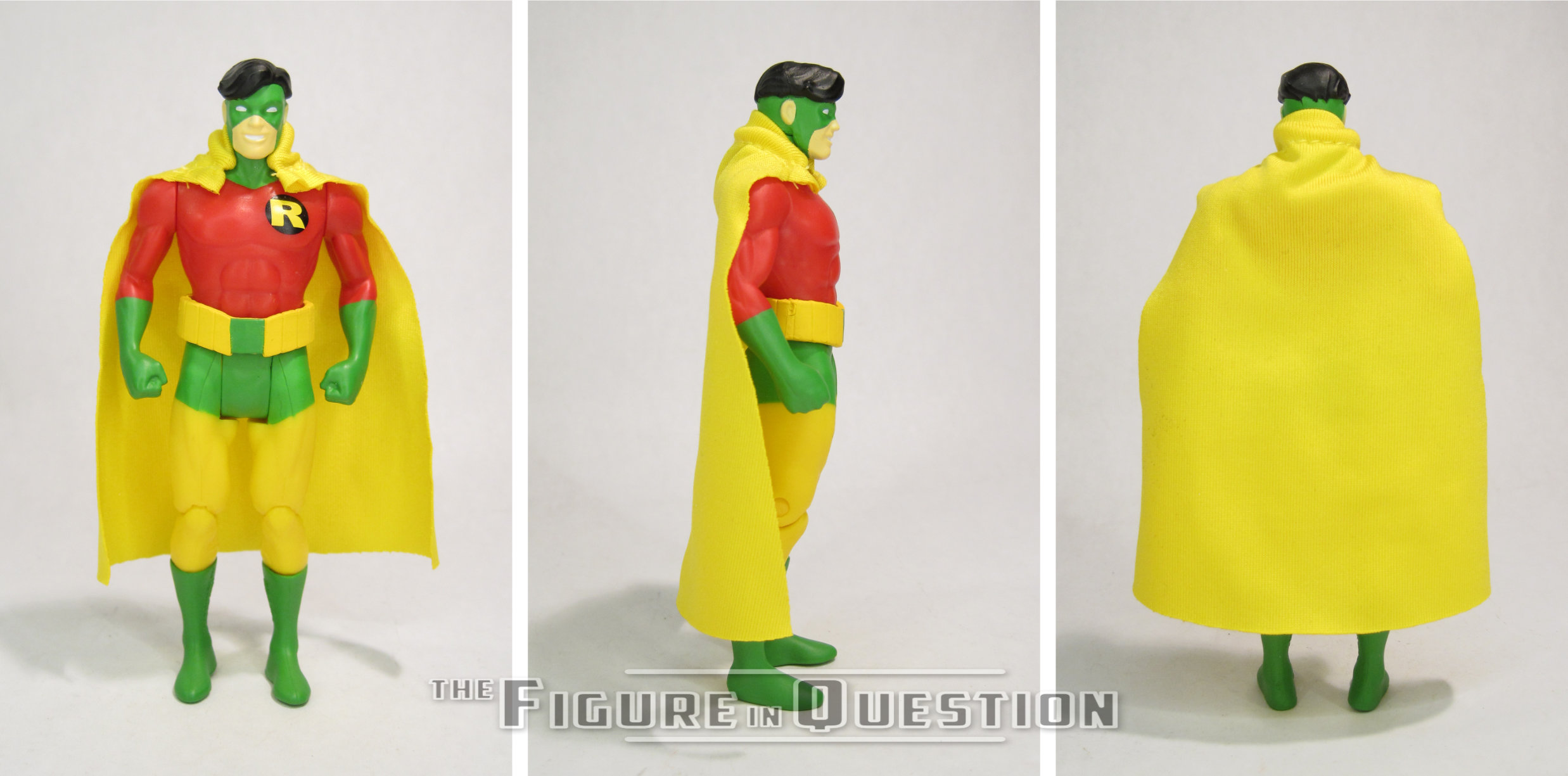
Robin is the final figure in Wave 13 of McFarlane’s Super Powers, numbered 66 in the overall line-up.  He’s not specifically denoted “Earth 2” anywhere on the packaging, but the bio on the back indicates it, though the call-out of Justice Society Infinity is a really specific post-Infinite Crisis reference.  When Earth 2 Dick Grayson first reappeared, he was sporting a costume heavily inspired by Batman’s, rather than his own Robin costume.  This figure is based instead on his second, more on brand costume, which, it should be noted, was actually worn by Earth 1 Dick Grayson first, during one of of the JLA/JSA crossovers.  Earth 2 Dick had full possession of it after that, though, and he kept the look until his demise during Crisis on Infinite Earths.  The figure stands 4 5/8 inches tall and he has 7 points of articulation.  He’s using the standard male body that’s based on the Flash mold, a first for any version of Dick in the line.  That said, it’s a far better match than the rather large base body of the first two Nightwings, and means he scales far better next to the various basic Batmen, so I certainly don’t mind it.  He gets a modified version of the Gold Label Nightwing head sculpt, with the hair removed on the sides and the lines of the mask removed, so that his wrap-around mask can be properly displayed.  I like that they keep that bit of consistency between the two.  He also gets a new belt piece, which matches well to his unique belt design as seen in the comics.  It’s all topped off with a cloth cape, which I think is actually a little nicer than a lot of the others from this line.  His color work is very bright and colorful, and the paint application is mostly pretty clean, and without any real slop or bleed over.

THE ME HALF OF THE EQUATION

When McFarlane’s Super Powers started, we got a modern Nightwing, and I figured that was the only Dick Grayson we’d get.  Then we got ‘90s Nightwing, and I was like, wow, I guess we’re getting two, but that’s got to be it, right.  Then we got ‘80s Nightwing, and I was really happy, but also 100% sure there was no way there could possibly be another Dick Grayson.  So this guy?  Totally out of left field.  Am I shocked?  A bit.  Am I unhappy?  Not in the slightest.  He turned out really well.  It’s a design that translates really well to the aesthetic, and it just makes for an incredibly fun figure.  And, sure, I’m now thinking it’d be great to *also* have his first costume, but you know what, I’m okay with just this one.

#4121: Green Lantern – Hal Jordan

GREEN LANTERN — HAL JORDAN

SUPER POWERS (McFARLANE)

“Test pilot Hal Jordan went from being a novelty, the first-ever human Green Lantern, to one of the most legendary Lanterns to ever wield a power ring.”

We’re four episodes into Lanterns, the latest live-action adaptation of Green Lantern, and I gotta say, despite some definite reservations going in, I’m really quite enjoying it.  Though he’s not the real star (that’s John Stewart), my personal favorite GL Hal Jordan’s been getting some rather nice focus, courtesy of a very strong portrayal by Kyle Chandler, which is nicely adapting what works well about the character and stripping some of the stuff that…doesn’t.  I like the more seasoned take on Hal, a take that goes back to the character’s book’s relaunch in 1990, which positioned Hal as one of the last of the Silver Age heroes, and actually showing his age a bit.  And how did they show this? Well, the same way that you show that any male comics character is older and more distinguished: bright white streaks on his temples.  Yeah, that’s the ticket

THE FIGURE ITSELF

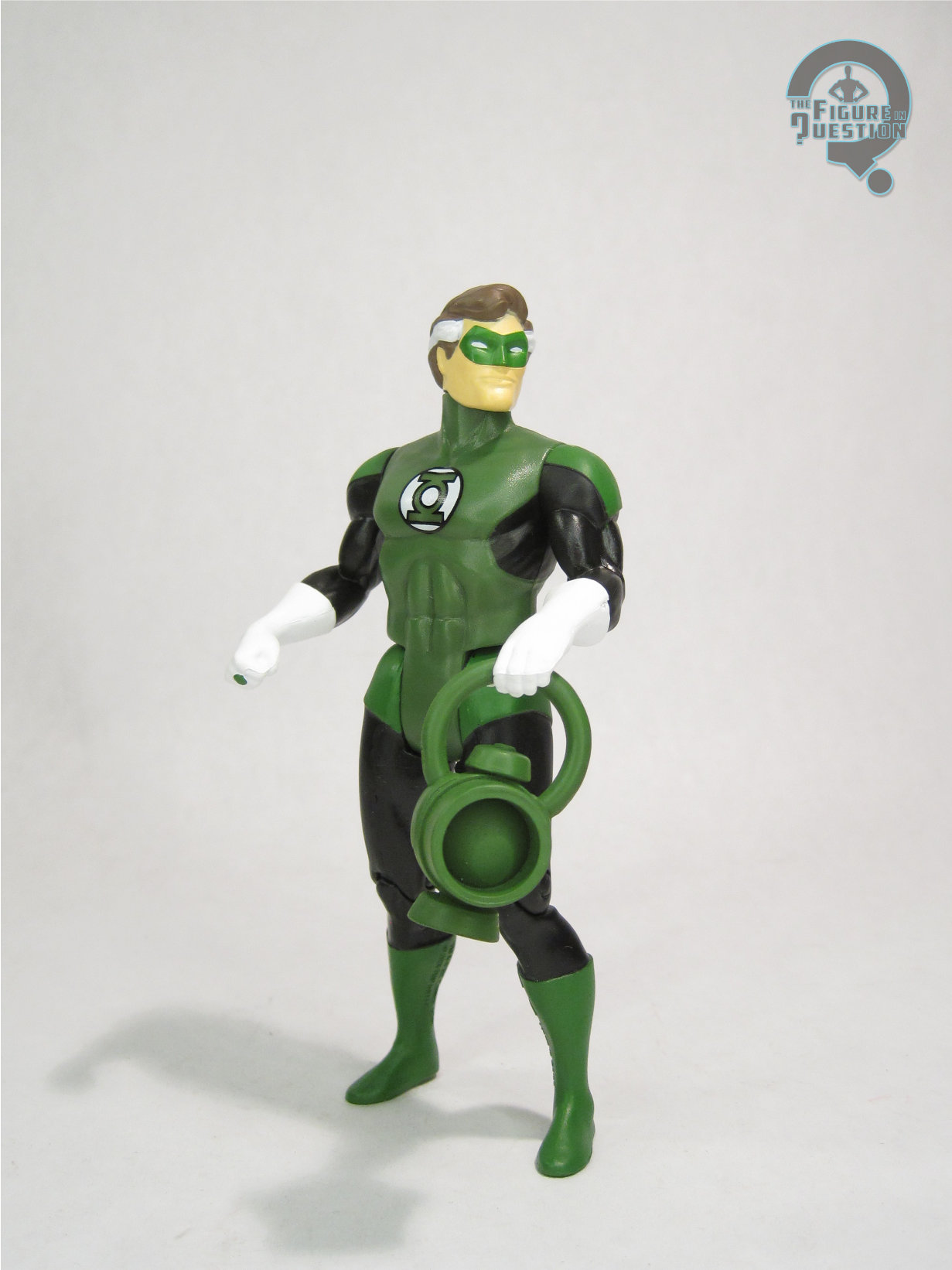
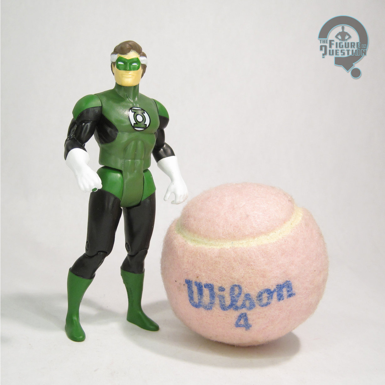
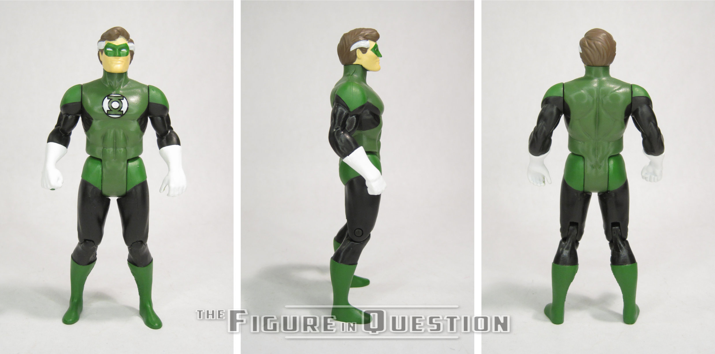
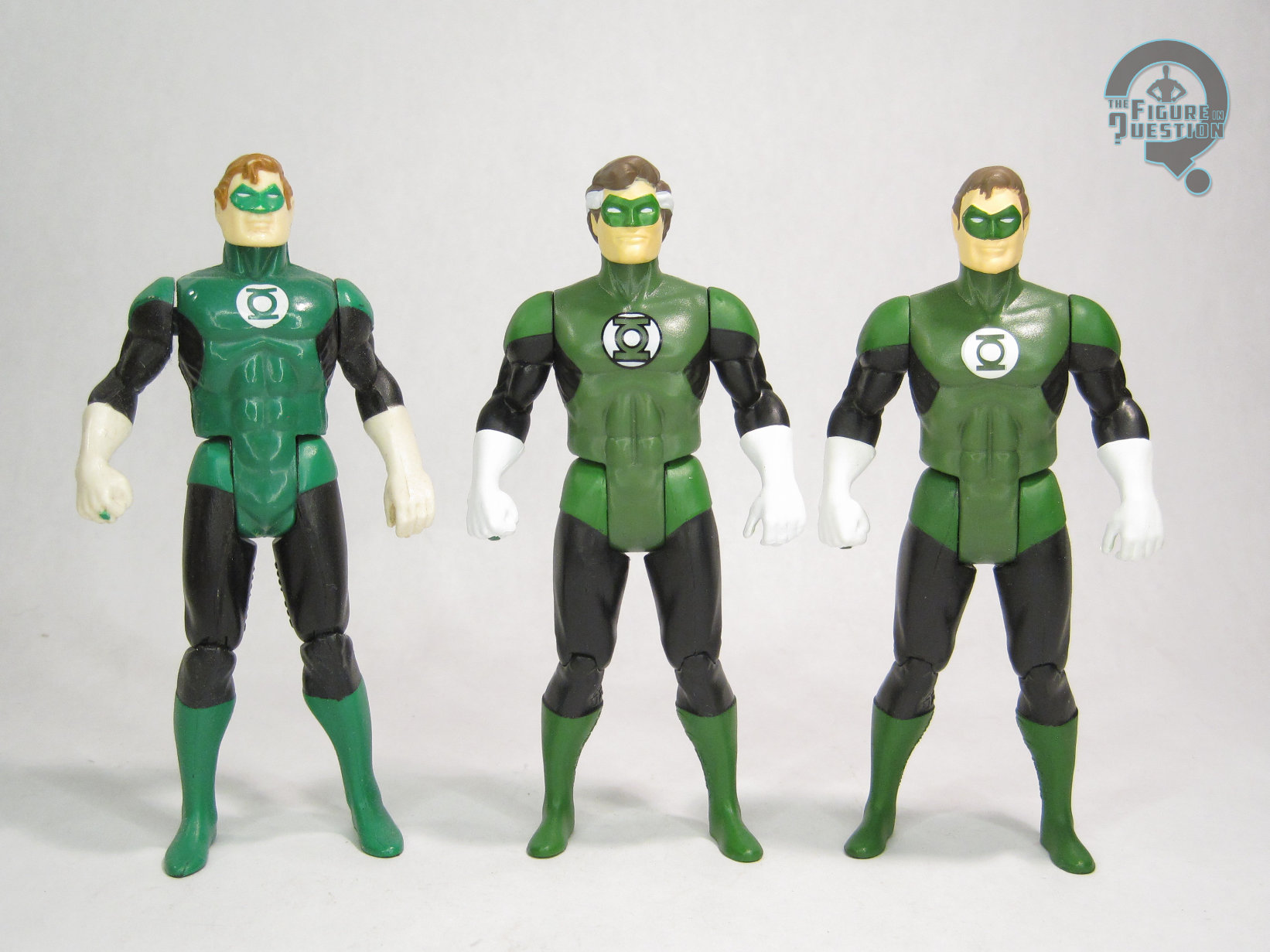
Green Lantern — Hal Jordan is the second to last figure in Wave 13 of McFarlane’s Super Powers continuation.  He’s figure 65, and is the first figure in this set not to be stealing someone else’s number.  Which is, admittedly, kind of amusing, because he’s astoundingly similar to another figure we’ve already gotten.  Hal’s obviously the post-1990 version of the character, meaning he ties in rather directly with the Cyborg Superman and Eradicator from this same set, as part of the “Reign of the Supermen” set-up, given his presence in that story and its effects on his own storyline.  His inclusion also feels like it’s probably meant to at least loosely tie into Lanterns, much like the Supergirl figure ties into her movie from this year.  Lastly, it serves to offer up an alternative figure for people who haven’t gotten the line’s first Hal GL, which was part of one of the change-over assortments after the line left Walmart, and which remains a rather pricey figure.  The figure stands 4 5/8 inches tall and he has 7 points of articulation.  He’s predominantly makes use of parts from the prior Hal figure, which makes a lot of sense.  That figure was, himself, mimicking the original Kenner mold, and doing a pretty good job of it, at that.  The Kenner mold’s one of my favorites, and I liked the update a lot too, so it’s a strong starting point.  Hal gets a brand-new head sculpt.  I was honestly surprised by that, since I feel like you could pretty easily just re-use the original head here, but they’ve decided to go for something more directly patterned on Pat Broderick’s depictions of Hal from the relaunch, specifically the shaping of the face, as well as the slightly longer hair.  I like that it still looks pretty consistently like the same guy, but he looks a little older than the last sculpt.  His paint work is *almost* identical to the last one.  The general layout and all the colors remain the same, but obviously he’s got the white streaks in his hair.  Also, his insignia is now outlined in black.  Don’t really know why, and it’s a departure from all the others, but it looks perfectly fine.  Hal is packed with his power battery, which is the same piece as last time.

THE ME HALF OF THE EQUATION

I was one of the lucky few to get ahold of the last Hal for a decent price, so I didn’t really *need* this one, but also I can’t say I hate that we got it.  He’s just got some minor changes, but they work well, and do help him feel more distinctly different from the main Hal.  The only real downside to this figure is that we get two Hals in the updated style, but never a John Stewart to match the rest of the GLs.  That said, this figure’s release does at least make a standard GL body more plentiful, should someone want to make a more classic John on their own…

#4117: Eradicator

ERADICATOR

SUPER POWERS (McFARLANE)

“The Eradicator is an ancient artifact of Krypton with sentient personality, who has been ally and enemy to Superman.”

During the “Reign of the Supermen” storyline, where four potential replacements for the original Man of Steel arose following his death, the new guys were all kind of set-up to represent the various trends of characters in comics.  The Eradicator took on the role of “edgy rebrand” with a “kewl” sounding name and a more lethal attitude towards criminals, but was, interestingly, not the one that turned out to be evil, merely lacking the human empathy that makes Superman, you know, Superman.  He was also the only of the new Supermen who didn’t really stick around, though he’s returned here and there as the story allows for it.  Eradicator’s first figure was supposed to be in Kenner’s Man of Steel line, but was cancelled and shunted to a mail-away release through ToyFare magazine.  Now he’s getting the (pseudo) Kenner treatment again, with some Super Powers coverage!

THE FIGURE ITSELF

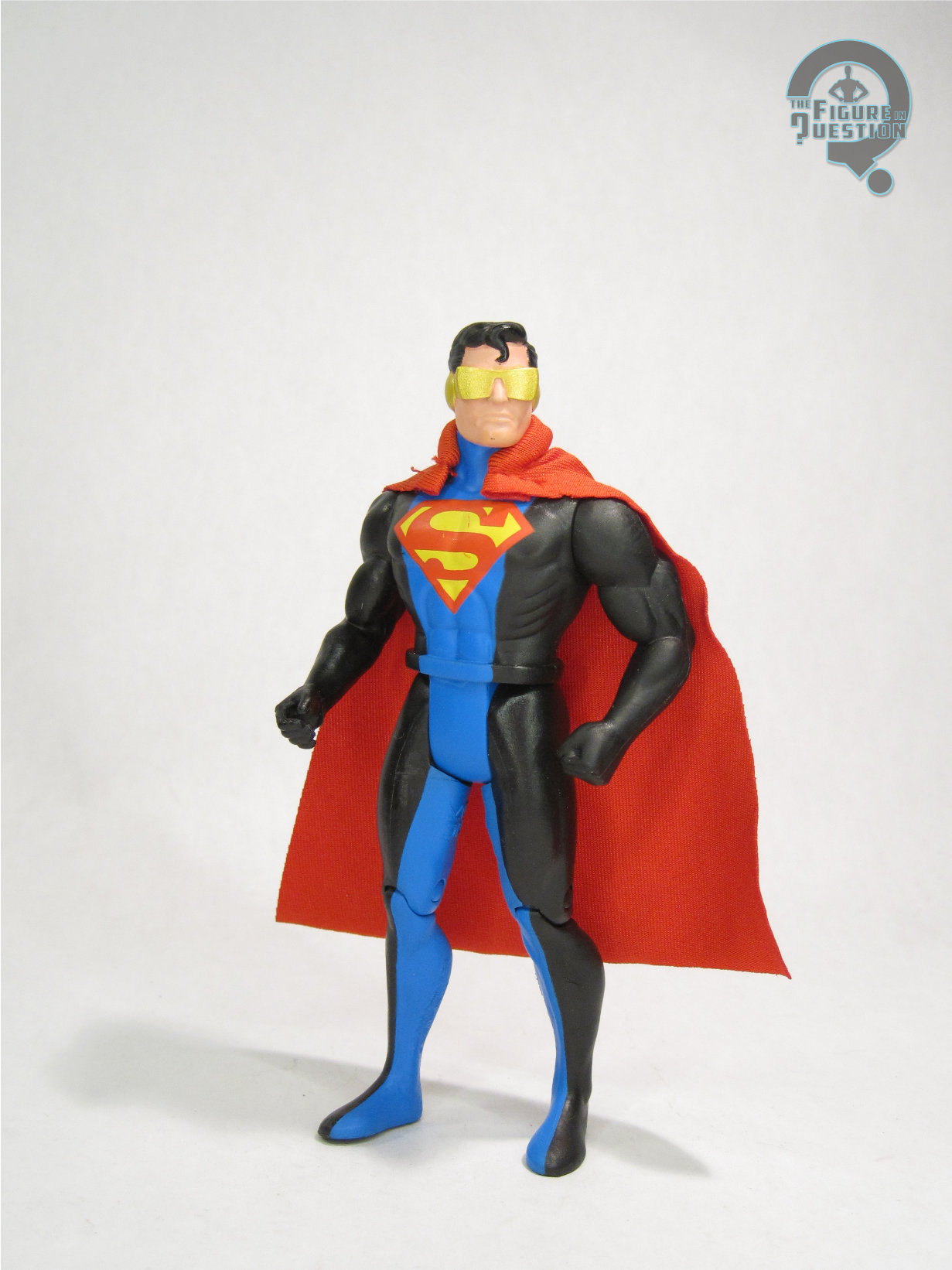
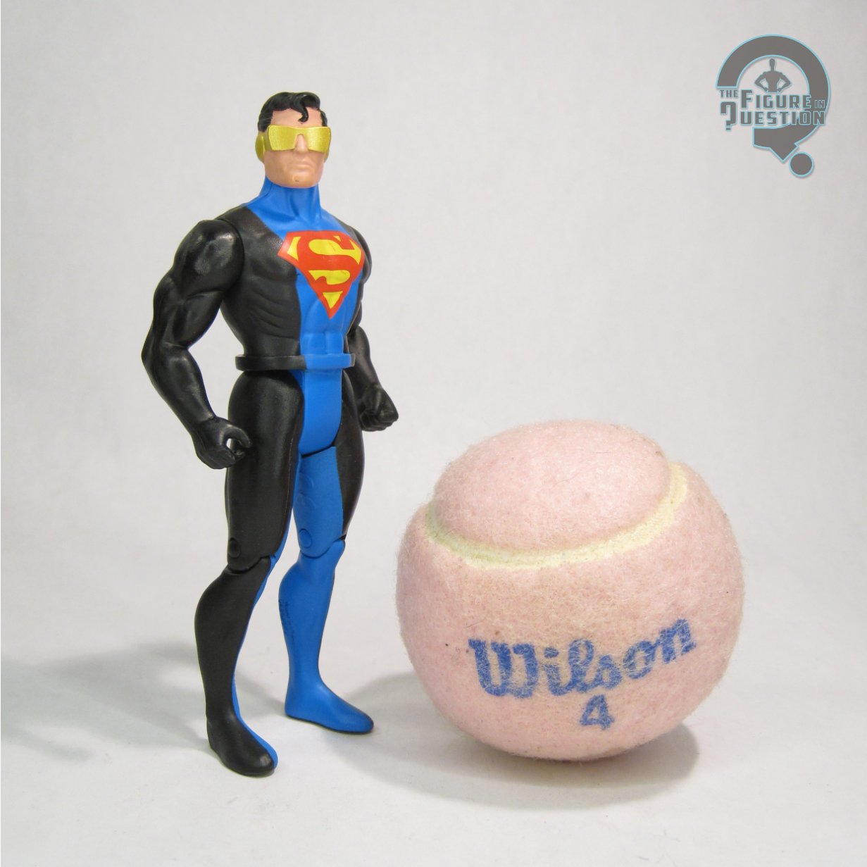
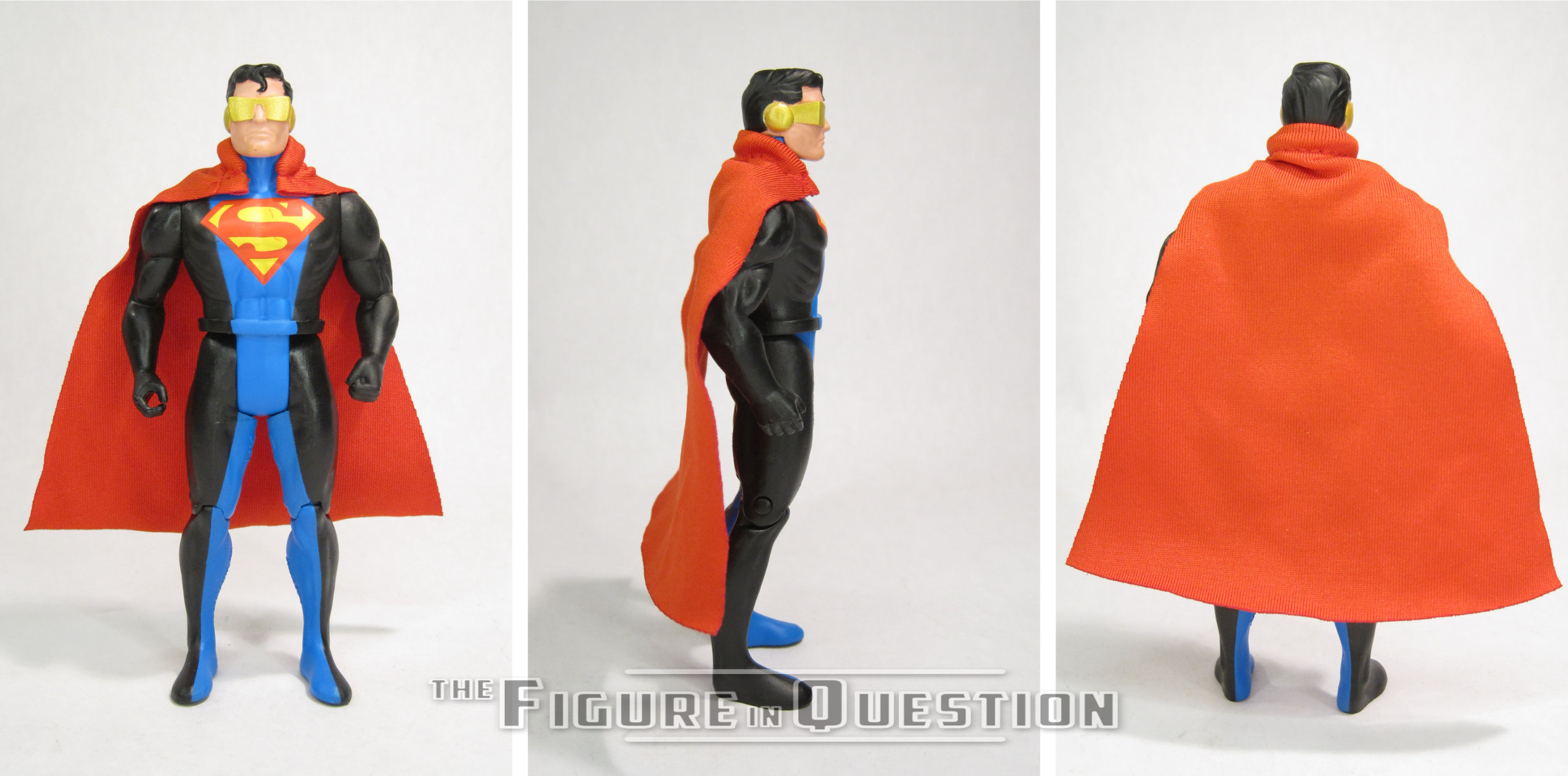
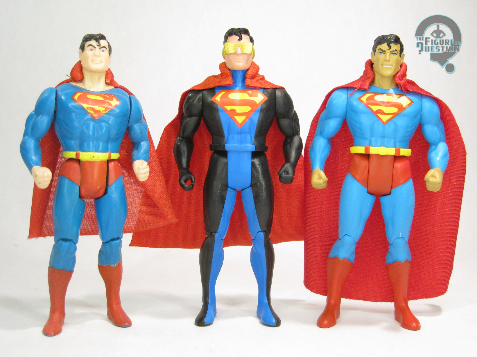
Eradicator is the fourth figure in Wave 13 of McFarlane’s Super Powers continuation line, numbered 64 in the overall line.  He’s the last figure in this set to share a number with a prior release, which he claimed from Wave 11’s Cyborg.  The figure stands just over 4 1/2 inches tall and he has 7 points of articulation.  Eradicator in the comics had a body that used some of Clark’s DNA, so he looked quite a bit like him (mostly; they were inconsistent about his hair), and so it’s little surprise that he’s using a lot of Superman parts.  He’s using a variation of the updated Superman body from Wave 9, but specifically the slightly more streamlined version from Wave 10’s black suit Superman.  The gripping hand on the right arm is kind of redundant, and the belt throws off the look a little bit, but generally it works.  He gets a new head sculpt, which is similar to the standard Superman, but with Eradicator’s signature goggles, and also a much more angry expression, better fitting Eradicator’s personality.  He also gets a cloth cape piece, which isn’t *quite* accurate to Eradicator’s usual look, which had the cape more dramatically flared at the shoulders and also went behind his logo.  That said, such a look would be quite difficult to do while also maintaining the aesthetic of the line, so I think they made it work well enough to pass muster.  The cape is once more missing the “S” on the back, but I’ve made my peace with that this far into the assortment.  Eradicator’s paint work is generally pretty good.  Application is clean, and the shades are all pretty eye-catching.  My only complaint is the color for the goggles; they’re gold, when yellow would be more accurate to the vintage style.  Super minor thing, though, and not enough to ruin the figure by any stretch.

THE ME HALF OF THE EQUATION

Since Eradicator didn’t stick around in the comics the way the others did, he was gone by the time I was reading, and it was his Kenner figure that introduced me to the idea, which has always tied me more to his presence as a toy.  There’s no denying he’s got a design that looks cool as a toy, and that holds up here.  This figure is kind of easy to overlook in an assortment with some flashier offerings, but he’s no slouch, and the minor issues I have with him certainly don’t keep him from being a very cool figure.

Flashback Friday Figure Addendum #0089: Plastic Man

PLASTIC MAN

JLA (HASBRO)

Well, we’re here at the end of the week.  I mean, I hope we’re all here.  It’s been kind of a rough week for, you know, everyone getting through it.  You know what we need?  Levity!  So, for today’s Flashback Friday Figure Addendum, let’s have a look back at a silly stretchy sort of guy, with Plastic Man!

If there’s one super power that has a tendency to be underestimated, it’s shape-shifting, particularly of the stretching type. Mister Fantastic, arguably the most famous “stretchy” character out there often has that part of his talents down played to focus on his high-level intellect. I’ve always felt that was a shame. I love stretchy characters because I think they have a lot of potential for creativity on the part of the writer/artist. They’re just a whole lot of fun! In fact, one of my favorite characters of all time is the Elongated Man. He’s not the character I’m looking at today, but he almost would have been, had it not been for the fact that Julie Schwartz, one of the guys behind the creation of Elongated Man (and so many other Silver Age DC characters, but that’s more for a later time), didn’t remember that DC owned the name Plastic Man. Granted, EM would have still be the same character, just with Plastic Man’s name, similar to the Hal Jordan Green Lantern and the Barry Allen Flash. I’m getting a bit off topic, aren’t I?

For those of you who don’t know, Plastic Man is Eel O’Brien, a one-time crook who gets doused by a strange chemical and left behind by his gang during a heist. When he awakes, he discovers he has the ability to stretch his body into impossible shapes. He decides to use this power to bring his old partners to justice and creates the identity of Plastic Man. He was big in the 40s, but faded into obscurity until around the 80s, where he saw a bit of a resurgence in popularity, eventually leading to him joining the Justice League of America during Grant Morison’s run on the series in the 90s. But, what of the figure?

THE FIGURE ITSELF

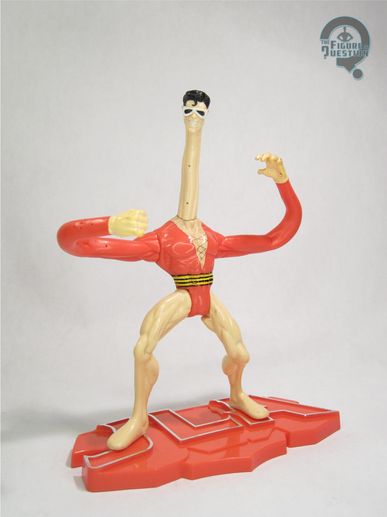
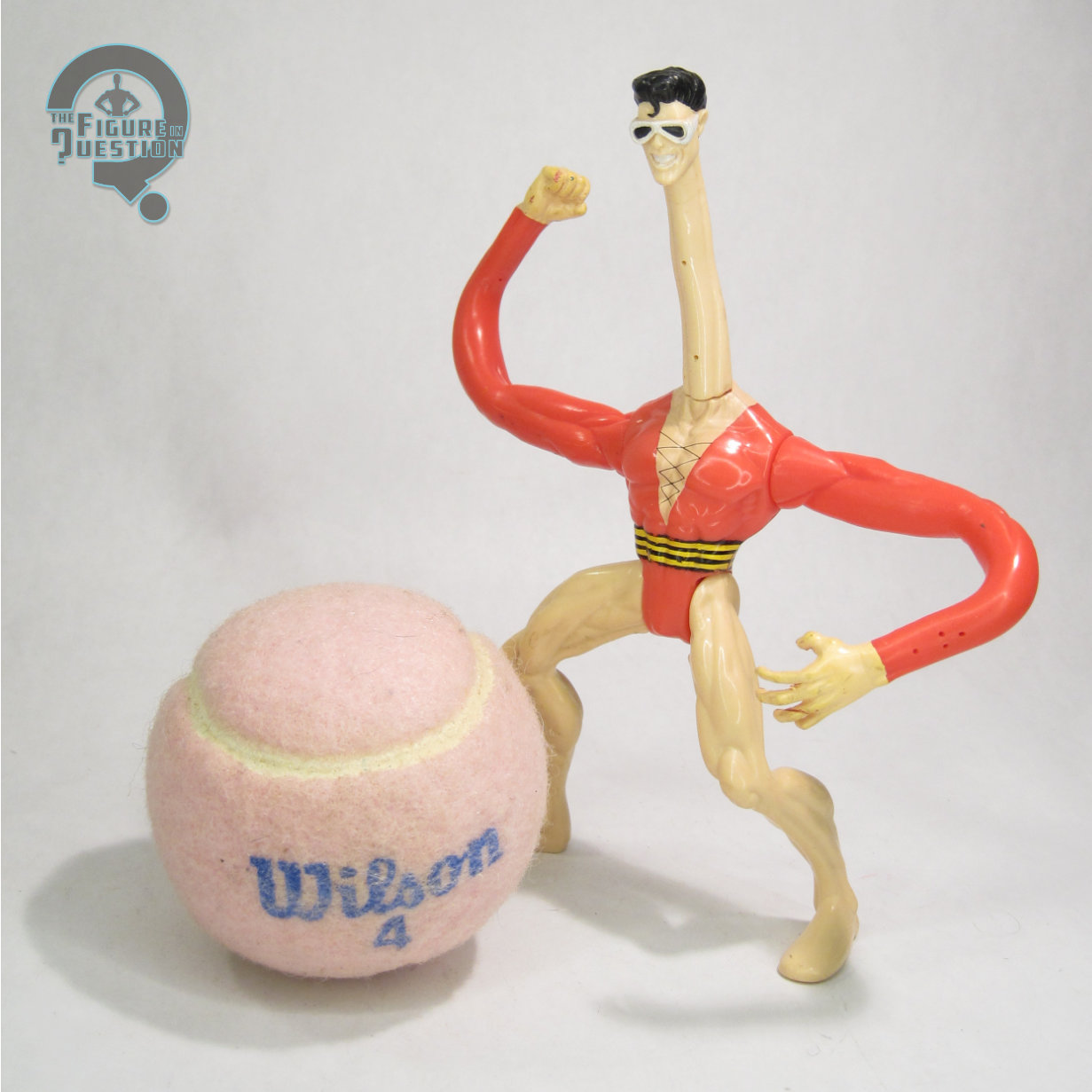
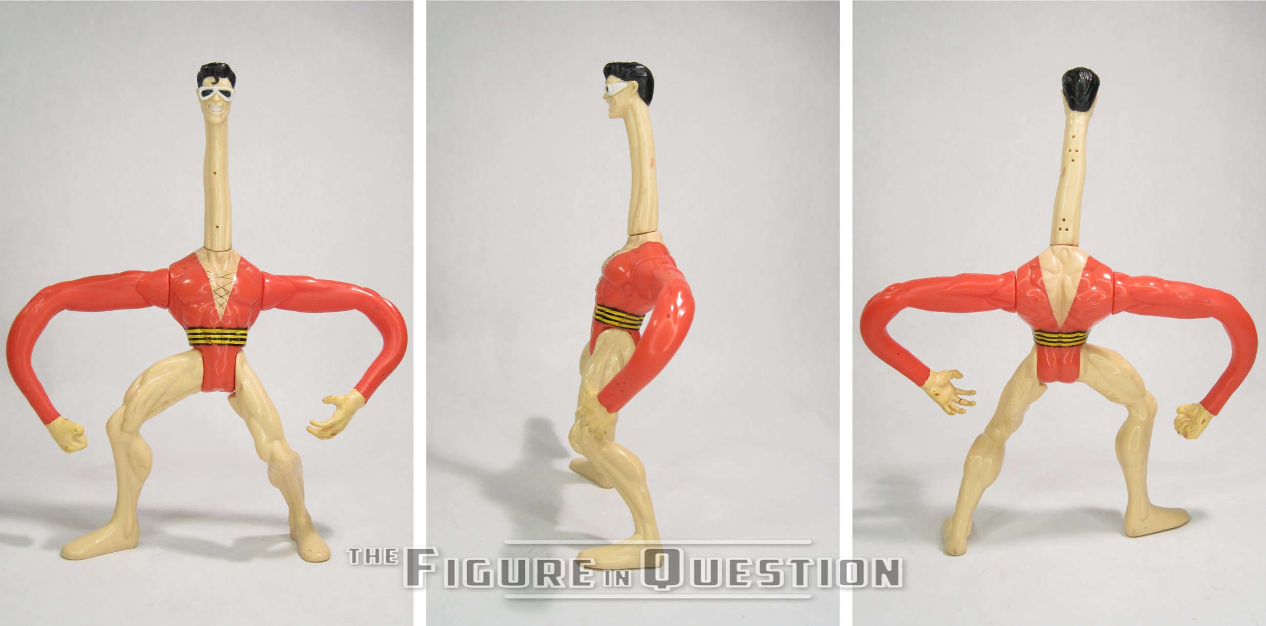
Plas was released in the 3rd series of Kenner’s JLA series. JLA was a line of figures exclusive to KB toys in the late 90s. They were made using retooled molds from Kenner’s Total Justice line from a few years previous. Plas’s inclusion in the line makes sense given his place on the titular team at the time. Plas has 5 points of articulation and stands about 7 inches tall with his neck fully extended. The line was in 5 inch scale, so he fits right in. The line used a few common pieces for certain figures, and Plas features the generic male torso, used by a few of the figures. The rest of the figure’s sculpt is unique. It all works together pretty well, though I can’t help but feel that the re-used torso looks a bit too stubby in comparison to the rest of the figure. The head and arms are cast in rubber with wires running through them, allowing you to pose the arms and neck in a variety of ways. The paint is passable. It’s fairly basic, but that fits with the rest of the line. The biggest issue with the paint is that it had some peeling issues on the rubber pieces, particularly the white on his goggles and teeth, which is almost gone on my figure. The hands have also suffered from some noticeable yellowing. Sadly, these are both issues of working with rubbery materials. I don’t know that anything could have been done to prevent them. Plas included a JLA logo stand, in red I believe.

THE ME HALF OF THE EQUATION

I got Plas from the KB Toy outlet in the town where my family vacationed. I know I had seen the figure before, and had been interested in getting it, but I never did. My parents bought him and another JLA figure (I believe it was Impulse) for me, which was pretty cool. It’s actually not a bad figure, though it sadly did suffer from a few issues over time. I’d be curious if a Plas who had less playtime might have come out unscathed.

This review was published in the early spring of 2014, less than halfway through my first year working in the site.  It’s particularly wordy for the time, I feel, and also goes off topic a bit there.  Like, I talk for a very long time before getting to anything about Plastic Man.  I even get in an Elongated Man mention, eight whole years before reviewing any of my Elongated Man figures.  No clue why I waited so long, especially given I had two Plastic Man reviews in my first year.  I’m getting side-tracked again, and I’m not even actually reviewing this time!  Since the original review, I’ve found his red JLA-logo stand, and also done some work restoring some of the messed up paint, so he looks a lot closer to his original self.  With the paint fixed up, I do really like how that head sculpt works; it’s one of the nicer ones from this line.  Also, giving me David Byrne vibes?  In some alternate reality, maybe there’s an ‘80s Plastic Man movie starring Byrne in the role.  He’s certainly eccentric enough!

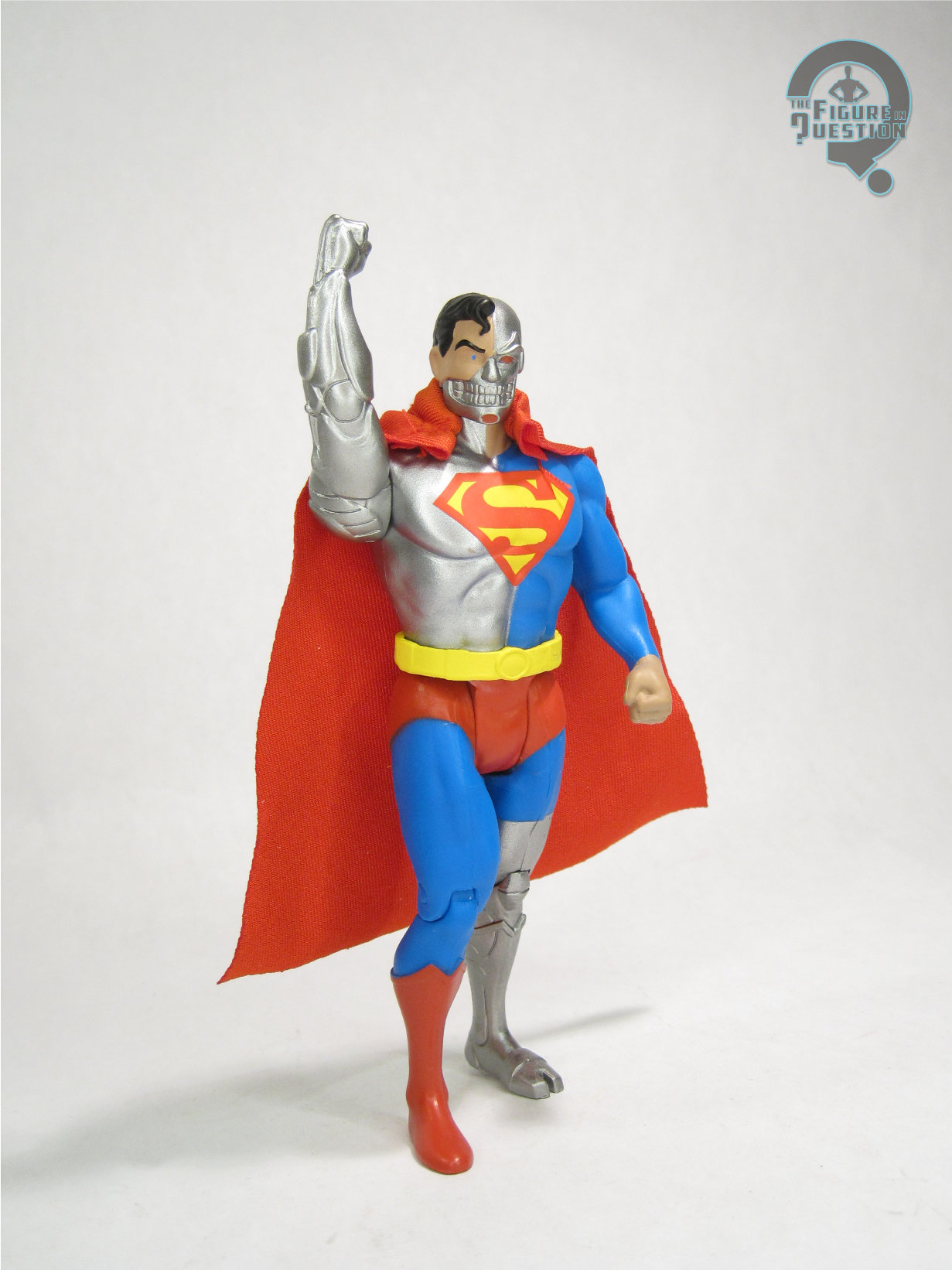
#4113: Cyborg Superman

CYBORG SUPERMAN

SUPER POWERS (McFARLANE)

“Cyborg Superman, also known as ‘The Cyborg’ is an evil counterpart to Superman with a robotic body designed using Kryptonian technology and genetics.”

Astronaut Hank Henshaw was originally introduced in the comics in 1990, as a sort of dark “real world outcome” take on the Fantastic Four origin story.  Though originally intended as a one-off character, his creator Dan Jurgens thought there was more to explore with the character, so during 1993’s “Reign of the Supermen” storyline, he was reintroduced as Cyborg Superman, claiming to be the genuine article rebuilt with Kryptonian technology following his demise at Doomsday’s hands.  Though the other three replacement Supermen from “Reign” would all receive figures through Kenner’s Man of Steel line in the ‘90s (well, okay, technically Eradicator actually made it out as a ToyFare exclusive), Cyborg Superman was notably absent from the line, not seeing any sort of toy release until nearly a decade later, under via DC Direct.  He’s finally getting that retro figure treatment now, though, through McFarlane’s continuation of Super Powers.

THE FIGURE ITSELF

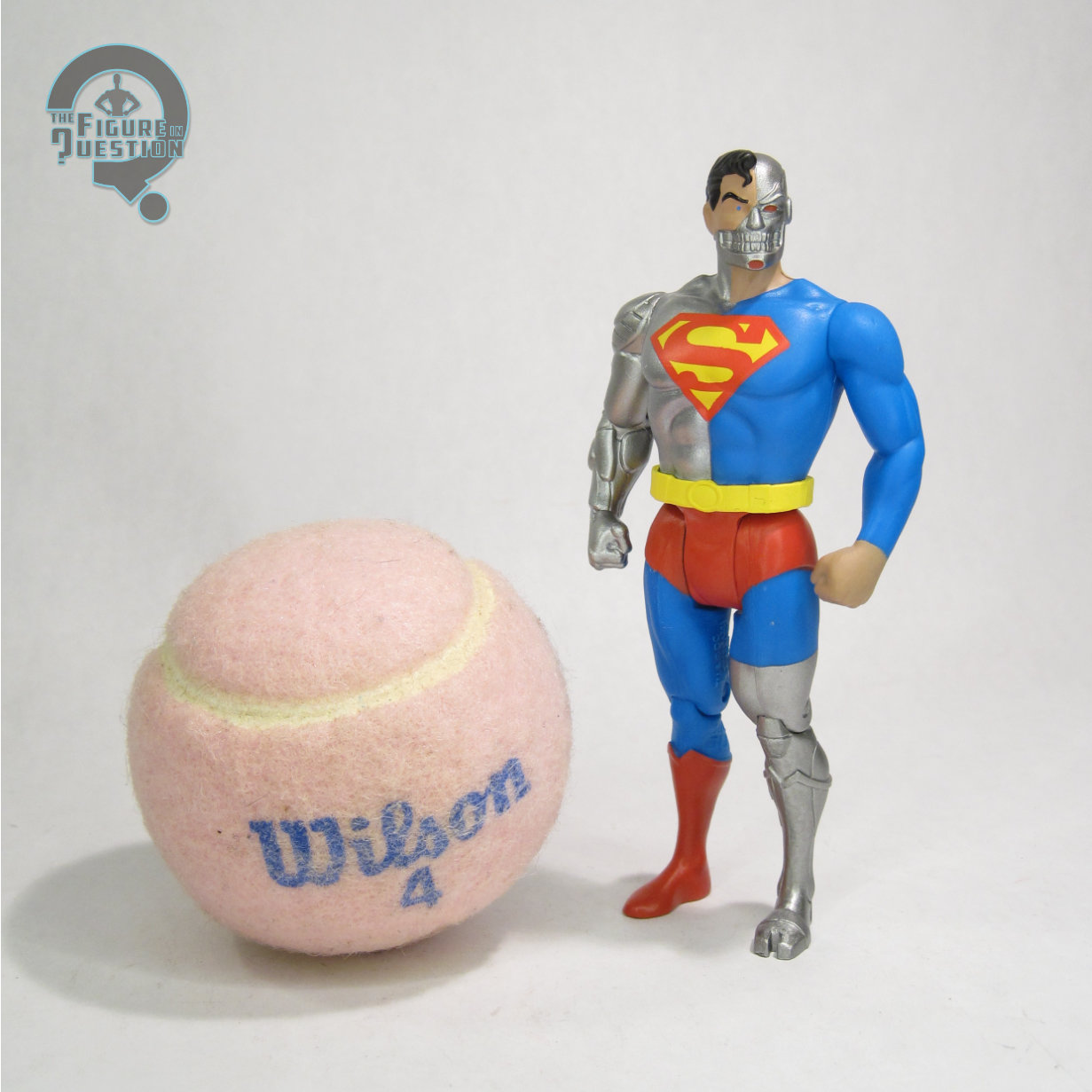
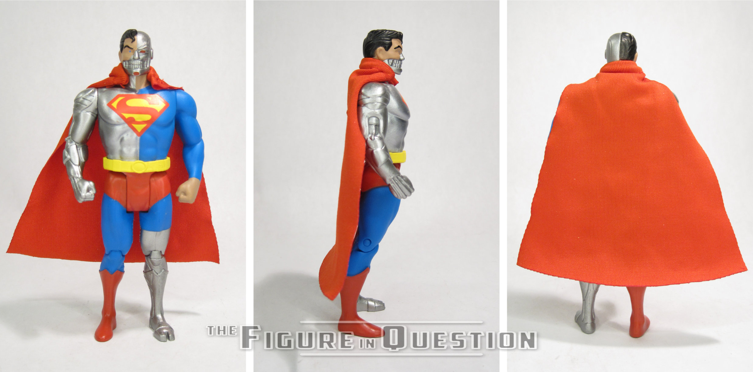
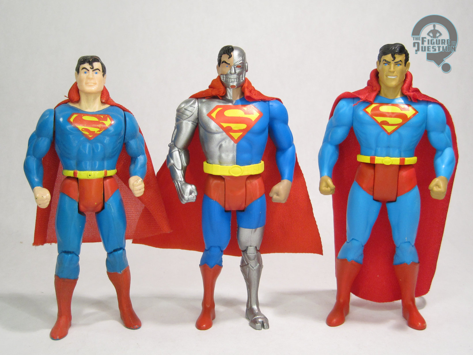
Cyborg Superman is the third figure in Wave 13 of McFarlane’s Super Powers continuation, numbered 63 overall in the line (which he took from Wave 11’s Nightwing, since we’re still doubling up there for whatever reason).  Cyborg Superman dials right into the overall Superman theme of this assortment, and while he’s a little outside the original line’s run, it’s not crazy to think of it continuing far enough to include him, especially given the McFarlane run has already tapped into “Knightfall.”  The figure stands 4 3/4 inches tall and he has 7 points of articulation.  It should come as no surprise that Cyborg Superman is using some Superman parts in his construction, but I was admittedly not expecting it to be the first Superman mold, rather than the improved one from Wave 9. He replaces the head, right arm, and left lower leg with new parts, so he does at least lose the Todd-inspired head sculpt, but he’s still a touch too tall and a little bit pigeon-toed.  Generally, though, the new parts do a lot to help rehabilitate the mold.  The head is more in line with the updated Superman, while still showcasing Henshaw’s slightly more hardened, angrier expression, and the raised and etched in elements of the robotic pieces are quite impressive.  *Technically* the torso should really have been resculpted as well, since it’s half-robotic, but ultimately, with the arm being resculpted and the cape hiding a lot of it, the look is pretty well pulled off.  The cape is the exact same one included with Supergirl and Powergirl, which means that like Supergirl, he’s missing the logo on the back, which is kind of annoying, but not the end of the world.  His paint work is…well, okay, it’s not strictly speaking accurate, because a proper Kenner Cyborg Superman would almost certainly be vac-metalized.  That said, such a process is clearly beyond the scope of the McFarlane figures even with full retail support, so it’s definitely not happening here, and it’s not fair to hold it against him.  The basic silver is perhaps not quite as exciting, but it’s well done.  My only actual complaint on the painting is that they missed painting the red loops on his belt, even though they’re still sculpted there.

THE ME HALF OF THE EQUATION

My first introduction to Cyborg Superman was actually fan complaints that he wasn’t included in Man of Steel, which led to me finding out more about him, and eventually buying the DCD figure when it was released.  He’s an interesting enough character, and he’s certainly got quite a striking design, so the fact that he’s got as few figures as he does is genuinely surprising.  This one’s got a few flaws that hold him back from perfect, but I do quite like him, and I think he’s a good fit for the line.