#0769: Cable & Stryfe

CABLE VS STRYFE

X-MEN: STEEL MUTANTS

CableStryfe1

The X-Men were so popular in the 90s that they not only had two books of their own, but also a whopping three spin-off titles. Two of those, Excalibur and X-Factor, had been launched in the 80s, and the other, X-Force, was a rebranding of the New Mutants in order to make them more “extreme.” This included adding Cable, a dude who’s mutant power was apparently being a big dude with a gun, aka being the personification of 90s comics. Cable had a twin/clone, called Stryfe. Let’s look at some figures of those two today!

THE FIGURES THEMSELVES

This pair was released in the second series of Toy Biz’s X-Men: Steel Mutants line, because apparently the X-Men just weren’t 90s enough.

CABLE

CableStryfe2
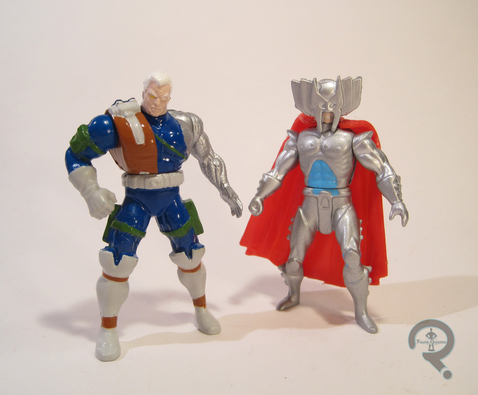
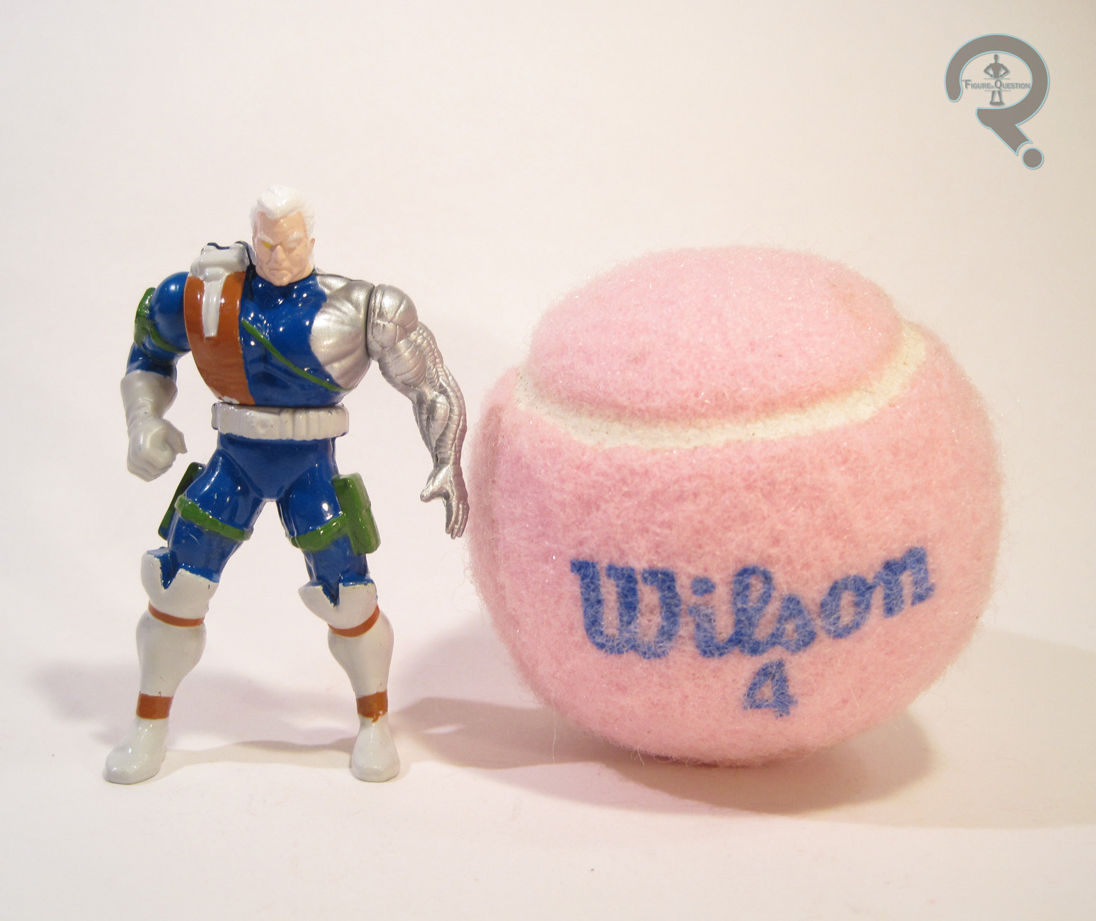
Oh man, here’s Cable. Why’s he called Cable? God only knows. Maybe he used to work for Comcast. That would certainly explain his surly nature. The figure stands 2 ½ inches tall and he has 4 points of articulation. Cable had quite a few figures in the 5 inch X-Force line, and this one uses Series 2’s Rapid Rocket Firing Cable as sort of a reference point. I don’t know if it’s based on a specific look, but it does present a slightly more subdued look for the character than usual. He doesn’t even have shoulder pads! His sculpt is generally pretty well handled. He’s got a good amount of detail, and his build does set him apart from the other figures in the line. Plus, I do dig that assymetry. His pose is pretty straight forward, with no real outlandish poising or anything, and he’s decently balanced, so there are no issues with getting him to stand. Cable’s paint is pretty much on par with the rest of the Steel Mutants. There’s a fair degree of bleed over around the edges, but he doesn’t look atrocious. The colors are pretty well chosen, and he looks pretty sharp.

STRYFE

CableStryfe3
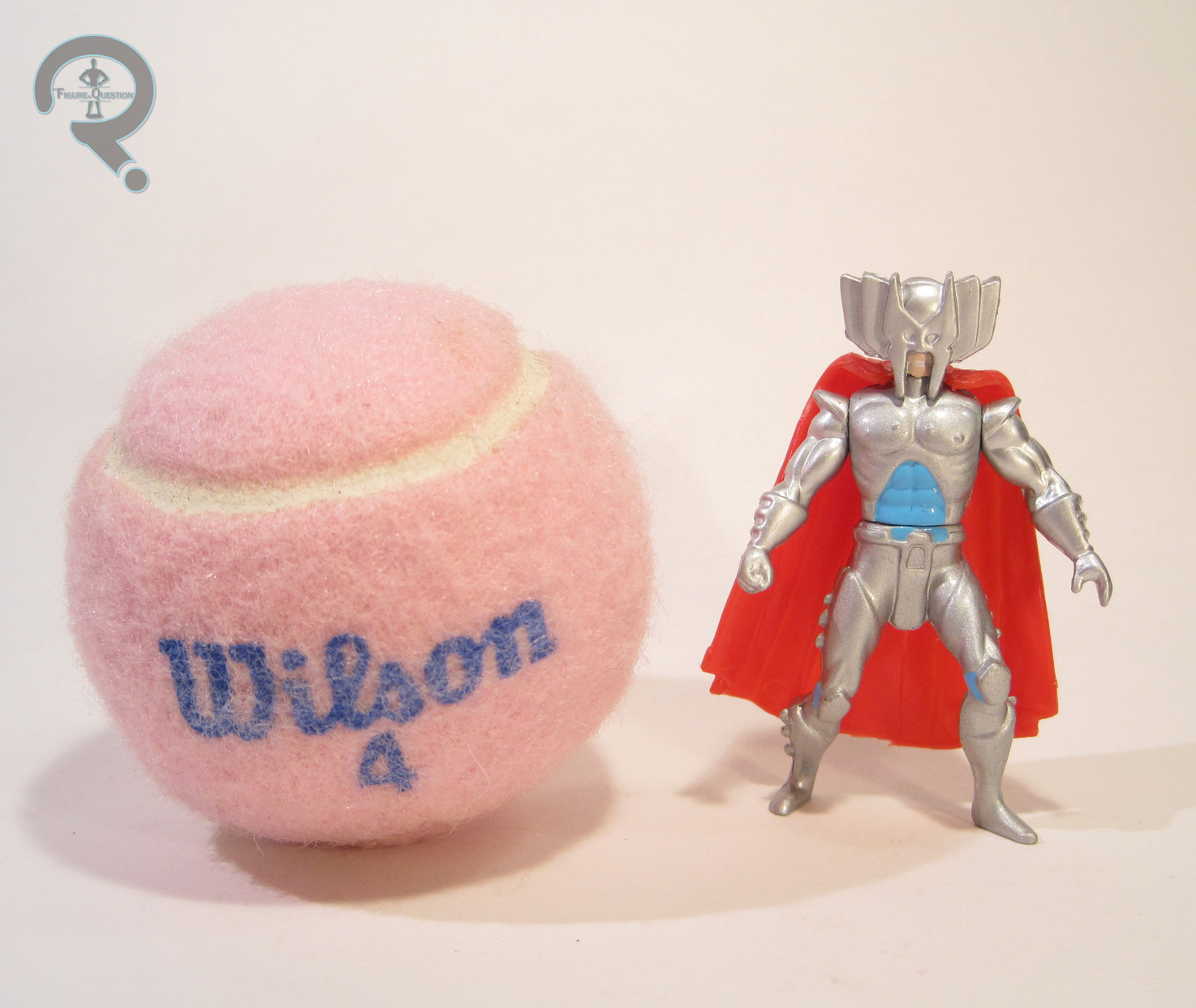
Yes, you read that name right. He’s named Stryfe. And it’s spelled with a “y.” Because 90s. Strule also stands roughly 2 ½ inches tall and has those same 4 points of articulation. Stryfe is presented here in full 90s glory. Check out that head gear. Seriously, that helmet looks like Liefeld deliberately set out to out-Wolverine Wolverine. I suppose they succeeded in that effort. Doesn’t make it look any less stupid, but more power to him. He appears to be inspired by the Stryfe figure in the 5-inch line, though he’s lost most of that figure’s interesting armor detailing, which has the unintended side effect of drawing more attention to just how goofy the main design of the character is. It doesn’t help matters that his sculpt is just markedly inferior to that of his pack mate. Cable is nicely sized, full of detail, and not in a super goofy pose. Stryfe is the opposite of those things. The size is particularly egregious, since he’s a clone of Cable, and should therefore be about the same size. That coupled with the long monkey arms, the strange lunging pose of the legs, and the ill-fitting cape makes for a really rough looking figure. The paint doesn’t really do him any favors either. He’s mostly a somewhat drab silver, which only further highlights the blandness of the sculpt. It is, at the very least, clean, which I suppose is a plus.

THE ME HALF OF THE EQUATION

This pair was purchased for me from Yesterday’s Fun, alongside the previously reviewed Cyclops and Mr. Sinister set, courtesy of my Super Awesome Girlfriend. Unlike the other set, I never had either of these guys growing up. In fact, this set represents the first, and to date only, Stryfe figure in my collection. So, there’s that. Cable is a pretty solid figure, but Stryfe is easily one of the weakest figures this line had to offer, resulting in an oddly balanced set.

#0768: Captain Cold

CAPTAIN COLD

THE FLASH (DC COLLECTIBLES)

CapCold1

Well, CW’s The Flash successfully made its way all the way through its first season and is now halfway through its second. It’s not a perfect show (few shows are), but it’s been a lot of fun, just all throughout. The series’ cast of regular characters have a lot to do with that, but they don’t do it all on their own; they get by with a little help from their… guest stars, who, more often than not, are playing members of the Flash’s oh so awesome rogues gallery. One of the most prominent, most recurring of those rogues is Captain Cold, who’s proved to be quite the popular character. He’s even getting an expanded role on the upcoming Legends of Tomorrow spin-off. So, what better to celebrate that than an awesome action figure?

THE FIGURE ITSELF

CapCold2Captain Cold was released earlier this year as figure 02 in DC Collectibles’ The Flash line. He follows the Flash, and precedes his frequent partner in crime, Heatwave. The figures stands about 6 ¾ inches tall (he’s just a little taller than Flash) and has 30 points of articulation. The range of motion on the joints is a little restricted, but I found Cold to be easier to pose than Flash, so that’s good. Captain Cold is based on his most frequent appearance from the show, which is his fur-lined blue parka look. It’s a pretty nice callback to his comics design, while still being reasonably practical in a real world setting. This figure’s sculpt is all-new, and it’s pretty reasonably handled, though it isn’t without its drawbacks. The articulation is mostly worked in well, but the ankle joints are a little rough, and his feet almost look like they belong on another figure. Also, there’s no way that this guy can get his arms close enough to his chest for a two-handed hold on his gun, so you’ll just have to pick one side or another. The hood is probably my least favorite aspect of the figure. It’s permanently up, for one thing. You can sort of pull it back behind his head, but it’ll want to go back into place. I feel the figure might have been helped by a separate hood piece that could be swapped for one that was folded down. Plus, the fur lining looks more like a poor CGI rendering of a fur lining than the real thing. The rest of the sculpt is actually pretty good. The texturing on the clothing is very nicely handled, and there’s a fully detailed shirt under the coat. The head gives us a pretty spot-on likeness of Cold’s actor, Wentworth Miller. He doesn’t quite have Miller’s intense stare, but I think that’s more a result of the goggles. Cold’s paintwork isn’t the most exciting paint ever, but it’s quite nicely done. Everything’s pretty clean, and there’s lots of nice accent work for the sculpt’s finer details. Captain Cold is packed with his trusty cold gun, as well as two pairs of hands (gripping and fists).

THE ME HALF OF THE EQUATION

I actually wasn’t sure I was going to get Captain Cold when he was announced, and even less sure after not being wowed by The Flash figure DCC put out, but I really found myself liking the character on the show a whole lot. So, when he showed up at my local comic book store, I happily picked him up. I’m glad I stuck with the line. Cold still isn’t a perfect figure, but he’s a definite step up from Flash, and shows that the line is definitely going in the right direction. I can’t wait to see who else we get!

CapCold3

#0767: Batman Beyond

BATMAN BEYOND

DC COMICS MULTIVERSE (MATTEL)

BatBeyondDCM1

Uh oh. It’s a Mattel figure. This can’t be good. Okay, that’s not entirely true or fair. Mattel figures have the potential to be good, or even on the rare occasion great. In fact, most are at least passable, but some aren’t. And also, I don’t like Mattel as a company, for a whole slew of reasons, chief among them being that a whole lot of their products just feel so lazy. In fact, in the last year, I believe I’ve bought a whole four Mattel figures, mostly due to the vast majority of their output being rather dull. One of those four figures is today’s entry, Batman Beyond. Let’s see how he turned out.

THE FIGURE ITSELF

BatBeyondDCM2Batman Beyond is part of Mattel’s DC Comics Multiverse line. The line doesn’t really have traditional series to speak of, but BB was released in the last year of the line. He’s part of the Arkham City sub-set, and is based on one of the alt looks for Batman from the game, rather than being an actual Terry McGuinness Batman Beyond. The figure stands 3 ¾ inches tall and has 18 points of articulation. The layout of the articulation is the same as both the Christopher Reeve Superman and Arkham Knight Robin figures. It’s not the worst articulation ever, but it could really, really use some sort of upper arm swivel and a mid-torso joint. The current layout leaves him a little stiff looking. In general, the sculpt of this figure feels pretty stiff and somewhat oddly proportioned. Some of that, such as the small head and larger hands, are at least partly present in the game design, but some of it’s just weird sculpting. Like Robin and Superman before him, the figure’s waist just sits too low, which looks really odd. Also, it looks like BB’s got at least a few parts in common with several of the previous Batmen. Because of this, he still has the usual Batman boots, which aren’t accurate to the design, as well as a weird shoulder piece that looks like it should have a cape or something attached, but it doesn’t, which is reasonable, since BB’s not supposed to have a cape anyway. Since one of the draws of Batman Beyond is his sleek design, these issues with the re-used pieces jump out a lot more than they would otherwise. BB does get his own head, belt, and forearms, which all do a pretty great job of capturing those parts of his design, and blend pretty decently with the rest of the sculpt. BB’s paint is one of his stronger suits. Everything is pretty cleanly handled, and his emblem in particular is nice and crisp, and really stands out well from the rest of the figure. BB has no accessories, which isn’t out of the ordinary for a Multiverse figure, but remains annoying given the price of the figure and the fact that he re-uses quite a few pieces.

THE ME HALF OF THE EQUATION

Remember how I was done with DC Comics Multiverse? Yeah, that seems increasingly incorrect. When I was down in North Carolina visiting family, I ended up finding this guy on a grocery run. I’ve always had a soft spot for the Batman Beyond design, and Super Awesome Girlfriend was there with me, so there really wasn’t a chance I was saying no to this one. He’s a flawed figure to be sure, and definitely reminds me of why I don’t really do Mattel figures anymore, but he’s Batman Beyond, which does a lot to outweigh some of the cons.

#0766: Hybrid

HYBRID

SPIDER-MAN

Hybrid1

Remember all that stuff I said yesterday about Marvel and symbiotes? Well, it pretty much all still applies today. Yep, I’ll be taking a look at another of those wacky symbiotes. But this one’s special. See, Lasher was just one single symbiote. Today’s figure? Well, if the name hadn’t clued you in already, he’s a combination of multiple symbiotes. Specifically, all of the symbiotes from the whole Planet of the Symbiotes thing. So, let’s have a looksee at Hybrid, shall we?

THE FIGURE ITSELF

Hybrid2Hybrid is another figure from the “Venom: Planet of the Symbiotes” series of the 90s Spider-Man line. Like all the other figures in the series, Hybrid was available in two different color schemes. The main color scheme was mostly variations of red, and pretty closely mimicked the look of the character from the comic. The second version, which I’ll be looking at today, was made up purely for the figure, and is grey and indigo, which is pretty wildly different from the original. The base figure is about 6 ¼ inches tall and has 5 points of articulation, but the wing/pincer thing mounted on his back brings him up to 8 inches and 16 points of articulation (though 6 of those points are tied into the spring-loaded feature). Hybrid was another all-new sculpt. He’s still got a lot of the items on the 90s checklist, but what’s interesting is that his sculpt is almost an entirely different style of 90s than Lasher. Lasher kind of stuck with more or less the Toy Biz style, but Hybrid’s more pre-posed, less articulation look makes him feel like he’d be more at home with Kenner’s Total Justice/JLA line from the 90s. It’s not a bad sculpt, mind you. There’s still plenty of texturing and muscular detail, which looks pretty great. In particular, the areas where the different styles of symbiote merge together are pretty cool looking, especially the gooeier bits running fluidly up the legs and arms, and down the top of the torso. It gives him a distinctively alien look. The proportions are definitely still exaggerated, but Hybrid is definitely a lot leaner than Lasher, and his proportions generally look a bit more conventionally heroic. Hybrid’s action feature is all worked into his back thingy. Each of the “fingers” on the end is spring-loaded, and they all move as one. There’s no activation for the feature, though, which is a little odd, but whatever. Hybrid’s paintwork isn’t quite as impressive as Lasher’s, but it’s solid work nonetheless. There’s a little bit of bleed over on the changes from indigo to grey, but the application is generally pretty good. I do wish the main body had more going on than the plain grey. The indigo of the upper torso has a light speckling of red, which keeps things somewhat interesting. Hybrid is packed with a “symbiotic wall-crawler”…thing, and a clear yellow Venom head with a small red symbiote inside it.

THE ME HALF OF THE EQUATION

So, I picked up Hybrid from the same vendor at Baltimore Comic-Con from whom I got US Agent and Lasher. They didn’t have him in his standard colors, so I had to settle for the variant. I can’t really complain about that, though, because the variant colors do look pretty sharp. Hybrid is a pretty fun figure, though maybe not quite as cool as Lasher.

Hybrid3

#0765: Lasher

LASHER

SPIDER-MAN

Lasher1

In the early 1990s, Venom was a pretty big deal for Marvel. Everybody loved the guy and his wacky symbiote. Marvel did their best to cash in on this, creating another symbiote wearing villain, Carnage. And, what do you know, Carnage ended up pretty darn popular himself. So, Marvel decided to try catching lightning in a bottle for the third time, but this time, they created a couple of different symbiotes, presumably hoping that one of them would have an easier time of sticking. It didn’t really work out so well for them (though one of the symbiotes, Scream, did end up getting to be a part of Universal Studios’ 3D animated Spider-Man ride, so that’s cool), but seeing as it was 90s Marvel, they still got action figures. Granted, those figures ended up being on the rare side, so they aren’t very cheap on the aftermarket. Who’d have thought the unsuccessful symbiotes would be the ones going for the big bucks? I managed to get a couple of the figures, so today I’ll be looking at my personal favorite of the symbiotes, Lasher!

THE FIGURE ITSELF

Lasher2Lasher was released as part of the “Venom: Planet of the Symbiotes” sub-set of Toy Biz’s 90s Spider-Man line. He was available in two different color schemes. The green/grey combo I’m looking at today is the more common of the two schemes, and is also the one closer to Lasher’s in-comic appearance. The Planet of the Symbiotes figures were pretty sizeable for Toy Biz figures from the day (when their figures were based around a 5” scale), and Lasher’s no exception. He stands 6 ½ inches tall and has 12 points of articulation. Lasher has a sculpt that was unique to him. It’s admittedly heavy on the late ‘90s stylization. His muscles are all bulging and ripped, and presumably all mid-flex. His hands and feet are huge, and his head is tiny. To be fair, this all makes perfect sense for Lasher. He’s supposed to be super 90s. That’s part of what the character is. With the exception of the hands, which seem a bit too cartoony and devoid of texturing, Lasher’s sculpt is actually pretty well handled. Everything is nice and sharp, and there’s plenty of detail work. The breaks between the colors are actually all etched into the sculpt, which adds a nice bit of pop to the figure. The tendrils on his back and forearms are made from a softer plastic, so they flop around a bit, as tendrils do. The ones on the back are removable, if you so choose, but they stay in place well if you want them to. Lasher has an action feature of sorts: when his legs are squeezed together, the top half of the figure spins, flailing his arms and tendrils about. To facilitate this, his shoulders are a little on the loose side. That can be a bit frustrating when trying to pose him, but the action feature is overall not too invasive. Lasher’s paintwork is pretty well handled. The base grey is actually this cool speckled plastic, which adds a more alien touch. The mint green color off the accents is a nice, unique look in superhero figures, and it’s got a bit of paint sprayed over it to help it match up with the grey plastic. Lasher is packed with a weird wrist-mounted shield thing, which looks like an extension of the symbiote, as well as a clear yellow Venom head which houses a small symbiote. The symbiote is cool, because it’s made from this tacky gooey substance, which sells the idea of what it is pretty well.

THE ME HALF OF THE EQUATION

I never had any of the Planet of the Symbiotes figures growing up. I don’t recall ever seeing them in the stores or anything. I do remember them from the backs of various Marvel toy packaging, and I definitely thought they looked pretty cool, but I never saw them. When I was filling some holes in my 90s Marvel collection a few years ago, I was always on the lookout for them, but they were prohibitively costly. But, it seems luck was on my side at this year’s Baltimore Comic-Con. The booth where I acquired US Agent (another personal grail) also had about a dozen bins just full of 90s Marvel figures. After digging through them for a few minutes, I managed to find a bunch of the Planet of the Symbiotes figures. Lasher was the one I knew I wanted the most, so I was thrilled to pull him from the bin, and even more thrilled to find out he wouldn’t cost me an arm and a leg. He’s definitely a goofy figure, but I’m really happy to have found one, and I really love this figure.

Lasher3

#0764: First Order Flame Trooper

FIRST ORDER FLAME TROOPER

STAR WARS: THE FORCE AWAKENS

Flametrooper1

Basic Stormtroopers are the bread and butter of Star Wars collecting, but if all you have are the basics, things can get a little bit boring. No, you’ve got to have some specialization, right? The original trilogy threw special troopers for piloting, scouting, cold climate, and even desert…stuff into the mix. The new trilogy of films looks to be following suit with all of those, as well as adding an all new brand of trooper, the Flame Trooper, into the mix. I’ll be looking at one of the figures of that design today.

THE FIGURE ITSELF

Flametrooper2Specialized Stormtroopers of the First Order, Flametroopers carry incendiary weapons that can transform any battlefield into an infernal blaze.” So, yeah, specialized troopers. Says it right there. The Flame Trooper is part of the first round of the basic 3 ¾ inch The Force Awakens line of figures.  He’s part of the first trio of the “Lava” sub-set of figures. The figure stands roughly 3 ¾ inches tall and has 5 points of articulation. The Flame Trooper gets an all-new sculpt, based, of course, on the upcoming film’s design. The design is a variation of the First Order Stormtrooper design, which makes sense. His armor has been tweaked in a few areas, most notably the helmet, which has a much thinner visor, no doubt to keep the Trooper from being blinded by his own blaze. He’s also got what appears to be a rebreather built into the bottom portion of the helmet, which makes sense. The rest of the armor has also all been tweaked in its own way, mostly to afford the wearer more protection. As far as the actual sculpt goes, the figure does a Flametrooper4pretty good job of capturing the design, at least from what I’ve seen. The figure is just a bit more pre-posed than most of the others from this line; his legs are in a slight step positioning, presumably to help balance the weight of his flame thrower’s fuel tank. The Flame Trooper’s paint is pretty straight forward. He’s molded in white plastic, with paint for the black and silver details. The application is generally pretty clean, so that’s good. The Trooper includes his flame thrower which, while well-sculpted, can’t actually be properly held. He also incudes another build-a-thing piece, for those who care (which doesn’t include me).

THE ME HALF OF THE EQUATION

I ended up finding the Flame Trooper during the same trip that got me PZ and Goss. I had actually seen the figure once before, while visiting Super Awesome Girlfriend, but ended up passing him up at the time. Of course I wasn’t able to find him anywhere else, which certainly bummed me out. So, I was glad to come across him again. I really like this particular design, and the figure does a good job translating it.

#0763: Jungle Disguise Dutch

JUNGLE DISGUISE DUTCH

PREDATOR (NECA)

DutchJD1

I love Aliens. It’s my favorite movie. NECA Toys has been making some pretty awesome toys from that movie recently. But, before starting on their awesome Aliens line, NECA took their first stab at total awesome-ness with the other big alien franchise from the 80s, Predator. They actually started things off with the franchise’s third film, Predators, before eventually making their way to the first two films. Since the Predator films came before a time when things like actor’s likeness rights for merchandise were included standard in actor’s contracts, NECA had to stick with the titular Predators. They did manage to get Arnold Schwarzenegger’s likeness rights, and promptly put out a whole bundle of figures of his character Alan “Dutch” Schaefer, based on his various appearances in Predator. I’ll be taking a look at his smelly, gross, oh-god-I-hope-that’s-mud covered “Jungle Disguise” figure today.

THE FIGURE ITSELF

DutchJD2Jungle Disguise Dutch was released in the tenth series of Predators figures from NECA. Series 10 was the second series following the addition of Dutch to the line, and was one of two versions of the character from this particular assortment. The figure stands 7 ¼ inches tall and has 29 points of articulation. Dutch is based on his appearance during his final, one-on-one battle with the Jungle Hunter. At that point, he’s covered himself in mud in order to mask his body heat, to get the upper hand. It’s kind of a distinctive look for the guy, so it’s not a shock to see it turn up here. The figure uses the forearms, and lower half of Series 9’s Jungle Patrol Dutch. Those pieces were pretty good there, and the re-use makes sense, seeing as he is the same guy in the same basic gear. The head, upper arms, and upper and lower torso are new to this particular figure, and they are, simply put, fantastic. The torso and arms are very nicely textured, with all sorts of cracks and leaves and such. The strap hanging on the torso is a separate add-on piece, which fits well in place, and can be removed, if one were so inclined. The head is an area where NECA could have cheaped out and used the Patrol Dutch head, but they didn’t. The face has texturing of the mud, to match the torso and arms, and the hair is even properly plastered down at the sides. And, on top of that, the Schwarzenegger likeness is dead-on. The paintwork on Dutch is pretty awesome too. It’s got some great subtleties to it; there’s a whole level of detailing, below the brown of the mud. This is most evident on the pants, which have full camo detailing, with matches up with all of the other Dutch figures, below a thin layer of brown. And, he’s even got a bit of red on his lip, from where the Predator hit him. Seriously, the level of detail on this paint is super great.  Dutch is armed to the teeth, as is befitting of him from this sequence of the movie. He’s got his assortment of hand-made weapons, including a spear, a bow, three arrows, and a torch.

THE ME HALF OF THE EQUATION

When I started picking up NECA figures, the Predators line pulled me in pretty quickly. That being said, I totally planned on limiting myself to just two figures: Jungle Hunter and Dutch. I ended up picking up the Jungle Extraction Dutch first (and he’s a fantastic figure in his own right), so I figured that would keep me covered. Then I got City Hunter and the Hive Wars Predator, and…my resolve kind of broke. But, this guy was expensive by that point, so I didn’t get him. I ended up finding him for a reasonable price at this past Shoreleave, and my Super Awesome Girlfriend insisted on buying him for me. So, now I have him, and he’s really, really cool. Easily one of NECA’s best.

DutchJD3

#0762: Arkham Knight

ARKHAM KNIGHT

BATMAN: ARKHAM KNIGHT (PLAY ARTS KAI)

ArkKnight1

When I was first starting to duck my head into the whole video game thing, I tended to stick to games based on properties with which I was already familiar. That meant I stuck with comic books and super heroes a lot of the time. Comic book-based video games have a reputation in the past of not always being the best they could. That being said, in the last few years, a few have been a bit better received, such as the Batman: Arkham games. The third (main) installment in that series, Arkham Knight was released earlier this year, and received a number of toy tie-ins. Today, I’ll be looking at one of the figures of the titular antagonist, the Arkham Knight.

THE FIGURE ITSELF

ArkKnight4Arkham Knight is the third figure in Play Arts Kai’s Batman: Arkham Knight line. He was released in September of 2015. The figure stands about 10 inches tall and has 49 points of articulation. The posablity on the figure is generally pretty great, though it’s worth noting that the joints are ratcheted, which can make moving them a little bit tough at first. He gets an all-new sculpt, based on the character’s appearance in the game. Well, more or less, anyway. Play Arts Kai has added their usual dash of stylization, in order to keep him consistent with their other figures, but the design is pretty much unchanged. It’s a pretty solid design, overall, and it’s got a cool “anti-Batman” vibe to it. The sculpt does a good job of translating the design into a real, physical object. There’s plenty of detailing, especially on the armored parts, and everything’s nice and sharp. He’s got softer rubber pieces for his upper torso, shoulder pads, and belt, all of which are very well sculpted and add a nice level of depth to the figure. The folds in the fabric portions of his costume (mostly the pants) are sculpted very dynamically, which definitely gives the figure ArkKnight3a sharp look, if not a super realistic one. The sculpt does a good job overall of integrating the articulation, though some areas, such as the wrists, are a little more obviously joints, and other joints will leave odd parts of the underlying sculpt exposed. Arkham Knight’s paint work is very nicely executed. Everything is pretty cleanly applied, and there are a lot of nice subtleties that add a lot to the figure. The faceplate of the helmet is definitely my favorite part; it’s cast in a semi-translucent dark blue plastic. The eyes on the helmet are set just a slight bit lower than they would be on a normal person (since they’re actually just HUD representations of eyes, not the real thing), which gives AK this weirdly unnerving quality. The figure is packed with a pair of handguns, a larger gun (which, I believe is meant to be a combined version of the two smaller ones, in-game), an extra folded up front grip for the larger gun, an extra head without the clear faceplate and HUD eyes, four pairs of hands (fists, trigger finger, relaxed, and open), and an articulated display stand.

THE ME HALF OF THE EQUATION

I haven’t actually played any of the Arkham games, but I’ve picked up a few of the figures here and there. I though Arkham Knight had a pretty cool design, so I was looking to pick up one of his figures. I had originally intended to get the DC Collectibles version, but I ended up deciding to pick up this guy when I found him at Baltimore Comic-Con (in no small part due to some pushing by Tim). He’s my first Play Arts Kai figure, and he’s a lot of fun. I’m definitely glad I decided to get him.

ArkKnight5

#0761: Ultron, Vision, & Hulk

ULTRON, VISION, & HULK

MARVEL LEGENDS INFINITE SERIES

UltVision&Hulk1

Last year, Hasbro partnered up with Target during the holiday season in order to offer a few exclusive items from a number of their lines. Among the lines included was Marvel Legends Infinite Series, which got a special three pack of figures, which included Captain America, Ms. Marvel, and Radioactive Man. It would seem Hasbro is looking to make this something of an annual thing, as another three pack was just released. Included this time around were Ultron, Vision, and the Hulk, all of whom received a nice popularity boost courtesy of Age of Ultron.

THE FIGURES THEMSELVES

These three are, as noted above, part of a Target exclusive set, arriving just in time for the holiday season.

ULTRON

UltVision&Hulk4Ultron’s had quite a few figures this year, but this is actually only the second Marvel Legend. This one gives us another shot at the comics design. Specifically, he seems to draw inspiration from Ultron’s comics appearances from the last several years, though he certainly amalgamates a few different designs. The figure is about 6 ½ inches tall and has 30 points of articulation. Part of why Ultron amalgamates a few designs is due to some necessary parts re-use. Ultron makes use of the body of last year’s Ultimate Beetle figure, along with a new set of forearms/hands, as well as yet another all-new Ultron head. Beetle’s body’s actually not a bad fit for Ultron, and it was pretty good sculpt to begin with, so it’s re-use is definitely a reasonable one. The new forearms and hands meld nicely with the rest of the body, and definitely work better for the character than the original Beetle hands would. The new head is definitely the star attraction here. It’s a fantastic sculpt, with lots of really sharp line work and some great symmetry, and it really captures the character well. Ultron’s mostly just molded in a dark silver plastic, which looks pretty decent, but he’s got a fair amount of red detailing throughout. In particular, I really like how the mouth has been handled; they managed to get that whole crackling energy thing down just right!

VISION

UltVision&Hulk2He’s had no new Marvel Legends for like 7 years (being dead can do that sort of thing to you) but Vision’s managed to get two whole new Marvel Legends figures. His first one hit just a few months ago, and was based on one of the character’s more recent designs. This figure opts for a slightly more oldschool look, offering Vision’s second design ever, from John Byrne’s run on West Coast Avengers. I respect Byrne a lot, but the less said about that run and why the Vision was suddenly mono-chromatic, the better. Regardless of the questionable rationale behind the why of the design, it’s actually not a bad look, and it’s certainly different enough to warrant a figure. The figure stands about 6 ¼ inches tall and has 32 points of articulation. He is, more or less, a repaint of the last Vision figure. He’s built on Hasbro’s favorite body, the Bucky Cap, and uses the same head as the previous Vision. Unfortunately, he’s back to the two-fisted look, which is a shame, since the outstretched hand of the last one (and this one’s prototype) made for a nice variety of poses. To make up for that, this guy gets a brand new pair of feet, sans shoes, which are very well sculpted. He’s also got that same cape piece, of which I am still not a huge fan, but it’s less offensive here. The paint is, of course, the main draw of this figure. Now, he could have been just solid white, since that’s how he was depicted in the comics. However, Hasbro decided to do something a bit more visually interesting, so he’s molded in clear plastic, with white painted over top, making him semi-translucent, which looks really cool. In general, this paint works a lot better for this sculpt than that on the Now! Costume. I do sort of wish the black costume lines went all the way around his torso, but he that’s relatively minor.

HULK

UltVision&Hulk3Last up, it’s the required heavy hitter of the set, Hulk. This Hulk, like Ultron before him, appears to be an amalgam of a few recent Hulk designs. Overall, he seems to take the most influence from the Indestructible Hulk book from the Marvel Now! relaunch, though he lacks that look’s armor. The figure is a little over 8 inches tall and has 31 points of articulation. The figure gets a new head sculpt, clearly based on the buzz-cut look from Indestructible. It’s a pretty nice sculpt, which is certainly expressive, so that’s cool. From the neck down, the figure is the same as the Age of Ultron version from earlier this year. It’s a decent enough sculpt, and it actually works a bit better for a comic design, than it did a film design. Hulk’s paint work is fairly straightforward, basic greens and purples. It’s not the most exciting look of all time, but it’s pretty solid work.

THE ME HALF OF THE EQUATION

I, unsurprisingly, got this set from my local Target. My main interest in getting this set was definitely Vision. He’s definitely a solid figure, and an improvement over the Now! version. Hopefully a proper classic look (or maybe even his 90s look) is on the horizon. Regarding the other two figures in the set, Hulk is a well done space taker, but Ultron is actually a pleasant surprise. He’s the best figure in the set, and probably one of the best Ultron figures ever. Solid work!

#0760: Maria

MARIA

SILENT SCREAMERS: REEL MASTERS

Maria1

What’s this? A silent film character on this site? What, am I trying to inject some culture or something?

As surprising as it may be, my interests do actually go beyond modern day entertainment and action figures. I love me some old silent movies, Fritz Lang’s Metropolis in particular. That movie’s got a lot going for it: cool dystopian setting, art-deco look, underground civilizations, gripping fight scenes, a crazy mad-scientist, and one of the coolest freaking robots of all time! Maria, the robot who became the film’s signature character(who actually stole the name from the film’s female protagonist. It’s Frankenstein all over again!), would go on to influence a number of other robots, with Star Wars’ C-3PO probably being the best known. She’s received a few pieces of merchandise over the years, including an action figure, which I’ll be looking at today!

THE FIGURE ITSELF

Maria2Maria was part of the second series of Silent Screamers, dubbed Reel Masters line, and released in 2000. Interestingly, while this series was released by Mezco, the first series was actually released by Aztech Toys. Aztech ended up splitting into two separate companies, Art Asylum (creators of Minimates, among other things) and Mezco. So, this series ended up being one of Mezco’s very first products. The figure is about 7 inches tall and has 13 points of articulation. While she is ostensibly based on her robotic appearance from Metropolis, Maria’s design has definitely been tweaked a bit for this figure. The original Maria design is kind of a classic for a reason, so changing the design is shaky ground to stand on at best. Mezco opted to go for a more modern design aesthetic, or at least an early 2000s design aesthetic. In the film, Maria’s look was built around an actual person, so she definitely wasn’t rail thin. Here, however, Mezco is taking advantage of the fact that there isn’t a person inside the figure, so they can give it whatever proportions they like. So, this Maria is really tall and quite lanky.  That’s a reasonable change. However, for some reason, they’ve also given her a pair of rather large breasts, and a pair of crazy high-heeled/platform shoes, which don’t really work well with the design, since Maria’s not really supposed to be overly-sexualized, especially not while in her robot form. Her face has also been tweaked to be more human, which kind of deprives the figure of the necessary cold, steely look.  In addition, the general retro-y, art-deco nature of Maria’s original design has been tweaked, to look a bit more like something that wouldn’t look completely out of place in, say, an early Image comic. The end result is a sculpt that is still clearly Maria, but just feels really off. On the plus side, her paint is actually pretty cool. She’s mostly silver; for some reason, I had always assumed she was gold, but I guess silver’s reasonable. She’s also got some blue accent work, which looks pretty sharp, and looks pretty nifty next to the silver. Maria includes the chair used to bring her to life. Like Maria herself, its design has been tweaked a bit, though nowhere near as much. The chair and stand need to be assembled once removed from the box, and those tubes are a bit of a pain to get into place, but the end result looks pretty cool. Plus, the figure ends up looking a fair bit better sitting in the chair than she does standing. The only real downside is that she has to sit with such a wide stance, due to her hip joints.

THE ME HALF OF THE EQUATION

I’ve been a pretty big fan of Maria from about 5 years old or so, even before having seen Metropolis (in fact, I saw Metropolis because it was the movie in which Maria appeared). My dad had one of the Maria statues, which I always though was pretty cool. I remember this figure being released, but I don’t think I ever saw it in a store, so I never got one. I ended up getting her as a birthday gift from my pal Phil just this past year. This figure’s far from perfect, but she’s also the only action figure of Maria on the market, and she’s not the worst thing ever. If you’re a fan of Metropolis or cool robots, you could do a lot worse.