#0860: Star Wars Mashers

LUKE SKYWALKER, HAN SOLO, DARTH VADER, STORM TROOPER, & SCOUT TROOPER

STAR WARS HERO MASHERS

ROTJMashers1

For a guy who’s not a huge fan of Hero Mashers, I sure do seem to be picking up a lot of these guys, don’t I? Yeah, I don’t really have an excuse. I’m a bit of a push over when it comes to certain things. But, hey, it means you guys get to keep reading about these figures. Isn’t that a plus? No? Well, sorry…

THE FIGURES THEMSELVES

This five-pack of figures was released not long after the onslaught of Star Wars-merch in September. It initially appeared to be a TRU-exclusive set, but has recently begun to show up at other retailers. All of the included figures are based on Return of the Jedi.

LUKE SKYWALKER

ROTJMashers2Luke makes his second appearance in the Mashers style here, based on his Jedi look from….Jedi. Specifically, he’s based on his look from towards the end of the film, after he’s ditched the vest and unbuttoned one side of his chest-flap-thingy. The figure stands 6 inches in height and he’s got 18 points of articulation. He’s got the same reduced shoulder movement that all the more recent Mashers have gotten, but I’ve really stopped noticing at this point. The figure shares his head with the Bespin version of Luke from the two-pack. That’s nice from a consistency standpoint (even if Hamill does look different in the two films…) and the actual sculpt does a pretty nice job of tweaking Hamill’s likeness to fit the style. The rest of the sculpt is unique to this figure, and it’s a pretty sharp sculpt. This particular design definitely transfers well to the Mashers aesthetic. Like every Mashers figure, Luke can be disassembled at the neck, elbows, hips, and knees, and his parts are interchangeable with the rest of the line (if you’re into that sort of thing…). Luke’s paintwork is generally pretty simple; it’s limited to the face and chest, with some slight finish variance on the glove and boots. There’s an odd spot of silver on one side of my figure’s collar, but aside from that, the application is pretty clean. Luke is packed with his green lightsaber from the movie, which is so far unique to this set.

HAN SOLO

ROTJMashers3After getting his styling jacketed look in the two-packs, this Han returns him to his classic vested look (albeit the slightly less classic variant of it from Jedi). Han’s sculpt is mostly the same as that of the two-pack figure, with only a new torso piece. The re-use isn’t too terrible, but it does mean Han’s got pockets on each arm, which isn’t accurate. The overall sculpt isn’t bad, but Han doesn’t seem to have translated as well to the Mashers style as Luke. The head in particular just seems far too generic for Harrison Ford. Also, this figure’s hips seem particularly wideset. An additional note: Han’s hands are separate pieces from the forearms. They aren’t designed to be removable, but they might pop off if you aren’t paying attention. Han’s paint is a bit more complex than Luke’s, and it’s handled pretty well. There are a few fuzzy lines, but nothing really terrible. Han is packed with his signature blaster. It’s got a blaster bolt permanently attached, which looks a little odd in a basic pose, but does add some nice flare in an action set-up.

DARTH VADER

ROTJMashers4
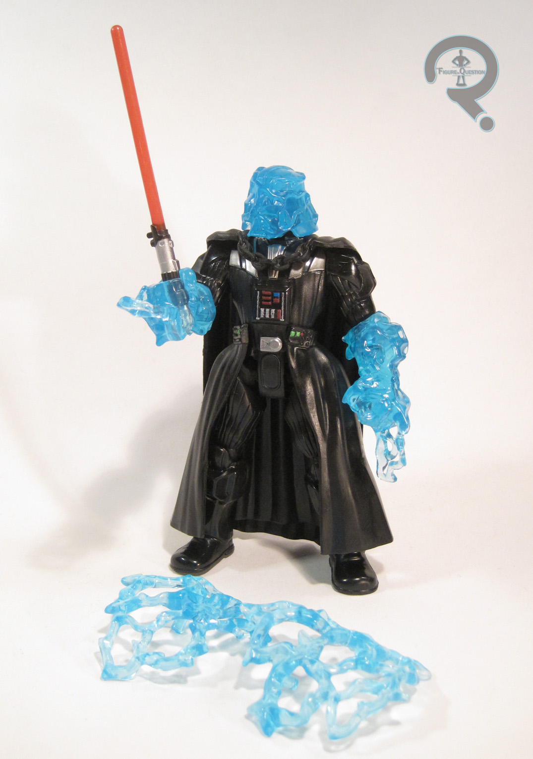
I’ve actually reviewed a lot of this guy before. Vader, unlike the others in this set, goes for a very scene specific look. Namely, the scene where he’s getting electrocuted by the Emperor. That seems a little morbid for a kid-aimed toyline, but okay! The torso, upper arms, legs, cape, and skirt are all exactly the same as the single-release Vader. Same sculpt, same paint, same everything. What’s new are the head and lower arms, which take the previously used pieces, add a bit of “electricity” detailing to them, and cast them in a cool translucent blue. Of course, to be truly accurate to the scene, he should be missing his right hand, but I guess that would be too morbid for the kid’s toy. Vader is packed with the same extra as his single-packed counterpart, a lightsaber, as well as two electricity effect pieces.

STORMTROOPER

ROTJMashers6
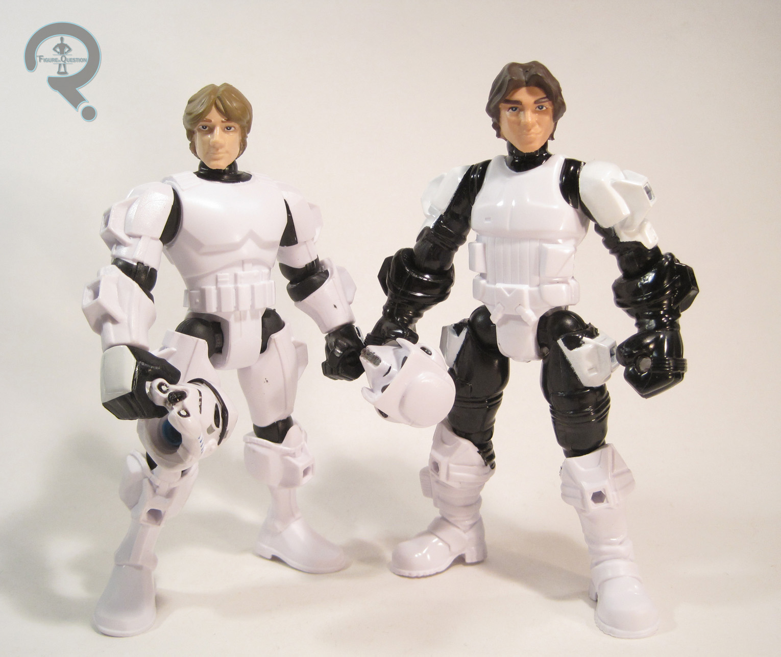
And now for the set’s one straight re-pack, the Imperial Stormtrooper! Yes, this guy’s the same exact figure as the single-packed version. But come on, it’s a Stormtrooper! You can’t have too many of these guys, right? The design definitely fits the style very well, and he’s helped by the totally armored look. He’s easily got the sharpest detailing of the figures included here, which definitely helps the overall look. The one major nit with the sculpt is more an articulation issue than anything; since his elbows only swing forward and back, he can’t actually hold a blaster two-handed. Also, like Han, the hands are separate pieces, glued in place. The Stormtrooper’s paint is generally pretty decent, though the black is a little sloppy in a few spots, and there are a few bits of slop. It’s all relatively minor, though. He’s packed with a standard trooper blaster, which, like Han’s, has a blaster bolt permanently affixed. Consistency!

SCOUT TROOPER

ROTJMashers5Last, and very much not least, it’s the Scout Trooper! By far my favorite Trooper design from the OT, and also the one totally new figure included in this set. The Scout Trooper’s design is already pretty chunky and blocky, so it translates very nicely to the Mashers style, and doesn’t look quite as cartoony as some of the other figures. The general quality of the sculpt is pretty great. Some of the details are a bit on the soft side, especially on the torso, but he’s no worse than other Masher figures. The one thing that knocks this figure down a peg is his paint. It’s not terrible or anything, but there’s definitely a fair bit of bleed over, and the edges of the white paint are all pretty fuzzy. From a slight distance, he looks fine, but up close he’s a bit off. The Scout Trooper includes a small blaster, which has the affixed blast, just like the other two. Three for three!

THE ME HALF OF THE EQUATION

“Ethan, if you aren’t a huge fan of Mashers, then why did you buy this big set of figures?” The answer is simple, hypothetical reader: Scout Trooper. I have an unhealthy addiction to Scout Trooper action figures. It was just my luck that this guy had to be part of a big boxed set. Due to the slightly high price tag of the set, I actually passed on it several times. However, last month, I was at Target, and they had this set for half-price. For $25, I figured it was worth it. I don’t regret this purchase in the slightest. The Scout Trooper is definitely my favorite, but the basic Stormtrooper and Luke are pretty awesome too. Han’s not really my preferred version and I can take or leave Vader, but the overall set is actually pretty fun.

ROTJMashers7

#0859: Perseus

PERSEUS

CLASH OF THE TITANS (MATTEL)

Perseus1

The incredible success of Star Wars and its associated merchandise was something that just about everyone was looking to cash in on in the late 70s/early 80s. Kenner had struck gold with their 3 ¾ inch line, leading to a number of imitators, hoping to get a slice of that success. Mattel tried a number of different lines, based on various sci-fi and fantasy properties of the time, each very clearly based on the Kenner aesthetic. One such line was Clash of the Titans, based on the 1981 film. The line was far from a smash success, and only managed to produce four basic figures and two larger creatures. Today, I’ll be looking at their figure of the film’s hero, Perseus.

THE FIGURE ITSELF

Perseus2Perseus was part of the first, and only, series of Clash of the Titans figures from 1981. The figure stands just shy of 4 inches tall (making him pretty tall for the time) and has 5 points of articulation. While the sculpt was clearly designed to mimic the Kenner figures of the time, this figure is noticeably less sturdy than his Kenner compatriots. For a classic Greek hero, he sure is scrawny. The sculpt is okay overall, but there are a number of odd things going on with it. The legs/pelvis area is definitely pretty weird looking; in the movie, he’s wearing a long tunic sort of a thing, but here it’s been transformed into an odd, squared off diaper thing. And that’s not even addressing the fact that his legs don’t appear to actually connect to his torso. His torso sports a strap that abruptly ends at the hip. In the film, this strap is connected to his scabbard, but Mattel wanted to be able to have Perseus share his legs with Thallo, so there was no scabbard to be had. The head probably exhibits the best work of the sculpt, but it’s still not all there. I can kind of see Harry Hamlin in this sculpt, but he looks a bit exaggerated, and almost has a sinister, scheming air about him, which hardly seems right for the film’s hero. Perseus’s paint is faitlu basic. One shade of brown for his hair, boots, bracelets, and eyes, another for his strap, and a light beige for his tunic. It’s nothing amazing, but it’s all pretty clean. Plus, he got eyes, which means he fared far better than any of the humans from Mattel’s Battlestar Galactica line! Perseus was originally packed with a sword and his shield, the Aegis, but my figure doesn’t have those.

THE ME HALF OF THE EQUATION

I’ve actually never seen Clash of the Titans. I’ve seen clips from it, I’ve heard the soundtrack, but I’ve never seen the movie. However, I’m a bit of a Greek mythology geek, and I’m also a huge action figure geek (try not to be too shocked). So, when I found this guy in a box of loose figures at a flea market last month, I was actually kind of excited. As usual, it’s a Mattel product that’s nowhere near the competing product of the time in terms of quality, but I kind of have a soft spot for this figure. And one of these days I’ll get around to watching the movie…

Perseus3

#0858: Green Lantern

GREEN LANTERN

DC ICONS (DCC)

GLIcon1

After the success of Barry Allen as the second iteration of the Flash, DC got to work on re-imagining as many of their old superheroes as they could. In the years since super hero comics had faded away, the magic and mysticism had fallen out of favor. When the heroes returned, science fiction was all the rage, so, when the new Green Lantern, Hal Jordan, debuted in 1959, his origin was tailored to fit that new sci-fi mold. It was a pretty successful idea, so successful, in fact, that years later, the original Green Lantern’s powers were re-tooled to be more in line with his successor’s. Anyway, I’m a pretty big fan of the second incarnation of GL, and I was happy to see him added to DC Collectibles’ new DC Icons line.

THE FIGURE ITSELF

GLIcon2Green Lantern is a deluxe figure in the DC Icons line, released to coincide with the release of Series 2. He’s #09 in the line, placing him just after Series 2 chronologically. He was designed by Ivan Reis and sculpted by Sam Greenwell and Erick Sosa. GL’s based on his appearance during the “Dark Days” storyline, which is a fancy way of saying he’s a New 52 figure. The figure stands just over 6 inches tall and has 31 points of articulation. Like Barry, he’s a bit taller than Mr. Miracle, but I find he doesn’t scale as well with other lines (such as ML) due to his head being slightly smaller than Barry’s. Also like Barry, he has lateral movement on his shins, which is much appreciated. He’s also got cut joints at the tops of his gloves, which are a bit redundant, but serve a purpose I’ll get to in a sec. Structurally, Hal is fairly similar to Barry (and by extension, the rest of the line). Despite being a New 52 design, this sculpt doesn’t feel over burdened with unnecessary details. The extra lines that are there feel well placed, and make the figure as a whole very appealing to look at. The head is a pretty sharp piece of work too, though perhaps not as sharp as the rest of the sculpt. Like the Flash, I feel the face is lacking a bit in expression, but it’s not quite as bad here. Hal’s paint is very nicely done; the greens are all a nice metallic shade, and the whites of the gloves have a nice white finish. The application is a little thick on the face, but not terribly so, and there’s a bit of chipping at the wrist joints. Aside from those issues, it’s pretty solid, though. Now, so far I haven’t outlined anything that’s all that different from a normal release. Why’s this guy a deluxe figure? Accessories, that’s why. He comes with hands in fists and gripping positions, a power batter, a giant green construct fist, and a full set of construct armor, made up of a helmet/wingpack, shoulder pads, two big gun hands, thigh armor, and big stompy boots. This is how you adequately showcase Green Lantern’s powers! The extra joints on the figure’s forearms are there to allow for them to be swapped for the construct gun-hands, which is a pretty good way of handling things. However, the giant fist is still a slip over piece, which is a bit of an issue, since Hal’s right forearm has some trouble staying in place. Had the fist been handled the same way as the gun-hands this wouldn’t have been a problem.

THE ME HALF OF THE EQUATION

While I’ve gotten away from it in recent years (in no small part due to DC doing a whole lot of sucking), at my core, I’m a huge Green Lantern geek. So, I was pretty thrilled to hear he’d be in this line. I was a little less thrilled when I found out he was a New 52 figure, but, I gotta be honest, in hand, I don’t care all that much. This is a really awesome Green Lantern, regardless of which incarnation he is. Undoubtedly the coolest figure I’ve picked up from this line. I am content to have this as my default GL. Of course, if they wanted to do a Neal Adams version of Hal later on, I certainly wouldn’t say no…

GLIcon3

#0857: The Flash

THE FLASH

DC ICONS (DCC)

FlashIcon1

In 1956, Barry Allen became the second version of the Flash, and officially brought about the Silver Age of comics, for DC anyway (though, if you want to get technical, the first real Silver Age character was Martian Manhunter, who appeared one year prior. And if you want to get REALLY technical, the first Silver Age character was Superboy, who appeared a decade before that. I feel I may have lost some people on that one…). Barry was a brand-new take on an already established hero, and in one fell-swoop showcased DC’s penchant for both reboots and legacies. Barry is a pretty important character for DC, so it’s not a huge shock to see him show up as one of the figures in DC Collectibles’ DC Icons line.

THE FIGURE ITSELF

FlashIcon2The Flash is part of the second series of the DC Icons line. He’s figure #05 in the line, placing him right after Mr. Miracle in the numbering, and making him the “first” figure in Series 2. Flash’s figure was designed by Ivan Reis (one of DC’s top artists) and sculpted Amos Hemsley. He’s officially based on Barry’s appearance in “Chain Lightning,” which was a five-issue arc during Mark Waid’s tenure on the book, which brought back a pre-Crisis Barry through time travel. Of course, all that’s just a very specific way of saying he’s a classic, pre-Crisis Barry Allen Flash. The figure stands 6 inches tall and has 29 points of articulation. He’s just a bit taller than the Mr. Miracle figure; he still totally out of scale with other DCC lines, but you can sort of fudge it a bit if you want to put him with, say, some Marvel Legends. Also, he’s got lateral movement on his legs! Yay! I was afraid DCC had totally abandoned such joints. Barry gets an all-new sculpt, but it’s worth noting that he, like many others in the line, is built on a base prototype body, which gives everyone a unified look. Overall, I really love this sculpt. It’s nice and clean, and full of classic comics goodness. The details of his costume are all sculpted elements, which is certainly a nice change of pace. The detailing on his boots is definitely a stand-out. The arms do seem just a touch small, and I really wish his facial expression was a little less bland, but aside from that, the sculpt is very nice. Barry’s paint is generally pretty nice. The colors are bright and vibrant, and there’s a nice glossy finish on the boots and his logo. His eyes are a tad wonky, but not terrible for the scale. The Flash is packed with two pairs of hands: one set of fist/gripping combo, and one set of flat palms, perfect for running. However, the coolest accessory by far is the Cosmic Treadmill. It’s a slightly more modernized design than I’m used to, but it’s exquisitely sculpted, and a fantastic companion piece to the figure.

THE ME HALF OF THE EQUATION

This is actually the figure that sold me on the whole DC Icons concept. It’s funny, because it isn’t like I don’t have classically-inspired Barry figures, but I just really liked the look of this one, and was happy to see more pre-New 52 stuff. I ended up using a giftcard I got for Christmas to order him from Amazon. While he isn’t perfect (the expression still kinda bugs me), I do like him a lot, and he’s one of my favorite Flash figures I own. He’s definitely a good indicator of how cool this line can be!

#0856: Black Panther

BLACK PANTHER

MARVEL UNIVERSE (HASBRO)

BPantherMU1

Poor Black Panther. He should be a really prominent character, but he always feels like he gets the short end of the stick. He has trouble keeping an ongoing comic (often due to poor creative direction), he’s mostly relegated to guest star roles in all the various Marvel cartoons (barring the truly awesome Avengers: Earth’s Mightiest Heroes), and he didn’t even get an action figure until the early 00s (and even then, it was only in the-10 inch line. It would take a little while longer before he got a normal 5-inch figure, just as the scale was starting to go away). Fortunately, it looks like his luck should be changing with the release of Civil War, as well as his solo film in 2018. Why not look at one of his action figures?

THE FIGURE ITSELF

BPantherMU2Black Panther was part of the first series of Hasbro’s Marvel Universe line. He’s based on the Panther’s classic look, from his time with the Avengers in the late 60s. The figure stands roughly 4 inches tall and has 24 points of articulation. Panther is built on Hasbro’s first attempt at a mid-sized male body. It was only used for him and two variants of the Punisher. The reason it didn’t see any further use is quite simple: it’s not very good. Sure, parts of it look pretty decent, but the overall assembly looks very awkward. The upper arms in particular are about as tall as they are wide, which just looks odd. In addition, the articulation scheme is weird and makes the figure pretty stiff. You won’t be getting much more than a basic standing pose out of this guy, which just isn’t right when you’re talking about Black Panther, a dude who does his fair share of crouching! The head, lower arms and lower legs are all unique to this guy. I like the head a lot, and it’s definitely the best part of the figure. The arms and legs do at least put some effort into detailing Panther’s striped gloves and boots, but they suffer from the same odd proportions as the rest of the body. The left hand is bigger than his face! Panther has paint for his eyes and… that’s it. Just the eyes. The rest is straight black plastic, which makes him a bit flat looking. Some highlights, or even painting the gloves blue, as they were often showed in the comics, would have done a lot to help this figure, but alas, no such luck. Black Panther was packed with a staff with a blade on it, which Wikipedia tells me is a naginata. It never struck me as particularly in keeping with Panther’s aesthetic, so I lost it at some point.

THE ME HALF OF THE EQUATION

I’ve always liked Black Panther (I chalk it up to his Keith David-voiced appearance on the 90s Fantastic Four cartoon). So much so that when I was 7, I made one of my Batman Forever Batmen into a custom Panther using some black tape. When Hasbro showed him as one of the first MU figures, I was pretty excited to see him there, and he was one of my first purchases from the line. Unfortunately, he got saddled with the worst of the initial bodies, which held him back. He’s not a terrible looking figure, but he’s not super fun either, which is disappointing. On the plus side, Hasbro just re-released him in their Avengers Infinite line, using the later mid-sized body (used on Falcon), so the character wasn’t totally forgotten.

#0855: Capture Net Superman

CAPTURE NET SUPERMAN

SUPERMAN: THE ANIMATED SERIES (KENNER)

SupermanCN1

In the 1990s, the vast majority of Kenner’s DC Comics output was TV and movie based. They struck veritable gold with the Batman franchise, which included the incredibly popular Batman: The Animated Series. When Superman got his own cartoon, Kenner tried to recapture the success of Batman’s toyline, but never quite hit that same spot, for a number of reasons. There were plenty of wacky Super-variants to be had. Today, we’ll be looking at Capture Net Superman, who, like Combat Belt Batman before him, was a standard version of the main character masquerading as a wacky variant.

THE FIGURE ITSELF

SupermanCN2Capture Net Superman was part of the first series of Kenner’s Superman: The Animated Series line. Of the seven Superman variants released in the first series, he was one of two that could be classified as a “normal” Superman, and since the other one was saddled with a quick-change feature, this was the one most people considered the “default.” The figure stands 5 inches tall and has 6 points of articulation. The S:TAS figures were all about that waist movement! Of all the figures offered in this line, this Superman has the virtue of being the most on-model. Of course, that only makes him the closest of the off-model figures, which isn’t saying a whole lot. The figure’s upper half isn’t too far off. The head is a little more elongated than it should be, and is certainly not as nice as a few of the later offerings, but it’s not terrible. The torso and arms are a bit more muscular than the show design, but once again, not terrible. The cape is a fairly decent match for the show, so that’s good. The design kind of goes off the rails on the legs; one of the staples of the Bruce Timm aesthetic is the streamlined nature of the legs. That’s definitely not shown here. They’re a perfectly fine sculpt, but they’re just not accurate. As a whole, the sculpt is nice and clean, and is certainly pleasing to look at, but it falls short of the show design. Superman’s paint work is generally pretty good, apart from one small issue. See, my figure is one of the initial wave of figures, which were rushed into production to be in stores by the time of the cartoon’s premier. Instead of proper eye detailing, corners were cut, and he instead has a solid black blob in place of his eye. Later waves would correct this issue, but no such luck on my figure. It’s a little odd, but honestly not that bad once you move past it. The rest of the paint is nice and bright, and makes him stand out quite nicely. The blue’s probably a little too bright to be show accurate, but why start being accurate now? The figure’s name comes from his one accessory, which is a big missile launcher thing, which fires two missiles with a net attached. As goofy as it is, it’s actually kinda cool, especially since the net is shaped and painted like his logo.

 THE ME HALF OF THE EQUATION

Despite being a fan of the cartoon and having several of the figures growing up, I only got this figure last summer (Quick Change was always my default Superman). I found him in the dealer’s room at Shore Leave and kind of impulse bought him. He doesn’t exactly offer anything new or groundbreaking, but he’s a fun figure.

#0854: Sgt Stalker

SGT. STALKER

G.I. JOE: 30TH ANNIVERSARY

Stalker30a

G.I. Joe’s switch to the smaller scale is probably one of the most successful re-brandings ever. For most, those smaller figures simply are G.I. Joe. When the line was initially launched, there were 13 figures. They were all unique, but they were specifically designed to make the most of as little tooling as possible. Today’s subject, Sgt. Stalker, was among those 13, though he was just “Stalker” at the time. When it came time to celebrate the 30th Anniversary of the smaller line, Stalker was chosen as the representative of the Original 13, with a reimagining of his first figure, in a more modern aesthetic.

THE FIGURE ITSELF

Stalker30bSgt. Stalker was released in the first series of G.I. Joe: 30th Anniversary figures. The actual anniversary year was 2012, but the 30th figures were rushed into the end of 2011, in order to make way for the G.I. Joe: Retaliation toys. Of course, Retaliation was then pushed back to 2013, making the rushed release of the 30th figures completely pointless. Yay. The figure is a little over 3 ¾ inches tall and has 24 points of articulation. While the later series of the line would release a wide variety of newly sculpted parts, the first series got by on as much re-use as possible, and Stalker was not exempt. The head is re-used from the Resolute version of the character. My feelings on this are a bit mixed. While it’s not a bad head at all, it has the Resolute design’s dreadlocks. Those fit in fine with the more exaggerated Resolute designs, but they look just a bit out of place on the more realistic figure, especially one that’s supposed to be an update on his original figure. The rest of the figure is repurposed from one of the Pursuit of Cobra Snake Eyes figures. That figure was itself meant to be an update on Snake Eyes’ original figure, and given that the original Snake Eyes and Stalker figures used the same body sculpt, this actually makes a lot of sense. It helps that it’s a really nicely sculpted body, with some amazing small detail work, especially on the underlying turtleneck piece. The body is so Stalker30cattentive to detail that it even has removable knee-pads, which is a pretty awesome touch. To differentiate him a bit from Snake Eyes, Stalker gets a different web gear piece, which was first seen on the Jungle Patrol Dutch Duke from PoC. Stalker’s paint is fairly decent, and is clearly meant to emulate his original design, but I can’t help but feel he’s a bit drab, especially when compared to some of the other 30th figures. Still, he doesn’t look bad at all. Perhaps the figure’s strongest suit is his accessory complement. He has a submachine gun, a pistol with a removable silencer, a pistol without silencer, a machete, a knife, a small sword, and a display stand with his name on it.

THE ME HALF OF THE EQUATION

By the time the 30th figures starting hitting, I had long since realized that finding the G.I. Joes I wanted in stores was not a thing that would be happening. So, I had resorted to ordering full sets of each series from Big Bad Toy Store. I hadn’t planned on getting Stalker at first, being content with the Resolute figure, but I wanted the rest of Series 1, so I got him anyway. I’m actually really glad I got him. Yes, I’d have liked for him to get a new head, but other than that (honestly minor) issue, he’s a pretty darn fun figure, who reminds me just why I loved this line so much.

#0853: BB-8, Jakku Scavenger, & Unkar’s Thug

BB-8, JAKKU SCAVENGER, & UNKAR’S THUG

STAR WARS: THE FORCE AWAKENS

BB8Scavengers1

Star Wars has characters of every shape and size, which can make things difficult when it comes to doing properly scaled action figure lines. Sure, the likes of Luke, Leia, or Han can all be more or less the same basic size and price point, but how do you handle outliers like Chewbacca or R2D2? Well, Kenner always went for an approach of letting the averages work out, pricing them the same as the others. Of course, then came The Force Awakens, which gave us BB-8, who was far too small to realistically sell by himself. The solution so far has been to pack him in with larger characters. In the Black Series, he was packed with Rey,and for the smaller scale line, he was packed with two of the lesser known Jakku characters. I’ll be looking at the smaller BB-8 and his two companions today.

THE FIGURES THEMSELVES

These three were part the the multi-pack assortment of Star Wars: The Force Awakens figures, which hit at about the same time as the second assortment of single figures.

BB-8

BB8Scavengers4He may be the smallest, but BB-8’s definitely the “draw” for this set, with this being one of the only two ways to get him in this smaller scale. The figure is about 1 ½ inches tall and has 1 point of articulation. BB-8 has a new sculpt, which does a pretty spot-on job of capturing his movie look. While the larger BB-8 was a more exact duplicate of the onscreen look, this figure has flattened the bottom of the body. While it’s not technically accurate, it does make this particular BB-8 much more stable, which is much appreciated. The paintwork on BB-8 isn’t the most involved work ever, but it gets all the basic work done. He’s orange and white and the colors mostly go where they’re supposed to. Some of the lines could probably stand to be a little cleaner, but that’s about it.

JAKKU SCAVENGER

BB8Scavengers2This figure is officially billed as “Jakku Scavenger,” but he does have an actual name. He’s Teedo. He’s called that, by Rey, in the film, and his bio on the back of the box even calls him that. So it’s a little odd that Jakku Scavenger is his official title. Oh well. The figure stands 2 ¾ inches tall and has the now standard 5 points of articulation. Teedo’s design harkens back to the OT in a lot of ways, looking like a cross between a Jawa and a Tusken Raider. The sculpt of this figure does a nice job of capturing his look, and offers a lot of really great detail work, especially on the body wraps. Some of the various stuff attached to him could stand to be a little more defined, though, as it has a tendency to blend in with the rest of his body. The paint on Teedo is decent, but like BB-8, it’s not anything super amazing. It gets the job done. Teedo includes a big giant missile launcher thing, with a net attachment. Gotta give them at least some credit for being pseudo accurate.

UNKAR’S THUG

BB8Scavengers3This guy is by far the most minor of the three characters included. He’s so minor he doesn’t even get a name. He’s the possessive of another character. That’s gotta suck. He’s the tallest of the three at a full 4 inches tall. He’s technically got the usual 5 points of articulation, but the nature of his hood renders the neck joint pretty much null. The Thug’s sculpt appears to be all-new to him; it’s a decent sculpt, though the design it’s replicating isn’t the most exciting look of all time. The mask/goggles are pretty cool, but other than that, he’s really just a mix-match of various common pieces of clothing. Still, the sculpt makes those parts look pretty cool, and he’s on par with most of the others in terms of quality. His paint is handled pretty well. He’s pretty muted, but it works, and all of the application is pretty clean, so that’s good. The Thug includes a staff (I think it’s supposed to go with him), and a small blaster pistol.

THE ME HALF OF THE EQUATION

This was the hardest to find of the multi-packs, so I didn’t get this one until after I’d seen the movie. I ended up getting these three at the same time as Rey’s Speeder. I actually really like this set a lot. BB-8 is clearly the main draw, and while he’s not as cool as the Black Series version, but he’s still pretty nifty. Teedo is a really fun figure of a neat background character. Unkar’s Thug isn’t the most exciting figure here, but he’s a solid figure, and he fills up the back of the display quite well.

BB8Scavengers5

#0852: Tri-Klops

TRI-KLOPS

MASTERS OF THE UNIVERSE

TriClopsVint1

Mattel is a company most often remembered as the makers of Barbie, but pretty much since the inception of Barbie, they’ve been trying to capture an equivalent market, but more aimed at boys (for better or for worse). There first real try was a line called Big Jim, which was a sort of an odd mix of Barbie and G.I. Joe. It was a decent enough success, but certainly didn’t have the lasting power of Barbie. Their next attempt, Masters of the Universe, was far more successful, though it sort of comes and goes. The line was a fairly standard “heroes vs. villains” set-up, and one of my favorite villainous characters is Tri-Klops, who I’ll be looking at today.

THE FIGURE ITSELF

TriClopsVint2Tri-Klops is part of the 1983 series of the original Masters of the Universe line. The figure stands about 5 ½ inches tall and he’s got 6 points of articulation, as well as a rotating visor piece. Structurally, he’s the same as the basic He-Man figure, with his own unique head and armor piece. The base body is, of course, hysterically proportioned, but that’s kind of on purpose. He’s certainly very muscle-y. The character-specific parts haven’t aged quite as well as other MotU figures. While later Tri-Klops figures would put effort into giving him some interesting tech things going on with his visor, this one doesn’t do any of that; he’s got a simple ring with three eyes on it, each eye having a slightly different brow. That’s really it. Not the most exciting design work. His armor is a bit more interesting and ornate, though still rather basic.  As far as paint goes, Tri-Klops is pretty TriClopsVint3basic, relying mostly on molded colors. Whatpaint he does have is generally pretty clean, overlooking the obvious wear and tear from regular play. The one odd thing is the total lack of paint on the insides of the arms, leaving his armbands only half-existent. Tri-Klops originally included a sword (which was unique to him) and a weird, glow-in-the-dark skull ring thingy. My Tri-Klops, however, does not have these.

THE ME HALF OF THE EQUATION

Since I wasn’t alive in 1983, Tri-Klops was purchase second-hand. He’s actually a fairly recent addition to my collection, having only been purchased last December. I found him in an antique store near my family’s usual holiday vacation spot. I’ve always liked Tri-Klops, but I can’t say I have a huge affinity for his vintage look. Definitely a character whose 2002 design was the one I enjoyed the most. Still, not a bad figure, especially given when it was released.

#0851: Dr. Bunsen Honeydew & Beaker

DR. BUNSEN HONEYDEW & BEAKER

MUPPETS MINIMATES

HoneydueBeaker1

Over the years, the Minimates brand has covered some pretty out there properties, in addition to the more conventional ones. Recently, DST has begun pushing the boundaries of the Minimate body, seeing just how far they can take that base body, to create ‘mates of properties that might not seem to scream “Minimates” at first glance. One such property is The Muppets, which is very much defined by the unique, non-standard looks of the characters. So, let’s see how well this translation worked, starting off with two of my personal favorites, Dr. Bunsen Honeydew and his unfortunate assistant Beaker!

THE FIGURES THEMSELVES

Honeydew and Beaker are part of the first series of Muppets Minimates. There are two versions of them: clean and “lab mishap.” This review covers the “lab mishap” versions, but both versions of the pair are exclusive to Toys R Us.

DR. BUNSEN HONEYDEW

HoneydueBeaker2The “talker” of the two, Dr. Bunsen Honeydew, is the typical absent minded professor, cheerily bumbling through his various wacky experiments. He is shown here after the “fall out” of one of these experiments, with his clothes slightly singed, and his glasses out of place. The figure is about 2 ½ inches tall and has 12 points of articulation (no ankle movement here). In addition to the normal base body, Honeydew gets a slightly larger head and a slightly shorter set of lower legs. The head unfortunately has a peg hole at the top, so I guess this piece has been used before for someone with hair. It’s too bad they couldn’t seal off the hole, but oh well. He also has an add-on piece for his lab coat, which appears to be a new piece.  It’s closed up, which is a first for ‘mate lab coats. Honeydew’s paintwork is actually quite impressive. His face is fairly simple, but sums up the character pretty perfectly. And yes, he has a nose. It’s kinda weird, but seems kinda key to the likeness, so I’m okay with it. The skewed glasses are definitely cool, and the patterns on the shirt and tie are really great. The front of the figure has been misted with a brownish grey, making him look like he just got caught in the explosion. For accessories, Honeydew is packed with an Erlenmeyer flask filled with a purple liquid and a clear display stand.

BEAKER

HoneydueBeaker3By far the more sympathetic of the pair, Beaker is memorable for his signature “meep meep”s, and his propensity to get blown up and thrown through things. And just look at that adorable mug. How could you not love him? Beaker uses more of the standard body than Honeydew, with only his head being a special piece. It’s the same extended head that was first used on Sinestro, back in DC Minimates Series 8. He also gets an all-new hair piece, as well as the same lab coat used on Honeydew. The hair piece is definitely a highlight, and it’s very well detailed, though I wish the mold line was a little less present. Given Beaker’s rather slight frame on the show, translating to the ‘mate body is a bit tricky, but the figure manages to be a pretty good approximation of Beaker’s build. The paint on Beaker is fairly similar to Honeydew’s. He too possesses a nose, but it works, and the face is undoubtedly Beaker’s. The shoes are a little sloppy, but not terrible, and the patterns on his clothes are even nicer than Honeydew’s. Beaker is packed with another Erlenmeyer flask (the same mold as Honeydew’s), this time in green, and a clear display stand.

THE ME HALF OF THE EQUATION

I found Honeydew and Beaker at my local TRU while on the prowl for Star Wars stuff just after Christmas. I wasn’t sure about getting them, but Super Awesome Girlfriend was with me, and she was having none of that, so she bought them for me. Beaker’s always been one of my favorite Muppets, so I was pretty happy to get him, and you can’t have him without the good doctor. Since my store only had the “lab mishap” set in-stock, that’s the one I got, but I actually think it’s my preferred one of the two. All in all, a good start to the new line.