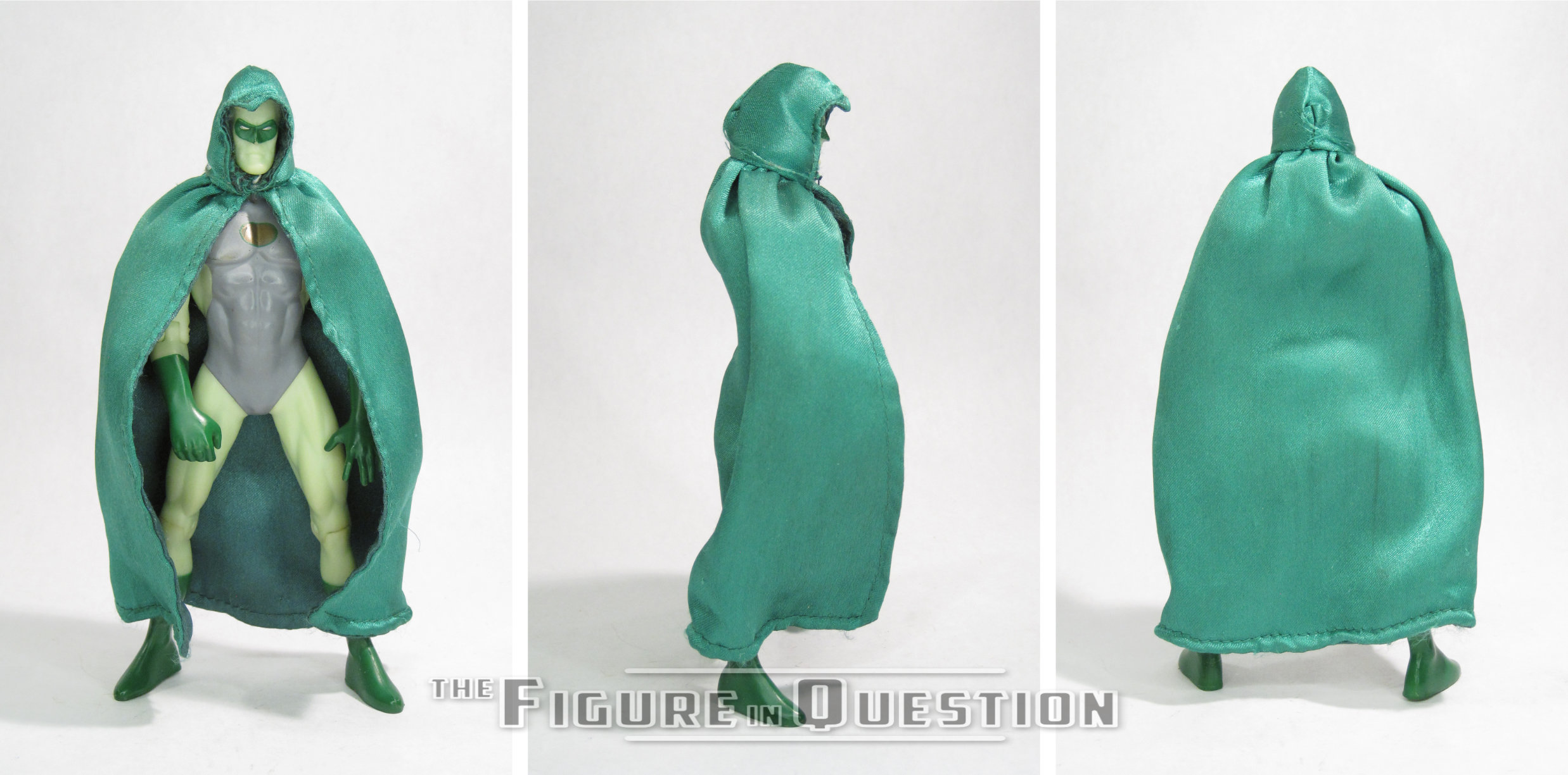
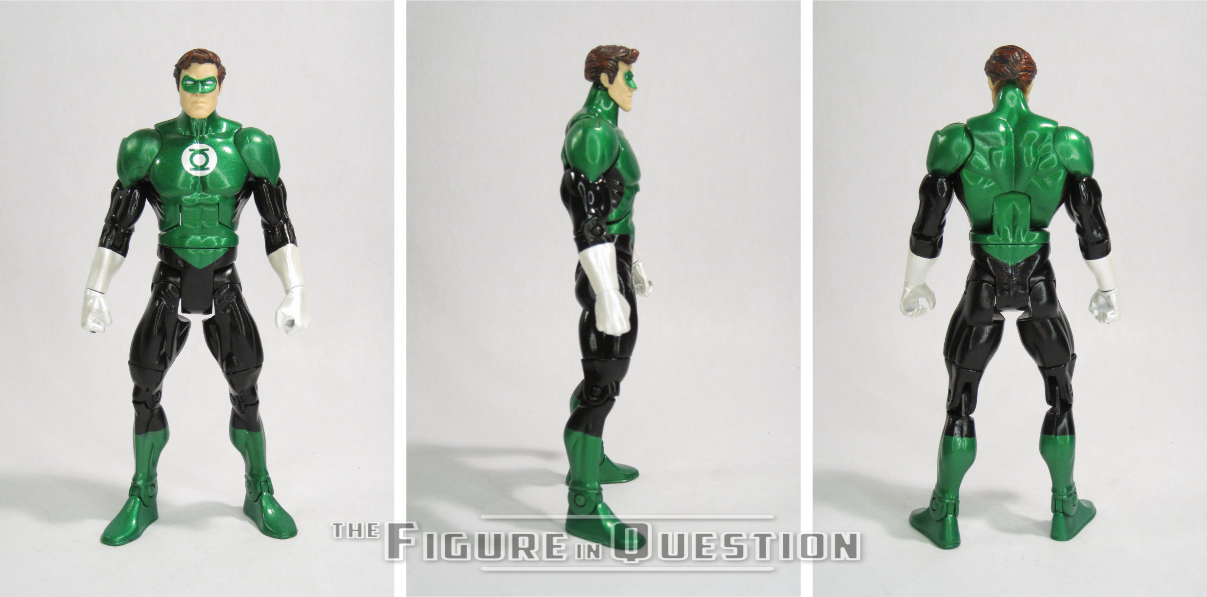
GREEN LANTERN
DC SUPER HEROES (TOY BIZ)
It’s Friday! We made it to Friday, you guys! High five! Good for us! Let’s celebrate with another Flashback Friday Figure Addendum. I know, it’s such a special occasion. Sticking to the usual, it *is* a Toy Biz figure, but in a break from the norms, it’s not Marvel, but DC. Let’s take another look at Green Lantern!
The now defunct toy company Toybiz is a name that is most commonly associated with making Marvel toys. This isn’t surprising, of course. They ended up bailing Marvel out of bankruptcy in the mid-90s, leading to them becoming a part of Marvel proper and thereby passing the name onto Marvel’s in-house toy making branch. However, their first major property was not Marvel. No, it was actually Marvel’s main competition, DC. See, when Super Powers ended, DC was looking to move the DC license elsewhere. They turned to a small upstart company by the name of Toybiz, who launched a line simply titled DC Superheroes. The line was pretty much the same scale as Kenner’s Super Powers, mostly because it was pretty much just a slightly lower budget version of Super Powers. The sculpts were just slightly tweaked and made out of inferior plastic. Needless to say, DC wasn’t thrilled by this offering, and after just two series, the rights reverted back to Kenner. Today, I’ll be taking a look at that line’s version of Green Lantern!
THE FIGURE ITSELF
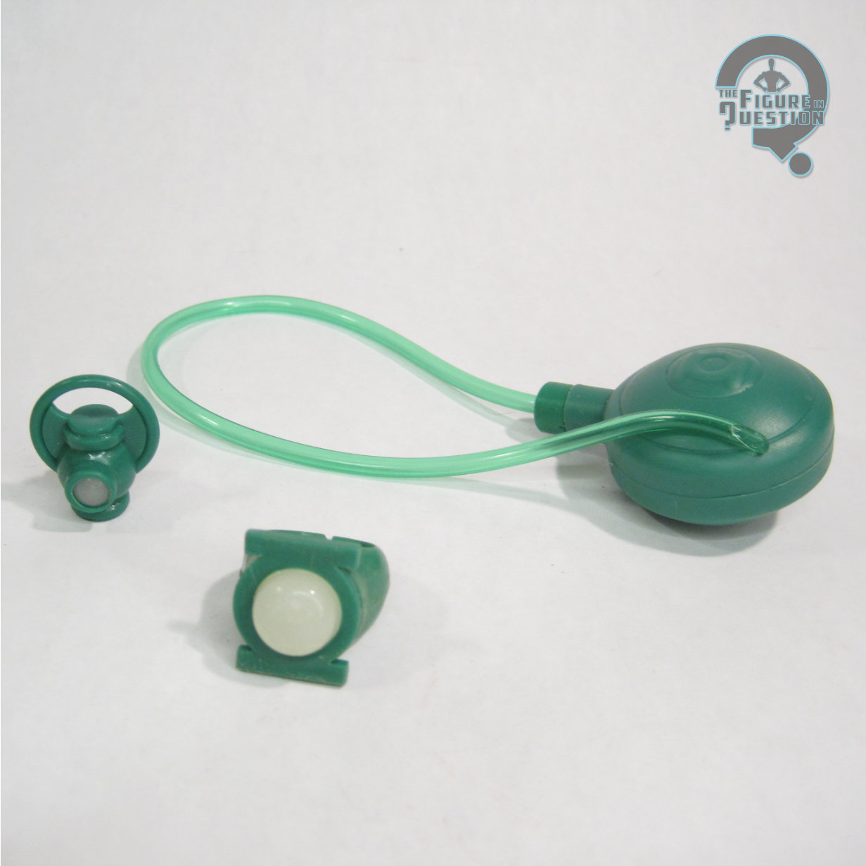
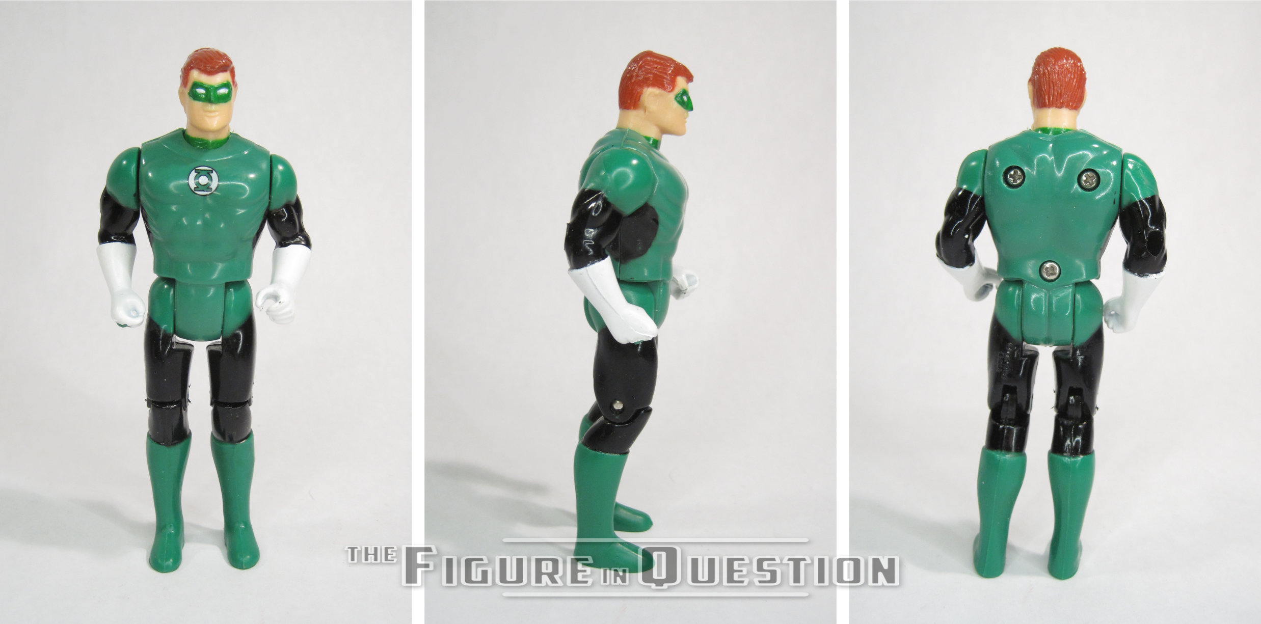
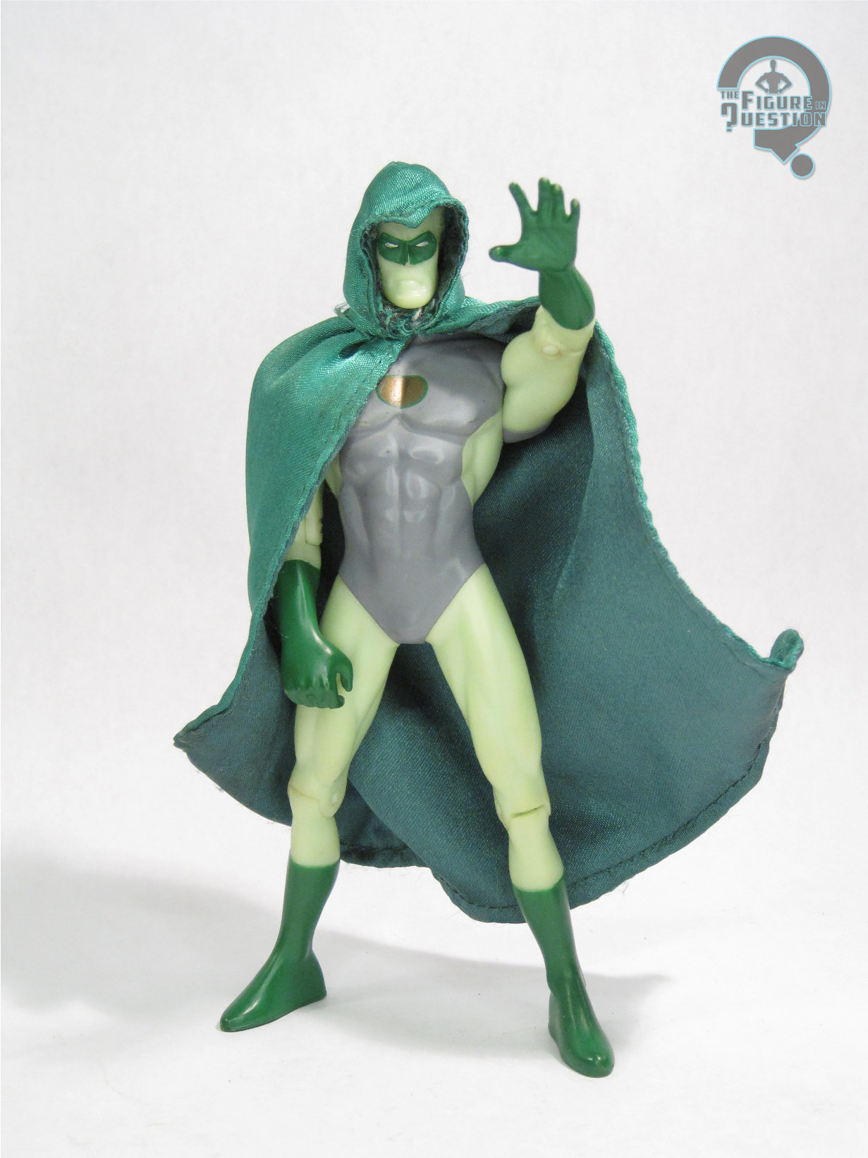
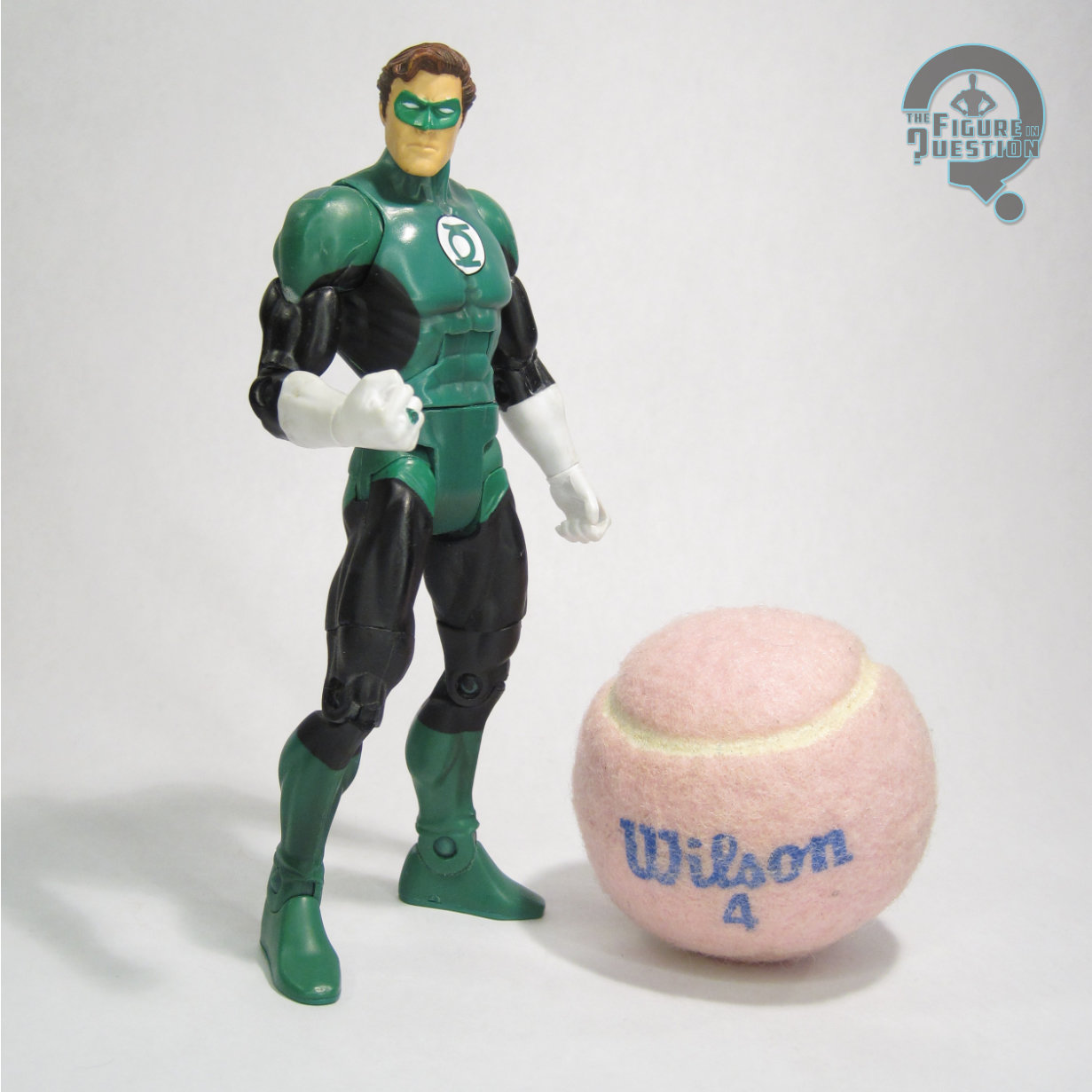
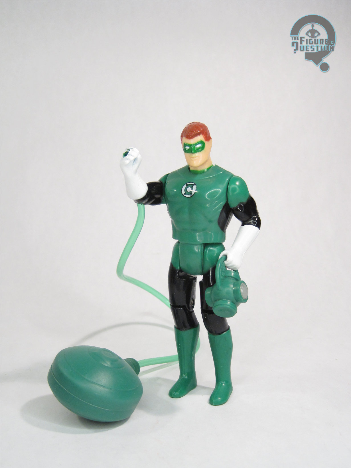
Green Lantern was released in the second series of Toy Biz’s DC Super Heroes line. The figure is just shy of 5 inches tall and he features 7 points of articulation. The second series is a little different from the first in that they actually featured new sculpts, rather than just retooled SP ones. So, for better or for worse, GL got a brand new sculpt, wholly unique from his SP counterpart. I suppose it’s not fair to compare the work of Kenner at their prime to that of Toybiz in their infancy, but the sculpt of the TB Green Lantern is not up to the quality of his predecessor. The sculpt is wide and oddly proportioned. He’s got these bent arms, which are honestly impressive, because I’m surprised he could bend arms that thick. The torso is huge and ill defined, and the legs lack any real detail. The head looks not unlike a papier-mâché head sculpted over a balloon, which is not a compliment. To top it all off, the joints are horrendously obvious, to the point where you have to question if they did that on purpose. I suppose if I were really trying to find something nice to say, I’d say he bears a passing resemblance to the Filmation version of the character, which isn’t a terrible thing. The paint is…well it’s there. It’s mostly cleanly applied, but other than that, there’s not much to be said of it. The figure is incredibly shiny, which really plays up the whole obvious toy angle. The figure came with an array to let him squirt water from his ring or something. I don’t know, I bought mine loose.
THE ME HALF OF THE EQUATION
This figure is another from the haul I picked up during the summer from the super cool Yesterday’s Fun. As an avid Green Lantern collector, it’s a figure I’d been looking to pick up for some time now, I’d just never gotten around to it. They had one for a reasonable price, so I went for it. Now I’m reminded of why I put off buying it. It’s not a terrible figure, it’s just overwhelmingly mediocre. It feels like one of those incredibly obvious toys they’d use on a TV show to more easily convey that it’s a toy. I just don’t quite know what they were thinking with this one, especially since it followed up figures that re-used the far superior Super Powers sculpts.
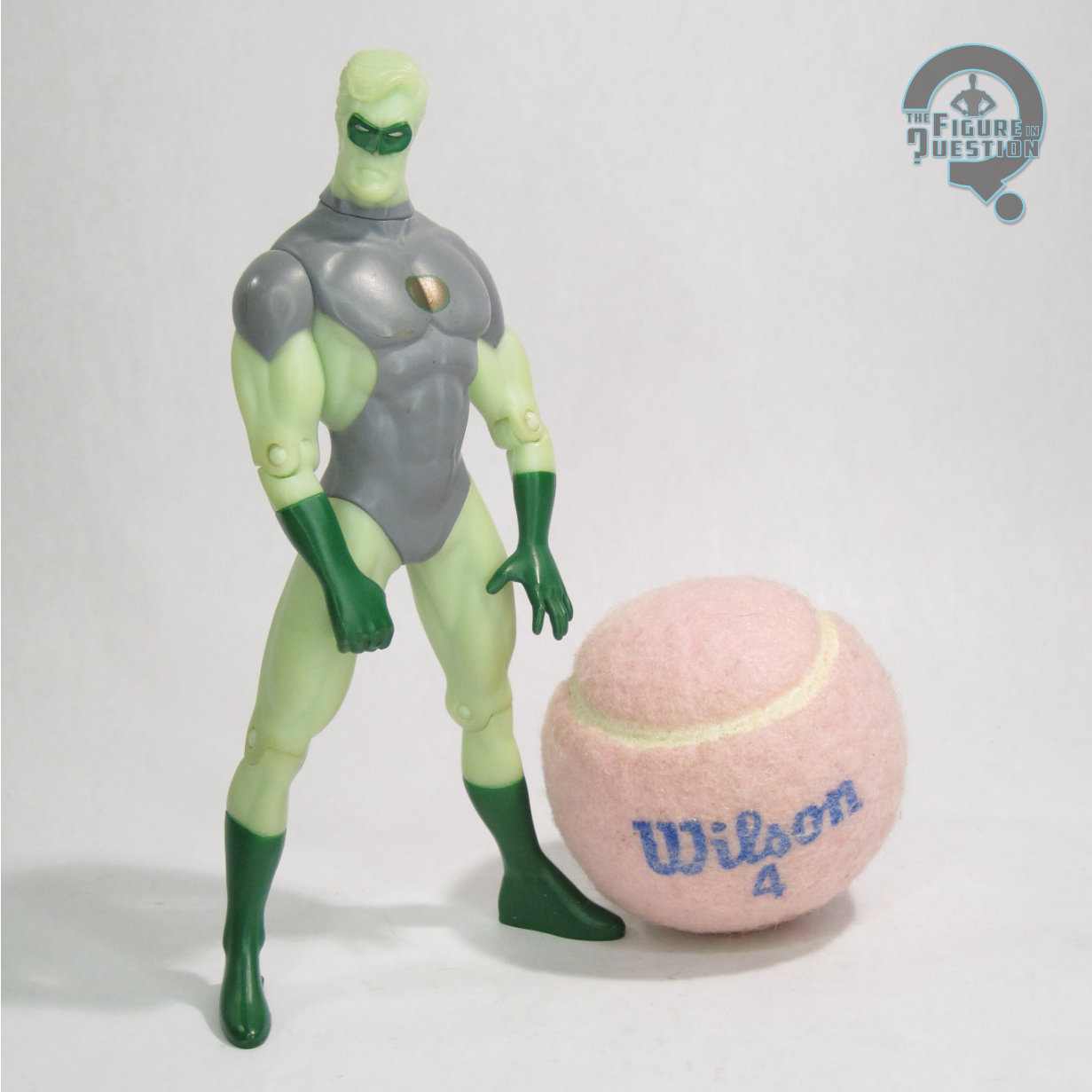
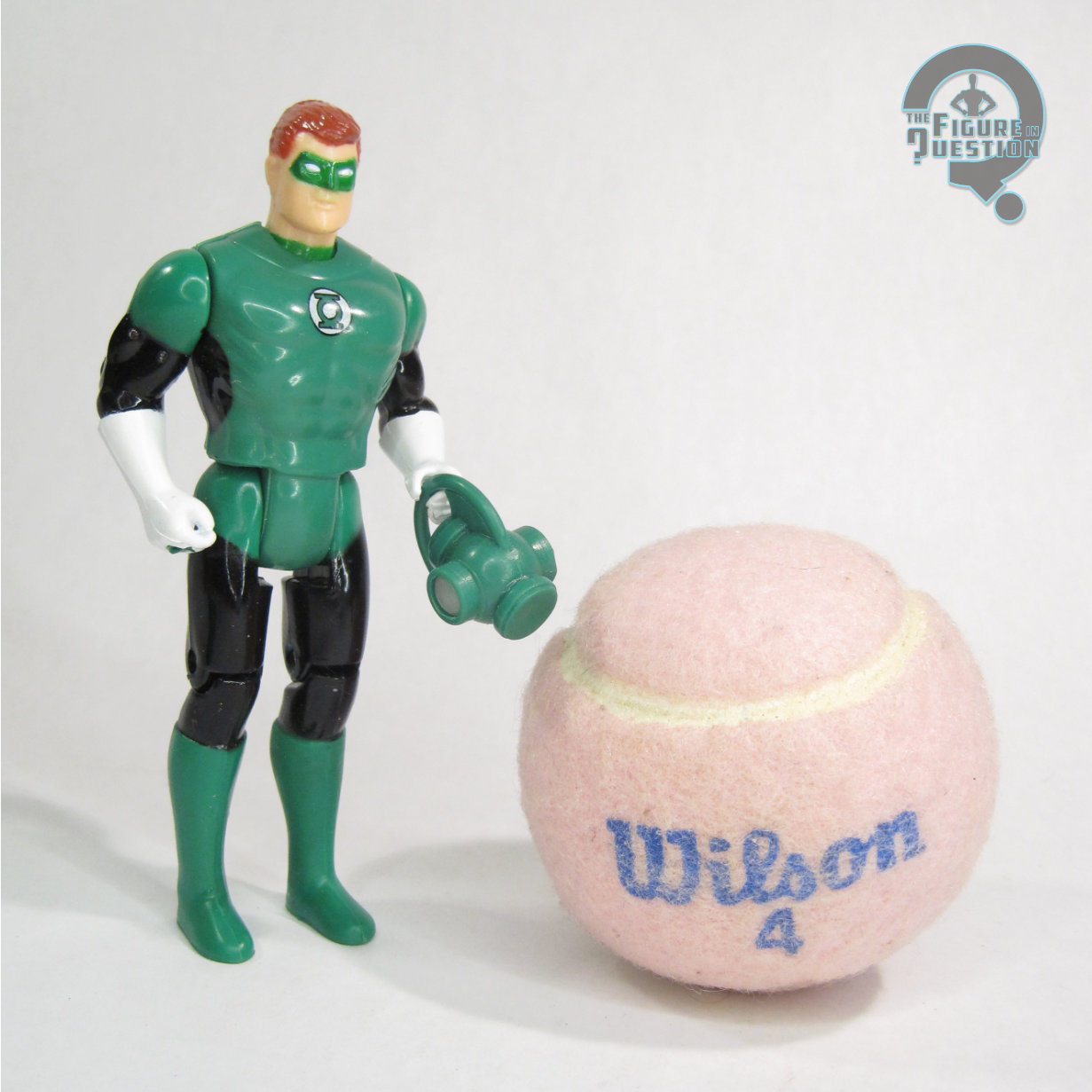 This review came from way back in my first year, from right at the tail end of it, in fact. While not the kindest review I’ve ever written, I can’t say I find it all that inaccurate. I do think the Filmation angle’s grown more on me over the years, which has made my appreciation of the figure a bit greater. In my original review, I was lacking all of the figure’s accessories, which I’ve subsequently replaced. He has the apparatus for squirting water, as mentioned in the original review, as well as a power battery and a wearable prop ring. The water squirting bit is very gimmicky, but fun, I suppose, and the other extras are actually pretty nice.