#2574: Invisible Man

INVISIBLE MAN

UNIVERSAL STUDIOS MONSTERS (SIDESHOW)

Universal Studios created and truly defined the horror film genre beginning in the 1920s.  In 1933, Universal released The Invisible Man, starring Claude Rains.  It was Rains’ unique speaking voice that won him the part and which was vital to portraying a man who, in a great portion of the film, would be invisible to the audience.  The role also assured Rains a place in Universal Studios’ unique and rich history of horror films.

The Invisible Man is the story of a mysterious doctor who, through his relentless experiments, discovers a serum that renders him invisible.  Covered by bandages and dark glasses, it is only his clothing that will reveal his form and presence.

Fleeing to a remote English village, the doctor tries to hide the effects of his serum.  However, the drug that was his ultimate discovery is slowly driving him to the brink of insanity, as he begins his spree of horror.”

It’s Halloween dear readers!  I know, given the general horror abounding in our everyday lives this past year, today is, perhaps, not as hard hitting as prior Halloweens.  But let’s try to be somewhat in the spirit, you guys!  Every Halloween, I like to review something appropriately spooky for the day.  In contrast to 6 of the 7 prior Halloween reviews, I’m not reviewing a Minimates set, though I’m still sticking with the overall Universal Monsters theme I’ve grown so accustomed to.  Sideshow Collectibles was kind of synonymous with Universal Monsters for a solid chunk of the ’00s.  While their main claim to fame for years has been their impressive output of 1/6 scale figures, their initial offerings were actually a little bit on the shorter side.  I’m looking at one of their earliest figures, the Invisible Man, today!

THE FIGURE ITSELF

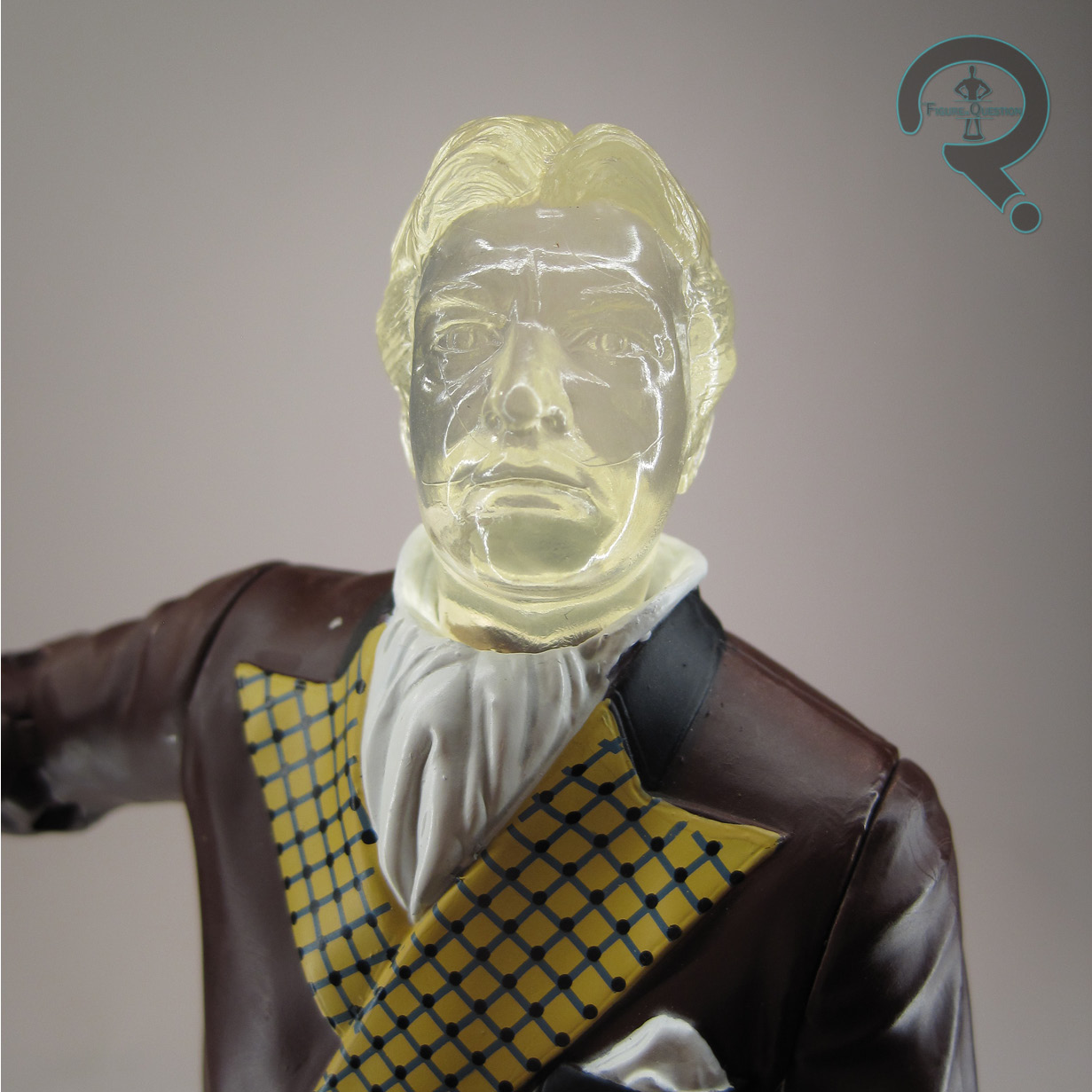
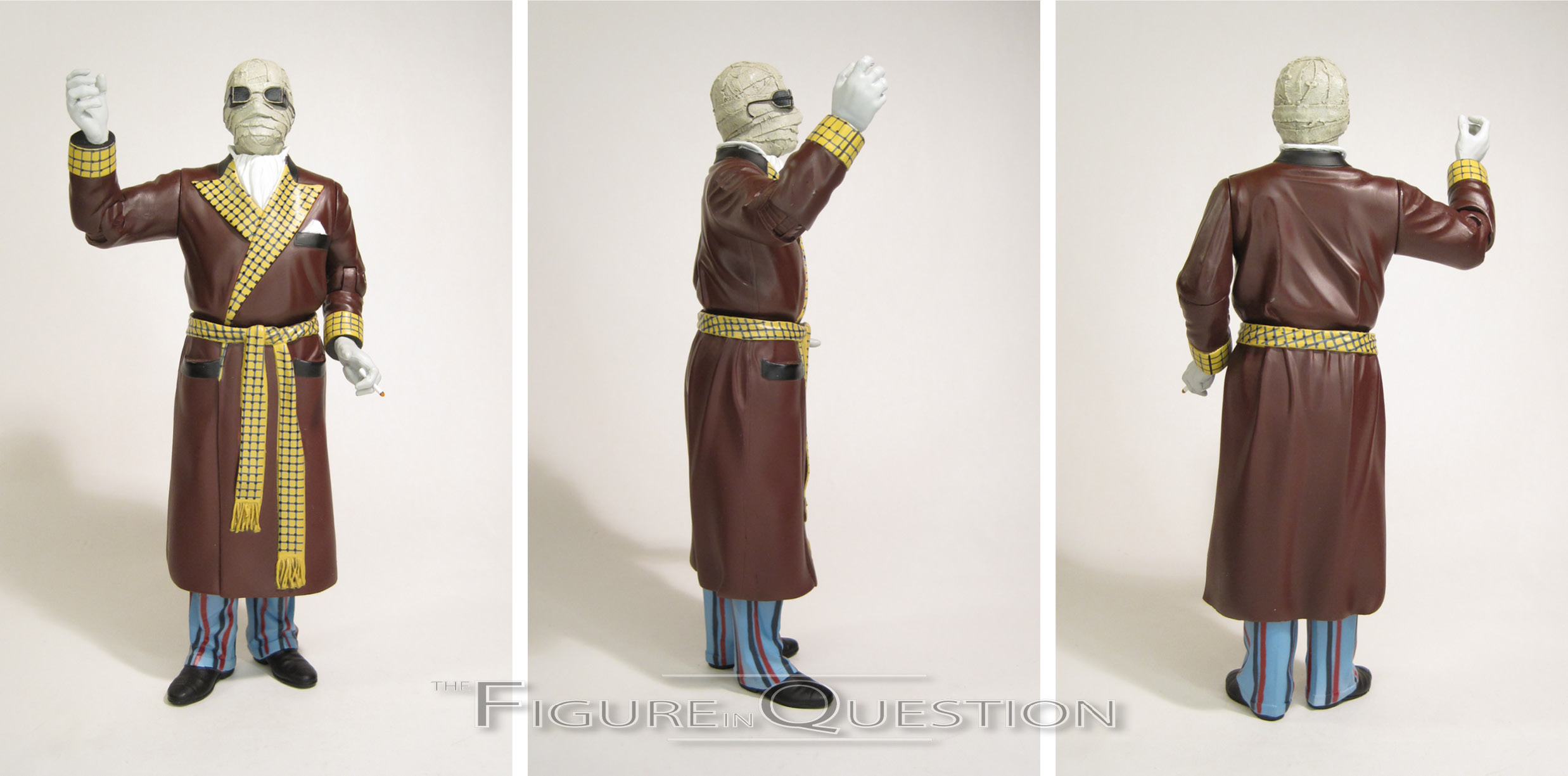
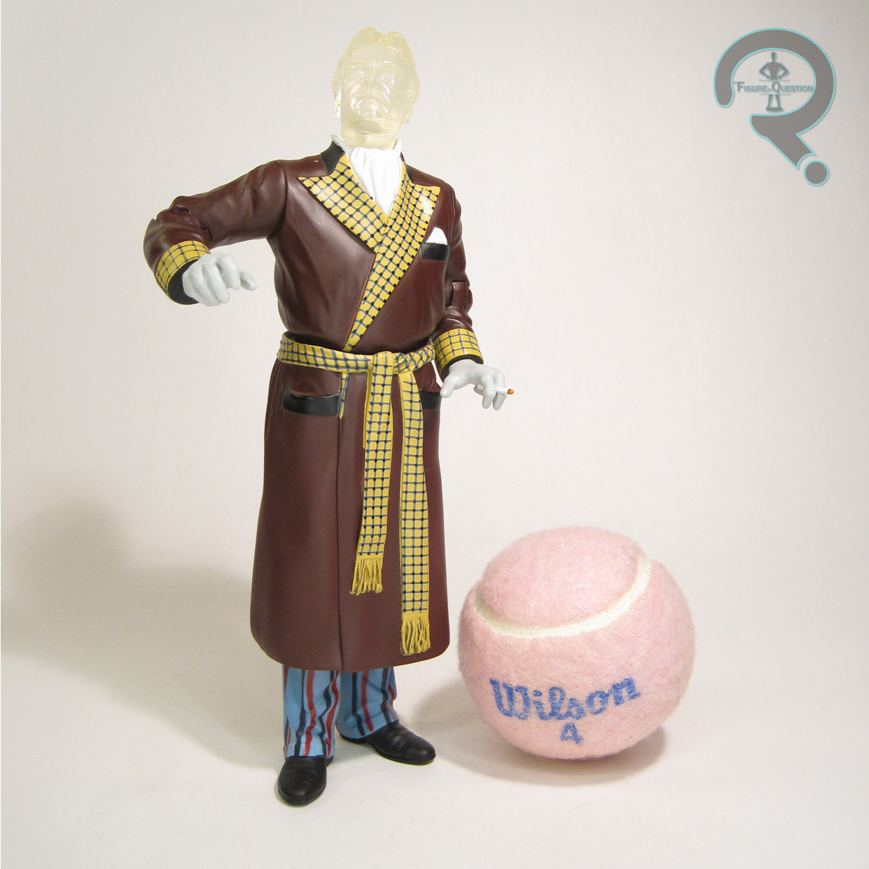
The Invisible Man was released in 2000 as part of Series 3 of Sideshow’s Universal Studios Monsters line.  Packed alongside the Hunchback and the Metaluna Mutant, the Invisible Man was definitely this assortment’s heavy hitter.  The figure stands 8 inches tall and he has 10 points of articulation.  The Invisible Man has a couple of looks over the course of the film, and this figure opts for the robed appearance.  It’s probably the most distinctive of his looks, and certainly makes for the sharpest looking figure.  The sculpt on this figure was unique to him, as was the case for most of the line.  He, again like the rest of the line, was designed more or less as a plastic statue that happened to have some joints for minor tweaking to the pose, rather than being a more traditional action figure.  The best range is definitely on the neck joint, though the elbow and shoulder joints do have a little bit of flex to them as well.  The mid-leg cut joints are pretty much exclusively for tweaking the balance of the figure to keep him standing, which isn’t too dynamic, but does help keep this guy standing.  Moving past the mobility of the figure, the actual quality on the sculpt is pretty good, if perhaps a touch un-even.  The best work is definitely on the head, which has a ton of texturing and pretty 
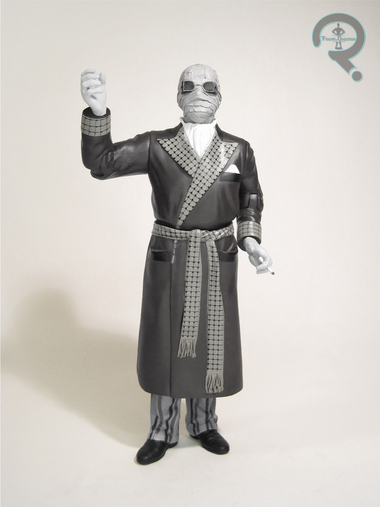
much perfectly recreates the masked appearance as seen in the film.  From the neck down, there’s markedly less texturing work.  It’s still a good recreation of his garb from the film, in a sharp and clean fashion.  It’s fairly striking looking, and honestly works out pretty well, even if the texturing is absent.  Given what he’s wearing, it actually looks pretty solid.  The figure’s paint work is pretty strong work as well.  Again, the head’s the best work, with a believably weathered set of bandages.  The rest of the figure is more basic coloring, but there’s some impressive work on the patterns on the robe and the pants.  As with the rest of the line, there was a “Silver Screen” edition, which did all of the paint work in a grey scale color scheme, matching the actual film presentation.  It’s a little more limited in its application, but it’s still a cool concept.  Regardless of version, the Invisible Man was packed with an unmasked head, three books, and a display stand.  The head’s a fascinating piece, because honestly it’s something that would be far more accurately recreated with just a removable head, but they went to the trouble of sculpting a really impressive Claude Rains likeness and then totally hiding it by leaving it translucent and unpainted.  That’s commitment right there.

THE ME HALF OF THE EQUATION

This line hit right in tandem with my first real stint with the Universal Monster movies, so I was very actively aware of it.  I only ever owned one figure from it, largely due to it being a pretty popular line, and me being an 8 year old without any money or transportation of his own.  I recall seeing this particular figure one time in a Toys R Us, while on a shopping trip with my Nana.  She was always pretty invested on pushing me into more conventional toys, so I ended up leaving the store with two X-Men: Movie figures instead (though, me being me, I went with Jean Grey and Professor X; yes, the girl and the guy in the wheel chair, which still raised some comment from Nana, who was really pushing for Wolverine and Magneto).  That marked the only time I saw this figure in person until earlier this month, when an entire set of this line came into All Time.  I snagged this guy for me right away, and I’m honestly really happy to finally have him.  He’s perhaps not the most action oriented piece, but he’s a really nice display piece.

Thanks to my sponsors at All Time Toys for setting me up with this guy for review.  If you’re looking for toys both old and new, please check out their website and their eBay storefront.

#2573: Mountain Trooper

MOUNTAIN TROOPER

STAR WARS: THE BLACK SERIES (HASBRO)

“Like all First Order Stormtroopers, specialized units of Batuu Mountain Troopers are trained from birth, growing up with unit designations instead of names and fed a steady diet of First Order propaganda to ensure absolute loyalty.”

There were no shortage of new Trooper variants introduced into Star Wars with the latest trilogy of films, and as such there’s also been no shortage of Trooper variant toys.  I’ve looked at a fair number of them here on the site, be they prominent in the films, or exceedingly minor.  What makes today’s particular Trooper different?  Near as anyone can tell, today’s focus the Mountain Trooper exists nowhere but in the toys, and only in a very exclusive set of them at that.  That’s actually pretty out there for a Star Wars concept, if you can believe it.

THE FIGURE ITSELF

The Mountain Trooper was originally added to the Black Series line in the Disney Parks-exclusive “The First Order” boxed set with Kylo Ren, Commander Pyre, and a Mouse Droid.  Like DJ R3X, he was given an outside of the parks release this year courtesy of Target’s exclusive “Trading Outpost” sub-line.  The figure stands about 6 inches tall and he has 27 points of articulation.  From a design stand point, there’s a lot of similar lineage here as we saw on the Scarif Troopers, as well as a little bit of Biker Scout thrown in, albeit with all of the elements somewhat updated to the slightly tweaked First Order aesthetic.  Ultimately, he ends up feeling like the First Order answer to the Biker Scouts, and I am totally on board with that.  Structurally, the figure uses the legs and hands of the Scarif-based troopers as a starting point.  Everything else is new, but it definitely all has a similar feel about it as the other Scarif figures in terms of how the construction is set-up.  The articulation scheme in particular sticks out as being pretty much the same.  This ultimately makes the figure a touch more restricted than some more recent troopers, especially when it comes to the elbow movement.  It’s really the only flaw with the figure.  Beyond that, the sculpt is a pretty impressive one, with a lot impressive and clean detail work.  The figure’s paint work is pretty solid.  The base colors are nice and strong, and the application is clean.  The figure also takes advantage of the printing technique to give the Trooper some pretty solid looking weathering.  The Mountain Trooper is packed with a single accessory: an all-new blaster rifle, which also sports some impressive weathering.

THE ME HALF OF THE EQUATION

My love of the Biker Scout and Scarif Trooper designs is no secret, so it’s probably not a terrible surprise that this guy intrigued me as soon as he was shown off. I hadn’t had the opportunity to procure the three pack, for obvious reasons, so when the Trading Outpost figures were announced, I was hopeful to find him.  Life’s been pretty jam-packed and hectic for me recently, so a few weeks ago Christian and Cheyenne forced me to take some time for myself and took me to Target to pick up a few things just for me.  I just so happened to walk back to the toy aisle right as the Outpost figures were going out, and boom, there this guy was.  He’s not anything amazingly special or anything like that, but he’s pretty fun, and I’m glad I was able to get a hold of him.

#2572: Red Ninja

RED NINJA

G.I. JOE: CLASSIFIED SERIES (HASBRO)

Oh, we’re just out of the frying pan and into the fire on G.I. Joe elements that Ethan’s not too big on, aren’t we?  That’s right, Ethan doesn’t really care for the Red Ninjas.  Let’s discuss.  The Red Ninjas were introduced in issue #21 of Marvel’s G.I. Joe comic, which is the famous “Silent Interlude,” the story that also introduced Storm Shadow, solidified Snake Eyes as a fan favorite, and hinted at a possible connection between the two.  Storm Shadow was, of course, introduced into the toy line the same year as “Silent Interlude’s” publication, but the Red Ninjas were not part of the line, since they were initially just rather generic looking ninjas meant to serve as Storm Shadow’s back-up.  They wouldn’t join the toy line proper until 1993, under the Ninja Force banner, and with a rather different look.  It wouldn’t be until the 2000s that we would get the more classic attire in toy form.  They then went on the be a key piece of one of the most infuriatingly repetitive sequences in G.I. Joe: Retaliation, and also got some more toys along the way.  And now they’re in the Classified Series line-up, which I guess isn’t unreasonable.  I guess.

THE FIGURE ITSELF

The Red Ninja is figure 08 in the Classified Series line-up, capping off the second main release series of figures.  Given how “core cast” the figures have been so far, he’s slightly obscure by comparison, but if you factor in that the Snake Eyes movie was supposed to be hitting this year, likely right around when this particular assortment would have arrived on shelves, it makes a bit more sense.  The figure stands just over 6 inches tall and he has 37 points of articulation.  The original Red Ninja design in the comics was a rather basic one, essentially being standard ninja garb, but in red.  Nothing thrilling or anything, but it’s a pretty straight forward look.  When it comes to toy designs, they’ve always been a little inconsistent.  The v1 figure’s a garish ’90s monstrosity, and subsequent releases have generally stuck to just being repaints of whatever Storm Shadow mold is available at the moment.  This one opts to take the basic Ninja look and inject it with, like, steroids, or something.  Remember how I was bringing up the whole “over designing” thing on Cobra Commander?  Yeah, I think it’s worse here.  There’s just too much going on with this guy.  He’s got a hood.  He’s got a collar.  He’s got a faceplate.  He’s got shoulder pads. He’s got gear strapped onto gear.  Where the Cobra Trooper took a lot of piece meal elements and made them flow into something that felt cohesive, and added a bit of customization, there is neither customization nor cohesiveness with this guy.  He’s just got…stuff everywhere.  At his core, this figure uses the same body as Snake Eyes, and boy did I love that Snake Eyes mold.  Unfortunately, one of the strengths of the Snake Eyes mold was its sleekness and posablitity.  This figure throws a bunch of stuff on top of the body, which ruins both the sleekness and the posability, and I don’t really feel that the appearance of the stuff they threw on top of him really justified the sacrifices they made.  Posing the figure for the photos was a bit of a chore, if I’m honest, and that’s not what you want out of a toy.  The paint’s not too terrible, I suppose.  There’s a few different shades of red going on, but I think they come together all right, and the pupil-less white eyes are appropriately eerie.  In terms of accessories, he’s at least well-armed, with two swords, two Sais, two Kama, and two axes, all borrowed from the Pulse-exclusive Snake Eyes figure.

THE ME HALF OF THE EQUATION

My enthusiasm for the Red Ninja has never been all that high.  Honestly, I think armies of faceless ninjas are a little over done as a whole, and it’s hard to dissuade me of that.  However, I am still a fan of a good action figure, and figures such as the Articulated Icons Basic Red Ninja did just that.  And perhaps that figure did things a little too well, I suppose, because this guy just really doesn’t click with me.  He’s one of those figures that feels lesser than the sum of his parts, because there are certainly elements that I like, but I just don’t enjoy the final product all that much.  In fact, I so don’t like the final product that I didn’t even opt to keep this one I’m reviewing, which is actually now in Max’s possession.  That’s just how it is some times, I guess.  With this guy out of the way, here’s to some slightly more exciting army builders.

Thanks to my sponsors over at All Time Toys for setting me up with this figure to review.  If you’re looking for cool toys both old and new, please check out their website and their eBay storefront.

#2571: Gung-Ho

GUNG-HO

G.I. JOE: CLASSIFIED SERIES (HASBRO)

♫Ooooooooh, every party has a pooper, that’s why we invited Gung-Ho!♫…..Sorry, does that seem harsh?  ‘Cause, I’m about to be real with y’all, I…uh…I don’t really care for Gung-Ho.  I get that he’s one of the core characters to a lot of people, I do, really, but I’ve just really never liked him.  I began my dislike of him in 2002, when I was first discovering 3 3/4 inch Joes, and I was forced to buy a Gung-Ho to get the Destro figure that I actually wanted…and then it pretty much stopped there, because I didn’t really like Gung-Ho, so I just never bought one again.  Well, until now, that is.  Look, I want to support this new G.I. Joe line, and I suppose I don’t have the seething hatred of the guy that my 10-year-old self did.

THE FIGURE ITSELF

Gung-Ho is figure 07 in Hasbro’s G.I. Joe Classified Series, the second figure numerically in the second main release assortment of the line.  The figure stands 6 1/2 inches tall and he has 36 points of articulation.  Design-wise, Gung-Ho’s not a terribly radical departure from his original v1 design…at least as a whole.  He’s got the same basic look to him, but some of the more real-world military elements are a bit different this time.  Notably, his hat isn’t quite shaped the same way as a proper Marine cap would be, which has some caused a bit of a stir amongst the purists in the audience.  As someone who’s first introduction to the character was the 2002 version, who also had a more generic hat, I didn’t realize it was that big an issue.  Ultimately, the rest of his get-up’s never been much for regulation anyway, but different strokes and all that.  The other notable adjustment is giving his vest a more sci-fi make-over, which matches with the adjustments made to other characters.  In terms of construction, Gung-Ho marks another bit of parts re-use for the line.  In a similar fashion to Beach Head making use of some of Duke’s parts, Gung-Ho is built on the same core body as Roadblock.  He gets a new head, of course, as well as a new left knee (sans knee pad), and new add-ons for his hat, vest, wrist and shoulder guards, and a thigh piece.  The wrist and thigh add-ons previously were seen on the Cobra Island Roadblock variant, though they were designed for this guy.  The head and hat pieces are definitely the best work on the figure.  Gung-Ho’s got a pretty distinctive look, and it’s well translated to this figure.  The hat sits tight on the head, and you could be forgiven for not realizing it’s actually a separate piece.  Removing it reveals an adorable little patch of hair at the very top of Gung-Ho’s head, which is actually a really fun little touch.  Gung-Ho’s paint work is pretty decent.  It’s fairly subdued, in keeping a bit more with the more recent renditions of his design.  It’s certainly not the turquoise of his original figure.  Another notable change-up to his design occurs under this section; Gung-Ho’s tattoo has classically been a slight take off of the Marine insignia (although not an exact match, since that’s trademarked), but for this release, it goes a bit further away from that source, presumably to further avoid any trademark issues.  Gung-Ho continues the line’s trend towards impressive accessory selections, with a backpack and three different guns: a shotgun, an assault rifle, and a grenade launcher looking thing.  The back pack can carry two of the guns at a time, which is pretty fun, though they do have a tendency to pop out of place somewhat easily.

THE ME HALF OF THE EQUATION

As I noted in my intro, I’m not much of a Gung-Ho fan.  In fact, I dislike him so much that when I drew up a series of G.I. Joe parody strips while I was in middle school, I ever so eloquently named his parody match “Dung-Ho”.  I know, I’m very clever.  All of this is to say that I wasn’t super thrilled by the prospect of this guy in the new line, but once I saw the prototype, I was actually somewhat intrigued.  He changes up some design elements, much like many of the figures in this line, but I think it works for the overall figure, and he’s got a lot of cool stuff going on.

Thanks to my sponsors over at All Time Toys for setting me up with this figure to review.  If you’re looking for cool toys both old and new, please check out their website and their eBay storefront.

#2570: Cobra Commander

COBRA COMMANDER

G.I. JOE: CLASSIFIED SERIES (HASBRO)

Since it was re-branded in the ’80s, G.I. Joe has been as much about the evil forces of Cobra as it has about the titular team of heroes.  The very first year of the line saw (as a mail away, anyway), the introduction of one of the most distinctive faces of the franchise…despite his lack of, you know, an actual face, Cobra Commander, the faceless leader to the faceless goons!  It’s really not much of a Joe line without him at this point, so it comes as little shock that he’s a pretty early addition to Hasbro’s recent relaunch…with three separate versions, no less.  Today, I’m looking at the only version I have so far, the most standard-est of the bunch!

THE FIGURE ITSELF

Cobra Commander is figure 06 in the G.I. Joe: Classified Series line-up, and heads up the second main release assortment of the line, which wound up being the third assortment at retail if you count the Target stuff…look, let’s not think about it too much, okay?  The figure stands 6 inches tall and he has 31 points of articulation.  He’s a little bit more restricted than some of the other figures in the line, missing out on the drop hips and the ball jointed waist in particular.  While it’s a little bit of a bummer, it’s not the end of the world, since the Commander’s rarely as agile as a lot of the other characters in the franchise, and what he has still allows him to pull of a lot of really good poses for the character.  Cobra Commander’s design is definitely a take on his original V1 battle-helmeted design, which has always been my preferred lineage for redesigns of the Commander.  This figure follows in the footsteps of both the Valor Vs Venom and Resolute takes on this particular look, taking the slightly more utilitarian design of the original figure and injecting some of the regal flair that would become so integral to the character.  On the whole, I think the design works, but I’ll also freely admit that there’s a degree of overdesigning going on with this guy, especially when compared to others in the line.  There are areas where I think simplifying things just a touch would help sell the design.  In particular, I think there’s just a little too much going on with the gloves, and the shoulder pad/half-cape also seems a little bit too involved.  I think this guy’s similarities to the Resolute version might be hurting him in that regard, because that design’s pretty cleanly handled, and is kind of the gold standard for Cobra Commander re-designs.  This one is quite far from being bad, mind you, and I do still really like a lot about it.  The paint work on this guy takes the Commander’s usual color scheme and slightly dials it back, going for an overall more subdued appearance, at least as far as the blues are considered.  As with the overall design on the sculpt, there’s perhaps a little too much going on with some of the color work, but as a whole it works, and it’s certainly got the appropriate vibe behind it.  Cobra Commander is packed with two sets of hands, one pointing/fist combo, and one gripping/open gesture combo, as well as a flintlock-style gun and a small sword.  The hands are definitely great for getting some expressive poses out of him, but I find the weapons once again fall victim to the dreaded over designing.

THE ME HALF OF THE EQUATION

I’m all-in on this new Joe line, or at the very least all-in on all of the standard release stuff, so there was no way I was missing out on the Commander.  I was planning to snag him through All Time, but ended up getting him just a bit earlier courtesy of Max, who snagged the standard early and then decided to upgrade to the PulseCon exclusive version.  While I see a few more flaws on this guy than with the prior figures, he’s still a solid figure.  Now I have to debate about whether I want the two repaints.

#2569: Cobra Trooper

COBRA TROOPER

G.I. JOE: CLASSIFIED SERIES (HASBRO)

So, how ’bout that new G.I. Joe line?  Aren’t you all really glad that everything from it’s so easy to get at regular pricing and not getting scalped at the first chance pretty much everywhere?  Oh, right, that’s…that’s just how it is in my dreams.  The real world is far more sad and painful.  What a shame.  Well, despite the relative insanity that is this line and its distribution, here’s another new review, of one of those insanely hard to get items, nonetheless.  Please don’t hurt me.

THE FIGURE ITSELF

The Cobra Trooper is figure 12 in the Classified Series line-up, making him numerically the last of the “Special Missions: Cobra Island” singles.  As with that whole sub-line, he’s a Target exclusive, but as Pulse Con confirmed, there’s a slightly tweaked version of this guy coming out in the main line in a few months.  The figure stands 6 inches tall and he has 37 points of articulation.  Like a lot of the figures coming out of this line, the Cobra Trooper’s design has its roots in the v1 figure design.  That said, this one works in a lot more modernized elements, and even grabs from a few later incarnations (the v3 from ’06 comes to mind, given the full balaclava under the helmet).  The final assembled product feels very v1-esque, but there’s a lot of layers going on there.  As with pretty much everything from the line so far, it’s a truly impressive sculpt, with a ton of detail work and careful thought being put into how it all assembles.  I really dig how much work goes into stuff like the mask, most of which is never going to be seen when it’s under the helmet.  This is definitely one of the line’s most impressive sculpts (though I think Beach Head still edges him out in my book).  The paint work is about what you’d expect from Cobra forces.  There’s a lot of blue and black, with just a hint of red.  This version in particular has more black than usual, which doesn’t look bad, but is certainly different.  This particular version of the Cobra Trooper has quite the accessory selection, with the removable helmet, a set of goggles, a removable arm band to give him a higher rank, standard and sniper rifles, two pistols, and a knife.  Everything can actually be stored on the figure at once, which is quite impressive, especially since it doesn’t require him to be holding one of the rifles like most Joes fall back on.  I dig the customization angle that all of these parts give the figure for sure, though I myself am drawn to a rather “standard” trooper set up.

THE ME HALF OF THE EQUATION

I’ve been able to pull some favors to get the rest of the Target-exclusive stuff for this line, but this Trooper in particular has been pretty much a ghost around here since before these figures dropped.  This one’s actually not mine, and is instead Max’s.  He was able to procure one through some of his connections, and even offered to let me have it outright, but I was content just to get to do the review.  He’s a fun figure, but one that I see a lot of people hyping up way too much and ultimately being let-down by.  I’m planning to wait for the standard release myself, but it was nice to get a little preview of how that version should turn out.

#2568: R2-D2

R2-D2

STAR WARS: POWER OF THE FORCE II (KENNER)

Remember last week’s Speeder Bike review, where I mentioned setting up an entirely different review completely by accident and getting further than I’d like to admit into it before realizing my mistake?  Wanna see what I started reviewing?  What could possibly be more exciting than that edge of your seat Speeder Bike review?  Gotta be honest, dear reader, it’s not actually that much more exciting, because it’s just another R2 variant.  It’s not like there were a metric ton of those or anything.  But, my subconscious was apparently more on board with this review than last week’s.  Let’s see how it did, I suppose.

THE FIGURE ITSELF

R2-D2 was part of the 1997 “Electronic Power F/X” sub line of Kenner’s Power of the Force line.  The main purpose of the line was to replicate some of the cool battles from the original trilogy with all of their cool effects….and then there was also this somewhat mundane “R2 while he was wandering through the desert in that one scene in the first movie” figure.  People were just lining up for this one, let me tell you.  The core R2 figure isn’t anything super special.  He has a few features that are new, but also trades out a lot of stuff that had become standard.  He’s about 3 inches tall and has a whopping 2 points of articulation, at the top of his two main legs.  He lacks the ankle joints of later figures, of course, but also loses the up and down movement on his third leg, as well as lacking the ability to move his head dome.  These changes are due to his main “F/X feature”, which is a lights and sounds gimmick.  Press the center of his body, and his eye lights up and there are some beeps to go along with it.  It’s okay, but it’s hard to say it’s worth losing all of the posability.  Additionally, it results in some loss of crispness on some of the sculpted details, which is another iffy trade off.  His paint work is actually not terrible.  He’s appropriately grimy for having been rolling through the desert, and he even has the more proper flat silver that most figures at this point lacked.  Of course, it might be an unexpected side effect of the more single-piece construction, I suppose.  All of the Power F/X figures included a rather elaborate base piece, which added to their features.  R2’s is of some rocky Tatooine terrain.  The piece has an arm built into the base, which has a magnet built into the end of it, which catches R2 by the piece of metal in his third leg’s foot.  This allows R2 to be moved back and forth somewhat seamlessly, although it doesn’t work overly consistently.  It’s kind of nifty, though.

THE ME HALF OF THE EQUATION

Unsurprisingly, R2 was a figure that excited me all that much as a kid, and was subseqently one that I never had much drive to own.  I had every other Power F/X figure before this one…so, of course this is the first one I’m reviewing, right?  Honestly, that’s because he was a rather recent addition (picked up at the same time as the bike, in fact), which made him rather easy to grab and review quickly.  Yes, sometimes what I’m reviewing is based on me being lazy.  I’m sure it shocks you to your core to find this out.

#2567: Gladiator

GLADIATOR

X-MEN (TOY BIZ)

“The most powerful member of the Shi’ar Imperial Guard, the alien super hero known as Gladiator is also its most devoted protector! Possessing nearly unlimited strength, virtual invulnerability, and a bevy of other abilities, Gladiator uses his powers on behalf of the throne of the Shi’ar Empire – no matter who may occupy it!”

The similarities between Marvel’s Shi’ar Imperial Guard and DC’s Legion of Super Heroes aren’t exactly a secret amongst the fans, and this especially comes to a head with the Imperial Guard’s leader, Kallark, aka Gladiator, who is a pretty thinly veiled take on Superman.  The differences are, however, enough to not actually cross any legal boundaries, making Gladiator a somewhat recurring character when it comes to action feature treatment.  Today, let’s have a look at his very first.

THE FIGURE ITSELF

Gladiator is part of the Phoenix Saga series of Toy Biz’s X-Men line, released in 1994 to tie-in with the cartoon’s adaptation of the story from the comics.  Gladiator gets some decent focus in the story, making him a pretty sensible choice for inclusion (certainly a more logical choice than the other Guardsman in the assortment, Warstar), and he helped to sort of round out all of the factions present in the story.  The figure stands a little over 5 inches tall and he has 10 points of articulation.  Gladiator’s sculpt was quite a bulked up affair, befitting most renditions of the character.  He seems to have misplaced most of his neck somewhere, and his arms seem a touch long, but beyond that the proportions aren’t bad.  This body wound up getting reworked to remove the Gladiator-specific elements and was re-used for Toy Biz’s Hercules tie-in line, before making its way back to Marvel in the Marvel Gold line, where it was used for Moon Knight, among others.  The cape’s a separate piece, though, like Dr. Doom, the chain for the clasp is actually sculpted on the main figure, rather than being a part of the cape proper.  The cape sits a little high on the figure, and also has a hole in it to facilitate the action feature, but it’s overall not a bad piece.  The paint work on Gladiator is pretty basic, but also pretty decent.  It’s appropriately bright and bold.  His skin tone seems a touch on the light side, but that’s pretty minor.  Gladiator’s initial short card release didn’t have any accessories, but his long card release added Stryfe’s mace and Silver Samurai’s sword for…reasons?  They had all that space to fill, I guess.  Both versions got the same “Super Strength Power Punch” action feature, which causes his right arm to jut forward when the button on his back is pressed.

THE ME HALF OF THE EQUATION

Gladiator is the only of the Phoenix Saga figures I didn’t have growing up.  I couldn’t tell you why, because I was a big fan of the whole saga, and I’ve always liked Gladiator as a character.  I guess I just never found him at the right time…I mean, until I did, obviously, since I’m, you know, reviewing the figure and all.  I snagged him very recently, as he was part of a collection of X-Men figures that came through All Time.  He’s a somewhat goofy figure, but I’m glad to have finally finished up the Phoenix set after all these years.

#2566: Batman – Defender

BATMAN — DEFENDER

BATMAN: THE CAPED CRUSADER (SPIN MASTER)

Remember earlier in this week when I was talking about the DC line’s wacky variant coverage?  Remember the thing about getting the variant before getting the standard?  And also the thing with the gold?  Great, that makes writing this intro a bit easier for me.  This time it’s Batman.  Here we go.

THE FIGURE ITSELF

Gold Batman, who is apparently called “Batman Defender,” is part of the very first series of the Batman: The Caped Crusader line.  He ups that “rare” game that was going on with Wonder Woman to a “Super Rare” game…again, whatever that means.  I’ve got this one and not the standard one, so I don’t know about the relative rarity.  The figure stands 3 3/4 inches tall and he has 17 points of articulation.  There are currently three Batman sculpts floating around in this line, and this figure makes use of the most “standard” of the the three.  It’s based on the Rebirth design for his costume, which is a pretty darn solid Batman design, all things considered.  The sculpt is pretty much on par with the rest of the Spin Master DC stuff, so it’s a little bit bulked up when compared to the comics depiction, but honestly, it has a pretty good basic Batman feel to it.  The costume details are well rendered, and I appreciate the level of work that’s gone into it.  The head in particular has a nice classic Batman vibe, which I can definitely dig.  He’s got a cloth cape, and like I noted with Superman and Shazam, it’s not a terribly impressive piece, but it’s also not like it’s particularly bad either.  They made a point of leaving a hole in it that corresponds with the port on his back, so at least he can make use of all of the gear from other figures, if you’re so inclined.  While the Gold Wonder Woman was totally devoid of paint, Batman mixes things up slightly.  He’s got his black insignia, white for his eyes, and flesh tone for his lower face, indicating that this is supposed to be a costume, I guess.  It’s different from all of the other gold variants, but it was also the first one, so I guess they hadn’t quite made up their minds fully on the concept yet.  I think I might have preferred the straight gold, but this isn’t bad either.  Gold Batman includes three blind packed accessories: a grapple in neon green, chest armor in black, and a shield in yellow.  It’s a shame they didn’t go for the all gold pieces like with Wonder Woman.  I feel that would have inclined me to use them, instead of just tossing them to the side.

THE ME HALF OF THE EQUATION

I liked the Wonder Woman a fair bit, and I definitely want the Gold Superman, so I figured I might as well grab a Gold Batman too.  The one from the corresponding series is built on the armored body, which I wasn’t quite as big on, but fortunately for me, Max was on board with trading out that one for this one, and passing this one along to me.  It’s a little weird that they changed the gimmick mid-run on these guys, but I still like this figure.  I guess I should pick up a Batman in standard colors now.

#2565: Killer Moth

KILLER MOTH

BATMAN: THE CAPED CRUSADER (SPIN MASTER)

So far, Spin Master’s DC product has been pretty heavy hitter-centric (though, for that matter, so has McFarlane’s), which is pretty understandable, given their more mass-release driven audience.  That said, it’s not *all* heavy hitters.  There are a few lower tier characters thrown in, to toss some of us more hardcore fans a bit of a bone.  One such character is c-list Batman foe the Killer Moth, who is today’s focus figure.  To quote Max, “WEEEEE HE’S A MOTH BOI!!!!!!!”

THE FIGURE ITSELF

Killer Moth is part of the second assortment of Spin Master’s Batman: The Caped Crusader toyline.  He’s one of two “new” figures in the line-up, the other being Batwoman.  Killer Moth has had a few rather differing appearances over the years; this figure’s main inspiration is clearly his original ’60s get-up, in all its garish glory, though it seems to have gotten a bit of an update.  The figure stands about 3 3/4 inches tall and he has 17 points of articulation.  On my figure, the neck joint is rather stuck, so I haven’t been able to really get any motion out of it, for fear of tearing the ball clear off.  Hopefully that’s not a wide spread issue.  Killer Moth gets an all-new sculpt, which is just downright shocking, because typically the main thing he’s got going for him is the ease of building him on a buck body.  This one, however, has quite a few character specific elements built into it.  Sculpturally, he looks to have taken a lot of influence from Batman: Bad Blood‘s incarnation of the character.  It’s a sleek and modern update on the classic jumpsuit with a harness and a helmet.  This one feels a little more cohesive and put together.  I definitely dig it.  The color scheme marks the major change-up from that design.  In the film, it’s mostly all black, but this figure gives Moth the classic color scheme I mentioned above.  Why’s a moth guy orange, green, and purple?  No idea, but I sure do love it.  The application’s all pretty solid, and the whole thing just really works.  Killer Moth’s blind-packed accessories include a gun in neon green, a briefcase in silver, and a chest piece, which mine does not have.  I’m pretty sure it did have that piece originally, but by the time it came to me, said piece was gone.

THE ME HALF OF THE EQUATION

I saw this guy and Batwoman when they’re promo shots got leaked early in the year.  I was definitely down for him right away, but finding him was the main obstacle there.  Max got one pretty quickly, and ultimately ended up passing along his to me shortly thereafter (though the chest piece appears to have not been passed along…).  This guy’s definitely another really fun figure, and I look forward to some more oddball characters when we get the chance.