#0993: Nostromo Crew Minimates

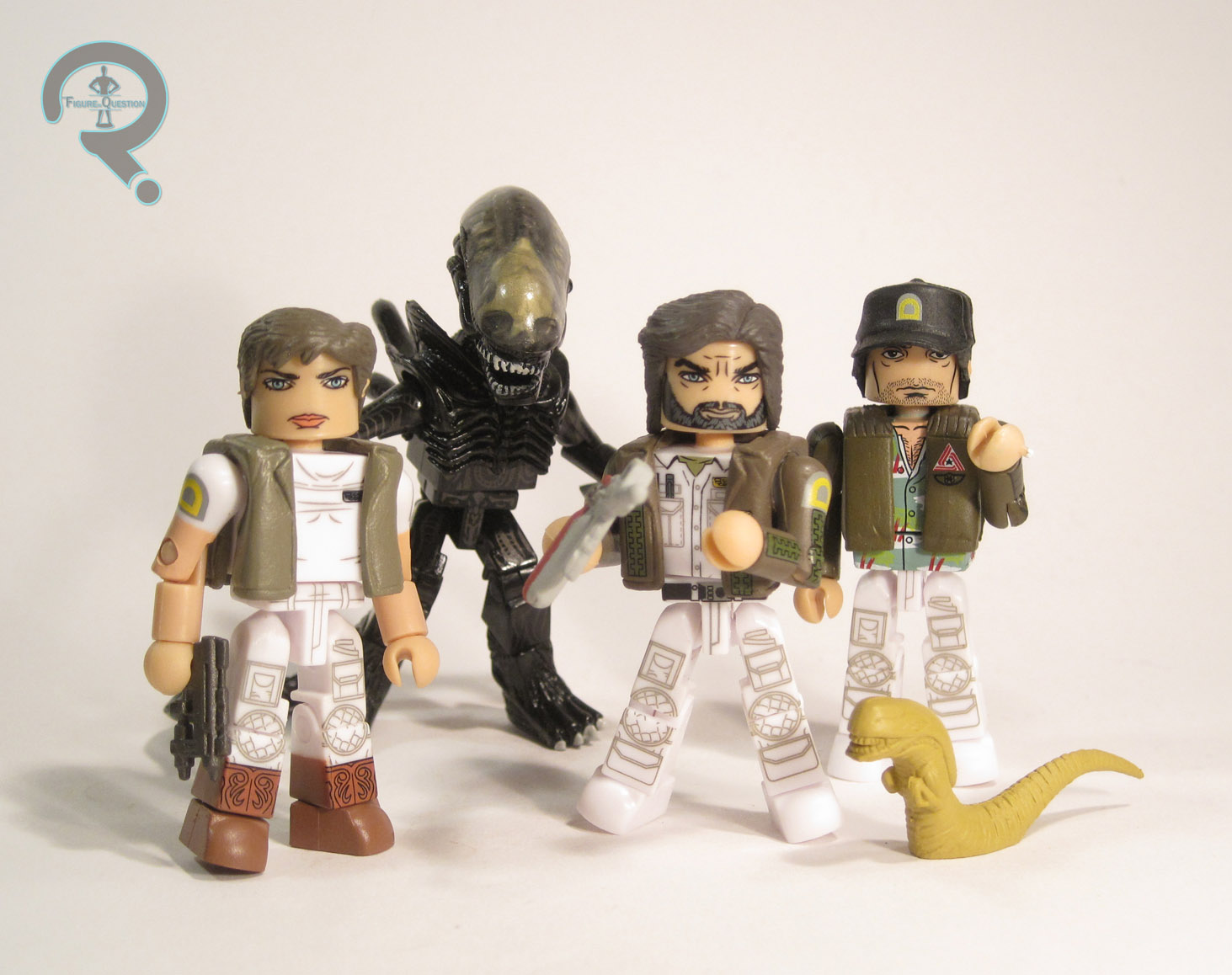
DALLAS, LAMBERT, BRETT, & XENOMORPH

ALIEN MINIMATES

Nostromo1

“In space, no one can hear you scream…”

Well, unless you’re talking about Lambert, in which case everyone can hear you scream. Constantly. With no end in sight. Ugh. Okay, perhaps that was a bit harsh. May what Lambert was really screaming about was the lack of any action figures. Well, scream no more Lambert, because Diamond Select Toys has got you, along with Brett and Dallas, covered, thanks to the awesome set of Minimates I’m looking at today!

THE FIGURES THEMSELVES

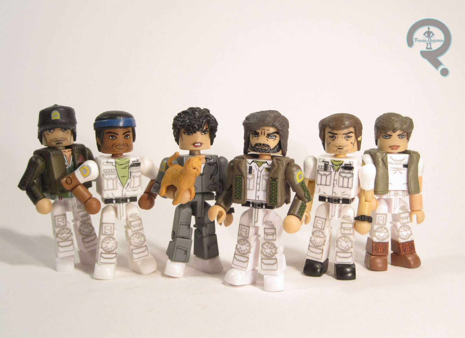
Dallas, Lambert, Brett, and the Xenomorph were all released together in the Hastings-exclusive “Nostromo Crew” set, the second Alien-themed boxed set from DST.

DALLAS

Nostromo2 
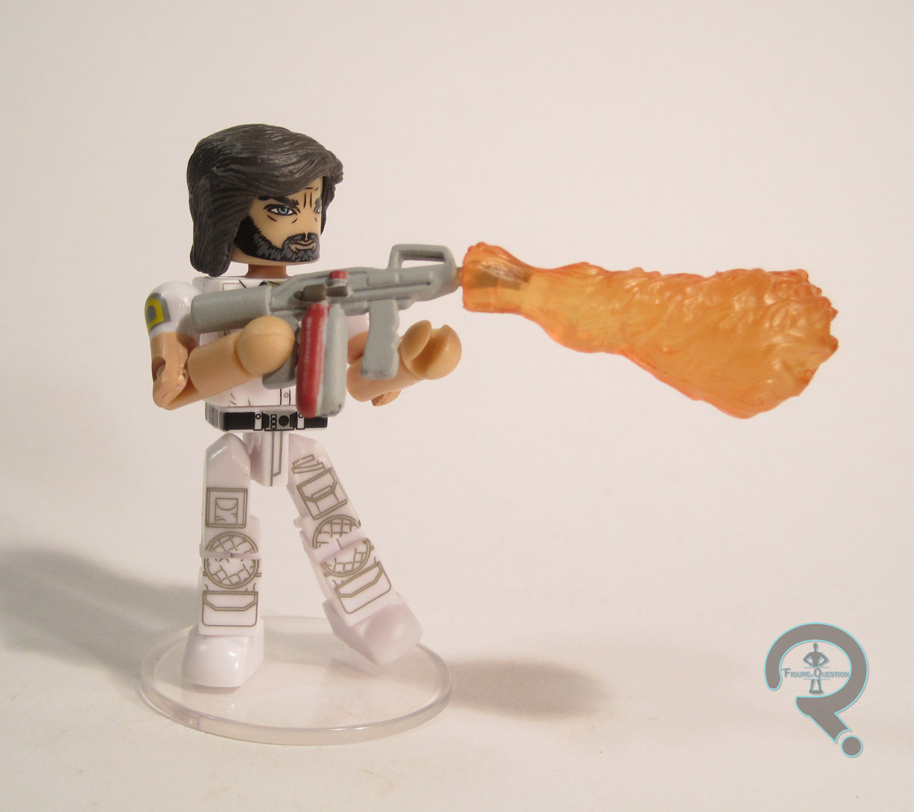
Dallas, captain of the Nostromo, is the one <human> member of this set who isn’t a stranger to action figures. In fact, he’s the one character who’s shown up in just about every major scale that Alien merchandise has been offered in, and he’s even got another Minimate on the way. This ‘mate shows Dallas as he spends most of his time on-screen: in his Nostromo crew uniform, wearing his signature jacket. Dallas is constructed using two add-on pieces, for his hair and jacket. The hair is a re-use from Marvel Series 31’s Captain Marvel. It’s a well sculpted piece, and it’s appropriately ‘70s enough for the look Dallas is sporting in the movie. The jacket is the same basic jacket piece we’ve seen several times before in this and other lines. It’s a pretty generic piece, and it works great for Dallas. The painted detailing on Dallas is really awesome. The face has a spot-on likeness of Tom Skerritt, and the rest of the body features a ton of fun little details. I like that he’s got the little Weyland/Yutani logo on both his jacket and his shirt, and I really appreciate the dedication to getting the lacing on the front and arms of his jacket just right. Dallas is packed with a spare set of arms, allowing for a sans-jacket look, as well as a small pistol, a flamethrower (with a flame attachment), and a clear display stand.

LAMBERT

Nostromo4
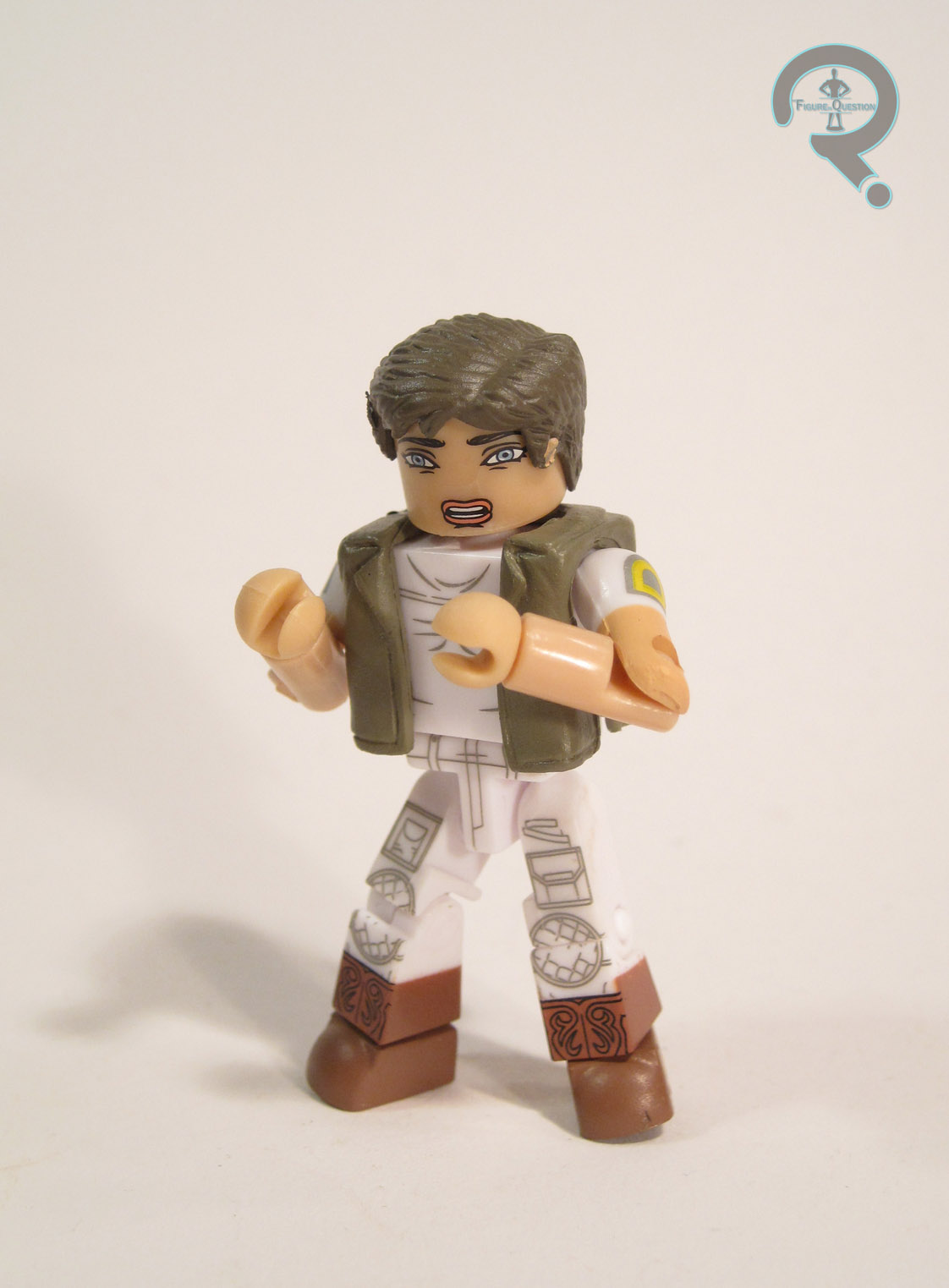
Lambert is the Nostromo’s navigator. She’s also one of the three members of the crew to go out on the surface of LV-426 and is one of the longest lasting members of the crew. As such, it’s a bit surprising that this is the first time she’s ever made it into action figure form. Maybe all that screaming deterred people. Lambert is seen here in her attire from when she’s on board the ship. It’s not the most exciting look ever, but it’s the one she spends most of the movie in, so there’s that. Lambert has add-ons for her hair and her vest. The hair is re-used from the T2 line’s first Kyle Reese figure, and it’s admittedly a bit off for Lambert. In the movie, her hair was a fair bit more close-cropped than this piece depicts, and she would probably have been more suited with something like the piece included with Cpl Hicks. The vest is the same piece as Dallas’s, and it works perfectly fine here. Lambert’s paint isn’t quite as exciting as Dallas’s, since it doesn’t feature as many fun details. That being said, it’s still high quality. All the details are nice and sharp, and she looks pretty much as she’s supposed to. The face is a bit on the bland side, but there’s a fix for that I’ll get to in one second. For accessories, Lambert includes a flamethrower (no flame trail this time), a pistol, an extra head, and a clear display stand. The best piece by far is the extra head, which depicts Lambert with the frightened look she has on her face for most of the movie’s runtime. Where the normal head is a bit bland and expressionless, this head is pitch-perfect for Lambert.

BRETT

Nostromo3
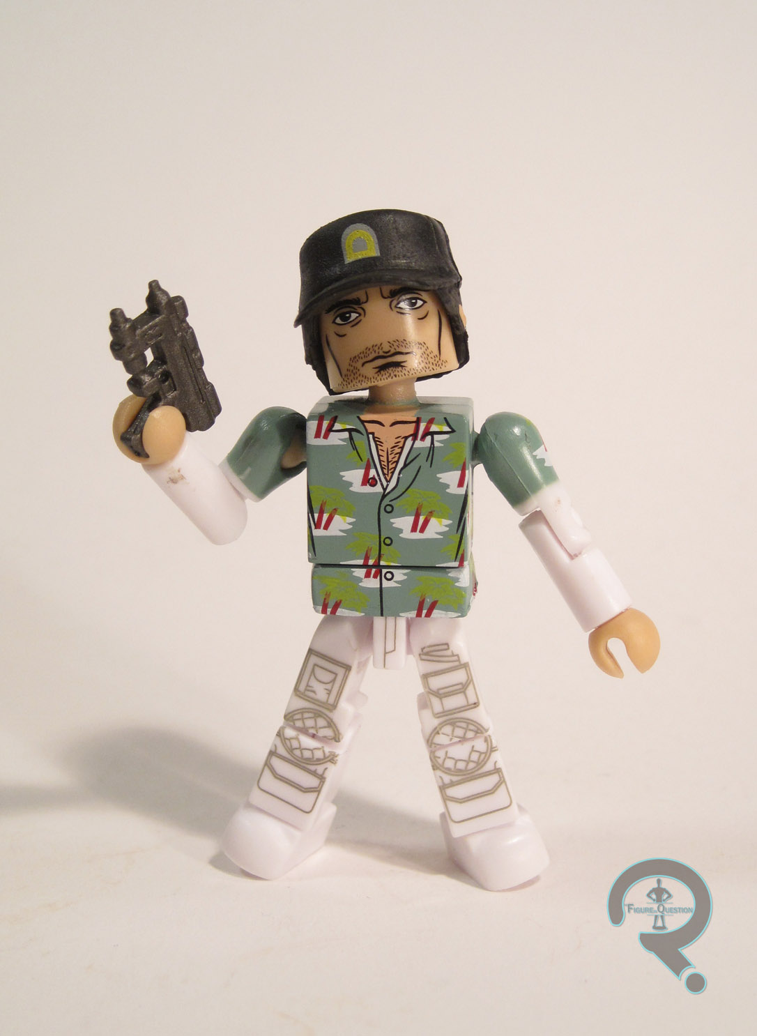
Brett is the lowest ranking member of the crew, and the first casualty of the full-grown Alien. He’s kind of a tragic character really, being little more than a working class yes-man who just wanted to be paid his fair share. Like Lambert, he’s never gotten an action figure before. This figure depicts Brett in pretty much the only thing we ever see him wearing: a uniform with a Hawaiian shirt over it, and a Nostromo-branded baseball cap. Brett gets add-on pieces for his hair/hat, jacket, and the lower part of his shirt. The hat comes from the first series of Walking Dead Minimates, and it’s a pretty good fit for Brett. The jacket was used on Star Trek Legacy’s Picard ‘mate, and it offers a slightly different jacket from the other two figures in this set, in order to differentiate that Brett is from engineering, rather than the bridge. Brett also gets a hand holding a cigarette, which helps add a nice extra bit of character to the figure. As far as paint goes, Brett’s is pretty great. The face isn’t quite as spot-on as Dallas was, but you can still definitely see a lot of Harry Dean Stanton in there. The rest of the body has a lot of other fun details as well, and I’m particularly pleased with how well the Hawaiian shirt turned out. I also really like the fact that there’s a fully detailed waist under the extra bit of shirt, which is fully distinct from Dallas’s. Brett includes an extra set of arms for displaying him without the jacket, as well as an extra normal hand, a pistol, and a clear display stand. It would have been nice to get the little stunning device he had while chasing the newborn, but what he got is reasonable.

XENOMORPH

Nostromo5
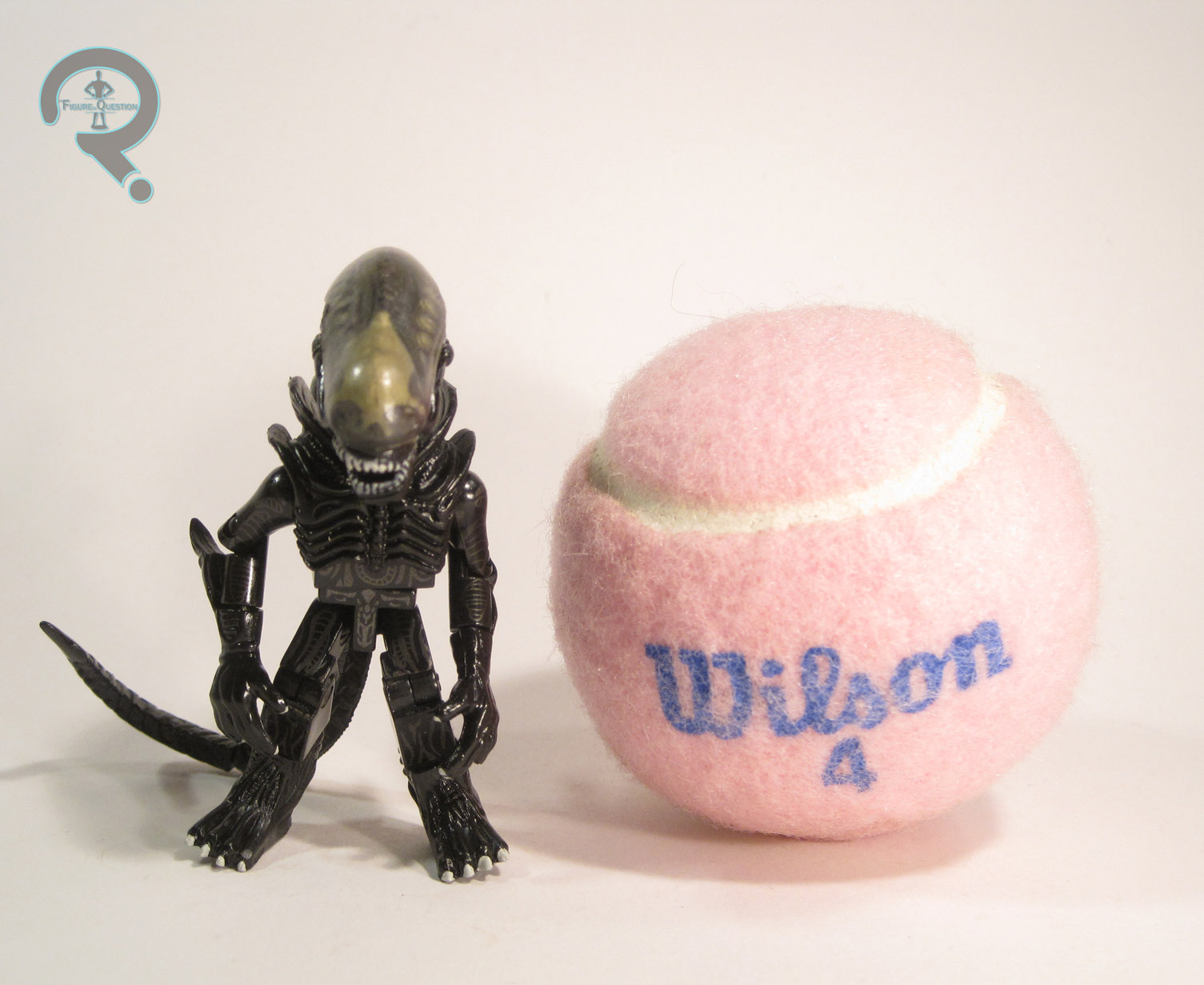
Well, I suppose you can’t really have an Alien set without throwing in at least one figure of the title character, can you? So, here’s the third of the four versions we’ve gotten of the Big Chap. Structurally, this is more or less the same figure as the Xeno in the first Alien boxed-set, which itself wasn’t too far removed from the various versions of the Xeno we’ve gotten from the main Aliens line. Aside from the slight inaccuracy on the hands (which are three-fingered like the Aliens design, rather than six-fingered like the Big Chap is supposed to be), the various pieces are all very nicely sculpted and are quite accurate to the source material. The one change to this figure from others is the jaw. Other versions of the Big Chap have all had an open jaw, but this one is closed. A minor change, to be sure, but one that adds a nice bit of variety. The paintwork on this Xenomorph is also pretty similar to what we’ve seen on other Xenos. The details are nice and sharp, and the figure has a cool glossy sheen. The dome is now more of an amber hue than other versions, which actually looks really cool, and allows you to better see the underlying skull. It’s hard to say who some of the accessories in this set were supposed to go with, so I’m going to lump the newborn and facehugger in with the Xenomorph. In addition to those two pieces, the Xeno also includes a clear display stand.

THE ME HALF OF THE EQUATION

I kept meaning to pick this set up, but not having any Hastings stores anywhere near me meant getting this set would be a little bit of a hassle, so it kept getting put off. With Hastings’ announcement they were filing for bankruptcy and closing down all the MovieStops (one of which I have near me), I decided to take advantage of the ensuing sale to pick up this particular set for a little bit less than its original value. Dallas is a very well-done figure. It’s immediately clear who he’s supposed to be, and the small details really seal the deal. Lambert isn’t the star of this set, but she’s certainly a solid ‘mate. The extra head in particular does a lot to make her even more worthwhile. Brett is a really fun figure, and probably my favorite in the set, even if he’s not quite as good as Dallas overall. Still, he’s a fantastic addition to the crew. The Xeno doesn’t really do anything new or exciting, but he’s still just as good as any of the prior Xenos have been. All in all, not a bad set. I’m glad I finally got one.

Nostromo6


#0992: Space Armor Iron Man

IRON MAN – SPACE ARMOR

IRON MAN (TOYBIZ)

SpaceIM1

Just like Captain America, my first exposure to Iron Man was via his cartoon from the ‘60s. However, unlike poor Cap, Iron Man wasn’t quite as obscure in the mid-90s. While Marvel’s big cartoons in the 90s were Spider-Man and X-Men, both Iron Man and the Fantastic Four received their own cartoons as part of the Marvel Action Hour. By extension, Iron Man (and the FF) got his own line of toys from Toy Biz, right as I was getting into super heroes and action figures. That was really quite convenient, wasn’t it? I’ve looked at a handful of figures from this line, but I’ve yet to look at the main man himself. That changes today, with my review of Space Armor Iron Man!

THE FIGURE ITSELF

SpaceIM2Space Armor Iron Man was released in the second series of the Iron Man line. He was one of three versions of Iron Man in this particular series, all of which were at least somewhat comics-based. The Space Armor has the notoriety of being one of the earliest specialty armors that Tony created. There have been a few different versions of the armor over the years (and a lot of the differences are really just based on inconsistencies between artists interpretations). This particular version was lifted directly from the cartoon’s design, which isn’t a direct translation of any particular look from the comics, but looks somewhat like a cross between the Model 05 and Model 10 armors (aka Marks I and II of the Space armor). The figure stands about 5 inches tall and he has 9 points of articulation. Now, the interesting thing to note about Toy Biz’s 90s Iron Men is that each one was a basic figure, with a number of vac metalized armor pieces, which could be clipped on to complete that particular armor’s look. Exactly how close the figures were to their intended design without these pieces greatly varied from figure to figure. Space Armor Iron Man isn’t far off from the intended design, but he’s noticeably a lot sleeker, which results in him bearing more than a passing resemblance to the classic Iron Man design from the 60s/70s. Of course, the Space Armor was really just a slight tweaking of that design anyway, so that’s about right. The base sculpt is quite nicely done, with balanced proportions and some cool little armor details here and there. To facilitate the removable armor, the figure has holes on either side of the torso, the waist, the shoulders, the forearms, and the shins. These can be a bit distracting, but they aren’t terribly so, and the figure doesn’t look horrid without the extra armor. Space Armor Iron Man included eight armor pieces: a chest plate, back pack, two shoulder pads, two wrist guards, and a pair of boots. My figure is missing the shoulder and chest pieces, but you can get a pretty good idea of what the armor looked like. The backpack had a set of handholds that were attached to a hook at the top of the pack. When the handholds were moved a certain direction, the hook would retract. As far as paint goes, Space Armor Iron Man was rather simple, with various reds and yellows, the majority of which are molded plastic. What paint there is has been applied cleanly, and the flat red of the figure and metallic red of the armor work well together. In addition to the armor pieces, this figure also included a missile launcher, though, curiously enough, no actual missile to launch.

THE ME HALF OF THE EQUATION

This Iron Man is a very special Iron Man. And no, not in a “keep your kids of drugs” sort of way. This is my very first Iron Man action figure. You remember waaaaaaaaay back in my review of Night Hunter Batman, when I mentioned my dad finding an Iron Man figure at the Service Merchandise that netted me my second Batman? Well, after he got an Iron Man, I wanted one too. On her way to work one day, my Mom took me to the KB Toys at the mall specifically to get me an Iron Man. I remember we got there before the store opened and I could actually see the display of Iron Men through the store’s window while we waited. After looking at the available options, this was the one I chose, mostly due to him being the closest to the classic Iron Man design, which was the one I was most familiar with. To this day, he remains my favorite Iron Man I own, and I think he really holds up!

#0991: The Spirit Minimates

SPIRIT, SAND SERRIF, THE OCTOPUS, & SILKEN FLOSS

THE SPIRIT MINIMATES

SpiritMates1

Sometimes, I like to use this space to defend unpopular movies, and talk about why people should cut them some slack or maybe point out some of the redeeming features that people may have missed. I won’t be doing that for The Spirit. Because The Spirit is not by anyone’s definition a good movie, and by pretty much everyone’s definition, it is a very bad movie. A very bad movie that I enjoy way too much for my own good. Seriously, I’m not defending the movie in the slightest. A lot of people hate the movie, and for very good reason. As an adaptation of The Spirit comics, it’s god-awful. Just as a movie, unconnected to the source material? Well, it’s still god-awful, but it’s that kind of awful where it’s so awful that it becomes entertaining. Before the movie was released (and everyone had realized just how awful it really was), several rather reputable toy companies picked up the license for it. This included Diamond Select Toys, who put out two sets of Minimates: a four-pack and a two-pack. I’ll be looking at the four-pack today.

THE FIGURES THEMSELVES

This set was released shortly after The Spirit hit theatres, alongside the complementary two-pack. In hindsight, it probably would have been better to release it prior to the film, but DST probably didn’t know what the reception was going to be like.

THE SPIRIT

SpiritMates2Say what you will about the movie, there’s no denying that it’s lead actor Gabriel Macht really tried his best to give a good performance. His comically serious Spirit was far from the worst thing in the movie, and he at least looked the part. Well, more or less. The figure stands a little under 2 ½ inches tall and has the standard 14 points of articulation. Spirit is built on the standard Minimate body, with add-ons for his hat/hair, coat, and tie. All of these pieces were new to Spirit when he was released, but DST wasted no time putting them to use in other lines. They’re all rather impressively sculpted. The Spirit is decidedly more geometrically based than the other characters, and this really works in the ‘mate’s favor. He looks very sharp. Spirit’s paintwork is pretty basic. He’s mostly just a lot of black. However, he does have a fully detailed pair of tennis shoes, a belt buckle, and even a fully detailed front to his shirt, despite it being obscured by his tie and jacket. The face definitely resembles Macht in the role, but it also makes for a nice generic masked hero face. Spirit included an extra hairpiece, also unique to this figure, which does a pretty nice job of capturing Spirit’s close combed hair from the film.

SAND SERRIF

SpiritMates4Sand Serrif ends up being a fairly generic femme fatale sort of character. Eva Mendes is sort of likeable in the part, but not incredibly interesting. This ended up being Mendes’ first Minimate, but it would have been her second had the infamous Marvel Minimates Series 15 (based on the first Ghost Rider) ever been released. Sand had several different appearances over the course of the film. This one is based on her catsuited look from early on in the film, which is probably one of her better looks. This version of Sand was originally supposed to be in the two-pack, rather than the larger set, but her two ‘mates were swapped just before release, presumably due to this look being the more prominent of the two Sands released. The figure has one add-on for her hair. It was a new piece at the time, but, like with Spirit, the piece has seen quite a bit of re-use since. It’s a good sculpt, and it looks pretty much just like Mendes’ hair in the movie, so that’s good. The rest of the details are handled via paint, which is pretty good, with the exception of one rather annoying issue. The actual application is pretty great, and I especially like the glossy finish of the catsuit. The face even has a very good likeness to Mendes. The issue is that her skintone is all painted, and this seems to have not been taken into account in regards to the sizing of the hairpiece. The piece is kind of tight, so there ends up being more than a little paint transfer, resulting in rather annoying dark brown lines on her face. Sand included no accessories, which was a definite bummer, since even a simple handgun would have been nice.

THE OCTOPUS

SpiritMates3Samuel L. Jackson’s performance as The Octopus was one of the stronger points of contention with this movie. In the comics, the Octopus is a mysterious figure, whose face is never seen. In the movie, the Octopus is loud, foul-mouthed, obnoxious, and his face is all over the place. SLJ’s version of the character is a pretty much complete departure from the source material. That being said, it’s also so over the top that it’s hard not to enjoy it just a little, even if it makes pretty much no sense. The Octopus has a bunch of different outfits over the course of the movie (it might be eight. That would be clever, and I’m not sure I can give the filmmakers that much credit). This figure appears to be based his final battle appearance. I can’t say it’s my favorite of his looks, but it’s fairly indicative of the character. Octopus has add-ons for his hat and his coat. They both feature quite a bit of textured detailing, and do a reasonable job of capturing the on-screen look. The painted details are quite plentiful. The pattern on his jacket is quite impressively done, and the sort of thing you don’t see very often on a Minimate. The face is rather generic. It doesn’t not look like SLJ, but it doesn’t particularly look like him either. He’s also missing ears, which is slightly annoying. The Octopus includes two weapons, constructed from various strapped together guns.

SILKEN FLOSS

SpiritMates5Hey, did you know that Scarlet Johansen’s first comic book super hero movie wasn’t Iron Man 2? Nope, it was actually The Spirit. She takes a villainous turn in this one, as the right-hand woman to The Octopus (meaning Iron Man 2 wasn’t the first time she worked for SLJ either). Silken Floss has a couple of notable costumes over the course of the movie. The one depicted here is her nurse’s outfit, which is probably her second most memorable look from the movie. Given that the other look is a Nazi uniform, though, it’s not hard to cut DST a little slack on the costume they chose. Floss has add-ons for her hair and skirt. The hair is a new piece, and it’s fantastically sculpted, with lots of amazing detail. It’s incredibly character-specific, which is probably why it hasn’t been re-used since. The skirt is the same piece used on the SM3 Mary Jane ‘mate, making it the first re-use piece in this whole set. It’s a close enough match that one can hardly complain about its use here. The paintwork on Floss is pretty solidly done. I think her likeness may be the best Johansen likeness that DST’s done, so that’s cool. I do wish the paint on the wrists extended just a little bit further down, so that she didn’t have the weird black wristbands that he has now. It would also have been nice if her feet were something other than solid black, but that’s minor. Silken Floss included no accessories, which is a little disappointing. A needle or something would have been nice.

THE ME HALF OF THE EQUATION

There’s a slightly sentimental story behind these guys, so bear with me. When The Spirit was released, I couldn’t find anyone to go and see it with me, and, at the time, I was not able to drive myself to the movie theatre. I made mention of wanting to see it to my dear friend the late Marty Gear while we were at a party. The next day, Marty showed up at our house out of the blue and said he had decided he wanted to see the movie and asked if I wanted to go with him. So, Marty and I went and saw The Spirit. And it wasn’t a good movie, but it was a fun time. Being who I am, when I saw this set of Minimates at Cosmic Comix, I had to pick them up. Looking back, it’s pretty astounding how much effort DST put into these guys. They really wanted this license to go well. It’s a shame it didn’t sell well, because these are some downright fantastic ‘mates. And, as an extra bonus to me, they’ll always remind me of Marty, and that’s no small bonus.

#0990: Mark Hamill

MARK HAMILL

THE SIMPSONS: 25 OF THE GREATEST CELEBRITY GUEST STARS

MarkHamill1

It’s a rather rare occurrence for one toy company to deliberately design a toyline with the express purpose of directly emulating and continuing another company’s toyline.  But, that’s what NECA did when they picked up the Simpsons license for the property’s 25th anniversary: they put together a line of figures deliberately designed to emulate the style and scale of Playmates’ World of Springfield line, despite it having been years since World of Springfield had ended.  It’s worth noting that NECA did have a much more focused aim than Playmates, placing a direct focus on The Simpsons’ plethora of celebrities who had guest stared as themselves.  The line introduced 25 new figures for collectors to add to their Simpsons displays, including today’s figure, Mark Hamill!

THE FIGURE ITSELF

MarkHamill2Mark Hamill was released in the second series of NECA’s The Simpsons: 25 of the Greatest Celebrity Guest Stars line.  He’s based on Mark’s guest appearance from the Season 10 episode “Mayored to the Mob.”  The figure is about 4 ¾ inches tall and he has the same 4 points of articulation that would be sported by a standard WoS figure.  Sculpturally, Mark is tasked with two things: capturing his look from the show, and capturing the style of the Playmates figures.  These can be slightly conflicting ideals, since the Playmates figures weren’t always 100% accurate (though they were always very close).  Ultimately, I think this figure does a good job balancing the two aesthetics.  He’s about as good a 3D rendering of the 2D design as you’re gonna get, and he also manages to fit in pretty seamlessly with prior offerings.  Hamill is just wearing a fairly generic button-down shirt and a pair of khakis, <which is one of the outfits he wears in the show.  The other is the more distinctive Luke Skywalker outfit, but something tells me that there would have been some legal issues with trying to do that look, which makes this the more preferable design>.  The likeness to Hamill is admittedly filtered through the usual Simpsons style, but it should be pretty clear to most fans who this is supposed to be.  The paintwork on Mark is pretty basic and straightforward.  Lots of flat color work, which is befitting of an animated design.  Everything is pretty clean, and he matches up pretty nicely with what’s seen on the show.  Mark Hamill includes no accessories, which is a little sad, since accessories were one of the defining parts of the WoS line.  Obviously, he couldn’t come with anything Star Wars specific, but a microphone or I don’t know, a fork in reference to the “Use the forks” gag would have been pretty amusing.

THE ME HALF OF THE EQUATION

Since I mostly skipped the World of Springfield line, I also mostly skipped this line while it was at retail.  I did occasionally eye up one or two figures, but I’m honestly not a huge Simpsons fan, so I never felt a big pull to get them.  However, I do remember “Mayored to the Mob” being one of the few episodes of The Simpsons that I saw when it was still current (mostly due to Mark Hamill being in it).  Back when ToyFare magazine ran their article proposing potential celebrity guest stars who might be made in the World of Springfield line (this was the same article that revealed that it was Stephen Hawking who would actually be getting a figure), I was rather disappointed to find out that the Mark Hamill figure shown was just a custom, and no official figure would be made.  So, when NECA finally released the official figure, I really kept meaning to pick him up, but never got around to it.  While taking advantage of my local MovieStop’s going-out-of-business sale, I came across this figure for under $3, a price at which I definitely wasn’t passing him up.  Is he the most exciting figure of all time? No, he’s a normal guy in normal clothes, and he’s not even all that posable.  That being said, he’s perfect for the style NECA was going for, and he’s pretty much exactly what I was looking for when I bought the figure.

MarkHamill3

#0989: Jaime Lannister

JAIME LANNISTER

GAME OF THRONES: LEGACY COLLECTION

JaimeLann1

What’s this? Four Game of Thrones figures? Yikes, this is getting bad. Three’s company, but four’s a crowd. Or something like that. So far, I’ve looked at two Starks and Brienne, who’s worked for both the Starks and their main antagonists the Lannisters. Today, I’ll be looking at a member of the latter house, and one who’s even had lots of direct interaction with Brienne. Yes, it’s the Kingslayer himself, Jaime Lannister!

THE FIGURE ITSELF

JaimeLann2Jaime was released in Series 2 of Funko’s Game of Thrones: Legacy Collection. He’s figure number 7, which makes him numerically the first figure in Series 2. The figure stands right about 6 inches tall (he’s just a smidge shorter than Brienne, as he should be) and he has 26 points of articulation. In terms of joint movement, Jaime’s much more similar to Robb than to Brienne. No stuck joints on this one! Yay! Jaime is presented here in his Kingsguard attire. He’s clearly meant to be a Season 1 Jaime, which we can tell due to the length of Jaime’s hair. Oh yeah, and there’s one other tell, but I can’t remember what it is. Can anyone give me a hand? Well, Jaime sure can’t, since he lost his dominant one in Season 3, which was before he re-donned his Kingsguard armor again. Jaime’s sculpt is incredibly detailed, and it’s a pretty fantastic recreation of the Kingsguard armor from the show. I particularly like the level of depth to all of the details and layers, which make him look like he’s wearing all of the different pieces of armor and such. In terms of facial likeness, I think Jaime is the best work I’ve seen on one of these figures. There’s absolutely no denying that this is Nikolaj Coster-Waldau, through and through. It’s also worth noting, that, unlike the other three figures I’ve looked at from this line, Jaime’s hair has very fine detailing and is nowhere near as chunky as the others. The only real flaw with the figure’s sculpt is actually just with my figure: my figure has two right forearms. It’s not a super major issue (and, in fact, it took me a little while to notice it at all), but it does sort of highlight Funko’s consistent problems with quality control.  As detailed as Jaime’s sculpt is, he needs a paint job to match. Fortunately, this figure has such a paint job. All of the details of the armor and clothing are painted the right colors, and each bit has its own very nice accent work, to help give Jaime that sufficiently worn-in look (but not quite as worn-in as the likes of Robb and Brienne). The head gets a very nice paint job as well, with eyebrows that aren’t too large, eyes that aren’t off-center, and probably the most successful attempt at five o’clock shadow that I’ve seen on a smaller scale figure. He also has just the slightest bit of gloss on his hair, which is surprisingly good at making it look like actual hair. Jaime includes his sword, which can be stowed in his scabbard, or held in his hand, provided you’re willing to do a bit of modding work to separate his thumb and forefinger. It would be nice not to have to do that, but I suppose it’s simple enough.

THE ME HALF OF THE EQUATION

Jaime was picked up at the same time as Brienne, which I felt was appropriate. As with Brienne, he was slightly marked down, due to MovieStop being in the process of closing. On the show, Jaime is a surprisingly likeable character. Likewise, his figure is a surprisingly enjoyable one, and is certainly a lot more fun than I’d expected him to be based on the pictures I’d seen. I’m very happy to have picked up this guy.

JaimeLann3

#0988: Brienne of Tarth

BRIENNE OF TARTH

GAME OF THRONES: LEGACY COLLECTION

Brienne1

Okay, guys, I gotta confess: I’ve been roped in by this whole Game of Thrones thing. Action figures and all. I get one action figure, it’s no big deal. Two? Well, maybe they’re keeping each other company. A third? That’s when I’m in trouble. So far, the two GoT figures I’ve looked at have both been members of House Stark, my personal favorite side in the great game. While today’s figure isn’t strictly from House Stark, Brienne of Tarth has quite a few ties to the Starks, and she’s even currently in the service of Sansa Stark in the show. She’s also genuinely one of the coolest characters on the show, and who can turn down an action figure of a character like that? Not me. Never me. That’s kind of why the site exists….

THE FIGURE ITSELF

Brienne2Brienne is from the second series of Funko’s Game of Thrones: Legacy Collection, where she’s officially number 8 in the line (which places her second in the second series line-up). The figure stands just over 6 inches tall and she has 26 points of articulation. Or, she’s supposed to have 26 points of articulation, anyway. Yep, though I managed to avoid the notorious stuck joints of the Legacy Collection on my first two GoT figures, I was not quite so lucky with Brienne. Her neck, left shoulder, and waist joints were all totally seized right out of the box. Through use of alternating freezing and heating, I was eventually able to free up the neck and shoulder (the shoulder actually finally freed up while I was writing this review, two weeks after I purchased the figure), but I’ve had no luck with the waist joint, and I don’t want to force it for fear of it snapping. On the plus side, the only joint that is truly stuck isn’t one that ruins the figure’s playability, but it’s still annoying that this was such a common thing with the line. Brienne is based on her early appearance on the show, when she was serving under Renly Baratheon and then when she was tasked with getting Jaime Lannister to King’s Landing. It’s not quite as cool a look as her more recent armor, but it was still current at the time of this figure’s release, and it is admittedly more colorful. The sculpt on this figure is a bit frustrating. While her height is correct for the 6’3” Gwendolin Christie, her build is somewhat off. She’s definitely a bit scrawny for Brienne, but I think the biggest issue is with her shoulders. They’re too narrow (in fact, the torso as a whole seems rather undersized), which creates an optical illusion that makes her head look too big and by extension makes the rest of her body look too small. I genuinely thought she was just too small in general until I stood her next to my Captain Phasma and determined that they were in fact the same height, so I really think it’s those shoulders. So, issues with the proportions aside, how’s the rest of the sculpting? Actually not bad. While I’m not she’s quite on par with Robb, the detailing on her armor is very sharp, and the face bears more than a passing resemblance to Christie as Brienne. The hair’s a little thick, but not too terribly so. Brienne’s paintwork is generally pretty good. The armor in particular gets the best work, with some nice solid colors and some tremendous accent work to offset them. Sadly, some of the areas of her clothing are without any accenting, which looks a little out of place. There are a few spots of slop here and there, most noticeably at the bottom of her jaw, but her paintwork is very clean otherwise. Brienne is armed with a broadsword. Since this is a season 2/season 3 Brienne, it’s just a nameless sword, not Oathkeeper. It’s still a cool sword, even if it doesn’t have some fancy name.

THE ME HALF OF THE EQUATION

Ever since getting Robb and Arya, I’ve been eyeing up the other figures in the line, with Brienne being right at the top of the list. I ended up finding Brienne at my local MovieStop, which, thanks to Hastings filing for bankruptcy, is currently having a sale to clear out their inventory. This allowed me to get Brienne for a reasonable (if not amazing) price, rather than a slightly marked up price. If I’m honest, Brienne’s the weakest of the GoT figures I’ve picked up. It’s mostly the shoulder thing. However, she’s not a bad figure at all, and the coolness of the character certainly helps to make up for some of the figure’s shortcomings.

Brienne3

#0987: Dynamole

DYNAMOLE

THE TICK

Dynamole1

SPOOOOOON!!!!!!!!

Does anyone else love The Tick?  Because, let me tell you something: I love The Tick.  I super-duper love The Tick.  I love the comics, I love the cartoon, and I even love the short-lived live action show.  Through his many adaptations over the years, the Tick and his supporting cast have been privy to a number of different styles of toys and action figures over the years.  None of them have quite lived up to the awesomeness of the source material, but I think they’ve all at least tried.  In the 90s, when the cartoon was on the air, Bandai America tried their hand at a few different lines, including a smaller scale line of figurines that covered a large number of cast members, both major and minor.  On the more minor side of things is Dynamole, a minion of the villainous Chairface Chippendale.  Not necessarily one of the most exciting characters from the show (or even the most interesting bomber on the show.  That would be the Evil Midnight Bomber What Bombs At Midnight!), but he was part of the ensemble none the less.

THE FIGURE ITSELF

Dynamole2Dynamole was part of the first (and only) series of Bandai’s small-scale The Tick line.  He stands about 3 inches tall (making him to be too large to be in scale with most of the other figures in the line, a common issue with Bandai America’s products) and zero, count ‘em, zero, points of articulation.  This guy and all the figures in this particular line were deliberately designed as figurines, not as full functioning action figures, so none of them got any movement.  The pose you see here is the pose that you get…for eternity.  He’s also permanently attached to a stand, one would assume for additional stability.  Dynamole’s pose is fairly generic, standing straight up and down sort of look, with his right arm bent outwards and his index figure pointing out as if he’s about to press a button or something.  Presumably, it’s a detonator of some sort.  The actual quality of the sculpt is overall pretty decent, if nothing particularly noteworthy.  He looks like the character from the show, which is the important thing.  The details could stand to be a little more defined in several spots, but it’s hard to tell if that’s truly an issue with the sculpt or if it’s to do with the paint.  Speaking of the paint, while the colors are pretty decent, the actual application is incredibly thick, and the details only tend to be in the same approximate area as the sculpted elements.  The paint is also incredibly glossy, which is a slightly odd choice, since I don’t believe Dynamole is supposed to be slimey or shiny or anything.  Kinda weird.

THE ME HALF OF THE EQUATION

Somehow, I managed to miss out on most of the cartoon-based Tick merchandise when it was still new.  I ended up finding Dynamole and most of the other figures from this particular line at a nearby antique store a few years back.  I mostly got Dynamole because I was buying the set, and I mostly bought the set because it was the most expansive selection of characters from the show that was readily available.  Ultimately, Dynamole isn’t a super exciting figure, but he’s interesting enough, and looks decent with the rest of the set.

#0986: Captain America

CAPTAIN AMERICA

MARVEL SUPER HEROES (TOY BIZ)

“When Captain America throws his mighty shield! All Foes who chose to oppose his shield must yield!”

Captain America Theme Song

My first introduction to Captain America was through VHS copies of the ‘60s cartoon. As cheesy as they are, I loved every minute of them. Sadly, in the mid-90s, when I was becoming so fond of Cap as a character, he was more or less absent from toy shelves. I eventually got the Spider-Man: The Animated Series version when it was finally released, but the figure I always wanted was Toy Biz’s first version of the character, which I’ll be looking at today!

THE FIGURE ITSELF

Captain America was released in Series 1 of Toy Biz’s Marvel Super Heroes line. This Cap stands just under 5 inches tall and has 7 points of articulation. This figure predates elbow articulation becoming a standard for Toy Biz’s Marvel stuff, as they were still very much aping the Kenner Super Powers style, and none of those had elbow movement. Really, this whole figure in general feels like a Captain America figure done to fit with Super Powers (well, aside from size, since he’s taller than any figure Kenner put out), which is far from a bad thing. Rather than the more ‘90s-esc proportions of which Toy Biz would later become so fond, Cap is pretty subdued, and looks more or less like a real person. His torso features some awesome detailing for the scale-mail, and I love the way they’ve sculpted the star logo so as to make it pop a bit more. Figures of Captain America have the unfortunate tendency to miss the mark on the good Captain’s face. I guess he’s just one of those characters where it has to be just right. I think this figure’s the closest anyone’s ever gotten to my ideal Captain America, at least from a comic-based perspective. It’s a little round by today’s standards, but I really like the overall style present here.  There’s just a certain sincerity to it that lots of Caps lack. Cap’s paintwork is quite nicely handled, especially for the time. The colors are all nice and bold, and he really sells the whole patriotic super hero thing. His eyes are admittedly a little wonky, and it would have been nice for his belt buckle to be something other than the unpainted blue plastic, but those are relatively minor complaints. Cap was packed with his mighty shield, as well as a weird launching device for it. However, my figure sadly lacks these pieces.

THE ME HALF OF THE EQUATION

As I noted in the intro, this was a figure I really wanted growing up. Unfortunately, he was released before I got into collecting, and wasn’t very easy to find after the fact. So, I had to settle for the US Agent repaint from a few series later. In fact, my dad, as awesome as he was, even bought me an extra US Agent and we painted him up in proper Cap colors, which held me over quite nicely. This particular figure ended up being one of the fifteen figures I picked up at the last Balticon. I’m glad to finally have the official version, and he’s aged a bit better than a lot of Toy Biz’s output from the same time period.

CapMSH3

#0985: Mr. Freeze

MR. FREEZE

BATMAN: THE ANIMATED SERIES (KENNER)

FreezeBTAS1

There’s no denying that Batman: The Animated Series is probably the greatest comic book adaptation in the history of comic book adaptations, and it’s also one of the greatest things to come out of the ‘90s. While the show as a whole was always very high quality, there are definitely some episodes that stand out above the rest. My two favorite episodes of the show’s run are “On Leather Wings” and “Heart of Ice” (which, no small coincidence, were both animated by Spectrum Animation, a sadly short-lived studio that produced some of the best animation ever seen on Saturday morning TV). “On Leather Wings” was the debut episode, which perfectly set the tone of the show. “Heart of Ice” comes later in the first season, but is just as defining an episode, taking a second-string Batman villain and turning him into one of the mythos’ greatest characters. I speak, of course, of Mr. Freeze, who is the subject of today’s review.

THE FIGURE ITSELF

FreezeBTAS2Mr. Freeze was released in Series 3 of Kenner’s Batman: The Animated Series line, based on his appearance in the above noted episode, “Heart of Ice.” Despite that being the story that elevated Mr. Freeze to the public eye, this is actually the third Mr. Freeze figure to be released, following the Super Powers and DC Super Heroes versions (though, if you want to get technical, those two are almost the same figure). The figure stands 5 inches tall and he has 4 points of articulation (it’s possible there’s an articulated neck, but since the dome isn’t removable, it’s not ever moving). He’s based on Freeze’s initial animated appearance, which, in my opinion, is the superior of the two. Kenner was known for tending to approximate the animated looks, without getting them dead-on. Freeze actually fairs quite a bit better than most of the figures Kenner put out. The head’s a little on the large side, but it’s a pretty much perfect recreation otherwise. Likewise, the body is overall quite solid, with the only real downside being the very skinny arms featured. That being said, they don’t look terrible, and the figure as a whole recreates the look very nicely. Freeze’s paint is pretty straight forward, but that’s to be expected with the animated designs. The colors are a very good match for the show, and the application is generally pretty clean. Freeze was packed with his freeze gun, which was connected to an over-sized version of his cold-tank.  The tank could be filled with water, and when squeezed, the water would shoot out of the freeze gun. Not a perfect effect, but not bad.

THE ME HALF OF THE EQUATION

Okay, I don’t know for sure, but I’m fairly certain that this Mr. Freeze was the first Batman rogue I ever owned. My dad got him for me not long after I saw “Heart of Ice” for the first time. This figure went a lot of places with me, including a trip to Gettysburg with my dad and Mr. Freeze himself, Michael Ansara. He also got stuck on the roof of my house once, through no fault of my own.  This is probably one of my favorite figures I own, mostly for sentimental value.

#0984: Jack O’Lantern

JACK O’LANTERN

SPIDER-MAN (TOY BIZ)

JackOLanternTB1

During their lengthy run doing 5-inch Marvel figures, Toy Biz really took a stab at getting out as many characters as they could, even if they were rather obscure. Though they never got as far into any property as they did X-Men, their Spider-Man line sure gave it a shot. Among the huge slew of villains the line gave us was the very first action figure of the somewhat offbeat villain Jack O’Lantern, which is the figure I’ll be looking at today.

THE FIGURE ITSELF

JackOLanternTB2Jack O’Lantern was released in the “Bug Busters” series of Toy Biz’s Spider-Man line. He was an interesting inclusion, seeing as he wasn’t ever featured on The Animated Series, but this was around the point that Toy Biz was moving away from using the cartoons as an influence in general. The figure stands about 5 ½ inches tall and he has 11 points of articulation.  This figure is based on the classic Jack O’Lantern design, which means it can serve as both the Jason Macendale and Steve Levins (the first and second Jack O’Lanterns), since they both had essentially the same design. Sculpturally, this figure was totally unique, which is both a blessing and a curse. On the plus side, the more character specific details, such as his head and his scale-mail tunic, are handled very nicely. The downside is that this figure came at the height of Toy Biz’s fling with oddly proportioned figures. The hands are enormous, dwarfing even his extra-large head, but they’re attached to a rather scrawny set of arms. Well, maybe the arms aren’t scrawny. From some angles, anyway. What they really are is flat. Jack also has in impossibly tiny waist and pelvis, which continues into a rather large set of thighs. He’s definitely got an odd appearance. The paintwork on Jack is pretty solid. He matches the multiple tones of green from the comics quite well, and he’s even got some very nicely rendered accent work on his head and torso. It would be nice if some of the accent work continued onto the rest of the figure, but it’s not too horribly jarring. Jack included a large bug thing, as well as a disc for it to shoot. These were both part of the gimmick of this particular series, and neither really adds to Jack in any meaningful way.

THE ME HALF OF THE EQUATION

Jack O’Lantern is figure 13 of the 15 I got from this year’s Balticon. I didn’t have Jack growing up, mostly due to being relatively unfamiliar with the character. I’ve come to appreciate him over the years, and have been on the lookout for this figure since. Like a lot of Toy Biz’s output from right around this time, this figure shows his age. The goofy proportions are the biggest issue, though, given the character’s ghoulish look, they aren’t impossible to overlook. Not a bad figure at the end of the day.