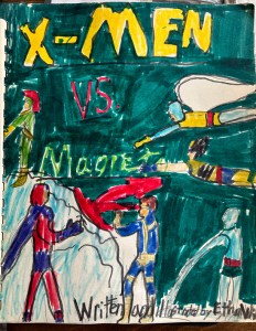
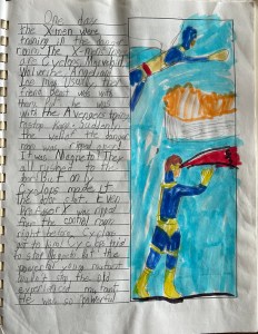
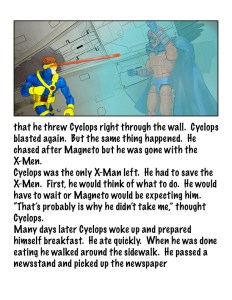
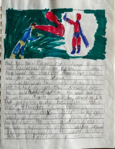
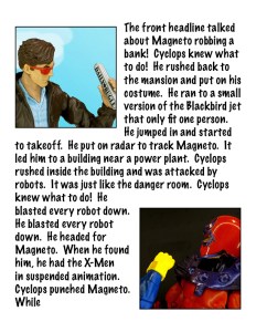
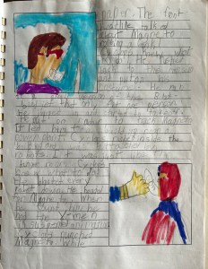
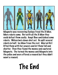
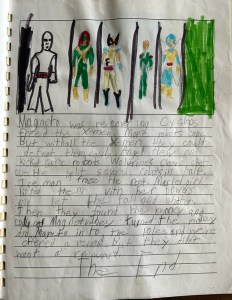
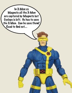
X-Men vs Magneto

X-MEN VS MAGNETO

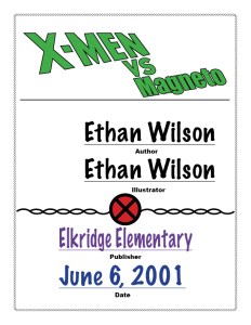
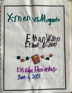
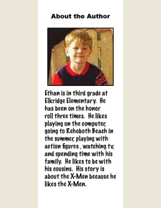
WRITTEN & ILLUSTRATED BY ETHAN WILSON (AGE 8)

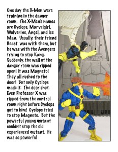
Hey guys!  What’s this?  Me posting on a Sunday?  What did we do, go back in time two years?  Nah, but I just had something cool to share, and I thought that today being Father’s Day, it might be an appropriate day for such a post.  In the last few months, my son Matty has been getting into creating his own comics and stories with friends at school.  He was mentioning this to my dad, who informed Matty that I had done some similar storytelling when I was younger.  As proof of this, my dad pulled out his copy of my third grade class project, “X-Men vs Magneto”, which he’s been saving for some 22 odd years now.  And, just for the heck of it, I decided to the craziest thing possible:  I updated it.  So, check out the fancy new version (using my verbatim words from the original), as well as the original!


#3380: Kyle Rayner

KYLE RAYNER

JUSTICE LEAGUE UNLIMITED (MATTEL)

When Green Lantern first appeared in the DC Animated Universe in Superman: The Animated Series, the producers opted to use the then-current holder of the title, Kyle Rayner, as their introductory Lantern.  Kyle gained a good portion of Hal Jordan’s origin, being the first Earth Lantern, having gotten the ring directly from Abin Sur, but he still retained Kyle’s personality and background as an artist.  When *a* Green Lantern reappeared in Justice League, it was not Kyle, but rather John Stewart, who was chosen not only to add a little more diversity to the titular team, but also to give the show a slightly less defined Lantern to work with for some of the show’s character arcs.  Rayner still existed within the narrative however, and was granted a couple of additional cameos, as well as a small speaking role in Justice League Unlimited‘s “The Return.”  It was this appearance that finally got animated Kyle some action figure treatment.

THE FIGURE ITSELF

Kyle Rayner was initially released in 2006 during the second iteration of Mattel’s Justice League Unlimited tie-in line, under the orange packaging style, in a pack that also included fellow GLs Katma Tui and Arkkis Chummuck.  He was then re-released as a single the following year, and once more in a convention-exclusive pack with Evil Star and Goldface.  As noted in the intro, Kyle is based on his design from “The Return,” which was itself an adaptation of Kyle’s Jim Lee-designed costume update from the early ’00s.  The figure stands about 4 1/2 inches tall and he has 5 points of articulation.  He’s based on the medium-sized male base body.  Rather fittingly, it started as a GL body, and it remains so here.  Kyle’s original build was a bit smaller, but by the time of “The Return,” he’d bulked up a bit, so it makes sense.  Kyle got a new head sculpt for this release, and it’s honestly a pretty good one.  We don’t see a ton of Kyle in the show, but this matches up pretty nicely with what we do see, while still being rather unique.  It’s sharp, clean, and pretty on point for the character.  Kyle’s paint work does most of the heavy lifting, as with most of these figures.  It does it well; his outfit’s detailing is pretty spot on.  The green’s a little prone to chipping, but not as bad as some figures from the line.  The head paint is alright, though a bit washed out; the brown for the hair feels a little light, as does the skin tone.  But, it still works well enough overall.

THE ME HALF OF THE EQUATION

“In Brightest Day” is far and away my favorite entry in the DCAU.  I was such a huge GL fan as a kid, and I excited recorded the episode on VHS when it aired back in the day.  The lack of a GL in the tie-in line always bummed me out.  When Kyle was replaced with John in JL, I obviously adjusted, and I was happy to get plenty of cool figures for John.  That said, I still hoped for Kyle.  Admittedly, this wasn’t the look I initially had in mind, and to this day, I still would love to get a STAS version of the character, but I do still really love this guy, too.  He honestly holds up pretty well.

#3379: Spider-Man 2099

SPIDER-MAN 2099

MARVEL LEGENDS (HASBRO)

“Trying to create a new superhero, Miguel O’Hara accidentally turned himself into the best Spider-Man in the multi-verse.”

Into the Spider-Verse ends with a teaser sequence that introduces Spider-Man 2099, as well as the concept of him pioneering safer cross-dimensional travel.  Across the Spider-Verse builds on that set-up, and installs Miguel as a main character for the film’s story.  Also, he’s Oscar Isaac.  So, that’s pretty cool.  And he’s 2099, which is also pretty cool by default.  We didn’t actually see 2099 in his regular form in Into, so we had to wait until the new movie for toy treatment.  But here we are now, and we’ve got his figure.  Dope.

THE FIGURE ITSELF

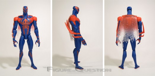
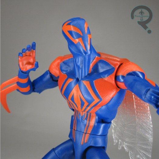
Spider-Man 2099 is the fifth figure in the Across the Spider-Verse tie-in series of Marvel Legends.  Much like the Spot, 2099 is a design that’s largely unchanged from his comics counterpart, really just relying more on stylization to change things up.  Given how strong and distinctive 2099’s look, this is hardly a surprise.  The figure stands about 6 3/4 inches tall and he has 30 points of articulation.  2099’s articulation is one of this assortment’s most restricted, which is admittedly odd, since it doesn’t really feel like there’s any clear reason for that.  He just winds up with a slightly more rudimentary articulation layout.  It’s not *bad*, mind you, just a little bit clunky, and therefore a little surprising to see.  He does at least still get a ball-jointed neck, as well as the pinless construction on the arms and legs.  2099 is sporting an all-new sculpt by sculptor Arlen Pelletier, and aside from issues with the articulation breaking it up a bit too much during posing, I really quite like it.  He’s notably bulkier and taller than the other Spiders, which I definitely dig, and which is also in line with his animation model.  The detailing is all nice and sharp, and it’s nice to see Miguel get full sculpted elements for his costume, after being relegated to largely just paint on his last few Legends.  2099’s paint work is overall pretty on the basic side.  He’s blue with red accents, and a lot of that’s molded.  The colors are rather bright, and they’re flat, straying away from his usual metallics.  It makes sense, of course, given the desire to stick with the animation look, which isn’t as shiny looking as the comics.  I feel like there should be some sort of darker accenting on the blue sections, and the sculpted textures on the red get a little lost with nothing to make them pop, but as far as the basics go, he’s alright.  Miguel is packed with two sets of hands, in fists and open gesture.  It’s too bad we didn’t also get an unmasked head like with the others, but it’s possible that model wasn’t finalized in time.  Still, he feels a tad light.

THE ME HALF OF THE EQUATION

2099’s got a pretty sick visual, and getting Oscar Isaac to voice him in the teaser at the end of Into definitely had me hyped for this guy in the sequel.  I was rather looking forward to this figure.  Ultimately, he’s the tiniest bit of a let-down.  He’s not bad.  I can’t stress that enough.  He’s just kind of fine.  And in this assortment, that puts him a bit behind the rest of the pack.

Thanks to my sponsors over at All Time Toys for setting me up with this figure to review.  If you’re looking for cool toys both old and new, please check out their website and their eBay storefront.

#3378: Mekaneck

MEKANECK

MASTERS OF THE UNIVERSE (MATTEL)

Introduced to the Heroic Warriors in 1984, during Masters of the Universe‘s third year, Mekaneck was dubbed the “Heroic Human Periscope!”  He was originally titled “Spy Man”, a name that would survive long enough to be listed for the character in Filmation’s series bible for their animated adaption.  This was, presumably, ruled out for being too basic, though in a line where the lead character is “He-Man,” you can only get too clever before you don’t actually fit in anymore.  Mekaneck splits the difference a bit, I suppose.  Though hardly one of the franchise’s heavy hitters, Mekaneck is nevertheless a fairly memorable member of the Heroic Warriors, and a solid second tier character that no line really feels complete without.  Today, I’m jumping back to the very beginning for the character.

THE FIGURE ITSELF

Mekaneck was included in the third main assortment of Heroic Warriors for Mattel’s Masters of the Universe.  The 1984 line-up introduced some pretty prominent figures to the line, including the Battle Armor versions of the two main characters He-Man and Skeletor, as well as the first figures for both Orko and Fisto.  But Mekaneck is today’s focus, and I’m certainly not gonna let the others take away from that.  Mekaneck stands about 5 1/2 inches tall and he has 5 points of articulation.  Due to the nature of his action feature, Mekaneck lacked an actual neck joint.  Additionally, his waist only turns one direction, and only about halfway at that.  Mekaneck made use of the standard barbarian arms, pelvis, and legs, as well as a new head/neck, a tweaked torso, and an all-new chest armor piece (which would see re-use the next year for Stinkor).  His sculpting is pretty standard for the line.  He’s got the usual rather goofy proportions, as expected, and minimal levels of detailing over most of the sculpt.  His head is the most distinctive piece, sporting a rather unique helmet and goggles.  The detailing is a touch soft, but not terrible.  I do quite like the mechanical details on the neck.  The color work on this guy is generally basic, and not super sharp or anything, but it gets the job done.  Obviously, this particular figure has seen better days, but he’s not incredibly bad given how old he is.  He’s still got faint traces of the chrome goggles, which are still fun.  Mekaneck was packed with a club-like sort of weapon, which would become a staple for the character.  It was somewhat prone to warping, given how soft the material was, but it’s a decent side-arm for him.  He also featured an action; twisting his toros to his left extends the neck.  It’s only about an inch and a half, since it’s got to fit in the torso, and he has to have his legs off to the side to use it, but it’s still fun.  Basic, but fun.

THE ME HALF OF THE EQUATION

When the pilot movie for the 200x tie-in cartoon ran in 2002, I watched it with quite a bit of excitement.  Mekaneck, as minor as he may have been, really stuck out to me.  I knew there was one coming in the 200x line, but he wasn’t out when the cartoon hit.  I made due with just having the basic He-Man to start, but I wanted more.  As luck would have it, we had a power-outage at my parents home that weekend, and, so as to not keep me stuck in a house with no power for a long stretch of time, my dad took me out for the day, which included stopping by a comic book store that had a decent selection of vintage toys, which just so happened to have this guy, meaning I was able to add a Mekaneck to my collection months earlier than the 200x figure’s release.  This one got a lot of use before the update came along, at which point, I believe I retconned this one into being a relative of some sort.  But this one was still the first, and that’s honestly pretty cool.

#3377: Peter B. Parker

PETER B. PARKER

MARVEL LEGENDS (HASBRO)

“Peter B. Parker must decide between protecting his old pal Miles and siding with his more experienced comrades.”

While Peter Parker was the main character of the comics version of “Spider-Verse,” for the Spider-Verse movies, the focus has been shifted to Miles Morales, with Peter, specifically the alternate universe Peter B. Parker, serving as a mentor to Miles.  It’s a change-up, but a decidedly fun one.  And there’s all sorts of goofy slacker Peter in costume looks that we got out of it.  So, let’s have a look at another Peter B. Parker!

THE FIGURE ITSELF

Peter B. Parker is the fourth figure in the Across the Spider-Verse tie-in line-up of Marvel Legends.  Technically, he’s not actually an Across figure, and is in fact the line-up’s one Into the Spider-Verse figure, making him the first true repeat.  He does at least get a slightly changed-up look, though.  While the last figure was based on Peter B’s fully civilian look, this one takes the next step in his costume evolution, with his into action look…well, at least the one before he gets his full costume back.  Yay sweat pants!  The figure stands just shy of 6 1/2 inches tall and he has 32 points of articulation.  Last time around, Peter was the most limited of the Spider-Verse figures in terms of articulation, but this one ends up fairing just a little bit better, largely due to the lack of bulky over coat, but also thanks to some of thinner limb parts, most notably the ankles and the neck, being less wobbly when posing.  Peter marks the sets one tiny little bit of re-use; the sweat pants are the same ones used on the prior figure, which does make a degree of sense.  Everything else is all-new, and it’s generally pretty good.  It’s certainly very on-brand for the film’s styling, though if I have one complaint it’s that his lower torso is definitely too fit and defined.  Those are Peter A’s abs, not Peter B’s.  It’s interesting, because that’s an area where re-using the torso from the prior figure would have solved the issue, and yet they opted not to.  One almost has to wonder if there was a plan to do a full Peter A figure, but they opted for the budget friendlier sweat pants version of Peter B.  Or perhaps there was some sort of a mix-up on the models being used.  Whatever the case, it’s not the end of the world.  Peter’s paint work is quite on the basic side, but that’s not a terrible thing, and he’s at least pretty eye-catching, and what’s there is clean.  Peter is quite on the light side for accessories, getting two sets of hands, one in fists and one in thwipping pose.  They look to be re-used from the last one.  Since we’re getting re-use anyway, getting one or both of those alternate heads might have also been nice, if there wasn’t any chance of any new parts.

THE ME HALF OF THE EQUATION

I wasn’t sure I was going to like this guy.  He honestly perplexed me a bit, since it’s odd to get another Into Peter B. before getting his new look from Across, but perhaps there’s a good reason for holding off on that one.  I was also a bit surprised that we still didn’t get Peter’s full costume.  That being said, I think I’m honestly happier with him this way.  We’ve gotten plenty of basic Spider-Men over the years, and a Spider-Verse one is kind of inevitable, so doing this one first is at least a slightly more unique look, and he’s also just a rather fun figure at that.

Thanks to my sponsors over at All Time Toys for setting me up with this figure to review.  If you’re looking for cool toys both old and new, please check out their website and their eBay storefront.

#3376: Classic Iron Man, Bolt Face Iron Man, & AIM Soldier

CLASSIC IRON MAN, BOLT FACE IRON MAN, & AIM SOLDIER

MARVEL MINIMATES

2008 into 2009 was quite a resurgence for Iron Man, due to that whole, you know, really successful movie thing he had going for him.  In the world of Marvel Minimates, it meant that he went from a character with one release every now and then to a character that could very seriously be banked upon.  In the space of about a year, his number of Minimates tripled, and we even got some looping back for proper updates to older releases.  He wound up as an anchor figure for the line’s 25th series, which saw him get two different figures, each packed with an AIM Soldier.

THE FIGURES THEMSELVES

Classic Iron Man and the AIM Soldier were released in the 25th specialty series of Marvel Minimates, with Bolt Face Iron Man swapping out for Classic Iron Man in the one-per-case Variant set.  Classic Iron Man and the AIM soldier would both also see release in the third TRU-exclusive series, albeit split up and packed with other figures (Mark I War Machine for Classic IM and Bucky Cap for the AIM Soldier).  Series 25 hit in May of 2009, and TRU Series 3 hit the following month.

CLASSIC IRON MAN

Continually improving his Iron Man armor designs, the brilliant Tony Stark’s early red and gold armor set the standard for years to come by combining lightweight and maneuverable armor with new Repulsor technology!”

Iron Man had debuted with his classic armor in Series 6, but it had been a couple of years since that at this point, and there hadn’t been a proper update to the design since.  With all of the new attention, DST opted to do an all-new one, based again on his ’70s-’80s armor.  The figure is built on the standard post-C3 ‘mate body, so he’s about 2 1/2 inches tall and he has 14 points of articulation.  Classic Iron Man got a rather astounding 9 add-on pieces for this release, which included the helmet, belt, collar, shoulder, arm, and leg cuffs.  All of the pieces were new for this release, and represented DST moving to a generally more sculpted approach to even classically-based designs, although it also showed more of a melding between purely sculpted and printed detailing, as well as a general slimming down of certain figures.  The gloves and boots get cuffs without the need of full hand and feet pieces, and the shoulders get their add-ons without needing to bulk up the whole torso.  It was honestly a pretty big change-up.  The shoulders in particular are a little frustrating, since they had trouble staying properly in place, but they do look good when properly set.  Iron Man’s paint work is pretty involve, with a lot of detail line work on just about all of the surfaces.  While the prior Classic Iron Man had used flat colors, this one used metallic red and gold.  The gold’s a little on the orange side, which kind of muddies the look just a bit.  On the plus side, it’s held up better long term than other gold paints, so it at least doesn’t look awful.  I was never much of a fan of the face plate on the helmet for this guy, though; something about the spacing of the eyes, coupled with the actual eyes being visible, just doesn’t work for me.  It was a pretty common complaint at the time of release, and DST changed it up for later releases of the designs, so they seemed to agree.  Under the helmet, there’s a slightly more intense facial expression for Tony, which was honestly a pretty decent look.  Classic Iron Man was packed with an alternate hair piece (re-used from 24‘s Tony Almeida) and an alternate left repulsor hand.

BOLT FACE IRON MAN

Similar to his previous armor designs, this improved model featured modular components such as the Black Light Tracer, Reverser Ray, Miniature Generator and even a Proximity Alarm designed to mimic Spider-Man’s Spider Sense!”

We couldn’t just have one Iron Man, so we got two instead.  This one goes for a just prior to classic look, ever so affectionately dubbed “Bolt Face” due to the rivets on the faceplate.  We’d sort of gotten this armor before in its horn-masked iteration, but this was the first proper “Bolt Face.”  Structurally, he’s largely the same as the standard version, though he ditches the shoulder add-ons and gets the Series 6 belt, which gives him a slightly older school look.  His paint scheme is also pretty similar, with the shades all being the same, but the actual detail lines being changed up.  They’re really nice, not as over detailed as Classic, and just a very nice recreation of his comics look for this one.  This time around, the helmet gets blacked out eyes, and the spacing just generally looks a bit better.  The face under the helmet is a lot calmer than the standard, and is again a very ’60s looking Tony, which I really like.  Bolt Face IM got an alternate hair piece (re-used from Jack Bauer), and a repulsor hand, just like he Classic.  He also got a spare helmet, which represents the short-lived nosed faceplate, as well as the shoulder pieces, so that you could turn him into a slightly later stage Iron Man.  Technically, the pieces don’t really match the rest of the detailing on the armor, and would be more at home on the standard Iron Man.  And, actually, swapping the nosed helmet to the Classic Iron Man fixes my only real issue with that figure, and lets me leave this one in all its Bolt-Faced glory.

AIM SOLDIER

Capable of both saving the world and destroying it, Advanced Idea Mechanics is a powerful terrorist group consisting of brilliant yet misguided scientists determined to invent more and more destructive weapons.”

The AIM Soldier marked an important change for Marvel Minimates: Army Builders!  Up to this point, you were forced to buy a duplicate of the figure packed with the Variant, and it was at this point that DST officially decided to try to make lemonade out of those lemons, and make the duped figure one that people might not mind having a dupe of.  The first offering in the army building venture was those crazy beekeeper guys themselves, who are honestly a pretty natural choice.  The AIM Soldier had two add-on pieces, one for the mask and one for the holster.  The mask was an all-new piece, and a pretty spot-on one for their classic comics look.  The holster was a re-use from Assault Punisher, and it’s a little bulky, but it’s also very easily removed if it’s not your thing.  The paint work does a quite nice job of capturing the usual AIM design; there’s plenty of line work on the suits, bot front and back, and the belts even continue all the way around the waist.  Under the mask, there’s a fully detailed face with ears and a pair of lenses.  The AIM Soldier included a standard pistol (re-used again from Assault Punisher), and a larger rotary gun, which is a slight reworking of one of of War Machine’s cannons.

THE ME HALF OF THE EQUATION

When this series and the Series 28 (which was originally Series 26, before it got bumped for the Origins tie-in assortment) line-ups were revealed, DST ran a contest to guess the line-ups based on daily clues.  I was actually quite good at it, and wound up winning a fair bit of free stuff because of it.  Interestingly, Iron Man and his variant were the two that stumped me, but I did get the AIM Soldier.  In general, the whole thing made me very pumped for both assortments, which, as per usual for the time, I got via Cosmic Comix.  Classic Iron Man wasn’t my go-to at the time of release, nor has he really stuck with me.  The variant, on the other hand, remains one of my favorite Iron Man variants.  Likewise, the AIM Soldier’s top two for army builders for me.

#3375: Elongated Man

ELONGATED MAN

JUSTICE LEAGUE UNLIMITED (MATTEL)

While I’ve up to this point only really mentioned him in passing here on the site, Ralph Dibney, aka the Elongated Man, is one of my favorite comic book characters, and certainly my favorite DC character. Though he’s been rattling around the DC universe since 1960, he spent his first 44 years strangely absent from other mediums, always playing second fiddle to Plastic Man. His lick finally changed in 2004, with first a DC Direct figure, and then a figure to correspond with his first animated appearance in Justice League Unlimited. I’m taking a look at the latter of those today.

THE FIGURE ITSELF

Elongated Man was released in the first assortment of Justice League Unlimited three-packs in 2004.  He was packed in a set which was supposedly based on “The Greatest Story Never Told.”  Given that the episode in question is honestly one of Elongated Man’s largest roles on the show, it made some degree of sense.  Of course, the fact that the set packed him with Batman and Hawkgirl (who, it should be noted, was not only not wearing her Thanagarian costume in JLU, but had also not yet returned after leaving in “Starcrossed”), and did *not* feature Booster Gold, who was, you know, the main character in the episode.  I mean, sure, I’m thrilled about the inclusion of Elongated Man and all, but still.  Elongated Man was also released single-careded, in both the orange and purple card styles, in 2006 and 2007.  The figure stands about 4 1/2 inches tall and he has 5 points of articulation.  He’s built on the skinny male body (which was a tweaked Flash sculpt), which very definitely fits with the character’s depiction on the show.  He got a new head sculpt.  It’s an alright offering; not quite as spot-on as some of the others in the line, but certainly not bad.  The decision to go with the full grin doesn’t work out quite as well as they’d hoped, I feel; he didn’t really show his teeth much on the show, so it throws the likeness off just a little bit.  But, like I said, hardly a bad sculpt at all, and certainly one that made him unique from the other figures in the line.  The figure’s paint work followed the show’s lead, putting Ralph in his ’80s era purple and white costume.  It translates fairly well, and the application’s generally pretty clean.  It hasn’t held up the best on my copy, who has some chipping and wear, but that could just be a me thing.  The original three-pack release of Ralph had no accessories, but the two single releases added a weird grapple thing to clip onto his wrist.  It’s an odd piece.

THE ME HALF OF THE EQUATION

The three-pack that Ralph was included in was one of the trickier ones to acquire early in the line’s run, and I don’t recall seeing one at retail during the original run.  I also missed out on his single releases.  Instead, I got my Elongated Man figure loose, in fact as one of my earliest purchases from All Time Toys way back in the day.  I recall being quite excited to find him, especially since it meant I didn’t get saddled with extras of the other two figures in the pack.  He’s not a perfect figure, but he *is* an Elongated Man figure, so that gives him quite a leg up in my book!

#3374: Spider-Gwen

SPIDER-GWEN

MARVEL LEGENDS (HASBRO)

“Spider-Gwen has grown up a lot over the past two years, keeping busy between band practice and protecting her city.”

Spider-Gwen, an alternate universe Gwen Stacy imbued with the Spider powers instead of Peter Parker, was introduced in, and central to, the comics “Spider-Verse” storyline, and was likewise central to Into the Spider-Verse.  The comics kept Gwen as pretty central to all the follow-up “Spider-Verse” events, and Across the Spider-Verse has the movies following suit.  Gwen was part of the rather small Legends tie-in for Into, and she’s also part of the much larger tie-in set-up for the sequel.  Let’s see how this one measures up to the last one!

THE FIGURE ITSELF

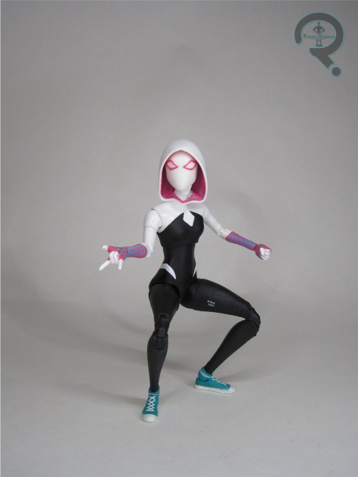
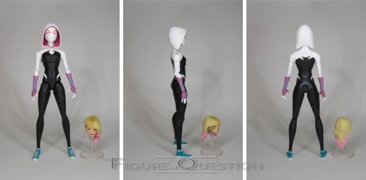
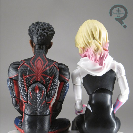
Spider-Gwen is the third figure in the Across the Spider-Verse tie-in assortment of Marvel Legends.  She’s one of three figures that are repeated characters from the movie, and arguably the least changed of the three in raw design terms.  It’s mostly just elements being shifted around a bit, just to give her a bit of a refresh.  The figure stands just shy of 6 inches tall and she has 29 points of articulation.  Gwen’s articulation scheme mimics the layout of Spot’s, which is again a slightly better set-up than we saw with Miles, as well as an improvement on the Gwen from the last movie.  Of note, she gets bicep swivels and double elbow joints.  Her arms are a bit on the thin side, so posing them is a slightly delicate affair, but it’s not as bad as I was expecting.  Gwen’s last animated figure was one of the two from the last round to make use of re-used parts, which slightly compromised her accuracy to the film.  This one, on the other hand, gets an all-new sculpt, which is more properly attuned to her look from the movie.  It’s a very basic and straight forward sculpt, but it does what it needs to, and it certainly looks the part.  I think I preferred the masked head on the last one, but the actual hood hangs more naturally here, and the build of the body is definitely more accurate this time around.  In terms of paint work, this Gwen, much like her predecessor, does suffer from just a bit of fuzziness in some spots, but for the most part it works out pretty well.  In particular, the detailing on the “webbed” parts of the costume turned out pretty nicely.  Gwen is packed with an alternate unmasked head, a corresponding pulled down hood piece, and two sets of hands.  As with others in the assortment, it’s perhaps a touch light, but at least it covers the basics.

THE ME HALF OF THE EQUATION

I wasn’t initially sold on this Gwen figure.  I really liked the last one, and with her design being less changed than others, I just wasn’t sure I needed to double-dip on her.  Ultimately, I decided I wanted a full set, so she just sort of came along for the ride.  I’m glad that’s the choice I made, because she’s all-new, and honestly a much nicer figure than I was expecting.

Thanks to my sponsors over at All Time Toys for setting me up with this figure to review.  If you’re looking for cool toys both old and new, please check out their website and their eBay storefront.

#3373: Ultra Magnus

ULTRA MAGNUS

TRANSFORMERS: TITANIUM SERIES (HASBRO)

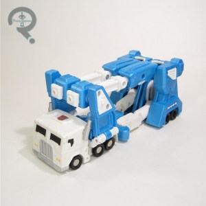
Hey, how about some Transformers?  Would that be good?  Would that be good for you guys?  Cool.  As is usually the case with Transformers reviews more recently here, we’re going back to the well of the two characters I put most of my focus on, Soundwave and Ultra Magnus. I’ll be focusing on the latter in particular for today’s review.  In particular, I’m jumping to the Titanium Series, a franchise-spanning banner that Hasbro ran under its Galoob arm from 2005 to 2007.  They had lines for Star Wars (which served largely as a replacement for Micro Machines), Marvel, and, of course, Transformers.  Transformers had two sub-lines running, a smaller non-transforming line called Robot Masters, and a larger transforming line called Cybertron Heroes.  The larger line had not one, but two Ultra Magnuses, the first of which I’m taking a look at today!

THE FIGURE ITSELF

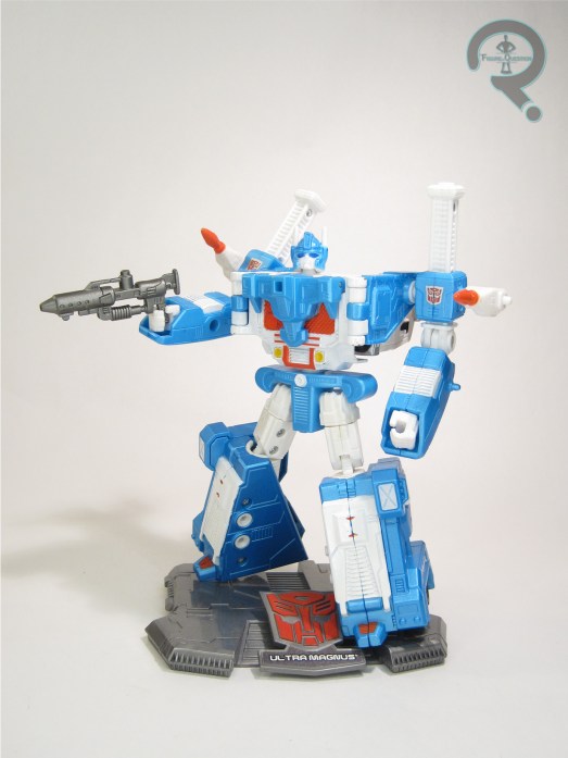
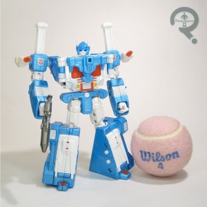
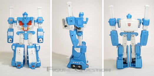
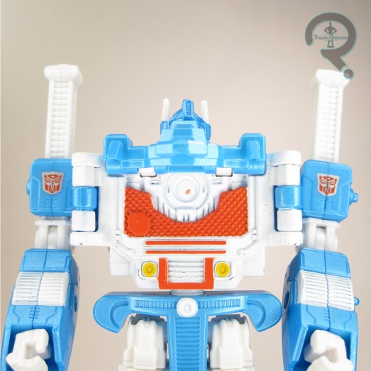
Ultra Magnus was released in 2007 as one half of Wave 7 of the Cybertron Heroes sub-line of Transformers: Titanium Series.  He was based on his G1 design, specifically the fully armored-up version.  This was the first time that the armored look had been officially updated since the ’80s.  Furthermore, this was also the first time that a fully armored Magnus figure had no inner-bot mode.  In his robot mode, he stands about 6 inches tall and he has 14 workable points of articulation.  The articulation is a bit wonky.  The balljoints for the shoulders are kinda loose and tend to pop out of place a lot.  Also, due to a design flaw, the knees bend far more forward than they do backwards.  The rest of the articulation is generally limited at best, and, due to the metal portions of the figure and the weird tolerancing of the joints, he tends to be a bit floppy.  Like the articulation, the sculpt is also a bit wonky.  There’s odd spots of flatness, a lot of obvious joints, his arms are set way back, and there’s just a lot of weirdness to the whole thing.  There’s also the whole flip-up panel on the torso thing, which feels like it’s kind of a half-formed idea that never went anywhere.  Magnus’s paint work is at least pretty solid looking.  I dig the bright blue with the metallic finish.  It doesn’t all hold up super well, of course, so you do have to be careful about it.  Magnus included a blaster, two rockets, and a “stand” with his name on it.  The stand, of course, does nothing to actually support him, but I guess it looks sort of cool.  Magnus’s alt-mode is his classic car carrier mode.  Since he has no inner-bot, he transforms straight from the fully armored mode directly to his car carrier mode.  It’s not a super complex transformation, and it results in not a super complex alt-mode.  The basic skeleton is there, but it only barely tabs together.  It feels like more of an afterthought to the robot proper.  There’s a concept there, sure, but the execution is just not there.

THE ME HALF OF THE EQUATION

This review was very nearly an “I Blame Max” review.  As it is, it’s kind of an honorary one, I guess.  I wasn’t routinely collecting anything Transformers when this guy hit, so I didn’t get one new, even when they were kind of everywhere.  So, I was reliant on used ones.  Max had a damaged one in his big bin of mixed TF parts he was sorting through some years back, which he handed over to me to fill the spot in my collection, which he did for a few years.  However, a much nicer, more proper one was traded into All Time, and that’s the one I’ve got in the review here.  I’ll admit, he’s not a *ton* better, even when not damaged.  He’s a rough offering, like most of the Titanium figures.  But, he’s also a Magnus, and I’m hard pressed to truly dislike any of those.

Thanks to my sponsors over at All Time Toys for setting me up with this figure to review.  If you’re looking for cool toys both old and new, please check out their website and their eBay storefront.

#3372: The Spot

THE SPOT

MARVEL LEGENDS (HASBRO)

“If The Spot can realize the power of his abilities, he could become a threat to the entire universe.”

The slightly quirkier tone of the Spider-Verse movies makes them great for deep dives into the Spider-Man mythos.  I largely comes in the form of lots of Spideys, but as the first film showcased, it’s also great for getting a focus on some slightly lower tier Spidey foes.  The first movie gave a particular focus to Prowler, and this one seems to be doing the same for the Spot, who looks to be the film’s main antagonist…maybe.  I’m writing this review pre-movie, so I can’t say for sure.  I’m just happy to be getting a Spot figure, honestly.

THE FIGURE ITSELF

The Spot is the second figure in the seven figure Across the Spider-Verse tie-in assortment of Marvel Legends.  He’s notably the only non-Spider in the set, and also the very first Marvel Legends Spot.  While some of the designs for the film are radical changes from the comics, the Spot actually sticks pretty close to his comics roots, albeit with the expected stylizing.  The figure stands just shy of 6 3/4 inches tall and he has 29 points of articulation.  Spot’s articulation is a slightly different set-up than we saw on Miles, and it’s better for it.  There’s still some slight issues with sticky joints on the limbs, and you have to be careful with moving the shoulders, lest they pop out at the biceps.  That said, I was especially impressed by the range of motion they managed to get into that mid-torso joint; it seems minimal at first, but once you get it working, it really does a lot.  The Spot’s sculpt is another all-new one, and it’s kind of the antithesis of Miles.  There’s very little actual detailing, making him largely a blank canvas, with the sculpting focus being placed on getting down his unique set of proportions.  It’s quite an effective set-up, with a quite distinctive silhouette, even without any extra key elements beyond the base body.  Despite the lankiness, the articulation is also worked in pretty cleanly as well, which is a definite plus.  Spot’s paint work is, like the sculpt, on the basic side.  It’s certainly effective, though.  It’s admittedly less spots than I’m used to, but that looks to be true to the film, so I’m hardly going to complain about that.  The Spot is packed with two sets of hands, in fists and open gesture, as well as two “spots”, one with Miles’ head sticking out, and the other with his hand.  There’s also a stand for clipping the spots onto, making for a pretty fun little set-up.  I would have liked to see some non-Miles-attached spots, but given the set-up for the rest of the figures, he still feels like he’s got enough to make it worthwhile.

THE ME HALF OF THE EQUATION

The Spot’s one of my favorite Spidey foes, going back to the ’90s cartoon, so I was actually pretty pumped when his inclusion in Across was announced, especially because I was pretty sure that would mean more toys…which it did.  Yay!  This guy was one of the first that images leaked for, and he’s definitely the one I was looking forward to the most.  My initial response after opening him was honestly just a touch let-down, but after getting to mess with him a little bit more, he’s grown on me, to about the point that I was expecting.  As it stands, he’s one of my top two for this set-up of figures.  I’d still love a comics version too, but this one’s a lot of fun on his own.

Thanks to my sponsors over at All Time Toys for setting me up with this figure to review.  If you’re looking for cool toys both old and new, please check out their website and their eBay storefront.