ULTRA MAGNUS
TRANSFORMERS: STUDIO SERIES (HASBRO)

“Ultra Magnus leads defensive measures against the Decepticons invading Autobot City.”
Well, it’s been another few months with no Transformers around these parts, so, you know, maybe I’ll address that? Yeah, let’s do that. And the best way to address a Transformers drought is…well, let’s be honest, with me it’s either gonna be Ultra Magnus or Soundwave. Today, let’s focus on the former. Back in 2021, Hasbro started working Transformers: The Movie figures into their Studio Series line, in celebration of the movie’s 35th anniversary. At the same time, Earthrise and Kingdom added a few more compatible characters in a fairly close to movie style. Ultra Magnus’s anniversary-related figure wound up in Kingdom, and sort of walked the line between cartoon and toy, having an animated style exterior, while still retaining the toy style inner bot. This doesn’t quite hit the same mark as a Studio Series release, so, obviously a follow-up was needed, right? Sure, yeah, let’s go with that. I will literally never turn down a new Magnus.
THE FIGURE ITSELF
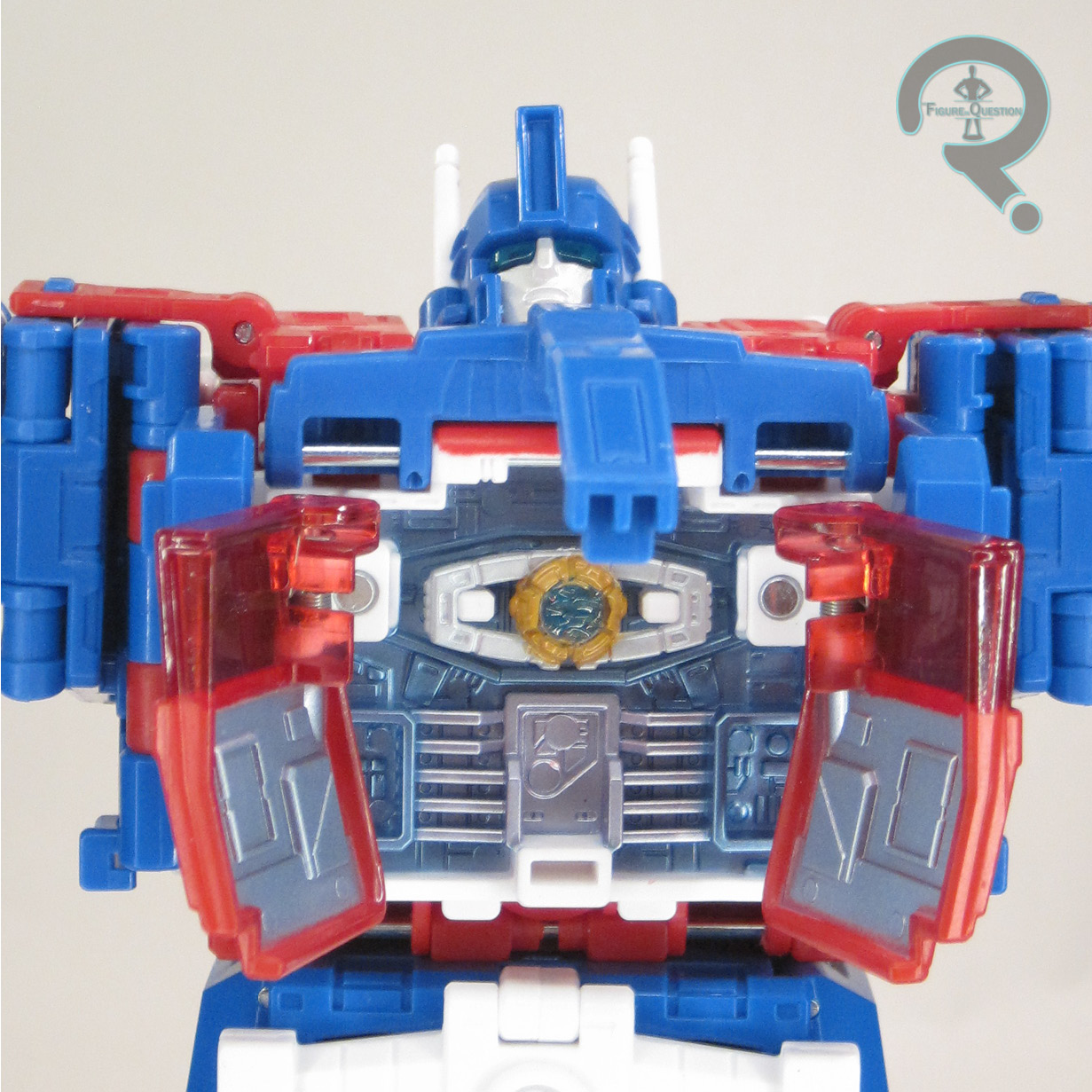
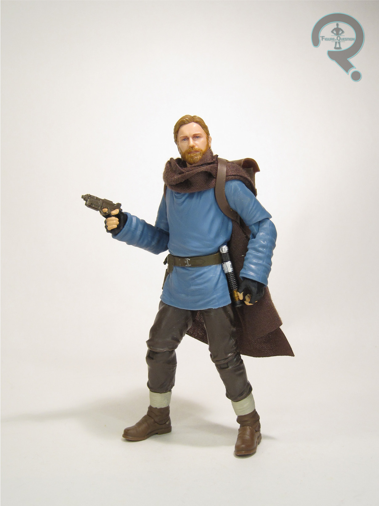
 Ultra Magus is a Commander Class release in Hasbro’s Transformers: Studio Series, where he’s numbered 86-21. Magnus is notable for being the first instance of a Commander release under the Studio Series banner; previously, they were just a main line thing. It also means he bumps up a class after being typically in the Leader category. In his robot mode, the figure stands 9 inches tall and he has 30 workable points of articulation. His articulation is generally improved compared to the usual Magnus, so he get a lot more poses than you might expect from a guy that’s so bulked up. In particular, he gets a really cool set up on his hands, allowing for “fists”, basic grip, trigger grip, and even pointing. The only part I’m not super keen on is how the shoulders work when extending out to the side; you’re effectively just popping them out of the socket, and the hinge isn’t strong enough to actually hold them up. Magnus’ sculpt is all-new, and, as noted in the intro, it eliminates the inner
 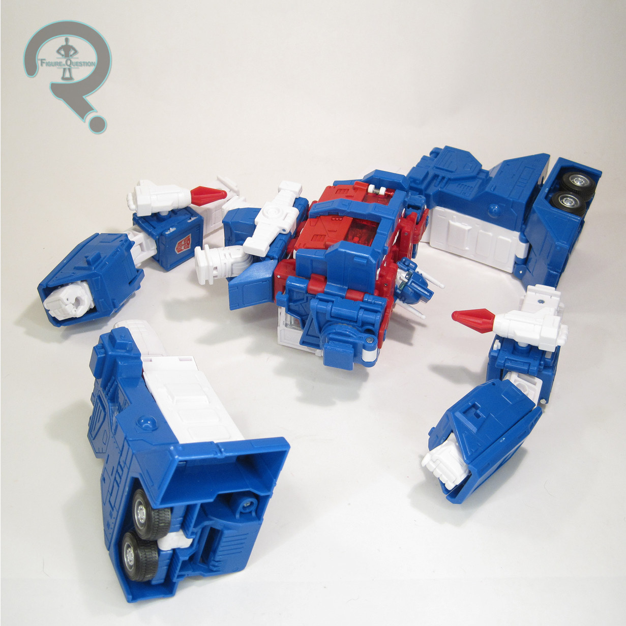 robot mode, since he had nothing of the sort in the movie or cartoon. This allows the design to focus purely on Magnus’ armored up design, and not have to worry about contending with an additional mode. As such, his proportions work out slightly differently, and he doesn’t have spots where you can still see the smaller bot poking through. It’s a strong sculpt, definitely capturing his movie design very well. The only part that feels off to me is, again, the shoulders, which seem to be a little too wide for proper animation accuracy. It’s not far off, mind you, and has to do with folding up parts from his alt-mode, so it’s not the end of the world. Ultra Magnus gets a few built-in features. To replicate the scene in the movie where he is drawn and quartered, his arms and legs are removable, by way of a
  spring-loaded locking system. Magnus also gets a spot in his torso to house the Matrix of Leadership (as he does for a while in the movie), which is likewise spring loaded. Pulling up the blue armored section of the torso flips the two chest doors open, revealing the included Matrix. Magnus is packed with his toy-style rifle, plus his smaller emergency rifle from the movie, both of which can be stored on his back. He also includes 7 different effects pieces, which are modular, and can be combined into different set-ups in conjunction with the rifles and the rockets.

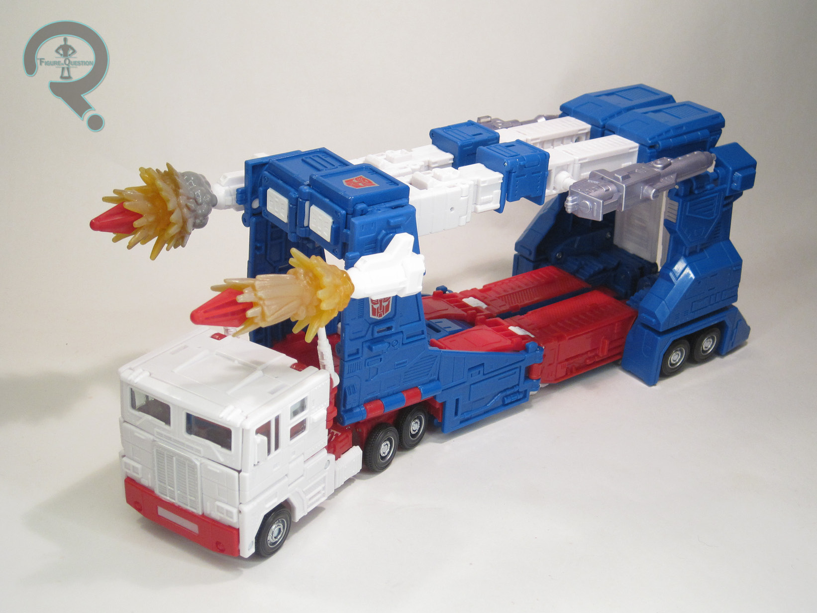
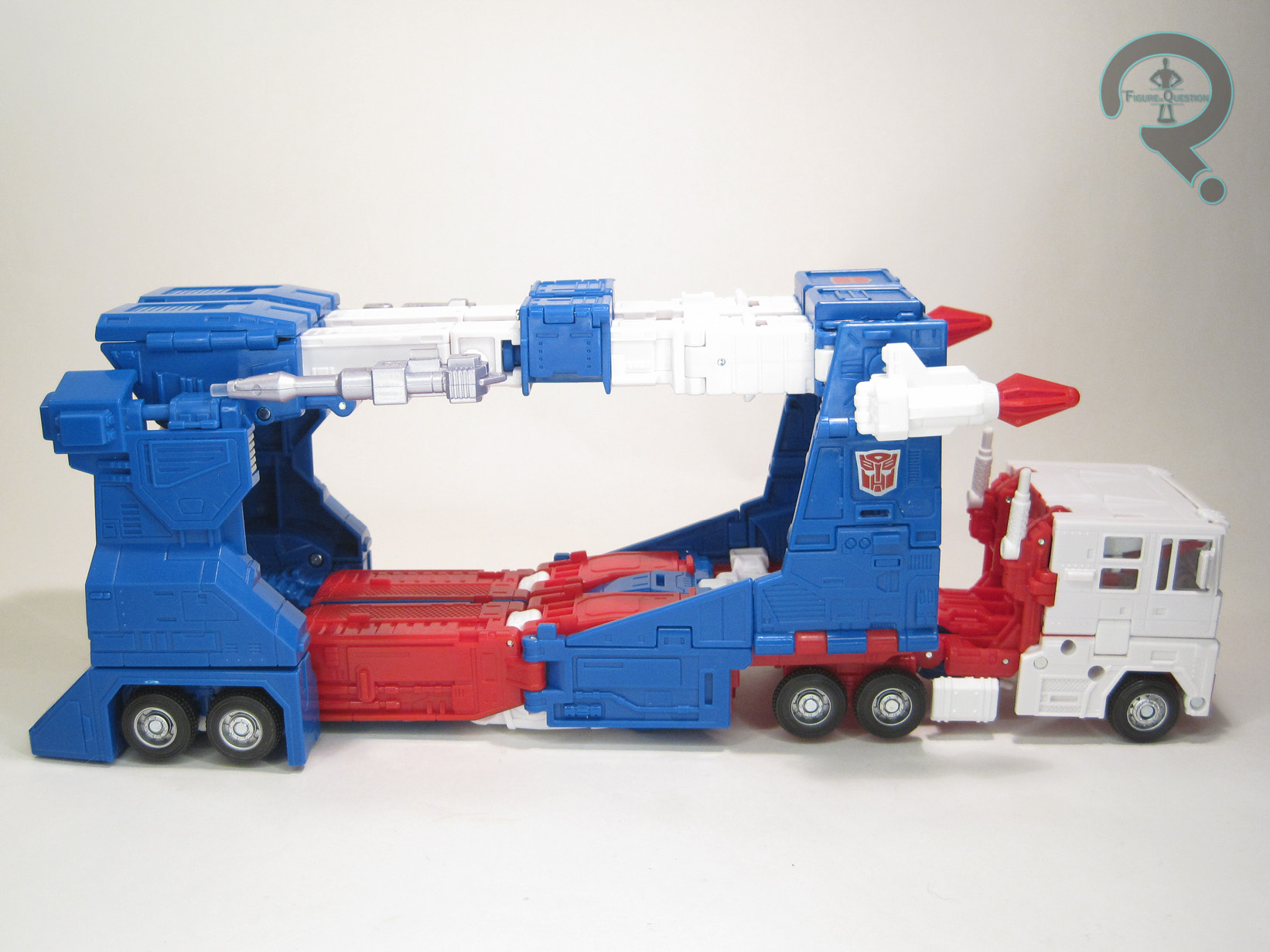
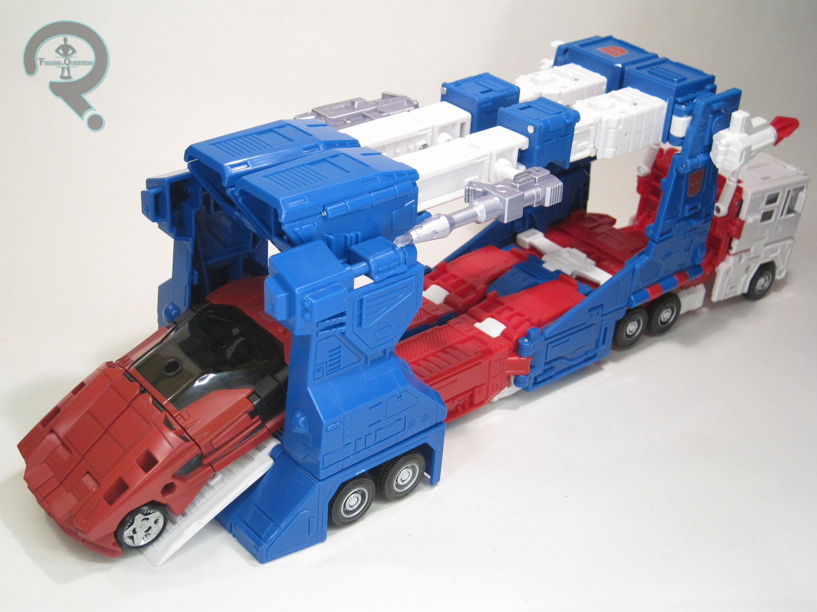 With no inner bot, this Magnus transforms directly into his car-carrier vehicle mode, rather than the separate cab/carrier set-up of the Kingdom and Siege molds. He’s a Commander Class, so there’s a definite complexity to the transformation. It’s definitely a little more on the fiddly side, and I was consulting the instructions more on this one than others. That said, it’s not terribly unintuitive, and its still a Magnus, so there are certain broad strokes that still land for the sequence. The resulting vehicle mode is honestly pretty good. There are a few spots where it doesn’t *quite* tab together perfectly, but otherwise it works, and the carrier portion is even large enough to properly carry Deluxe Class car bots, which is definitely a plus from the compatibility stand-point.
THE ME HALF OF THE EQUATION
After getting the Kingdom Magnus, I didn’t think I needed another G1-style Magnus. I mean, that one’s, like, really solid. How do you top it? You don’t, as it turns out. You go a different direction. This one definitely was a surprise, but a happy one. He’s definitely fun. I don’t know that he beats out Kingdom Magnus in my *personal* order, but that doesn’t mean I can’t appreciate another Magnus for my Magnus shelf.
Thanks to my sponsors over at All Time Toys for setting me up with this figure to review. If you’re looking for cool toys both old and new, please check out their website and their eBay storefront.