#3373: Ultra Magnus

ULTRA MAGNUS

TRANSFORMERS: TITANIUM SERIES (HASBRO)

Hey, how about some Transformers?  Would that be good?  Would that be good for you guys?  Cool.  As is usually the case with Transformers reviews more recently here, we’re going back to the well of the two characters I put most of my focus on, Soundwave and Ultra Magnus. I’ll be focusing on the latter in particular for today’s review.  In particular, I’m jumping to the Titanium Series, a franchise-spanning banner that Hasbro ran under its Galoob arm from 2005 to 2007.  They had lines for Star Wars (which served largely as a replacement for Micro Machines), Marvel, and, of course, Transformers.  Transformers had two sub-lines running, a smaller non-transforming line called Robot Masters, and a larger transforming line called Cybertron Heroes.  The larger line had not one, but two Ultra Magnuses, the first of which I’m taking a look at today!

THE FIGURE ITSELF

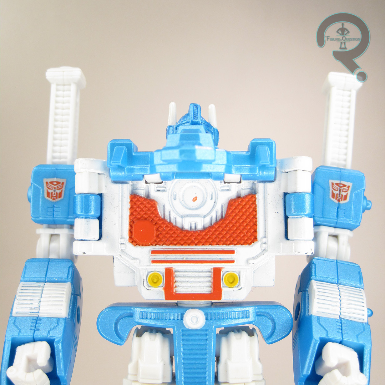
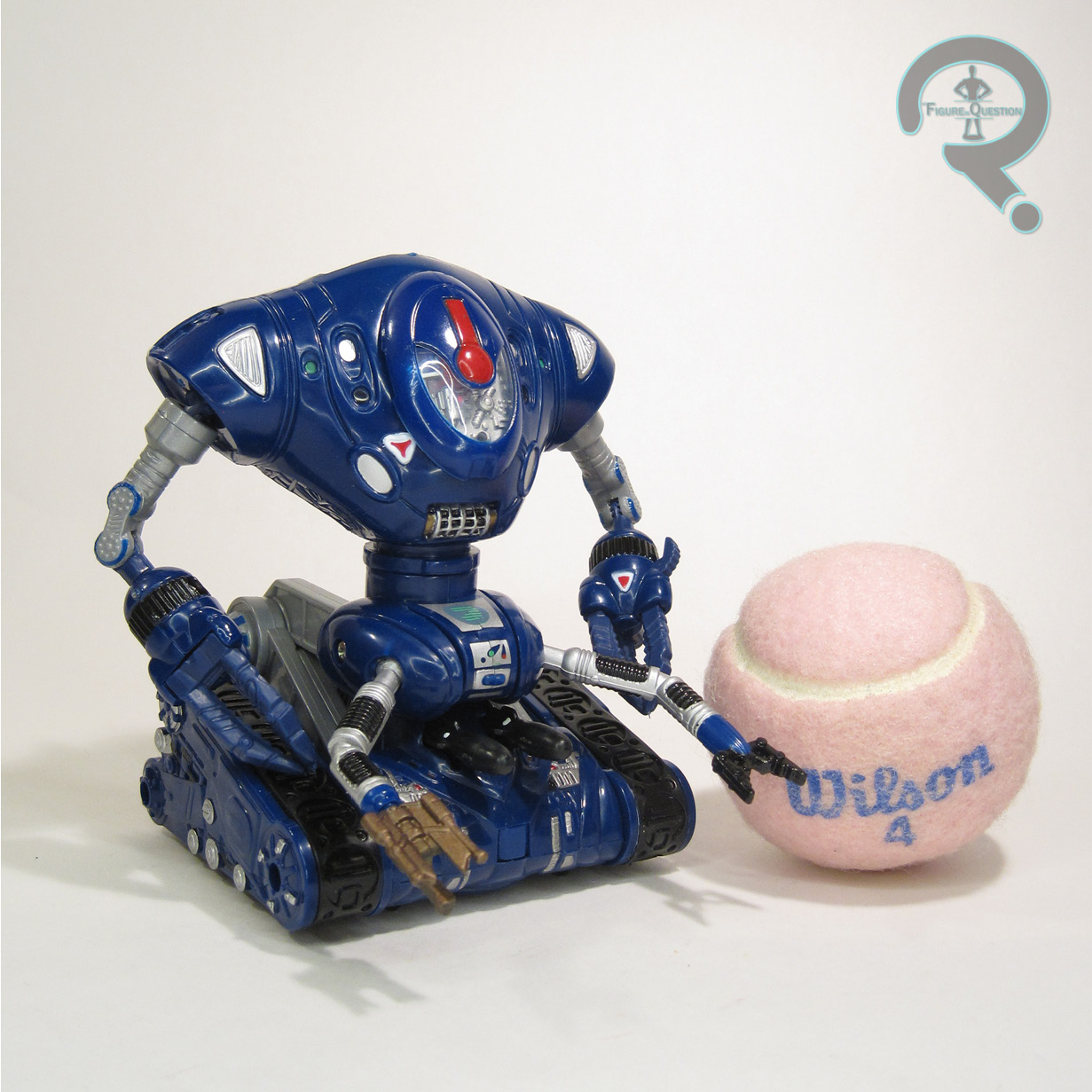
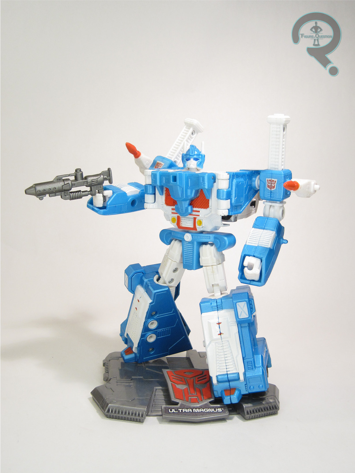
Ultra Magnus was released in 2007 as one half of Wave 7 of the Cybertron Heroes sub-line of Transformers: Titanium Series.  He was based on his G1 design, specifically the fully armored-up version.  This was the first time that the armored look had been officially updated since the ’80s.  Furthermore, this was also the first time that a fully armored Magnus figure had no inner-bot mode.  In his robot mode, he stands about 6 inches tall and he has 14 workable points of articulation.  The articulation is a bit wonky.  The balljoints for the shoulders are kinda loose and tend to pop out of place a lot.  Also, due to a design flaw, the knees bend far more forward than they do backwards.  The rest of the articulation is generally limited at best, and, due to the metal portions of the figure and the weird tolerancing of the joints, he tends to be a bit floppy.  Like the articulation, the sculpt is also a bit wonky.  There’s odd spots of flatness, a lot of obvious joints, 
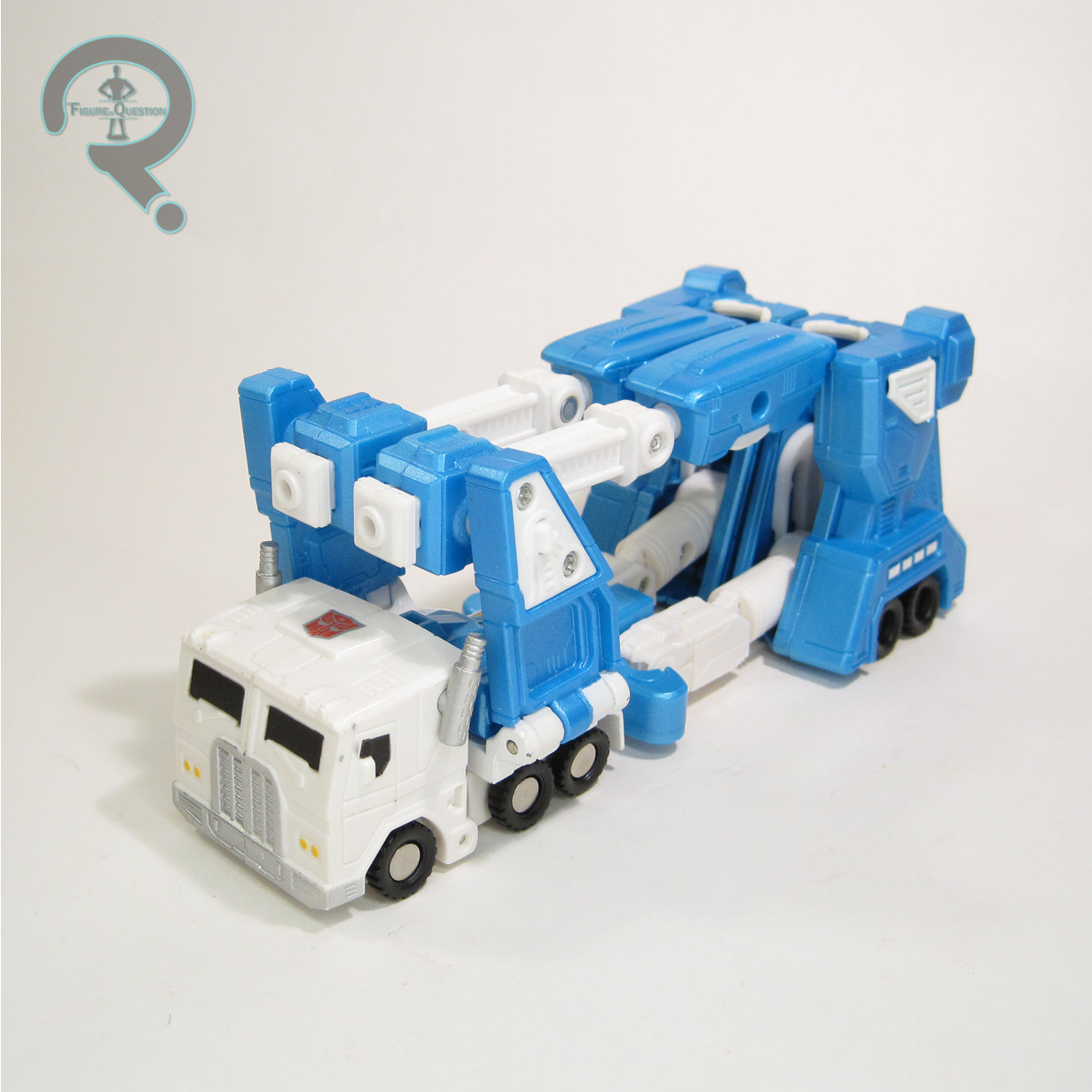
his arms are set way back, and there’s just a lot of weirdness to the whole thing.  There’s also the whole flip-up panel on the torso thing, which feels like it’s kind of a half-formed idea that never went anywhere.  Magnus’s paint work is at least pretty solid looking.  I dig the bright blue with the metallic finish.  It doesn’t all hold up super well, of course, so you do have to be careful about it.  Magnus included a blaster, two rockets, and a “stand” with his name on it.  The stand, of course, does nothing to actually support him, but I guess it looks sort of cool.  Magnus’s alt-mode is his classic car carrier mode.  Since he has no inner-bot, he transforms straight from the fully armored mode directly to his car carrier mode.  It’s not a super complex transformation, and it results in not a super complex alt-mode.  The basic skeleton is there, but it only barely tabs together.  It feels like more of an afterthought to the robot proper.  There’s a concept there, sure, but the execution is just not there.

THE ME HALF OF THE EQUATION

This review was very nearly an “I Blame Max” review.  As it is, it’s kind of an honorary one, I guess.  I wasn’t routinely collecting anything Transformers when this guy hit, so I didn’t get one new, even when they were kind of everywhere.  So, I was reliant on used ones.  Max had a damaged one in his big bin of mixed TF parts he was sorting through some years back, which he handed over to me to fill the spot in my collection, which he did for a few years.  However, a much nicer, more proper one was traded into All Time, and that’s the one I’ve got in the review here.  I’ll admit, he’s not a *ton* better, even when not damaged.  He’s a rough offering, like most of the Titanium figures.  But, he’s also a Magnus, and I’m hard pressed to truly dislike any of those.

Thanks to my sponsors over at All Time Toys for setting me up with this figure to review.  If you’re looking for cool toys both old and new, please check out their website and their eBay storefront.

#3372: The Spot

THE SPOT

MARVEL LEGENDS (HASBRO)

“If The Spot can realize the power of his abilities, he could become a threat to the entire universe.”

The slightly quirkier tone of the Spider-Verse movies makes them great for deep dives into the Spider-Man mythos.  I largely comes in the form of lots of Spideys, but as the first film showcased, it’s also great for getting a focus on some slightly lower tier Spidey foes.  The first movie gave a particular focus to Prowler, and this one seems to be doing the same for the Spot, who looks to be the film’s main antagonist…maybe.  I’m writing this review pre-movie, so I can’t say for sure.  I’m just happy to be getting a Spot figure, honestly.

THE FIGURE ITSELF

The Spot is the second figure in the seven figure Across the Spider-Verse tie-in assortment of Marvel Legends.  He’s notably the only non-Spider in the set, and also the very first Marvel Legends Spot.  While some of the designs for the film are radical changes from the comics, the Spot actually sticks pretty close to his comics roots, albeit with the expected stylizing.  The figure stands just shy of 6 3/4 inches tall and he has 29 points of articulation.  Spot’s articulation is a slightly different set-up than we saw on Miles, and it’s better for it.  There’s still some slight issues with sticky joints on the limbs, and you have to be careful with moving the shoulders, lest they pop out at the biceps.  That said, I was especially impressed by the range of motion they managed to get into that mid-torso joint; it seems minimal at first, but once you get it working, it really does a lot.  The Spot’s sculpt is another all-new one, and it’s kind of the antithesis of Miles.  There’s very little actual detailing, making him largely a blank canvas, with the sculpting focus being placed on getting down his unique set of proportions.  It’s quite an effective set-up, with a quite distinctive silhouette, even without any extra key elements beyond the base body.  Despite the lankiness, the articulation is also worked in pretty cleanly as well, which is a definite plus.  Spot’s paint work is, like the sculpt, on the basic side.  It’s certainly effective, though.  It’s admittedly less spots than I’m used to, but that looks to be true to the film, so I’m hardly going to complain about that.  The Spot is packed with two sets of hands, in fists and open gesture, as well as two “spots”, one with Miles’ head sticking out, and the other with his hand.  There’s also a stand for clipping the spots onto, making for a pretty fun little set-up.  I would have liked to see some non-Miles-attached spots, but given the set-up for the rest of the figures, he still feels like he’s got enough to make it worthwhile.

THE ME HALF OF THE EQUATION

The Spot’s one of my favorite Spidey foes, going back to the ’90s cartoon, so I was actually pretty pumped when his inclusion in Across was announced, especially because I was pretty sure that would mean more toys…which it did.  Yay!  This guy was one of the first that images leaked for, and he’s definitely the one I was looking forward to the most.  My initial response after opening him was honestly just a touch let-down, but after getting to mess with him a little bit more, he’s grown on me, to about the point that I was expecting.  As it stands, he’s one of my top two for this set-up of figures.  I’d still love a comics version too, but this one’s a lot of fun on his own.

Thanks to my sponsors over at All Time Toys for setting me up with this figure to review.  If you’re looking for cool toys both old and new, please check out their website and their eBay storefront.

#3371: Black Suited Spider-Man & Sandman

BLACK SUITED SPIDER-MAN & SANDMAN

MARVEL MINIMATES

Marvel Minimates‘ relationship with movie tie-ins is sort of a turbulent one.  The first series of the line only exists in the form that it does because it was 2003, and Daredevil and Hulk both got movies, but the actual ‘mates are entirely comics-based.  The first true movie tie-ins were a pair of waves, one being based on X3 and the other being based on Ghost Rider.  The X3 set was at least able to get by on being X-Men, but the Ghost Rider set is infamously the only specialty series of Marvel Minimates to be outright cancelled.  DST’s next go at movie tie-ins was for something that felt like more of a shoe-in, but still didn’t quite stick the landing, Spider-Man 3, which got two whole assortments of coverage.  Today, I’m taking a look at Black Suited Spider-Man and Sandman, based on their looks from the film.

THE FIGURES THEMSELVES

Black Suited Spider-Man and Sandman were released in Series 17 of Marvel Minimates, which was the first of the two assortments dedicated to the movie (though both of them wound up shipping at the same time, as was a common practice for Marvel Minimates at the time).

BLACK SUITED SPIDER-MAN

With the symbiote playing a major part in Spider-Man 3, there were understandably quite a few variations available in the line.  This one aimed to be the standard issue version…but it wasn’t quite there.  The figure’s on the post-C3 minimate body, so it’s about 2 1/4 inches tall and has 14 points of articulation.  He gets one add-on piece for his torso, because, for some reason, DST decided to make Black Suited Spider-Man really buff.  Not sure why, since it’s still just Tobey McGuire, with his regular Spidey build, under the suit; there’s no reason to bulk him up compared to the regular one.  But, they did, and it makes him look really puffy.  Not exactly what you hope for on this design.  The paint work is generally alright, with a good deal of texturing and smaller detail work going on.  While the preview version of the figure (which also ditched the torso cap) got web detailing on the hands, this one does not, and the shades are a little closer between the underlying color and the weblines on this one too, making him generally seem just a bit too muddled.  His eyes also feel just a touch too close together, which makes the torso look even larger by comparison, and makes him feel even more bloated.  Spidey was packed with no accessories.

SANDMAN

We got two different Sandmen courtesy of this movie, depicting him in relatively human and totally sand forms.  This was the relatively human one.  Seeing as his design was also a rather faithful recreation of his classic comics look, it also allowed him to serve as a standard Sandman, if you were so inclined.  He’s got add-ons for his hair and chest cap, both of which were new for this release.  The hair became a rather common piece, and the chest cap saw use on a couple of other Sandmen that followed.  They’re both actually pretty nice pieces, working well within the context of the film design, but also showcasing the improved sculpting that DST really started to roll out with this assortment.  His paint work is generally pretty solid.  The face sports a respectable likeness of Thomas Haden Church, though he’s perhaps a little too light-hearted looking for the rather sullen Marko from the movie.  Of course, it makes it easier to turn him into Lowell for my Wings display, so I suppose it’s not all bad, right?  Sandman gets a spare set of arms bulked up into sand form, which is honestly a pretty fun extra.

THE ME HALF OF THE EQUATION

I got the whole Spider-Man 3 set, minus the variants, from my parents the Christmas that they were released.  I was rather excited for them at the time, I recall.  The Black Suited Spider-Man was always rather a let-down, and is only more so in recent years.  Sandman, on the other hand, is actually a really good figure, and was honestly one of my favorites from the set.  He signifies the advancements that these two particular series really brought to the line, all in one little package.

#3370: Red Tornado

RED TORNADO

JUSTICE LEAGUE UNLIMITED (MATTEL)

Originally the costumed alter-ego of the humor-based Ma Hunkel in the Golden Age, the identity of Red Tornado was worked into the more serious side of DC in the ’60s, this time around as an android.  Built by T.O. Morrow to attack the JSA, Red Tornado would, unsurprisingly, turn on his creator, and join the team he was meant to destroy, before dying and then coming back and joining the JLA, and then dying some more, and then coming back some more.  Lotta dying and coming back for this guy.  Red Tornado’s first appearance in animation was as a background/cameo character in Justice League Unlimited, before getting up to a speaking role.  It wasn’t a ton, but it was a decent focus, and, most importantly, it meant toy coverage.

THE FIGURE ITSELF

Red Tornado was initially released in the second round of Mattel’s Justice League Unlimited tie-in line in 2004, in a three pack that included the Flash and Green Lantern.  He then got a single release in 2005, and then another in 2010.  The figure stands about 4 1/2 inches tall and he has 5 points of articulation.  Red Tornado is built on the medium size male base body, which was originally Green Lantern.  It’s a good match for Tornado’s build on the show, so it’s a sensible choice for a starting point.  He got a re-worked set of legs featuring his boot cuffs, as well as a unique head sculpt and an add-on for his cape.  The new pieces do a respectable job of capturing his show design, especially the head, which feels especially true to that incarnation of the character.  Red Tornado winds up rather similar to Dr. Fate when it comes to the paint work, which is decent in terms of application, but misses the mark a bit in terms of accuracy.  He steers closer to Tornado’s classic color scheme, which means that his gloves are yellow and the boots are red, when they should both actually be blue.  Moreover, the blue on his cape is far brighter than it should be for proper show accuracy.  The 2010 release would correct the issues with the paint, but the 2004 and 2005 releases were both incorrect.  Ultimately, it’s really not the end of the world, and the application is at least still pretty nice.  The three-pack version (which I have) didn’t get any accessories, but the single versions both got a tornado effect piece.

THE ME HALF OF THE EQUATION

I know I didn’t get Red Tornado brand new, but I know I also got him pretty new.  Like, line was still running, but it was probably in a different packaging style.  According to my records, he came from Cosmic Comix, which makes a degree of sense.  I remember being pretty happy to have gotten one.  Not a ton beyond that, but he’s definitely fun.

#3369: Miles Morales

MILES MORALES

MARVEL LEGENDS (HASBRO)

“Miles Morales faces a new villain with abilities that will take more than one Spider-Man to defeat.”

When Spider-Man: Into The Spider-Verse was released in 2018, it hit with only minimal tie-in offerings, with the major push for tie-in stuff hitting about 2 1/2 years later.  Since it’s very clear what kind of a marketing success the first film was, the sequel is coming out of the gate strong for its theatrical release this week.  The basic figures have actually been out for the while, and there’s an entire dedicated assortment of Legends hitting right out of the gate, which snuck in real quietly right before the movie’s release.  I’ve got my whole set, because why the heck not.  I’m kicking off with a look at Miles today!

THE FIGURE ITSELF

Miles Morales is the first figure in the 7 figure Across the Spider-Verse tie-in assortment of Marvel Legends.  After getting the half-step “What’s Up Danger” look for the first film, this time around we get a fully-costumed Miles, sporting his brand new costume from the movie.  The figure stands about 6 inches tall and he has 30 points of articulation.  The articulation scheme this time around isn’t quite as impressive as what the Into Miles got; sure, he gets double elbows now, but he also loses the ball-jointed waist and neck, which really added to the prior figure’s posability.  This one can still pull off a good deal of poses, but the joints can get a little sticky, and it’s a little awkward to move him.  On the plus side, he’s still got the pinless construction, which works pretty well for the aesthetics.  Miles is sporting an all-new sculpt (courtesy of sculptor Dennis Chan), and it’s a good looking one.  It matches up nicely with what we’ve seen so far of the animation models, showcasing a Miles that’s a bit more grown up than the last time we saw him.  The texturing on the outfit is truly impressive, and there’s a nice flow to the overall sculpt.  Mile’s paint is more complex than it looks at first glance; obviously he gets the red accents on the black base, which looks nice and slick, but there’s also some subtle dark blue work.  It’s easy to miss, but it adds a little extra pop to the figure’s visual.  Miles is packed with an extra unmasked head and two sets of hands (thwipping and fists).  The last unmasked head didn’t *quite* land the film design, especially the hair, but this one really gets it down.  Also, they don’t have the weird ball joint for each head, so that’s a plus.  Of course, it’s still a smaller socket size than the standard, so swapping isn’t going to really be a thing, but it’s progress.  As with the last Miles, I do wish we’d gotten another set of hands with open gesture, but I’ll just have to continue to be disappointed with every Spider-Man that cuts those, I guess.

THE ME HALF OF THE EQUATION

I really enjoyed the Into tie-in Legends, and I’d been hoping for more since that one small release.  One of the things that excited me the most about the sequel was getting more figures.  Miles was a figure that I wasn’t quite as jazzed for on the outset, I think just because he seemed rather basic, at least from the in-hand leaks we saw.  Having him in hand, there are some smaller issues that I’m a little let-down by, but he’s overall a figure that I wound up liking a lot more than I’d expected to.

Thanks to my sponsors over at All Time Toys for setting me up with this figure to review.  If you’re looking for cool toys both old and new, please check out their website and their eBay storefront.

#3368: Donatello as the Invisible Man

DONATELLO AS THE INVISIBLE MAN

TEENAGE MUTANT NINJA TURTLES X UNIVERSAL MONSTERS (NECA)

During the vintage TMNT line run, Playmates was faced with the dilemma of needing to keep the main Turtles in the line, without the line becoming just repeats of the same basic looks over and over again.  Enter the wacky variants.  But not just any wacky variants; the Turtle variants were like variants on steroids.  They covered all sorts of themes and play features, and eventually they even started doing cross-over figures with other properties.  In 1993 and 1994, they did two sets of Universal Monsters cross-over Turtles, and 30 years later, NECA is also exploring that concept.  They’re actually reaching the tail end of the line-up, it seems, but they’re also getting around to the best Turtle, crossing over with the best monster, with Donatello as the Invisible Man!

THE FIGURE ITSELF

Donatello as the Invisible Man is the sixth figure in NECA’s Teenage Mutant Ninja Turtles X Universal Monsters line, and he started hitting retailers at the end of March/beginning of April.  He’s the second to last figure in the line (at least based on what we know so far), and he’s also the final of the four Turtles.  For Playmates’ vintage versions, there was an Invisible Man, but it was actually Mikey that got assigned the identity, while Donnie’s only figure in the set had him as Dracula.  NECA’s changed almost all of the crossovers for their versions, and while I think some of it’s been a bit of a mixed bag, making Donnie into the Invisible Man is one that feels much more natural than either of the Playmates choices.  The figure stands about 6 1/2 inches tall and he has 32 points of articulation.  The movement on this guy is pretty decent, an improvement on the usual set-up for their actual Turtles molds (which were first sculpted a good long while ago), bringing him closer to their more recent Ultimate offerings.  Range of motion has some slight restriction on the mid section and hips, due mostly to how the design is laid out.  Donnie sports an all-new sculpt, courtesy of Tony Cipriano and Kushwara Studios.  It’s an all-new design, of course, since they’re not doing a direct translation of any prior figures.  It’s a pretty good set-up; the actual turtle side of things seems to be more 1990 movie-inspired than anything else, which I think vibes pretty well with the horror feel.  The Invisible Man elements are a bit more broad strokes, and less specifically the Universal version.  This one’s a tad more steampunk, and that honestly works out alright with it being Donatello.  The sculpting has quite a bit of detailing, including some impressive texturing, especially on the jacket and the scarf.  While other Invisible Man figures go for making the invisible parts truly invisible by just omitting them entirely, this one molds those parts in clear plastic, which feels more Playmates-y.  The standard head has exposed “eyes”, and the feet are wrapped up to the toes, both featuring clear parts for what you can’t see.  Likewise, the shell is also clear, which allows for some fun Playmates-esque details, notably the pizza slices visible in his shell on the back; how exactly they got there is anyone’s guess, but it’s a funny touch.  The only thing I’m not keen on is an issue I also had with the movie Donnie; the straps on the back of his shell for his bo staff storage are just cloth ties, and they really don’t work all that well, especially at this scale.  It’s really difficult to make use of them at all, and I’m honestly just not going to bother.  Donnie’s paint work is rather on the muted side, which has been the general theme on this line.  While the other three turtles kept their bandanas in the usual colors, the adjusted design for Donnie removes the bandana, replacing it with a more Invisible Man appropriate set of goggles.  To help keep some of Donnie’s trademark palette in play, the strap of the goggles, as well as his scarf, are purple, which adds a nice little splash of color.  Donnie is packed with three sets of gloved hands, one set of clear hands, an alternate set of clear feet, an alternate head, his goggles, his hat, his bo staff, a TGRI journal, and a beaker of serum.  For the most part, the extras are pretty solid.  The only one that’s weird is the extra head; it goes for the “going mad” partially wrapped look seen in the original film, and achieves its invisibility by leaving it hollow, much like the standard NECA Invisible Man did.  That’s all well and good, but everywhere else this figure commits to the molded clear plastic look, so it makes for a rather strange mix of styles.  I wouldn’t have minded seeing a standard turtle head in clear for an unmasked look, like the vintage Mikey had.

THE ME HALF OF THE EQUATION

The crossover Turtles are a cool idea, but they weren’t wowing me at the start.  That said, I’m a Donatello fan, so I was always planning to wait until they showed him off to pass final judgement.  I wasn’t really big on him as Drac in the vintage line, so the move to Invisible Man, who’s also one of my favorite monsters, was quite fortuitous.  He’s not a perfect figure, but he’s a pretty good one.  I don’t see myself getting anything else from the line, but he makes for a fun standalone piece.

Thanks to my sponsors over at All Time Toys for setting me up with this figure to review.  If you’re looking for cool toys both old and new, please check out their website and their eBay storefront.

#3367: Abe Sapien

ABE SAPIEN

HELLBOY (1000TOYS)

Comic book companies sure do like their fish men, don’t they? After Hellboy did a few brief appearances in other books, and moved to headlining his own series, he brought with him his own host of supporting players. Debuting in the first issue of “Seed of Destruction” was the franchise’s own resident fish man, Abraham Sapien. Abe became a popular character in his own right, eventually taking a leading role in his own self-titled series, as well as the BPRD spinoff series. As the franchise’s secondary lead, he’s a good go-to for merchandising, making him a pretty natural choice for the second offering in 1000toys’ Hellboy line.

THE FIGURE ITSELF

Abe Sapien is, as noted above, the second character added to the 1000toys Hellboy toyline. Not quite the second figure, counting the various versions of Red, but the second, and thus far final, unique character. There were two versions of this figure released: a standard version and a Dark Horse-exclusive version with a non-articulated Rasputin figure. This one is the standard. He stands 6 1/4 inches tall and he has 36 points of articulation.  Abe’s articulation scheme has a lot in common with Hellboy’s; obviously, his right arm doesn’t get the extra movement with the individually jointed fingers, instead mirroring the way the movement on the left works.  Like Hellboy, his torso is a softer material, to allow for more posability.  Abe winds up with some segmenting at the middle, which allows for even a bit more range than Hellboy was able to get.  In general, Abe’s movement is up to the impressive standards that everything else from 1000toys has set.  Abe’s sculpt is all-new.  He’s again got a heavily Mignola-inspired design, albeit just a touch more polished.  Abe is, of course, less rough and scarred than Hellboy, but he still gets a lot of smaller details, capturing his slightly more amphibian skin.  I also appreciate the difference of texturing between the skin and his shorts.  The only thing I’m not super crazy about is how his gills attach to the neck; it’s a whole slip-over piece at the top of the torso, which results in a separation between the two parts, which looks a tiny bit like his throat’s been slit.  Thankfully, it’s usually covered by the chin, so it’s not a *huge* issue.  In place of the cloth greatcoat sported by Hellboy, Abe gets a rubber BPRD vest piece, which fits pretty snuggly over the figure’s torso.  It stays on securely; securely enough that I didn’t actually realize it was meant to be removable at first.  Abe’s color work is strongly rendered, with plenty of accenting, especially on the exposed skin.  It really emphasizes the strengths of the sculpt, and matches up nicely with his incarnation from the comics.  Abe is more impressively accessorized than Hellboy, with six different pairs of hands (in fists, tight grip, loose grip, trigger finger, relaxed, and open gesture), a dive watch, knife, sheath for the knife, handgun, holster for the handgun, and a spear.

THE ME HALF OF THE EQUATION

Abe’s my favorite part of the Hellboy mythos, and I’m always down for a good figure of him.  Back when Mezco did their comics-based line, I really wanted an Abe, but they made him a convention exclusive, and it honestly kinda killed me on the whole line.  I’ve been waiting for another chance since then, and it was actually this guy’s announcement that really sold me on this line as a whole.  Thankfully, when the Hellboy that I snagged got traded into All Time, this guy was alongside him.  The partners remained partners!  Abe’s a fantastic figure, just like HB.  Now I don’t even mind that I never got the Mezco.  And, if this is all we get from 1000toys, I’ll be content.  But, I certainly wouldn’t say no to a few others.  Like a Liz.  Or a Lobster Johnson.  Or a Johan.  Or a Roger.  Or just a whole entire line of really amazing figures based on all the characters.  And maybe some movie ones, too.  Right?  Right.

Thanks to my sponsors at All Time Toys for setting me up with this figure for review.  If you’re looking for toys both old and new, please check out their website.

#3366: Mandalorian Police Officer

MANDALORIAN POLICE OFFICER

STAR WARS: THE CLONE WARS (HASBRO)

Mandalorian officers maintain order on Mandalore. Because this planet of warriors has become a world of peace, the guards are seldom needed for more than minor issues. But the Death Watch group has begun committing acts of violence, so the officers are prepared with riot shields and weapons, in case all peaceful solutions fail.”

When Mandalorian culture was brought into Clone Wars‘ second season, there was a great focus on the divide in the two sides of Mandalore; while the antagonistic Death Watch were violent and warlike, the masses at large had attempted to take on a more peaceful stance.  The toys, of course, largely focused on the more visually exciting Death Watch side of things, but we did at least get some token coverage for the peace keepers, in the form of the Mandalorian Police Officer.  They’re ultimately a minor part of the show, but a cool look is a cool look, especially when it comes to Star Wars.

THE FIGURE ITSELF

The Mandalorian Police Officer is from the second wave of 2010 offerings for the Clone Wars tie-in line.  He’s figure #9 in that year’s line-up, making him the second figure in his assortment, following up the similarly-themed Pre Vizsla figure.  The figure stands about 3 3/4 inches tall and he has 14 points of articulation.  While the line was generally improving on the articulation front at this point, this guy doesn’t quite benefit from that.  Instead, he’s using the early line non-trooper articulation scheme, meaning he’s got decent movement on his arms, but only the basic hip movement, with no knee or ankle joints.  I suppose, given his more peaceful nature, that this isn’t as horribly limiting, but it’s a little bit of a bummer.  His sculpt was an all-new one, and one which would remain unique for this figure.  It’s generally pretty solid, capturing the knight-like design from the show rather well.  He’s a bit more angular and stylized than some of the line’s other figures, and his proportions look a little strange, especially with the arms being as long as they are relative to the other parts of the body.  The visor is also rather loose fitting, and doesn’t quite sit the way it’s supposed to when it’s down.  Beyond that, though, he does what he needs to.  His color work is more on the drab side; in the show, the police sported variations of grey (fitting the generally off-white colors of the peaceful Mandalorians), and that’s what we get here.  Application’s generally pretty good, and he looks like he should, which is the important thing.  The officer is packed with his baton and riot shield, as well as a missile launcher and missile, which can be mounted on the back of the shield.  There was also a display stand, as had become standard for the line at this point.

THE ME HALF OF THE EQUATION

This guy wasn’t my main want from this assortment back in the day (that was Pre Vizsla), but he was a close second.  I always thought this was a pretty cool design, and it’s a shame they never did too much with it.  I picked this figure up new, just before starting my freshman year of college.  He and Pre were two of the last items I got before moving into my dorm, and were in fact picked up while I was shopping for dorm stuff.  I intended to use these two to slow down my figure buying, but that…didn’t happen.

Thanks to my sponsors at All Time Toys for setting me up with this figure for review.  If you’re looking for toys both old and new, please check out their website.

#3365: Cyclops

CYCLOPS

X-MEN (TOY BIZ)

Studying the genetic structure of Scott Summers’ family for many years, Mister Sinister took special care when mutating Cyclops into the one-eyed mutant monster Cyclaw! A bizarre genetic creation, Cyclaw is a one-eyed beast with optic blasts that disintegrate whatever they hit! Completely under the control of Mister Sinister, Cyclaw is Sinister’s chief weapon against the remaining X-Men!”

At the end of the ’90s X-Men toyline from Toy Biz, they got much more experimental with themes.  1997 seemed to hit peak levels of weirdness for that experimentalness, including turning a bunch of the team into monsters.  You know, as you do.  Amongst the X-Men getting all monster-ized was Cyclops.  Big surprise, I have a Cyclops figure to review.  I know.  Crazy.  Anyway, let’s look at the figure.

THE FIGURE ITSELF

Cyclops is part of the “Monster Armor” series of Toy Biz’s X-Men line, which was the line’s 20th assortment.  He was the line’s sixth version of Cyclops.  The standard portion of the figure is sporting Scott’s Jim Lee costume, which made its second appearance in the scale here, after Cyclops II.  The figure stands just over 5 inches tall and has 8 points of articulation.  This assortment’s articulation set-up marked a move towards slightly less posable, and slightly more detailed sculpts, as Toy Biz attempted to emulate some of the McFarlane style that had become so popular towards the end of the decade.  Scott made out alright, though he lost elbow and knee movement.  On the flip side, he got universal joints at the shoulders, and a swivel at the waist.  I’ve actually looked at most of this figure’s sculpt before; it was re-used the next year for the X-Men vs Street Fighter version of the character.  The unique piece between the two was the head sculpt.  This one is a far more intense sculpt, with his head back and his expression screaming.  It’s not exactly an all-purpose sort of sculpt, but I guess it’s unique.  It also fits that whole “I’m transforming into a monster” vibe that the whole set was going for.  The figure’s paint work was more on the basic side.  His colors were very bright; arguably too bright for his design, and that’s something the X-Men vs Street Fighter figure would adjust.  Cyclops, like the rest of the series, was packed with a selection of clip-on Monster armor, which turns him into “Cyclaw,” which is kind of a lackluster name.  There’s a mask, “gloves”, and “boots.”  My figure is missing the feet pieces these days, but beyond that, the remaining pieces are appropriately grotesque and horrifying.

THE ME HALF OF THE EQUATION

Cyclops was, unsurprisingly, the only one of this set that I got when they were new.  Look, I liked Cyclops, okay?  He got some play time as my standard Cyclops, before getting pretty quickly replaced by the Vs version.  Something about the head always seemed a little off to me, but I really liked the monster set-up, so that got a lot of use.  And, honestly, that was kind of the main point, right?

#3364: Rocket Launcher Robot

ROCKET LAUNCHER ROBOT

LOST IN SPACE (TRENDMASTERS)

I’ve talked exactly once before here on the site about the 1998 Lost in Space movie.  It’s got quite a reputation of being quite bad.  It’s a well-earned reputation, I’ll tell you that.  There’s a very short list of things about the movie that don’t totally suck.  Amongst them is the handling of the Robinson family’s companion the Robot. Voiced once more by his original series voice actor Dick Tufeld, the Robot got a radical redesign for the film, but one that was still pretty solid.  He also stuck pretty closely to his original characterization.  Unsurprisingly for any adaptation of Lost in Space, the Robot was also the most heavily merchandised member of the cast, forming the backbone of Trendmasters’ tie-in toyline for the movie.  He was available in all manner of styles and sizes, and I’m looking at one of the smaller ones today.

THE FIGURE ITSELF

The Rocket Launcher Robot was one of two smaller-scale Robots released in 1998 to go with the main 5-inch scale Lost in Space line of tie-in figures.  This was the more standard of the two Robots at this scale, meant to serve as the Robot in his basic configuration from the first half of the movie.  The figure stands about 5 3/4 inches tall and he has 9 points of articulation, as well as the same spring-loaded pop-up legs feature and rolling wheels seen on the Battle Ravaged version of this guy.  He’s also got a grabbing feature for the pincers on his hands, and his head extends outward on his “neck.”  The Robot’s sculpt is one of the best offerings Trendmasters had from its output for the movie.  It’s got a couple of parts in common with the Battle Ravaged release, though not as many as you might expect.  Obviously, the most of the upper half is unique, since the design is different, and all.  All of the arms are shared with the other release (though, the other figure only used one of the larger ones), as are the legs and outer treads.  The inner portion of the treads is different, so as to allow for rocket storage.  Everything makes for a solid recreation of the Robot’s updated design from the movie.  Some of the technical details are a little bit on the soft side, but it’s not out of line given the era, the price point, and the general style.  Since the figure gets “Rocket Launcher” as his descriptor, he understandably works in the shoulder launcher he has in the movie.  It’s a more complex mechanism in the movie, actually folding out and all.  While the larger Robot from Trendmasters did it more like the movie, this one goes more rudimentary.  The launcher is held to the back with a single peg.  You pull it out and re-orient it and boom: rocket launcher.  The paint work on this figure is generally pretty solid.  He’s more basic in his color work, but that’s more appropriate for this particular design.  He still gets all of the proper details he needs to.  Some of the application is a little sloppy around the edges, but it’s overall pretty good.  The Robot is packed with two rockets for his rocket launcher, which he can store in his treads.  He also got a sound feature.  When the button on his base is pressed, he alternates between “Weapons systems armed!” and a blasting sound effect.

THE ME HALF OF THE EQUATION

I’m quite nostalgic for this movie, regardless of its quality.  I saw it in the theatre when I was 6, and I had a bunch of the toys.  This was the one main Robot release from this movie that I never had as a kid, and one I’ve been low-key keeping an eye out for in recent years.  Cosmic Comix got a run of Trendmasters Lost in Space figures in a little while back, and this guy was there for $5, and at that price, he was an easy grab.  He’s a fun figure.  Nothing fancy.  Just fun.