TERRAX
FANTASTIC FOUR (TOY BIZ)

When I revived the Flashback Friday Figure Addendums in April, I did so with a crazy, radical idea: a second addendum. Yes, back when I did my first round of addendums, all the way in distant year of 2017, some of my figures were more complete than their initial reviews, but still not *totally* complete. That’s just not good enough for me. I returned to Savage Land Angel for a round three, and now I’m doing the same for another Toy Biz figure, Terrax!
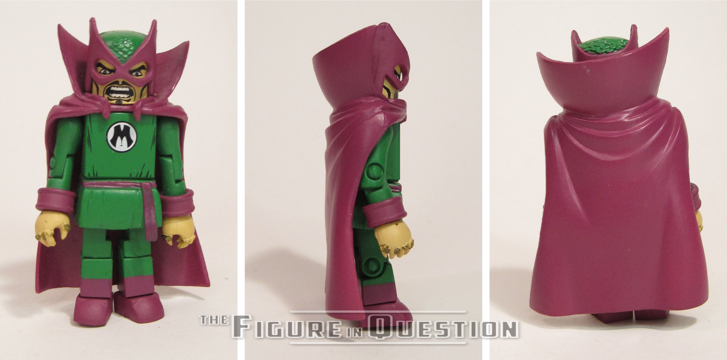
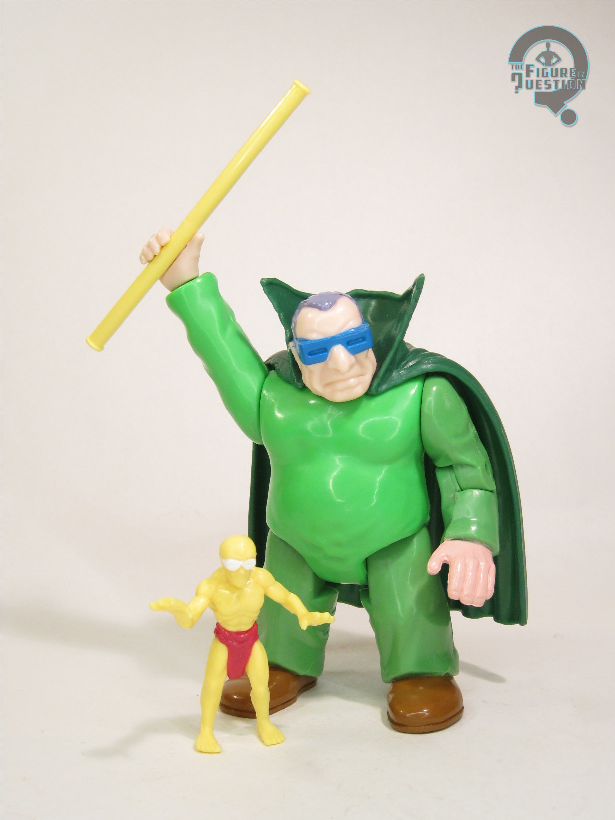
Today’s review is another Fantastic Four figure, this is the last of the wave one reviews: Terrax. There was one other figure in the first wave, Benjamin J Grimm, aka the Thing, but I didn’t have that version. I had the later wave 3 version. And can I just address the fact that I’m reviewing Terrax, but I’ve yet to get to the Human Torch and the Invisible Woman? You know the other HALF of the title team! How exactly did TERRAX get himself a spot in the line before two of the title characters? He’s really not that great a character, nor has he ever really been all that important…ever. Anyway…
THE FIGURE ITSELF
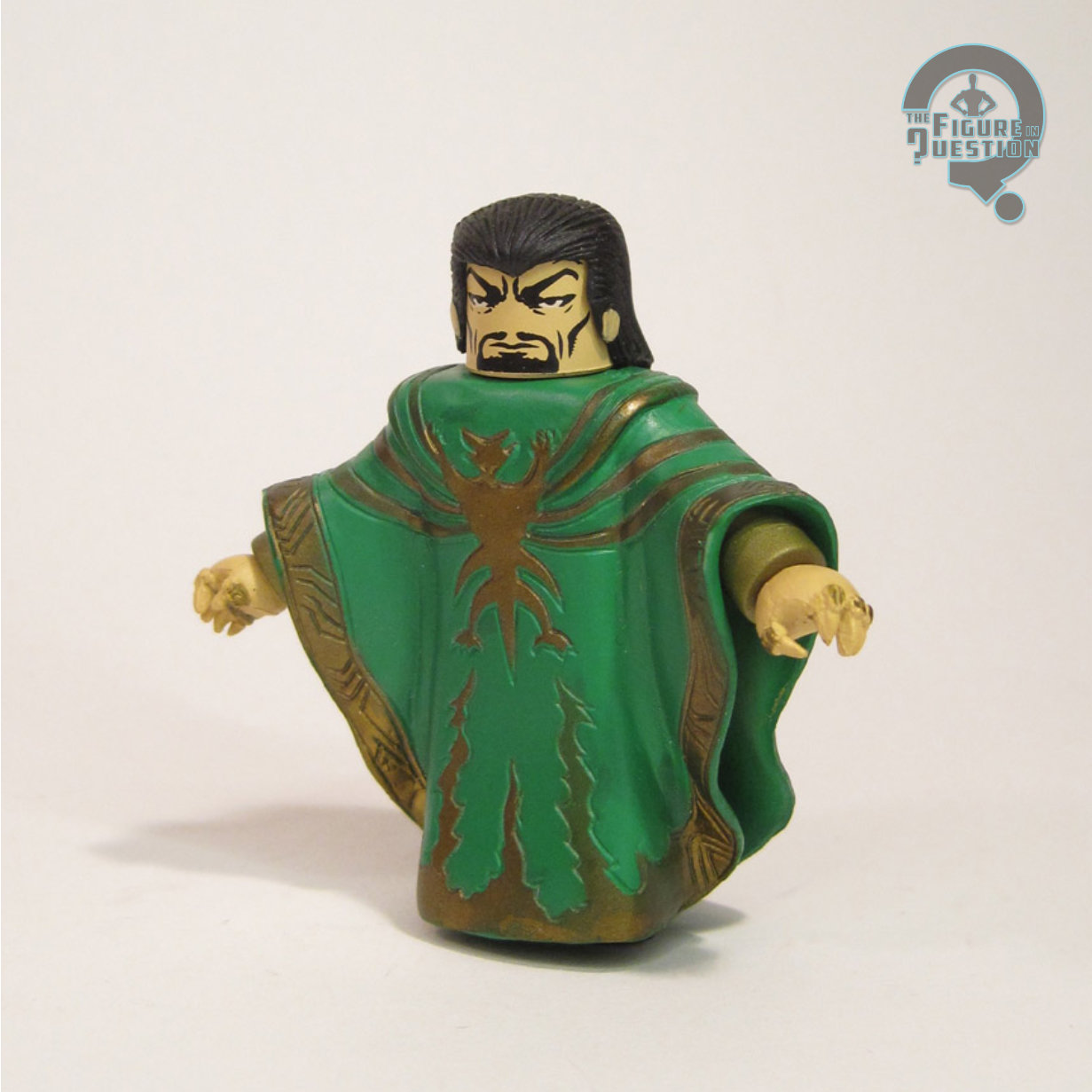
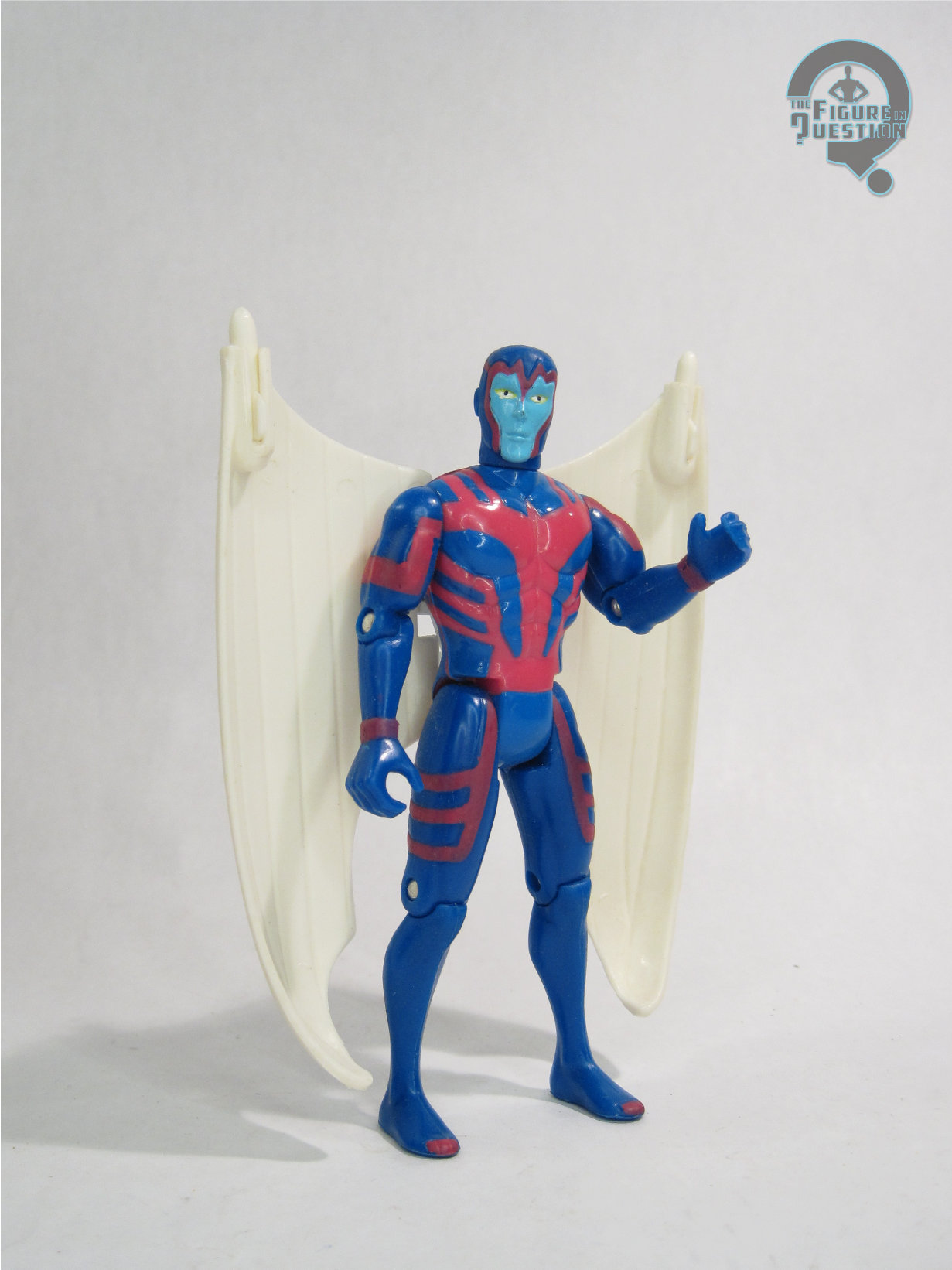
So like I said before, this is Terrax, the second herald of Galactus, part of the first wave of Toybiz’s FF line. He’s depicted here in Terrax’s only look ever, which must have made the costume choice pretty easy for the guys at Toybiz. At one point in time, Terrax had a rock stand and his trusty axe (which tears through stuff. Cleaver name….). Mine doesn’t have these items any more. The figure’s actually a very good depiction of Terrax, which is nice because he’s not one of those characters who gets many chances at having an action figure made. His hands are interesting, because they’re both molded to hold his axe, but due to their vertical placement and his limited articulation, he can only hold it in one hand at a time. This leaves the other hand with this thumbs up position. What is this guy, the Fonz? (AAAAAAAAY!) Actually, that might make his character a bit more interesting. You heard it here first Marvel! (Do they even realize that this character exists?)
THE ME HALF OF THE EQUATION
Terrax was another of the gift figures. It’s fine because he’s a great, big, bad guy for your heroes to fight. That was always good enough for me!
 Well, there’s the original review. It’s…it’s something. In these earliest reviews, I was still finding my voice, and I was aiming for witty and perhaps a bit edgy? I wasn’t aiming for well-proof-read, I’ll tell you that, hence the use of “cleaver” in a sentence clearly meant to use “clever.” Yikes.
Okay, by this point I was starting to get into the swing of things. Over 300 words and an actual intro. Still doesn’t quite follow my modern structuring, but not terrible at all. And of course, I was still doing full series reviews at this point, which is rather different than how I do things now.
Terrax is a little over 5 inches tall and has 9 points of articulation. Missing from my original review were his rock stand, removable skirt piece and his axe. Of those pieces, the only one I found during The Find was his axe, but that’s okay, since the axe is definitely the most important piece!
Not a whole lot of extra thoughts on this guy, I gotta say. That’s all for cosmic Fonzie here.
One of my briefer addendums, for sure. I cover the basics and add the note about the axe I found. Well, that’s all good, I suppose. This time around, I have his two skirt pieces, as well as his rock stand, bringing him back up to a complete figure. He’s actually quite a nice little package of a figure, and you could hardly ask for more from a Terrax.