#3950: Superman

SUPERMAN

SUPER FRIENDS (McFARLANE TOYS)

While the main offerings from McFarlane’s DC line are all in the 7-inch range, the Batman: Classic TV Series line notably broke from the pack in its decision to go with 6-inch, thereby allowing it to *sort of* serve as a continuation of Mattel’s run with the line.  They had a good, solid run with the line, but there’s only so many characters to do, even calling in the continuation comics.  So, to keep the style running, McFarlane moved into another notable feature in the mainstream TV coverage of the DC Universe, Super Friends.  It’s a solid way to get a bunch of heavy hitters in one cohesive style, so I guess that’s not so bad.  Today, I’m taking a look at the line’s take on the Man of Steel, Superman!

THE FIGURE ITSELF

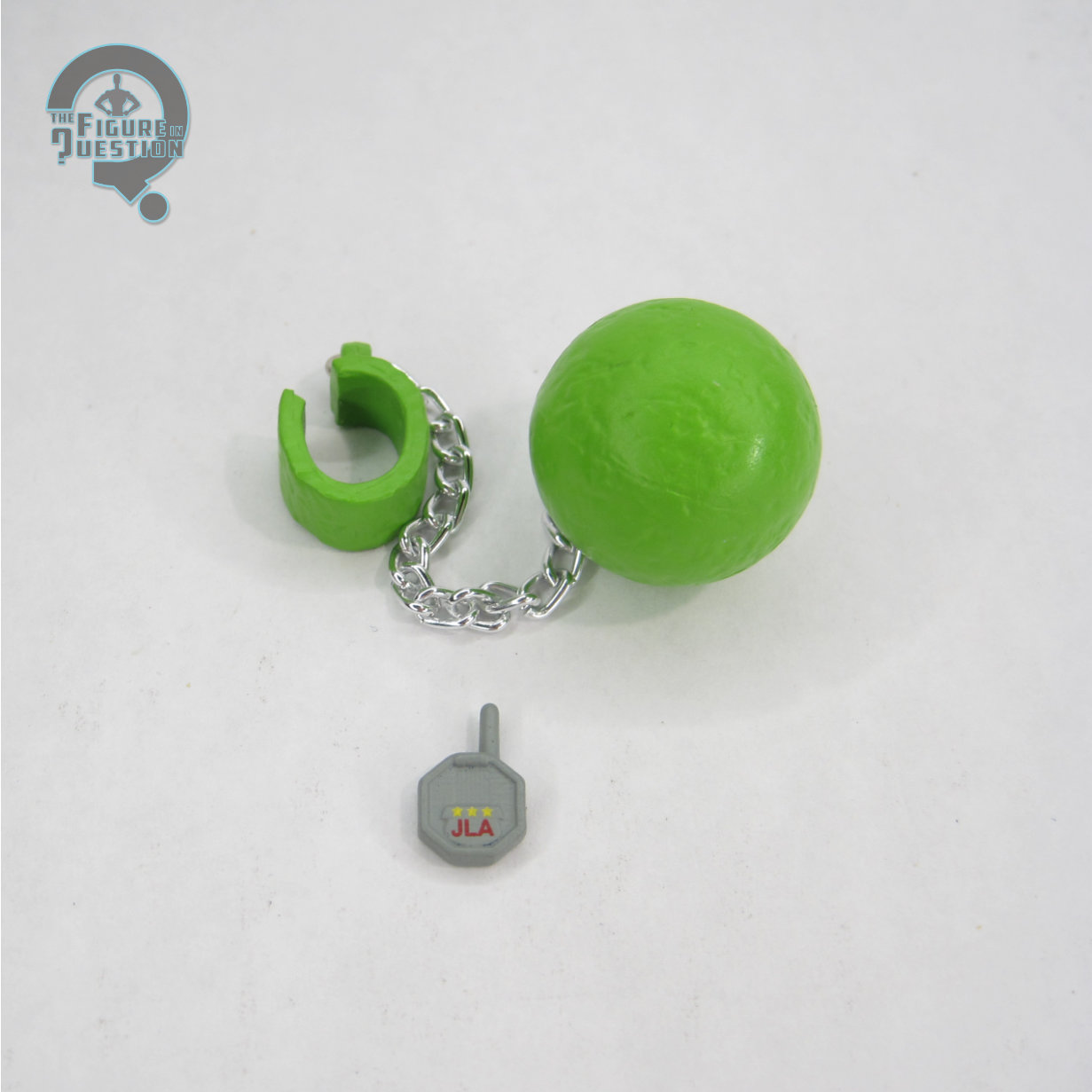
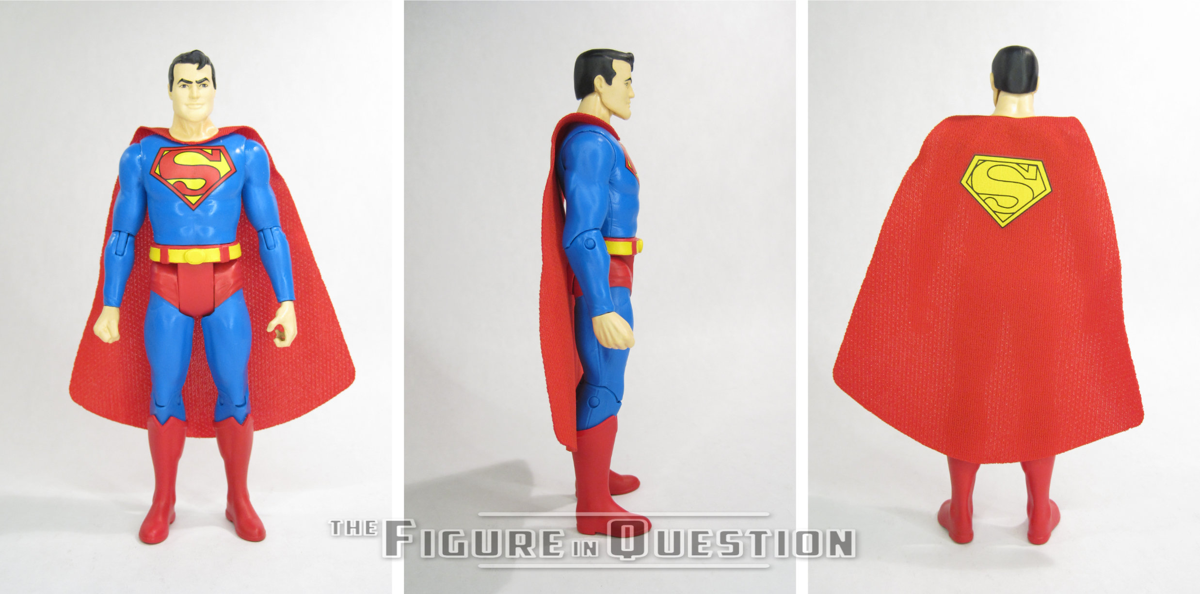
Superman was released in Series 2 of McFarlane’s Super Friends line.  Thus far, they’ve stuck to a two heroes paired off with two matching villains, so Superman is paired off with his counterpart Lex Luthor, which is pretty sensible.  The figure stands just over 6 inches tall and he has 18 points of articulation.  In addition to sharing a scale, the Super Friends and Batman: Classic TV Series lines also share a number of parts.  Superman, unsurprisingly, has some parts in common with his Classic TV Series release.  With its sculpted wrinkles in the suit and generally more realistic build, it’s a bit of a departure in style, from the show.  It’s especially notable with Supes, who ends up looking a touch skinny.  That said, it fits with what they’re trying to do with the line, so I get it.  It’s definitely not a badly sculpted set-up, though the articulation’s a little awkward at times.  There are a number of new parts, though, most notably the head.  It’s not a pitch perfect match for Toth’s take on Supes, but it gets the idea across, and is certainly closer to the animated Superman depiction than the Classic TV figure was to George Reeves.  I feel like, if nothing else, the expression feels very much in character with the show version of Superman.  Like the Classic TV figures, the cape on this guy is cloth; it’s kind of flat and looks a bit odd at the collar, but it’s also the same general set-up used in the Batman line, so it’s not like it’s any sort of crazy upset.    Superman’s color work is decently handled.  It matches okay with the show scheme, and while the insignia didn’t always have the extra line around the edge, but it’s a more unique look, so I appreciate the choice.  Superman is packed with a JLA communicator and the Kryptonite ball-and-chain from the Challenge of the Super Friends episode “Monolith of Evil.”  I especially dig the ball-and-chain, because it’s such a nice signature scene from the show.

THE ME HALF OF THE EQUATION

This whole line kind of snuck in without a ton of fanfare.  I wanted the GL from Series 1, but he sold out really quickly, and I haven’t gone to the trouble of finding one, so I wasn’t really sure I’d be jumping in any further.  But, I was in NYC a little over a month ago, and found myself with time to kill while Rachel and her siblings were in a show, so I spent a chunk of it wandering through Midtown Comics.  I felt obliged to buy something, and they had this guy, and he just sort of spoke to me.  He’s got his quirks, but he’s fun.

#3949: The Thing II

THE THING II

FANTASTIC FOUR (TOY BIZ)

“Bombarded by cosmic rays during an exploration in deep space, Ben Grimm’s body underwent an extraordinary transformation. His strength, endurance and durability were boosted to super-human levels and his skin became an orange colored, rock-like armor. As a member of the Fantastic Four, The Thing is a sworn protector against villainy and threats of conquest, but his monsterish appearance has always remained his greatest enemy. Often feeling the need to disguise himself when entering public, Grimm’s crude camouflage poorly covers the heart and soul of a true, blue-eyed hero.”

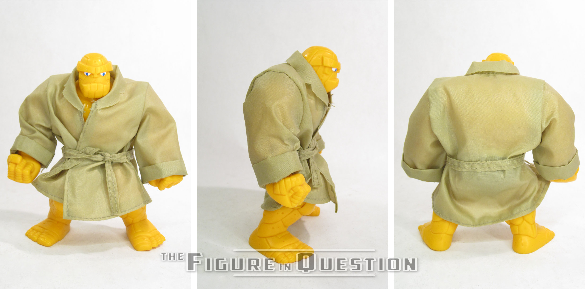
While the team has always shared equal footing within the confines of the book, and have always been equally billed, there’s no denying that there’s an unprecedented break-out character from the quartet that is the Fantastic Four, and that’s Benjamin J. Grimm, the ever-lovin’ blue-eyed Thing.  Curiously, when Toy Biz put together their line based on the team, Ben was, through odd circumstances, *not* the first to double up on figures, as both of the Storm siblings beat him to the punch.  But, he was the first to get a properly planned variant, and also one that made a good degree of sense.  Since Ben’s rocky-form can’t turn on and off like the others (most of the time, anyway), he frequently had to hide himself away under a baseball cap, a colored hoody, and a pair of Aviators a trench coat, glasses, and hat.  It’s a signature look that’s been adapted a number of times, including as part of the very first Toy Biz line, which I’m looking at today!

THE FIGURE ITSELF

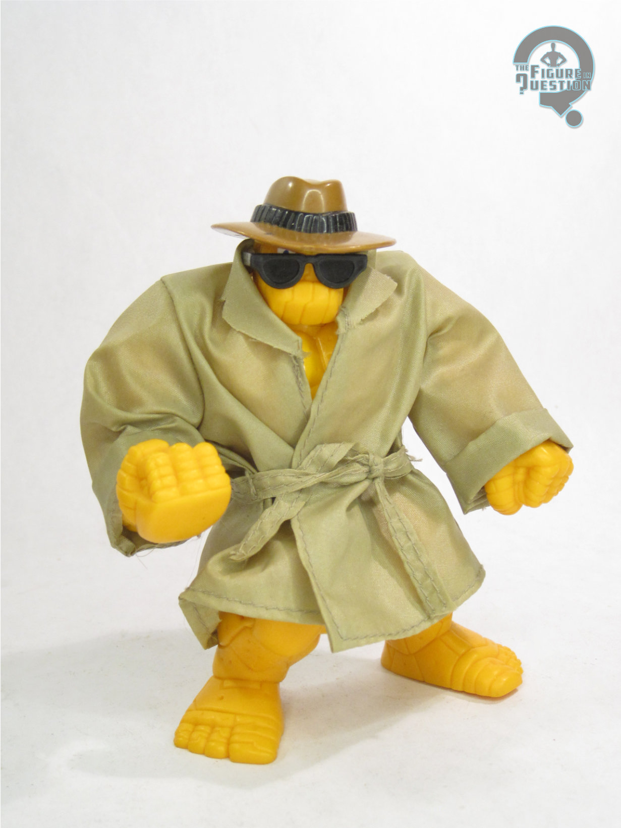
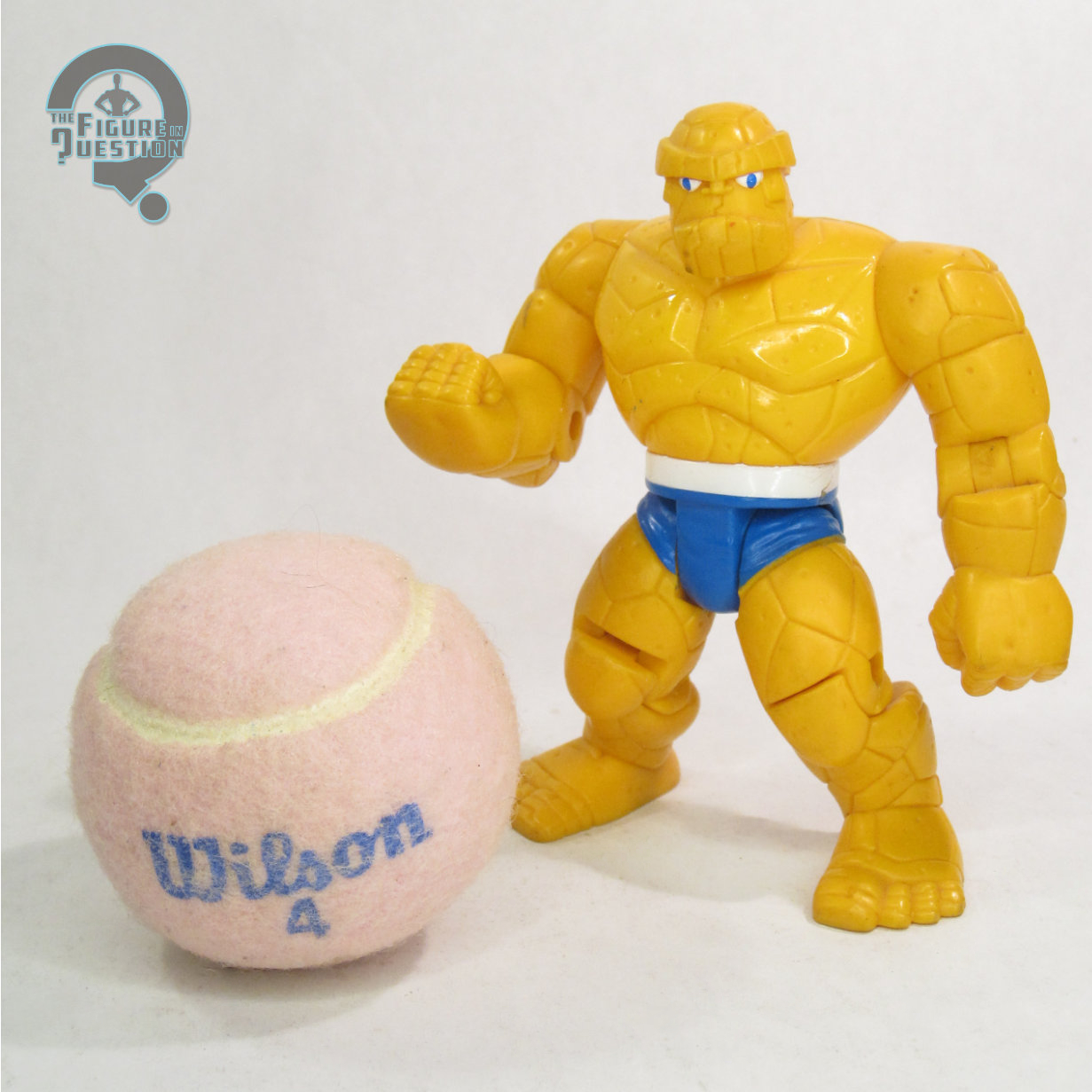
The Thing II was released in Series 3 of Toy Biz’s Fantastic Four line.  He was the only member of the team present in this particular line-up, which was otherwise a much wackier collection of characters.  The figure is just shy of 5 inches tall and he has 9 points of articulation.  His bulky stature means even with the standard articulation, he’s not exactly agile, but you can get some subtle variations of his standing around pose.  While it would seem like a great time to re-use parts from the first version, this figure sported an entirely new sculpt.  The line was generally a loose tie-in to the show running at the time, but Ben marks a departure from “loose,” being a pretty spot-on recreation of his animation model from the show.  Of course, it’s his Season 1 model, which was far more cartoony and goofy, and stands out more from the rest of the line, and which was phased out of the show in the same year this figure was released.  It does okay by the design, though, and certainly captures its more bold line-work and cleaner rock structures.  It’s certainly a more huggable Thing.  The figure comes out of the box wrapped in a cloth coat.  It’s a very thin material, and also not *technically* designed for removal, since it’s tied shut with a very tight knot.  You can remove it, though that certainly makes it more prone to damage.  The figure’s paint work is fairly light, with just the eyes and shorts, which appear to be the same two colors.  It’s perfectly fine it its application.  The shade of orange plastic used for the bulk of the body does seem a touch pale, but it’s at least a bit better than the Marvel Super Heroes version.  Ben is packed with his hat and sunglasses, which are specially molded to fit over his head.  They do okay, and round out his disguised look nicely.

THE ME HALF OF THE EQUATION

Since I came into the line a little bit after launch, this was my first figure of the Thing.  Mine, of course, immediately had the coat torn off and thrown aside, since I really just wanted the basic figure.  When my Grandmother took me to the KB Toys Liquidation Center in Delaware about a decade later, they still had a pile of this guy, so I got myself a second one, who has kept his jacket on the whole time, so it’s a little nicer.  He’s a very specific take on the character, and it’s interesting to have such a cartoon-specific version of the character, given there aren’t matching figures of the rest of the team.  He’s not incredibly playable, all things told, but he does make a neat enough display piece.

Flashback Friday Figure Addendum #0050: Cantina at Mos Eisley

CANTINA AT MOS EISLEY with SANDTROOPER

STAR WARS: POWER OF THE FORCE II (HASBRO)

Hey, who’s ready for a thematic tie-in?  I sure am! Yesterday, I looked at one of two cardboard playsets released during Power of the Force II.  The first released of those two actually was a more direct callback to the original Kenner run, a Mos Eisley Cantina, and I’ve looked at that one, albeit tangentially, via the figure it was later released at retail with following a run as a mail-away, who I reviewed back in 2020, making this a Flashback Friday Figure Addendum, following up on the Sandtrooper!

“Their remote location makes the spaceports of Tatooine havens for the varied masses from across the galaxy. At the seedy Mos Eisley spaceport, this variety is more than evident at the main hangout, Chalmun’s Cantina. The most loathsome of Mos Eisley’s population can regularly be found there, including imperial sandtroopers, who are deployed by the Empire to quell outbursts with brutal efficiency. In the days before the Galactic Empire, the spaceport of Mos Espa hosted a similar reputation as a “wretched hive of scum and villainy.” From the outdoor markets to the junk shops – overseen by the gambling crimelords, the Hutts – Mos Espa was a place where a nine-year old boy could learn the ways of the universe.”

Hey, remember how I’ve got all these Power of the Force figures I can review? Great, I don’t have to remind you why I’m doing this review, then. I’ve looked at all manner of Stormtrooper variants, many of them from this very line, but today I’m kind of doubling back and looking at a variant of a variant. Oh man, how crazy is that?

THE FIGURE ITSELF

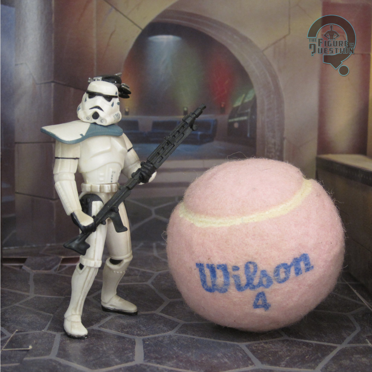
The Sandtrooper was released in 1998, accompanying a 3D display diorama of the Mos Eisley Cantina. He was the actual figure used to sell a bunch of cardboard, wrapped in cardboard. Neat trick, I suppose. We had gotten a standard, run of the mill Sandtrooper in the main line, but this one aimed to be different enough to make collector’s buy. Guess it worked. According to expanded universe materials, this guy actually has a name. He’s Davin Felth, the trooper who says “Look sir, droids!” while they’re searching on Tatooine. And now you know that. Don’t you feel like your life has meaning now? The figure stands 3 3/4 inches tall and he has 6 points of articulation. He uses the same head, torso, and pelvis as the single-carded Sandtrooper, but gets a new set of arms and legs. It’s still the super goofy PotF2 trooper build, but by this time things were starting to be a little bit more toned down. Those arms and legs are definitely less bulked up compared to prior troopers. His pose is also a more neutral one, but, in an interesting turn of events, he’s not really able to do anything but hold that one neutral pose. He looks like he’s standing guard (which makes sense for the playset he came with), meaning he’s designed to hold his weapon in a non-battle stance. He can’t actually hold it by the handle, due to the relative posing of his arms. The paint on this guy is also toned down from the prior Sandtrooper. He’s still got a little bit of weathering, but it’s nowhere near as intense. His pauldron has changed colors to mark a change in rank, with it being white instead of orange. For some reason, the black section has also changed to a light grey, which is an odd choice. Moving further down, the figure has also lost the black detailing at the elbows that prior troopers had, which does look a little weird. The Sandtrooper was packed with a blaster rifle and a patrol droid (missing from mine) which plugged into his back.

THE ME HALF OF THE EQUATION

As part of my goal of getting all the figures from the PotF2 line, I’m having to track down some of the more odd-ball releases as well, which includes this guy. I ended up getting ahold of one from a loose collection that was traded into All Time, though he was missing the droid piece. He’s not a bad figure. I actually like him quite a bit, certainly more than I was expecting to.

That’s a May 2020 review up there, meaning I wrote this review in the midst of the pandemic shutdown, when I had a *lot* of reviewing time on my hands.  My notable backlog of Power of the Force figures was certainly an asset during that stretch of time.  I definitely got a little more quippy during that period, for sure.  Hey, comedy gets you through it, I guess.  The review of the figure holds up fine, so no issues there.  Pandemic Ethan knew what he was talking about.  The figure proper was missing his Scanning Droid, which I have subsequently tracked down.  It’s a pretty fun piece, and it plugs into the spot originally meant for his survival pack, which is a clever re-use of the spot.

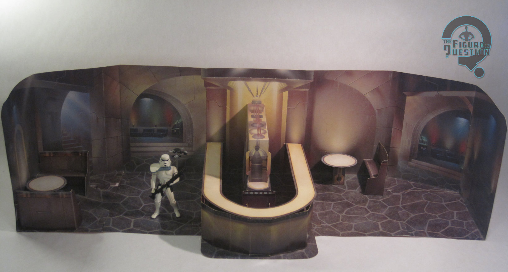
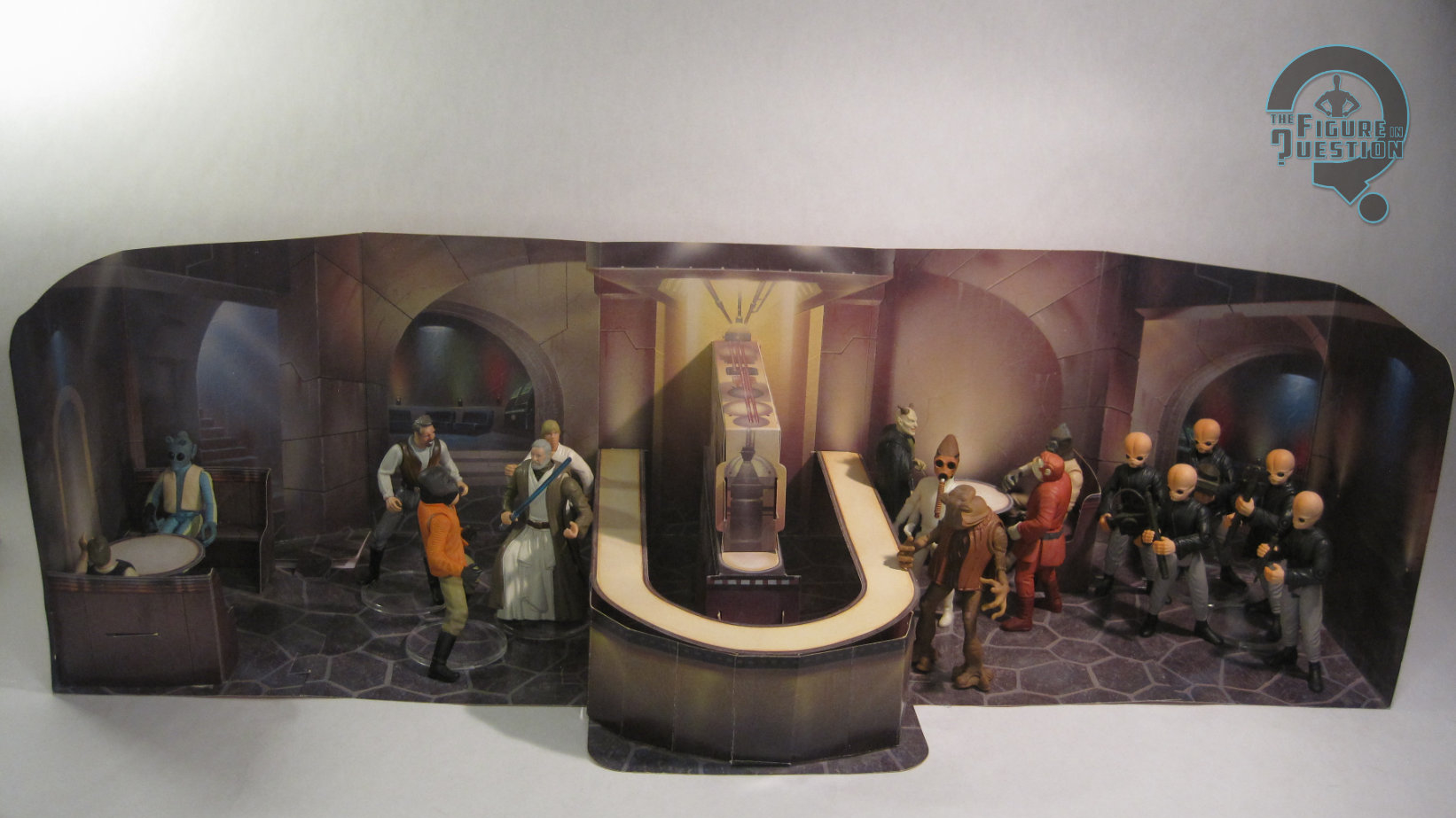
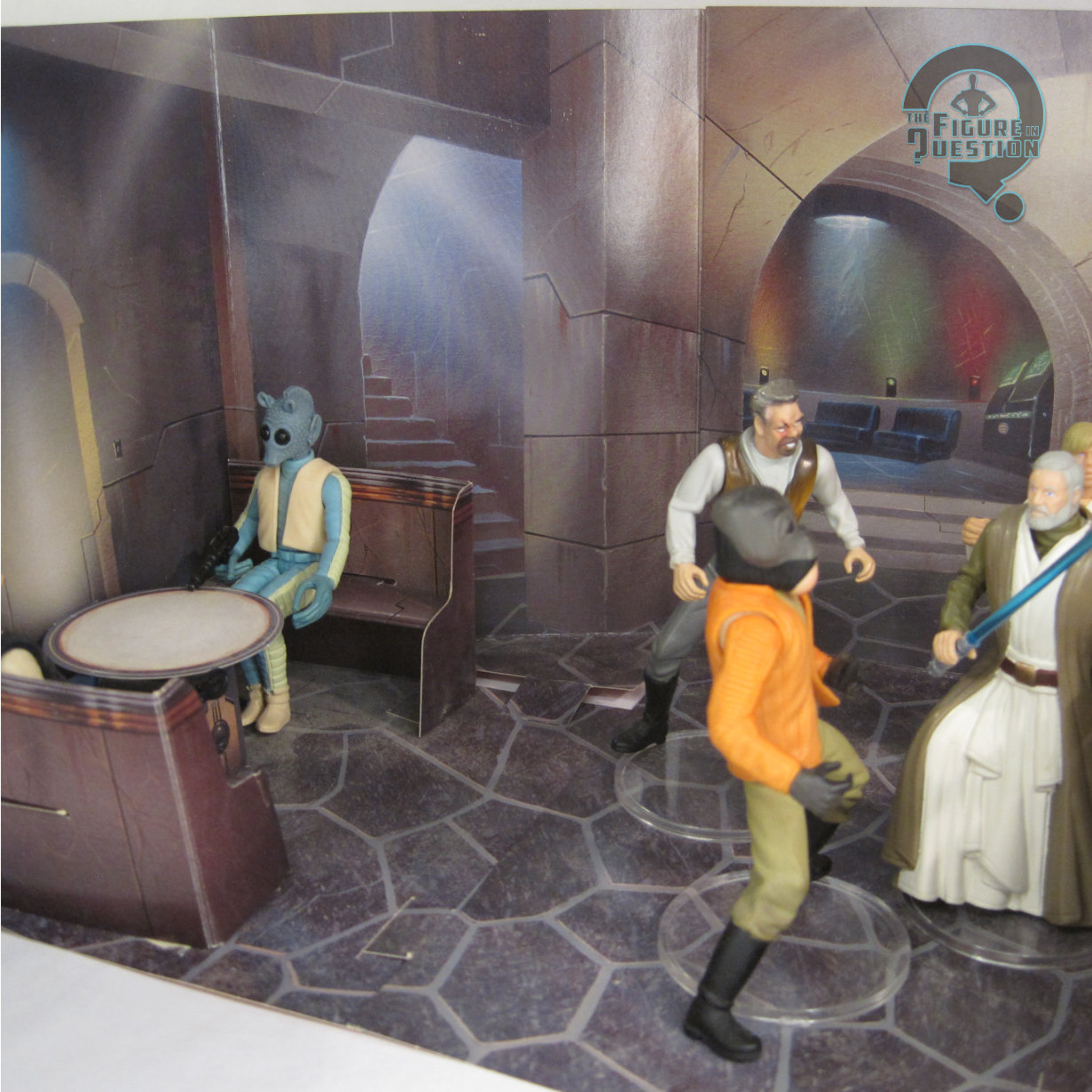
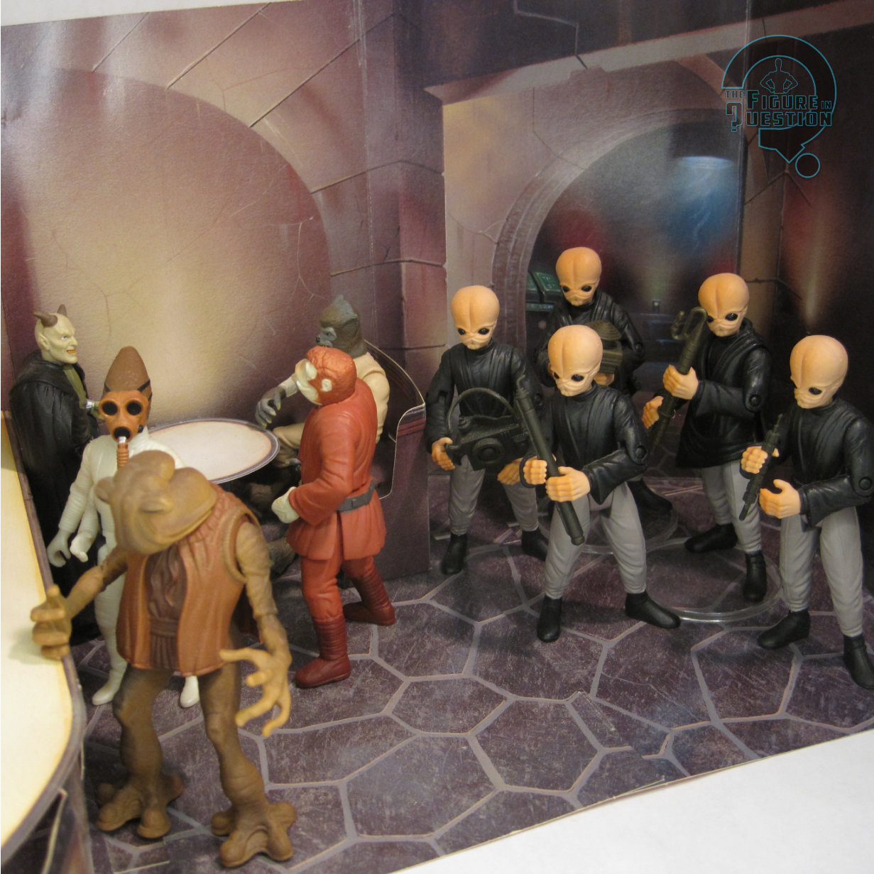
The main omission, of course, was the actual playset.  It’s similar in concept to the Jabba’s Palace, and has a similar footprint.  The exact layout’s a bit different, though, with walls that fully enclose it, and a lack of raised platforms, instead placing the emphasis on the central bar, as well as the two included booths with tables.  I think it ends up working a bit better in terms of potential use with the figures, and there’s a general feeling of better stability to the whole thing, which I do really like.

#3948: Jabba’s Palace

JABBA’S PALACE with HAN SOLO in CARBONITE

STAR WARS: POWER OF THE FORCE II (HASBRO)

“As one of a species known to live for at least one thousand years, Jabba the Hutt had plenty of time to build up his ill-gotten empire. No other crime lord lived in such luxurious, palatial surroundings, where his every need was immediately attended to by members of his court and a large collection of slaves. The repulsive, slug-like Hutt had his fingers in just about every unseemly activity known, from elaborate smuggling operations to his early days on Tatooine when gambling on Podraces was as big as the sport itself.”

When the original Star Wars line launched under Kenner, they had one proper playset, based on the Death Star, but in order to further expand the line at a smaller budget, they also partnered with Sears to offer another playset, based on the Mos Eisley Cantina, which, to save on tooling costs, was made out of card stock.  This was repeated for Empire, which saw a similarly card stock Cloud City playset.  By the time of Jedi, they didn’t need to concern themselves with tooling costs as much, so no card stock sets were crafted for that one.  When bringing the line back in the ‘90s, Kenner/Hasbro went back to that particular well, though, and we got a couple of new ones, including a Jedi-based one, Jabba’s Palace.

THE SET ITSELF

Jabba’s Palace was released as part of the “3-D Display Diorama” sub-line of Star Wars: Power of the Force II in 1998, officially under the Hasbro brand, not the Kenner one.  Included in the set was the fold-out Palace playset, an exclusive Han Solo figure, and some associated accessories.

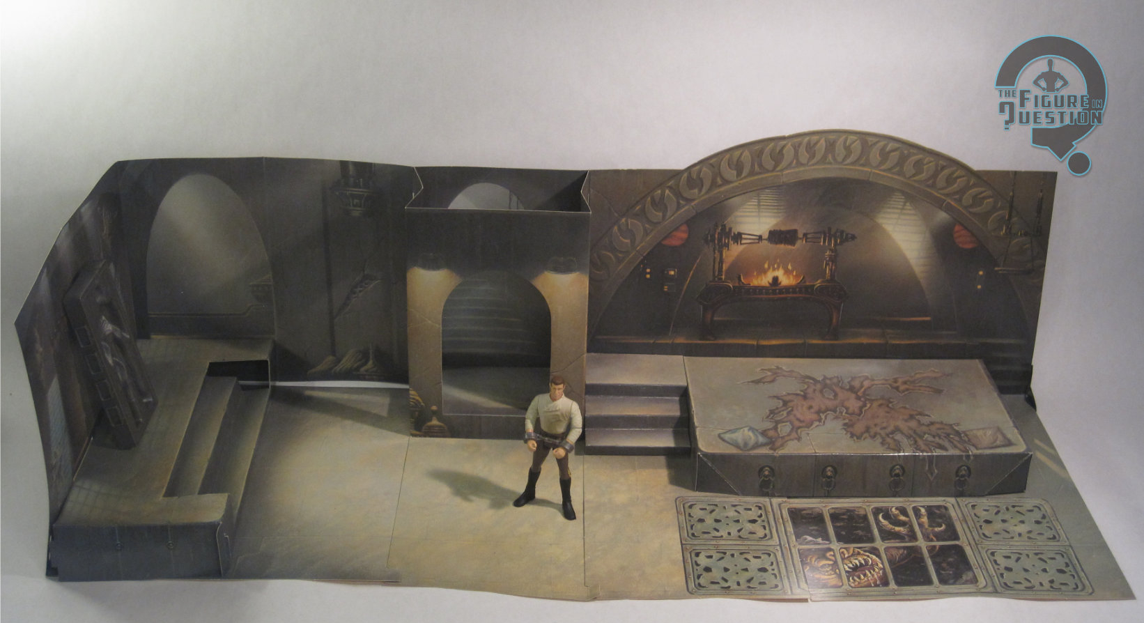
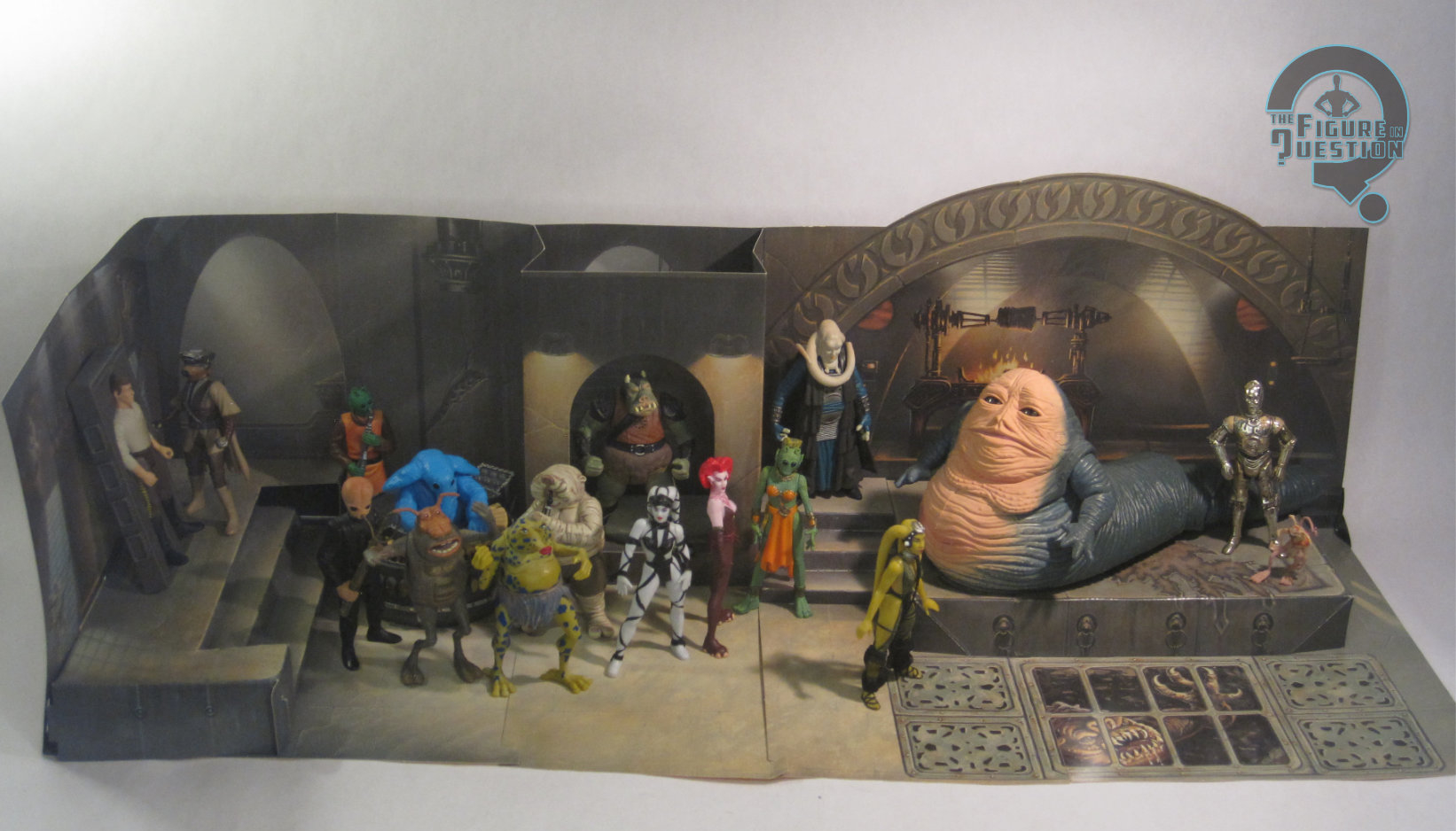
The main set is, as noted, made from card board.  It’s based on the throne room of Jabba’s Palace as seen in the movie’s opening sequences.  Or, at least an approximation of it, which lets you get all of the main story focus spots into one main area.  The set has a footprint that’s about 25 inches long, and includes Jabba’s throne, the grate in front of it that leads to the Rancor’s pit, the entryway with the stairs, and the trophy wall that held Han in his carbonite slab.  The whole thing folds out without too much trouble, and tabs together without much issue.  The printing is generally pretty nice, and there’s a respectable amount of simulated texturing.  The only real downside is that some of the raised elements don’t hold weight especially well.  They do overall better than expected, especially Jabba’s throne, but the spot where the carbonite slab should go isn’t very good at supporting that weight.  Still, there’s plenty of space for spreading out the many denizens of the palace released over the course of the line.

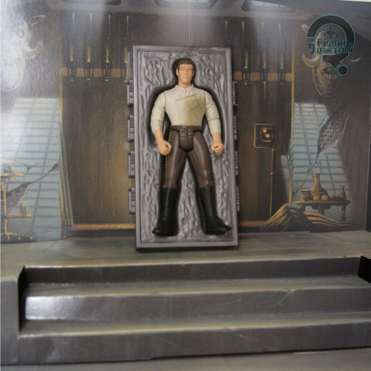
The included exclusive Han Solo marks the second time the line did Han in Carbonite, following up on a solo release in ’96.  This one was based more specifically on his look immediately after being unfrozen, when he’s all…damp.  The figure stands 3 3/4 inches tall and he has 8 points of articulation.  He uses the same legs as the last version, but is otherwise a unique sculpt.  It’s certainly different.  Is it better?  In some ways.  They did at least actually get his shirt right this time around, and the added movement on the elbows is very handy.  The head’s not really any more Ford resemblant than the early release figures, but he’s got the wet and sweaty slicked back hair, which is accurate to the scene and also hides the likeness a touch.  I’m not sure exactly what’s going on with his facial expression, but it’s at least different from the other Han figures.  The paint only exaggerates the oddness of the face, with those strange eyebrows.  The rest of the paint is decent enough.  Han is packed with a pair of manacles, as well as a version of the carbonite block that has a spot where Han was thawed out.  The figure fits well in the spot, but there’s no real way for it to stay upright with him in it, which is annoying.

THE ME HALF OF THE EQUATION

This is one of those sets I remember seeing a few times as a kid.  I don’t know that I fully understood what it was, and I mostly just remember the Han with carbonite.  Since I already had the standard one, I didn’t see much need for this one at the time.  Obviously, my opinion on that shifted, since I, you know, own one and all.  The Palace is a pretty simple thing, but I think it really works well as a backdrop for the figures.  Han’s fine, but definitely goofy.  Still, not a bad set, all things considered.

Shoutout to my friends at All Time Toys, from whom I purchased this figure for review!  If you’re looking for cool toys both old and new, please check out their website and their eBay storefront.

#3947: Magne Arthur

MAGNE ARTHUR

MICROMAN MAGNE POWER (TAKARA)

In the ‘90s, teams of colorful heroes imbued with weird fantasy powers were all the rage.  Well, Power Rangers was all the rage, and a lot of other people wanted that success for themselves, so other stuff became very Power Rangers-like.  Takara’s Microman, descendant of G.I. Joe and progenitor to Transformers, decided to give the whole thing a try, as well as throwing in a bit of a scale shift.  The result was Microman Magne Power, a brief run on the line at the tail end of the decade.  Today, I’m looking at the central member of this incarnation’s core team, Magne Arthur!

THE FIGURE ITSELF

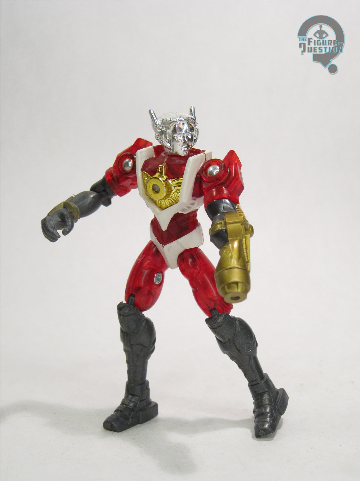
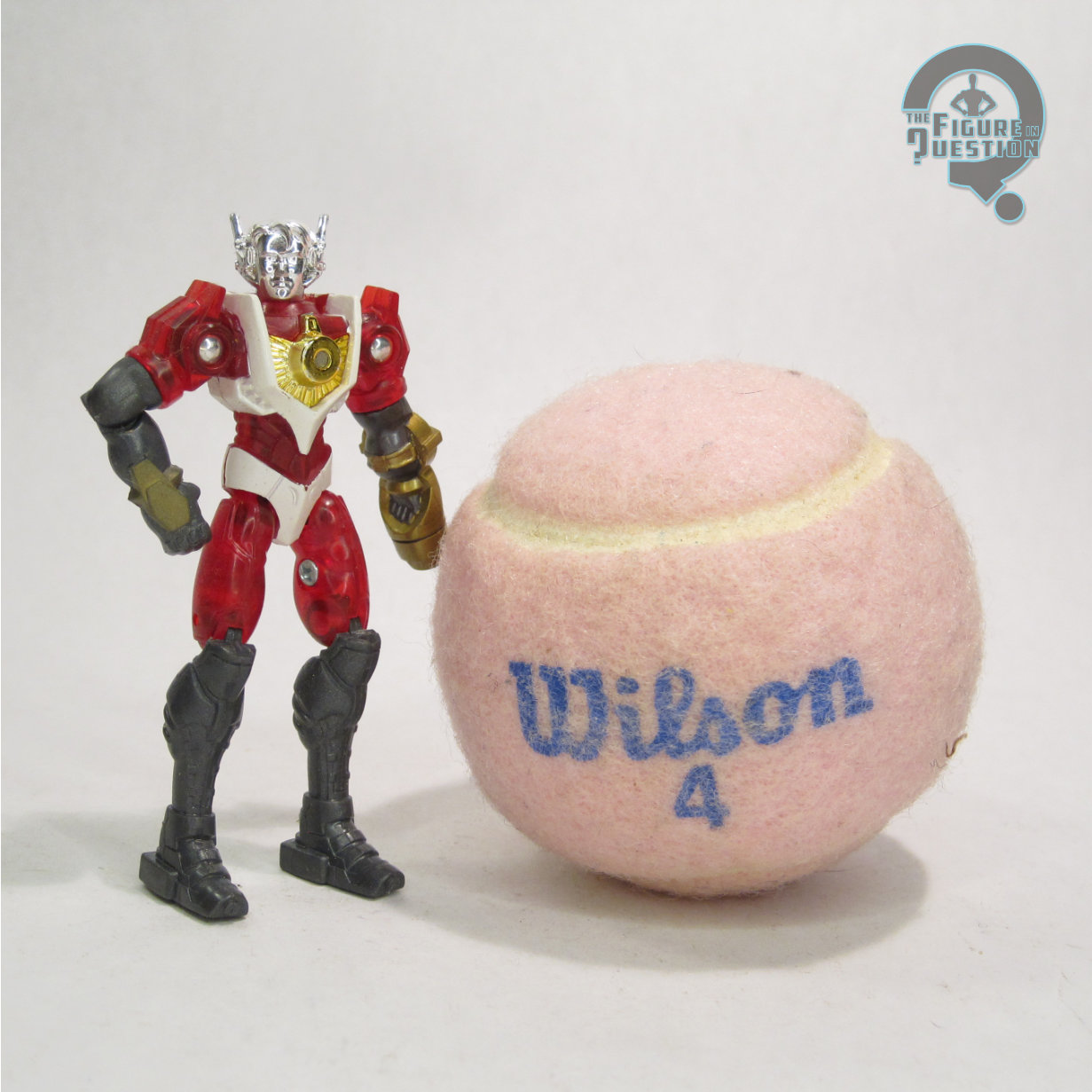
Magne Arthur was figure 001 in Takara’s Microman Magne Power series.  He was the first of the figures that debuted the line at the very end of 1998, and helped to establish the line’s new style.  The figure stands abut 3 inches tall and he has 12 points of articulation.  As with the rest of the figures in this line, Arthur was scaled down from Microman’s usual 3 3/4-inch set-up, with the in-universe explanation being that these guys came from a  different Micro Earth than the original line’s figures, following up on the slightly smaller vintage Micro Hoodmen, who shrank themselves further to conserve resources.  His sculpt is largely the same as the other four core figures from the line, albeit with a unique head.  Arthur’s head was especially unique amongst the launch figures, as he didn’t have a helmet like the other four, instead just getting a set of funky headphones.  It’s ultimately a sculpt that’s a bit more in keeping with the earlier Microman figures in that regard.  From the neck down, he’s the same as the others, with the same kind of dated, bulky and boxy sort of body sculpt.  As the leader guy of a team of chromatically themed heroes in the ‘90s, Arthur was obviously predominantly red, which is done in a nice translucent plastic.  He’s also got white and dark grey accenting, and of course the usual chromed head.  As with all the basic figures, he had no accessories, but did have magnets in his torso, right arm, and feet, so you can stick him to all manner of metal surfaces.

THE ME HALF OF THE EQUATION

After discovering this line’s existence from the Micronauts guy at Mego Meet in 2011, I jumped pretty quickly on finding what I could of the line domestically.  Thankfully, Big Bad Toy Store had a rather nice selection of figures for pretty cheap at the time, so I was able to get the whole core set without much trouble.  Arthur is the most standard of the set, and that makes him the easiest for taking in the whole of what the line meant to be.  It’s not quite the success that Takara was hoping for, but it’s still a fun little set to look back at, and Arthur is a nice central piece.

#3946: Nightwing – Teen Titans

NIGHTWING — TEEN TITANS

DC MULTIVERSE (McFARLANE)

“A youthful version of the Justice League, the Teen Titans featured Robin as leader from the outset. In the 1980s, when the title was relaunched with new characters, Robin grew more independent than ever, living in Titan’s Tower and later changing his codename to Nightwing.”

Remember the last time I reviewed a McFarlane Nightwing here on the site and I discussed George Lucas’s “It’s like poetry; it rhymes” quote?  Well, I feel like it might be appropriate again.  One of my earliest 7-inch McFarlane DC reviews was his first take on Nightwing.  As we wind down on his offerings (….maybe?  Apparently he’s still got some version of the license going into ’26?  It’s all gotten very confusing), I’m looking at another Nightwing, who, much like the Super Powers version before him, is based on the character’s disco-inspired original costume design.  Let’s check him out!

THE FIGURE ITSELF

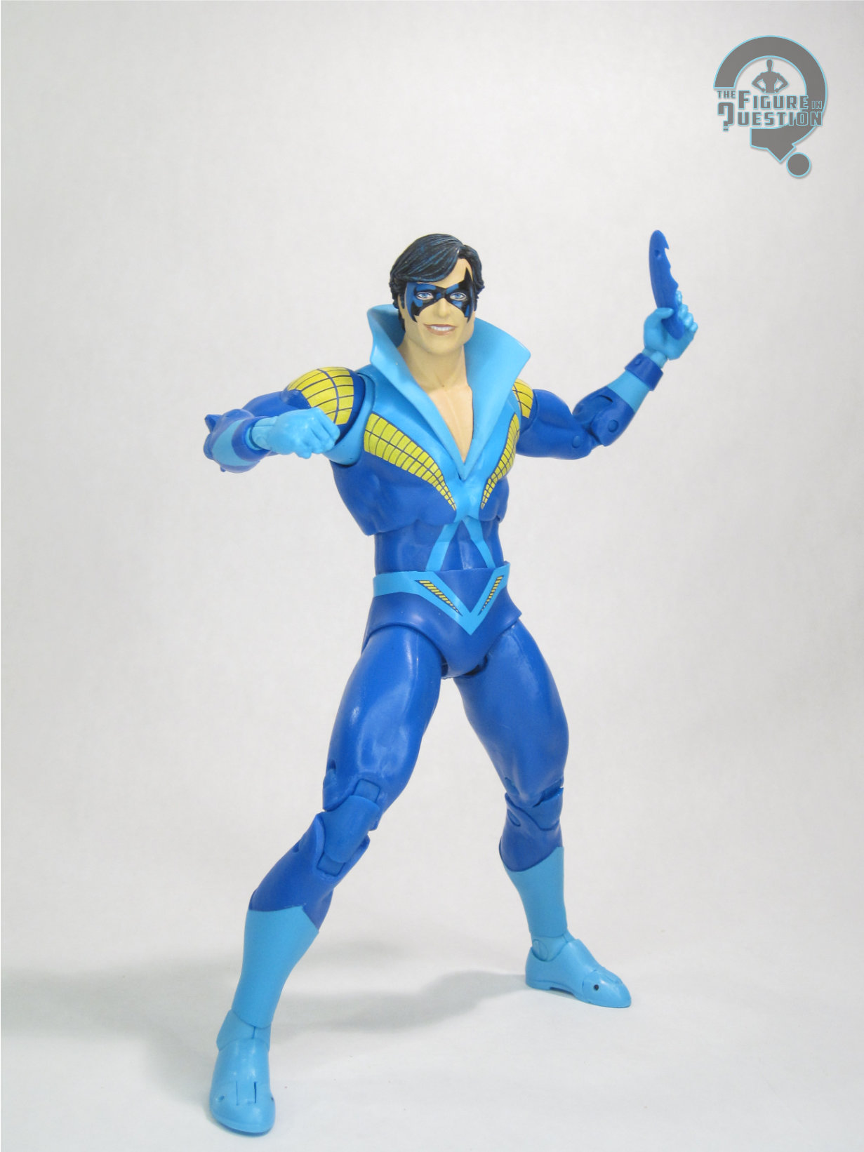
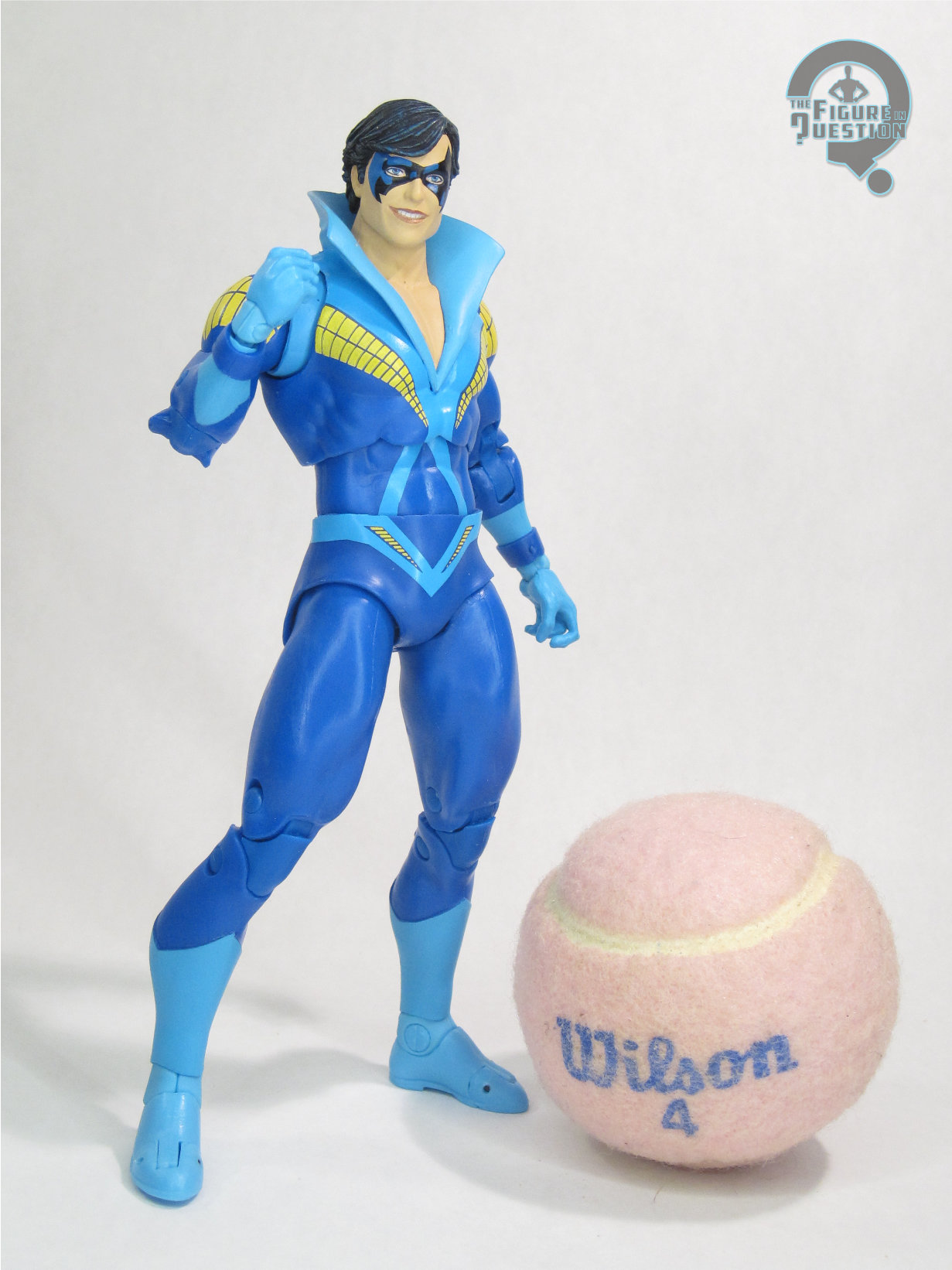
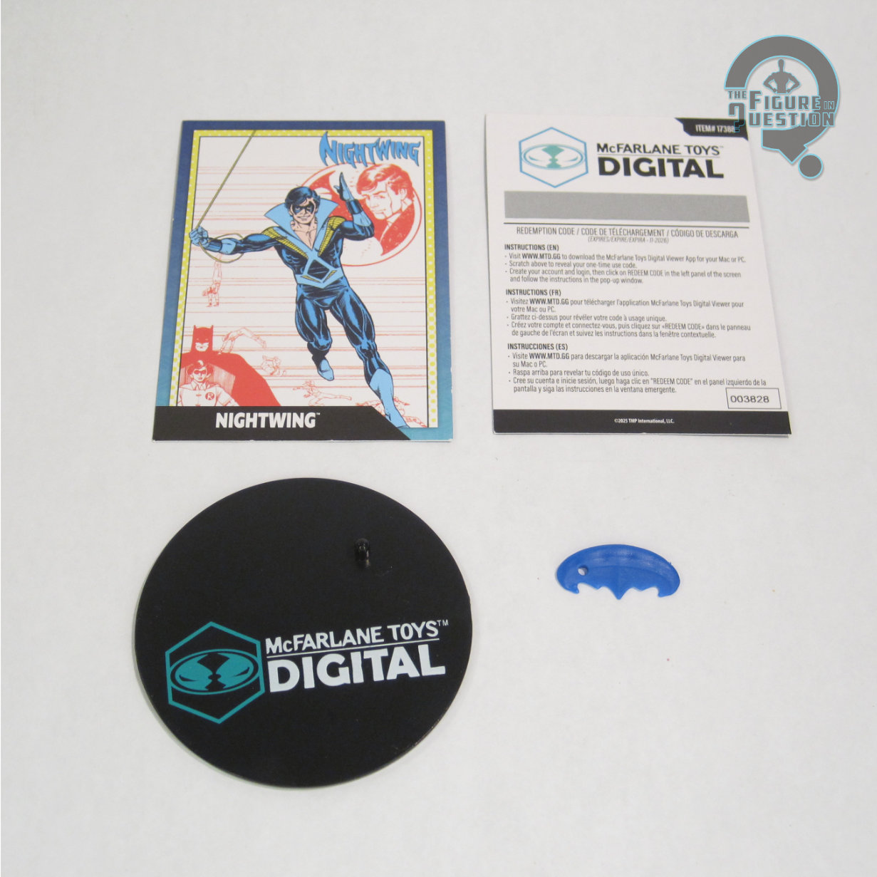
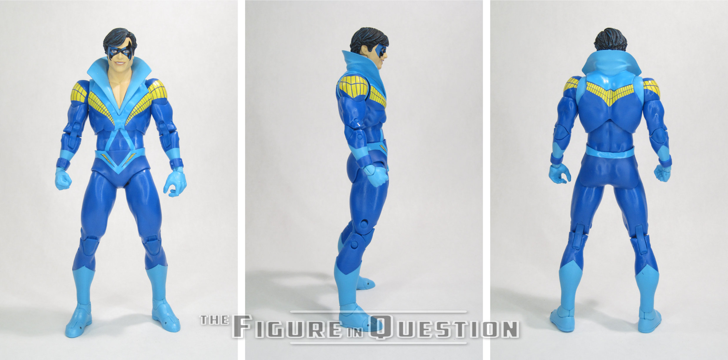
Nightwing — Teen Titans is part of the fifth “Digital” assortment of DC Multiverse, meaning he’s pretty much just a standard figure, but there’s also an extra card that literally no one will ever make any use of.  He’s officially under the “DC Direct” banner, alongside wave-mates Batman and Monarch.  He’s the eighth version of Nightwing under the Multiverse line.  The figure stands 7 inches tall and he has 37 points of articulation.  Nightwing is built on the Beetle/Booster body, which has been a favorite starting points for mid-sized characters.  Nightwing himself has used it once before, for his ‘90s costume.  This time around, it actually gets a few adjustments to make it more accurate.  He adds the collar to the torso, as well as finally re-tooling the shins so as to redo the boot-tops, so that he’s not yet another figure saddled with the weird boot tops.  Instead, he’s got the proper, slightly more unique design for this costume.  He’s also got a brand new head sculpt, clearly patterned on Perez’s illustrations of the character in the early years.  It’s a very nice sculpt, with a lot of really sharp and clean work, and, above all, it’s a happy Nightwing, which I always appreciate seeing, especially in this costume.  It’s certainly the nicest of the Nightwing head sculpts we’ve gotten from McFarlane.  The paint work is generally okay, though it does wind up with some slight oddities.  The mask gets a pattern suggesting shading, which I don’t mind, as it’s effective and doesn’t look weird.  That said, it’s the only instance of painted shading on the figure, which is strange.  The rest of the work is more basic stuff.  Application’s clean and sharp, so that’s good.  The only off spot is the shoulders, which are already kind of off due to the way the assembly works, but then also miss the lighter blue on the top section.  You can kind of hide it with posing around the shoulder “cups”, but it’s odd when you can see it.  Nightwing is packed with a batarang, a display stand, a collector’s card, and the card with the info for the “digital” collectible.

THE ME HALF OF THE EQUATION

I wasn’t certain I was going to get this one when it was announced.  It seems kind of strange, I suppose, but the Super Powers version was announced around the same time, and I already have the DC Direct one and….yeah, none of it was very solid reasoning, honestly, so when I saw this one in person, I folded pretty quickly.  I’m glad I did, because, apart from some slight oddities to do with the paint, he’s a really nice figure, and definitely McFarlane’s best take on Nightwing, which is actually a pretty noteworthy statement, given how many Nightwing figures he did.

#3945: Gorgon

GORGON

FANTASTIC FOUR (TOY BIZ)

“A member of the mysterious race known only as the Inhumans, Gorgon is one of the staunchest defenders of their hidden city of Attilan. Possessing the ability to cause staggering shockwaves with a stamp of his hoof-like feet, as well as superhuman strength and stamina, Gorgon is a foe to be reckoned with…as those who would exploit or harass his people have discovered, to their regret!”

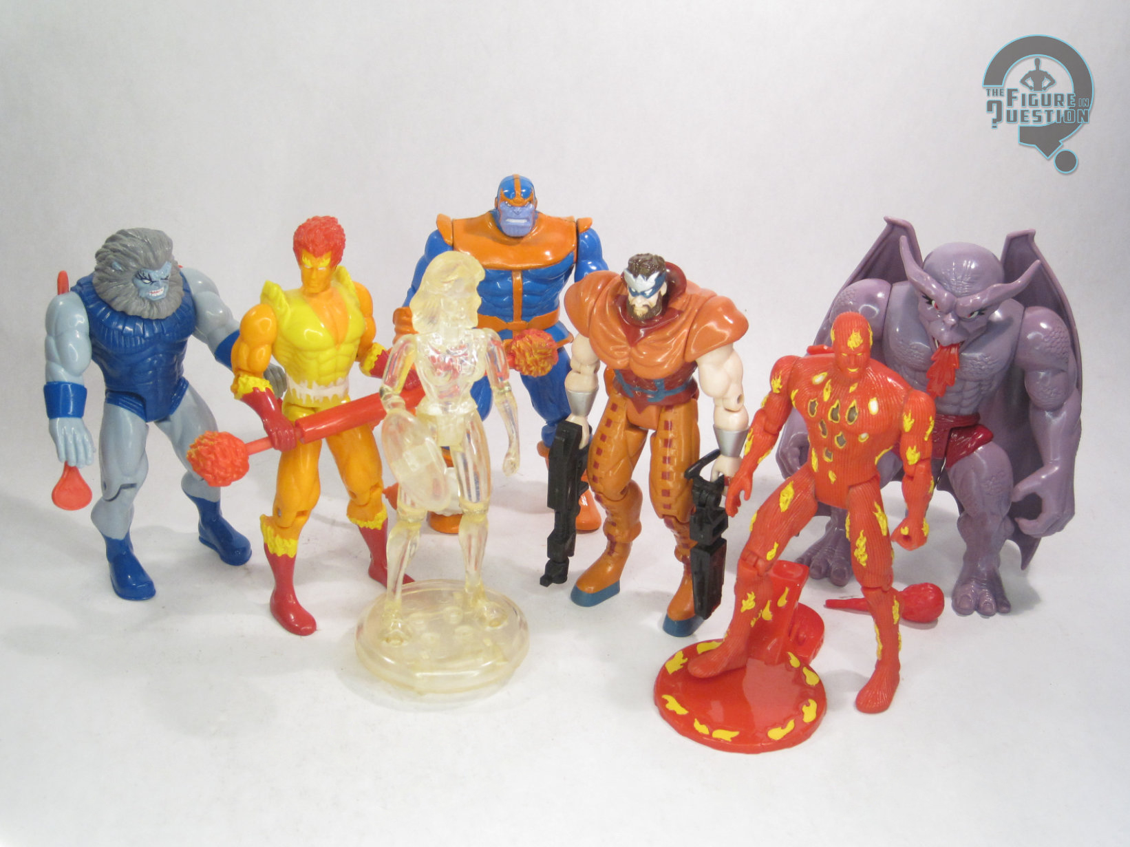
Apart from a brief stretch of time where Marvel was *really* trying to push them as X-Men replacements, the Inhumans have kind of been a back burner for Marvel.  As supporting players, they’re neat enough, but as the main feature, it’s hard for people to connect.  They’ve struggled pretty fiercely with proper toy coverage, and it’s been a running gag that in 30 years of them getting toys, the royal family’s never been done collectively in one cohesive style.  Hasbro’s finally doing it this year, but in the mean time, I’m running back to near the beginning, with Toy Biz’s second entry in their ultimately incomplete line-up, Gorgon!

THE FIGURE ITSELF

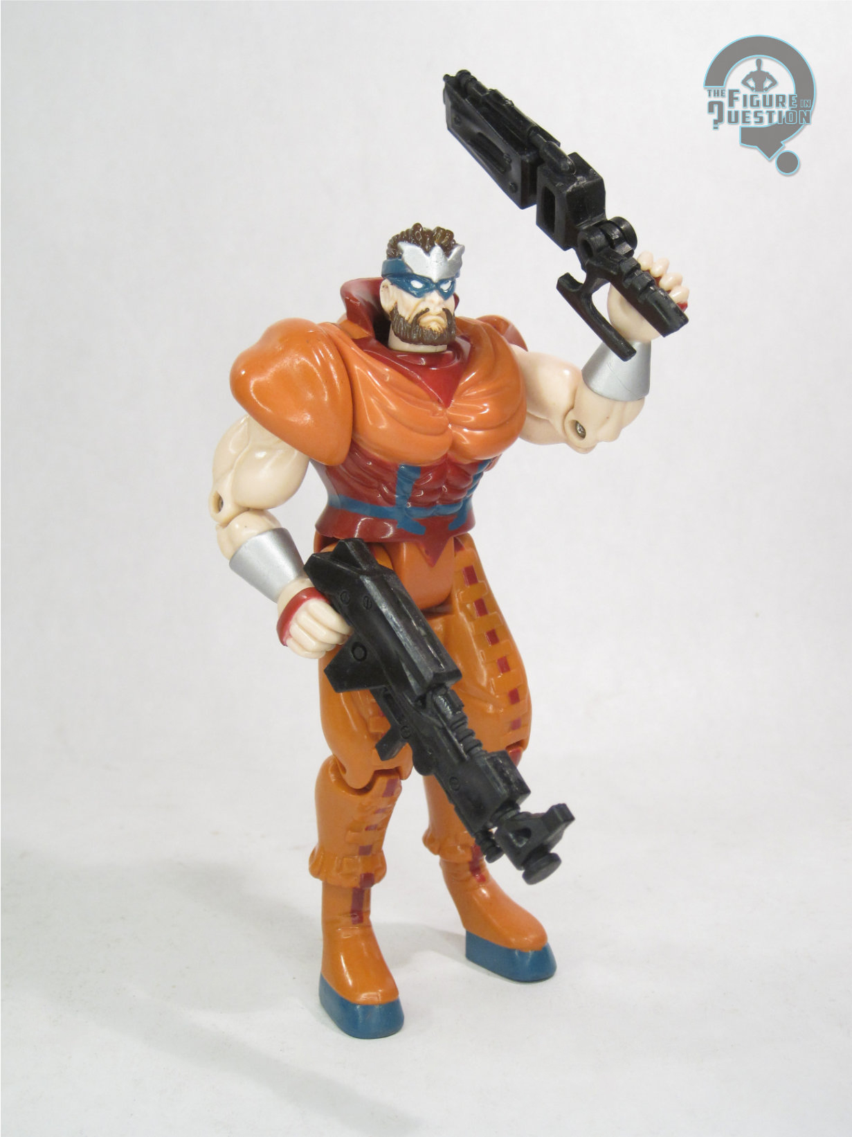
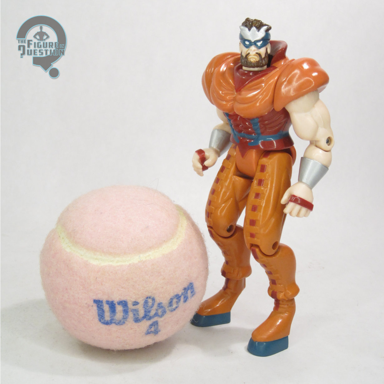
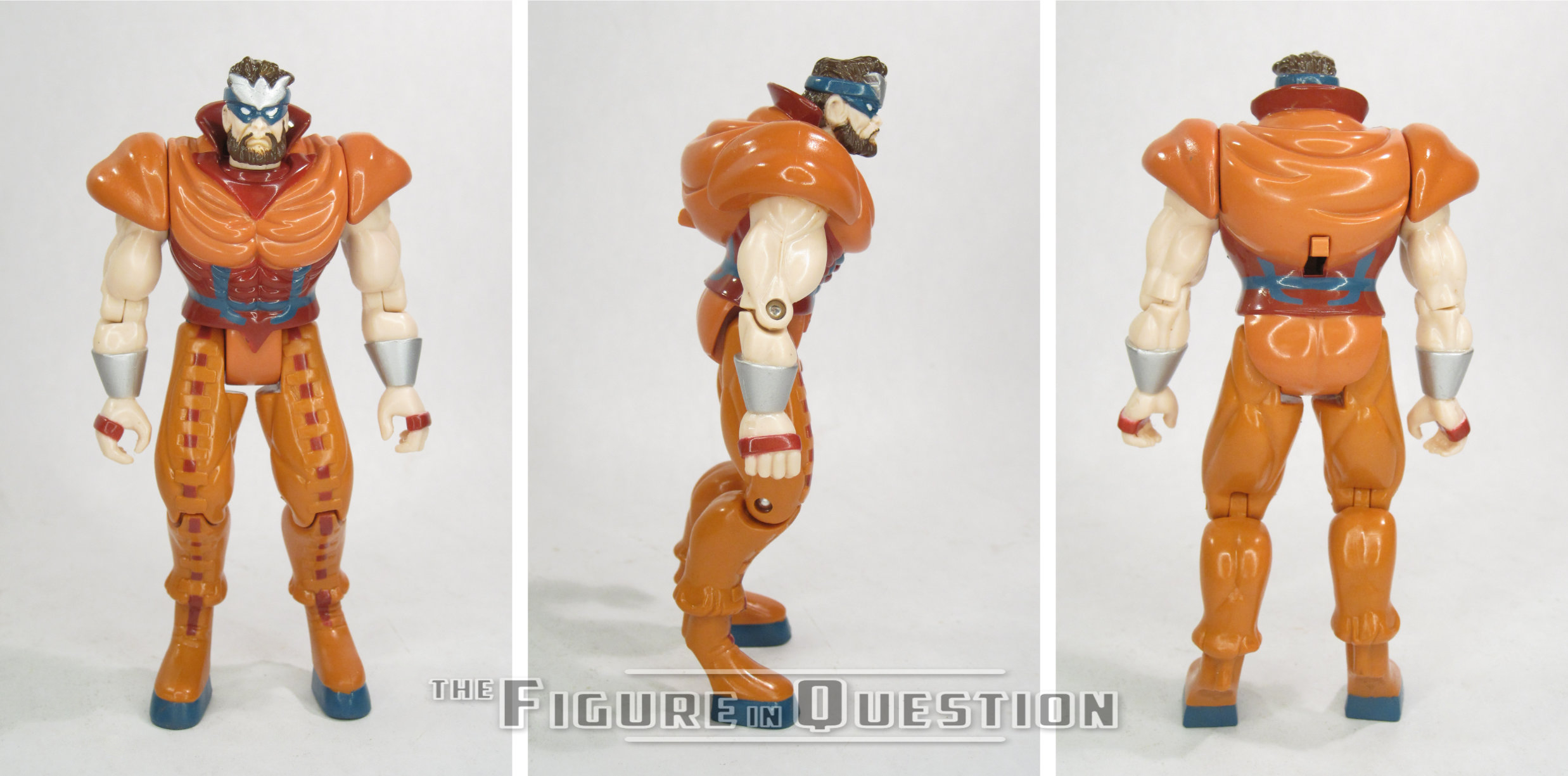
Gorgon is the final figure in the Series 2 line-up of Toy Biz’s Fantastic Four line.  He predates the character’s Season 2 debut on the show they were tying into, but uses a design that’s pretty typical classic Gorgon, in line with what the show eventually used.  The figure stands just over 5 inches tall and he has 9 points or articulation.  While the arm movement’s perfectly fine, the legs are quite stiff.  The right hip is tied into a kicking (or in this case, I guess stomping) feature, same as the first Gambit, so it’s not really for posing, so much as it is either locked down or extended upward.  The non action feature-y left hip doesn’t have much more motion, though, and his knees are also kind of limited.  That said, he can stand there all menacing like, which is most of Gorgon’s thing anyway.  The sculpt is generally pretty good.  It gets all the major points, and certainly looks the part for the character.  He does feel maybe a little small, especially by more modern standards, but it’s not an unreasonable size.  The sculpt’s also a tad soft on a lot of the details.  I do, however, like the detail work on the head, especially his somewhat unkempt hair.  Color work on this figure is decent overall.  The colors match well with his usual depictions, and application on the paint mostly looks good.  He does have a bit of missing paint on his chin, but other than that, the coverage is pretty consistent.  Gorgon is packed with a pair sci-fi rifles, re-purposed from the X-Men line’s Bishop.  Not really Gorgon’s speed, but I guess there was extra space in the package and they wanted to fill it? 

THE ME HALF OF THE EQUATION

I didn’t have a Gorgon figure as a kid.  I wasn’t as personally drawn to the Inhumans, so I just stuck with Black Bolt.  My dad had one, which he got during one of our many trips to Ageless Heroes when it was closing down.  I remember messing with it a few times, but not much beyond that.  Ultimately, he wound up third to last on the list for this line, snagged early this year when Rachel and I took a trip down to Factory Antiques Mall.  He was there, he was affordable, and I didn’t have him, so it all worked out.  He’s not without his drawbacks, but he’s also kind of neat in his own right.  

#3944: Millennium Falcon CD-ROM Playset

MILLENNIUM FALCON CD-ROM PLAYSET with HAN SOLO

STAR WARS: POWER OF THE FORCE II (HASBRO INTERACTIVE)

“Explore 7 Worlds of the Star Wars galaxy! Battle TIE Fighters, search for the Death Star and destroy the Empire!”

Are you guys ready for things to get weird?  Okay, so, you *are* reading a review on a toy review site that’s nosing in on 4000 entries, so maybe weird’s a bit relative.  Are you ready to jump into some of the weird marketing strangeness of the ‘90s?  Yeah, of course you are!  In the midst of the success of the Power of the Force relaunch in the ‘90s, Kenner got bored with just doing basic toy stuff, and really started just trying a little bit of everything to see what stuck.  The back half of the decade saw household computers become a lot more common, and CD-ROM based media was seen as the thing to get into.  Toy Biz did a whole set of Marvel figures that included CD-ROMs with digital comics, but Kenner/Hasbro needed to do better than that, so they built a whole interactive platform.  Like, literally.  It was a platform that you put over your keyboard and it let the figures “interact” with your computer.  Welp, let’s check this thing out.

THE TOY ITSELF

The Millennium Falcon CD-ROM Playset was added to the Star Wars: Power of the Force II line in 1998 as a standalone piece.  It was released not by Kenner, but rather by the Hasbro Interactive division, because of its more computer-based side.  Included were the actual Falcon playset, an exclusive Han Solo figure, and a Windows 95-compatible CD-ROM with a “game” featuring 7 different locales that you can “guide” the playset through.  I, unfortunately, don’t have a Windows 95 PC these days, so I was unable to try out the game.  I know.  For shame.

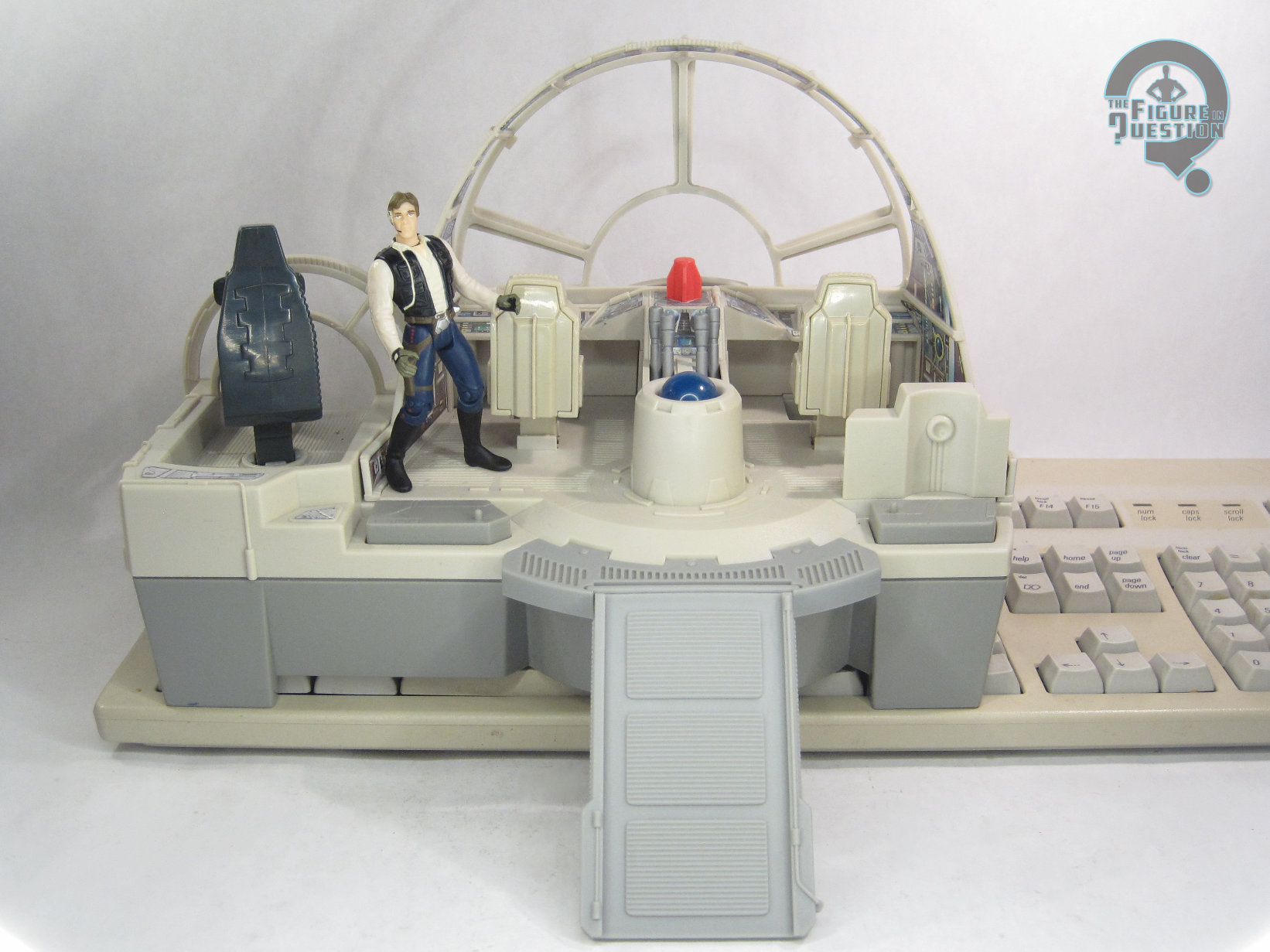
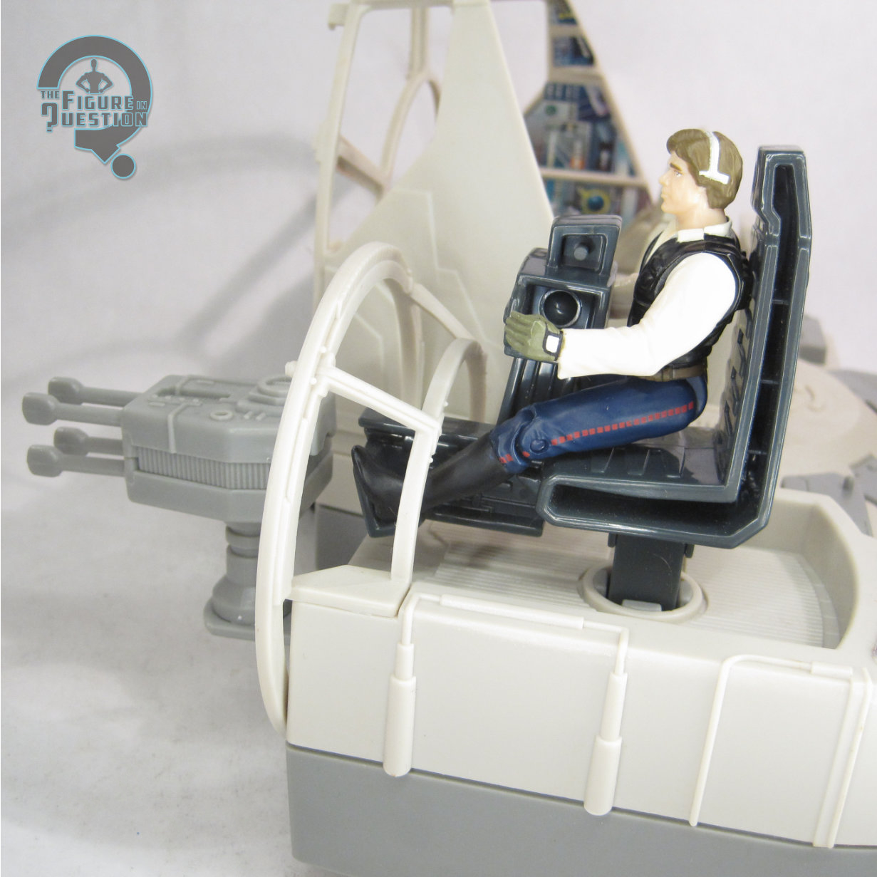
The bulk of what’s included here is the playset.  It’s a sizable chunk of the innards of the Millennium Falcon, largely focusing on the main cockpit, but also including one of the gunner stations, so that you have some options.  It’s a pretty large set-up, which does actually give you some space for fitting in a bunch of the figures.  It’s notable for actually giving us a pretty nicely sized take on the cockpit, which were don’t usually see.  In fact, it’s a bit too large, which isn’t the direction you’re used to seeing.  It’s also somewhat comedic that, for as much space as there is included, they still don’t give you all four seats.  That said, there are the two seats for Han and Chewie, as well as two spots with pegs for additional figures.  In terms of sculpting, it’s all pretty rudimentary stuff.  Not a lot of smaller technical details, and it’s soft even by the standards of the other offerings around it.  It does at least have a neat visual presence.  The whole thing is designed to go over a standard sized (at the time, anyway) QWERTY keyboard, placing the weight on the outside sections.  There’s even a strap meant to hold it in place, lest the children get to vigorous in their playing.  The three seats, the two spots for the standing figures, and three different spots on the central console are all capable of pushing down, and through use of springs, they can correspond to the keys to “interact” with what’s on the computer screen in front of them, which will appear through the set’s widow.

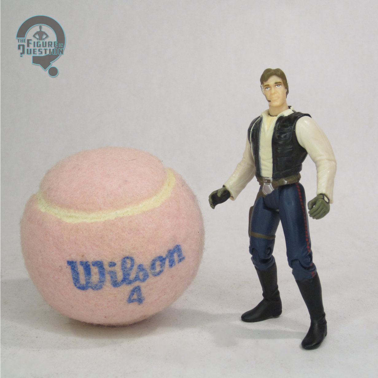
In order to really tie it into the line, there’s an included Han Solo, who’s exclusive to here.  Nowhere else to get him.  Unless, of course, you just opted to get the very similar figure from the gunner stations line from the prior year who was likely still available and retailed for 1/4 of this item.  But this one’s got knees!  This figure stands 3 3/4 inches tall and he has 7 points of articulation, which, yes, includes the knees.  On the flip side, though, he loses the waist swivel that was standard for the rest of the line.  This is Han with the headset and gloves, seen most prominently during the gunner station sequence when they’re being chased by the TIE Fighters.  It’s a sculpt that’s similar but not identical to the gunner station one.  It’s different for different’s sake.  It’s still on the old Han likeness, so it doesn’t look much like Ford, and he’s still a little bulked up.  Generally, though, it’s not a bad figure, just a bit redundant.  The paint’s more or less the same, which is to say it’s fairly basic and not terribly exciting.  He doesn’t get any accessories of his own, but by this point in the line, everyone had, like, 50 Han Solo blasters, so you can just give him one of those.

THE ME HALF OF THE EQUATION

I did not own this set as a kid.  I did look at this set *sooooooooooooooooo* many times on the shelves at CompUSA, where it was the only toy that was ever carried.  My dad was in IT and had to make a lot of trips there for work, and there this set would sit.  I thought it was cool, but there was no way I was getting it for its retail price.  Instead, I got it many years later, when I had my own job and my own money, and no one could stop me.  It came in through All Time Toys a number of years back, and it was still very cheap at the time, so boom, I had one.  It’s goofy.  There’s no denying that.  But, it’s also kind of a cool display piece, even removed from the whole CD-ROM thing.

Shoutout to my friends at All Time Toys, from whom I purchased this item for review!  If you’re looking for cool toys both old and new, please check out their website and their eBay storefront.

#3943: Cyclops & Jean Grey

CYCLOPS & JEAN GREY

MARVEL LEGENDS (HASBRO)

As a direct continuation of X-Men: The Animated Series, the designs in X-Men ’97 at its launch stick pretty close to the designs from the original, which for most of the characters also means sticking to their Jim Lee-designed looks from X-Men #1.  Before the show launched, we heard that the main cast would be getting some costume changes, which led to a lot of deliberation about which set of post-Lee costumes they’d land on, until the show itself threw things into reverse, reverting most of the cast to their ‘70s and early ‘80s era attire (the explanation in-show being that those are the costumes they had on-hand at the auxiliary base they have to launch their final run on Magneto from).  For me, it’s the best of both worlds, because I love both sets of designs, and it also means that the more frequently overlooked ‘70s designs get an excuse for some toy focus.  Also, there’s a new Cyclops and Jean Grey, and how can I ever complain about that?

THE FIGURES THEMSELVES

Cyclops and Jean Grey are a Hasbro Pulse-exclusive Marvel Legends two-pack.  They’re under the X-Men ’97 banner, and were released at the same time as a Storm and Wolverine two-pack with their matching costumes (Jubilee in her alternate attire, which was *not* a ‘70s/‘80s look also hit right around the same time in the main line).

CYCLOPS

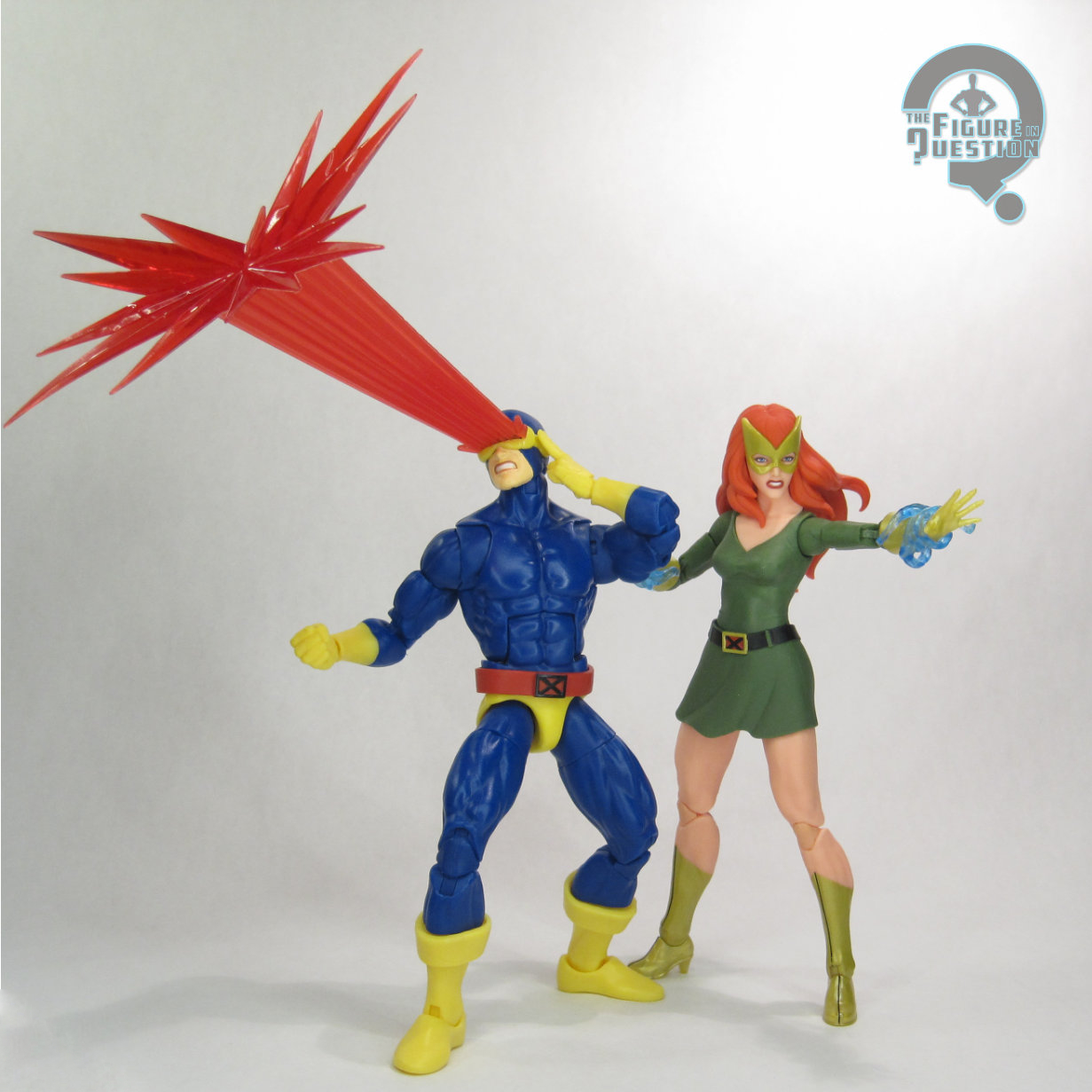
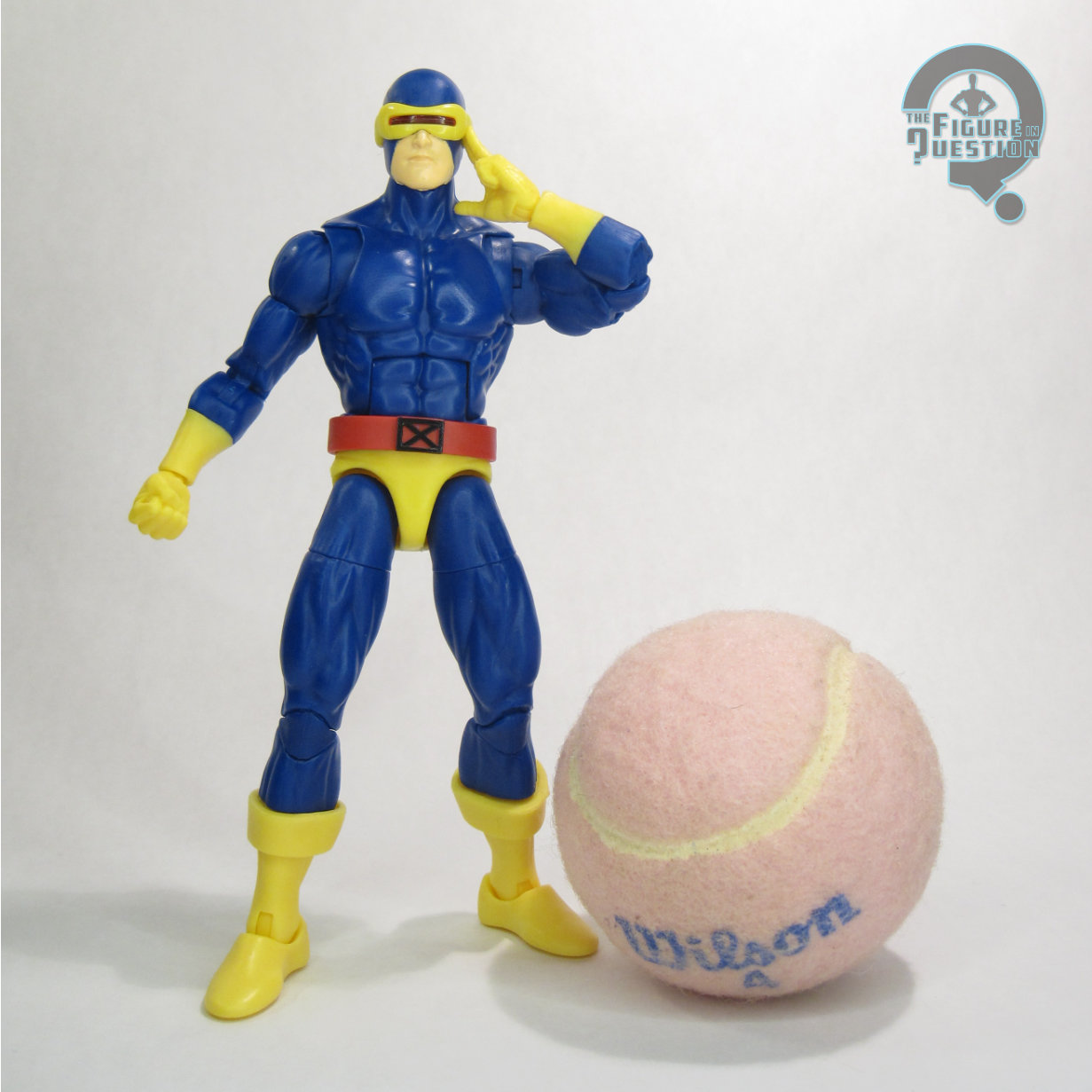
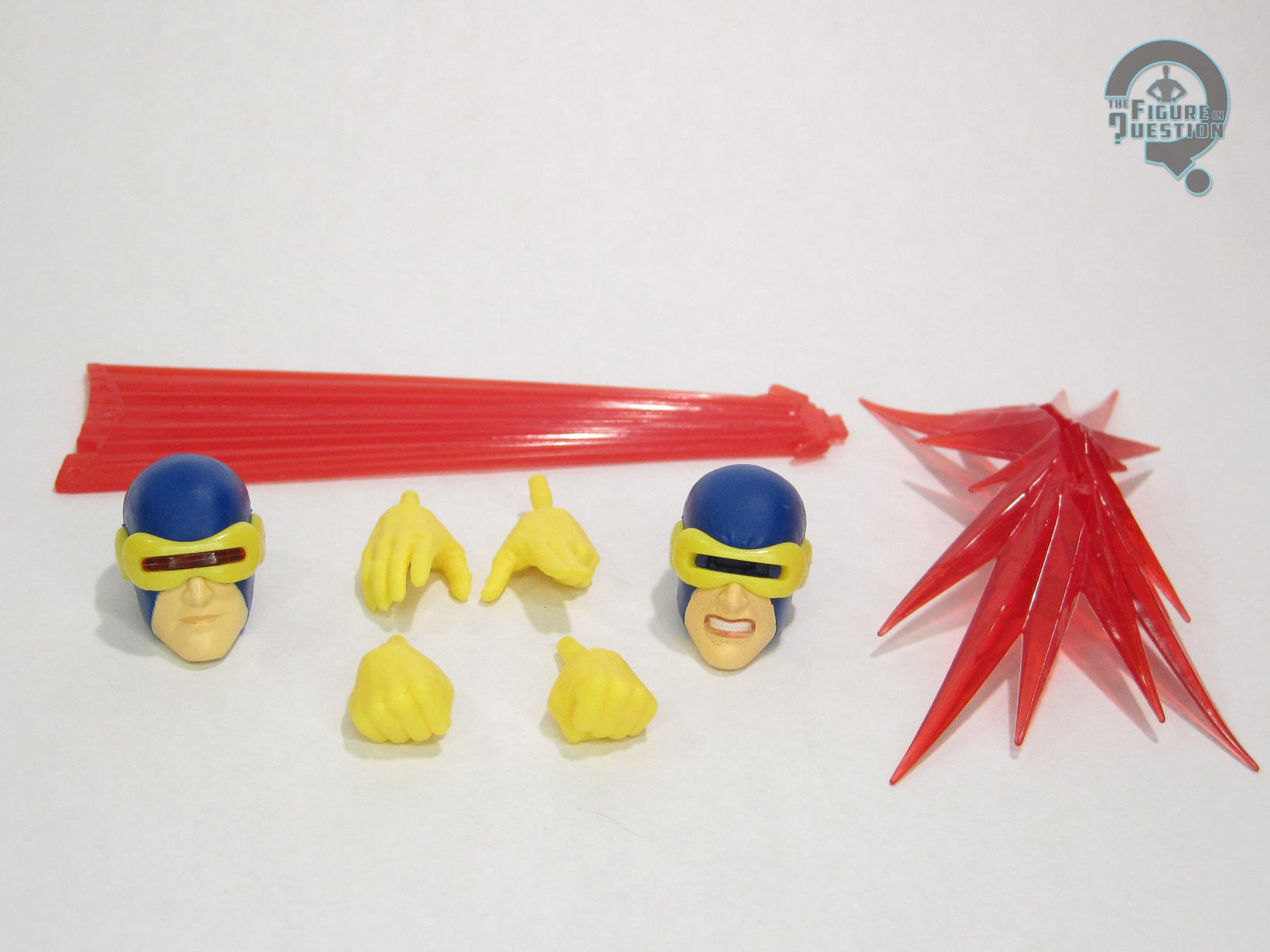
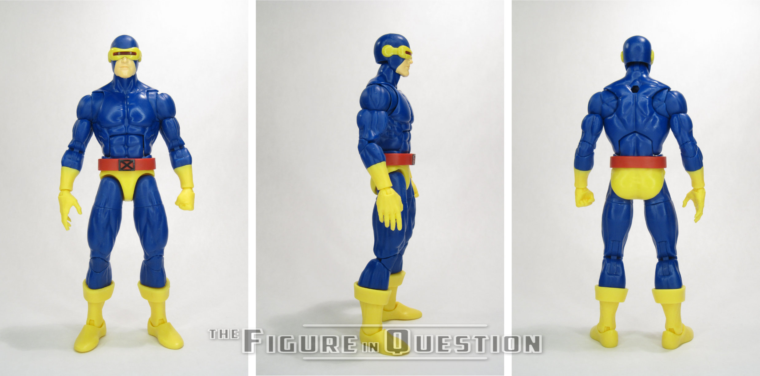
This figure makes up kind of the central need for this whole set in the first place.  Though this look served as Scott’s main appearance for just over a decade, it often gets the short end of the stick on toy coverage.  In the case of Legends, the last release was back in 2017, as part of an exceptionally hard to get Toys R Us-exclusive two-pack.  Suffice to say, that figure’s gotten pretty pricey on the aftermarket, and also doesn’t quite fit with newer releases.  This one’s aim is to address all that, and also to maybe fix some issues with prior figures?  I’ll get to that.  The figure stands just shy of 6 1/2 inches tall and he has 34 points of articulation.  As with most recent Cyclops figures, this one is built on the Vulcan body.  For this design in particular, it feels like a pretty natural choice for the character.  He gets a pair of new heads, new shins, and a new belt add-on piece.  The two heads follow the trend of recent Cyclops figures, with one calm, and one more intense.  As with prior instances, the more intense head has a slot in the visor for the attachment of an optic blast effects piece, which is always a fun touch.  When the X-Factor Cyclops was released, I was low-key kind of expecting those heads to get a straight re-use for this costume, despite the inaccuracies involved with such a choice.  I was very pleasantly surprised by the decision to go all-new for both sculpts, meaning that not only does he get the more distinctive visor shape of the Cockrum/Byrne days (complete with the etched in lines running at either side of the visor), he also gets the proper slants of the full mask under the visor; both prior Legends versions of this costume have gone with the later straight lines from the edges of the visor look, and while it’s a minor detail, I’m very glad it didn’t get overlooked here.  Likewise, his new boot pieces are a more accurate version of the boots Scott wore with this costume than the more generic buccaneer boots of earlier releases, making him even more accurate.  The only thing that isn’t quite as cool as Hasbro’s last version is the paint work, which, rather than replicating the shading of the comics for the blue sections, just goes for a flat blue.  They’re going for the animated look, which was a bit flatter, and I know the coloring on the last one was difficult to get consistent, so I understand it, and this one ultimately doesn’t look *bad*, but it’s the one area where he’s not *quite* as impressive.  Cyclops includes two pairs of hands (in fists, and an open/activating visor combo) and the large optic blast effect first used with X-Factor Cyclops.  It’s basic, but covers the important bases.

JEAN GREY
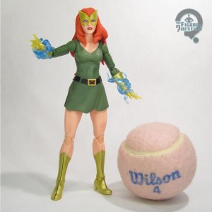
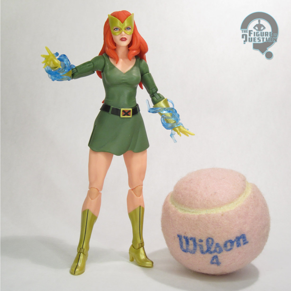
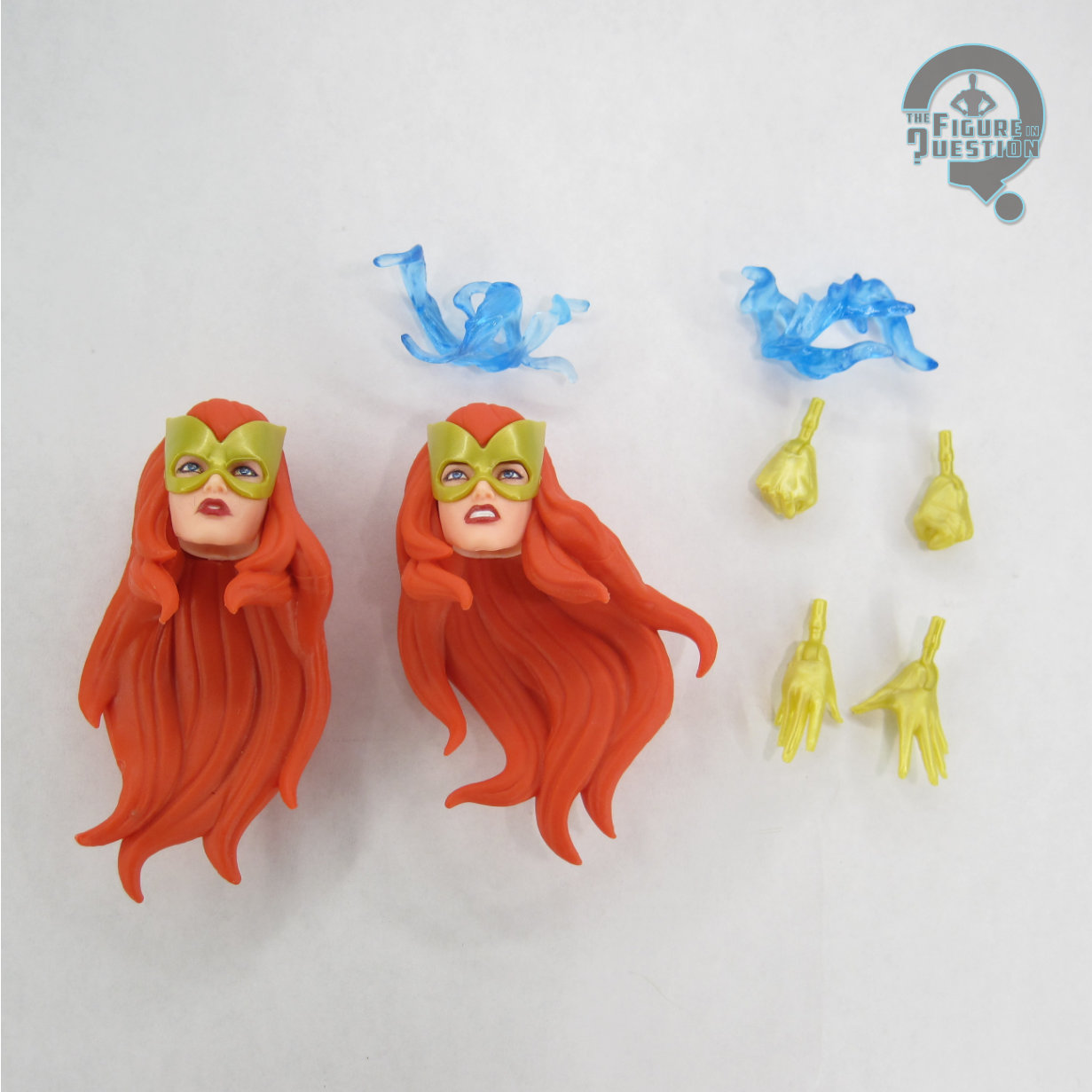
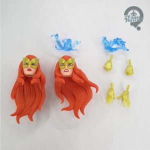
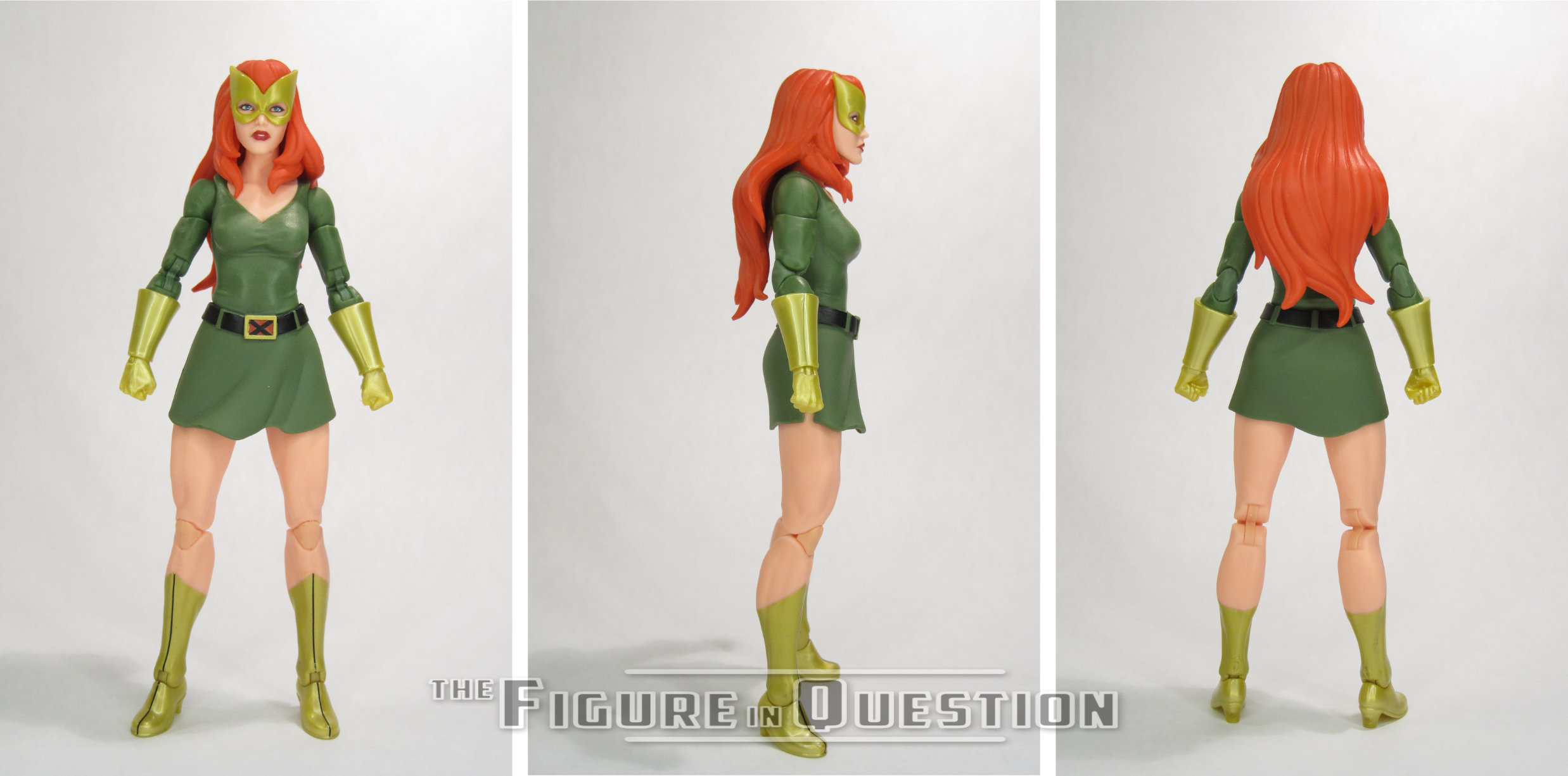
Jean’s return to her green miniskirt costume in the last pair of ’97 episodes is a return in more ways than one, since she’d also worn it during the original show’s adaptation of the “Dark Phoenix Saga.”  She’d also recently returned to it during the Krakoan-Era in the comics, which was how it got its last Legends figure.  That one wasn’t all that long ago, nor was it super hard to find, so this one was a *little* surprising, but given the two-pack angle, not incredibly so.  The figure stands 6 1/4 inches tall and she has 29 points of articulation.  Going in, I was expecting a lot of re-has from the HoX release of this costume, but that’s really not the case.  The only piece actually shared between the two is the torso.  The arms and legs are newer, updated pieces that sport the pinless construction on the elbows and knees.  The feet are now proper closed boots with heels, instead of the re-purposed shoe-d feet from Peggy Carter, and the gloves are now cleaner slip-over pieces, rather than the wrinkled ones from the last one.  She’s also got two new heads, and a newly sculpted skirt piece, which is more dynamic than the last one, and therefore more practical for posing the legs.  In general, she’s a much easier figure to pose, and by extension more easy to balance.  Much less falling over with this one.  The two heads mimic Cyclops, with one calmer, and the other more intense.  They’re both clearly patterned on her animation model from the show, but can also work easily as a stand-in for her comics look.  Jean’s color work is a slightly different approach than the HoX version, which went for flatter shades.  This one goes a bit more off-kilter, making the yellows gold and the green a sort of duller shade.  I wasn’t sure about it at first, but in hand it actually really works, and gives this design a more unique feel, while also calling forth her Phoenix design.  Jean is packed with two pairs of hands (in fists and open gesture), as well as two energy effects pieces in blue.
THE ME HALF OF THE EQUATION

I’ve mentioned many times how the late ‘70s X-Men is really what I consider my X-Men.  So, I’ve got this real attachment to that classic Cyclops look.  The Toy Biz version’s not worth mentioning, and much as I love the TRU Cyclops (because he’s a half-way decent Cyclops), he’s got some issues that hold him back.  When this look reappeared in ’97 I was very hopeful it would turn up in toy form again.  It took a while, but here it is.  I jumped on the pre-order for these as soon as possible, because I was not missing this Cyclops.  He’s sooooooooooo nice.  Very much the best version of this costume, and I love so much about him, but especially the actual accuracy to the costume’s intended design, which is always overlooked.  Jean I had very little actual expectations about.  I had the HoX release, and it was fine but not overly impressive.  I expected mostly re-hash here, and just saw her as a glorified accessory for the Cyclops figure.  While she doesn’t supplant Cyclops as the star for me, she’s a lot better than I expected, and an unquestionable improvement over the last release, and I’m very happy about that.
#3942: Nightwing

NIGHTWING

BATMAN: ARKHAM KNIGHT (DC COLLECTIBLES)

Okay, what did I say in last week’s  intro?  Hang on….checking…ah, right, Arkham games were a big splash for DC in the ‘10s.  Very good.  Solid intro. Right, so we’re doing a bit more with that this week.  No need to get too far outside your comfort zones, though, because I’m sticking with Dick Grayson, aka Nightwing, as seen in 2015’s Arkham Knight.  Because that’s just how I roll.  Let’s check out Nightwing!
THE FIGURE ITSELF

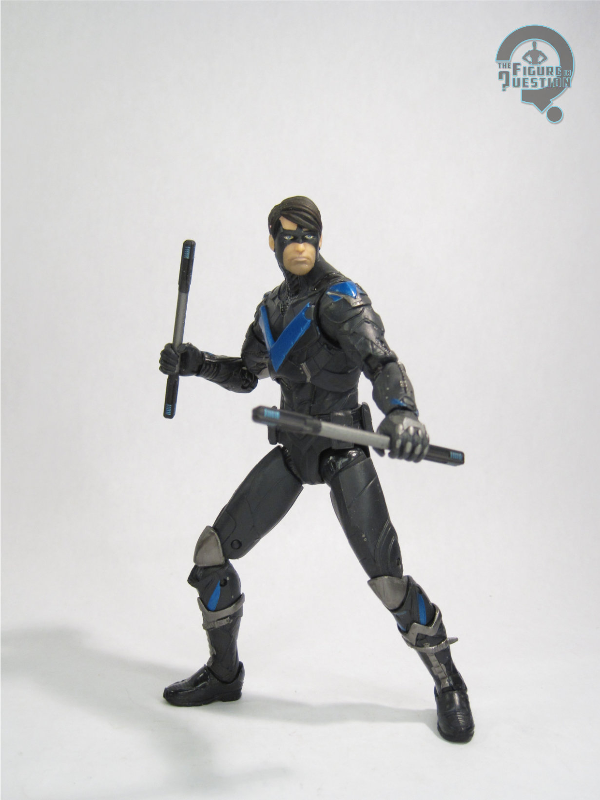
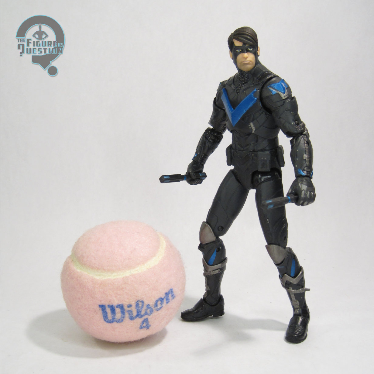
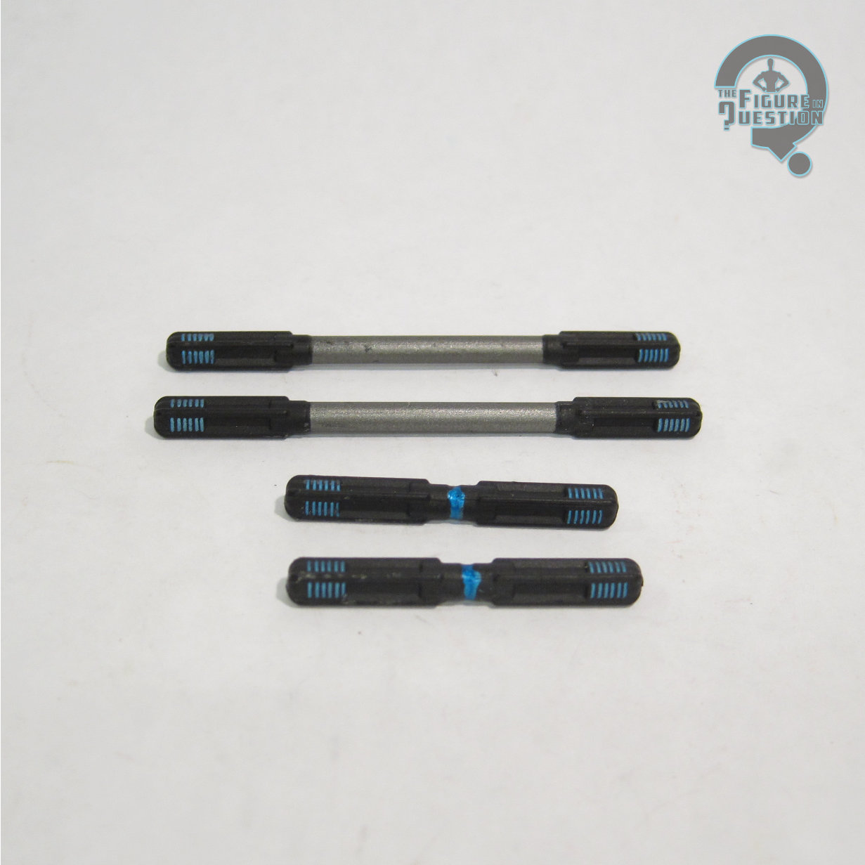
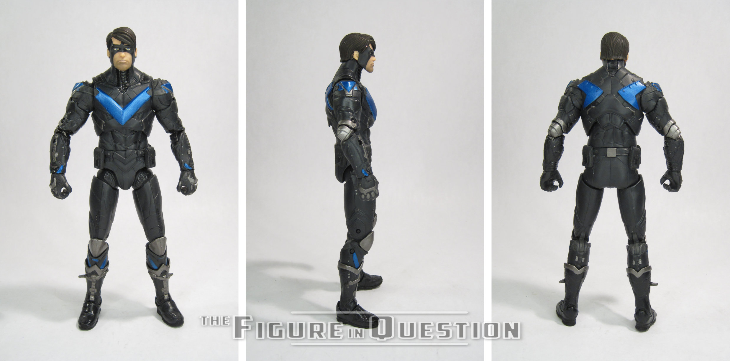
Nightwing was released as part of the second series of DC Collectibles’ Batman: Arkham Knight tie-in line.  He was figure 05, making him numerically the first figure in the series.  While there were a number of different options for Nightwing’s City look in figure form, this was his only figure from Knight.  The figure stands 6 3/4 inches tall and he has 31 points of articulation.  By the time of this line’s release, DCC hadn’t gotten a bit more invested in trying out improved articulation schemes.  They were still using a lot more fragile plastic than they should have been, so he’s a bit tricky to pose without worry of breakage, but generally the design and implementation of the joints gives him a decent range.  This is honestly one of the better posing Arkham figures I’ve handled from the DCD/DCC run, so that’s actually quite nice.  Nightwing had an all-new sculpt, based on his updated game design.  City added a tactical flair to the comics designs, but Knight heavily re-worked everyone into far more teched-out and armored appearances.  Nightwing follows suit, and ends up with something that quite a departure from how he tends to look in the comics. The armor seems like it would bee pretty restricting to an acrobat, but I don’t hate the overall silhouette of the suit.  I’m not *crazy* about the mask, which goes from his usual domino-style piece to a whole cowl-style thing that connects to his suit.  Ultimately, though it did sort of grow on me.  I still don’t like it, but I can stand it.  The sculpt does a generally good job of capturing the model in plastic form.  The suit is very sharply defined, and the face feels a little less weird than the last one (though he still feels a little bit “dead”).  His paint work is generally not bad.  The colors match the game assets (still not crazy about how dark the blues are, but whatever), and none of the suit’s smaller details are missed.  My figure has a weird spot of pink on the hair, and I don’t know how well the attempt at stubble on his face works out.  Otherwise, though, he’s fine.  Nightwing is packed with his batons in both extended and collapsed form.  They’re a bit tricky to get into his hands, and it’s a shame there’s no storage for them on this release, but at least they’re present.

THE ME HALF OF THE EQUATION

I didn’t play any of the Arkham games, but I did pretty closely follow a lot of goings on with Knight when it was released.  I was less than enthused with Nightwing’s design at the time, so I didn’t jump on the figure.  A decade removed, I’ve softened on it a bit.  I had the chance to get this one at the same time as the City version at the beginning of the year, and opted to snag him.  While I still have some issues with how the design works relative to the character it’s meant for, I do have to admit that this makes for a cool figure, and it’s definitely a superior offering to the City release.  I actually had a lot of fun messing with this guy.

Shoutout to my friends at All Time Toys, from whom I purchased this figure for review!  If you’re looking for cool toys both old and new, please check out their website and their eBay storefront.