#1517: Han Solo – Concept

HAN SOLO – CONCEPT

STAR WARS: 30TH ANNIVERSARY COLLECTION (HASBRO)

“The vivid imagination of conceptual artist Ralph McQuarrie brought to life the characters and worlds envisioned by George Lucas. McQuarrie’s paintings and drawings were instrumental in the push to bring Lucas’s saga to the big screen, giving shape and form to a multitude of fantastic individuals, creatures, planets and technology encompassed in this epic tale. Developed in collaboration with McQuarrie himself, this remarkable action figure series pays tribute to the man whose art defined some of the most memorable characters in film history.

McQuarrie’s concept painting of central characters in A New Hope depicts Han Solo as a fierce Jedi Knight rather than a rougish smuggler. Wearing close-fitting battle gear, he is ready for combat with his lightsaber blazing and his face set with stern determination.”

Here, celebrating the 40th Anniversary of the Star Wars franchise, it’s nice to look back at all the possible what-ifs of the franchise.  Ralph McQuarrie’s contributions to the early designs of what was then titled The Star Wars are quite well-known within the fan base.  They’ve spawned comics, animation, and yes, even action figures.  I’ll be looking at one of those figures today!

THE FIGURE ITSELF

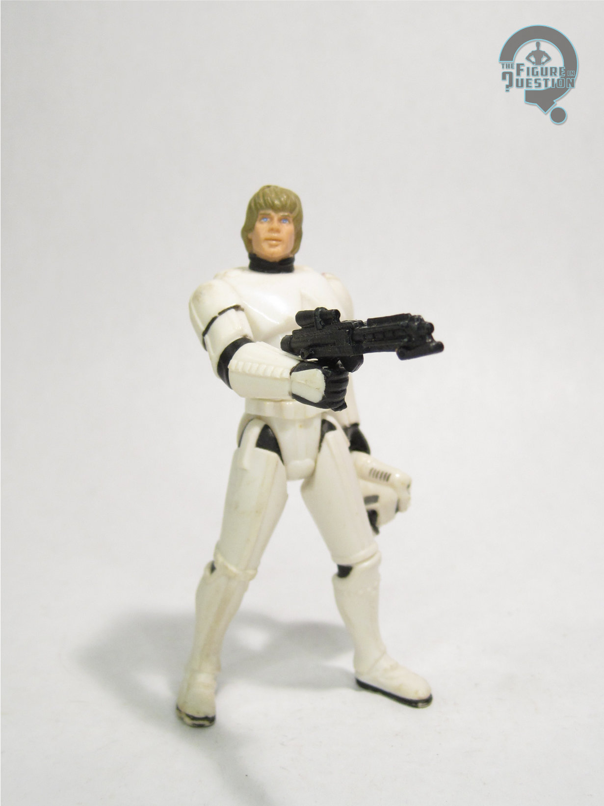
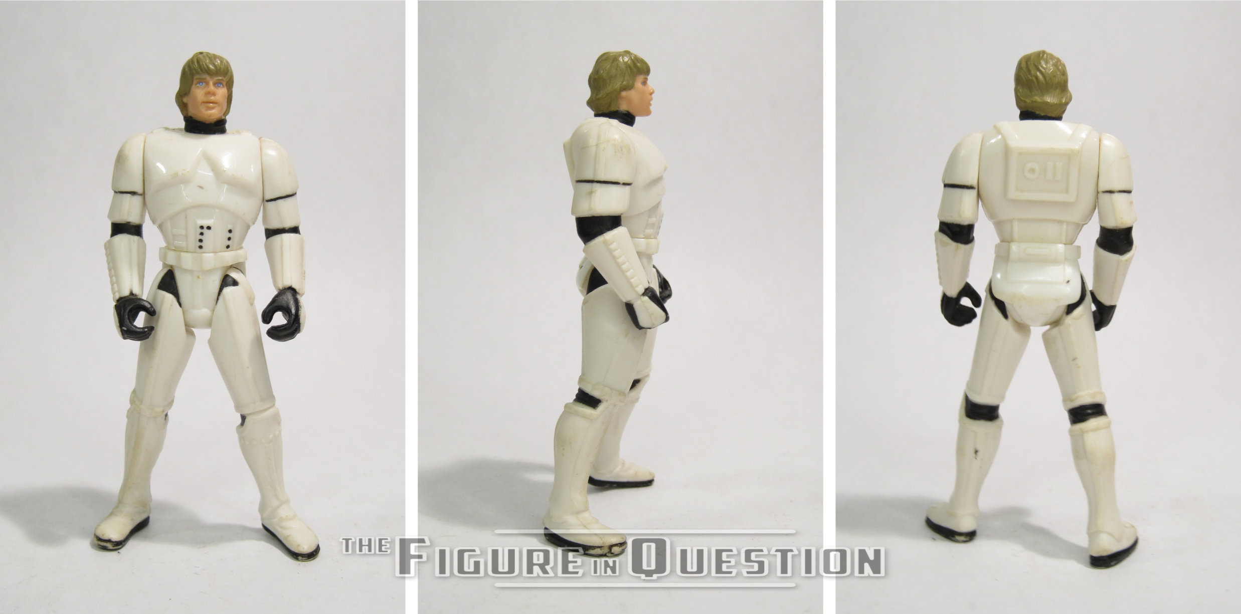
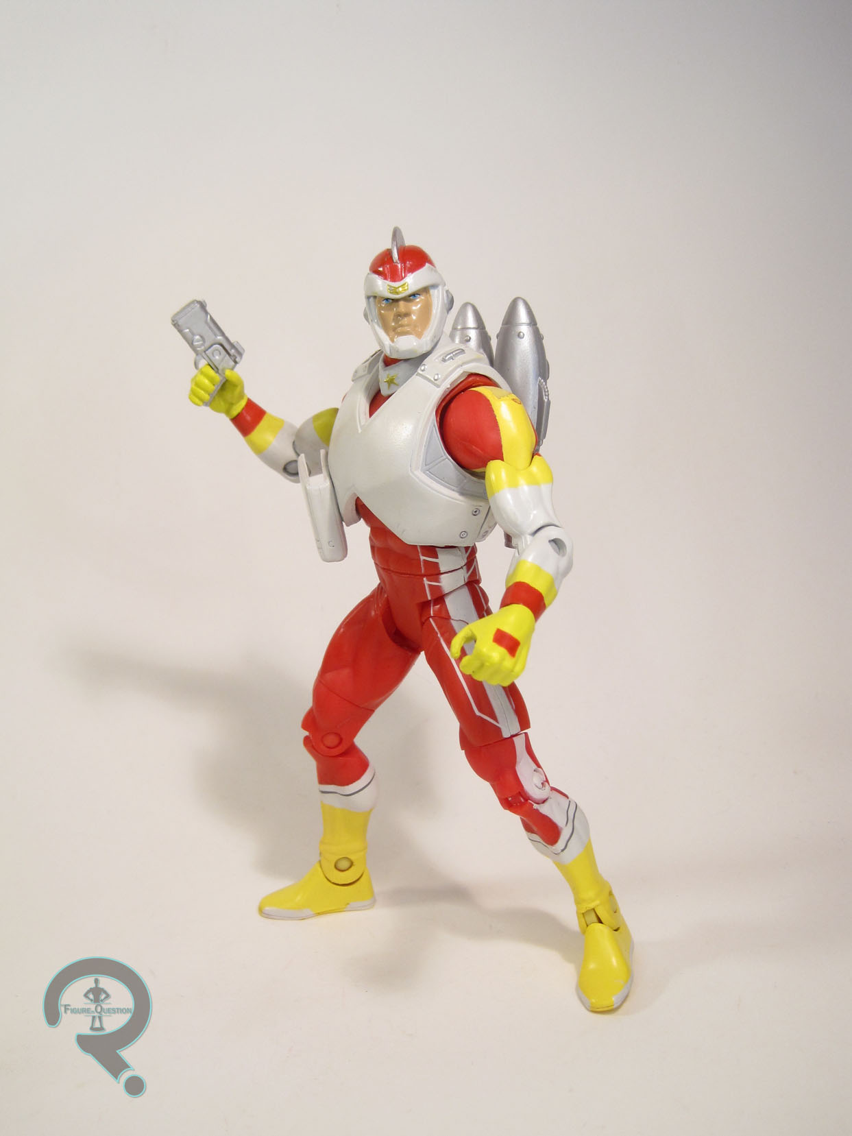
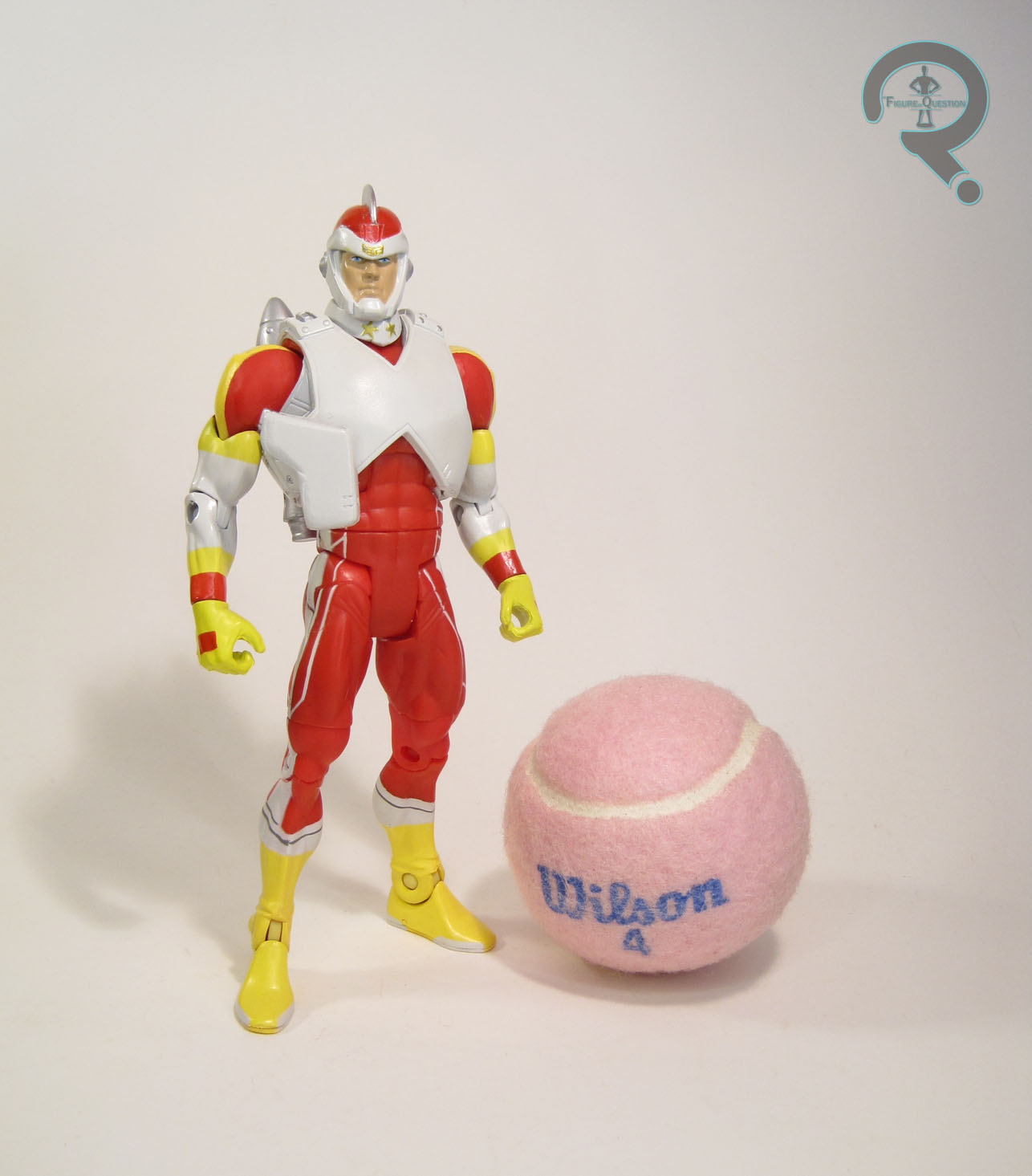
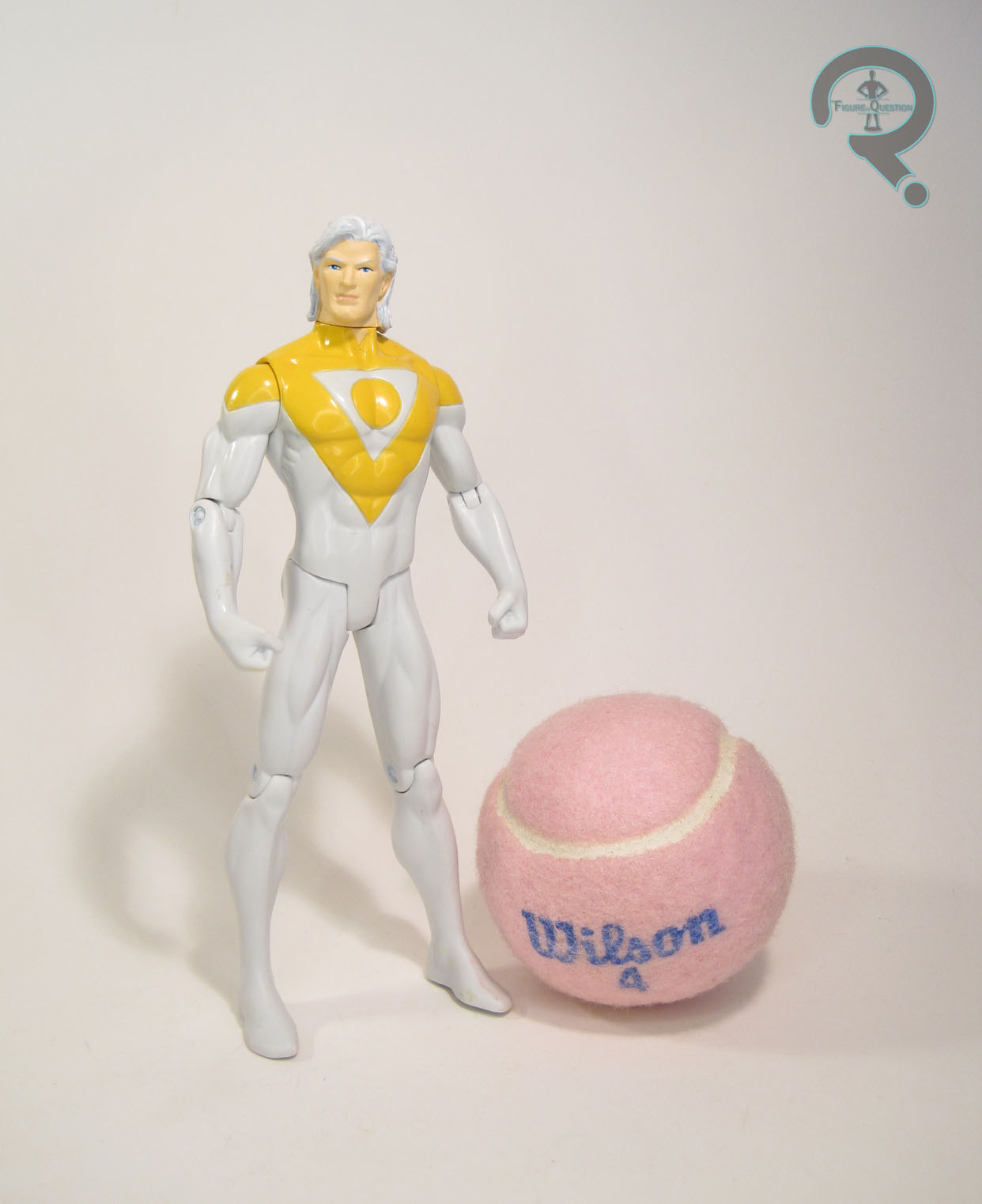
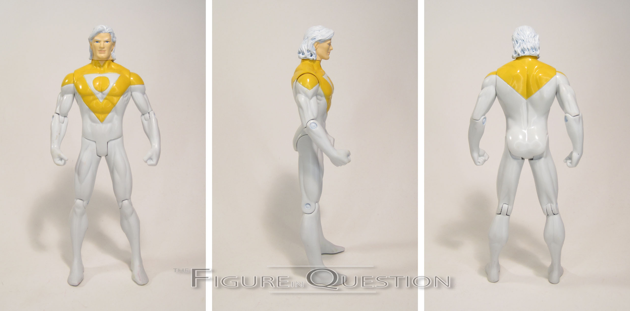
Concept Han Solo was released in the seventh wave of Star Wars: 30th Anniversary Collection, as figure 47 in the line’s overall count.  He was the seventh of the Concept figures (there was one of them per wave), and is a slightly odd-ball figure in an otherwise Return of the Jedi-based assortment of figures.  The figure stands 3 3/4 inches tall and has 18 points of articulation.  Han was sporting an all-new sculpt, obviously based on McQuarrie’s early design of Han.  Ultimately, it;s rather far removed from Han’s final character, and seems to have more in common with Obi-Wan Kenobi’s final character, especially as seen in the Prequel Trilogy.  Still, it’s a pretty solid piece of retro-sci-fi design work, and the figure’s sculpt does a rather admirable job of replicating it in three dimensions.  It keeps a lot of McQuarrie’s style, but adds a touch or realism, so he’ll still fit in with the standard movie figures.  There’s a ton of detail work going on, especially on the various parts of his uniform.  If I have one complaint about this figure, it’s the way his articulation works.  It’s not bad; as a matter of fact, he comes from when Hasbro was really starting to improve the movement on their figures, so he’s got a lot of posablity. With that said, the joints aren’t always worked in so well, and when posed, they can leave him looking a little bit odd.  Han’s paintwork is actually pretty solid, and much more detailed than your average Star Wars figure.  The base colors all match up pretty well with the original concept work, and there’s a ton of accent work, which adds a lot of dimension to this figure that a good number of his contemporaries lacked.  Han was packed with a lightsaber (both on and off) and his blaster pistol.  They resemble the final film’s props, but are definitely more classic sci-fi, especially the saber, which has a cool energy flare effect going on at its base.

THE ME HALF OF THE EQUATION

The McQuarrie Concept figures have always fascinated me, but for one reason or another, I’ve just never tracked them down.  And, honestly, if I was going to get just one of them, it probably wouldn’t be Han.  With that said, I was out with Super Awesome Girlfriend two weeks ago participating in Ellicott City’s Midnight Madness, and I found this guy at All Time Toys.  I wasn’t 100% sure I was going to get him, but she insisted on buying him for me, so here he is.  He’s actually a pretty solid figure, truth be told, and he has a fun bit of history behind him.  Now I definitely feel the need to track down the rest of these guys!

The Blaster In Question #0037: First Order Stormtrooper Deluxe Blaster

BlasterInQuestion1

FIRST ORDER STROMTROOPER DELUXE BLASTER

STAR WARS

stormrifle1Look at this post.  Only Imperial Stormtroopers are so punctual.  Ok ok, technically this week’s blaster isn’t from the “empire” so to speak, but the First Order is basically the Empire 2.0, so yeah.  Also, I know there is a more recent First Order Stormtrooper Deluxe Blaster on the market now, but I couldn’t justify hefty price tag on that one just yet so we’re going with the older one.  But that’s enough about that, on with the review!

THE BLASTER ITSELF

stormrifle2The First Order Stormtrooper Deluxe Blaster (the first one) was released in 2015 as part of Nerf’s Star Wars tie-in products, at the time, corresponding with the release of The Force Awakens.  Functionally, the blaster operates just like the N-Strike Elite Rampage, or Raider before it as it built on virtually the same internal mechanism using a pump-action magazine fed setup.  This makes a lot of sense as a design choice since it probably saved the good people at Hasbro some time and therefore money working out how the blaster was going to work.  Also, given that the Sterling Mk. IV SMG (the real steel firearm on which the F-11D Stormtrooper rifle is based) loads magazines from the side, I’d say the decision practically made itself.  The blaster looks and feels pretty good.  Leaving enough to clearly denoted it as a toy, the blaster resembles the prop from the film pretty closely.  Being modeled after a real world firearm, the ergonomics are pretty good.  The pistol grip is simple but does the job well.  The pump grip could be a little more rounded for comfort in my opinion, but it’s understandable squaring it off to accommodate the proportions of the blaster body.  As a fun side-note, most of the official promotional stormrifle3
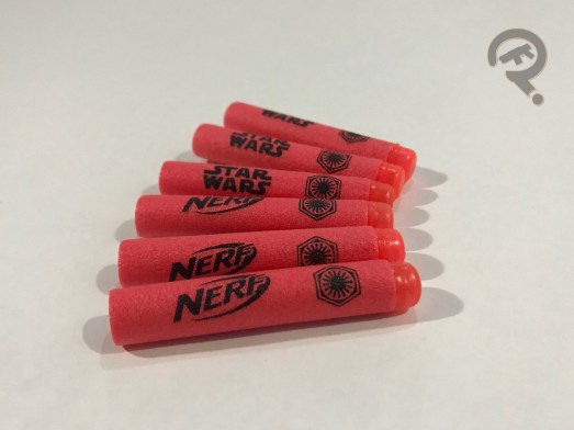
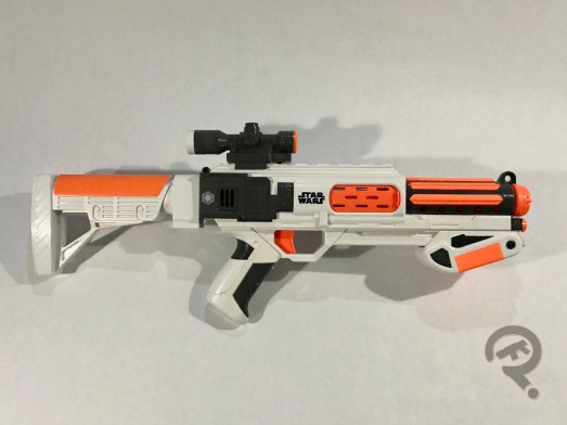
images for the blaster show it with the pump grip installed backwards.  The FOSDB also comes with a scope and stock accessories that fit onto standard Nerf attachment rails and lugs, respectively.  The scope is very low-profile and actually provides quite a nice sight picture for what that’s worth in a Nerf attachment.  The stock is nice and solid, if a bit short on its own but the way the body of the blaster extends back past the grip means it’s at least a useable length when attached.  At the very least, it fits with the overall compact size of the blaster.  Without the stock, the blaster itself is really sized more like a large handgun than a rifle, something that it has over the Rampage.  That and the fun primed indicator disguised as a vent that changes from black to red when the blaster is primed.  Both of these little improvements make it that much more disappointing that the performance isn’t up to the same standard as Elite blasters.  I’ve been over the reasons why this is the case, but it still bums me out sometimes, especially with blasters that should be awesome by all rights.  Even if you’re not getting exactly the same range and power, at least you can throw out movie quotes as you bust into your younger sibling’s room and start blasting.  Good luck hitting anything, though.  It is a Stormtrooper rifle, after all.  The FOSDB comes packaged with a scope, a stock, an all-white 12 round magazine, and 12 red Star Wars branded Elite darts with transparent red tips.stormrifle4

THE ME HALF OF THE EQUATION

This blaster was really the first Star Wars Nerf blaster I can remember seeing and getting excited about.  Before this series, the best we got always seemed to be single shot, muzzle loaders, so it was really great to see tie-in blasters get more serious designs, even if they’re almost direct copies of existing blasters.  Clones, maybe.  Wait, no, we’ve confirmed the First Order doesn’t do clones.  Only bad movies do that, that’d be stupid.

#1516: Luke Skywalker as Stormtrooper

LUKE SKYWALKER AS STORMTROOPER

STAR WARS: POWER OF THE FORCE II (KENNER)

“Disguised as stormtroopers and fighting off a regiment of Imperial troops inside the Death Star, the escaping band of heroes finds refuge in a garbage receptacle. The Rebels realize their problem has changed when the walls begin closing in.”

So, apparently there was this movie released yesterday.  Star Wars?  Kind of a big deal I guess.  While I’m still totally up to date on the actual Last Jedi stuff in my collection, I still have plenty of older figures in the backlog.  And, since I looked at the Stormtrooper Disguise Han Solo two weeks ago, why not take a looksie at his companion Luke figure!

THE FIGURE ITSELF

Luke Skywalker as Stormtrooper was released in the 1996 assortment of Power of the Force II, as that year’s third variant of Luke, and the fifth overall Luke in the line.  This was our second Stormtrooper Disguise Luke, following the one released in the original Power of the Force line.  He’s about 3 3/4 inches tall and he has 6 points of articulation.  Despite how it may look, the only re-used piece on this guy is the torso, which is the same one used on the Stormtrooper Han.  Nevertheless, he’s still the same height as Han and the basic troopers, meaning he’s not actually short for a Stormtrooper.  Instead of Han’s more pre-posed look, Luke has a more generic standing pose, which looks decent enough.  He still follows the general style of the line, so he’s far more muscle bound than any of the troopers we see on screen.  But, like I said with Han, if you’re gonna have the style, I guess it’s best to stick with it.  His head is a re-working of the early PotF2 Luke head.  It’s not one of the better Hamill likenesses, but it’s not as terrible as some of the early sculpts.  Plus, it means he fits with the rest of them, which I suppose is for the best.  The paint on Luke is fairly straight forward stuff.  It’s pretty clean overall, and matches up with the rest of the line pretty well.  Luke was packed with a removable helmet (the same one included with Han) and a standard Stormtrooper blaster.  It’s a pretty standard set of extras, but more than one accessory is always nice with a Star Wars figure.

THE ME HALF OF THE EQUATION

After getting Han as a mail-away, I was on the look out for this guy.  It took him a little while to hit, but I ended up finding him at Another Universe, the comic book store in the local mall.  I was pretty excited for him, and he makes for a pretty cool pairing with Han to be sure.

#1515: First Order Special Forces TIE Fighter

FIRST ORDER SPECIAL FORCES TIE FIGHTER

STAR WARS: THE BLACK SERIES (HASBRO)

“The elite of the First Order straighter pilots have access to specialized craft, such as the two-seater TIE craft outfitted with enhanced weapons and sensor systems. The skilled pilots of the First Order launch into combat aboard advanced fighter craft, hunting down enemy vessels and protecting space around installations and warships.”

There’s no denying that vehicles are a defining piece of the Star Wars mythos.  They’re so important, that the scale of the vintage line was largely chosen to facilitate the inclusion of these vehicles.  They’ve been an important part of the line for the past 40 some years, and its part of why the 3 3/4 inch scale has never fully died out.  When Hasbro introduced the 6-inch Black Series, it was kind of assumed by the fanbase that this line would be without any vehicles.  Fairly early on, there were a few smaller items (such as the speeder bike), but full scale vehicles seemed more than a little cost-prohibitive.  Imagine the fanbase’s surprise at SDCC 2015 when Hasbro unveiled a 6-inch scaled TIE Fighter, as part of the products tying into The Force Awakens.  I’ll be looking at that vehicle today!

THE VEHICLE ITSELF

The First Order Special Forces TIE Fighter (gosh, that’s a long name) was released as a special deluxe item in Hasbro’s Star Wars: The Black Series, which hit in the winter of 2015.  The TIE has a pretty large footprint, at a whopping 18 by 18 inches.  It’s sizable enough that I was half tempted to just put a flat surface on the top of it and just use it as a coffee table.  It has an articulated antennae, a rotating lower cannon, and an opening hatch at the top.  Like the smaller scale TIE, this vehicle is based on the slightly updated TIE Fighter design seen in TFA, which isn’t too far removed from the classic TIE design.  The sculpt is, understandably, unique to this particular item.  It’s a pretty solid piece of work.  Hasbro took advantage of the larger scale, and has filled every inch of this rather sizable piece with tons of detail work.  Speaking of scale, this TIE is a fair bit closer to proper scale with its respective figures than the smaller TIE was.  It’s still not 100% spot-on, but you can get two people in the cockpit sitting back to back as seen in the film, which is a step up indeed.  Said cockpit is definitely the coolest part of the Fighter for me; it’s got two full seats, plus all of the various instruments and panels seen in the movie.  There are clips in each seat, to help hold the figures in place.  They can make it a little difficult to get the figures in there, but once you get the hang of it, it’s not too bad.  A definite plus, though, is that you don’t have to be quite as picky about the figures that go into this Fighter, unlike the smaller one.  I was able to get Poe and Finn in there without too much trouble at all.  The paintwork on the Fighter is decent enough.  It’s pretty clean overall, and there’s some sharp work on the interior of the cockpit.  There’s also some pretty sweet accent work on the red Special Forces stripe.  The TIE Fighter’s only real accessory was an exclusive TIE Fighter Pilot figure, which I didn’t get with my fighter.  It’s the same as the single-release First Order TIE Fighter Pilot, just with some extra red detailing.

THE ME HALF OF THE EQUATION

As cool as the novelty of this item was, when it was originally released with a $180 price tag, I passed.  That’s a lot of money and it takes up a lot of space.  And then I was out to dinner with my family, and there was a wait for our table, so Christian, Tim, and I walked over to the Goodwill across the parking lot.  At said Goodwill, they had this behind the counter, marked at $20.  So, for the price of a single Black Series figure, I got this huge freaking thing.  It’s pretty awesome, I gotta say.  Sure, I don’t have either pilot for it, but Poe and Finn look pretty at home in there, and I can’t stress enough how awesome it was to get this thing for 11% of its original retail price.

#1514: Mystery Inc

SCOOBY DOO, SHAGGY, & VELMA

SCOOBY DOO (CHARACTER OPTIONS)

Almost a year ago, I took a look at a few Scooby Doo figures, which are a little bit outside of my usual reviewing bubble.  Not super far or anything, but just outside.  Of course, as anyone who reads this site with any regularity can probably tell you, all it takes is one figure and the next thing you know, I’m getting a whole set.  So, I had Fred, I had Daphne, and I had the Mystery Machine.  But the Mystery Machine needed the rest of its passengers, right?  I certainly thought so.

THE FIGURES THEMSELVES

The figures included here are all part of the “Mystery Solving Crew” boxed set, which is part of Character Options’ overarching Scooby Doo line.  All of the figures available here are also available a few other places, but this is the most convenient way of getting the whole gang.  Included in this set are Scooby, Shaggy, Velma, Daphne, and Fred, all based on their slightly modernized appearances from Scooby Doo: Mystery Incorporated.  Daphne and Fred are the same ones reviewed here and here.

SCOOBY

This is quite a landmark for me, because this is actually my first Scooby figure.  Handful of Scooby Doo figures, and not a one of them’s been the main character.  Yeah, I know, I’m weird.  Anyway, Scooby’s Mystery Inc design was one of the least changed; mostly he just had a few sharper angles.  The figure stands about 3 inches tall (since he’s on all fours) and has 10 points of articulation.  He gets a whole extra point thanks to that tail of his.  His sculpt is a pretty decent translation of the design from the show; I think Scooby’s design translates better to three dimensions than some of the others.  This results in a slightly less wonky looking figure than some of the others.  And when you really get down to it, it makes a bit of sense that Scooby’s figure would be the best, since he *is* the title character.  His paint is fairly basic, and there’s not a ton going on, but it’s certainly clean, which is better than the last two figures I looked at.

SHAGGY

You can’t have Scooby and not have Shaggy.  It’s just wrong.  So, here’s Shaggy!  His figure stands a little over 5 inches tall and has 9 points of articulation.  He’s the tallest of the five, and also the scrawniest, both of which fit the character, so that’s good.  His sculpt is also a pretty decent translation of the show design, with only minimal changes being made to help him work in three dimensions.  I can’t really point to anything in particular being different on him the way I could with Fred and Daphne, and I think he’s second after Scooby in terms of a successful translation.  I like that they’ve carried over his distinctive posture, since the other four humans just got fairly generic standing poses.  Shaggy’s paint is also pretty decent, but it’s once again pretty simple, so there wasn’t a whole lot to screw up.

VELMA

Last up is Velma, the perpetual fifth wheel of the group.  Her figure stands about 4 inches tall and has the same 9 points of articulation as Shaggy, albeit with far more limited hip joints.  Velma’s redesign for Mystery Inc was actually one of my favorites, as I felt it injected some new life into the character.  I’m not sure how successful the figure was in that venture.  She’s rather similar to Daphne in that regard.  I think she still ends up looking decent, but it’s not as strong a sculpt as some of the others, that’s for sure.  Her head’s a little big, and the glasses seem a bit misshapen.  Also, her right hand is sculpted to hold an accessory of some sort (I’d guess a magnifying glass), but no extras are included, which is a little weird.  Velma’s paint is passable, and for the most part pretty clean, but it ends up missing a few details (such as the barrettes in her hair, which are just left brown), which is a little annoying.

THE ME HALF OF THE EQUATION

In my review of Daphne, I noted that I just needed to resist the urge to finish off the gang.  I’d like it to be noted that I managed to do so for a whole 10 months.  Kudos to me, right?  I found this set at one of the last K-Marts in the area, priced at $9.99, which I’m fairly certain was an error, since the two-packs with the monsters were $7.99.  Regardless, I wanted to finally have the whole gang, and even with the extra Fred and Daphne, this was the cheapest way to go about it.  None of these figures are amazing or anything, but they’re kind of fun, and I’m happy to have the set.

#1513: Rowen

ROWEN

RONIN WARRIORS (PLAYMATES)

Hey, remember when I was talkin’ ‘bout Ronin Warriors?  That was pretty cool, right?  Well, guess what!  I gonna talk about them again!  Alright!  Last time, I looked at Cye, the Ronin Warrior of trust, who was a blue guy.  Today, I’ll be looking at Rowen, the Warrior of Life Force, who’s…another blue guy.  Aw man, they got the same color, this is so embarrassing…

THE FIGURE ITSELF

Like Cye, Rowen was part the basic assortment of Ronin Warriors figures, which were available and in steady production for a good part of the ‘90s.  The figure’s roughly 6 inches in height and has 14 points of articulation.  From the neck down, Rowen’s sculpt is completely identical to that of Cye, for good and for bad.  This means he’s got the same slightly odd articulation scheme, and the same very bulky construction, which is a little off from how the characters were depicted on the show.  That being said, they were all depicted as being roughly the same size on the show, so at least the line was internally consistent.  Rowen gets a unique head sculpt, which is a pretty decent piece.  It’s stylistically very similar to Cye’s, which I suppose is a good thing.  I will say his hair ends up noticeably less matted to the sides, and in general the head looks less tiny in comparison to the overall body, both of which are minor improvements over Cye.  Rowen had 11 snap-on armor pieces, which are unique to him, but still in keeping stylistically with the rest of the line.  They do add some more bulk to the body, which perhaps isn’t the best direction for the already overly bulked up figure, but it could certainly be worse.  My figure is missing a couple of his armor pieces, most noticeably his helmet, which is a little sad, but he’s still got most of it.  The paintwork on Rowen is decent enough to be passable.  There’s not any particularly stand-out work or anything, but everything seems pretty clean and all.  Like the rest of the Ronin Warriors, Rowen was originally packed with a whole tree of weapons with which to arm him.

THE ME HALF OF THE EQUATION

I had a handful of Ronin Warriors as a kid, but Rowen was actually not one of them.  When I picked up my replacement Cye from Collector’s Corner a few months back, I spotted this figure, but ended up passing on him at that time.  Cye was a pleasant trip down memory lane, so when I was in the area next, I went back for Rowen.  I’m glad I did.  He’s another fun little addition to my collection, and I’m happy to have him.

#1512: Adam Strange

ADAM STRANGE

DC UNIVERSE CLASSICS (MATTEL)

“Archaeologist Adam Strange was transported to the distant planet of Rann by a random communications beam from outer space. Adam soon became the official hero of Rann, the planet’s protector against strange menaces of all kinds. Though without powers, frequently outnumbered and almost always outgunned, Adam’s cleverness and innovation have allowed him to overcome every menace and gain a reputation as the ‘thinking man’s hero.’”

It sure is convenient that the archeologist named “Adam Strange” was the one who got zapped into space, isn’t it?  He sure would be less catchy if his last name was “Smith” or “Wilson.”  Also, do you think he has any relation to Stephen?  And, as an archeologist, would he also carry the title of “doctor”?  Because if so, that could get very confusing.  I think this intro’s getting too thoughtful.  Sorry, the bio *did* refer to Adam as the “thinking man’s hero.”  I think it just comes with the territory.

THE FIGURE ITSELF

Adam Strange was released in 2009, packed alongside Starfire as the first of four Matty Collector-exclusive DC Universe Classics two-packs.  While Adam and Kori haven’t exactly had a ton of time together in the comics, but in ’09, the most prominent thing Adam had done in recent was staring in one of the recurring stories in 52, where he, Starfire, and Animal Man had to make their way back to Earth the slow way after being stranded following the events of Infinite Crisis.  Suffice it to say, it was certainly a relevant pairing at the time.  Following that relevance, Adam is seen here in his then current design, based on his revised appearance from 2004.  While it doesn’t have the timelessness of the original design, I do still think one works pretty well, and keeps all of the important elements.  The figure stands about 6 1/2 inches tall and sports 25 points of articulation.  He’s built on the medium sized body, with a new head and add-ons for collar and harness/jetpack.  The body ends up feeling a bit large for Adam, and it’s not really helped by the extra bulk from the add-ons.  He’s definitely an example of why the base body system doesn’t work for every character.  I feet he really should have at the very least gotten a unique torso, but what are you gonna do?  The harness isn’t a bad sculpt, though.  The holster’s a little obtrusive, but it’s nice to get a working one for a change.  His head’s not a terrible offering, but like some of the earlier DCUC heads, it lacks the depth it should have and also sports some rather obvious seams.  Still, it’s a perfectly serviceable offering.  The paintwork on this guy is passable, but not without its flaws.  On the plus side, it’s bright and colorful, so that’s good.  That said, the application is a bit sloppy, and there are more than a few fuzzy edges, taking a design that really should be very clean and making it look quite iffy.  Adam is packed with a small blaster pistol, which is nice and all, but I do really wish he’d gotten a proper trigger finger to hold it.

THE ME HALF OF THE EQUATION

I never did get this two-pack when it was new, mostly due to it being rather pricey for two figures that pretty much everyone agreed were mediocre at best.  I ended up coming across Adam by himself at House of Fun just a few weeks ago.  He looked cool enough in person and he wasn’t too expensive, so I went for it.  Is he great? No.  He’s passable, but at best he’s middle of the road.  If you’re looking for an Adam Strange, I guess he’s okay.

#1511: Star-Lord & Ego

STAR-LORD & EGO

MARVEL LEGENDS (HASBRO)

“Roguish and unpredictable, Ego and Star-Lord share many of the same qualities as father and son. But when it comes to defending the galaxy as each sees fit, their approaches unquestionably differ.”

It’s been about three months since I took a look at the second assortment of Guardians of the Galaxy Vol. 2-themed Marvel Legends.  While those reviews mostly wrapped up the Legends releases for the movie, there’s still one item I haven’t yet reviewed.  I’ll be taking care of that today, with a look at the film’s main antagonist Ego, as well as another variant of his son, Peter Quill, better known as Star-Lord!

THE FIGURES THEMSELVES

Star-Lord and Ego were released as a two-pack over this past summer.  They’re officially the last of the GotG2 releases to hit stores, but thanks to some wonky distribution, a lot of areas saw them before the Mantis Series (I live in one such area).  They hit around July/August, a fair bit after the movie’s release, which may not have been the strongest marketing strategy.

STAR-LORD

This marks Star-Lord’s third Legends figure this year.  It’s functionally the same figure as the one released in the Titus Series, but there are some notable differences if you own both.  As far as the sculpt goes, the only real change is the hair, which is the more coifed Mantis Series piece, denoting this as a more official Vol. 2 figure than the first Star-Lord.  The hair’s seated better on the head this time around, making for a better overall appearance.  Beyond that, the sculpt’s identical to the first figure, which is hardly a bad thing since that was a phenomenal sculpt.  Like the sculpt, the paint is largely the same as the first release, but there are a few differences.  The most minor is the shirt, which is now a light grey instead of a dark one.  The more intense changes are on the face, which uses the fancy new face printing method.  It’s not terrible, and it’s certainly a vast improvement over the Mantis Series head, but the Titus Series head is still my overall favorite.  Star-Lord includes an extra helmeted head, his two element guns, and his Walkman.

EGO

In the comics, Ego and Peter Quill’s father are two separate characters.  James Gunn disliked Quill’s father’s identity in the comics, and decided to go for something a bit more exciting, finally deciding on Fantastic Four villain Ego the Living Planet.  He was slightly re-worked for the film (he doesn’t tend to have an actual body in the comics), but his overall characterization was pretty spot-on, and Kurt Russel was clearly having a lot of fun with the part.  It should be noted that this figure’s official name is actually “Marvel’s Ego,” which I found to be rather amusing in its own unintentional way.  The figure stands about 6 1/4 inches tall and he has 31 points of articulation.  His sculpt is new to him, and it’s…well, it’s alright, I guess.  Compared to some of the other Guardians figures, it feels a little weak.  It’s mostly how the articulation’s been worked in.  It just feels rather stilted and unnatural.  It’s not like we’re at Mattel levels of bad or anything, but it definitely could have been better.  It’s not all bad, though.  The head actually has a pretty solid likeness of Russel, and I was rather impressed with the texture work on his clothing.  Overall, I’m happy with the sculpt, I just think it wasn’t helped by being packed with one of Hasbro’s best sculpted figures ever, that’s all.  The paintwork on Ego is pretty solid work.  It’s not the most exciting set of colors, but it’s true to the movie, and there’s enough accent work to keep him from looking too bland.  Like Peter, he gets a printed face, which I think ends up looking a bit better than Peter, and is my favorite sample of this technique so far.  Ego is packed with an extra head, which is largely the same as the standard one, just with a slightly friendlier expression.  It’s not really all that noticeably different, and I can’t even say for sure that it’s even a different sculpt.  Personally, I’d have rather had a battle damaged head from when Peter shoots him, but I guess that might have been too morbid.

THE ME HALF OF THE EQUATION

When this set was first announced, I was pretty excited for it, even if I did already have the basic Star-Lord.  Then it took its sweet time getting here, and I had some financial things going on, and so by the time it actually arrived on shelves, I just could bring myself to drop the full $40 on it.  Ultimately, I ended up getting it for about half price from Target, meaning I pretty much just payed for the Ego figure.  The set’s alright, but I don’t find it to be quite as entertaining as the Thor/Valkyrie set.  Star-Lord’s different enough from the Titus Series figure for me to notice, but not enough to make me actually care to have the extra, which is a bit frustrating.  Ego’s not a bad figure, but he’s not a great one either, and I feel he’s a little bit of a step down from the rest of the set.  At half-price, I don’t feel ripped off, but I’m certainly glad I didn’t buy it when it was brand-new.

The Blaster In Question #0036: Twinshock

TWINSHOCK

N-STRIKE ELITE (MEGA)

There’s one thing blasters from the MEGA series all have in common and that’s being rather large. Being rather large and red. Yes. They all share relative largeness, redness, and radical devotion to the pope. Wait, hang on… scratch that last one. Large and red are still valid, though, and they certainly apply to this weeks blaster, the Twinshock. I guess I should tell you about it, then. Yeah alright, here goes.

THE BLASTER ITSELF

The Twinshock was released in 2017 as part of the MEGA series of blasters. If you’ve read my review on the Roughcut 2×4, you should have a good idea of how this blaster works, because it’s functionally identical, just with 10 barrels instead of 8. In summary, it’s loaded from the muzzle, holds 10 rounds and for every rack of the priming handle, the staged trigger allows you to fire 2 darts either successively or simultaneously. Given the increased size of the projectile, it’s understandable that the power of the blaster has been accordingly bumped up. The Roughcut took advantage of a gear system to assist in priming two plungers with one motion. This gave it a slightly longer priming stroke than most other blasters. This is doubly true for the Twinshock which has an enormous stroke length but with comparatively low resistance, so there’s the trade-off. Now, I think it’s worth bringing up that the Twinshock, much in the same way as the Alien Menace Ravager before it, has a buttery smooth prime. It’s hard to describe how nice of a priming stroke it has so if you want to know what I’m talking about, you’ll just have to buy one and see, but it’s pretty great, so maybe do that. The exterior of the Twinshock is completely original and features two attachment rails on the top of the blaster. As mentioned before, it feels pretty hefty in hand and has some substantial bulk to it. The only real issue with that is that it is rather top heavy so make sure you have strong wrists if you’re planning on holding this blaster for a long time. I also wish it had a stock, or at least an attachment point for one, but I wish for a lot of things. The performance with the Twinshock is admirable. In line with other MEGA blasters, it hits hard and shoots far with the added perk of whistling darts that really frighten younger siblings when they hear them flying past their head. The capacity for double-tapping or shotgunning 2 darts is really what sets the Twinshock apart. The Twinshock comes packaged with 10 MEGA darts.

THE ME HALF OF THE EQUATION

I’m being fully serious about how great priming this blaster feels. If you don’t feel like buying one of these for yourself to experience it, find a friend who will and borrow theirs. Even if you’re some kind of weirdo who isn’t sold on that premise alone, its use as a weapon against younger siblings also cannot be understated.

#1510: Apollo

APOLLO

THE AUTHORITY (DC DIRECT)

“Apollo, The Authority’s mightiest member and partner to Midnighter stands ready to turn his super-strength and speed to taking care of the team’s business…no matter what the cost!”

Isn’t it a bit weird when a parody character is owned by the same company that owns the original character?  Because, that’s kind of The Authority.  They’re a dark parody of the Justice League, injecting the more idealistic League with a healthy dose of ‘90s anti-heroism.  To be fair, they weren’t originally owned by DC; they came out of Jim Lee’s Image Comics-borne Wildstorm imprint, which Lee sold to DC when he decided he didn’t want to be a publisher anymore.  The New 52 made them an official part of the main DCU, so now there’s a parody Justice League that exists in the same universe as the actual Justice League.  What a world we live in.  Anyway, today I’m looking at the resident “Superman” of the team, Apollo!

THE FIGURE ITSELF

Apollo was released in the first, and only, series of DC Direct’s The Authority line in 2002, alongside his husband Midnighter, team leader Jenny Sparks, and the Engineer.  The figure stands about 6 1/4 inches tall and has 9 points of articulation.  His prototype had 11 points of articulation, but somewhere along the way, he lost his wrist joints.  While Apollo obviously draws from Bryan Hitch’s take on the character (since I believe he was still the only artist to draw him at this point), it’s not an artist-specific figure like a lot of DCD’s later stuff would be.  Instead, he’s been interpreted into DCD’s house style of the time.  It gave their earlier offerings a more cohesive look, which I suppose isn’t the worst thing.  He’s just a little blander than Apollo usually tends to be.  The pose is also a bit stiff, but that’s just true of this era of DCD figures.  The figure’s also rather scrawny for Apollo, who should ideally be sporting the same basic build as Superman.  Nevertheless, this figure’s got about half the body mass he should; he almost looks more like Kid Apollo from the Authoriteens.  Apollo’s paint is decent enough for what it is.  He does end up looking a bit washed out, but that’s true of the design from the comics.  It’s a bit tricky to do the creative lighting of the comics in three dimensions.  I suppose they could have made the white pearlescent or something, but they weren’t really doing stuff like that at this point.  I do like that they’ve done some accent work on his hair, and the details on his face are pretty sharp, so it’s hardly like they phoned it in or anything.  Apollo included no accessories, not even one of the display stands DCD were so fond of for a while.  That seems a little light given what he cost, but I don’t really know what you could have given him.

THE ME HALF OF THE EQUATION

So, I’ve never actually read any of The Authority or even any non-Authority stories with Apollo in them.  My entire exposure to the character is having seen this particular figure solicited back in 2002, and then reading up on him in preparation for this review.  Why do I own this figure, you ask?  I was at All Time Toys on Small Business Saturday, and I had grabbed a handful of loose figures.  They have a deal on loose figures, where you get a discount if you buy so many.  Long story short, Apollo ended up running me about 50¢.  I can get behind a 50¢ action figure.  Of course, now I’ve got this compulsion to track down the other three Authority members, which is just downright silly, isn’t it?