#0975: Scarlet Witch

SCARLET WITCH

AVENGERS: EARTH’S MIGHTIEST HEROES (TOY BIZ)

ScarletWitchAR1

I’ve been tackling a lot of characters’ first action figures as of late. Oddly enough, it’s not really been an intentional choice, just sort of something that’s cropped up. Today, I’ll be looking at the first figure of one of the quintessential Avengers, the Scarlet Witch. Though she’s been with the team since the mid-60s, and was also a recurring character in the ‘90s Iron Man cartoon (she was actually the only member of Force Works not to get a figure from that show’s tie-in line), Scarlet Witch’s first figure wouldn’t be released until 1996, when the Avengers got their own dedicated series of figures.

THE FIGURE ITSELF

ScarletWitchAR2
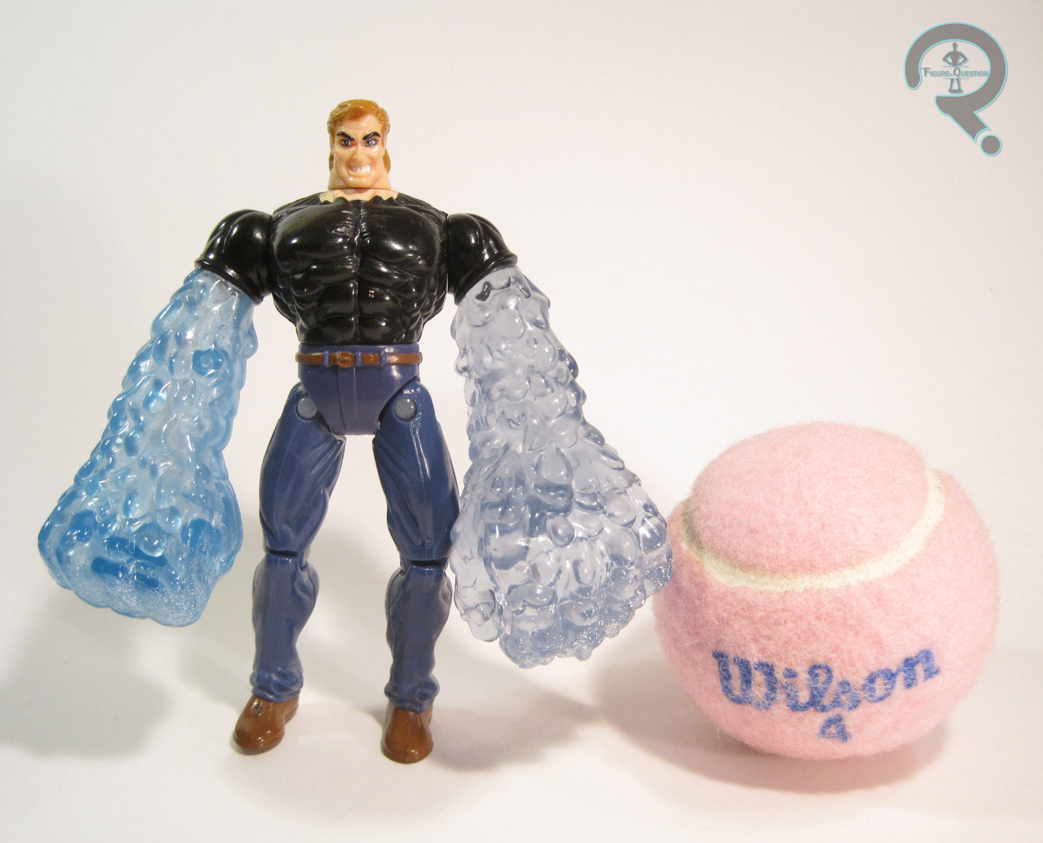
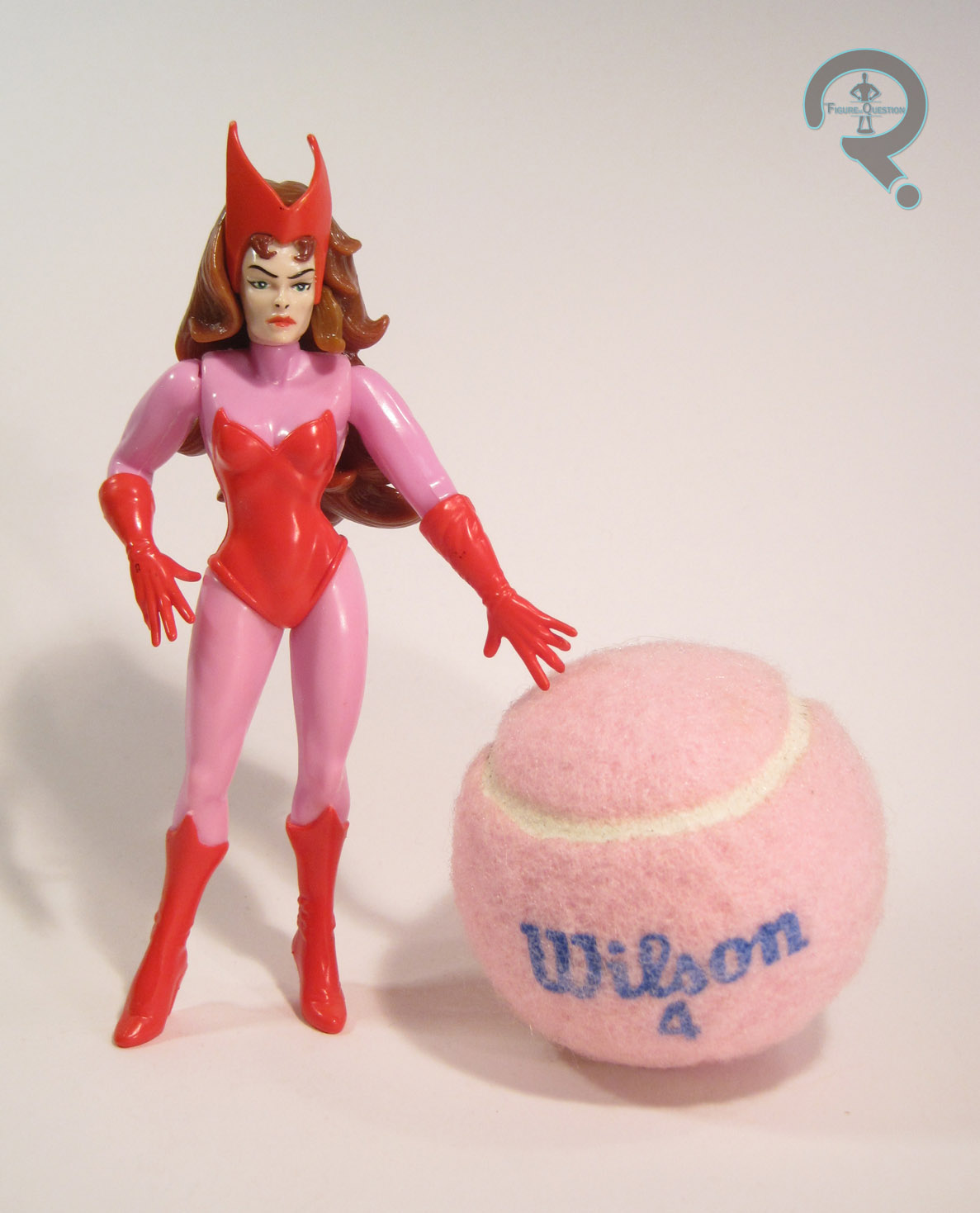
Scarlet Witch was released in the first (and only) series of Avengers: Earth’s Mightiest Heroes, a line which was designed to roughly tie-in with the Heroes Return event. The figure stands about 5 ½ inches tall and she has 7 points of articulation. The articulation isn’t particularly useful, sadly. You can get a bit of decent posing out of the shoulders, but even then, the arms have a tendency to pop off if you move them too much. Also, did you catch that height? Yeah, at 5 ½ inches, this figure is 6-inch scale. While that’s a prevalent scale now, at the time of her release, it made her too tall to go with couple hundred 5-inch scale Marvel figures that Toy Biz had put out. The first Scarlet Witch figure ever made, and she was out of scale with just about every one of her teammates. That’s a bit frustrating. On the plus side, the sculpt actually isn’t horrid, especially when compared to Toy Biz’s next attempt. The head is probably the best part. The hair a little thick and hard to work with, but the face is still probably the most attractive take on the character in sculpted form. The rest of the body isn’t bad, but some of the proportions seem a little out of whack. Her waist is definitely too small, but her whole torso in general feels a bit tiny when compared to the arms.  To be fair, the slightly oversized nature of the arms is preferable to the stick arms many female figures are saddled with. I do wish they were a bit less tubular, but the gloves and hands are certainly nicely detailed. Originally, this figure also had a cloth cape, which my figure no longer has. It wasn’t anything especially impressive, though. The paintwork on this figure is pretty straightforward, but also pretty good overall. My only real complaint is the nose: like McFarlane’s Carol from Walking Dead, Wanda has painted nostrils, and she would definitely look much better if they had been left unpainted. Wanda was packed with two “magic orbs” and a hex bolt.

THE ME HALF OF THE EQUATION

Scarlet Witch is yet another figure from the 15 figures I picked up at this year’s Balticon. Despite how much I liked the character, I never got one of these when it was new (I had actually been holding out for the United They Stand version, which didn’t even make it to the prototype stage…). While this isn’t a perfect figure, it’s certainly better than the one that followed, and it was the best Scarlet Witch figure available for over a decade. Which is honestly kinda sad, but there it is.

#0971: Hydro-Man

HYDRO-MAN

SPIDER-MAN (TOY BIZ)

Hydroman1

You know what the absolute best reason to create a new character is? To replace another character you can’t use at the moment. Seriously, that always results in a fully formed, exciting character, who’s just as exciting as the previous character. That’s why everyone’s favorite Red Ranger is Rocky, Heavy Duty is hands down the best heavy gunner G.I. Joe’s ever had, Chachi was the coolest guy on Happy Days, and Coy and Vance Duke were universally loved by all. What’s that? I’m wrong on every single count? Oh, my bad. Apparently, substitute characters aren’t a good thing.

So, speaking of substitute characters, let’s talk about Hydro-Man. Strictly speaking, he didn’t start out as a substitute, though he’s always been rather similar in concept to Sandman. When James Cameron was working on putting together a Spider-Man movie in the ‘90s (yeah, it was a weird time), he wanted to use Sandman as one of the main villains, and an embargo was placed that prevented using Sandman in any media outside of the comics. So, when Spider-Man: The Animated Series wanted to use him, they had to settle for Hydro-Man (the same thing happened when the Fantastic Four cartoon did the Frightful Four, but Hydro-Man had been a part of that team before). This meant that Hydro-Man also got his first shot at an action figure, courtesy of the Spider-Man tie-in line. I’ll be looking at that figure today.

THE FIGURE ITSELF

Hydroman2Hydro-Man was released in the “Spider-Wars” series of Toy Biz’s 5-inch Spider-Man line. The figure stands just over 5 inches tall and he has 9 points of articulation. Though he lacks any sort of elbow movement, he makes up for it with a disc-and-pin style joint for his hips. This makes him a bit imbalanced in terms of posability, but I’ve certainly dealt with worse. Hydro-Man is based on his look from Spider-Man: The Animated Series, which was a fairly faithful recreation of Hydro-Man’s look from the comics. The figure does an…interesting job translating his look to three-dimensions. Hydro-Man has always been depicted as being a pretty beefy guy, and this figure tries to convey that. He’s certainly big, but perhaps a bit too big. Well, in some areas, anyway. In other areas (such as the head), he’s too small. Hydro-Man’s been saddled with some pretty serious man-boobs. I think there was an attempt to make him muscular, but they missed the mark and he just ended up lumpy instead. Also, check out the mom jeans. Not exactly the sort of thing that makes for an imposing villain, there. On the positive side, the head sculpt, while a bit weird-looking, certainly has quite a bit of expressiveness. The arms are also pretty good. While I might like a pose other than straight-armed, the water effect is pretty believable and the overall sculpt is pretty cool. Hydro-Man’s paintwork is fairly straightforward, but also pretty solid. The application is nice and clean, and the translucent arms even have a few flecks of white paint to emulate the impurities in the water. Hydro-Man originally included a base to make it look like his lower half was also water, as well as a “water gun” for his left hand to hold. He also came with a small pump, which was used for his right arm’s water shooting feature. The pump could be filled with water and plugged into his back, and when squeezed, the water would shoot out of his right middle finger. It’s a rather gimmicky feature, and the removal of the pump results in a rather large, gaping hole in his back, which is slightly annoying.

THE ME HALF OF THE EQUATION

Hydro-Man is the ninth figure of the 15 figures I picked up at this past Balticon. I never had Hydro-Man growing up, but I did have the Sandman that was a repaint of this guy. This figure is super, super goofy, and probably not one of the better figures from Toy Biz’s run. But, you know what? I kinda love this guy. I can’t really say why, but I do.

#0970: Silver Surfer

SILVER SURFER

MARVEL SUPER HEROES (TOY BIZ)

SilverSurferMSH1

Though they were best known for their 15 year run with the Marvel license, Toy Biz’s first work of note was actual doing toys based on Marvel’s Distinguished Competition. Toy Biz’s DC action figures were little more than knock-offs of Kenner’s Super Powers line. When Toy Biz was granted the Marvel license, their initial offerings were rather similar to what they had done for DC. They offered a rather broadly ranging line, covering the major corners of the Marvel Universe (barring the X-Men, who got their own line). Today, I’ll be taking a look at one of that line’s versions of the Silver Surfer!

THE FIGURE ITSELF

SilverSurferMSH2Silver Surfer was released in the third series of Toy Biz’s Marvel Super Heroes line. The figure stands about 5 inches tall and has 6 points of articulation. That’s actually a pretty low articulation count for a Toy Biz figure, and it’s even a bit low for this particular line. This figure is mostly the same sculpt as his Series 1 counterpart. The only difference between the two is the lack of neck articulation. It’s an odd choice, and it definitely limits what can be done with the figure, but I’d guess it had something to do with the vac metalizing. The sculpt isn’t terrible, but it’s not particularly great either. He’s similar in style to the Toy Biz Green Lantern, in that his proportions feel rather off, and the level of detail is very low. Also, his head is just very oddly shaped. It’s definitely too small, and the face (which is very ill-defined) sits too high. In fact, the head in general sits too high on the neck, and the whole construction there just looks weird. As far as paint goes, this particular Surfer doesn’t really have any, he’s just vac metalized. Later Surfer’s would at least get detailing on the eyes, but that’s not the case with this guy. Just the straight up and down silver for him. Silver Surfer originally included his surfboard, done up to match him. Unlike other versions of the board, this one was really thick, and it had wheels on the bottom. So, he’s not actually the Silver Surfer, he’s the Silver Skateboarder. Radical.

THE ME HALF OF THE EQUATION

The Surfer is the eighth of the 15 figures that I picked up from a vendor at this past Balticon. I…I’m not really sure how I feel about him. I mean, the chrome look is certainly cool, but the actual figure’s kind of a bit lame. Toy Biz definitely improved in leaps and bounds over the years, but this guy’s a disappointment even compared to the figures from the same line. I hate to be this down on a figure, but this guy, well, he’s not great.

#0969: Cyclops

CYCLOPS

X-MEN: AGE OF APOCALYPSE (TOY BIZ)

CyclopsAoA1

Man, I feel like I was just talking about Age of Apocalypse not that long ago. Oh, that’s right, I was! Back in May, I looked at the AoA version of the most popular X-Man, Wolverine. Today, I’ll be dipping back into that universe, to look at an X-Man who’s almost as popular, Cyclops! One of the things that the event liked to play with was which side of the battle certain characters were on. While classically villainous characters like Magneto and Sabertooth ended up firmly on the side of good, some of the more traditionally heroic characters found themselves on the side of bad. Such was the case with both Cyclops and his brother Havok. At the time, Cyclops as a villain was supposed to be really shocking, but it’s since become a rather predictable story beat (and Cyclops doesn’t stay evil in the story anyway, so…). Ah well. How about the figure?

THE FIGURE ITSELF

CyclopsAoA2Cyclops was released in the 12th Series of Toy Biz’s 5-inch X-Men line, which was entirely based around Age of Apocalypse. The figure is about 5 ½ inches tall and he has 10 points of articulation. Obviously, he’s based on Cyclops’ design from the Age of Apocalypse event. While Wolverine/Weapon X got a rather extensive redesign, Cyclops actually didn’t change all that much from his standard look of the time. Sure, there are plenty of minor changes, but the overall look is still pretty much the same. The biggest change is all the asymmetry. In the comics, Scott had lost his left eye in a battle with Logan, making him an actual cyclops. Isn’t that clever? Anyway, his visor has been tweaked so the eye slit is just on the right side, and they just kind of went nuts to play up the imbalance. With the asymmetrical armor, the pouches, the long hair, and the five o’clock shadow, the whole thing is very ‘90s. It’s almost quaint. The figure does a decent job of replicating this design, but holy crap is it stylized! His muscles are bulging all over the place, and his hands are huge, yet his head and waist still manage to be impossibly small. His head’s smaller than his bicep. That’s the kind of thing you might want to have checked! Also worth noting is that the structure and pose of this figure’s legs make him virtually impossible to keep standing for any length of time. On the plus side, the sculpt does have some pretty cool detail work, especially on the armored bits. He’s even got little sculpted scars across his eye! Cyclops’ paintwork is decent enough. The application is pretty clean,many the slightly metallic blue and yellow work really nicely. The hair’s a bit of a mess, but more or less gets the job done. The scars lose some of their subtlety with the huge red lines that have been placed on them, which is a slight letdown. Still, they aren’t terrible. Cyclops was originally packed with a weird gun thing and a brain in a jar. Classic Cyclops accessories! Mine, however, does not have these pieces.

THE ME HALF OF THE EQUATION

Cyclops is another figure from the rather large assortment of figures I picked up at this year’s Balticon. Given that I was a huge Cyclops geek as a kid, it’s a little surprising that I didn’t get this guy when he was new, but I don’t recall ever seeing any of the Age of Apocalypse figures in stores. Honestly, this isn’t one of my favorite incarnations of the character. However, he’s not a terrible figure, and his ramped up 90s-ness does make him a bit of fun!

#0966: Buccaneer Batman

BATMAN – BUCCANEER

LEGENDS OF BATMAN (KENNER)

In Super Hero toylines, it’s rarely a shock to see wacky, non-cannon variants of the main heroes . After releasing a basic version of the heroes, variants are the easiest way to get them into every assortment. They’re kind of one of those necessary evils (and honestly, they aren’t even that evil). Oddly enough, in the mid-90s, Kenner released the Legends of Batman line, which was a line of figures pretty much exclusively devoted to weird variants of Batman and his supporting cast. Today, I’ll be looking at one of those Batmen, specifically Buccaneer Batman, because who doesn’t love pirates?

THE FIGURE ITSELF
Buccaneer Batman was released in the third series of Legends of Batman. He was part of the “Pirate” sub-line that Series 3 introduced, alongside First Mate Robin, Laughing Man Joker, and … Pirate Two-Face. Yeah, they kind of gave up on the names after “Buccaneer Batman.” The figure stands a little over 5 inches tall and has the standard 5 points of articulation for a figure of the time. There’s a slight bit of limited motion on the right shoulder, thanks to his “Slamming Mace Action,” which would swing his arm downward when the button the figure’s back was pressed. As far as I know, this figure (and all the other Pirate figures) is not based on any particular comicbook appearance of Batman, but rather comes from the minds of Kenner. The design takes the classic Batman design, and makes a few tweaks here and there, to play up the whole pirate angle. His mask is no longer a cowl, but is instead a bandana tied into shape (though, how he got it to duplicate the bat ears is anyone’s guess). Gone is the utility belt, replaced by a simple sash, albeit one where he can still stow a batarang. He’s also got a belt running along his chest, which has a bat-logo affixed to it, just in case you didn’t know who this was. What’s slightly odd about the logo, though, is that it’s oriented parallel to the belt on his waist, despite the belt it’s attached to being diagonal. It almost feels like the logo was meant to be diagonal too, but then someone in DC’s merchandising insisted it be oriented flat, so as to not cause any brand confusion or something. Anyway, the design’s interesting enough. The actual sculpt isn’t bad, but it definitely has some oddities. For one thing, Batman’s really beefy, more so than he usually is depicted. Despite the fact that the costume is clearly meant to be loose and flowing, his muscles are still bulging through in every spot that they can. Also, he’s in a very strange pose, with one of the widest stances I’ve ever seen on an action figure. It’s not that this sculpt is bad, but rather that it seems uncertain of what it’s trying to do. Also, he did have a cape at one point, but I seem to have lost mine. Batman’s paint is fairly standard, but still pretty cool. He predominately uses the basic Batman colors, but they’ve given him red in place of the usual yellow. It makes it so this is clearly Batman, but he’s just different enough that you’re given pause. Plus, red seems more pirate-y anyway. Batman included a sword and a mace, both of which had been given slight bat-makeovers. He could only hold one at a time, and, if I’m honest, the sword was a lot cooler.

THE ME HALF OF THE EQUATION

I received Batman (and his corresponding Robin) for my fourth birthday. I definitely recall seeing the commercials for this particular set of figures and being rather excited to get them. Which is odd, since I’ve never been much of a pirates guy, but whatever. The figure took quite a beating over the years, and as goofy as he is, I still have something of a soft spot for him. This figure, like the rest of the Legends of Batman line, goes to show that wacky variants aren’t inherently a bad thing, provided you’re having fun with them.

BuccaneerBatman3

#0962: Gambit

GAMBIT

X-MEN: CLASSIC (TOY BIZ)

GambitLightUp1

The ‘90s were quite good to the X-Men. They several top selling comics, a few video games, and a cartoon. But, most importantly, they had an awesome, hugely expansive line of action figures, courtesy of Toy Biz. Earlier figures in the line were fairly straightforward versions of the X-Men, but as the line continued, Toy Biz started experimenting with a number of different gimmicks to keep things interesting. The very first “gimmick series” gave each figure a light-up feature. Though light-up features weren’t new to the line, these figures were different in that, rather than lighting up themselves, they used a two-part light-up feature that allowed them to light up their accessories. Mostly, the series was just an excuse to release new versions of a few outdated figures. Today, I’ll be looking at Gambit from that series.

THE FIGURE ITSELF

GambitLightUp2Gambit was released in the X-Men: Classic “Light-Up Weapons Series,” which was the 13th series of figures in Toy Biz’s 5-inch X-Men line. This was Gambit’s second figure in the line, after getting his first back in Series 3. The figure stands about 5 ½ inches tall and has 9 points of articulation. His articulation isn’t terrible, but the light-up feature’s inner workings are in his chest and right arm, which reduces the posablilty of the right shoulder quite a bit and also necessitates removing the usual elbow joints. Though the X-Men line was meant as a tie-in for the cartoon running at the same time, the figures tended to be more directly based on their comics appearances. Gambit actually looks to take a lot of influence from his Capcom game appearances, since he’s rather beefy and stylized. The overall look isn’t too bad, though it does seem like Gambit’s been juicing just a bit, since he’s usually more slender than he’s depicted here. He’s about to burst out of his sleeves for Pete’s sake! Also, his hands are absolutely huge, and if I’m honest the right one barely even looks like a hand at this point. The head exhibits the best sculpted work, and does quite a nice job of capturing Gambit’s smarmy personality. Gambit’s paint is fairly decent, if not fantastic. There’s a bit of slop here and there, especially on the fingers, and the pink lines on the sides of his pants are way more subtle than they should be. The color scheme they picked is once again pretty game-inspired, but it has a nice degree of pop, so no complaints here. Gambit included his usual staff, as well as a piece showing a fan of playing cards being kinetically charged, as if Gambit has just thrown them. The latter piece is the source of the light up feature. When plugged into Gambit’s right hand, the cards would light up at the push of the button on Gambit’s back.

THE ME HALF OF THE EQUATION

This is another ‘90s X-Men figure that I’ve owned two of. The first was bought for me by my grandparents on my Mom’s side, I believe as a reward for finishing kindergarten. I got him and Juggernaut, but I think I mostly got Gambit because my grandparents felt I needed to get a “good guy” figure to go with the villain. Somewhere along the way, I lost that figure, so I picked up this replacement from a dealer at Balticon this year. He’s not a terrible figure, but he definitely shows his age.

#0955: Bane

BANE

BATMAN: THE ANIMATED SERIES (KENNER)

BaneBTAS1

One of Batman: The Animated Series’ greatest successes was condensing Batman’s rich, 50-year history into one easy to follow, cohesive show. This involved taking characters from all eras of Batman’s history and making them all fit with the show’s art deco style. For the most part, they managed this task pretty well. However, there were a few that slipped through the cracks. At the time of the series’ debut, Bane was a very new addition to the comics, but he was a fairly popular one, so he made his way into the show. Unfortunately, the producers had a bit of trouble working Bane into the show’s style, resulting in a rather goofy interpretation of the character, true to neither the original character nor the show itself. Nevertheless, that version of Bane got a toy in Kenner’s tie-in line, resulting in Bane’s very first action figure, which I’ll be looking at today!

THE FIGURE ITSELF

BaneBTAS2Bane was released in Series 5 of Kenner’s Batman: The Animated Series line. He was one of two new villains in the line, alongside Killer Croc, which is actually kind of appropriate, seeing as Croc featured prominently in Bane’s first appearance. The figure is 5 ½ inches tall and has 5 points of articulation. Due to his swinging action feature, the shoulders move as one, however, with careful posing, they can be moved independently from each other. This figure is based on Bane’s single B:TAS appearance, in the episode “Bane.” It’s similar to his original comics appearance, but the luchador themes have been played waaaaay up, which severely reduces his intimidation factor. The sculpt does, at the very least, do a nice job of translating the show design into three dimensions. In fact, it’s probably one of the most faithful sculpts that Kenner ever produced. His arms are a bit pre-posed in order to facilitate his throwing feature, so they’re slightly out of whack when he isn’t holding anything. That being said, it’s not awful looking. He just looks a bit like he’s sorry for interrupting somebody’s conversation. His legs also seem a bit on the short side, especially when compared to the arms. However, this was somewhat common for the line, so Bane doesn’t really look super out of place. Bane’s paint is actually pretty solid. The colors are pretty bold, so he really pops, and the application is pretty solid. Bane originally included a bent section of girder, which he could “throw,” but mine doesn’t have his.

THE ME HALF OF THE EQUATION

Bane is a recent addition to my collection. At Balticon last weekend, one of the dealers had a large box full of loose figures. I believe they had purchased someone’s collection. Anyway, they were $2 each, so I ended up fishing out 15 of them to purchase. Bane was the only DC figure in the lot. Since I never got one back in the ‘90s, I was actually pretty happy to find him. Yeah, it’s a goofy design, and yeah, it’s a rather goofy figure. But I still really like this guy. He’s really not bad.

#0945: Weapon X

WEAPON X – BURNED

MARVEL LEGENDS (TOY BIZ)

WeaponXAoA1

The ‘90s had a lot of big comics “events,” especially compared to prior decades, which had virtually none. I think a lot of it had to do with the success of the likes of Crisis and Secret Wars in the ‘80s, prompting the Big Two to do whatever they could to recapture some of that glory. Marvel’s efforts were primarily focused on their cash cow of the time, the X-Men, who found themselves dealing with all sorts of events of epic proportions. At one point, Marvel deemed that it wasn’t enough to make life hell for our own merry mutants, so they showed us how much worse things could have been by launching the alternate reality-based Age of Apocalypse, which examined what the X-Men ‘verse would have been like without Professor Charles Xavier. The storyline took over all of the X-Men-related books, and was generally pretty successful for Marvel. There’s been a smattering of different figures from it all over the years and today I’ll be looking at one of the four Marvel Legends to be based on the event, Weapon X! Apparently, one of the things that changed in the AoA reality was that the title “Wolverine” went to a different character, so poor Logan had to stick with his Weapon X title. Thrilling! Let’s look at the figure!

THE FIGURE ITSELF

WeaponXAoA2Weapon X was part of the Giant-Man Series of Toy Biz’s Marvel Legends. It was exclusive to Walmart and was one of the last series to be produced under Toy Biz’s tenure. There were two versions of Weapon X offered: normal and burned. The difference between the two versions is the head and the stump on the left arm. The figure here is the burned version (the only one of the two I still have). Though this figure was technically a variant, he was packed in equal numbers to his regular counterpart and also featured a different Giant-Man piece, which was quite frustrating for a lot of collectors at the time. The figure is about 6 inches tall and he has 35 points of articulation. Weapon X made use of a lot of pieces from the Series 6 brown costume Wolverine. It was one of Toy Biz’s best Wolverines, and one of the best parts about it was that they really got down Logan’s short, stocky physique. The re-use here was definitely warranted. He got a new head, lower arms, and lower legs, all of which fit pretty well with the rest of the parts, and make for an overall pretty cohesive looking figure. The head is actually really cool. I’m not sure if it’s based on a specific instance of Logan getting burned, since it happens a few times, but the level of detail is pretty awesome, and it’s a nice, refreshing take on the usual Wolverine look. The other unique piece here is the stump, which has claws on this version. In the story, it was revealed that Logan’s claws had been retracted when he lost his hand, so he could still pop them out of his wrist. That’s cool, I guess. The claws suffer from a bit of warping, but are otherwise pretty cool. Weapon X’s paint isn’t bad, provided you ignore his rather doofy looking outfit. Most of the work is pretty clean, and there’s some rather nice accent work in several places. There’s a few instances of scratches or slop, but that’s relatively minor. Also, the painted on arm hair’s a bit silly in some places, but it’s overall an okay attempt. The best part is once again the head, which looks convincingly burned, while still managing to not look too out of place next to the unburned skin of the neck and arms. The only accessory included with Weapon X was the left hand of Giant-Man. Honestly, it feels like the burned head and clawed stump would have made for decent accessories to the regular Weapon X, rather than being a separate figure, but I guess Toy Biz really wanted to sell that extra Logan.

THE ME HALF OF THE EQUATION

Weapon X was given to me as a birthday present by my friend Cindy Woods. I was super into Marvel Legends at the time, and this particular series was fairly difficult to get. She was so excited to find this guy for me that she didn’t notice that some jerk had stolen the Giant-Man piece right out of the side of the box (in her defense, the piece was hidden by the figure’s name tag. Also, who steals just the piece? The figures were like $8!). Fortunately, my dad was able to find another Weapon X online with the piece, so it worked out alright. On the face, this feels like an extraneous Wolverine variant that nobody really asked for. However, this guy’s fun and different enough that he ended up being my one of my favorite Legends Wolverines produced. Definitely a winner!


#0942: Batman

BATMAN

BATMAN: THE ANIMATED SERIES (McDONALD’S)

BatmanMcD1

I’ve looked a number of different types of action figures over the course of my over-900 reviews for this site, but the one type of figure I haven’t looked at so far is the “Happy Meal” figure. More often than not (and increasingly in recent years), toys included with happy meals and the like are kind of lame and in no way compare to anything you might actually buy in a store. However, every so often, there’s one or two of these guys that doesn’t totally suck. Today, I’ll be looking one of the ones that doesn’t suck: Batman!

THE FIGURE ITSELF

BatmanMcD2Batman was part of a set of 1993 McDonald’s Happy Meal toys, which were used as a promotion for Batman: The Animated Series. There were 8 toys offered; half were proper figures and half were weird car things. The figure is roughly 3 inches tall and he has 4 points of articulation. He had a unique sculpt, technically based on the appearance of Batman in the initial seasons of Batman: The Animated Series, though a few liberties have been taken. Mostly, it’s proportional stuff. For instance, his arms are about the same length as his legs, which is, you know, a bit off. His head is also a bit on the large side, and rather oddly shaped. Honestly, he looks more like a weirdly shaped child in a Batman costume than he does the actual Batman. He’s definitely sporting a slightly off build. As far as details go, Batman’s fairly simple, but that’s not far off from the show design, so that’s good, I guess. Also, the cape is a separate piece, and it’s worth noting that it doesn’t have the usual scallops. His paintwork is actually not bad, especially given the source of the figure. The colors are a decent enough match to the show, and all of the appropriate details are there (which is better than can be said of some much more expensive figures). Batman had no accessories, but that’s not hugely surprising, given the figure himself is more or less an accessory for fast food.

THE ME HALF OF THE EQUATION

I actually didn’t get this guy from a Happy Meal (well, not one of my own, anyway). My dad brought this guy home with him one day. Presumably, he got one during lunch that day. Anyway, I know he got him for me and I’ve held onto him for all this time. He’s not a super great figure, but he’s also not bad, especially given his origins.

#0941: Space Marine Lt. Ripley

SPACE MARINE LT. RIPLEY

ALIENS (NECA)

KenRipley3

A little over three weeks ago, it was Alien Day, a celebration of the 30th anniversary of Aliens, the greatest movie of all time. There was lots of awesome stuff going on to celebrate (I even got to see Aliens on the big screen!). NECA, who’ve been making Aliens figures for several years now got in on the fun by offering an exclusive figure in partnership with Toys R Us. So, without further ado, here’s Space Marine Lt. Ripley!

THE FIGURE ITSELF

KenRipley1Ripley is a part of NECA’s ongoing Aliens line. She was a special one-off exclusive, so she’s not officially part of a specific series. However, she falls in between Series 7 and Series 8 as far as the timeline of releases goes. So, we’ve got Ripley from the first movie, Ripley from the second movie, and Ripley from the third movie’s in Series 8; what version of Ripley is this? Well, it’s not Ripley from the fourth movie, that’s for sure. This Ripley isn’t based on a movie incarnation at all: she’s instead based on Kenner’s Lt. Ripley from their ‘90s Aliens line. NECA started using Kenner variants in their Predator line when they started running out of movie designs, so it’s not a huge shock to see them go that route with Aliens too. This Ripley stands 7 ¼ inches tall and she has 26 points of articulation. Since she was meant to be a figure that could be turned around relatively quickly, most of Ripley’s sculpt is the same as the Series 5 version of the character. That was a fantastic sculpt, and is perhaps one of my favorite NECA sculpts to date, so the reuse is far from a bad thing. There are still a few minor nits, but the good outweighs the bad by like a whole lot. In addition, the Kenner Ripley was based on the same basic design as the Series 5 Ripley, so the sculpt really isn’t far off. To help seal the deal, Ripley gets one additional add-on piece for her bandana, which does a suitable job of capturing the Kenner piece, while at the same time fitting right in with the rest of the sculpt. The rest of the changes in design are handled via the paint job, which I must say is quite impressive. The ‘90s were a truly garish time for fashion, and Kenner’s Ripley was not unaffected by this. However, despite not toning down the colors all that much, NECA’s managed to make Ripley not look super ridiculous. To the casual fan, she’s a fairly serviceable normal Ripley, but a toy fan should be able to instantly recognize the reference. The original Kenner Ripley included a huge freaking flamethrower thing. To properly replicated this would have required a whole new tool that wouldn’t have been useful for too much else. So, instead of that, this Ripley gives us our first look at the Smartgun that’ll be included with Series 9’s Vasquez. Ripley has a little trouble holding it, since it’s not what her hands are designed to hold, but it’s an awesomely sculpted piece. Also, as a neat little throwback, the figure also includes a reprint of the comic included with the original Kenner Ripley (These really need to be put out in a collected edition of some sort).

THE ME HALF OF THE EQUATION

Oh boy, was getting this figure an ordeal. I hit up my local TRU on Alien Day with no luck finding this figure. I also had no luck finding at any of the nearby TRUs for the next two weeks. In addition, it sold out of TRU’s online store in a few hours, and then the product page disappeared, so I had no luck there. However, patience persevered, and TRU listed more stock online, allowing me to get the figure. Yay. I’m glad I got this figure. Sure, I have most of it already, but it’s an incredibly fun variant, and a wonderful throwback to my very first Aliens figure.

KenRipley2