SUPERMAN & KRYPTO — 2025 MOVIE
MOVIE MASTERPIECE SERIES (HASBRO)

Last year definitely had some good movies, but none stood out to me as much as Superman, far and away my favorite movie of the year. Heck, I liked it enough to see it six times in the theatre and as a parent of two, I frequently don’t get to see movies I like *once* in the theatre. In the dumpster fire that was 2025, Superman was a movie that really connected with me, and gave me some hope that maybe, just maybe, being a good person was still a worthwhile thing. David Corenswet’s performance as the title character is, to my eyes, a defining performance, and I’ve been snagging a bunch of toy coverage of him as its come along. Since it’s kind of one of my favorite movies now, it’s also the sort of movie I feel comfortable dropping actual, serious money on the merch for, which, more specifically, means I’m dropping Hot Toys level money, you know, on a Hot Toys figure. And hey, now I’ll have two Hot Toys reviews that are punk rock!
THE FIGURE ITSELF
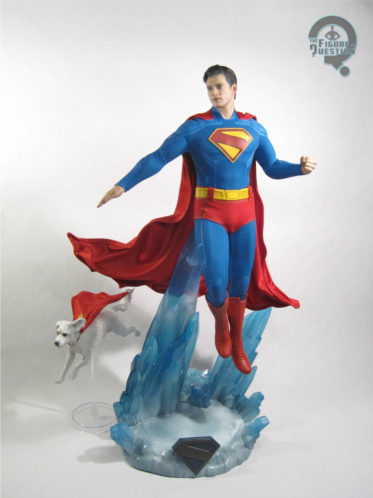
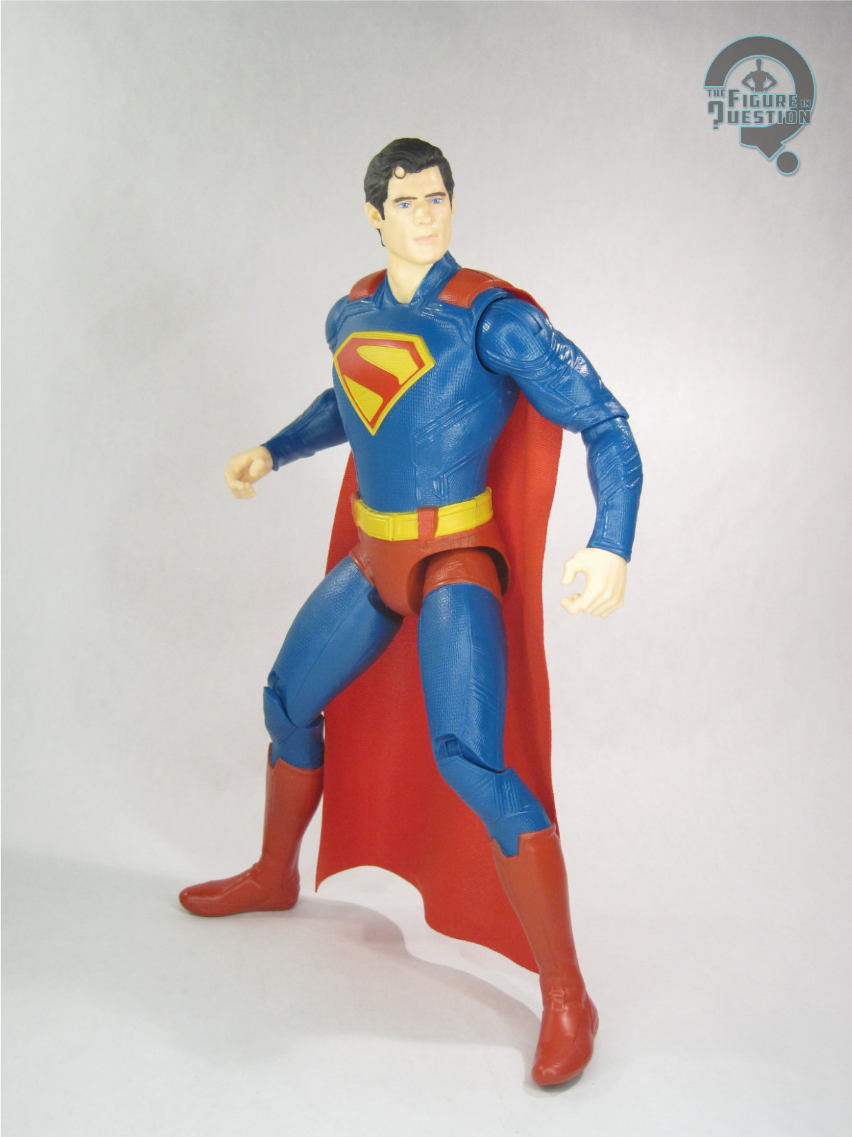
 Superman is figure MMS812 Hot Toys’ Movie Masterpiece Series. Numerically, he’s wedged between the Revenge of the Sith Darth Vader and First Steps Thing. He started hitting domestically right in the last couple of weeks of 2025, which is a pretty nice turnaround relative to the movie’s release. This is the first, and thus far only, offering from Superman by Hot Toys. Officially, it’s billed as a Superman and Krypto set, but it’s very definitely a Superman figure that includes Krypto as an accessory, so I’ll be reviewing it as such. The figure stands just under 13 inches tall and he has over 30 points of articulation.
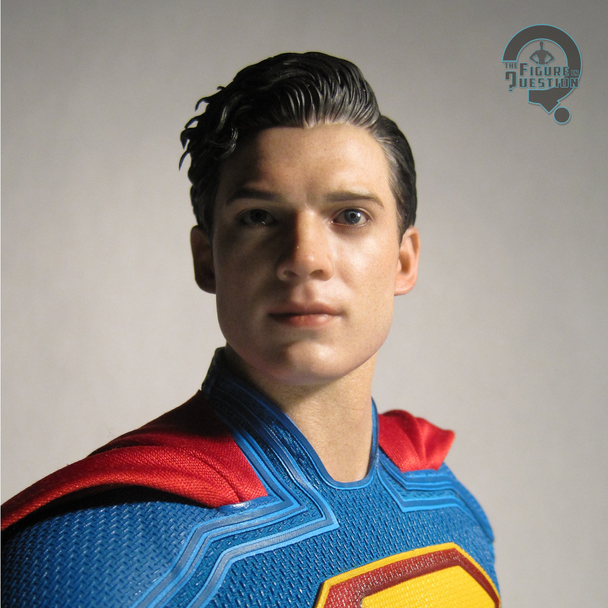
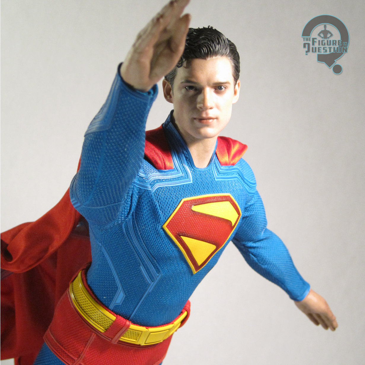
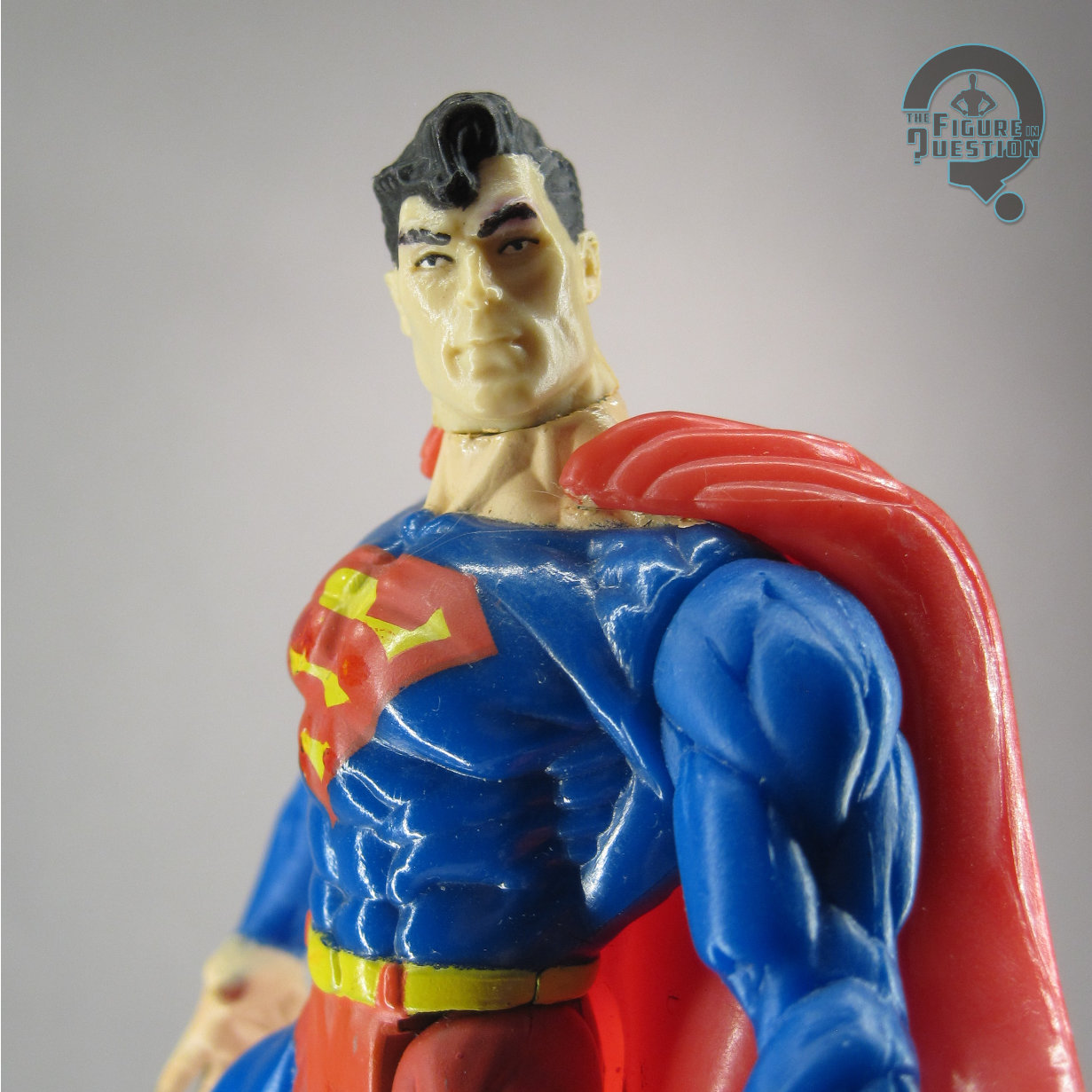
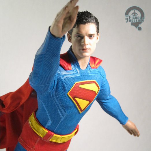
 Unlike most of the more recent Hot Toys figures on which I’ve focused, Superman only gets a single head sculpt, rather than multiples, though that’s largely because he doesn’t have a masked look like the others. Instead, this one just focuses on his main Superman look. It does have moving eyes, much like Spider-Punk’s unmasked head. They’re not PERS (the parallel rolling system), so you have to actually match them up manually, which can take some finessing. Thankfully, they’re also not prone to popping out of the sockets the same way as Punk’s, which I’m certainly a fan of. The actual head sculpt is generally pretty solid. I’m not sure it’s quite a spot-on Corenswet. I think the eyes are a touch large (a frequent symptom of the moving eye feature on these), and his jaw feels a little too small relative to the rest of his features. That said, it’s still a very lifelike sculpt, and there’s a lot of Corenswet’s likeness visible in the final product. This marks the first of the figures I’ve looked at from this movie that I think gets his hair right, rather than plastering it down to his sides more than it was in the movie, so I do certainly appreciate that. I also like the expression, which isn’t too dour or serious, and is thusly in keeping with Corenswet’s portrayal of Clark. The paint work is up to HT’s usual standards of lifelike nature. Nothing surprising, but still very good.
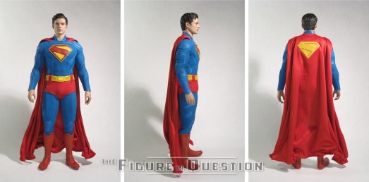
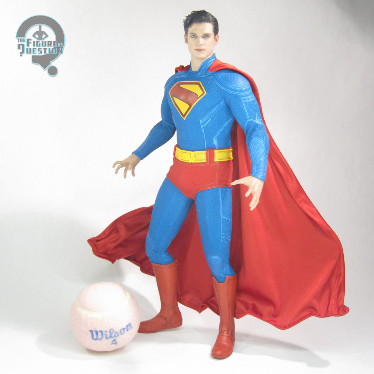
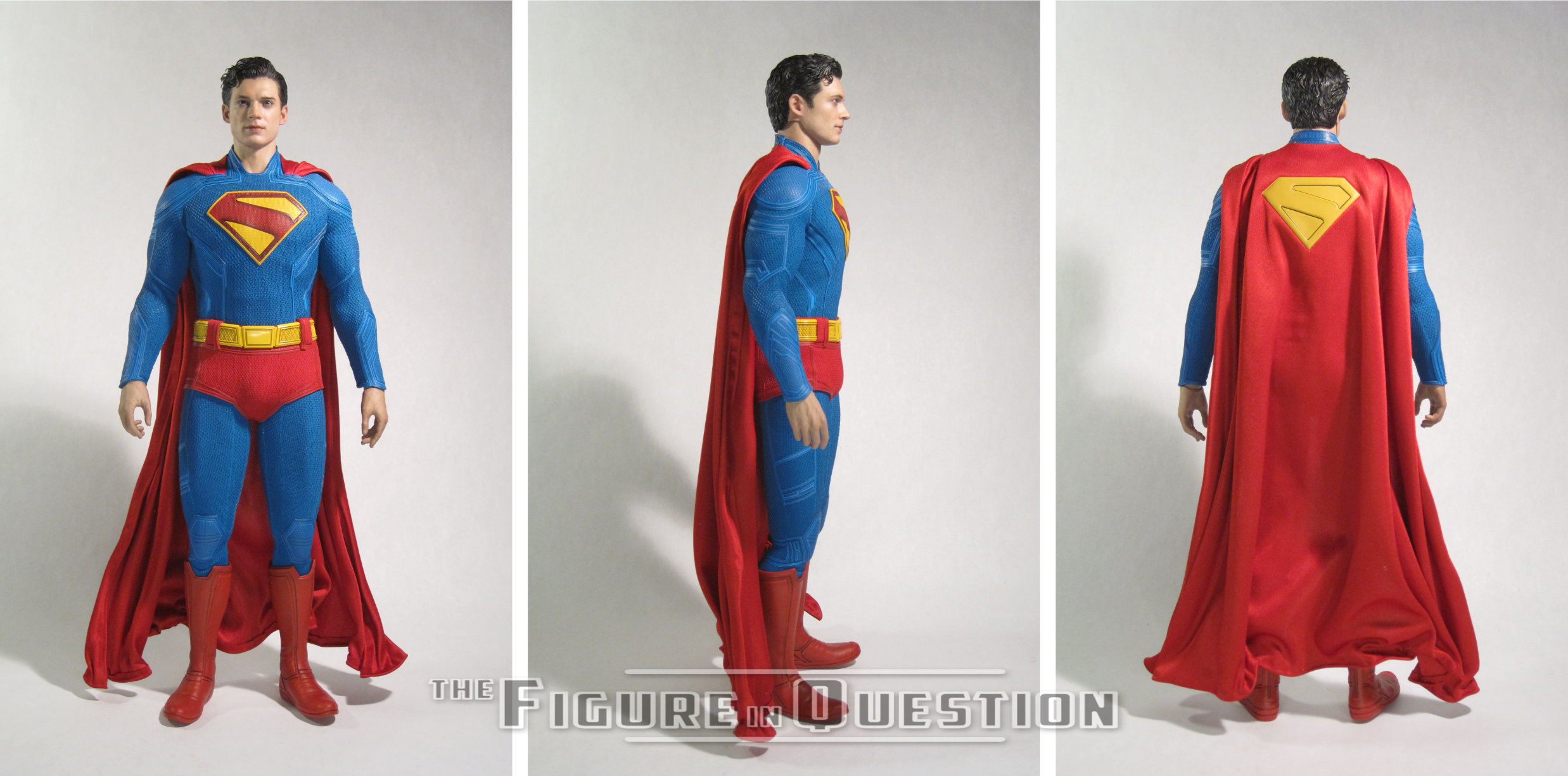
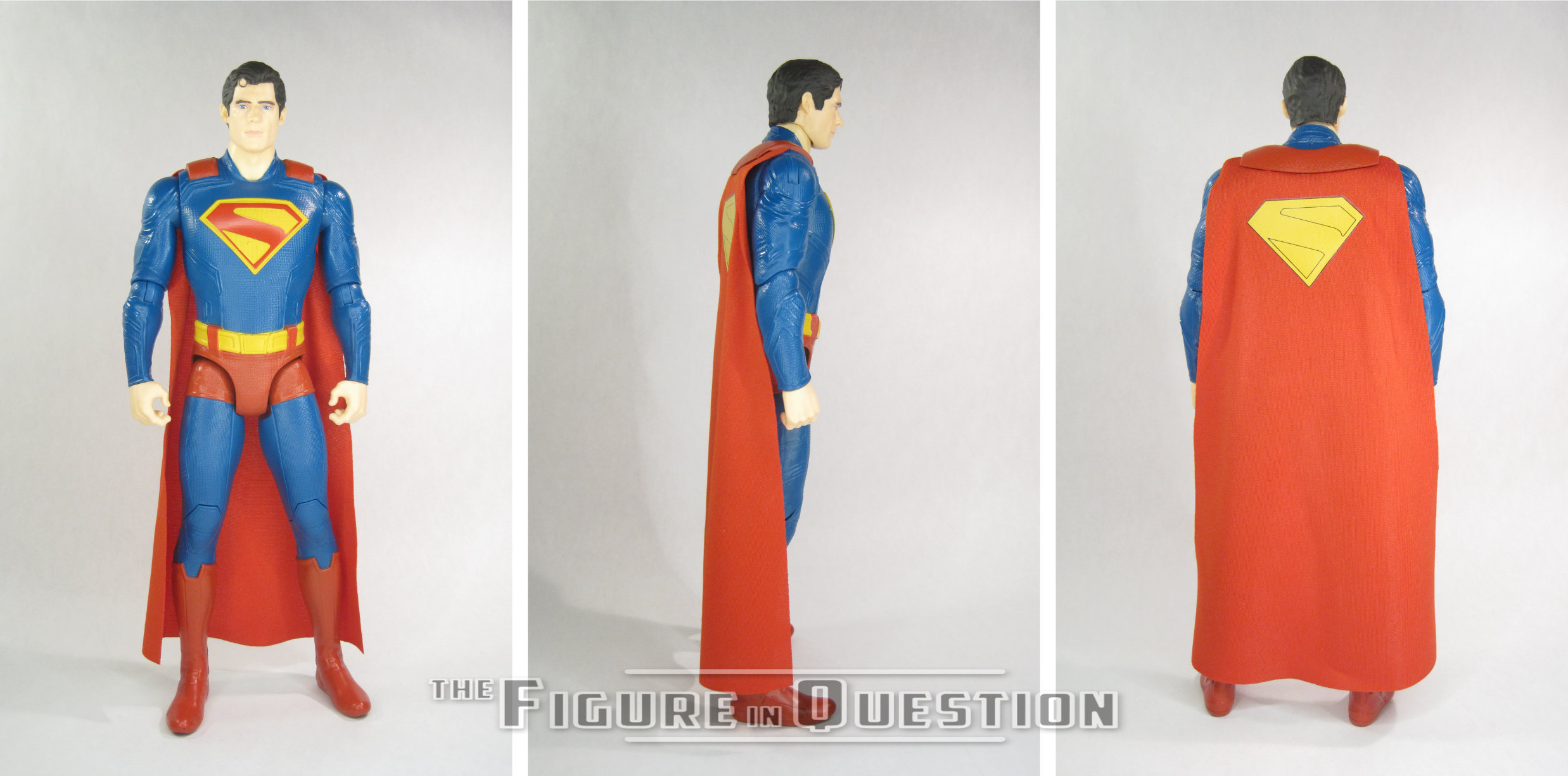
Corenswet’s Superman costume was the topic of a lot of discussion prior to the film’s release, with mixed opinions about how well it translated the classic look. I’ve been happy they kept the red trunks since the beginning, and I’ve warmed up to the other elements over time, notably the collar, which was my biggest point of contention when it was first shown off. I think it’s a look that benefits from being seen in motion, but also getting to see it in-hand helps it too. The figure’s suit is largely one piece, much like the movie. The trunks and belt are separate, but not designed for removal, and the same is true of the cape. There’s a pair of plastic boots/feet as well, which sell the whole thing. The suit is well tailored to the figure, and fits more or less like it does in the movie. The texturing seems a touch exaggerated from what we see on-screen, but not to the point of distraction. The slightly rubberized nature of the suit does mean you’ll want to be careful about leaving it in deep poses; I’ve have him in a flying pose with one knee bent since opening him, and noticed a bit of stretching when I returned him to a neutral pose. Nothing that will ruin the figure, but worth noting. The cape has wiring running through it, so you can do a bit of posing, to the extent that gravity lets you, of course. I quite like the sculpted “S” on the back of the cape, as it gives it a nice pop. The boots are perhaps my favorite piece of the suit, as they’re a flexible enough material that he can still use his ankle joints, which is a rarity on other figures at this scale. I’m also quite a fan of the coloring on the suit, which is more in line with the film’s final coloring than the other merchandise has been.
The underlying body is designed for a mix of posing and build. It’s a good match for Corenswet’s build in the role, which helps the head sculpt in selling the likeness. It’s decently posable, and the costume sits nicely on it, making it a good fit for all the things in needs to do.
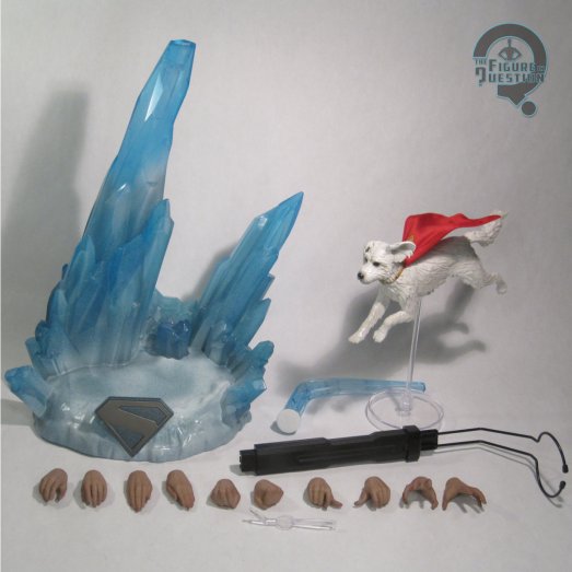
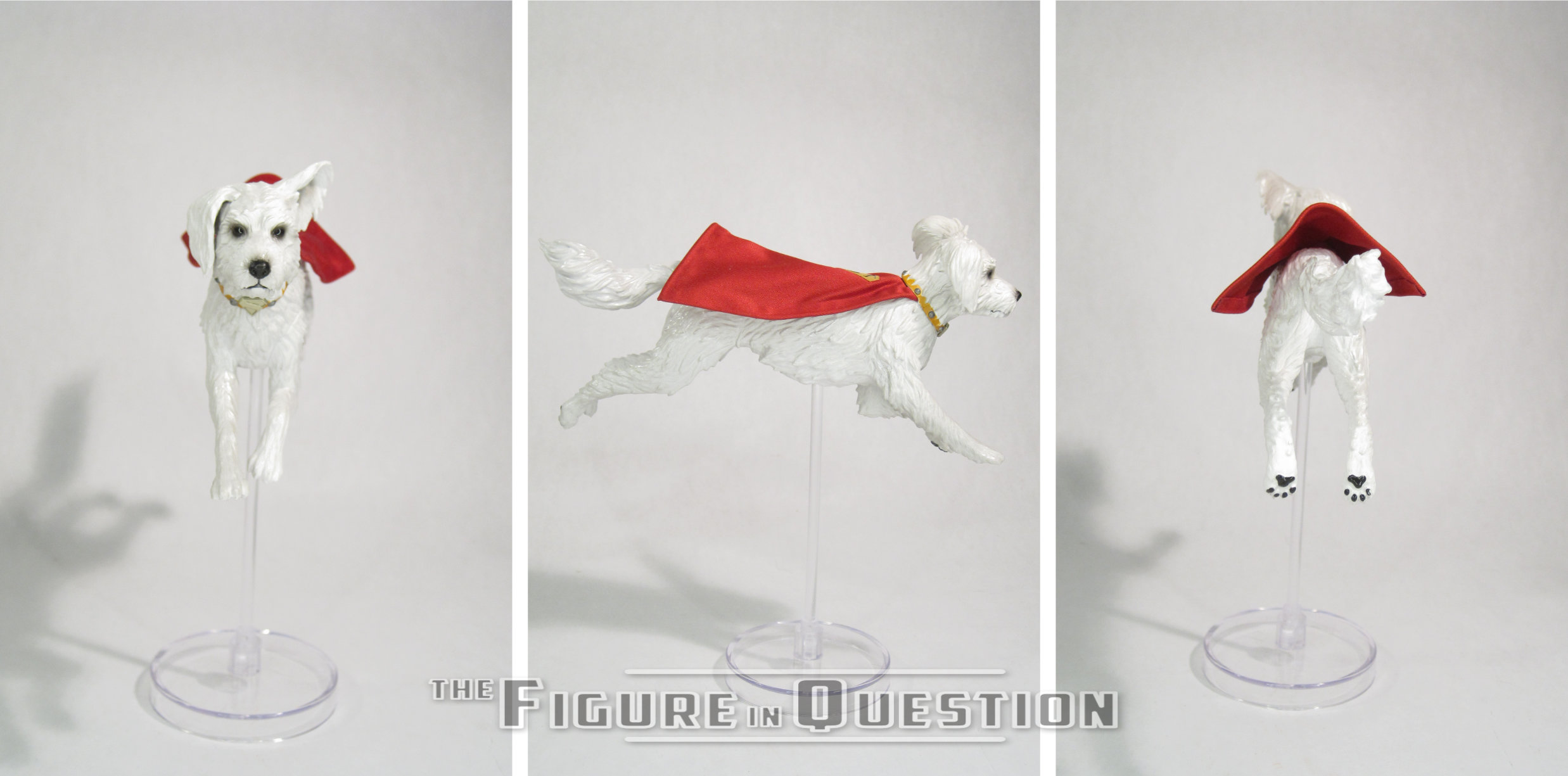
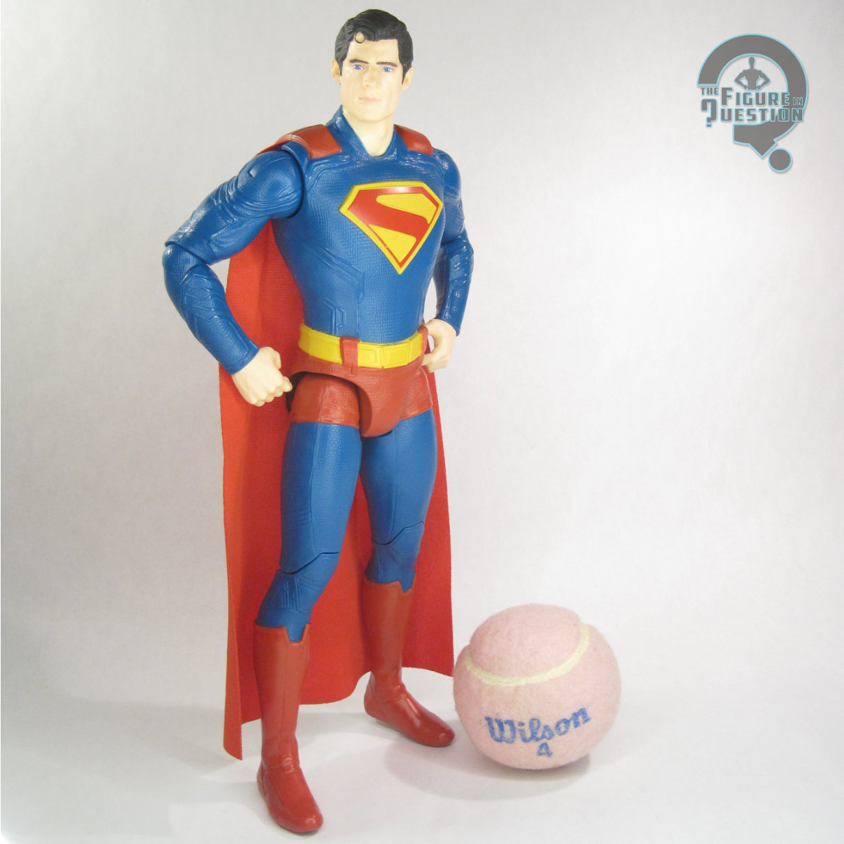
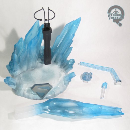
Superman is packed with the Krypto mentioned in the title, as well as 10 hands and a display stand.
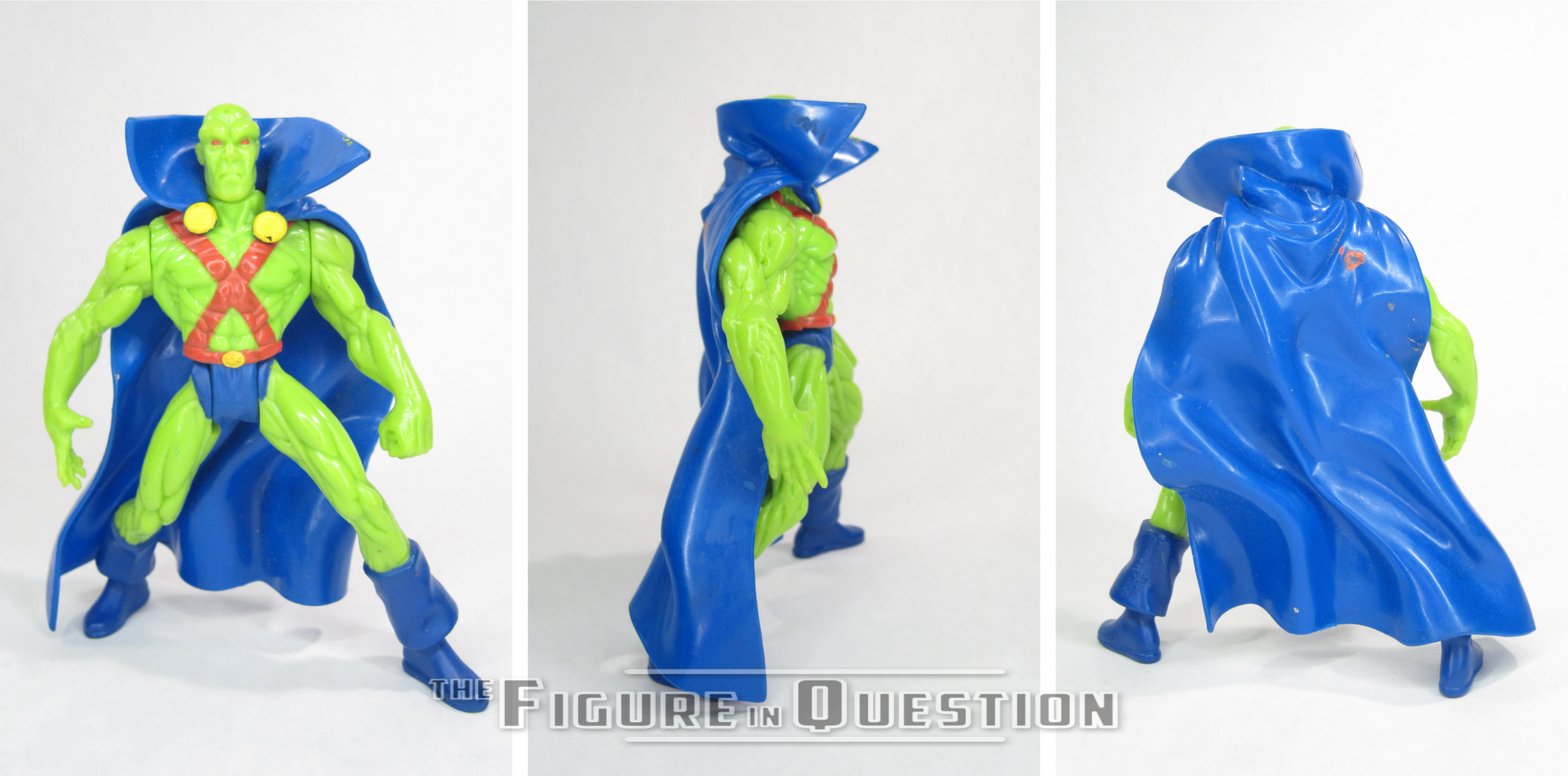
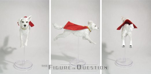
Krypto is mentioned as part of the figure set here, and, well, that’s honestly kind of a misnomer. I get the appeal of pushing Krypto, what with him being a rather popular part of the movie and all, but what we get here isn’t a proper figure at all, just more of a figurine that accompanies the main figure. Apart from wiring in his cloth cape to match Clark’s, Krypto isn’t posable, just in the one flying pose. He gets a flight stand of his own to hold him up, which is good, since it’s not like he can really stand on his own. His sculpt is a fine match for the the model in the movie, but does feel rather soft on detailing for a Hot Toys offering. The paint is likewise a bit thick and basic for the most part.
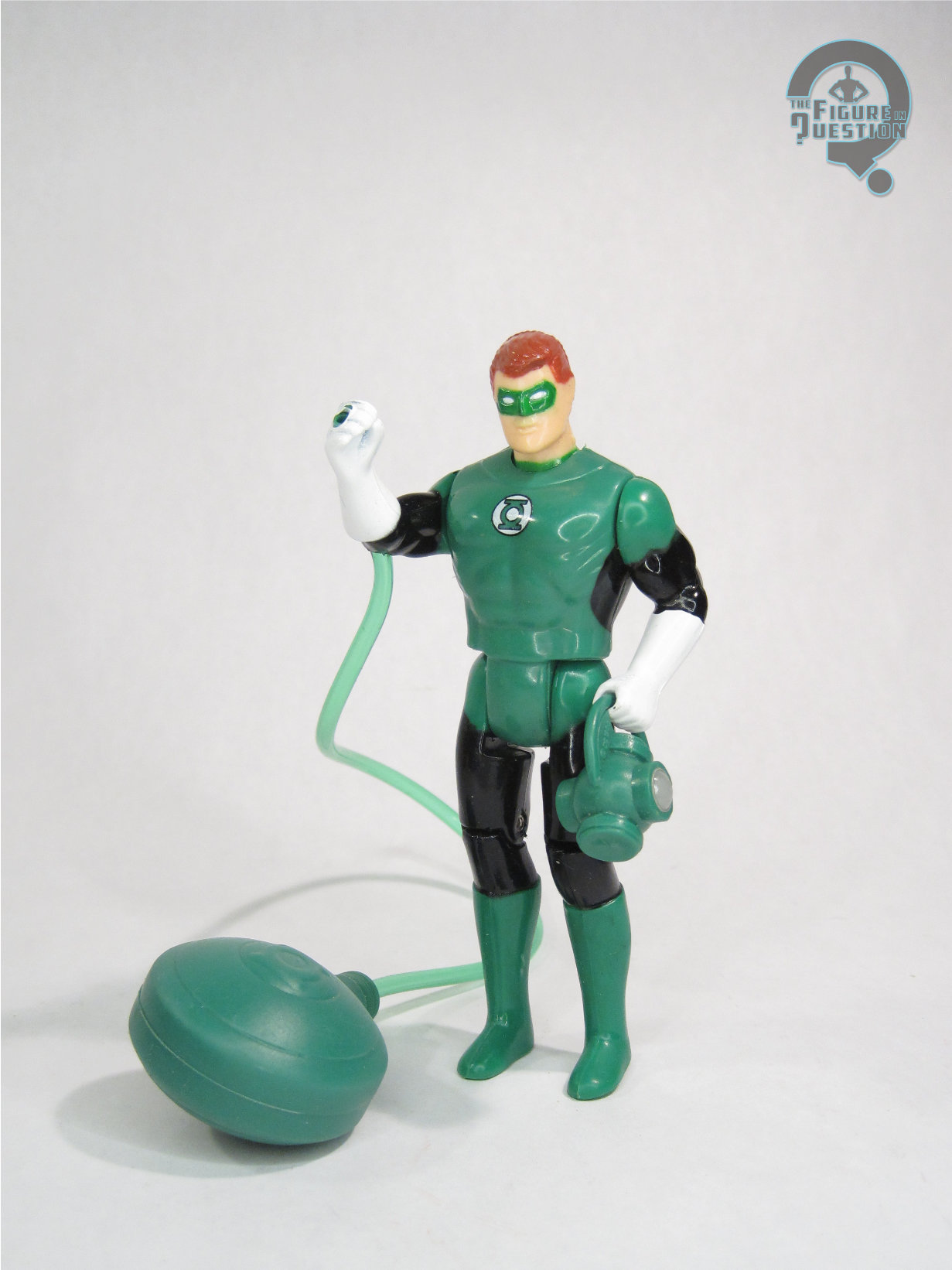
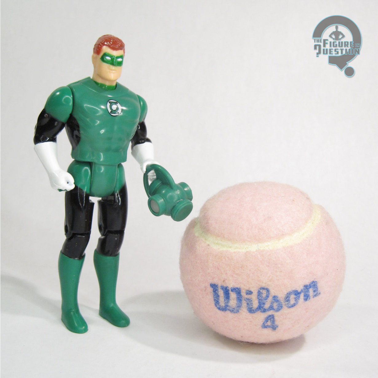
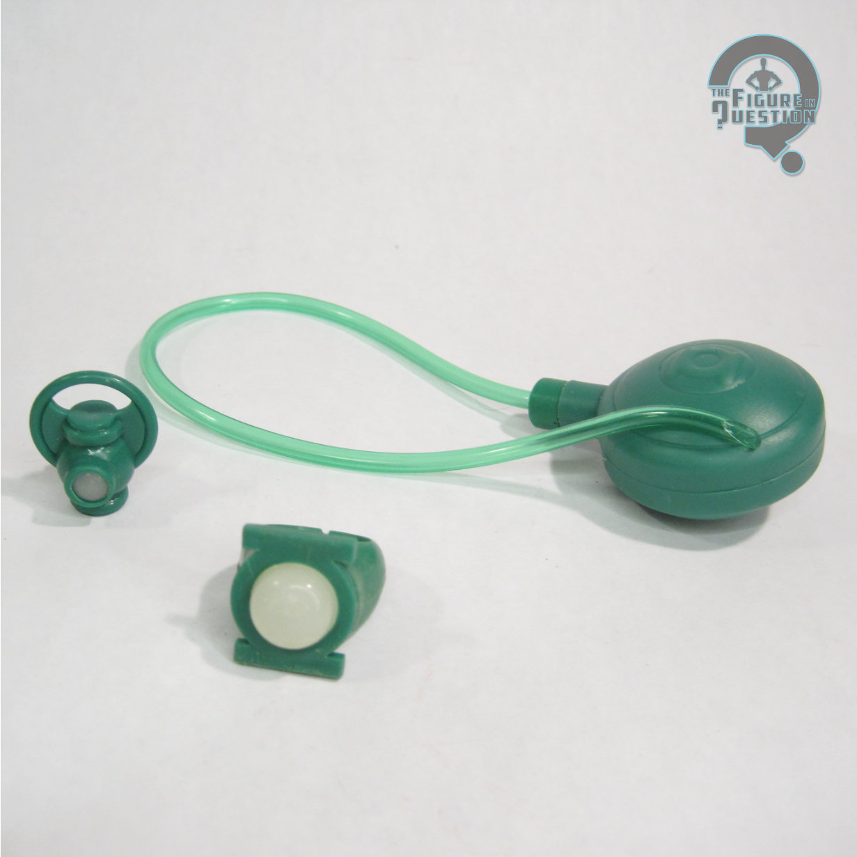
Superman himself gets hands in relaxed, fist, gripping, flat, and open gesture poses, which work the way all Hot Toys hands do. They give him a nice selection of variety, but I’m also not going to be swapping them like crazy, as they take a bit of doing. The display stand is a rather elaborate, somewhat modular piece, patterned on part of the Fortress of Solitude. It’s impressive, and I like the options for how to use it. There’s two ways to attach him to it, with the standard “cradle” attachment piece, as well as an arm with a magnetic attachment to aid in flying poses. I wish the magnetic arm had a joint on it for some more variety in angles, but I definitely like the magnetic set-up for use with the flying.
THE ME HALF OF THE EQUATION
Superman was my favorite comic book movie since Captain America: The Winter Soldier, which is a pretty big deal for me, because I *really* like The Winter Soldier (and also saw it six times int he theatre). Unfortunately, I stopped my main stretch of Hot Toys collecting just before the Winter Soldier figures got released, so I never got Cap from that movie, which I always regretted. I wasn’t planning to do that again, so I made sure to get myself down for this guy fairly quickly. I was primarily in this for the Superman, with Krypto more as an accessory, and that’s good, because that’s how the final product worked out. I definitely feel like the “set” angle is a marketing move more than a proper approach from the beginning. That said, the Clark figure is pretty darn fantastic, and a really great representation of the character for the shelf. He poses well, looks very nice on display, and with the big stand set-up, he makes for quite a centerpiece.
Shoutout to my friends at All Time Toys, from whom I purchased this figure for review! If you’re looking for cool toys both old and new, please check out their website and their eBay storefront.

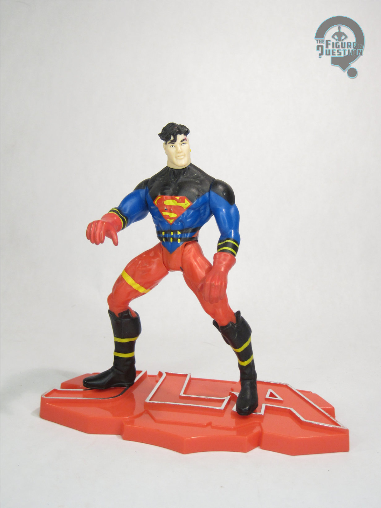
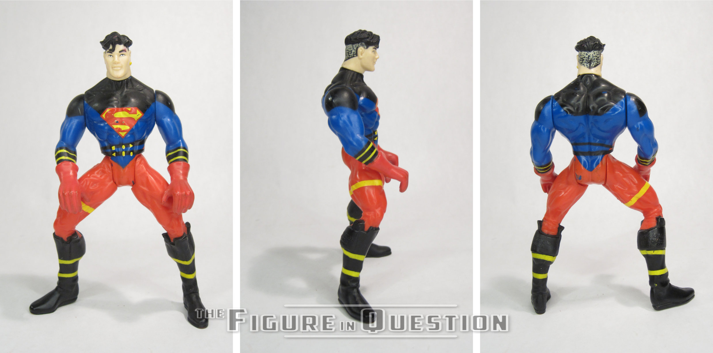
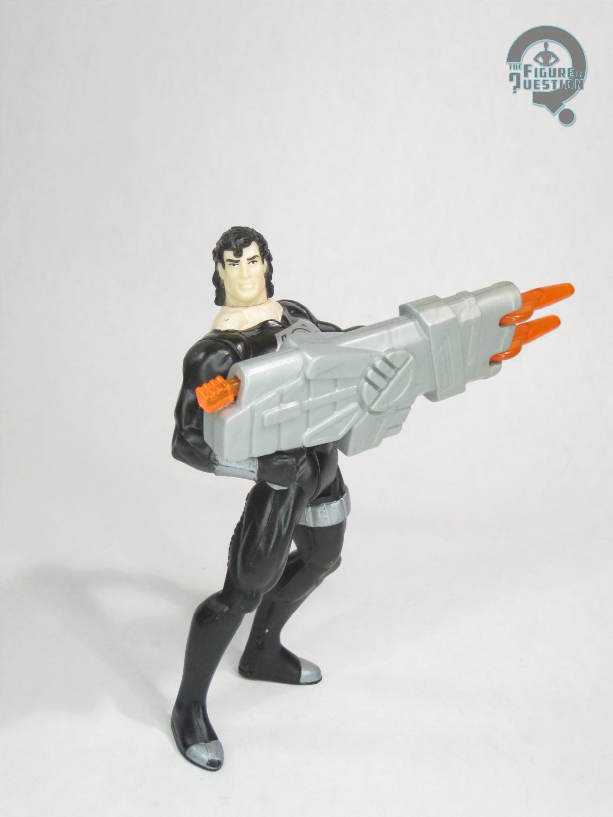
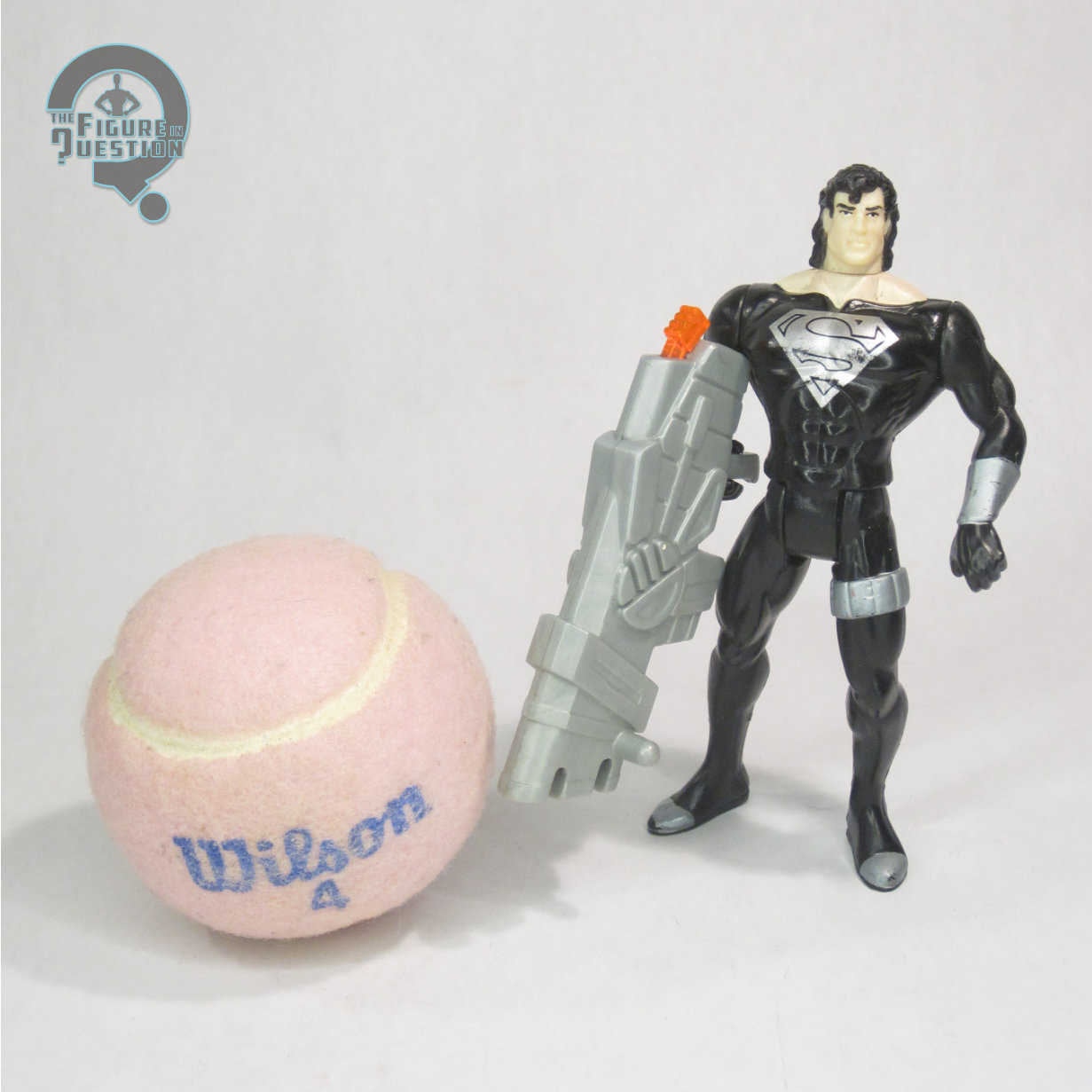
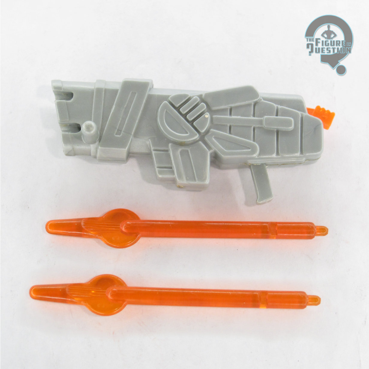
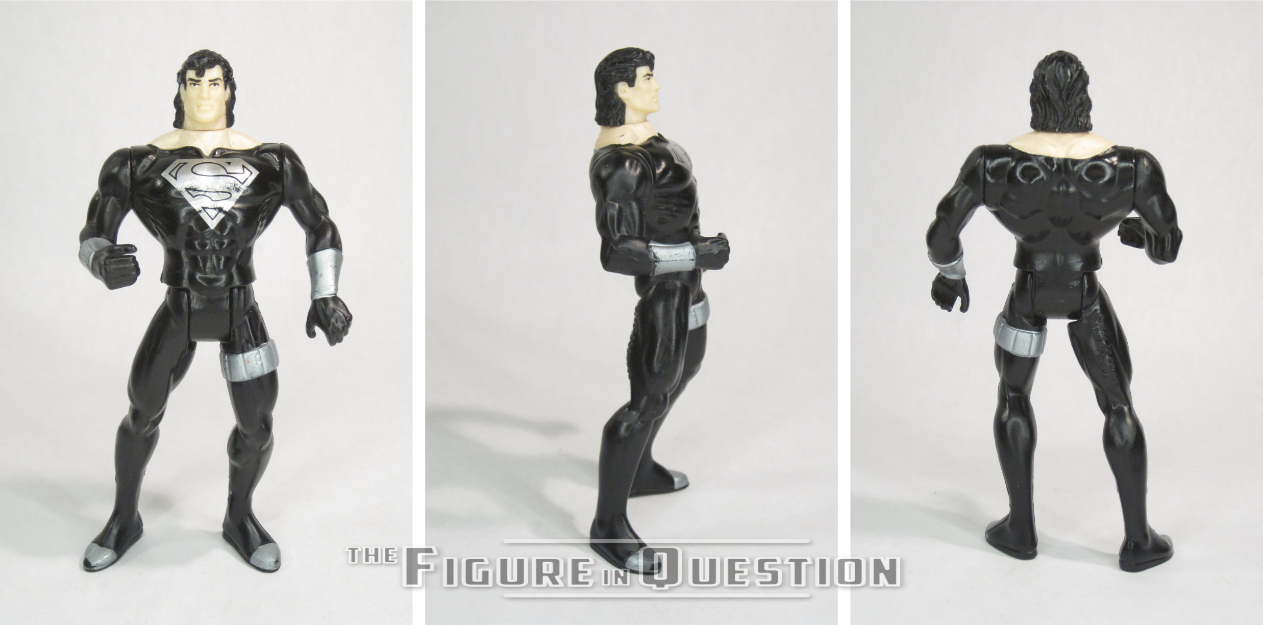
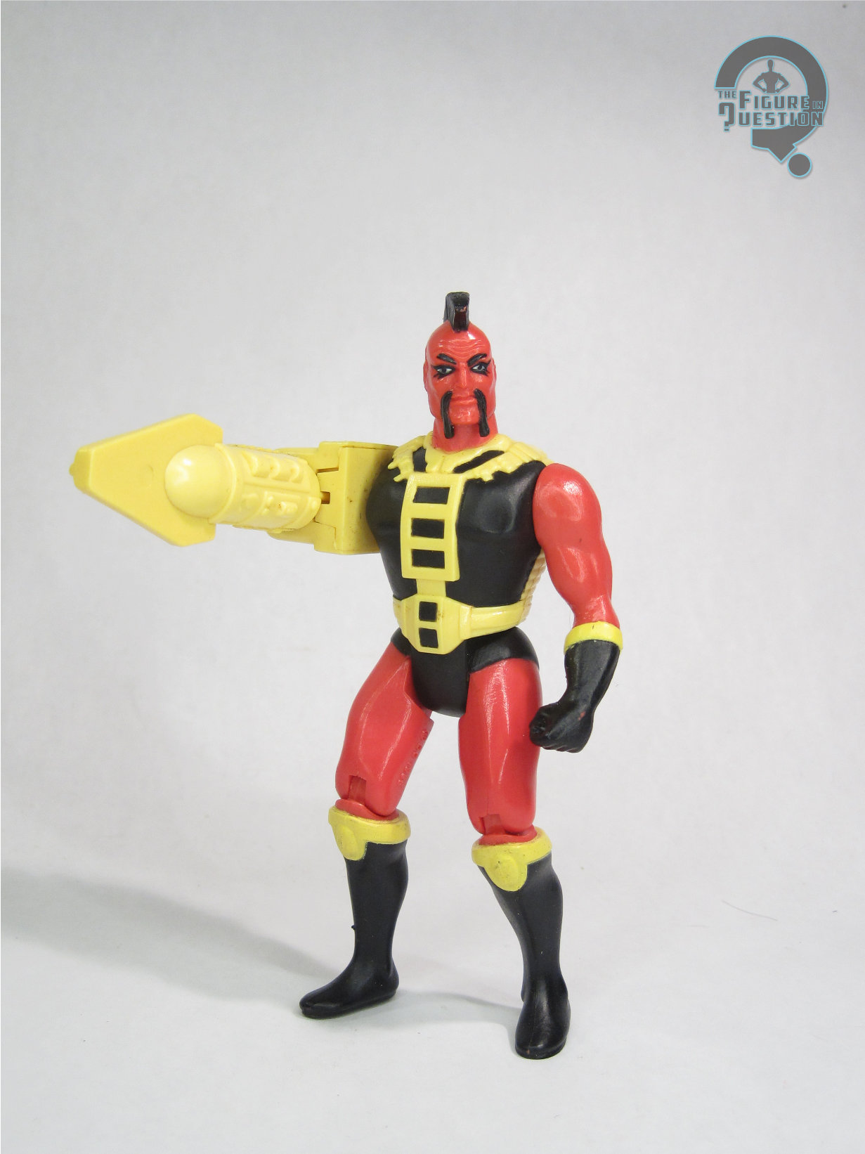
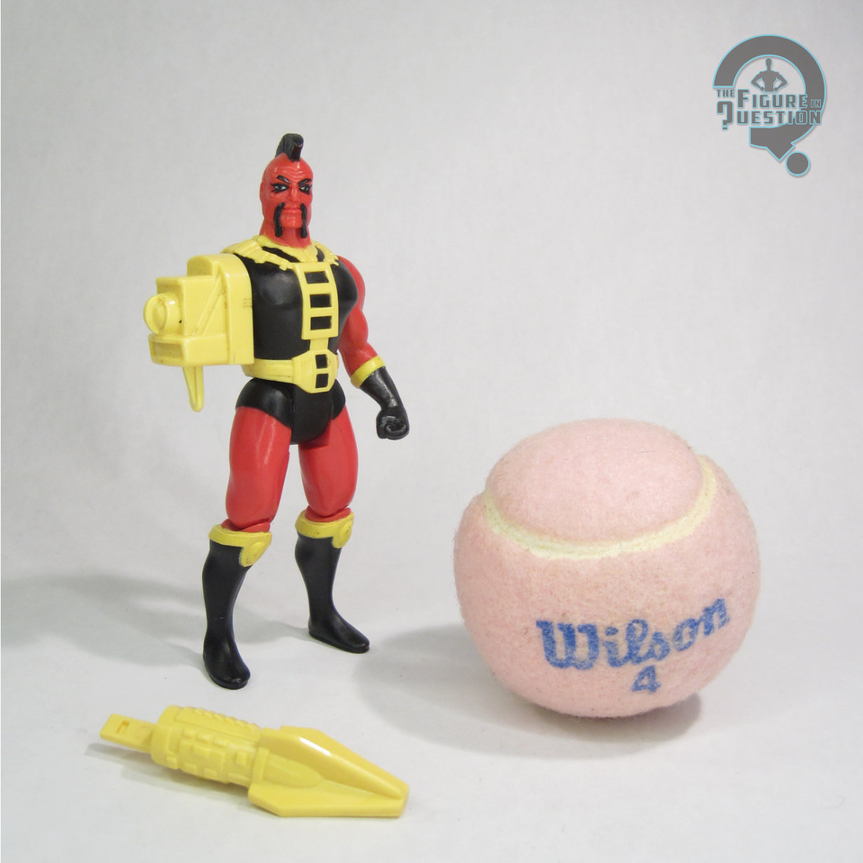
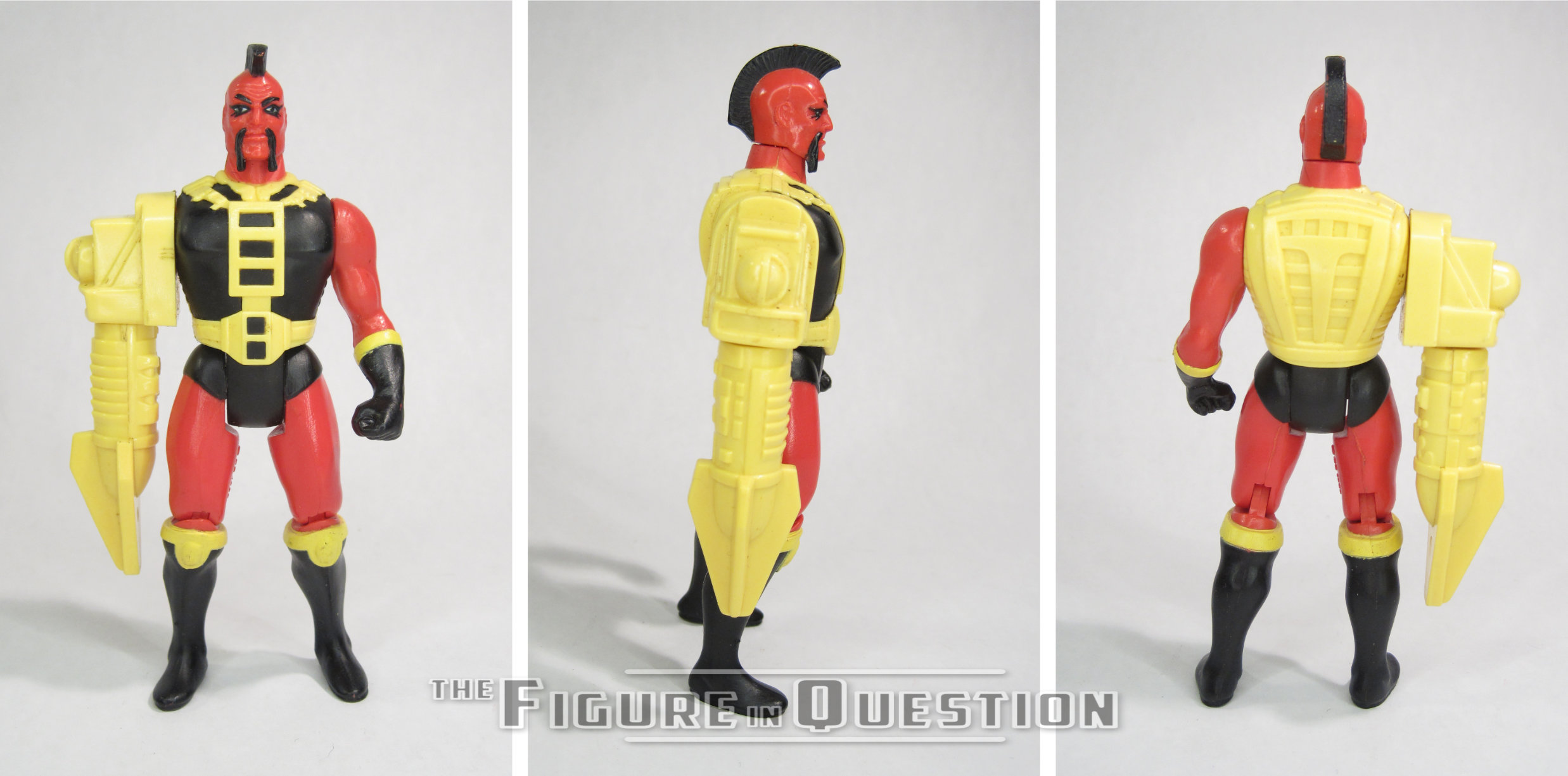
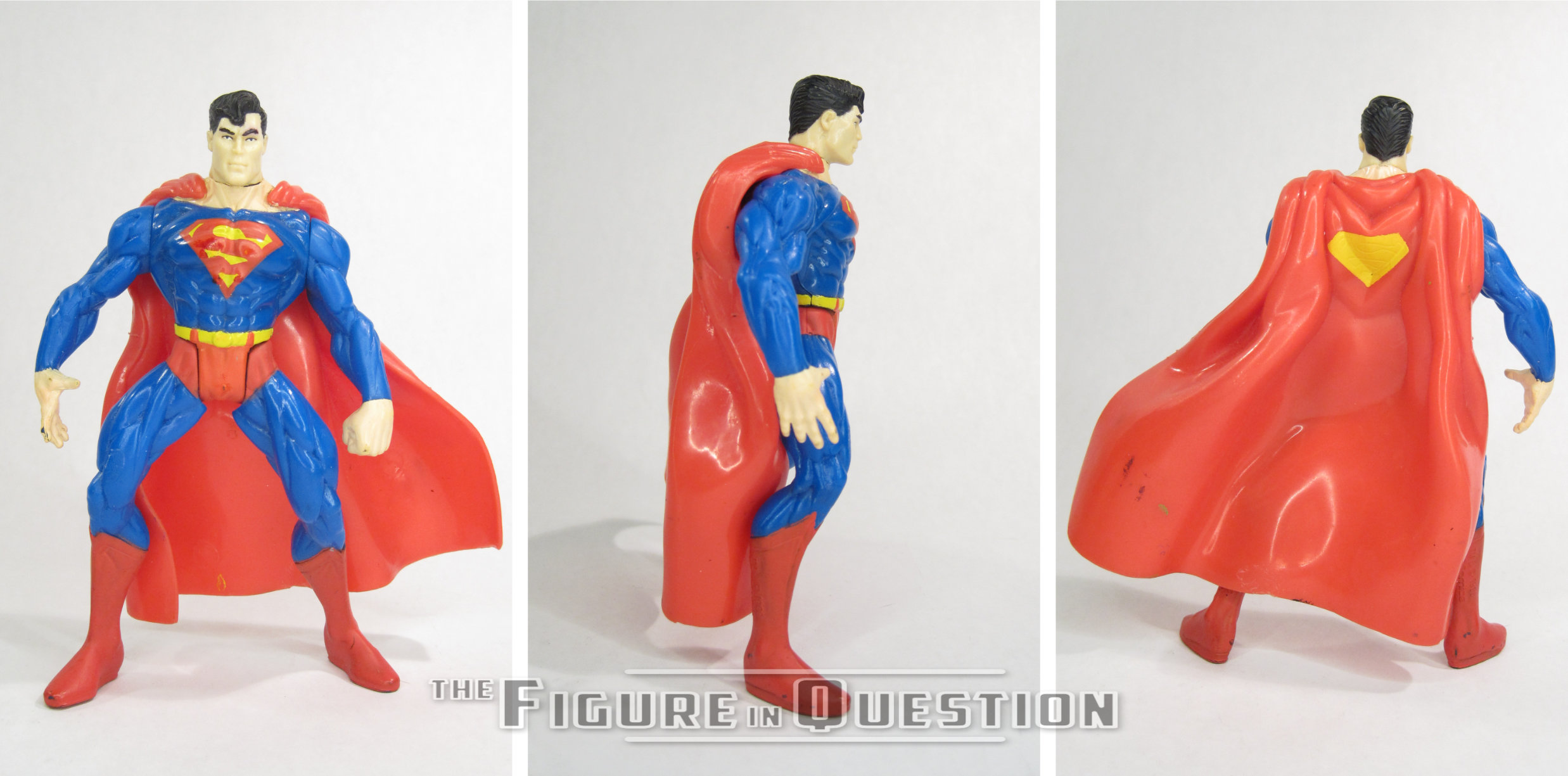
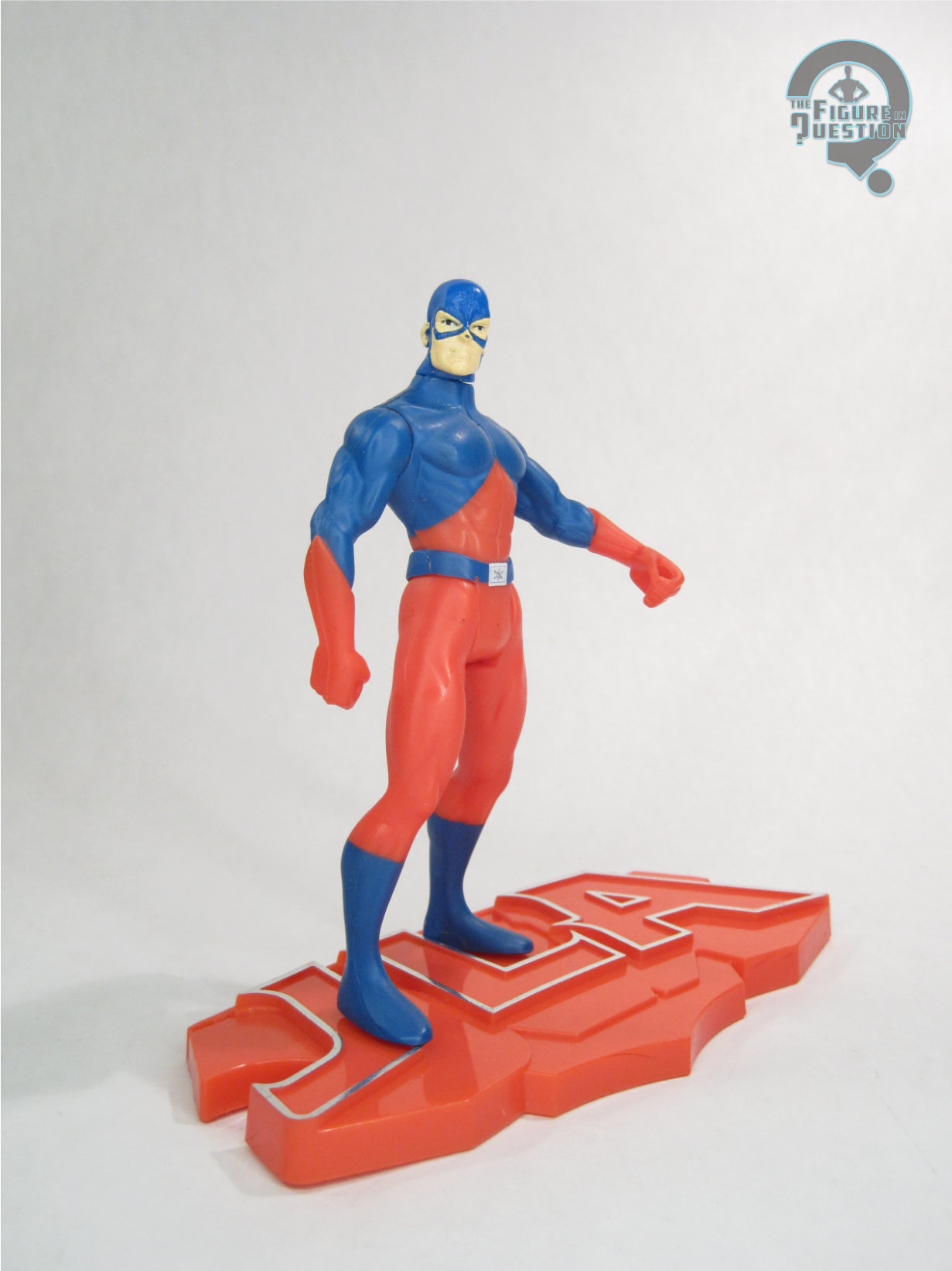
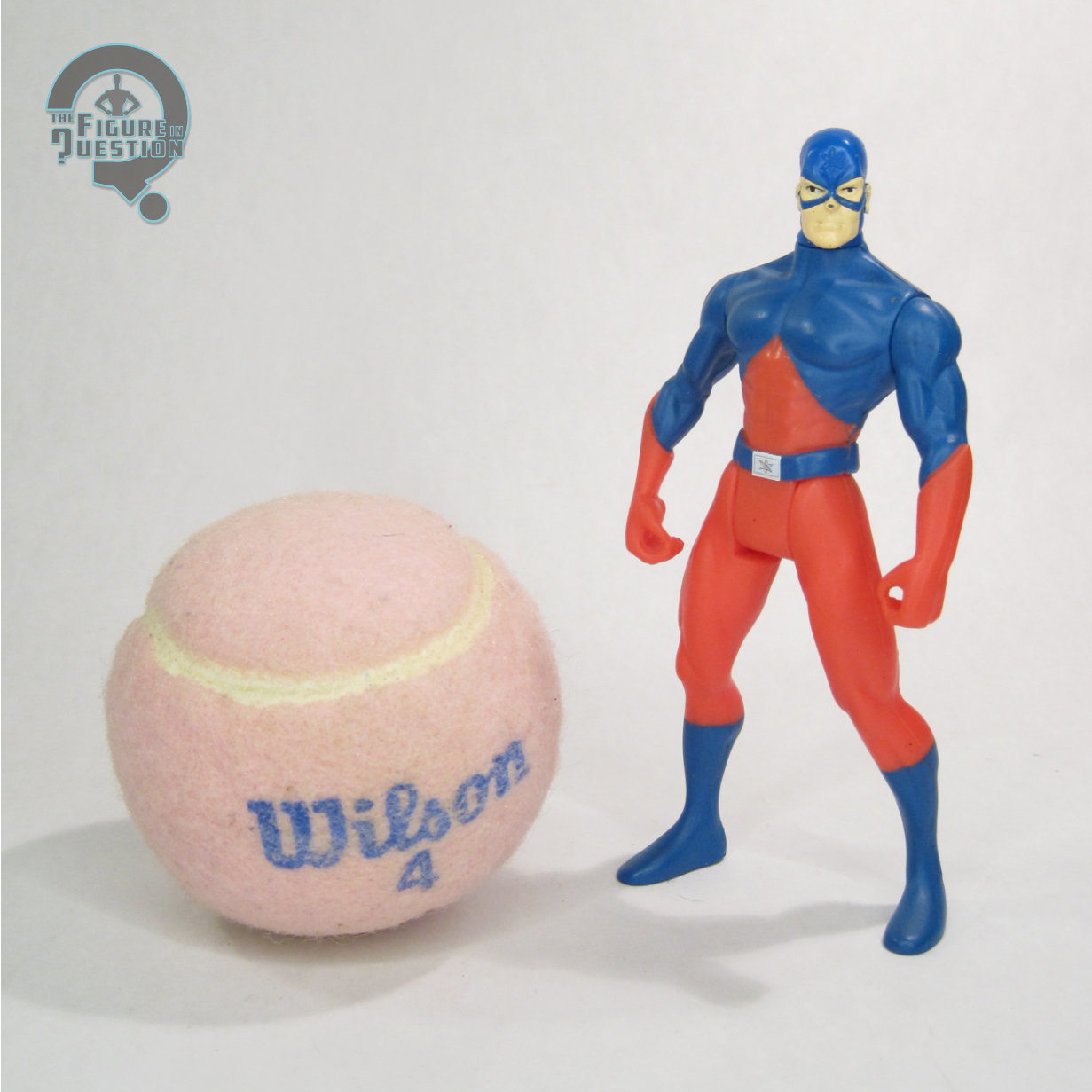
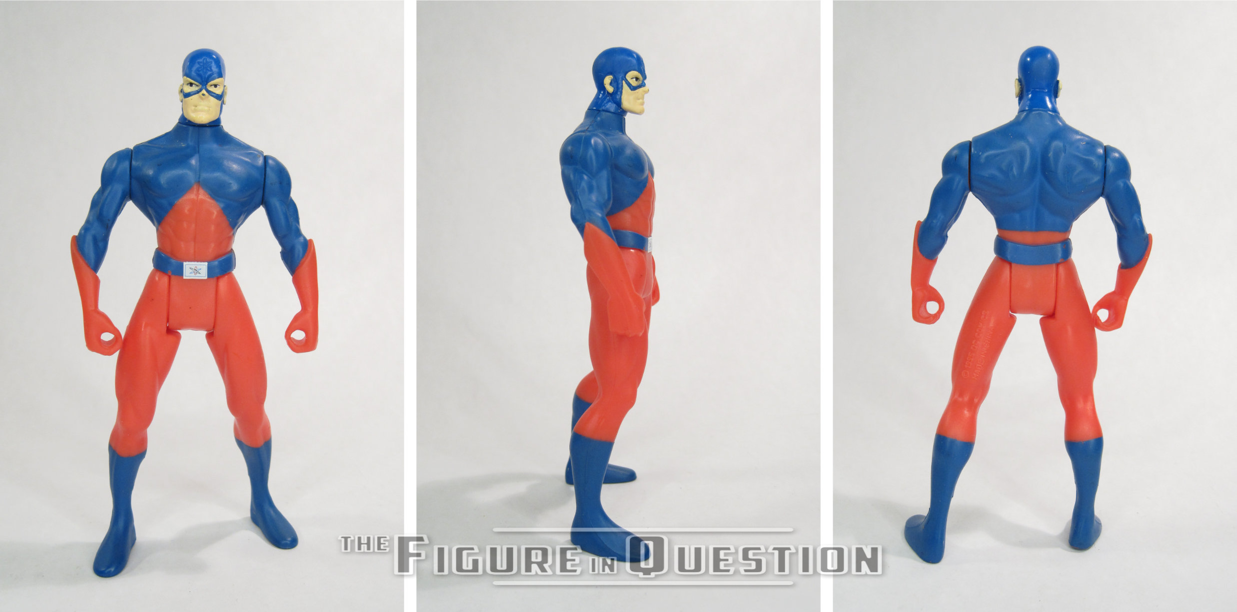
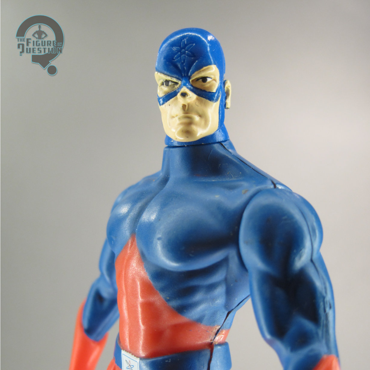
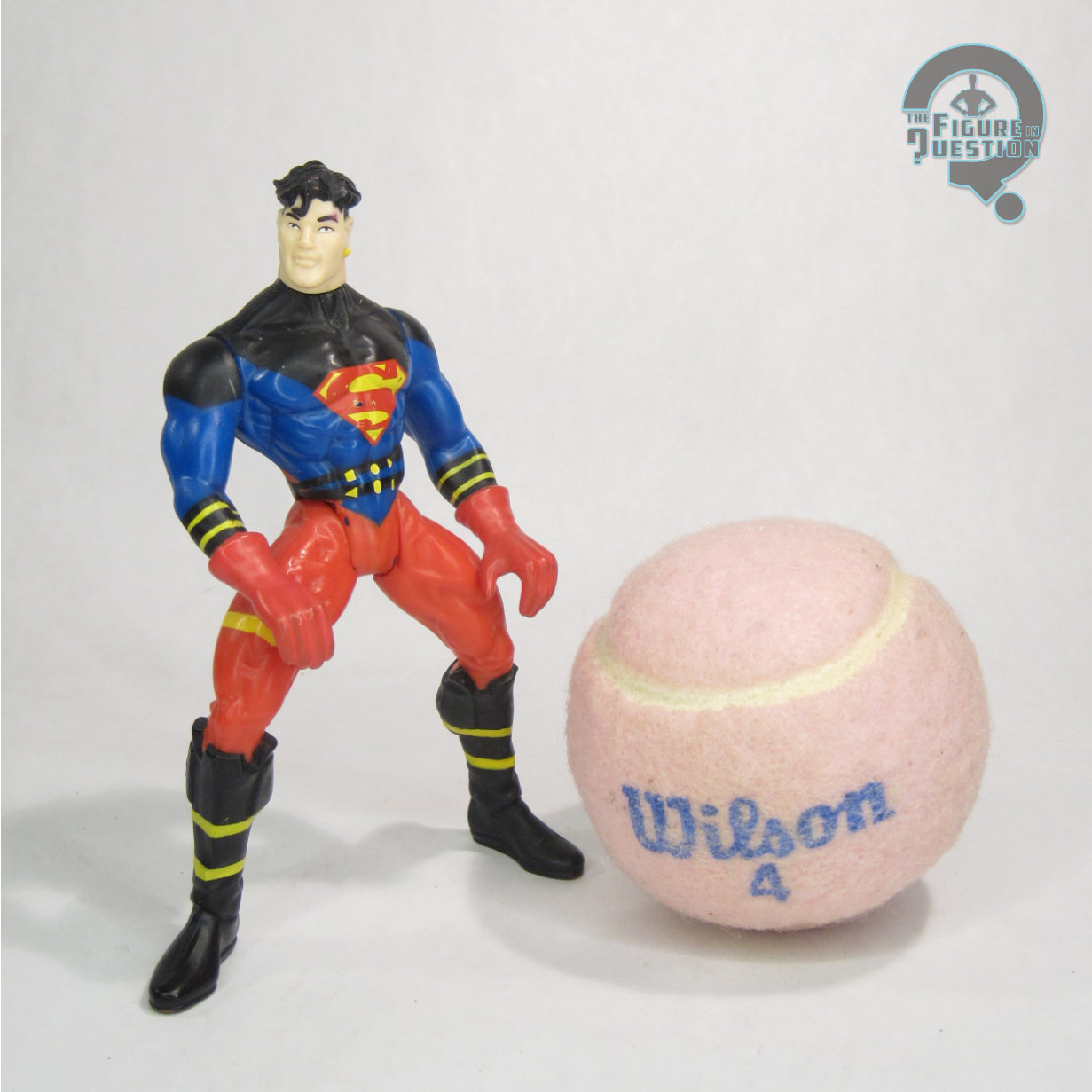 Superboy was added to Hasbro’s JLA line in its third series in 1999. He was also available in the line’s fourth boxed set, alongside Impulse and Robin from the third series, and a pair of exclusive “Hologram” figures of Aquaman and Martian Manhunter. Like his earlier Man of Steel figure, he’s based on Conner’s original look, though this time around he’s without his usual leather jacket. The figure stands just over 5 inches tall and he has 5 points of articulation. Since JLA was all about getting as much mileage as possible out of re-used parts, Superboy is a lot of re-use. His torso is the modified Superman torso that a lot of the line used as a starting point, and he’s got the legs from Black Lighting (albeit with some serious mold degradation, which removes a lot of the sharpness of the details) and the arms from the Legends of Batman Riddler. It was rare to see them reach outside of the Total Justice molds, but it happened. The Riddler arms are designed with a narrower gait to the legs in mind, though, so his hands can’t clear his legs when posing. He gets a new head sculpt, which is decent enough, though it’s a bit on the large side, in order to off-set the sizing on the body. The face is a little bit goony, but it fits the later ‘90s take on the character alright. His paint work carries a lot of the work on selling the character design. Mostly, it’s not bad, but it’s a little odd to see the straps and belts all just as painted elements, rather than with any sort of dimension to them. The hair is also quite odd; in the comics, he had the back and sides buzzed, which the original figure more or less just ignored. This one didn’t sculpt them in, but then they were painted black, and then painted back over with a sort of a grey shade, and then there’s sort of stubble effect. It’s weird looking. Superboy was packed with a JLA display stand, in bright red.