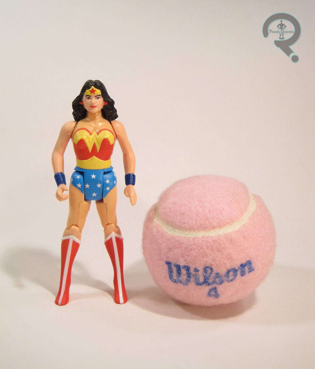
PRINCESS LEIA ORGANA — BESPIN GOWN
THE EMPIRE STRIKES BACK (KENNER)

2016 was pretty unrelenting when it came to celebrity deaths (and, sadly, 2017 seems to be continuing the trend). The one that me the hardest personally was undoubtedly Carrie Fisher, an actress I had come to admire more and more with every passing day. She was truly awesome. Truly, there is no better way to celebrate an awesome person than with action figures, and, thanks to Star Wars, Carrie was privy to quite a few of them. Today’s focus figure is one of the earliest, coming from Kenner’s Empire Strikes Back line of figures.
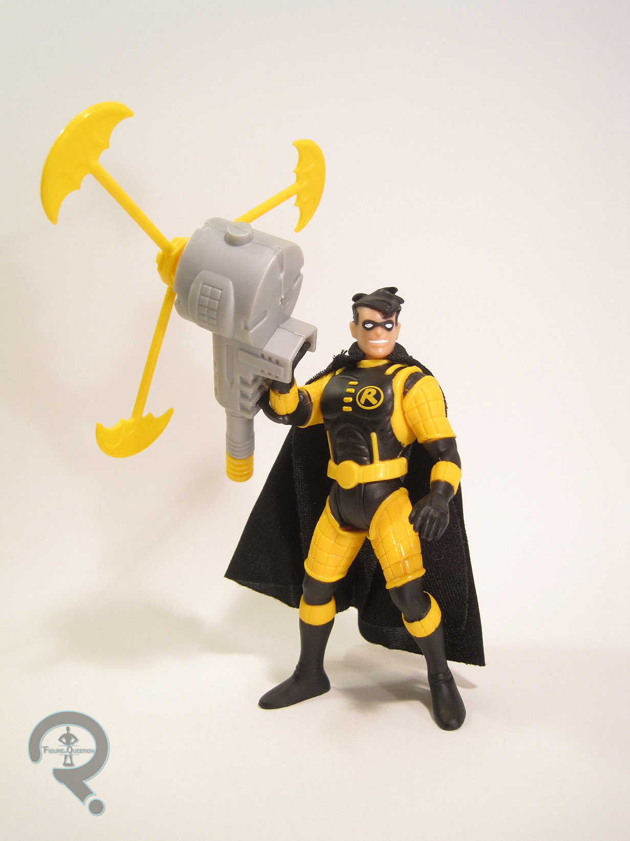
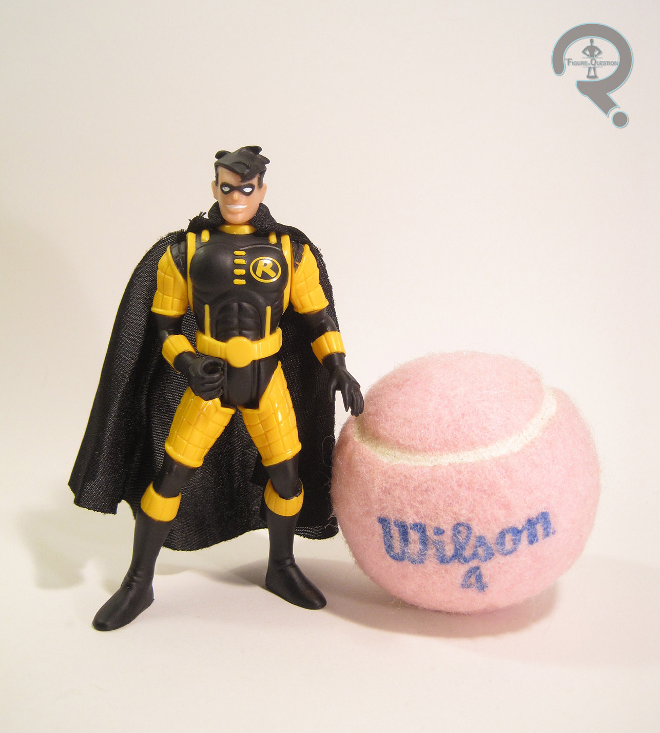
THE FIGURE ITSELF
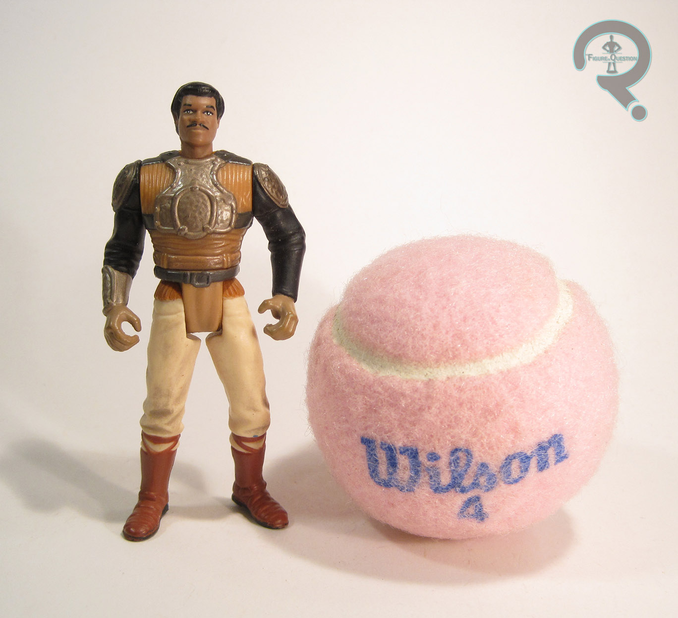
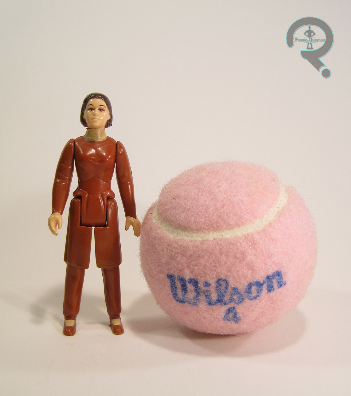 This Leia figure is one of the two Leias released in Kenner’s Empire Strikes Back line (the other is her Hoth attire, reviewed here). This one depicts Leia in the gown she was given by Lando when she and the rest of the Millennium Falcon’s passengers arrived on Bespin. It’s not as prominent a look as the Hoth gear (which she spends most of the movie’s runtime wearing), but it’s certainly unique, and, if nothing else, was an excuse to release a Leia figure in a color other than white. It’s actually a rather infrequent look for Leia figures, with only a handful of figures over the years. Still, Han and Luke both got Hoth and Bespin figures, so Leia was due two figures as well. The figure stands a little over 3 1/2 inches tall and has the usual 5 points of articulation. Bespin Leia was an all-new sculpt. Like every other figure in the vintage line, there’s definitely a degree of stylization going on here, especially in how the outfit has been rendered. With that being said, she’s not as far off from the film design as her first film predecessor. The basics of the sculpt are pretty good. She doesn’t really look a whole lot like Carrie Fisher, but she’s at least consistent with the ANH and Hoth versions. The details on the clothes are rather on the simple side, but all of the important stuff is there, and she fits in with the rest of the line. The skirt has still been cut into a set of legs, but no longer in a way that resembles whatever the first figure was wearing. Here, the skirt is simply cut with straight lines, as many of the other figures in this line were handled. Also, while she’s still got the vinyl robe thing that the first figure had, it actually works a bit better with this design, which included a sleeveless cardigan-thing of a similar nature (thanks to Super Awesome Girlfriend for help IDing that piece of clothing. Side note: she would like it noted that she’s not a fashion expert). Sure, it wasn’t opaque pink like this one is, but it’s close enough, given the rest of the line. It’s even got some nice printed detailing, which I believe is a unique feature to this iteration of Leia. As far as paint, she’s once again pretty simple. Mostly, she’s just got paint for the hair, the details of her face, and the few spots of flesh tone on the body. Everything’s pretty clean (apart from the slight wear present on my figure). The figure was packed with a small blaster pistol, which my figure does not have.
THE ME HALF OF THE EQUATION
This Leia is a relatively recent acquisition. I actually picked her up a few days after Carrie Fisher’s passing, from an antique store just outside of the town my family vacations in (in fact, it was the same store where Super Awesome Girlfriend bought me the ANH Leia just the year before). It’s a figure I’ve been meaning to get, and they had this one there, and she was in pretty nice shape for the price. I guess it was kind of part of my mourning process. Anyway, despite this being one of her less essential looks, this was probably the best version of Leia that Kenner released.