#0807: Bola Attack Mariner

BOLA ATTACK MARINER

WATERWORLD (KENNER)

Mariner1

Alright, it’s day 6 of the Post-Christmas gift reviews. Today, we’re keeping things moving at a steady pace. I mean, so far I’ve looked at figures from Aliens, Guardians of the Galaxy, and Star Wars, what amazing piece of science fiction could possibly follow those? Waterworld? Ah. Thought we were going a different direction. Like, maybe a less sucky one. Okay, I have to be totally fair here: I’ve never seen Waterworld, so I can’t really judge it fairly. By the nature of being a sci-fi film with a decent budget in the 90s, Waterworld actually managed to get an entire line of action figures, with vehicles and everything. The figures are kind of the action figure equivalent of head lice. Their unwanted, incredibly hard to get rid of, and they leave you scratching your head. And you get them by sharing hats. Okay, no, not that last one. But the other stuff is true! Anyway, let’s look at one of the many, many, many variants of the Kevin Costner-played lead, the Mariner.

THE FIGURE ITSELF

Mariner2Bola Attack Mariner was part of the first, and as far as I know, only series of Waterworld figures, produced by Kenner. The figure stands 5 inches tall and has 5 points of articulation. The Kenner standard 5 and 5! I can’t say for sure whether this guy’s look is movie accurate. Going by what I’ve been able to find online, none of the Mariner figures in the line were exact matches for his looks in the movie, but this one does seem to be closer than some of the others. Sculpt-wise, he shares a lot of parts with other Mariner figures. The upper body sculpt is shared Hydro Stinger Mariner, the legs with Warrior Mariner, and the head and hands with ALL the Mariner figures. The quality of the sculpt actually isn’t bad. The likeness is a pretty decent Costner (certainly better than any of the Prince of Thieves figures) and the body sculpt shows some pretty decent detail work, especially on the clothing. The proportions are a little off (his head and feet are both a tad large), but it’s actually not as bad as a lot of figures from the time. The paint is where things take a bit of a dive (ha!). There’s a fair bit of slop all around, and they can’t seem to decide where exactly his hairline is supposed to start. That said, his color scheme is vaguely interesting, and he does have some neat metallic paint going for him. Bola Attack Mariner a giant bola-missile launcher thing, a weird spear thing, and a purple fish thing, none of which were included with my figure.

THE ME HALF OF THE EQUATION

Those of you reading this review are probably wondering why in god’s name I got this figure for Christmas, let me ‘splain. No, it’s too much; let me sum up.  It all started when I was born. No, sorry, it actually started four years after I was born, when I received three Waterworld figures as a birthday present from my cousins Noah and Caryn. Now, as I noted, I’ve never seen Waterworld, so it follows that I also hadn’t seen it when I was four, making this a slightly odd gift. See, for years, extended family members who didn’t quite understand what I liked about action figures would buy me literally the first or cheapest action figure they found as gifts on the major holidays. I always assumed the Waterworld figures were another case of this, and would often cite them as such. They, like all those other odd gifts, just sort of disappeared over time. I might still have them somewhere, but I honestly couldn’t say. In the last year or two, I was discussing the figures in the company of Caryn, who stopped me and told me that, no, they weren’t just a random, cheap gift. Waterworld was, in fact, Noah’s favorite movie, which is why he bought me the action figures. This is the part of the story where I start to feel like a bit of a jerk.

On Christmas Eve this past year, my Dad and I were out doing some last minute shopping in the small beach town where my family spends the holidays. We stopped by Yesterday’s Fun, who happened to have this guy (along with a row of several other Kevin Costner action figures, mostly Robin Hoods). I joked about how I should buy him to make up for the prior figures getting lost, but ultimately passed on him. On Christmas morning, I pulled this guy out of my stocking. Yep, my Dad went back and bought him, apparently to the amusement of the shop owner, who thought he’d never be rid of the head li—I mean Waterworld figure. Honestly, he’s not that bad, and he kind of reminds me that I didn’t totally hate the three figures I had as a kid either. Also, unexpected bonus, now I’ve got a Kevin Costner figure who can shake his head silently at all of my Supermen and then go die in a tornado.  Yay?

#0797: Endor Rebel Soldier

ENDOR REBEL SOLDIER

POWER OF THE FORCE II

EndorRebel1

Star Wars has always had army builders and generic troops as an important part of the story (and toylines). The Imperial forces tend to get the most focus and have the most effort devoted to them, but we can’t let the bad guys have all the fun, right? Enter the Rebel Soldiers. The Rebels have a tendency to change up their designs to suit their environment, even more so than the Imperials, so they’ve got a few divergent looks. One of my personal favorites has always been their uniformed look from Endor, which has been privy to a few different figures over the years. Today I’ll be looking at the second of those figures.

THE FIGURE ITSELF

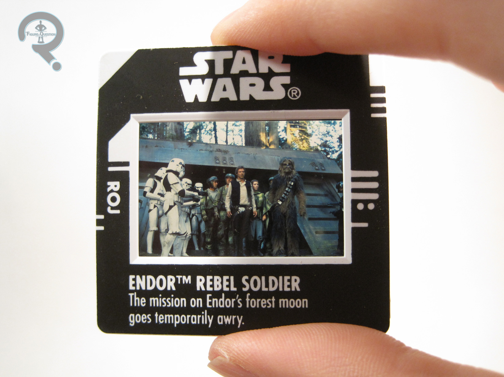
EndorRebel2The Endor Rebel Soldier was released in the 1997 series of Kenner’s Power of the Force II line. The figure is a little bit over 3 ¾ inches tall and he has the standard 6 points of articulation of the time. He doesn’t appear to be based on one Rebel Soldier in particular, but is instead an amalgamation of several of the Rebels from the Endor scenes. The sculpt is generally very well done, and I’d consider it above the usual quality of a PotF2 figure. The general proportions aren’t too exaggerated, and there’s only the slightest bit of pre-posing to him. The best work is definitely on the head, particularly the helmet, which is a great recreation of the film design. From the neck down the details are a bit looser. The Rebel uniform had a few different looks, and this figure tries to make itself work well enough for a bunch of them. It does this by going a bit fuzzy on some of the more defining elements of the uniform. The texturing on the uniform is pretty nicely handled, and rather abundant, which is a little surprising on a figure from this time period. The only real iffy part of the sculpt is his feet, which look more like ugg boots than the WW2 inspired look from the film. The paint on this guy is probably his weakest point. It’s not bad, mind you, just not terribly accurate to the film. Instead of the more complex selection of various colors, the majority of this figure has been painted in a generic camo pattern. It doesn’t look half bad, and I think it probably ends up making him a bit more interesting as a toy than a more faithful color scheme might have done. The Rebel Soldier includes a backpack and a rifle. Both are a little oversized, though not as comically so as other PotF2 figures.  He also included a “Freeze Frame,” which was the gimmick of PotF2 at the time.  It’s just a projector slide of Han, Leia, and several of the Endor Rebel Soldiers in front of the Imperial base.  It doesn’t add much value to the actual figure, but I guess it’s sort of nifty.

THE ME HALF OF THE EQUATION

I originally got this figure from the KB Toys outlet near where my family vacationed every summer. I recall just liking the basic look of the guy, and just being fond of the Endor Rebels in general. He was one of my favorite PotF2 figures, and I even gave him a name (Pterlick, after one of my middle school teachers). Somewhere along the line, I lost track of him. Ever since, every time I came across a selection of well-priced PotF2 figures, I’d always look for him. After a few years, I finally got lucky just last month, when I found him at the House of Fun. I’m glad to have him again, and even more glad that he held up as well as I remembered.

EndorRebel3

#0730: Nightwing – Force Shield

NIGHTWING – FORCE SHIELD

THE NEW BATMAN ADVENTURES (KENNER)

NightwingFS1

In case you missed it, The Figure in Question has officially made it through two years of reviews. In honor of that, today’s review will a little bit more special. I’ll get to that in a bit.

In the mid-80s, Dick Grayson gave up his Robin identity, going without a costumed identity for a little while before taking on the identity of Nightwing (previously the Kandorian alter-ego of Superman. It’s a long story). To the general populace, Dick remained Robin, mostly due to his presence in the role for Batman: The Animated Series. Nightwing made his way into the public eye in that show’s sequel series, which is how I became familiar with the character. That series’ toyline also provided the character with several of his earliest figures, one of which I’ll be looking at today.

THE FIGURE ITSELF

NightwingFS2Force Shield Nightwing was part of Kenner’s The New Batman Adventures line. He was the second version of the character in the line, released not long after the first. The figure stands just shy of 5 inches tall and has Kenner’s signature 5 points of articulation. It’s a pretty low articulation count, but it’s a standard for the time, and aside from the neck joint, which is limited by the hair, the movement is pretty decent. Nightwing is, obviously, based on his design from the show, sculpturally at least. As a “wacky variant” of Nightwing, a little parts re-use is to be expected. What’s actually a bit surprising is that this Nightwing is NOT a complete reuse. The head, arms, and legs are all the same as the regular Nightwing release, but the torso is a new piece, which removes the weird plug from the original’s back. So this one’s sculpt is actually more accurate than the normal one. Nifty! The sculpt does a pretty spot on job of translating Nightwing’s show design to three dimensions, which is nice to see. The etched in logo is a nice touch, especially since it could have easily just been painted on. The paintwork is what really sets this guy apart from the prior Nightwing. Rather than the usual blue logo, this one keeps the logo black, and paints the surrounding area gold. Certainly a different look, but it’s handled pretty well. The gold, like a lot of gold paint has faded over time, but it still stands out well enough. Nightwing was originally packed with a big grappling hook launcher (Kenner was a Hasbro subsidiary at that point…), as well as his titular force shield. I’ve lost it, but it was shaped like his logo, bright yellow, and the “wings” folded out to reveal pictures of the various Batman allies and rogues. It’s an odd gimmick, but there it is.

THE ME HALF OF THE EQUATION

Hey, so, this is actually my first Nightwing figure! Cool!

Story time: When I was 5, my parents took me down to visit my Dad’s family home in North Carolina. My dad came and got me from school, and one of our stops was, I believe, a Kmart, where I found this guy. I had yet to see any of his appearances on the cartoon, so my dad had to explain to me who he was. I thought he looked super cool, so my dad was nice enough to buy him for me. This guy went on the trip with me, all the way down there and back again, so I formed a bit of a bond with the guy.

Over the years, my collection grew, and this guy fell by the side. Somewhere along the way, I decided to paint him up like Jace from Space Ghost. I have no idea why. Anyway, he just got thrown in a box for a while, until I rescued him just a few years ago, while deep in my whole indexing my collection project. He was still covered in paint, but it was acrylic, so I began the process of returning him back to his original state. I finally got him cleaned up just in time to take him with me on my fifth trip down to NC. Here he is on the mantle place. Doesn’t he look so happy?

NightwingFS3

#0672: Bounty Hunter Chewbacca

BOUNTY HUNTER CHEWBACCA

STAR WARS: POWER OF THE FORCE II

ChewieBountyHunter1

My first introduction to Star Wars toys was courtesy of Kenner’s Power of the Force II line of figures. The interesting thing is that I came into the line during the second round of figures, so some of my initial versions of the main characters weren’t exactly standard issue. I’ve already discussed how Dagobah training Luke was my first figure in the line, and some of the other main characters followed a similar pattern. Chewbacca was one such character, which seems a little odd, since you wouldn’t think there would be a lot of potential Chewbacca variants. Well, faithful reader, feast your eyes on Bounty Hunter Chewbacca!

THE FIGURE ITSELF

ChewieBountyHunter2Bounty Hunter Chewbacca was part of the second year of Power of the Force II figures. He was released as part of a small subset of figures based on Shadows of the Empire, which is a story set between Empire and Jedi. In the story, Chewbacca has to take on the guise of well-known Wookie bounty hunter Snoova in order to infiltrate Imperial City. So, technically, this figure could pass for either character. This is only the third time that Chewbacca had made it into the 3 ¾ inch line, which is surprisingly low, given his prominence. The figure stands a little over 4 inches tall and has 6 points of articulation. As a Chewbacca variant, you might think that this figure would be heavy on reuse. However, that’s not the case, as the only shared part between this and the regular POTF2 Chewie is the left leg. Everything else is new to this guy, though the sculpt maintains more than a few similarities with the regular version. Chewbacca definitely has a slightly exaggerated style about him (as did most of the POTFII figures) but I think this is one of the few figures in the line that really couldn’t work without the slightly cartoony feel. The concept looks pretty nifty here, presented in all its over-complicated 90s glory, but placed on a more realistically proportioned body I dare say it would look downright silly. And being exaggerated certainly doesn’t mean the figure doesn’t have some great texturing. The armor in particular looks sufficiently worn and beaten. Someone had a lot of fun sculpting this guy. This version of Chewbacca also got some of the very best paintwork POTF2 had to offer. All of the base paint is cleanly applied, with minimal bleed over. He’s also got some pretty nice work on his fur, which, in story, has patches died to make him look more like Snoova. They could have just been solid blotches of color, but they’ve actually been worked in rather subtly, making them look like they’re actually died into his fur. Chewbacca was packed with a giant blaster and a sci-fi looking axe, which both just add to the 90s over-complication thing. They can both be held, or the axe can also be plugged into his back for storage.

THE ME HALF OF THE EQUATION

This guy was my very first Chewbacca figure. If I recall correctly, Chewie was one of the last main characters I got. I remember that my Grandmother took me to the store (Sears, I think) specifically because I had asked to get a Chewbacca figure. I seem to recall that both versions of Chewbacca were there, but I picked this one. Even then I knew what cool was! The one pictured is actually a replacement I picked up a few months ago, as the original got lost some ways back. I have to admit, I was ready to tear into this one for its absurdity when I first sat down to write this, but I’ve come out of the review with a rekindled love for this X-Treme little guy.

#0670: X-Ray Vision Superman

X-RAY VISION SUPERMAN

SUPERMAN: THE ANIMATED SERIES

XRaySupes1

Remeber last week when I looked at one of the wacky Superman variants from Kenner’s tie in line for the 90s cartoon?  Well, that one wasn’t even the tip of the iceberg.  At least he was somewhat passable as a basic Superman.  Today’s figure? Less so.  Without further ado, here’s X-Ray Vision Superman.

THE FIGURE ITSELF

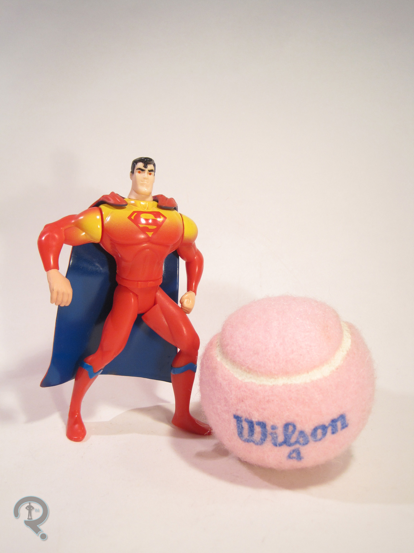
XRaySupes2X-Ray Vision Superman was released as part of the fourth series of Kenner’s Superman: The Animated Series, the story of which I covered in Power Swing Superman’s review.  He’s another of the frivolous Superman variants designed to showcase Superman’s less obvious power set.  Yay?  The figure is 5 inches tall and he features 6 points of articulation.  He sports a unique sculpt.  It’s not quite show accurate, but it’s in line with the all of the other Animated Series figures, so at least it’s consistent.  It’s nowhere near as extreme in pose as Power Swing Superman, but he’s still a bit removed from a standard standing pose.  The most out there part is definitely the throwing arm, which is permanently outstretched and at a 90 degree angle.  That’s a bit on the awkward side, but it works okay with the accessories.  The rest of the sculpt is more standard fare: fairly simple musculature and decent enough proportions.  The head sculpt isn’t as good as the PS Superman, but that’s mostly due to the “action feature.”   What is this action feature?  Well, he’s got light piping, so as to light up his eyes and simulate his…X-Ray vision.  I think they may have gotten confused with his heat vision.  The paintwork is where the figure really gets wonky.  In lieu of the traditional Superman colors, this figure is primarily a red-orange-yellow gradient.  It’s a very warm look, which once again makes me think someone at Kenner kept mixing up heat vision and X-Ray vision when designing this guy.  That said, it’s a unique look, so I actually can’t complain.  The cape has been swapped to blue, I guess to break up the reds a bit.  Overall, the paint is pretty decently applied, with no real slop or anything and lots of nice, bold colors.  Superman is packed with a bundle of dynamite, as well as a safe to hide it in.  The safe is partially translucent, so as to demonstrate Superman’s power.

THE ME HALF OF THE EQUATION

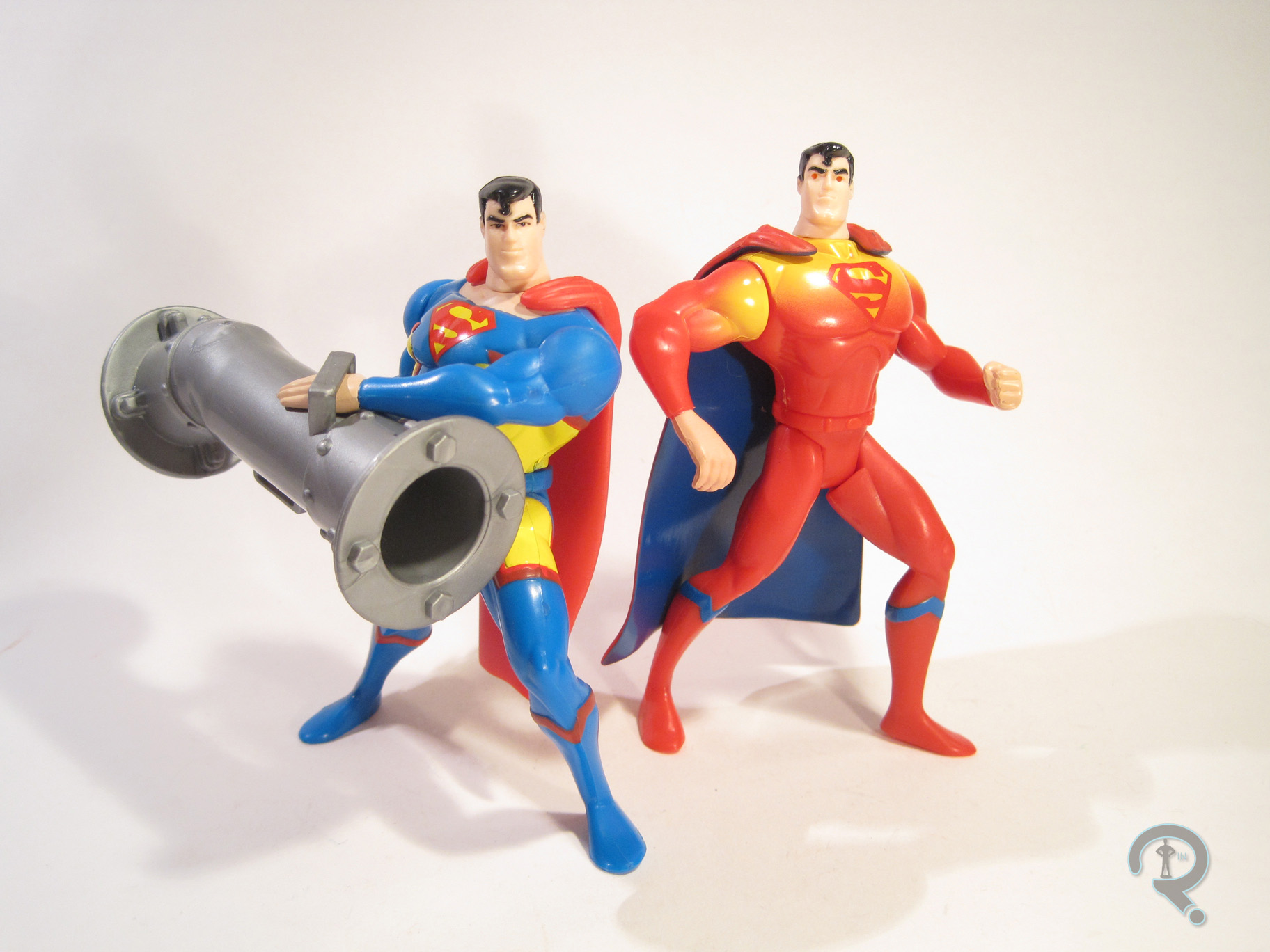
Like his series-mate, I picked this Superman up from Yesterday’s Fun. He was another one of the wacky Supermen that had intrigued me all those years ago.  In fact, he has the notoriety of being the very last thing I bought on vacation.  He’s not quite as much fun as Power Swing, but he’s not too bad.  And, as an added bonus , paired up with Power Swing, you get a pretty decent Silver Age Superman Blue and Red.

XRaySupes3

#0663: Power Swing Superman

POWER SWING SUPERMAN

SUPERMAN: THE ANIMATED SERIES

PowerSwingSM1

When you are creating an entire line of action figures based on a property with one defined look for your main character, the only way to keep the main character at the forefront, logically, is to release a bunch of variants of that character. Sometimes, they’ll be authentic designs from the source material (such as many of Hasbro’s recent ML Spider-Men) or a practical extension of their basic look (like Iron Man). Other times, they’ll just be completely made up. Enter Power Swing Superman.

THE FIGURE ITSELF

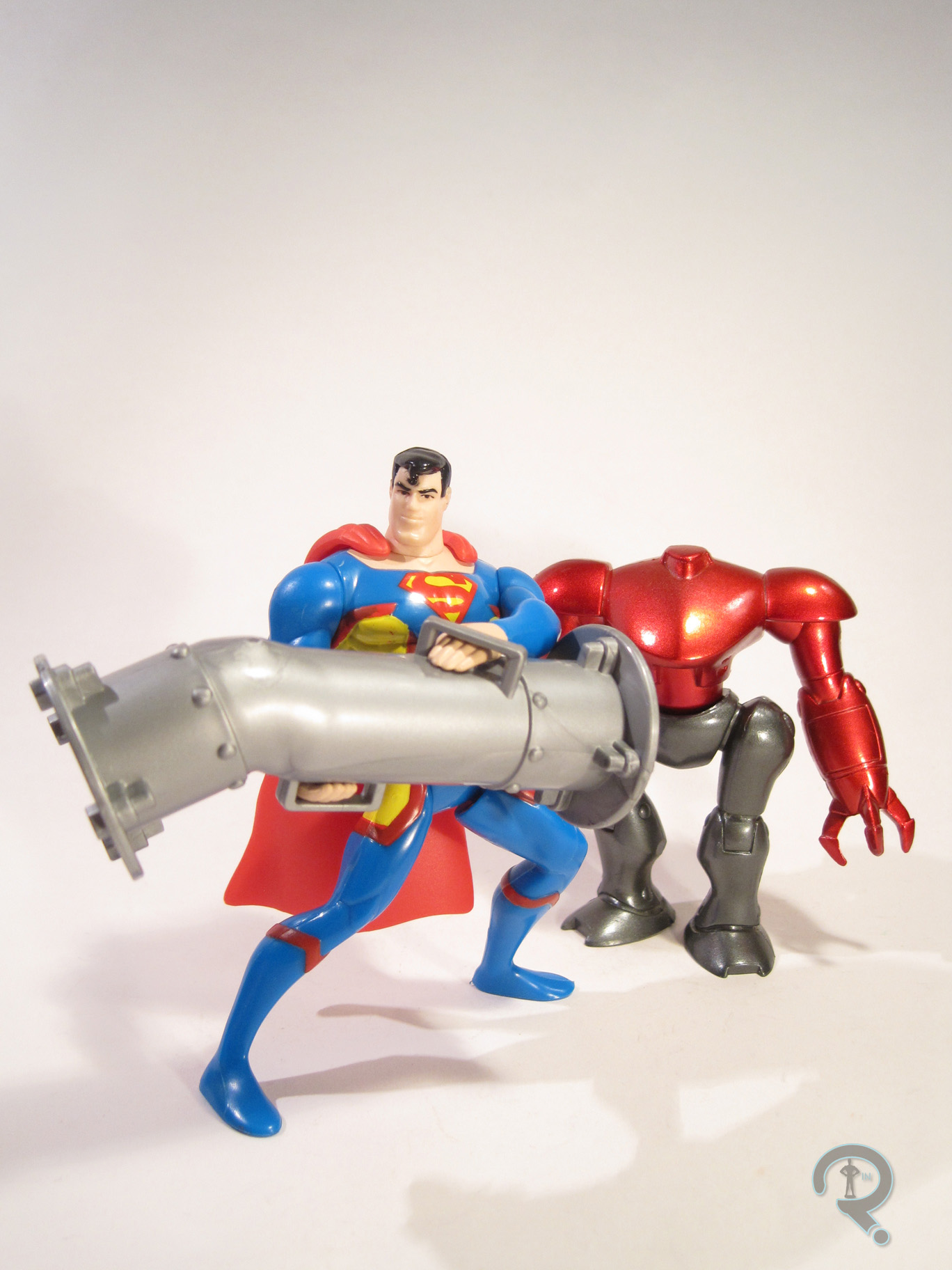
PowerSwingSM2Power Swing Superman was part of the fourth series of Kenner’s Superman: The Animated Series line. This series is significant because it wasn’t carried by conventional US retailers. Instead, it hit in Europe first. The series didn’t make it to the States until it was offered by Diamond Distributers a few months later. So, there’s that story. The figure stands 5 inches in height and has 6 points of articulation (though his waist swivel is limited by the action feature). Now, where, you might ask, did this figure’s costume originate? Some one episode look, or perhaps an obscure Elseworlds story? Nope, it came straight from the minds of the toy designers. Yes, this costume is totally made up for the figure, though it is notable that this figure removed the signature red shorts over a decade before the New 52 redesign made it canon. The line never really stuck to the show’s style when it came to sculpts, but this figure actually takes it even further, with more defined musculature and an exaggerated pose that wouldn’t look out of place on the dance floor of a disco. While many of the wacky Supermen were sculpted in his traditional garb and painted funky after the fact, this figure’s sculpt actually has details that correspond specifically to this design, which is kinda neat. The best part of the figure is easily the head sculpt, which actually manages to be the most show-accurate sculpt the line ever produced. It’s spot on! The paintwork on the figure is alright, but not great. It sticks to his traditional colors, though placed a bit differently. The colors are nice and vibrant, but the application is spotty. The costume has a lot of bleed over, and the red areas in particular feel like they could use another coat of paint. The head manages to be the best piece once again, avoiding the bleed over and actually doing a very nice job on the eyes. The figure included a large piece of pipe for him to hold, as well as a miniaturized version of Luthor’s exo-suit from the pilot episode. Also, his waist is spring-loaded, allowing him to “swing” the pipe at the exo-suit and “demolish” it. It’s not high-end or anything, but it’s amusing.

THE ME HALF OF THE EQUATION

Power Swing Superman was one of my many purchases from Yesterday’s Fun whilst on vacation this year. I had actually always been intrigued by this guy, but I’d never seen him in person. So, when I came across him, I snatched him up quickly. He’s definitely goofy, but I really enjoy him.

PowerSwingSM3

#0603: Lex Luthor

LEX LUTHOR

SUPERMAN: THE ANIMATED SERIES (KENNER)

LuthorSTAS1

Batman: The Animated Series is pretty much universally viewed as one of the best interpretations of Batman and his supporting cast ever. It was revolutionary at the time it was released, and, thanks to top notch writing, animating, and acting, it still holds up pretty great after over 20 years. For me, though, the best entry in the DC Animated Universe is the series that followed B:TAS, Superman: The Animated Series. While B:TAS got a pretty decent run of figures at the time of its release, S:TAS wasn’t quite so fortunate. Kenner produced a line of toys to tie-in, but the character selection was somewhat limited, and many of the characters were rather off-model. One of the characters hit the hardest by off-model-ness was Big Blue’s arch enemy Lex Luthor, who is the focus of today’s entry.

THE FIGURE ITSELF

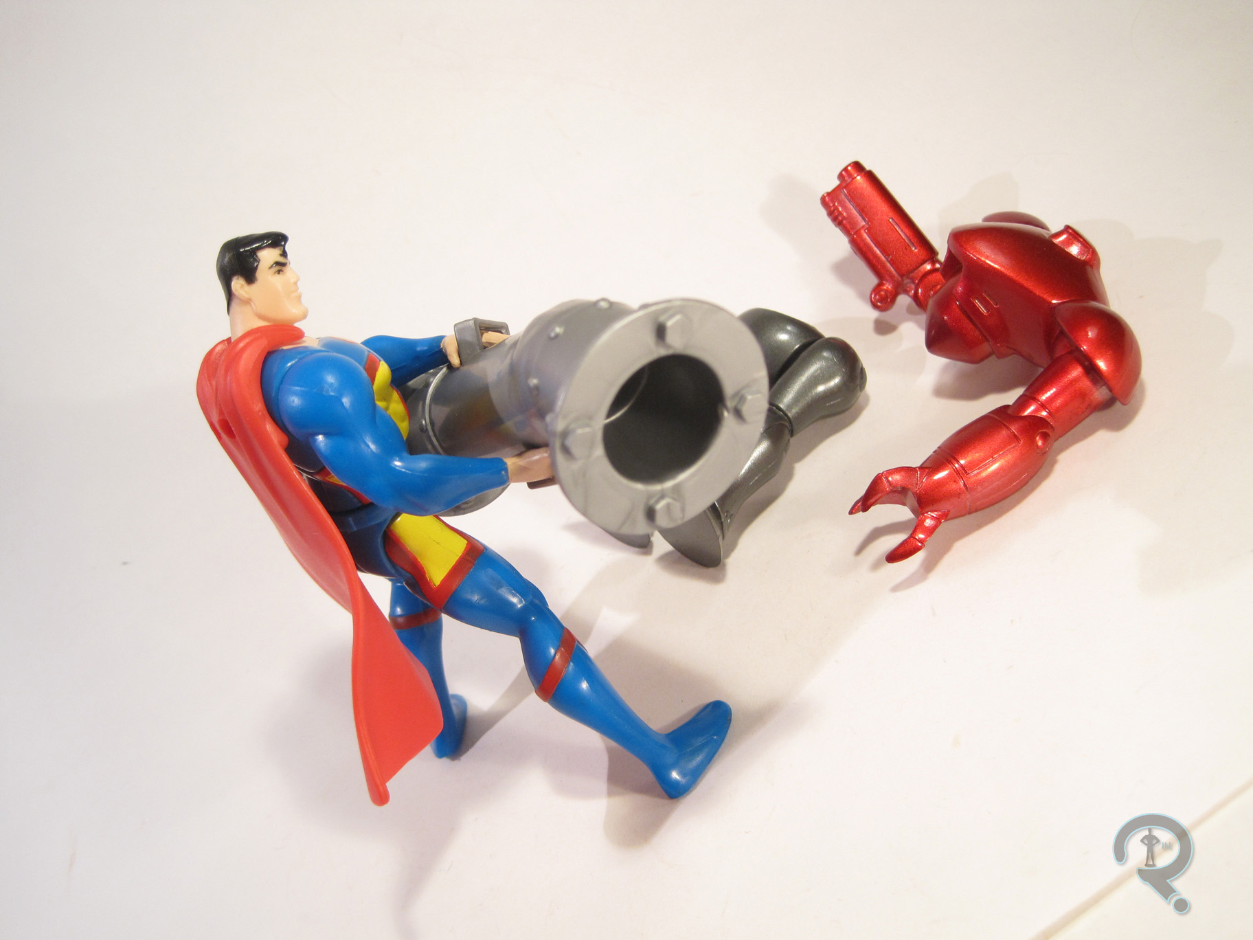
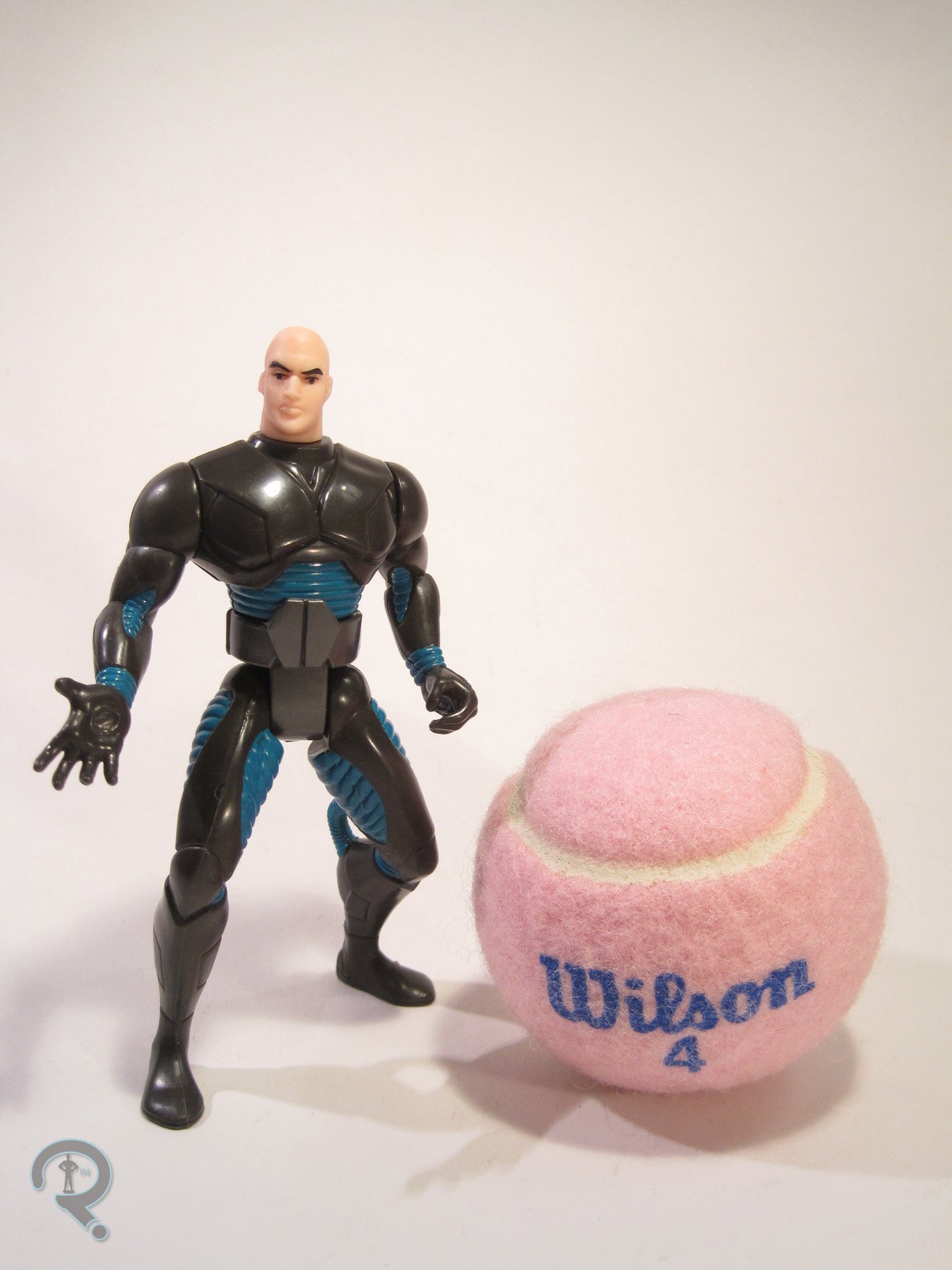
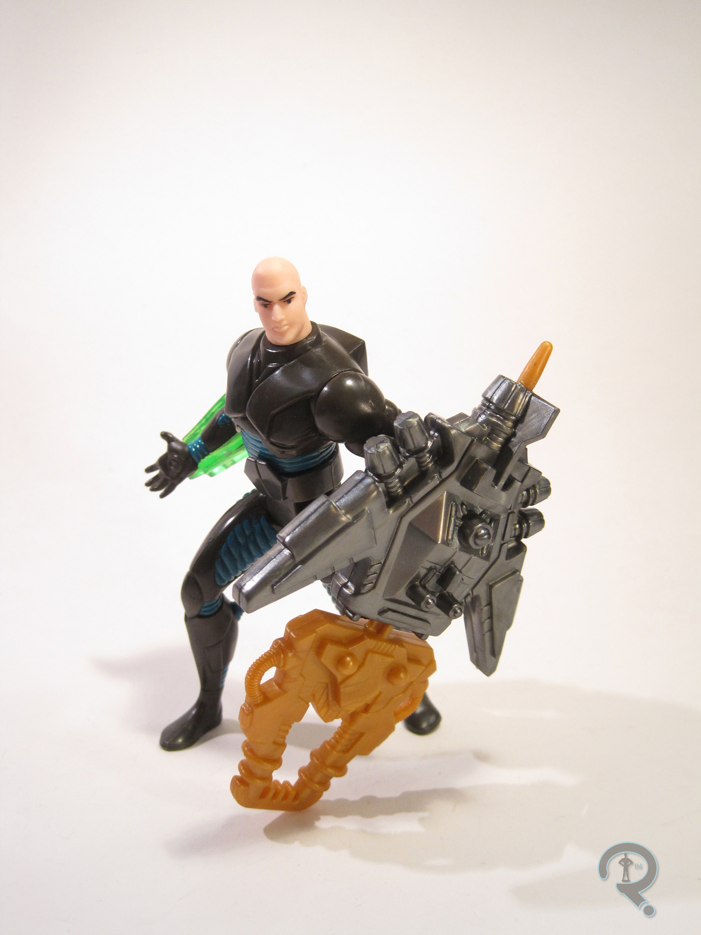
LuthorSTAS2Lex Luthor was released as part of the first series of Kenner’s Superman: The Animated Series tie-in line. He was one of the two non-Superman characters in this particular series. The figure is a little over 5 inches tall and has 6 points of articulation. Dig that waist articulation guys! It’s more than most DC figures had at this point! Now, this figure is sort of based on Luthor’s animated appearance, but, as I noted in the intro, the figure is more than a little bit off-model. To Kenner’s credit, they managed to produce a near-perfect rendition of the animated Luthor’s noggin. It’s really a very good piece. The trouble lies with literally every other piece of the figure. Rather than release him in his signature suit, Luthor is depicted here in a Kryptonite armor suit, which is completely made up for this figure. The “Kryptonite” parts are all snap-on armor pieces, which can be removed to reveal….some sort of exoskeleton thing. It’s a perfectly fine sculpt on a purely technical level, but it looks pretty wonky and the body doesn’t even have proper Bruce Timm-style proportions. I get that a guy in a suit doesn’t make for the most exciting figure. That said, if they were going to do the clip on armor thing, why not put a more conventional suit under the armor? Just seems like a weird choice. Also, the figure seems to have borrowed Total Justice’s guide to posing; his arms and legs are all bent and turned. It’s most annoying on the legs because it makes getting him to stand next to impossible. As far as paint goes, Luthor is pretty reasonably handled. Nothing super thrilling, but everything is applied pretty cleanly. It’s a nice touch that he veers away from the primary colors, helping set him apart from Superman. In addition to the clip on armor, Luthor includes a big freaking missile launcher thing. Hasbro would be so proud.

THE ME HALF OF THE EQUATION

I never had this figure growing up. I saw him many times over the years, but I just never got one. It’s most certainly due to the weird design of the figure. Why now? Simple, my comicbook store had a table of action figures for $2.99. If you bought five, they were only $2 apiece. So, I bought ten. Luthor was one of them. This actually isn’t a bad figure, just kind of weird.LuthorSTAS3

#0559: Admiral Akbar

ADMIRAL AKBAR

RETURN OF THE JEDI

Akbar1

It’s a trap! Sorry, there was literally no way I was starting this review without saying that. It had to be done. So, happy Star Wars Day everyone! May the fourth be with you! In honor of the day, I figured I’d take a look at something Star Wars-related, and this guy called to me. Something about a tarp… I don’t know. So, let’s jump right on into the review of everybody’s favorite aquatic, trap-sniffing, rebel Admiral!

THE FIGURE ITSELF

Akbar2Admiral Akbar was released way back in 1983 as part of the Return of the Jedi line, released to tie in with the movie. The good Admiral stands roughly 3 ¾ inches tall and features 5 points of articulation, which was the standard for the time. The figure is, of course, based on the character’s appearance in the film, though, like the rest of the line, he’s presented as viewed through the Kenner lens. So, he’s a little bit more exaggerated and a little bit more simplified than his on-screen counterpart. As was the standard operating procedure of the time, Akbar features his own, unique sculpt. It’s probably one of the goofier sculpts of the time. The head and arms are pretty faithful to the film’s design, but they lack a lot of the texture and such that made the character more believable-looking. Without it, the goofier aspects are more obvious to the eye. In addition, the figure’s body is a lot skinnier and stretched out than the guy on-screen. This ends up adding goofy proportions to the list of wonky features, which only emphasizes the figure’s silliness. As far as paint goes, the figure is pretty straightforward. He’s mostly just molded in the appropriate colors, with paint for his eyes, hands, the sides of his torso, and the tops of his legs. The paint is all pretty straight color work. It ends up further adding to the somewhat goofy look of the figure, but at least it’s consistent. Akbar’s only accessory was a weird sort of stick-thingy, which mine never actually had.

THE ME HALF OF THE EQUATION

Now, obviously, I didn’t pick this figure up when it was released, what with not being born and all. This figure is actually one of the most recent vintage Star Wars figures I’ve picked up. He was amongst a small selection of them that I found at an antique store located near my friend Phil’s house. Admittedly, I picked up Akbar for the novelty of having such a figure. Sure, he’s super goofy, but that’s exactly what I was looking for in this figure. There is definitely a certain level of charm to such figures.

#0506: Han Solo – Bespin

HAN SOLO – BESPIN

POWER OF THE FORCE II

HanBespin1

Hey! Do you like reading about Han Solo figures? I sure hope you do, cuz I’m reviewing another one today. Yes, after the barrel of laughs I had writing yesterday’s review, I thought, why not another one? So, I’ll be wrapping up this little subset of Power of the Force II reviews with another Han Solo. Yay!

THE FIGURE ITSELF

HanBespin2This particular Han found himself released in the second year of Kenner’s Power of the Force II line. After doing the primary looks of most of the main characters from A New Hope (as well as one or two figures from the other two movies), the second year turned to the later looks of the primary characters, just to make sure the line didn’t run out of Hans and Lukes. So, Han is based on his primary look from Empire Strikes Back, commonly referred to as his Bespin look, as it’s what he’s wearing during all of those scenes. It’s definitely a fan-favorite look, and I’d say its popularity rivals the ANH look. The figure is about 3 ¾ inches tall and he has 6 points of articulation. The figure’s sculpt is mostly new, with the exception of the head, which is re-used from the previous Han figure. That was definitely the best sculpted piece on the last figure, but it’s still saddled with its own set of issues, chief among them being it just doesn’t really look like Han Solo. That said, it’s on an entirely new body here, and that does the sculpt a few favors, chief amongst them being that the head is just a heck of a lot more proportional with the new body. Kenner kind of caught on to some of the complaints about the first assortment of POTF II figures’ proportions, so later assortments ended up at least a tad less ridiculous. Han is still a little bulky, but it’s more evenly spread this time. He lacks the laughable hour glass figure of the previous Han, and his arms don’t look like they’re about to bust the seams of his sleeves either. Those are both pretty big improvements. The figure’s clothes also have a fair bit more texture this time around, especially the shirt and coat, which helps make the figure at least a little more interesting looking. Sadly, he still has some oddly posed legs, but at least they look more like a deep step this time than the freaking side lunge that smuggler Han was doing. The paintwork on Han is overall pretty clean and well handled, and it seems to be better that the other Han. However, there’s a paint chip on his neck, which is rather annoying. Also, the most glaring issue with that paint is that they flat out got the color of his coat wrong. In the movie it’s very definitely blue. Here, it’s black for some reason. I wonder why that happened. Han includes his trademark (and still way oversized) blaster pistol, as a large gun, which I am once again pretty certain he never actually carries in the movies.

THE ME HALF OF THE EQUATION

Okay, so while I didn’t actually have this figure growing up, I did get to play with one on a fairly regular basis. See, my grandmother wanted my cousin Patrick and me to have some figures to play with when we stayed with her, so she had me pick out a handful of POTF II figures for the two of us. This version of Han was among them. Patrick and I had dug out a small little dirt pit in the back yard, which we used as a stand in for the Sarlac Pit, and one day, it started raining and we had to run back in. We thought we had grabbed all of the figures, but poor Han got left behind. The next time we were both at the house, our grandfather had filled in the pit. Patrick and I dug for a while, but Han was nowhere to be found. It’s always been that figure that got away. While at Farpoint this year, still high from the excitement of getting the other POTF II figures from the charity sale, I found this Han at one of the dealer’s tables. His package had yellowed so much that it looked like the poor guy had been encased in amber, but the figure was just fine. And now I have that Han figure again. Huzzah!

#0505: Han Solo

HAN SOLO

POWER OF THE FORCE II

HanANH1

I’m desperately trying to come up with a good intro here, and literally the only thing going through my head is “Han Solo Cup.” Of which I feel rather ashamed. Yesterday, I remarked that I never had any of the Power of the Force II Stormtroopers. Well, funny thing about that is, on the flip side, the only Han Solo I owned from the line was Stormtrooper disguise Han. And, in what seems to be the story of my adult collecting life in general, I’ve decided to fix that. So, let’s look at a Han Solo figure!

THE FIGURE ITSELF

HanANH2Han was released in the first assortment of POTF II figures, which shouldn’t really surprise anyone. He was Han freaking Solo after all. He’s roughly 3 ¾ inches in height, and he has the line’s standard 6 points of articulation. He’s based on Han’s primary look from A New Hope, which is generally the look most people associate with the character. Han’s sculpt was original to him, and it exhibits a lot of the same style cues present in other POTF II figures. Let’s start off with the basic proportions of the figure: he has an overall body-builder-esque physique, but even by body-builder standards, he’s a bit absurd. His shoulders are really broad, and his arms are practically bursting out of his sleeves. He also has the huge hands and impossibly thin waist that were prevalent in the line. Han, more so than others in the line, feels like a cartoon caricature, not a human being. On top of the proportions, Han’s sculpt is plagued by a few issues. Like a lot of the others in this line, Han’s legs are somewhat strangely posed, requiring that he stand in a deep stance to be even remotely balanced while standing. Also, though his hands may be large, they haven’t been sculpted to really hold anything. This is the worst on his right hand, you know, the one he holds his blaster with, which is sculpted flat, so he can’t actually do so. Finally, there’s the head. Now, to be fair, the head is easily the best part of this figure, especially from a technical standpoint. There’s some really nice detail and texturing. However, it seems like the sculptor was working from pictures of Harrison Ford at the time these figures were made, instead of at the time of the movies. And even then, it’s hard to see a lot of Ford in this sculpt. He looks a bit like the lovechild of Ford and Tommy Lee Jones, which, needless to say, isn’t Han Solo. Han’s paintwork is pretty much typical for the time. It’s certainly not bad, but it’s not anything amazing either. Everything is pretty much where it’s supposed to be, and there aren’t really any issues with bleed over or slop.  Han included his signature blaster pistol, which is hysterically oversized, and a larger blaster rifle, which doesn’t appear to be one he carries in the film.

THE ME HALF OF THE EQUATION

As I mentioned in the intro, this isn’t the Han I had growing up. I think part of what turned me off to Han figures in general was that likeness he had. I just didn’t like that Han looked so much older than he should. But, over time, the old Han figure has started to grow on me. So, Han ended up being one of the POTF II figures that I fished out of the charity sale box at this year’s Farpoint. Like the Stormtrooper, he’s definitely a goofy figure, but I feel a twinge of nostalgia for this guy.