GROOT
MARVEL LEGENDS (HASBRO)

“Grown into a more mature tree, Groot uses his new body changes and more advanced skills to help build Knowhere and protect his family.”
And we all know there’s nothing more important to Vin Diesel than family…
So, you know how I’ve gotten you guys all accustomed to this lovely sort of curated mix of old and new for my reviews the last few months? Hasn’t that been nice? Isn’t spacing everything out super nice? It sure is. Nobody told that to Hasbro, though, so, umm, I’ve got four serious of Marvel Legends, all at once. I sure hope you like Legends, because that’s what we’re doing for at least the next month and a half. To preserve my own sanity, I’m gonna do things just a little bit differently this time, and rather than looking at each set in a straight shot, I’m gonna do one of each set per week. Does that sound better? It does to me, and I outrank the rest of you.
Back in May, James Gunn closed out his trilogy of Guardians of the Galaxy movies, and he did it with one very strong finish. And they may have been on uncertain ground for their first outing, but there’s no denying the merchandising juggernaut that the Guardians have become at this point. For their Legends component, there’s a full assortment of movie-based figures, as well as a deluxe Groot, which just so happens to be the item I’m looking at today!
THE FIGURE ITSELF
 Groot is a one-off deluxe Marvel Legends release, whose arrival coincides with the main Guardians tie-in assortment. Long gone are the days of making Groot a Build-A-Figure; he’s far too popular a character for that. After keeping the same general Teen Groot look since Vol 2’s post credits scene, the Holiday Special gave us a more aged up Groot, which Vol. 3 continues with. Now he’s no longer the skinny twig he was before. The figure stands 7 inches tall and he has 29 points of articulation. Despite his bulked up stature, this Groot is probably the most posable version of him we’ve gotten for Legends. In particular, the elbows get a much better range that the Teen Groot body did, and his knees and ankles are better than the elder Groot from the first movie. The shoulders use the moving plate construction that Classified has utilized a few times for armor. It allows for more flexibility when posing, which is nice. Unfortunately, due to a slight mold error, it also means the right arm on my figure tends
 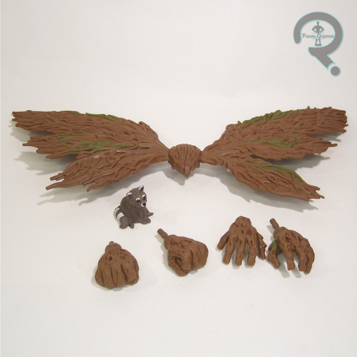 to pop out of place. Groot’s sculpt is all-new, patterned on that all-new design. It seems a little softer on detailing than the elder Groot, but it’s sharper than Teen or Baby Groot were. In terms of accuracy to the source material, it’s generally pretty good, although the head does seem just a tad more squat and wide than it should be, with features that ever so slightly too human. The general look is still there, of course, and Hasbro was undoubtedly working from in-progress designs for the character. Groot’s color long is largely achieved via molded brown plastic, which is a richer shade than his prior figures. He gets a little bit of green accenting for his “moss,” and printed eyes, which again seem maybe just a bit too human to be fully accurate. Prior Groots have largely been pack-ins of some sort, and therefore pretty light on extras, but this guy gets two sets of hands, wings that can be mounted on his back, and a small baby Rocket figurine. At least I assumed it was Rocket before seeing the movie, but it could also be
[SPOILER]
one of the baby raccoons that Rocket saves at the end of the movie. This one does appear to be unmodified, so perhaps that’s it.

THE ME HALF OF THE EQUATION
I quite like Groot, and it was that like of him that got me to buy the whole set of the first film’s figures, just to build him. I’ve really enjoyed his evolution over the movies, and he was an essential part of Vol 3. Being able to get him on his own now is cool, but of course, now I’m sold in the whole set anyway. This guy’s pretty fun. I don’t know that he was quite what I was expecting, but he’s still fun.
Thanks to my sponsors at All Time Toys for setting me up with this figure for review. If you’d like to see a video of this guy in action, I helped out with one for their YouTube channel, so check that out. If you’re looking for toys both old and new, please check out their website.