#1374: Roboto

ROBOTO

MASTERS OF THE UNIVERSE (2002)

One year ago exactly, I wrapped up a two-week stretch of Masters of the Universe reviews with a review of the Castle Grayskull playset from the 2002 line.  In what I guess is going to become a birthday tradition on the site, I’m looking at yet another MotU figure today.  It’s one of my favorite characters from the franchise, Roboto, Heroic Mechanical Warrior!  I’ve actually looked at Roboto once before, having looked at his vintage counterpart, but today I look at his super awesome 2002 version!

THE FIGURE ITSELF

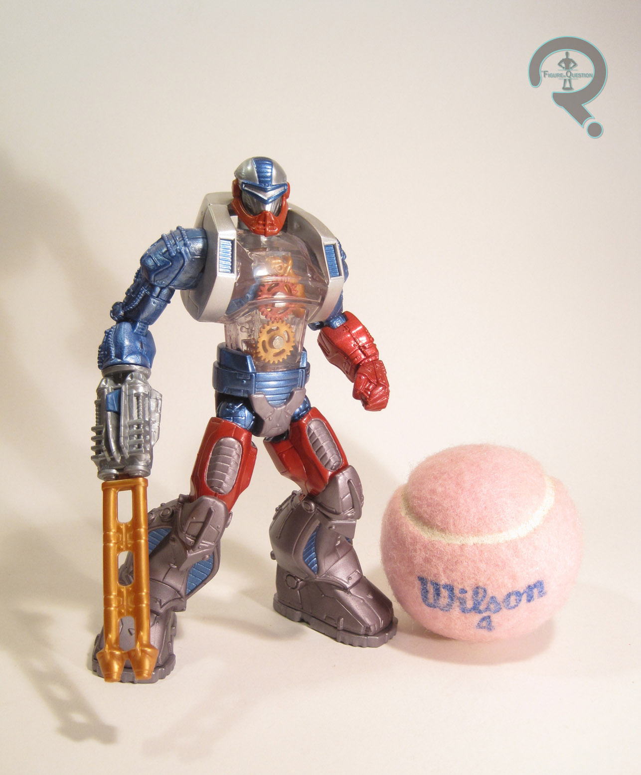
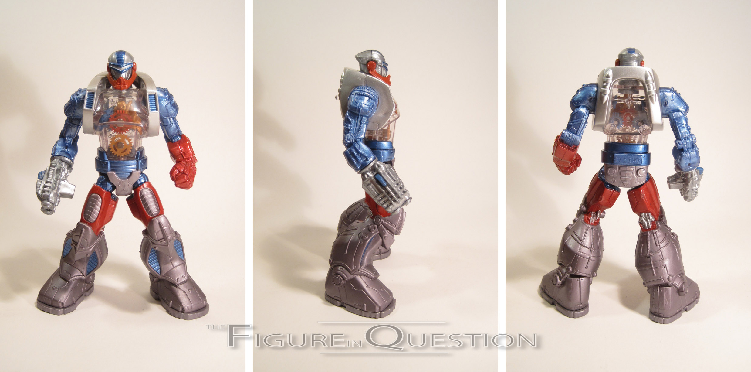
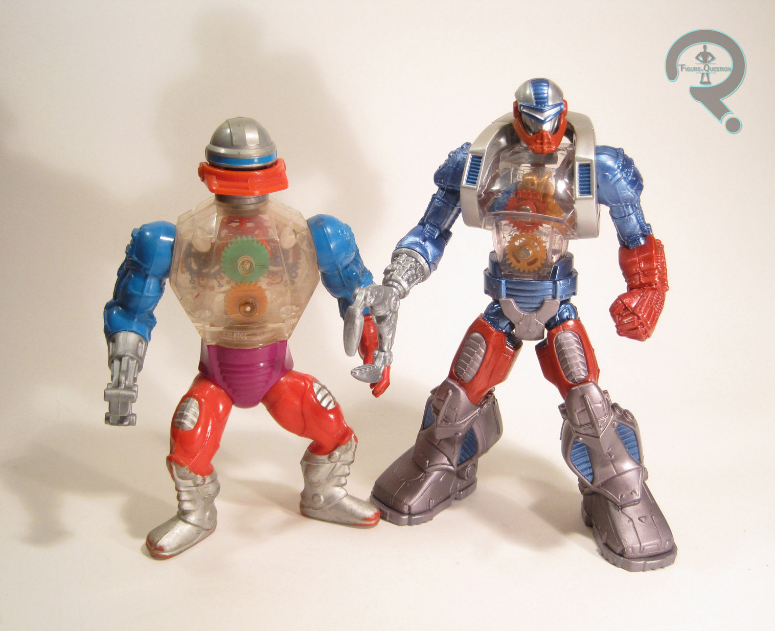
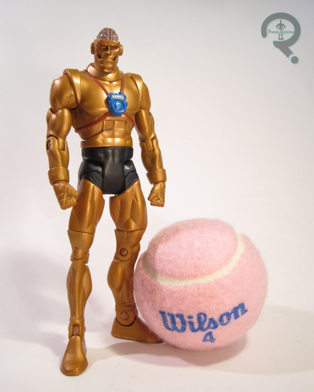
Roboto was added to the re-launched Masters of the Universe series in 2003, as part of the fifth assortment of Heroic Warriors.  The figure stands about 6 1/2 inches tall and he has 12 points of articulation (13 if you count the very slight mobility of his jaw).  Where the vintage Roboto made use of a couple of pieces from Trap-Jaw, this Roboto was a totally unique sculpt.  This figure takes Roboto’s admittedly rather goofy vintage design, and does its very best to make him look, you know, actually pretty cool.  Unlike a lot of things that Mattel tries at, this figure succeeds.  In fact, this is easily one of my favorite designs from the 2002 line, and really Masters of the Universe in general.  He keeps all of the important details from the original Roboto, so you can clearly tell it’s the same character, but all of these details have been made much sharper, more robotic, and more in line with other cool robots of the last few decades.  The head in particular ditches the duck-billed knight looking design of the vintage figure in favor of a more futuristic warrior look, which made more sense in the setting of the updated cartoon.  Like his vintage counterpart, this guy takes advantage of the usual hollow torso of these figures, and has molded it in clear plastic and placed an assortment of gears inside, representing his inner workings.  In terms of paintwork, this guy is pretty great; the application is all very clean, and I really like the metallic re-working of his classic color scheme.  It really pops.  The figure is packed with two arm attachments for his right arm: a claw and a blaster.  Both are updates of the same pieces included with the vintage figures, updated to match the new figure’s style.  He loses the third attachment (the axe) but gains an extra armored piece for his torso, as well as a missile for his blaster arm.  Not a bad assortment of extras at all!

THE ME HALF OF THE EQUATION

Roboto’s debut episode was one of my favorites of the 2002 show, so I always wanted this figure.  Remember how I mentioned that his re-design was one of my favorites?  Well, I wasn’t alone in this thought.  That, coupled with Mattel’s incredibly stupid methods of packing cases and distribution, meant that I never once saw this figure at retail.  It also meant he was one of the figures to hold onto his aftermarket value, even well after most of the line had fallen way down in price.  Honestly, I’d never even seen this guy in person.  So, when I found him at Lost In Time Toys a few weeks ago, I was pretty excited.  I was even more excited when I found out that he was half-off his given price, allowing me to get him for a more than reasonable price.  I’m thrilled to finally have this guy, and for all the ragging I do on Mattel, there’s no denying that this is a cool toy.

*As an added bonus, Roboto was also the 4000th unique figure to be added to my collection!  Wow, that’s a lot of figures!

#1372: Martian Manhunter

MARTIAN MANHUNTER (aka “Martin Spartan”)

RETRO ACTION DC SUPER HEROES (MATTEL)

It’s been the better part of a month since I’ve looked at a DC Comics-based item, so I guess I should go ahead and give them some coverage too!  So, hey, that Justice League trailer just hit and it looks…about the same as everything other DC movie that’s been released in the last 4 years.  Oh goody.  I must admit, I’m not a huge fan of the line-up they’ve chosen for the team’s first live-action outing.  Obviously, I’m lamenting the lack of my personal favorite heavy hitter, Green Lantern, but I’m also really not digging the lack of J’onn J’onzz, aka the Martian Manhunter.  Sure, he’s not the team’s most prominent member, but it’s a bit like if they’d left Hawkeye out of the first Avengers movie.  Alas, there’s no going back now.  Anyway, I’m gonna make myself feel better by reviewing this here Martian Manhunter in all of his retro-inspired goodness.

THE FIGURE ITSELF

Martian Manhunter (or “Martin Spartan,” as Super Awesome Girlfriend accidentally named him) was released in the fourth, and final, series of Mattel’s Mego-inspired Retro Action DC Super Heroes line of figures.  Like a large number of figures in the line, he has no original Mego counterpart.  The figure stands roughly 8 inches tall and he has 18 points of articulation.  J’onn was built on Mattel’s Mego-equivalent body, which is different from the standard body in ways that make it…different.  That’s it.  They’re changes for the sake of change, with no actual improvements to the basic body.  It’s just Mattel being weird, really, but hey, what else is new, right?  It’s certainly workable, and at a glance really isn’t much different, so that’s good.  Manhunter has a unique head-sculpt, which depicts an earlier, more human-like version of the character, which is certainly befitting of a Mego-styled figure.  Apart from a slight molding error on my figure, it’s a pretty great sculpt.  Manhunter has an outfit made up of a cloth jumpsuit, a cape, and a pair of rubber buccaneer boots.  The jumpsuit makes up his exposed skin, which is true to the old Mego style, and it has some nice extra bits attached to it make up his actual costume.  I particularly like the use of pleather for the straps and belt, though I do wish there were an actual buckle.  The cape is a little thin for my taste, but overall a nice addition.  The boots are nicer than a lot of the Retro Action figures, and look a good deal less bulky.  Manhunter is largely without paint; the only actual paint is on his eyes, and it’s probably my one real point of contention with this figure.  The sculpt is clearly a classic Manhunter, so his eyes should be white, and possibly even have pupils, but they are instead red, as they would be on a modern Martian Manhunter design.  It’s a small nit, but it sort of throws the whole retro thing off for me.

THE ME HALF OF THE EQUATION

My dad and I collected this whole line of figures together when it was first released, so I remember when this guy first hit.  The ones we collected are more part of my dad’s collection than mine, since he was the one with the vintage Mego collection, so I only have the few spares I picked up along the way.  This guy came into my collection when Super Awesome Girlfriend and I found him at a 2nd Avenue for $2.  Super Awesome Girlfriend felt sorry for him, and insisted that I add him to my collection.  He’s a pretty fun figure.  Definitely for a specific demographic, but fun nonetheless.

#1367: Falcon

THE FALCON

MARVEL SUPER HEROES: SECRET WARS (MATTEL)

“Transported to a strange planet by a force from beyond the universe, earth’s deadliest villains try to destroy the Marvel Super Heroes – as they fight the Secret Wars through the use of secret messages!”

Before Toy Biz came along and gave us just about every single Marvel character under the sun in the ‘90s, there was a very eclectic selection of Marvel characters available in toy format.  Major characters went completely figureless for years.  And yet, in the chaos of pre-Toy Biz Marvel stuff, somehow The Falcon, a relatively minor character until very recently, wound up with not one, but two whole figures.  I’ll be looking at the second of those, courtesy of Mattel’s Secret Wars line.

THE FIGURE ITSELF

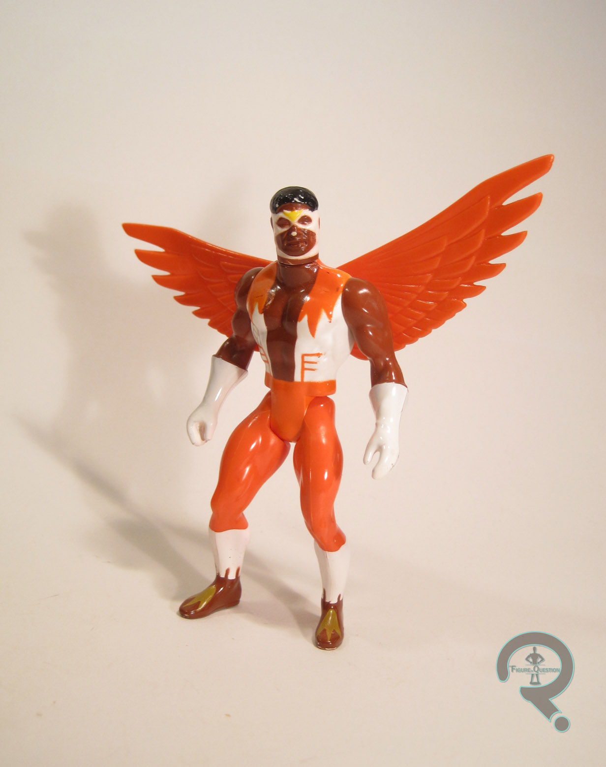
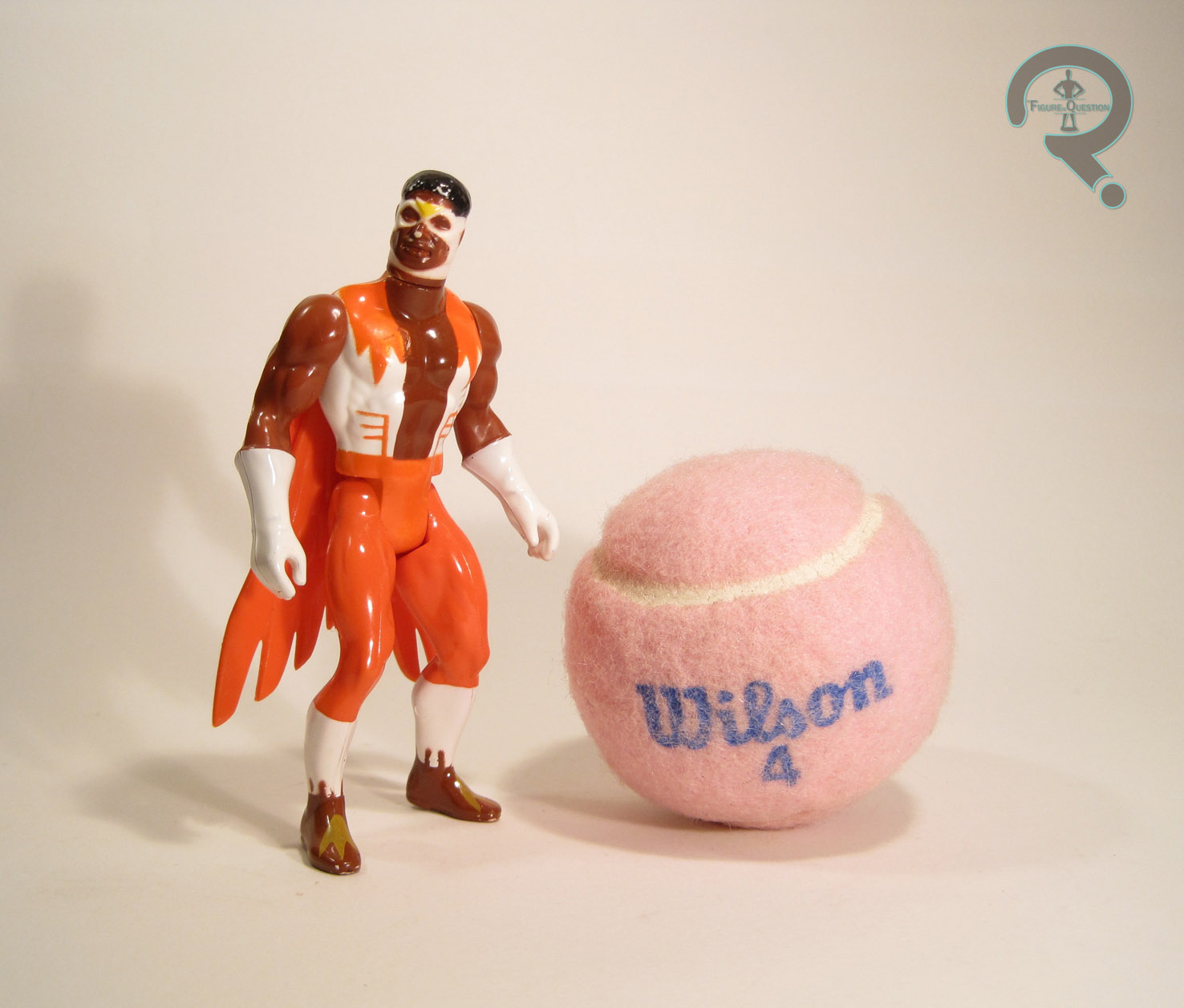
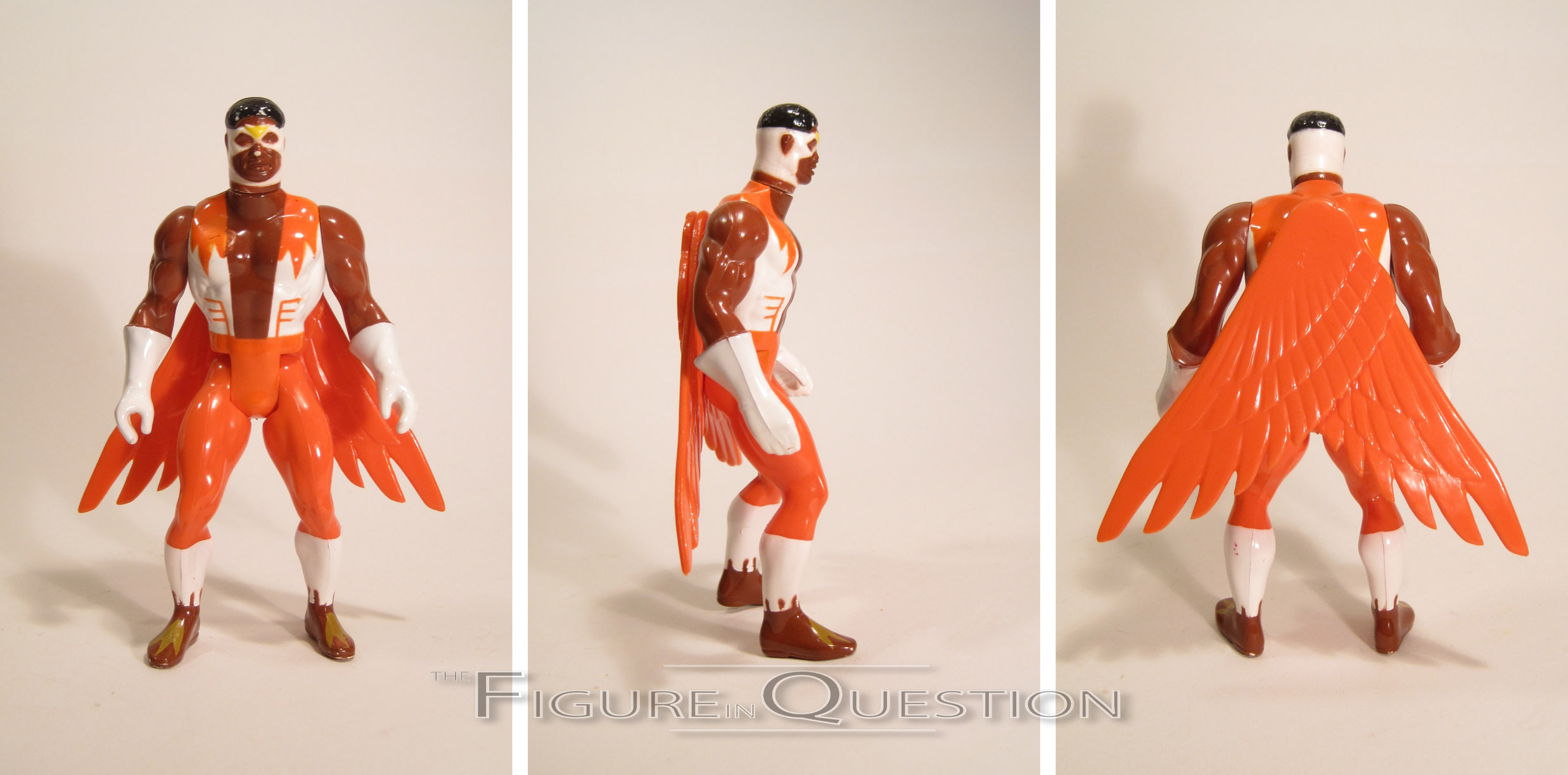
Falcon was released in the second series of Marvel Super Heroes: Secret Wars, alongside the previously reviewed Daredevil, Black Costume Spider-Man, and Baron Zemo.  As with DD and Zemo, Falcon is another character in the line who wasn’t present in the maxi-series at all.  Not sure why they went with so many non-series stars, but if it gets me a Falcon figure, I won’t complain.  The figure stands about 4 1/2 inches tall and has 7 points of articulation, counting the wings.  He’s built on the same basic body as most of the line, at least for the torso and legs, anyway.  His arms are from Captain America, and his head was an all-new sculpt.  The head is sort of iffy.  I think part of the problem is that he’s the only Secret Wars figure to incorporate hair, and Mattel clearly wasn’t up to hair in terms of sculpting prowess.  He’s also rather wide, and somewhat nondescript.  The standard torso’s been tweaked slightly to allow for the attachment of his wings.  The wings don’t really follow the usual layout for Falcon; his wings have classically been attached to his arms, but these are purely attached to his back, sticking straight out like Angel or Hawkman’s wings.  I find it doesn’t look as cool as his traditional look, but doing them the right way wouldn’t have really been possible given the constraints of the base body.  The paint on Falcon is about on par with the rest of the line, which is to say it’s passable, but far from stellar.  The colors sort of run together, I find, and for whatever reason his shoes are the same color as his skin.  He’s also missing any detailing on the eyes, which comes across as incredibly cheap and lazy in my opinion.  Also, like all of the other figures I’ve looked at, this guy’s exhibiting some rather noticeable paint wear, a symptom of the lower quality paint that was used.  The worst of it’s the missing spot on the nose, which is a little frustrating, but far from horrible.  He was originally packed with his sidekick Redwing, as well as one of the goofy lenticular shields.  Mine has neither, but I can’t really say I’m hurting for either piece.

THE ME HALF OF THE EQUATION

Falcon is a figure that’s eluded me for quite some time.  Cosmic Comix got one in about a decade ago, which I wanted to get, but decided to come back for later.  Sadly, he was gone when I got back, and not long after I discovered that he’s actually one of the rarer releases from the line.  I was able to finally track him down, courtesy of Heywood Comics in Asheville, NC.  He’s not in perfect condition, but he’s decent enough that I’m happy with him.  The figure’s not one of Mattel’s stronger offerings, but I can’t say he’s out of place with this line.  He could be worse.

#1319: Joker

THE JOKER

DC UNIVERSE CLASSICS

“The Clown Prince of Crime is Batman’s deadliest and most unpredictable foe. Rumored to be a failed stand-up comedian turned petty criminal who fell into a vat of chemical waste while escaping from the scene of a crime – that incident turned his skin white and his hair green. Batman knows the Joker is certifiably insane, which makes the end result of his action  that much more deadly.”

A common complaint of DC Universe Classics was about its over-reliance on oddball, C and D-list characters that most of the general public hadn’t heard of, and the subsequent delaying of heavy hitter characters until too far into the line’s run.  Case in point: the Joker.  Batman’s greatest foe, and we had to wait more than a year to get him (made especially egregious by Harley Quinn’s presence in Series freaking 2).  Obviously, in a line like this, you want to hold some heavy hitters back, but 10 series seems like a bit much.  But, with the line wrapped and gone, at least he got a figure.  I’ll be looking at that figure today.

THE FIGURE ITSELF

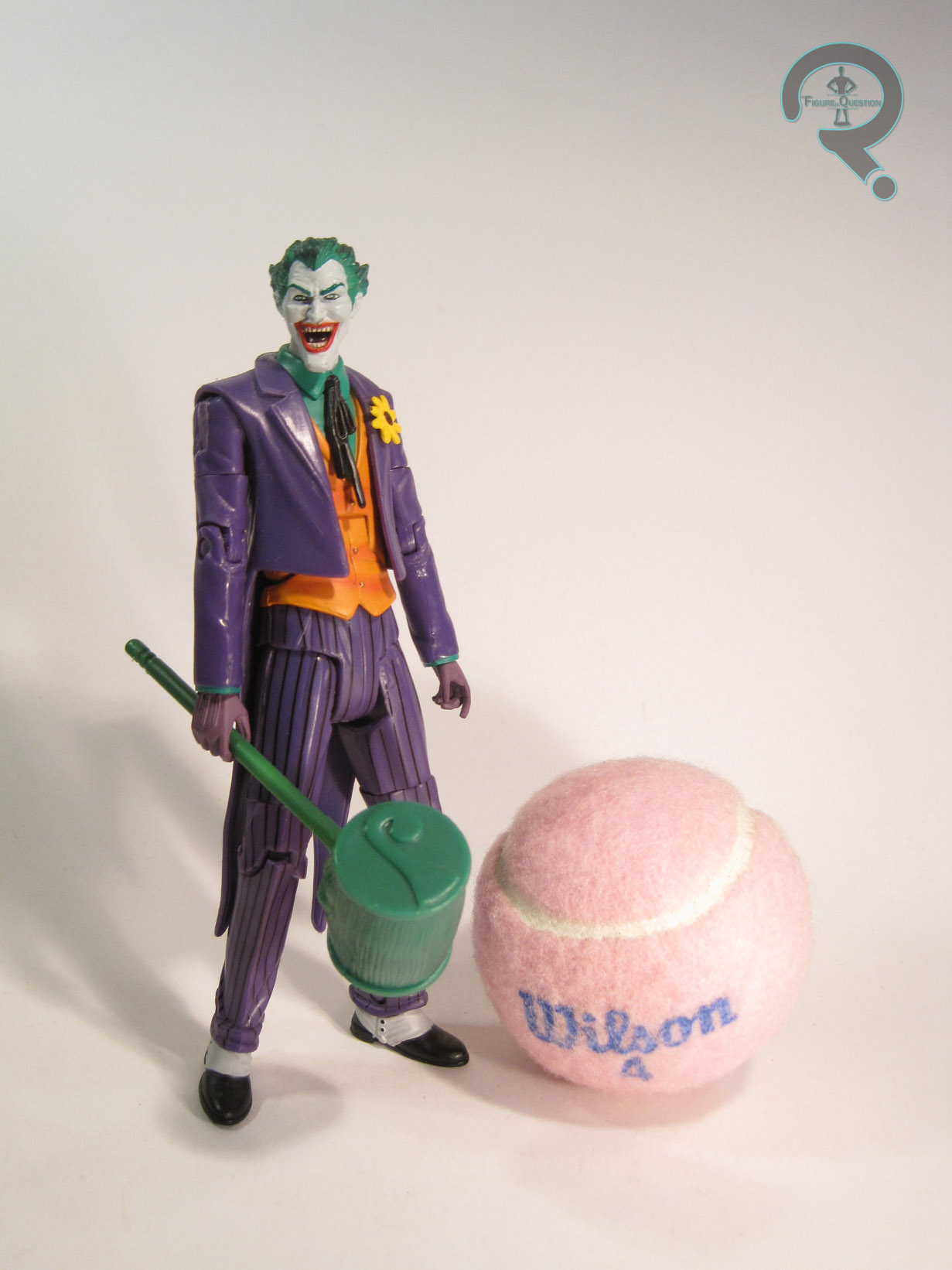
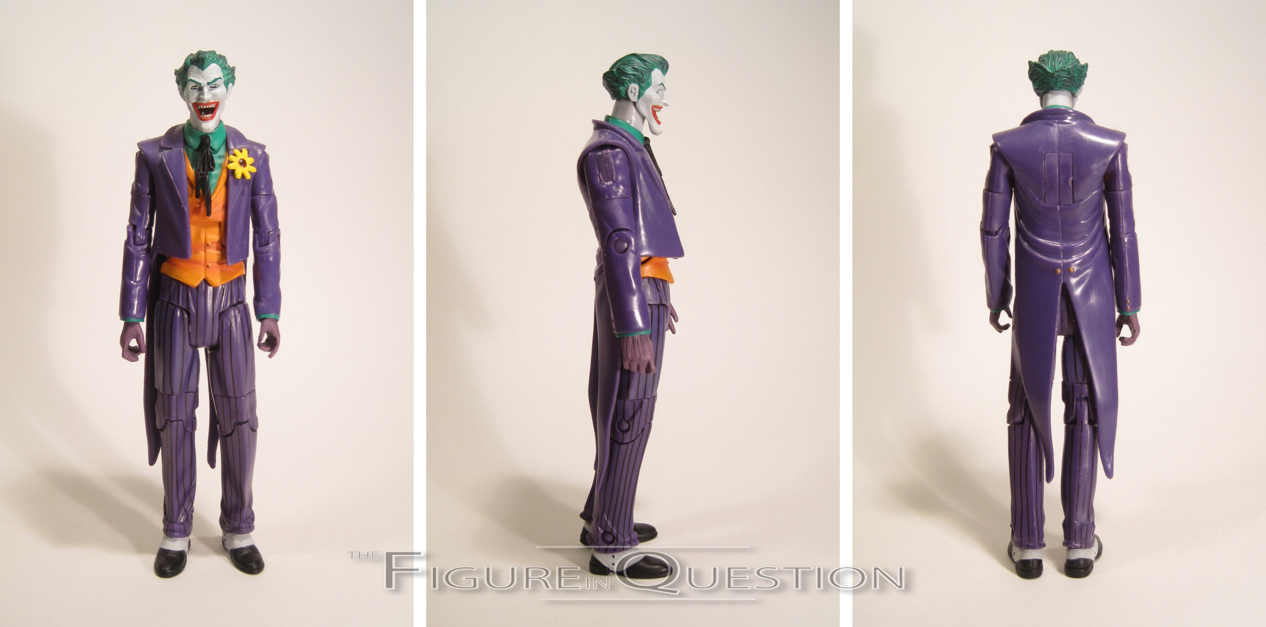
Joker was released in Series 10 of DC Universe Classics.  I’ve been reviewing a lot of this particular series lately.  Not for any particular reason, or anything; just luck of the draw I suppose.  As I’ve noted in prior reviews, the series was the line’s second Walmart-exclusive series.  While it was far less scarce than the first, it still seems a little odd that DC’s most recognizable villain was relegated to a store-exclusive release.  There’s a reason this guy has one of the heftier aftermarket prices in the line.  Anyway, the figure stands about 6 1/2 inches tall and he has 23 points of articulation.  Joker is seen here in an appearance that’s about as classic as he can get (specifically, he’s modeled after his Super Powers figure as this was really when the line was leaning hard into the recreation of Super Powers).  He’s built on the body that was introduced with Gentleman Ghost, which was designed with Joker in mind.  In that effect, the cut of the suit matches up pretty well with classic depictions of Joker.  The body showcases a lot of Mattel’s troubles with working articulation into a sculpt naturally.  It’s nowhere near as bad as some of their more recent work, but it’s definitely not the strongest showing from DCUC.  On the plus side, it’s not awful to look at, especially if you chose a decent pose.  He had a unique head and neck, which are definitely the star pieces of this figure.  He also has a tweaked jacket, which removes the cape from Gentleman Ghost and adds a flower to his lapel.  It’s an okay piece, but slightly marred by the weird panel in the back where the cape was originally attached.  Why does Mattel insist on attaching capes with that huge rectangular peg?  I don’t think I’ll ever know.  The paint work on the figure’s actually pretty good.  The colors are nice and bold, and there’s some really well-executed accenting, especially on the hair and the vest.  The pinstripes on the legs could probably stand to be a little straighter, but they look decent enough.  Joker was actually pretty well accessorized.  He includes a joker-head cane, some playing card, a laughing fish, and a large green mallet (deliberately pattered after the one included with the Super Powers figure).  They were all pretty solid extras, among the best in the line.  He also included the right leg of Imperiex, the Series’ CnC.

THE ME HALF OF THE EQUATION

Joker came from the same assortment of trips to Walmart with my Dad that netted me the previously reviewed Beast Boy.  I don’t recall the exact circumstances, but he was definitely a later find, since he was the most sought after initially.  He’s not one of my favorite DCUC figures, but that’s hardly because he’s bad.  He’s actually very well executed, apart from the slightly lackluster handling of the articulation.  For me, he just suffered from being “yet another Joker” in a series full of brand-new characters, but I suppose I’m a bit counter to most fans in that respect.

#1309: Beast Boy

BEAST BOY

DC UNIVERSE CLASSICS

“While traveling to Africa with his scientist parents, Garfield Logan fell victim to a deadly virus and was saved via an experimental treatment that tuned his skin and hair green, in addition to granting him the ability to transform into any animal he imagined. After his parents died in a boating accident, Gar was taken in by the Doom Patrol, a team of misfit heroes that helped him to master his powers.”

It’s kind of odd that his bio mentions the Doom Patrol, but not the Teen Titans.  I’m not complaining, just noting that that’s the way they went.  In regards to DC Universe Classics, I’ve looked at Negative Man, Elasti-Girl, and Robotman.  The only Doom Patrol member they released that I haven’t yet looked at is the aforementioned Beast Boy, adopted son of Elasti-Girl (but we don’t seem to talk about that anymore), and, more prominently, member of the New Teen Titans.

THE FIGURE ITSELF

Beast Boy hit in the Walmart-exclusive Series 10 of DC Universe Classics, alongside fellow Doom Patroller Robotman.  The figure stands about 5 1/2 inches tall and has 25 points of articulation.  The sizing on this guy is confusing to say the least.  He’s effectively wearing his costume from the Teen Titans cartoon, which was worked into the comics when Gar rejoined the Doom Patrol after “One Year Later.”  When Gar was wearing this costume in the comics, he was a full-grown adult, but this figure builds him on the small teen male body (introduced on the Series 3 Robin figure), as if he were just the version of BB from the cartoon.  This wouldn’t be a huge issue if the BB-specific parts weren’t clearly meant to be emulating the older Gar from the “One Year Later” storyline, and built with the proportions of an adult.  So, the end result is a Beast Boy that just sort of seems out of scale with just about everything.  I’m fine with Gar being a little smaller than the rest of the Patrol, but a full inch difference seems a little excessive, and he’s actually just flat-out in the wrong scale.  What’s really frustrating is that the actual sculpt really isn’t that bad.  He’s a pretty solid recreation of Gar from this period in the comics, and has a lot of nice little small details, such as the arm hair on his forearms, and even the really sharp work on his shoes.  The hair is a separate piece, which makes its contrast really sharp, and the ears even have the point they gained in later designs.  It’s clear a lot of effort went into this sculpt; he’s simply too small.  The figure’s paint is pretty solid, at least; the colors are a good match for both the comic and the cartoon, and everything is applied pretty cleanly.  There’s not a lot to mess up here, and Mattel succeeded in not messing it up.  Good for them.  Beast Boy included a green falcon (re-used from the MotUC line), meant to emulate his shape-shifting abilities, as well as the right arm of the series’ Collect-N-Connect, Imperiex.  Woo.

THE ME HALF OF THE EQUATION

Beast Boy is one of the earlier figures I got from this series.  Just after it started hitting Walmart, my dad and I had a few trips just checking our local stores, and he was one of the ones we found.  I’ve always liked Beast Boy, and at the time I was super pumped about getting the Doom Patrol as action figures.  I can acknowledge some of this figure’s merit, and I certainly don’t hate him, but he disappoints me greatly.  He’s kind of a perfect example of DCUC in a nutshell; great in theory, and in 95% of the execution, but there was just enough leeway for Mattel to find a way to screw him up.  They were so close, and yet still so far.

#1285: Water Patrol Woody

WATER PATROL WOODY

TOY STORY 2 (MATTEL)

As a action figure collector that grew up in the ‘90s, it was nigh impossible that I would run this site and not ever touch on Toy Story.  What’s a bit surprising is just how long it took for me to get here.  Moreover, I’m kind of starting at an odd point.  The toys for the first film in the franchise sort of came and went.  It was the ‘90s, so every movie was getting toys.  This one was no exception, obviously.  But, aside from some serious scarcity of a few choice items, it was a fairly standard line.  When it came time for the sequel, things got a little weirder.  Which is admittedly a bit of a surprise, since the first film hit in the mid ‘90s, when action figures were at probably their weirdest, while the second film hit in ’99, when things were cooling down.  The first film’s toys were done by the relatively unknown Thinkway Toys (who actually have the license again), but for the second movie, Disney partnered up with Mattel to secure Barbie for the film.  Part of the deal was that Mattel got to make the action figures.  They released some fairly straightforward versions of most of the main characters, but after the main movie stuff was mostly through, they launched a few sub-lines, showcasing non-film variants of the main characters.  I’ll be looking at one of the variants of Woody today.

THE FIGURE ITSELF

Water Patrol Woody was released in the “Aqua Action” sub-line of Mattel’s Toy Story 2 tie-in.  The figure stands about 6 1/2 inches tall and has…movement.  I don’t know that I’d classify the movement as “articulation.”  Thanks to the non-removable head dome, there’s no movement at the neck, and his arms and legs are just a rubber mold over a wire.  So, he’s posable in theory, I guess. The figure sports a totally made-up design, just like all the other figures in this particular series.  It’s supposed to be a dive suit, I guess.  I personally always thought it looked more like a space suit, but I guess there’s an old dive suit quality about it.  It’s not a bad design.  It keeps the important elements of Woody’s main design (the hat, belt/holster, and boots), but also crafts a pretty solid protective suit for him.  The head’s a little odd; Mattel’s Woody likeness was never quite as good as others, and the hat had to she shrunk to fit inside the helmet.  I personally would think it would make sense for him to lose the hat all together, but I’ve been told in the past that I’m not good with “brand identity” so what do I know?  At the end of the day, the head’s close enough that you should be able to pick up on who this is supposed to be.  It’s worth noting that despite being clearly engineered for water play, Woody’s helmet was far from air-tight; more than once, this figure ended up with a full helmet of water, followed by a day or two with a fogged up helmet while the condensation cleared.  It was rather frustrating to 8-year old me.  In terms of paint, this guy’s pretty decent from a technical standpoint, but I can’t help but feel that Mattel chose the dullest possible color scheme for him.  Ooooh, varying shades of brown.  Such fun!  Couldn’t we have at least gotten some of Woody’s regular colors worked in here and there?  A little blue and yellow would have gone a long way.  Woody’s one accessory was a “Quick Draw Squirter” which sounds a little bit…off.  I’m also not sure what constitutes it being “Quick Draw.”  He just stands on it.  Wait, it’s always out.  The quickest draw of them all!  That’s it!

THE ME HALF OF THE EQUATION

Water Patrol was a gift I got for my eighth birthday.  I’m not 100% sure who gave him to me, but if I had to guess, I’d say it was either my Nana or my cousin Rusty.  It feels like a “mom’s side of the family” gift.  While that was the year of me being largely obsessed with the then recent X-Men Movie figures, I know that Woody was a figure I had specifically requested.  I was on a Buzz Lightyear of Star Command kick at the time, and I wanted this Woody figure because he looked like he was in a space suit, and therefore made sense with all of my Star Command figures.  Even as a kid, I didn’t really buy him as a Water figure.  He’s not the most exciting figure of all time, but he amused me as a kid, and that’s the most important thing, really. 

#1258: Robotman

ROBOTMAN

DC UNIVERSE CLASSICS (MATTEL)

Wasn’t I just talking about DC Universe Classics a few days ago?  Okay, technically it was only in passing, since Catwoman was actually from one of the spin-off lines.  The main line is particularly noteworthy due to just how deep into the DC Universe it went (something that may have contributed to its downfall in the end, unfortunately).  One of my personal favorite subsets from the line was the Doom Patrol, who are one of my favorite DC teams.  I’ve looked at Negative Man and Elasti-Girl, but now it’s time for me to take a look at the team’s final founding (and most consistently present) member, Cliff Steele, better known as Robotman!

THE FIGURE ITSELF

Robotman was released in Series 10 of DC Universe Classics, which was the second Walmart-exclusive series in the line.  He was the first member of the Doom Patrol to be released, which was rather sensible, as he’s probably the most popular of the main three.  The figure stands about 6 1/2 inches tall and he has 23 points of articulation.  There are a few different Robotman looks to choose from, but Mattel went for his classic ‘60s design.  It’s definitely a wise choice; it’s easily his best design, and it’s one he’s returned to a number of times over the years.  Cliff is built on the medium male body, with his own unique head, hands, and upper torso.  The new pieces all fit pretty seamlessly with the pre-existing stuff, and it all does a really great job of capturing Cliff’s retro-sci-fi design.  The head is a pretty decent piece; it’s not quite as streamlined as Cliff frequently was in his classic appearances, but it’s a pretty close match.  That slightly less streamlined appearance is also there due to the removable scalp, which allows us a view at Cliff’s brain.  It’s a pretty fun little touch, which takes this figure from average to awesome.  The upper those isn’t too far removed from the basic piece, but adds a few of Cliff’s extra robotic bits, as well as the video monitor that allowed the Chief to keep in contact with the team when they were on missions.  Also, since the upper torso includes the ridges above each shoulder, some of the shoulder’s size is masked, thus remedying what I find to be the weakest aspect of the basic DCUC body.  Cliff’s paintwork is some of the cleanest DCUC had to offer.  In the comics, he was always just orange, but here he’s more of a copper sort of color, which looks really slick in person.  The black shorts preserve his robot modesty (and also break up the colors a little bit), and there’s some really sharp detailing on the monitor.  The straps for the monitor are a little rough around the edges, but not horribly so.  Robotman’s only extra was the torso of the series Collect-N-Connect figure Imperiex.  It would have been kind of cool to maybe get an extra robotic Chief head from when he replaced Cliff on one of the missions, since poor Niles was never going to get his own figure.  But, that’s honestly pretty issue-specific, and probably a bit much for a character that was already lucky just to be getting a figure at all.

THE ME HALF OF THE EQUATION

I found most of Series 10 at retail when it was released, but I never had any luck with Robotman.  It was made worse by the fact that I really needed to find a pair of them, since my Dad’s a huge Doom Patrol fan too.  Fortunately, my good friends at All Time Toys came through for me, and I was able to find two Cliff figures for a reasonable price.  Robotman is a great example of the sort of awesome stuff this line could do when they actually put in the effort.  He’s a lower tier character with exceptional execution, and just a really fun figure all around.  As much as I rag on Mattel, this guy is really one of my favorites, and the whole Doom Patrol set is just really fantastic.

#1254: Catwoman

CATWOMAN

BATMAN: LEGACY (MATTEL)

Okay, I’ve really been ragging on Mattel recently.  While they’ve probably earned it, I still like to at least attempt to be even handed with my reviews here.  And, for a while there, Mattel was actually my favorite toy company.    I know, that seems like blasphemy, but when they were really in the swing of things with DC Universe Classics, they were kind of my jam.  As with Toy Biz on Marvel Legends, it’s not a line that’s aged super well, but they were top-notch at the time.  The line was even successful enough to get a few off-shoots, including Batman: Legacy, which gave us a few of the Caped Crusader’s allies and foes, all in that DCUC style.  Today, I’ll be looking at that line’s Catwoman figure.

THE FIGURE ITSELF

Catwoman was released in the third and final series of Batman: Legacy.  While the first two series each offered a Batman and two supporting players, for some reason Series 3 only gave us Selina and 1st Appearance Batman.  Catwoman was officially dubbed a Golden Age figure, and is seen here in what most would consider her “classic” costume.  It was her first official costume (though it showed up seven years after her first appearance), worn until well into the ‘60s, and it even made a brief comeback in the ‘80s, which means it also works for the silver/bronze age incarnation of the character as well.  The point is, it was one of her longer-lived looks, and it was a pretty solid choice.  The figure stands about 6 inches tall and has 23 points of articulation.  Due to the long hair, the cape, and the skirt, her movement’s rather restricted, but you can still manage to get a few decent poses out of her.  Structurally, she’s built on Mattel’s second attempt at the female base body.  It was definitely a marked improvement over their first one (seen on Katma Tui), and is about on par with he base male body.  It looks more or less like an actual human, which I suppose is pretty good.  She got her own unique head, lower arms, and hands, and made use of Donna Troy’s boots.  She also had a new add-on for her cape, and re-used the skirt piece from Raven.  She was just stealing all of the Teen Titans’ stuff.  Which is probably in character, when you get down to it.  Clever move Mattel.  The new pieces all matched up pretty well with the pre-existing parts, which is good, and they add-up to a nice recreation of the classic Catwoman appearance.  The head is one of the stronger ones from this era, although I really do wish she’d gotten maybe a more sly facial expression.  She looks a little bit dead inside as it is.  As far as the paint goes, this figure’s pretty solid.  An argument could probably be made for he being a tad less magenta, but she doesn’t look awful in that respect.  The base application is all pretty cleanly applied, and there’s even some halfway decent accent work on the face and the skirt.  Catwoman’s only extra was a display stand, which was the same one included with all of the Legacy figures.  It had a label with her name on it, which I guess was nice.  The fact that she didn’t include her whip seems a bit silly, since Mattel already had one on hand from the last Catwoman and this one’s right hand is very clearly sculpted to be gripping that piece.  I feel that would have been a more exciting extra than the stand.

THE ME HALF OF THE EQUATION

After skipping the entirety of Series 1, and then grabbing all of the figures in Series 2, I decided to split the difference on Series 3 and just get Catwoman.  Of course, that may have been slightly motivated by the fact that Batman: Legacy Series 3 were the first figures to hit the $20 mark at retail, which killed my buying buzz a bit.  Still, I was pretty pumped when I found this figure on the pegs at my local Target.  She’s not perfect, but I do think she’s faired a bit better over the years than some of her compatriots.  This was kind of the last hurrah for Mattel’s DC stuff when you get down to it, which is sort of sad.

#1251: Kilowog

KILOWOG

GREEN LANTERN: MOVIE (MATTEL)

You know how I rag on Mattel a lot, but sometimes they still do things right, and I can give them props?  This isn’t one of those times.

2011’s Green Lantern isn’t a particularly well-regarded film.  In a lot of ways, I don’t think it deserves a lot of the hate it gets.  It had the misfortune of being released in a summer already pretty jam-packed with super hero movies, three of which hailed from Marvel and were generally above expectations.  Marvel fans wanted another Iron Man (which, in their defense, is what DC was promoting the film as; not their smartest move) and DC fan’s wanted The Dark Knight.  The end result is really more in line with Tim Burton’s Batman movies.  It definitely could have been better, but it was far from awful.  One of the movie’s better aspects was its cast.  The late Michael Clarke Duncan made his second turn in super hero flick (his first being the similarly maligned Daredevil; I ain’t defending that one!), playing the GL drill sergeant Kilowog.  He got a few figures courtesy of Mattel’s tie-in line.  I’ll be looking at the standard version today.

THE FIGURE ITSELF

Kilowog was released in the first series of Green Lantern figures, which hit about a month or so before the movie’s release.  The figure stands about 4 1/2 inches tall and has 8 points of articulation.  The articulation scheme on these figures was really strange; it’s not totally out of the ordinary to see lesser articulated figures in the 3 3/4-inch scale, but these figures randomly had extra shoulder joints, which tend to come after elbows and knees in the articulation hierarchy.  Also, while Hasbro’s started offering more lower POA figures as of late, their competing figures from 2011’s Thor and Captain America lines were fully articulated.  Heck, even Mattel’s own DC Infinite Heroes line was fairly decently articulation.  I’m not really sure why these figures were so out of sync with everything around them.  I’m getting distracted.  Sorry.  Kilowog had a unique sculpt initially, but it would eventually be reused for a number of variants as the line progressed.  It’s a reasonable translation of Kilowog’s movie design.  Of course, the problem with that is that his movie design wasn’t really their strongest.  I mean, it’s nice that he didn’t have the same muscle striation thing that Hal did, but he’s just for of lumpy looking.  Also, they seriously tweaked the shape of his head, which always bugged me; he looks more like Shrek than Kilowog.  Objectively speaking, the head on this figure was definitely the best part.  It’s actually so detailed that it looks rather out of place on the smooth and mostly featureless body.  They almost look like they belong to different figures.  Also, note that once again Mattel has made no attempt to work the articulation into the sculpt.  It’s especially bad at the waist, where there’s really no good reason to have a joint that obvious.  Like many of this line’s figures, Kilowog’s feet are bent back a little too far, which results in a lot of falling on his back.  Getting the two photos for this review was no small feat.  As far as paint, Kilowog was okay, but suffers from a very similar issue as with the sculpt.  The head has some very nice, very subtle work, which makes him look really lifelike.  Then the body seems to just let the paint go where it goes.  One thing that really frustrated me with this whole line was the inconsistency of the greens.  Pretty much ever lantern had their own shade, which was really odd, since that wasn’t true onscreen.  Was it really that hard to pick on pantone number and stick with it?  Each figure in the line included their own construct piece to slip over their ring hand.  Kilowog actually didn’t get a proper construct, but instead got the larger hand adapter piece, which allowed for him (and other larger figures) to make use of the constructs included with smaller figures.

THE ME HALF OF THE EQUATION

I picked up a handful of the GL movie figures when they were first released, during my pre-movie excitement, and Kilowog was one of those figures.  No figure in this line is particularly noteworthy, but Kilowog was probably the best the line had to offer.  He’s got his issues, but he’s also got some saving graces, which is more than can be said about a lot of the line.

Flashback Figure Friday #0008: Robin

Hey, look at that, I missed another Friday.  Last week was pretty jam-packed, and I barely had the time to right Friday’s main review, much less a second feature.  Nevertheless, I apologize to all of you who were expecting one of these last week!

This week’s Flashback Friday Figure Addendum is actually less an addendum, and more me going back and finally writing a proper review for #0166: Robin.  Why?  You’ll see in a second.

Okay guys and gals, hang on tight. The site is about to go off! No, not like “off” off. It’s still gonna be here. It’s going off in a metaphorical sense, because today, we’ll be looking at one of the greatest entries into the world of action figures ever.

This figure hails from the very first Batman line released once Mattel had picked up the DC license. I know I’ve been hard on Mattel in the past, but it’s only because I’ve been trying to hold them to the standards they set for themselves so early into their run. You see, this Batman line was important, but not for the ways you think. Oh, sure the Batmen were cool and all (especially those sweet neon colored gun-toting variants!), but the real star of this line was Robin! So, let’s have a look at the greatest toy to ever grace shelves!

THE FIGURE ITSELF

Robin was the flagship figure of the first series of Batman. He was the real heavy hitter of the wave, there so that Mattel could take chances on the Joker and Martial Arts Batman. He stands about 5 inches tall, and has 10 points of articulation, which may seem like a low number, but they had to take that awesome sculpt into account. Speaking of that awesome sculpt: has Robin ever looked this cool before? I mean, they really out did themselves. I’ve always found that a bad head sculpt can ruin a great figure. In this case, Mattel has wisely chosen to leave off the head so as to avoid any potential issue. This is the first time I’ve ever truly believed that Robin could make people think he’s anyone other than Tim Drake. I mean, Tim Drake has a head and Robin doesn’t. Can’t be the same guy! I’d also love to commend Mattel on the body sculpt, which perfectly captures Robin’s physique. I mean, those muscles are so realistic! And the torso’s straight posture coupled with the relaxed muscles everywhere else? Perfection. I’m heartbroken to say that I lost the accessories included with Robin. He had his ever present Blade-Shield thingy with his logo on it, which was such an important staple of the character at the time. It even launched discs! Who doesn’t need one of those?

THE ME HALF OF THE EQUATION

I knew as soon as I saw the prototype pictures of this figure back in 2003 that it was going to be the figure to own. So, naturally, I spent all my time searching for this figure at every nearby store, day and night. Eventually I found one, and after sucker punching a four year old and his grandmother to get it, finally the figure was in my possession!

Yeah, so this was my first April Fool’s Day post.  It’s almost quaint, isn’t it?  This review was more a joke thing than anything.  Now a days, I’d have written the review both ways, but the figure was quite incomplete at the time.  Since I finally found this guy’s freaking head, I guess I can actually review him now!

The figure, officially titled “Battle Board Robin,” was released in the first series of Mattel’s 2003 Batman line.  Robin stands about 6 inches tall and has 11 points of articulation.  The main hook of this line at the time was that they’d brought in the Four Horsemen (who had just helped Mattel relaunch Masters of the Universe) to sculpt most of the figures, including the Bat-variants.  There was one exception to this in the first series.  Care to guess who it was?  Yep, it was this here Robin figure, which was handled by Mattel’s in-house team.  In their defense, it’s actually a decent enough sculpt.  It doesn’t look quite as good as the  prototype did, but what figure does?  His muscles are sort of impossible, and I’ve always disliked how stiff he was, bit there are some nice things about the sculpt.  The boots in particular look pretty solid.  But how about that head that I finally found after all these years?  Well, full disclosure: the reason it was missing when I found him was because I had fully intended to replace it with another one.  Unfortunately, I wasn’t particularly good at sculpting at 12, so the replacement I made wasn’t much better.  Ultimately, this one’s okay, but not my favorite Robin head.  I think it’s got a lot to do with the hair, which just doesn’t really look like anything Tim ever sported.  Also, still missing from the figure is his cape.  It was just two pieces of fabric glued together, and was too thick and short to actually hang realistically.  It’s kind of exhibit A of why I prefer capes to be sculpted.  In terms of paint, this figure was fairly basic colors.  For some reason the gloves are black.  Don’t know why, never did.  The accents on the muscles and some of the other sculpted work actually weren’t standard to the figure; I added them around the time that I tried replacing the head.  I really wanted to salvage this figure for some reason.  His only accessory was his titular Battle Board, which was really just a disc launcher than he could also stand on.  It was an odd choice.

There’s actually not a particularly exciting figure regarding the acquisition of this figure.  He, Joker, and the basic (Zipline) Batman were all really hard to find when these figures started hitting stores.  I eventually found him at the KB Toys near where my family vacationed (I got him alongside some Star Trek: Nemesis figures.  Oh what a joyous day that was).  He’s not awful, but he’s also not super great.  The saddest thing is that Mattel never actually returned to this design for Robin (apart from an inaccurate repaint of the later DCUC figure), so this is the best there is from them.