PIRATE TWO-FACE & PIRATE BATMAN
LEGENDS OF BATMAN (KENNER)

Remember when I reviewed Buccaneer Batman, the inexplicable pirate-themed Batman variant from super wacky ‘90s Legends of Batman line? Well, he wasn’t the only inexplicable pirate-themed variant in the line. Not by a long shot! Today, I’m looking at the *other* pirate-themed Batman from the line, dubbed “Pirate Batman” (real original on that one, guys), alongside one of his pirate-themed foes, Pirate Two-Face (again, great job on the name, guys…). Let’s have a look!
THE FIGURES THEMSELVES
Pirate Two-Face and Pirate Batman were released in 1996 as one of the two two-packs from Kenner’s Legends of Batman. These two wrapped up the Pirate subset that was started in Series 3 of the main line.
TWO-FACE
 “After a tragic accident left half his body hideously scarred and half his mind horribly insane, the once promising ship’s captain Pirate Two-Face sailed the seven seas as the most ruthless pirate leader in the annals of history. Upon boarding captured ships laden with treasures, Pirate Two-Face would decide the fate of the crew and passengers with the flip of a coin. His unpredictability, unchecked greed, and sword fighting skills could be challenged by just one man, Pirate Batman, who he eluded at every port of call.”
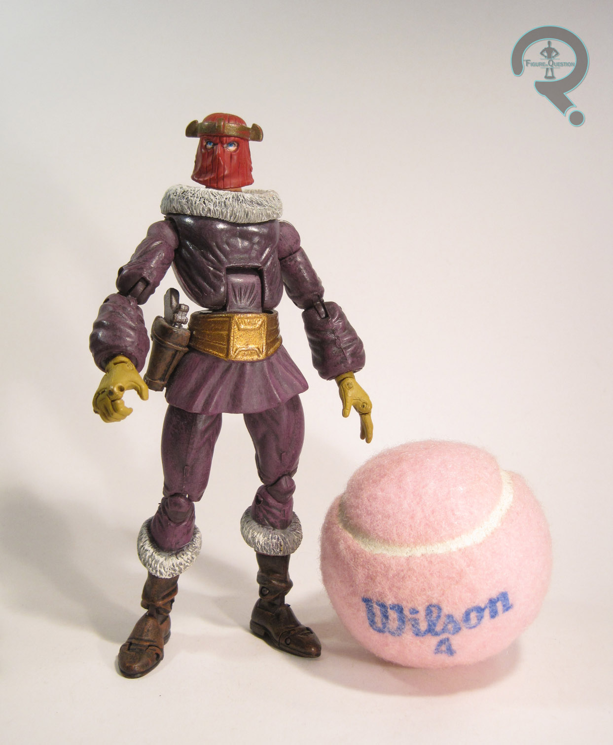
So, in this pirate scenario, Two-Face is more or less unchanged, it seems. Mostly, they just threw the word “pirate” in there a lot. Fair enough. It’s worth noting that this was Two-Face’s only figure in this line; Joker, Catwoman, and Riddler all had standard comic figures, but Harvey was stuck as a pirate all the time. I mean, at least he got a figure at all, right? The figure stands about 5 inches tall and he has 7 points of articulation. Pirate Two-Face was a unique sculpt, and it’s actually a pretty solid one. His design plays up the “good vs evil” dichotomy, but in true pirate style. Rather than his usual suit, Pirate Two-Face is half naval officer, half dastardly pirate captain. His naval officer side is clean and pressed while the pirate side is disheveled and wrinkled like crazy. His collar on the pirate side is even slightly popped, before settling back down on the “good” side. The pirate side gets the usual facial scarring (which is surprisingly gruesome for a kid’s toyline), and he also seems to have lost an arm and a leg along the way, replacing them with a peg-leg and some sort of swiss army knife-sword-hook combo replacing them. As a whole, he really sells the pirate angle pretty well, while still sticking close to the Two-Face side of things as well. For paint, Pirate Two-Face is generally pretty good for the time; his colors are obviously split down the middle, with blue on the right and red on the left. The changeover works pretty well, though there’s a bit of slop right on the line, where some of the primer coat under the red shows through. Most annoyingly, the paint for his belt doesn’t continue all the way around, so it’s just flat blue and red back there. It looks kind of sloppy. Pirate Two-Face included no accessories, which is slightly odd, since his hand seems to be begging for something to hold. He does have a “sword-fighting action”; when you turn the wheel in his back, his sword hand spins. Woooooooooo!

BATMAN
 “Taking it upon himself to make the world’s waterways safe from marauding bands and looters, Pirate Batman relentlessly scoured the seas in pursuit of the most villainous of them all—Pirate Two-Face. Armed with a razor sharp sword and dagger, Pirate Batman was renowned for his extraordinary dueling ability and courage in the face of danger. He ceaselessly hunted his evil foe with the split-personality, hoping to rid the seas of his maniacal menace once and for all!”
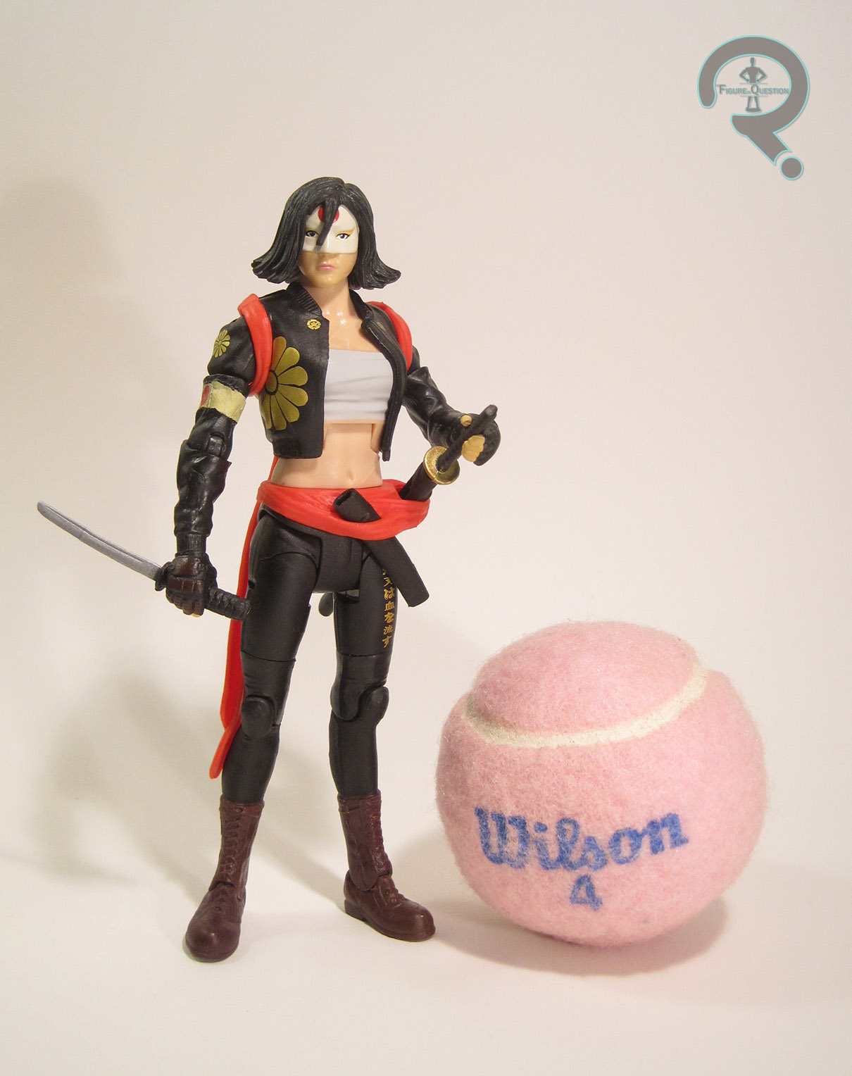
There was already a Buccaneer Batman in Series 3 of Legends of Batman, but I guess Kenner felt a second one was needed to be made. The bios for the two indicate they actually might be two different people, which is a somewhat interesting idea. The figure stands about 4 1/2 inches tall and has 6 points of articulation. Of course, one of those points is on his right shoulder, which does jack-all in terms of posing, thanks to the outstretched arm. The figure is actually a complete re-hash of Series 1’s Power Guardian Batman. Admittedly, the Zorro stylings of that figure lend themselves to a pirate-theme as well, so it’s not a terrible re-use in theory. Unfortunately, it wasn’t one of the stronger sculpts when it was new, and two years later, it felt even more out of place with the rest of the line, especially the pirate subset it belonged to. He’s more pre-posed than even the worst of the Total Justice figures, in this really deep lunge. Remember when I said Buccaneer Batman had the widest stance I’d seen? Well, this guy’s topped him on that, which has the added bonus of making him virtually impossible to keep standing. Also, I’m not really sure what’s going on with the left arm; it’s just at an odd angle, and the hand’s doing…something. Not really sure what. And it’s at least half an inch too long and isn’t attached to the shoulder in a natural way at all. In general, the proportions are just super wacky on this guy. The cape is a removable piece, and while it looks okay, it never really seems to sit right and it falls off a lot. Pirate Batman’s paint is decent enough. His scheme is actually somewhat reminiscent of the “Gotham By Gaslight” design, albeit slightly bluer. I personally find this design to be a bit more exciting than the Power Guardian look, so I guess that’s a plus. The figure is packed with the sword and dagger mentioned in the bio (they’re the same pieces included with the PG version). He’s also got his own sword-fighting action, which works fairly similarly to Pirate Two-Face’s. Honestly, it’s probably the best thing about the figure.

THE ME HALF OF THE EQUATION
I don’t actually recall seeing this set when it was new. It wasn’t until years later that I even knew that it existed. When I dug out my Buccaneer Batman to write his review, my interest in completing the set was piqued. A few months back, while picking up Super Awesome Girlfriend’s comics, I noted that the store had this set in stock. Super Awesome Girlfriend, being who she is, insisted on getting them for me. Pirate Two-Face is pretty cool. Goofy, but cool. Pirate Batman is…well, he’s the other figure in the set. And that’s about it for him. He just feels really tacked on, and almost as if he’s from another line entirely. Still, the set’s more than worth it for Two-Face!