CYCLOPS
X-MEN: METALLIC MUTANTS (TOY BIZ)

I’ve discussed Toy Biz’s larger 10-inch-scaled Marvel figures in the past. Essentially, since Toy Biz did the prototypes for their successful 5-inch line as two-ups, they had an easy time re-using those sculpts for a line of slightly cheaper 10-inch figures (though, interestingly, the line was originally billed as a deluxe line of figures. It was only later, when they decided to focus more on building as many figures as they could out of a limited pool of parts that it became “cheap”). Toy Biz’s 10-inch X-Men line, like it’s smaller scale counterpart, was the most successful of the initial lines, even managing to get its own spin-off line, Metallic Mutants, where certain figures were re-released with metallic color schemes. Today, I’ll be looking at the Cyclops figure from that line.
THE FIGURE ITSELF
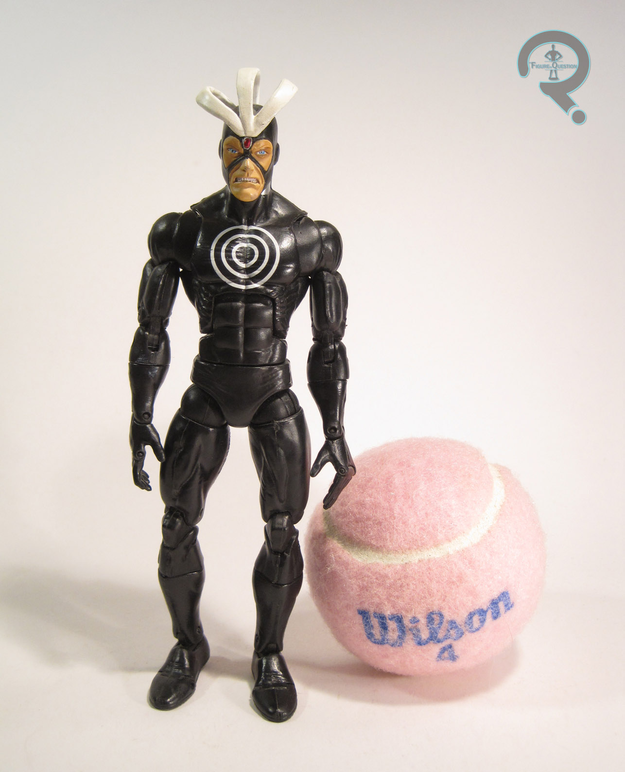
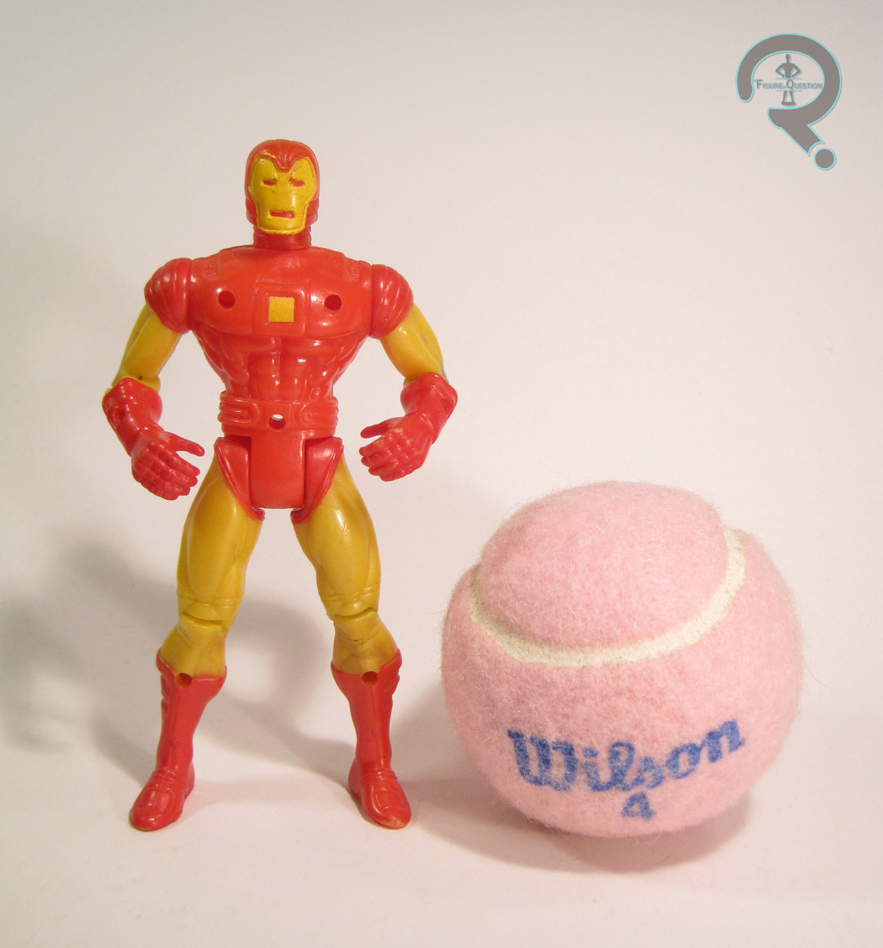
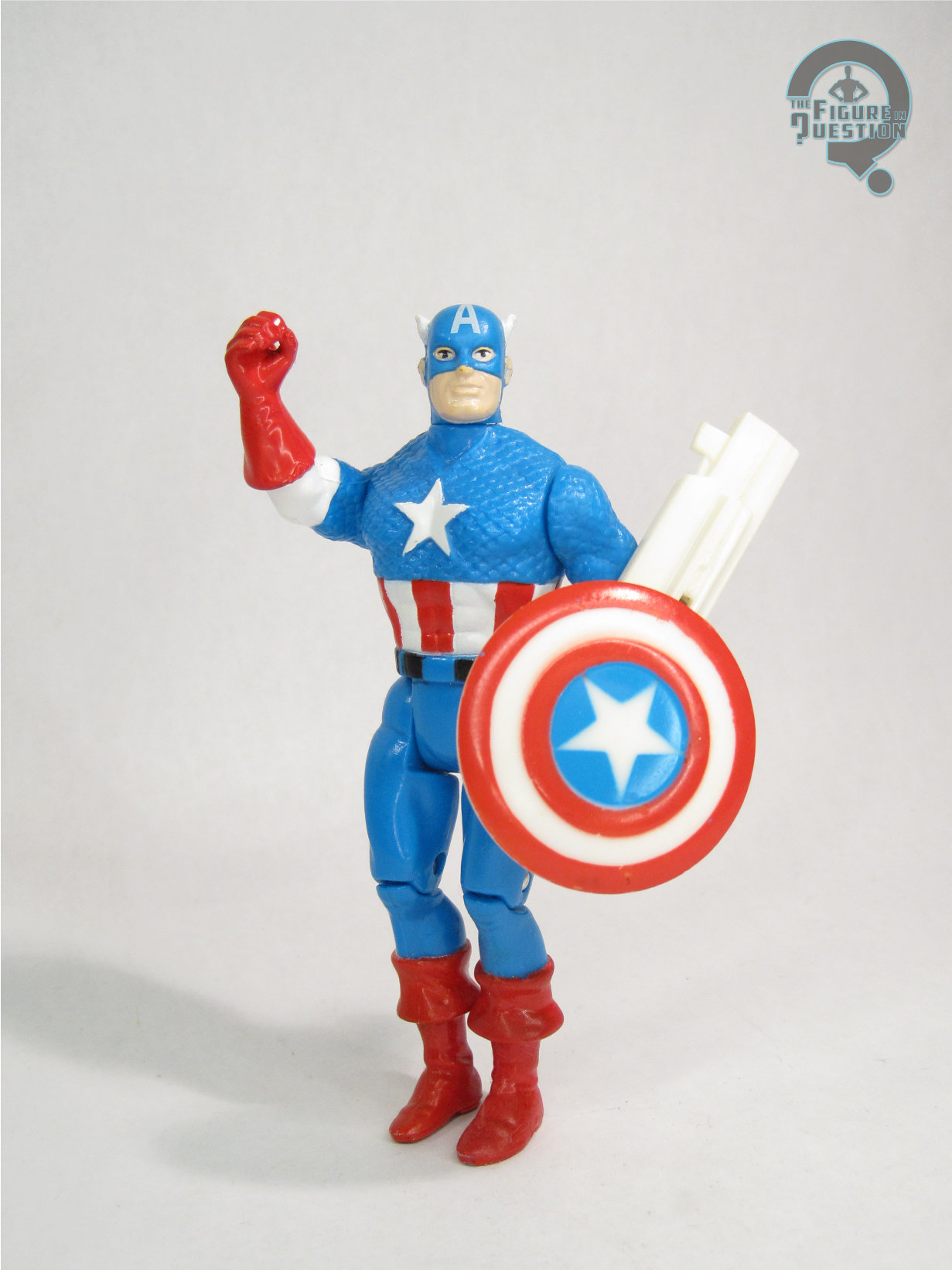
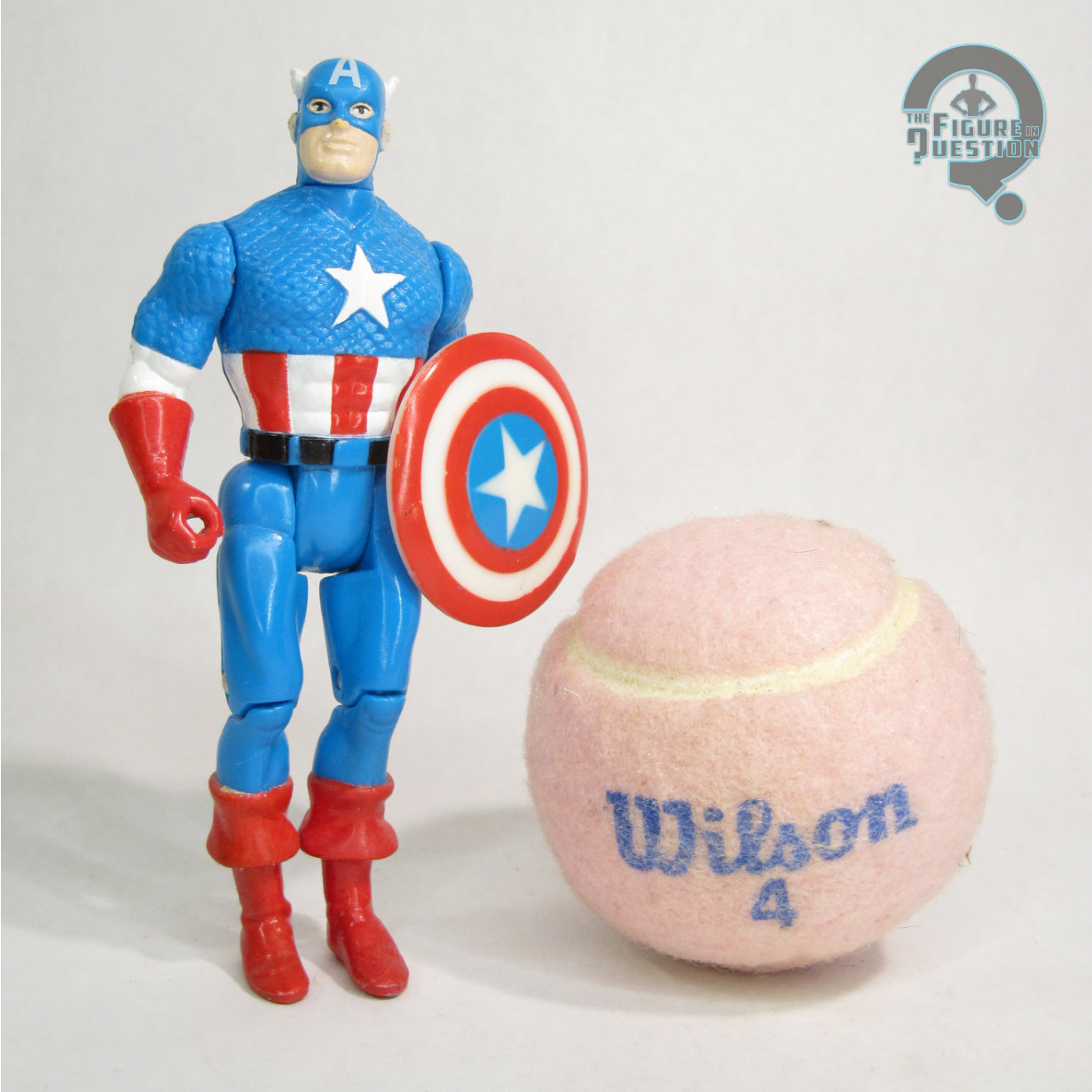
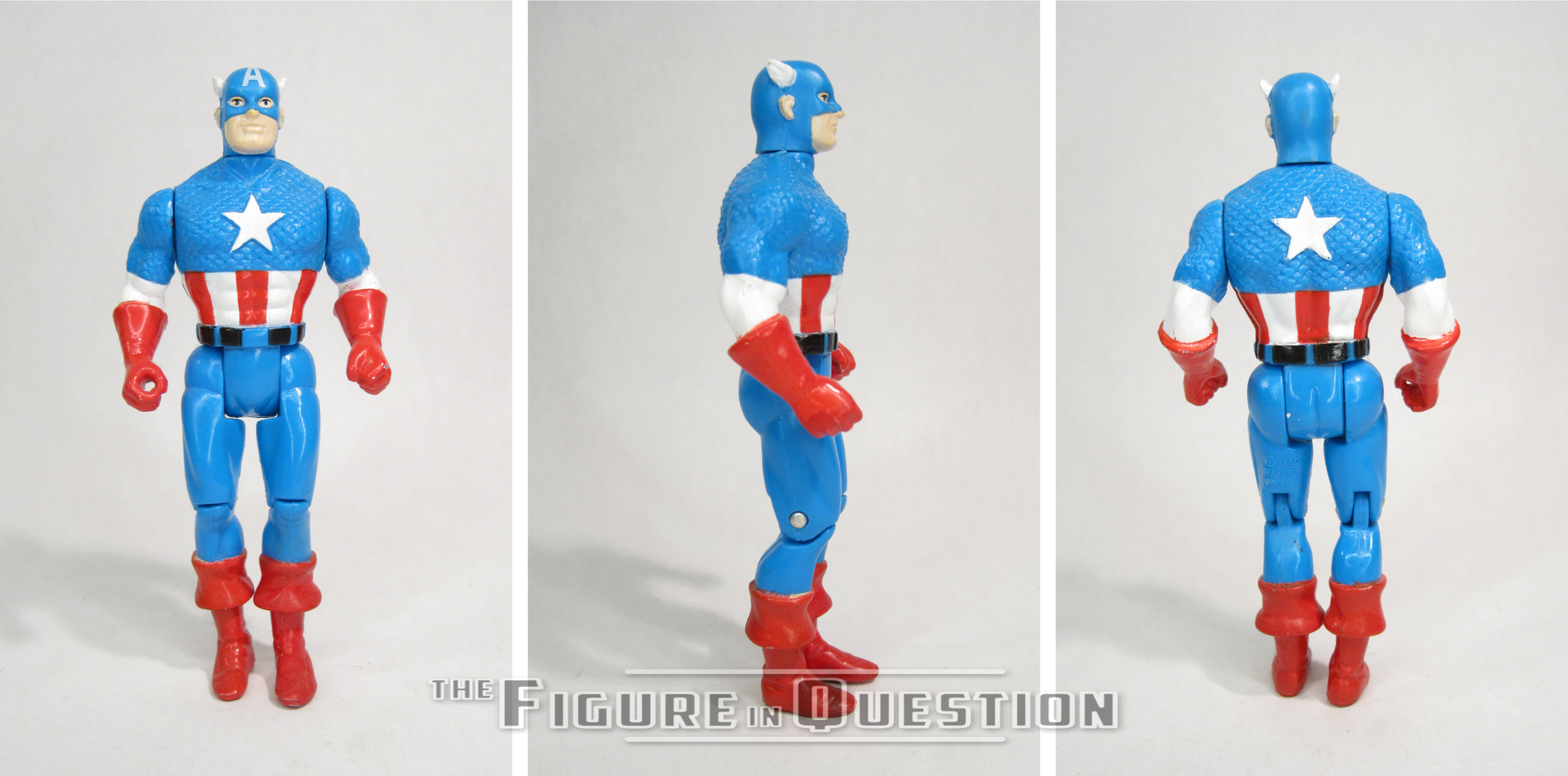
 Cyclops was from the first series of X-Men: Metallic Mutants. The whole Metallic Mutants line was available exclusively at KB Toys (who would also become the exclusive retailers of the entire 10-inch line a few years later). The figure is about 10 inches tall and he has 9 points of articulation, which was a whole extra point more than his 5-inch equivalent had. The figure is a straight repaint of the basic 10-inch Cyclops, who was himself patterned on the sculpt of Cyclops II from Toy Biz’s main X-Men line. The sculpt is a little bit different. He lacks the light-up feature of the smaller figure, which results in him getting the neck articulation the smaller figure lacked. Aside from that, the sculpt is pretty much the same. It’s okay for the time, but certainly isn’t one of Toy Biz’s stronger sculpts. Due to the light-up nature of the smaller figure, the torso was made a bit larger to house the battery compartment, and that’s still seen here. While the legs seem to match up okay with the larger torso, the arms and head feel rather under-sized by comparison, which makes him look rather odd overall. Each piece of him seems fine on its own, but as a whole he looks a bit patchwork. I will admit, there’s a certain quaintness to the sculpt that I appreciate, though. The big deal on the figure, of course was the paint. It’s certainly metallic, there’s no denying that. The costume looks cool in the metallic shades, but what sort of throws him off is the decision to do his skin and hair in the same gold as the “yellow” bits of the costume. Clearly, Toy Biz caught on to this being weird, since the second set of Metallic Mutants just had the metallic colors on the costumes, not the actual faces. Cyclops included a blaster thing, in the same gold as used on the body, which is cool I guess.
THE ME HALF OF THE EQUATION
As hokey as this guy is, I’ve actually always wanted one. Growing up, I had the little product booklet that came with the TB Galactus, which had these guys all pictured in it, and I always wanted Cyclops in particular. I ended up finally getting this guy for my birthday this summer from my parents, who bought him from 2nd Chance Toyz. Is he weird and goofy and strange? Yes. Do I love him? Emphatically yes.