MONDO
GENERATION X (TOYBIZ)

The 90s were a very strange time. I can’t say it enough. Amongst other things, Marvel’s merry mutants, the X-Men were really, really popular. That meant spin-offs out the wazoo. One such spin-off was Generation X. They weren’t “X-Treme” like X-Force, but they still had a very definite 90s flare to them. They were popular for a while, but the team eventually fell into some pretty serious obscurity. However, they managed to get more than one series of an action figure line, leading to a lot of figures that nowadays make people go “Who?” One such figure is team member Mondo. Yeah, I don’t really know him all that well either.
THE FIGURE ITSELF
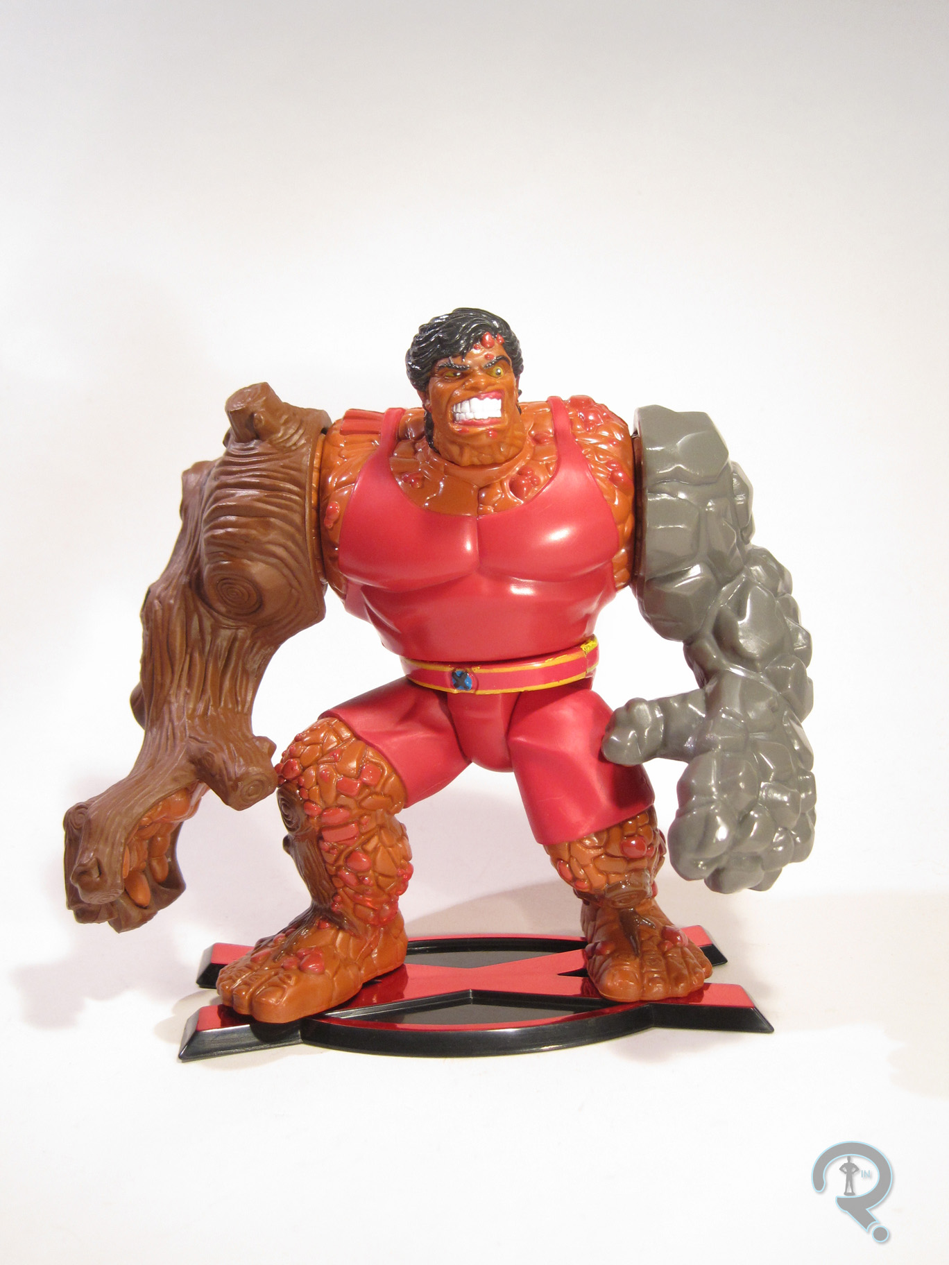
 Mondo was released in the second series of ToyBiz’s Generation X line. Mondo was the only actual team member in the series, making him the last released in the line (though a ToyFare exclusive version of Synch would be released not too long after. Who’s Synch? Exactly.) The figure stands about 5 inches tall and features a whole 6 points of articulation. Usually, ToyBiz’s Marvel stuff was pretty well articulated, but for whatever reason, the Generation X figures were less so. Mondo’s sculpt was also pretty pre-posed. His arms are somewhat spread at his sides and his legs are in a deep walking stance. Unlike a lot of pre-posed figures, Mondo is actually quite stable and well-balanced, so the lack of movement isn’t really too detrimental. The sculpt is actually pretty well handled; there’s plenty of texturing and detailing, and his proportions are in line with what he looked like in the comics. He’s definitely an angry spud, which seems a little out of character, at least going by the bio on the back of the package. The paintwork on Mondo isn’t super complex, but there are a few more minor details that are handled rather nicely. Plus, there’s not really any slop or bleed over, which is always cool. Mondo included a set of clip on armor pieces for his arms, which help to simulate his “omnimorph” abilities. The right side is meant to be wooden and the left is made of stone. Both clip on well enough, and are decently detailed (though the right is definitely a step above the stone). He also has the standard “X” stand, which was included with every figure in the line. He doesn’t need it, but hey, consistency isn’t bad!
THE ME HALF OF THE EQUATION
Mondo is another piece of the lot of figures I picked up from my local comicbook store during a recent sale. I only had a passing familiarity with Generation X growing up, so I never really got many of the figures. I saw Mondo sitting there and, for whatever reason, he called to me. He’s actually a pretty neat figure, truth be told. Sure, he’s not the most standout character of all time, but it’s clear a lot of effort went into this guy, and that always makes a figure better.