#0635: Cyclops & M. Bison

CYCLOPS & M. BISON

X-MEN VS STREET FIGHTER (TOYBIZ)

CyclopsBison1
The 90s were an interesting time to say the least. The X-Men were at the height of their popularity, which, of course, meant plenty of tie-in stuff. Capcom, makers of hit games series such as Mega Man and Street Fighter, licensed the team for a fighting game, called Children of the Atom. This ended up being a success, leading to Capcom pitting the X-Men against the cast of Street Fighter. ToyBiz already held the license for Marvel, so they picked up the Capcom license as well, allowing them to do their own tie-in two packs. One of these sets was X-Men leader Cyclops versus Street Fighter’s big bad M. Bison, which I’ll be looking at today.

THE FIGURES THEMSELVES

Cyclops and Bison were a two pack in ToyBiz’s X-Men vs Street Fighter line, released in the late 90s. I believe these two were part of the first assortment of packs.

CYCLOPS

CyclopsBison2
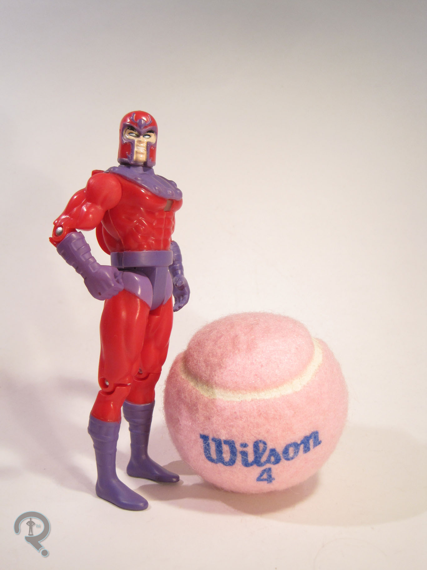
Cyclops is presented here in his fan-favorite 90s costume, designed by Jim Lee. It’s one of those looks that doesn’t make a whole lot of practical sense and could be considered a bit silly. That said, nostalgia is a powerful thing, so I can’t help but love it. The figure stands just over 5 inches tall and sports 8 points of articulation. That’s a little lower than the typical Marvel figure of the time, due to his lack of both elbow and knee joints. I can’t say why ToyBiz decided to leave those out, but he does at least have some extra shoulder articulation, which certainly eases the pain. Structurally, Cyclops makes use of the body of the Monster Armor Cyclops from the main X-Men line, along with a new head. The body is from towards the end of the X-Men line, when ToyBiz was trying to emulate the higher-detailed, more pre-posed figures being offered by McFarlane at the time. However, Cyclops had one of the tamer sculpts, so he doesn’t end up being too bad. The one real drawback of the original figure, the head, has been replaced CyclopsBison3
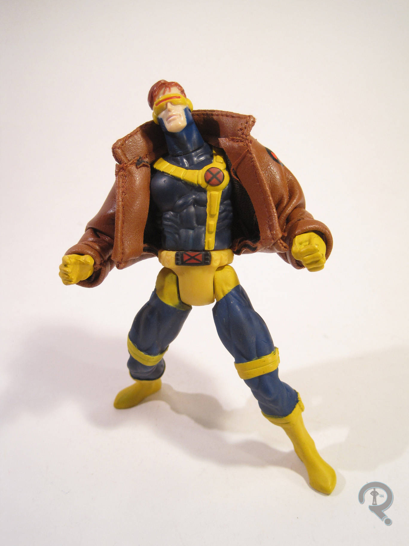
with a much nicer piece. This new head does a great job of capturing the animated style Cyclops from the cartoon; it’s simplistic, but all the necessary details are there. The paintwork isn’t the best ever, but it’s not terrible. There’s a bit of slop, especially around the yellow spots. Also, the hair and headband don’t quite meet up right, giving poor Cyke a bit of a bald spot. On the plus side, the blue is a darker shade than the Monster Armor figure, which is more true to the character design, and the plastic/paint is much more matte, which has an overall better look. Cyclops came packed with an optic blast piece (Which I don’t have) and a pleather jacket like the one he was known to wear from time to time in the 90s cartoon (mostly when Jean was crazy or presumed dead. It’s his brooding jacket.)
M. BISON

CyclopsBison4
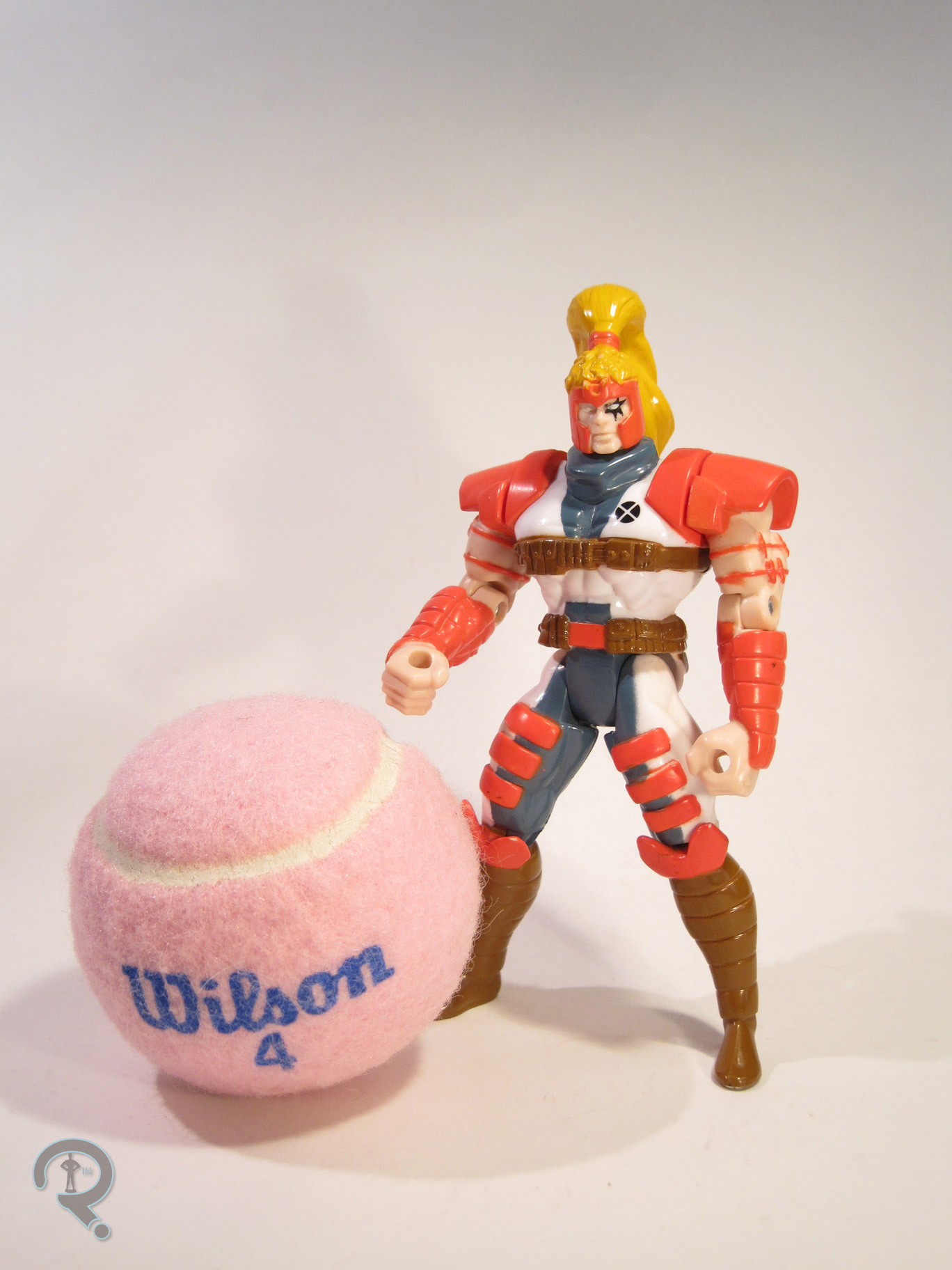
Ah, good ol’ M. What’s it stand for? Well, apparently it’s a shortening of Mister, which seems kinda dumb. In reality, Bison, Vega, and Balrog all swapped names when the game was imported to the US, mostly because Capcom wanted avoid the potential legal issues of having a boxer character whose name was Mike Bison. So the villain became M. Bison, with little explanation of what the M was exactly. Oh well. The figure is about 5 inches tall and has 10 points of articulation. He also has a punching action feature, which sort of gives him two more points of articulation. Bison is built on the Spider-Man line’s Tombstone body, with some additional armored pieces added on, as well as a new head. The body isn’t a perfect match for Bison, but it’s pretty good. The proportions are quite exaggerated, but it was the 90s, so that’s sort of to be expected. There are a few oddities, such as the hand clearly molded to hold something that he doesn’t include. The head is a little on the small side and a little light in the details. The hat is really nice, though. Paint is pretty rough here. Some areas make out okay; the red sections have a nice wash to bring out the details of the sculpt, and the armored parts are clean. The biggest issues are on the head. The hair apps are almost totally missing from one side, and the eyes are at best an approximation of what they should be. M. Bison originally included a cloth cape, but mine no longer has it.

THE ME HALF OF THE EQUATION

I first got this set many years ago, purchased from KB Toys while on a trip with my grandmother. I got it purely for the Cyclops, who was the most accurate version of the character available. I had no idea who this M. Bison guy was. I eventually found out, and became quite a fan of Street Fighter II, but Cyclops was still why I got these.  Somewhere in the last 15 years, Cyclops went missing (stupid house gremlins!) and Bison crumbled into pieces. I thought about replacing them, but this line picked up quite an aftermarket price, with this set being one of the highest. A few weeks ago, I came across this pair for a reasonable price and snagged them as fast as I could. Years later, Cyclops is still very much the star, but I’m happy to have them both again.

#0622: Tail-Whipping Nightcrawler

TAIL WHIPPING NIGHTCRAWLER

MARVEL MOTORIZED TWIST ‘EMS

NightcrawlerTwist1

Licensed toys can be weird. Sometimes, you get totally straight-forward action figure lines. They represent the property well, and they don’t really surprise anyone.  They are what they are. Of course, you might occasionally get the wacky variant here and there, just to keep main characters out there. But the line as a whole is still pretty standard. Occasionally, you get a whole line of figures that are just wacky from start to finish. Take, for instance, ToyBiz’s Marvel Motorized Twist ‘Ems, a short-lived little line of super-deformed figures from the early 2000s. At the time, ToyBiz was taking the “see what sticks” approach to toy making, trying a variety of things. Twist ‘Ems was just one of the things that didn’t take off. Still, that didn’t stop them from making two regular series and one movie-based series. They really tried. Let’s have a look at Nightcrawler, shall we?

THE FIGURE ITSELF

NightcrawlerTwist2Tail Whipping Nightcrawler was released in the Movie Series of Marvel Motorized Twist ‘Ems, as one of the two figures based on the recently released (at the time) X-Men 2. The figure is about three inches tall and, while his shoulders, hips, and neck all have “joints,” they aren’t really articulated, due to the motorized nature of the figure. They move pretty well when the wind-up feature is activated, but they’re not of much use for anything else. The sculpt takes the design of the character from X-Men 2 and “twists” it into a more super-deformed style. The body is where most of the styling kicks in, with short, stubby arms and legs, and larger hands and feet. In proportion, the head is really huge. In fact, the head is pretty much just a 1/6 scale sculpt of Alan Cumming as Nightcrawler. The head sculpt is really well done, with plenty of detail and an excellent likeness of Cumming. Were one to want a Hot Toys-style Nightcrawler, this sculpt would definitely be a good starting point. It’s a little weird to see this detailed a sculpt on a “cartoony” figure like this, but the details are fairly present throughout the rest of the figure, so it blends well enough. The body is subject to a little bit of intrusion from the wind-up mechanisms, but the tabs on the feet and the winding gear aren’t too obtrusive, just obviously present. The figure’s paintwork is generally pretty good. The colors all match up pretty well to the movie look, everything is applied pretty cleanly, and there’s plenty of small detail work that adds a lot of dimension to the figure. Some areas, such as the jacket, are a little bit on the more simple side, but it works pretty nicely. Nightcrawler doesn’t have any accessories, but he does have the wind-up feature. When wound up, his legs walk him forward, his arms move up and down, and his head goes side to side. Interestingly, despite the name, the tail doesn’t really move or whip.

THE ME HALF OF THE EQUATION

I didn’t entirely miss out on the Twist ‘Ems, but I didn’t get any of the movie ones. In fact, I had almost entirely forgotten about this goofy little line. While at a local Goodwill with Super Awesome Girlfriend (who was looking for some unrelated stuff) I found this little guy just sitting on a shelf, amongst a random collection of stuff. He was only a few dollars, so I figured he was worth it. Like I said, this is a goofy little line, and it’s a little difficult to figure out just who the target audience was meant to be. That said, you can tell a lot of effort was put into this guy, and he’s just a whole lot of fun. And check out this walk cycle!

#0617: Mondo

MONDO

GENERATION X (TOYBIZ)

Mondo1

The 90s were a very strange time. I can’t say it enough. Amongst other things, Marvel’s merry mutants, the X-Men were really, really popular. That meant spin-offs out the wazoo. One such spin-off was Generation X. They weren’t “X-Treme” like X-Force, but they still had a very definite 90s flare to them. They were popular for a while, but the team eventually fell into some pretty serious obscurity. However, they managed to get more than one series of an action figure line, leading to a lot of figures that nowadays make people go “Who?” One such figure is team member Mondo. Yeah, I don’t really know him all that well either.

THE FIGURE ITSELF

Mondo2Mondo was released in the second series of ToyBiz’s Generation X line. Mondo was the only actual team member in the series, making him the last released in the line (though a ToyFare exclusive version of Synch would be released not too long after. Who’s Synch? Exactly.) The figure stands about 5 inches tall and features a whole 6 points of articulation. Usually, ToyBiz’s Marvel stuff was pretty well articulated, but for whatever reason, the Generation X figures were less so. Mondo’s sculpt was also pretty pre-posed. His arms are somewhat spread at his sides and his legs are in a deep walking stance. Unlike a lot of pre-posed figures, Mondo is actually quite stable and well-balanced, so the lack of movement isn’t really too detrimental. The sculpt is actually pretty well handled; there’s plenty of texturing and detailing, and his proportions are in line with what he looked like in the comics. He’s definitely an angry spud, which seems a little out of character, at least going by the bio on the back of the package. The paintwork on Mondo isn’t super complex, but there are a few more minor details that are handled rather nicely. Plus, there’s not really any slop or bleed over, which is always cool. Mondo included a set of clip on armor pieces for his arms, which help to simulate his “omnimorph” abilities. The right side is meant to be wooden and the left is made of stone. Both clip on well enough, and are decently detailed (though the right is definitely a step above the stone). He also has the standard “X” stand, which was included with every figure in the line. He doesn’t need it, but hey, consistency isn’t bad!

THE ME HALF OF THE EQUATION

Mondo is another piece of the lot of figures I picked up from my local comicbook store during a recent sale. I only had a passing familiarity with Generation X growing up, so I never really got many of the figures. I saw Mondo sitting there and, for whatever reason, he called to me. He’s actually a pretty neat figure, truth be told. Sure, he’s not the most standout character of all time, but it’s clear a lot of effort went into this guy, and that always makes a figure better.

Mondo3

#0614: Domino

DOMINO

X-FORCE (TOYBIZ)

Domino1

Grrrrr! 90s! Everything had to be soooooo X-Treme! And no one was more X-Treme than the X-Men! Well, okay, actually, that’s not true. There was one team than was more X-Treme, by design. They were the X-Force and they were super hardcore 90s. So hard. One of their more prominent members was Domino, who had luck based powers. You know, like a domino!

THE FIGURE ITSELF

Domino2Domino was released in Series 6 of ToyBiz’s X-Force line. It’s surprising to see one of the team’s higher tier members not being released until one of the last few series of the line, but, hey, it was the 90s, and we were in the worst dregs of boys thinking girl toys were icky, so…..yeah. The figure stands 5 inches tall and has 9 points of articulation. While she was fortunate enough not to be saddled with the dreaded v-style hip joints that plagued many female figures of the time, she’s completely lacking in neck articulation, and for some strange reason her elbow joints are just simple cut joints. This ends up severely limiting what can be done with the figure, which is quite a bummer. Domino featured an all-new sculpt (though it would see a couple of re-paints later on down the line). It’s…passable. They’ve done a fairly decent job of capturing the design from the comics, which, it should be noted, is her second, non-Liefeld-designed costume. It’s got all the requisite buckles, pouches, shoulder pads, and even a weird head thing! The proportions aren’t the worst thing ever and she has one of the better female faces of the time. That said, she’s rather boxy, especially in her lower half, and I’m really not sure what’s going on with the straps on her torso. They certainly can’t be comfortable configured that way. Also, she seems to have lost a row of abdominal muscles, which ends up making the legs look way too long. The paintwork on the figure is alright.  Nothing amazing, but the colors are pretty good matches for the look in the comics, and there isn’t any substantial slop or bleed over. Domino originally included a set of gun attachments, which hooked into her legs. Yeah. Not really sure why they did that, since she just held the guns in her hands in the comics, but hey, whatever. Mine didn’t have them anyway.

THE ME HALF OF THE EQUATION

Domino was another figure that I fished out of a box of loose figures at one of the dealer’s tables at this past Balticon. I was never really into X-Force growing up, and Domino never played a prominent role in the X-Men cartoon, so I didn’t really have a reason to get this figure while it was still new. But, it was a dollar. It’s not ToyBiz’s best work, but it isn’t atrocious.

#0605: The Brood

THE BROOD

X-MEN (TOYBIZ)

Brood1

For the X-Men, simple terrestrial foes just weren’t enough. No, they had to kick off the extraterrestrial bit, starting fairly early in the series, before the original team had even left, when they faced off against the dastardly Lucifer! The aliens continued to show up with a fair bit of regularity, and in the mid-80s, we were introduced to the Brood. They were a bug-like race of creatures that gestated inside other beings and when they hatched, they would take on certain characteristics of the hosts. Sound familiar? Yeah, they weren’t too far removed from the Xenomorphs seen in Alien and Aliens. Not that it was a bad thing! The Brood have made their way into a few X-themed toylines over the years, with their first plastic appearance being in ToyBiz’s massive X-Men line from the 90s.

THE FIGURE ITSELF

Brood2The Brood was released in the fifth series of the X-Men line. The figure is about 3 ½ inches tall and 4 inches in length. It features 8 points of articulation, as well as an action feature that flaps the wings and opens the jaw when you press the button on the figure’s back. The Brood are all fairly similar in design, and this figure was meant to be just a generic Brood. That said, if I recall correctly, the presence of wings denotes this as a Brood Queen. But, I could be wrong on that (EDIT: nevermind. I double checked and it looks like some of the drones were winged too). Given the non-human nature of the character, it’s not much of a surprise that the Brood had an all-new sculpt. Overall, it’s a pretty decent translation of the comic design, or at least their appearances in the 80s. It’s not quite as “buggy” as later figures would be, and it’s somewhat on the simpler side when it comes to texture, but it’s not bad, and it certainly fits in with the rest of the line. The muscles at the top of the front arms seem weirdly over-defined, but hey, it was the 90s. Everything had muscles then! I’m surprised the figure didn’t have shoulder pads and pouches. The Brood’s paint is pretty decently handled. The colors are on the drab side, but that’s accurate to the comics, and everything is pretty cleanly defined, if a little on the basic side. The Brood included no accessories, but what the heck would it even come with?

THE ME HALF OF THE EQUATION

The Brood is another Balticon acquisition. It came from the same dealer as Shatterstar and Magneto, though, this one was actually dug out of bin of $5 loose figures. So, a little more expensive, but honestly it feels worth it. The figure is a pretty solid piece and it holds up rather well even twenty years later.

#0601: Magneto II

MAGNETO II

X-MEN (TOYBIZ)

The 90s, as wacky as they may have been, are still a rather important decade to me. Obviously, being born in that decade does it some favors, but many of my formative action figure collecting years occurred during that decade as well. Growing up, my favorite toy company was very definitely ToyBiz, who were just killing it with their huge selection of Marvel toys. The line that pulled me in was X-Men, which also happened to be their biggest line. And what kind of an X-Men line would it be without a few versions of their very first foe, Magneto?

THE FIGURE ITSELF

MagnetoII2Magneto (or Magneto II, as he’s officially known) was part of the third series of ToyBiz’s X-Men line. He was the second version of the character to show up in the line, which, you have to admit, is pretty impressive for someone who wasn’t Wolverine. The figure stands roughly 5 inches tall and features 9 points of articulation. The 90s X-Men definitely had a style to it when it came to the figures’ sculpts. Some of them have aged pretty well, some haven’t. Magneto is one of the latter. He’s not too bad, but he definitely has some odd spots. The arms are rather stubby, and the torso is quite short as well. He also has a strange assortment of muscles on his torso. I think they’re meant to represent muscles that exist on actual people, but they seem to have missed the mark. At the very least, they’ve managed to translate his costume pretty well to three dimensions. The figure has a weird action feature, even for the 90s. He has a (rather obtrusive, I might add) lever on his back, which, when pulled, is supposed to activate a sparking effect in the transparent square on the front of the chest. It’s worn out on my figure, which is actually a rather common occurrence. Magneto originally included a cape, to aid in masking the action feature, but, as you can see, my figure no longer has his. The paintwork on Magneto is fairly straightforward. He’s got some pretty basic color work, which is all pretty clean.  There is some bleed over on some of the edges, but nothing too major. He’s lacking in pupils; I’m not sure if that’s purposefully that way, but it seems a little weird. Magneto originally included a blaster, because…I really don’t know. Mine doesn’t have that either, so I guess it doesn’t matter.

EDIT 12/25/20 – I have located both the cape and the gun for my figure, so now he’s complete.  Yay!

THE ME HALF OF THE EQUATION

For as many of these figures as I owned growing up, this Magneto wasn’t one of them. I ended up finding this guy in a bin of loose figures at this past Balticon. Not quite as great a find as Shatterstar, but, for a dollar, I really can’t complain. I still prefer the first version of the character, but this one’s not bad.

#0598: Shatterstar II

SHATTERSTAR II

X-FORCE (TOYBIZ)

ShatterstarII1

Ah, the 90s. What wondrous creations you gave us. The X-Men were super hyped up, so, obviously, it being the 90s, they needed an edgier, x-ier spin-off team. Enter X-Force, a slightly re-worked version of the New Mutants, with several new, more x-treme members. It had art done by Rob Liefeld, who seemed to set out to make it the most 90s thing imaginable. One of his additions was the character Shatterstar, who was either an alien or a mutant who had the amazing ability to…ummm….have swords? Yeah, I don’t know.

THE FIGURE ITSELF

Shatterstar here was released as part of Series 3 of ToyBiz’s X-Force, which, like the comic, was a spin-off of the X-Men line. As the name denotes, this is the second figure of Shatterstar that the line offered. Shatterstar stands roughly 5 inches tall and features 9 points of articulation. This figure is actually based on Greg Capullo’s redesign of the character following Liefeld’s departure from the series. It’s…a little better? It’s more symmetrical, that’s for sure.  That being said, he’s still got many of the 90s trademarks. He’s got pouches, shoulder pads, pouches, some weird headband thing, pouches, and that funky sunburst tattoo over just the one eye. Though, I guess you need some of that 90s flare to recognize it as Shatterstar, right? It should also be noted that Shatterstar also appears to have been doing a bit of juicing since his first figure. He looks…I don’t want to say puffy… but, yeah. He’s gotta be at least twice the size of the previous Shatterstar figure. Now, to be fair, that figure did seem a little emaciated, but this one seems to have gone a bit too far the other way. It’s not completely off the mark for Capullo’s rendition of the character, but the size feels a little bit laughable. That being said, the figure has a sculpt that is up to the standards of other ToyBiz Marvel stuff of the time. The details are nice and clean (which is certainly better that the comics) and the figure does a pretty good job of translating the comics design to three dimensions. The paintwork on Shatterstar is generally pretty clean. There’s some bleed over here and there, but nothing too noticeable. The colors are nice and bright, which is always a plus. Shatterstar included a pair of his trademark (and oh so silly looking) twin-bladed swords. Sadly, my figure doesn’t have them. He does, however, still have his action feature. His arms can be raised and locked into place, and then released by pressing the button on his pack, resulting in a slashing effect of sorts. So there!

THE ME HALF OF THE EQUATION

Whilst at Balticon this year, I dug this guy out of a dollar bin of loose figures. I kind of have an addiction to the old 90s ToyBiz stuff, so I obviously had to get him (and several others…). Truth be told, goofy as he is, I kind of like Shatterstar, and this is definitely the best of his 90s figures. Certainly worth the dollar I paid!

#0578: Banshee & Pyro

BANSHEE & PYRO

MARVEL MINIMATES

Banshee&Pyro1

In the 90s, the X-Men were just the very biggest thing at Marvel. They were in everything, they had everything. They even had two rather extensive lines of toys running, offering pretty much everyone who showed up even for just a little while. After the 90s ended, that cooled down a bit, and they haven’t had nearly as extensive a hold on the market since. However, Diamond Select Toys, with their extensive Marvel Minimates line, is doing their very best to live up to the 90s X-Men toylines. The most recent round of ‘mates is once again centered around the team, and does its fair share to fill a few X-shaped holes. Let’s kick things off with my favorite set, Banshee vs. Pyro!

THE FIGURES THEMSELVES

This two pack is part of Marvel Minimates Series 60. The series is an even split between the X-Men and their foes the Brotherhood of Evil Mutants. Each set includes one X-Man and one Brotherhood member, and, as an added bonus, three of the four sets feature parts to turn the X-Man into another member of the team.

BANSHEE

Banshee&Pyro3Banshee is a figure we’ve been waiting quite some time for. He started popping up on wishlists just a few series into the line, mostly due to his absence from the Giant-Size X-Men #1 boxed set. Then he showed up as one of the choices in the Series 50 poll, but was ultimately not one of the finalists. Now we’ve finally gotten him. Of course, he’s in his 90s Strike Force uniform instead of his traditional green and yellow, but let’s not split hairs here. We got Banshee! Focus on the positive! The figure stands 2 ½ inches tall and features the usual 14 points of articulation. As I noted above, this is Banshee’s Jim Lee design from the 90s. It’s not his longest lasting look, but he did wear it in a few noteworthy appearances. He uses the standard Minimate body, with the addition of a hairpiece, cape, gloves, leg straps, and boot straps. I believe that the gloves are new to this series, though they are used on all of the X-Men in this series. The rest of the pieces are some rather clever re-use. The hair is from the Infinity Gauntlet set’s Adam Warlock, the cape is from the Secret Wars set’s Photon, and the straps are all from Series 34’s 90s Cyclops. All of the pieces are well-sculpted and well-chosen for Banshee’s look. Banshee’s paintwork is generally pretty good. The colors are nice and bold, and the detail lines are all very well Banshee&Pyro2applied. There is a little bit of bleed over here and there on the changes from blue to yellow, and the belt buckle isn’t fully red like it should be. All minor things, but things that it would be nice to see handled just a bit better. Banshee is packed with a piece replicating his sonic scream ability, a flight stand, and a clear display stand. In addition to the Banshee parts, he also includes parts to transform the figure into Gambit. He has a head, hairpiece, set of card throwing hands, and a satchel. All of these pieces are very nice, and they translate the figure to Gambit quite expertly.

PYRO

Banshee&Pyro5Now, the wait for Pyro alone hasn’t quite been as extensive as it was for Banshee, but he and his fellow Brotherhood members have been waiting in the wings for a little while. Like Banshee, Pyro is about 2 ½ inches tall and has 14 points of articulation. The collar piece is a little bit restricting of the head movement, but it’s still there, so that’s good. Pyro makes use of add-on pieces for his mask, collar, and gloves. All of these pieces are new to Pyro, and they’re all pretty good adaptations of his comic design. The mask is a little soft on the details, but it’s not too bad. The paintwork on Pyro isn’t quite as good as Banshee, but it’s still not horrid. The biggest issues seem to occur on the mask, where the paint is only in the same general area of where it should be, which is rather distressing. Aside from that, the colors are nicely chosen and the linework is all pretty clean. In particular, I really like the fully detailed face under the mask. It has a lot of personality. Pyro includes two flame constructs and a clear display stand.

THE ME HALF OF THE EQUATION

I picked this set up all by itself from my local comicbook store. They had three of the four other sets, but this was the only one I felt like I had to get right away. These are two of my favorite X-Men characters, and they turned out quite nicely. I can’t wait to get the rest of the series now!

Banshee&Pyro4

#0549: Quicksilver

QUICKSILVER

X-MEN (TOYBIZ)

Countdown to Avengers: Age of Ultron: 7 days remaining.

Alright, we just took a look at Scarlet Witch and Hawkeye, two of the most important Avengers in my books. They both joined the team back in Avengers #16, along with the subject of today’s review, Quicksilver. They were led by Captain America and dubbed “Cap’s Kooky Quartet.” Yeah, it was the 60s. Anyway, Quicksilver is an Avenger of moderate importance, though he’s not quite on the same level as the other two. Still, he’s an important guy, and seeing as he’s Scarlet Witch’s twin brother, it’s a little difficult to have one without the other. Plus he had that fantastic scene in X-Men: Days of Future Past, so he’s going places. Let’s look at one of his action figures!

THE FIGURE ITSELF

Quicksilver was released in ToyBiz’s 90s X-Men line as part of their infamous “Muntant Armor” series. The figure was available in two possible decos: his classic blue and white and his current (at the time) white and grey. This one, in case you hadn’t already noted, is the white and grey, which, for those interested, was designed by legendary artist George Perez when he helped re-launch The Avengers in the 90s. The figure is 5 inches tall and has 11 points of articulation. Quicksilver was built on one of ToyBiz’s recurring male bodies of their 5 inch lines, which first popped up in the sixth series of ToyBiz’s Spider-Man line. It’s a pretty decent sculpt, with a nice, lean look, and a decent amount of movement. The only real downside is the left hand, which was hastily retooled from a web-shooting pose, resulting in a rather strange looking fist. In addition to the base body, Quicksilver features a head that is sort of new. The facial structure is the same as that of the “Battle Brigade” series Archangel, but the hair is completely new, giving us Pietro’s signature ‘do. The face is actually a lot better for Quicksilver than it was for Archangel, and the hair is very nicely handled, so it works very well. The figure’s paintwork is generally pretty well-done, though mine has taken its fair share of wear and tear. The lines are a bit fuzzy in some places, but overall the figure is pretty decent. The semi-metallic sheen on the dark grey parts is actually pretty cool, so there’s that. Quicksilver was packed with a stands shaped like a dust cloud and some sort of strange machine gun thing. Most intriguing about this is that he doesn’t actually have any armor, not even of the “Muntant” variety.

THE ME HALF OF THE EQUATION

I got Quicksilver at a local toyshow, which my dad took me to, probably about 15 years ago. I remember that I was never able to find either of the Quicksilver figures when they were at retail. My dad had the blue and white version, but my collection was sadly Quicksilver-less. So, when I found this guy, I was pretty excited. I didn’t have a choice in deco, but I actually like this one, so it worked out. This figure’s still a pretty strong figure, even after almost 20 years. I’m certainly glad I found one!

#0520: The Beast

THE BEAST

AVENGERS INFINITE

GreyBeast1

So, here’s a fact a few people reading probably don’t know: though he debuted and has been a prominent member of the X-Men, the first real bit of notoriety gained by Hank McCoy, aka the Beast, was his admission into the Avengers in Avengers #137. Since then, he’s kind of pin-balled back and forth between the two teams. Due to licensing and such with Fox, he’s generally paired up with the X-Men for merchandising, so most people think of him with them. I myself actually prefer him with the Avengers, but that’s just me. Anyway, Beast just wound up with not one but two new figures in Hasbro’s Avengers Infinite line, and I picked one of them up. Let’s see how he turned out.

THE FIGURE ITSELF

GreyBeast2Beast (or “Marvel’s Beast” as he’s listed on the package) was released in the 5th Series of Hasbro’s Avengers Infinite line. The packaging seems to be exclusively referring to this line as “Marvel Infinite” and the character selection is actually pretty sparse on true Avengers figures, but Hasbro seems pretty dead set that the actual name of the line is Avengers Infinite. They know best, so I’m just gonna trust them. The figure is roughly 4 inches tall, with 19 points of articulation. The figure lacks wrist and waist articulation, with is rather annoying, especially for a character like Beast. It seems Hasbro is trying to cut down articulation on the smaller line to save costs. Beast was available in two versions: Blue and Grey. At first it may seem like just a paint swap, but the figures are actually pretty different. If you couldn’t tell from the pictures, the one I’m looking at is the Grey Beast figure, which is the rarer of the two. The look is based upon Beast’s initial furry appearance, during his short solo series. By the time he appeared in Avengers, his fur color had been changed to blue, and he stuck with that. Over the years, Beast has become bulkier and more feral, but this sculpt takes him back to the basics. The sculpt is all-new to this figure (though many of the pieces are shared with his blue counterpart) and it’s quite well done. Beast is bigger than others in the line, but not gargantuan; he has the stocky strongman look that the character sported into the 80s or so. The proportions are all pretty much what they should be, something AI and its predecessor Marvel Universe have been known to struggle with in the past. The figure is coated almost from head to toe in a furry texture that is really well rendered and sells the characters beastly nature quite nicely. All of this is topped off by a head sculpt that is a near perfect translation of the “Classic Beast” style head. For all the expert work that was done on the sculpt, the paint is a bit sparse. The figure mostly relies on the molded grey, with some flat blue for the shorts, and a few black and dark grey details. Most of the paint is on the head; the eyes and mouth are pretty good, and the hair’s not bad. There’s a random spot of black on the chin, which I feel certain isn’t supposed to be there. The only other paint is on the forearms, where his hair is painted black. There isn’t really any transition work, so he just has the big black spots on his arms, with looks weird. Overall, the paint’s not atrocious, but it could definitely be better. Beast includes no accessories.

THE ME HALF OF THE EQUATION

I picked up Beast from Target. I was actually looking for some of the new Marvel Legends at the time, but I came across this guy and the rest of his series. I’ve been working on a MU Avengers display for a while, and being able to replace the existing Cat Beast with this guy was definitely nice. The figure really has some issues with paint, however the underlying sculpt is strong enough that it ends up saving the figure. And now I’m gonna sit here and wait for Hasbro to release this guy painted blue so that I can have a proper Classic Beast.