SPIDER-MAN
MARVEL RETRO FIGURES (DIAMOND SELECT TOYS)

Holy crap, it’s been 500 whole reviews. I really wasn’t sure I’d get this far. I had originally planned to do another high-end figure review (Mech-Test Tony Stark, for those who are curious) but I decided to do something else for a couple of reasons. It’s an item that I realized deserved the deluxe treatment and in doing some background research for the review, I discovered that there were almost no reviews of this figure, which I felt wasn’t fair to the figure or the company that produced it.
While Mego may not have been the first company to produced licensed figures, they were definitely one of the most influential. They ruled the toy aisle for most of the 70s and they were not only the one of the first prominent example of Marvel Comics-based figures, but they were also responsible for bringing a fair number of people into the Marvel fanbase and revolutionizing the action figure industry as a whole.
There has been quite a resurgence of Mego style toys in the last few years, but one property has been noticeably absent. Due mostly to contract issues with Hasbro, Marvel was out of the running for the Mego style. However, Diamond, who had helped kick off the resurgence of the style with their Star Trek Retro Figures, found a way around that. By releasing the figures in larger deluxe sets at a higher price point, they can technically classify them as “collectibles” and not be in direct competition with Hasbro. So, each figure comes packed as a recreation of their original Mego figure, with two full sets of alternate pieces, allowing two full additional figures to be built by just supplying a basic Mego body. The first figure to be released is one of Marvel’s top characters, Spider-Man!
THE FIGURE ITSELF
 Spider-Man is the first figure in Diamond’s new Marvel Retro Figures line. He will be followed by Captain America, due out later this month, as well as Wolverine and Thor later this year. The figure uses the standard Mego-style body (re-tooled with a few improvements by Paul “Dr. Mego” Clarke), meaning he’s about 8 inches tall and features 16 points of articulation. This is body is essentially the same as Mego’s Type II body, which was their go-to body for the vast majority of their basic male figures. The Mego body is really helped set the standard of what was expected from an action figure body, so it’s a very strong starting point for a figure. It’s also worth noting that this new version is a lot sturdier than the original Mego bodies, and even a little sturdier than the ones Diamond used for their Star Trek and Planet of the Apes Retro lines. It’s always nice to see a company actively working to improve these kinds of parts of a product.
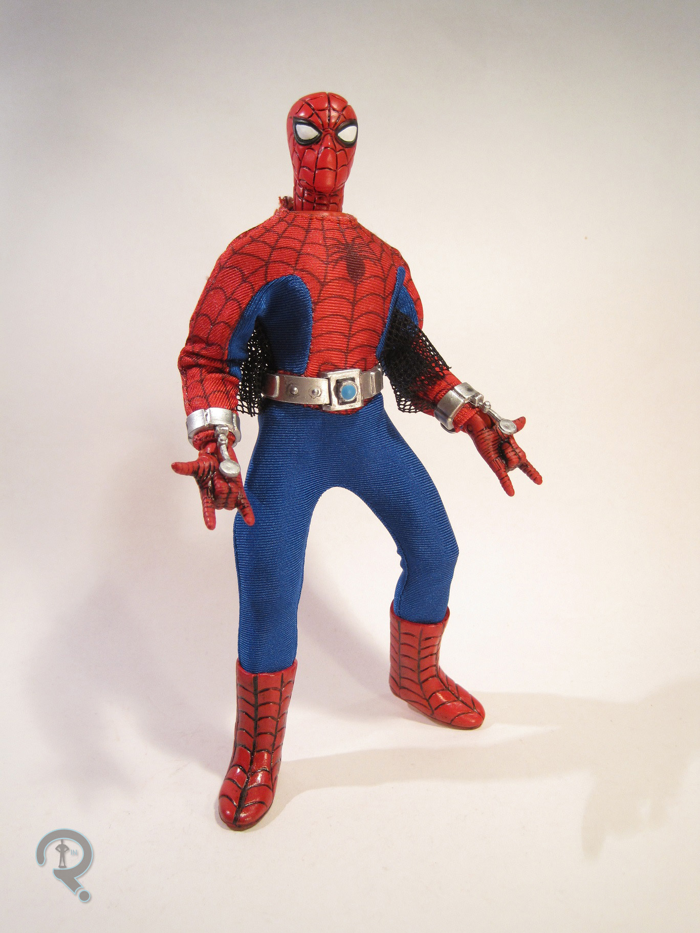
 This figure is a little different from the figures I often review for this site, in that there are three possible looks, which are effectively three separate figures. So, let’s start off with the basic, original Mego-style Spider-Man, which is how the figure is assembled in the packaging. As a recreation of the original, he makes use of the original Mego head. Mego’s Spider-Man sculpt was certainly one of their most distinctive pieces. By today’s standards, some of the details, especially the etched in weblines, are a little on the soft side, however, for the time, it’s truly a remarkable sculpt. It has a lot of character to it, and I do believe that it’s one of the few Spider-Man sculpts to actually note the presence of a nose under the mask, which is a very nice touch. The head has been painted to pretty much match the original. The edges of the black outline around the eyes are a little fuzzy in some spots, but the overall look is quite nice. This version features a one-piece costume, with all the proper details silkscreened on. The costume replicates the original “circle logo” Mego figure, which had a rather distinctive circle cut out of the webs around the spider emblem. Mego ultimately replaced this with a more comic-accurate version, but this one is often remembered for its more unique look. The costume has a bit of a shine to it, which isn’t quite accurate to the original, but actually looks rather sharp.
 The next “figure” included is the updated version of the basic Spider-Man. Essentially, this one is what a Spider-Man Mego would look like given all the advancements in toy making technology. This one gets an all-new head sculpt, which offers a more conventional take on Spidey’s noggin. The eyes are wider, the weblines are finer, and the head has a more… head-like shape. It’s also a little smaller, to keep it more proportional with the body. This head really feels like a genuine evolution of the Mego head. It’s definitely different, but it has a lot of the same charm. Plus, that nose is still there, which really sells the whole thing for me. The paint also feels like the next step after the Mego version. The colors are the same, but this time around, a black wash has been applied to give the weblines their proper color. The black around the eyes also seems a little sharper on this head, which is great to see. The costume on this one is expectedly more elaborate than the previous one. The tailoring is just a bit tighter to the body, and the stitching has been brought more in line with the outlines of the costume. The reds and blues are more defiantly separate on this one. He also has the classic underarm web-wings, which are done with a very nice netted material and manage to
  actually look pretty respectable. That can’t really be said for most attempts at replicating them. The weblines on the red portions of the costume are finer, though they are oddly a little lighter, as well, which doesn’t seem to have been the intent. They end up being more of a brown than a true black. It’s a minor nit with an otherwise very nice costume. While the original Spidey had printed on boots, this one has a pair of sculpted boots, done in a manner that matches the head sculpt. They’re well sculpted, and certainly a little tighter fitting than most Mego boots. Admittedly, I still find myself partial to the printed boots, but that’s more of a personal preference. The sculpted boots still work quite well. This Spidey includes three sets of specially sculpted hands, each done with a web pattern that matches the head and boots. There are a pair in the classic web-shooting pose, a pair of fists, and a pair that are open in a pose perfect for wall-crawling. All of the hands are fantastically sculpted, and the web-shooting hands in particular are a great version of a piece long missing from the Mego Spider-Man. In addition to the hands, Spidey also includes a pair of web-shooters and a camera belt. Neither are essential pieces, however, both make for some entertainment value.
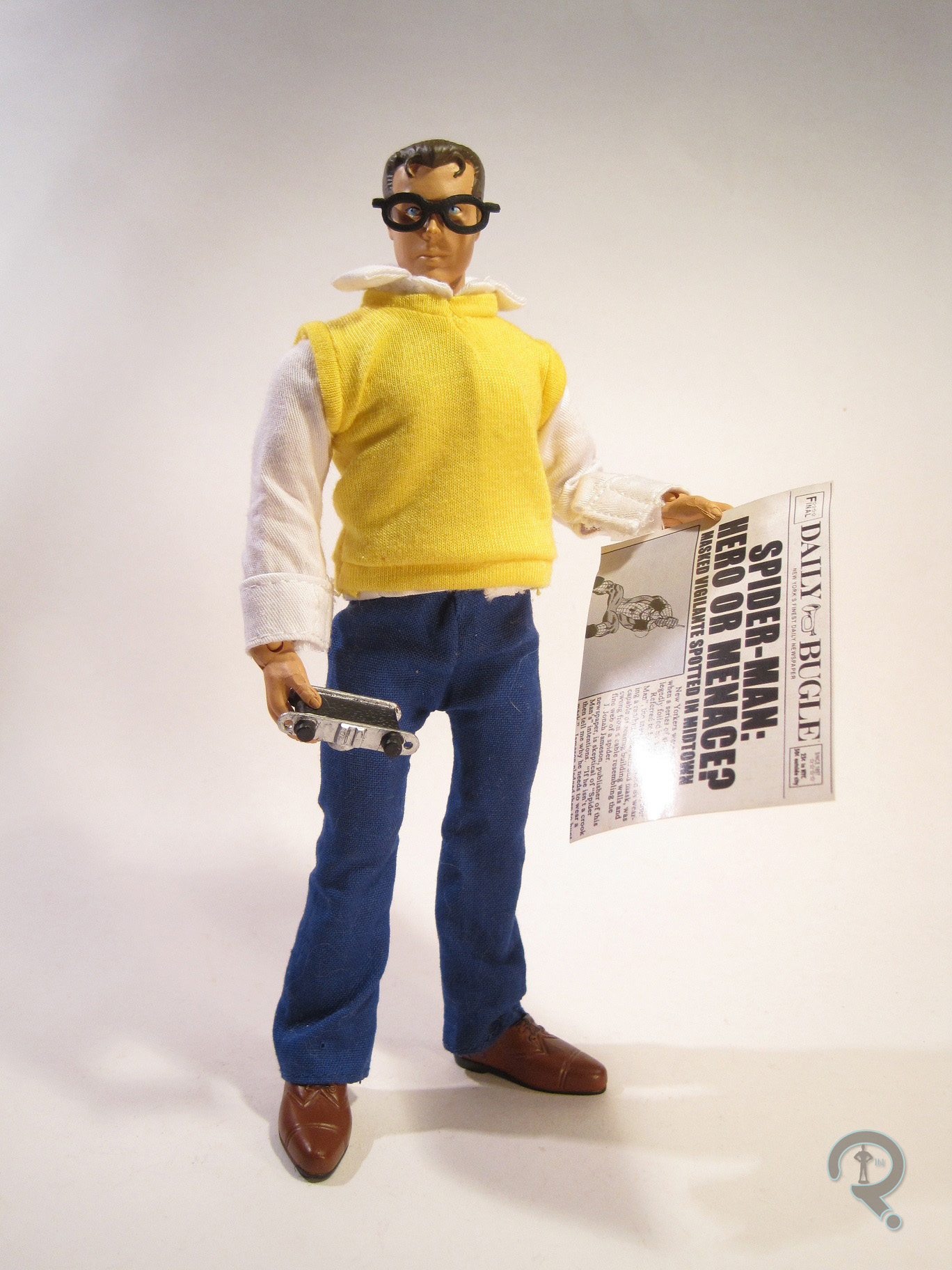
 The third, and final, “figure” is a version of Spider-Man’s alter ago Peter Parker. Right off the bat, there’s one minor issue with Peter, and it’s not really an issue with the Peter pieces, but rather the Spider-Man body. The body is molded in red plastic. This is clearly meant to make the two Spider-Man costumes more convincing, but it leaves Pete without a proper body. His clothes will mostly cover the body, but the few flashes of red are rather noticeable. For the purposes of the review, my Parker is assembled on a spare body I got from Dr. Mego a few years ago. The figure has what appears to be an all-new head sculpt. The original Peter just made use of the Shazam head, which obviously couldn’t be done here. This head does appear to have at least taken the facial features of the original as an influence, so the sculpt holds on to some of the original’s style. One of the things that really stands out about this sculpt is the hair, which features some really great fine detailing, often lacking from genuine Megos. This head has easily the most complex of the three paintjobs, and ends looking quite nice. All of the paint work is clean, with pretty much no bleed over. There’s a tiny bit of slop where some brow paint ended up on his ear, but other than that, things are pretty good. Peter’s outfit is also probably the most complex. It’s made up of five pieces in total: shirt, pants, vest, and shoes. The shirt and pants are decently tailored, and pretty much just look like Mego clothes (apart from the use of Velcro). The
  vest is also nicely tailored, however, it’s a real pain to get on over the shirt. While the separate pieces are nice, it seems like a shirt/vest combo might have been more practical here. The shoes are well sculpted and well painted. They go on with ease, which is always a plus. They do look a little large, but that’s just something that goes hand in hand with removable shoes. Peter also includes a pair of the standard Mego hands in the proper flesh-tone, as well as a pair of glasses, a camera, and a copy of the Daily Bugle. The glasses are good in theory, however, they don’t stay on very well, and they look super goofy to boot. The camera is definitely a nice piece, and really helps make the figure. It would be cool if it had a strap, but it’s still great as is. The Bugle is just a single sheet of paper; it’s more there for the appearance than anything else, but it’s a cool touch nonetheless.
In addition, the set also includes a booklet with a few articles from various Mego experts, which was an entertaining read.
 Also, I don’t talk about packaging much, but there are a few things to note here. First of all, this is a really attractively packaged set. I’m not one for keeping things in the packaging, but if I were, I’d certainly be pleased with this. Sadly, the packaging really can’t be salvaged once the figure is opened. The extra pieces are blister packaged, so they have to be torn off the backing. Also, the replica Retro packaging is really cool. However, for some reason, some sort of adhesive was used to hold it in place. I managed to get mine out without damaging it too badly, but it was a lot of work. Given the obvious effort that went into it, I can’t imagine that the adhesive was intentional.
THE ME HALF OF THE EQUATION
Most of my experience with Megos was playing with my dad’s old figures when I was younger. However, Spider-Man was actually one of the few that my dad bought for me, so that particular figure definitely has a soft spot for me. As such, I was eager to get this updated version.
This set was picked up from Luke’s Toy Store, who I generally deal with for my Minimates purchases. The store decided to give the Retro Figures a try with this one. Sadly, it sounds as if I may have been the only person to buy the set from him, which is a real shame. I think a lot of people are turned off by the price of these sets. Admittedly, they are on the expensive side. However, you’re essentially getting three figures, which brings the per figure cost down quite a bit. About the only thing I would say in regards to the price is that it would be nice if Diamond included at least one extra body, or if they provided an easy location to order extra bodies at a reasonable price. I had a few extras I’d gotten from Dr. Mego a while back, but the average consumer won’t know where to find such things.
All in all, this is actually a really fun set. It offers both the chance to re-buy an old favorite, and the chance to get a loving update on that figure. And for me personally, it provided me with the chance to take a Mego out of its box for the first time ever, which was a really cool experience. I intend to buy every figure this line offers, and I would urge anyone who was a fan of Megos to do the same.


 Han was released in the first assortment of POTF II figures, which shouldn’t really surprise anyone. He was Han freaking Solo after all. He’s roughly 3 ¾ inches in height, and he has the line’s standard 6 points of articulation. He’s based on Han’s primary look from A New Hope, which is generally the look most people associate with the character. Han’s sculpt was original to him, and it exhibits a lot of the same style cues present in other POTF II figures. Let’s start off with the basic proportions of the figure: he has an overall body-builder-esque physique, but even by body-builder standards, he’s a bit absurd. His shoulders are really broad, and his arms are practically bursting out of his sleeves. He also has the huge hands and impossibly thin waist that were prevalent in the line. Han, more so than others in the line, feels like a cartoon caricature, not a human being. On top of the proportions, Han’s sculpt is plagued by a few issues. Like a lot of the others in this line, Han’s legs are somewhat strangely posed, requiring that he stand in a deep stance to be even remotely balanced while standing. Also, though his hands may be large, they haven’t been sculpted to really hold anything. This is the worst on his right hand, you know, the one he holds his blaster with, which is sculpted flat, so he can’t actually do so. Finally, there’s the head. Now, to be fair, the head is easily the best part of this figure, especially from a technical standpoint. There’s some really nice detail and texturing. However, it seems like the sculptor was working from pictures of Harrison Ford at the time these figures were made, instead of at the time of the movies. And even then, it’s hard to see a lot of Ford in this sculpt. He looks a bit like the lovechild of Ford and Tommy Lee Jones, which, needless to say, isn’t Han Solo. Han’s paintwork is pretty much typical for the time. It’s certainly not bad, but it’s not anything amazing either. Everything is pretty much where it’s supposed to be, and there aren’t really any issues with bleed over or slop. Han included his signature blaster pistol, which is hysterically oversized, and a larger blaster rifle, which doesn’t appear to be one he carries in the film.