
APOCALYPSE
X-MEN (TOY BIZ)

“The megalomaniacal mutant villain known as Apocalypse believes that total war between humans and mutants is inevitable. In order to weed out those he feels are weak and unsuitable for the coming conflict, he manipulates mutants into battling one another, calculating that with the help of the strongest and most ruthless survivors he can conquer the world and become ruler of all – both man and mutant!”
Introduced in the ’80s, as a foe for the recently launched X-spin-off X-Factor, Apocalypse has gone on to become one of the X-franchise’s most enduring foes. Throughout the ’90s, he maintained a rather prominent place in at the center of a lot of conflicts and cross-overs, and also wound up as a big-bad for the ’90s X-Men: The Animated Series, and, by extension, got some pretty solid coverage from the toyline that ran alongside it. He was actually among the very first figures released in the line, but due to evolution of the character’s design, he found himself up for a second figure quite quickly.
THE FIGURE ITSELF
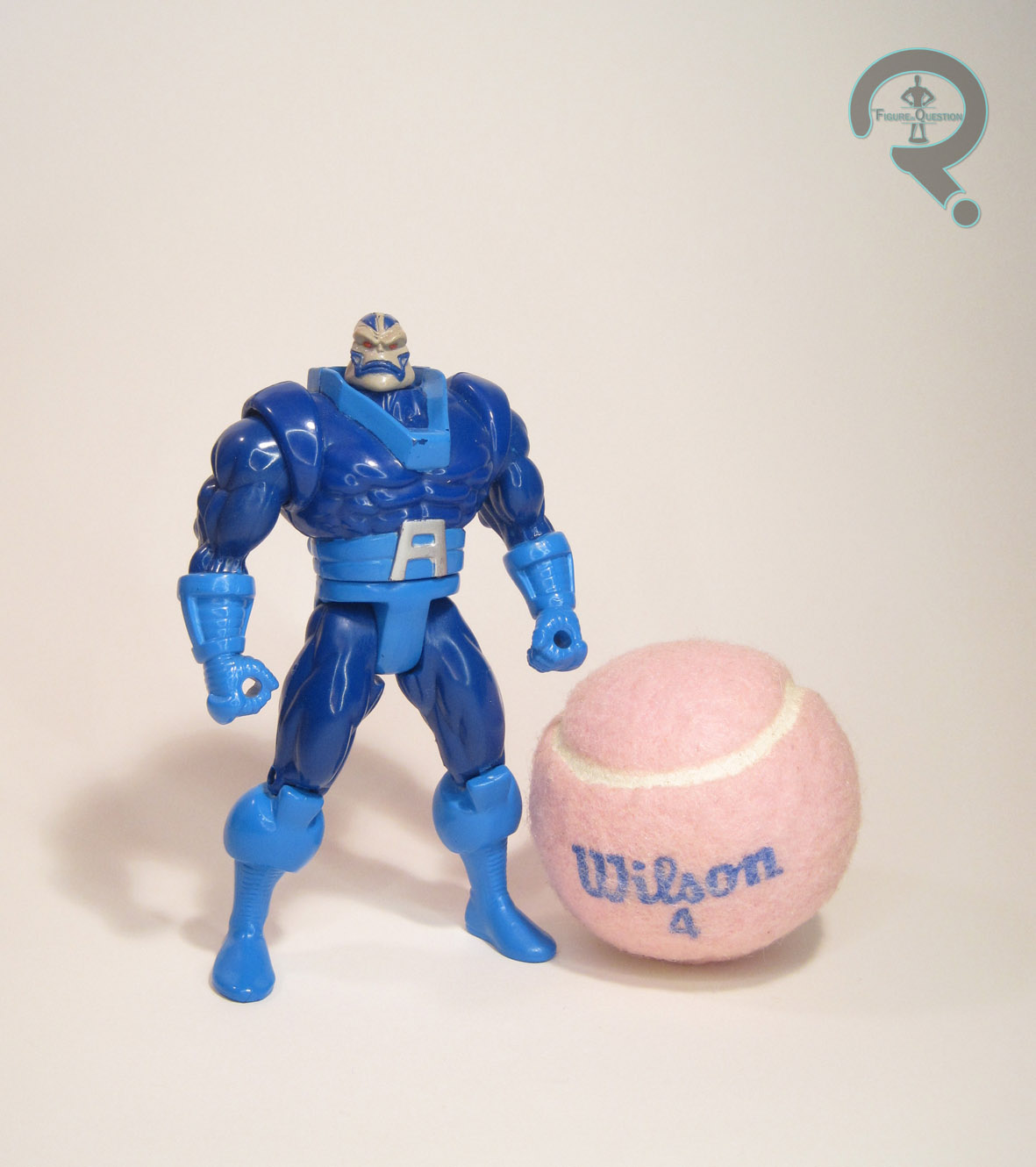 Apocalypse was released in Series 4 of Toy Biz’s X-Men line, just two years after his initial figure debut. Following Magneto, he was the second true remake of a Series 1 figure (Wolverine had also shown back up, but all of his figures up to this point were using unique designs, so it’s every so slightly different). The figure stands 5 1/2 inches tall and he has 8 points of articulation. He’s actually quite a step-down on the articulation front when compared to his predecessor. He got an all-new, much more bulked up sculpt, based on the steady changes to Apocalypse’s design since he’d first appeared in the ’80s. This was very much the current Apocalypse design at the time, making him a more definitive take on the character than his prior release had been. His sculpt is a fairly decent one, and definitely had a little more menace to it. The head in particular really captured how Apocalypse looked in the comics at the time. His color work was another marked change from the prior figure, and again befitted the changing design of the character. This one, with his brighter blue accents, follows the lead of the cartoon design. I do miss the black details, but overall, it’s a decent colorscheme, and certainly one that’s accurate to the character. Apocalypse was packed with a spare set of arms, simulating his techno-shifting abilities. There’s a claw arm and a drill arm, both of which are pretty neat. They swap out at the shoulders, which means that both they and the regular arms do have a slight tendency to pop out of place when you don’t want them to.

THE ME HALF OF THE EQUATION
I had a copy of this guy growing up, but it was a ways after getting the first one, who remained my favorite. That one went missing, so I picked up this replacement during one of my splurges of 5-inch Marvel figures, about a year or two ago. He’s an okay figure, and was certainly a more accurate figure at the time of his release. Personally, though, I find that the changes make for a figure that’s just not as much fun to play with as the original was, so he’s always been second gear to me.
