BATMAN — GOTHAM BY GASLIGHT
ELSEWORLDS (DC DIRECT)

“As a young Bruce Wayne takes up the mantle of the Bat, a series of slayings mirroring the work of Jack the Ripper begins.”
DC’s Elseworlds line allowed them to tell stories that fell outside of the confines of a normal universe story, which opened the playing field to all sorts of crazy concepts. It also lent itself pretty well to lots of “let’s mash up this DC thing with another established thing” scenarios. This actually goes back to the very first Elseworlds tale, Batman: Gotham by Gaslight, which is “what if Batman was Victorian era and fought Jack the Ripper?” It’s not high concept, but it’s certainly fun. It’s also some of Mike Mignola’s earlier work, and has some pretty impressive design work. The story’s Victorian Batman design is quite distinctive, which makes it ripe for making action figures, as DC Direct did in 2007.
THE FIGURE ITSELF
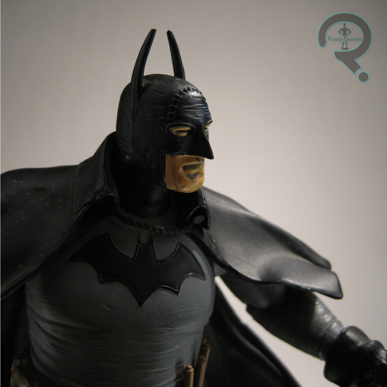
 Gotham By Gaslight Batman was released in the second series of DC Direct’s Elseworlds line. He was one of two Batmen included, the other being the Red Son version of the character, which is another quite distinctive, if perhaps slightly thematically similar version of the Batman design. The figure stands 6 1/2 inches tall and he has 13 points of articulation. The articulation’s not a lot, but it was about what you’d expect from DCD at the time. It’s good for some slight tweaks to his posture, but that’s really it. It’s certainly better than nothing. The sculpt was an all-new piece, and it was definitely DCD at their best. They really had a lot of fun with the artist-specific work in this line, and in the case of this Batman, they’ve done a pretty spot on job of capturing that early Mignola art style. He doesn’t quite have the extreme hallmarks of later Mignola stuff, but there’s still enough to make it recognizable. I really like how they’ve translated the texturing of Mignola’s work into something three dimensional, and I also quite enjoy how they’ve managed to keep him rather dynamic while also keeping a fairly neutral pose. The flow of that cape is just beautiful. The only thing I’m not too keen on are the ears, which always point a bit inward on mine. It’s an unfortunate side effect of how small they have to be and how they were packaged in the box, I suppose. The paint work does a nice job of replicating the way Mignola’s work is illustrated in the book, with a subdued palette and a decent job of outlining the features on the face. There’s also some great accenting on the belt, as well as some impressive work on the mud stains on his boots and cape. All in all, a very well rendered paint scheme. The only slight let down to this guy are the accessories. All he gets is a stand. Its not much to go on, and felt quite light given the price these things were going for relative to everything else at the time.

THE ME HALF OF THE EQUATION
I picked up this guy back when he was brand new, courtesy of my usual comics haunt, Cosmic Comix. He was the first of the Elseworlds line I grabbed, mostly because I wanted a Mignola Batman figure, and I wasn’t picky about which particular design it was. I hadn’t even read the comic at the time (I have since). He’s certainly a nice looking figure, even if he’s maybe not so exciting to actually play with.