GREEN LANTERN JOHN STEWART
DC ICONS (DC COLLECTIBLES)

Before they went out of business and then got reinvented as little more than a glorified way for McFarlane to put out more of the same figures, DC Direct/Collectibles went through quite a few attempts at creating a central, singularly styled line of figures. There were a few extended lines based on specific works, such as Justice, which took advantage of the large cast of the book to do a sizable swath of the DCU in one style. Their first deliberate aim at a consistently styled, full universe-spanning line was History of the DC Universe, which honestly was kind of doomed before it began, because it arrived only half-formed and never really tried to improve that. After rebranding as DC Collectibles, the company launched with a New 52 line, again with the same basic idea, but given the lukewarm reception to the New 52 and its designs, the line again had short legs. After that failed, they tried again, with DC Icons. Icons had a sort of rocky start, but it managed recover pretty quickly, and actually was shaping up to be a really strong line…until DCC decided they didn’t have faith in it anymore, and decided to reboot once again with DC Essentials, a line doomed before it even began. Though short-lived, Icons did at least have a solid run of figures. I reviewed a bunch of them back when the line was still relatively new, but today I’m looking at one more. It’s John Stewart Green Lantern!
THE FIGURE ITSELF
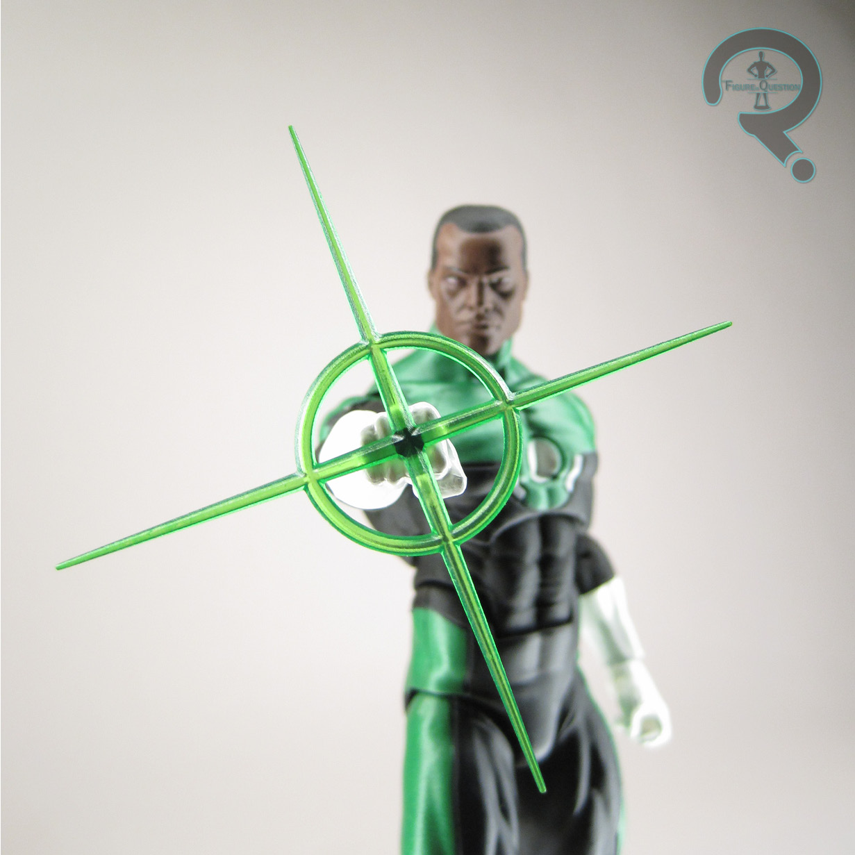
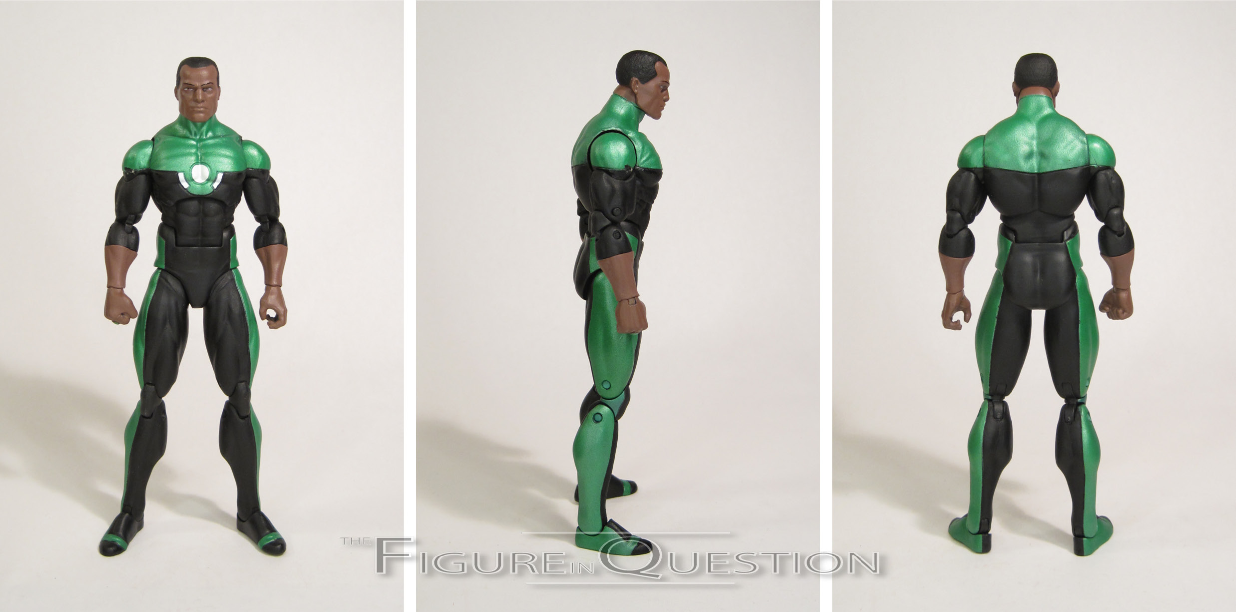
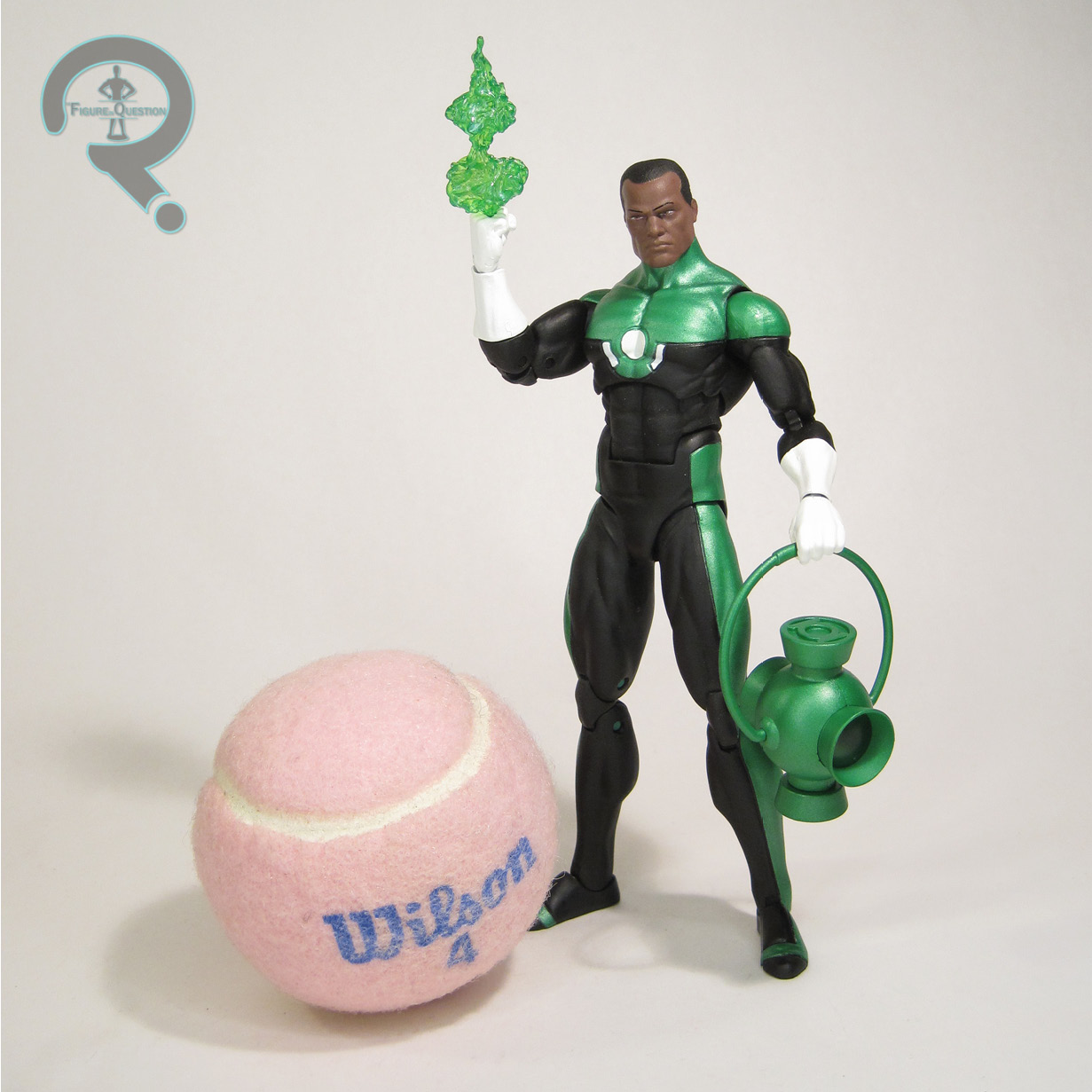 Green Lantern John Stewart was part of the fourth series of DC Icons. He was figure 15 in the line, placing him just before the previously reviewed Firestorm, also from the same assortment. Each of the figures in this line was specifically patterned on a certain comics appearance. In John’s case, he’s based on Green Lantern: Mosaic, a GL-spin-off series from the early ’90s. The series was a showcase for John in particular, and laid a lot of ground work for the modern interpretations of the character, so it’s a pretty distinctive choice for him. It was also nice to see them go for something a little bit older. It does have the sort of odd side effect of not putting John in the outfit he’s been sporting since the early 2000s, which would match a good number of other figures in the line, but we’d seen that look a couple of time recently at this point, so the change-up was seemingly a show of good faith that they might possibly do more than one John. How foolish we all were. The figure stands about 6 1/4 inches tall (since this is after they’d started to address the early scale issues of the line) and he has 33 points of articulation. He got the improved articulation set-up that came with the fourth series forward, which included the addition of drop hips, which makes for a much better posing situation. John’s sculpt was completely unique. It’s a pretty nice offering. He’s got a larger build than Hal did, which feels appropriate for the character. The head’s not my favorite take on John (that’s still the DCUC version, which just really slaps), but it’s certainly better than a lot of other recent takes. It at least gets away from the “generic black guy” issue that I had with the McFarlane and Mezco figures. It’s honestly not a bad translation of how he looked in Mosaic specifically, which is really the point. The figure’s paint work is pretty decent; he matches up with Hal alright, keeping that satin metallic finish for the green, as well as the high gloss finish on the white. Application’s pretty clean for the most part. The eyebrows are a little bit misaligned, and there’s a spot of green missing on one of his shoulders, but otherwise things look pretty decent. John gets a solid selection of accessories, including two different forearm/hand combos for both gloved and ungloved looks, since he alternated in Mosaic. The gloved look gets an extra right hand, with a hole in place of the ring, allowing for use of the three construct attachments. It’s a shame there’s not another one for the ungloved hands, but I understand the line being drawn somewhere. He also includes a power battery, for all those recharging purposes.
THE ME HALF OF THE EQUATION
I slept on a lot of Icons, unfortunately, and John was one of those that I really slept on. Thankfully, I got another chance with him, since one got traded into All Time a couple of years ago. I already wanted one, so he was an easy sell for me. While the Mosaic design isn’t top of my list for John’s look, I can appreciate the variety, and I think it did turn out pretty well. And, at least he actually got a figure in the line, which is more than can be said for a lot of DC’s prominent heroes.
Thanks to my sponsors over at All Time Toys for setting me up with this figure to review. If you’re looking for cool toys both old and new, please check out their website.