#3743: Robocop

ROBOCOP

ROBOCOP (TOY ISLAND)

In prep for this review, I was genuinely uncertain if I’d talked about Robocop on the site, and in fact, yes, I have.  I looked at the two NECA figures I had, which is well enough.  Of course, that’s all on the more recent side (relatively speaking, at least), but let’s go back to the beginning.  Or, you know, at least closer to it, with a little company called Toy Island, who devoted quite a bit of their business to making toys of things that probably shouldn’t have had toys in the ’90s.  There was a whole selection of Robocop stuff from them, following up on what Kenner had done in the prior decade.  And today, I’m looking at one of their smallest offerings.

THE FIGURE ITSELF

Robocop was released by Toy Island in 1995, as a tie-in to the live-action show, rather than the movie.  Of course, for Robocop himself, it’s only a minor distinction.  He was part of the smaller scale stuff, which was a lot of one-and-done releases of main characters, usually designed to fill out the pegs at KB.  The figure is just under 3 3/4 inches tall and he has 8 points of articulation.  He’s *sort of* 1/18 scale, but not really, because he’s ultimately rather small, which was the case with a lot of the Toy Island stuff.  He’s very limited in his posing, especially because he lacks a neck joint.  Of course, to be fair, Robocop was also rather stiff in his movements by design, so it sort of tracks in that respect.  The sculpt is itself pretty rudimentary.  His head seems to be a little thin, and also too big, which feels like its saying two different things, but it’s not.  That said, the armor and body details are all actually pretty sharp.  Sure, they don’t all completely line-up with the design for the character, but it’s also not terribly far off.  His paint work is pretty basic.  The armoring seems a little dark for the character, but beyond that, it’s generally fine.  Robocop’s one accessory was an M-16, which is just emphatically not right for the character at all, but it’s presumably something Toy Island already had a mold for, so there it was.  Regardless, it’s a piece that’s missing from mine.

THE ME HALF OF THE EQUATION

This guy was one of my Nana’s signature “bought one for all the grandkids” purchases, paired off with the Toy Island T-800, all of them purchased on sale at KB Toys.  I had no clue about either character at the time, and I thought they were actually linked, and had to sort of come up with my own story for them.  It was a good while before I knew anything about Robocop in actuality.  This figure’s pretty hokey, but at the same time, he’s really not bad, especially given what he was meant to be.

#3742: Pavitr Prabhakar

PAVITR PRABHAKAR

MARVEL LEGENDS (HASBRO)

The cast of Spider-Verse, both as a comics event and as a set of movies, is populated by a mix of spider-variants both new and pre-existing.  While a number of the ones at the center of things were created for the story (such as Spider-Gwen and Spider-Punk), there are a very great many that existed well before the event.  Pavitr Prabhakar, aka Spider-Man India, was created for a series that retold the Spider-Man story in an Indian setting for an Indian market in 2004.  The story was brought back to the States in ’05, and he was subsequently worked into the main “Spider-Verse” event.  He’s one of the notable new Spiders in Across the Spider-Verse, albeit in more of a supporting role.  He was left out of Hasbro’s first round of toy coverage, but the second round swoops in with the fix!

THE FIGURE ITSELF

Pavitr Prabhakar is another figure from the second Across the Spider-Verse tie-in assortment of Marvel Legends, which just started hitting retail in the last few weeks.  This is Pavitr’s first figure treatment, and he’s also the only proper “new” character in the assortment (though I guess Miles G and Peter A are *kinda* new characters for the line).  The figure stands 5 3/4 inches tall and he has 27 points of articulation.  He’s notably shorter than the others, but that’s appropriate, and adds some nice height diversity to the set-up.  His articulation  scheme is pretty decent overall, but I did find it a little restricting at the shoulders and neck, given what we’re used to for Spider-Men.  The figure gets a totally new sculpt, based on his updated design from the film.  In the comics, much like with Spider-Punk, Pavitr’s costume is a far closer adaptation of the traditional Peter Parker design.  They did a pretty radical re-work for the film, resulting in a design that’s far more unique, but also still feels at its core like it gets the spirit of a Spidey design.  It translates very well to figure form; it’s sharp, clean, and it has a good flow to it.  Pavitr’s color work is very bright and clean, and quite eye-catching.  What paint work he has is sharply applied, especially the “tattoo” designs.  About the only thing I’m not crazy about is the feet, which are supposed to have his toes exposed.  They’re sculpted that way, and sort of painted that way, but the coverage is inconsistent, and it doesn’t really look natural.  Pavitr is packed with an alternate unmasked head (which I’m very happy is a standard thing here), two pairs of hands, and his bangle-web-line.  The bangles on his wrists, as well as the dimensional stabilizer, are also all removable, so you can mix up his look appropriately that way as well.

THE ME HALF OF THE EQUATION

I only had moderate knowledge of Spider-Man India before going into the movie, but after seeing the movie, he jumped up very high on my want list.  He was certainly the most notable omission from what we got last year, so he was very definitely a strong choice for this line-up.  He’s just a very solid figure and a solid addition to the line.  He rounds out the main set of characters very nicely.

Thanks to my sponsors over at All Time Toys for setting me up with this figure to review.  If you’re looking for cool toys both old and new, please check out their website and their eBay storefront.

#3741: Snake Eyes

SNAKE EYES

G.I. JOE: REACTION+ (SUPER 7)

Well, I took a week off, but I guess I’m back with some more Super 7?  I didn’t *mean* for it to be a weekly feature, but that’s certainly where it’s sitting right now.  So, being back with the Super 7, what in particular am I focussing on?  This time around, it’s more G.I. Joe.  Hasbro’s attempt to give the Joe brand a re-launch included amongst its many product lines a revisit to the O-Ring assembly Joes of the ’80s.  Despite attempting to come at it from a few different angles, Hasbro wasn’t able to get the market support they wanted to keep the O-Rings going, so they’ve opted to license the style out.  Super 7, who already had a set of ReAction figures going at the same scale, picked up the additional license, and has launched an upgraded selection of Reaction+ figures, now with O-Ring assembly.  The first round of the figures just hit, and I’ve snagged myself a Snake Eyes to try out the line.

THE FIGURE ITSELF

Snake Eyes next to Pink Tennis Ball for scaleSnake Eyes is one of the four figures that launched Super 7’s G.I. Joe ReAction+ line.  Thus far, they’re all comics-based, with Snake Eyes specifically being based on his updated V2 look that coincided with his ’85 figure.  The figure stands 3 3/4 inches tall and he has 14 points of articulation.  He’s making use of the expected O-Ring articulation set-up, or at least a version of it.  Unlike the original V2, which had the upgraded ball-jointed neck, this one’s more like the earlier vintage figures, when they still just had the swivels.  I also found his hip articulation to be a bit more restricted than your average vintage figure.  You can sort of get some side-to-side, but it’s mostly just forward and back.  Snake Eyes has an all-new sculpt, and it’s got its pluses and its minuses.  It’s generally more geometric in its shaping, and the limbs, especially the arms, are a little more tubular and less organic.  That said, there’s some very sharp detailing for the outfit, which is a little better than we’d see on a vintage release.  In particular, the head’s quite good at capturing the classic Snake Eyes look in a very clean and striking way.  I also find that the sculpt just Accessories for Snake Eyesgenerally looks a bit better and more polished than the early renders we saw initially.  Snake Eyes’ color work is reasonably well done.  The dark grey of the main body is certainly well chosen, and the blue is a more unique accent choice.  Personally, I don’t love the entirety of the boots being blue, but it’s minor.  The actual paint application is pretty clean, and I noticed no real issues on mine.  Snake Eyes is packed with a sword, Uzi, and backpack.  The weapons fit alright in the hands.  I’m not sure how the paint will hold up over time, but it looks okay now.  The back pack looks alright, but its storage for the sword isn’t a great design, and doesn’t really hold it well.  I worry about how it will hold up long term.

THE ME HALF OF THE EQUATION

After falling out of love with Classified, I’ve been trying to find something good to keep some form of Joe collecting going.  I’ve been trying a little bit of everything.  This line’s announcement intrigued me, and I liked the look of the prototypes for this guy in particular.  Admittedly, I have a hard time saying no to a halfway decent Snake Eyes.  This one does a little better than halfway decent, but I can’t say he does *much* better than that.  He’s generally fun, and friendlier to mess with than a proper V2 release, and for the price point, he’s alright.  That said, I’ve definitely got some concerns, and there’s room for improvement.  I worry about this line’s long-term viability, but at least I got a fun little Snake Eyes out of it.

Thanks to my sponsors over at All Time Toys for setting me up with this figure to review.  If you’re looking for cool toys both old and new, please check out their website and their eBay storefront.

#3740: Peter Parker

PETER PARKER

MARVEL LEGENDS (HASBRO)

It’s been the better part of a moth since I’ve looked at any Marvel Legends, which isn’t a *crazy* long time, but it is a notable hiatus for me.  I largely blame that on Hasbro’s slightly more erratic release schedule for the line in the last year, though I suppose my slightly more tailored interests regarding which figures I’m picking up also contribute.  While Beyond the Spider-Verse, the third installment in Sony’s animated Spider-Verse films is still a ways off, there’s still plenty of product to be had from the first two movies, so Hasbro’s taking the opportunity to go back and do some more of those.  Up to this point, a notable omission from the line-up has been a standard, fully-costumed version of Peter, which this latest round finally gives us, albeit in the form of Peter A…or whatever is the “official” designation of the Peter from Miles’ home dimension.  The one what’s voiced by Chris Pine.

THE FIGURE ITSELF

Peter Parker is part of the second Across the Spider-Verse tie-in assortment of Marvel Legends.  However, like the standard Miles from this assortment, as well as the Peter B from the last round, he’s officially Into branded, since that’s the movie he’s actually from and all.  We are, as of yet, still without any Peters at all from Across, but it’s not like I’m bitter or anything.  The figure stands 6 1/2 inches tall and he has 34 points of articulation.  He’s a mix of old and new parts, with the upper torso and arms from the Peter B figure from last year.  It also looks like his head is the same as the Stilt-Man Series unmasked head.  The rest is new, and it offers up some improvements to the articulation scheme.  He’s now got the waist crunch like we’ve been seeing on more recent Spideys, as well as drop hips for slightly better range.  Some of the joints are a little sticky, and it would have been cool to get some butterfly shoulders, but generally it’s a nice step up.  The actual sculpting is as top-notch as the Spider-Verse figures have been the whole time.   Generally, he’s pretty sharp, and they’ve given him those nice, defined abdominal muscles to show that he’s not Peter B.  Paint here is generally pretty basic stuff.  Largely, he’s using molded colors, of course, but there’s the blue/red overlaps, which are overall okay.  There’s some slop on the mid-section of my figure, but it’s minor.  The head gets some more in depth work, with a printed face, and some accenting on the hair.  Peter is packed with a masked head (the same as the one from last year) and two sets of hands in fists and thwipping poses.  It covers the basics, but does feel a little light.  Maybe another head with a damaged mask, like his final scene showed, would have been cool.

THE ME HALF OF THE EQUATION

I honestly wasn’t expecting to get this guy, especially once we’d moved onto the figures from the sequel.  I even bought the Sentinel figure largely because it came with the parts to do this look, and I wanted the option.  Hasbro sure did show me, huh?  He’s pretty basic, as far as figures go, but that’s not a bad thing.  He does what he needs to, and he does it well.  He’s an easy variant, but also a new character, so that’s very cool.  Now, with this Peter covered, can we please get one from Across finally?

Thanks to my sponsors over at All Time Toys for setting me up with this figure to review.  If you’re looking for cool toys both old and new, please check out their website and their eBay storefront.

#3739: Mutiny in the Ranks

LEX LUTHOR, TALA, DEVIL RAY, DR POLARIS, GENTLEMAN GHOST, & PSYCHO PIRATE

JUSTICE LEAGUE UNLIMITED (MATTEL)

Hey, ho, it’s off to more JLU reviews I go!  And, you guys didn’t have to even wait all that long for another one this time around.  Wasn’t that so very nice of me?  Heck, I’m gonna go the extra mile, and just review a whole pile of them all at once.  I mean, for a reason; I’m not just arbitrarily reviewing a bunch of them.  They’re, like, a set.  But what set?  I’ll tell you, but first, a bit of a side track!  I just finished a watch through of Justice League and Justice League Unlimited with my son Matty, which was a fun trek through memory lane.  The run notably has three effective finales, two of which were followed by there being more show.  “Starcrossed” leads into the Unlimited revamp, of course, which builds up to the finale of the Cadmus arc, a rather grounded and quite series look into the League, its enemies, and who gets caught in the crossfire.  How do you top that?  Well, you don’t even try, honestly.  Instead, the show revamped into something more akin to Challenge of the Super Friends for its final season (albeit still being more serious and thought out than anything Super Friends ever tackled), giving the expanded League roster a Legion of Doom to face off against.  The toyline ran with this as justification for doing more villains, who had been a rarity for most of the line’s run.

THE FIGURE ITSELF

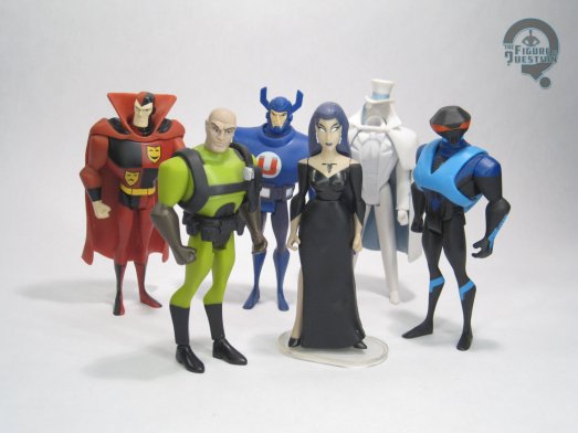
The “Mutiny in the Ranks” set was released as part of Mattel’s larger Justice League Unlimited line in the fall of 2009.  The pack was after the switch to the DC Universe banner, in the orange style packaging, and was part of the fourth wave of product in this packaging style.  There was a corresponding pack of heroes released at the same time, with both sets being based on the show’s final season.  All six figures included are exclusive to this set, which was quite rare for one of these bigger sets.

LEX LUTHOR

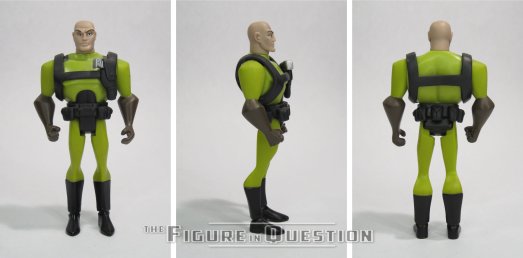
Luthor figures prominently into most of JLU, and is the central figure in the Legion of Doom storyline on the show, so he’s kind of a lock for this set, and also the real heavy hitter of the bunch.  He was no stranger to the line, being the first villain Mattel introduced into the animated style, and getting a few variants along the way.  This one…well, this one’s a bit odd.  I guess he’s meant to be based on the recolored version of Luthor’s tactical gear seen in the show’s final season, but there’s definitely been some *choices* made in the interpretation of that design.  I’ll get to that.  The figure is about 4 1/2 inches tall and he has 5 points of articulation.  His sculpt is the same as the standard line release of the “Injustice For All” Luthor, so he’s the medium GL-based body, with a new head, harness, and legs with boots.  It’s not one of the line’s finer offerings.  The head’s a bit large, and just too bulbous for Luthor on the show.  His expression is also just too classically evil looking, and lacks the suave nature of the DCAU Luthor.  The harness is fine enough, though, and the booted legs do at least remove the odd uneven leg problem of the medium base mold.  The paint work is sort of there, I guess.  Like, the general colors are okay for the show design, but the layout doesn’t match at all, and ends up looking downright goofy.
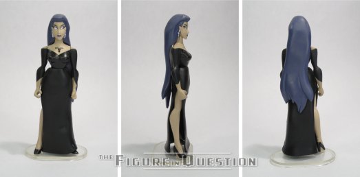
TALA

Tala is a rather minor character in the comics, who initially appeared as part of Cadmus on the show, seemingly to just fill in the roster for table shots.  In the final season, she got an upgrade to full villain for unrevealed reasons in show, but in the real world seemed to be kept on because the producers liked Juliet Landau’s performance in the role.  No complaints from me on that.  The figure uses the standard female base body, which certainly has its issues.  Notably, it does feel a little short for Tala, who always appeared to be a bit on the taller side in the show.  Also, she was always barefoot, which the base is not, so it means she’s got shoes for whatever reason.  She does get a new head and skirt at least.  The head’s alright.  It’s a little too wide at the jaw, but there were certainly worse offerings in the line.  The skirt has the benefit of hiding her legs, which is a good thing when it comes to this mold.  Paint is minimal and basic.  There’s some definite slop on the edges, but it generally does what it’s supposed to.  She’s the only figure in the set to get an accessory, as she gets a display stand.
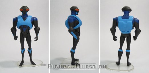
DEVIL RAY

With the Aquaman-centered Mercy Reef pilot floating around, JLU‘s final season was unable to use any Aqua-related characters, because of Warner Brothers’ rather reductive embargo set-up.  As such, the character intended to be Black Manta became “Devil Ray”, who is…well, he’s Black Manta with a different name.  Even his design works perfectly fine as an update to Manta.  Not being Manta, though, the writers didn’t need to get approval on what they did with him, so he’s a notable casualty within the show, which does up the ante a bit.  Devil Ray uses the medium male body again, with a new head and harness.  The new parts are quite nice, with the head in particular being a strong match for his show design.  He’s a little tricky to keep standing, but by this point in the line, all of the molds, especially the medium male, were degrading a bit, so weak ankles weren’t uncommon.  He relies on paint for a lot of his details, and it generally works, but the guns on his wrists do look a little silly just being flat painted on details.
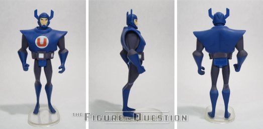
DR POLARIS

Dr. Polaris continued the trend started by Star Sapphire of being a GL villain on the show who never got any real connection to GL or even any notable interactions.  He does get some decent focus after Luthor kicks Grodd out of the Legion, so good for him.  The show used the character’s original design, which is pretty goofy, but I suppose fits the tone alright.  The figure uses the medium base body, with a new head and overlay for the torso piece.  The head feels a little small, but it’s a solid, sharp sculpt that’s accurate to the show model.  The chest overlay is rather bulky and winds up making the whole figure look a little overstuffed.  There’s a weird mold error on mine that makes it look like one of his legs has snapped in half and been reglued, but beyond that, the color work is decent enough.
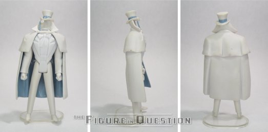
GENTLEMAN GHOST

Gentleman Ghost’s most notable turn on the show’s not actually with the Legion of Doom, and is instead in one of the Hawkman episodes.  However, by facing off against one of his actual foes, he does somewhat get a leg up on Dr. Polaris, so good for him.  He’s got a rather unique design, and this might have been his first figure?  I know the DCUC version came out right around the same time, so it’s a bit of a toss-up.  Still, pretty cool.  The figure uses a modified version of the two suited bodies, with a new cape piece that also had his hat and monocle mounted to the collar.  It’s not an exact science, and is only convincing from certain angles, but it’s about the best you’re going to get for ways to sell the “floating hat” look he had in the comics.  He’s got very minor paint work, since he’s largely just molded in white, but the light grey accenting’s pretty nice.

PSYCHO PIRATE

Psycho Pirate doesn’t get any focus on the show, serving just as background filler.  It does seem slightly odd for a character who’s had some very pivotal moments in the comics, but I suppose Crisis was a bit much for the show to handle.  I mean, they dedicated those three whole movies to it, and look how that turned out.  Or don’t.  Actually don’t, you guys.  It’s six hours you won’t get back.  Anyway, this guy uses the medium male body for the fourth time in this six figure set.  It seems rather bulky for Psycho Pirate, if I’m honest.  That said, it seems like parts re-use is really selling him, because he’s got Red Tornado’s cape, which they couldn’t do if he were on a different body.  He gets a new head, which is alright.  It’s got an odd shape, though, and seems too large, presumably to offset the size of the body.  It’s a shame there’s no medusa mask, but he never had it on the show, so that’s not really on Mattel.  The paint work is at least pretty nice, though.

THE ME HALF OF THE EQUATION

I bought this set and the corresponding Heroes set at the same time, when they were still rather new.  I want to say they were on clearance post-2009 holidays, and I had some gift cards to spend.  Honestly, I was more invested in the heroes set at the time, and I don’t know that’s changed much in the years since.  It’s not all bad mind you.  While Luthor’s a definite weak point, the Devil Ray figure is quite cool, as is Gentleman Ghost.  And the others are decent middle of the road figures.  The set’s not super focused beyond “villains”, but that’s also not terrible focus.
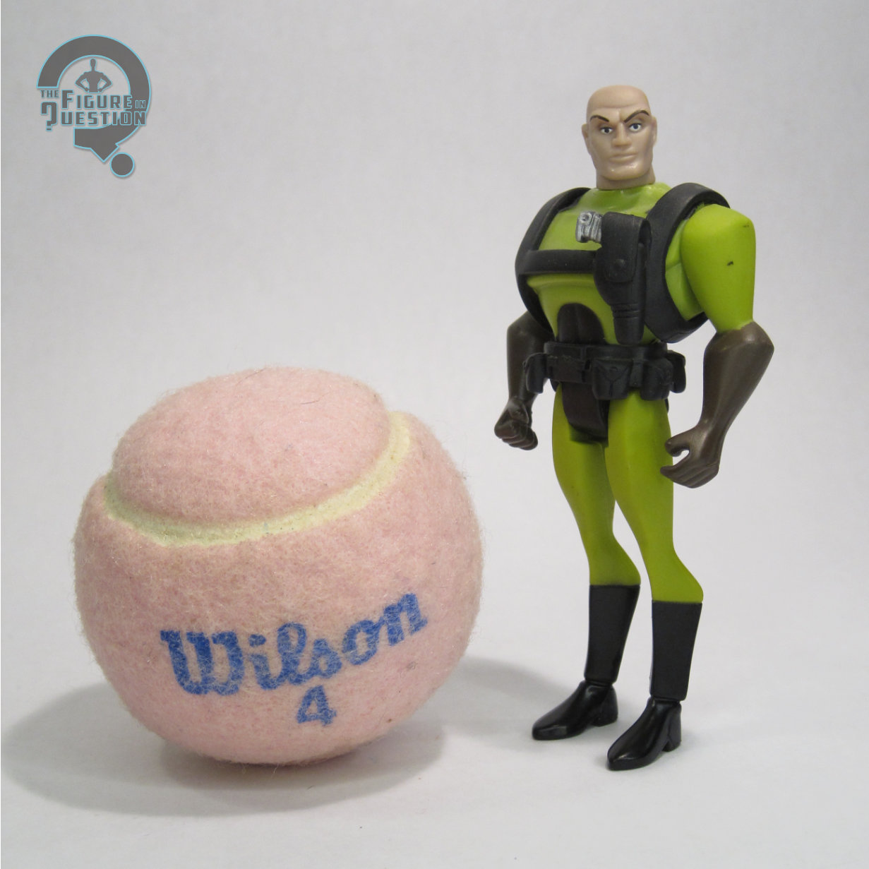
#3738: Lobster Johnson

LOBSTER JOHNSON

HELLBOY REACTION FIGURES (SUPER 7)

Okay, who’s ready to punch some Nazis? Well, a good chunk of Golden Age comic heroes, for sure, and also some retroactive additions to that time period as well. Mike Mignola’s Hellboy, which has its main character arrive on our world during World War II, is obviously supportive of the punching Nazis front, and that includes later retroactive addition Lobster Johnson, WW2-era pulp hero turned recurring character. Lobster has become one of the franchise’s most distinctive characters, and that lends itself to some pretty decent toy coverage as well.

THE FIGURE ITSELF

Lobster Johnson was released in the single-carded assortment of Super 7’s Hellboy ReAction Figures line, much like the Abe Sapien I looked at a little while back. Lobster was the only non-BPRD guy in the mix, but he’s Lobster Johnson, so he’s a pretty natural fourth figure. The figure stands about 3 3/4 inches tall and has the usual 5 points of articulation. His sculpt is rather basic, as is the line’s style. It strips him of a lot of the grit that Mignola’s art depicted, but it still works for Lobster and his more classical pulpy vibe. Like Abe, the head still feels a touch large for the body, but not terribly so. Lobster’s color work is rather basic, which is expected; guy’s always had a pretty simple look.  The application’s decent, though, and the blue and orange details are quite striking.  Lobster was originally packaged with a small gun, which mine is unfortunately missing.  I guess he’ll just have to keep punching Nazis with his fists.  Oh, darn.

THE ME HALF OF THE EQUATION

As with all of the Hellboy ReAction Figures, this is a figure I wanted back when he was new, but just wasn’t really in the spot to buy at the time, so I wound up missing him.  Like Abe, this one I got loose, when one came into All Time a little while back.  It’s a solid figure. No muss, no fuss, nothing crazy, but he’s certainly nifty and fun.

Thanks to my sponsors over at All Time Toys for setting me up with this figure to review.  If you’re looking for cool toys both old and new, please check out their website and their eBay storefront.

#3737: Superman

SUPERMAN

SUPER POWERS (MCFARLANE)

You know what’s a line that I’m surprisingly excited to collect right now?  McFarlane’s Super Powers.  I did not see that coming.  I mean, sure, I’m a huge fan of the Kenner line, so I was an easy mark in that capacity, but McFarlane’s handling of DC has been pretty rocky, and I was really turned off by this particular set’s first few rounds of figures.  Of the earliest figures, his basic Superman and Batman were definitely some of the worst.  Batman got a ground up rework relatively quickly, but it’s been a wait for a corresponding Superman mold.  But, the wait’s finally over, and we’ve got another go at the Man of Steel!  Let’s check it out!

THE FIGURE ITSELF

Superman is part of the ninth series of McFarlane’s Super Powers, which is officially under the DC Direct banner.  This is the line’s seventh Superman, and the first to use anything other than the initial mold.  He’s also the line’s second “classic” Superman, following the first series release.  The figure stands just a bit over 4 1/2 inches tall and he has 9 points of articulation.  He’s sporting a brand-new sculpt courtesy of Owen Oertling.  It’s patterned on the original, but not a direct copy, with some slight updates here and there.  The most notable change-up is the head, which gets a grinning expression, which works very well, and is still very much in keeping with the character.  In general, it’s a very strong update to the Kenner mold, which feels different enough to justify its existence, but also not so different as to feel out of place with the line.  I like that.  The only thing I don’t love is the cape, specifically the clip used to attach it to his neck.  It’s not a traditional C-clip, and is instead sort of oblong and flatter on one side.  It seems to be patterned to the necks of the earlier, more angular figures, and it doesn’t quite sit right on the new mold.  Todd’s gotta Todd in some way, I guess?  At least the cape doesn’t have a hole punched through it.  The color work on this guy’s not bad.  The colors aren’t far from vintage, which is good.  Application’s not bad.  There’s some smaller spots of slop, but I think it generally looks okay.  Superman doesn’t get any extras, but he’s at least got the cape, so it doesn’t feel too lacking.

THE ME HALF OF THE EQUATION

With the line sort of drying up at retail, pre-ordering seems to be my best option.  This round in particular seemed to sell out quickly at most online retailers, so I was back to ordering him on GameStop’s site.  He’s the first of the latest set I’ve gotten, which is honestly a nice little preview.  He’s quite fun.  And, as an added bonus, my daughter Aubrey, who’s been consuming a steady diet of Superman cartoons recently, got to help me open him, because she’s downright obsessed with “Man”, as she calls him.  We opened this one while watching the Filmation show, and she kept taking his cape off and swinging it around, which is really just too cute to contain.

#3736: Soundwave – G1 Universe

SOUNDWAVE — G1 UNIVERSE

TRANSFORMERS: LEGACY UNITED (HASBRO)

Transformers, a brand with virtually no footprint here on the site for my first five years, is sort of returning to its roots, I guess?  I don’t really talk about it as much any more.  I mean, sure, I looked at one of the Blokees back in October, but the last time I reviewed one that actually transformed was back in May.  It was a Soundwave, which is sensible, since he’s one of my two go-tos.  And, you know what?  I’m gonna go to it again.  Here’s another Soundwave, you guys.

THE FIGURE ITSELF

G1 Universe Soundwave is part of the third Leader Class assortment of Transformers Legacy: United, the third year of the Legacy branding.  This marks Soundwave’s third inclusion under Legacy, at a third size-class no less.  We’ve had Core and Voyager, and now Leader, so all that’s left is some form of Deluxe?  Go for the full spread?  Whatever the case, this guy is, as his name denotes, another G1 Soundwave.  In his robot mode, he’s about 6 1/2 inches tall and he has 25 practical points of articulation.  Structurally, he’s exactly the same as the Walmart-exclusive War For Cybertron release from 2020, which is a mold with less uses than you might expect for such a solid updating of the G1 Soundwave figure.  Prior to this year, it was only available in its initial run and as Shattered Glass Soundwave in 2022.  Earlier this year, it got another re-use in the Dramatic Capture three-pack, and now it’s been used again here.  Yay!  It’s a re-working of the Siege mold (which was *also* re-released in Legacy), and still holds up as a strong offering four years after the fact.  Since he’s using the WFC mold, that means this guy’s alt-mode is a cassette player again, which is how Soundwave do at his Soundwave best.  As with prior instances, it’s good when viewed from the front, but a bit spottier at the back.  This Soundwave’s color work isn’t drastically different from the Walmart release, but it tweaks things every so slightly still.  It adds back in the missing red details from that release, and also makes the other colors match-up a bit better with each other, so no mixes of yellow and gold, and the greys and silvers are also a little closer in finish this time.  It results in a slightly punchier look.  The real test, of course, is whether this one will face the same discoloring issues as the last one.  Like the last release (and the Siege release as well), he gets his two cannons and folding gun, and to justify the Leader class price point, he also adds in three cassette buddies: Ravage, Buzzsaw, and Frenzy Rumble.  Ravage is once more using the Siege mold, with a deco that matches the WFC pack-in, albeit with black limbs now instead of grey.  Buzzsaw’s actually a big deal because this is the first time he’s been done in the Siege compatible style.  That took a surprisingly long time.  He’s a repaint of the WFC Laserbeak re-tool, which isn’t much of a surprise, I suppose.  Frenzy Rumble is re-using the Studio 86 mold, just now in proper toy colors.  Of course, he’s named “Rumble” on the box, despite “Frenzy” very definitely being the name on the blue cassette guy for the toys, but I won’t split hairs here.  I know what his name is in my heart, and that’s all that truly matters.

THE ME HALF OF THE EQUATION

As someone who got the Walmart release at retail (which is something an unfortunately high number of collectors can’t say), I didn’t *need* this release.  Of course, it *is* a Soundwave, and it *is* different from the prior offering.  On top of that, the pack-in cassettes do a lot to sell me on it this time around, since I’ve been waiting patiently for Buzzsaw since 2019, and I also won’t say no to a toy-colors update to the 86 mold of Frenzy.  I’m glad I snagged it because, if nothing else, I got to mess with the Walmart mold one more time, and I do always forget just how much I like that particular mold.  This is a nice set if you missed the Walmart version, and honestly the superior offering if you have that one already, so I’m happy with my purchase.

Thanks to my sponsors over at All Time Toys for setting me up with this figure to review.  If you’re looking for cool toys both old and new, please check out their website and their eBay storefront.

#3735: Giant-Man

GIANT-MAN

MARVEL LEGENDS (HASBRO)

Hey, guess what time of year it is!  It’s time to review a Haslab!  Man, it’s crazy how I do this *every* year with no breaks.  What’s that? There was a break?  I missed a year?  Oh, man, how did that happen?  Oh, yeah, Engine of Vengeance.  Boy was that a whole thing.  But also, it seems so quaint nowadays, doesn’t it?  Ah, well, at least we got back on the horse…or Giant-Man, as it may be.  Yes, continuing the trend of updating Build-A-Figures from the Toy Biz days, Hasbro provided an update for was probably the hardest to complete of all the Toy Biz Build-A-Figures, Giant-Man.  First appearing in Tales To Astonish #49, Hank Pym’s second identity, Giant-Man, was an inversion of his previous shrinking powers, adding an important switch-up that would remain key to his identities going forward.  The identity also debuted alongside one of the greatest Marvel villains of all time that no one remembers, the Living Eraser, which I think is pretty noice.

THE FIGURE ITSELF

Giant-Man is the fourth Marvel Legends HasLab project, and the third to successfully meet its funding goal.  The campaign for Giant-Man ran last year from September 9 to October 23, needing 10,000 backers to go into production.  It ultimately ended with 13,889 backers, putting it at just 111 shy of the third stretch goal.  It’s the lowest backer count of the successful Haslab projects, but it’s not a huge shock given that it’s Giant-Man, and he’s got more limited appeal than the other two, and also isn’t getting caught up in all the pandemic speculation buying.  This guy started shipping out to backers at the end of last month.  The figure stands 24 inches tall and he has 90 points of articulation.  While he’s the shortest of the three HasLabs, he’s also the most articulated, which feels like a good trade off.  In general, he does just feel a but more mobile than the other two, which is honestly pretty nice.   The only thing I’m not crazy about is how sticky the finger articulation is.  I’m very concerned about breakage, because they just don’t seem as solidly constructed as prior offerings.  Where Galactus and the Sentinel both used more modernized versions of their designs for the purposes of the HasLabs, Giant-Man is based more specifically on his classic look, specifically the second iteration with the “suspenders.”  Giant-Man is sporting an all-new sculpt, courtesy of sculptor Rene Aldrete.  It’s generally a pretty strong one, taking the classic design and adding enough additional “real-world” details to fill in the larger canvas a bit more.  It also generally maintains consistency with the smaller Giant-Man we got in the two-pack earlier this year.  Giant-Man’s color work is largely reliant on molded colors fitted together, which looks appropriately striking, and just generally works well.  There’s some smaller accent work that works okay, and, much like the sculpted details, fills in some of the larger canvas a bit.  At the start of the campaign, Giant-Man had three swappable face plates, and three sets of eyes.  The faces are standard, smiling, and angry, and the eyes are *supposed* to be straight ahead, off to the left, and looking down.  Unfortunately, on the eyes, it seems a rather sizable portion of the figures are actually shipping out without the correct selection of eyes.  In my case, there are no straight ahead, just two looking off to the side, which is more than a little annoying.  It seems Hasbro is planning to get replacements back out to people, but it seems things are still in the early stages there.  So, for right now, I guess he’s got a bit of Todd McFarlane syndrome going on.  Ultimately, it feels like it might have been a few too many moving parts for what’s ultimately a minimal adjustment.  The three faceplates also offer up some variety, but ultimately, I don’t see myself using anything but the standard for actual display.  Partway into the campaign, Hasbro also offered up interchangeable antenna, so that he can have either black or white.  I thought I’d prefer white, but I actually think black works a bit better at this scale. There were two possible stretch goals, both pertaining to extra looks on the head.  The one we got was the zombie one, which provides an extra faceplate, eye set, and antenna set.  Honestly, I wasn’t much sold on it, but it works surprisingly well.  It’s too bad we don’t have any other “classic” zombies to go with him, but he still looks nice with the What If…? Cap we got.

THE ME HALF OF THE EQUATION

Just when I was out, they pulled me back in!  After Galactus, I really thought I was done with HasLabs.  The Engine of Vengeance came along and seemed to confirm that for me (not that I was rooting for its failure or anything; I thought it was a decent product, I just didn’t have the space for it), but then this one showed up, and how could I say no?  I never did get to finish the Toy Biz one, so this was a cool opportunity.  He’s definitely fun.  Does he top the Sentinel and Galactus?  No, but also I didn’t expect him to.  He’s a more basic style of figure, and, apart from some slight hiccups, it works.

#3734: The Riddler

THE RIDDLER

BATMAN: THE CLASSIC TV SERIES (MATTEL)

Okay, so let’s play a little game called “this makes Ethan feel old.”  In prep for writing today’s review of a Mattel Batman ’66 figure, I went back through the archives to see what other Mattel Batman ’66 figures I’d already reviewed, and discovered I’ve reviewed three.  The only one from the standard releases was the Catwoman figure I reviewed just over a month into the site, when she was a brand-new figure…over a decade ago.  My retro throwback reviews are now of items released the same year I started the site.  For reference, if I were reviewing a figure at the start of this site that were as old then as this figure is now, I’d have been looking at a figure from 2002.  That would be a figure that predates Mattel having the DC license.  Oh boy am I getting side tracked here.  Okay, so, yeah, let’s embrace the throwback and look at the 1966 Batman, which, amongst other things, really invigorated Batman’s rogues gallery.  Frank Gorshin’s turn as The Riddler in particular took the character from just one of the pack to one of the heavy hitters, and remains one of the show’s stand out villains.  Here’s an action figure of him!

THE FIGURE ITSELF

Riddler was released in Series 1 of Mattel’s Batman: Classic TV Series line, alongside a standard Batman and the Penguin.  They hit in the late-summer/early-fall of 2013, right as all the ’66 licensing started hitting in full force.  The figure stands right at 6 inches tall and he has 23 points of articulation.  The line as a whole was a bit under-sized compared to other offerings, with it being closer to a true 1/12 scale than anything else Mattel offered, which made these guys all at least a half-inch shorter than all of the DCUC figures, and also so very much scrawnier.  Like, I know Gorshin was a skinny guy, but I feel this is excessive, to almost cartoonish levels, especially around the legs and hips.  The head sculpt doesn’t look *unlike* Gorshin, but neither is it a spot on likeness.  It’s certainly on the weaker end for this line, and I honestly get Matthew Lillard vibes off of it.  I think part of it’s the expression seeming too reserved for Gorshin; he brought a manic energy to the character that doesn’t really feel like it’s captured here.  It’s also kind of soft on the detailing.  The body, aside from it’s odd proportions, does at least get a little more detailing, especially with the wrinkles on the suit, which do at least set him apart from the painted on suits of the main DC line at the time.  His paint work was largely pretty basic, with the only notable shift being the accenting on his suit, which keeps it from being too much of a stretch of the same colors.  He was packed with a display stand with “Ka-Pow” written on it, as well as a card with part of the batcave on one side, and an illustration of the Riddler on the other.  Unfortunately, the Riddler illustration is landscape orientation, and the spot in the stand that holds the card only works for portrait orientation, so…not so much working for that set-up.  And, that’s all he got for extras.  No hat, or cane, or alternate unmasked head.  Not even some sound effects.  It’s exceedingly light.

THE ME HALF OF THE EQUATION

I was very, very excited for this line, and Gorshin’s Riddler in particular was very high on my list.  I went to the trouble of pre-ordering him and everything, and got him when he was brand new.  He’s actually in one of the last batches of figures I bought before new stuff was getting reviewed on the site as “new stuff.”  This line always so very greatly disappointed me.  I wanted to love it, but I couldn’t, and Riddler is kind of one of the worst offenders.  Ultimately, looking back on him, he’s fine, but not really any better than I’d remembered him being.