Flashback Friday Figure Addendum #0041: Gambit

GAMBIT

MARVEL LEGENDS (TOY BIZ)

Okay, after a brief interruption in the Flashback Friday Figure Addendums last week, we are back, and we are jumping back onto that Toy Biz bandwagon!  This one strays a bit later than a lot of the Addendums, hitting up Toy Biz’s move to 1/12 scale figures with Marvel Legends.  Let’s look at Gambit!

So, Happy President’s Day, I guess. Um, I don’t really have that much in the way of presidential action figures, so I’m just gonna go ahead as if it’s any other day. But I thought I’d point it out anyway. Just to mess with you.

Looking back at my past reviews, I’m actually a bit shocked by how few reviews I’ve done of ToyBiz’s Marvel Legends. For a while back there they were, like, the only line I really collected, and I’ve done quite a few reviews of DC Direct figures, which I collected about the same time, so it seems odd I haven’t really looked at any of them. I think part of this might be that I have some bad memories of trying to track certain figures down, and part of it might be that the figures just haven’t aged all that well. Or, I’m going by a totally randomized list, and not as many of them have popped up. Who knows? (Well, me but that kinda ruins my intro).

So, in an effort to attempt to correct some slight oversight, I’ll be reviewing the Marvel Legends version of the X-Men’s own resident scum bag, Gambit! Gambit isn’t as big a deal as he once was, but he was pretty big in the 90s, and even into the early 2000s, hence his place in the line. So, let’s take a look at the figure!

THE FIGURE ITSELF

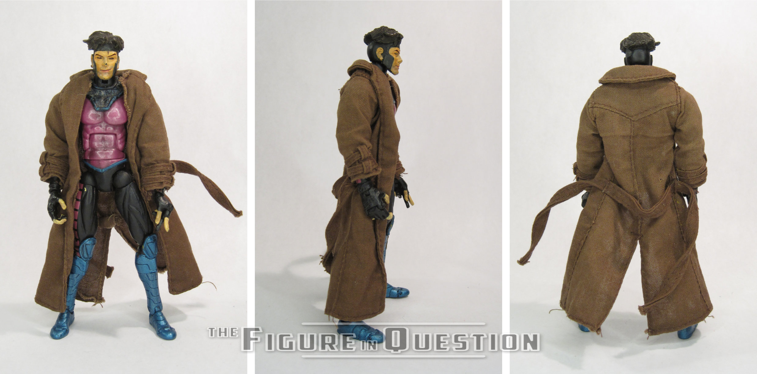
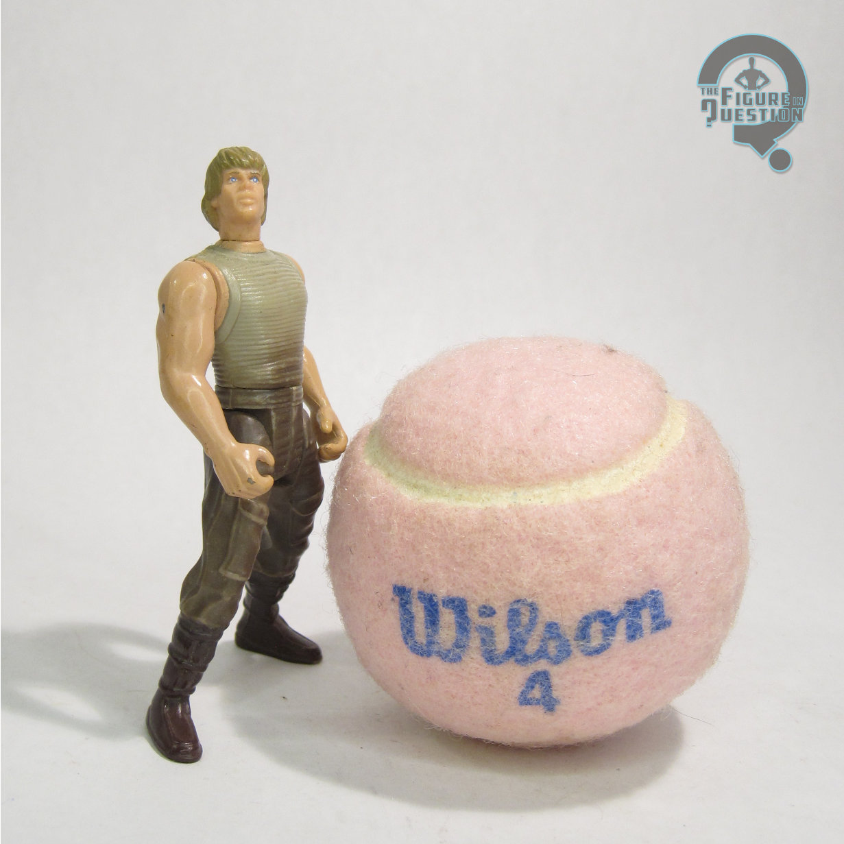
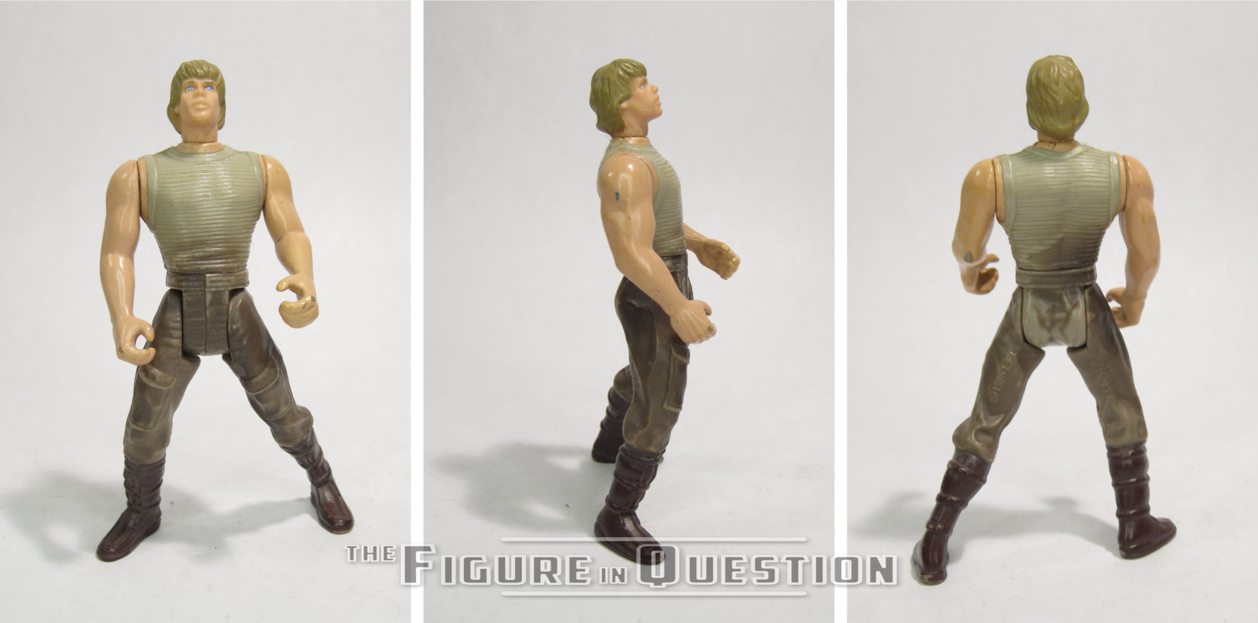
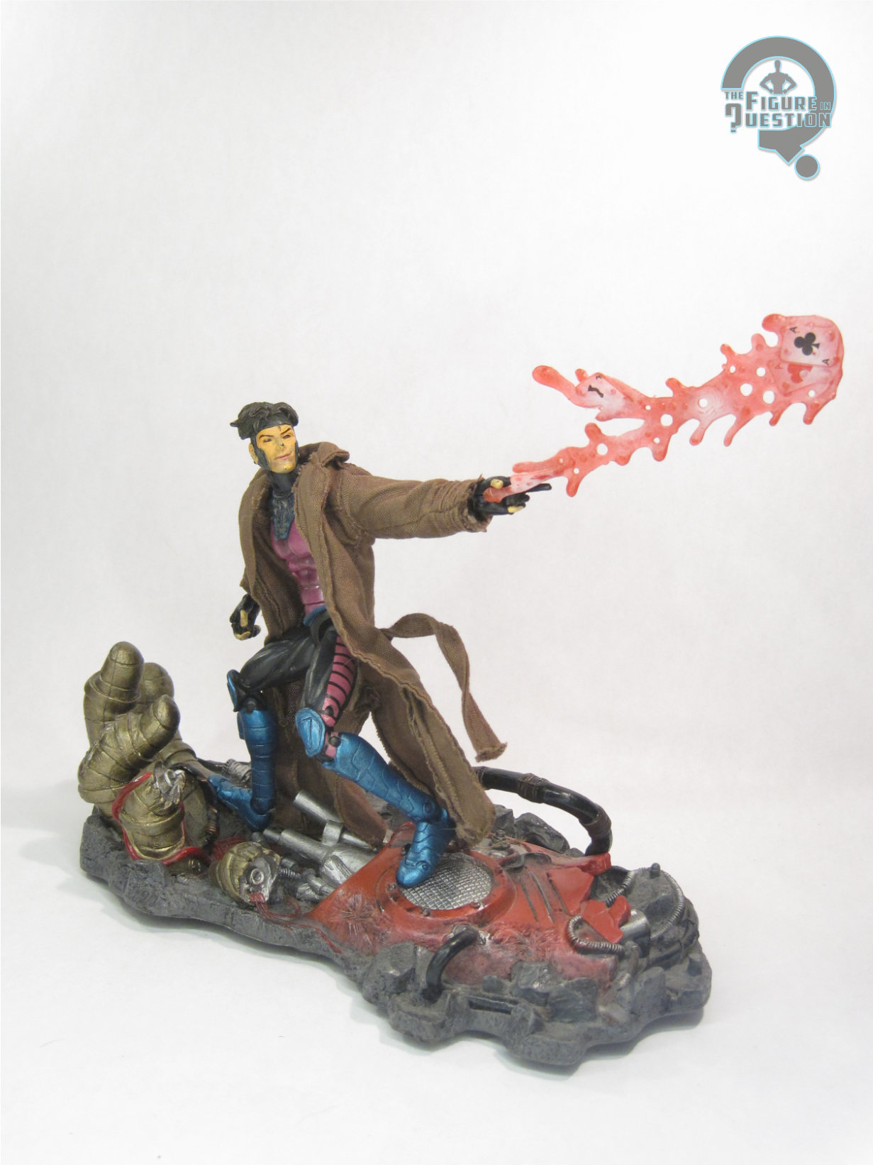
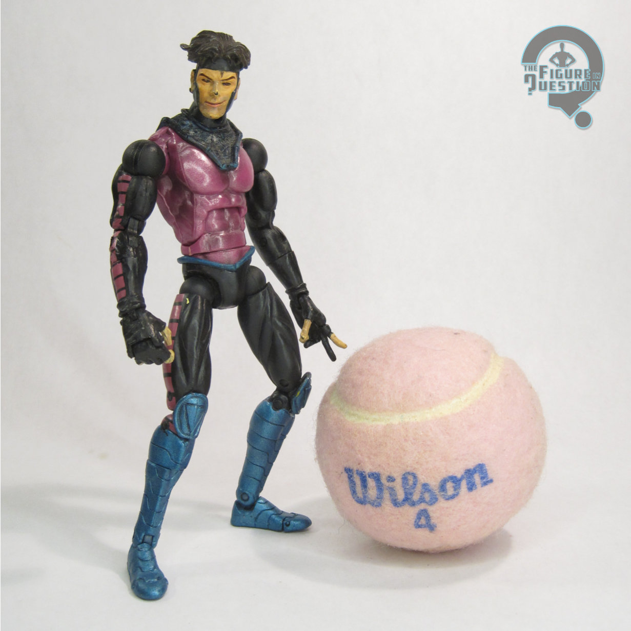
Gambit was released as part of the 4th wave of ToyBiz’s Marvel Legends line. He stands about 6 inches tall, and he has 40 points of articulation. The figure depicts Gambit in him classic pink/blue/black leotard and brown trench coat look that everyone thought was oh so rad in the 90s. It’s a truly hideous design, but I can’t help but be so damned nostalgic about it, because being born in the 90s ruined me as a person. The sculpt was pretty good at the time, but now feels like one of the more outdated sculpts in the line, with huge hands, some pretty serious monkey arms, and an overall emaciated look to him. I think the head still holds up, with that perfect floppy Gambit hair, and the totally in character smirk. The coat isn’t the best tailored thing ever, but it isn’t too bad, and it does somewhat mask the odd proportions of the figure. The figure’s paint is pretty good, though it can be sloppy in some places, particularly the face, which I’ve seen have some variance from figure to figure. I do appreciate that this is one of the only Gambit figures to give him the appropriate black sleeves with those weird pink squares, instead of just leaving them pink. The figure had a really nice assortment of accessories that I wish I still had, including: his staff, an energy explosion with a set of cards to simulate his powers, and a base sculpted to look like a fallen Sentinel hand. These pieces were all pretty cool, and I think I still have the stand in a box with some others, but the other two pieces are long gone.

THE ME HALF OF THE EQUATION

Believe it or not, Gambit was one of my favorite ToyBiz Legends. I’m not really sure why, as I’m not that big a fan of the character, and the figure isn’t that amazing, but I really liked him. I suppose coming early in the line, he got a lot more play time than some of the later figures, and he was one of the figures in the line who you didn’t have to devote all your free time to tracking down.

He hasn’t aged amazingly well, but he’s still held up better than some of the figures, which does give a leg up. And given Gambit’s rather quick decline in popularity, the character has yet to see any kind of rerelease in the more recent incarnations of the line, which I suppose makes this guy a bit more valuable. 

That is a very long intro, and it sure does take a while to get to the point, doesn’t it?  I was still getting the feel for how to jump into things, I think, and I was still doing a lot of call outs for even more minor holidays, which I just don’t do now.  At this point, I was still recovering from being burned by some bad experiences collecting Toy Biz Legends.  Another decade removed, I’m less that way, and generally feel a bit more nostalgic about the whole experience.  Also, I do kind of rag on Gambit for being not really relevant anymore, which is funny here in 2025, when he’s definitely come back around.

Generally, the review proper’s not bad.  I stand by a lot of what I said.  The sculpt has good aspects, but also some issues as well, much like most of the Toy Biz run of this period.  When I originally reviewed him, he was sans accessories.  Since then, I’ve tracked down the stand (which I knew I had when I reviewed him originally, but just didn’t go to the trouble of tracking down), as well as the charged card effect piece (which I was convinced there was no chance at me finding originally, but I was clearly wrong).  The display bases could be a bit of a mixed bag, but Gambit’s is undoubtedly one of the best from the line, and the best of the running subset of damaged Sentinel bases packed with X-Men characters.

#3913: Princess Leia & R2-D2

PRINCESS LEIA & R2-D2

STAR WARS: POWER OF THE FORCE II (KENNER)

“Moments before being captured by the evil Darth Vader, Princess Leia inserts secret plans for a new Imperial battle station into her loyal astromech droid, R2-D2”

Waaaaaaaaaaaaay back in 2016 (which was almost a decade ago, and also falls into my view of the site being in the full swing of things; that doesn’t make me feel old *at all*), I did a couple of reviews of “The Princess Leia Collection,” an off-shoot of Power of the Force from 1997.  I didn’t talk much about what it actually was, though, so I guess I’ll do that now.  In 1997, Kenner brought in the “girls division” for some fresh Star Wars products with a slightly different approach than what they’d been doing.  One of the two notable projects was the Princess Leia Collection, which was a series of two-packs, centering on Leia, and bringing some more doll-like sensibilities to figures that could otherwise interact with the main line.  Here’s Leia and R2 from that line.

THE FIGURES THEMSELVES

Princess Leia & R2-D2 were one of the four two-packs that made up 1997’s “Princess Leia Collection” assortment of Star Wars: Power of the Force.  They were from A New Hope, which was granted two different sets, in contrast to the single set for each of the other movies.  While both the Luke and Han sets were made up of totally new figures, this set features a straight re-pack of the standard R2-D2, reviewed here.

Leia is the main selling point here, which is sensible.  This was one of four figures based on her standard A New Hope design.  It’s certainly better than the first one, but most things are.  The figure stands 3 1/2 inches tall and she has 6 points of articulation.  All of the Leia figures in this line were heavy on their use of soft-goods, with minimal sculpting visible.  The head is a unique piece, and it’s much better than the prior one; it looks distinctly not monkey-ish in its depiction, so that’s a win.  She also gets a sculpted belt piece, which is good for keeping the general shaping of the design down.  The underlying body is basic and rudimentary, but it does what it needs to, and it’s not meant to be seen.  Covering it up is a cloth robe piece.  It’s nothing crazy, but it’s pretty decently implemented.  My biggest complaint is that the hood it tailored more like a cape, so she can’t actually put it up, which is a bummer.  But, she looks good when it’s all just left the way it is.  Leia’s paint is largely limited to the head.  Again, pretty good work.  Application is clean, and the sculpt is well-served by how the paint accents it.

THE ME HALF OF THE EQUATION

The Luke and Han sets are the flashier pairings from this line, and also the most frequent to show up.  I had them back in 2015, but took my time finding the other half of the line.  This one wound up being the scarcest of the bunch, but all things said, that doesn’t make it especially rare or anything.  I ended up snagging a sealed one that got traded in through work a couple of years ago.  As with so many things Power of the Force related, I opened it just prior to writing this.  R2 is the same figure from before, which is fine, but not new.  Leia’s actually quite a nice figure, and probably the best standard Leia the line had to offer.

Shoutout to All Time Toys for setting me up with this figure to review.  If you’re looking for cool toys both old and new, please check out their website and their eBay storefront.

#3912: Roboto

ROBOTO

MASTERS OF THE UNIVERSE CLASSICS (MATTEL)

It’s been a year and a half since I’ve talked at all about Masters of the Universe Classics.  There’s….reasons?  I mean, the big one is that the line’s been dead for the better part of a decade, so it’s not like there’s a lot of updates.  Also, I’m only a moderate MOTU fan at best, so it’s not like I’ve even got a huge backlog of them.  And discussion of how the line was run is tricky at best, and I’ll just leave it at that.  But, I do have some parts of the franchise that I enjoy no matter the surrounding situation, and one of the core characters for that is Roboto.  He’s just so neat and nifty and retro, and that’s very fun.  So, let’s look at another one of those!

THE FIGURE ITSELF

Roboto was the October release for Masters of the Universe Classics 2010 run of figures, making him the tenth standard figure of the line’s third year.  By 2010, the line was pretty much in full-swing, and they’d gotten the subscriptions set up, so Roboto was around for a leisurely 2 hours and some change before selling out, which I guess was pretty nice.  The figure stands 7 inches tall and he has 23 points of articulation.  While he loses the mid-torso joint that most figures in the line sported, he does gain an articulated jaw, so it winds up as an even trade.  Roboto’s sculpt was a mix of new and re-used, which was pretty par for the course.  Like his vintage counterpart, he shares his legs with Trap-Jaw (who also shared his legs with Optikk, all three the same year), but his upper half is all-new.  Roboto was very definitely based directly on his vintage counterpart, rather than his 200x version.  At the time, it was the most sensible choice.  There was an alternate head made available later, but that wasn’t present with the initial release.  The sculpt does a pretty respectable job of capturing that vintage look.  The head and torso are very cleanly detailed, and I love the working jaw and turning gears inside the torso.  I also really dig the little heart sculpted around the central gear, in reference to his mini comic appearance.  The arms are fine, but the elbows are notably rather restricted in their motion, which was a recurring issue for the line.  QC was unfortunately a notable issue for this guy.  Thankfully, mine isn’t plagued by the torso cracking, but there was no avoiding the reversed shoulders.  They aren’t the end of the world, but it’s pretty obvious they’re not the way they’re supposed to be.  The color work was actually pretty nice for this guy; he’s really bright and bold, so it makes him very eye-catching.  He’s also got a wash on the silver sections, to help bring out the sculpted details a little better.  Roboto was packed with his classic claw, axe, and blaster attachments, as well as a standard hand.  The weapons are a bit soft and prone to warping, but generally they look okay, and the standard hand is a nice addition.

THE ME HALF OF THE EQUATION

I had only *just* picked up my first MOTUC figure when Roboto dropped, and I wasn’t up on keeping current, so I missed his day-of.  I contemplated getting him a number of times early in the run, but he was always just a little over what I wanted to pay, and then I ended up sort of falling out of it all.  I’ve been keeping an eye out for a bit, though, since he was the only of my regular line-up of characters I didn’t have for Classics.  While on family vacation, Matty wanted to go to the toy store, and they just so happened to have one of this guy for for a price I was willing to pay, so, huzzah, I have one!  Admittedly, in light of the Origins and Masterverse figures, he feels kind of quaint and a little outmatched, but I’m glad to have him nevertheless, and I’ll never complain abut more Roboto figures.

#3911: Hal Jordan – Armor Suit

HAL JORDAN — ARMOR SUIT

DC MULTIVERSE (McFARLANE)

“After years of faithful service, Hal rebelled against the Guardians when they refused to let him change history and restore Coast City after Mongol destroyed it. Unbeknown to anyone, Jordan was infected by the fear parasite Parallax, which had been imprisoned for eons in the Central Power Battery on Oa. It drove Hal to attack hundreds of his comrades, stealing their power rings as he stormed across the universe to a titanic confrontation with the Guardians’ last hope—a freed and restored Sinestro.”

If nothing else, McFarlane’s run with the DC license has certainly gotten us a lot of looks that have never seen toys before.  After exhausting pretty much every Batman variant possible early in their run, they then started doing this with other DC characters.  We got a whole plethora of Green Lanterns, and Hal Jordan in particular got some decent coverage of a lot of his major looks.  And also some not so major ones, too.  How about that?  Well, let’s look at one of those not particularly major ones, shall we?

THE FIGURE ITSELF

Hal Jordan in Armor Suit is a 2025 release for DC Multiverse.  He shipped alongside Eradicator and Western Batman.  He and Eradicator are both from the “Return of Superman” story.  Crazy that we got a white-streaks in his hair Hal and you’ll never know it.  Hal’s seen here in his armored up look from his fight with Mongul after the destruction of Coast City.  It’s a rather minor look, but also kind of a cool one, since it serves as something of a precursor to his eventual Parallax costume upgrade.  The figure stands just shy of 7 1/2 inches tall and he has 35 points of articulation.  This figure’s entire existence more or less relies on one thing: parts re-use.  As such, he is almost entirely re-used from the Steel figure released last year.  He gets a new head and a modified torso to sell it all. As with other instances of McFarlane doing this sort of re-use, it relies on half-stepping between both looks, and as a result neither is truly accurate to the source material.  In Hal’s case, that’s ultimately kind of forgivable.  The armor was a construct of his ring, and that allows a little more room for interpretation and imagination, I feel.  The new parts are pretty decent.  I like that the head keeps the same general facial structure as the Silver Age Hal from last year.  I also appreciate the decision to keep the helmet consistent with the body armor, rather than making it specifically comic accurate and risking it not really matching.  Hal’s color work is a lot of molded greens, of differing shades.  For the most part, they’re supposed to be different, but the elbows and knees notably don’t match the rest of the arms/legs around them, which looks a bit off.  The symbol on his chest is painted with a textured paint that made me think it was supposed to glow, but it appears it doesn’t.  He’s also got a tiny bit of painted shading on his lower torso and upper legs, which seems a little out of place.  It’s not awful, just strange that there’s not more of it, honestly.  Hal is packed with Steel’s hammer, a display stand, and a collector’s card.  The hammer’s a pretty essential part of the scene, so it’s good it’s here, though it’s really kind of floppy and prone to bending under its own weight.

THE ME HALF OF THE EQUATION

While I’ve cooled somewhat in more recent years, there’s very definitely a part of my ape brain that if there’s a neat Green Lantern figure, especially Hal Jordan, then I need to own it.  This figure was definitely activating that part of my ape brain.  Thankfully, I ended up getting him as a birthday present from my parents this year, so, hey, ape brain needs fulfilled.  He’s not accurate, and the droopy hammer is silly, but I do think he’s quite fun.

#3910: Grey Hulk

GREY HULK

SILVER AGE (TOY BIZ)

“Meet Dr. Robert Bruce Banner, a nuclear physicist working for the United States Defense Department. Dr. Banner designed a Gamma Bomb, a weapon that emitted a high output of gamma radiation. During the testing of the bomb, Dr. Banner attempted to rescue a civilian who had wandered onto the test site. Banner was caught in the blast and thanks to an unknown genetic factor, was transformed into a grey-skinned behemoth known as the Hulk. The meek and timid Banner, when enraged, changes into the unstoppable Hulk. Possessing unearthly strength, the Hulk can easily lift 70 tons. While in Hulk form, he is nearly impervious to harm as well. Make no mistake, the Hulk more than lives up to his name and has yet to meet his equal in sheer brute force.”

Hey, look it’s a Grey Hulk.  Or perhaps a Gray Hulk.  You know, depending on your take on spellings.  This one’s emphatically a “Grey” Hulk, and I’m gonna go so far as to say that it’s ultimately this figure’s fault that I default to the “e” spelling over the “a” spelling.  But I’m getting ahead of myself.  I’ve thoroughly exhausted the one real bit of trivia I have for Grey Hulk, so I won’t bring it up again.  I’ll just assume you know why he shifted from grey to green in the comics.  Because of that shift, however (and Marvel’s recoloring of reprints of his original appearance), Hulk merchandise always stuck to his emerald pallor.  It was a pretty big deal to get any sort of Grey Hulk at all, and an especially big deal for it to not be a Joe Fixit variant.  So, hey, let’s check out the big deal.

THE FIGURE ITSELF

Grey Hulk is the fourth and final figure in Toy Biz’s Silver Age line, a PX-exclusive assortment from 1999.  He, like last week’s Spidey, is actually true to the line’s name, and perhaps one of the very best uses of such an idea.  As noted above, this was the first proper Grey Hulk figure released, which was very cool.  The figure stands 5 inches tall and he has 7 points of articulation.  He wasn’t especially big, but I guess Grey Hulk was kind of on the smaller side.  The articulation is notably limited, with no elbows or knees, which happened a lot with the Hulks.  Most of his sculpt is a re-use of the “Crash-Out Action” Hulk from the main Hulk line’s “Smash & Crash” assortment.  It was that line’s take on the standard look for the character from the UPN series at the time.  Issues of size and articulation aside, it’s a decent basic Hulk sculpt, and it fits in well with the rest of the Toy Biz figures of the time.  Since that figure’s head sculpt was very much a later style Hulk, this guy gets a new head, a rare new piece for the line.  It gives Hulk his shorter hair and more pronounced brow, and while it’s a touch soft, it’s generally a pretty nice sculpt.  He also gets a soft-goods shirt and shoes, so as to give him more of the tattered remains of Bruce Banner’s clothing, in line with the look on the original cover.  They’re admittedly a little dopey looking, but they’re also completely removable if they’re not your vibe.  The color work here’s not bad.  The grey is all painted, and there’s pretty extensive accenting, which works quite well.  Hulk is packed with a couple of pieces of wall, which are re-purposed from the Cyclops Laser Arena, a seven year old set that had no re-use up to this point.  Pretty impressive resourcefulness, honestly.  The new paint work makes them look a bit more natural than the original use as well, which is certainly a plus.

THE ME HALF OF THE EQUATION

This figure is the only Silver Age figure I had as a kid.  He was, if I’m recalling correctly, left for me by my dad the Tooth Fairy after I lost my first front tooth.  Sneaking an entire sealed figure under my pillow was a neat trick, I’ll tell you that.  I was always reading old Marvel comics, and the early Hulk look fascinated me, so he was right up my alley.  Despite not technically being a standard Hulk, he rivaled my Avengers boxed set Hulk for being my go-to Hulk at play time.  I lost the shirt, shoes, and wall shortly after getting him, I recall, but was able to get replacements more recently.  He holds up pretty well, and I think he’s probably the best figure in this particular set.

#3909: Ponda Baba

PONDA BABA

STAR WARS: POWER OF THE FORCE II (KENNER)

What better way to demonstrate the destructive power of a weapon you just introduced than by having it used by one of your heroes to maim some poor schmoe?  That’s how George Lucas does it!  Honestly, in light of the whole “Greedo shot first” thing, it’s shocking that Lucas didn’t, like, digitally insert another guy in the scene for Ponda Baba to slice the arm off of, just to show he really got what he deserved.  Missed opportunity if you ask me.  Anyway, here’s a figure of the not slicing-off-arms-first Ponda Baba! 

THE FIGURE ITSELF

Ponda Baba was released as part of the 1997 line-up for Kenner’s Power of the Force II line.  He was Ponda’s second figure, after the original vintage one, and would be joined by a third that same year, thanks to the Cinema Scenes release.  The figure stands 3 3/4 inches tall and he has 6 points of articulation.  He was sporting an all-new sculpt at the time, but the head and torso wound up shared with the three-pack version.  Of the two, this one goes for more basic and standing in its pose.  It does fine.  It’s certainly more accurate to the source than the prior “Walrus Man” figure, though he’s certainly got a bit of that early Power of the Force bulkiness.  The biggest downside of the figure remains the lack of ability to remove his arm as in the scene, but it is what it is.  His color work is more or less the same as the multi-pack version, which means it’s passable stuff.  Colors match what they’re supposed to, and he’s even got a bit of subtle accent work on the jumpsuit.  Ponda Baba is packed with two different blasters, one in pistol form, the other a rifle.  You’ve got some options, I guess.

THE ME HALF OF THE EQUATION

Sometimes, the decision to go completist on this line is awesome, because you get to see all the neat subtle differences between two similar versions of a character.  Sometimes, you end up buying a figure that’s different for the sake of different.  This one is the second thing.  I bought him to have him, and for no other reason.  I got several years ago, and he remained unopened, because I just didn’t have much draw.  I opened him purely for the purposes of this review.  He’s…fine.  You really don’t need him, but he’s fine.

#3908: Peter B. Parker & Mayday Parker

PETER B. PARKER & MAYDAY PARKER — ACROSS THE SPIDER-VERSE

S.H. FIGUARTS (BANDAI)

The two Spider-Verse films we’ve gotten thus far have both had a lot of importance placed on growth of characters and definitively moving them forward in their own narratives.  In a world of super hero movies that change the main heroes’ costumes purely for the sake of change, it’s nice to see an approach that works those changes more into the story, and how it affects the characters.  Into the Spider-Verse showcases a Peter Parker at his lowest point.  He’s alone, out of shape, and disheveled, and spends a good portion of the film in a makeshift outfit that further emphasizes that.  Across re-introduces us to Peter as he’s well into his way of recovering, and he’s so not alone that he’s literally got another person strapped to his chest for most of his screen time!  Despite him being more on the mark and put together this time around, Peter B. Parker was surprisingly absent from the toy coverage for Across, with most of his figures actually being repurposed looks from the first movie.  He got a Pop, which is great if you like Pops, but then it was a rather long wait for a proper figure.  Bandai ultimately took the lead this time, with a figure from their SH Figurarts line, which I’m taking a look at today!

THE FIGURE ITSELF

Peter B. Parker & Mayday Parker are part of the larger sub-line of Across the Spider-Verse figures in the SH Figuarts line-up.  This is the latest of the figures to hit, and it’s the seventh in the set.  Certainly a more in-depth line-up than the prior movie.  Though billed as a two-pack, the set is really a Peter B with a Mayday accessory, so I’ll be treating it that way for the purposes of the review set-up.  Peter stands just over 7 inches tall and he has 40 points of articulation.  Figuarts has always occupied a sort of nebulous “1/12 scale” space, which can make scaling with other nebulous “1/12 scale” lines sometimes hit or miss.  What’s curious about the Across figures is that they land on the opposite end of the nebulous range than usual.  Relative to, say, Marvel Legends, Figuarts tend to run a bit on the smaller side, but Peter here winds up taller than all of the standard sized Legends for the movie.  Not so much so that you can’t fudge things a bit, but it’s a little funny to see him end up taller than Miguel.  Also, it’s not like they’re designed to scale with each other in the first place, but I did find it amusing.  Peter’s articulation is generally decent for a Figuarts release.  They’re definitely less floppy and sort of weird in their articulation schemes these days, so he feels a bit more naturally flowing and intuitive.  I still had some slight issues with stability, especially in the more intense Spidey-style poses, but it generally works okay.  The sculpt is totally new, and it’s doing a few different things at once.  Right out of the box, he’s just a standard Spider-Man in the movie style.  It’s a good match for the film design in terms of proportions and stylization.  The texturing is quite impressive, and there’s a lot of neat visual filler that keeps him interesting.  His build shows that he’s certainly working on getting into better shape then he was in Into, but he’s not quite back to Peter A levels, and I like that.  But, that’s just standard Spidey, and nobody’s really buying this one for a standard Spidey, right?  No, we want the goofy, more put-together, but still disheveled look.  To that end, this figure gets two alternate unmasked heads (with a corresponding neck piece with a lower collar), ungloved hands, and an alternate set of lower legs with socks and slippers instead of boots.  The unmasked heads give us Peter with a more neutral slight smile and with a more intense opened mouth laugh.  Both are very much on model and keep things nice and internally consistent.  The legs are goofy, and fun, and I like them a lot.  And it’s all topped off with the most important part of the whole ensemble: the pink bathrobe.  It’s quite a statement piece and neat counterpoint to his green jacket from Into.  Here, it’s a soft goods piece, which makes a lot of sense.  It’s very soft and fuzzy, and there’s a wire in it for dynamic posing.  Peter’s paint work is all pretty top-notch.  The work on the unmasked heads is by far the best, but even the suit is clean and well-rendered.  As mentioned above, Peter gets all the parts for both of his looks, as well as six pairs of hands (four gloved in fists, thwipping, gripping, and open gesture, two ungloved in open gesture and relaxed), the wrist bracelet goober thingy, and three different weblines.  The weblines are ultimately a bit unimpressive compared to others we’ve seen, but I don’t see myself using them anyway.  The most important selection of extras is Mayday and her associated parts.  The main Mayday is done up in a crawling pose, and is jointed at the neck and waist.  While the arms and legs are separate, they have rectangular pegs, so they can’t be posed, which is kind of a shame.  She does get two heads, so you can do with or without the hat.  Why you’d leave off the hat is anyone’s guess, but the option’s there.  Also included is the carrier for Mayday, which can be attached to the main Peter figure.  There’s a special neck piece that goes in that one of the two heads can be attached to (the hat fits better than the one without), and you can move the arms and legs over as well.  It stays on pretty securely, and scales well to the other figure.  It’s also relentlessly adorable.

THE ME HALF OF THE EQUATION

Across the Spider-Verse was a well-timed movie for me, because I also had a daughter in the spring of 2023, and Mayday reminded me very, very much of her.  For Halloween that year, my mom knitted Aubrey a spidey hat, and I stole my wife’s pink bathrobe, so that we could be Peter and Mayday, and I assure you, we were also relentlessly adorable.  As we have become rather linked to the look, getting a figure of it was kind of important.  I have the Pop, but it’s just not the same, so I realized I was going to have to make the jump to Figuarts.  But, Rachel and Aubrey got ahead of me on that one, and this was my birthday gift from the two of them this year.  It’s awesome.  I’ve got some quibbles, but they’re minor, and this figure just does so much right.  Just a ton of fun.

#3907: Superboy

SUPERBOY

MAFEX (MEDICOM)

I’ve touched on Medicom’s MAFEX line a few times here on the site.  While my most recent review kind of broke the mold a bit, my reviews have otherwise been DC-based, all of them hailing from the running sub-line of figures based on Batman: Hush.  Hush is a pretty solid way of doing a large swath of Batman-related characters in one cohesive style, but it does limit you mostly to just Batman.  For a focus on DC’s original super hero, Medicom also started up a based around the “Death” and “Return of Superman” storylines from the ‘90s.  Their primary focus has been the Superman replacements from “Reign of the Superman,” who each took over one of Supes’ four books running at the time. Taking over Adventures of Superman was “the Metropolis Kid,” Superboy!

THE FIGURE ITSELF

Superboy is figure 232 in the MAFEX line-up.  He’s the fifth figure in the Return of Superman set-up, and the last of the four replacement Supermen to join the line.  The figure stands a hair over 6 inches tall and he has 42 points of articulation.  In terms of scaling, Superboy feels a touch too large for the other MAFEX figures I’ve picked up.  Not crazy levels of out of scale, but he definitely feels like he should maybe be a little shorter.  His articulation scheme is pretty much the same as the others I’ve looked at, which is to say it’s quite good, and allows for a lot of solid posing.  Nothing’s too overly loose or anything, and he can hold a pose quite well.  The figure’s sculpt is based on Tom Grummett’s initial design for the character, which is by far his best, and really his most enduring design.  It’s also the one that matches all the other figures, so it’s got that going for it too.  It translates quite nicely into figure form, and the little raised and recessed elements of the costume design all make it stand out quite well.  There are three included heads, all based on Grummett’s depictions of Kon-El.  There’s a neutral expression, an angry expression, and one with sunglasses affixed.  Of the three, I think I lean towards the sunglasses head the most, but I really like all three, and it’s great how consistent his look is between all of them.  Rather than being a sculpted element, like Hush’s trench coat was, Superboy’s distinctive leather jacket is a softgoods piece.  It’s good.  It’s well-tailored, not too limiting on the posability, and there’s a wire running through the belt for extra dynamic posing options.  I do worry about how well it will hold up in the long run, but I guess I’ll just enjoy it for what it is now.  The color work here is really bright and colorful, and feels very true to his early appearances.  The paint is all really clean, and there’s some especially strong work on the heads.  Superboy is packed with five different pairs of hands (fists, flat, thumbs up, open gesture, and relaxed), and a display stand.  It’s a little light, but he’s also got the three heads and the jacket, so it makes up for it, I feel.  The hands swap easily, but I’d be careful with them, because the glove cuffs have a real tendency to go flying during the swaps.

THE ME HALF OF THE EQUATION

I got in relatively close to the ground floor with this incarnation of Superboy, getting the Man of Steel figure when it was new, and following his comic from an early point until it was cancelled.  I’ve always liked the character, and I’ve never been much of a fan of the jeans and t-shirt direction they took him under the Johns era.  It feels like something of how he was supposed to work kind of got lost there.  Thus far, I’ve just stuck to the Hush figures, and I even missed the standard Superman from that line, so I avoided the Return figures.  Superboy made that a lot harder to stick to, especially in light of my seriously renewed investment in Superman as a whole, post movie release.  This guy wound up being a birthday gift from my parents this year, and he’s super, super cool, and a great reminder that, no matter how far I progress from the decade that birthed me, I’ll never really be able to kick the need to own characters wearing leather jackets over their spandex.

#3906: Spider-Man

SPIDER-MAN

SILVER AGE (TOY BIZ)

“Peter Parker, a mild mannered honor student in high school was fascinated with all things scientific. While attending a science exhibition on the manipulation of wavelength radiations, Peter was bitten by a spider that was exposed to radiations. Peter was bitten by a spider that was exposed to radiation. As a result, he was given superhuman, spider-like abilities. Peter could now climb walls, leap incredible distances, and life more than 10 tons, prompting him to adopt the identity of Spider-Man. He made a costume and with his knowledge of science created “web-shooters.” Attached to each wrist, his web-shooters allow Spider-Man to shoot super strong, sticky webs to swing from and use as various weapons. Spider-Man also has a “spider-sense” that warns him of impending danger making him one of the most legendary crime fighters ever known.”

While he spent the first two decades of his existence with only a handful of action figures, but the end of the ‘90s, there was absolutely no shortage of Spider-Man action figures.  Toy Biz released a metric ton of them in the 5-inch line, mostly under his own self-branded line, launched to tie-in with his ‘90s Animated Series.  The more obscure offshoot lines weren’t as likely to include him, since he was better suited in other, more big-box-retail-friendly set-ups.  He did get the occasional less mainstream release, as was the case with today’s offering, which goes back to the character’s earliest days.

THE FIGURE ITSELF

Spider-Man is the third of the four figures in Toy Biz’s PX-exclusive Silver Age line from 1999.  By far, he is the assortment’s heaviest hitter, making him this line-up’s correspondent to the Wolverine in the Modern Age line-up.  Unlike the Cap figure, which was emphatically *not* Silver Age, and the Gwen figure, which was a loose connection, Spidey is emphatically well within the timeline for Silver Age…for the most part.  I’ll get to all that.  The figure stands right under 5 inches tall and he has 15 points of articulation.  Spidey was entirely parts re-use, using the body of the Marvel Super HeroesMulti-Jointed Action Poses” Spidey, with the head from the Animated Super-Posable Spidey.  It’s actually kind of a neat combo.  The MSH body is smaller and skinnier than most of the other Spideys that Toy Biz put out, and the head being originally meant for a more bulked up Spidey means it’s a touch too large…which is a pretty good match for Ditko’s portrayal of a teenage Peter Parker in the costume.  The base body is very posable, as well, which makes for a better general Spidey set-up.  To really sell the earlier Spidey look, they’ve also pinned a pair of vinyl “web-wings” to the backs of his arms, much like the first Fantastic Four line’s Black Bolt.  I limits the posing on the arms a little bit, but it’s not terrible, and it’s a good change-up for the look.  The figure’s paint work is more or less what you would expect from this era of Spider-Man.  I might have perhaps liked a slightly more Ditko-like pattern and eyes on the face, but it’s not incredibly far off, and it wouldn’t shock me to find out there may have been some branding involved in the look here.  The blue is a darker shade, but not the straight on black of his original appearance, meaning this isn’t a First Appearance figure, but rather a broader Silver Age figure.  While I always love a good First Appearance Spidey, the blue with the web-wings is the look less often done, so can dig it.  Spidey was packed with the web-shooters, belt, and ankle pouches from Scarlet Spider, all done in the same silver with darker accenting, as well as an actual rolled paper copy of the Daily Bugle, and a card with the cover of Amazing Fantasy #15 (which makes this line 3 for 3 on the figures not wearing the costumes depicted on the covers for their cards).  Not entirely sure why he gets all the Scarlet Spider gear, but it’s a neat extra nevertheless.

THE ME HALF OF THE EQUATION

I had *plenty* of Spider-Men by the time this figure hit, so he’s the one member of the line-up that didn’t tempt me in the slightest…you know, until I had the other three and he was all I needed to finish the set.  So, off to eBay I went.  In light of figures that are more obviously new and different, he sort of gets lost, but at the same time, he’s actually a pretty neat figure with a solid take on a more specific design.  And, he does at least actually stick to the theme.

Flashback Friday Figure Addendum #0040: Luke Skywalker – Dagobah

LUKE SKYWALKER — DAGOBAH

STAR WARS: POWER OF THE FORCE II (KENNER)

We are officially taking the Flashback Friday Figure Addendums back to Star Wars!  Oh yeah!  Let’s jump back to some of the earliest Star Wars coverage here on the site, and indeed the very earliest Star Wars in my entire collection, with Dagobah Luke!

So, today’s review is actually pretty nifty. I’ve looked at the most recent round of Star Wars toys with The Black Series, and I’ve also taken a look at one of the vintage figures from the original line, but I’ve never really looked at any of the figures released in between.

Star Wars is looked at as one of the permanent fixtures of the action figure aisle nowadays, but that wasn’t always the case. Following Return of the Jedi, the line shifted to Power of the Force for a little while, but that line only ran until 1985, at which point Star Wars toys effectively ended. Ten years later, Kenner relaunched the line under the branding Power of the Force II. In 1995, I was 3 and just getting into action figures. So, POTF II came at just the perfect time and provided me with my very first Star Wars figure, which I’ll be looking at in this review.

THE FIGURE ITSELF

Luke was released as part of the 1996 assortment of Power of The Force II. He’s based on Luke’s look while he’s training on Dagobah in Empire Strikes Back. The figure stands about 3 ¾ inches tall, and features 6 points of articulation. That waist articulation was revolutionary, let me tell you. The sculpts for POTF II, in general, have not aged well. For some reason, everybody got really buff. Luke follows that trend, and looks more like Arnold Schwarzenegger than Mark Hamill. From a purely aesthetic stand point, it’s actually not a bad sculpt. There’s some nice texture on his clothing, and the proportions are about right, even if they don’t belong to Mark Hamill. One negative point: the feet are sculpted at a bit of an angle, which can make getting him to stand up a chore. The paint is actually very good for the time. There’s no bleed over or slop and the smaller details are all clean and sharp, and the shading on the shirt to show it’s wet and stained gives the figure a nice level of depth rarely seen on figures of this era. Luke was packed with a lightsaber and a blaster.

THE ME HALF OF THE EQUATION

The trip on which I acquired this figure is actually one of my earlier memories of going to the store and buying something. I don’t remember what store it was (for some reason my gut says Target, but that doesn’t seem right). What I very vividly remember was being walked over to the toy aisle by my parents, seeing the display of figures and running to them. I saw Luke hanging there and immediately grabbed him. In particular, I remember my mind being completely blown by the idea that he actually included a lightsaber. I guess I just assumed that would have to be a separate purchase. I had yet to pick up on how action figures worked, I guess. Regardless, I was thrilled to have this figure. As the years have gone by, the figure has started to show its age, but I still feel pretty damned nostalgic for him. All in all, he’s not a bad figure, and the sentimental value pushes him up to 11.

Well, I can generally stand by this review pretty well, I feel.  Nicely formed, and generally on point.  Covers all the bases.  Kind of funny.  Good hook at the end. Go me.  A few notes to follow up on, though.  I addressed the angle of the feet, which mean he has to stand at an intense angle to remain upright, which is actually to do with him being designed to work with the Yoda released at the same time.  It actually works well in that regard, but I didn’t own Yoda until *after* this review was written, so I didn’t really know.  When I reviewed him, he didn’t have his lightsaber and blaster, but I’ve found both of those, so now he’s all complete!  And lastly, my wife an I watched all of Righteous Gemstones a few months back, and after watching it, I can’t help but see this take on Luke as looking unmistakably like Keef.  So there’s that.