#2911: Bib Fortuna

BIB FORTUNA

STAR WARS: POWER OF THE FORCE II (KENNER)

Behold the biggest surprise return Star Wars character of 2020, Bib Fortuna.  Sure, Boba Fett gets all that fuss around him, but we all knew that would happen anyway.  And I’m still not entirely convinced it was Boba anyway.  I mean, did you see how he actually had an impact on the plot and like a character arc, and like dialogue, and like something to do other than just suck?  I feel like that’s not very Boba Fett.  What if he’s another clone?  What if that’s the real twist of Book of Boba Fett?  What if he was really Rex the whole time?  Yeah, that’d be cool.  Wait, I’ve gotten too far off track ragging on Boba Fett.  What was I doing?  Right, Bib Fortuna review.  Of course.  How could I possibly get distracted from that?

THE FIGURE ITSELF

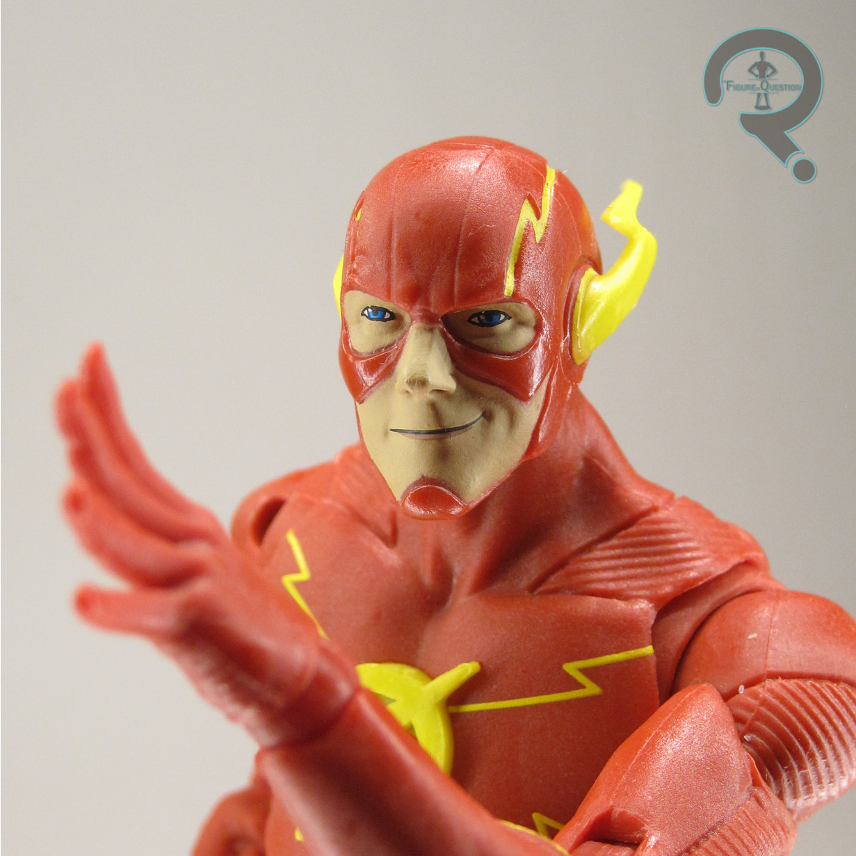
Bib Fortuna was added to the Power of the Force II line in 1997, a year with quite a solid helping of Jabba’s Palace related characters.  Guess they really wanted to have them all ready for the playset the next year.  The figure stands 3 3/4 inches tall and he has the usual 6 points of articulation.  Bib is rather restricted on the articulation front, thanks to a handful of his design cues.  The tendrils on the head negate most of the neck movement, and the robes negate most of the leg and waist movement.  So, while all that articulation is present, he’s not really much more posable than, say, the Royal Guard.  His sculpt is still kind of from the transitional period of the line, so he’s kind of got some of that lingering bulkiness, which makes him not terribly far removed from his Mandalorian appearance, I guess.  The head’s kind of light on detailing for an alien from the line, and while there’s a fully detailed body beneath the rubber robes, there’s also no easy way to see it, since the robes can’t make it over his head.  In general, the detailing on him does seem to be a little softer than other entries from the line, which is too bad.  It’s not terrible, but not great either.  In terms of paint, he’s likewise not bad, but also not terribly inspiring.  The base work is alright, but it’s really just bare minimum.  Also, the blues seem a little too bright to me, but that might just be personal perception.  Bib was packed with a small blaster pistol, you know, for all that cool action stuff he gets into.

THE ME HALF OF THE EQUATION

Bib is an alright character, I guess, and it was cool seeing him show back up after three decades, but I’m not sure he makes for the most exciting action figure.  This one’s really only good for standing there, which, admittedly, is all the character really does anyway, so I can’t fault them there.  This one wasn’t one I had as a kid, nor was he one I wanted as a kid.  I got his rather recently, as part of a batch of PotF figures I picked up from All Time in the fall of 2019.  He’s okay.  Not super exciting, but he stands behind Jabba well enough.

#2910: Ant-Man

ANT-MAN

AVENGERS: UNITED THEY STAND (TOY BIZ)

“As the leader of the Avengers, Dr. Hank Pym is Ant-Man! Ant-Man blends brilliant battlefield strategies with a guide-by-example bravery to unite Earth’s mightiest heroes against the forces of evil. The symbol on his chest means Ant-Man will always heed the call, ‘Avengers Assemble!'”

In 1999, after the massive success of their Spider-Man and X-Men animated series (and in light of the at least moderate success of Iron ManFantastic Four, and The Incredible Hulk), Marvel tried to bank on a few more cartoons.  From the “big team of colorful heroes” angle, we got Avengers: United They Stand, an ill-fated attempt at getting Earth’s Mightiest Heroes out to a wider audience before the MCU would do so far more successfully.  I’m an unashamed fan of the show, but it didn’t really hit with most people, and has generally been seen as a black mark on the team’s reputation in larger media terms.  Something notable about the show was its shift away from the big names in favor of focusing on the lower tier mainstays of the team.  In accordance with that, for the purposes of the show, the team’s leader wasn’t Captain America or Iron Man, but rather Ant-Man, specifically of the Hank Pym variety.

THE FIGURE ITSELF

Ant-Man was released in the first series of Toy Biz’s tie-in line for Avengers: United They Stand, not that it was anything other than a clerical numbering, since all of the figures from both assortments shipped at the same time.  The figure stands about 5 1/2 inches tall and he has 16 points of articulation.  He’s remarkably posable for this era of figures, which certainly makes him a very playable figure.  Ant-Man had an all-new sculpt, based on his design from the show.  The show gave a good portion of the cast some rather radically different designs, Ant-Man included.  He got a whole armored appearance within the show, removing him quite a bit from his classic attire.  In retrospect, it’s not quite as crazy different, though, since elements of it would make their way into Scott Lang’s early ’00s re-design, and likewise would become part of the character’s MCU design.  He’s actually closer to the MCU Ant-Man than the classic is in many ways, making him a fair bit more recognizable.  I guess that’s an unintended bonus.  The sculpt does a respectable job of capturing the style of the show’s animation and translating into a working figure.  It honestly ends up looking pretty darn good, and may even be the best of the sculpts this line produced.  Heck, it’s just one of Toy Biz’s best 5-inch Marvel sculpts.  He’s even got a fully removable helmet, which was pretty great at the time.  The only slight oddity to the sculpt is his “action feature”; in order to simulate his ability to grow into Giant-Man in the show, they gave him extending limbs.  It’s not the worst concept in theory, but it doesn’t really give the intended effect; he just looks like he’s really stretchy.  Fortunately, it doesn’t at all impede the figure’s function at normal scale.  His paint work’s not bad for the era.  It’s a lot of base work, and it’s pretty cleanly applied.  There’s a little bit of wear on the hair on mine, but it’s otherwise held up pretty well in the two decades I’ve owned it, so I’ll consider that a win.  Ant-Man was packed with his removable helmet, a miniature version of himself, and the mini-ship he would ride around in on the show.  The ship could be placed on his back, like on the show, and could be fully deployed by using the magnet on his forearm to unlock it.  I’ve lost half of mini Ant-Man, because he was literally an inch tall and I was 7, as well as the hatch for the vehicle, because, again, 7, so, you know, that’s how it works.

THE ME HALF OF THE EQUATION

I absolutely love this figure.  He’s probably my favorite figure from this line.  He just really works.  Despite that, he’s one of the very last figures I actually got from the line.  The line was rather scarce at launch, so finding multiples of figures wasn’t super likely.  Because of this, my dad and I wound up sharing most of the line, at least at first.  He wound up getting the first Ant-Man.  However, as the line began to become more plentiful, I started getting more of them, and Ant-Man was one of the last three I had left to get.  I mentioned this to my Grandmother, and she asked for a list of the three I was missing.  The next week, when I went over to their house, she pulled this guy out for me, having bought him in the mean time, and he very quickly became one of my favorites.  He holds up remarkably well, and I still really like him.

#2909: Shriek Unmasked

SHRIEK UNMASKED

DC MULTIVERSE (MCFARLANE)

“Walter Shreeve was a skilled audio engineer living in Neo-Gotham, trying to fund his research in the field of sonics. Unable to do so, Shreeve used his highly advanced sound technology to build an armored suit capable of demolishing buildings with sonic blasts. Going by the name Shriek, he was soon hired to destroy Batman and nearly succeeded, but lost his hearing in the ensuing battle. He was then sent to Blackgate Penitentiary where he was able to continue his research behind bars. Since then, Shriek has managed to break out on occasion, each time seeking revenge against Batman and wreaking havoc on the citizens of Neo-Gotham!”

It was bound to happen eventually, I suppose.  After two days of McFarlane DC reviews that weren’t Batman-related, we’ve circled back to what Todd truly knows best about DC.  I mean, it’s not specifically a Batman, of course, but it’s a Batman villain, and it’s also got a stupid variant structure, so we’re right back in that McFarlane comfort zone!

Batman Beyond‘s creator’s strove to give Terry his own unique cast of villains, which wouldn’t just be cheap re-hashes of Bruce’s old foes.  Introduced early on, and becoming a rather recurring opponent, was Walter Shreeve, aka Shriek.  He’s got one of the most distinctive and memorable designs of Terry’s foes, making him a solid choice for toy treatment.  That said, he never did get it during the show’s original run, with his McFarlane figure being his very first…or second, I guess, what with there being two of them and all.

THE FIGURE ITSELF

Shriek Unmasked is a solo release within McFarlane’s DC Multiverse line.  As with Batman Beyond, he was preceded by a Target-exclusive release, which also included a Build-A-Figure part, and was fully armored, rather than unmasked.  Yes, in classic McFarlane form, rather than giving us one figure with an extra head, they’re selling us two of the same figure with different heads, and thereby making both figures less valid than one single figure with an extra accessory would have been.  Greeeaaaaat.  The figure stands 7 inches tall and he has 32 points of articulation.  It’s largely the same as the usual set-up, but the movement on the arms is predictably kind of restricted by how the armor works.  To McFarlane’s credit, the movement is all pretty decent, and the arms work better than you might expect at first glance.  The sculpt is a pretty decent piece of work.  He’s technically based on the comics, as was the Batman Beyond, but it’s a good merging of the aesthetics.  The armor’s detailing is pretty sharp and cleanly detailed, and there aren’t too many extra details shoved in to really mess things up, so it’s generally a nice piece.  The head is likewise a very nice piece of work.  It’s real world-styled version of Shreeves, but it really still feels like the character as depicted in the show.  There’s just the right level of slimy sleezebag, and I love it.  Shriek’s paint work is well handled; the suit has some nice contrast on the black/white, and the clear blue parts are definitely fun.  His head has a rather involved paint deco, which gives Shreeves his usual sickly pallor.  He’s clearly a guy who doesn’t get out much.  Shriek is packed with two sound effect pieces, a display stand, and a collector’s card.

THE ME HALF OF THE EQUATION

This guy reminds me of exactly why I don’t like how McFarlane does things, because the splitting of the two looks just really sucks all around.  I certainly was down for a Shriek to go with my Batman, but I wasn’t really big on how the helmet looked on the first release.  I wanted an alternate head of some sort, which this figure gave me, but, of course, at the cost of him never actually being helmeted now, which is limiting in its own right.  Sure, I may not be thrilled by the helmet’s design, but that doesn’t mean I don’t want the potential option of displaying it.  Ultimately, I was going to feel he was lacking either way, but I felt slightly less so this way, so it’s what I went with.  I do really like this figure, and I think he turned out really well.  He’d be better with the extra head, though.

Thanks to my sponsors at All Time Toys for setting me up with this figure for review.  If you’re looking for toys both old and new, please check out their website.

#2908: Green Lantern – John Stewart

GREEN LANTERN — JOHN STEWART

DC MULTIVERSE (MCFARLANE)

“John Stewart is a former U.S. Marine who uses his military training and discipline to protect Earth, and the rest of Space Sector 2814, as a member of the intergalactic peacekeeping force known as the Green Lantern Corps. As Green Lantern, John wields a power ring, which creates a protective shield around him, allows him to fly, and generates hard-light energy constructs in the form of anything he imagines. Fueled by willpower, Green Lantern’s power ring is one of the mightiest weapons in the universe!”

On the topic of McFarlane not always *just* doing Batman, here’s a bit more in that category.  I’m classically a pretty big Green Lantern fan, and there’s no denying that Todd’s been rather stingy on the GL love.  To date, there’s been a Green Lantern Batman (which only half counts), and two different versions of John Stewart.  I don’t really want to delve into the monstrosity that was the animated-style version, so I guess I’ll look at the other one.

THE FIGURE ITSELF

Green Lantern John Stewart was 2021 release for the DC Multiverse standard line.  Again, there’s the whole distribution thing, which means he showed up early some places, but just showed up rather recently others.  Yay, that’s fun.  The figure stands 7 1/4 inches tall and he has 32 points of articulation.  John’s articulation scheme is again pretty much the same as the other DC McFarlane stuff, but I did find the range of motion on him to be a fair bit more restricted, and also more prone to breaking up the flow of the sculpt.  John’s sculpt was unique to him to start, but most of it’s already planned for a re-use on the upcoming Hal Jordan.  Effectively, this means they kind of designed it with the two uses in mind, so you can sort of see how the details are loosely meant to work for their two differing costume designs.  In simplest terms, that means that no matter which of the two you’re looking at, they’re really over designed, especially for GLs.  There’s just so many unnecessary details just really muddying up the cleanness of the GL design.  It’s especially notable on John, since he’s wearing his more modern, even further streamlined costume.  They didn’t even add extra lines to his costume during the New 52, you guys.  Even New 52 standards knew not to mess up the John Stewart design.  And yet, here we are, with way too much going on.  Todd really does remind me of the old adage “if less is more, think of how much more more could be.”  All the excess detail might be easier to get away with if the actual body sculpt worked, but it’s got kind of wonky proportions, with the arms in particular just being far too long.  I’m also really not digging that the right hand is doing a trigger finger grip; how do you not give a GL a fist for their ring hand?  Topping it all off is the unique head sculpt that’s supposed to be pulling the heavy weight on selling this figure as John Stewart.  Trouble is, it doesn’t really look like John.  It looks like a generic black guy.  They don’t all look the same, I can assure you.  I felt kind of the same way about Mezco’s version of John as well, so maybe there’s just some confusion about his defining facial features.  John’s paint work is alright.  It’s nothing to write home about, and I find myself wishing the greens were a bit brighter, or possibly even metallic.  Just something to make it pop more would be good.  John’s accessories include a construct armor piece for the torso, a construct minigun, a display stand, and a collector’s card.  The minigun isn’t the worst thing ever, but it does really feel a little less joyful and fun than the usual constructs.  I also don’t really like that’s only held, and doesn’t clip on in any way, nor do I like that we missed out on getting a lantern, or maybe some extra hands.  It’s not an awful selection, but it’s not particularly thrilling either.

THE ME HALF OF THE EQUATION

The general lack of GL focus in the McFarlane output hasn’t really thrilled me.  I wanted to be excited by this guy, but the prototype shots did nothing for me, and seeing him in person didn’t do a lot either.  A loose one wound up coming in at the same time as the Flash figure I reviewed yesterday, so I decided that was the time to give him a try.  He’s…well, he’s really not great.  I want to like him, but I guess I’ve been a little bit spoiled by earlier, better John Stewart figures.  If I’m entirely honest, I pretty much went the whole review just wanting this figure to be the DCUC one, and he’s not, and he’s never gonna be.

#2907: The Flash

THE FLASH

DC MULTIVERSE (MCFARLANE)

“In a freak lab accident, forensic scientist Barry Allen was struck by lightning and doused with chemicals, which gave him the superpowers of the Speed Force. Now he uses these powers to defend his hometown of Central City—and the rest of the world—from the forces of evil as The Flash! The Fastest Man Alive can run up the sides of buildings, across oceans, and around the world at light speed. He can also vibrate his molecules to phase through solid objects!”

Hey, look at that, sometimes McFarlane doesn’t only do Batman.  I know, it’s a crazy concept.  Sometimes he’ll laser focus in on a different character for just a moment.  And for a little portion of the last year or so, one such laser focused character was the Flash, who’s now had a whole five figures.  Can you believe that?  I mean, I guess it’s possible to believe it.  I mean, there’s like empirical evidence to support it and all.  It’s probably been peer reviewed.  Speaking of reviews, that’s what I’m supposed to be doing here, so why don’t I do that?  Yeah, I think I will!  Let’s jump in on that!

THE FIGURE ITSELF

The Flash was part of the basic DC Multiverse line-up, hitting retail at roughly the mid-point of last year…some places anyway.  McFarlane’s distribution’s been all over the map, so exact timelines can be weird.  He was the first of the Flash figures McFarlane released, but was quickly followed by the slight retool of this one for the two-pack release with Red Death.  The figure stands 7 1/4 inches tall and he has 33 points of articulation.  Flash’s articulation scheme follows what we’ve become used to with McFarlane’s DC stuff.  The range isn’t bad, but it does have a tendency to break up the sculpt in rather odd ways.  Also, some of the joints, notably on the ankles, are a little on the loose side, so it can be hard to get him to hold poses for terribly long.  But, for the most part, it’s not terrible.  Flash’s sculpt was initially unique, but then saw re-use for the two-pack release, and is getting another re-use for the upcoming Reverse Flash as well.  It’s patterned on his far more ridge-y post-New 52 appearance.  While it’s got a bit too much going on for it to be my preferred Flash, it does seem like it’s more up Todd’s alley.  Also, it’s still his current look, so it adds up.  It does at least make for a pretty nice looking figure, and they didn’t add a bunch of other unnecessary details that don’t need to be there.  The main defining trait of this figure, in contrast to the two-pack release, is the head sculpt.  For this one, he gets a more playful expression with a smile.  It’s a bit cartoony an exaggerated, but it feels appropriate for the character, and I really like it.  The only part I’m a bit iffy on is the ear wings, which seem a little too crazy for my preferred take on Flash.  Otherwise, it’s pretty solid.  Flash’s paint work is generally pretty basic.  It’s bright and colorful, which is a bit of a contrast from the usual McFarlane output, so I won’t really complain on that.  The figure is packed with an assortment of lightning effects, as well as a display stand, so that you can get some more intense running displays…when he remains standing, of course.

THE ME HALF OF THE EQUATION

When DC Collectibles launched Essentials, I picked up Reverse Flash, but not the standard, because I found basic Flash to be just a touch too bland for my taste.  I still wanted one in a comparable scale, so when this guy was shown off, I was at the very least interested.  Of course, with the wonky distribution and such, All Time never ended up getting theirs, and I couldn’t really be bothered to actually hunt him down.  As luck would have it, he wound up getting traded in loose a couple of months ago, so I was able to pick one up without much fuss.  He’s still got those typical McFarlane things going on, but I do like him a fair bit overall, and he fits in well with my Essentials figures, so I’d call that a win.

#2906: Beast Man – Revelation

BEAST MAN — REVELATION

MASTERS OF THE UNIVERSE: MASTERVERSE (MATTEL)

The events of Masters of the Universe: Revelation show us the end of the big heroes and villains conflict that’s run throughout the entirety of the franchise, and at the other side of that end, the characters don’t really have the same hard-lined loyalties of earlier stories.  As a result, Teela’s rag-tag band assembled to save Eternia isn’t just heroes, but also includes a few classically villainous characters, such as Evil-Lyn and Beast Man.  No longer Skeletor’s eternal punching bag, Beast Man is now loyal purely to Lyn and her wishes, as well as wanting what’s ultimately best for Eternia.  It’s a nuanced take on a classically rather one-note character, and I very much enjoyed that.  And now he’s also got a figure!

THE FIGURE ITSELF

Beast Man is another figure from Series 2 of Mattel’s Masterverse line, the second of the two post-time-jump characters included in the line-up (the other being yesterday’s Teela figure).  We’ve gotten takes on Beast Man’s classic evil-beast-master design, but for Revelation he’s got a more reserved noble savage look about him, befitting his character growth.  He’s less dressed up, and more focused on just being him, I guess.  The figure stands a little bit over 7 1/4 inches tall and he has 32 points of articulation.  Beast Man’s articulation scheme is very similar to that of the main male body, though it’s thankfully without the hip issue.  There are some slight tradeoffs, though, and the neck/mid-torso joints definitely don’t get the same kind of range as other figures in the line.  For the first time ever, I believe, despite the two of them being so close in release times, Beast Man does not share any parts with Moss Man.  I was honestly rather shocked by that, but it’s not so bad.  I anticipate this one will be sharing lots of parts with the inevitable classic Beast Man, but for now he’s unique.  It’s a good, slightly more bulky sculpt, and the texture work in particular is quite impressively handled.  It’s not as layered as some of the other sculpts, but it follows his slightly simpler design well.  His paint work is overall pretty good.  Generally pretty basic, but there’s some cool smaller touches.  I do have to say, though, I saw a pretty abominably bad version of the eye paint in the same case I grabbed mine from, so it’s worth keeping an eye out on this one.  Beast Man is packed with three different sets of hands (fists, gipping, and open gesture), as well as his whip.  The whip is a tad rudimentary in terms of design, but gets the job done, and the hands offer a lot of variety.

THE ME HALF OF THE EQUATION

I’m typically only a moderate Beast Man fan (although I did really dig his 200x figure), but I really liked how they changed up the character a bit in Revelation.  He was just a nice fit for the whole team dynamic they had, and I definitely wanted his new design as a figure.  This one’s a bit more basic than the others, but he’s a still a pretty fun figure.

Thanks to my sponsors over at All Time Toys for setting me up with this figure to review.  If you’re looking for cool toys both old and new, please check out their website.

#2905: Teela – Revelation

TEELA — REVELATION

MASTERS OF THE UNIVERSE: MASTERVERSE (MATTEL)

As we wait for the second half of Masters of the Universe: Revelation, Mattel is still at work actually getting us the toys from the show.  The first assortment of figures based on the show (released as part of Mattel’s newly launched Masterverse line), were largely inspired by the show’s pre-time-skip opening episode, which was a little heavier on the classic aesthetic.  For the second assortment, there’s a bit more focus on those later appearances, including Teela, who spends the post-jump sequences as the the show’s central character, as she and her patchwork team attempt to restore power to Eternia.  Teela’s always been a major character in the mythos, but Revelation really gives her some proper focus, and she’s one of my favorite parts of the show, so I’m very excited about this figure.  Let’s see how it turned out.

THE FIGURE ITSELF

Teela is part of the second series of the Masterverse line, which just started showing up at retail in the last few weeks.  As noted in the intro, this Teela is her post-jump design, which is how she looks for most of the show’s run, at least so far.  We also had a confirmation at PowerCon that there will also be a classic-inspired version of her coming later in the line.  As with Evil-Lyn’s new design, Teela’s new design keeps elements of her original, while also modernizing.  She honestly takes it a bit further even then Evil-Lyn, with a design that’s probably the most up-to-the-minute and “trendy” of the new Masters design.  It’s got a good post-apocalyptic vibe, and it’s quite utilitarian, so I dig it.  The figure stands 7 inches tall and she has 31 points of articulation.  At her core, Teela shares parts with Evil-Lyn, as expected, though it’s not a ton.  Mostly, it’s just the inner workings and most base level parts.  It means that she’s got Evil-Lyn’s more improved articulation, which isn’t prone to the weird sticking at the hips, making her far more easily posed.  The majority of the sculpt is still new parts, so as to better line-up with Teela’s show design.  As with the others, it’s not a direct translation of the animation, but gets the important details and sort of homogenizes them with the house style.  Generally, I really like it.  The only slight issue I had with mine was where the hair piece aligns with the head; because of the undercut, there’s a little more room for error, resulting in my figure having a little bit of a gap where they join.  It’s not terrible, though, and it varies from figure.  Mine also has a glue spot on the back of the hair, which I wasn’t so thrilled about, but, again, this is an isolated issue…at least I hope.  Teela’s paint work is one of the more involved schemes from the line so far.  It all manages pretty well, with all of the base work being rather cleanly applied.  There’s even some accent work on her boots to make them look a little bit muddy, which is a cool touch.  In the show, Teela’s staff has the ability to take on a few different forms, so the figure gives us a few different versions.  There’s the spear set-up, the sword, and the collapsed version.  She’s also got two sets of hands, making for a pretty nice little selection of extras that cover a fair number of bases.  Not quite the same level as Evil-Lyn, of course, but still very good.

THE ME HALF OF THE EQUATION

I really enjoyed Teela’s portrayal in Revelation, and I also liked her new design for the show, so I was down for the figure pretty much as soon as I knew it was coming.  As with Evil-Lyn, I’m very glad they started off with the post-jump look, and it makes for a very fun figure, especially with the extras that they threw in to cover more bases.  I look forward to building up more of her team from the show!

Thanks to my sponsors over at All Time Toys for setting me up with this figure to review.  If you’re looking for cool toys both old and new, please check out their website.

#2904: X-Force Cannonball & Shatterstar

X-FORCE CANNONBALL & SHATTERSTAR

MARVEL MINIMATES

Marvel Minimates have always paid very close attention to ‘90s Marvel, specifically the X-Men side of things. In 2010, we even got a small subset of Liefeld-inspired X-Force Minimates, which included Liefeld-favorite Cannonball and Liefeld-creation Shatterstar!

THE FIGURES THEMSELVES

Cannonball and Shatterstar were released in the ninth TRU-exclusive series of Marvel Minimates, which hit at the tail end of 2010.

X-FORCE CANNONBALL

Not Cannonball’s first or last time as a Minimate, this particular take on the former New Mutant gives us his first Liefeld design, which, despite my usual distaste for things Liefeld, is actually one of the better takes on Cannonball.  Cannonball is built with four add-on pieces, for his hair/goggles, coat, and gloves. The gloves are just standard flared gloves (DC flared gloves, though; not Captain America flared gloves), but do their job well enough. The hair piece and jacket are both new, and do a reasonable job of capturing Sam’s in-book appearance. The hair could perhaps stand to be a little sharper in terms of detailing, but the coat definitely turned out well.  The paint on Cannonball is reasonable overall, but some of the application is rather sloppy. The boots on my figure are particularly messy. This assortment falls during the stretch of time where the plastic quality on Minimates took a bit of a dive. They aren’t hit by the worst of it, but you can sort of see the difference in the coloring of the skin-tone on the head, and how the paint takes to the plastic (detail lines here are generally a bit duller).  In terms of accessories, Cannonball’s only got one, but it’s a good one. He’s got a blast effect piece that plugs into the bottom of his torso in place of his legs, depicting how he is usually drawn when using his powers.

X-FORCE SHATTERSTAR

This figure marked Shatterstar’s debut as a Minimate, appropriately in his debut costume from the pages of New Mutants #99. Shatterstar is a character with a history of truly hideous costumes. This one is hardly an exception.  Shatterstar has add-on pieces for his hair/headgear, shoulderpad/scarf, belt, and gloves. The gloves are the same ones used on Cannonball, but beyond that, all of the other add-ons were new to Shatterstar.  They’re decent enough recreations of his gear from the comics, goofy as they may be. Shatterstar also has the poofy sleeved upper arms that first showed up on the Series 29 90s Storm. I’ve never been overly fond of these pieces, given how far they stick out from the chest block. Just the standard arms might have worked better, especially on a figure that’s already as bulked up as this one.  Shatterstar’s paint is rather similar to Cannonball’s. There’s some serious slop on the changeover from white to black on the legs. He’s also plagued by the same issues of plastic quality. The skintone’s a sickly color, and the white has always been a little bit yellowed. Just an overall messy piece of work.  Shatterstar is packed with a pair of his signature twin-bladed swords. They’re decent enough on their own merits (apart from some slight warping from the packaging), but the choice of hands for him means he has some serious trouble properly holding them. Getting them into his hands can take some serious effort.

THE ME HALF OF THE EQUATION

This pack marked a rather easy to acquire purchase for me back when they were new, surprisingly.  I wound up finding them on a last minute stop at TRU during the holiday season, when I wasn’t actually expecting to find anything.  Cannonball is an overall decent rendition of the character, slightly held back by a few quality issues.  Shatterstar is a flawed figure, in both design and execution. Had the execution been there, I think he still would have been fine, but he had the misfortune of being released during one of the roughest periods of quality control, so he ends up really middle of the road. Not awful, but not so great either.


#2903: Steppenwolf

STEPPENWOLF

SUPER POWERS (KENNER)

As one of Darkseid’s most trusted agents, Steppenwolf commands the every action of the huge, vicious, canine army known as the Hounds of Hades.  In addition, Steppenwolf carries the Electro-Axe, a universally dreaded device that fires deadly Radion Bolts.”

Even within the Fourth World itself, Steppenwolf has always kind of been the red-headed steppenchild stepchild.  He’s just sort of there, and occasionally they’d send him off to go look imposing at someone and invariably get the snot kicked out of him to prove that the heroes are greater than expected. Even Jack Kirby didn’t know what to do with him, and he created him. He’s low tier in an already low tier bracket.  The choice to use him as Justice League‘s main antagonist was odd to say the least, no matter which version you took in.  But, I guess more people know him now?  Yay?  Well, let’s go back to the beginning, and look at his very first action figure.

THE FIGURE ITSELF

Steppenwolf was added to Super Powers in its second year.  Initially, he was the line’s very first mail-away figure, but he was later added to the line proper with his own carded release.  The figure stands 4 1/2 inches tall and he has 7 points of articulation.  Steppenwolf’s design was one of the most changed of the Fourth World Characters.  Up to this point, he’d generally worn a lot of green with more of nobleman hunter sort of a feel, but his Super Powers design really amped up the sci-fi side of things, as well as just generally making him a whole lot spikier.  I mean, not Justice League levels of spikes, or anything, but, still, like, a lot of spikes.  While I’ve generally been okay with the Super Powers redesigns, Steppenwolf is one that I’ve never really jived with.  There was a formality to the original, which just is lacking here.  So, rather than being imposing he’s just…goofy.  I don’t think that’s what they were aiming for.  From a technical standpoint, it’s not a bad sculpt.  As with all of the Super Powers sculpts, it’s got a nice set of balanced proportions, and just enough detailing to keep him interesting, without making him too overcomplicated.  His backpack and axe are all connected to the figure permanently, and the axe is *supposed* to clip onto the backpack for storage.  On my figure, however, that clip has broken, so he’s forced to forever just hold his axe.  Poor guy.  While the character had classically been done up in shades of green and yellow, for this figure he was inexplicably in red and brown, perhaps to further differentiate him from Mantis?  I don’t know, but I’m not sure I like it.  The application’s not bad, though, and he’s even got some vac metalizing on his axe, which is pretty cool.  Steppenwolf’s action was his “Power Action Electro-Axe Chop,” which swung his right arm downward when his legs were squeezed.

THE ME HALF OF THE EQUATION

I’ve never been a huge Steppenwolf fan, and I’m even less of a fan of his redesign here.  So, when it came time to confront buying this figure, I wound up bundling him in with another figure I actually was very excited to get, Brainiac.  Even when he was new to me, he wasn’t my focus.  And that’s probably for the best, because he still doesn’t really wow me, honestly.  He’s hardly a bad figure, but probably on the low end of my list for Super Powers.  That’s the price of being such a strong line in general, I suppose.

#2902: Dr. Ian Malcolm

DR. IAN MALCOLM

JURASSIC WORLD: AMBER COLLECTION (MATTEL)

Wait, another Jurassic thing?  This quickly?  But I just looked at one last week.  Shouldn’t I be spacing them out more?  It’s okay, this one’s not actually a dinosaur, so it gets a special exemption, under the Goldblum by-laws.  Unless he, uhh, unless he wants to be a dinosaur.  That’s also covered by the by-laws.  They cover a great many things.

Ian Malcolm is really just a supporting player in the first Jurassic Park novel, and is even technically killed off, but when it came to the movie, Jeff Goldblum’s very Jeff Goldblum-y performance made him one of the film’s most distinctive and likeable characters.  His presumed death at the end of the book was therefore removed from the film, paving the way for him to take up the lead for the film’s first sequel.  He’s gotten plenty of toy coverage over the years, and Mattel made sure to include him as one of the very first human figures in their more collector-oriented Amber Collection line.  I’m taking a look at that figure today.

THE FIGURE ITSELF

Dr. Ian Malcolm was part of the first assortment of the Jurassic World: Amber Collection from Mattel.  It initially was a GameStop-exclusive line in 2019, but over the course of the last year, the follow ups have seen wider releases, and so has Malcolm himself.  He’s seen here in his all-black attire from the first film, which is really just the best choice for him.  The figure stands about 6 1/2 inches tall and he has 29 points of articulation.  Malcolm’s articulation represent’s Mattel’s learning curve from 2019 pretty well.  They were definitely taking strides in the right direction, but he’s not *quite* there.  The original prototype for this figure was sporting double-jointed elbows, which were removed and turned into a universal joint during the production process.  It’s a little bit of a step-down, and Mattel clearly recognized this, since they’ve subsequently done a V2 release that swaps out this figure’s arms for ones with those joints added back in.  The two releases are otherwise the same, and the rest of the articulation is still a little bit of a mixed bag of not the best range and rather obtrusive to the sculpt.  It’s certainly not Mattel’s worst work, though, and was a vast improvement to their output from the few years prior.  The sculpt’s quality is generally pretty decent.  The likeness is a rather respectable Jeff Goldblum, certainly better than any prior attempts for the character, and really rivaled only by Hasbro’s Grandmaster figure in terms of closeness.  The glasses are a separate piece, but not one designed for removal.  I’m okay with that, as it gives them the appropriate depth, but means they aren’t overly bulky or at risk of getting lost.  His body matches decently with Goldblum’s rather slender build as well, and while the detailing is maybe a little soft on the clothing, it’s an overall respectable output.  The paint work on Malcolm is largely centered on the head, which gets a rather lifelike and realist paint app which helps the likeness quite a bit.  The rest of the work is rather basic, but it gets the job done and is generally pretty clean.  Malcom was packed with two sets of hands (relaxed and gripping), the flare he uses to distract the T-Rex, a glass, and a display stand.  My figure is without the extra hands and the glass, but he’s still got the flare, which is the most exciting piece anyway, so I’m not too bummed about it.

THE ME HALF OF THE EQUATION

Ian Malcolm is definitely my favorite character in Jurassic Park, so I’m not opposed to having a cool toy of him, and I was certainly interested in this one when it was shown off.  Of course, then he was a GameStop exclusive, and I wasn’t having any of that, so I held off.  Fortunately for me, life, uhh, finds a way a loose one was traded into All Time back at the beginning of the summer, and while he was missing a few small pieces, it meant he was a whole lot easier to get, so I went for it.  I like him quite a lot, actually.  He’s not perfect, but he shows the direction Mattel was headed, and he’s just a pretty solid figure.  It almost makes me want to possibly pick up one or two of the others, and I’m not even that big a Jurassic Park fan.