#3394: Cyclops

CYCLOPS

MARVEL LEGENDS (HASBRO)

“With the loss of Jean Grey still weighing on the team, Cyclops must rally the X-Men to face unprecedented new threats.”

At the turn of the millennium, the X-Men were in a rather creatively bankrupt spot, having burned out exactly all of the momentum they had built up at the beginning of the prior decade.  In order to rejuvenate things, as well as bring things more in line with the first live action film, Marvel hired JLA scribe Grant Morrison, who did a hefty re-work on the team.  And, at the end of Morrison’s run, which was admittedly a rather self-contained story, they needed to re-work things again to keep them rolling forward.  So, they brought in another big-name writer, Joss Whedon, and paired him with a big-name artist, John Cassidy, and they launched Astonishing X-Men.  The results were admittedly pretty mixed, and ultimately, the book kind of thrashed around without purpose for another good while.  But Cassidy did at least come up with some pretty cool costume designs for the team, and that included a cool Cyclops who also makes for a cool figure.  Neat.

THE FIGURE ITSELF

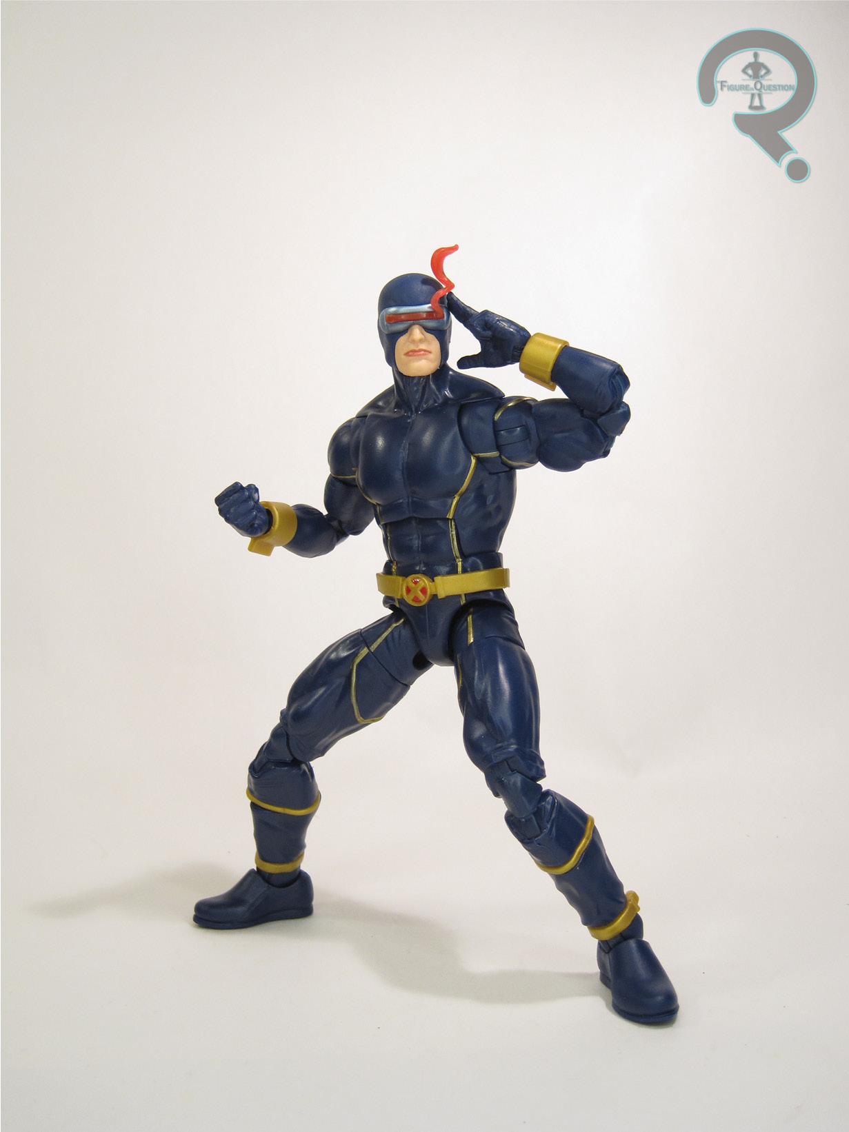
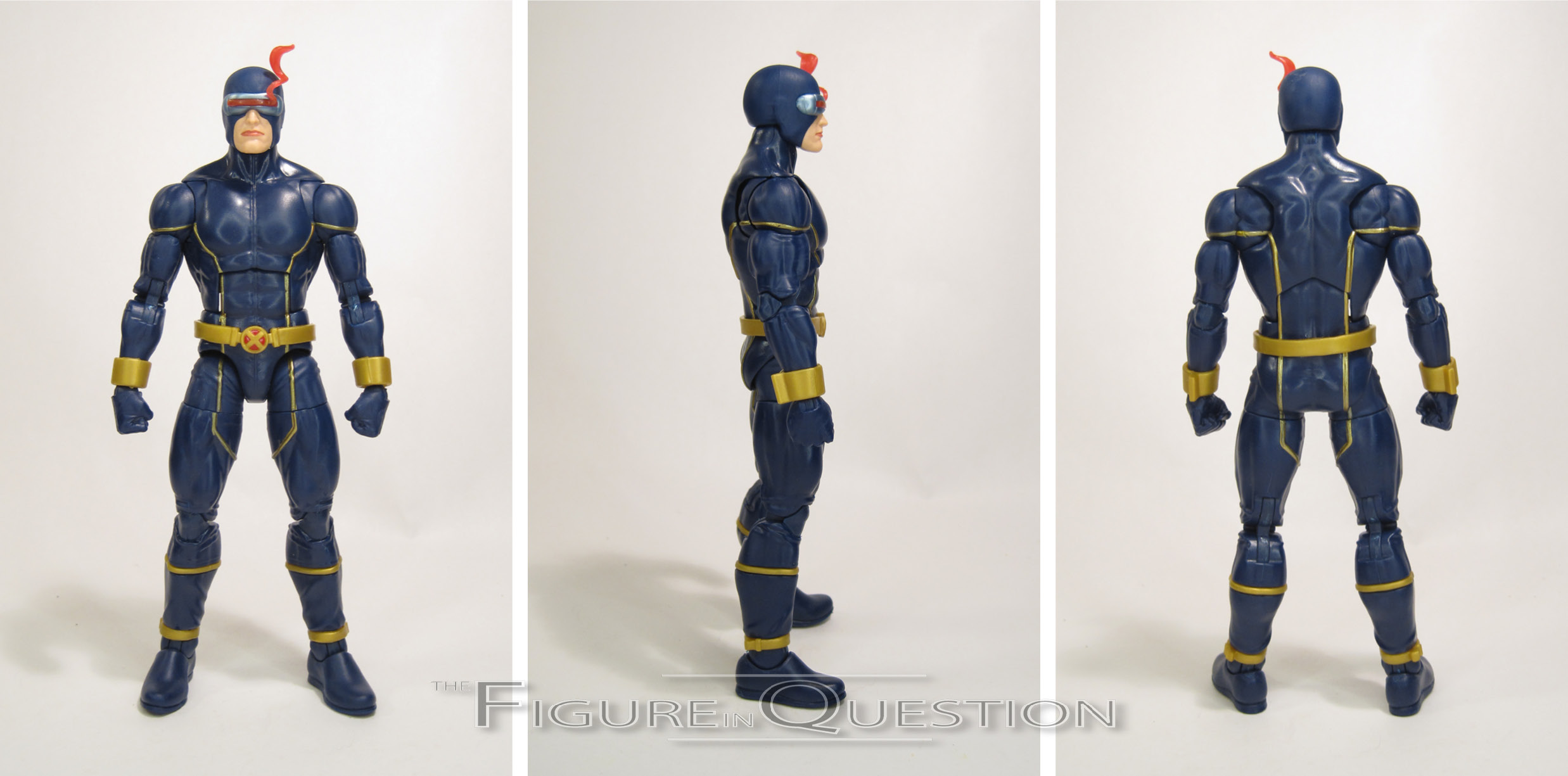
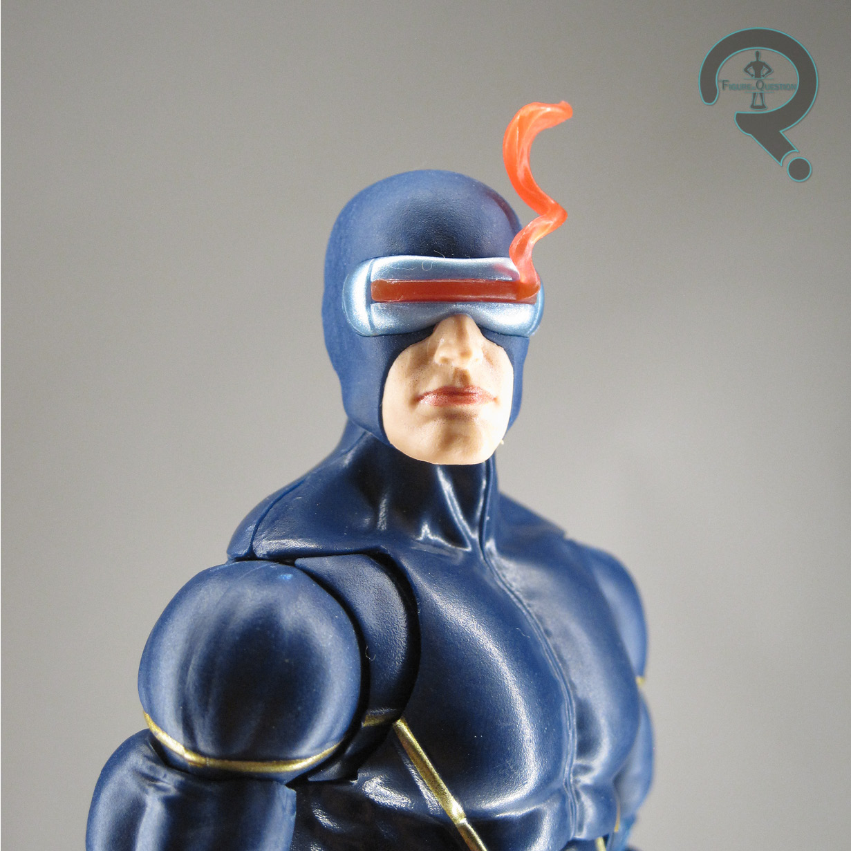
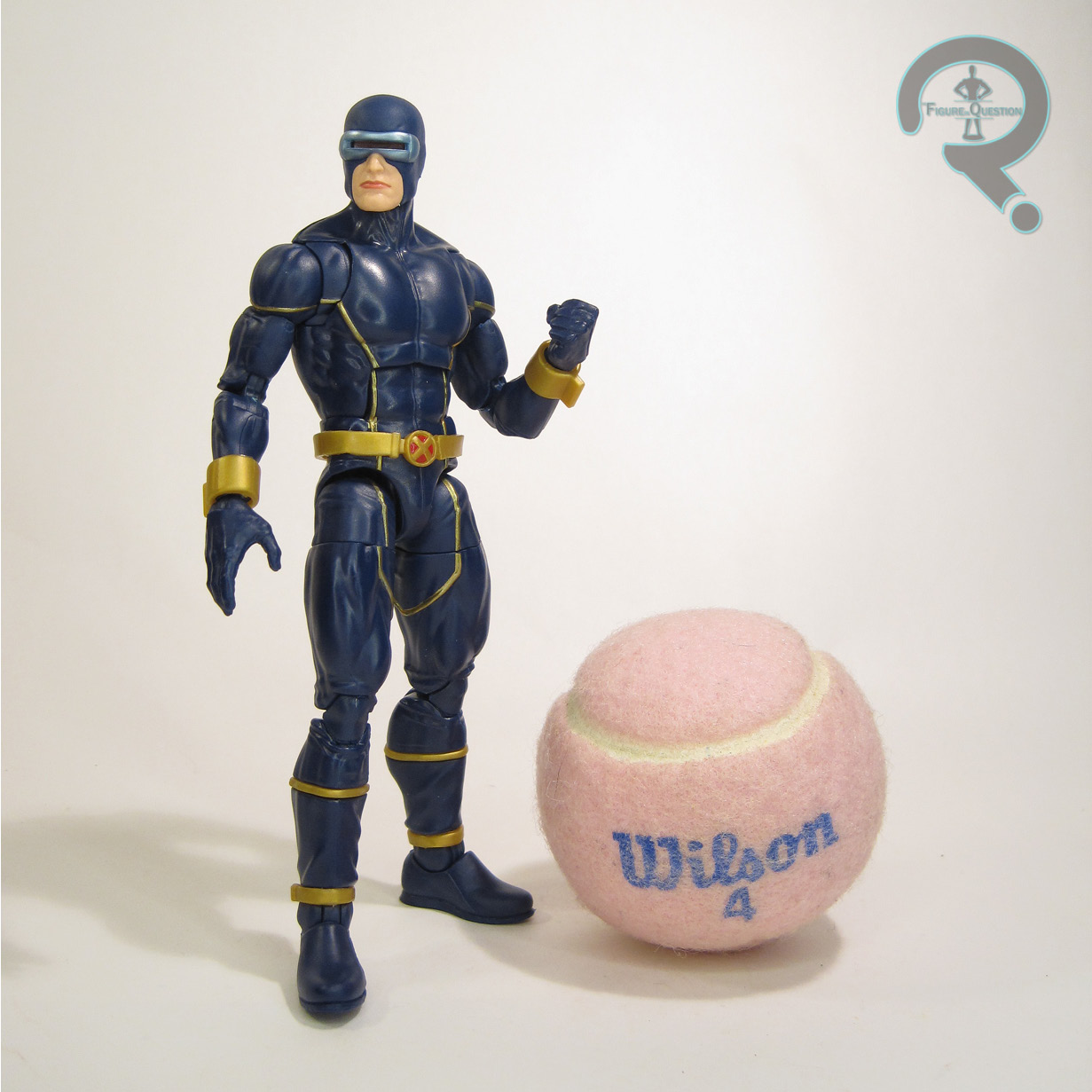
Cyclops is the one unnumbered figure in the Ch’od Series of Marvel Legends, which is the second X-Men assortment of the year, and the first to get a Build-A-Figure.  Cyclops himself is the non-Build-A-Figure-piece-bearing double-pack figure for the assortment.  He’s based specifically on Cassidy’s revamped costume for the character, and marks the second time the look has been adapted to Legends, following one waaaaaay back in Hasbro’s first year with the license. The figure stands 6 1/4 inches tall and he has 34 points of articulation. His articulation scheme is pretty much the same as the Vulcan body, which is a pretty good set-up for Scott. That being said, his actual sculpt doesn’t appear to be borrowing any parts from the Vulcan body, instead being and all-new offering, courtesy of Rene Aldrete. It matches the build of the Vulcan base, which is a good fit for Scott, but adds all of the specific elements for this particular design, with all of the piping, seams, and buckles being 3D elements. It works quite well. I’m not a fan of how the wrist 
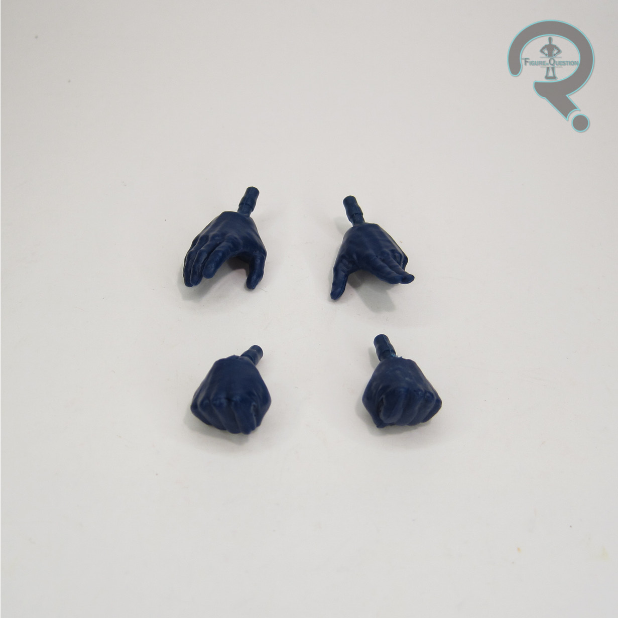
pieces sit, but beyond that, I do like it. The head in particular is rather fun; the little bit of stray energy trailing from his visor is a unique touch.  Though not advertised anywhere, like, at all, the energy effect can be removed, if you so choose.  It leaves quite an indent on the head, and you can’t swap it for other blast effects, which is a slight bummer, but the options are nice. Cyclops’s color work is pretty solid. Not a ton going on, but what’s there is very clean, and gets the job done. Cyclops is packed with two sets of hands, in fists and a relaxed/visor operating combo. It’s a bit light, given he’s got no Build-A-Figure piece, but he’s also a totally new sculpt, so it’s offset.

THE ME HALF OF THE EQUATION

Astonishing X-Men was the first X-book I actively read while it was coming out, so I have a bit of a nostalgic kick for it. Admittedly, it doesn’t really hold up in the end, but there’s no denying that Cassidy’s art was its strongest suit. And I’m always a sucker for a new Cyclops. This one is quite nice. Is he VHS Cyclops? No, but he’s still very nice, and it’s clear a lot of care went into him.

Thanks to my sponsors over at All Time Toys for setting me up with this figure to review.  If you’re looking for cool toys both old and new, please check out their website and their eBay storefront.

#3393: Ant-Man

ANT-MAN

MARVEL LEGENDS (HASBRO)

“While he occasionally dons the Ant-Man suit to promote his new autobiography, Scott Lang has put his super hero days behind him to bond with his daughter, Cassie.”

Remember when people could just, like, enjoy movies for what they are and not have to just tear every little thing apart? Me either. Well, earlier this year, we got our third Ant-Man film, Ant-Man & The Wasp: Quantumania. It was officially the worst Marvel movie ever, taking the title fromLove & Thunder, which took the title from Eternals, which took it from Captain Marvel, maybe? I don’t know. Look, guys, I’m gonna level with you all on this one: Quantumania is hardly the worst Marvel movie. It’s not even close. Some of you haven’t seen the 1990 Captain America, and it really shows, okay? I promise, if the MCU puts out a worse product than that, I’ll let you all know.  In the mean time, let’s talk about something that’s *not* the 1990 Captain America, and also doesn’t make me want to blow my brains out:  Quantumania!  Or, more specifically, it’s version of Ant-Man!

THE FIGURE ITSELF

Ant-Man is the one non-Build-A-Figure-piece-bearing figure in the Cassie Lang Series of Marvel Legends, which is the tie-in assortment for Quantumania.  Due to schedule shifts for the movie, the tie-in assortment wound up trailing the film release by about 2 1/2 months, hitting retail in that April-May window.  Not exactly striking while the iron was hot, but they at least got out before the movie switched over to streaming.  Scott’s gotten some sort of upgrade to his suit for most of his cinematic appearances, and Quantumania keeps that trend going.  It’s another batch of smaller adjustments adding up to a fairly similar looking design, at least at first glance.  This one’s a little more segmented on the red parts, as well as further downplaying the silver a bit more, and is also just generally a bit more streamlined than his prior looks.  I for one am most excited about him finally getting the black circle on his chest, which has been missing from the previous designs.  Ant-Man needs his black circle chest, you guys.  The figure stands a little shy of 6 1/4 inches tall (making him the shortest of the MCU Ant-Man Legends figures) and he has 29 points of articulation.  The last few MCU Ant-Men have had slightly more stilted movement, but this guy actually gets a pretty solid articulation set-up.  There’s still a little bit of restriction on that mid-torso joint, but it’s not bad.  I particularly like the range on the neck joint.  Ant-Man gets an all-new sculpt, and it’s definitely my favorite MCU Ant-Man sculpt to date.  It’s actually pretty spot-on to the film design, in contrast with the concept work for the first film and Civil War figures, and the scaling relative to other figures feels a bit more on point this time around.  I was also very thrilled to see that Scott finally got transparent lenses on a 6-inch figure.  I was really bummed that the AM&TW figure just got the painted ones, and this one winds up looking really good.  It just adds so much to the figure.  The color work on this guy is pretty decently rendered.  His paint drops a few of the smaller silver details, but really only where they’re outlining something else that’s already painted.  The detailing is all sharply handled, and he gets all of the main design elements, with nothing major getting skipped over this time.  He’s packed with two sets of hands, in fists and a pointing/open gesture combo, as well as an unmasked head.  I like the extra hands.  I’m not much of a fan of the unmasked sculpt.  The renders looked okay, but it seems like something happened to the mold during manufacturing, because the face and hair don’t look like they’ve gone together the right way.  It’s also a little large compared to the helmeted head.

THE ME HALF OF THE EQUATION

I didn’t really think much of this guy when the figures were shown off, and was really only interested in this assortment’s Build-A-Figure.  I had the last Ant-Man, and I figured that was good enough.  However, I got the opportunity to mess with the whole set for review purposes, and discovered that I actually really, really liked this guy.  The unmasked head’s kind of a dud, but all of the unmasked Rudd heads kind of have been.  This guy is by far the best MCU Ant-Man release, though, so I’m opting to upgrade to this one for my main collection.

Thanks to my sponsors over at All Time Toys for setting me up with this figure to review.  If you’re looking for cool toys both old and new, please check out their website and their eBay storefront.

#3392: Ultimate Captain America

ULTIMATE CAPTAIN AMERICA

MARVEL LEGENDS (HASBRO)

The Captain America of the Ultimate Universe has served as the Allies’ super-soldier in World War II, the leader of the first Ultimates team”

You know, it’s kind of crazy, but in the ten years I’ve been doing some sort of Captain America reviews in July 4th, I’ve never actually reviewed a new item on the day. I’m just bad at saving that sort of thing up, I guess. Well, I did it this year! So a-ha!

For today’s review, I’d jumping into an area of Captain America stuff that I only very rarely venture into: The Ultimates.  I’ve made it no secret that I’m not much of a fan of the Ultimate Universe’s take on Steve Rogers, at least from a characterization side, but on the flip side, he definitely made out pretty well from the design side of things.  While his altered WW2 uniform is my main jam from that line, his modern day outfits are no slouch either, and they all certainly make for some pretty good toys, including Cap’s most recent Legends treatment.

THE FIGURE ITSELF

Ultimate Captain America is figure 6 in the Puff Adder Series of Marvel Legends, which is 2023’s first Avengers-centric assortment.  It’s a real mix of looks, with Cap representing the “modern” side..or at least as modern as any design from 20 years ago can really be.  Cap is based on his main look from the first Ultimates, which is his most distinctive, so it makes sense.  The figure stands 6 1/2 inches tall and he has 31 points of articulation.  Cap’s articulation is really just a set of butterfly shoulders away from being the best the line has to offer, and even then, it’s still very good.  He’s got the pinless construction on his arms and legs, and his mid torso is a ball-joint, in contrast to the ab-crunch we’ve seen the last few times.  It all makes for quite a fluid set-up to the movement, and I very much dig it.  When this figure was first shown off, I had assumed that he’d be making liberal use of parts from the 80th Cap body, since that’s the new standard.  I was rather surprised to get him in hand and discover he’s actually sporting an entirely new sculpt, courtesy of Rene Aldrete.  It maintains a nice bit of internal consistency with how the two Anniversary Caps were handled, but just improves the layout of the articulation, as well as adding a bit more depth to the detailing of his actual suit.  Ultimate Cap may not be my go-to design, but this sculpt certainly takes advantage of the additional elements Hitch’s design added.  Cap’s got two new heads, one calm, the other angry.  They’re both a bit meaner than the 20th Cap heads, which is appropriate for this version of the character, but they still look like the same guy, which is especially impressive given the change of sculptor between the two releases.  Of the two, I do like the calmer look just a touch more, but the teeth-gritting look makes for some fun action poses.  Cap’s color work is a little more in depth than a “classic” Cap, largely because of the little bit of grey and brown added to the design.  His paint work is still more on the basic side, which works well enough.  On mine, the paint on the face and the emblem are prone to rubbing away a little easier than I’d like, so do be careful with those spots.  Cap is packed with two sets of hands (fists, and a gripping/open gesture combo), his shield, and the head of the Puff Adder Build-A-Figure.  The shield is the same base mold as the one included with the 20th Cap, but without the holes for the effects this time.  Unfortunately, the actual painted detailing isn’t the same between the two, so it’s not a clean swap if you’re looking to replace the 20th, but it’s at least a step in the right direction.

THE ME HALF OF THE EQUATION

Legends has been incrementally giving us better and better Captain America figures as its gone along, and Hasbro set themselves a very high bar with last year’s 20th Cap, which was *so* close to being the perfect Cap figure.  When this one was announced I didn’t pay a ton of attention to it, but figured I’d at least grab it on the basis of it looking like a decent Cap.  It’s sooooooooooooooooooo much better than I was expecting.  He’s not a classic Cap, and for that reason, he’s not dethroning the 20th version, but boy is he just a very, very nicely done figure.  Hasbro has now gotten me to be genuinely excited about two Legends Ultimate Caps.  I don’t like Ultimate Cap.  I swear.

Thanks to my sponsors at All Time Toys for setting me up with this figure for review.  If you’re looking for toys both old and new, please check out their website.

#3391: Groot

GROOT

MARVEL LEGENDS (HASBRO)

“Grown into a more mature tree, Groot uses his new body changes and more advanced skills to help build Knowhere and protect his family.”

And we all know there’s nothing more important to Vin Diesel than family…

So, you know how I’ve gotten you guys all accustomed to this lovely sort of curated mix of old and new for my reviews the last few months? Hasn’t that been nice? Isn’t spacing everything out super nice? It sure is. Nobody told that to Hasbro, though, so, umm, I’ve got four serious of Marvel Legends, all at once. I sure hope you like Legends, because that’s what we’re doing for at least the next month and a half. To preserve my own sanity, I’m gonna do things just a little bit differently this time, and rather than looking at each set in a straight shot, I’m gonna do one of each set per week. Does that sound better? It does to me, and I outrank the rest of you.

Back in May, James Gunn closed out his trilogy of Guardians of the Galaxy movies, and he did it with one very strong finish. And they may have been on uncertain ground for their first outing, but there’s no denying the merchandising juggernaut that the Guardians have become at this point. For their Legends component, there’s a full assortment of movie-based figures, as well as a deluxe Groot, which just so happens to be the item I’m looking at today!

THE FIGURE ITSELF

Groot is a one-off deluxe Marvel Legends release, whose arrival coincides with the main Guardians tie-in assortment. Long gone are the days of making Groot a Build-A-Figure; he’s far too popular a character for that. After keeping the same general Teen Groot look since Vol 2’s post credits scene, the Holiday Special gave us a more aged up Groot, which Vol. 3 continues with. Now he’s no longer the skinny twig he was before. The figure stands 7 inches tall and he has 29 points of articulation. Despite his bulked up stature, this Groot is probably the most posable version of him we’ve gotten for Legends. In particular, the elbows get a much better range that the Teen Groot body did, and his knees and ankles are better than the elder Groot from the first movie. The shoulders use the moving plate construction that Classified has utilized a few times for armor. It allows for more flexibility when posing, which is nice. Unfortunately, due to a slight mold error, it also means the right arm on my figure tends to pop out of place. Groot’s sculpt is all-new, patterned on that all-new design. It seems a little softer on detailing than the elder Groot, but it’s sharper than Teen or Baby Groot were. In terms of accuracy to the source material, it’s generally pretty good, although the head does seem just a tad more squat and wide than it should be, with features that ever so slightly too human. The general look is still there, of course, and Hasbro was undoubtedly working from in-progress designs for the character. Groot’s color long is largely achieved via molded brown plastic, which is a richer shade than his prior figures. He gets a little bit of green accenting for his “moss,” and printed eyes, which again seem maybe just a bit too human to be fully accurate. Prior Groots have largely been pack-ins of some sort, and therefore pretty light on extras, but this guy gets two sets of hands, wings that can be mounted on his back, and a small baby Rocket figurine. At least I assumed it was Rocket before seeing the movie, but it could also be

[SPOILER]

one of the baby raccoons that Rocket saves at the end of the movie. This one does appear to be unmodified, so perhaps that’s it.

THE ME HALF OF THE EQUATION

I quite like Groot, and it was that like of him that got me to buy the whole set of the first film’s figures, just to build him. I’ve really enjoyed his evolution over the movies, and he was an essential part of Vol 3. Being able to get him on his own now is cool, but of course, now I’m sold in the whole set anyway. This guy’s pretty fun. I don’t know that he was quite what I was expecting, but he’s still fun.

Thanks to my sponsors at All Time Toys for setting me up with this figure for review.  If you’d like to see a video of this guy in action, I helped out with one for their YouTube channel, so check that out.  If you’re looking for toys both old and new, please check out their website.

#3390: Star Sapphire

STAR SAPPHIRE

JUSTICE LEAGUE UNLIMITED (MATTEL)

Outside of DC’s main trinity of Superman, Batman, and Wonder Woman, when the shift from Golden Age to Silver Age occurred, most of the heroes rogues galleries were restarted completely from scratch.  Since a good number of the heroes were really just re-using the name, and applying it to a totally new character, there was very little reason to carry anything else over.  One exception of note was Star Sapphire, a Golden Age Flash foe whose name would be re-used in the Silver Age as an antagonist for the new version of Green Lantern.*  Like GL, she got a re-work to update the concept.  She was now Hal Jordan’s love interest Carol Ferris, imbued with the powers of the Zamarons, who sought to prove that women were a superior force to men, by using their own Star Sapphire to bring down the male Green Lantern.  Carol held the title for a while, with the persona manifesting as a split personality that she retained no memories of, and after she was rid of it, others were granted the power as well, before it was ultimately re-worked into a parallel Lantern corps to the Green Lantern.  But, before they went that crazy with it, a version of the character was featured in Justice League and its follow-up Justice League Unlimited, where she’s just kind of a run of the mill villain with unexplored ties to Green Lantern.

THE FIGURE ITSELF

Star Sapphire was added to Mattel’s Justice League Unlimited tie-in line in 2007.  She was part of the seventh series of three packs under the “DC Universe” branding, in a set that also included Sand and the extra articulation version of Superman.  She was subsequently re-released on her own in 2010.  Star Sapphire is, of course, based on her animated design, which marked a fair bit of a departure from her comics look.  It’s not a bad one, though, and certainly paired well with the redesign for GL.  The figure stands about 4 1/2 inches tall and she has 5 points of articulation.  None of that articulation’s particularly useful, mind you, since the neck is effectively rendered motionless by the hair, and the v-hips offer no practical movement of any sort.  She can move her arms up a bit, I suppose, so, you know, there’s that.  Star Sapphire is based on Mattel’s generic female body, which was never a particularly good one.  It’s got kind of funky proportions and an odd stance.  It also doesn’t really stand up well.  She got a new head sculpt, which is at least a pretty decent recreation of her appearances on the show.  Unfortunately, it’s not very well served by the paint work, which is thick, sloppy, and has a rather uneven texture.  I appreciate what they were going for with the gloss finish on the pink sections, but they don’t help with the odd texture, and the face is even worse.  She looks unwell.  Star Sapphire included a display stand with both releases (all the figures on this body did, since it was so poor at balancing on its own feet), and the single also added an effect piece.

THE ME HALF OF THE EQUATION

While I’m certainly a GL fan, I’ll admit that the animated version of Star Sapphire never much clicked with me.  She always felt like more of a space filler than anything.  Even when it came to this line, that was kind of the case, since it’s not like there’s any sensible reason for packing her with the two characters she came with.  What’s more, the actual quality of the figure feels kind of lackluster, making her the weakest entry in a three pack where one figure was a total re-hash.  It’s kind of a shame, but at least she got a figure, I guess.

*The Golden Age Star Sapphire would also later be connected to the Zamarons, who created the Silver Age incarnation, via a retcon establishing her as a someone who was vying for the Zamaron throne and had been exiled.

#3389: SCAR Trooper Mic

SCAR TROOPER MIC

STAR WARS: THE BLACK SERIES (HASBRO)

“SCAR Trooper Mic is part of a Special Commando Advanced Recon team called Scar Squadron. Also known as Task Force 99, this tight-knit group is accustomed to operating on its own in the most hostile environments.”

Back in 2021, Hasbro decided to officially launch a comics based subline of Black Seties, as a way of touching on some Expanded Universe stuff, be they Legends or current canon. They’ve kept it to one run of figures per year, each focusing on a different portion of the comics. Last year, they launched a sub-brand within the sub-line, in the form of Imperial Task Force 99, a group of elite troopers that are the Empire’s answer to the Bad Batch. We got the squad’s leader Sgt Kreel last year, and this year we’re getting Mic, the team’s answer to Tech. Let’s see how he turned out!

THE FIGURE ITSELF

SCAR Trooper Mic is the second figure in the third round of the comics-inspired sub-line of Hasbro’s Star Wars: The Black Series. I already looked at the Mara Jade, and there’s also a variant on Doctor Aphra. The figure is roughly 6 inches tall and he has 29 points of articulation. Like Kreel, Mic is built on the upgraded 2020 Stormtrooper body. As a deviation on the standard trooper, it makes sense, and it helps that it’s still a very good mold. Where Kreel swapped out the torso for a new one, Mic keeps that piece consistent, instead getting a unique helmet sculpt, which features a modified visor and attached antenna. He also gets the extra wrist add-on piece that we got with Kreel, adding some nice internal continuity. Mic’s color work isn’t far removed from the standard Stormtrooper. He gets a little more color on the helmet, but that’s really it. The application is all pretty clean, and he matches well with other troopers. Mix is packed with a standard trooper blaster and a backpack. The pack is an all new sculpt, with extending thrusters. They’re a little janky to move back and forth, but it’s still a fun feature.

THE ME HALF OF THE EQUATION

I only knew of most of the Marvel Star Wars run through indirect stuff, so the Kreel figure was really my first interaction with these guys. I liked him a fair bit, so I was intrigued by the rest of his squad. Mic is perhaps not as impressive a standalone piece as Kreel was, but he’s still a solid figure.

Thanks to my sponsors at All Time Toys for setting me up with this figure for review.  If you’re looking for toys both old and new, please check out their website.

#3388: Orko

ORKO

MASTERS OF THE UNIVERSE (MATTEL)

He-Man’s goofy floating sidekick wasn’t an immediate addition to Masters of the Universe, but he was certainly an early one.  He officially debuted during the franchises first few years, with toy coverage and regular appearances on the animated adaptation.  Orko’s break from the line’s usual design aesthetics made him a memorable and distinctive looking character amongst the rest of the rank and file.  That said, it also has had the tendency to work against him, since it makes it a heck of a lot harder to share molds between him and other figures.  As such, he’s usually locked in at one figure per iteration of the line.  At least they usually wind up being pretty good, though.  Today, I’m going back to the character’s start, with his very first figure.

THE FIGURE ITSELF

Orko was added to the Masters of the Universe line in 1984.  He’s one of the year’s most notable additions, though it’s generally a good year for the franchise.  The figure is about 3 3/4 inches tall and he has 2 points of articulation, with one joint at each of his shoulders.  The height of articulation, he is not, but there’s really only so much you can do with the design.  I suppose a neck joint might have been nice, but it is what it is.  Orko’s sculpt was a completely unique one.  He’s a bit stiff and stilted in posing, and he’s certainly rather large when compared to other figures in the line (a common issue with Orko figures), but he’s certainly got something of a charm about him.  The robes also do have a nice bit of flow to them, which is a nice touch.  Orko’s hat is a separate piece, which you can *technically* remove, but there’s not really much to see beneath it.  It does at least give him a bit more depth.  Orko’s color work is pretty standard for the line, with molded colors and basic paint application.  The robes wind up with two different shades for the magenta, thanks to the varying plastics on the arms and torso, but it’s minor.  The actual application of paint is a little fuzzy at the edges, and it’s a bit worn on mine, but the colors are bright and he’s got a lot of pop.  Orko was originally packed with a ripcord, which could be used in conjunction with his internal mechanisms to give him a “hovering” effect.

THE ME HALF OF THE EQUATION

When I got into Masters in ’02, the then-current line was quite tricky to get, so I tended to fill in with vintage figures here and there.  Orko was one such case.  Since his 200x figure was rare, I got this one instead, at a small toy show I attended with my dad back in the early ’00s.  This guy is goofy and hokey and I honestly love that.

#3387: Vincent “Falcon” Falcone

VINCENT “FALCON” FALCONE

G.I. JOE: CLASSIFIED SERIES (HASBRO)

I’ve admittedly slowed down pretty severely around here with reviews of Hasbro’s current go at G.I. Joe, their 6-inch scale Classified Series line.  My last one was Sgt Slaughter, which was all the way back in February.  I’ve got my reasons for that, and they’re gonna become pretty apparent here rather shortly.  But, as I mentioned in my aforementioned Sgt Slaughter review, I do have a soft spot for 1987’s G.I. Joe: The Movie and its focus characters.  And, central to the whole movie is Falcon, Hasbro’s proposed replacement for Duke as the franchise’s face, who perhaps didn’t pan out quite the way they were expecting.  Falcon’s hardly a rarity to toys, but it does tend to take him a minute to show up in any given style shift for the line.  Three years into Classified, here he is.  Let’s look at that, I guess.

THE FIGURE ITSELF

Vincent “Falcon” Falcone, as Falcon has been renamed since 2011 so as to avoid confusion with other “Falcons”, is figure 64 in the Classified Series line-up.  He’s part of the latest assortment for the line (though they’ve officially switched to only solid cases of the figures at this point), and he’s a mass-release figure.  The figure stands 6 1/4 inches tall and he has 35 points of articulation.  Falcon has the same standard layout for articulation that we’ve seen on most of the line, with the only adjustment being the inclusion of pinless construction on his elbows and knees.  The articulation works for the most part, and keeping consistent articulation schemes across a whole line of figures is a pretty G.I. Joe thing to do.  Falcon is based on his v1 figure, and, as has become the trend for the line in recent waves, that’s a pretty direct, shot for shot update.  Like 25th before, the approach here is if the v1 figure did it, so does this one.  Apart from one small bit of sci-fi detailing replacing his radio on his shoulder, he’s all v1.  Falcon’s sculpt is an all-new one, and one that’s been the source of some contention in the fanbase.  There were some complaints earlier in the line that Joes were all winding up a little too pretty, so Hasbro’s evidently trying to course-correct a bit.  The end result means that Falcon winds up looking somewhere between John Wayne and Rondo Hatton, which on one had isn’t quite what you’d anticipate for the character, but is on the other hand is consistent with Falcon’s tendency to look funk ugly when it comes to toys (his 25th Anniversary figure being a prime example of this).  There’s been a lot of fuss about this head sculpt since the figure was shown off, and while it’s not my favorite, it does at least look a bit better in hand than it did in the prototype shots.  I honestly think it’s the paint on the lips that’s throwing the look off the most; beyond that, he’s just got slightly more defined features than I think he should have.  But, for me personally, the head’s really not the issue.  It’s kind of everything else.  The core body’s not bad, I suppose.  There’s not really a lot that can go with fatigues on a basic body.  It’s really the add-ons that cause issue.  The only non-issue is the beret, which is removable, but actually sits in place alright, and doesn’t look too bulked up.  The belt/suspenders/tails for the shirt are all one piece, which is free floating.  It’s very difficult to get it to sit right during posing, and it’s usually popping up oddly at the shoulders.  There’s a non-function knife in a sheath sculpted on, because the v1 had a a non-functioning knife in a sheath, and we’re recreating that, I guess.  The neckerchief is likewise a free-floating add-on piece, and it…well, it just doesn’t sit in place.  Like, at all.  Always out of place.  Just there to annoy you, really.  It’s all just really fiddly.  The paint work is pretty standard stuff.  He’s designed to emulate the v1, and he does that.  There’s the weird paint on the lips, which I don’t like so much, but he’s otherwise alright.  The accessories are where the issues really ramp up again.  Since we’re just emulating the v1, this Falcon gets a shotgun, backpack, and knife, just like that one.  Since the v1 Falcon’s shotgun had a stock, this one does too, though it’s been designed to fold up…in theory.  In practice, there’s no configuration, fully folded, or fully unfolded, where the thing doesn’t just fall apart.  The knife’s a knife; not a lot to do with that.  It’s too small to be gripped by his hands properly, which is certainly frustrating.  It’s designed to slot into the sheath on his backpack because that’s what the v1 figure did, but the sheath is *also* too loose, so it falls out a lot.  Of course, that’s a minor thing, since the backpack is also almost impossible to keep attached to his back.  Since it’s totally flat, so as to mimic the v1 piece, it doesn’t actually contour to his back at all, so there’s nothing but a very small peg securing it in place.  And that peg has to also contend with the suspenders popping up and knocking it out of place, so it just falls out a lot.  Like the add-ons, it makes the figure very fiddly, and hard to mess with.

THE ME HALF OF THE EQUATION

I was really hyped for Classified when it launched, and it’s first year it was really a highlight of my collecting.  I really dug the updates to the old designs, and that sort of sci-fi, high-tech feel, which kept up the spirit of the older toys, without being strict recreations.  Unfortunately, as we’ve seen multiple times before, Joe fans get pretty nasty when they aren’t getting those strict recreations, so the line has shifted towards that.  I’ve got the vintage figures.  I’ve got the 25th updates of those figures.  I don’t really feel an undying need to buy the, again, but larger.  So, my enthusiasm for the line’s been kind of waning overall.  But, I do like my ’87 movie cast, so I was down for Falcon, even if he was just a strict update.  Unfortunately, he’s…well, he’s just no fun.  The overly fiddly nature of the figure made for one of the most infuriating photo shoot experiences I’ve had in some time, and also served to shatter the glass on the whole line for me, and make me realize I haven’t actually been enjoying it for quite a while.  At this point, I’ll pick up the occasional figure here and there, but I’m definitely scaling way back.

Thanks to my sponsors over at All Time Toys for setting me up with this figure to review.  If you’re looking for cool toys both old and new, please check out their website and their eBay storefront.

#3386: Spider-Man & New Goblin

SPIDER-MAN & NEW GOBLIN

MARVEL MINIMATES

While we’ve gotten a lot of movie-themed Marvel Minimates over the years, they weren’t quite as plentiful in the early days.  Spider-Man 3 marked a turning point, though, getting the full two assortment treatment, covering just about every major character from the movie.  I’m diving back into that set-up today, with a look at the standard movie Spidey, and the vengeful New Goblin!

THE FIGURES THEMSELVES

Spider-Man and New Goblin were released as a two-pack in Series 17 of Marvel Minimates, notably the first of the two assortments based on the movie.  Both assortments wound up shipping at the same time, in late 2007, as was a common practice for Marvel Minimates assortments during that era.

SPIDER-MAN

Since the two prior Spider-Man films hadn’t gotten any tie-in coverage for Minimates, SM3 our first stab at the standard Spidey look from the Toby McGuire films.  That said, this was the *second* standard issue to hit the line, following the con-exclusive two-pack version that had hit during the summer before these assortments.  While the differences between the two Black Costume Spider-Men were more notable, these two versions of the standard had their differences as well.  The figure is built on the post-C3 minimate body, so he’s about 2 1/4 inches tall and he has 14 points of articulation.  He’s a vanilla ‘mate, so there’s not extra add-ons for this guy.  It’s as it should be, since he doesn’t need to be bulked up or anything, and sculpting the weblines would certainly be overkill for this style.  He gets an impressive selection of paint work.  It’s not quite as good as the preview pack version, but there’s still a lot going on.  He gets all the appropriate webline detailing, as well as texturing on the blue sections of the costume.  The texturing even goes all the way around, which is pretty cool.  He doesn’t get the weblines for his hands and feet the way the preview version did, but it’s still more than the average Spidey got.  The SM3 figures marked a change in styling for Spidey ‘mates, as this was the first time that the belt of his costume was on the actual waist piece.  It changes the proportions a bit, moving him towards the more modern stylings of the line.  Spidey was without any accessories for this release.

NEW GOBLIN

Harry Osborne’s arc was one of the trilogy’s most invested ones, and Spider-Man 3 paid off his journey following in his father’s footsteps…to perhaps mixed results.  Norman’s Goblin design in the first movie wasn’t really met with universal praise, so they went a different direction for Harry’s “New Goblin” design.  Unfortunately, while it may be less overtly hideous, it’s also a lot less distinctive.  He’s kind of just a generic snowboarder looking guy.  I mean, it could be worse, I suppose.  Like Spidey, Harry is based on the standard ‘mate body.  That said, he gets quite a few add-on parts, all of them new to this figure.  He’s got a mask/hair combo, shoulder harness, belt, thigh pouch, bracers, left hand with pumpkin bomb, and boots.  It makes for one rather built-up figure, but not one that’s actually too bulky, which is certainly a plus.  The harness in particular marks DST actually doing just a harness, rather than a whole bulked up torso piece, which was a rarity at this time.  It all honestly works pretty well.  There are the odd quirks, of course, such as the bracers being loose enough to pretty freely spin even with the hands in place, but it’s not so bad.  Since his sculpted parts handle so much of the detailing, the paint’s not quite as detailed.  That said, he gets all the proper base work, and still gets a little extra detailing for the torso, as well as a pretty good likeness of James Franco for the face under the mask.  He’s packed with an alternate hair piece to show off said face, as well as his sword, knife, and glider.  The glider was the first time any of the Goblins got such a piece; unfortunately, due to the way the boots are molded, he doesn’t peg in place quite right on it, so he can’t actually attach to it.

THE ME HALF OF THE EQUATION

Despite all the nay-saying about it, I was very excited for Spider-Man 3‘s release, loved seeing it in the theatre, and was thrilled to get the tie-in stuff for it, with the Minimates in particular being high on my list.  I got the full standard set of the tie-ins from my parents for Christmas the year that they came out.  The basic Spider-Man’s not a lot too look at on first glance, but the extra detailing is certainly cool.  New Goblin may not be the most thrilling design, but I think he translated well, and he marked a real turning point for how sculpting could interact with the core ‘mate body.

#3385: Atom Smasher

ATOM SMASHER

JUSTICE LEAGUE UNLIMITED (MATTEL)

When the titular team of Justice League expanded its roster for the follow-up Justice League Unlimited, they had to reach beyond just canon Leagers from the comics, including a number of other unaffiliated heroes, and, of course, rolling in some competing teams’ rosters as well.  Since the JLA’s predecessors the Justice Society had not been adapted into the earlier show (apart from their role in the comics being referenced by stand-ins the Justice Guild in “Legends”), a mix of their classic and modern rosters were added to the League.  From the modern side, there was Albert Rothstien, aka Atom Smasher.  Atom Smasher was never really more than a cameo role, with a few focuses during some of the more involved fight scenes, but never a speaking role.  Still, he did get included in the toyline, so he had that going for him.

THE FIGURE ITSELF

Atom Smasher was first added to Mattel’s Justice League Unlimited tie-in line in the third assortment of three-packs, released in early 2005.  He was packed alongside re-packs of the more articulated Green Lantern and Flash figures.  He was re-released later that same year as a single release.  The figure stands about 4 3/4 inches tall and he has 5 points of articulation.  Atom Smasher is based on the larger male base body, based on tooling that originally belonged to the first Superman figure.  It’s the largest available base body, and one that matches respectably well with how Atom Smasher is depicted on the show, at least in terms of build.  He was, however, almost always shown as above average size, so he’s woefully short for Atom Smasher.  But, without the re-use, it’s not like he was going to get made.  His only new part is a head sculpt.  It’s a little on the small side, but that seems to match with his internal proportions alright.  It’s fully masked, so there’s not a ton of detailing, but it gets what it needs to.  The rest of the detailing is carried via paintwork, which is handled alright.  Not amazing, or anything.  Of note, the sections that should be blue are more of a purple.  That, coupled with the slightly darker shade of the gold for his belt, kind of muddies the overall look of his design.  At the very least, a little bit more actual line work may have helped to differentiate the costume elements just a bit more.  As it stands, it’s okay, but just sort of “meh.”  The three-pack version of Atom Smasher didn’t include any extras, which was honestly okay, since he doesn’t use much.  For the single release, he got an extra large hand clip-on piece.

THE ME HALF OF THE EQUATION

This Atom Smasher didn’t start out as mine.  Back when the JLU line was running, there was a Walmart on the way home from where my family vacationed, which was out of the way enough to be the perfect spot to find new JLU figures.  On the trip that got me my Hawk and Dove figures, my brother got the set that included this guy.  He got out of action figure collecting for the most part a few years ago, and this figure was one of the ones I inherited when he purged a lot of his collection.  He’s not the line’s strongest offering, that’s for sure, but he does alright, given the confines of how these guys were made.