#0682: Old Fred

OLD FRED

YELLOW SUBMARINE (MCFARLANE)

OldFred1

Yellow Submarine is a very strange film. Very, very strange. But, as a fan of both the Beatles and animated films, it’s a movie I enjoy quite a bit (it helps that I was 7 the first time I saw it). While the film obviously stars the Beatles as its main protagonists, for most of the film, they’re paired up with lovable goofball Old Fred, a native from Pepperland, the undersea land that the Beatles are recruited to save from the Blue Meanies. I told you the film was weird. Back in ’99, McFarlane Toys of all companies grabbed the Yellow Submarine license, and put out a small assortment of figures from the movie, including Old Fred.

THE FIGURE ITSELF

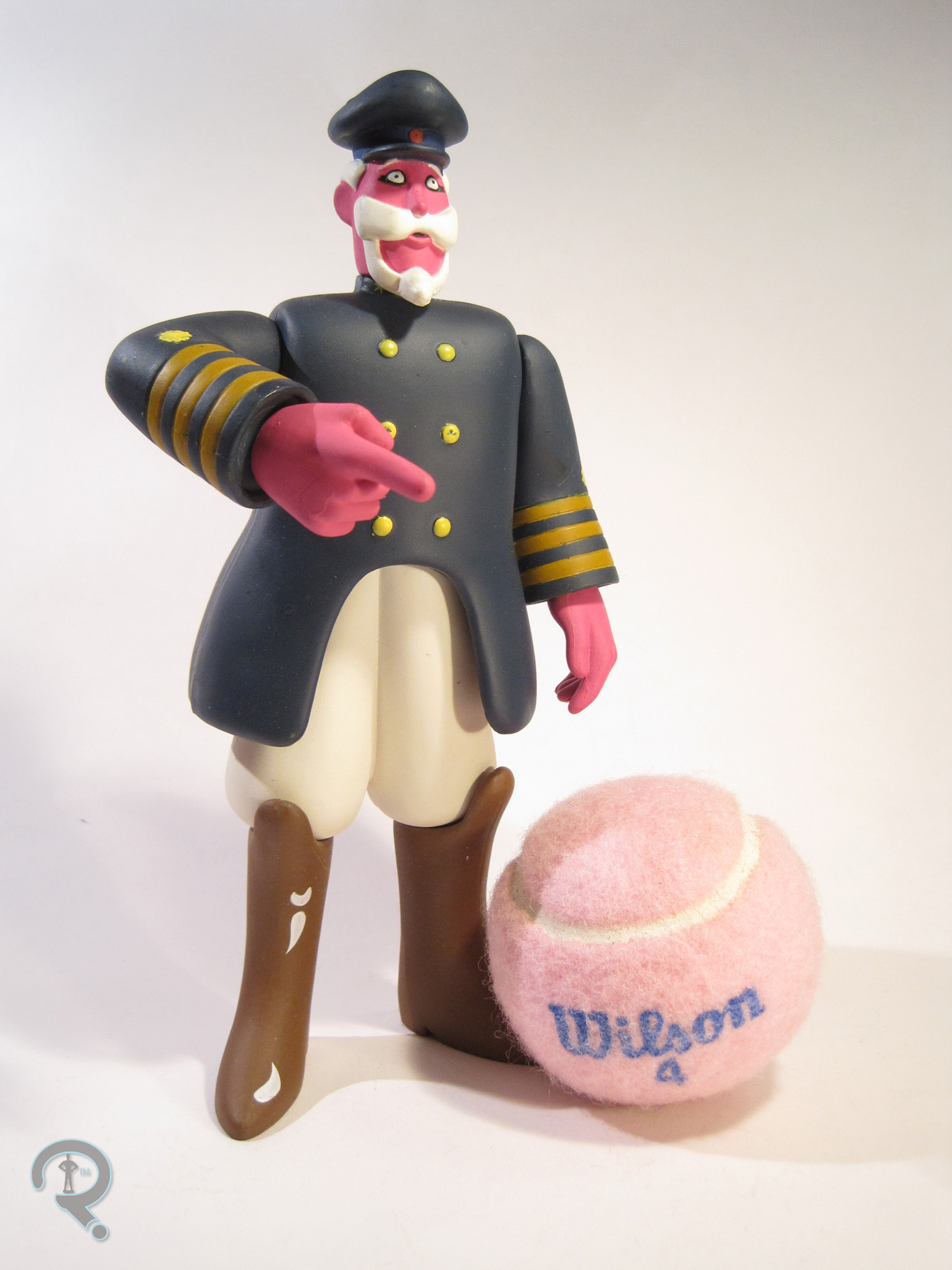
OldFred2Old Fred was technically part of the first series of Yellow Submarine figures from McFarlane, but he was a rather late addition. The initial shipments of the series featured Ringo and the Blue Meanie, John and the Boob, George and the Submarine, and Paul and the Glove. When fans complained about the lack of Old Fred, McFarlane responded by replacing the Glove with him in subsequent shipments. Why he wasn’t just released separately is beyond me, but oh well, here he is. The figure stands 8 inches tall and has 6 points of articulation. His sculpt was new to him, and it does a good job of capturing the admittedly inconsistent design of the character from the film. He’s mostly constructed out of connected abstract shapes, but that’s about right. The details of the face are absolutely spot on, and the uniform is basic, but accurate. He’s sculpted in a mostly normal standing pose, but for some reason, his right arm is bent at the elbow and extended outward at the shoulder, which looks sort of odd. Like, I’m not sure how the arm is meant to be positioned, because it looks equally weird in all of the poses.  I just don’t recall him having this pose at any point of the movie. Paint is a bit iffy on this figure. The basic colors are fine and all, but the application is really sloppy, especially on the yellows. The buttons don’t even always get fully covered. It’s not ideal. As he’s sort of an accessory himself, Old Fred includes no accessories of his own. Which is fine I guess.

THE ME HALF OF THE EQUATION

The Yellow Submarine Paul McCartney was actually my very first Yellow Submarine figure. However, that one was an earlier release, so he didn’t come with Fred. I got Fred about two months ago when my brother found a Fred and Paul set at a nearby antique store. Not a whole lot to say on this figure to be honest. He’s about on par with the rest of the set, so yay consistency, and I’m happy to have one to go with my Beatles.

#0681: Mercury

MERCURY

DC UNIVERSE CLASSICS

MercuryDCUC1

It’s been 160 reviews since my last DC Universe Classics review. Guess I’ll fix that then. So, one of the coolest things about DC Universe Classics was just how obscure they went with the line. For all the crap I give Mattel about their various practices, they built a successful line that ran for 21 series and gave us the likes of Kamandi and Cyclotron. That’s downright impressive. It is also the only DC line to date to give us a full line-up of the Metal Men, who are one of DC’s cooler off-kilter teams from the 60s. So, let’s look at the team’s resident jerk with a heart of jerk, Mercury. He’s the only metal who’s liquid at room temperature!

THE FIGURE ITSELF

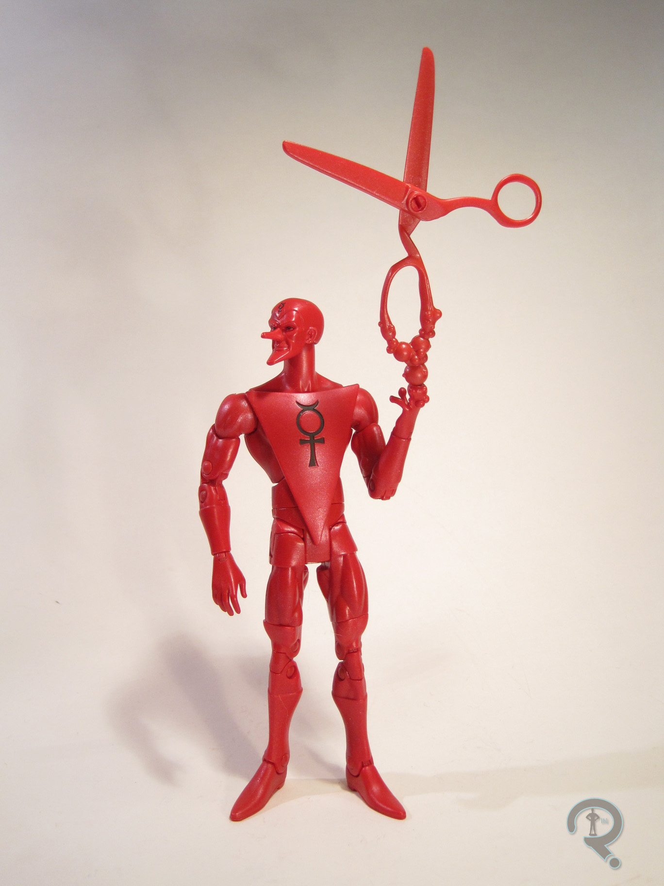
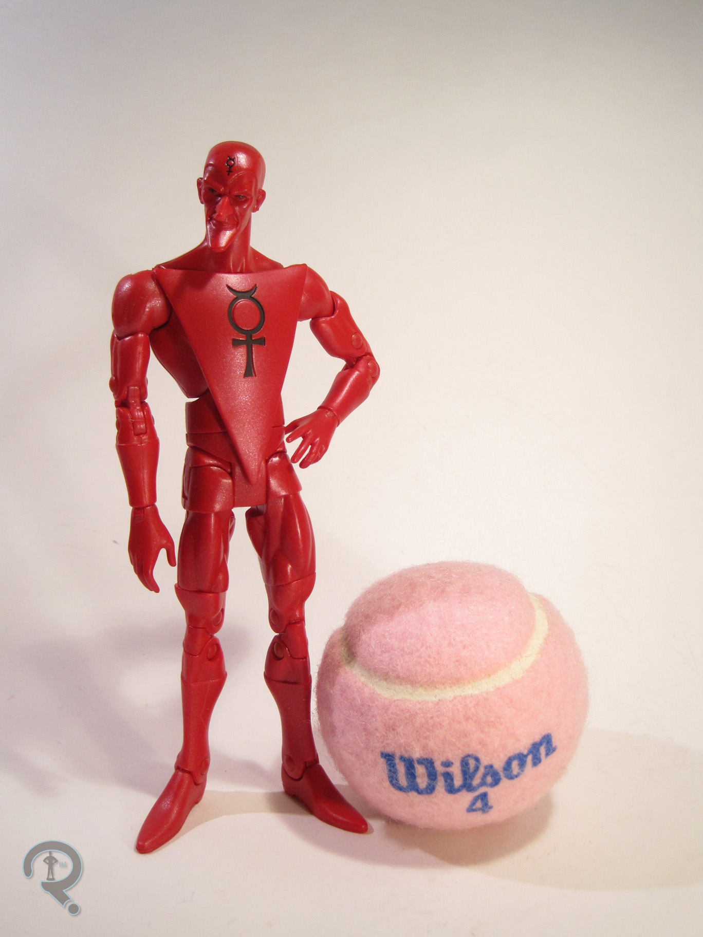
MercuryDCUC2Mercury was released as part of the 16th Series of DC Universe Classics. He was the third member of the Metal Men to be released, and the last member to be released at retail. Way to go Mercury, you ruined it for everybody. The figure is 6 ¼ inches tall and has 29 points of articulation. Mercury was another figure built on the skinny buck. I know that the first “skinny” character was Deadman in Series 11, but I think 16 was the first series to use this slightly improved iteration of the body. While he uses the base as a starting point, Mercury actually has a fair number of non-standard parts. The best piece if the figure is definitely the head, which does a fantastic job of capturing the character. His expression is just perfect for Mercury, and they’ve really nailed the exaggerated proportions. The extended nose is a separate piece from the face, so there’s a noticeable seam if you look closely, but from a normal viewing distance, it’s unnoticeable. The rest of the body works pretty well for Mercury; a lot of the wackier proportions that looked out of place on other characters look perfect here. Mercury’s paintwork is somewhat deceptive. The previous two Metal Men were just straight metallic colors, so when I first saw Mercury, I was disappointed that he was just a flat red. But, after taking him out of the package, I realized the red was actually pearlescent, which is actually really impressive looking, and gives him a nice unique feel. Mercury included an extra hand made to look like it’s morphing into a giant pair of scissors, which is a pretty awesome way of showcasing his powers (they’re even articulated!). He also included the torso of Bane, the Collect-N-Connect for Series 16.

THE ME HALF OF THE EQUATION

Series 16 was one of the few series of DC Universe Classics that I found mostly in one shot at retail. However, I didn’t get the first Mercury I found; it went to my Dad, who’s a bigger Metal Men fan then I. Fortunately, I came across another Mercury not long after, and here he is. For me, Mercury represents some of the best work DCUC had to offer. He’s a fun, obscure character, on the right body, with a superb head sculpt, solid paintwork, and a well-executed accessory.

#0680: Ant-Man Boxed Set

GIANT-MAN, GOLIATH, & HANK PYM

MARVEL’s ANT-MAN

AntManSet1

Marvel is definitely pushing Ant-Man pretty hard right now. The movie was a resounding success, in spite of all the negative press that seemed to be surrounding it, he’s joined the cast of the Avengers Assemble cartoon, and he’s headlining one of the best solo comics the company is currently publishing. Things are definitely looking up for the bug-sized hero. Marvel licensee Hasbro has been joining in on the fun, and two of their San Diego ComiCon exclusives this year were based around Ant-Man. Today, I’ll be looking at what I feel is the more impressive of the two exclusives.

THE FIGURES THEMSELVES

Giant-Man, Goliath, and Hank Pym (along with two smaller Ant-Men) make up an Ant-Man-themed boxed set, released this year at SDCC. The set was also available after the convention on Hasbro’s online store, which is how I got mine.

GIANT-MAN

AntManSet2Hey! Haven’t I already looked at this guy? Well, sort of. Yes, this figure uses the same costume design as the Ant-Man Marvel Legends Infinite Series Giant-Man. However, unlike that figure, this one lives up to the name-sake a bit better. The figure is 12 inches tall, making him twice the height of the Infinite Series version, and he has 32 points of articulation. The figure is built on Marvel Legends Icons Cyclops body, which was previously used for the Marvel Universe Gigantic Battles Goliath and Bill Foster figures. It’s a body that was good at the time it was created, and was still pretty serviceable when it was used for Gigantic Battles, but has started to look pretty dated in recent years. The proportions and sculpted details are still okay (though he does look a little underfed), but the range of motion on the joints is rather restricted. In addition, the body has a lot of sculpted details that are specific to Cyclops, and thereby look out of place on Giant-Man. In the case of seams and the like, it’s easy to overlook them, but the straps/buckles on the wrists and the clear outline of the boots on the calves are quite distracting. It doesn’t seem too unreasonable to want Hasbro to at least retool those particular pieces. Giant-Man does get a unique head and an add-on for his belt. The head is pretty decently sculpted, though, for some reason, the antennae look sillier here than they did on the smaller figure. The belt is decent enough, but it seems a little bulky, especially compared to the painted on belt of the MLIS figure. The paint on this figure is pretty decent, aside from the obvious issues with sculpted details not lining up with the costume. The black sections are slightly glossy, and incredibly sharp at the edges, which is nice to see. One minor issue: the two black lines emanating from the circle on his chest end at the shoulder joints, instead of continuing around the shoulders like they should.  Giant-Man includes no accessories of his own.

GOLIATH

AntManSet3Moving downward on the scale chart, we get to my personal favorite figure from the set, Goliath. He’s based on Hank Pym’s first costume for his third identity. Confused? That’s okay. Most people are. This figure ends up being the most unique of those offered in the set, mostly due to his color-scheme. The figure stands a little over 6 inches tall and has 32 points of articulation. He’s based on the ML Infinite Series Bucky Cap body, just like the single release Giant-Man. The body’s a pretty great base for a lot of characters, and it fits Hank rather nicely. Goliath gets a new head sculpt; it’s a little on the soft side as far as details go, but it’s pretty good overall. It’s a nice, classic hero-style head, and it isn’t too struck with the level of same-ness we’ve seen on a lot of Hasbro’s male heads in this scale. The figure also gets a new add-on piece for his belt, which is a little bit loose, but pretty well sculpted. While I like this figure a lot, oh boy did he get hit with some seriously messy paint. The colors are pretty nicely chosen, but the flesh tones are really thick and goopy, and the yellow has been applied too thinly in many areas, causing the blue of the plastic to bleed through. He’s also got some random scratches of blue on both forearms, where the glove paint has chipped. Viewed as a whole, the figure is alright, but he would have been a lot nicer if the paint had been even a little bit better. Like Giant-Man, Goliath has no accessories of his own.

HANK PYM

AntManSet5Moving down the scale chart again, we find our way to another version of Hank Pym, as well as our first actual Ant-Man figure in a set with Ant-Man plastered all over it. Hank’s presented here in his Ant-Man costume, but with a lab coat over top of it, which is a look that Hank’s been known to sport rather frequently, when he’s in an inventing mood. It’s an important look that’s largely been absent from toy form. The figure is about 4 inches tall and has 22 points of articulation. Structurally, Hank is very similar to the Ant-Man figure from last year. He uses the torso, legs, and feet from the basic skinny male body. It’s kind of an outdated body, but I guess it’s at least consistent with the last Ant-Man. He also has the arms and hands from the AIM Agent/Ghost Rider body, which are good for the AntManSet7looser sleeves, but are a little too long for the body. For the lab coat, he re-uses the add-on piece from G.I. Joe: Rise of Cobra The Doctor figure, which isn’t a perfect fit for the body, but it isn’t too far off. The head appears to be a new piece, though it’s generic enough that it could potentially be a re-use. It’s an okay sculpt, but it seems a bit too angry for Hank. The paintwork on the figure is pretty decent. The actual Ant-Man costume is identical to the regular Ant-Man, which is good, I guess. It would be nice if the lab coat were more detailed than just straight white, but oh well. Hank gets the only actual accessory in the set: an alt helmeted head. It’s exactly the same as the normal Ant-Man’s head.

ANT-MEN

AntManSet8Last up, it’s the two mini Ant-Men, who are really more accessories than outright figures. The larger of the two is based on Scott Lang’s Ant-Man costume from the 00s. It’s definitely a more modern design, but I like the enclosed nature. The figure AntMan2stands about an inch and a half tall and features no articulation. He’s got a unique sculpt, and he’s actually pretty nicely detailed for such a small figure. The paintwork is also pretty decent, with three different colors and no visible slop. The smaller Ant-Man is once again based on the classic Ant-Man design. It’s actually just the same smaller Ant-Man as was included with the Avengers Infinite Ant-Man. It’s under an inch tall and is, predictably, pretty light on the details.

THE ME HALF OF THE EQUATION

So, as noted above, I picked this set up after the con from Hasbro Toy Shop. I detailed the ordeal in my Book of the Vishanti review, so I won’t go into that again. Ultimately, I have to admit I’m a little underwhelmed by this particular set. Giant-Man and Hank Pym are both held back by outdated bodies, and Goliath has some rather annoying paint issues. The Scott Lang figure is kinda neat, I guess, but I’d have preferred to get a larger scale version. All-in-all, I certainly don’t feel like this is a bad set, and I don’t regret purchasing them, but they just seem a bit off.

AntManSet4

#0679: Spartan Thorne

SPARTAN THORNE

HALO 4 (MCFARLANE)

Thorne1

Well, guys, I don’t know how to tell you this, but I think I’ve gotten hooked on video games. Well, a video game, anyway.  I know, the video games were supposed to be the guest reviewers’ thing. I’m cutting into their area. So, the game (or game series, rather) in question is Halo. Given that both Tim and Super Awesome Girlfriend are pretty big fans of the franchise, it was really only a matter of time. Of course, another factor for me getting into the games is so that I can have an excuse to buy all the cool toys from the game, like today’s focus, Spartan Gabriel Thorne.

THE FIGURE ITSELF

Thorne2Spartan Thorne was released in the third series of McFarlane Toys’ Halo 4 line. Thorne is one of the main Spartans featured in the story portion of Spartan Ops. His armor is a re-skin of the Recruit armor, which is the armor set every player starts out with in Halo 4‘s multiplayer portion. McFarlane’s Halo stuff is kind of in a scale all its own; Thorne is about 5 inches in height, which puts him at about the same height as all the other Spartans in the Halo 4 line, and he has 32 points of articulation. His articulation is very similar in design to McFarlane’s Walking Dead line, though it’s a series or two behind in some of the joint styles. In particular, he’s still got the rather restricting ball jointed hips, which really can’t do much but a basic standing pose.  Also, the shoulders and elbows are somewhat restricted, but this is more to do with the character design than it does the articulation scheme.  Although the character himself may just be a re-skin of an existing game model, Thorne’s figure is actually a unique sculpt.  Overall, it’s an impressive piece of work.  The Recruit armor has been very nicely translated to plastic form, and the figure has lots of nice detail work, especially on the more heavily armored portions. One thing that is a bit of a let down is the sculpt on the hands. Neither of them has a trigger finger, the fingers are just one solid piece.  For a figure based on a game where 99% of the characters are carrying some sort of gun at all times, that seems like a silly decision.  As it stands, it means he holds every weapon awkwardly at best, which is not cool.  The paintwork on Thorne is pretty nicely handled.  There’s a bit of slop here and there, but nothing too noticeable, and the armor has some tremendously well-handled weathering to it.  He looks appropriately battle-hardened.  Thorne was supposed to be packed with a basic Halo 4 assault rifle, but the piece was missing from my Thorne’s packaging.  Given that Halo‘s really big on the whole two weapons at a time thing, it’s a bit of a letdown that Thorne didn’t include anything else, and it’s just made worse by my figure not having the one piece he was meant to have.

THE ME HALF OF THE EQUATION

I wasn’t going to get into Halo toys.  I really wasn’t.  Then Tim and I found a clearanced Commander Palmer figure at Target.  Tim ended up getting her, and I caught this guy on the back of the box.  He wasn’t anywhere to be found at that Target, but I kept my eye out and eventually found him at a slightly out of the way Toys R Us.  Of course, he was missing his gun and they only had the one, but, fortunately, Tim offered to loan me one of his spare Magnums, so Thorne wouldn’t have to go unarmed.  Thorne has a few minor issues, but he’s a pretty great figure overall.  Of course, he also opened up the floodgates on getting more Halo stuff…

#0678: Avengers #1 Boxed Set

HANK PYM, GOLDEN ARMOR IRON MAN, INCREDIBLE HULK, & WASP

MARVEL MINIMATES

AvengersFA1

The Avengers may be a hot commodity now, but about ten years ago, they were mostly unknown to the public at large. This meant that they were somewhat absent from the whole merchandising thing. When Marvel Minimates was launched, the Avengers were few and far between, with only a few of the mainstays showing up here and there. Fortunately, things started turning around, right around the release of the first Iron Man. With the announcement of the Avengers Initiative in that film’s stinger, people seemed to be on board for merchandise based around Earth’s Mightiest Heroes. DST met demand by offering a boxed set based on the team’s first appearance in Avengers #1.

THE FIGURES THEMSELVES

Hank Pym, Iron Man, Hulk, and Wasp were released as a boxed set in the fall of 2008, based around the first appearance of the team. Thor, the other founding member, was noticeably absent from the pack. He wouldn’t see another Minimate for another year, and his classic design wouldn’t be seen again for another year after that, which proved a bit frustrating for fans just getting into things with this set. This set also has the notoriety of being the final boxed set to be packed in a window-less box.

HANK PYM

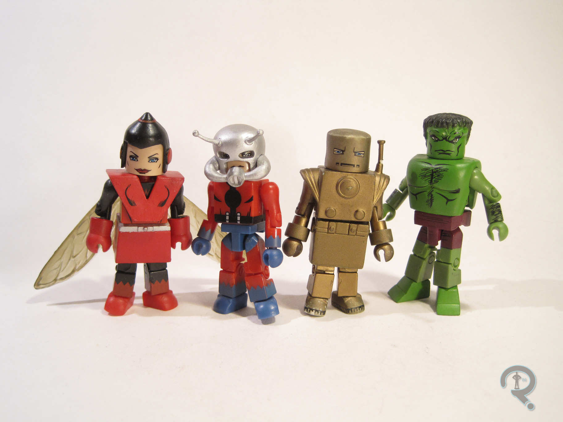
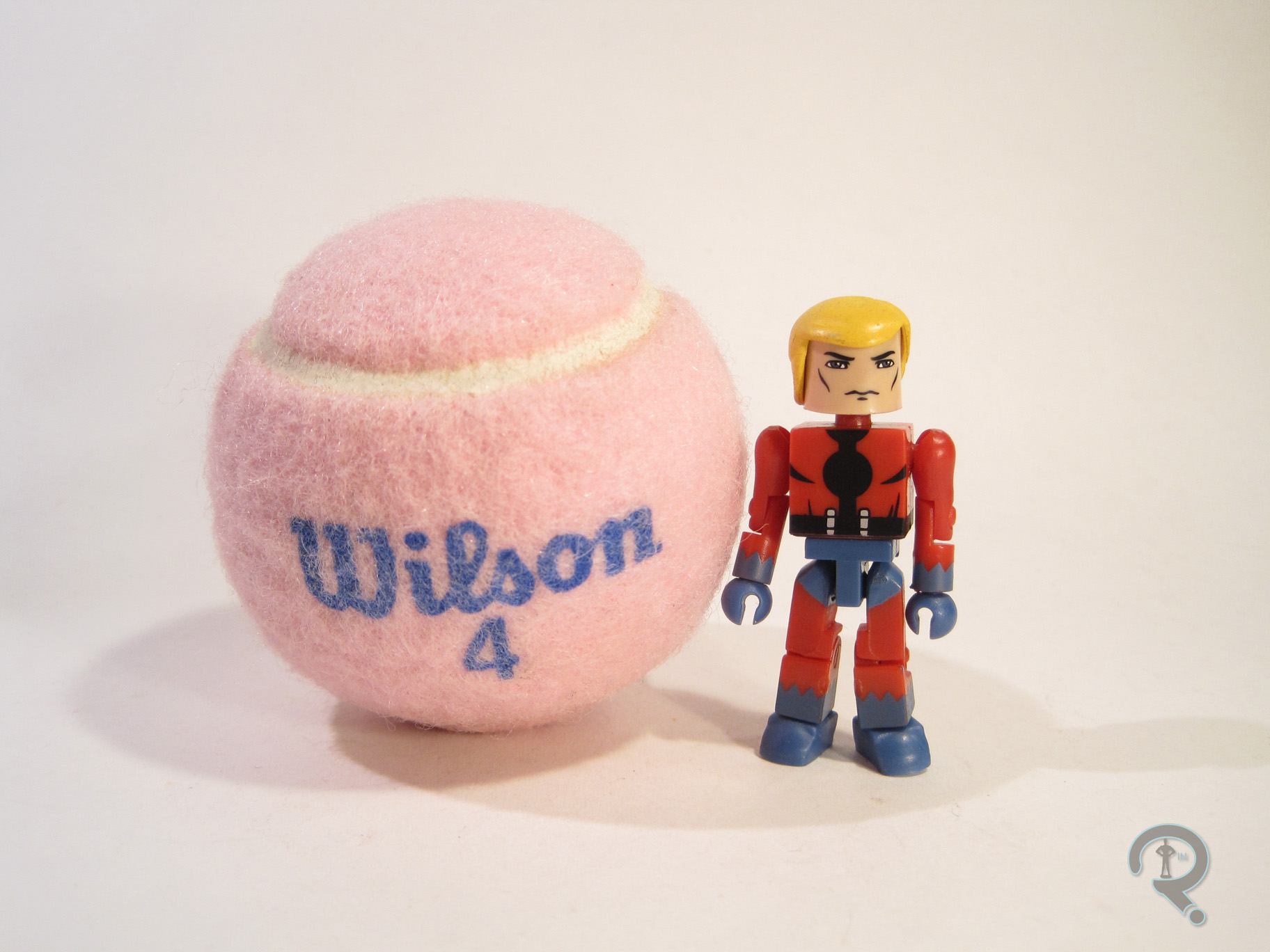
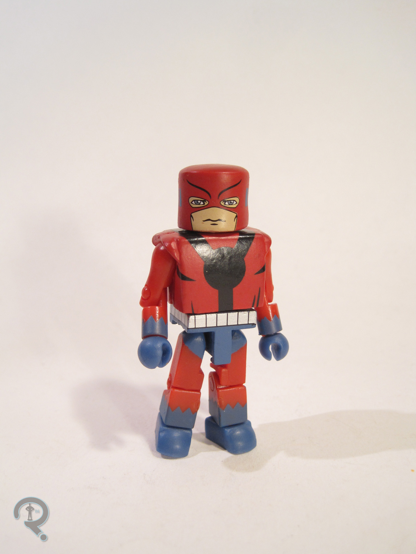
AvengersFA3Henry Pym, man of many names, made his Minimate debut with this set. He had the option of being displayed as Ant-Man or Giant-Man, giving fans two of his identities in one fell swoop. Since this was an Avengers #1 boxed set, let’s consider Ant-Man the main look. The figure stands about 2 ½ inches tall and has the usual 14 points of articulation. He used the basic Minimate body, with an add-on for his helmet. The helmet was new to this figure, and was also used on the recent Best of Series 3 Ant-Man. It’s a very well sculpted piece, and it manages to capture the comic design of the helmet without looking too goofy. The paint on Hank is nice and bold; the colors are bright, and the line work is pretty clean. The face AvengersFA6under the helmet looks maybe a bit too chiseled for Hank, but it’s not bad. Hank included a separate mask, torso cover, and waist cover to transform him into Giant-Man, as well as a spare hairpiece to allow him to be unmasked. The Giant-Man parts are alright, but not great. They bulk him up a lot, but don’t add any height, so he looks rather off. It’s clear they were trying their best, but he just doesn’t quite work right. The hair is perfectly fine; it’s a re-use from the classic Battlestar Galactica Starbuck, which seems odd for Hank stylistically, but it doesn’t look too bad once it’s in place.

GOLDEN ARMOR IRON MAN

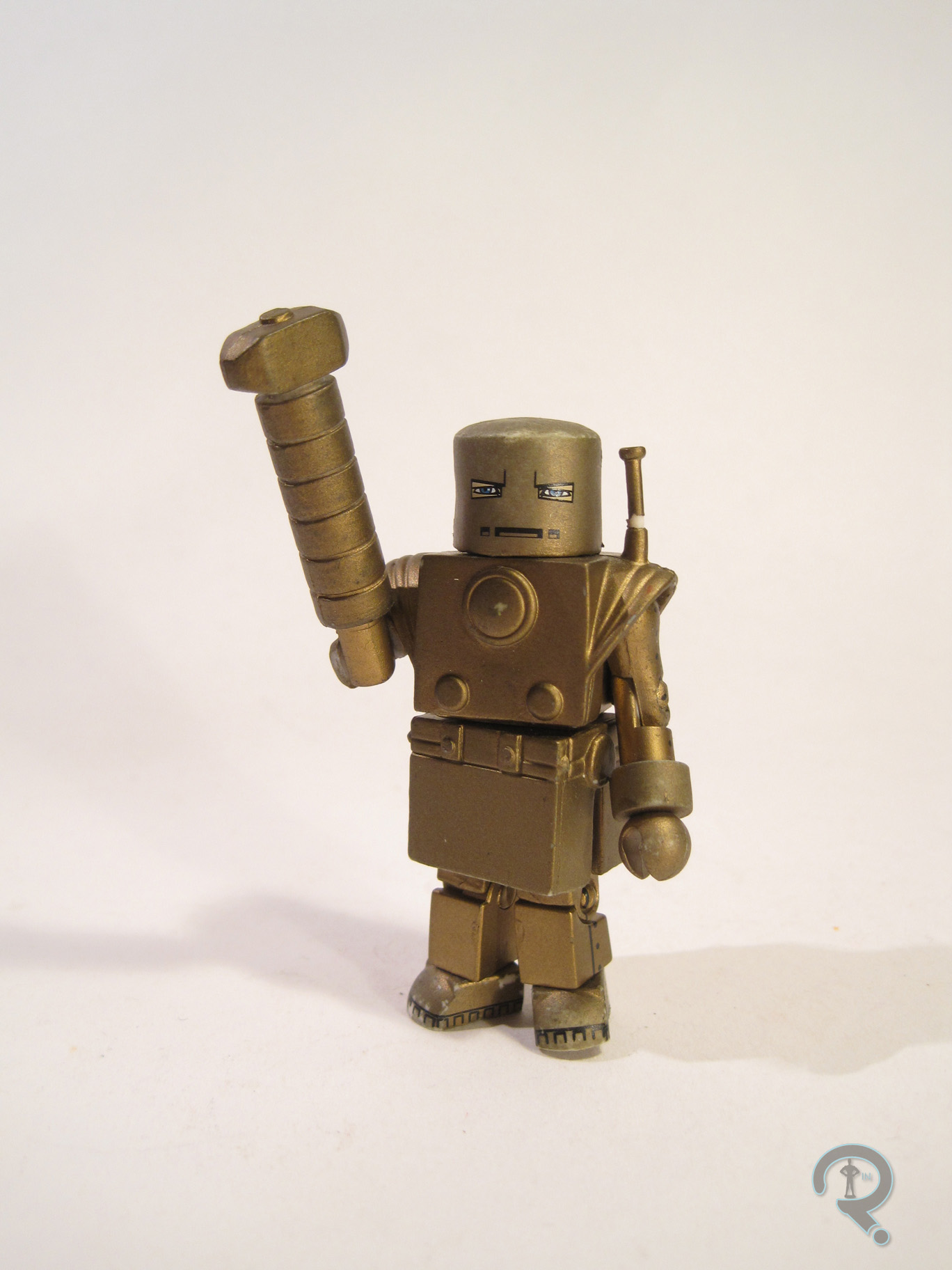
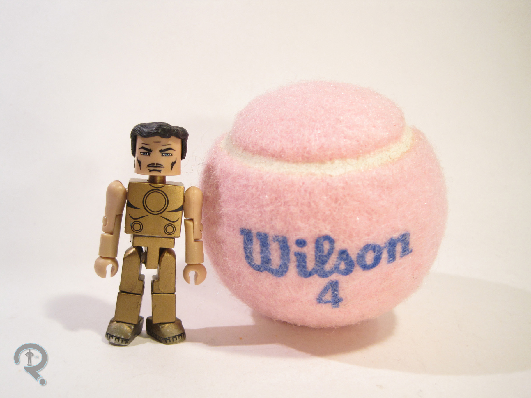
AvengersFA7Iron Man was at the top of his game in 2008, so seeing him turn up in this set was pretty much a guarantee. This was his eighth Minimate that year alone! He presented here in his second armor, which was really just a repainted version of the Mark 1. It’s the armor he was wearing for the first two issues of Avengers, and it’s also a pretty memorable look for the guy. He was built on the usual body, with 5 add-ons: helmet, torso, skirt, and bracelets. The helmet and bracelets were both generic pieces, used on numerous figures around the same time. The torso and skirt pieces were re-used from the AFX exclusive First Appearance IM, released a few years before. That’s a pretty sensible re-use, since they were supposed to be the same armor in-universe. The IM-specific parts are nicely crafted. They don’t have tons of sculpted detail, but the look from the comics is captured well. Paint on this figure is kind of a mixed bag, mostly due to the fact that, in its current state, it really doesn’t represent how it AvengersFA2looked out of the box. The gold paint seems to have not adhered very well to the plastic, resulting in a rather chipped and tarnished looking figure, which is a bit of a disappointment. Subsequent gold-based figures have remedied the issue, but this one is left looking somewhat lackluster. On the plus side, the detail lines are all very well handled, especially on the underlying torso and face, which you don’t even see in the main set-up. Iron Man is packed with a spare hairpiece, for unmasked display, a hammer attachment for his hand, and a spare set of flesh-toned arms so that you can display Tony in re-charge mode.

INCREDIBLE HULK

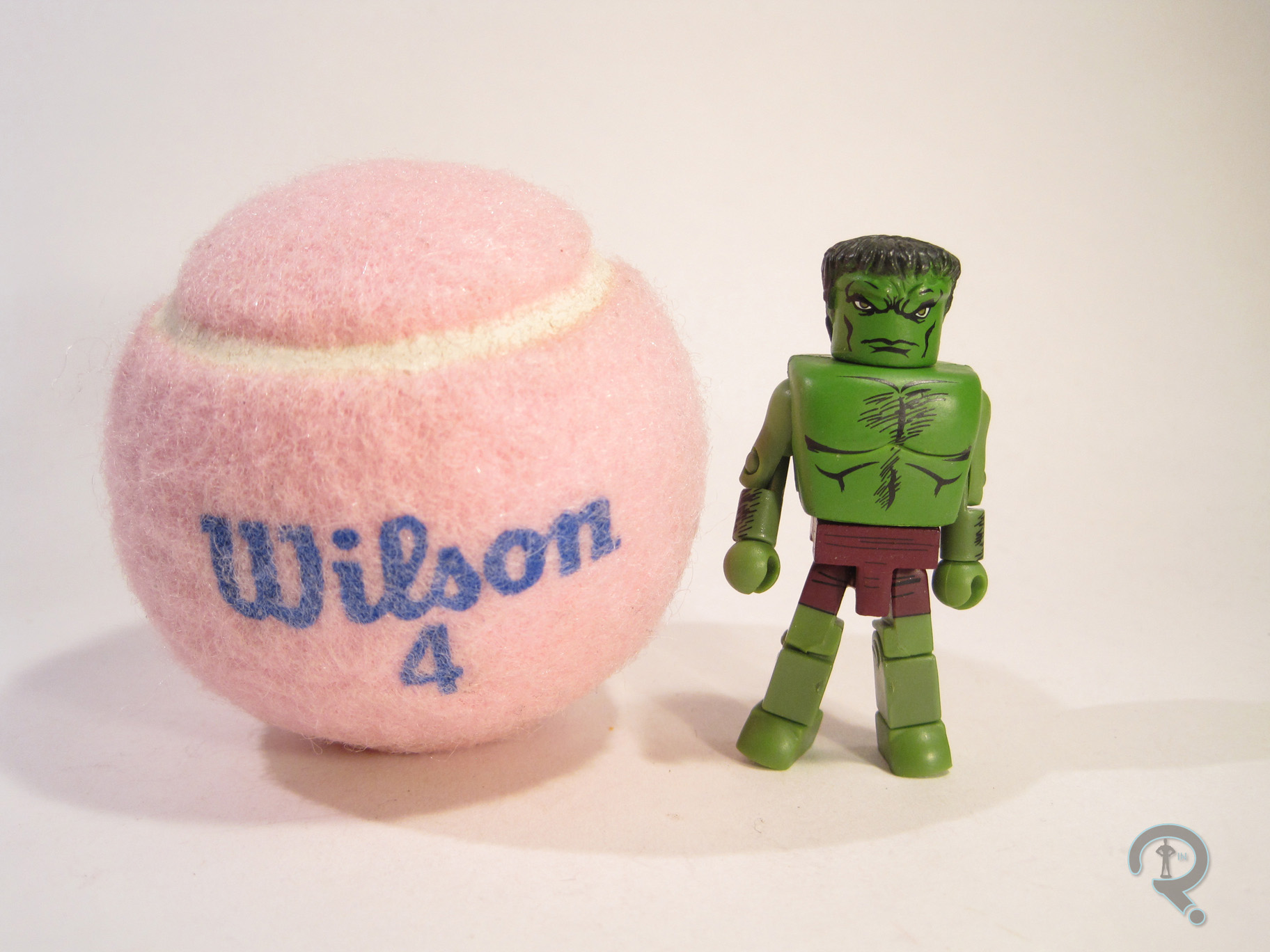
AvengersFA5He may not have been quite as successful as Iron Man, but Hulk was pretty big in 2008 as well, making him another heavy hitter in this particular set. Hulk is presented here in his purple shorted look, which was rather short(heh!)-lived in the comics, but was the look Hulk had in the two issues this set is based upon. So, it’s an interesting enough variant of the character. The figure has a unique head sculpt, as well as add-ons for the torso, waist, and the infamous “duck feet.” The torso and waist pieces were both re-used from Series 20’s Abomination, and are both rather basic pieces. The head was only ever used on this figure, most likely due to the negative reaction it garnered from fans. It seems to try to capture the more Frankenstein’s Monster-inspired head of the early Kirby Hulk, but it comes out looking a bit lumpy. And then there’s the “duck feet.” They were one of Diamond’s first attempts at adding extra height to figures, and they built up a rather infamous reputation in the Minimate community, due to their general goofiness and lack of adherence to the usual Minimate style. Fortunately, Hulk included a spare set of regular feet, so no one was stuck with the weird ones. Hulk’s paint is decent enough. I think this might actually be my favorite shade of green for Hulk, and I do really like the Kirby inspired line work.

WASP

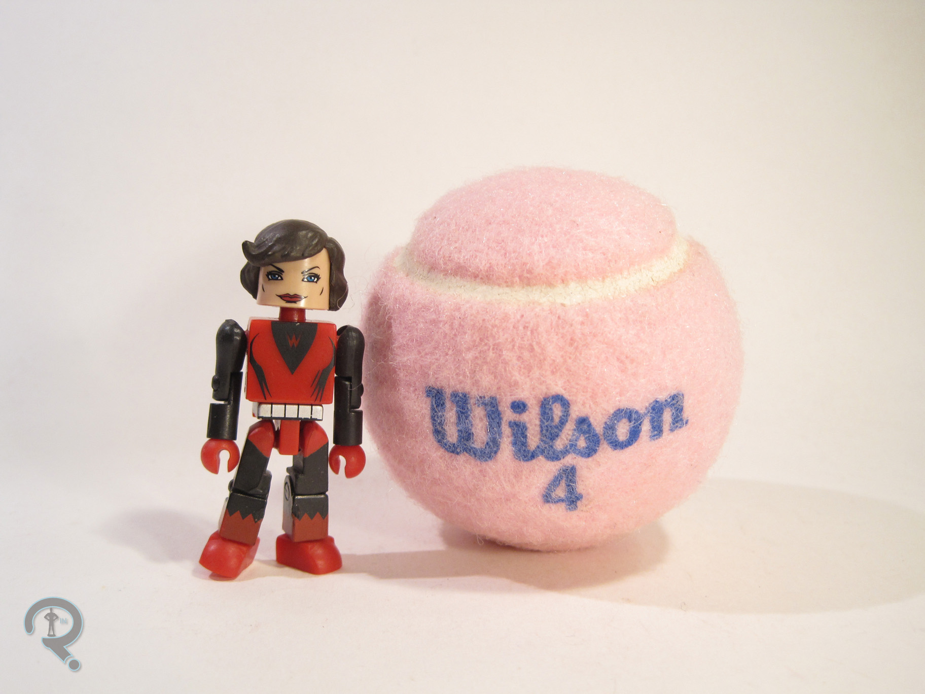
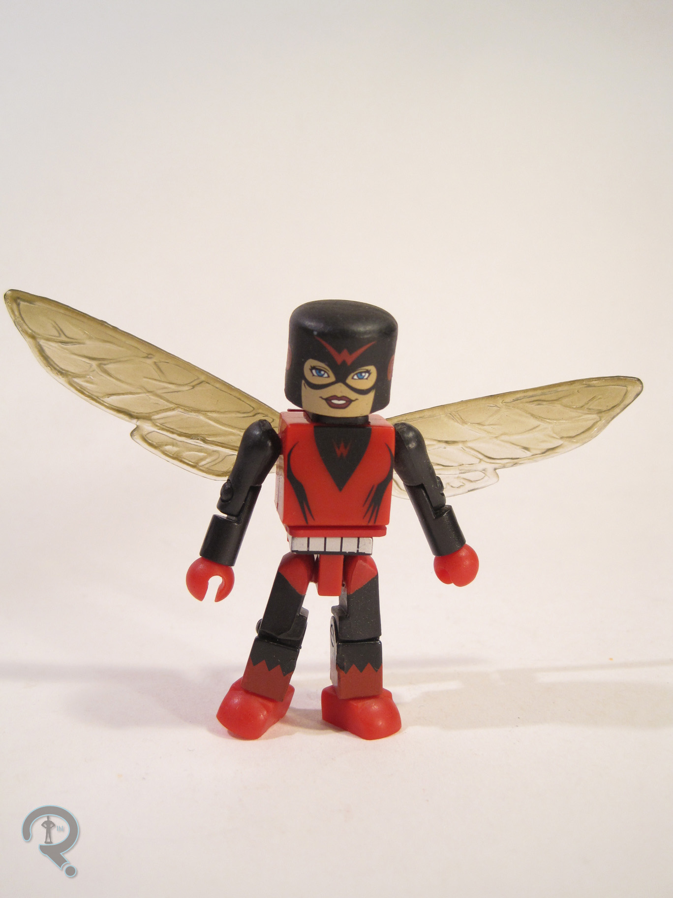
AvengersFA4Wasp was another character that debuted in this set, though, unlike Hank Pym, she’s yet to actually get a follow up. Which is kind of a shame, since she’s had a boat-load of different costumes over the years. She’s presented here in her original costume, which has gotten a fair number of figures over the years. The figure makes use of 7 add-on pieces, used for her headgear, vest, gloves, skirt, and wings. The parts are a little on the bulky side, especially for Wasp, but they balance each other out pretty well, I guess. The skirt is a lot boxier than later pieces would be, which makes the whole figure look rather stiff. The wings are probably the best part of the sculpt, and they actually do a decent job of replicating the comic look. The paint on Wasp was pretty decent from a design standpoint. The line work is all pretty well laid out,AvengersFA8 and everything. The real issue is in assembly. The figure was clearly assembled before fully drying, so several pieces, the wings in particular, were stuck, almost to the point of breaking. Wasp made out pretty well on the accessories front, including a spare hairpiece, a set of normal hands, an alternate mask, and an extra wing mount so that she can be displayed without the bulky vest piece.

THE ME HALF OF THE EQUATION

So, I actually ended getting a couple of this set when it was released, without even trying. I got one from my friend Lance, and then won another in a contest, and then eventually picked up a few more from Record and Tape Traders at super marked down prices. The set itself is pretty decent, if maybe a bit out of date when compared to more current stuff. Ant-Man and Wasp were definitely the stars here, and they both still hold up pretty decently.
#0677: Battle Ravaged Robot

BATTLE-RAVAGED ROBOT

LOST IN SPACE

RobotBR1

You know when you hear about a bad movie, for like a long time, and it just builds up this reputation of being so bad, and you think to yourself “it can’t really be that bad”? And then you watch it and it is indeed that bad? Yeah, that’s the Lost In Space movie from the 90s. To be fair, the movie isn’t completely without its merits. Among the positives are the end credits (and no, I’m not just saying that because they meant the movie was over. I actually like the end credits. They soothe me.) and the film’s take on the distinctive Lost In Space Robot. There were also some toys, which always excites me. Most of them were garbage, but some of the Robot toys didn’t suck. Let’s look at one of those!

THE FIGURE ITSELF

RobotBR2So, this is the Battle Ravaged Robot, from Trendmaster’s movie-based Lost In Space line. He was one of the two versions of the Robot released to go with the 5-inch scale human figures. The Robot is based on two separate looks from the film, all rolled up into one figure. As the name notes, he represents the Robot after he’s damaged while fighting the spider-things on the derelict ship, but that’s actually more of an alt look for the more show-inspired, second half of the movie look that is the figure’s default form. In his default set-up, the figure is about 4 inches tall and has 7 points of articulation. He also had wheels on the underside of his base, allowing him to roll, as well as legs that have weird spring-loaded feature to them. Also, the pincers on the larger arm are supposed to move via the very obvious lever on the side, but they really don’t. The main base of the figure, the legs, and the lower arms were all shared between this figure and the other Robot in the series, which seems sensible enough. They’re actually pretty well sculpted parts for the time. They have plenty of detailing, and they match up pretty well with the designs from the film. The figure also gets a unique “torso” piece, which features the joint for his more classically show-inspired head, as well as a socket to plug in his larger third arm. The head and arm are both just as nicely sculpted as the re-used parts and match up pretty well, so that’s good. Paint-wise, the figure is a little on the simple side, at least for the source material, but he’s not terribly handled. There’s a nice mix of greys and browns, with the occasional blue cropping up as well. The paint works reasonably well for the second iteration of the Robot. The figure is packed with a two-piece shell, allowing him to be “transformed” into the Battle Ravaged version of the Robot’s first iteration. This is a cool idea, but the execution ends up being a little off, mostly due to the color schemes of the two designs being different. It doesn’t look terrible, and, to their credit, they’ve added some brown damaged parts to the torso shell, so as to make it look like the brown-colored parts of the second Robot are just additional damage, but it doesn’t quite work. The figure also had a sound feature, but the batteries are long dead on mine, so I have no idea what sounds it would have made.

THE ME HALF OF THE EQUATION

I actually went and saw Lost In Space opening day. My dad and uncle had been big fans of the show growing up, so they took me and my cousin to see it. Truth be told, as a 6 year old, I didn’t mind the movie all that much. I really liked the Robot, so I ended up having a few of the toys of him, this one included. However, my original Battle Ravage Robot went missing, so I ended up getting this replacement from Yesterday’s Fun. He was the only LIS figure they had and I felt sort of bad for him. This figure definitely has some issues, and he comes from a pretty bad line, but he himself is actually a lot of fun. I’ve owned far worse.

RobotBR3

#0676: Captain Jack Harkness

CAPTAIN JACK HARKNESS

DOCTOR WHO

CapJack1

So, interestingly enough, before I got into Doctor Who, I actually gave the Who-niverse a try-out with the spin-off series, Torchwood. I liked the show well enough at first, but I decided it wasn’t for me when I got to the finale of the third series, Children of Earth. Just like the comic version of The Walking Dead, I found there are some storytelling techniques I just can’t move past. When I finally got around to watching Doctor Who proper, I was pleasantly surprised by how much I enjoyed Torchwood’s lead, Captain Jack Harkness, when he was given the chance to be a little more light-hearted than Torchwood had allowed.

THE FIGURE ITSELF

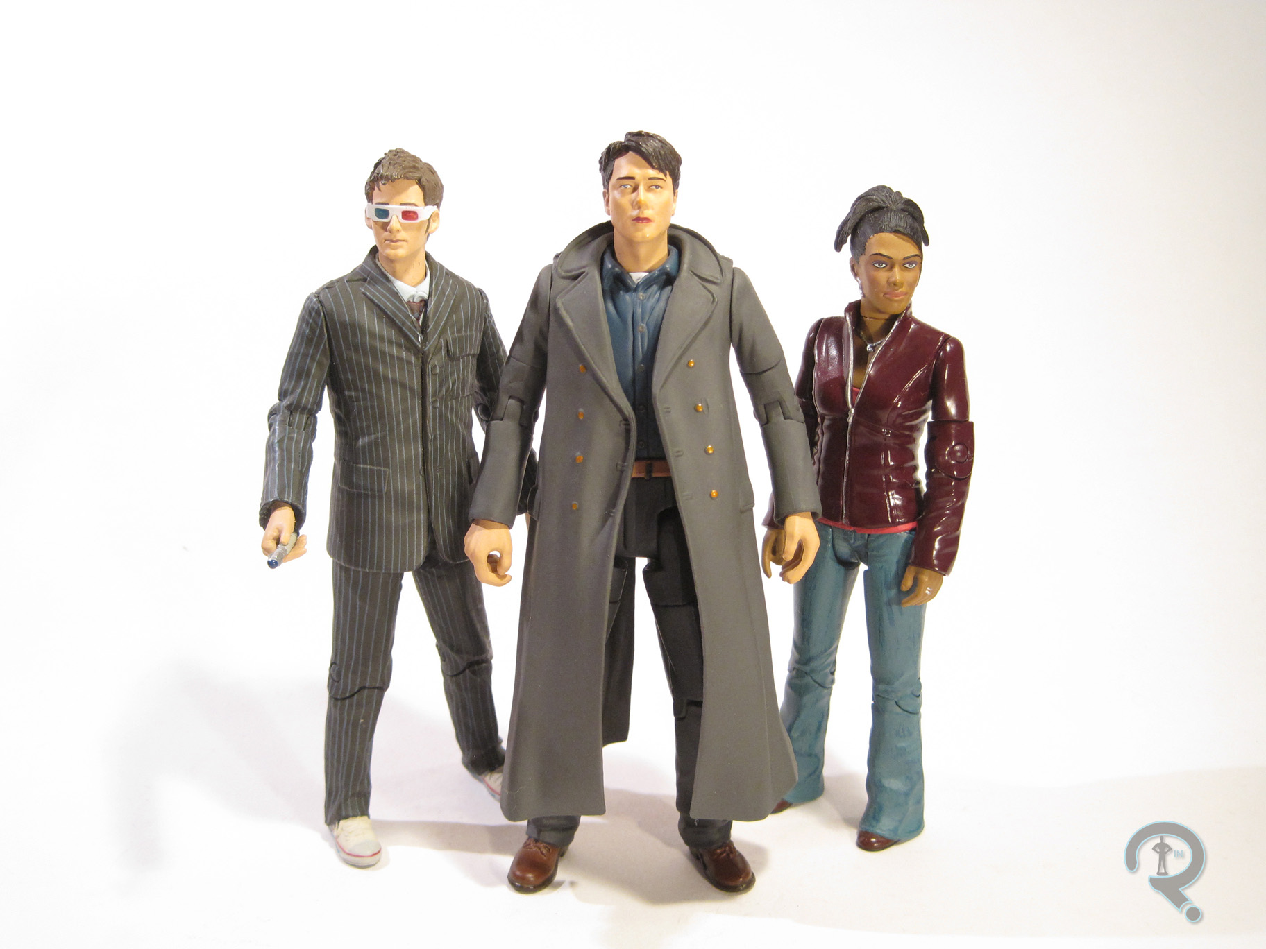
CapJack2Captain Jack was a special single release in the Doctor Who line. He was actually a re-issuing of the line’s first Captain Jack figure, which had become a little bit difficult to get a hold of in the years since its release. The figure depicts Jack in his gear from his second tenure on the show, during the Tennant run. It also happens to be the look he has for most of Torchwood. It’s a look with a lot of appearances, so it’s definitely a good representation of the character. The figure stands a little over 5 inches tall and has 16 points of articulation. Compared to some of the more recent figures from this line, he’s a bit lacking in movement; you aren’t going to get much more than a basic standing pose out of him. A fair bit of that comes from the somewhat restricting nature of his long coat, but even without that, the figure would still be a little stiff. Jack features a unique sculpt. It’s decent enough, over all. The proportions are mostly pretty good, aside from his somewhat alien looking fingers. Some of the areas, particularly the coat, are a little bit lacking in texturing, but that’s about the same, stylistically, as the other figures from this era, so he fits in pretty well. The likeness on the head sculpt seems like it’s pretty good, under the paint, but it’s hard to tell. As it is, it feels a little bit off. It’s still recognizably him, but not quite 100%. Also, the expression seems a little bland for Jack. I think a grin of some sort would be far more in character. So, what about that paint I was just touching on? Well, it’s best described as “adequate.” Not bad or anything; in fact, it’s remarkably clean. That being said, it just feels too smooth for a figure based on a real person. Also, it’s a bit thick in application, so things like the likeness on the face can be rather hard to make out. Jack includes a revolver, which is more than a lot of Doctor Who figures get, so that’s good.

THE ME HALF OF THE EQUATION

Jack here was one of a handful of things bought for me by my Super Awesome Girlfriend while we were at Yesterday’s Fun. After purchasing a rather sizeable selection of figures myself, she came out of the store and presented me with another bag full of things, Jack amongst them. Jack was the one major Tennant companion I was missing, so I’m glad to finally have one, even if he isn’t a perfect figure.

CapJack3

#0675: Recondo

RECONDO

G.I. JOE: SPY TROOPS

Recondo1

You can’t really run an effective action figure review site if you don’t occasionally touch on the original action figure, G.I. Joe. It’s been a fair few months since I last looked at anything Joe-related, so their probably overdue for another review, don’t you think? I’ll be taking another gander at the early 2000s re-launch of the line, which is really what got me hooked. Let’s look at Recondo, who was one of my favorites.

THE FIGURE ITSELF

Recondo2Recondo was released in the first series of G.I. Joe vs Cobra following the line’s re-branding under the G.I. Joe: Spy Troops heading in 2003. He was originally released in a two-pack with an Iron Grenadier, but he was also released as one of the Mission Disk single-pack figures, which is how I got mine. Recondo is one of the taller vs Cobra Joes, coming in at just shy of 4 inches tall. He featured 18 points of articulation, which was pretty impressive at the time (and still kind of is now!) Recondo got an all-new design for Spy Troops, which was a pretty radical departure from his vintage design. Now, I never owned the vintage Recondo, so this was my first exposure to the character. Due to that, I find myself liking this particular design a fair bit more than the original. That said, this design is a little more generic, and does ditch some of the original’s charm, so I can certainly see why people might have wanted a return to the classic design. The figure’s sculpt is very nicely handled, regardless of which design it represents. The proportions are some of the best the 00s line had to offer and his uniform has a ton of awesome little details put into it, especially on the torso, which houses a pistol, grenade, and several pouches for ammo. The paintwork is also pretty great on Recondo. Aside from a minor issue with his sleeves being fleshtoned at the elbows, everything is nice and clean and where it’s supposed to be. And, none of the things on the torso have been left unpainted, which is always a nice thing to see! Recondo was packed with a rifle, knife, and backpack, as well as the Mission Disk, which featured two episodes of the 80s cartoon and a few games.

THE ME HALF OF THE EQUATION

When the first series of Spy Troops two-packs were first announced, I knew I wanted the Recondo set. He just looked really cool. But, for whatever reason, I never got him (I got several of the other sets, though), and then he had mostly disappeared from stores. However, while on a mall outing with my Grandmother, I found Recondo and Wild Bill in their single-pack form at KB Toys. Man do I miss that place. Anyway, Recondo went on to be one of my favorite figures. I’m happy to see he’s held up pretty well!

#0674: The Putties

PUTTIES

IMAGINEXT POWER RANGERS

Putties1

Minions. Minions are what make the world go ‘round. No, not the little yellow guys in overalls (though they do seem to have infiltrated every facet of our lives…), just minions in general. All the best villains have a legion of near identical followers, who can do their bidding and serve as cannon fodder for our charming heroes. Darth Vader has the Stormtroopers; Shredder has the Foot Clan; Dr. Doom has the Doombots. Almost every iteration of Power Rangers has had its own set of faceless minions, starting way back in Mighty Morphing Power Rangers, with the clay warriors The Putties.

THE FIGURE ITSELF

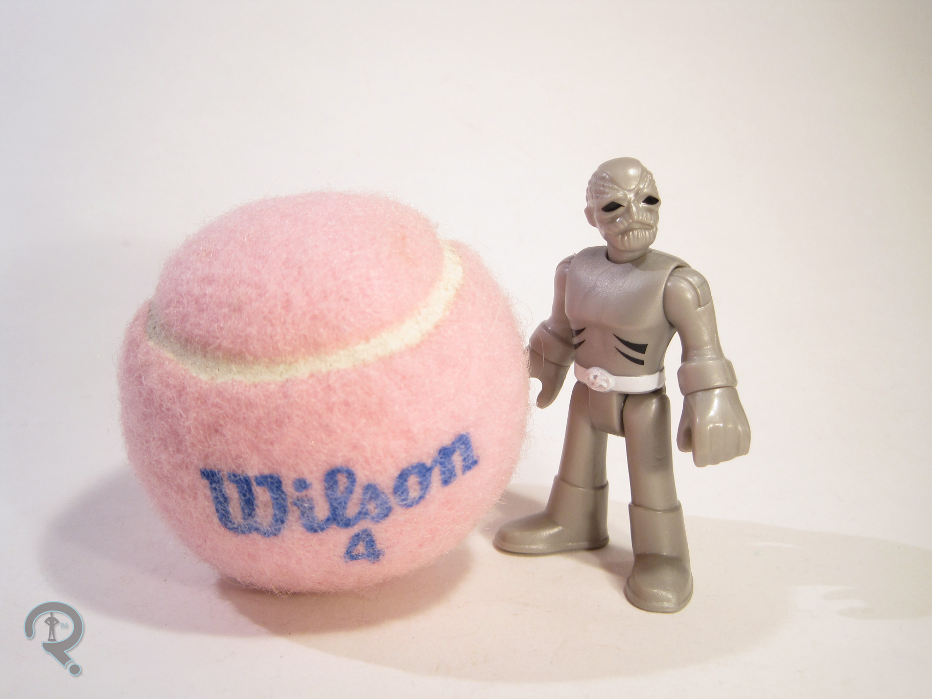
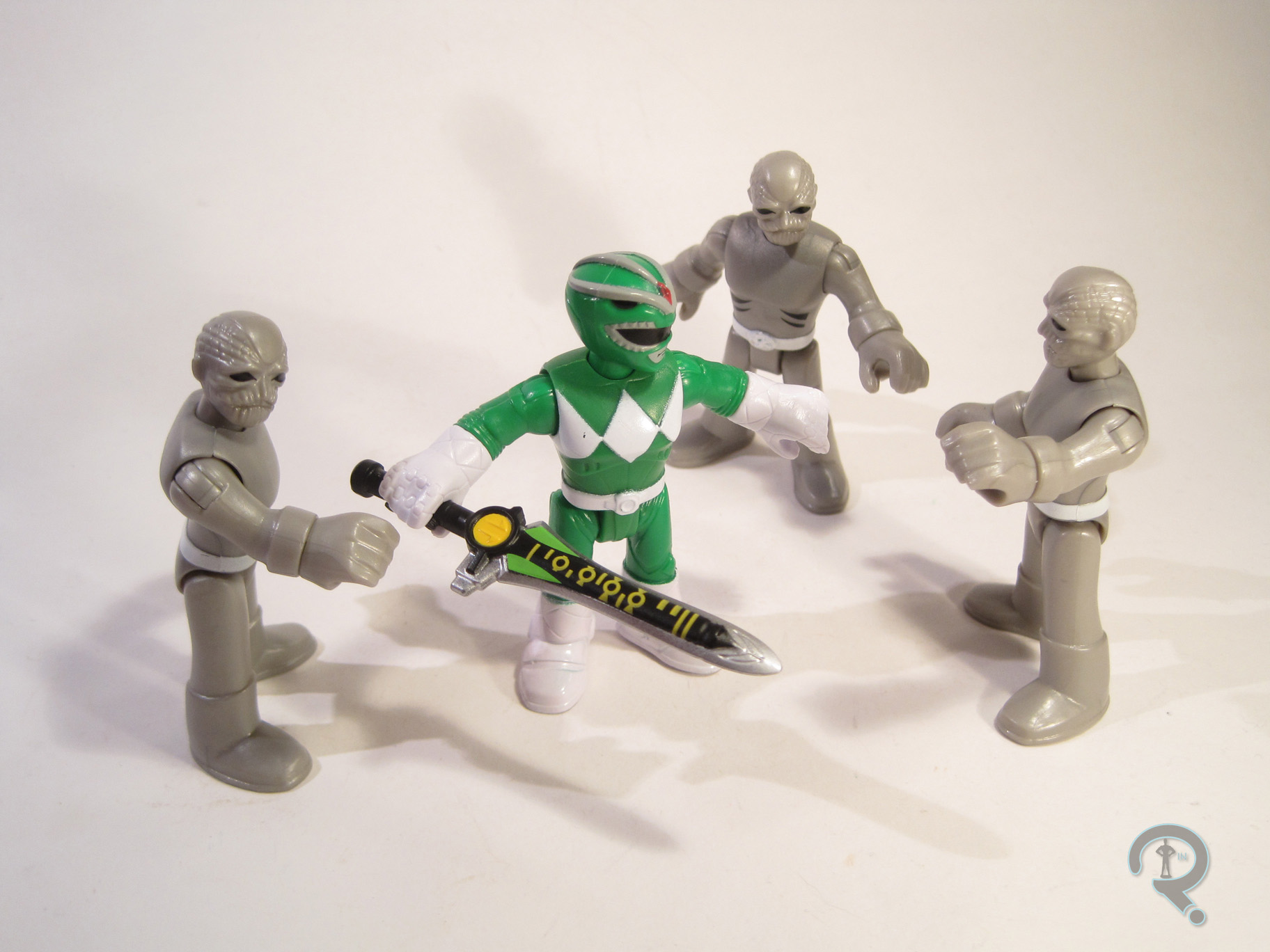
Putties2The Putties were released in a pack of three figures as part of the first assortment of Imaginext Power Rangers figure packs. The pack is made up of three identical Putty figures. They’re based on the Putties’ Season 1 appearance, before they were retooled by Lord Zedd. The design is a little more streamlined than future designs would be, and it’s when the characters were the most prominent. The figures each stand 3 inches tall and feature 8 points of articulation. The sculpt is fairly basic, which is fitting for the Putties. The body sculpt is pretty standard; the proportions are on par with the rest of the Imaginext line, and the basic parts are nice and cleanly sculpted. The heads are more detail filled than the body; on the show, the putties faces were a bit slap-dash, so replicating them can be a bit of an issue. Imaginext has opted to refine them a bit, which looks decent enough. I only wish they’d done up their hands to match, as they did in the show. The paintwork on the figures is pretty simple, but done well enough. The figures are molded in a slightly metallic grey, which replicates the spandex costumes from the show pretty decently. They’ve got painted details for their belts and eyes, as well as the black marks on their chests. The paint is pretty clean overall, though there’s some variance to the chest markings between the three. The Putty pack includes no accessories, but three Putties cost the same as two Rangers, so I guess, in theory, one of the Putties is an accessory to the other two.

THE ME HALF OF THE EQUATION

The Putties are really what sold me on the Imaginext Power Rangers. The Figuarts versions of the Rangers are the be-all-end-all versions of the heroes, but Bandai has yet to make any movies toward Putties in that scale. So, for someone who wants a few Putties to bat around, there aren’t many options. Add in the rather low price-point of the Imaginext stuff and I’m definitely sold, at least on a few of the figures.

Putties3

#0673: Green Ranger & Pink Ranger

GREEN RANGER & PINK RANGER

IMAGINEXT POWER RANGERS

PinK&Green1

Man, I really didn’t think Power Rangers was a thing I’d ever get back into. Then all these toy companies had to go and start making all these cool Power Rangers toys, and I had to go and have no self-control when it comes to cool toys. What are you gonna do, right? I can definitely tell you that a few years ago I would have never imagined that I’d be buying Imaginext stuff. They’ve really stepped up their game, and, more importantly, they’ve started making a lot of things I want to buy. Like Mighty Morphin’ Power Rangers. They’ve just released a bunch of Rangers merchandise, including several of the Rangers’ individual Zords, a really cool combined Megazord, and several smaller figure packs, for those who aren’t quite ready to dive all in. I just picked up Green and Pink Rangers, so let’s see how they turned out.

THE FIGURES THEMSELVES

Green and Pink were released as a two-pack in the first assortment of Imaginext Power Rangers figure packs. They’re probably the most sensible pairing of the bunch (given that they were a couple in the show), and it looks like they’re both currently exclusive to this particular pack, though Kimberly’s already been slated for a release with her Zord, and I’m sure Tommy won’t be far behind.

GREEN RANGER

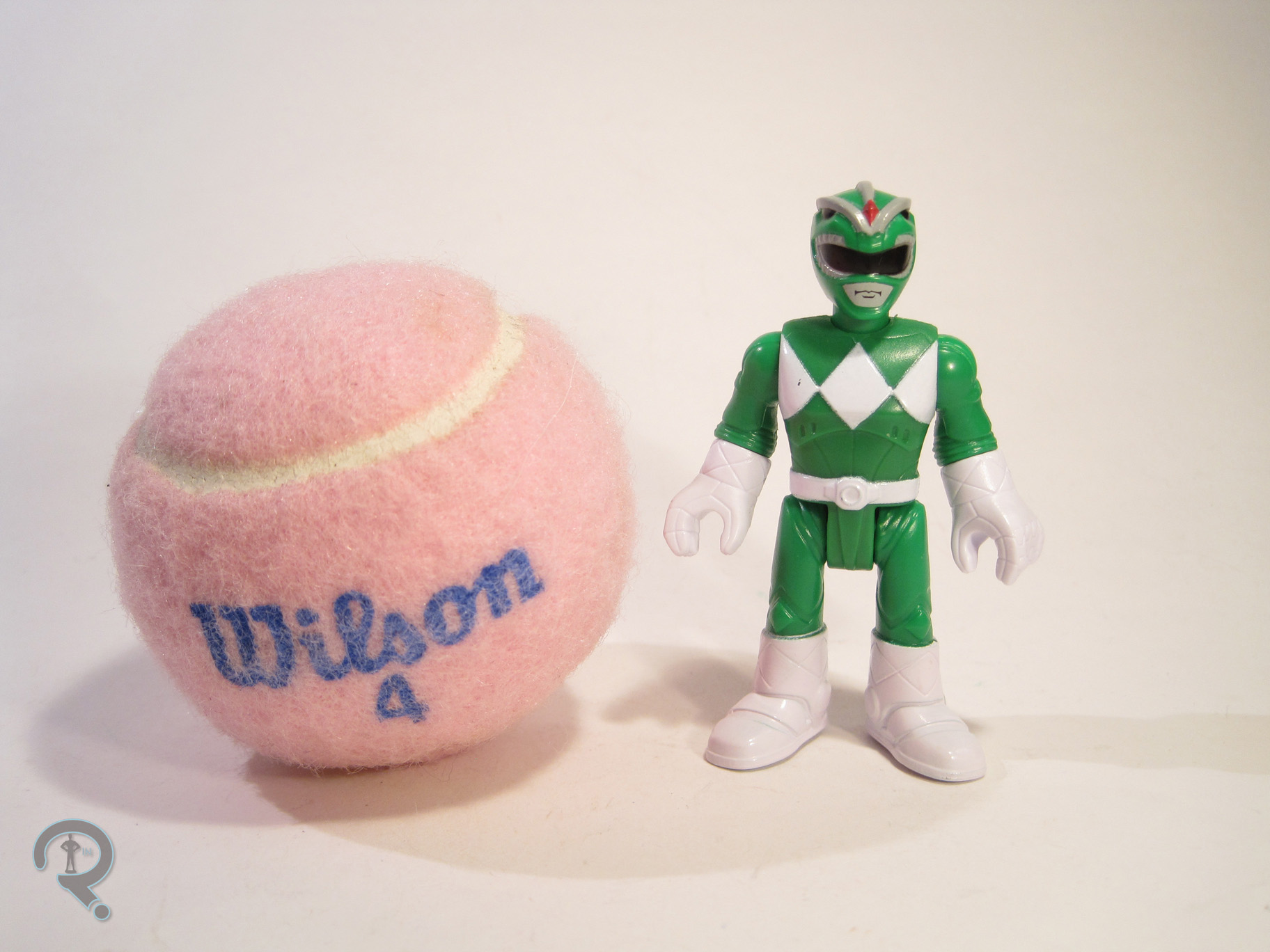
Pink&Green2The Green Ranger is the first identity of Tommy Oliver, the original Sixth Ranger, who would take on another four Ranger identities over the course of the various Ranger series. He was also portrayed by Jason David Frank, an actor of near legendary status in the Power Rangers community. So, the Green Ranger’s kind of a big deal. The figure stands 3 inches tall and has 8 points of articulation. Aside from the legs both being on the same joint (which still kinda baffles me) the movement is all pretty good, especially for a figure of this size and style. Tommy’s technically based on his appearance in Mighty Morphin’ Power Rangers, but there are a few changes, aside from the obvious stylistic ones. The Rangers in this set all appear to be an amalgam of sorts of their show and movie designs, taking the general design cues from the show, but also possessing the movie’s armored bodysuits and more detailed gloves and boots. It’s an interesting choice, doubly so on the Green Ranger, who was not in the movie. Also, there’s one glaring thing missing from this guy: his Dragon Shield! Yeah, he doesn’t have the extra armored bit that set him apart from the others, which is, admittedly, a bit odd. Sculpturally, Tommy uses the same body shared by all of the male Rangers in the line (so far, anyway). The proportions are slightly tweaked, so as to bring him in line with the rest of the Imaginext figures. The body has a lot more fine detail work than what I’ve seen before from Imaginext, and it’s certainly very impressive. Tommy also gets a unique head sculpt, which is a pretty good translation of his dragon-styled helmet, with the same level of detail as the body. The mouth is painted, rather than sculpted, but that keeps him more or less in line with the un-helmeted characters. As far as paint goes, the Green Ranger is handled pretty well, though he does make a few more deviations from the source material. For one thing, the gloves and boots are just straight white, as is the belt. One presumes this was done as a way of simplifying the designs just a bit. Interestingly, the other big change is not a simplification. For whatever reason, they’ve painted the ridges on the top of the helmet grey, presumably to set them apart from the rest of the helmet. However, on the show, that part of the helmet was just straight green. I’m not sure why they changed that particular thing, but it certainly doesn’t look bad, so I can’t really complain. The Green Ranger includes his Dragon Dagger, up-scaled a fair bit to meet safety standards. It’s nicely sculpted and pretty well painted, though it’s worth noting that the details on the blade are sculpted on the opposite side of the one they were painted onto, which is kinda funny.

PINK RANGER

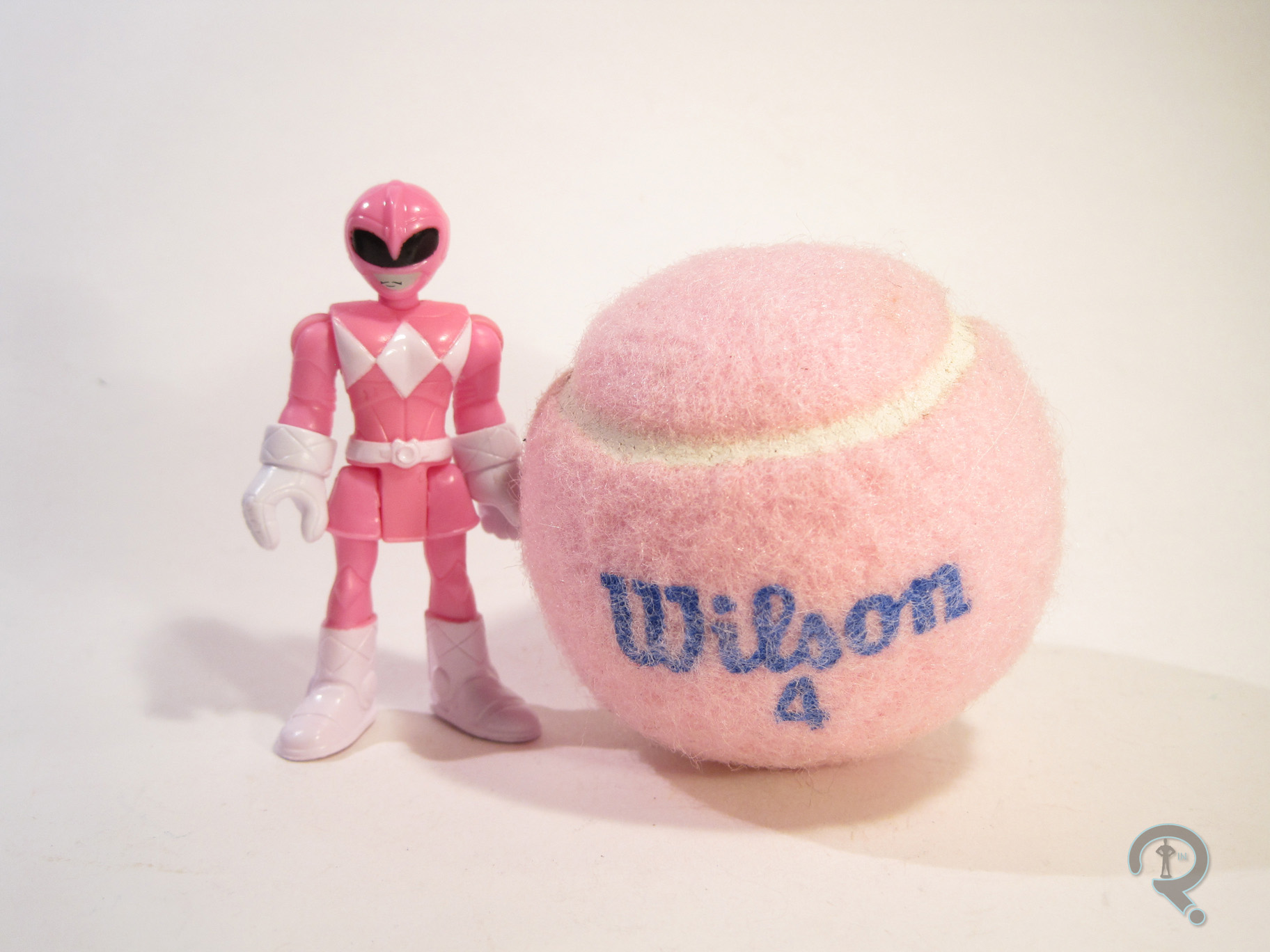
Pink&Green3The Pink Ranger was actually one of the set’s main draws, at least initially, since it’s the only way to get her in the initial product release, and she is one of the original five, after all. Unlike Tommy, Kimberly would only be the Pink Ranger for one incarnation of the show, but she’s still the original, and that’s kind of important. The figure is a little under 3 inches tall and has the same 8 points of articulation as Tommy. She too is an amalgam of her show and movie designs, keeping the basic layout and the skirt from the show design, but still adding the stitching and armoring of the movie design. Due to the presence of the skirt (which the Yellow Ranger does not have), the Pink Ranger gets a mostly unique sculpt, apart from a re-used set of arms. Once again, the proportions have been slightly tweaked, so as to make her fit stylistically with the rest of the Imaginext line. I must admit, it’s refreshing to see one of these “kid-ified” lines not horribly under-sizing the female characters. It’s especially great when it comes to the Power Rangers, who should all be similarly sized. I’m not 100% sold on the head sculpt. It’s not bad, but it seems her helmet just didn’t translate as well to the style as the others. She kinda looks like one of those stereotypical aliens. Kimberly’s paintwork isn’t all that different from Tommy’s; it still lacks some of the extra details on the gloves, boots, and belt. She’s also missing the patch of white on the back of her helmet, which might actually be what’s throwing her head sculpt off for me. Also, the mouth on this one is mis-aligned, which makes her look a little wonky. She includes her Power Bow, which is once again up-scaled a bit for safety. She can’t really hold it, but it’s decently sculpted, and it includes clips so that you can assemble the Power Blaster if you get the other Rangers.

THE ME HALF OF THE EQUATION

I saw the various Imaginext Power Rangers stuff a few times before picking this set up, mostly due to this seemingly being the most difficult to obtain set. I wound up finding at a Target near a convention I was attending, and these two just really drew me in. The Green Ranger’s definitely the star here, even with his handful of inaccuracies, but both of these figures are just a lot of fun!

Pink&Green4