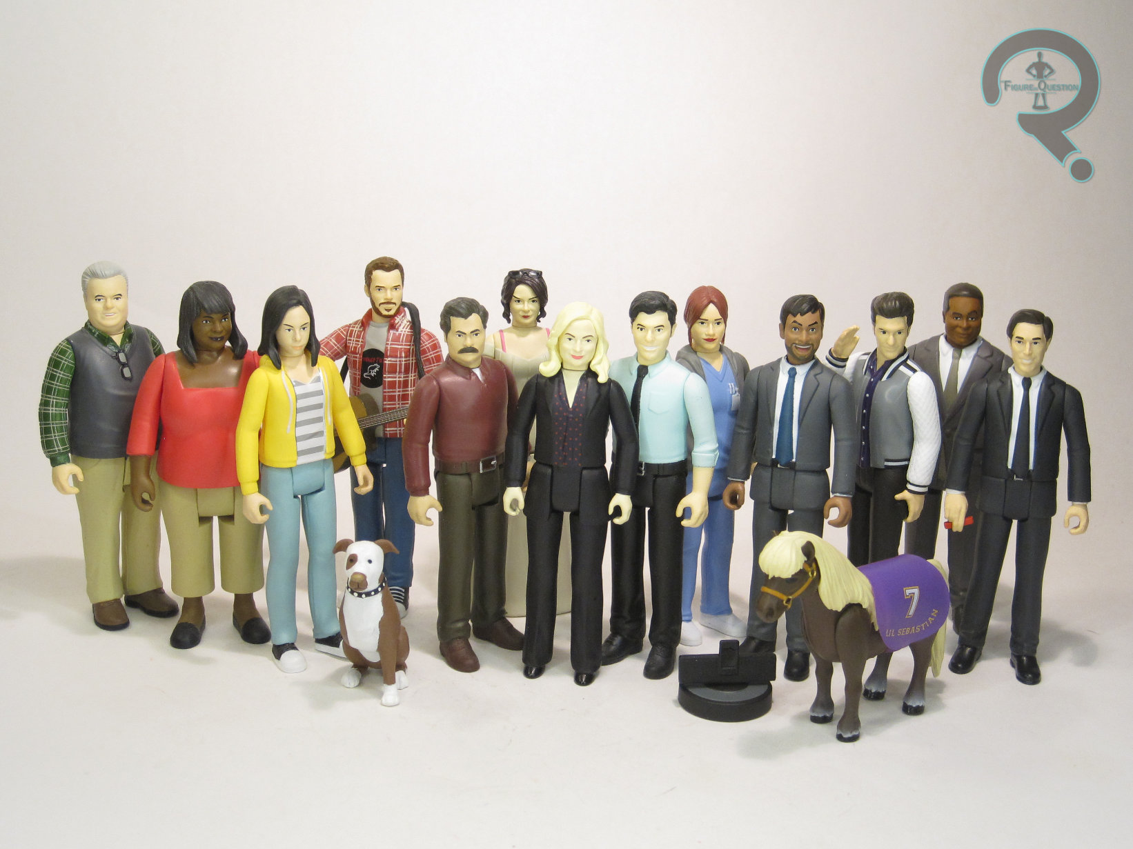
ANDY DWYER, ANN PERKINS, JERRY GERGICH, L’IL SEBASTIAN, RON & TAMMY 2, PERD HAPLEY, JEAN-RALPHIO, BOBBY NEWPORT, SICK RON, TOM HAVERFORD, & VOTE KNOPE
PARKS & RECREATION REACTION FIGURES (SUPER 7)
I’ve mentioned Parks and Recreation only twice before on the site, but both times, I’ve taken the very important stance that, compared to The Office, it’s the superior work-place comedy. I bring that up every time because, as stated, it’s very important. I really need you all to know my point. Genuinely, though, it’s one of my very favorite shows, and has one of the best ensemble casts on television. Back in late 2022, Super 7 launched a line of ReAction figures based on the show, and…it’s apparently had four series? I’ve had some stuff going on. But I’m diving back in, because that’s how I do. And, to show how absolutely insane I am, I’m reviewing everything I’ve missed since Series 1, all in a single shot. Woooooo!
THE FIGURES THEMSELVES
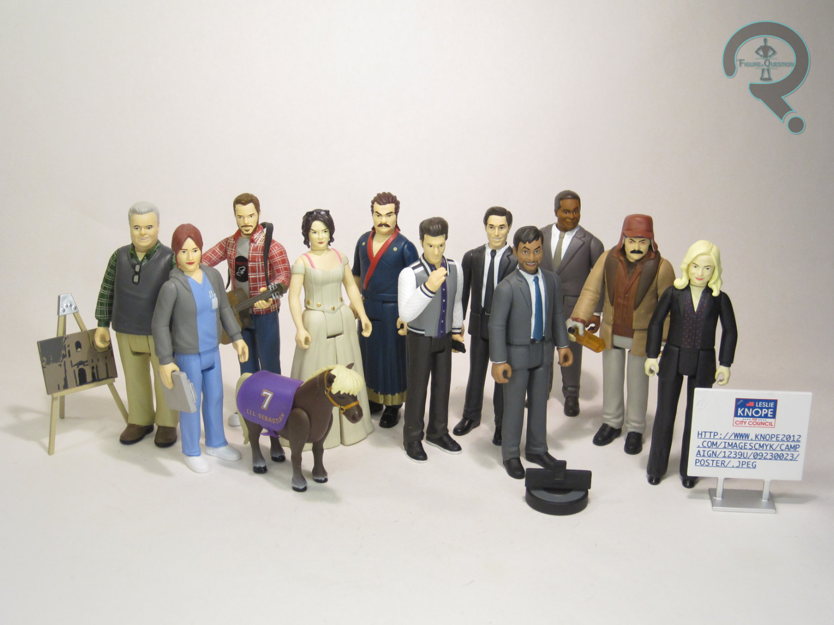
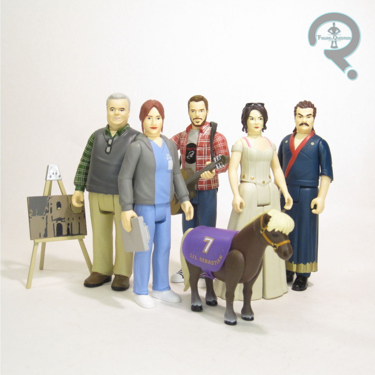
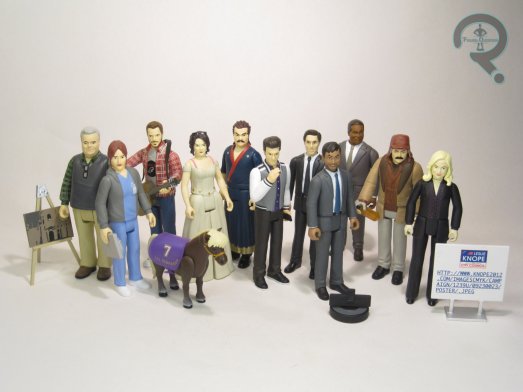
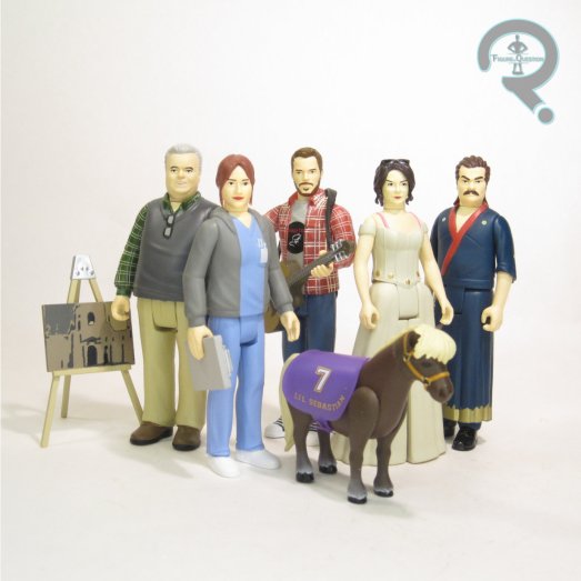
Andy Dwyer, Ann Perkins, Jerry Gergich, L’il Sebastian, Ron & Tammy 2, Perd Hapley, Jean-Ralphio, Bobby Newport, Sick Ron, Tom Haverford, and Campaign Leslie Knope make up the last three series of Super 7’s Parks and Recreation ReAction Figures. Andy, Ann, Jerry, and L’il Sebastian are the standard Series 2 figures, with the Ron & Tammy 2 two-pack serving as a companion piece. Perd, Jean-Ralphio, and Bobby are Series 3, and Sick Ron, Tom, and Campaign Leslie are Series 4.
ANDY DWYER
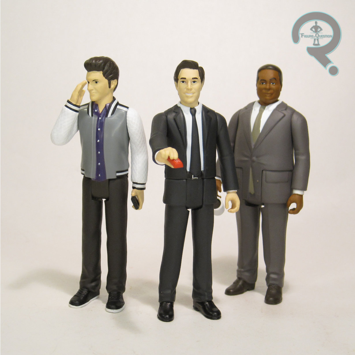
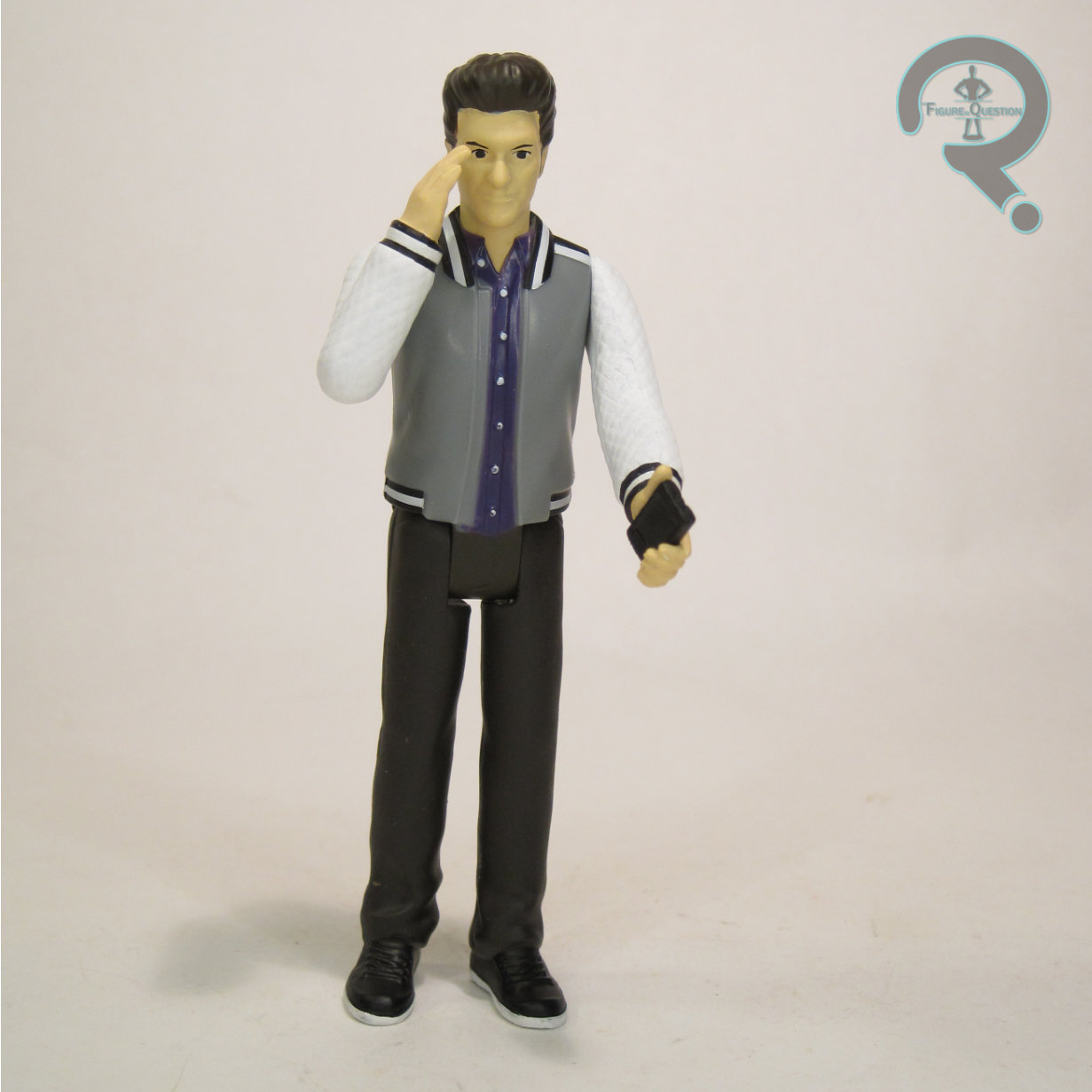
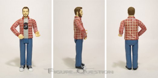
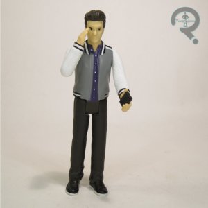
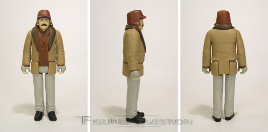
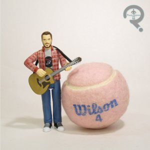 Series 2’s first figure is also the line’s first retread….sort of. There’s not *technically* an Andy Dwyer in Series 1, since it was actually Burt Macklin that we got, but, you get the idea. Anyway, this one’s an actual proper figure of Andy just as Andy, which makes sense, with him being Chris Pratt and all. The figure’s 3 3/4 inches tall and he’s got 5 points of articulation. Andy’s an earlier season version of the character, erring more on the casual, rock star side. Honestly, I know Andy wears the t-shirt and flannel a lot in the show, but it’s not a look I ultimately associate with him by default, so this one sort of struggles to land for me. The sculpt is notably quite pre-posed, especially for this line, with his arms being posed to hold his guitar. Otherwise, it’s fairly standard. I don’t see much of a Pratt likeness on the head, especially compared to the Macklin head, and the body feels a bit thin for Andy. His paint work is pretty basic. They do well with the plaid detailing, and I definitely dig the “Mouse Rat” shirt print. While Burt had no accessories, Andy does at least get his guitar, which justifies the whole pose of the figure (and also makes him one of the only figures in this line that can actually properly hold his accessory).
ANN PERKINS
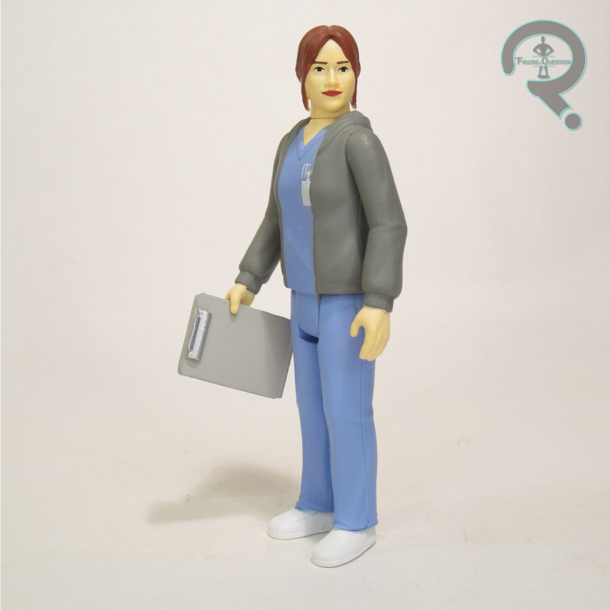
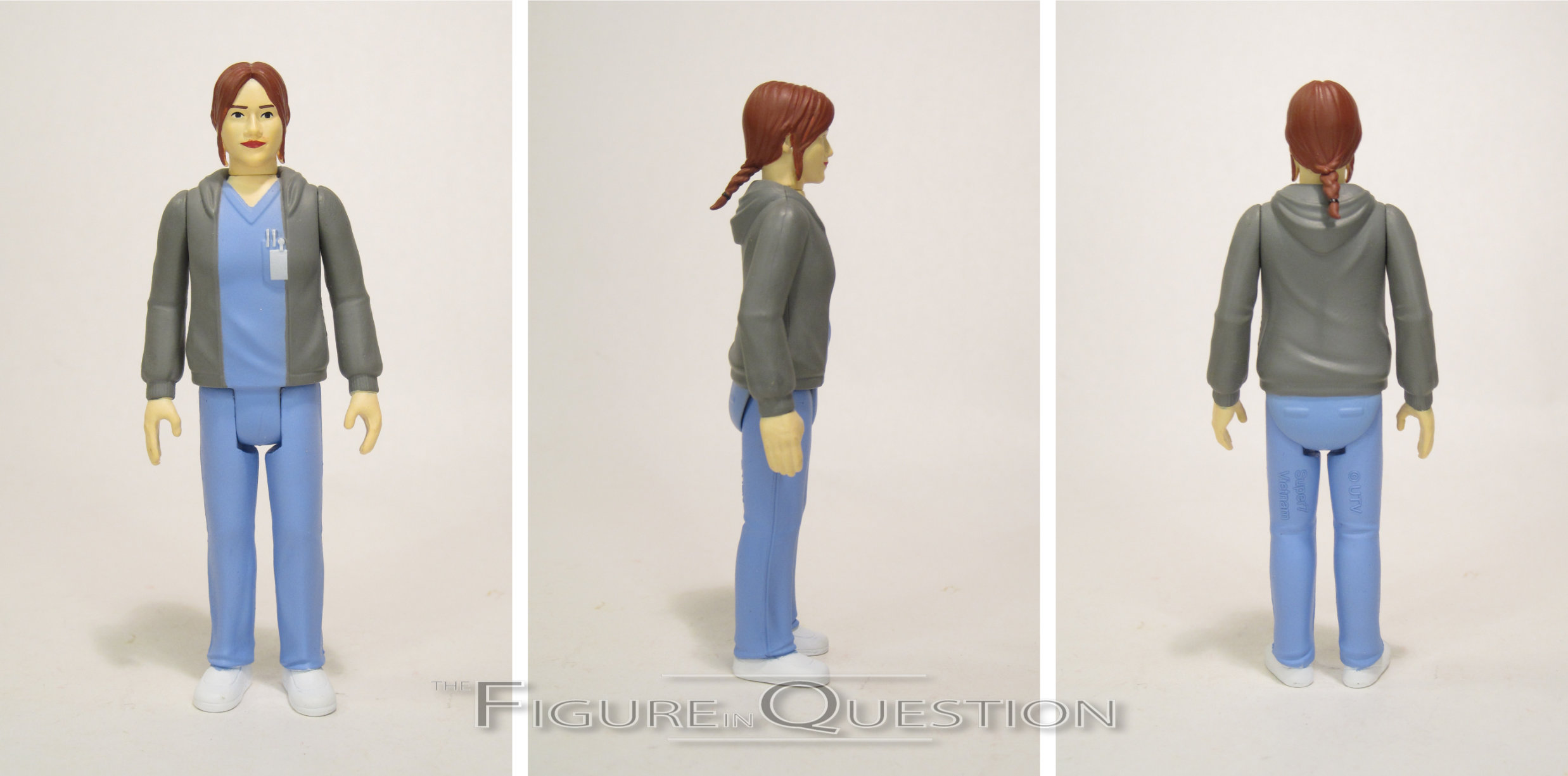
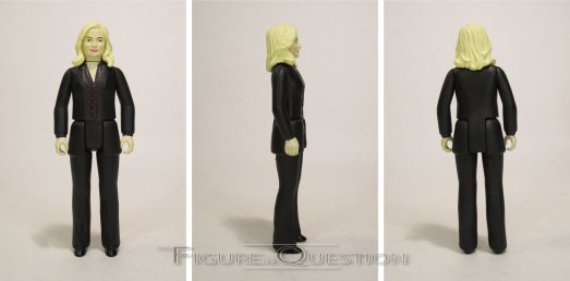
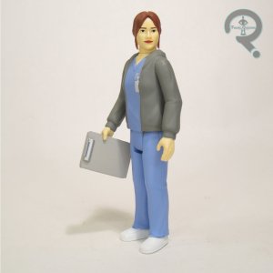 There were a handful of notable omissions from the first series, and high on that list was Ann Perkins, effectively the show’s secondary lead in the early portion of its run. Unsurprisingly, she headlined the second round. She’s in her nurse scrubs, which is a reasonable enough choice for her, especially since it helps her remain more unique from the others in the line. Her sculpt is back to the more basic posing. It’s not bad. A tad more on the generic side, and lacking a lot of the the sorts of things that could make it more quickly recognizable as Ann, but not terrible. The biggest problem this figure faces is the color palette. For some reason that I can’t fathom, Super 7 decided to give Ann the complexion of a fair skinned Irish girl who’s never seen the sun, rather than, you know, anything actually close to what Rhashida Jones’ actual complexion is. No matter what the quality of the underlying sculpt, it’s the paint that’s removing the likeness almost in its entirety. I don’t know if there was some mix-up, or if it’s some sort of weird licensing thing, but it’s just thoroughly an odd end result. Ann is packed with a clip board, which is a fine accessory, but, again, not overly dialed into Ann.

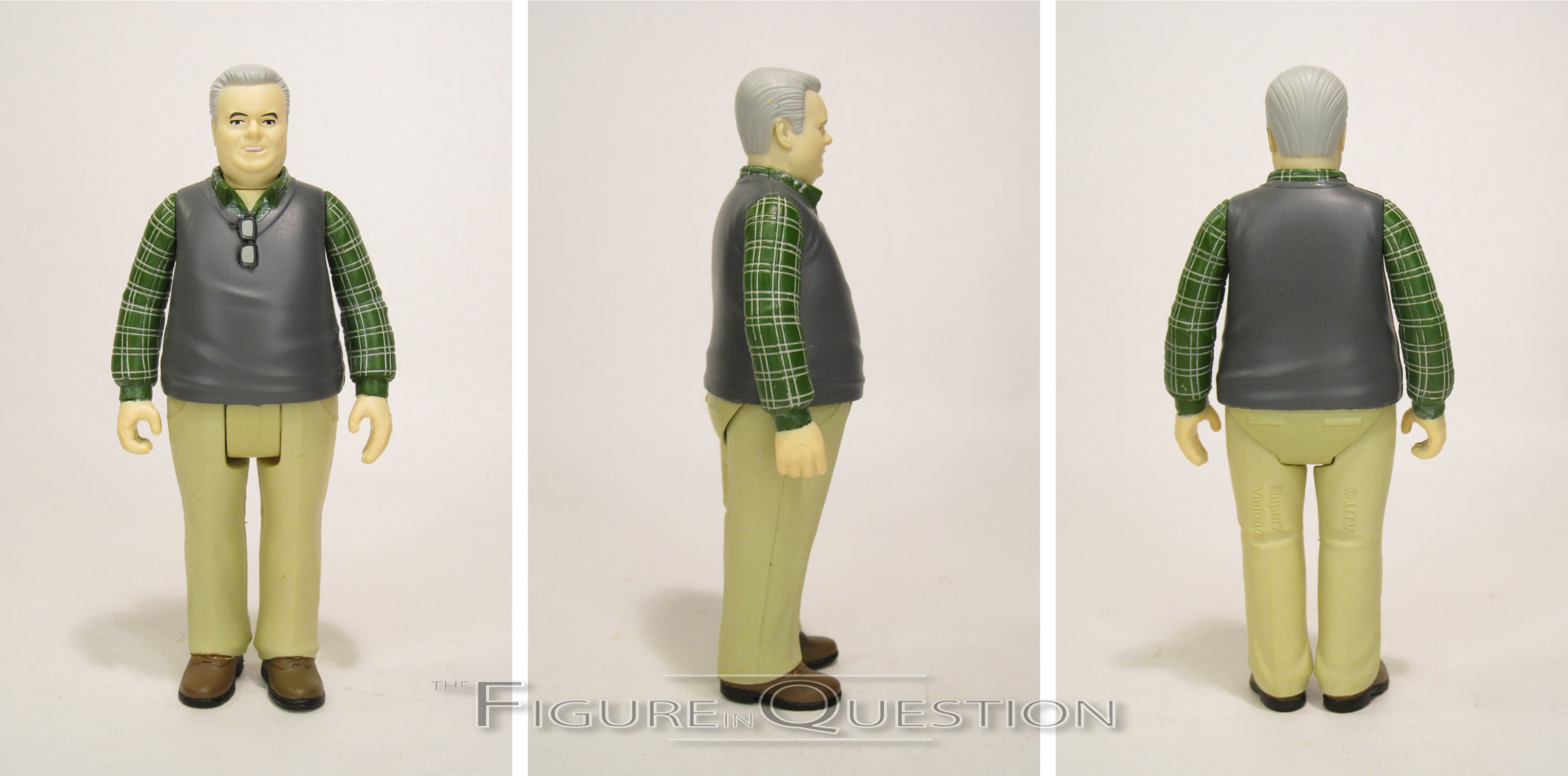
JERRY GERGICH
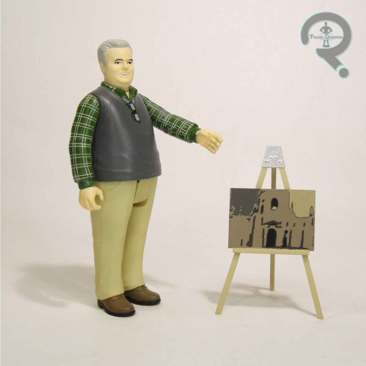
 Alongside Donna, Jerry began as essentially a glorified extra (his actor, Jim O’Heir, had auditioned for Ron, but Michael Shur liked him so much that he cast him and decided he’d figure out the character later)in the show’s first season, but his role expanded as the show went on, until he got promoted to proper series regular by the end of the show. He also gets one of the show’s very best send-offs in the finale, and just an all-around great progression on the show. And he gets *so* many names. They settled on his “original” of Jerry, but you can pretend he’s Larry, or Terry, or even Gary if you so choose. Jerry’s seen here in his standard office attire, sweater vest and all. He’s got one of the more consistent looks from the show, so it’s a pretty easy choice. The sculpt on Jerry is pretty darn good, actually. He’s got a unique build, and the facial likeness that’s a good match for Jim O’Heir. His paint work is reasonable as well. It’s fairly clean, if perhaps a bit thick. Jerry is packed with an easel with a piece of art on it, which, in contrast to Ann, feels quite character appropriate.
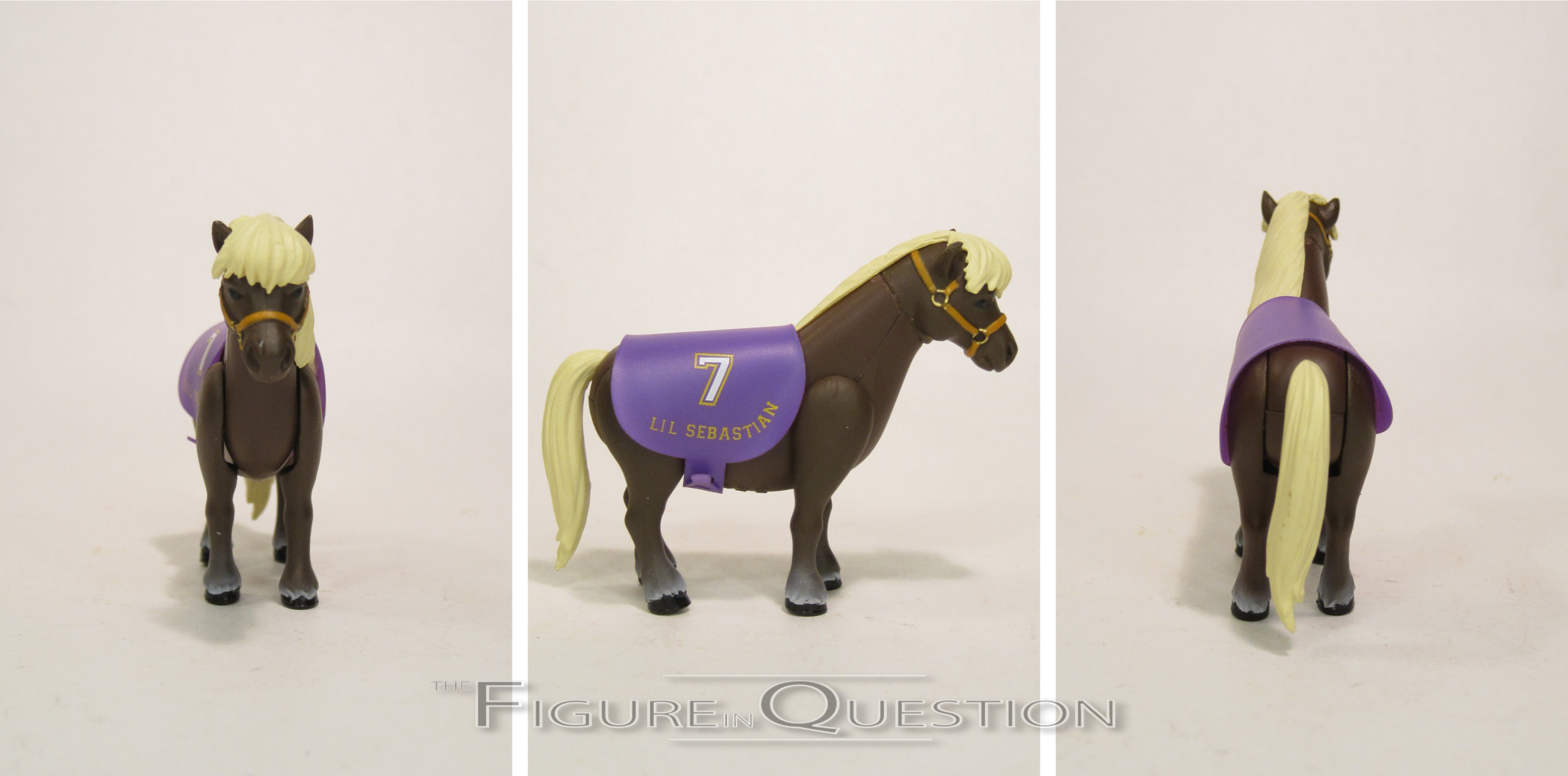
L’IL SEBASTIAN
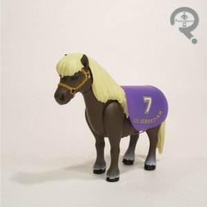 Though he only actually appears in a single episode of the show’s run, miniature horse L’il Sebastian is nevertheless a major fixture of the series, influencing a great many actions, and inspiring “5000 Candles In The Wind”, one of the show’s most memorable original songs. L’il Sebastian is the smallest of the line’s figures, and he only gets 4 points of articulation, rather than the usual 5. Obviously, it’s a rather unique sculpt in its own right, and, you know, it’s a pretty good horse sculpt. And also tiny, which feels appropriate. The little drape thingy (sorry, I don’t really know horse terms) is a soft vinyl piece, ala the original Kenner Star Wars capes, and can be removed, if you want to give Sebastian a more dressed down look. His paint work is okay; the bridle detailing is pretty sharp (I apparently know one horse term), and the subtle shift on the coloring for the legs looks quite nice.
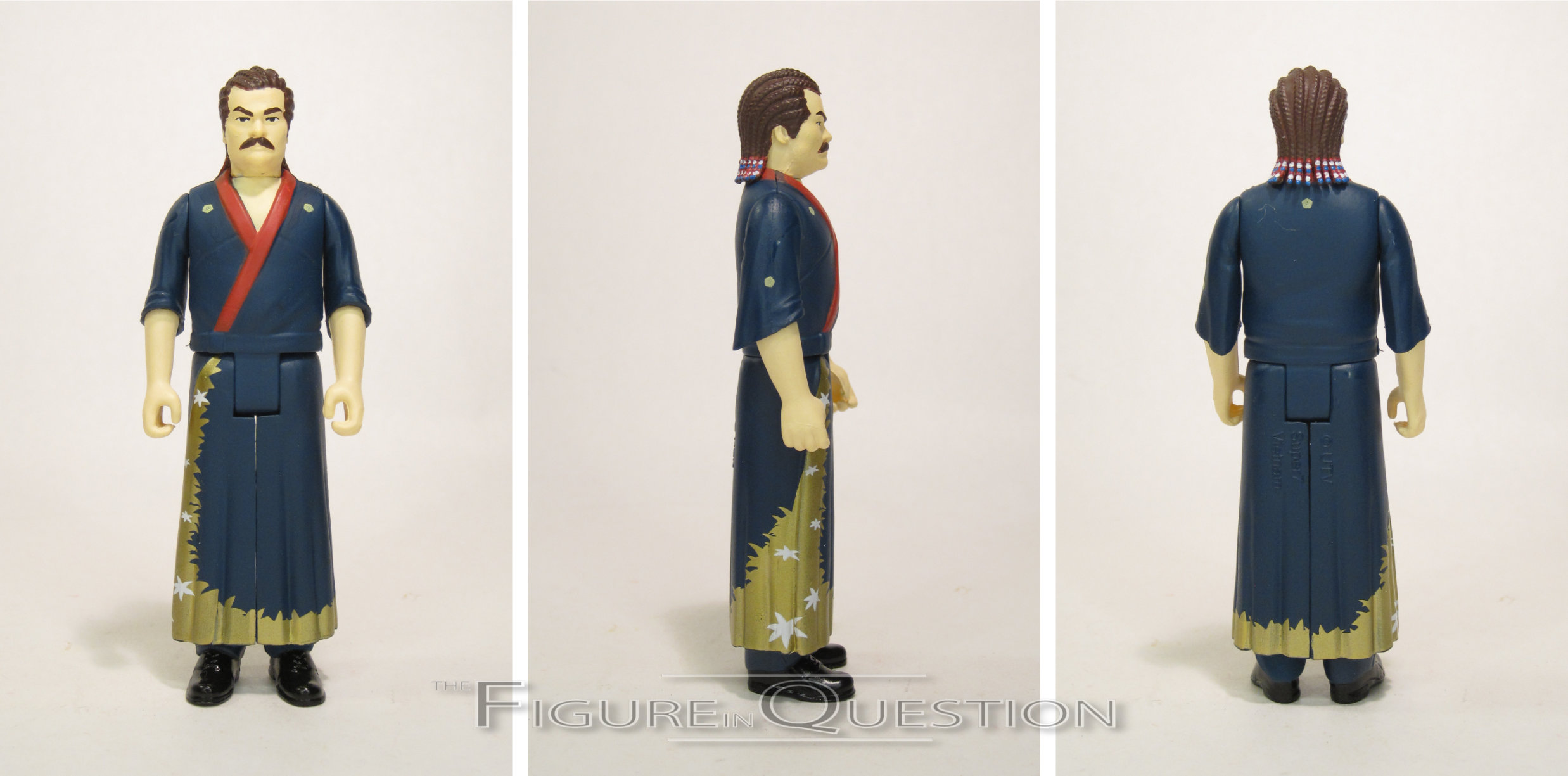
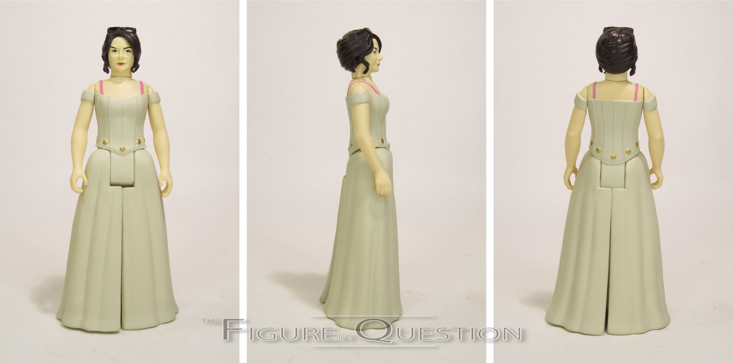
RON & TAMMY 2
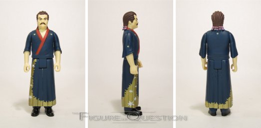
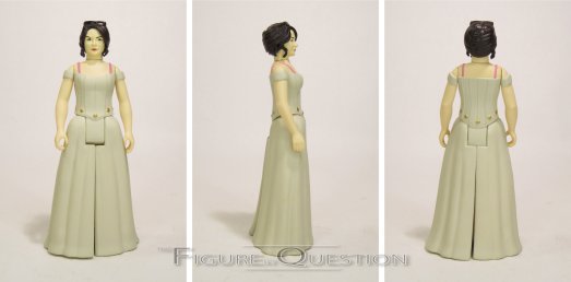
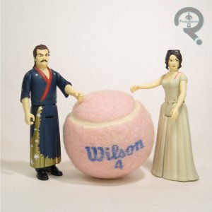 Loosely related to the Series 2 line-up, we got what is thus far the line’s only multipack, Ron and Tammy 2, pairing the first Ron variant of the line with an all-new figure, based on his second wife Tammy, played by Nick Offerman’s real-life wife, Megan Mullally. These two are based on their post-arrest appearances from “Ron & Tammy: Part 2,” Ron with his cornrows and kimono, and Tammy in her wedding dress. Ron’s sculpt handles the head pretty well, still maintaining the Offerman likeness of the standard, but the body seems a bit small for his usual build. Tammy 2’s sculpt isn’t bad from a technical side, especially the body sculpt, but I don’t really see much of Mullally in the head sculpt. I suppose it’s not completely off the mark, but it just seems a tad too generic for her. Ron’s paint work is generally alright, but he does notably have his entire mustache painted on, which is inaccurate, as by that point in the episode, it had worn off from “friction”. Otherwise, the color work is basic, but matches the show. Tammy 2’s work is sharp and clean, and definitely hits the mark. This set doesn’t have any accessories, but I guess maybe they act as each *other’s* accessories?

PERD HAPLEY
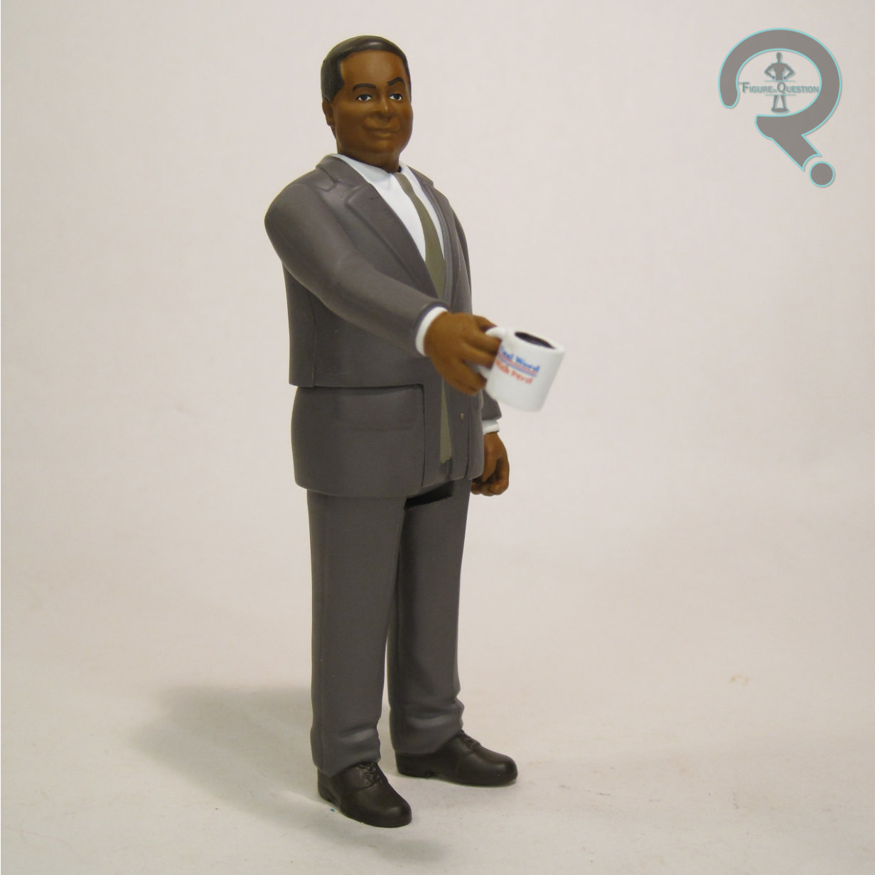
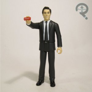
 This next figure is the one that I’m reviewing next, because it’s Perd Hapley! The story behind Perd Hapley is that he’s a recurring character on the show Parks and Recreation portrayed by a real newscaster. No, really, Jay Jackson, who played Perd, was a newscaster for 22 years, and has made an effort to play a newscaster in as many projects as he could. Perd Hapley just happens to be one he stuck with, thanks to the writers loving the character so much. The sculpt here gives us Perd in his usual suited look. It’s not bad, but it’s also not one of the stronger ones. I feel like preposing one of the arms bent on this one would work better. As it stands, he’s a little stiff. The head definitely tries to capture Perd’s usual demeanor, which I think it does alright, but I’m not sure the likeness is quite there. Perd is packed with a coffee mug bearing the logo of his show “Final Word With Perd.”
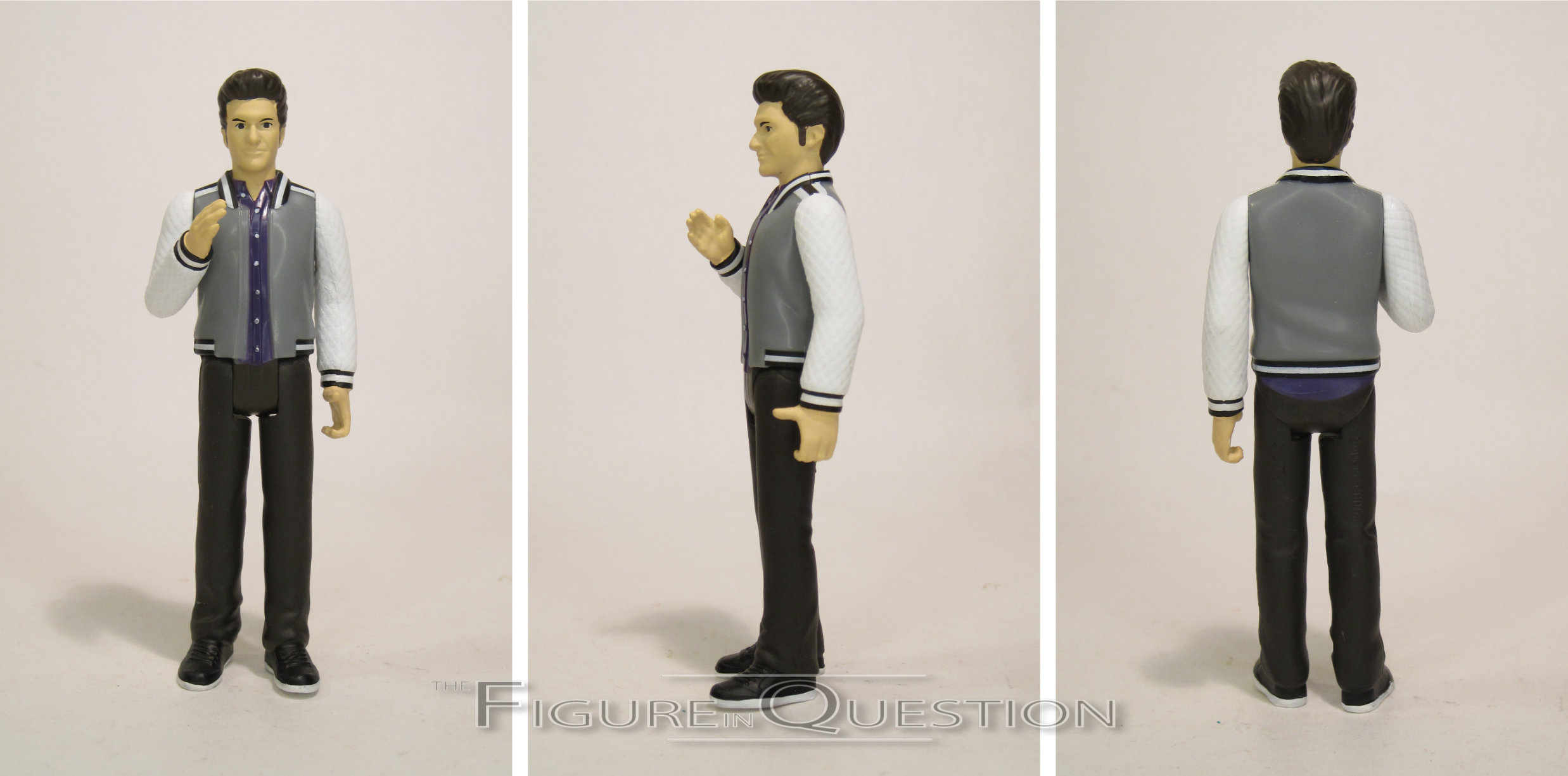
JEAN-RALPHIO
 Partner in crime to Aziz Ansari’s Tom Haverford, Ben Schwartz’s Jean-Ralphio Saperstein is one of the show’s most frequent recurring characters, and a natural choice for the line. It’s curious that he joined the line *before* Tom, but ultimately that’s pretty trivial. Jean-Ralphio’s sculpt is one of the most impressive in the line thus far. The head’s got a strong likeness, with the hair being perhaps a little tamer than the show, but the character otherwise being summed up nicely. He’s got some preposing, with his right arm bent to allow him to do his signature “amplifying his voice with his hand” move. The detailing on the outfit is pretty sharp, with the texturing on the sleeves in particular being pretty impressive. His paint work does its best to match up with the sculpt. Some of the details get a little lost, and it’s a little sloppy, but it hits all the major notes. Jean-Ralphio is packed with his smart phone, which fits perfectly into his left hand.
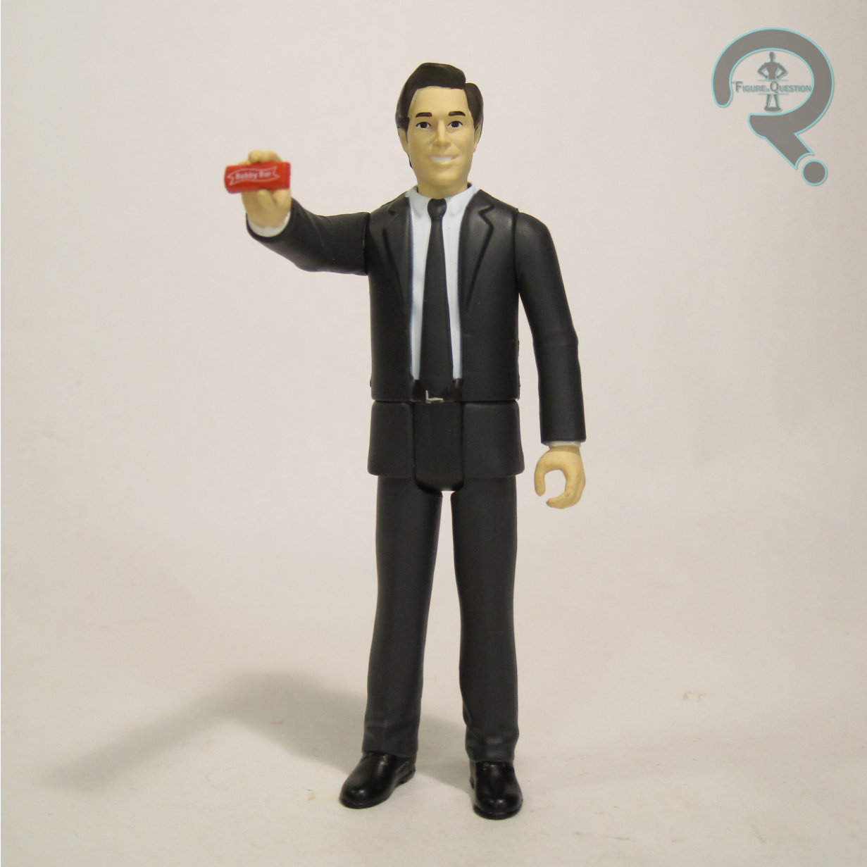
BOBBY NEWPORT
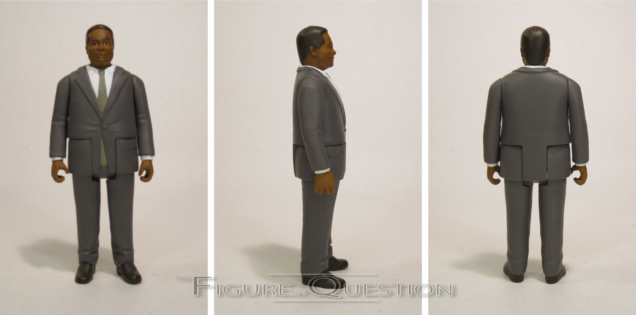
 Bobby’s a notable recurring character during the show’s campaign arc for Leslie in the fourth season, made extra notable because he’s played by Paul Rudd. The Rudd thing is probably the biggest reason he got a figure here, so, you know, good for him. He’s seen here in full campaign mode, suited up and all smiley. The sculpt does pretty well with it, and I think the likeness on the head’s honestly a pretty good one, definitely capturing Rudd’s general charm in the role. The posing is generally just the basic, but his right hand’s a little different. Why? I’ll get to that. The paint work is par for the course; the only notable issue I see is the solid color on the tie, which is a little understated for Bobby, who tended to go with more visible and bright patterns. So, the right hand mold, what’s up with that? Well, it’s sculpted to hand out a Bobby Bar, which Super 7 was nice enough to include.

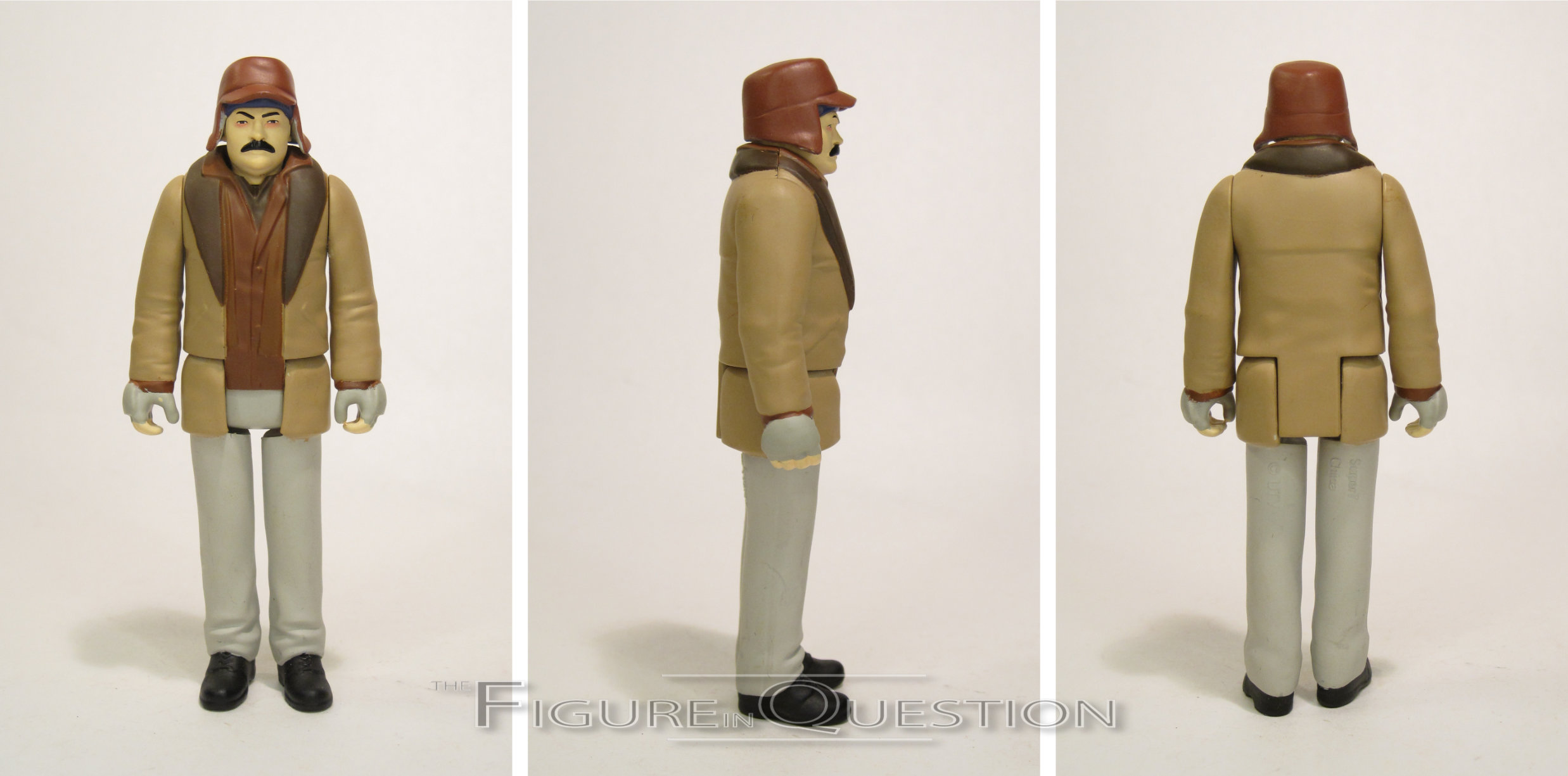
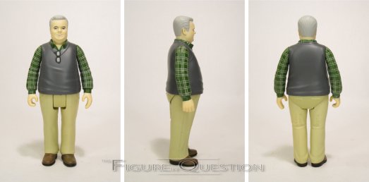
RON SWANSON (STREP THROAT)
Series 4 officially pulls Ron into lead in terms of figures. For a guy with the one set look for most of the show, he sure does get some fun variant options. This one’s based on his look from the beginning of the Season 5 episode “Animal Control”, when he’s gotten strep throat from one of his step-daughters. He’s in his Ignatius J. Riley-inspired bundled up attire, which is certainly a silly look, and also quite distinctive. The sculpt does well with it. He’s consistent with the standard version, keeping up with the likeness on the face, and also making him look sufficiently bundled up. The paint work is pretty good, getting all of the different layers in there. I also like the redness around the eyes; it really sells the “sick” look. Ron is packed with is bottle of alcohol, his planned solution for his sickness.
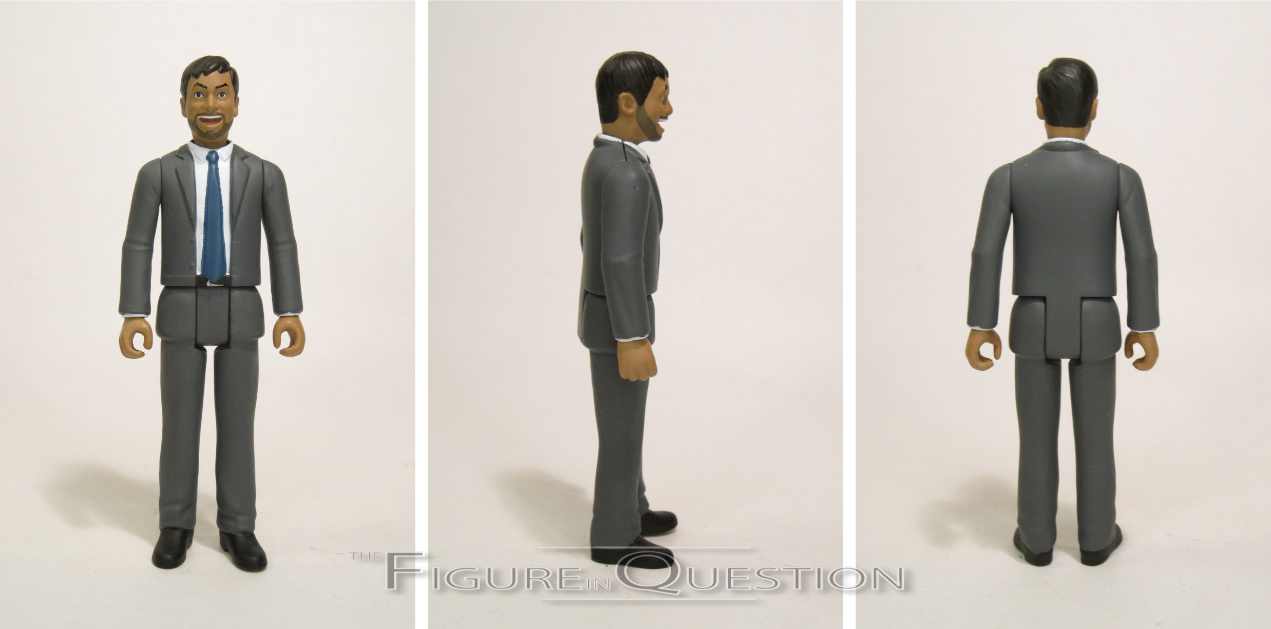
TOM HAVERFORD
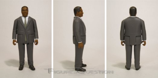
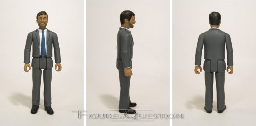
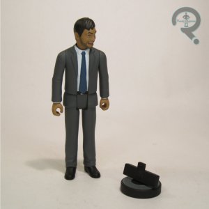 Easily the biggest missing cast member from Series 1, it’s astounding that it took until Series 4 to get to Tom, but here he is. We get him in his standard suited set-up. There’s certainly a lot of options for him, but I think this one’s a good starting one. The sculpt is pretty good, apart from seeming maybe a little too big to properly scale with the others. The head sculpt in particular has a strong likeness of Aziz, and the facial expression is what really sells it. The body sculpt is okay, but there’s something awkward about how the jacket is sculpted at the hips. We’ve gotten a few characters with suit jackets that go over the hips, and they’ve looked fine, but this one feels off for some reason. Tom’s paint work is a little messy on some of the edges, but generally alright. I’m glad that he didn’t suffer the same issue as Ann when it came to complexion. Tom’s accessory is one of my favories: DJ Roomba! It’s like a whole other character!
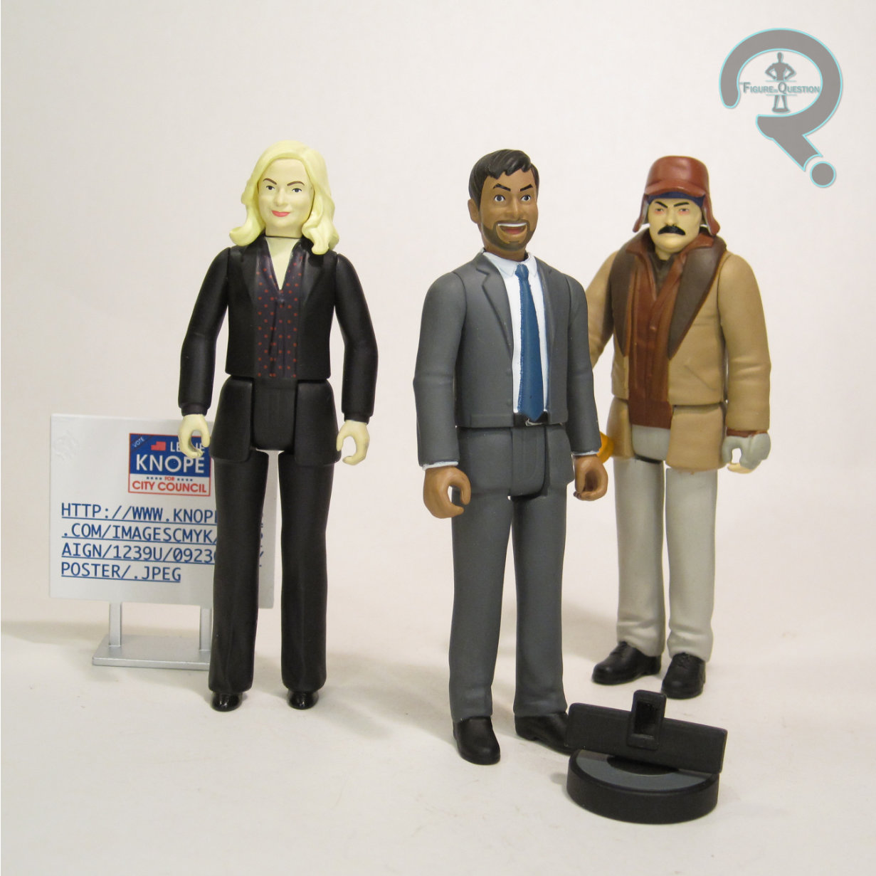
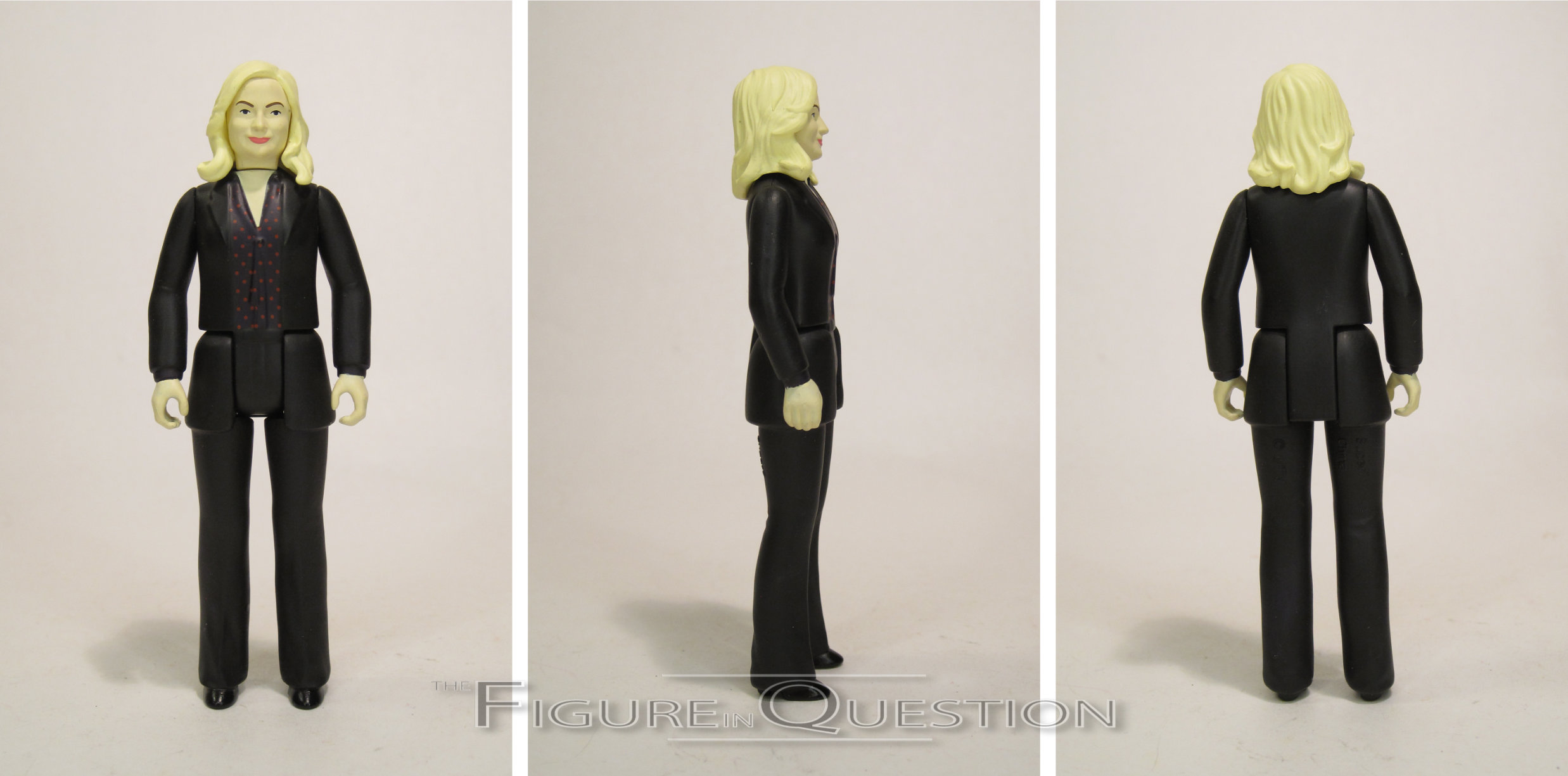
LESLIE KNOPE (CAMPAIGN TRAIL)
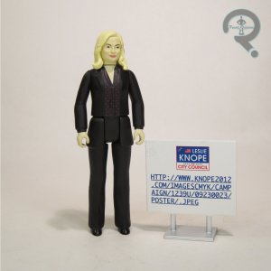 It’s a little surprising that it’s taken this long to get another Leslie figure, with her being the main character and all, but better late than never. This one’s specifically based on her Season 4 campaign for city council, making her a good counterpart to the Bobby figure from the prior assortment. This time around, she’s swapped out the skirt from the first figure for a more campaign-ready pantsuit. She’s using the head and arms from the older figure, with new parts for the torso and legs. It’s a good combo, resulting in a decent refresh to the look, without going too drastically different. Her paint work is much darker, and she’s got a neat pattern on her blouse, which keeps things fun. Leslie is packed with one of her ill-fated campaign signs, which appeals to the former IT guy and the former publication designer in me.
THE ME HALF OF THE EQUATION
After getting the first series, I definitely wanted more, but I honestly didn’t expect them to hit as quickly as they did. I did manage to snag Jerry and Ann at retail when they first hit, but then I lost track of the line, and suddenly there were a whole bunch of them I didn’t have. That wasn’t daunting at all, you guys! Thankfully, my parents were kind enough to get me everyone I’d missed for my birthday this year, so now I’m all caught up. It’s kind of crazy how deep this line’s gone, and I’m here for it. The Series 3 package renders had Chris and a “Janet Snakehole” variant of April on them, so presumably there’s more of these on the horizon? I’d love to get them, and I also wouldn’t say no to a Councilman Jamm. Or a Dianne. Or a Craig. Or a Mona Lisa. I’d say no to a Mark, though. Don’t make Mark….eh, I’d probably buy a Mark, too, honestly.


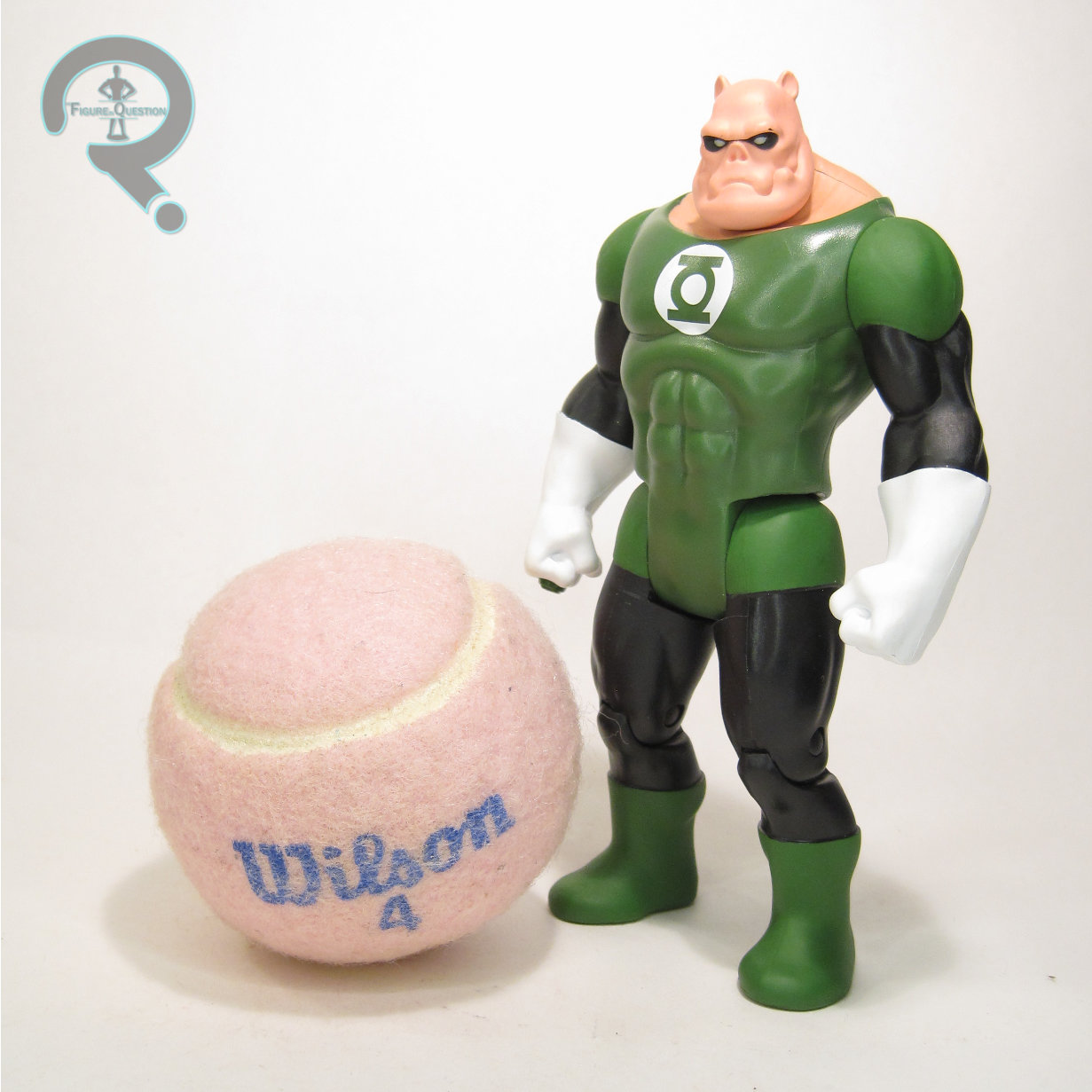
 Booster Gold is part of Series 8 of McFarlane’s Super Powers line under the DC Direct banner. They started trickling out in the last month or so, following up pretty closely on Series 7. Series 8 has three new character additions for the line, which includes Booster. The figure stands a little under 4 3/4 inches tall and he has 7 points of articulation. Booster’s scaling places him just a little bit taller than Ted, which makes sense, and is consistent with their usual depictions. In general, Booster’s a little more bulked up than Ted, which is an element a lot of his figures tend to miss, so I’m glad this one didn’t. Like Ted, this sculpt feels
  really, truly genuine for a Kenner Super Powers figure. The slight raising of the costume elements calls to mind how the original Green Lantern costume was handled, and gives the whole thing a little extra pop. I’m also thrilled to see they remembered to give him is Legion flight ring, as that’s such an easily missed element. Booster’s color work is very bright and vibrant. He’s straight yellow and blue, rather than going for any sort of metallic. I think it works well here, and it again feels pretty authentic to the whole Kenner vibe. His paint application is generally clean, apart from the notable spot of missing blue paint on the interior of his right elbow. Booster is without any accessories, which is a slight bummer, because it feels like it would have been the perfect opportunity to include his robot buddy Skeets.