#1055: Flash Gordon

FLASH GORDON

FLASH GORDON (PLAYMATES)

flashg1

While everyone and their mother is out there celebrating the anniversary of that Star Trek thing, I think its about high time we all looked at the really important September 2016 anniversary: Flash Gordon!  No, not the whole franchise (which, it should be noted is actually 82 this year), or even the original movie serial (which is 80), but rather the 1990s cartoon adaptation, which first aired this month 20 years ago, way back in 1996.  You don’t remember that show you say?  Okay, that’s actually fair.  It only lasted for 26 episodes, never made it to any of the major networks, and the only official home media release was a VHS containing the first five episodes of the show.  It’s not particularly widespread.  However, it did manage to get a nice little toyline in the ‘90s, courtesy of Playmates.  Over the course of the next week, I’ll be looking at those figures, starting with the titular character, Alex “Flash” Gordon.

THE ME HALF OF THE EQUATION

flashg2Flash was released as part of the aforementioned Flash Gordon line from Playmates.  As far as I know, there was just the one series (though other figures were planned and scrapped).  This figure stands about 5 inches tall and has 6 points of articulation.  He presents Flash in his main look from the show.  If you thought the ‘80s Flash might be a bit dated, hoo boy, get a load of this guy.  He is the most ‘90s of the ‘90s.  The whole show had something of a ‘90s skateboarder feel to it, but Flash in particular stands out as being the most dated.  The hair, the pants with the weird belt line, the inexplicable choice of a belly shirt.  I’m not sure what they were thinking with this, but, well, here he is.  The sculpt does, at the very least, do a pretty good job of translating the show design into three dimensions.  It’s not spot on, but the animation was a bit inconsistent, so I think this is the best they could have done.  He’s slightly pre-posed, but not too absurdly, especially given that he’s from the era of Total Justice.  The paintwork on Flash is decent enough.  The colors are nice and bright, and everything seems to be pretty clean.  He’s really, really shiny, which bugs me quite a bit, but there it is.  Flash includes a TriBlaster, Rebel VisiPad, and an Air Sled (which really is just a skateboard).

THE ME HALF OF THE EQUATION

Flash was the first figure I got from this line, way back in 1996.  I actually had not yet seen the show at the time that I got him, I just knew the character from the ‘30s serials that my dad had on Laserdisc (yes, you read that right).  That figure was lost over the years, and in the mean time, I actually saw the show these guys were based on.  At last summer’s Shore Leave, one of the dealers that I’ve bought stuff from before was selling the whole set of 8 figures for $20, which seemed like a really good deal to me.  Is this figure a great one? Nope, but he’s fun enough.  Really, I bought him because I wanted the rest of the set.  Were they worth it?  You’ll have to keep reading to find out.

#1052: Classic Star Trek Bridge Crew

KIRK, SPOCK, McCOY, UHURA, SCOTTY, SULU, & CHEKOV

CLASSIC STAR TREK (PLAYMATES)

bridgecrew1

Fifty years ago today, Star Trek premiered its very first episode, “The Man Trap”.  Now, here we are, all these years later, and it’s become a whole lot more than the simple three-season, hour-long  science fiction drama that it started out as.  The franchise has, admittedly, cooled off a bit in terms of popularity, but it’s still kicking, and Paramount and CBS are doing their very best to make sure it doesn’t totally fade away.  This year saw the release of Star Trek Beyond, the franchise’s thirteenth film (which was AWESOME, by the way), which was pretty awesome, and there’s even a new TV series in development. Over the years, there have been quite a few lines of action figures based on the property.  In honor of the franchise’s anniversary, I’ll be taking a look at my real introduction to Star Trek, the Playmates versions of the original bridge crew.

THE FIGURES THEMSELVES

The seven Original Series bridge crew members were released in 1993 as part of a special Bridge Set, which served to launch Playmates’ Classic Star Trek line.  All seven figures were exclusive to this set, though many of the molds would be later used on various single-release figures from later in the line.

KIRK

bridgecrew2
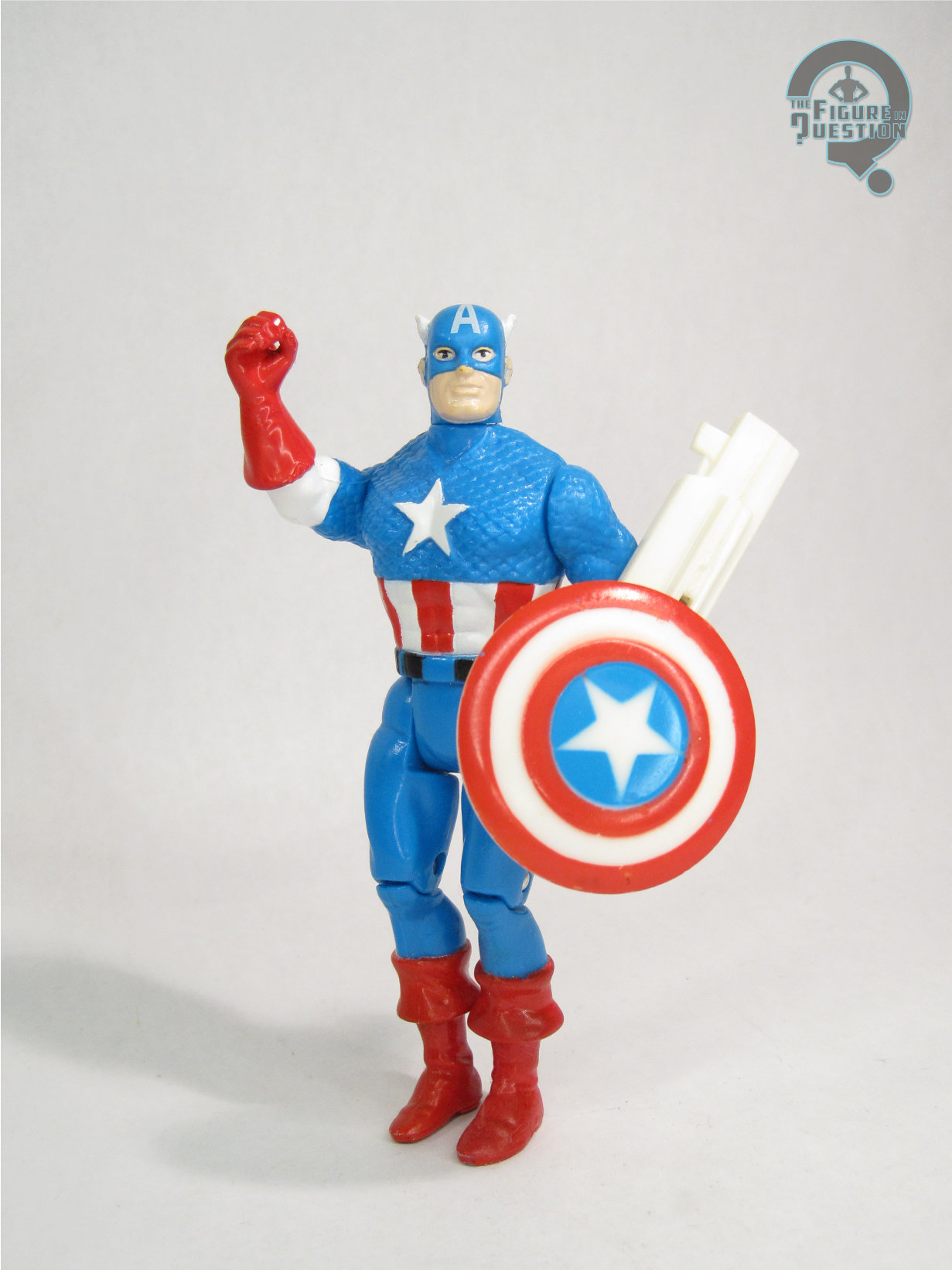
Kirk was one of Playmates’ favorite characters to release during their run with the line.  And who can blame them?  He’s one of the signature characters from the series.  This isn’t the first Kirk Playmates released, but he was the first of the classic Kirks, so there’s that.  The figure stands about 4 1/2  inches tall and has 12 points of articulation.  Those were both standard counts for the line, and they hold true on just about all of the figures in this set.  Like almost every figure from Playmates’ Star Trek run, Kirk suffers from the strange V-hips.  I’m not really sure what their purpose is.  I mean, sure, they give him extra movement, but it’s not really good for anything, since even a basic sitting pose is virtually impossible with these hips.  They do allow him to do a fancy jig, so I guess that’s better than nothing.  Kirk’s sculpt is about par for the line, which is to say it’s not anything amazing.  You can tell who he’s supposed to be, but nothing about him is really spot-on.  Most of the details are rather soft and bold.  “Lifelike” is not really a quality this guy possesses.  He almost feels like someone flattened him just a bit, especially on the torso, and the head seems rather large compared to the rest of the figure.  The paint on Kirk is generally pretty basic.  All the colors and such look about right, and most of the application is pretty clean, which is certainly a plus.  On the plus side, the paint on the face is remarkably sharp and well-detailed, which actually does quite a lot to save the figure.  Kirk was packed with a phaser and a communicator, which seem slightly large, but are otherwise very nicely detailed.  He also included a display base, which is patterned after one of the badges, and has the Command symbol to match Kirk.

SPOCK

bridgecrew3Spock was another of Playmates’ favorites.  As perhaps the most recognizable character from the franchise, you kind of expect him the show up a lot.  Like Kirk, this was far from the first figure he had received from Playmates, but it was his first classic figure.  Structurally he’s very similar to Kirk.  He stands a little taller, but he has the same articulation scheme, for better or for worse.  Surprisingly, there are no shared parts between Kirk and Spock.  Spock has been sculpted to be a little thinner than Kirk, which works alright.  He still looks a bit wider then he should, and I can’t say the head has a particularly good Nimoy likeness, but you can see who it’s supposed to be.  Spock’s right hand is sculpted giving the Vulcan salute, which was a nice touch that really gave Spock a nice bit of uniqueness.  Spock’s paintwork is very similar to Kirk’s, which I suppose is good.  The uniform is still very basic, and the face still very nicely detailed.  On the downside, the blue of Spock’s shirt makes the paint wear on the gold sections far more noticeable than it was on Kirk.  Spock also included a communicator and a phaser, as well as a badge-shaped display stand, this time sporting the Science symbol.

McCOY

bridgecrew6McCoy was a far less common character than the other two, but he did still get his fair share of figures.  Which is good, because this guy’s just the best.  McCoy is very similar to the other two figures in terms of structure.  His closer to Spock in terms of height, which is appropriate.  I find that he’s got one of the better sculpts in the set.  He’s still a bit too wide, but his torso feels less flat and more organic than the other two.  In addition, I think his head has one of the better likenesses in the set.  It’s still not spot on, but it’s not awful.  His noggin’s still pretty huge, McCoy’s paint is more of the same.  That’s good from at least a consistency standpoint.  McCoy included the standard phaser and communicator, as well as the display stand, once again with the Science symbol.  It would have been nice to get a tricorder for him, since he’s a doctor and all, but you’ll have to grab that piece from one of the later McCoys.

UHURA

bridgecrew7Here’s where we start to get into the figures that Playmates was a bit more lenient on, though Uhura was far from absent from the line.  Uhura’s probably the most unique figure in this set, being the only female and all.  That being said, apart from the more obvious changes in sculpting, she’s still more of the same in terms of construction.  She has the same articulation scheme and is roughly the same height as the others in this set.  The hard plastic skirt kind of limits the movement on the legs, but that’s really it, and it’s not like it was particularly useful movement anyway.  On the plus side, Uhura probably has the best sculpt in the bunch.  She’s still a little squatter than she should be, but she doesn’t feel as flat and wide as the others in this set, which is a definite point in her favor.  Uhura’s paint is pretty much the same as what we’ve seen on the others, which isn’t bad.  She included the same three extras as the others, though this time the stand had the engineering symbol.

SCOTTY

bridgecrew4I’m givin’ this review all she’s got, Captain, but I think I’m running out of intros for these guys.  Here’s Scotty.  He was the engineer, and he was very Scottish.  This was his third figure from Playmates, but, like the others, it was his first classic figure.  Scotty is noticeably stockier than the others in this set, which actually isn’t too bad, because it means his head doesn’t look quite as out of scale.  He’s also got a pretty decent likeness, so that’s a plus.  The paint is similar to the others, though the red does help him stand out a bit.  He had the same phaser, communicator, and stand (once again with the Engineering symbol).

SULU

bridgecrew8Oh my!  It’s Sulu.  After getting totally overlooked by Mego, this was Sulu’s second figure from Playmates, though it was the first one that a lot of people were able to find.  He’s very similar to the other figures.  Still no re-used parts, which is actually kind of surprising, but good for them.  Sulu gets another of the better likenesses.  It’s still far from perfect, but you can definitely see some of George Takei in there.  The paint’s more or less the same as the others, which is kind of expected six figures into this review, as is the accessory selection, which includes the same three extras as the others.

CHEKOV

bridgecrew5Like Sulu, Chekov was totally left out of Mego’s selection of figures.  What’s more, despite being one of the three original series cast members included in the Generations line, he was really hard to find, meaning this was the first chance that most people had to get a Chekov.  That’s a pretty big deal.  The figure is probably the weakest in the set, if I’m honest.  The head is absolutely huge, and the hair looks totally fake (even more fake than it should…).  He also doesn’t have the greatest likeness (and mine’s even got a chip missing from his chin).  At the very least, the paint is still pretty good, so he’s got that going for him.

THE ME HALF OF THE EQUATION

This set was a gift, I’m pretty sure from my parents, for either my birthday or Christmas.  I know my dad had one of these first, and I really liked it, so he and my mom made sure that I had one of my own.  I think I still have the actual bridge diorama they were packed in somewhere as well.  That thing got some pretty serious play time.  What I don’t have is my original Uhura figure.  She went missing not long after I got the set.  It was only in the last few years that I got a replacement, courtesy of family friend (and Star Trek author and script writer) Howie Weinstein.  There’s no denying that my love of this set is mostly based around nostalgia.  The figures are hardly on par with even the figures being released alongside them.  That said, it was the first time the whole crew had ever been available, and that’s pretty awesome in and of itself.
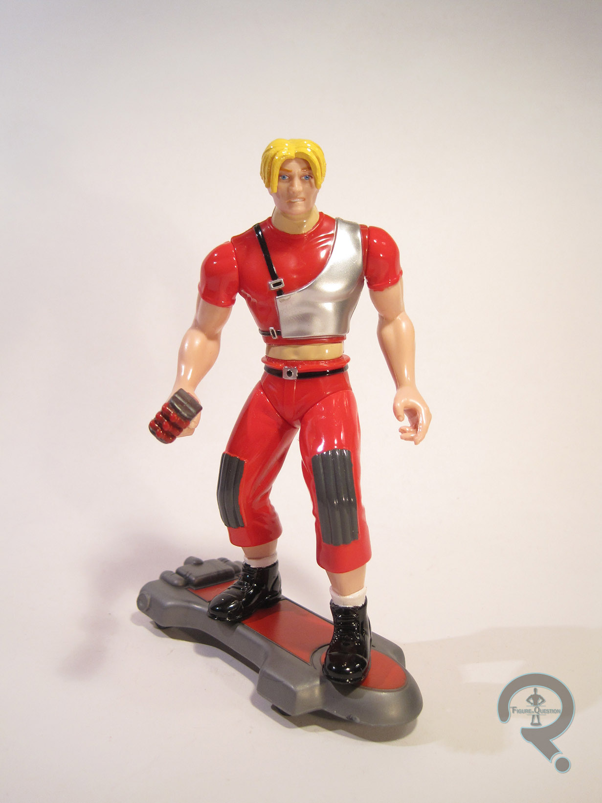
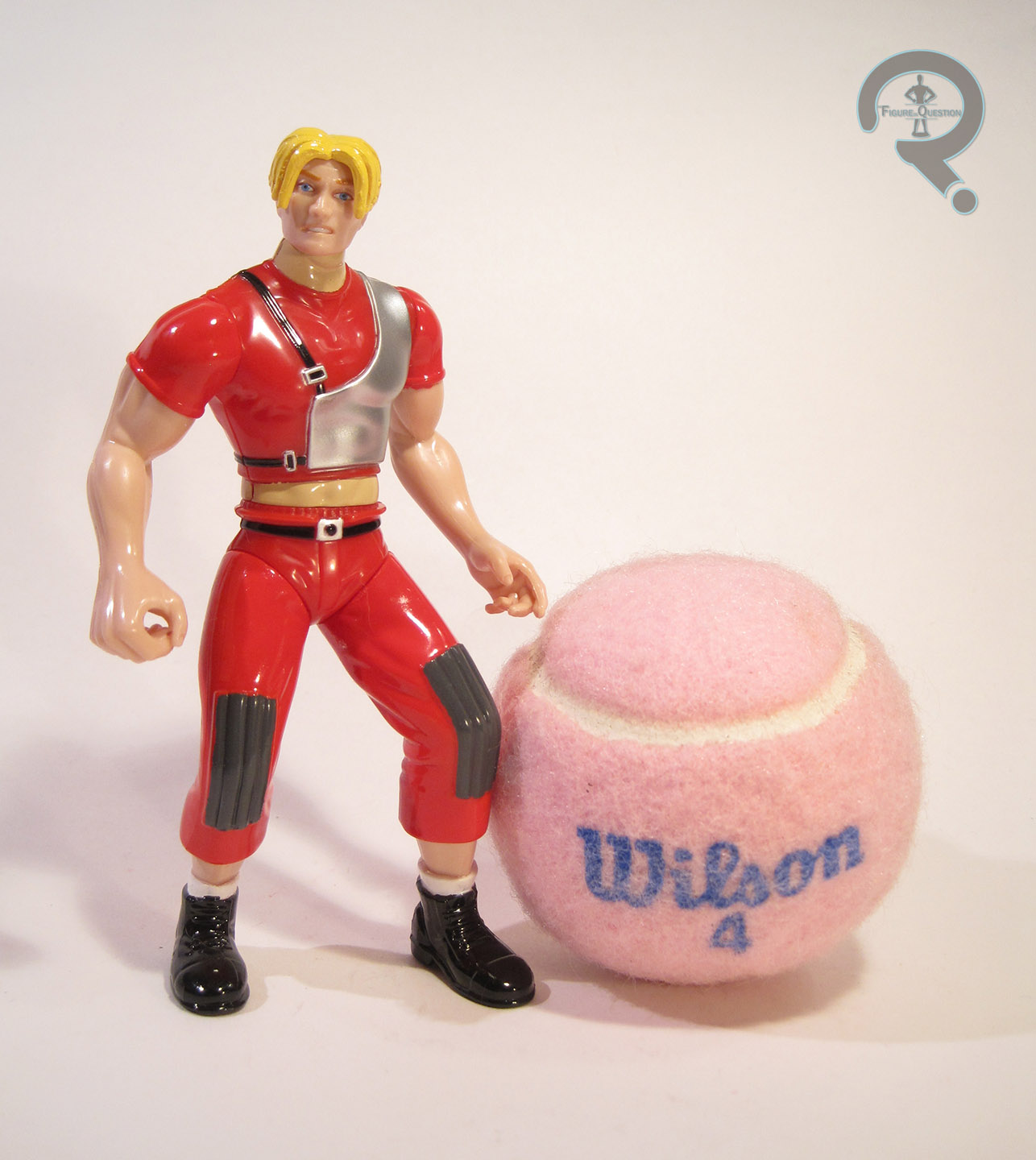
#1031: Cyborg Ninja

CYBORG NINJA

METAL GEAR SOLID (MCFARLANE)

GrayFox1

In my family, I’m the action figure guy and my brother Christian is the video game guy. The cool thing about those two hobbies is that they have a tendency to overlap, with lots of games getting action figures. I’ve been known to dabble in such figures, but I generally stick to ones from games I’ve actually played. Not so with today’s figure, who comes from Metal Gear Solid, a game from a series of games I’ve never once played. I did watch the “movie” version of the first MGS, though, for what that’s worth. Anyway, despite not playing the game, I like a few of the designs, especially today’s figure, the Cyborg Ninja, better known as Grey Fox!

THE FIGURE ITSELF

GrayFox2Cyborg Ninja was released by McFarlane Toys in 1999, as part of their Metal Gear Solid line. This figure is actually the camouflaged variant of the main figure. There were a number of similar variants in this particular line, but it’s actually pretty sensible for Grey Fox, who spends a good portion of the game cloaked. The figure stands 6 ½ inches tall and he has 16 points of articulation. His articulation is a bit better than a lot of McFarlane’s earlier stuff, but still he’s really only good for a basic standing pose. It’s a shame, since Fox is pretty agile in the game, and it would be cool to do a bit more with the figure. The real killer is those freaking v-hips. V-hips are consistently annoying, no matter the figure. Grey Fox’s sculpt is decent enough, especially since it’s based on the PS1-era graphics of the original game. He looks more or less like the character he’s supposed to be. He lacks the cool detail work that later versions got, but he was also a fraction of the price, so it’s acceptable. I will say that his arms seem a bit short and his legs a bit long, but that could just be a stylization thing. The paintwork on the figure is more detailed than you’d think, given the whole active-camo thing. Every detail of the suit has been outlined in black, so that you can still see what he’s supposed to look like. It’s a nice effect, and makes him feel like a whole figure, rather than just a cheap recolor. Grey Fox included a sword (done to match the rest of the figure), an extra head with the faceplate open, and an extra arm with a rail gun attachment. The extra arm is really cool, because it has an elbow joint, which the normal arm does not. Why they didn’t just put elbow joints on both arms is beyond me, though.

THE ME HALF OF THE EQUATION

The Cyborg Ninja figure was actually my very first exposure to MGS. I saw a picture of the figure in ToyFare and thought he looked kind of cool. It was years before I had any clue who he was or what MGS was. In the last couple of years, Tim’s introduced me to the games, and I still quite like Grey Fox. For my birthday, I took a trip to 2nd Chance Toyz and Tim pointed this figure out to me. I would have preferred the regular version, I think, but this one’s not bad. He’s got the sorts of problems I’d expect from an old McFarlane figure (weird proportions, no movement, fragile, etc.), but he’s still a decent enough figure that I don’t regret getting him.

#0992: Space Armor Iron Man

IRON MAN – SPACE ARMOR

IRON MAN (TOYBIZ)

SpaceIM1

Just like Captain America, my first exposure to Iron Man was via his cartoon from the ‘60s. However, unlike poor Cap, Iron Man wasn’t quite as obscure in the mid-90s. While Marvel’s big cartoons in the 90s were Spider-Man and X-Men, both Iron Man and the Fantastic Four received their own cartoons as part of the Marvel Action Hour. By extension, Iron Man (and the FF) got his own line of toys from Toy Biz, right as I was getting into super heroes and action figures. That was really quite convenient, wasn’t it? I’ve looked at a handful of figures from this line, but I’ve yet to look at the main man himself. That changes today, with my review of Space Armor Iron Man!

THE FIGURE ITSELF

SpaceIM2Space Armor Iron Man was released in the second series of the Iron Man line. He was one of three versions of Iron Man in this particular series, all of which were at least somewhat comics-based. The Space Armor has the notoriety of being one of the earliest specialty armors that Tony created. There have been a few different versions of the armor over the years (and a lot of the differences are really just based on inconsistencies between artists interpretations). This particular version was lifted directly from the cartoon’s design, which isn’t a direct translation of any particular look from the comics, but looks somewhat like a cross between the Model 05 and Model 10 armors (aka Marks I and II of the Space armor). The figure stands about 5 inches tall and he has 9 points of articulation. Now, the interesting thing to note about Toy Biz’s 90s Iron Men is that each one was a basic figure, with a number of vac metalized armor pieces, which could be clipped on to complete that particular armor’s look. Exactly how close the figures were to their intended design without these pieces greatly varied from figure to figure. Space Armor Iron Man isn’t far off from the intended design, but he’s noticeably a lot sleeker, which results in him bearing more than a passing resemblance to the classic Iron Man design from the 60s/70s. Of course, the Space Armor was really just a slight tweaking of that design anyway, so that’s about right. The base sculpt is quite nicely done, with balanced proportions and some cool little armor details here and there. To facilitate the removable armor, the figure has holes on either side of the torso, the waist, the shoulders, the forearms, and the shins. These can be a bit distracting, but they aren’t terribly so, and the figure doesn’t look horrid without the extra armor. Space Armor Iron Man included eight armor pieces: a chest plate, back pack, two shoulder pads, two wrist guards, and a pair of boots. My figure is missing the shoulder and chest pieces, but you can get a pretty good idea of what the armor looked like. The backpack had a set of handholds that were attached to a hook at the top of the pack. When the handholds were moved a certain direction, the hook would retract. As far as paint goes, Space Armor Iron Man was rather simple, with various reds and yellows, the majority of which are molded plastic. What paint there is has been applied cleanly, and the flat red of the figure and metallic red of the armor work well together. In addition to the armor pieces, this figure also included a missile launcher, though, curiously enough, no actual missile to launch.

THE ME HALF OF THE EQUATION

This Iron Man is a very special Iron Man. And no, not in a “keep your kids of drugs” sort of way. This is my very first Iron Man action figure. You remember waaaaaaaaay back in my review of Night Hunter Batman, when I mentioned my dad finding an Iron Man figure at the Service Merchandise that netted me my second Batman? Well, after he got an Iron Man, I wanted one too. On her way to work one day, my Mom took me to the KB Toys at the mall specifically to get me an Iron Man. I remember we got there before the store opened and I could actually see the display of Iron Men through the store’s window while we waited. After looking at the available options, this was the one I chose, mostly due to him being the closest to the classic Iron Man design, which was the one I was most familiar with. To this day, he remains my favorite Iron Man I own, and I think he really holds up!

#0987: Dynamole

DYNAMOLE

THE TICK

Dynamole1

SPOOOOOON!!!!!!!!

Does anyone else love The Tick?  Because, let me tell you something: I love The Tick.  I super-duper love The Tick.  I love the comics, I love the cartoon, and I even love the short-lived live action show.  Through his many adaptations over the years, the Tick and his supporting cast have been privy to a number of different styles of toys and action figures over the years.  None of them have quite lived up to the awesomeness of the source material, but I think they’ve all at least tried.  In the 90s, when the cartoon was on the air, Bandai America tried their hand at a few different lines, including a smaller scale line of figurines that covered a large number of cast members, both major and minor.  On the more minor side of things is Dynamole, a minion of the villainous Chairface Chippendale.  Not necessarily one of the most exciting characters from the show (or even the most interesting bomber on the show.  That would be the Evil Midnight Bomber What Bombs At Midnight!), but he was part of the ensemble none the less.

THE FIGURE ITSELF

Dynamole2Dynamole was part of the first (and only) series of Bandai’s small-scale The Tick line.  He stands about 3 inches tall (making him to be too large to be in scale with most of the other figures in the line, a common issue with Bandai America’s products) and zero, count ‘em, zero, points of articulation.  This guy and all the figures in this particular line were deliberately designed as figurines, not as full functioning action figures, so none of them got any movement.  The pose you see here is the pose that you get…for eternity.  He’s also permanently attached to a stand, one would assume for additional stability.  Dynamole’s pose is fairly generic, standing straight up and down sort of look, with his right arm bent outwards and his index figure pointing out as if he’s about to press a button or something.  Presumably, it’s a detonator of some sort.  The actual quality of the sculpt is overall pretty decent, if nothing particularly noteworthy.  He looks like the character from the show, which is the important thing.  The details could stand to be a little more defined in several spots, but it’s hard to tell if that’s truly an issue with the sculpt or if it’s to do with the paint.  Speaking of the paint, while the colors are pretty decent, the actual application is incredibly thick, and the details only tend to be in the same approximate area as the sculpted elements.  The paint is also incredibly glossy, which is a slightly odd choice, since I don’t believe Dynamole is supposed to be slimey or shiny or anything.  Kinda weird.

THE ME HALF OF THE EQUATION

Somehow, I managed to miss out on most of the cartoon-based Tick merchandise when it was still new.  I ended up finding Dynamole and most of the other figures from this particular line at a nearby antique store a few years back.  I mostly got Dynamole because I was buying the set, and I mostly bought the set because it was the most expansive selection of characters from the show that was readily available.  Ultimately, Dynamole isn’t a super exciting figure, but he’s interesting enough, and looks decent with the rest of the set.

#0986: Captain America

CAPTAIN AMERICA

MARVEL SUPER HEROES (TOY BIZ)

“When Captain America throws his mighty shield! All Foes who chose to oppose his shield must yield!”

Captain America Theme Song

My first introduction to Captain America was through VHS copies of the ‘60s cartoon. As cheesy as they are, I loved every minute of them. Sadly, in the mid-90s, when I was becoming so fond of Cap as a character, he was more or less absent from toy shelves. I eventually got the Spider-Man: The Animated Series version when it was finally released, but the figure I always wanted was Toy Biz’s first version of the character, which I’ll be looking at today!

THE FIGURE ITSELF

Captain America was released in Series 1 of Toy Biz’s Marvel Super Heroes line. This Cap stands just under 5 inches tall and has 7 points of articulation. This figure predates elbow articulation becoming a standard for Toy Biz’s Marvel stuff, as they were still very much aping the Kenner Super Powers style, and none of those had elbow movement. Really, this whole figure in general feels like a Captain America figure done to fit with Super Powers (well, aside from size, since he’s taller than any figure Kenner put out), which is far from a bad thing. Rather than the more ‘90s-esc proportions of which Toy Biz would later become so fond, Cap is pretty subdued, and looks more or less like a real person. His torso features some awesome detailing for the scale-mail, and I love the way they’ve sculpted the star logo so as to make it pop a bit more. Figures of Captain America have the unfortunate tendency to miss the mark on the good Captain’s face. I guess he’s just one of those characters where it has to be just right. I think this figure’s the closest anyone’s ever gotten to my ideal Captain America, at least from a comic-based perspective. It’s a little round by today’s standards, but I really like the overall style present here.  There’s just a certain sincerity to it that lots of Caps lack. Cap’s paintwork is quite nicely handled, especially for the time. The colors are all nice and bold, and he really sells the whole patriotic super hero thing. His eyes are admittedly a little wonky, and it would have been nice for his belt buckle to be something other than the unpainted blue plastic, but those are relatively minor complaints. Cap was packed with his mighty shield, as well as a weird launching device for it. However, my figure sadly lacks these pieces.

THE ME HALF OF THE EQUATION

As I noted in the intro, this was a figure I really wanted growing up. Unfortunately, he was released before I got into collecting, and wasn’t very easy to find after the fact. So, I had to settle for the US Agent repaint from a few series later. In fact, my dad, as awesome as he was, even bought me an extra US Agent and we painted him up in proper Cap colors, which held me over quite nicely. This particular figure ended up being one of the fifteen figures I picked up at the last Balticon. I’m glad to finally have the official version, and he’s aged a bit better than a lot of Toy Biz’s output from the same time period.

CapMSH3

#0985: Mr. Freeze

MR. FREEZE

BATMAN: THE ANIMATED SERIES (KENNER)

FreezeBTAS1

There’s no denying that Batman: The Animated Series is probably the greatest comic book adaptation in the history of comic book adaptations, and it’s also one of the greatest things to come out of the ‘90s. While the show as a whole was always very high quality, there are definitely some episodes that stand out above the rest. My two favorite episodes of the show’s run are “On Leather Wings” and “Heart of Ice” (which, no small coincidence, were both animated by Spectrum Animation, a sadly short-lived studio that produced some of the best animation ever seen on Saturday morning TV). “On Leather Wings” was the debut episode, which perfectly set the tone of the show. “Heart of Ice” comes later in the first season, but is just as defining an episode, taking a second-string Batman villain and turning him into one of the mythos’ greatest characters. I speak, of course, of Mr. Freeze, who is the subject of today’s review.

THE FIGURE ITSELF

FreezeBTAS2Mr. Freeze was released in Series 3 of Kenner’s Batman: The Animated Series line, based on his appearance in the above noted episode, “Heart of Ice.” Despite that being the story that elevated Mr. Freeze to the public eye, this is actually the third Mr. Freeze figure to be released, following the Super Powers and DC Super Heroes versions (though, if you want to get technical, those two are almost the same figure). The figure stands 5 inches tall and he has 4 points of articulation (it’s possible there’s an articulated neck, but since the dome isn’t removable, it’s not ever moving). He’s based on Freeze’s initial animated appearance, which, in my opinion, is the superior of the two. Kenner was known for tending to approximate the animated looks, without getting them dead-on. Freeze actually fairs quite a bit better than most of the figures Kenner put out. The head’s a little on the large side, but it’s a pretty much perfect recreation otherwise. Likewise, the body is overall quite solid, with the only real downside being the very skinny arms featured. That being said, they don’t look terrible, and the figure as a whole recreates the look very nicely. Freeze’s paint is pretty straight forward, but that’s to be expected with the animated designs. The colors are a very good match for the show, and the application is generally pretty clean. Freeze was packed with his freeze gun, which was connected to an over-sized version of his cold-tank.  The tank could be filled with water, and when squeezed, the water would shoot out of the freeze gun. Not a perfect effect, but not bad.

THE ME HALF OF THE EQUATION

Okay, I don’t know for sure, but I’m fairly certain that this Mr. Freeze was the first Batman rogue I ever owned. My dad got him for me not long after I saw “Heart of Ice” for the first time. This figure went a lot of places with me, including a trip to Gettysburg with my dad and Mr. Freeze himself, Michael Ansara. He also got stuck on the roof of my house once, through no fault of my own.  This is probably one of my favorite figures I own, mostly for sentimental value.

#0984: Jack O’Lantern

JACK O’LANTERN

SPIDER-MAN (TOY BIZ)

JackOLanternTB1

During their lengthy run doing 5-inch Marvel figures, Toy Biz really took a stab at getting out as many characters as they could, even if they were rather obscure. Though they never got as far into any property as they did X-Men, their Spider-Man line sure gave it a shot. Among the huge slew of villains the line gave us was the very first action figure of the somewhat offbeat villain Jack O’Lantern, which is the figure I’ll be looking at today.

THE FIGURE ITSELF

JackOLanternTB2Jack O’Lantern was released in the “Bug Busters” series of Toy Biz’s Spider-Man line. He was an interesting inclusion, seeing as he wasn’t ever featured on The Animated Series, but this was around the point that Toy Biz was moving away from using the cartoons as an influence in general. The figure stands about 5 ½ inches tall and he has 11 points of articulation.  This figure is based on the classic Jack O’Lantern design, which means it can serve as both the Jason Macendale and Steve Levins (the first and second Jack O’Lanterns), since they both had essentially the same design. Sculpturally, this figure was totally unique, which is both a blessing and a curse. On the plus side, the more character specific details, such as his head and his scale-mail tunic, are handled very nicely. The downside is that this figure came at the height of Toy Biz’s fling with oddly proportioned figures. The hands are enormous, dwarfing even his extra-large head, but they’re attached to a rather scrawny set of arms. Well, maybe the arms aren’t scrawny. From some angles, anyway. What they really are is flat. Jack also has in impossibly tiny waist and pelvis, which continues into a rather large set of thighs. He’s definitely got an odd appearance. The paintwork on Jack is pretty solid. He matches the multiple tones of green from the comics quite well, and he’s even got some very nicely rendered accent work on his head and torso. It would be nice if some of the accent work continued onto the rest of the figure, but it’s not too horribly jarring. Jack included a large bug thing, as well as a disc for it to shoot. These were both part of the gimmick of this particular series, and neither really adds to Jack in any meaningful way.

THE ME HALF OF THE EQUATION

Jack O’Lantern is figure 13 of the 15 I got from this year’s Balticon. I didn’t have Jack growing up, mostly due to being relatively unfamiliar with the character. I’ve come to appreciate him over the years, and have been on the lookout for this figure since. Like a lot of Toy Biz’s output from right around this time, this figure shows his age. The goofy proportions are the biggest issue, though, given the character’s ghoulish look, they aren’t impossible to overlook. Not a bad figure at the end of the day.

#0983: Punisher

PUNISHER

SPIDER-MAN (TOY BIZ)

PunisherWJ1

Hey! It’s another Punisher figure. That’s actually a pretty rare occurrence in my collection (since only own two of them). I’ve never been much of a Punisher fan, but Jon Bernthal’s truly amazing turn as the esteemed Mr. Castle in Daredevil has definitely changed my opinion, at least a little bit. So, let’s have a look at the second half of my Punisher collection!

THE FIGURE ITSELF

PunisherWJ2This Punisher was part of the “Monster Mayhem” set from Toy Biz’s 5-inch Spider-Man line. The set was initially a BJ’s exclusive, but it later showed up at KB Toys as well. All the figures in the set were loosely based around the “Man-Spider” arc from Spider-Man: The Animated Series. This figure stands 5 inches tall and has 9 points of articulation. Structurally, this figure is the same as the last Punisher I looked at. It’s a fairly sensible re-use, since that figure was a fairly decent rendition of the animated design. The only downside to the sculpt is that it lacks any sculpted indication of a headband, despite there being one painted on. Speaking of the paint, it’s kind of the figure’s main selling point. The prior Punisher was based on his classic black and white look. When they were translating Punisher to animation, it was decided that black and white would be too hard to animate. So, he was given a slightly altered version of his War Journal look from the ‘90s, and that’s what this figure represents. With the exception of the clearly just painted on headband, the paint on Punisher isn’t bad, aside from the obvious wear and tear present on my figure. Punisher included a cloth trenchcoat (to complete the cartoon look) and a knife.

THE ME HALF OF THE EQUATION

My dad bought me the whole “Monster Mayhem” set from the KB Toys in Rehoboth Beach, on a trip we took just after my brother was born. I remember being incredibly excited by the set, even though Punisher was not a favorite. I actually gave my original Punisher to my friend Charlie, who was a much greater Punisher fan than I, and seemed rather happy to have the figure. Of course, years later, I regretted this decision, since it meant my set was now incomplete. It’s okay, though, because I ended up finding myself a replacement at this year’s Balticon! Now no one’s the wiser….apart from everyone reading this review….which I believe actually accounts for about 100% of anyone who cares about my action figure collection in the slightest. Oh well.

#0978: Venom

VENOM

MARVEL SUPER HEROES (TOY BIZ)

VenomMSH1

Venom, Venom, Venom. For as many Venom figures as I’ve reviewed on this site, there’s not actually a whole lot to this guy. He’s a pretty simple concept, taking the main hero and creating a “dark reflection” of said hero to serve as a villain. Of course, it was the late ‘80s, so he was also super huge (and he got huger as time went on). In the early ‘90s, when Toy Biz started up with the Marvel license, Venom was, amazingly enough, not in their first assortment of figures. Clearly they felt bad about that, because they then turned around and released three of him in the space of a year. Today, I’ll be looking at the last of those.

THE FIGURE ITSELF

VenomMSH2Venom was released in Series 3 of Toy Biz’s Marvel Super Heroes line. He was the second version of the character released in the main line (after the one released in Series 2) and the third in the overall scheme of things (following the Talking Heroes version). The figure stands just shy of 5 ½ inches tall and he has 8 points of articulation. He has no neck movement due to his action feature, which is quite limiting, but he is otherwise decently posable. The prior Venom figures had focused on bulk over all else. This figure, on the other hand, focused on making Venom tall (he’s a good ¾ of an inch taller than the Spider-Man from the same line), but not quite as bulky. The end result is a figure that looks not unlike Venom in his earliest appearances, before he had become quite as monstrous. The sculpt us actually pretty decent. It’s somewhat stylized, but not incredibly so, and he has a nice, subdued look about him, which is refreshing to see in a Venom figure. Venom’s paint is rather simple: it’s exclusively white paint on black plastic. The detailing doesn’t look too bad, though, as you can see from my figure, the paint wasn’t the most durable. Still, the pure black and white has a nice stark contrast about it, something that a lot of later Venom figures would miss out on by adding unnecessary blue highlights. Venom originally included a clip on torso piece, simulating the symbiote wrapping around him. He also had the previously mentioned action feature, which allowed for Venom to stick his tongue out when the lever on his back was pulled. It’s rather a goofy feature, but it’s also really in keeping with the character, so I guess it made sense.

THE ME HALF OF THE EQUATION

Venom is the 11th of the 15 figures I got at Balticon this year. Amazingly enough, prior to this figure I did not own a single 5-inch Venom figure. This one’s not bad, and the quality of his sculpt, especially when compared to last week’s Silver Surfer figure, shows how incredibly fast Toy Biz was taking steps forward in that department.

Also, not related to me, but worth noting: this figure has become one of Super Awesome Girlfriend’s favorites. She constantly picks it up so that she can make it stick its tongue out at me. I’ve ensnared another action figure geek!

VenomMSH3