CAPTAIN CHRISTOPHER PIKE
STAR TREK: THE ORIGINAL SERIES (EXO-6)
Hey, it’s a Star Trek review, which means it’s time for me to talk about how I’m not *really* into Star Trek. But, honestly, I’m starting to realize I’m perhaps misrepresenting that point a bit. I mean, I’m certainly not *as* into Star Trek as a lot of Star Trek fans I know, but, maybe, just maybe, that’s because I spent the first two and a half decades of my life helping run Star Trek fan conventions, which has a tendency to skew your personal accounting of fandom. By the metrics of some of the most obsessed and dedicated Star Trek fans in the country, all gathered in one space? Maybe not the biggest fan. By the metrics of the average person? I know way too much not to be considered a decent fan. I have opinions on the movies and shows, and favorite episodes, and favorite crew members, and a lot of toys. Like, again, relative to others, maybe not a ton, but still a sizable amount. While the merchandise in my collection has general trended towards to the cheaper stuff, usually, more recently I’ve even started adding some more expensive pieces to the mix. Back in 2024, I looked at one of EXO-6’s high-end 1/6 scale figures, and now, I’m back with another one of those. This time around, it’s my personal favorite captain of the USS Enterprise, Captain Christopher Pike!
THE FIGURE ITSELF
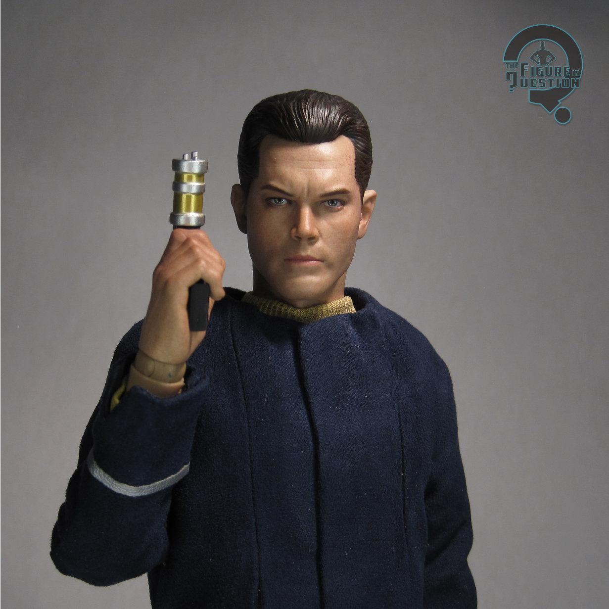
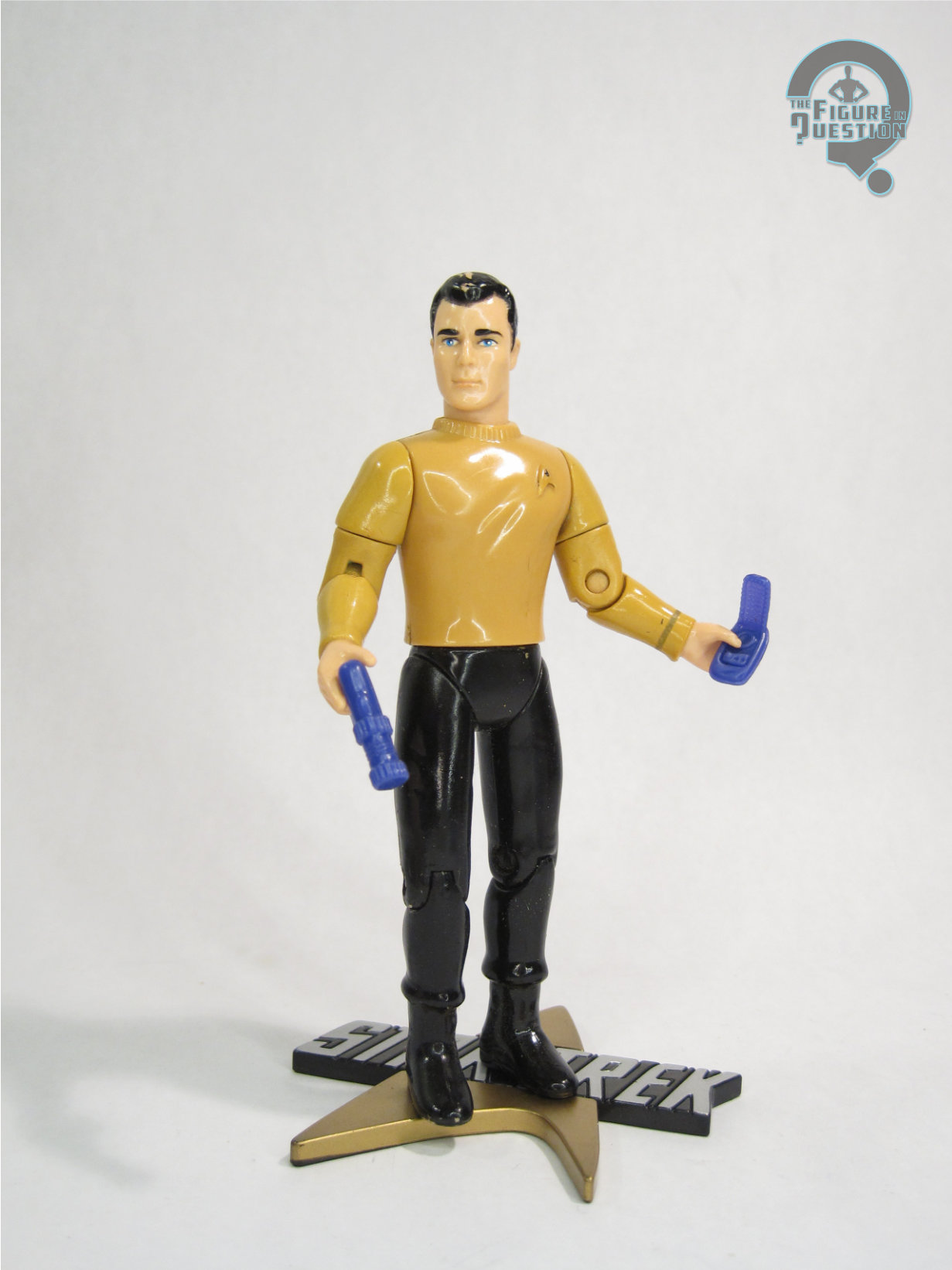
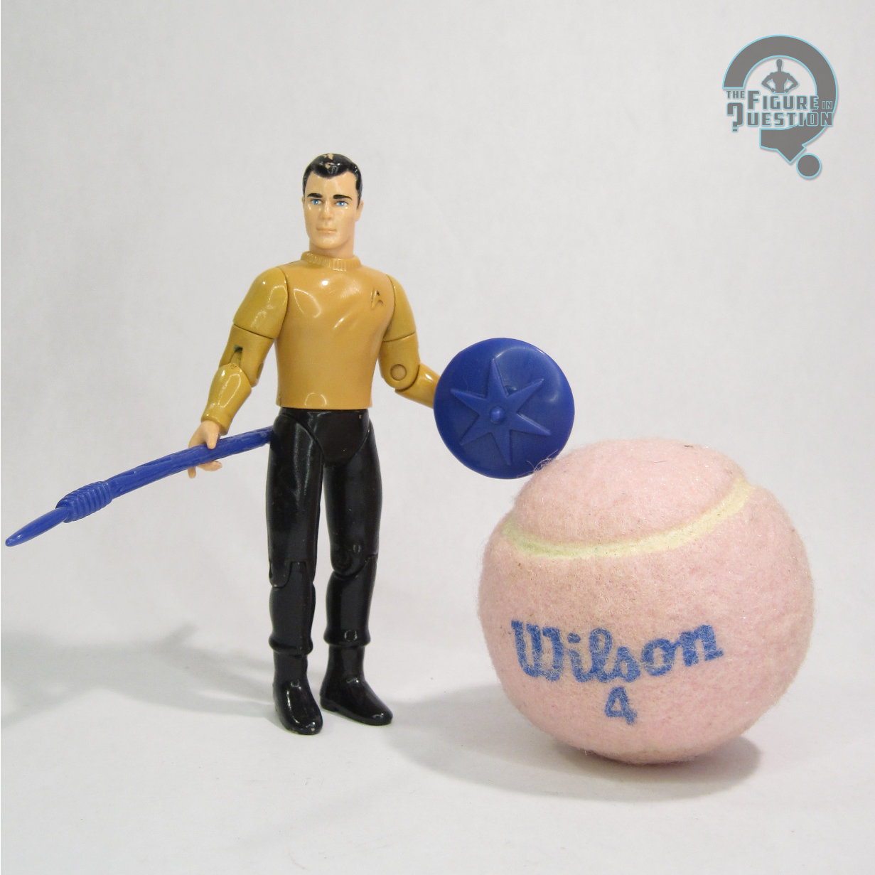
 Captain Christopher Pike from “The Cage” is the 41st figure in EXO-6’s Star Trek Series, denoted “EXO-01-041” on the shipping box for the figure. He went up for order last year, and has been making his way out to people slowly through the first half of 2026. He’s directly called out as being from “The Cage” on the box, and his announcement and orders went up during the 60th anniversary of the pilot episode, and his actual release coincides with the 60th anniversary of “The Menagerie,” which worked the pilot’s footage into the show proper, which feels rather appropriate. The figure stands about 12 1/4 inches tall and, as with all of the clothed 12-inch figures I look at here on the site, he’s got that nebulous “over 30 points of articulation.”
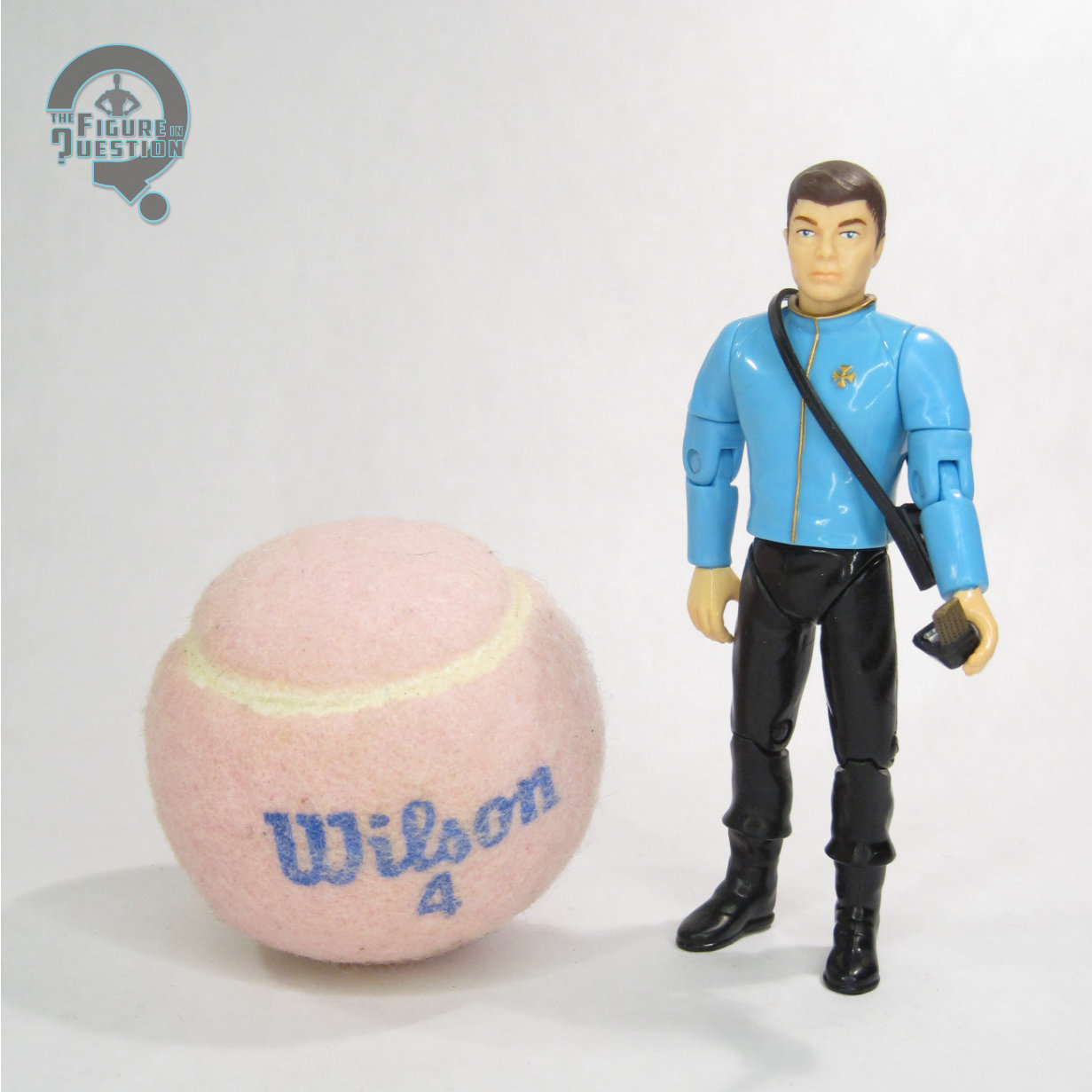
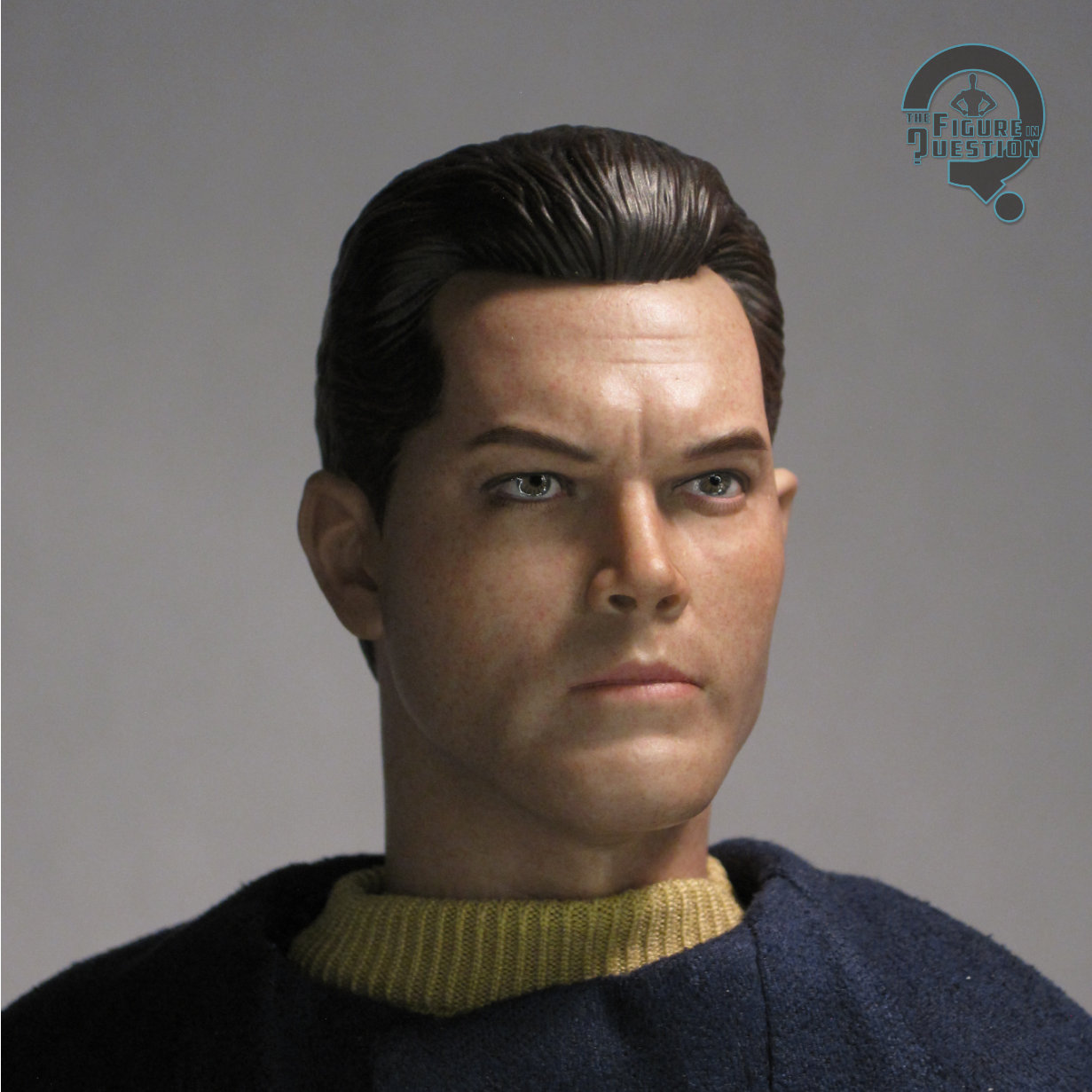 Pike has a single head sculpt, and since this is clearly him from “The Cage,” that’s based on Jeffery Hunter in the role. Hunter’s likeness can kind of get all over the place when it comes to toys (as the standard Playmates figure showcases clearly with his very cartoony look), but EXO-6 have done a pretty admirable job here. He’s a very serious Pike, which is ultimately more fitting of Hunter’s demeanor in the role (in contrast to Shatner’s more jovial Kirk), especially in the context of what we see of him in “The Cage.” Unlike the Data sculpts, I don’t feel this one has any real weak angles, and the likeness is pretty easy to catch no matter how you’re viewing him. The sculpt here also is a little bit sharper than the two Data sculpts, bringing it closer to Hot Toys, and certainly on par with the better Sideshow offerings. The paint work is likewise a bit of a step up, going for a generally more lifelike and more accented quality.
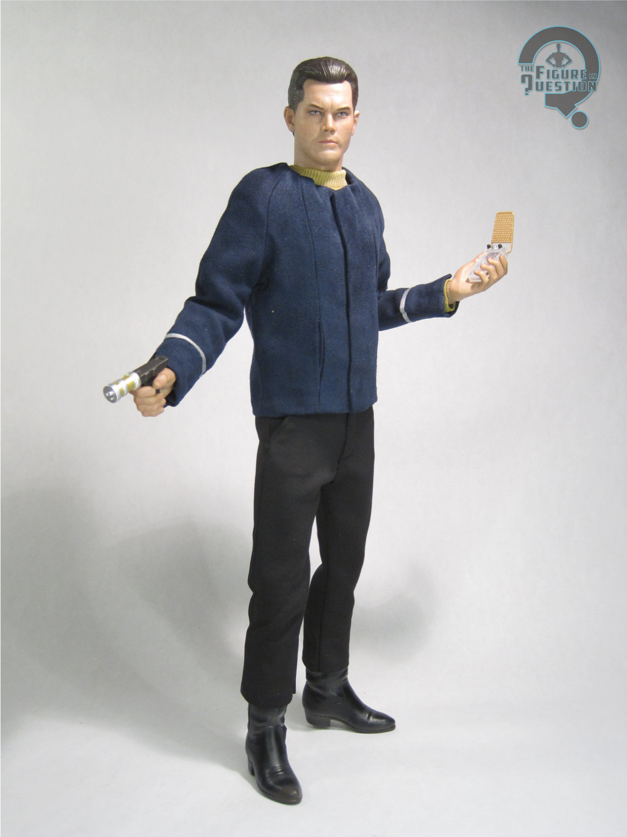
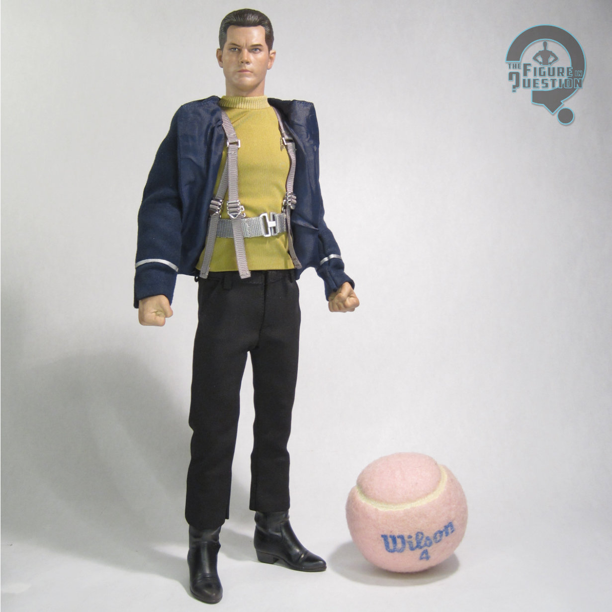
Pike has his turtle-necked uniform from “The Cage,” consisting of his tunic, slacks, field jacket, and sculpted boots. The core uniform is pretty closely tailored to the body, and seems to be a decent match for what Hunter’s wearing in the show. I appreciate in particular that the pants are a different cut than the standard TOS flared pants, as that’s a detail that’s usually overlooked with the Cage-era uniforms. He’s even got working pockets! It’s all topped off with his field jacket. While the main show just had the crew walking around in their standard bridge attire, the pilot gave them all extra jackets for surface missions, and they’re kind of a rarity in toy form. Playmates gave one to their 12 inch release, but none of the others, and no one else has done one for Pike since. This one’s really cool, it’s well tailored, looks the part, and even gets a fancy set of magnetic closures on the flap, so that it be seamless. The only slight downside is that, to keep him from looking too bulky when jacketed, he ends up looking a touch too skinny without the jacket, but I prefer the jacketed look, so I don’t mind the trade off.
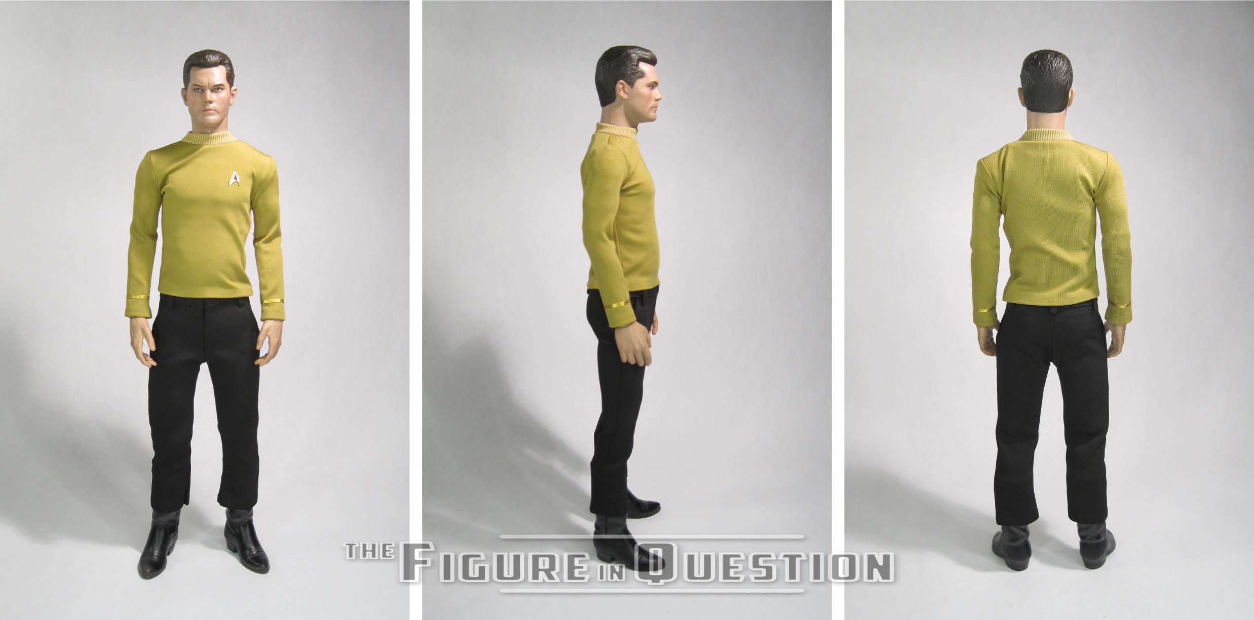
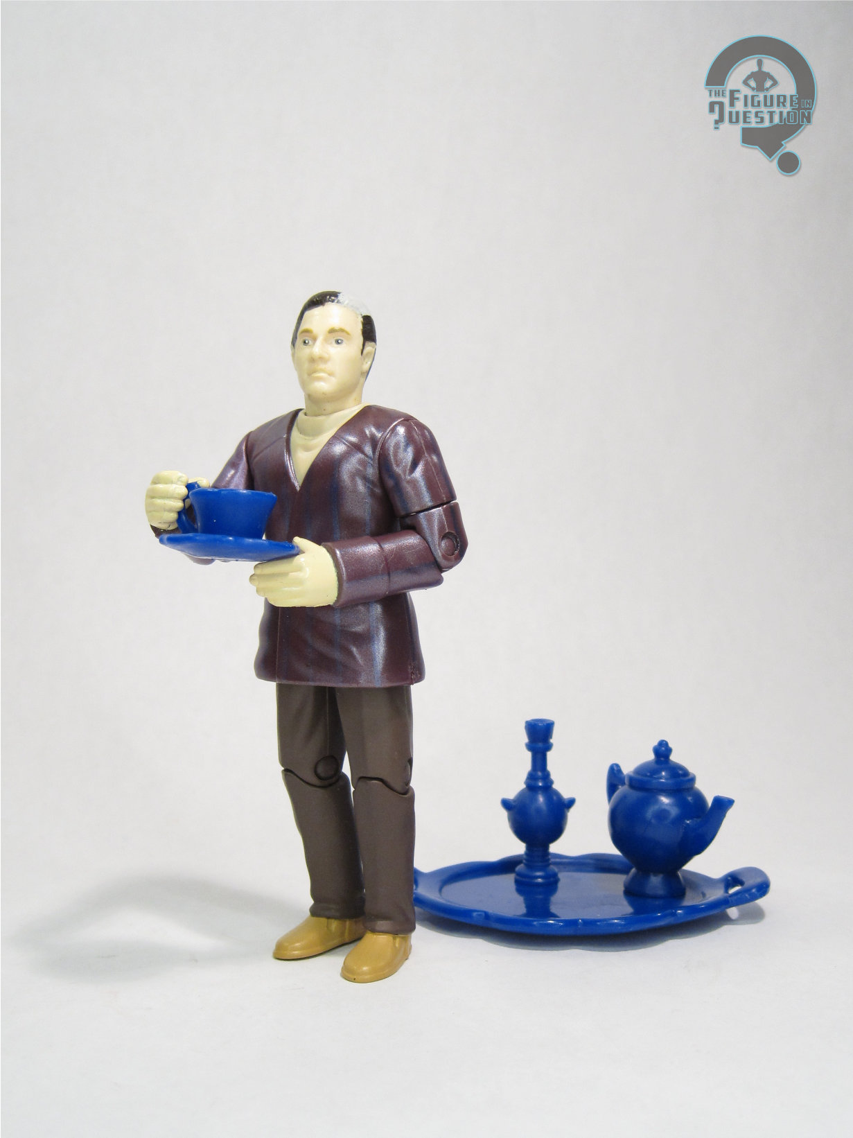
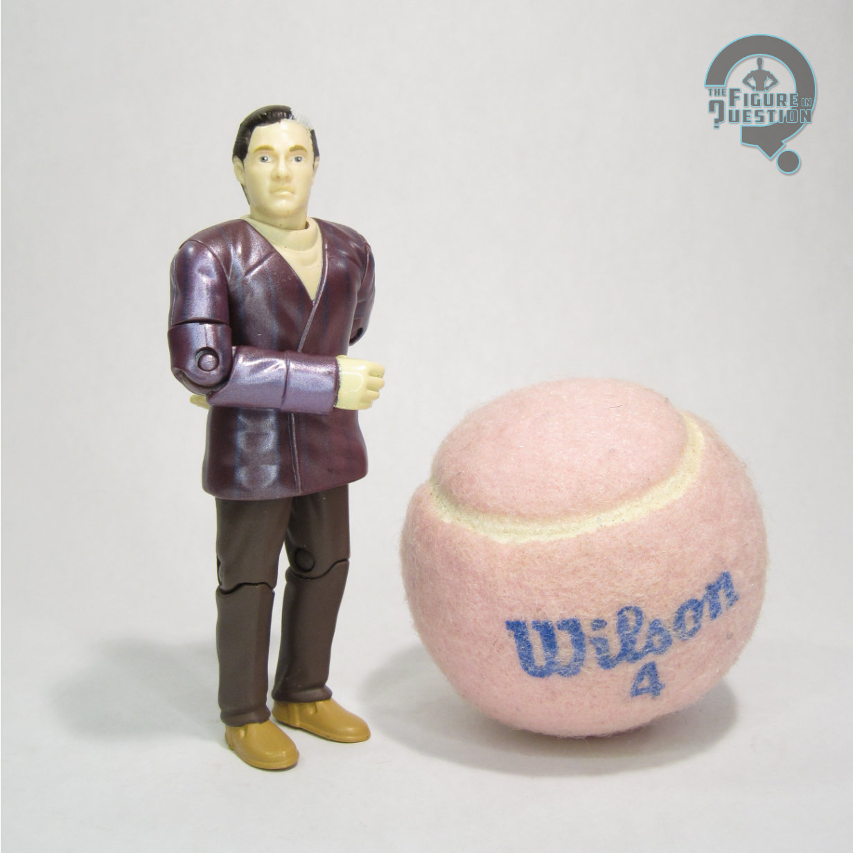
Pike’s underlying body seems to be more or less the same as the one used for Data, which works fine by me. It’s a perfectly serviceable modern era 1/6 scale body, with a decent articulation set-up, and the uniform hangs well on it. His skin tone is also a closer match than with Data, which makes for a more cohesive look, should the sleeves creep up during posing.
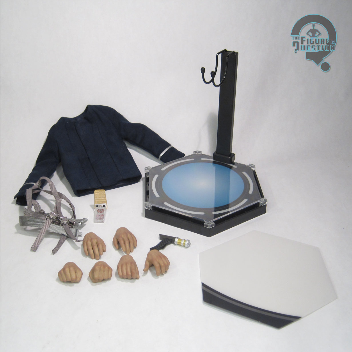
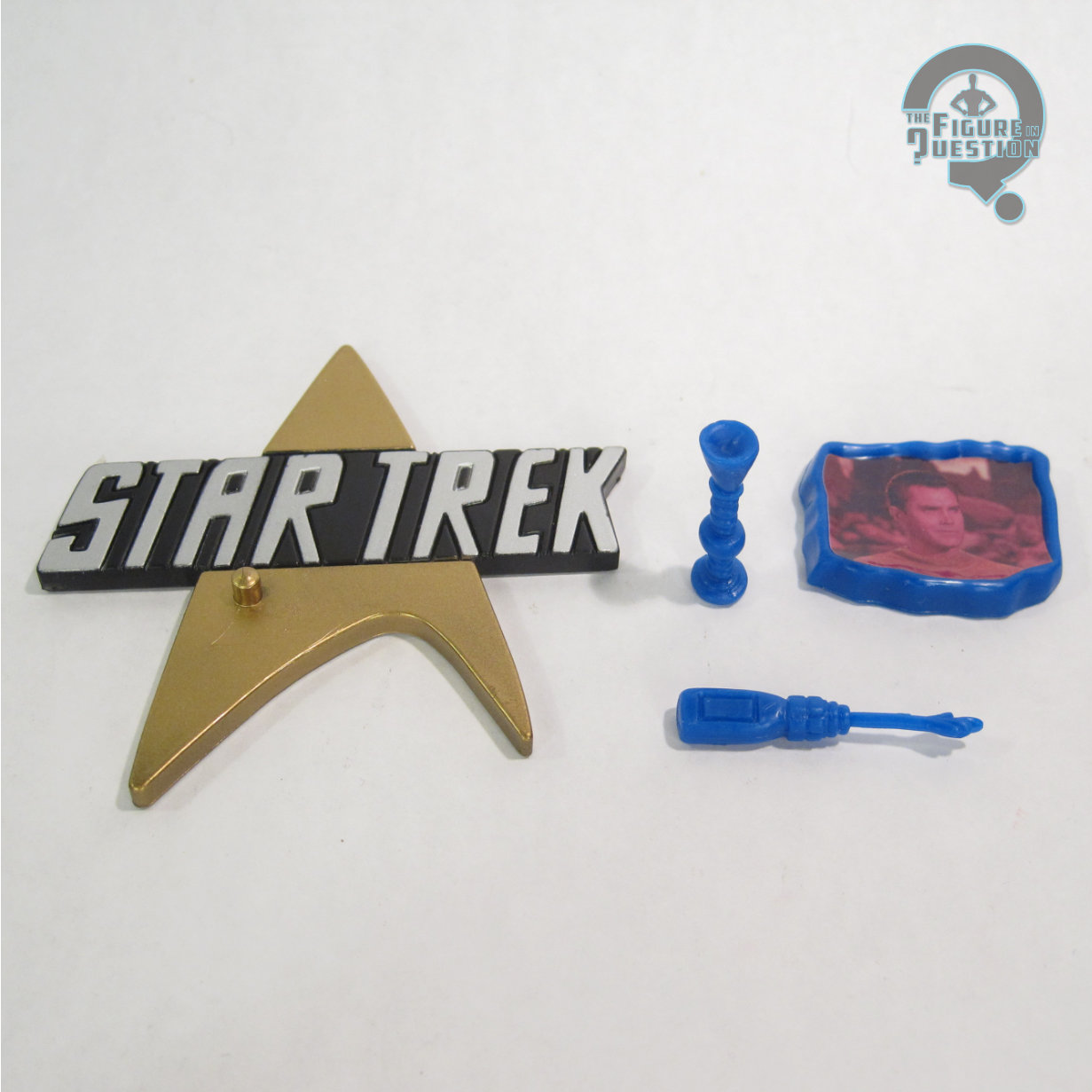
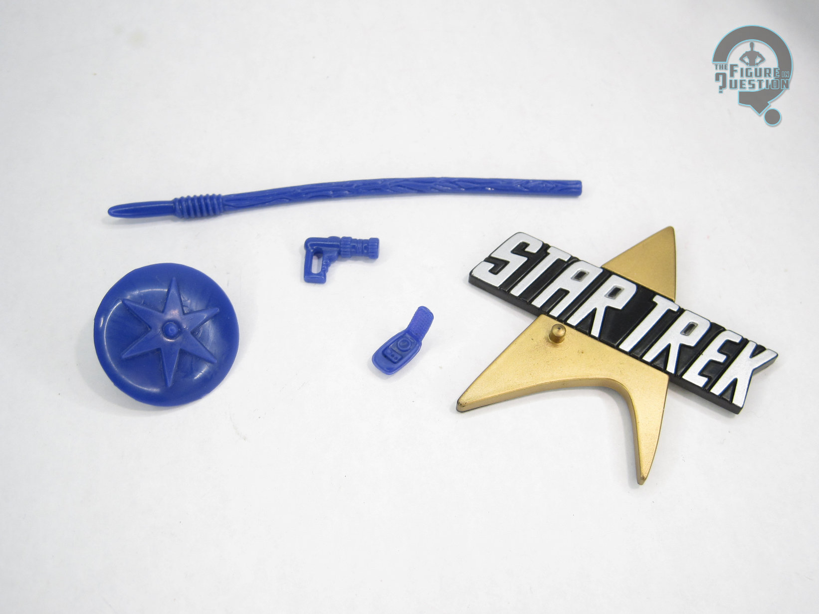
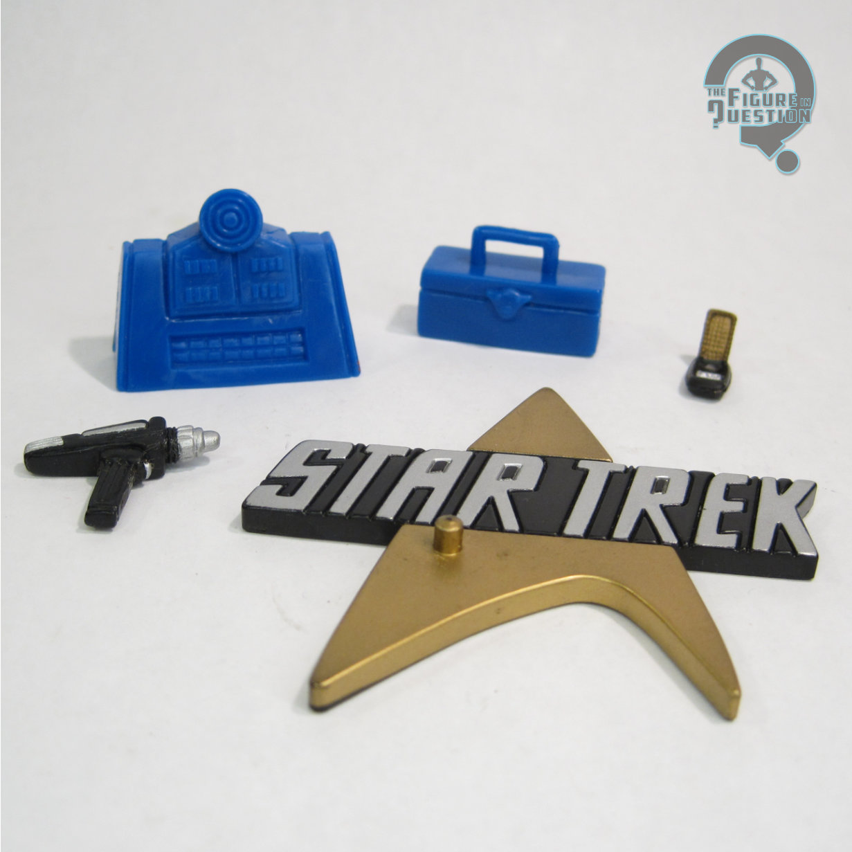
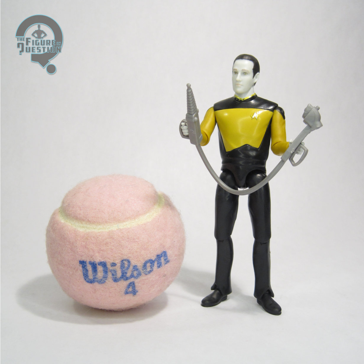
Pike’s accessory selection includes three pairs of hands (in relaxed, fists, and gripping), a phaser, a communicator, a harness, and a display stand. It’s a generally basic set-up, but covers the main stuff a Hunter Pike would need. Maybe some sort of extra head, either of a differing expression, or even a scarred Sean Kenney Pike, but those both feel a bit outside of the norms for EXO-6. Of what’s actually included, the communicator’s my personal favorite part, because I’m just a sucker for that clear communicator design. The stand is the same as Data’s right down to the transporter pad-based design, and the swap out illustration for the larger combined set-up.
THE ME HALF OF THE EQUATION
I’m a big Pike fan, especially the Jeffery Hunter version, so I’m always a sucker for a figure of him. I do, have a running gag of being denied figures of him, though, with my Nana buying me a weird Independence Day alien for my fourth birthday instead of the 9-inch figure, and a whole ordeal where I thought I was getting the 12-inch Playmates figure from my Grandmother for Christmas the year it came out, only to unwrap an Insurrection Worf figure instead (admittedly, not at all a bad figure, just not what I was expecting). I was, apparently, notified by my father of this figure’s pre-order going up, but I don’t actually recall that happening, which I blame on sleep deprivation, if I’m honest. Whatever the case, this figure was purchased for me by my father as a Christmas present last year, though he obviously wasn’t there on the day. That would be too easy for a Pike figure. But, I have him now, and he’s actually quite cool. Anyway, there’s over 1000 words about a high-end Star Trek figure from a supposed not-Star-Trek-fan.