#0672: Bounty Hunter Chewbacca

BOUNTY HUNTER CHEWBACCA

STAR WARS: POWER OF THE FORCE II

ChewieBountyHunter1

My first introduction to Star Wars toys was courtesy of Kenner’s Power of the Force II line of figures. The interesting thing is that I came into the line during the second round of figures, so some of my initial versions of the main characters weren’t exactly standard issue. I’ve already discussed how Dagobah training Luke was my first figure in the line, and some of the other main characters followed a similar pattern. Chewbacca was one such character, which seems a little odd, since you wouldn’t think there would be a lot of potential Chewbacca variants. Well, faithful reader, feast your eyes on Bounty Hunter Chewbacca!

THE FIGURE ITSELF

ChewieBountyHunter2Bounty Hunter Chewbacca was part of the second year of Power of the Force II figures. He was released as part of a small subset of figures based on Shadows of the Empire, which is a story set between Empire and Jedi. In the story, Chewbacca has to take on the guise of well-known Wookie bounty hunter Snoova in order to infiltrate Imperial City. So, technically, this figure could pass for either character. This is only the third time that Chewbacca had made it into the 3 ¾ inch line, which is surprisingly low, given his prominence. The figure stands a little over 4 inches tall and has 6 points of articulation. As a Chewbacca variant, you might think that this figure would be heavy on reuse. However, that’s not the case, as the only shared part between this and the regular POTF2 Chewie is the left leg. Everything else is new to this guy, though the sculpt maintains more than a few similarities with the regular version. Chewbacca definitely has a slightly exaggerated style about him (as did most of the POTFII figures) but I think this is one of the few figures in the line that really couldn’t work without the slightly cartoony feel. The concept looks pretty nifty here, presented in all its over-complicated 90s glory, but placed on a more realistically proportioned body I dare say it would look downright silly. And being exaggerated certainly doesn’t mean the figure doesn’t have some great texturing. The armor in particular looks sufficiently worn and beaten. Someone had a lot of fun sculpting this guy. This version of Chewbacca also got some of the very best paintwork POTF2 had to offer. All of the base paint is cleanly applied, with minimal bleed over. He’s also got some pretty nice work on his fur, which, in story, has patches died to make him look more like Snoova. They could have just been solid blotches of color, but they’ve actually been worked in rather subtly, making them look like they’re actually died into his fur. Chewbacca was packed with a giant blaster and a sci-fi looking axe, which both just add to the 90s over-complication thing. They can both be held, or the axe can also be plugged into his back for storage.

THE ME HALF OF THE EQUATION

This guy was my very first Chewbacca figure. If I recall correctly, Chewie was one of the last main characters I got. I remember that my Grandmother took me to the store (Sears, I think) specifically because I had asked to get a Chewbacca figure. I seem to recall that both versions of Chewbacca were there, but I picked this one. Even then I knew what cool was! The one pictured is actually a replacement I picked up a few months ago, as the original got lost some ways back. I have to admit, I was ready to tear into this one for its absurdity when I first sat down to write this, but I’ve come out of the review with a rekindled love for this X-Treme little guy.

#0670: X-Ray Vision Superman

X-RAY VISION SUPERMAN

SUPERMAN: THE ANIMATED SERIES

XRaySupes1

Remeber last week when I looked at one of the wacky Superman variants from Kenner’s tie in line for the 90s cartoon?  Well, that one wasn’t even the tip of the iceberg.  At least he was somewhat passable as a basic Superman.  Today’s figure? Less so.  Without further ado, here’s X-Ray Vision Superman.

THE FIGURE ITSELF

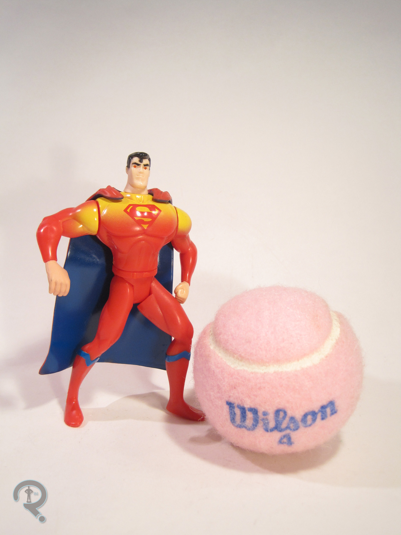
XRaySupes2X-Ray Vision Superman was released as part of the fourth series of Kenner’s Superman: The Animated Series, the story of which I covered in Power Swing Superman’s review.  He’s another of the frivolous Superman variants designed to showcase Superman’s less obvious power set.  Yay?  The figure is 5 inches tall and he features 6 points of articulation.  He sports a unique sculpt.  It’s not quite show accurate, but it’s in line with the all of the other Animated Series figures, so at least it’s consistent.  It’s nowhere near as extreme in pose as Power Swing Superman, but he’s still a bit removed from a standard standing pose.  The most out there part is definitely the throwing arm, which is permanently outstretched and at a 90 degree angle.  That’s a bit on the awkward side, but it works okay with the accessories.  The rest of the sculpt is more standard fare: fairly simple musculature and decent enough proportions.  The head sculpt isn’t as good as the PS Superman, but that’s mostly due to the “action feature.”   What is this action feature?  Well, he’s got light piping, so as to light up his eyes and simulate his…X-Ray vision.  I think they may have gotten confused with his heat vision.  The paintwork is where the figure really gets wonky.  In lieu of the traditional Superman colors, this figure is primarily a red-orange-yellow gradient.  It’s a very warm look, which once again makes me think someone at Kenner kept mixing up heat vision and X-Ray vision when designing this guy.  That said, it’s a unique look, so I actually can’t complain.  The cape has been swapped to blue, I guess to break up the reds a bit.  Overall, the paint is pretty decently applied, with no real slop or anything and lots of nice, bold colors.  Superman is packed with a bundle of dynamite, as well as a safe to hide it in.  The safe is partially translucent, so as to demonstrate Superman’s power.

THE ME HALF OF THE EQUATION

Like his series-mate, I picked this Superman up from Yesterday’s Fun. He was another one of the wacky Supermen that had intrigued me all those years ago.  In fact, he has the notoriety of being the very last thing I bought on vacation.  He’s not quite as much fun as Power Swing, but he’s not too bad.  And, as an added bonus , paired up with Power Swing, you get a pretty decent Silver Age Superman Blue and Red.

XRaySupes3

#0664: Silver Ranger

SILVER RANGER

POWER RANGERS IN SPACE

SilverRanger1

When I was a fair bit younger, I was pretty into Power Rangers. That shouldn’t be a shock, seeing as I was a boy under 10 in the 90s. It was sort of a rite of passage. Once I hit 10 or so, I moved away from the series, though, unlike a lot of other people, it wasn’t because I suddenly found the series lame, but rather because none of the new seasons could live up to Power Rangers In Space, which had been by far my favorite iteration of the series. I recently sat down and watched a few episodes from the show and I was actually pleasantly surprised to find out that the show was actually as good as I remembered it to be. Like just about every Power Rangers incarnation, In Space had a “Sixth Ranger” added to the team as the show progressed, called the Silver Ranger because he was…well, silver. He was super cool. Let’s look at a toy of him!

THE FIGURE ITSELF

SilverRanger2The Silver Ranger was an interesting case as far as figures go. None of his figures were in the initial offerings of toys, as his character had not yet appeared. When he did finally appear, Bandai had to do a handful of special offerings to ensure that he got a few figures that would fit with the other Rangers. This particular version was released in a set with a Galaxy Cycle in silver. The figure stands roughly 4 ½ inches tall and has 13 points of articulation. Silver is built on the exact same body used for all of the Galaxy Cycle Pack-in cycles (yes, even the girls). It’s an interesting body because, unlike all of the other Power Rangers In Space figures released in the US, the figures on this body aren’t overly musclebound. That’s actually kind of nice to see. That said, the body ends up being exceptionally simplistic in general, which doesn’t win it a lot of points. Aside from the slight detailing on the mouth of the helmet, and some decent work on the belt buckle, the figure is more or less devoid of any real detail. It looks somewhat like a crash test dummy. Also, the hands are ginormous, to almost insane levels, which looks rather silly on an otherwise skinny figure. It’s not a bad sculpt overall, but it was out of date even when it was brand new. The paintwork on the figure is just about as simple as the sculpt. He’s mostly just molded in the appropriate colors, which leads to some oddness, especially where the gloves go up past the elbows. The head gets the best detailing, with several different colors and no real issues with bleed over and slop. The details on the torso aren’t actually painted. Instead, they’re just decals, which definitely didn’t hold up in the long term. The Silver Ranger originally included a blaster, as well as the previously mentioned Galaxy Cycle. However, my figure has neither of these, so no review for them. Sorry guys!

THE ME HALF OF THE EQUATION

Silver Ranger was purchased at Yesterday’s Fun while I was on vacation this year. I never managed to find any of the basic Silver Ranger figures growing up, and they’ve since shot up in price, so I was actually pretty excited to find him. Yeah, the figure is definitely dated, and not in the greatest condition, but it’s the Silver Ranger. He’s just cool! And that kind of outweighs the negatives.

#0663: Power Swing Superman

POWER SWING SUPERMAN

SUPERMAN: THE ANIMATED SERIES

PowerSwingSM1

When you are creating an entire line of action figures based on a property with one defined look for your main character, the only way to keep the main character at the forefront, logically, is to release a bunch of variants of that character. Sometimes, they’ll be authentic designs from the source material (such as many of Hasbro’s recent ML Spider-Men) or a practical extension of their basic look (like Iron Man). Other times, they’ll just be completely made up. Enter Power Swing Superman.

THE FIGURE ITSELF

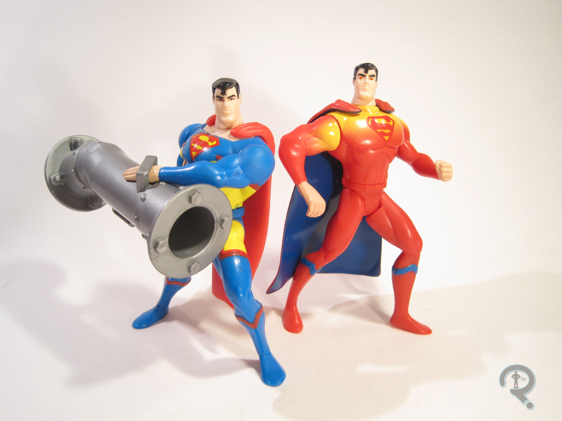
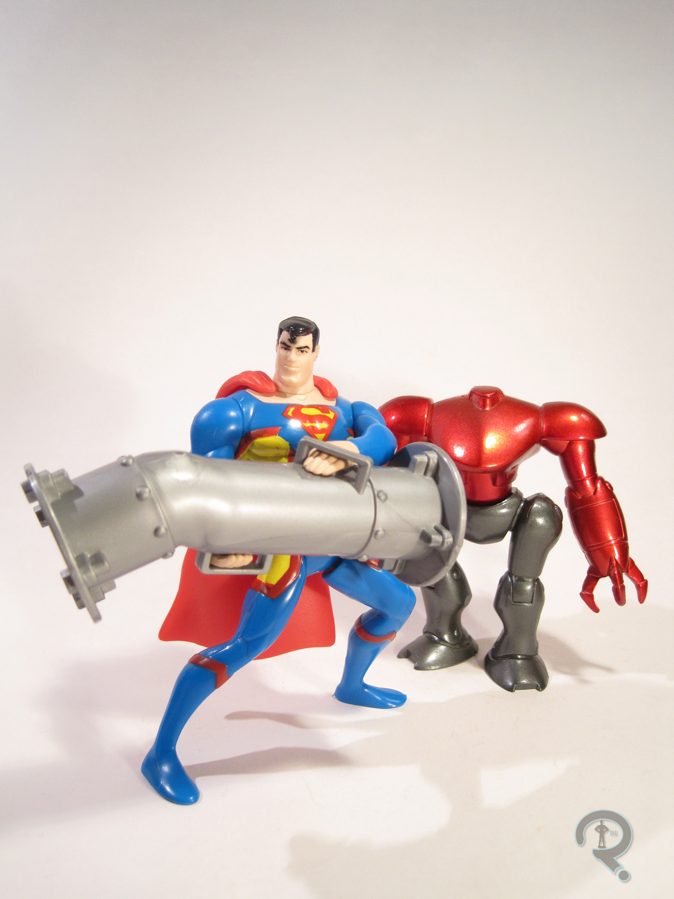
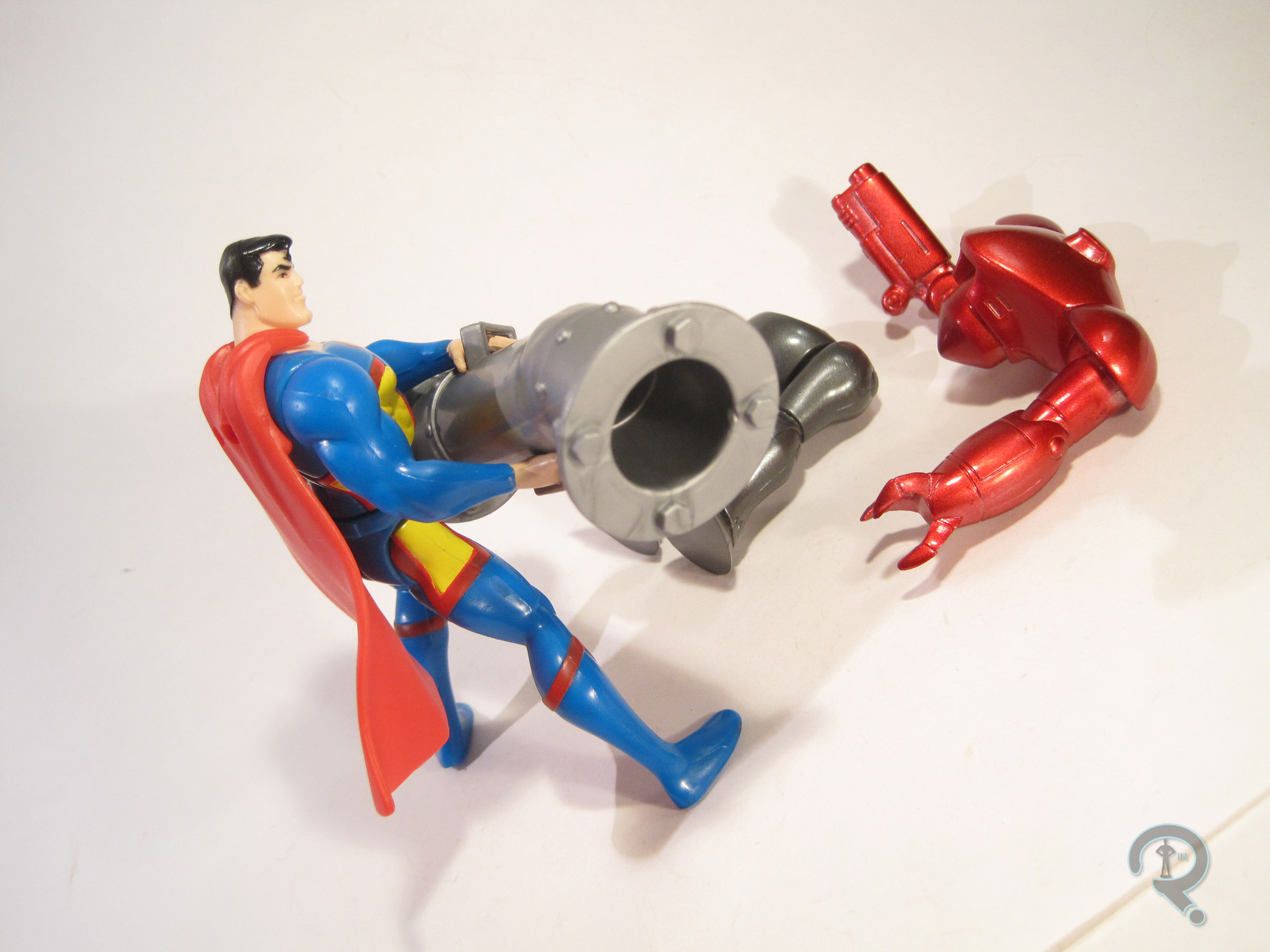
PowerSwingSM2Power Swing Superman was part of the fourth series of Kenner’s Superman: The Animated Series line. This series is significant because it wasn’t carried by conventional US retailers. Instead, it hit in Europe first. The series didn’t make it to the States until it was offered by Diamond Distributers a few months later. So, there’s that story. The figure stands 5 inches in height and has 6 points of articulation (though his waist swivel is limited by the action feature). Now, where, you might ask, did this figure’s costume originate? Some one episode look, or perhaps an obscure Elseworlds story? Nope, it came straight from the minds of the toy designers. Yes, this costume is totally made up for the figure, though it is notable that this figure removed the signature red shorts over a decade before the New 52 redesign made it canon. The line never really stuck to the show’s style when it came to sculpts, but this figure actually takes it even further, with more defined musculature and an exaggerated pose that wouldn’t look out of place on the dance floor of a disco. While many of the wacky Supermen were sculpted in his traditional garb and painted funky after the fact, this figure’s sculpt actually has details that correspond specifically to this design, which is kinda neat. The best part of the figure is easily the head sculpt, which actually manages to be the most show-accurate sculpt the line ever produced. It’s spot on! The paintwork on the figure is alright, but not great. It sticks to his traditional colors, though placed a bit differently. The colors are nice and vibrant, but the application is spotty. The costume has a lot of bleed over, and the red areas in particular feel like they could use another coat of paint. The head manages to be the best piece once again, avoiding the bleed over and actually doing a very nice job on the eyes. The figure included a large piece of pipe for him to hold, as well as a miniaturized version of Luthor’s exo-suit from the pilot episode. Also, his waist is spring-loaded, allowing him to “swing” the pipe at the exo-suit and “demolish” it. It’s not high-end or anything, but it’s amusing.

THE ME HALF OF THE EQUATION

Power Swing Superman was one of my many purchases from Yesterday’s Fun whilst on vacation this year. I had actually always been intrigued by this guy, but I’d never seen him in person. So, when I came across him, I snatched him up quickly. He’s definitely goofy, but I really enjoy him.

PowerSwingSM3

#0646: Leon Kennedy

LEON KENNEDY

RESIDENT EVIL (TOYBIZ)

Leon1

For a guy who’s not really into video games, I sure do have a lot of video game-based action figures, don’t I? Hey, I’m a sucker for a halfway decent action figure, regardless of its origin. That said, I do usually try to have at least a passing familiarity with the source material. In the case of Resident Evil, I can name most of the franchise’s main characters and give a fairly loose summary of what’s going on in a given game. I consider that good enough. Now, without ever playing any of the games, I’d say my favorite character is Leon Kennedy. Dude just looks super cool. Of course, everyone else agrees, so figures of him tend to be quite pricey. However, I did manage to find one of them, for better or for worse.

THE FIGURE ITSELF

Leon2Leon was released as part of ToyBiz’s first series of Resident Evil figures. He was originally packed in a two pack with a Licker, but I just picked up Leon. Resident Evil seems like a slightly odd choice for ToyBiz in the 90s, but they were running the X-Men vs Street Fighter and Marvel vs Capcom lines at the same time, so I’d guess RE was just part of the master Capcom license. Leon stands 5 inches tall and has 14 points of articulation. He’s seen here wearing his Racoon City Police Department uniform from Resident Evil 2. It’s nowhere near as cool as his bomber jacket look from RE4, but it’s not a terrible look, and it’s certainly distinctive. The figure featured a sculpt that was unique to him. It’s alright, but not really fantastic. It certainly isn’t the same quality of a lot of ToyBiz’s Marvel stuff from the same time. His proportions are weird, with a huge head and hands, but a tiny waist and feet. He’s also very oddly posed, with this sort of hunch and oddly turned legs. It’s weird. The uniform has some decent detail work, so that’s cool, I guess. Leon’s paintwork is actually pretty good. He’s mostly molded in the appropriate colors, but he has a fair amount of paint. I like the subtle differences between the regular parts of the uniform and the padded ones, and the RPD initials are nice and sharp. To be really true to the game design, Leon’s hair should be sort of two-toned, but the single color they’ve gone with is at least a decent midpoint. Aside from being packed with the aforementioned Licker, Leon also featured a shotgun he could hold, which my figure is also missing. In addition, Leon has a lever on his back which…raises his arm and turns his head to the right. Yeah, I guess it went with the gun somehow?

THE ME HALF OF THE EQUATION

I ended up finding Leon loose in a bin of other video game figures at Yesterday’s Fun. Since he was fairly inexpensive, I figured I might as well get one, just for the novelty of it. He’s definitely not going to be winning any awards or anything, but he’s not the worst thing ever. I certainly can’t say the guy disappointed me or anything.

#0639: Invisible Woman

INVISIBLE WOMAN

MARVEL HALL OF FAME

InvisibleWoman1

The Fantastic Four have sort of become personae non gratae over at Marvel Comics in the last few years (thanks Fox) but they’re kind of one of the most important sets of characters Marvel’s ever had. Without them, there really isn’t a modern day Marvel Comics. It’s a shame they aren’t getting the respect that they deserve. It’s been a little while since any of the team has graced the toy world, but there’s a pretty decent back catalogue of stuff out there, including today’s focus, Invisible Woman.

THE FIGURE ITSELF

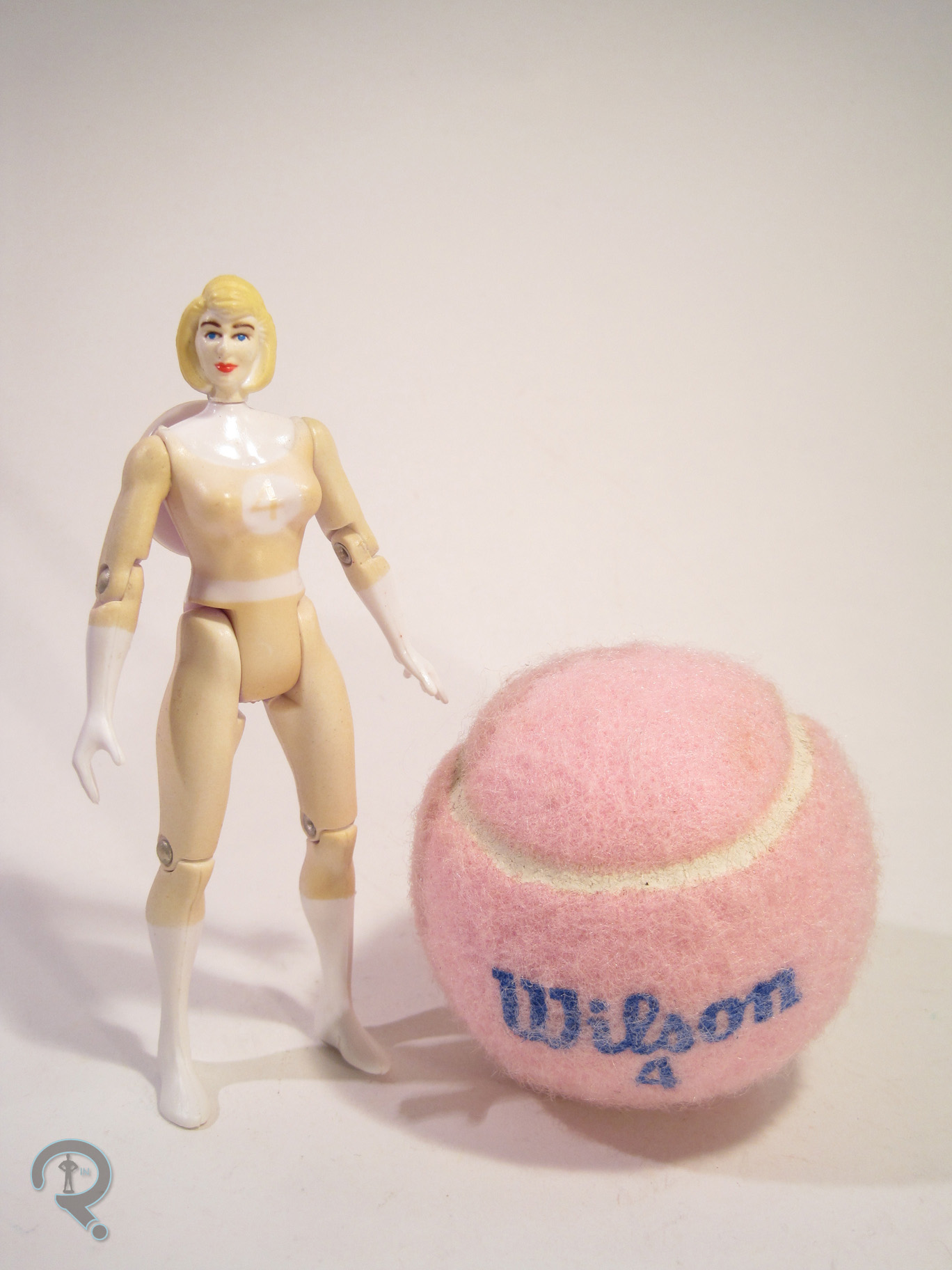
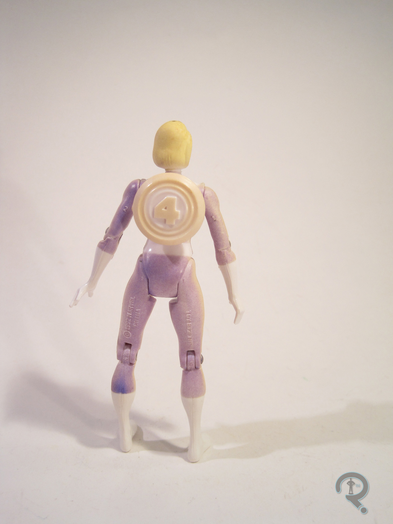
InvisibleWoman2Invisible Woman was released as part of the first series of ToyBiz’s Marvel Hall of Fame line. The figure stands 5 inches tall and has 9 points of articulation. She, like most of the other figures in the line, is more or less a re-release of a previous Marvel figure. In this case, she’s a rehash of Marvel Superheroes’ series 3 version of the character. That figure was available in both color-changing and non-color-changing versions, but this one seems to just have been offered with the feature, hence her somewhat odd coloring. The sculpt for the figure is definitely a dated one; it’s from very early in ToyBiz’s run with the license, so they were still finding their footing. The head is rather small, the articulation isn’t worked in very smoothly, and the figure just feels rather clunky in general. It’s not the worst thing ever, and it’s not even the worst female figure of the time (I’m looking at you, Monkey Face Princess Leia) but it certainly shows its age. The paint on the figure is somewhat hard to judge, mostly due to the figure’s color-change “action feature.” I can’t speak for when it was new, but the feature doesn’t really work anymore, which leaves the InvisibleWoman3figure sort of in this middle state. I tried putting her in cold water, as the packaging says to do, and all it really did was slightly change the back of the figure. Now she looks like a pie…(Tim’s been calling her Miss Meringue). Invisible Woman’s only accessory is…uhh…well, it sort of looks like a Tron disk or a Fantastic Four Frisbee. I don’t know. It plugs into her back. So, there it is.

THE ME HALF OF THE EQUATION

This figure’s another piece of the slew of figures I bought from Cosmic Comix a few months back. I actually own the original, non-Hall of Fame release, but I didn’t have the color-change version, so I figured this one was probably worth the $3 I paid. She’s not a figure that’s going to win any awards or anything, but she’s a neat little product of the early 90s.


#0638: Wolverine & Blob

WOLVERINE –STRIKE FORCE & THE BLOB

MARVEL MINIMATES

Wolv&Blob1

Man, I haven’t reviewed many Minimates recently. There’s no denying that the X-Men, particularly the 90s incarnation of the team, have gotten quite a bit of love from DST. The latest comics-based series of Marvel Minimates has done its best to fill some important holes in the team (and give them a few more foes to fight) while also trying out a new way of distributing some of the characters. Today, I’ll be looking at the guy who’s easily the most well-known X-Man, Wolverine, as he faces of against Brotherhood of Evil Mutants member the Blob!

THE FIGURES THEMSELVES

These two were released as part of Marvel Minimates Series 60.

WOLVERINE (& FORGE!)

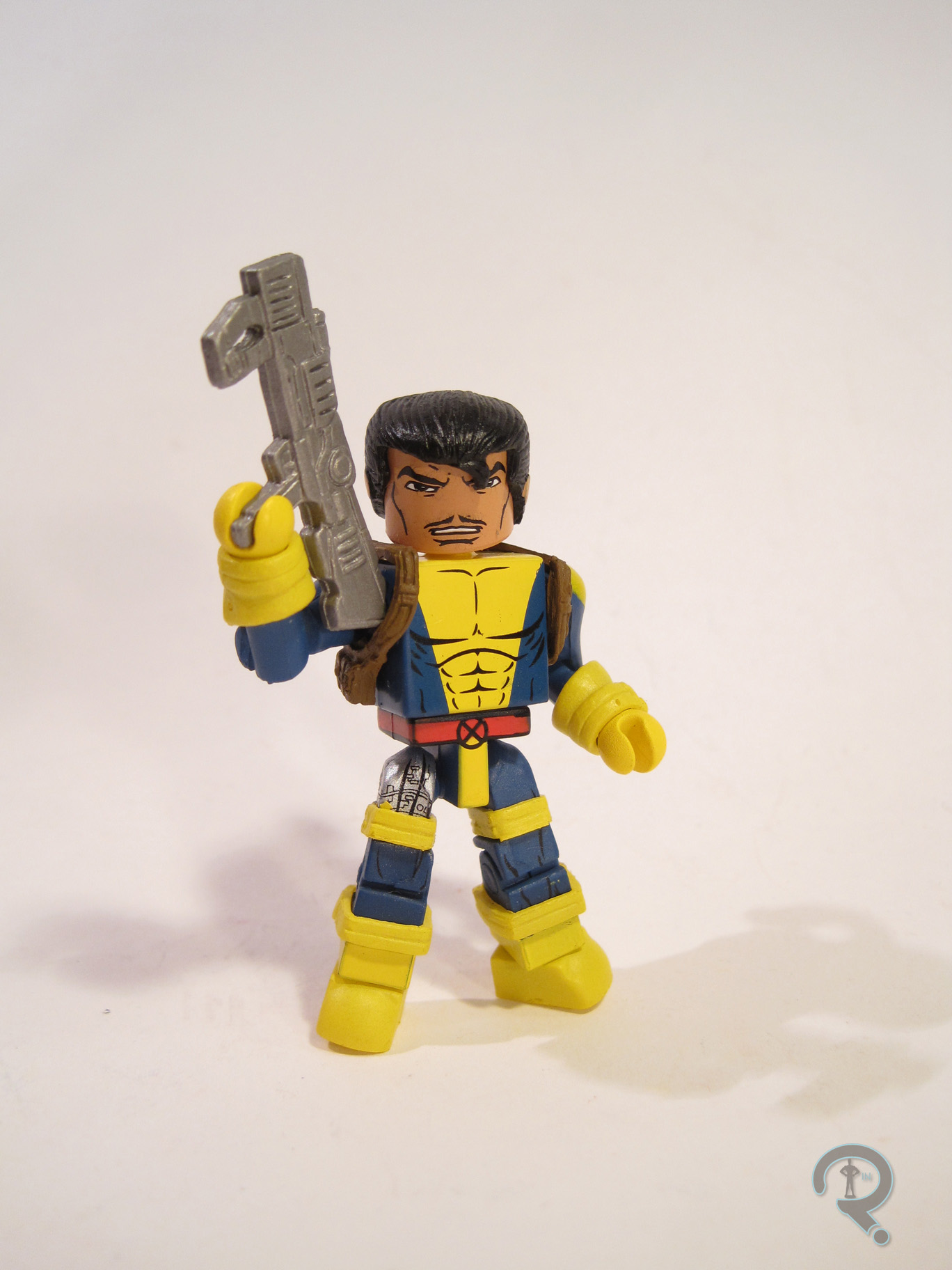
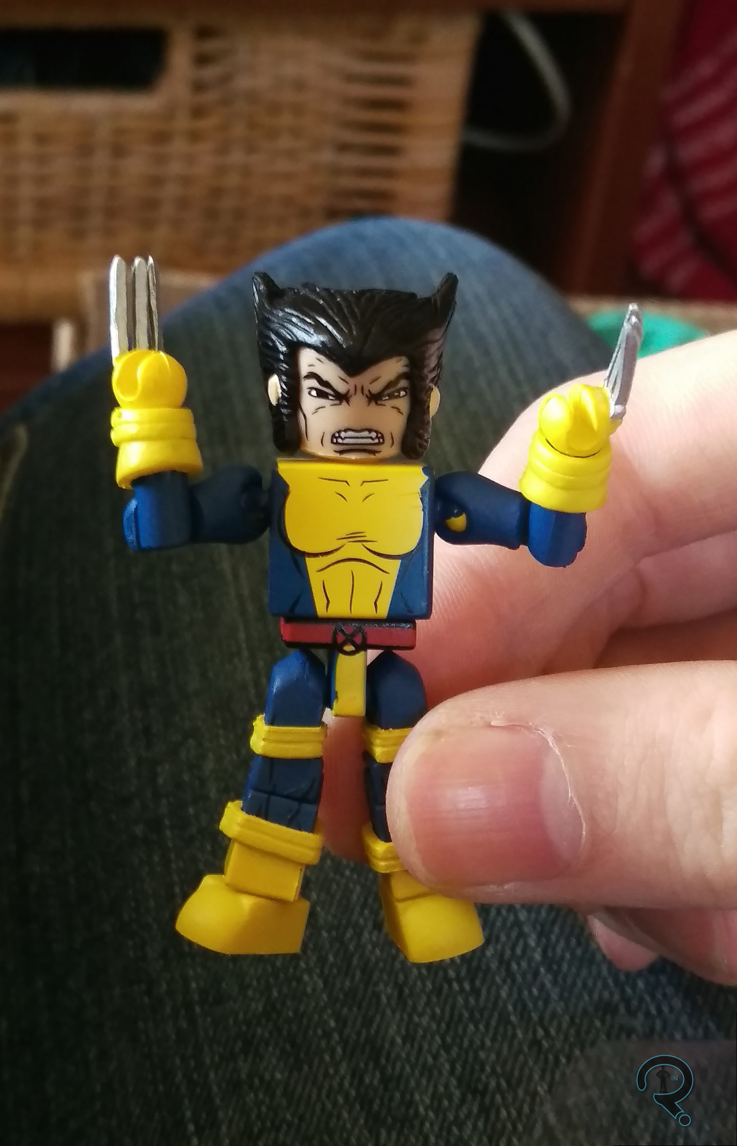
Wolv&Blob2Wolverine is no stranger to Minimates, with this being his 57th foray into the line. Hey, a heavy hitter’s a heavy hitter. There has to be at least one in every series, right? The figure depicts him in the standard Strike Force uniform that several of the X-Men wore during the 90s. Wolverine didn’t really stick with it, but he did wear it a few times. The figure is about 2 ½ inches tall and has 14 points of articulation. He has sculpted add-ons for his hair, gloves, and the two sets of straps on his legs, as well as a standard pair of clawed hands. The hair is a piece that’s been used several times before. It first showed up on the TRU Series 9 Brown Wolverine, and has been used fairly regularly since then. It’s definitely a good piece, and it’s accurate to that wacky hair of his from the comics. The leg straps are the same as those used on Series 34’s 90s Cyclops, which is fitting, seeing as they’re meant to be the same design in the comics. The gloves are the same as Banshee, released in this same series. They’re a good sculpt, and they sit nicely on the Wolv&Blob3figure. The paintwork on Wolverine is passable, but not the best. The detailing on the face is top notch; all the lines are nice and sharp and the facial expression feels perfect for the character. The torso detail is also pretty good, though it’s hampered a little bit by the sloppy edges on the change from blue to yellow. The real issues with the paint are on the shoulders, where the yellow hasn’t been consistently applied, resulting in the underlying blue bleeding through, and on the pelvis, where the red of the belt does not continue down through the whole buckle. The accessories are what sets this figure (and the rest of the series) apart. In addition to the standard clear display stand, the figure also includes an extra head, hair, hands, and right leg, as well as a shoulder harness and a large gun, allowing the figure to be re-configured as Forge, a previously un-released X-Man. The pieces are all nicely handled and match up well with the regular parts, resulting in a figure that is just as much Forge as it is Wolverine. Also, I really like that the skin tone on the head is different from Wolverine, thus properly denoting Forge’s Cheyenne ancestry, which is far too often overlooked.

BLOB

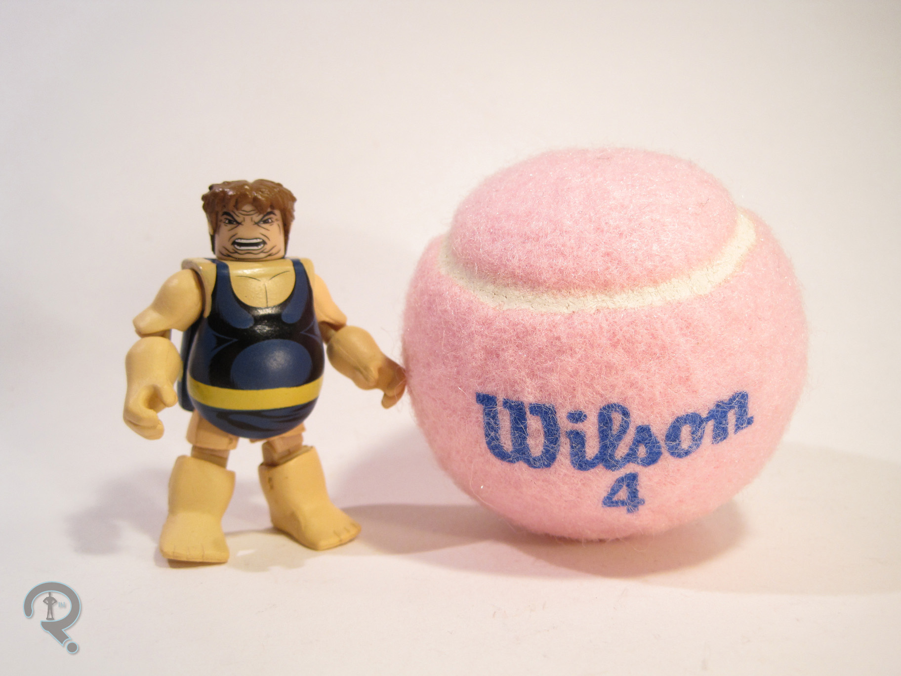
Wolv&Blob4Fred Dukes, aka the Blob, is actually one of the X-Men’s oldest foes, first appearing in X-Men #3. This isn’t the first time he’s appeared as a Minimate, however, his last figure was based upon his film appearance in X-Men Origins: Wolverine, which wasn’t the comics-inspired look most were hoping for.  Blob is no slouch when it comes to sculpted add-ons. He features pieces for his hair, torso, upper arms, lower arms/hands, thighs, and feet, as well as a torso extender hidden under that torso piece. The last Blob figure was somewhat on the small side, but this one moves to correct that, making use of a combination of pieces from the Marvel line’s various Hulks and the Street Fighter vs Tekken line’s Rufus. The pieces all mesh together quite well, resulting in a Blob that accurately represents him as the wall of mutant we know from the comics. One small issue with my figure: one of the shoulders on my figure has a chip missing out of it. It isn’t terribly noticeable, but it’s still annoying. Blob’s paintwork is generally pretty well handled, though it isn’t without issues. The colors are all of the proper shades for the character, which is always good, and the detail lines on his torso and face do a tremendous job of bringing the character to life. However, some of the more base level paint is a little off. The straps on the shoulders don’t quite line up with each other, and the gold bands on the wrists are rather uneven and sloppy, with gold paint ending up a few places it shouldn’t. For accessories, Blob isn’t quite as loaded as Wolverine, but he’s certainly no slouch. He includes a spare set of hands and feet, without wristbands or boots, allowing for the figure to be displayed as the Blob from some of his earlier appearances. This offers a nice bit of extra value, and gives the buyer two possible looks, should they end up with a second Blob while completing their Strike Force X-Men. He also includes the standard clear display stand, which is always appreciated.

THE ME HALF OF THE EQUATION

So, this is actually my second set of these two. When my full series set arrived from Big Bad Toy Store, I opened these two up first, and they seemed fine. Then I took a closer look at Wolverine’s torso and noticed he had…boobs. Seems my figure got a Storm torso by mistake. Hey, secondary mutation, right? Or maybe they were just easing us into X-23 taking over the title. Anyway, I ended up buying a second set from Cosmic Comix, so, there’s that!

IMAG0007

#0635: Cyclops & M. Bison

CYCLOPS & M. BISON

X-MEN VS STREET FIGHTER (TOYBIZ)

CyclopsBison1
The 90s were an interesting time to say the least. The X-Men were at the height of their popularity, which, of course, meant plenty of tie-in stuff. Capcom, makers of hit games series such as Mega Man and Street Fighter, licensed the team for a fighting game, called Children of the Atom. This ended up being a success, leading to Capcom pitting the X-Men against the cast of Street Fighter. ToyBiz already held the license for Marvel, so they picked up the Capcom license as well, allowing them to do their own tie-in two packs. One of these sets was X-Men leader Cyclops versus Street Fighter’s big bad M. Bison, which I’ll be looking at today.

THE FIGURES THEMSELVES

Cyclops and Bison were a two pack in ToyBiz’s X-Men vs Street Fighter line, released in the late 90s. I believe these two were part of the first assortment of packs.

CYCLOPS

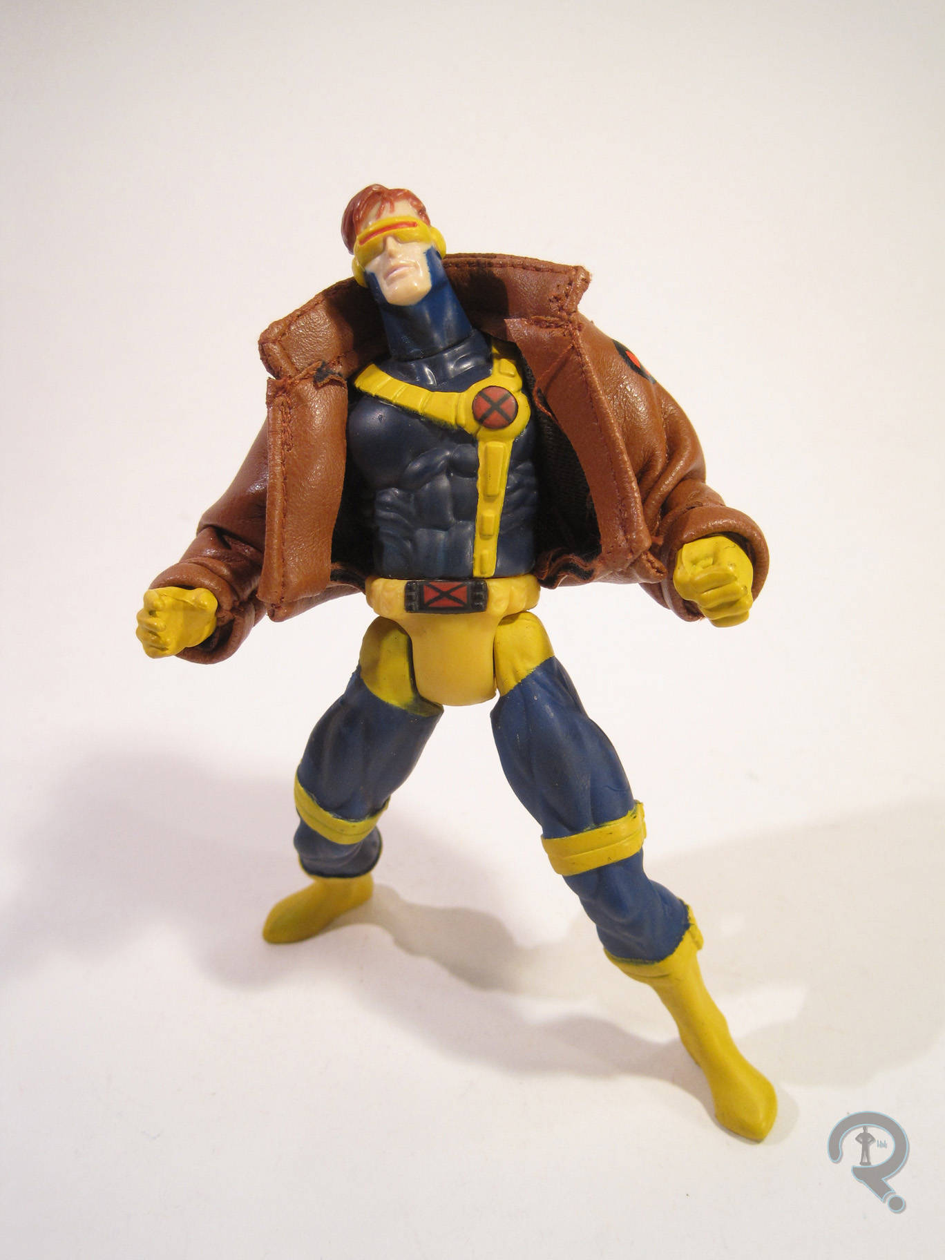
CyclopsBison2Cyclops is presented here in his fan-favorite 90s costume, designed by Jim Lee. It’s one of those looks that doesn’t make a whole lot of practical sense and could be considered a bit silly. That said, nostalgia is a powerful thing, so I can’t help but love it. The figure stands just over 5 inches tall and sports 8 points of articulation. That’s a little lower than the typical Marvel figure of the time, due to his lack of both elbow and knee joints. I can’t say why ToyBiz decided to leave those out, but he does at least have some extra shoulder articulation, which certainly eases the pain. Structurally, Cyclops makes use of the body of the Monster Armor Cyclops from the main X-Men line, along with a new head. The body is from towards the end of the X-Men line, when ToyBiz was trying to emulate the higher-detailed, more pre-posed figures being offered by McFarlane at the time. However, Cyclops had one of the tamer sculpts, so he doesn’t end up being too bad. The one real drawback of the original figure, the head, has been replaced CyclopsBison3with a much nicer piece. This new head does a great job of capturing the animated style Cyclops from the cartoon; it’s simplistic, but all the necessary details are there. The paintwork isn’t the best ever, but it’s not terrible. There’s a bit of slop, especially around the yellow spots. Also, the hair and headband don’t quite meet up right, giving poor Cyke a bit of a bald spot. On the plus side, the blue is a darker shade than the Monster Armor figure, which is more true to the character design, and the plastic/paint is much more matte, which has an overall better look. Cyclops came packed with an optic blast piece (Which I don’t have) and a pleather jacket like the one he was known to wear from time to time in the 90s cartoon (mostly when Jean was crazy or presumed dead. It’s his brooding jacket.)
M. BISON

CyclopsBison4Ah, good ol’ M. What’s it stand for? Well, apparently it’s a shortening of Mister, which seems kinda dumb. In reality, Bison, Vega, and Balrog all swapped names when the game was imported to the US, mostly because Capcom wanted avoid the potential legal issues of having a boxer character whose name was Mike Bison. So the villain became M. Bison, with little explanation of what the M was exactly. Oh well. The figure is about 5 inches tall and has 10 points of articulation. He also has a punching action feature, which sort of gives him two more points of articulation. Bison is built on the Spider-Man line’s Tombstone body, with some additional armored pieces added on, as well as a new head. The body isn’t a perfect match for Bison, but it’s pretty good. The proportions are quite exaggerated, but it was the 90s, so that’s sort of to be expected. There are a few oddities, such as the hand clearly molded to hold something that he doesn’t include. The head is a little on the small side and a little light in the details. The hat is really nice, though. Paint is pretty rough here. Some areas make out okay; the red sections have a nice wash to bring out the details of the sculpt, and the armored parts are clean. The biggest issues are on the head. The hair apps are almost totally missing from one side, and the eyes are at best an approximation of what they should be. M. Bison originally included a cloth cape, but mine no longer has it.

THE ME HALF OF THE EQUATION

I first got this set many years ago, purchased from KB Toys while on a trip with my grandmother. I got it purely for the Cyclops, who was the most accurate version of the character available. I had no idea who this M. Bison guy was. I eventually found out, and became quite a fan of Street Fighter II, but Cyclops was still why I got these.  Somewhere in the last 15 years, Cyclops went missing (stupid house gremlins!) and Bison crumbled into pieces. I thought about replacing them, but this line picked up quite an aftermarket price, with this set being one of the highest. A few weeks ago, I came across this pair for a reasonable price and snagged them as fast as I could. Years later, Cyclops is still very much the star, but I’m happy to have them both again.

#0626: Shocker

SHOCKER

SPIDER-MAN: THE ANIMATED SERIES (TOYBIZ)

Shocker1

Spider-Man definitely has one of the best rogues galleries around. Maybe it’s not as cool as Batman’s (though that mostly falls to personal opinion), and sure, for my money, it doesn’t quite have the same flare as the Flash’s, but it’s definitely a strong contender. Of course, with every rogue’s gallery comes the inevitable selection of less than threatening entries. Those, by the way, are my personal favorites. I love the lower tier guys. My favorite Batman villain is Calendar Man for God’s sake! So, I have a real appreciation for them. One of the Spider-Man foes who has never really managed to be anything more than a nuisance is the Shocker, eternal punching bag.

THE FIGURE ITSELF

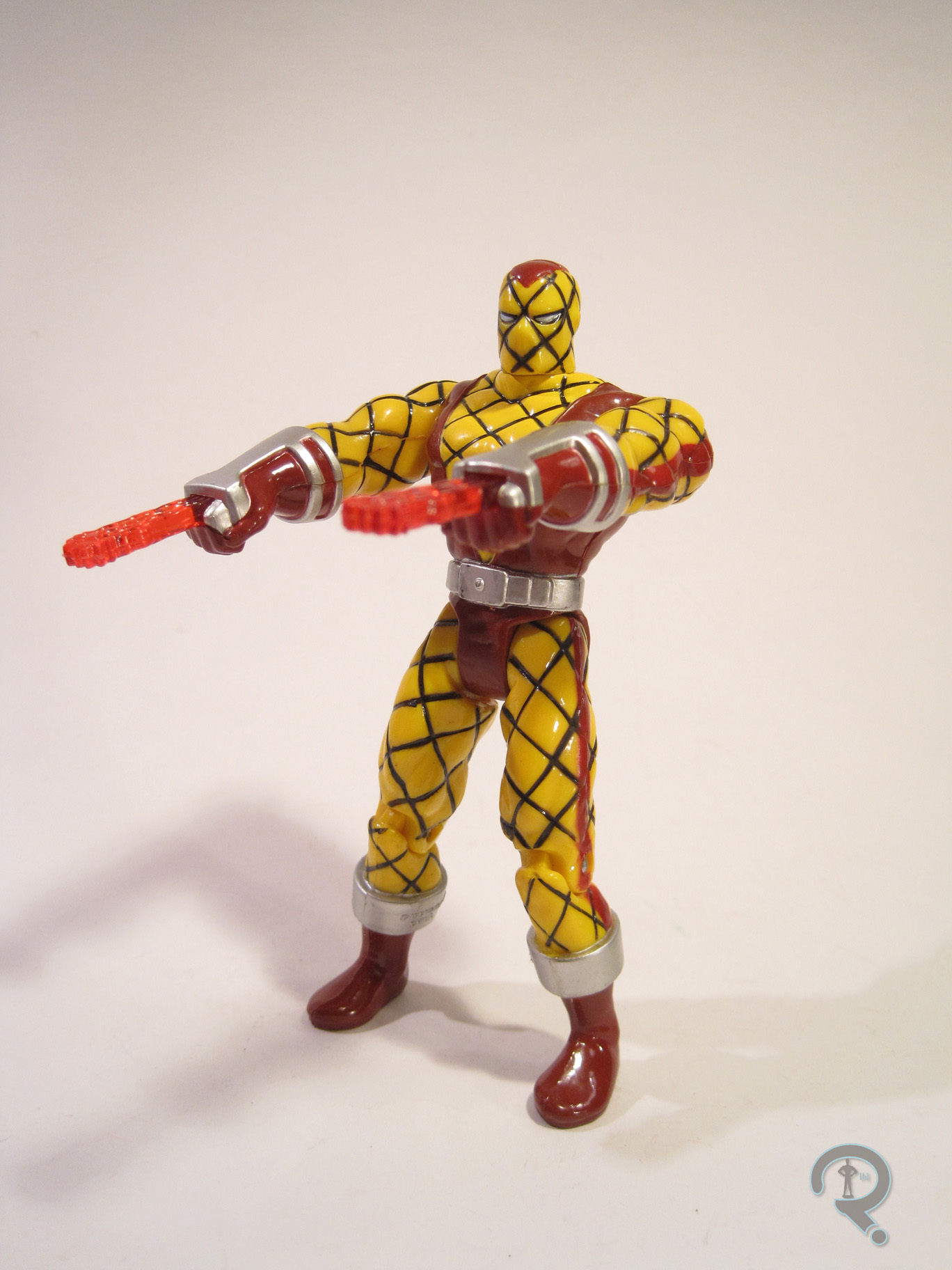
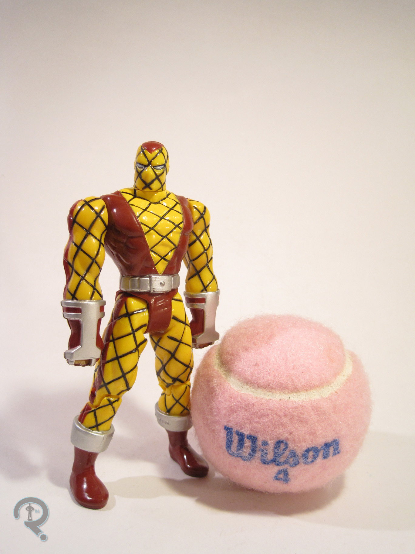
Shocker2Shocker was released in the third series of ToyBiz’s 90s Spider-Man line. The line was designed as a tie-in to the cartoon of the same time, and as such, the characters drew from their animated designs. Fortunately, Shocker was pretty much unchanged from the comics, so this is just a fairly basic classic Shocker figure. The figure stands just over 5 inches tall and features 7 points of articulation. That’s less articulation than was usual at the time, due to the figure’s action feature preventing him from having elbow joints. And what was this feature? It was dubbed “Shooting Power Blasts” on the box; in reality, he comes with two red missiles, which pop into the spring-loaded arms and can be “launched” by…well, just letting them go. The springs have no locking feature, so the missiles just launch as soon as you let go. Also, the feature doesn’t really make much sense for Shocker. His powers are based on vibration, so he doesn’t actually blast anything. I don’t know. Shocker featured a sculpt that was unique to him. It’s in line with the rest of the figures in the series; the details are rather simple, and the proportions are slightly boxy. He’s a little pigeon-toed, but not excessively, and due to the action feature, his arms are really straight and stiff. That can’t be a comfortable position. Still, the sculpt isn’t bad, and it does a pretty good job of translating Shocker’s design into three dimensions. Shocker’s paintwork is also pretty simplistic, with basic color work. Most of its pretty clean, but the silver areas seem especially prone to bleed over. The figure included the two missiles to go with the action feature and nothing else, though I can’t say I know of anything Shocker would really need to include.

THE ME HALF OF THE EQUATION

Like the vast majority of the 90s Marvel stuff I’ve been reviewing as of late, Shocker was purchased from a vendor at this year’s Balticon. I missed out on a lot of the Spider-Man stuff growing up, mostly due to me not liking Spider-Man: The Animated Series as much as the other cartoons of the time. That said, I still appreciate the series, and I love Spidey’s rogues gallery, so I’m glad to be filling some holes in my collection. Shocker’s not a perfect figure, but he’s fun enough to make the purchase worthwhile.

#0619: Superman – Red

SUPERMAN – RED

JLA: CLASSIFIED

SupermanRed1

Hey, do you remember back about two weeks, when I took a look at Superman Blue? That weird changeup to Superman to help keep him “hip?” Yeah, well, umm, long story short, he got split into two separate beings, and the second one was today’s focus, Superman Red. See, cuz it’s clever, cuz Superman is usually just one guy, who wears red AND blue, but now he’s two guys who each only wear one color. Isn’t that smart? But, of course, they also had slightly different personalities. Can you guess what was Superman Red’s defining trait? If you guessed the incredibly obvious answer of hot-headedness, you win a special no-prize! Good for you! Now, onto the figure!

THE FIGURE ITSELF

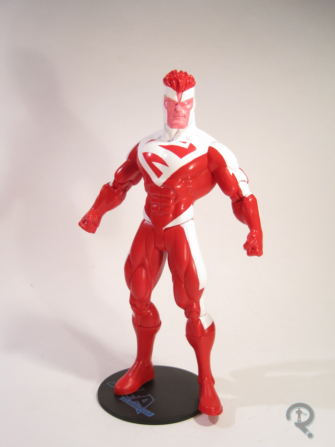
SupermanRed2Superman Red was released in the third series of DC Direct’s JLA: Classified line. He directly followed Blue in Series 2. While 2 had a more defined “looks of the 90s” theme to it, Series 3 was a little bit more free-form. The figure is about 6 ½ inches tall and has 13 points of articulation. Like just about every other McGuinness-styled figure, the articulation is mostly pointless, and he’s really only good for a basic standing pose. Superman Red is, completely unsurprisingly, a head to toe repaint of Series 2’s Superman Blue. Seeing as they’re essentially just palate swaps of each other in the comics, you can’t exactly blame DC Direct for just using the same mold. I guess they could have given this one a more emotive face (like Mattel did when they released these two) but it’s hardly a requirement. The head still feels too big for the body, and the arms are still too stubby, but it’s not a terrible sculpt. The paint is the real difference here, though even then it’s pretty much the same, but with red swapped in for blue. The paint does feel a little sharper this time around, and the white details are more properly aligned. Like his blue counterpart, Superman Red’s single accessory is a black display stand with the JLA: Classified logo in blue. Would have been cool to get it in red, just for the heck of it, but I guess they wanted it to be the same as the rest of the line.

THE ME HALF OF THE EQUATION

Like Superman Blue, Superman Red was from the assortment of figures I picked up during an action figure sale at Cosmic Comix. He was $3. That was most of my reasoning for getting him. Well, that and I was getting Superman Blue. Having both seemed like a good idea. I think Blue is my favorite of the pair, but I like both, and I certainly don’t regret buying them.

SupermanRed3