#0617: Mondo

MONDO

GENERATION X (TOYBIZ)

Mondo1

The 90s were a very strange time. I can’t say it enough. Amongst other things, Marvel’s merry mutants, the X-Men were really, really popular. That meant spin-offs out the wazoo. One such spin-off was Generation X. They weren’t “X-Treme” like X-Force, but they still had a very definite 90s flare to them. They were popular for a while, but the team eventually fell into some pretty serious obscurity. However, they managed to get more than one series of an action figure line, leading to a lot of figures that nowadays make people go “Who?” One such figure is team member Mondo. Yeah, I don’t really know him all that well either.

THE FIGURE ITSELF

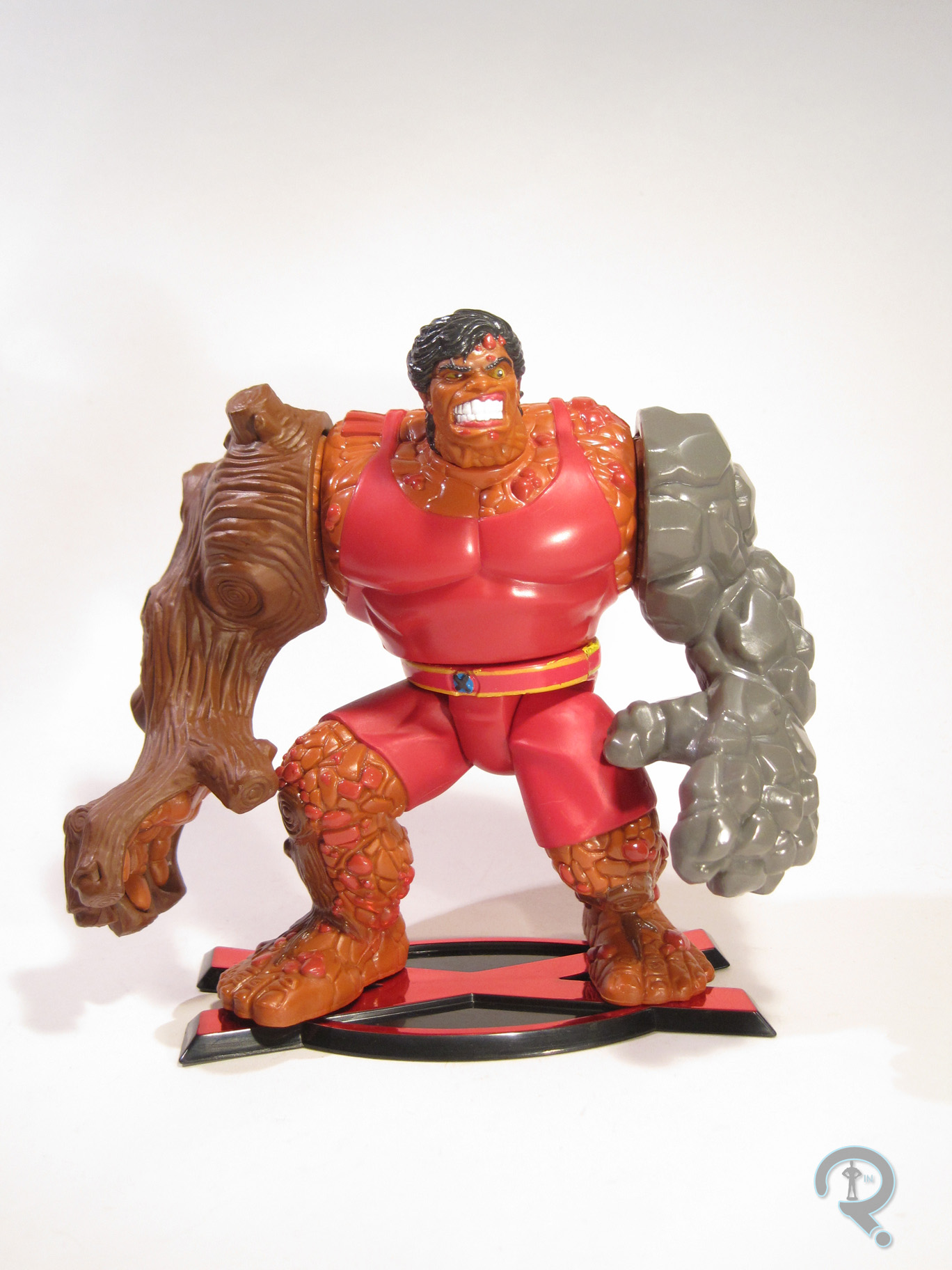
Mondo2Mondo was released in the second series of ToyBiz’s Generation X line. Mondo was the only actual team member in the series, making him the last released in the line (though a ToyFare exclusive version of Synch would be released not too long after. Who’s Synch? Exactly.) The figure stands about 5 inches tall and features a whole 6 points of articulation. Usually, ToyBiz’s Marvel stuff was pretty well articulated, but for whatever reason, the Generation X figures were less so. Mondo’s sculpt was also pretty pre-posed. His arms are somewhat spread at his sides and his legs are in a deep walking stance. Unlike a lot of pre-posed figures, Mondo is actually quite stable and well-balanced, so the lack of movement isn’t really too detrimental. The sculpt is actually pretty well handled; there’s plenty of texturing and detailing, and his proportions are in line with what he looked like in the comics. He’s definitely an angry spud, which seems a little out of character, at least going by the bio on the back of the package. The paintwork on Mondo isn’t super complex, but there are a few more minor details that are handled rather nicely. Plus, there’s not really any slop or bleed over, which is always cool. Mondo included a set of clip on armor pieces for his arms, which help to simulate his “omnimorph” abilities. The right side is meant to be wooden and the left is made of stone. Both clip on well enough, and are decently detailed (though the right is definitely a step above the stone). He also has the standard “X” stand, which was included with every figure in the line. He doesn’t need it, but hey, consistency isn’t bad!

THE ME HALF OF THE EQUATION

Mondo is another piece of the lot of figures I picked up from my local comicbook store during a recent sale. I only had a passing familiarity with Generation X growing up, so I never really got many of the figures. I saw Mondo sitting there and, for whatever reason, he called to me. He’s actually a pretty neat figure, truth be told. Sure, he’s not the most standout character of all time, but it’s clear a lot of effort went into this guy, and that always makes a figure better.
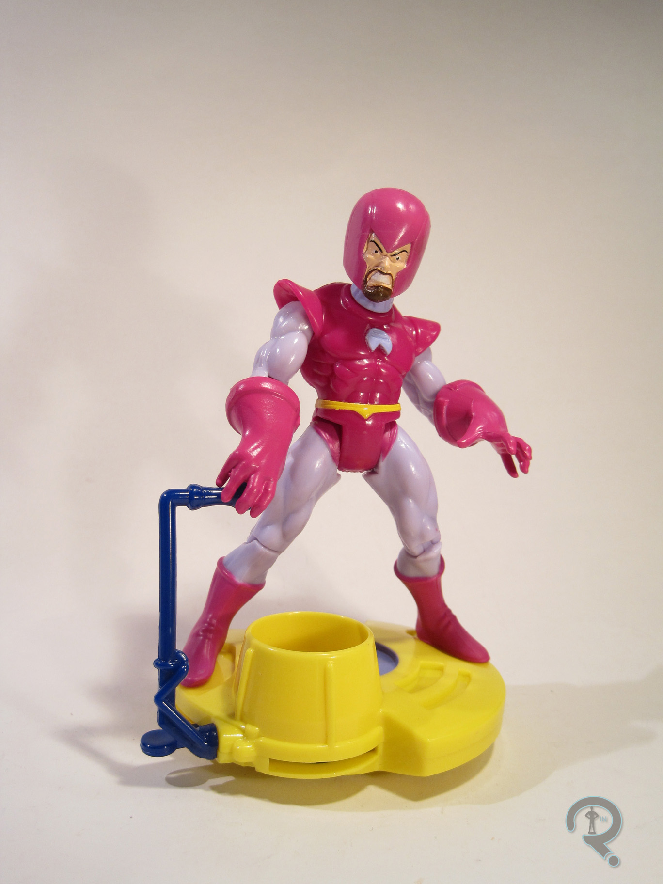
Mondo3

#0615: Wizard

WIZARD

FANTASTIC FOUR (TOYBIZ)

Wizard1

The 90s was a great time to be an action figure fan, especially if you liked Marvel comics. Thanks to animated versions of several of their properties airing on TV, there was a lot of tie-in product to be found. Entire lines of figures would be devoted to one particular hero and his rogues and allies, providing a rather large depth of characters, many of whom had not and would not get another figure. One such character is today’s focus, the Wizard, a slightly lesser-known Fantastic Four foe.

THE FIGURE ITSELF

Wizard2The Wizard was part of the fourth series of ToyBiz’s first Fantastic Four line. The character made an appearance in an early episode of the show’s second season, which had just kicked off when this series of figures was hitting stores. The figure stands about 5 inches tall and features 9 points of articulation. The figure features an entirely unique sculpt, which is…odd to say the least. Let’s start with the posture: he seems to be somewhat hunching, with widely splayed legs, and strangely outstretched arms. His head is atop a crooked, flexing neck, and his torso is oddly shifted to the left. Then there’s the proportions: his head and hands are huge, and his torso is far too short. The Wizard has always had a helmet that made his head look a little bigger than it was, but here it’s his whole head that’s huge, which ends up making the helmet look too small by comparison. Then there’s the arms, which start off somewhat normally sized, and then quickly shift into some sort of jacked-up, oversized monstrosity. I actually kind of like the positioning of the hands, but they look like they belong to another figure. And, of course, you can’t look at this figure and not mention the muscle definition. Seriously, most of those are just made up. The figure’s paint is passable, but not really anything outstanding. It accurately represents his garishly clashing color scheme of the comics, so that’s good, I guess. However, the figure has more than a few instances of bleed over, and his belt in particular is only a slight approximation of where it should be. If you read my Medusa review, you’ll remember that Series 4’s gimmick was that each figure had a base with some sort of action feature. Medusa got her hair, which wasn’t bad, but Wizard’s been given some strange disk…thing. I really don’t know what it is. It’s big, yellow, circular, and so goofy. There’s this lever on the right, which he can loosely hold. It doesn’t do anything, though. If you want to activate the action feature, you have to use a second lever, located behind the first, which shoots some blue disk things. That’s fun I guess.

THE ME HALF OF THE EQUATION

Wizard was one of the many figures I picked up from my local comicbook store a month or so back when they were running a big sale on action figures. They had several, and I’d passed him up several times over the years, so I figured I might as well break down and buy one. I don’t say this often, but he’s really not a very good figure. So much about him is just so off, and there’s no real rationale as to why. And, to make things worse, this is literally the only figure the character’s ever had, which makes it a serious bummer.

#0614: Domino

DOMINO

X-FORCE (TOYBIZ)

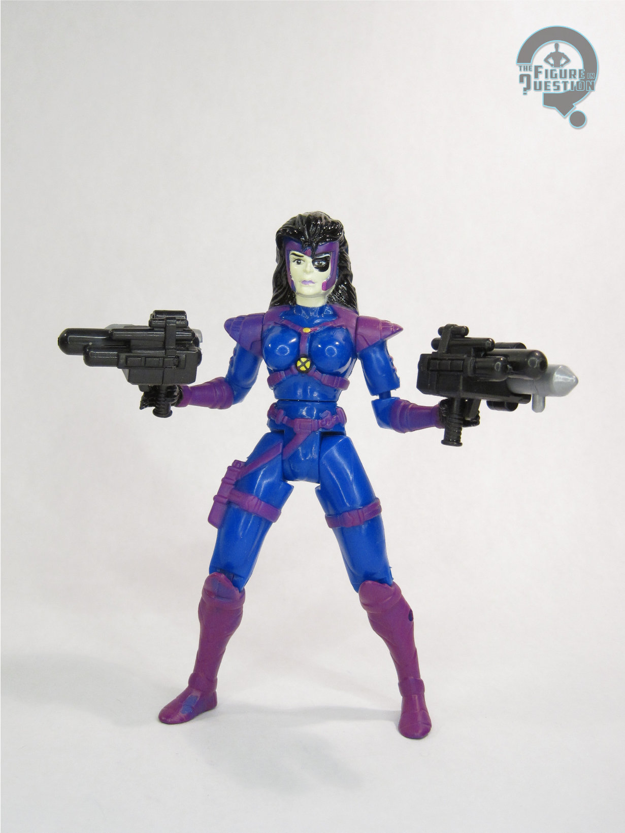
Grrrrr! 90s! Everything had to be soooooo X-Treme! And no one was more X-Treme than the X-Men! Well, okay, actually, that’s not true. There was one team than was more X-Treme, by design. They were the X-Force and they were super hardcore 90s. So hard. One of their more prominent members was Domino, who had luck based powers. You know, like a domino!

THE FIGURE ITSELF

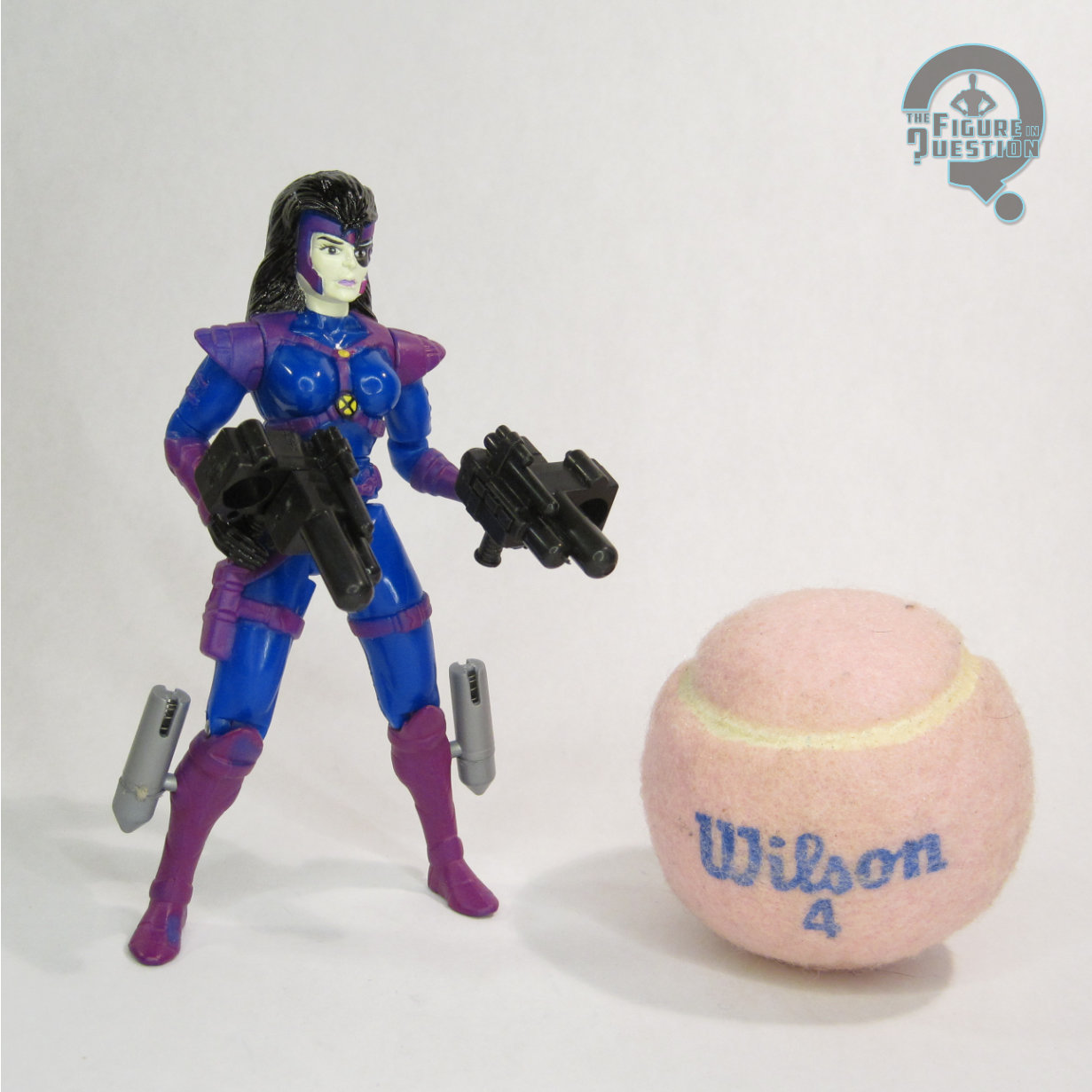
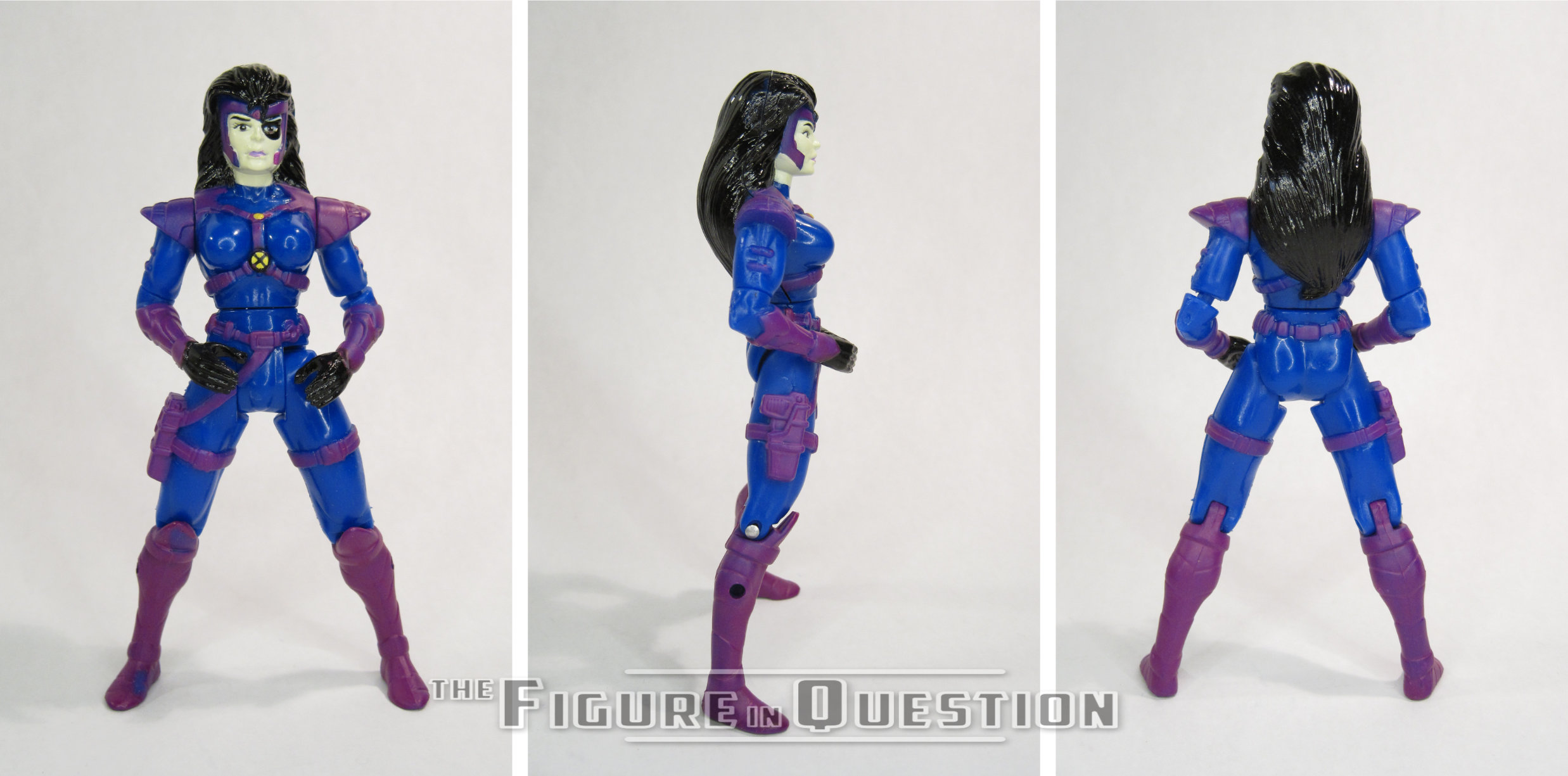
Domino was released in Series 6 of ToyBiz’s X-Force line. It’s surprising to see one of the team’s higher tier members not being released until one of the last few series of the line, but, hey, it was the 90s, and we were in the worst dregs of boys thinking girl toys were icky, so…..yeah. The figure stands 5 inches tall and has 9 points of articulation. While she was fortunate enough not to be saddled with the dreaded v-style hip joints that plagued many female figures of the time, she’s completely lacking in neck articulation, and for some strange reason her elbow joints are just simple cut joints. This ends up severely limiting what can be done with the figure, which is quite a bummer. Domino featured an all-new sculpt (though it would see a couple of re-paints later on down the line). It’s…passable. They’ve done a fairly decent job of capturing the design from the comics, which, it should be noted, is her second, non-Liefeld-designed costume. It’s got all the requisite buckles, pouches, shoulder pads, and even a weird head thing! The proportions aren’t the worst thing ever and she has one of the better female faces of the time. That said, she’s rather boxy, especially in her lower half, and I’m really not sure what’s going on with the straps on her torso. They certainly can’t be comfortable configured that way. Also, she seems to have lost a row of abdominal muscles, which ends up making the legs look way too long. The paintwork on the figure is alright.  Nothing amazing, but the colors are pretty good matches for the look in the comics, and there isn’t any substantial slop or bleed over. Domino originally included a set of gun attachments, which hooked into her legs. Yeah. Not really sure why they did that, since she just held the guns in her hands in the comics, but hey, whatever. Mine didn’t have them anyway. [EDIT 11/14/25 — But she does now and I talk about how I was totally wrong about they attached in the Addendum!]

THE ME HALF OF THE EQUATION

Domino was another figure that I fished out of a box of loose figures at one of the dealer’s tables at this past Balticon. I was never really into X-Force growing up, and Domino never played a prominent role in the X-Men cartoon, so I didn’t really have a reason to get this figure while it was still new. But, it was a dollar. It’s not ToyBiz’s best work, but it isn’t atrocious.

#0608: MODOK

MODOK

IRON MAN (TOYBIZ)

MODOK1

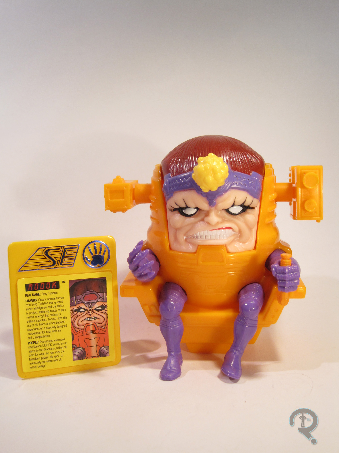
MODOK! The Mental Organism Designed Only for Killing! That is, unless he’s on a children’s cartoon on Saturday mornings, in which case, he’s the Mental Organism Designed Only for Konquest. You remember how Konquest is spelled with a “K,” right? Hey, it could have been worse; originally he was going to be Mental Organism Designed Only for Kittens. That just doesn’t seem as threatening, does it?

THE FIGURE ITSELF

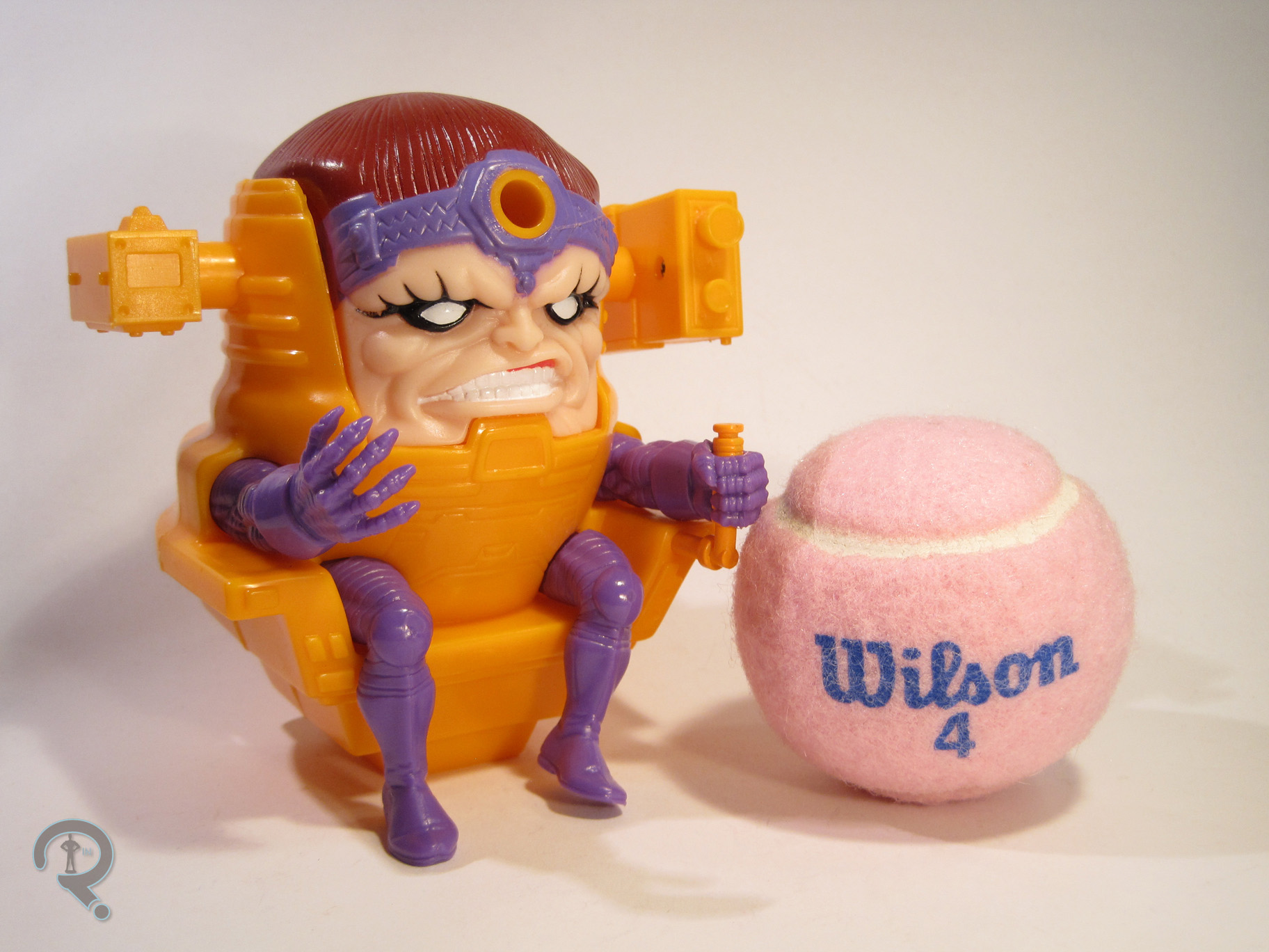
MODOK2MODOK was released in the second series of ToyBiz’s 90s Iron Man line. The line was released to tie-in with the cartoon of the time, so MODOK is based on his appearance there. Though, to be fair, his look on the show was largely unchanged from his comic appearance, so the figure can easily pull double duty. The figure is about 5 inches tall and he has 6(?) points of articulation. The articulation is a little hard to get an accurate count on; the attachments on the head definitely move, but it’s hard to tell if the arms and legs are actually supposed to move. If they are, they’re quite limited. MODOK has a sculpt that was totally unique to him, and it’s actually pretty great. It captures the character’s design rather nicely, and it has a surprising level of detail for a figure of the time. The face has some nice, deep set wrinkles, making him appropriately grotesque and all of his armored parts have some nice etched in details. While the sculpt may be impressive, the figure’s been saddled with one of the more lackluster paintjobs of the time. It isn’t actually bad, but it’s incredibly basic, with most of the colors just being molded plastic. Plus, the colors are all flat, which doesn’t really showcase the sculpt all that well. A little bit of a metallic finish would go a long way. MODOK included an ID Card with his picture, powers, and a quick little bio (these were included with all the figures in the first two series of the line), as well as a blast piece that works with the figure’s “action feature.” When you press the button on the back of the figure, or squeeze the head, the blast piece gets launched, at least in theory. In reality, the button doesn’t actually work; you can still go with the head squeezing method, though the launch distance is a little…underwhelming.

THE ME HALF OF THE EQUATION

MODOK is another one of those figures that I missed out on growing up. I feel like he may have been one of the more difficult figures to find. He ended up being one of the figures I came across in the dealer’s room at this past Balticon. He actually ended up being the most expensive of the figures that I picked up, though he still wasn’t all that pricey. As an adult, I can appreciate this figure, especially for the strength of the sculpt. As a kid, I think I might have found this figure a little bit less exciting. No real articulation and a lackluster action feature don’t do the figure any favors. That said, he’s a decent looking figure and works perfectly fine as a display piece. I guess it really just depends what you look for in a figure.

#0607: Superman – Blue

SUPERMAN – BLUE

JLA: CLASSIFIED

SupermanBlue1

The 90s were weird. Like, for everyone. Marvel had their whole shoulder pads and pouches thing going on, which is one of those things we’d all like to forget now. DC was getting in on the weirdness too, and few characters got hit as much as Superman. First he died and got replaced with four “x-treme” takes on the mythos. Then he came back, but he was different and he had a mullet. Then he lost the mullet, but the sun also got blotted out, preventing him access to his solar-based powers. The only logical solution was to convert his powers to electricity. That’s just obvious. Anyway, the result was Superman Blue, a radical departure from the Superman we all knew and loved. He didn’t really stick around for long, but he had a rather distinctive design, which did build up a rather decent fan following, resulting in a few action figures over the years. Let’s take a look at the most recent version!

THE FIGURE ITSELF

SupermanBlue2Superman Blue was released as part of the second series of DC Direct’s JLA: Classified line. All of the figures in the series were based on looks from the 90s, so Superman fit in pretty well. The figure stands roughly 6 ½ inches tall and features 13 points of articulation. Due to the nature of the sculpt and how the articulation was implemented, most of the articulation is ultimately pointless, and the figure’s only real pose is a basic standing one. The JLA: Classified line worked as a companion line to the four assortments of Ed McGuinness-styled Superman/Batman figures produced not long before. So, Superman Blue is presented here in Ed McGuinness’s style, though I’m not sure that McGuinness ever actually drew Superman Blue. Admittedly, it’s a style that works pretty well for the design, so I can’t really complain. Most of the McG-styled figures made use of a lot of the same pieces, and Superman Blue is no exception. He gets a brand new head, but from the neck down he’s a straight re-use of the basic McG body first used for Captain Atom. It’s not a terrible body, but it’s not without its flaws either. It’s definitely well-defined, and in keeping with a lot of McG’s illustrations, but the arms are definitely way too stubby. The head is a pretty decent sculpt; it matches up pretty well with the regular McG Superman, but it’s got a slightly more smug expression, which at the very least adds some variety. The character’s spiky electric hair is quite nicely conveyed, and the head-band-thingy is appropriately sharp and clean. The only real issue is that the head is just a tad too big for the body. The paintwork is alright; the blue and white are appropriately bold, and the figure definitely stands out. However, the application of the white areas is a little uneven, and the elements on the arms and legs which should mirror each other end up not doing so. The figure’s one accessory is a small black display stand with the JLA: Classified logo printed in blue.

THE ME HALF OF THE EQUATION

Superman Blue was another piece of the large selection of figures I bought on sale from my local comicbook store. He’s not my favorite design of all time, but at $3, I figured he was worth it. The figure is overall pretty decent, and while it’s not perfect, it does add a certain degree of “pop” to the shelf.

#0605: The Brood

THE BROOD

X-MEN (TOYBIZ)

Brood1

For the X-Men, simple terrestrial foes just weren’t enough. No, they had to kick off the extraterrestrial bit, starting fairly early in the series, before the original team had even left, when they faced off against the dastardly Lucifer! The aliens continued to show up with a fair bit of regularity, and in the mid-80s, we were introduced to the Brood. They were a bug-like race of creatures that gestated inside other beings and when they hatched, they would take on certain characteristics of the hosts. Sound familiar? Yeah, they weren’t too far removed from the Xenomorphs seen in Alien and Aliens. Not that it was a bad thing! The Brood have made their way into a few X-themed toylines over the years, with their first plastic appearance being in ToyBiz’s massive X-Men line from the 90s.

THE FIGURE ITSELF

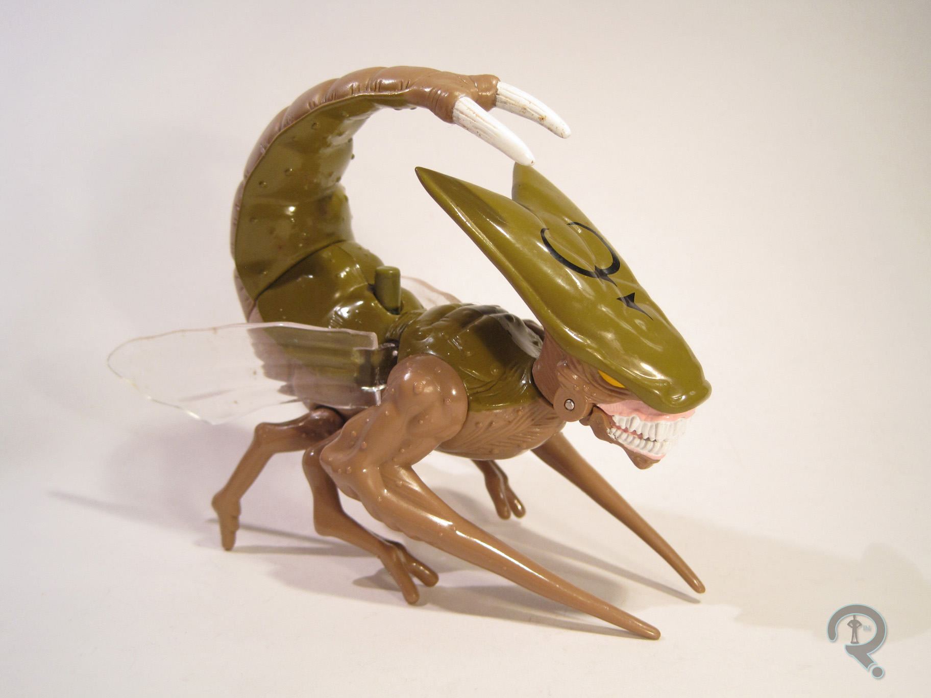
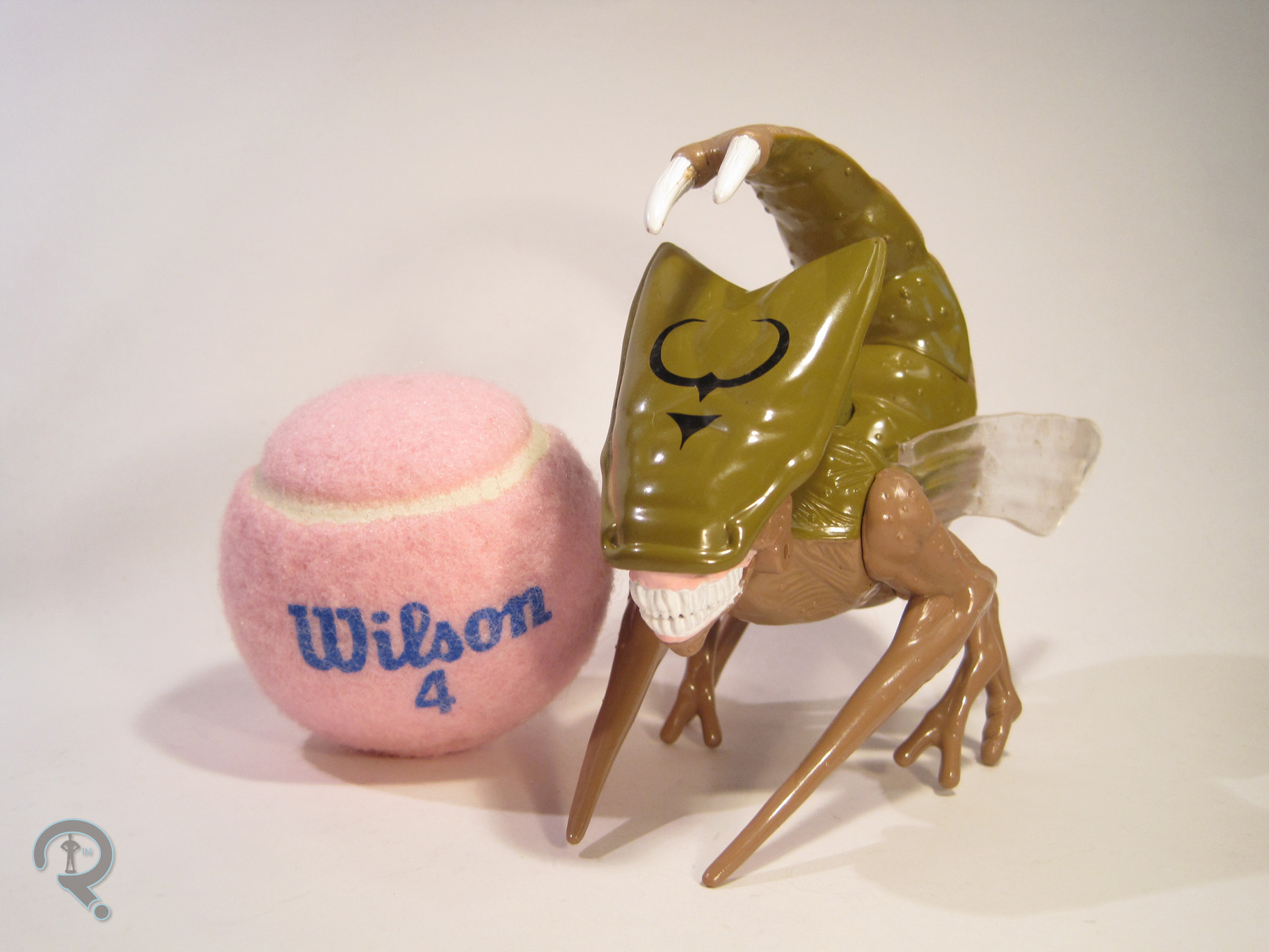
Brood2The Brood was released in the fifth series of the X-Men line. The figure is about 3 ½ inches tall and 4 inches in length. It features 8 points of articulation, as well as an action feature that flaps the wings and opens the jaw when you press the button on the figure’s back. The Brood are all fairly similar in design, and this figure was meant to be just a generic Brood. That said, if I recall correctly, the presence of wings denotes this as a Brood Queen. But, I could be wrong on that (EDIT: nevermind. I double checked and it looks like some of the drones were winged too). Given the non-human nature of the character, it’s not much of a surprise that the Brood had an all-new sculpt. Overall, it’s a pretty decent translation of the comic design, or at least their appearances in the 80s. It’s not quite as “buggy” as later figures would be, and it’s somewhat on the simpler side when it comes to texture, but it’s not bad, and it certainly fits in with the rest of the line. The muscles at the top of the front arms seem weirdly over-defined, but hey, it was the 90s. Everything had muscles then! I’m surprised the figure didn’t have shoulder pads and pouches. The Brood’s paint is pretty decently handled. The colors are on the drab side, but that’s accurate to the comics, and everything is pretty cleanly defined, if a little on the basic side. The Brood included no accessories, but what the heck would it even come with?

THE ME HALF OF THE EQUATION

The Brood is another Balticon acquisition. It came from the same dealer as Shatterstar and Magneto, though, this one was actually dug out of bin of $5 loose figures. So, a little more expensive, but honestly it feels worth it. The figure is a pretty solid piece and it holds up rather well even twenty years later.

#0604: Medusa

MEDUSA

FANTASTIC FOUR (TOYBIZ)

Medusa1

The Inhumans. They seem to be Marvel’s new pet project. They served as major players in Agents of SHIELD’s second season, they’ve had a couple of recent events that centered on them, and they’re slated to get their own movie. Rumor has it that Marvel’s hoping to elevate them to a near X-Men-like status. Best of luck to them on that. The Inhumans have been rather obscure for a while, but they’ve shown up a few times in toy form over the years. Let’s have a look at the very first figure of the hair-controlling Medusa, member of the royal family.

THE FIGURE ITSELF

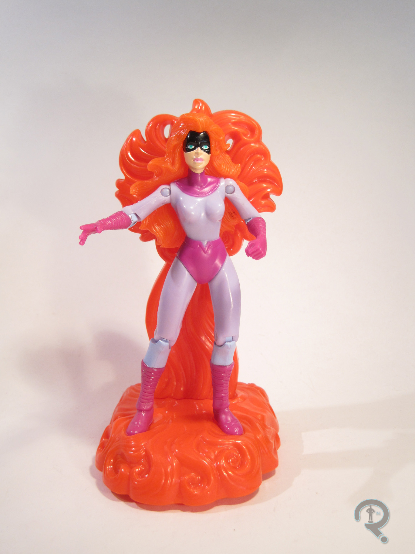
Medusa2Medusa was released as part of the fourth series of ToyBiz’s 90s Fantastic Four line. This series was based on the cartoon of the same name, and it was the first (and only) series to be based specifically on the show’s second season. Medusa was a recurring character throughout the season, so her inclusion here is quite sensible. The figure is roughly 5 inches tall and features 10 points of articulation. The articulation is…odd. She has some very nice shoulder movement, but she’s got the v-style hip joints that plagued most of the female figures of the 90s, and she has no neck movement at all. Posing her isn’t the easiest thing. Medusa had a sculpt that was new to her (though it would end up being re-used a few times), and, truth be told, it’s not great. The proportions are all pretty off; the hands and feet are rather large, and the torso feels way too small, especially by comparison. Also, for a character whose whole shtick is hair, hers seems rather lacking in volume. Then there are her legs, which are a) at a weird angle, and b) two different lengths, resulting in a figure that’s rather difficult to stand. At the very least, the figure’s face isn’t terrible, which is a good thing for the time. Paint on the figure, sadly, doesn’t do much to salvage the sculpt. It’s not terrible, but there’s more than one instance of bleed over, the face is kind of sloppy, and the purple paint on the lower arms and legs doesn’t match the molded color of the rest of the body. This particular series’ main gimmick was that each figure included a stand with an action feature of some sort. Medusa included a stand sculpted to resemble her hair. It has a set of wheels on the bottom, and when it’s pushed forward, the “pinwheel” at the top spins. Yay?

THE ME HALF OF THE EQUATION

Medusa was another Balticon purchase. She was actually packaged when I got her, but still pretty low priced. She’s a figure I’ve seen lots of times before, but never actually gotten around to buying. She’s not exactly the most thrilling figure, which is kind of a shame, since was her only figure for over ten years. Oh well.

#0603: Lex Luthor

LEX LUTHOR

SUPERMAN: THE ANIMATED SERIES (KENNER)

LuthorSTAS1

Batman: The Animated Series is pretty much universally viewed as one of the best interpretations of Batman and his supporting cast ever. It was revolutionary at the time it was released, and, thanks to top notch writing, animating, and acting, it still holds up pretty great after over 20 years. For me, though, the best entry in the DC Animated Universe is the series that followed B:TAS, Superman: The Animated Series. While B:TAS got a pretty decent run of figures at the time of its release, S:TAS wasn’t quite so fortunate. Kenner produced a line of toys to tie-in, but the character selection was somewhat limited, and many of the characters were rather off-model. One of the characters hit the hardest by off-model-ness was Big Blue’s arch enemy Lex Luthor, who is the focus of today’s entry.

THE FIGURE ITSELF

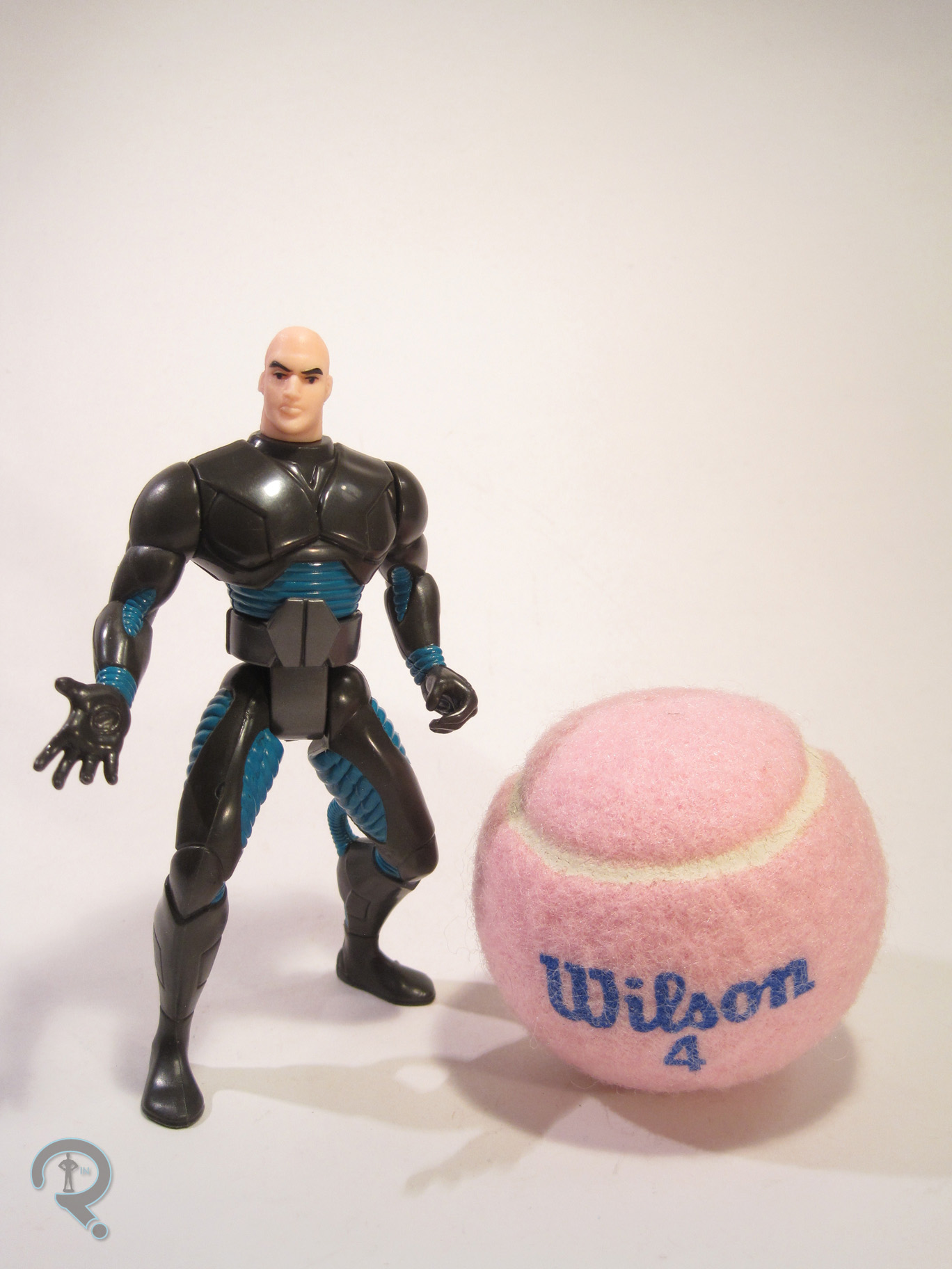
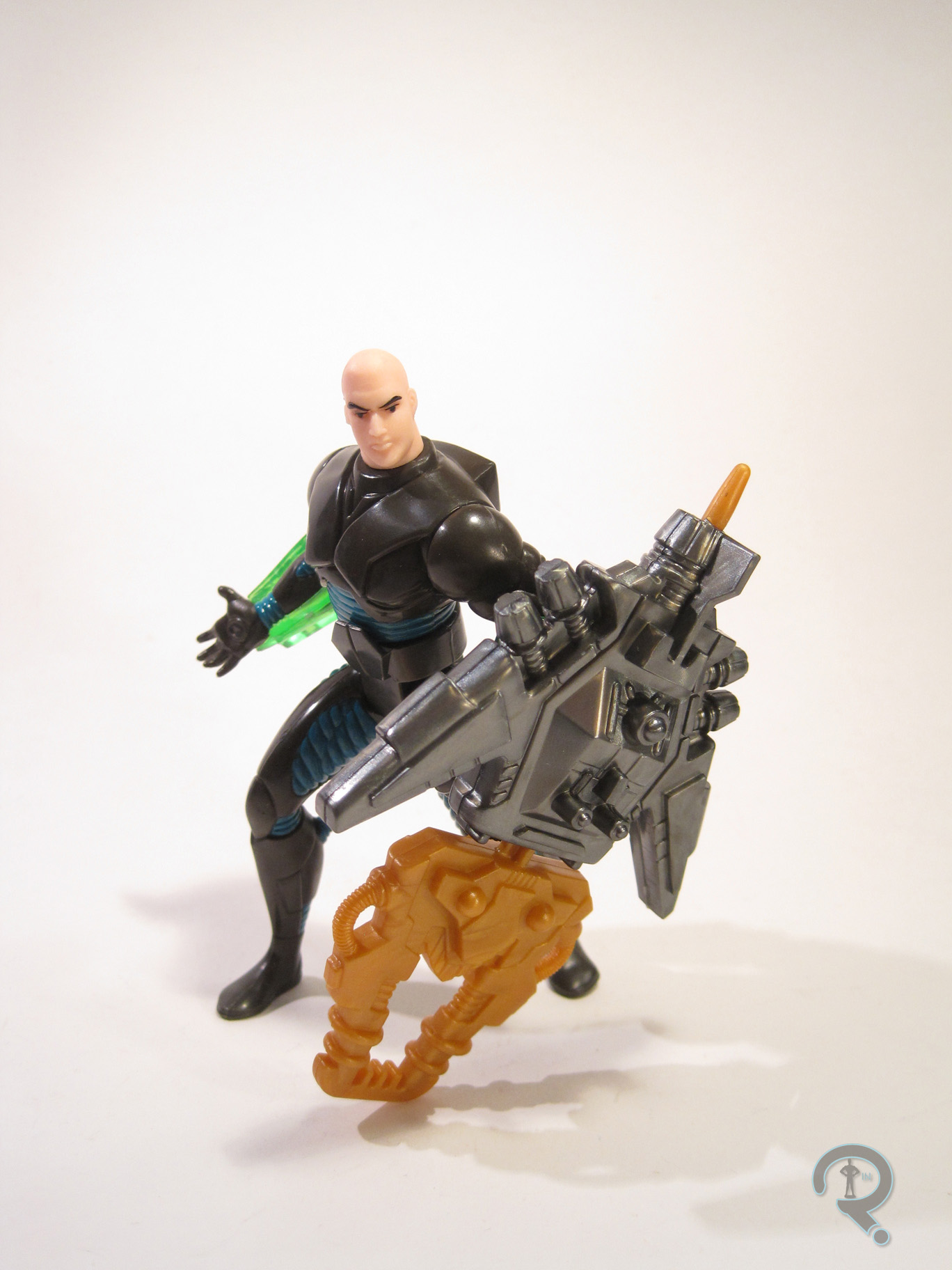
LuthorSTAS2Lex Luthor was released as part of the first series of Kenner’s Superman: The Animated Series tie-in line. He was one of the two non-Superman characters in this particular series. The figure is a little over 5 inches tall and has 6 points of articulation. Dig that waist articulation guys! It’s more than most DC figures had at this point! Now, this figure is sort of based on Luthor’s animated appearance, but, as I noted in the intro, the figure is more than a little bit off-model. To Kenner’s credit, they managed to produce a near-perfect rendition of the animated Luthor’s noggin. It’s really a very good piece. The trouble lies with literally every other piece of the figure. Rather than release him in his signature suit, Luthor is depicted here in a Kryptonite armor suit, which is completely made up for this figure. The “Kryptonite” parts are all snap-on armor pieces, which can be removed to reveal….some sort of exoskeleton thing. It’s a perfectly fine sculpt on a purely technical level, but it looks pretty wonky and the body doesn’t even have proper Bruce Timm-style proportions. I get that a guy in a suit doesn’t make for the most exciting figure. That said, if they were going to do the clip on armor thing, why not put a more conventional suit under the armor? Just seems like a weird choice. Also, the figure seems to have borrowed Total Justice’s guide to posing; his arms and legs are all bent and turned. It’s most annoying on the legs because it makes getting him to stand next to impossible. As far as paint goes, Luthor is pretty reasonably handled. Nothing super thrilling, but everything is applied pretty cleanly. It’s a nice touch that he veers away from the primary colors, helping set him apart from Superman. In addition to the clip on armor, Luthor includes a big freaking missile launcher thing. Hasbro would be so proud.

THE ME HALF OF THE EQUATION

I never had this figure growing up. I saw him many times over the years, but I just never got one. It’s most certainly due to the weird design of the figure. Why now? Simple, my comicbook store had a table of action figures for $2.99. If you bought five, they were only $2 apiece. So, I bought ten. Luthor was one of them. This actually isn’t a bad figure, just kind of weird.LuthorSTAS3

#0601: Magneto II

MAGNETO II

X-MEN (TOYBIZ)

The 90s, as wacky as they may have been, are still a rather important decade to me. Obviously, being born in that decade does it some favors, but many of my formative action figure collecting years occurred during that decade as well. Growing up, my favorite toy company was very definitely ToyBiz, who were just killing it with their huge selection of Marvel toys. The line that pulled me in was X-Men, which also happened to be their biggest line. And what kind of an X-Men line would it be without a few versions of their very first foe, Magneto?

THE FIGURE ITSELF

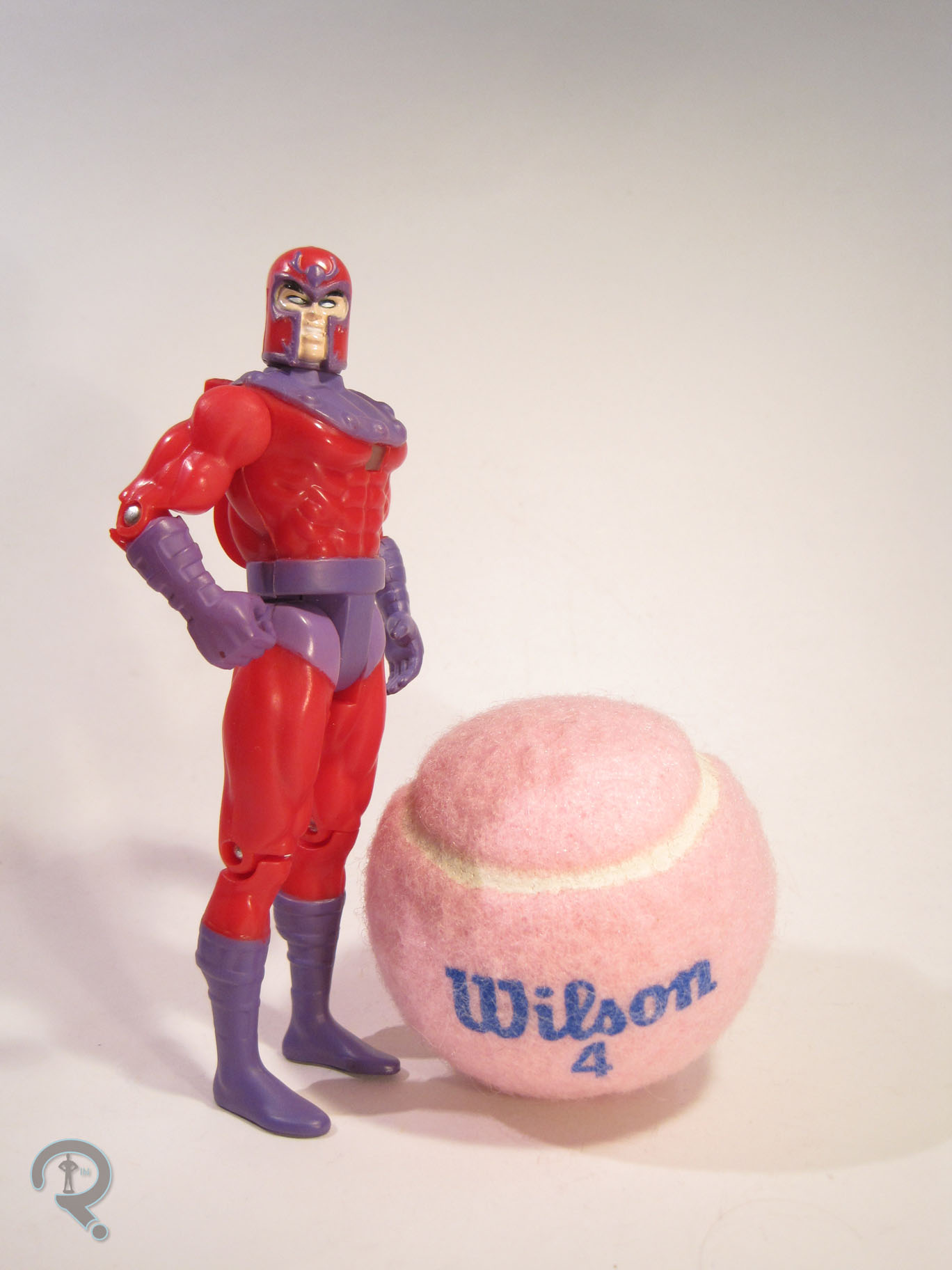
MagnetoII2Magneto (or Magneto II, as he’s officially known) was part of the third series of ToyBiz’s X-Men line. He was the second version of the character to show up in the line, which, you have to admit, is pretty impressive for someone who wasn’t Wolverine. The figure stands roughly 5 inches tall and features 9 points of articulation. The 90s X-Men definitely had a style to it when it came to the figures’ sculpts. Some of them have aged pretty well, some haven’t. Magneto is one of the latter. He’s not too bad, but he definitely has some odd spots. The arms are rather stubby, and the torso is quite short as well. He also has a strange assortment of muscles on his torso. I think they’re meant to represent muscles that exist on actual people, but they seem to have missed the mark. At the very least, they’ve managed to translate his costume pretty well to three dimensions. The figure has a weird action feature, even for the 90s. He has a (rather obtrusive, I might add) lever on his back, which, when pulled, is supposed to activate a sparking effect in the transparent square on the front of the chest. It’s worn out on my figure, which is actually a rather common occurrence. Magneto originally included a cape, to aid in masking the action feature, but, as you can see, my figure no longer has his. The paintwork on Magneto is fairly straightforward. He’s got some pretty basic color work, which is all pretty clean.  There is some bleed over on some of the edges, but nothing too major. He’s lacking in pupils; I’m not sure if that’s purposefully that way, but it seems a little weird. Magneto originally included a blaster, because…I really don’t know. Mine doesn’t have that either, so I guess it doesn’t matter.

EDIT 12/25/20 – I have located both the cape and the gun for my figure, so now he’s complete.  Yay!

THE ME HALF OF THE EQUATION

For as many of these figures as I owned growing up, this Magneto wasn’t one of them. I ended up finding this guy in a bin of loose figures at this past Balticon. Not quite as great a find as Shatterstar, but, for a dollar, I really can’t complain. I still prefer the first version of the character, but this one’s not bad.

#0598: Shatterstar II

SHATTERSTAR II

X-FORCE (TOYBIZ)

Ah, the 90s. What wondrous creations you gave us. The X-Men were super hyped up, so, obviously, it being the 90s, they needed an edgier, x-ier spin-off team. Enter X-Force, a slightly re-worked version of the New Mutants, with several new, more x-treme members. It had art done by Rob Liefeld, who seemed to set out to make it the most 90s thing imaginable. One of his additions was the character Shatterstar, who was either an alien or a mutant who had the amazing ability to…ummm….have swords? Yeah, I don’t know.

THE FIGURE ITSELF

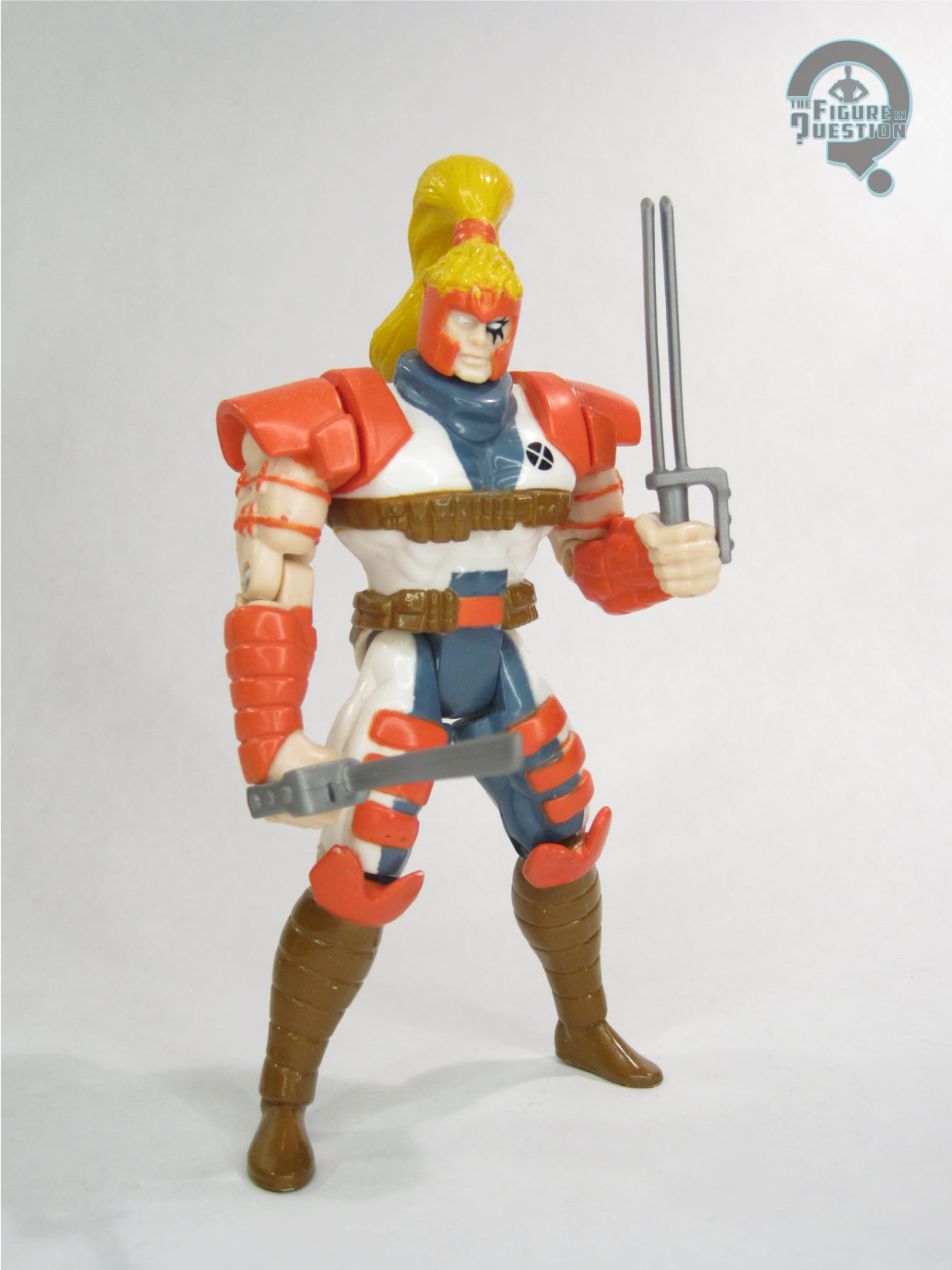
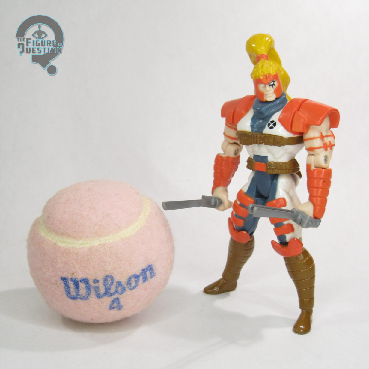
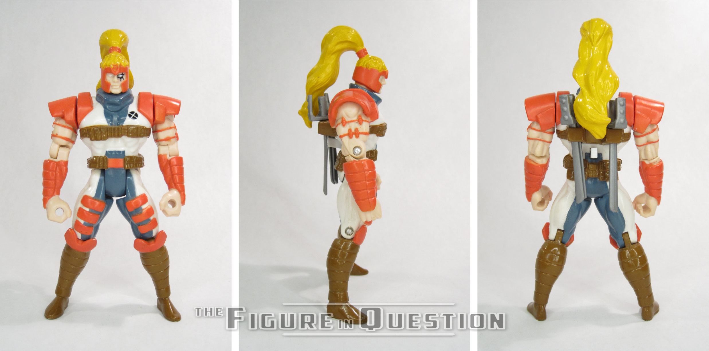
Shatterstar here was released as part of Series 3 of ToyBiz’s X-Force, which, like the comic, was a spin-off of the X-Men line. As the name denotes, this is the second figure of Shatterstar that the line offered. Shatterstar stands roughly 5 inches tall and features 9 points of articulation. This figure is actually based on Greg Capullo’s redesign of the character following Liefeld’s departure from the series. It’s…a little better? It’s more symmetrical, that’s for sure.  That being said, he’s still got many of the 90s trademarks. He’s got pouches, shoulder pads, pouches, some weird headband thing, pouches, and that funky sunburst tattoo over just the one eye. Though, I guess you need some of that 90s flare to recognize it as Shatterstar, right? It should also be noted that Shatterstar also appears to have been doing a bit of juicing since his first figure. He looks…I don’t want to say puffy… but, yeah. He’s gotta be at least twice the size of the previous Shatterstar figure. Now, to be fair, that figure did seem a little emaciated, but this one seems to have gone a bit too far the other way. It’s not completely off the mark for Capullo’s rendition of the character, but the size feels a little bit laughable. That being said, the figure has a sculpt that is up to the standards of other ToyBiz Marvel stuff of the time. The details are nice and clean (which is certainly better that the comics) and the figure does a pretty good job of translating the comics design to three dimensions. The paintwork on Shatterstar is generally pretty clean. There’s some bleed over here and there, but nothing too noticeable. The colors are nice and bright, which is always a plus. Shatterstar included a pair of his trademark (and oh so silly looking) twin-bladed swords. Sadly, my figure doesn’t have them. [EDIT 12/05/25 — Now he does!]  He does, however, still have his action feature. His arms can be raised and locked into place, and then released by pressing the button on his pack, resulting in a slashing effect of sorts. So there!

THE ME HALF OF THE EQUATION

Whilst at Balticon this year, I dug this guy out of a dollar bin of loose figures. I kind of have an addiction to the old 90s ToyBiz stuff, so I obviously had to get him (and several others…). Truth be told, goofy as he is, I kind of like Shatterstar, and this is definitely the best of his 90s figures. Certainly worth the dollar I paid!