CYCLOPS — GAMERVERSE
SH FIGUARTS (BANDAI)
Two Marvel reviews? In the same week? Is that allowed? Well, it’s my site, and I say yes, so that’s the definitive answer, I’m afraid. Don’t worry, though, this one’s totally different….but also kind of the same. While most of my Marvel reviews these days are ‘90s Toy Biz, I do occasionally break away for more unique releases. And, while most of my Figuarts reviews are of Japanese properties, I do also break into their Marvel stuff from time to time, as well. In the past year, Marvel’s been doing a push with “Gamerverse” a branding that encompasses all of their video game stuff. It’s previously been more modern in focus, but last year Hasbro started getting into the ‘90s era fighting games, and now Bandai is following suit, kicking things off with objectively the best Marvel fighting game character, Cyclops!
THE FIGURE ITSELF
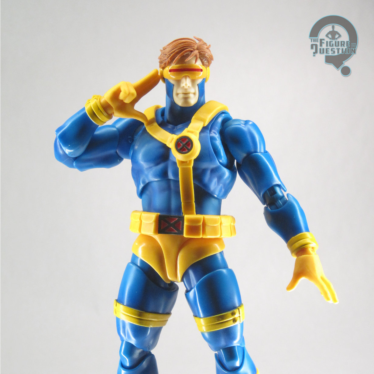
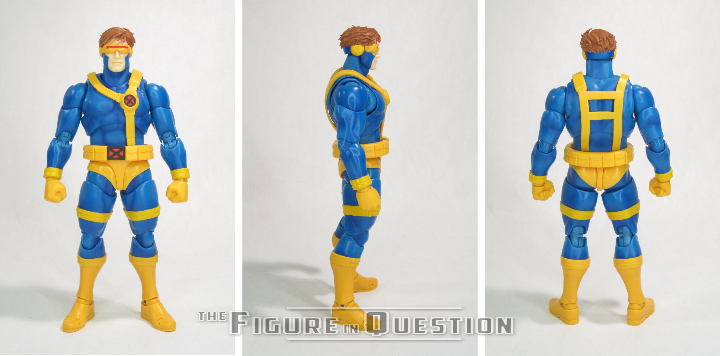
 Cyclops is the first figure in the “Gamerverse” sub-line of the Marvel portion of Bandai’s S.H. Figuarts line. He started hitting overseas just before the end of last year, and shortly after the new year domestically. The figure stands a little over 6 inches tall and he has 39 points of articulation. While the Spider-Verse figures went larger on the loose 1/12 scale set-up of Figuarts, Cyclops is back to more usual slightly smaller than Legends scaling, which is more practical for the purposes of intermingling with Bandai’s earlier versions of some of the Capcom characters. His articulation scheme is generally the more straight-forward approach we’ve gotten in the more recent Figuarts releases, so he generally feels less fiddly. The only part that’s still a little more involved is the moving “shorts” at the tops of his hips, which can sometimes get stuck up or down during posing. His sculpt is all-new to this figure. This version of Cyclops is meant to encompass his sprite designs from the earlier MvC games, for a full
 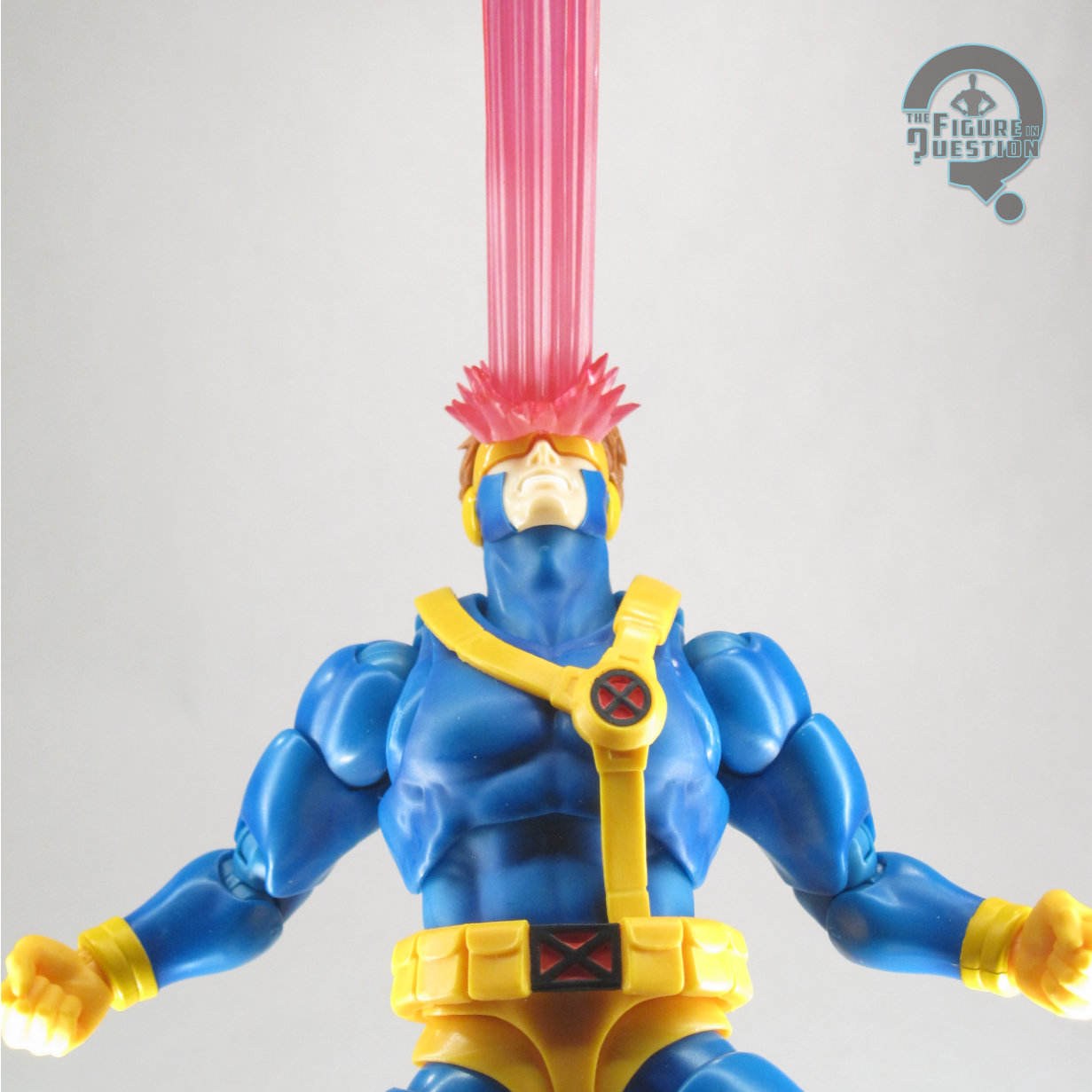 ‘90s feel, and the sculpt does its best to replicate that. It’s a really clean sculpt, which definitely feels like a classic ‘90s Cyclops. I hadn’t noticed before this figure that the Capcom Cyclops’s back design mimics the strap layout of the second Toy Biz figure, rather than the single-strap set-up of the comics and cartoon appearances. It’s a rather specific element, and I like to see it kept here. As has become common with Cyclops figures these days, this one includes multiple heads, three specifically. He’s got calm, gritted teeth, and screaming. Taking it even further, there are also three different necks, in standard, tilted back, and leaning forward, giving you a lot of options on what exactly he’s doing with his head. All three heads have one hair piece to swap between them; it’s a good rendition of his game hair, and it sits well on all of the
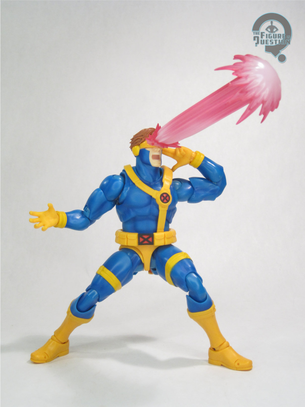
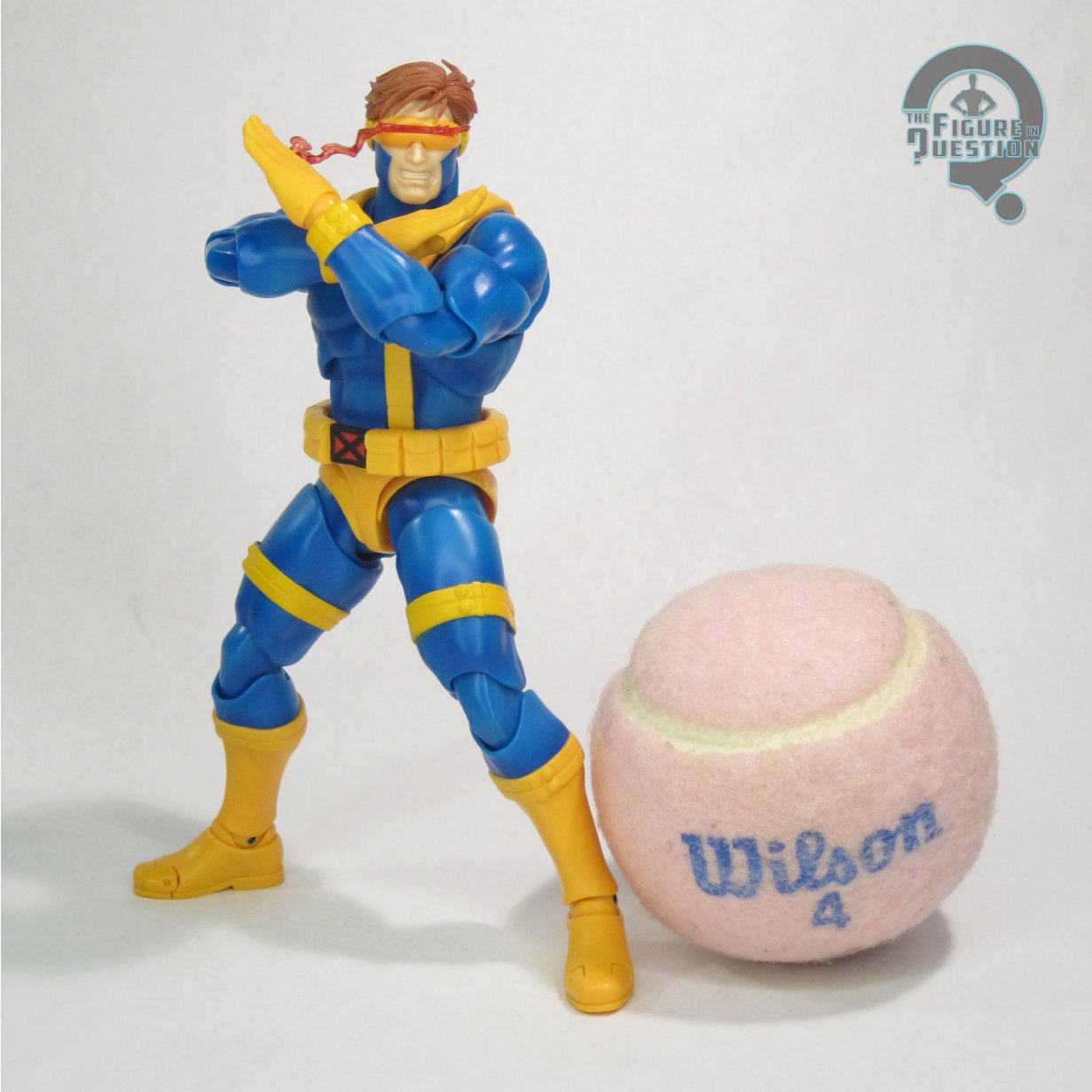
 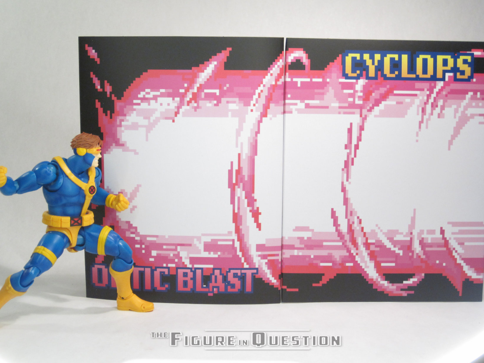 heads, with out falling out of place too easily. Cyclops’s color work is a good match for the game sprite, which trended a little oranger on the yellow than other versions. A lot of the coloring his molded here, bit there’s some really good accenting on the blue sections of his suit, as well as some very clean base work. Cyclops is packed with five pairs of hands (in fists, flat, two different types of open gesture, and two fingers extended), and four different visors (standard, with energy trail, with small optic blast, and with large optic blast). The hands offer a nice variety for posing purposes, and are fun as usual with
 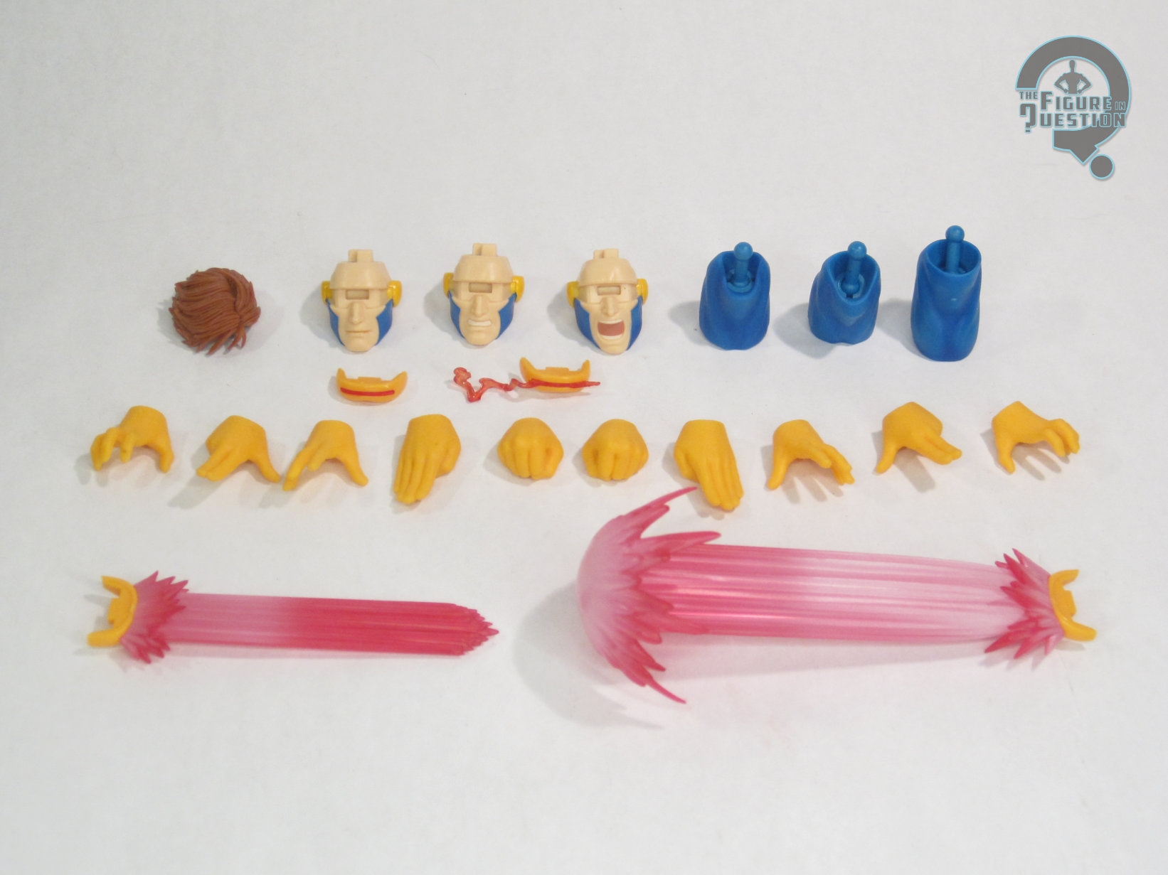 these sorts of releases. The different visors are great for showcasing his power set, though the larger optic blasts both have a tendency to fall out on their own. As with some of the other fighting game figures, Cyclops includes a pair of cardboard backdrops, specifically showing off his huge optic blast attack from the games, as his name, simulating a fighting stage. They’re a bit touch to keep standing, but a cool enough set-up for a rather low-cost extra.
THE ME HALF OF THE EQUATION
My knowledge of the existence of the Marvel fighting games owes a lot to my buying the old Toy Biz Cyclops vs M. Bison pack, because I just wanted a good ‘90s Cyclops figure. I’m always game for a good figure of that look, and I’ve sure bought a lot of them over the years. Did I need one more? Well, maybe not need, but want for sure. I knew I wanted this one as soon as he was shown off, so I jumped on the pre-order right away. He’s got his minor issues, but boy is he just a really nice looking, very fun version of my favorite Cyclops look.