#1131: Solomon Grundy

SOLOMON GRUNDY

JUSTICE SOCIETY OF AMERICA (DC DIRECT)

grundydcd1

“Solomon Grundy; Born on a Monday…”

How many comics characters can claim they come from an 19th Century nursery rhyme?  Not many, if you’re using that rather specific qualifier.  There’s a few, I’m sure, but the most prominent, for me anyway, is Solomon Grundy.  Grundy is one of DC’s older super villains, first appearing as a Golden Age Green Lantern foe, before making his way around a few of the DC rogues galleries.  He’s appeared in both Challenge of the Superfriends and Justice League.  His appearances in the latter show got him a fair bit of notoriety, since he was used as a very cool ersatz Hulk for a few stories.  He’s had a handful of figures over the years, but today I’ll be looking at his very first!

THE FIGURE ITSELF

grundydcd2
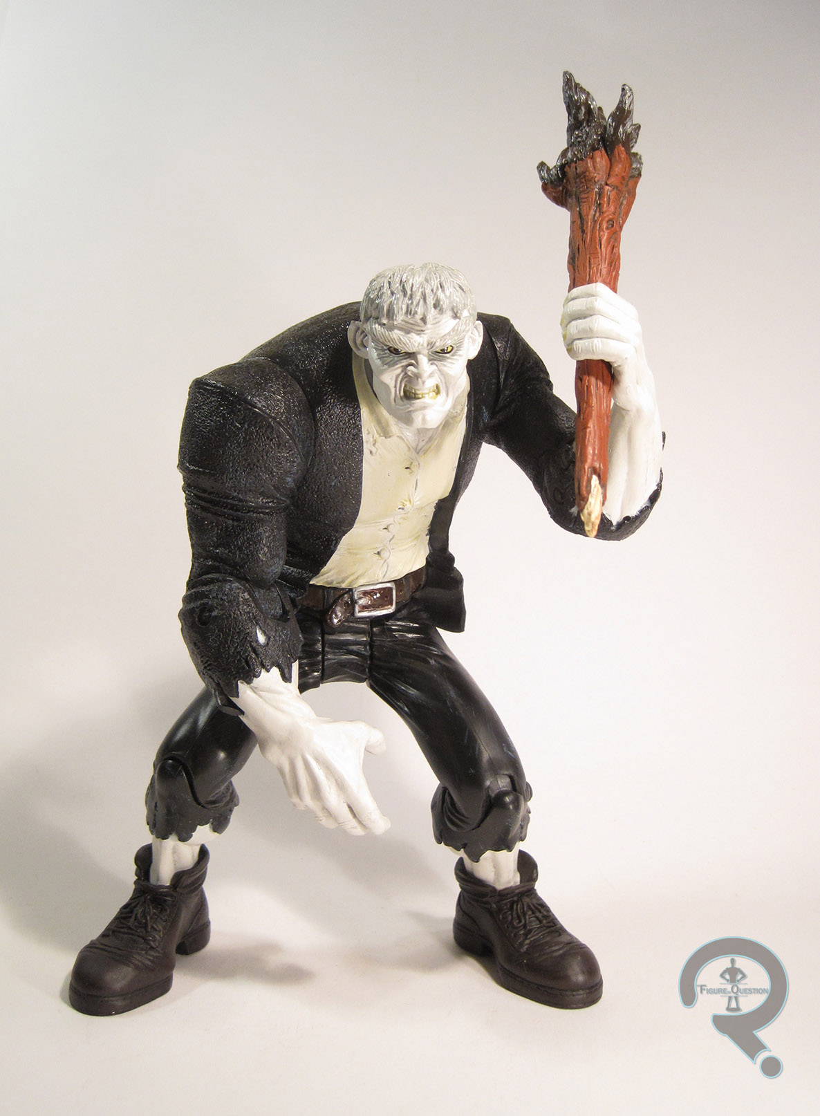
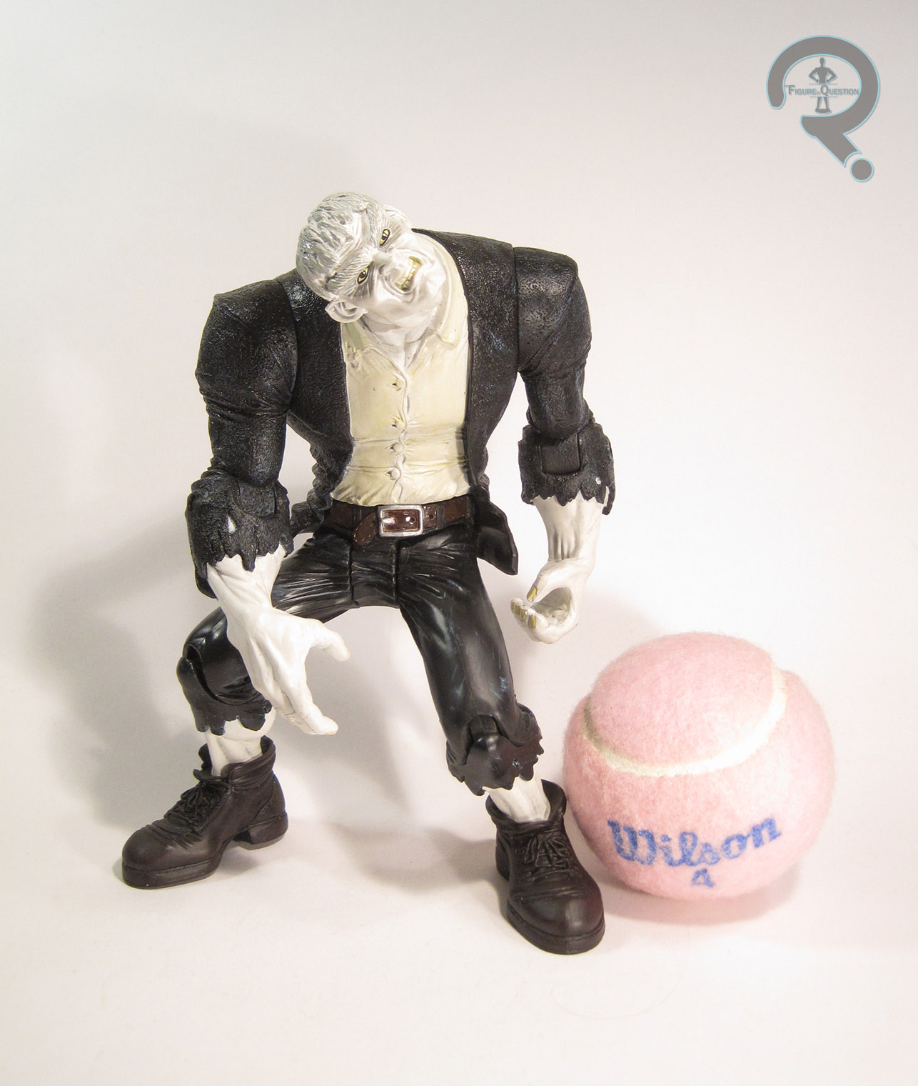
Solomon Grundy was released at the very end of 2001, technically as part of DC Direct’s then running Justice Society of America line.  Grundy, given his size, was released as a stand-alone deluxe figure.  The figure stands about 7 1/2 inches tall (with the hunch; without, he’d be about an inch taller) and he has 9 points of articulation.  Like a lot of figures from the pre-Marvel Legends era of collectibles, he’s pretty much just a plastic statue, with only one real pose he works in (unless you really like him craning his head like his neck is broken).  The sculpt is unique to this figure, and it’s decent enough.  It’s not really based on any specific artist’s take on the character, but it does a reasonable job of summing up the basics of the classic Grundy design, though he’s clearly got some late ‘90s aesthetic to him.  There’s definitely some odd proportions going on, especially on the legs, which are rather on the gangly side, but then finished off with a rather large set of feet.  Honestly, Grundy’s legs almost feel like they’re from a different figure than his top half.  They’re not only built differently, but textured differently as well.  The coat and shirt have a tone of texture work, but the legs are comparatively very smooth, which seems a little out of place.  Grundy’s paintwork is definitely up there.  There’s not a lot of variance in colors, but he’s got some really clean work all around, and a lot of nice, subtle accent work.  DC Direct really knew what they were doing with paint at this point.  Grundy’s main accessory was a big club of wood, which he could hold in his left hand.  It’s a pretty fun piece, even if it’s not totally essential.  Grundy was also packed with a “preview” figure from DCD’s then-upcoming Pocket Super Heroes line, which was a Silver Age version of Wonder Woman, and was actually one of the major selling points of this figure, oddly enough.

THE ME HALF OF THE EQUATION

I always wanted a Grundy figure when he was new, but never got one for whatever reason.  I ended up picking him up several years later from a vendor at Baltimore Comic-Con, for well below his original retail value (which looks to be even more a of a steal nowadays).  There have been a number of Grundy figures in subsequent years, of varying quality.  This one isn’t a perfect figure, but he’s pretty strong, especially for early DCD. 

#1118: Rorschach

RORSCHACH

WATCHMEN (DC DIRECT)

rorshach1

Hey, remember back when Zack Snyder wasn’t totally divisive, especially in regards to comic book fans?  Yeah, me neither.  It’s worth noting, though, that there was actually a time when I was on the opposite side of the divided fans (that is, those siding with Zack).  Back in 2009, when he directed the film adaptation of Watchmen, I was actually pretty happy.  I went through a phase of being super, super into Watchmen, and the movie hit sort of at the crux of all that.  In retrospect, I can still enjoy the movie, but I certainly see it’s flaws, as well as the early warning signs of what he’d end up doing with the rest of the DC movies he’s directed.  One of the definite plusses about the movie (and one of the few things everyone can agree was a positive) was that it meant we finally got Watchmen action figures, after having them cruelly snatched away from us just a few years before.  Today, I’ll be looking at perhaps the most popular character to be spawned by the franchise, the Question Rorschach!

THE FIGURE ITSELF

rorshach2The Watchmen figures from DC Direct were divided into two series of four figures each.  Rorschach was released in the first series, alongside Nite Owl, Silk Spectre II, and Ozymandias.  The figures were all based on their movie designs, but fortunately in the case of Rorschach, his movie design was a pretty direct lift from the comics.  The figure stands about 6 inches tall and has 9 points of articulation.  At this point in their run, DCD was mostly producing plastic statues, so the articulation doesn’t really amount to much.  You can sort of move his arms up and down a little, his head can rotate maybe 45 degrees (and even then, it really only looks good in the one pose), and there are swivels at the tops of his legs to aid a bit in keeping him standing.  There’s really one pose for this figure, and that’s all you’re gonna get.  At the very least, it’s not an awful pose, so there’s that.  In addition, the sculpt on the body is actually pretty solid.  The coat in particular is really nice, and looks appropriately broken in.  Rorschach was available with three different heads: masked, unmasked, and unmasked prisoner.  Masked was the standard figure, available pretty much everywhere.  Specialty stores with qualifying orders of Series 1 got the unmasked figure, and the prisoner version was a TRU exclusive.  The masked head was clearly the best way to go.  It’s pretty straightforward.  The actually head lacks any real details, but that’s pretty accurate, and the hat definitely makes up for it.  Both exclusives had the same head rorshachunmasked2sculpt, with slight tweaks in paint (the prisoner version has taken a bit of a beating).  It’s a decent head, and captures Jackie Earl Haley’s likeness pretty well.  In a perfect world, the normal version probably would have just included the extras from the other two.  I myself skipped the basic unmasked version.  The paintwork on Rorschach is pretty decent.  The base work is clean, and he matches up with the source material.  The jacket makes out the best again with some nice weathering.  The masked head seems a bit too clean.  In the movie, the mask was never really pure black and white, but rather grey around the edges, since the black was always in motion.  Also, that one face was all we got.  He was originally solicited to include different face plates with different “expressions” but those never materialized.  The prisoner head is alright.  It’s clean, but really too clean when you get down to it.  He also looks a bit too friendly, if I’m honest.  He’s not awful, though, certainly on par with the rest of DCD’s output from the time.  All of the Rorschach figures included his grappling hook gun, a hand to hold it, and one of the interlocking display stands all of the figures had. The TRU version also included a plate with his name and prisoner ID, which hung from a chain around his neck, but the chain broke on mine, and I’ve since lost it.

THE ME HALF OF THE EQUATION

Believe it or not, I was ecstatic beyond belief to buy the basic Rorschach when he was released.  He was the very first Watchmen figure I got (picked up from Cosmic Comix, of course), on the very first day they were released.  I picked up the TRU version about a month later, and figured I didn’t really need the basic unmasked version (since he’s never actually seen unmasked in costume without the injuries in either the movie or the comics, and I’d already bought two figures).  As an action figure, Rorschach kinda sucks.  I mean, the sculpt’s great, and the paint’s not bad, but all he’s good for is just standing there.  He’s certainly not a bad investment, and I don’t regret getting him at all, but if you want something you can actually play with, there’s far better options out there.

#0959: Guy Gardner & Kilowog

GUY GARDNER & KILOWOG

DC MINIMATES

Guy&Kilowog1

Today, I’ll be taking another look at the somewhat sad tale of DC Minimates. The line was amazing when it was new, and showed a ton of promise. And then, after eight series, it ended, and despite lots and lots (I mean LOTS) of requests, there’s been no return in the eight years since its demise. As amazing as it seemed at the time, the failure of DC Minimates seems pretty obvious looking back. In a desperate attempt to play catch-up with Marvel (who had a 15 series lead at this point), DC Direct frontloaded the line, by putting just about every heavy hitter in the first three series. This presented a bit of a problem for later series, as finding anchor figures was no simple task. As such, Series 4 and 5 went more or less anchor-less, instead relying on characters who were stand-ins for the heavy hitters. One such example is today’s set, which features the original stand-in Green Lantern, Guy Gardner, along with everyone’s favorite Poozer trainer, Kilowog!

THE FIGURES THEMSELVES

Guy and Kilowog were released in Series 5 of DC Minimates. Due to the prominence of the Green Lantern books at the time, they were probably the best known pair in Series 5. That’s probably a first for either of them.

GUY GARDNER

Guy&Kilowog2Guy Gardner was originally introduced as the “back-up” Green Lantern of sector 2814, who was supposed to take over for Hal Jordan, should anything bad happen to him. Presumably, this was only if Hal was incapacitated in some way other than death, though, since the comics have established that there’s a different process in place for replacing a dead Lantern. When he first appeared, Guy really wasn’t much different than Hal. Which kinda makes sense when you think about it. However, when they decided to have Guy be more than a one-shot wonder, his personality was changed, to make him a bit more unique. Also a bit more surly, cocky, and all-around less friendly. It was at this point that Guy got a new, more ‘80s vintage design, which is the basis of this Minimate. The figure is a little shy of 2 ½ inches tall and has 12 points of articulation. He has 7 add-on pieces for is hair, vest, belt, boots, and the edges of his gloves. The wristbands, belt, and boots were re-used from a number of earlier figures, but the hair and vest are unique to Guy. They’re a pretty good approximation of Guy’s look in the comics, though the hair feels like it could use a touch more detail work. Guy’s paintwork is fairly straight forward. His colors are pretty well chosen, and the details are all nice and sharp. His face does seem just a touch high on the head, causing the eyebrows to be covered by the hair. Guy was packed with a smaller lantern power battery, the same as Hal’s.

KILOWOG

Guy&Kilowog3Kilowog is a surprisingly recent addition to the Green Lantern mythos, first showing up in the late ‘80s. He was around for less than a decade, before being killed by Hal Jordan during the horribly written Emerald Twilight. He then spent another decade or so being dead, but was brought back to life a few years before Green Lantern: Rebirth restored the GL Corps to its former glory. Despite being out of the game for quite a while, Kilowog is still one of the most prominent Green Lanterns. Kilowog uses his post-Rebirth design, which was mostly based on his DCAU look. The figure is built on the larger 2 ½ inch base body, since he was a pretty sizeable guy. It’s a little odd to see this body nowadays, but it’s not too bad for Kilowog. He has a unique head, which, aside from seeming a little squat, is a pretty good fit. He also has a bulkier add-on piece for his torso, which makes him a bit more imposing than some of the others to use the larger body. Though it has no character specific details, Kilowog was the only figure to use it. Kilowog’s paint isn’t too far removed from what Guy has. He uses all the same shades and such, which is good for consistency’s sake. His logo is slightly different than the ones seen on Guy and Hal, which is nice, since Kilowog sports his modern design. Kilowog was packed with a larger power battery (re-used from DCD’s Pocket Heroes line).

THE ME HALF OF THE EQUATION

Like every set in the DC Minimates line, I picked these two up from Cosmic Comix the week they were released. As both a Green Lantern geek and a Minimates geek, I was pretty excited for these two. That being said, neither of them is super stand out. I mean, they’re solid ‘mates, especially for the time, but they don’t do anything particularly noteworthy…which is probably why the pegwarmed pretty hard. Not bad little figures, though.

#0937: Doctor Fate

DOCTOR FATE

DC’s NEW FRONTIER (DC DIRECT)

DrFate4

Over the weekend, it was announced that artist Darwyn Cooke had passed away. While Mr. Cooke may not necessarily have been a household name, his body of work was nothing short of amazing, and his death is a huge loss to the comics community. Cooke spent most of his career working for DC Comics. A lot of his work was used for promotional purposes, but he did have a few prominent runs, as well as several one-shots and miniseries. Perhaps his greatest work was his Elseworlds project DC’s New Frontier, a love letter to late Golden Age and early Silver Age stories from the company. It was successful enough to get an animated adaptation through Warner Brothers, and even got a two series line of figures from DC Direct. In honor of Darwyn Cooke’s legacy, I’ll be looking at my personal favorite figure from that line, Doctor Fate.

THE FIGURE ITSELF

DrFate2Doctor Fate was part of the second series of New Frontier figures from DC Direct. His inclusion in the series was a bit of a shock, since the character doesn’t really have a very prominent role in the comic. Of course, neither did Series 1’s Black Hawk, so perhaps DCD just wanted to have one oddball choice per series. It’s also possible that the figure was requested by Cooke, as is known to happen with lines based on one specific artist’s work. Whatever the case, I don’t think anyone complained about his inclusion in the line. Doctor Fate is about 6 ½ inches tall and he has 11 points of articulation. That’s not a whole lot of movement, but it wasn’t bad for a DCD figure of the time. He’s not going to be getting into any major action poses, but the arms and head offer a pretty good range of possibilities. The figure is, obviously, based on Cooke’s illustrations of Doctor Fate from the comics. He’s not far removed from the classic Doctor Fate; in place of the usual flared gloves, he has a pair of wrist bands. It preserves all the classic Fate styling a, while still adding a nice flair of originality to the design. While some of the other figures in this line exhibited a little bit of difficulty translating Cooke’s style into three dimensions, Doctor Fate’s sculpt does a pretty fantastic job. Something about his general design just really DrFate3brings out the best of Cooke’s work, and results in a really sharp looking figure. The hands have unique posing (I especially love the right hand) and the cape has some of the best flow I’ve seen in a sculpted cape, but the best part of the sculpt is the head. The helmet is a separate piece, though it’s not removable (well, not intentionally, anyway). The use of a separate piece allows for a fully sculpted set of eyes to be visible beneath the helmet, which adds an incredible amount of depth to the figure. Even without there being a whole head below the helmet, the appearance is there. Doctor Fate’s paint work is pretty strong. The colors are well chosen, and nicely match up with the color palette of the books. The application is nice and clean. There isn’t much accent work, but that feels true to the comics. Doctor Fate’s only accessory was a display stand, which was the same stand included with all the New Frontier figures.

THE ME HALF OF THE EQUATION

Doctor Fate, along with the rest of Series 2 of New Frontier, was a Christmas gift from my parents. Amusingly enough, though he’s my favorite figure from the set, he was the one figure in the Series I wasn’t sure I wanted. I’m happy to say I was wrong, and he’s remained not only my favorite New Frontier figure, but also my favorite version of Doctor Fate (which isn’t as simple a task as you might think).

#0921: Lobo & Ambush Bug

LOBO & AMBUSH BUG

DC MINIMATES

Lobo&Ambushbug1

So, let’s talk DC Minimates.  Two weeks ago, I discussed Play Along’s use of legal loopholes to get out the first DC-based Minimates in the C3 Construction line.  That line unfortunately ended fairly abruptly, leaving a very incomplete collection of characters.  A few years down the road, DC Direct teamed up with Diamond Select Toys, creating an official line of DC Minimates, which offered a more diverse selection of characters.  Sadly, it too was short-lived, lasting only eight series before ending, once again leaving certain groups incomplete.  The diverse selection of characters ended up as both a blessing and a curse; off the wall characters were fun while the line was running, but after the fact the likes of Lobo and Ambush Bug, who I’m reviewing today, seem like wasted slots in a line that didn’t get us important members of the Justice League.

THE FIGURES THEMSELVES

Lobo and Ambush Bug were released in the seventh series of DC Minimates.  They seem like something of an odd pairing, since I don’t believe the two of them have ever interacted.  Of course, they’re both weird, occasionally fourth wall breaking characters with a tendency to parody popular comics conventions of the time.  So, maybe they aren’t such a bad pairing.

LOBO

Lobo&Ambushbug3Lobo is, by and large, a parody of grungy 90s anti-heroes.  So, of course, he had a large fan base who missed the parody bit and took him as a straight character.  I’ve never been much for Lobo, but I did have a soft spot for his teen-spin-off Slobo, who appeared in Young Justice.  But, that’s neither here nor there; let’s talk about Lobo.  The figure is a little under 2 ½ inches tall and he has 12 points of articulation (due to his boots removing the ankle joints).  Lobo has 5 add-on pieces for his hair, vest, hook-chain-thing, and boots.  All of these parts were new to Lobo, but several of them have seen re-use since.  The parts are pretty well sculpted, and do a suitable job of bulking Lobo up a little bit.  Also, the chain on the hook is a real chain, which is a nice touch.  In general, Lobo is a good example of how great the sculpted work was on this line.  Lobo’s paintwork is fairly impressive; he’s fairly monochromatic, but there’s a lot of detailing, especially on the face and torso.  Lobo included no accessories.

AMBUSH BUG

Lobo&Ambushbug2Ambush Bug is one of the weirder characters in the DCU.  He doesn’t really belong to any particular realm of the universe, and he’s almost entirely absent from normal DCU stories, tending to reside in stories set firmly in his own corner of things.  But hey, he was played by Henry Winkler once, which is pretty cool.  Ambush Bug is mostly a vanilla ‘mate, with one small exception: the antennae on his forehead, which are glued in place.  They’re a pretty good translation of his weird antennae from the comics, so that’s good.  Other than that, everything’s done with paint.  He’s actually surprisingly detailed; DCD could have easily just done a blank green body with only detailing on the face, but Ambush Bug has small wrinkles (just like the ones he has in the comics) on just about every surface.  That’s really nice to see and keeps him from being too boring for the average fan.  I suppose they could have done him in his casual wear he’s known to wear in the comics, but this is his classic look, so it’s understandable.  Like Lobo, Ambush Bug includes no accessories.

THE ME HALF OF THE EQUATION

As with every figure in the DC Minimates line, I picked these two up from Cosmic Comix on the first day they were available.  I’ll admit that I was split on this set; I love Ambush Bug way more than I should, but Lobo’s not my thing.  At the end of the day, both ‘mates are pretty awesome, for totally divergent reasons.  It might be easy to say that these two are part of the reason the line ended so early, but given that the Marvel line just released Dazzler and Howard the Duck together, it’s hard to say.

#0684: Catwoman

CATWOMAN

BATMAN: THE LONG HALLOWEEN

CatwomanLH

A few of Batman’s foes have a tendency to go back and forth across the line of friend or foe, but none more so than Selina Kyle, aka Catwoman. She’s one of the Bat’s oldest enemies (debuting in the same issue as the Joker), but she rarely stays on his bad side for too long. In addition to switching sides a lot, she also gives the Wasp a run for her money in terms of number of costumes. She’s been in the leather catsuit for a while, but before that she seemed to be changing costumes just about every week. She did manage to keep roughly the same look for most of the 90s, and that look’s gotten a handful of figures (including my very first Catwoman figure). Let’s look at one of those figures, shall we?

THE FIGURE ITSELF

CatwomanLHWilsonCatwoman was released in the first series of DC Direct’s Batman: The Long Halloween. The series was based on the comic of the same name, which featured the work of artist Tim Sale (who’s one of my favorite Batman artists). It follows that Catwoman is based on Sale’s interpretation of the character, as she appeared in that series. She’s essentially wearing her purple bodysuit costume from the 90s, with a few tweaks. The figure is just shy of 6 inches tall and has 13 points of articulation. That’s not a lot of movement, but it was above average at the time of this figure’s release. Still, she’s not going to get into any poses more creative than a basic standing look. Catwoman featured an all-new sculpt, which has remained unique to this particular figure. DC Direct definitely had some trouble translating Sale’s artwork into three dimensions on several of the figures in this line, but Catwoman actually ended up with a pretty great sculpt. She manages to capture Sale’s style without being too cartoony or odd looking. The head is probably the most stylized part of the figure. Sale had a fairly distinctive take on Selina’s mask, and it’s been translated very nicely here. She’s missing her whiskers, but those probably would have looked silly in three dimensions, and they were absent from a lot of the silhouettes. That face is definitely a Sale face. The proportions of the body are pretty decently handled; she’s still somewhat stylized, but not absurdly so. The boots and gloves exhibit some of the best work on the figure, with some of the best sculpted wrinkles I’ve ever seen. Seriously, those wrinkles are fantastic. It’s a weird element to focus on, but it really impresses me. The bracelets on the wrists are actual, metal rings, which is a cool touch (though, I seriously have to question the practicality of such accessories on a burglar…). The tail is really the only part of the figure that’s just “ehh,” and that’s really just because it’s not in any way posable. Catwoman’s paintwork is pretty straight forward, but it’s nicely handled. The face paint does a nice job of accenting the “Sale-ness” of the sculpt. The glossy paint on the gloves and boots is also a nice way of breaking up those parts from the rest of the body, so that’s cool. Catwoman was packed with a pair of night vision goggles, a whip, a calendar page (February 14th, for those who are curious), and a display stand that looks like a section of pavement. Of course, I’ve misplaced all of those over time.

THE ME HALF OF THE EQUATION

When this figure was first announced, I didn’t want it. The prototype shots looked really odd, especially the head. Then my comic book store was running a sale on DC Direct figures, and she was marked down to like $5, at which point I realized I didn’t yet own a Catwoman in this scale and figured I could do a lot worse for five bucks. Oh boy could I have done worse. In hand, this is probably one of the best Catwoman figures out there. Sure, the articulation could be better, but the figure is just a great looking figure.

#0619: Superman – Red

SUPERMAN – RED

JLA: CLASSIFIED

SupermanRed1

Hey, do you remember back about two weeks, when I took a look at Superman Blue? That weird changeup to Superman to help keep him “hip?” Yeah, well, umm, long story short, he got split into two separate beings, and the second one was today’s focus, Superman Red. See, cuz it’s clever, cuz Superman is usually just one guy, who wears red AND blue, but now he’s two guys who each only wear one color. Isn’t that smart? But, of course, they also had slightly different personalities. Can you guess what was Superman Red’s defining trait? If you guessed the incredibly obvious answer of hot-headedness, you win a special no-prize! Good for you! Now, onto the figure!

THE FIGURE ITSELF

SupermanRed2Superman Red was released in the third series of DC Direct’s JLA: Classified line. He directly followed Blue in Series 2. While 2 had a more defined “looks of the 90s” theme to it, Series 3 was a little bit more free-form. The figure is about 6 ½ inches tall and has 13 points of articulation. Like just about every other McGuinness-styled figure, the articulation is mostly pointless, and he’s really only good for a basic standing pose. Superman Red is, completely unsurprisingly, a head to toe repaint of Series 2’s Superman Blue. Seeing as they’re essentially just palate swaps of each other in the comics, you can’t exactly blame DC Direct for just using the same mold. I guess they could have given this one a more emotive face (like Mattel did when they released these two) but it’s hardly a requirement. The head still feels too big for the body, and the arms are still too stubby, but it’s not a terrible sculpt. The paint is the real difference here, though even then it’s pretty much the same, but with red swapped in for blue. The paint does feel a little sharper this time around, and the white details are more properly aligned. Like his blue counterpart, Superman Red’s single accessory is a black display stand with the JLA: Classified logo in blue. Would have been cool to get it in red, just for the heck of it, but I guess they wanted it to be the same as the rest of the line.

THE ME HALF OF THE EQUATION

Like Superman Blue, Superman Red was from the assortment of figures I picked up during an action figure sale at Cosmic Comix. He was $3. That was most of my reasoning for getting him. Well, that and I was getting Superman Blue. Having both seemed like a good idea. I think Blue is my favorite of the pair, but I like both, and I certainly don’t regret buying them.

SupermanRed3

#0607: Superman – Blue

SUPERMAN – BLUE

JLA: CLASSIFIED

SupermanBlue1

The 90s were weird. Like, for everyone. Marvel had their whole shoulder pads and pouches thing going on, which is one of those things we’d all like to forget now. DC was getting in on the weirdness too, and few characters got hit as much as Superman. First he died and got replaced with four “x-treme” takes on the mythos. Then he came back, but he was different and he had a mullet. Then he lost the mullet, but the sun also got blotted out, preventing him access to his solar-based powers. The only logical solution was to convert his powers to electricity. That’s just obvious. Anyway, the result was Superman Blue, a radical departure from the Superman we all knew and loved. He didn’t really stick around for long, but he had a rather distinctive design, which did build up a rather decent fan following, resulting in a few action figures over the years. Let’s take a look at the most recent version!

THE FIGURE ITSELF

SupermanBlue2Superman Blue was released as part of the second series of DC Direct’s JLA: Classified line. All of the figures in the series were based on looks from the 90s, so Superman fit in pretty well. The figure stands roughly 6 ½ inches tall and features 13 points of articulation. Due to the nature of the sculpt and how the articulation was implemented, most of the articulation is ultimately pointless, and the figure’s only real pose is a basic standing one. The JLA: Classified line worked as a companion line to the four assortments of Ed McGuinness-styled Superman/Batman figures produced not long before. So, Superman Blue is presented here in Ed McGuinness’s style, though I’m not sure that McGuinness ever actually drew Superman Blue. Admittedly, it’s a style that works pretty well for the design, so I can’t really complain. Most of the McG-styled figures made use of a lot of the same pieces, and Superman Blue is no exception. He gets a brand new head, but from the neck down he’s a straight re-use of the basic McG body first used for Captain Atom. It’s not a terrible body, but it’s not without its flaws either. It’s definitely well-defined, and in keeping with a lot of McG’s illustrations, but the arms are definitely way too stubby. The head is a pretty decent sculpt; it matches up pretty well with the regular McG Superman, but it’s got a slightly more smug expression, which at the very least adds some variety. The character’s spiky electric hair is quite nicely conveyed, and the head-band-thingy is appropriately sharp and clean. The only real issue is that the head is just a tad too big for the body. The paintwork is alright; the blue and white are appropriately bold, and the figure definitely stands out. However, the application of the white areas is a little uneven, and the elements on the arms and legs which should mirror each other end up not doing so. The figure’s one accessory is a small black display stand with the JLA: Classified logo printed in blue.

THE ME HALF OF THE EQUATION

Superman Blue was another piece of the large selection of figures I bought on sale from my local comicbook store. He’s not my favorite design of all time, but at $3, I figured he was worth it. The figure is overall pretty decent, and while it’s not perfect, it does add a certain degree of “pop” to the shelf.

#0561: The Flash

THE FLASH

THE FLASH (DC COLLECTIBLES)

FlashTV1

Live action and DC Comics have something of an iffy history. While they pretty much invented the modern Super Hero movie with Richard Donner’s Superman, most of their film work has been acceptable at best and horrifyingly bad at worst. On the small screen, they faired a little better, with popular runs of Superman, Batman, and Wonder Woman, but they kinda started to run out of steam. Smallville lasted for an insane 10 seasons, but I wouldn’t really call any of them particularly noteworthy. When they launched Arrow, I watched for about a half a season, but gradually lost interest. I figured that DC TV just wasn’t for me anymore. Enter The Flash. It’s fun, light-hearted, and it doesn’t seem to be shying away from the bolder aspects of the characters. And now it’s getting action figures.

THE FIGURE ITSELF

FlashTV2Flash here was just released last month as part of DC Collectibles’ The Flash line, based on the show. It’s sort of a spin-off of the Arrow line, and Flash is a single release figure (though he’ll soon be joined by Captain Cold). Flash is marked as figure 01, so clearly DCC is planning on there being at least a few of these. The figure stands about 6 ½ inches tall and features 30 points of articulation. In case you hadn’t already pieced it together, Flash is based on the character’s appearance on the TV series of the same name. The show design is, of course, based on the comics design, with a fair bit more texturing and the like added. The figure features an all-new sculpt. After dipping my toes into the DCC waters with several of their animated figures, the Flash is a little bit of a letdown. The sculpt certainly isn’t bad. There is plenty of texturing on the suit, and most of its finer details are nice and sharp. The problems with the sculpt are mostly related to its resemblance of actor Grant Gustin. Gustin is a pretty skinny guy, but he’s definitely not as lanky as this figure would have you believe. In addition, while the head features a passable likeness, the details are a little on the soft side. The figure’s paintwork is generally pretty decent. The colors seem to be a close match to those on the show, and most of the details stay within their designated areas. The only real weak point is the head, where the paint ends up being a little softer at the edges, although that’s at least in part due to the sculpt. The Flash is packed with three sets of hands, in fist, grip, and open poses. They’re perfectly fine additions, but the figure would have majorly benefited from the inclusion of some sort of stand to facilitate some deeper running stances.

THE ME HALF OF THE EQUATION

Flash was something of an impulse buy (which is fitting, I suppose). I don’t do that very often anymore, but my comicbook store had him sitting on the shelf, and I have been enjoying the show. The figure isn’t the most impressive figure ever made, and he hasn’t really swayed me on buying anymore of DCC’s TV-based figures. That said, he’s really not a bad figure, and I don’t regret the purchase. I’ll definitely be keeping an eye on the rest of the line, and I’ll probably end up picking up a few others, depending on the character selection.

#0402: Cyborg Superman

CYBORG SUPERMAN

SUPERMAN (DC DIRECT)

In the early days of DC Direct figures, Hasbro’s contract for the license prevented DCD from making figures of any characters related to Batman and Superman. Following the transfer of the license to Mattel, DCD was allowed to release those characters to their heart’s content. So, they released a line of figures for each of them. The Batman figures skewed more classic, while the Superman figures took a more modern flare. Today, I’ll be looking at that line’s version of Cyborg Superman, another character with “Superman” in his name who is not actually the man of steel.

THE FIGURE ITSELF

Cyborg Superman was released in Series 2 of DC Direct’s Superman line. The figure is about 6 ½ inches tall and he sports 17 points of articulation, which was quite a thing for a DCD figure to have at this point in time. With a character like this, there’s bound to be some parts overlap between this figure and the basic Superman. In reality, he doesn’t share as much as you might expect. His entire left arm, his left thigh, his right foot, and his cape are the same. The rest is unique to this figure, though some parts are tweaked parts from the base Superman. I should point out at this time that my figure’s lower jaw went missing at some point, and I replaced it with a somewhat crudely sculpted replacement. So, the real figure’s jaw was much nicer. However, this figure’s price has since skyrocketed, so I won’t be getting a proper replacement anytime soon. The figure’s sculpt was very, very well done. The proportions are great, and the robotic pieces look fantastic. One of the coolest things about the sculpt is the organic quarter of his face, which is similar to the full sculpt of the main Superman, but just different enough to let you know this isn’t the same guy. It’s really good work. The figure’s paint, while not anything outstanding, is pretty solid. The colors are nice and vibrant, and everything is nice and cleanly applied. Cyborg Superman included a S-emblem display stand.

THE ME HALF OF THE EQUATION

I got Cyborg Superman when he was relatively new, from a comicbook store nearby the house we had just moved my aunt into. I had missed out on the regular version of Superman, so I “settled” for this figure. While there are plenty of Supermen that have surpassed the version offered in Series 1, none of the Cyborg Supermen have come close to this one, so I’d say I got the better end of the deal. I just wish I hadn’t lost that jaw…