#3679: Crusader Robin

CRUSADER ROBIN — SPECIAL LEGENDS EDITION

LEGENDS OF BATMAN (KENNER)

“Armed with his powerful crossbow, bat-shaped shield and cunning wit, Crusader Robin accompanied Silver Knight Batman on his zealous mission to impose peace on the war-torn medieval world. Since being rendered an orphan at the hands of marauding infidels, Crusader Robin constantly battled internal demons as well as the ones visible to the outside world. His never ending quest for justice – coupled with his youthful energy – made Crusader Robin a powerful force – one that the enemy would be wise not to take lightly. Crusader Robin’s brilliant new costume colors inspire his peace-keeping troops to make an all-out effort in battles to come.”

While Marvel jumped full-force into their comics-inspired toy lines in the ’90s, DC, who generally were having a greater success than Marvel with their outside media, tended to lean more heavily on tie-in products. They did at least have a few shorter run lines dedicated to comic versions of their heaviest of hitters, Batman and Superman, with Legends of Batman offering up a number of comics looks, albeit mixed in with some made-up and otherwise “Elseworlds” inspired takes. Batman got to try out all sorts of different personas, and sometimes his sidekick Robin was even lucky enough to tag along. Dick Grayson, seen in his Nightwing gear, got a pretty standard figure, but there were also two more Robins, both leaning more into the Elseworlds side. Today, I’m looking at the knight themed Crusader Robin.

THE FIGURE ITSELF

Crusader Robin (who, it should be noted, has no relation to the Crusader Batman from the same line, which served as a “standard” Batman) was part of the “2.5” revision to the second series of Kenner’s Legends of Batman line…originally. But that’s not the figure I’m reviewing here. No, this one is the “Special Legends Edition”, one of a whole sub-line of repaints created by Kenner to be sold through the Warner Brothers Studio Store, back when they were trying to give it an actual retail presence in the ’90s. The figure stands 5 inches tall and he has 5 points of articulation.  The Legends of Batman line preceded Total Justice in its usage of rather intense pre-posing for the figures, and Robin’s a pretty good example of this.  In particular, he’s got a rather wide stance, which makes keeping him standing rather tricky.  You have to get his balance *just* right, and even then, it’s kind of a toss-up.  Well, maybe not a toss-up, because if you toss the figure up, nothing’s gonna stand.  But, you get my point.  The sculpt has quite a bit going on, with Robin’s usual spandex re-imagined into a mix of armored plates and chainmail.  The chainmail in particular makes for some visually interesting texture work, which is fun.  The color work on the standard release was pretty close to the Tim Drake Robin’s color scheme, but for this release, it winds up going a lot heavier into the reds, which serve to replace the black from the standard, as well as most of the yellow as well.  What I find interesting about both releases is the decision to give him a medium brown color for his hair, given that all three potential Robin identities at the time had black hair.  Presumably they were attempting to loosely tie-in with Batman Forever‘s casting of Chris O’Donnell, but it’s still kind of weird to see it done on a comics-inspired figure.  Robin was packed with a crossbow, three green arrows for it, a bird-shaped shield, a cape, and a removable helmet.

THE ME HALF OF THE EQUATION

As a kid, my first Robin, of course, was Hydro Claw Robin, but he was a movie Robin, and I wanted one that wasn’t.  I recall this resulting in a store trip with my Grandmother, expressly for the purposes of getting a comic Robin, which resulted in me getting the standard version of this guy, who was, admittedly, the best option at the time.  That one took quite a beating, and at one point got completely covered in acrylic paint for some sort of project.  It’s been a project *since* then to clean him back up, which is still ongoing.  In the mean time, I only in the last few years discovered the “Special Legends Edition” figures even existed, and during my family vacation this summer, I happed upon this guy.  He’s fun, as was the original.  It’s crazy that there wasn’t a standard Robin in this line, but with as cool as this one is, I can’t really knock it.


#3677: Kilowog

KILOWOG

SUPER POWERS (MCFARLANE)

“A brilliant geneticist on his home world Bolovax Vik, Kilowog served as Green Lantern of Sector 674. Following the destruction of his planet during the events of Crisis on Infinite Earths, Kilowog trained new Green Lantern recruits, teaching essential tools to survive the most dangerous job in the universe.”

Kenner’s sole Green Lantern entry for their Super Powers line was Hal Jordan, who was still the main GL at the time. There were plans at early stages to include a greater GL focus in the line, and the list of unproduced figures they’d planned even included a John Stewart. It’s hard to say if they’d have ever gotten to a character like Killowog, who wasn’t even introduced in the comics until the line’s final year in 1986. Nevertheless, he’s become one of the quintessential Green Lanterns over the years, and there’s no denying he’s got a cool visual, so he found his way into McFarlane’s continuation of Kenner’s line.

THE FIGURE ITSELF

Kilowog was released in Series 7 of McFarlane’s Super Powers line under the DC Direct banner.  He’s the second of the new character additions, the other being Blue Beetle.  He’s also the line’s third GL, and he pairs off with the Sinestro Corps Sinestro figure from the same assortment.  The figure stands 5 1/2 inches tall and he has 7 points of articulation.  His sizing is a lot larger than the rest of the line, putting him pretty much on the same mark as the vintage Darkseid figure.  It’s appropriate for the character, of course, and it’s nice to see, in contrast to how McFarlane scaling can sometimes go, that the line’s general trend smaller doesn’t affect a character who *should* be larger.  His sculpt is an all-new one, and it’s likely to remain fairly unique.  I think it’s honestly one of the line’s strongest (though I feel like I keep saying that for each new figure I get).  It’s a great match for his classic appearance, and fits in really well with the pre-existing Kenner aesthetic, especially the vintage Hal.  I appreciate the larger build, while still having a balanced set of proportions, and I really like the extra heft he’s got.  Kilowog’s paint work is okay.  It’s not his strongest mark.  The edges are a little sloppy in some spots, especially on his ring.  I’m also a bit bummed that the green’s off from the vintage GL, but I understand something like that can be kind of tricky.  It’s at least not a bad shade.  Kilowog is without any accessories, but given his larger size, that’s an understandable cut-back.

THE ME HALF OF THE EQUATION

Before I was even sure I was going to actually jump in on this line, Kilowog was one I was waffling on, because I sure do like a good Kilowog figure, and even before they addressed the scaling issues, I figured he’d fit in okay with the older stuff.  I figured I’d snag him if I saw him in person, but then I didn’t, and I got impatient, so I wound up ordering him from GameStop.  Yes, I ordered a McFarlane DC product from GameStop.  I don’t really know what the world’s coming to, honestly.  Kilowog’s pretty darn great, and another figure that really feels like an authentic continuation of the vintage line.

#3675: Sinestro

SINESTRO

SUPER POWERS (MCFARLANE)

Though it served as the most visible media presence of DC’s heroes for a long stretch of time, Hanna Barbera’s Super Friends didn’t have any direct toy tie-ins. Both Mego’s World’s Greatest Superheroes and Kenner’s Super Powers were clearly drawing from the show’s influence, of course, but there were a great many characters, even notable ones from the comics, who didn’t get coverage. Green Lantern and his evil counterpart on the Legion of Doom, Sinestro, were both left out of Mego’s run, and while GL found his way into Super Powers, Sinestro remained unlucky, not getting his first figure until the DC Direct days. It’s fitting, then, that he would be added to Super Powers by (what remains of) DC Direct!

THE FIGURE ITSELF

Sinestro was released in Series 6 of McFarlane’s Super Powers continuation, which they released under the DC Direct banner. He’s the first of two Sinestros released in close succession, this one based on the character’s classic blue and black, while the other is his more modern Corps uniform. He pairs off in Series 6 with an updated Hal Jordan. The figure stands about 4 3/4 inches tall and has 7 points of articulation. Sinestro has typically been depicted as tall and lithe, something this figure’s stature captures. He’s taller than the average Kenner Super Powers figure, but in the way he should be, rather than in an “out of scale” sense like some of the line’s earlier offerings. The sculpt is all-new, and pretty decent. It definitely feels like it captures the Kenner style pretty well. You can certainly see where elements of it were designed with re-use for the Corps model in mind, meaning he does ultimately wind up with some costume details that are a little outside of the intended era. The collar in particular is just a little too modernized in its shaping. His head is likewise a tad more modernized, calling to mind his DCAU appearances, and lacking the larger forehead typical of classic Sinestro. None of it’s bad, mind you, and Kenner wasn’t always 100% faithful in their own figures, so he doesn’t look entirely out of place. Sinestro’s color work is pretty solid, hitting the usual colors, and feeling pretty on the mark for what a Super Powers paint job should look like. Sinestro is packed with his power battery, which, like the figure is maybe just a touch too modern. In reality, Kenner would have probably just reused Hal’s, so getting something different at all isn’t so bad.

THE ME HALF OF THE EQUATION

After being won over so thoroughly by the Blue Beetle, I’ve gotten more invested in this line as a whole, so I’m looking more at some of the other figures that would fit well with my vintage set. I happened to find this guy at the Walmart close to my work. He’s not quite as on the mark as a few of the others I’ve looked at, but he’s still a marked improvement on the earlier releases, and a solid counterpart to my vintage Hal.

#3667: Blue Beetle & The Bug

BLUE BEETLE & THE BUG

SUPER POWERS (McFARLANE)

Back in the ’90s, the Super Powers fandom had a lot of hypothetical discussions about what characters the line might have done had it continued.  In 2004, Jason “Toy Otter” Geyer’s Super Powers Archive ran a huge piece regarding the discovery of Kenner prototypes, which revealed what the next wave or two of the line would have been.  One of the most notable omissions from Kenner’s plan, at least going by characters that had long been theorized to be part of any continuation, was Ted Kord, aka Blue Beetle.  He may not have been marked to get his due from Kenner (for Super Powers, anyway; they *had* planned to do him for the scrapped fourth wave of Total Justice, and that figure was eventually released by Hasbro), but that doesn’t mean he was completely overlooked, because he’s part of the McFarlane revival!  And it’s not just him!  He got a vehicle, too!  And….I’m actually excited?

THE FIGURE ITSELF

Blue Beetle is part of Series 7 of McFarlane’s Super Powers line, which was released early summer this year.  Beetle is one of the two figures in the set that’s not a variant on a prior figure, and if you’re counting Kilowog as a Green Lantern, he’s the only truly new character entirely.  Ted is seen here in his classic attire, which is the absolute correct choice for such a release.  The figure stands a hair under 4 1/2 inches tall and he has 7 points of articulation.  I’ve been talking a lot about scaling with this line, and I’m going to continue to do so.  Ted’s scaling is by far the best I’ve seen from the line.  He’s actually just exactly the size he should be, with no issues at all.  He’ll fit right in with the vintage stuff.  Aiding with that is the sculpt, which is…well, it’s just really nice, you guys.  Everything about it feels just very genuine and on the mark for Super Powers.   The build, the detailing, the slight preposing, the stance of the legs.  Sure, there’s the visible pins, which aren’t quite right, but everything else works well enough that I just don’t notice them.  His costume elements are all sculpted, it should be noted, with raised edges for the darker blue sections.  Kenner didn’t lean on purely painting for much of the detailing on their figures, so this just helps to further push the authenticity.  The goggles are a separate piece, fitted into the head, which keeps the lines sharp, and the face gets a nice, friendly, slightly whimsical that fits the character so well.  The paint work is generally clean, with very minimal slop, and it’s a good match for his comics appearances.  He’s got no accessories, which isn’t the end of the world, but it’s a shame he didn’t get his BB gun.  It’s really the only thing I can note as an issue here.

Of course, if you’d still like to accessorize your Blue Beetle, there’s always the option of going for The Bug, Blue Beetle’s Mobile headquarters.  McFarlane’s been keeping up with doing a few vehicles to coincide with the figures, and The Bug hit right alongside Ted.  It’s pretty great timing, not just for tying in with the Ted figure, but also since the Bug was quite prominent in last year’s Blue Beetle movie.  The vehicle measures 11 1/2 inches long by 12 inches wide.  It’s sporting an all-new sculpt, which, like Ted, is a good match for the vintage line’s work.  Having handled the vintage Batmobile, the Bug has a very similar feel to its construction, right down to the polished exterior with the cool transparent windows.  It’s even got its own action feature!  The’s a grapple on the bottom, which Ted can hang from.  It pulls out, and can spring back when the hatch on the bottom is pressed.  Accessing the interior of the ship is really easy; the “wings” on the back are spring loaded and pop up when you press the button on the back.  Inside, there’s two seats at the front, one for Ted, and one for that Booster Gold figure that got shown off on the back of this box.  There’s also a whole little space set-up in the back for the mobile HQ bit, which is certainly nifty.  There’s not paint on the Bug, but it does get a few decals.  The inside gets the most of them, with coverage for all of the consoles, and even a mock-up of the internal hatch to match the sculpted one on the bottom.  Outside, there’s a fun little “I heart NY” sticker on the back, which is a great little character touch.

THE ME HALF OF THE EQUATION

This pair right here is the thing that truly broke me on the McFarlane Super Powers.  I’d seen others that looked cool enough, but nothing I *needed*.  Then they showed off these two and I just had to have them.  They haven’t been the easiest items in the line to get.  I found the Bug at the same time as the Peacemaker three-pack, but there was no Ted in sight.  I almost passed, but my Dad insisted on getting it for me, which gave me the push to track Ted down online.  I’m glad I did, because I haven’t been happier with a McFarlane offering.  Honestly, I haven’t been happier with a DC offering in a very long time.  I’ve wanted a Super Powers continuation since I was a kid, and this right here is exactly what I wanted.

#3665: Peacemaker, Vigilante, & Judomaster

PEACEMAKER, VIGILANTE, & JUDOMASTER

SUPER POWERS (MCFARLANE)

It’s been a year since I’ve discussed McFarlane’s revival of Super Powers here on the site.  My previous venture into the line was…mixed.  I’m a huge fan of the vintage line, and the idea of revival *should* excite me, but McFarlane’s output was…well, it was McFarlane output.  There might have been some good ideas, but they were saddled with the strangeness that Todd seems intent on injecting into everything he does.  But, Todd just keeps dragging me back in, because even if it’s mixed results, there’s limited options for DC, and it’s not like anyone else is doing a Super Powers continuation.  So, here I am, going back to the well on McFarlane, specifically looking at the Peacemaker multipack!

THE FIGURES THEMSELVES

Peacemaker, Vigilanter, and Judomaster were released late last year as a three-pack in McFarlane’s Super Powers line.  The set is loosely designed to tie-in with the Peacemaker show, though the characters are obviously in their comics attire.

PEACEMAKER

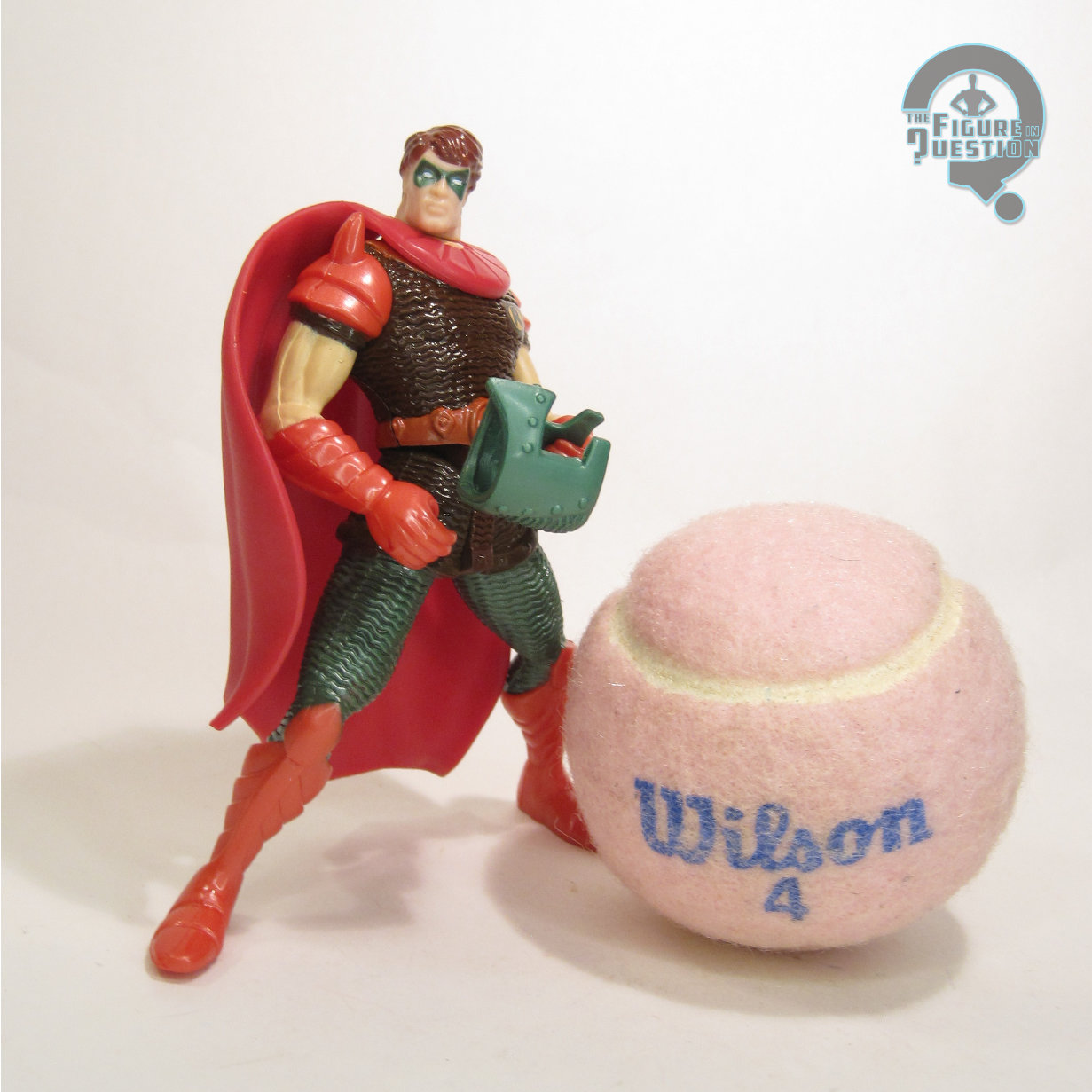
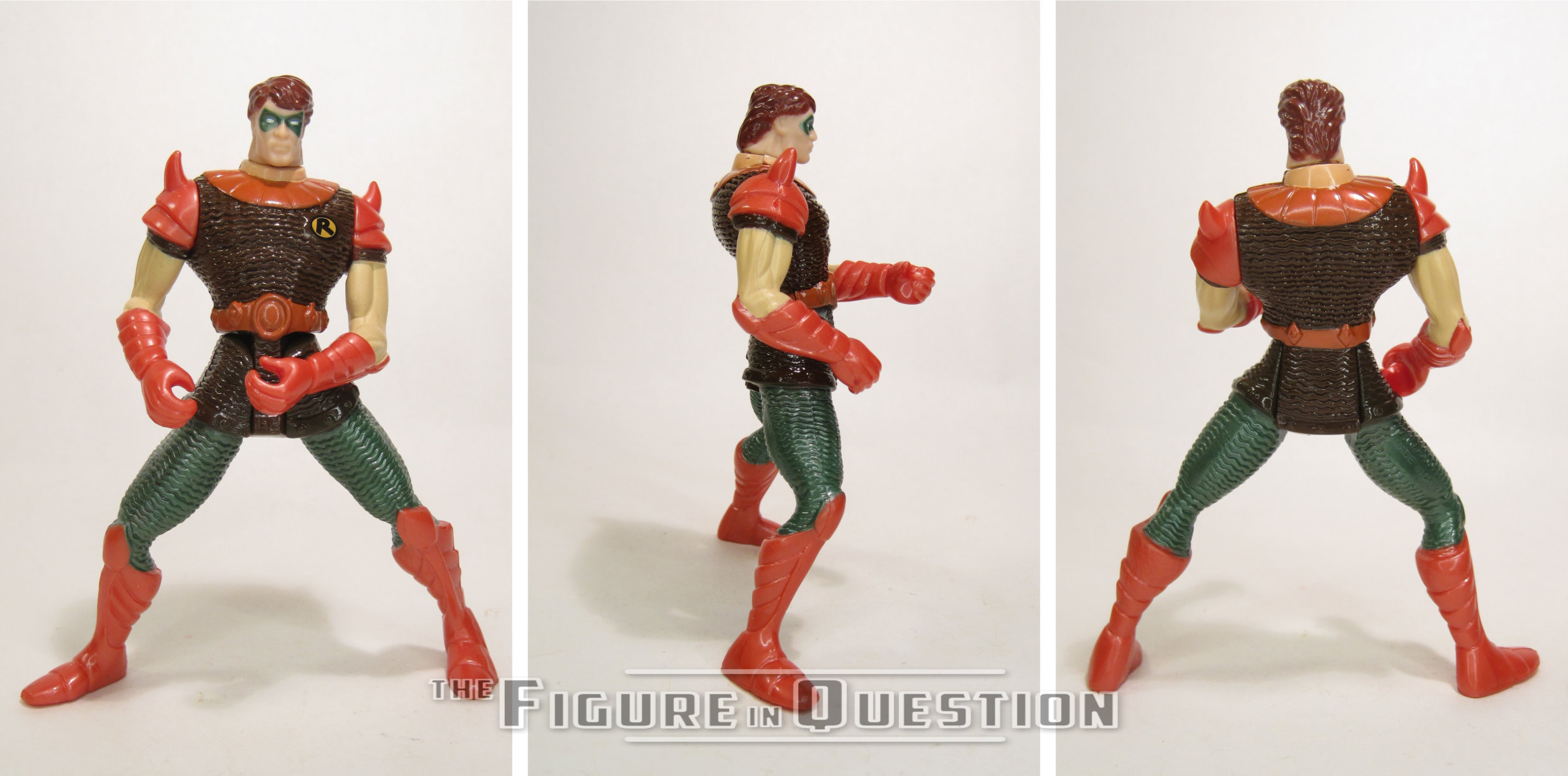
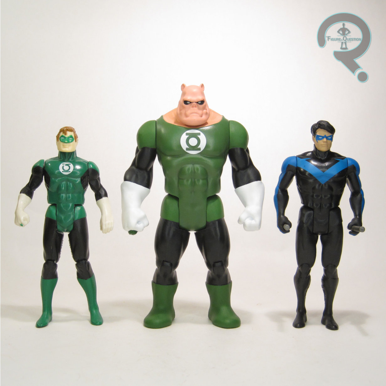
Peacemaker, whose main contribution to the world of comics was inspiring the Comedian in Watchmen, has gotten a real elevation in his recognition in the last few years, thanks largely to John Cena’s turn as the character in The Suicide Squad and its follow-up Peacemaker.  As a result, he got this figure, his very first comics-based figure.  Pretty nifty.  The figure stands just under 5 inches tall and he has 7 points of articulation.  So, first and foremost, let’s address the number one issue with this line: scaling.  The previous figures were all scaled a bit too large, typically running about half an inch too tall to properly fit with the vintage line.  Peacemaker, however, is, like, pretty much spot on.  Since he’s under 5 inches, and Smith’s always been depicted as a slightly bigger guy, he fits in pretty much perfectly with the actual proper Kenner figures.  He’s got an all-new sculpt, and it’s a marked improvement on prior offerings itself.  His stance definitely feels more proper Super Powers in its nature. The weird pigeon-toed issue’s gone, and the proportions are a solid match for how Kenner tended to handle things.  His head uses a separate assembly for the helmet, which is really sharply detailed.  In general, the sculpt is pretty clean and slick.  I have two minor complaints, the first being the continued presence of visible knee joints (which, honestly, bug me a lot less here than on earlier figures), and the belt assembly being just a touch sloppy on my figure.  Beyond that, though, he’s really great.  He’s even got a gripping hand, should you want to arm him with some sort of weapon.  His color work is appropriately bright and eye catching.  The application is pretty clean, and it again matches well with the style.  I like that he’s not totally painted up, which also feels more authentic.  The only slight oddity is that he’s got no paint on his eyes, so there’s just flesh-tone visible under the helmet.  It’s a very small area, but it looks strange.
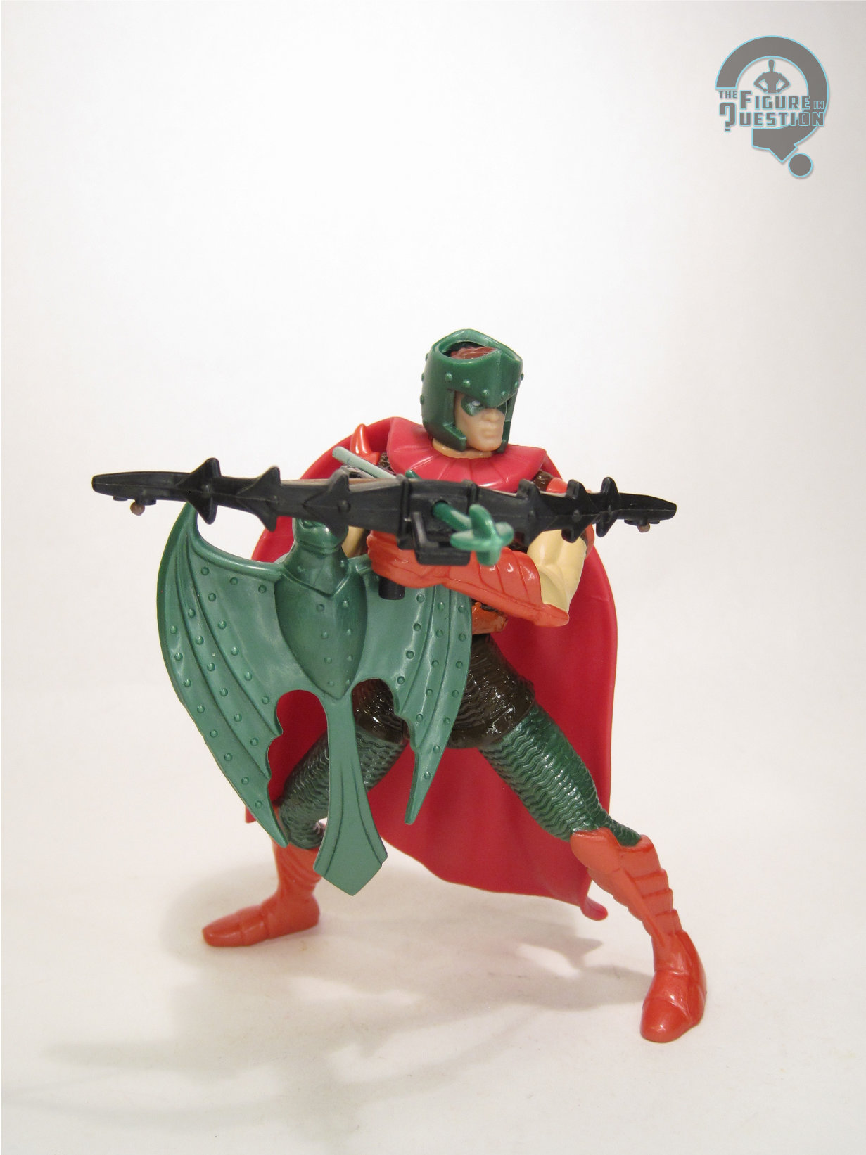
VIGILANTE

Vigilante is a fun choice here.  Obviously, he was included thanks to his increased visibility thanks to Peacemaker, but getting further into the Super Powers lore, Vigilante was one of the proposed characters for Kenner’s 1987 line-up, had there been a fourth year of the line.  So, it’s nice to see him finally get his due.  The figure stands 4 3/4 inches tall and he has 6 points of articulation.  Scaling wise, Vigilante is just a *touch* too tall for proper fit with the vintage line, but he’s so very close that it works fine in most settings, and it’s certainly better than earlier figures.  His sculpt is decent enough; his toes point inward a little too much, but his proportions are pretty decently handled.  He seems to be at least somewhat inspired by the original Flash figure, which isn’t the worst fit.  Generally, it’s more basic sculpt than Peacemaker’s, but it does pretty well with the source material.  Vigilante’s paint work is decent enough.  Nothing too fancy, but the application’s pretty clean, and the colors are well chosen.

JUDOMASTER

Judomaster is the most obscure of the three figures included here, though we did at least see a version of him in Peacemaker alongside the other two.  Like Peacemaker, he started out as a Charlton character, before getting folded into DC.  He’s mostly filled in the background of big crossovers since then, which honestly is effectively his role in Peacemaker, too.  Judomaster is new to the world of action figures, and this one is based on his original incarnation.  The figure is a little under 4 3/4 inches tall and he has 7 points of articulation.  Scaling wise, Judomaster is probably the most off of the set, since he should really be the shortest of the three, but isn’t.  Of course, he’s still better than the early run figures, so it’s still a win.  Judomaster’s sculpt is totally unique, and it’s honestly pretty impressive how much work they put into this guy.  Like, I mean, it’s Judomaster, and here we are getting a sculpt that details all of his individual costume elements.  It’s a character I wouldn’t be shocked to see phoned in, and yet, it’s absolutely not.  He even gets his own pretty unique pose, which is fun.  The paint work is nice and bright, and pretty cleanly handled too.  The red and yellow feels particularly on-brand for Super Powers.

THE ME HALF OF THE EQUATION

This set was announced after I’d gotten the two prior figures I had from this line, so I was already aware of the ups and downs.  I was interested, but still kind of put off by the scaling thing, so I didn’t jump on it right away.  That said, I’d been hearing really good things about the course of the line since I’d dropped it.  A few weeks back, Matthew really wanted to stop into the Gamestop next to where we were grabbing lunch, so we obliged, and there was one of these sets there.  It looked really good in person, so I went for it.  I’m glad I did, because they’re all quite good.  Peacemaker is the best of the set, for sure.  He hits all of the marks he needs to.  Vigilante was the one I was looking forward to, and I think he’s probably the weakest in terms of execution, but still pretty solid.  Judomaster wasn’t a figure I really needed, but he’s better than I’d expected.  In general, a very fun set.
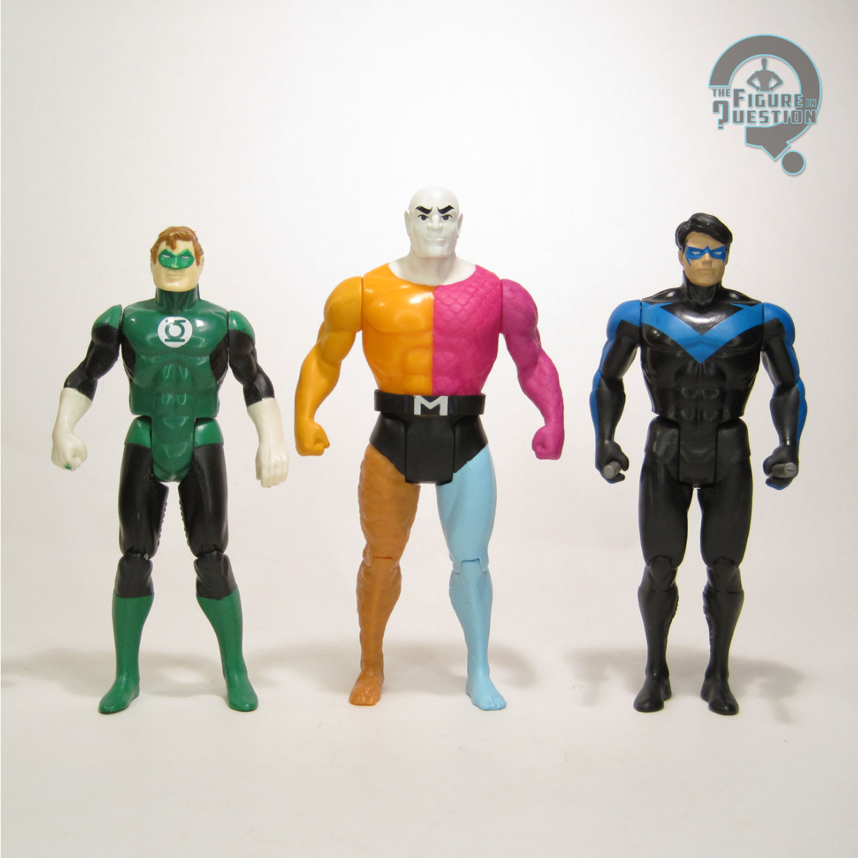
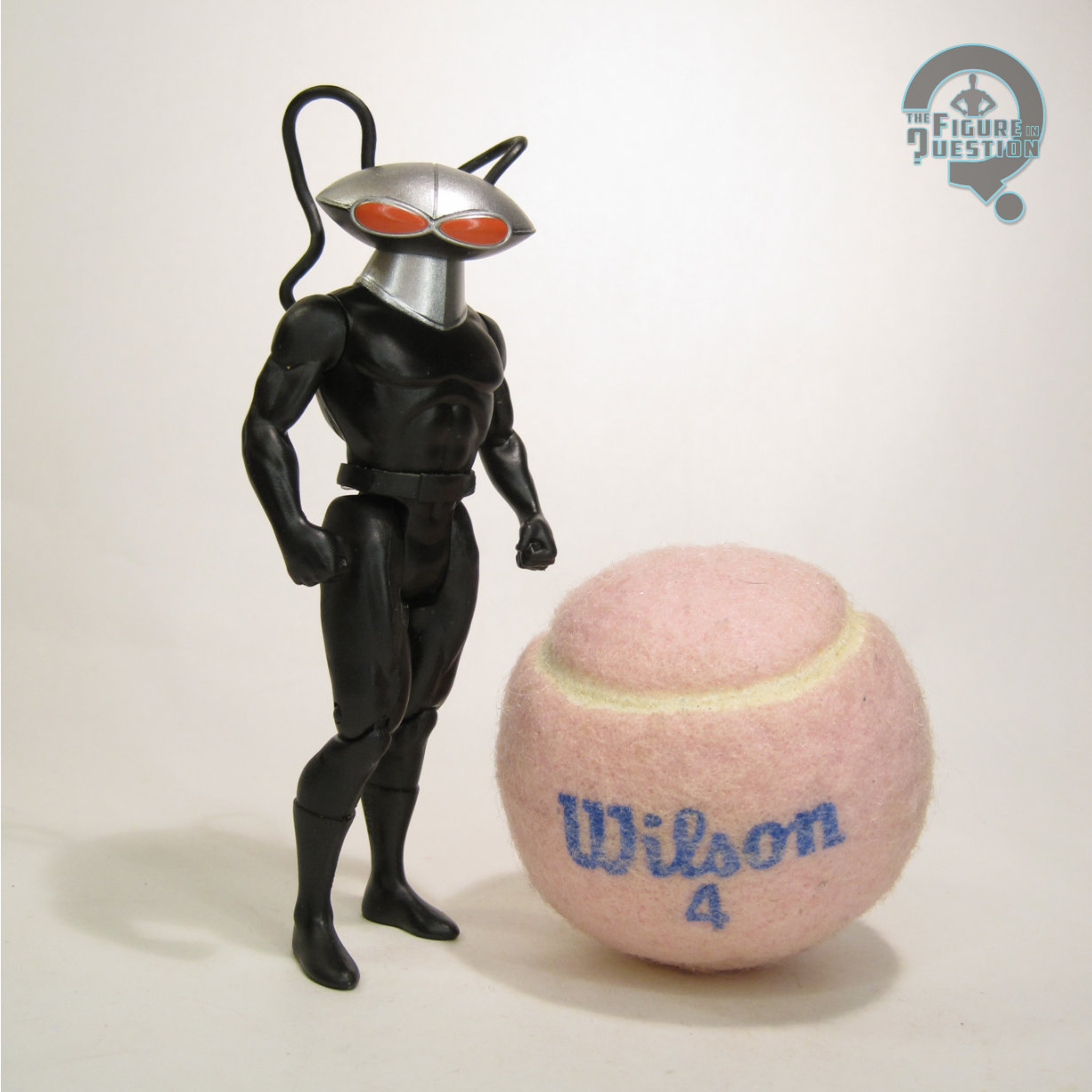
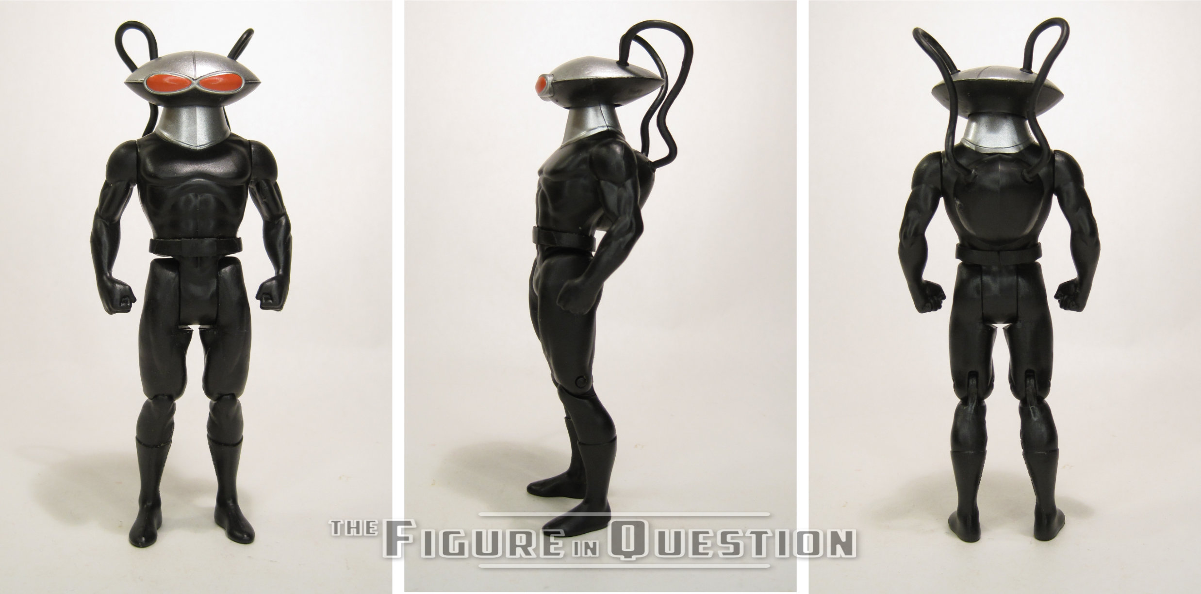
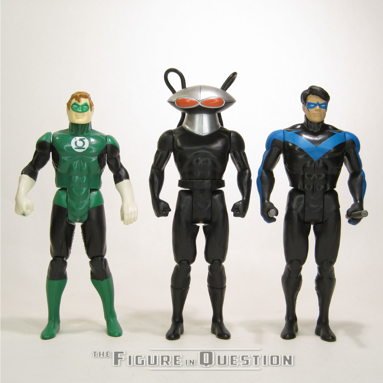
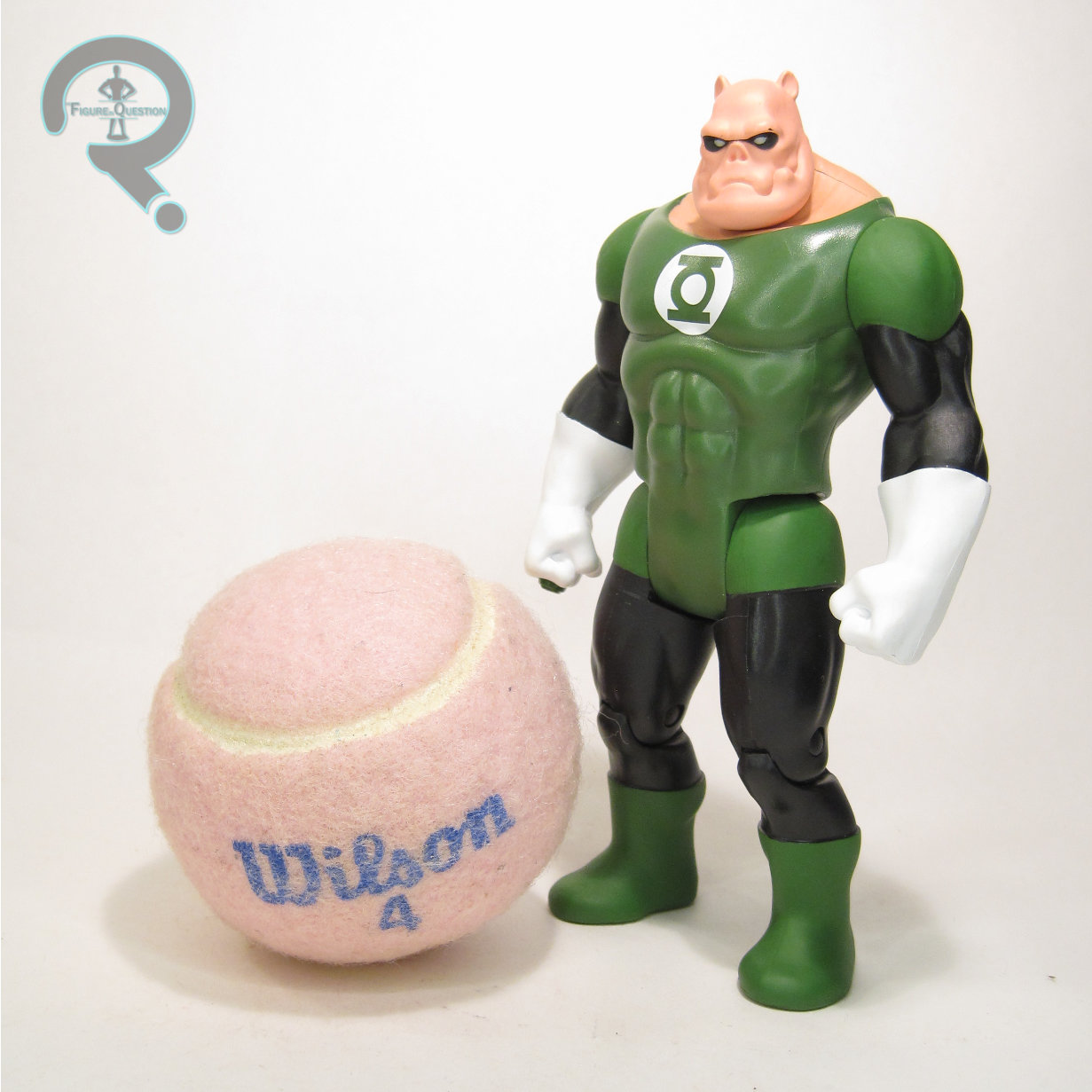
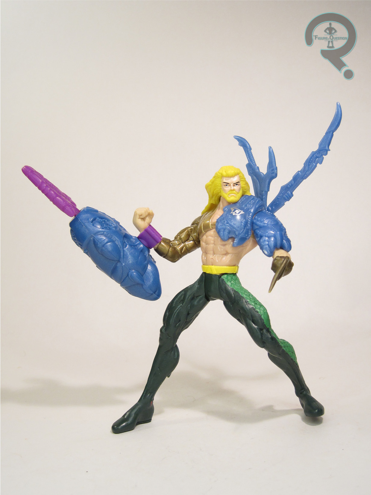
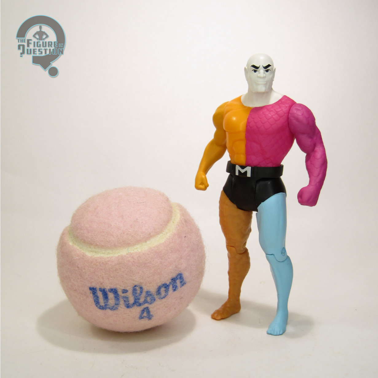
#3649: Aquaman

AQUAMAN

TOTAL JUSTICE (KENNER)

“Born in the underwater world of Atlantis, Arthur Curry leads a dual life as Aquaman, protector of the world’s oceans. He is able to “breathe” water, swim at speeds up to 100 miles per hour, and communicate with most sea life. Though his strength diminishes after prolonged exposure out of the water, Aquaman’s Fractal Techgear allows him to remain on land and battle villains with his blasting hydro spear for extended periods of time.”

Aquaman seems like he’s in this perpetual state of bouncing back and forth between everyone thinking he’s lame and the people responsible for his stories trying overcompensate for the perceived lame-ness by making him super edgy.  Perhaps the earliest instance of this was Peter David’s revamp of the character in the ’90s, a run which, amongst other things, had Arthur lose a hand and replace it with a hook.  Don’t ask how he lost it.  It’s really important that you don’t.  Because it made him very edgy and serious, and you don’t want to risk upsetting that.  To aid with the edginess, Arthur also grew a beard and long hair.  Edgy!  It was the ’90s, so there were toys abound, meaning this new Aquaman got coverage pretty darn quickly.  Let’s look at him today!

THE FIGURE ITSELF

Aquaman was released in 1996 as part of the first series of Kenner’s Total Justice line.  This was Kenner’s second time doing an Aquaman, following their Super Powers offering in the ’80s.  That one was, of course, in his classic attire, while this one was, as noted above, all edgy.  The figure stands just shy of 5 inches tall and he has 5 points of articulation.  Well, 5-ish.  The neck joint’s pretty my useless, what with the hair, and the range on the hips is also pretty restricted.  You can spin those shoulders all the way around, though.  Total Justice figures are, of course, defined by their extreme posing.  Aquaman follows suit, and has perhaps one of the most extreme poses the line had to offer.  So extreme that he can barely even stand most of the time, which is a bit frustrating at times.  Why the pre-posing?  What exactly is the pose?  I have no clue.  The sculpt is…well, it’s also extreme.  There’s certainly a lot of detail going on there, with all those flexing muscles and everything.  It matches well with the typical depictions of Aquaman from the time, so I’ll certainly give them that.  Aquaman’s color scheme came in two set-ups; the standard had the shoulder armor in an off-black, while there was a variant that did it in gold, presumably in reference to his classic costume.  Beyond that detail, the paint work remains the same on the two figures.  It’s not a bad set-up, and all the major details are present and pretty cleanly handled.  In addition to the odd posing, one of the other signatures of Total Justice was the “fractal armor.”  Aquaman’s is a sort of purple-ish asymmetric set-up.  It’s very goofy, and it’s very ’90s, and I very much enjoy it.

THE ME HALF OF THE EQUATION

So, I may not be the world’s biggest Aquaman fan myself, but he’s one of my dad’s favorite characters, which does give me a bit of a link to the character.  My first figure exposure was my dad’s old Mego, which he had on display in my parents’ living room.  I wanted my own Aquaman, and this was really my only option at the time.  I got the standard one pictured above, I want to say from an Ames near where my family vacationed?  I might be totally off on that, but it’s what I’m visualizing.  He was well-loved, and my only Aquaman for a bit.  He lost the hook not terribly long after I got him, and it was never fixed.  I snagged the gold variant more recently, when a loose one came through All Time.  He’s oh so much a product of his time, more so than just about anything else in this line, and, honestly, that’s pretty fun.

#3644: Evil Bizzaro

EVIL BIZZARO

SUPERMAN: THE ANIMATED SERIES (KENNER)

While Kenner’s tie-in line for Batman: The Animated Series was far from lacking in made up variants of its main character, it still did an okay job of filling in the villains and supporting cast. For Superman: The Animated Series, things were a touch less balanced, especially notable given how much harder it was to make variants of Superman. The third assortment of the line was *just* Superman variants, which led to it being skipped at mass retail. Kenner tried to course correct for the next set, which had a whole three non-Superman figures. It wound up being too little too late for mass retail, but the set got a second life through Diamond, which, amongst other things, made sure we didn’t miss out on Bizarro!

THE FIGURE ITSELF

Bizarro, or “Evil Bizzaro” as he was called on the packaging, was part of Series 4 of Kenner’s Superman: The Animated Series line, which was released domestically through comic shops via Diamond Distributors. He was also re-released under Hasbro alongside Supergirl and Metallo from the same series as part of the “Super Heroes vs Super Villains” boxed set. The figure stands about 5 inches tall and he has 6 points of articulation. His sculpt was totally unique to this figure, and honestly one of this particular line’s best. Kenner struggled with keeping these figures on-model to the show, especially when it came to proportions, but Bizarro is actually a pretty good match to his animation model. Even the rather notable pre-posing isn’t a terrible departure from Bizarro’s usual poor posture in the show. Bizarro’s color scheme here isn’t bad. The purple’s a little closer to lavender than it really should be, and his belt is green for some unknown reason, but generally the look is good. Bizarro is packed with a wheel and a gear, molded in grey for this one, which is the single release, or in block for the boxed set version. The figure has a wheel in his back, which, when turned, spins his arms in opposite directions, allowing him to swing his accessories back and forth.

THE ME HALF OF THE EQUATION

As a kid, I owned one figure from Series 4, and it wasn’t this guy. My first Bizarro was actually one of the Mattel ones, though I always wanted one of these. I got my shot at him a little bit back, when a bag of DC animated figures got traded into All Time, and Max and I split the contents. He’s one of the best this line had to offer, so I’m glad I finally got one.

Thanks to my sponsors over at All Time Toys for setting me up with this figure to review.  If you’re looking for cool toys both old and new, please check out their website and their eBay storefront.

#3641: Superman – Man of Steel

SUPERMAN — MAN OF STEEL

ONE:12 COLLECTIVE (MEZCO)

Fun FiQ Fact #0120:  Justice League Unlimited‘s adaptation of “For The Man Who Has Everything” is a rare instance of Alan more actually liking an adaptation of his work, even allowing his name to be credited in the episode.

In a world where I’ve got plenty of options for solid 6-inch figures of Marvel characters, it’s still a little baffling at times how hard it is to find similar quality DC figures in the same scale.  It’s largely locked in on the higher price-point stuff, and even then, you’re dealing with very specific looks.  I love Superman, but I’ve struggled to find a solid Superman figure, honestly at any scale.  I keep trying them out, and I keep being kind of let down.  But…I’m trying again.  With Mezco, even.  It’s an odd day for me, I won’t lie.  Let’s see where it goes.

THE FIGURE ITSELF

Superman – Man of Steel is part of Mezco’s One:12 Collective line, offered as a one-off steel-boxed release last year.  He’s their second classic comics Superman.  The first one was more general purpose, while also being adapted to Mezco’s in-house style (more in line with earlier One:12 offerigns), but this one is a little more specifically based on Superman circa John Byrne’s Man of Steel reboot of the character.  It’s not an exact match, though, for reasons I’ll touch on further down.  The figure stands just under 6 1/2 inches tall and he has over 30 points of articulation.

Mezco figures tend to get more than one head, and that’s maintained here…and then sort of shifted into overdrive, because the figure gets not one, not two, but seven different heads.  It’s…it’s a lot of heads.  Possibly too many heads.  I mean, I don’t want to seem ungrateful for the options, but, like, wow.  All of them are pretty clearly inspired by Byrne’s version of Clark.  I may have my issues with what Byrne did for the character from a story standpoint, but there’s no denying that his illustrations of Clark are always solid, and a pretty definitive take.  Of course, Byrne’s style is one the more cartoony side, whereas Mezco’s aiming for something more real-world.  The translation works okay…for some of the heads.  In particular, the friendliest of the heads really works, and feels like a proper Superman through and through.  The angrier heads aren’t bad either, albeit sort of out of character.  It’s the in-between ones that I feel just slightly miss the mark, making him look downright crazed; there’s some real uncanny valley stuff going on there.  But, of course, there’s so many heads that even if a bunch of them are iffy, there’s still plenty to work with.

Superman’s base body is a slightly bulked up one, but with slightly more balanced proportions than, say, the earlier Captain Americas.  It still looks a little squat from certain angles, but it’s generally a solid match for Clark’s usual build.  The outfit makes use of a jumpsuit with an attached cape, red briefs, a sculpted belt, and sculpted two-piece boots.  The coloring on the suit is really nice, and I dig the exact shades they’ve gone for.  His chest emblem is one notable deviation from the “Man of Steel” set-up, being a basic classic Superman logo, rather than Byrne’s larger version.  He’s got a matching one in all yellow on the back of the cape, which, it’s worth noting, gets wires for posing.  I’m glad they moved away from the weird armature pieces for the capes.

In addition to all seven heads, Superman still gets a huge selection of extras, including five pairs of hands (fists, gripping, flat, and two different styles of open gesture), two different styles of heat vision attachments, a Starro spore, the Black Mercy, three bullet ricochets (which attach to the torso via magnets), a container of all the different colors of Kryptonite, two punching effects, a Phantom Zone projector, and a display stand.  Despite the “Man of Steel” influences of design, a lot of the accessories included are notable Pre-Crisis elements, which makes for an interesting mix.  It’s a lot of cool stuff, though.

THE ME REMAINDER OF THE EQUATION

In my search for a solid Superman in this scale, I’ve largely overlooked Mezco, because I’d kind of moved away from them.  When this one was shown off, I was intrigued, but not enough to jump on it right away.  Then All Time got three of them traded in over a three month span, and I took that as something of a sign.  The middle one was loose, so I got to actually mess with him in hand, and I honestly just couldn’t say no at that point.  He’s got some minor things off, and the sheer number of heads is downright silly, but I generally really, really like this guy, and I’m glad I decided to snag one.

Thanks to my sponsors over at All Time Toys for setting me up with this figure to review.  If you’re looking for cool toys both old and new, please check out their website and their eBay storefront.

#3636: Parallax

PARALLAX

TOTAL JUSTICE (KENNER)

Fun FiQ Fact #0115: According to Wikipedia, a parallax is “the difference in the apparent position of an object viewed along two different lines of sight,” which is honestly not a terrible name to attach to a former hero driven to extremism.

Growing up, thanks to my dad’s old comics and re-runs of Challenge of the Super Friends, I became rather attached to Hal Jordan, despite his having been replaced by Kyle Rayner in the role before I started reading comics.  Options for Hal figures were, admittedly, a little limited in the ’90s, with the only option in 5-inch scale being not a Green Lantern figure, but Parallax, Hal’s villainous turn from the comics.  Of course, in my collection, he was never *really* villainous.

THE FIGURE ITSELF

Parallax was released in Series 3 of Kenner’s Total Justice, which wound up being the line’s last series.  Each set got one “villain”, which was Parallax…I guess.  Like I said, never so much to my eyes.  The figure stands just under 5 inches tall and he has 5 points of articulation.  Total Justice‘s sculpts were always very heavy on the pre-posing, and Hal’s no exception.  This one’s definitely one of the better ones; Hal’s flair for the dramatic during this era translates well into the sculpt, and he’s got a pose that reads as dynamic, without being too absurd. The sculpted elements of the costume are a pretty good match for the source material (certainly a closer match than McFarlane’s attempt from two decades later), and there’s a nice sharpness to them. The head’s my favorite part of the whole thing, capturing Hal’s likeness, while also getting the crazed expression he was so wont to have during this period of time. The last set of Total Justice got a lot of its paint budget slashed, resulting in a lot of unpainted elements. For his part, Parallax was pretty fortunate, getting all of the base details he was supposed to, and really only missing out on a few metallic details. The end result still looks totally fine, and you’d be unlikely to guess what was cut if you didn’t know it was supposed to be there. Another notable change-up for the last round was making the accessories into things that made a little more sense for the characters. Rather than “fractal armor”, Parallax gets a missile launcher and a shield, both molded in clear green.

THE ME REMAINDER OF THE EQUATION

I had a few Total Justice figures when they came out, but Series 3 was pretty rare at the time. I wanted a Parallax, of course, since he was the only option for Hal, but it took a bit for me to find one. I wound up getting him just a few years after his release, at a toy show my dad took me to, I think for my birthday. He’s a solid figure, even now, and remains my favorite of the Total Justice line-up.

#3631: Condiment King

CONDIMENT KING

BATMAN: ANIMATED (DC DIRECT)

Fun FiQ Fact #0110: In his original Batman: The Animated Series appearance, Condiment King was one of three new “villains” who turned out to be stand-up comedians brainwashed into villainy by the Joker.  The other two, Packrat and Mighty Mom, didn’t have the same staying power as the King, though.

As a kid of the ’90s, I of course experienced a great deal of Batman: The Animated Series in its…well, maybe not first run, but early run.  Syndication run?  Something like that.  However, I hardly saw the whole run of episodes.  For a good portion of the episodes, I actually saw them for the first time when the DVD collections came out.  I quite proudly had the whole run of Batman, and I watched those DVDs religiously in my teen years.  It was through those religious watchings that I gained my appreciation for characters like Condiment King, a one-off throw-away character from the episode “Make ‘Em Laugh.”  As in depth as Kenner/Hasbro’s Batman: The Animated Series tie-in lines were, we never got anything that deep.  But, McFarlane’s DC Direct-branded relaunch of the DC Collectibles/Direct Batman: Animated line has been doing sets of re-paints that have new figures done as Build-A-Fogures, and, well, where else am I going to get a Condiment King, right?

THE FIGURE ITSELF

Condiment King is the Build-A-Figure for the first “new” assortment of Batman: Animated under McFarlane (previous releases have just been straight reissues of DCC/DCD figures), assembled by purchasing re-decoed versions of Batman, Robin, Mr. Freeze, & Scarecrow.  The figure stands about 6 1/2 inches tall and he has 26 point of articulation.  In terms of movement, he’s pretty much on par with the later run stuff from DCC/DCD, which is a good thing, since that’s when they started actually giving the figures consistently useful articulation.  Unfortunately, McFarlane’s spottier QC hits a bit here, though, and pretty much every copy has incredibly loose hip joints, which make him quite tricky to keep standing.  Other than that, though, the articulation works quite well.  Condiment King’s sculpt was an all-new one, and a pretty good one.  Condiment King comes from the pre-design change years of the show, which is when the characters had a tendency to be more inconsistent from shot to shot.  This guy seems to be aiming for a “best approximation” look, rather than going for one specific frame from the show.  The general feel is there, and the only real inaccuracy that sticks out to me is the lack of ears visible under his cowl.  The most important aspect of the sculpt, of course, is that he fits in with the pre-existing figures, and that he definitely does.  In terms of color work, Condiment King does run into the one notable downside of the McFarlane Animated figures: cel shading.  DCC/DCD experimented with some shading later in their run, but only for characters that already had figures, and in a fairly minor fashion.  While Condiment King isn’t as intense as the others in the set that builds him, but it’s still a little…off looking, especially because it doesn’t really follow a logical path, and there are just a bunch of spots it outright skips.  It’s weird.  Not ruin him weird, but worth noting it weird.  Also, there’s one notable error: the packets on his right arm should be red, not white.  It’s small, but still important.  Condiment King includes his backpack and attached ketchup and mustard guns.  The backpack doesn’t sit *quite* right on his back, but it’s close enough.  I like that they used actual string for the tubes going to the guns, so as to avoid issues of breakage.

THE ME REMAINDER OF THE EQUATION

You know whose fault this is?  I’ll tell you: Max.  See, I wanted this figure, sure.  It’s Condiment King, and he’s great.  However, I’d already walked away from and unloaded a large portion of my DCC Batman: Animated figures, and I certainly wasn’t looking to re-buy four of them for a single new figure.  So, no Condiment King for me.  But, Max wouldn’t stand for that, so when a complete one came into All Time, he purchased it for me.  So, Condiment King for me.  He’s got his issues, but he’s still fun, and I’m glad to have him.