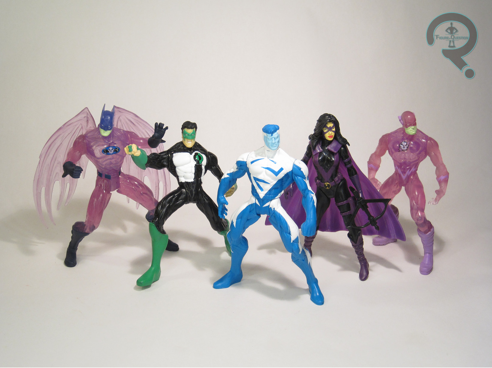
SUPERMAN BLUE, GREEN LANTERN, THE HUNTRESS, HOLOGRAM BATMAN, & HOLOGRAM FLASH
JLA (KENNER)

“The mightiest heroes in the universe join forces to combat the world’s most diabolical villains – and their own evil counterparts!”
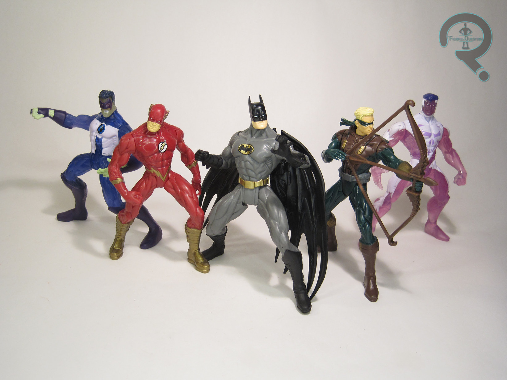
In 1996, looking to expand their DC line beyond just Batman, and after the success of the more comics-based Legends of Batman, Kenner launched Total Justice. Okay, to be more specific, they launched “Batman: Total Justice” because they still weren’t totally sold on non-Batman success. The line did alright, but only lasted three assortments, two of them abbreviated ones at that. Two years later, they revisited the concept, in light of the success of the relaunched JLA comic, and dubbed it, rather predictably, JLA. The whole thing was kicked off by two boxed sets, which repurposed old TJ molds to put the characters back out before delving into new ones. The sets re-released six JLA members, coupled with four of their holographic duplicates from “Rock of Ages.” And hey, why don’t I look at the first of those today?
THE FIGURES THEMSELVES
Superman Blue, Green Lantern, Huntress, Hologram Batman, and Hologram Flash were released as “The World’s Greatest DC Comics Super Heroes Collection I” boxed set, which, along with Collection II, kicked off Kenner’s JLA line. Both sets were Previews-exclusives, though the three JLA members per set were also available in the first single-carded assortment of the line.
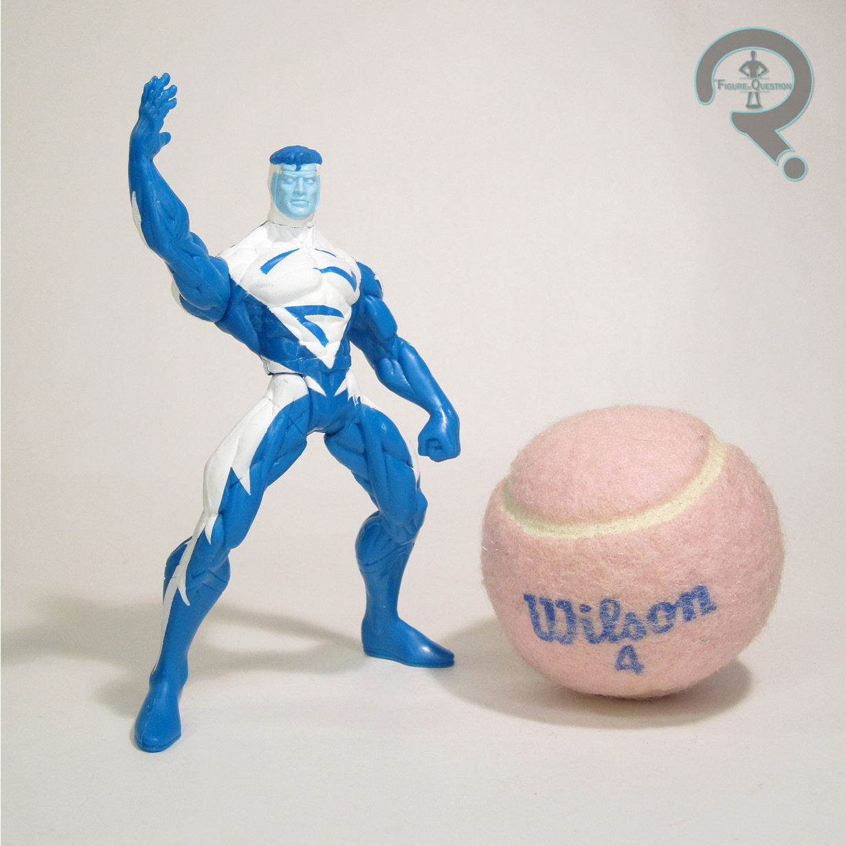
SUPERMAN BLUE
 “As one half of Clark Kent’s alter ego, Superman Blue is slow to anger, patient, courteous and serious in nature. He shares the powers and strategic thinking of Superman Red, but their different attitudes tend to get in each other’s way.”
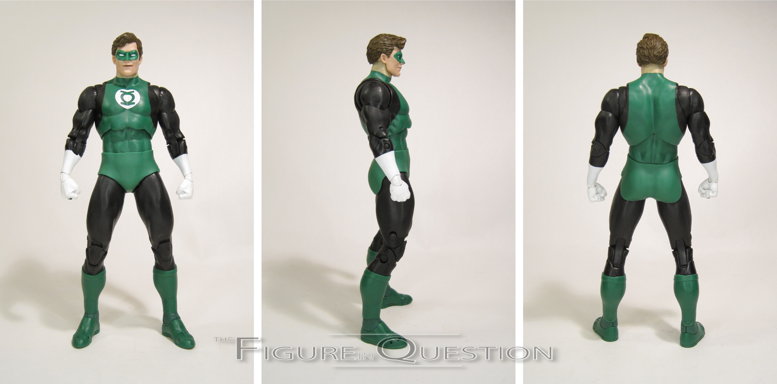
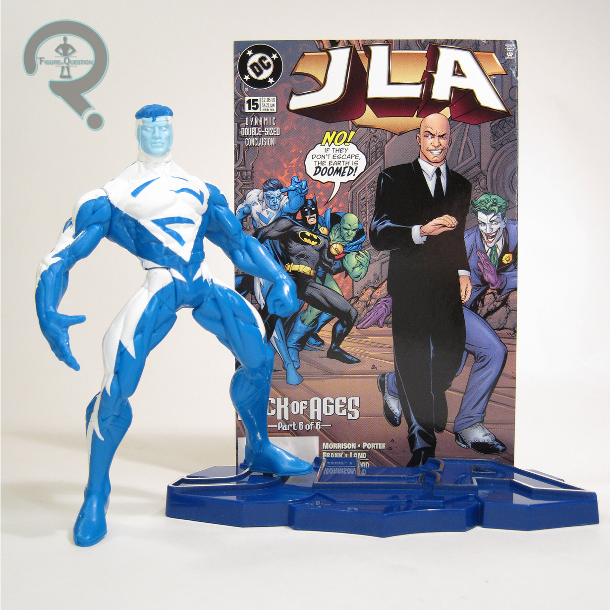
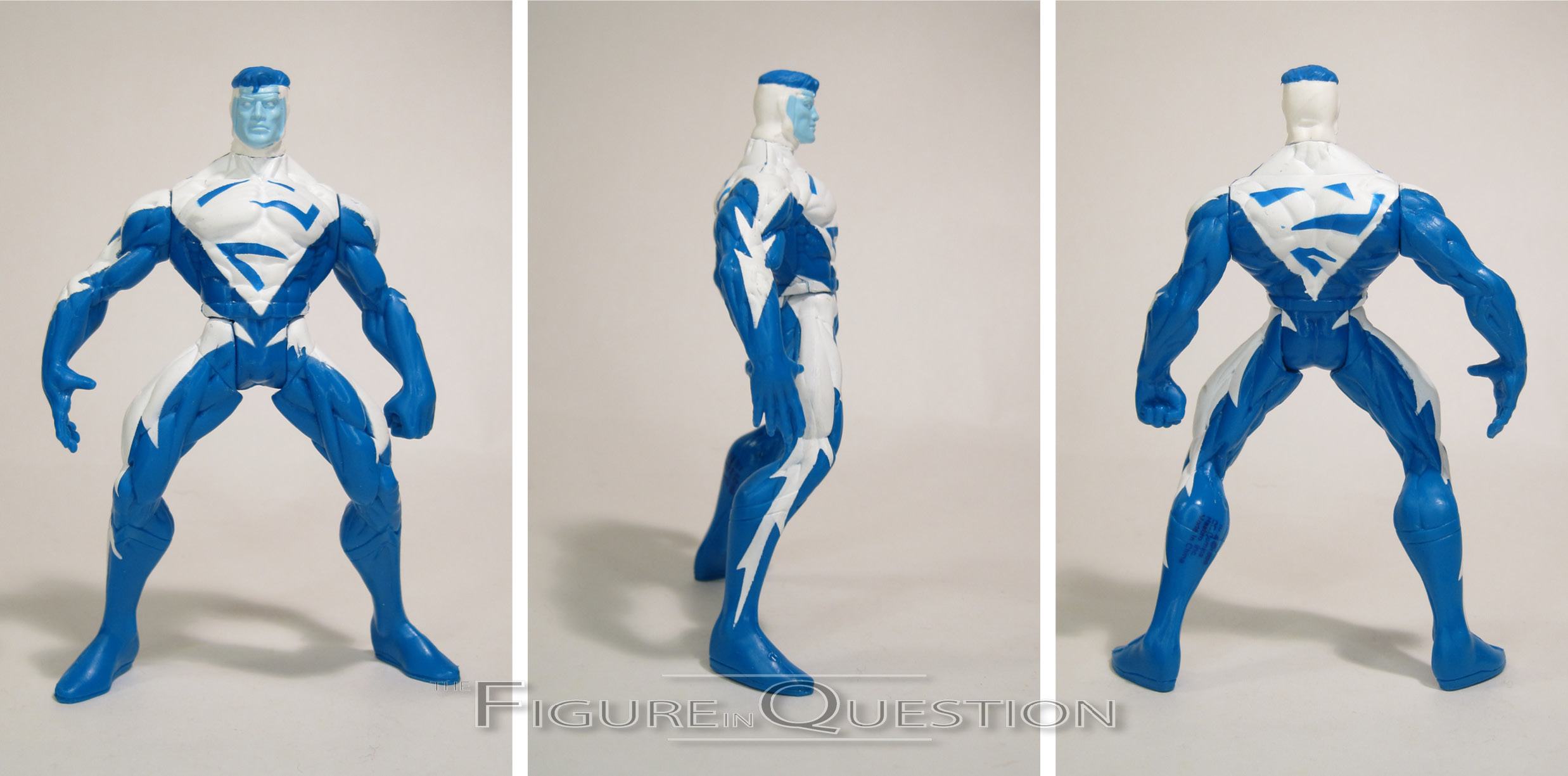
While Man of Steel and Total Justice had hit firmly during Superman’s mullet phase, JLA hit right as he was spending a year with a brand-new power set, and a brand-new design to correspond. So, rather than a classic Superman (who, to be fair, we got later down the line), our main Superman at launch was Superman Blue, who got his first of three figures in short succession right here. The figure stands 5 inches tall and he has 5  points of articulation. He is, unsurprisingly, the exact same construction as the Superman Red from the single-card releases, meaning he’s the Total Justice Superman sans cape, with the head of the Man of Steel line’s Hunter Prey Superman. It’s not a perfect set-up. In fact, it’s not a great set-up, since he still keeps all of the sculpted details for the standard Superman costume, as well as the totally different head gear set-up of the Hunter Prey design. They straight up just paint over it all and really hope you don’t notice. And, honestly, it’s fine. It’s not great, but it’s fine. The colors actually look really solid; like Red, Blue is bright and vibrant, and really pops off the shelf. I can definitely dig that. Superman Blue gets a blue JLA display stand, and a cardstock cover of JLA #15, which does at the very least actually feature him.

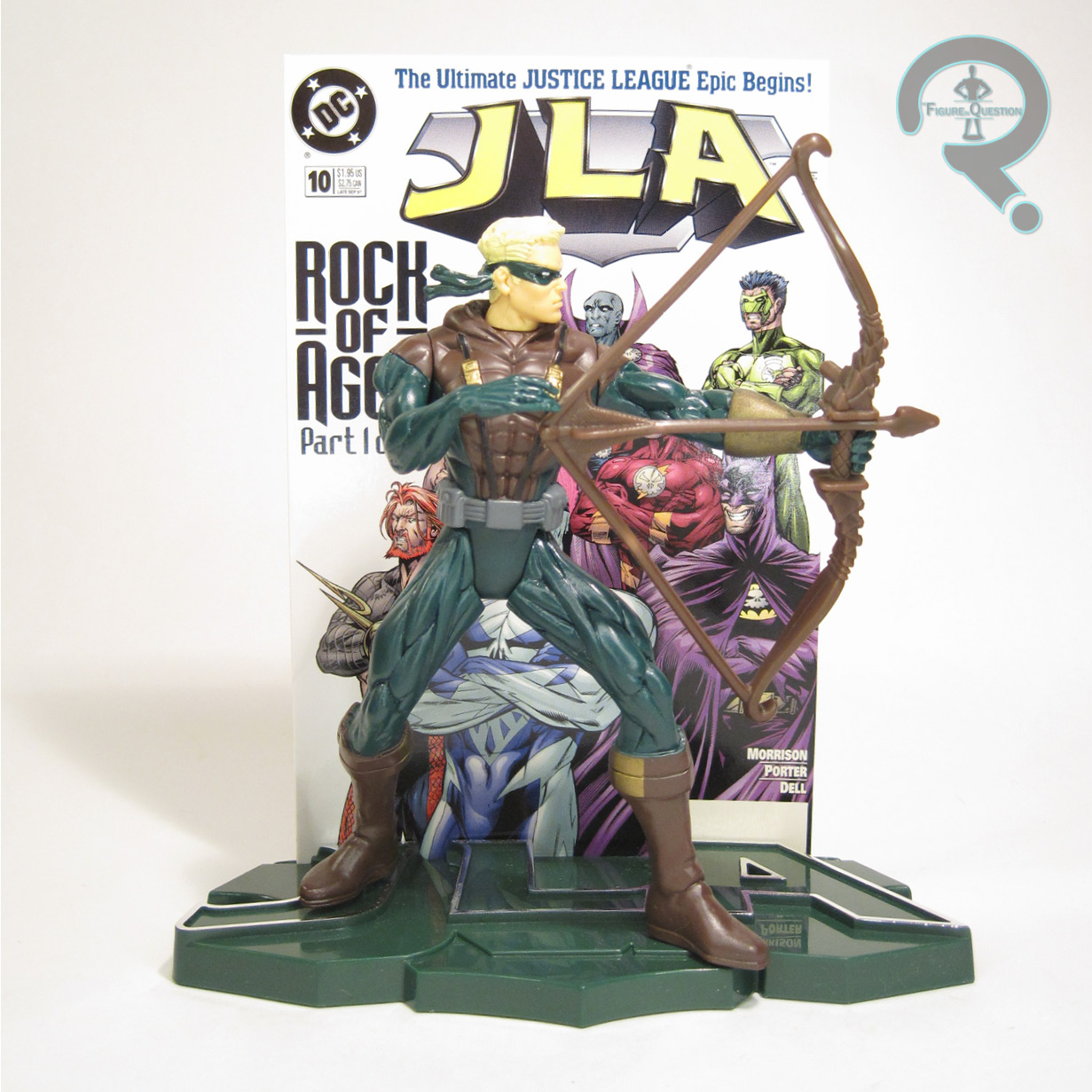
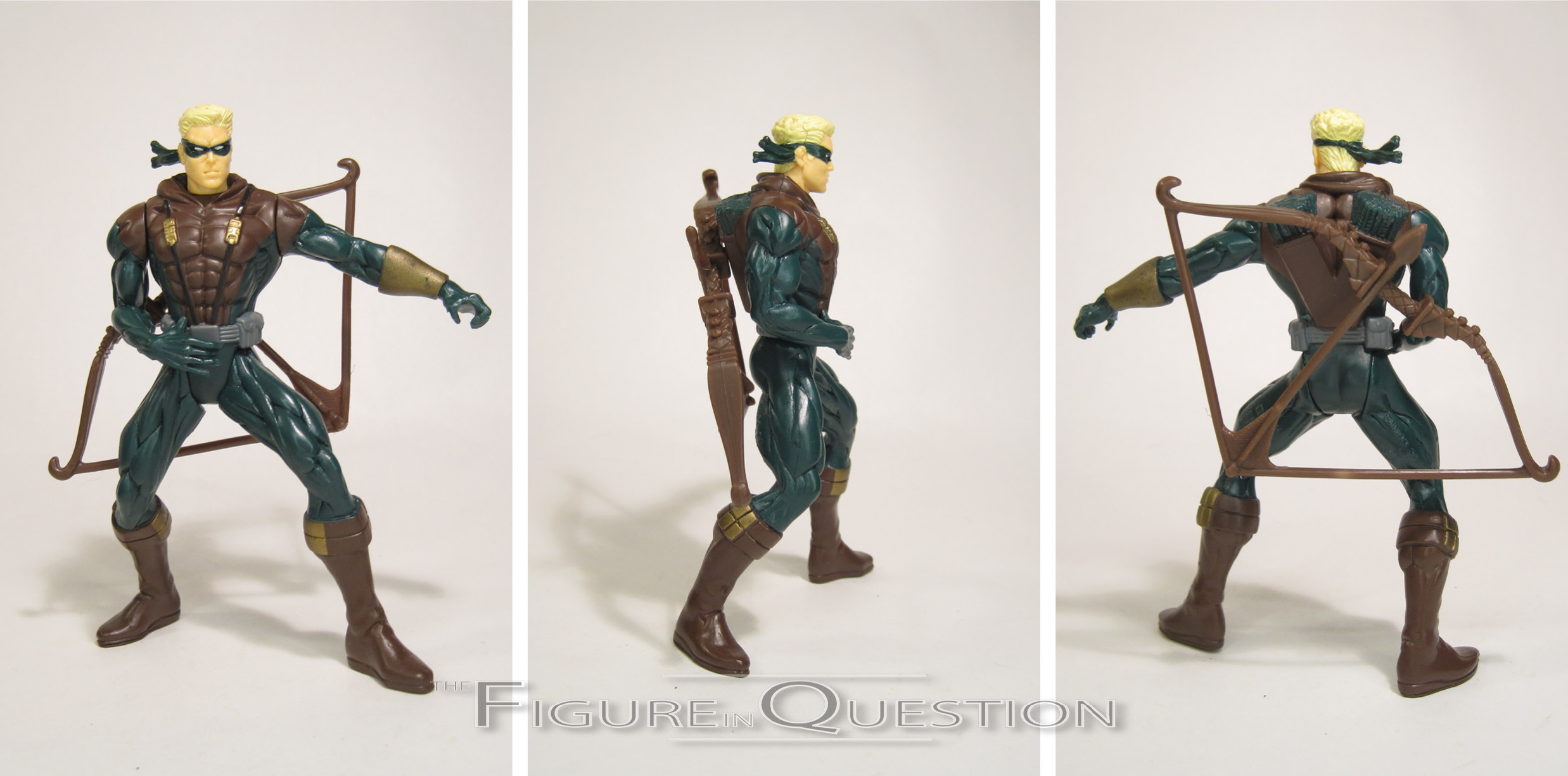
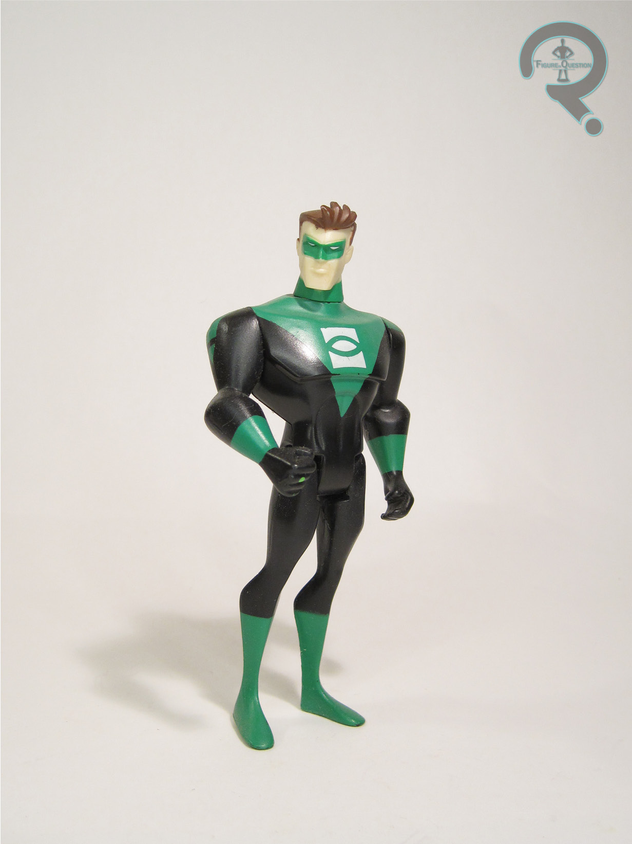
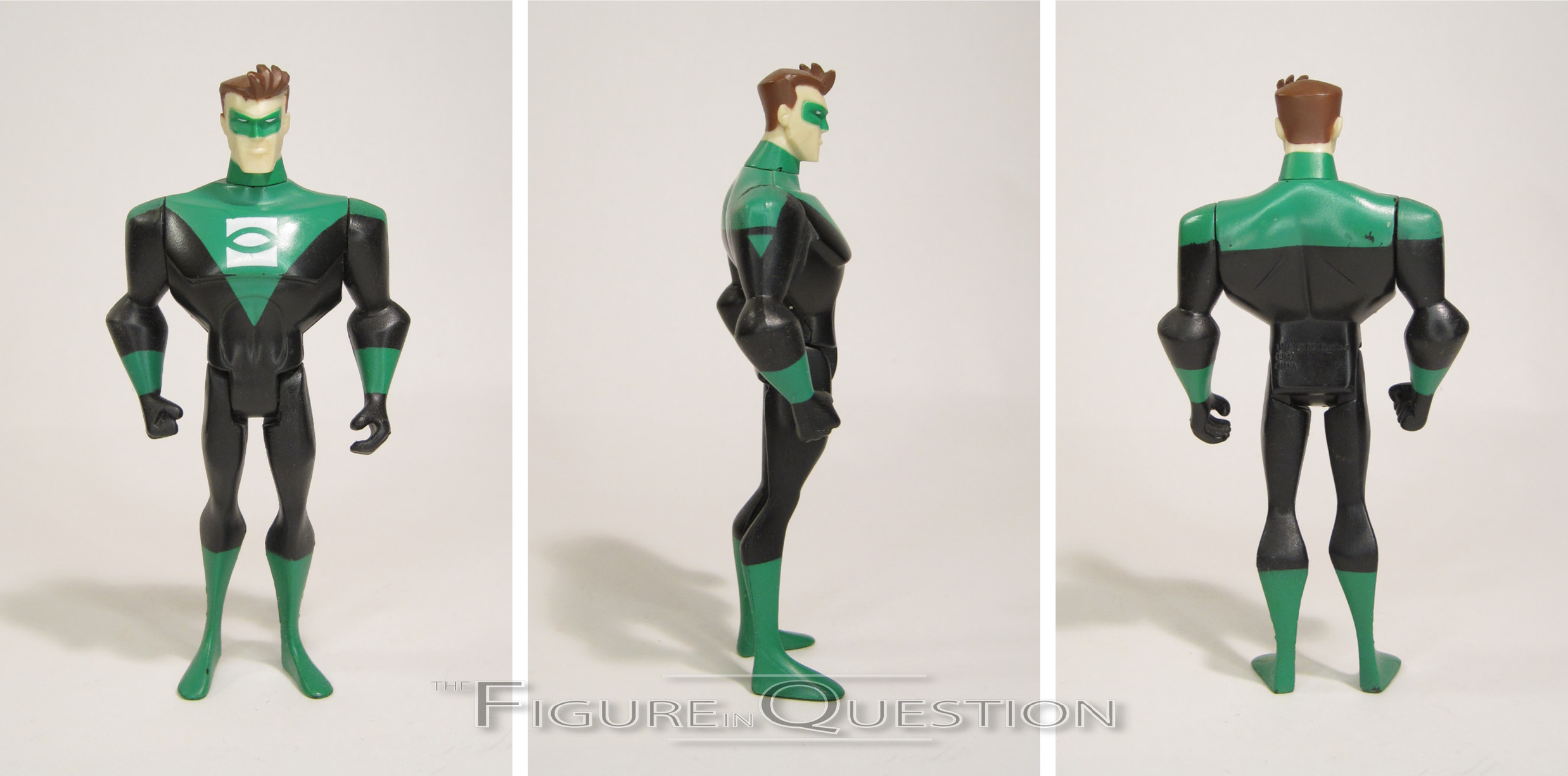
GREEN LANTERN
 “One of the youngest members of the JLA team, Kyle Rayner inherited a ring, which is considered to be the most powerful weapon in the universe. The ring is capable of generating solid light in the form of anything Kyle imagines”
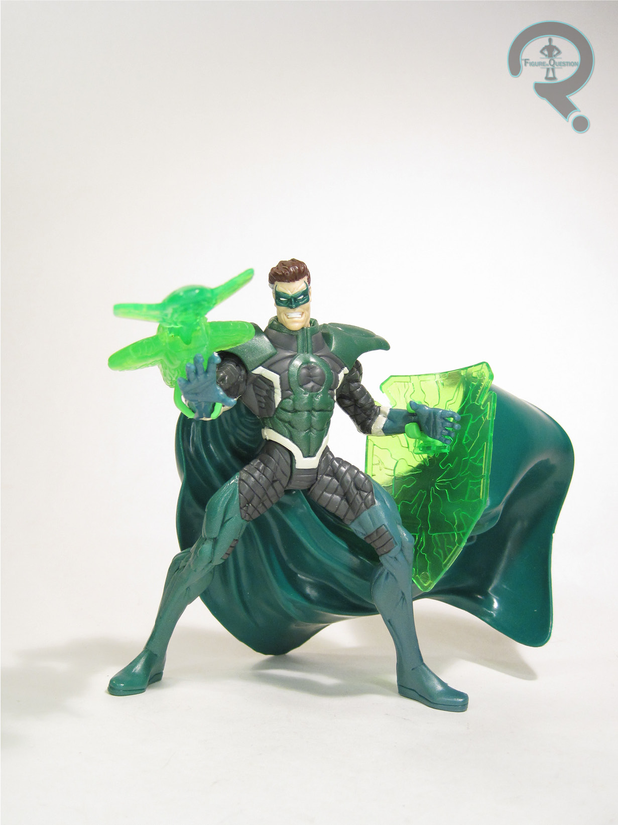
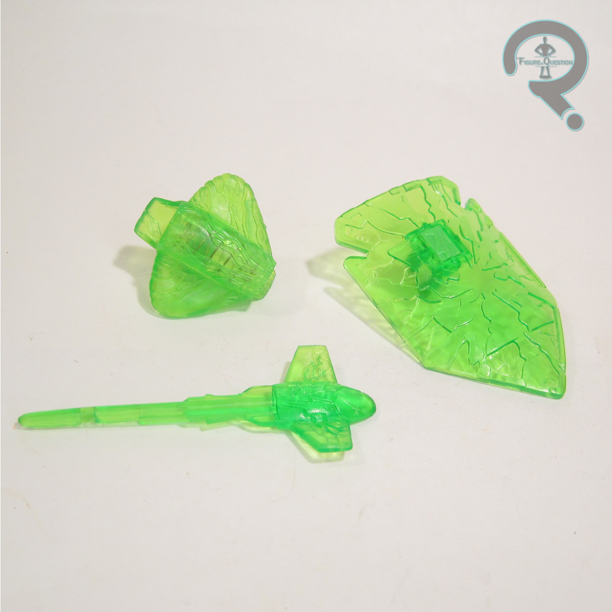
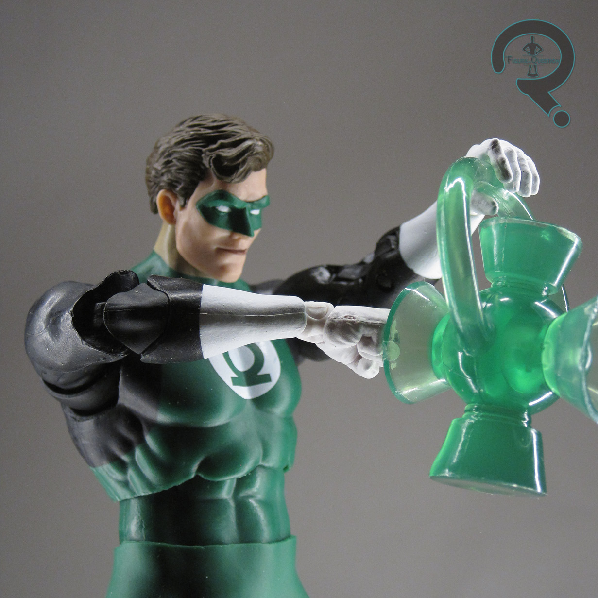
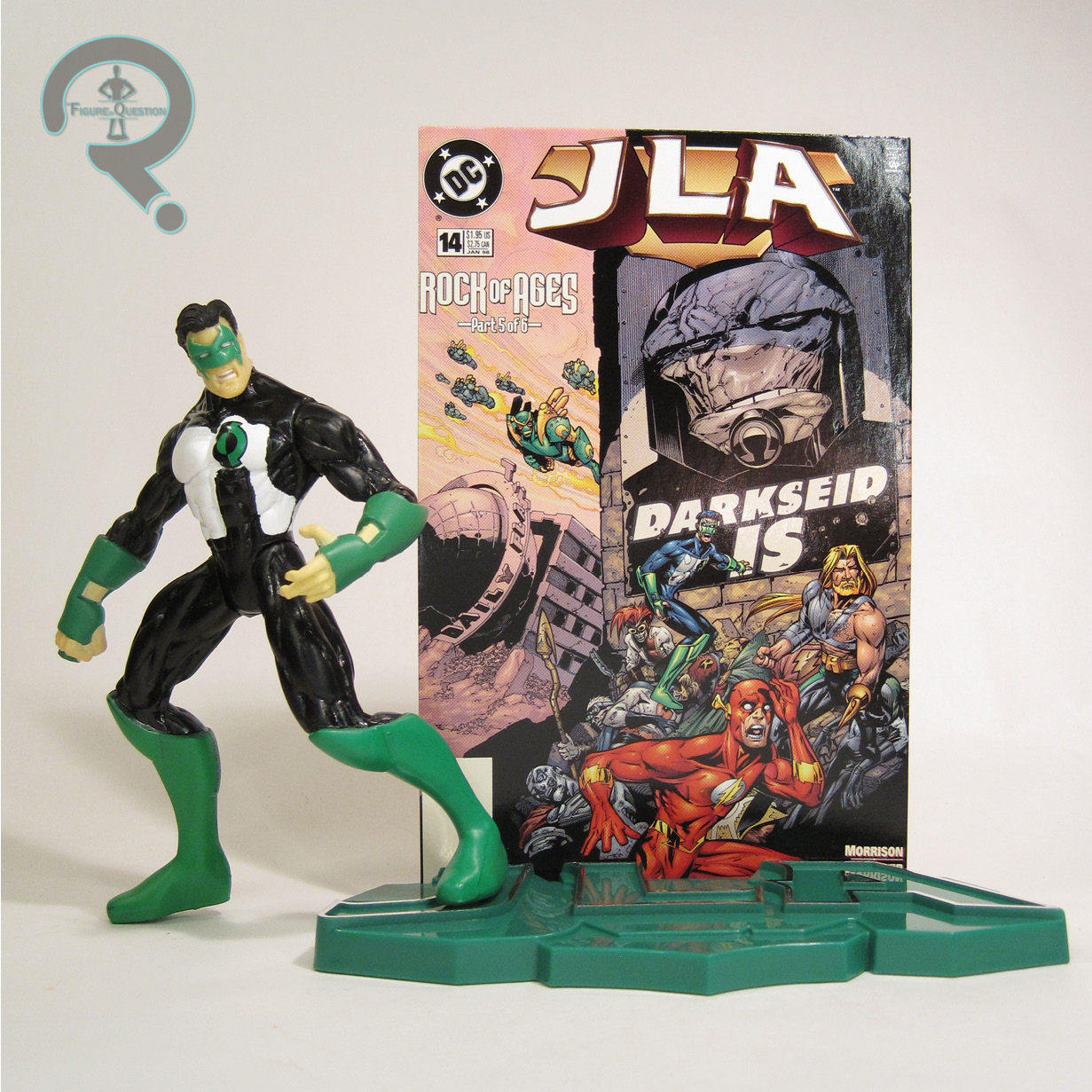
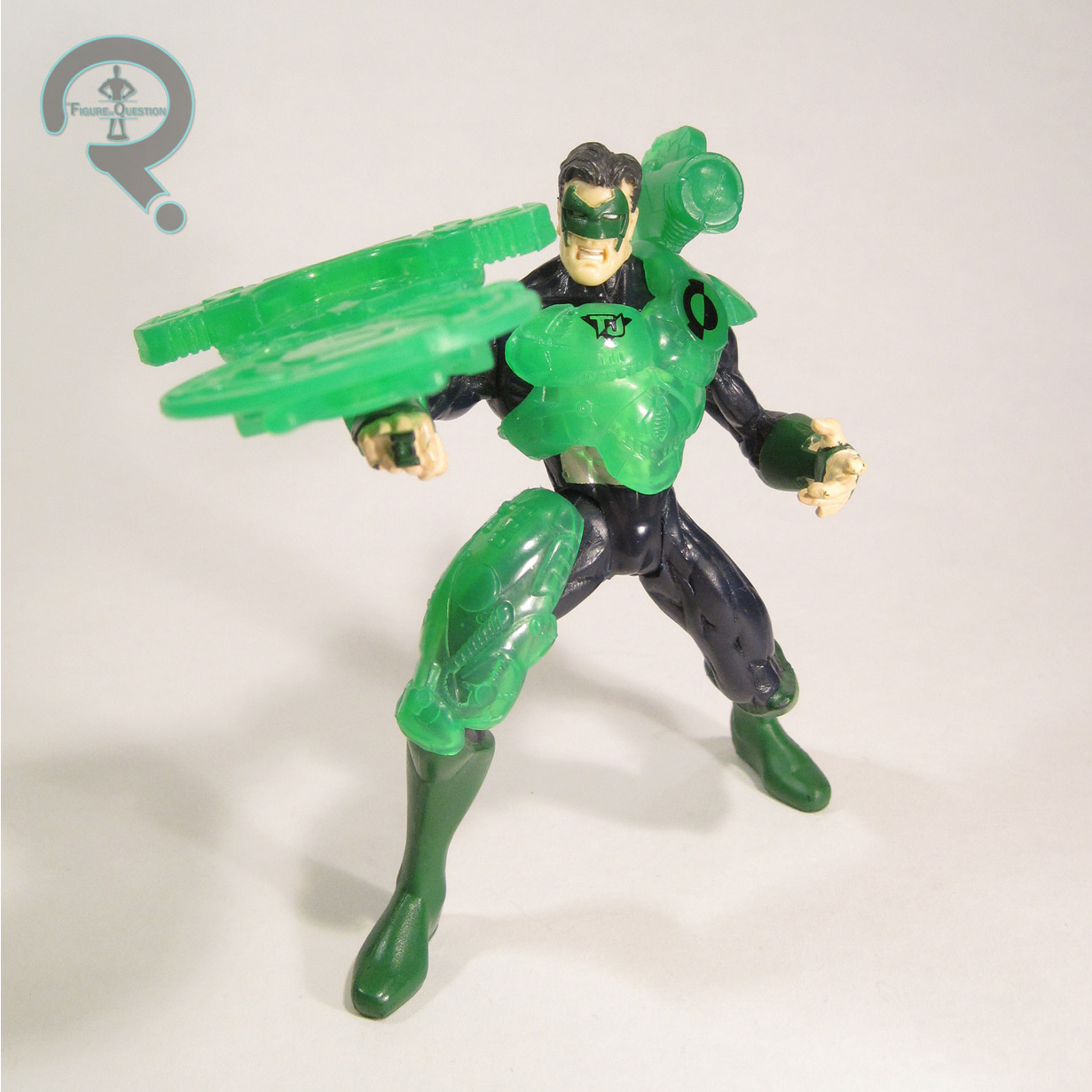
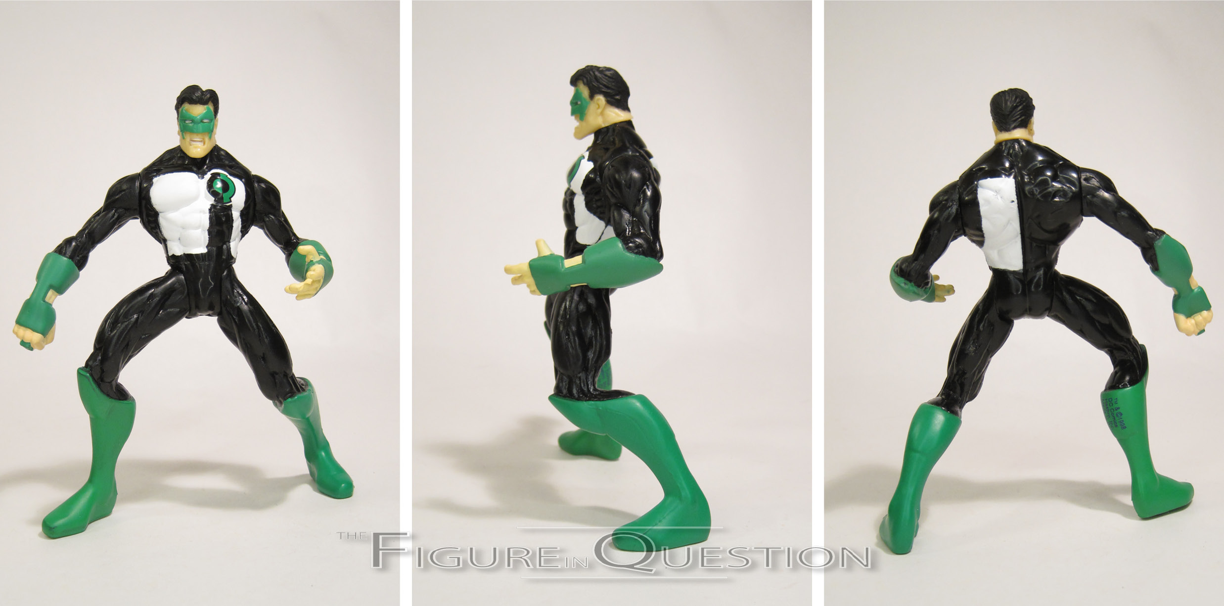
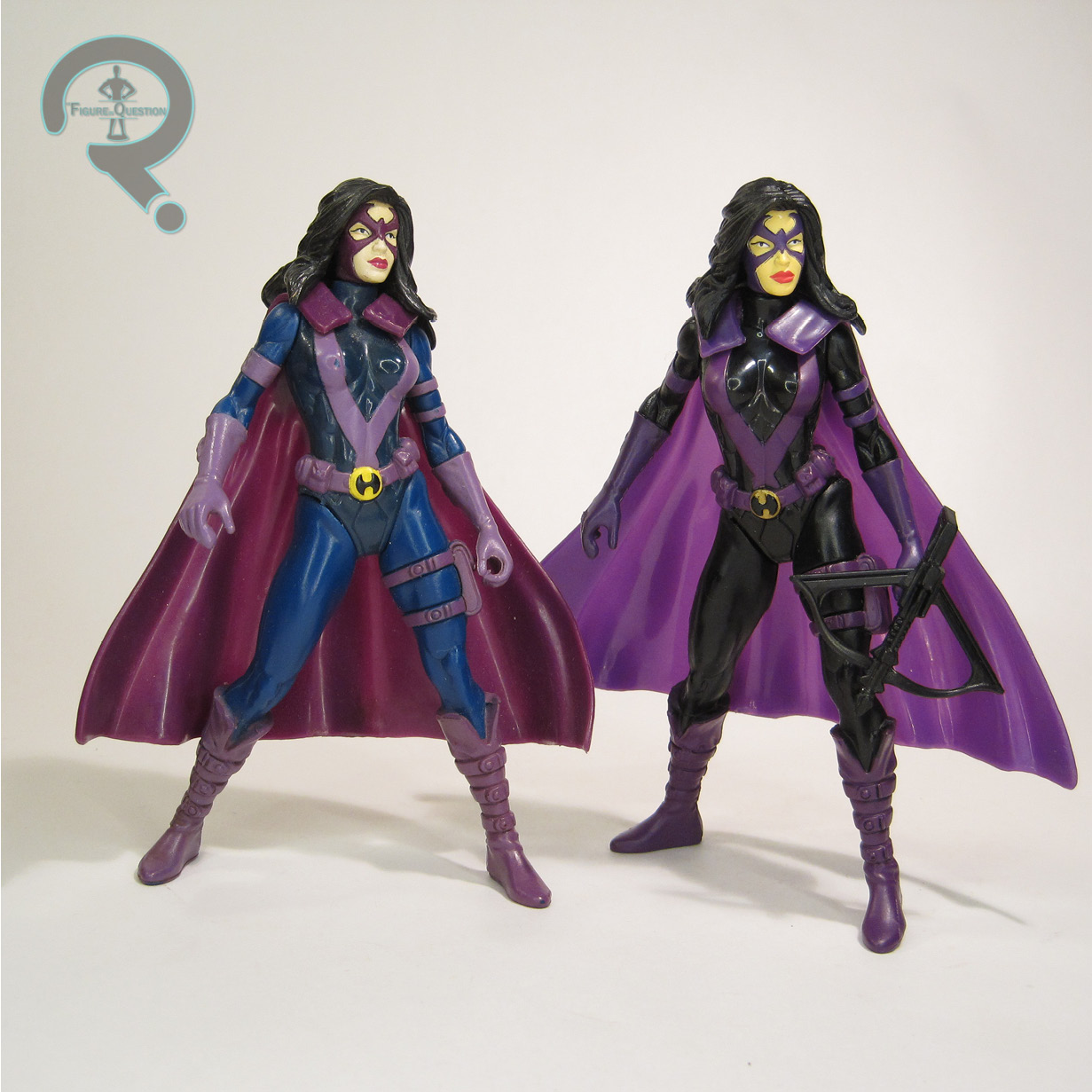
Since Kyle Rayner was the Green Lantern of the ’90s, he had gotten his first figure during Total Justice. JLA gave him a rather quick follow-up second, albeit one that’s not incredibly different from the first. Whatever the case, the figure stands just under 5 inches tall and he has 5 points of articulation. Kyle’s sculpt is one that has a lot of trouble standing, due to the severe pre-posing present. Those legs are just jutting out there. It’s kinda crazy, really. The best word I can think of to describe it is “intense.” Like, he’s very angry, and very into it, and he’s not planning to stop any time soon. Kyle was generally depicted as rather on the jovial side, but that’s not the case with this guy,  who’s got a pretty angry look about him. Presumably, he just found his girlfriend in the refrigerator. Shame. It’s a sculpt that I don’t think anyone can quantify as “good,” but it sure does do…something. Look, it’s very memorable. In terms of color scheme, Kyle’s original Total Justice figure was pretty subdued on his colors, with the greens a little on the darker side, the black more of a dark blue, and the white a sort of pearlescent shade. For JLA, which tended to aim darker, they actually punched it up a bit. The white and black are much starker, and the green is just a tad lighter. During Total Justice, GL got some of the line’s crazy Fractal Armor, but in his case it was done up in translucent green plastic, so it looks like a construct, which seems less silly. For JLA, he got a green stand and a backer with JLA #14 on it. He’s one of the three Leaguers on the cover, so it works well enough.

HUNTRESS
 “In a quest for vengeance against the death of her family, Helena Bertinelli, a Gotham City high school teacher, became The Huntress. With her arsenal of weapons, she preys upon Gotham City criminals.”
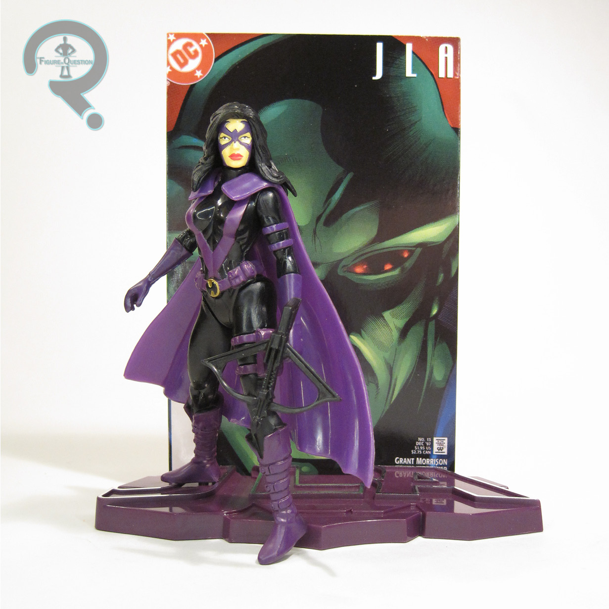
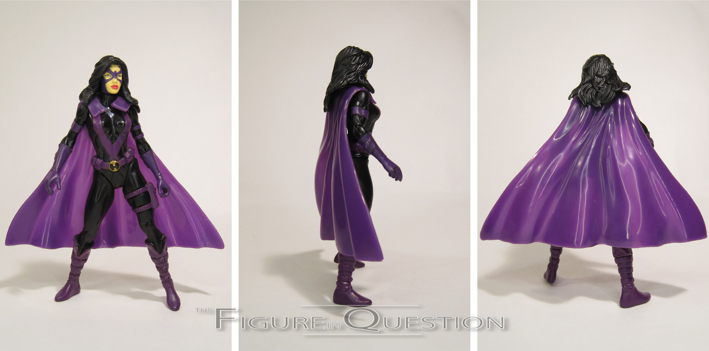
Huntress was a later addition to the JLA in the comics, and also had been a late addition to Total Justice, hitting during the ill-distributed final wave of the line. As such, she’s one of two odd-ball characters included in these sets, without a Hologram duplicate in the alternate. She’s seen here in her mid-90s attire, which she quite fortunately kept through both Total Justice and JLA’s runs. I’ll admit, it doesn’t quite hit the same for me as the later Jim Lee redesign, but I guess it’s not a terrible design. The figure stands a little under 5 inches tall and she has 5 points of articulation…technically. Of course, the hair costs the neck almost all of its movement, and the hips are at an  odd angle. Like, not quite v-hip, but not straight t-hip. So, it’s really just the arms that do anything. That all said, her sculpt’s honestly one of the better ones from the line. Her pose isn’t anything too crazy, she’s surprisingly stable on her feet, and her face lacks the weird intensity of most of the others. Her cape is also pretty basic, with enough flow to prevent it from looking too stiff, but not anything that looks *too* crazy. Huntress’s Total Justice color scheme went for the comic style shading, giving her a purple and blue outfit. For the JLA release, that was translated to purple and black, which definitely looks a little bit sharper. Her TJ figure got a crossbow and fractal armor (which are both missing from my figure), while the JLA figure got the crossbow, a purple display stand, and a backer with JLA #13 on it…which is interesting, because, in addition to the cover being just a close-up of Martian Manhunter’s face, Huntress is also just not in the issue. So, you know, there it is?

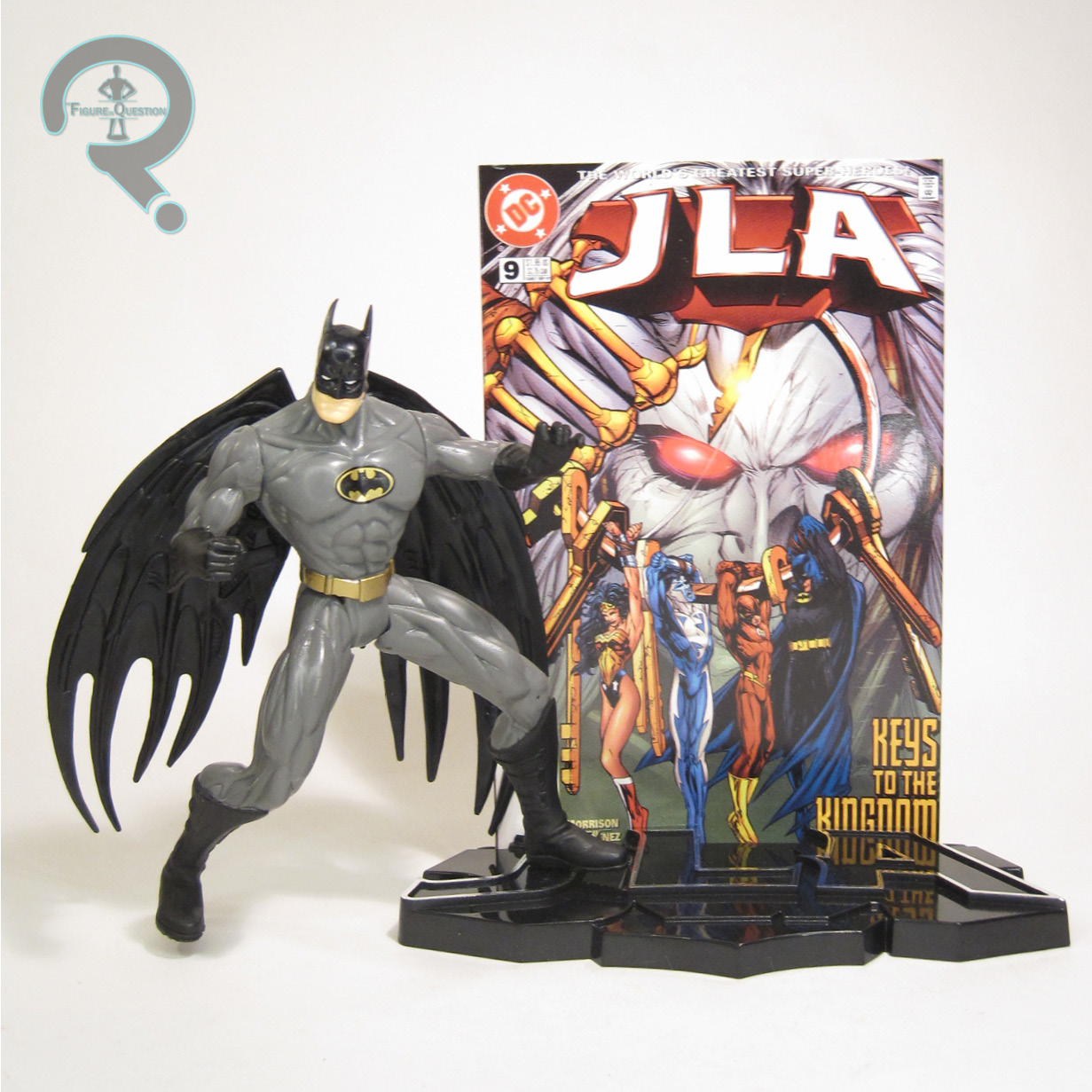
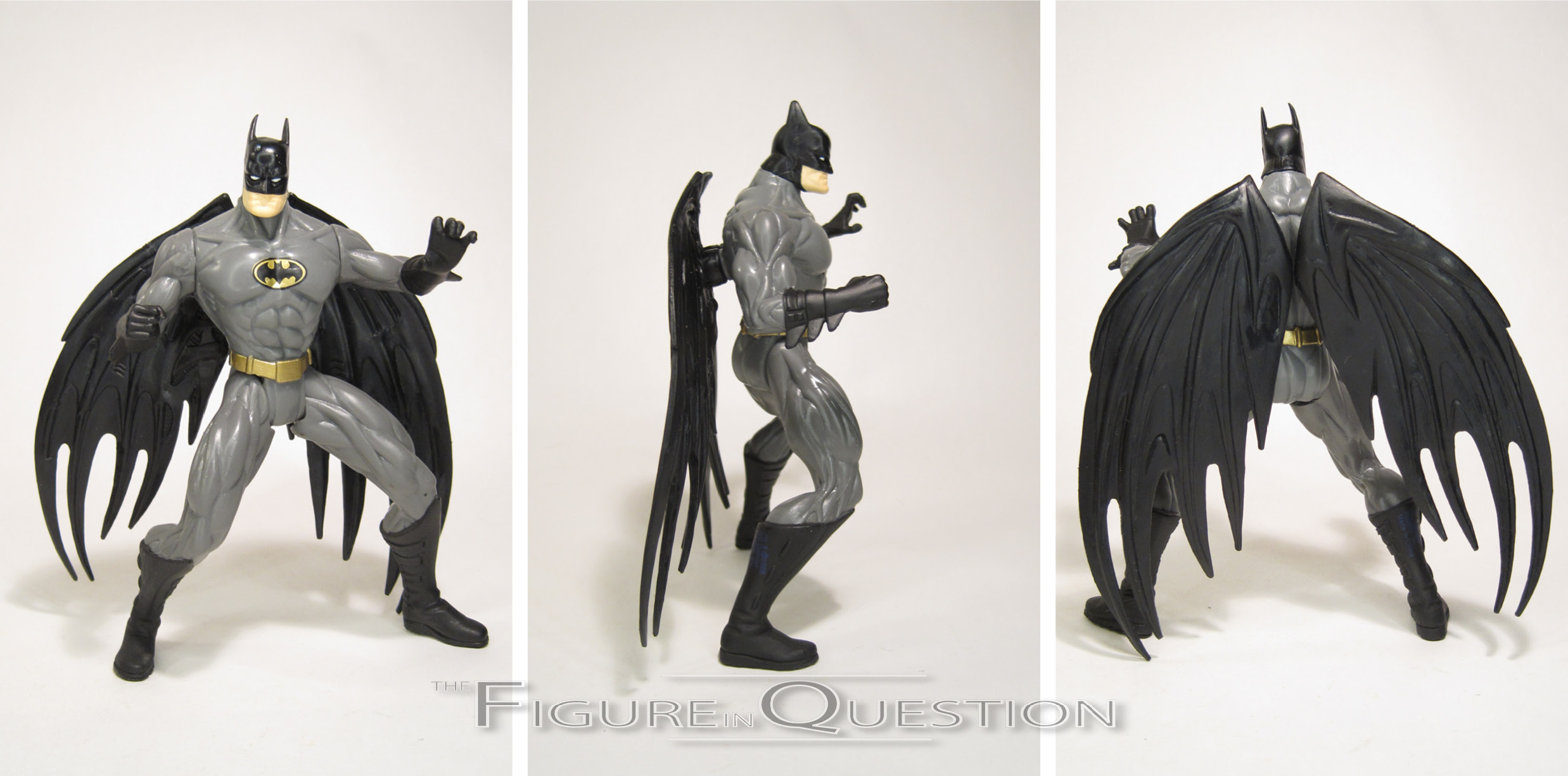
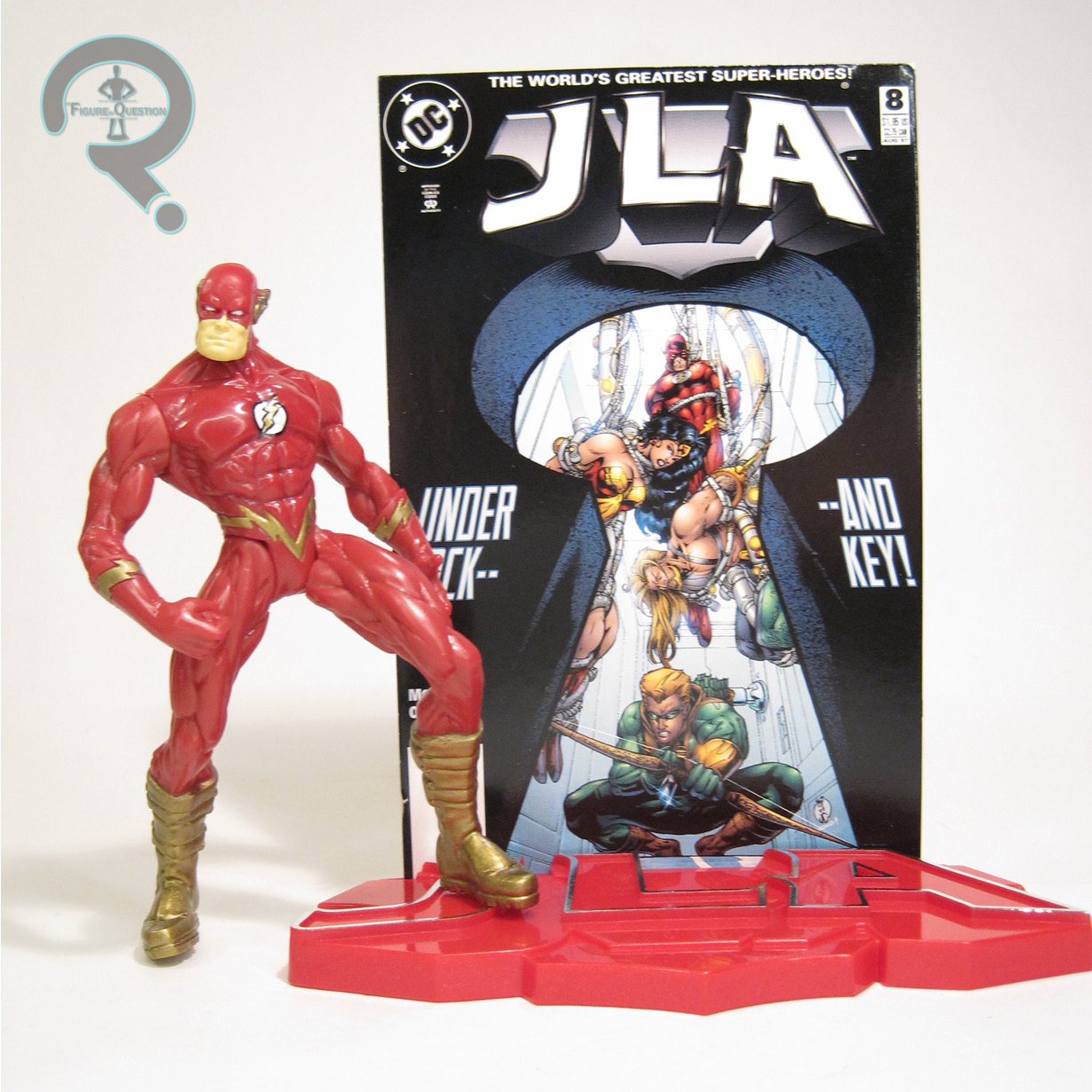
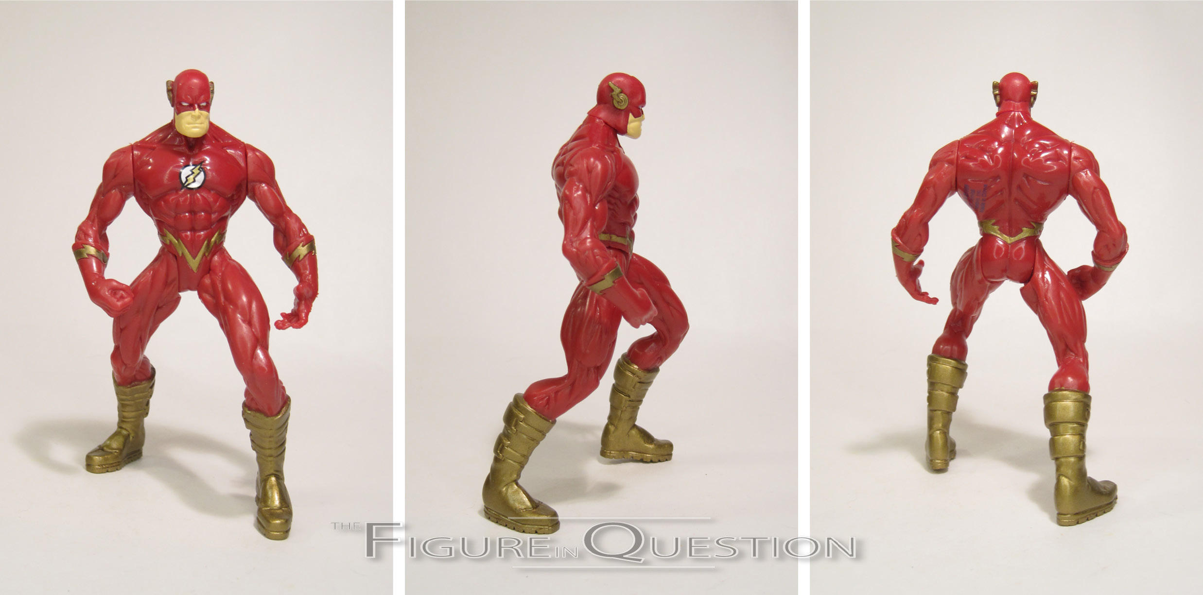
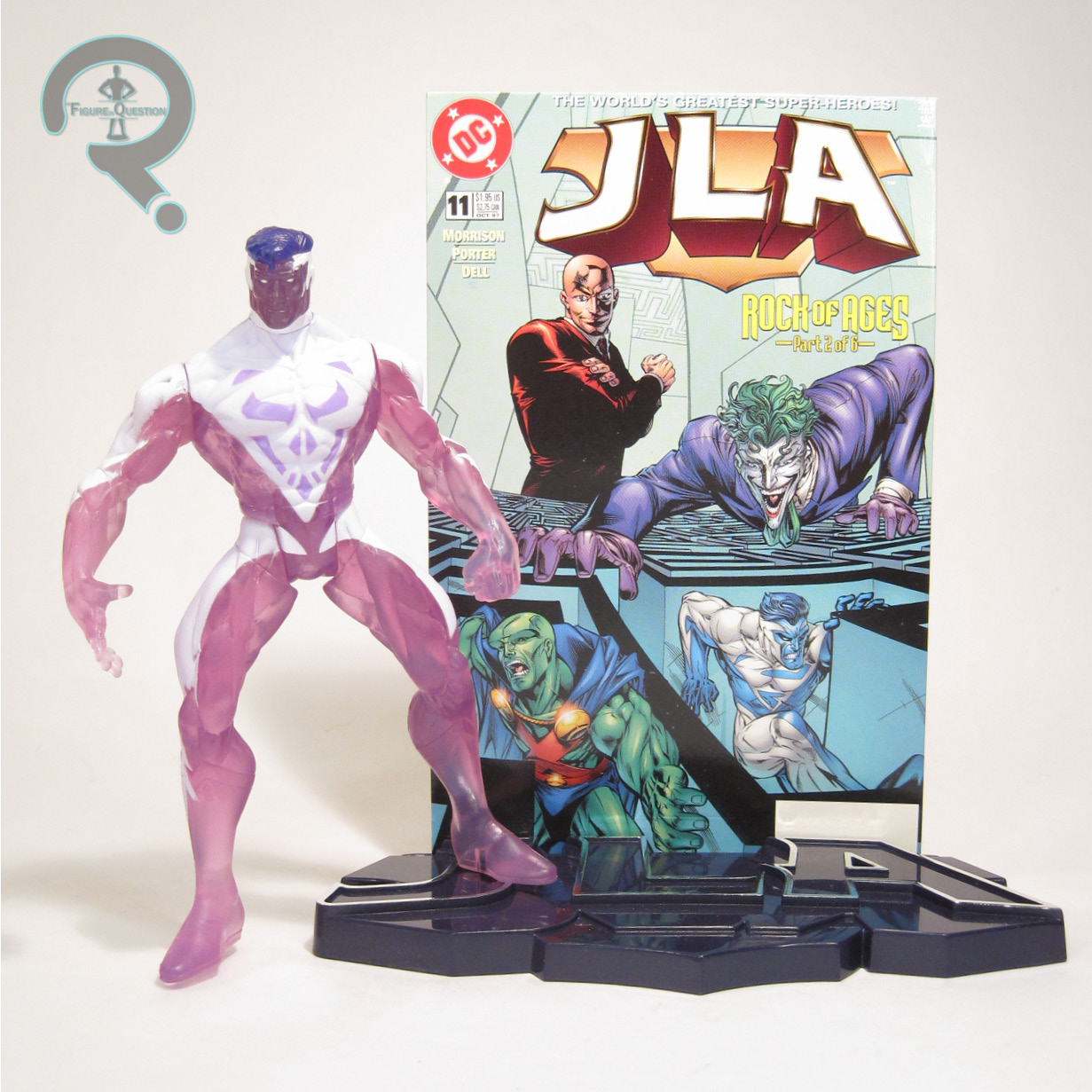
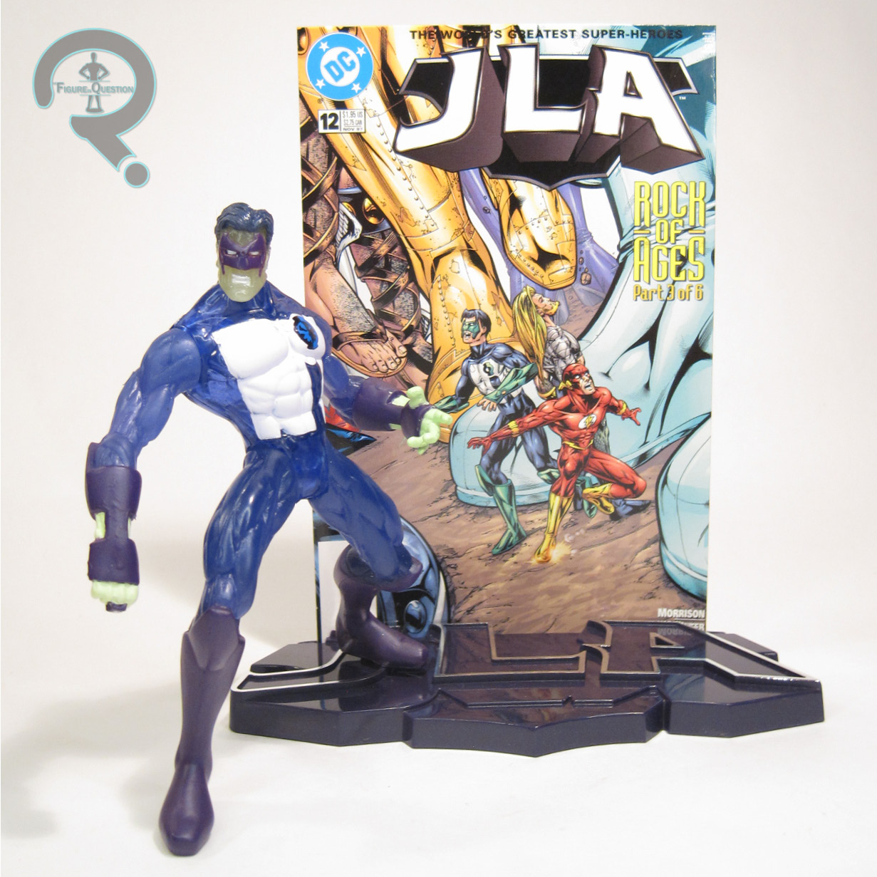
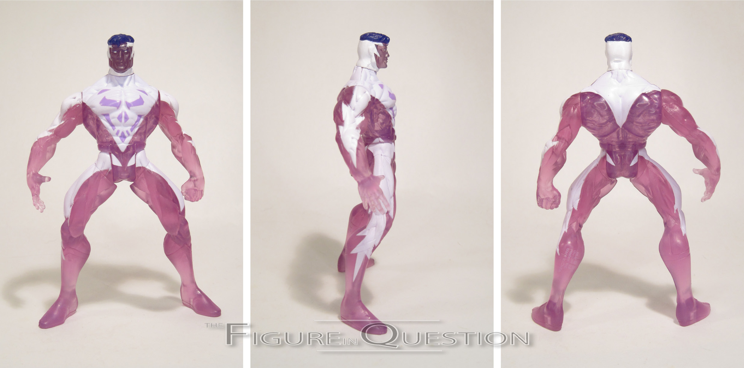
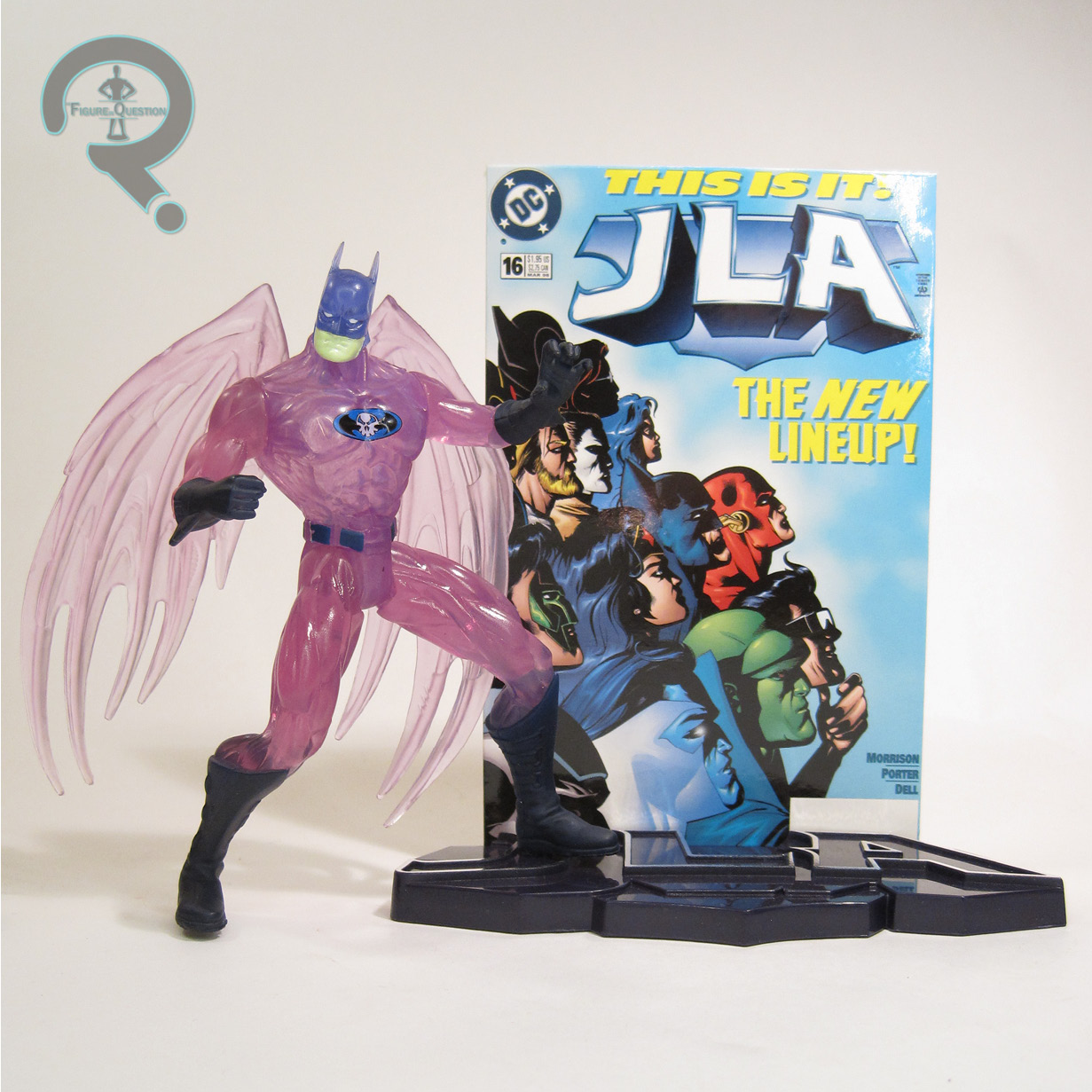
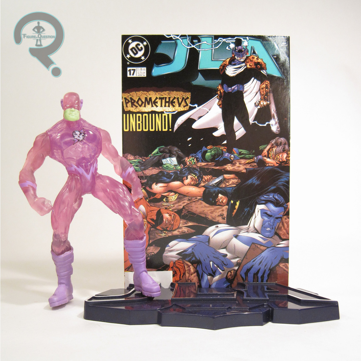
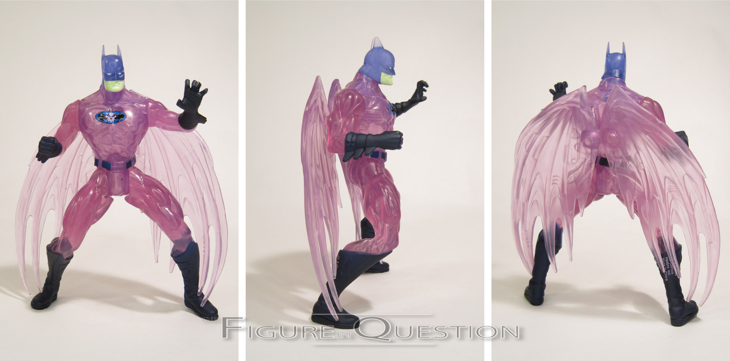
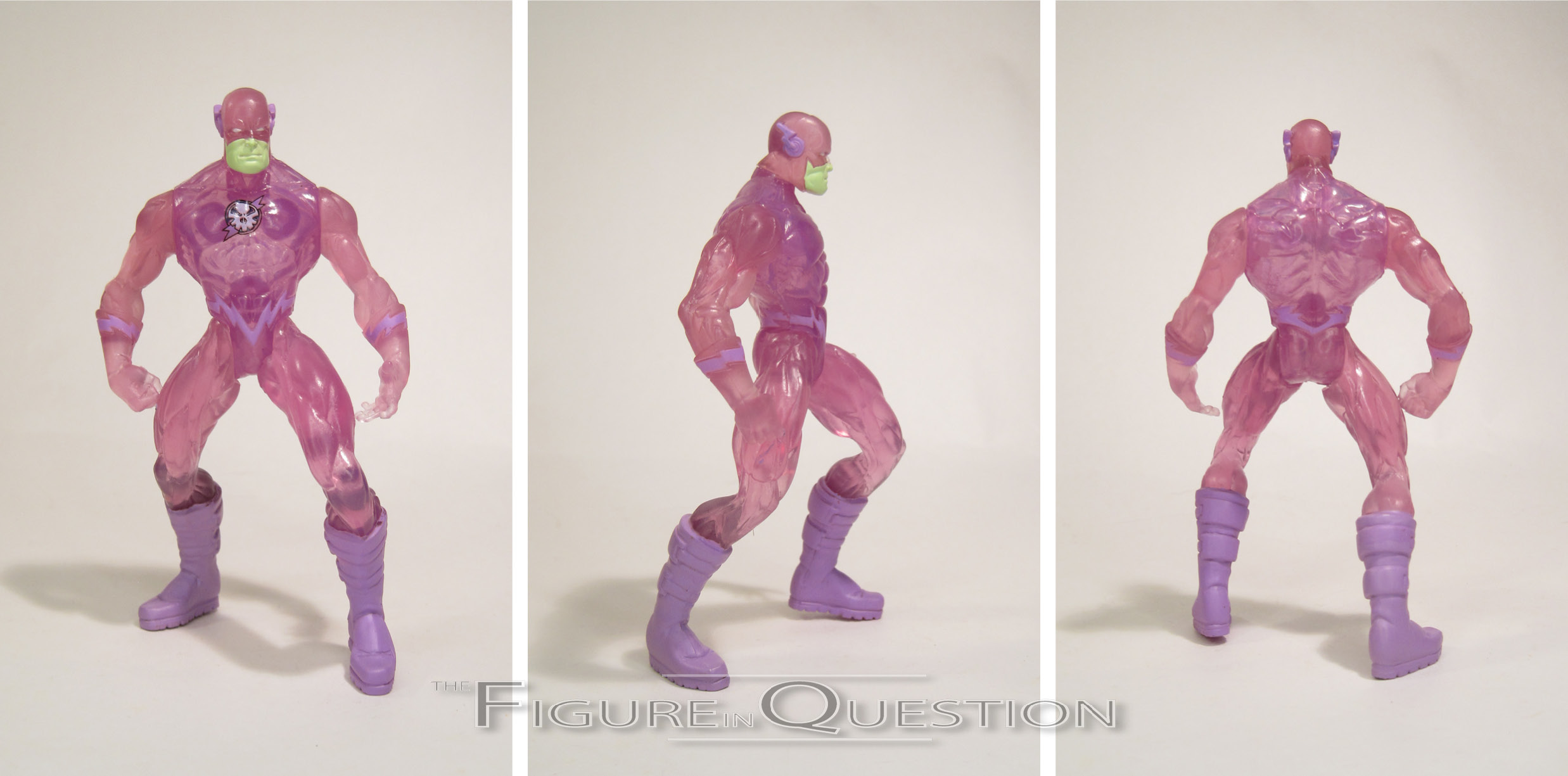
HOLOGRAM BATMAN & HOLOGRAM FLASH
 “Embroiled in their greatest battle ever, the legendary JLA confronts its own holographic counterparts in a fight to save Star City from mass destruction. Identically matched in power and ability to the originals, the evil holograms were engineered by the infamous Injustice Gang – a group of such sinister masterminds as The Joker, Lex Luthor, Circe, Mirror Master, Dr. Light and Ocean Master.”
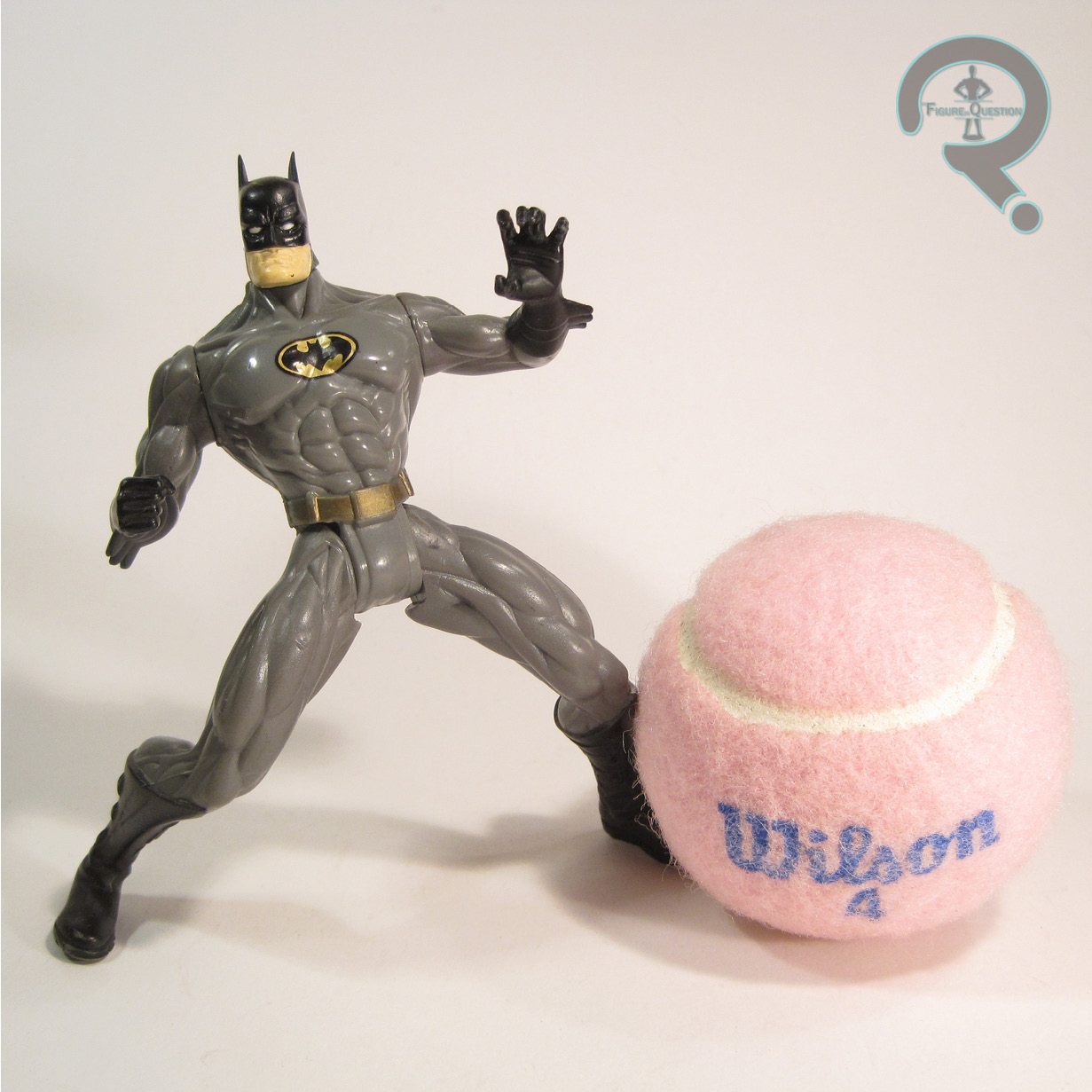
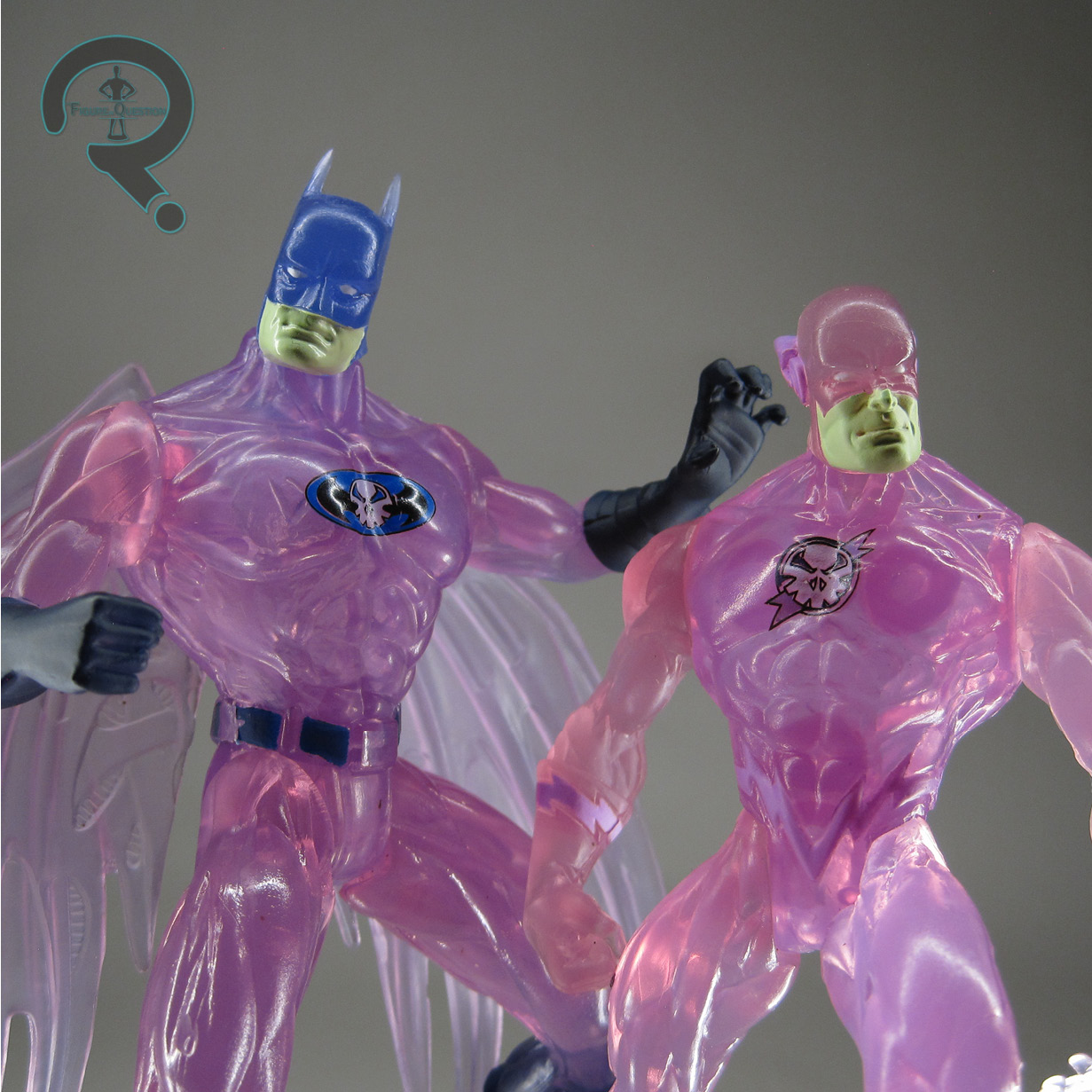
Exclusive to these sets were the Hologram JLA, based on the purple-hued JLA avatars that the Injustice Gang used during the first issue of the “Rock of Ages” storyline. They were a pretty straight forward gimmicky re-paint using the existing TJ molds of the JLA members. This set got Batman and Flash, whose standards were included in the other set. Both figures are just shy  of 5 inches tall. Flash has the standard 5 points of articulation, while Batman also gets the sliding glider wings of the TJ mold. I’ve looked at both of these molds previously here and here. They’re very much products of their time. To sell them as the holograms that they are, both figures are molded in translucent plastic, with a big emphasis on purple hues, which honestly is a pretty fun and unique look. They come with JLA logo stands, both in a dark purple, as well as their own backer cards. Batman gets #16 and Flash gets #17, neither of which features these two, either on the cover or in their contents. Also, #16 has Huntress, so, like, maybe that one should have gone to her? I don’t know, I’m just spit-balling here.


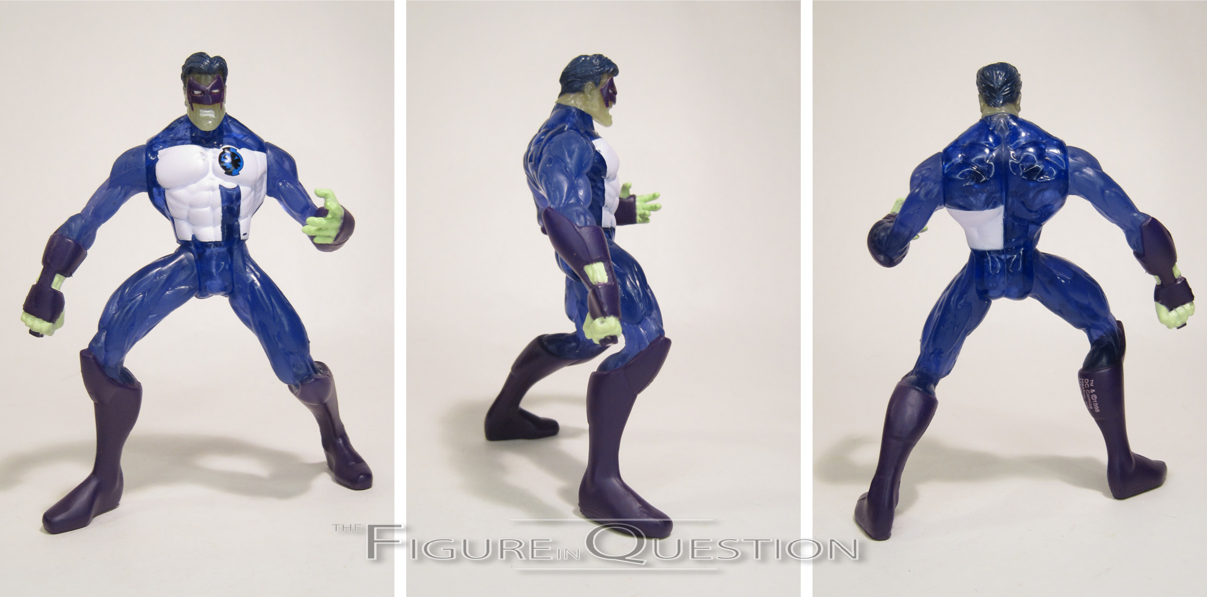
THE ME HALF OF THE EQUATION
I didn’t get this set when it was new. I had gotten the Total Justice Green Lantern as a Christmas gift from my aunt, and my cousin Rusty had traded me the Huntress for something else, and I didn’t really care for Superman Blue at the time, nor did I have any attachment to the Hologram JLA. Over the years, I’ve grown to have more appreciation for this line overall, and I really wanted those Holo guys above all, but I haven’t seen the sets in person since. But, a couple of weeks ago, Cosmic Comix got this one and the second one in, and I was feeling particularly nostalgic.


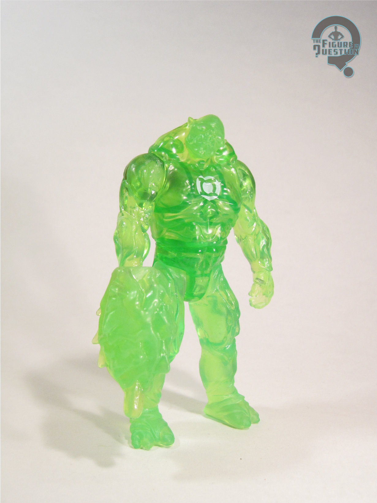
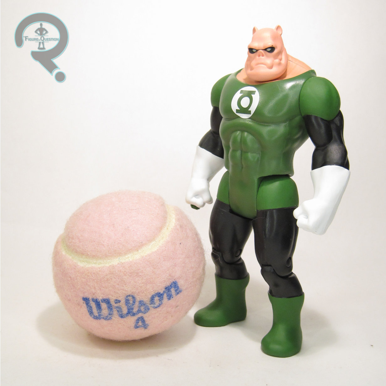
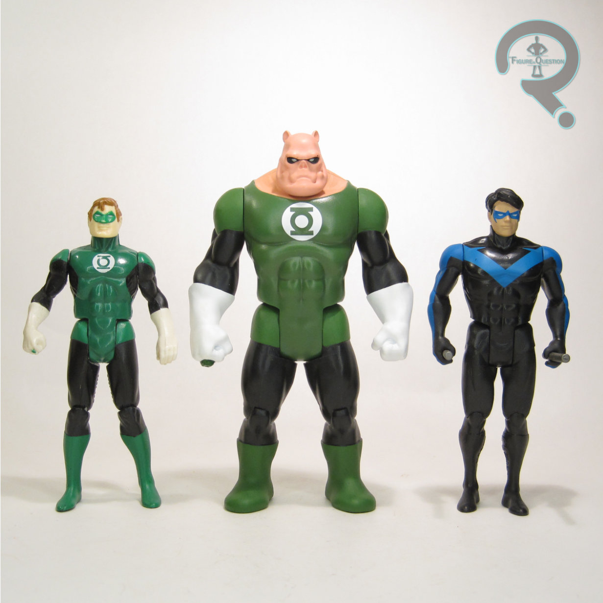
 Max Charge Kilowog was part of Mattel’s basic small-scale Green Lantern movie tie-in line. There weren’t really strict assortments, so to speak, or at least none that were really advertised, but I recall this particular figure was of a later run than others, and I believe he hit after the movie’s release. The figure stands about 4 1/2 inches tall and he has 8 points of articulation. Structurally, he’s the same as the basic Kilowog, for all the good and bad that brings. His articulation’s still sub-par for the era, and I’m still not the biggest fan of the movie Kilowog
  design. That said, the sculpt itself isn’t a bad one, and I can get the desire to re-use it. Prior to this figure, there was a “Max Charge” Hal Jordan, who took the basic Hal mold and did it in translucent green, with only some white for the eyes and his insignia. This figure does the same with the Kilowog mold, and it honestly is a pretty fun look. It does sort of make him look like a construct, though. Speaking of constructs, like the first figure, this one gets the larger hand construct adapter piece, as well as a wearable Green Lantern ring.