GREEN RANGER & PINK RANGER
IMAGINEXT POWER RANGERS

Man, I really didn’t think Power Rangers was a thing I’d ever get back into. Then all these toy companies had to go and start making all these cool Power Rangers toys, and I had to go and have no self-control when it comes to cool toys. What are you gonna do, right? I can definitely tell you that a few years ago I would have never imagined that I’d be buying Imaginext stuff. They’ve really stepped up their game, and, more importantly, they’ve started making a lot of things I want to buy. Like Mighty Morphin’ Power Rangers. They’ve just released a bunch of Rangers merchandise, including several of the Rangers’ individual Zords, a really cool combined Megazord, and several smaller figure packs, for those who aren’t quite ready to dive all in. I just picked up Green and Pink Rangers, so let’s see how they turned out.
THE FIGURES THEMSELVES
Green and Pink were released as a two-pack in the first assortment of Imaginext Power Rangers figure packs. They’re probably the most sensible pairing of the bunch (given that they were a couple in the show), and it looks like they’re both currently exclusive to this particular pack, though Kimberly’s already been slated for a release with her Zord, and I’m sure Tommy won’t be far behind.
GREEN RANGER
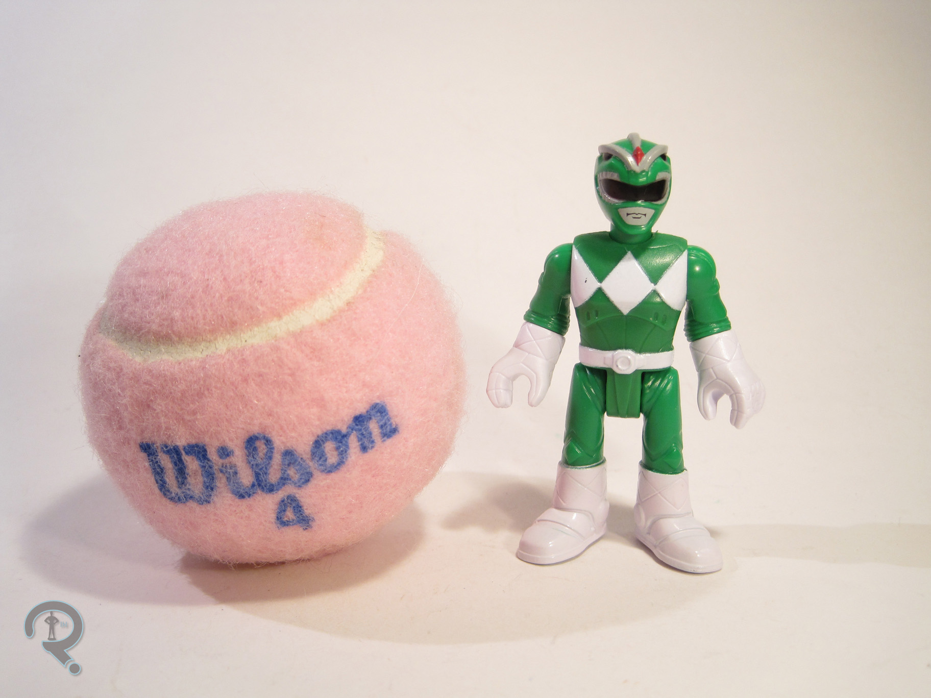 The Green Ranger is the first identity of Tommy Oliver, the original Sixth Ranger, who would take on another four Ranger identities over the course of the various Ranger series. He was also portrayed by Jason David Frank, an actor of near legendary status in the Power Rangers community. So, the Green Ranger’s kind of a big deal. The figure stands 3 inches tall and has 8 points of articulation. Aside from the legs both being on the same joint (which still kinda baffles me) the movement is all pretty good, especially for a figure of this size and style. Tommy’s technically based on his appearance in Mighty Morphin’ Power Rangers, but there are a few changes, aside from the obvious stylistic ones. The Rangers in this set all appear to be an amalgam of sorts of their show and movie designs, taking the general design cues from the show, but also possessing the movie’s armored bodysuits and more detailed gloves and boots. It’s an interesting choice, doubly so on the Green Ranger, who was not in the movie. Also, there’s one glaring thing missing from this guy: his Dragon Shield! Yeah, he doesn’t have the extra armored bit that set him apart from the others, which is, admittedly, a bit odd. Sculpturally, Tommy uses the same body shared by all of the male Rangers in the line (so far, anyway). The proportions are slightly tweaked, so as to bring him in line with the rest of the Imaginext figures. The body has a lot more fine detail work than what I’ve seen before from Imaginext, and it’s certainly very impressive. Tommy also gets a unique head sculpt, which is a pretty good translation of his dragon-styled helmet, with the same level of detail as the body. The mouth is painted, rather than sculpted, but that keeps him more or less in line with the un-helmeted characters. As far as paint goes, the Green Ranger is handled pretty well, though he does make a few more deviations from the source material. For one thing, the gloves and boots are just straight white, as is the belt. One presumes this was done as a way of simplifying the designs just a bit. Interestingly, the other big change is not a simplification. For whatever reason, they’ve painted the ridges on the top of the helmet grey, presumably to set them apart from the rest of the helmet. However, on the show, that part of the helmet was just straight green. I’m not sure why they changed that particular thing, but it certainly doesn’t look bad, so I can’t really complain. The Green Ranger includes his Dragon Dagger, up-scaled a fair bit to meet safety standards. It’s nicely sculpted and pretty well painted, though it’s worth noting that the details on the blade are sculpted on the opposite side of the one they were painted onto, which is kinda funny.
PINK RANGER
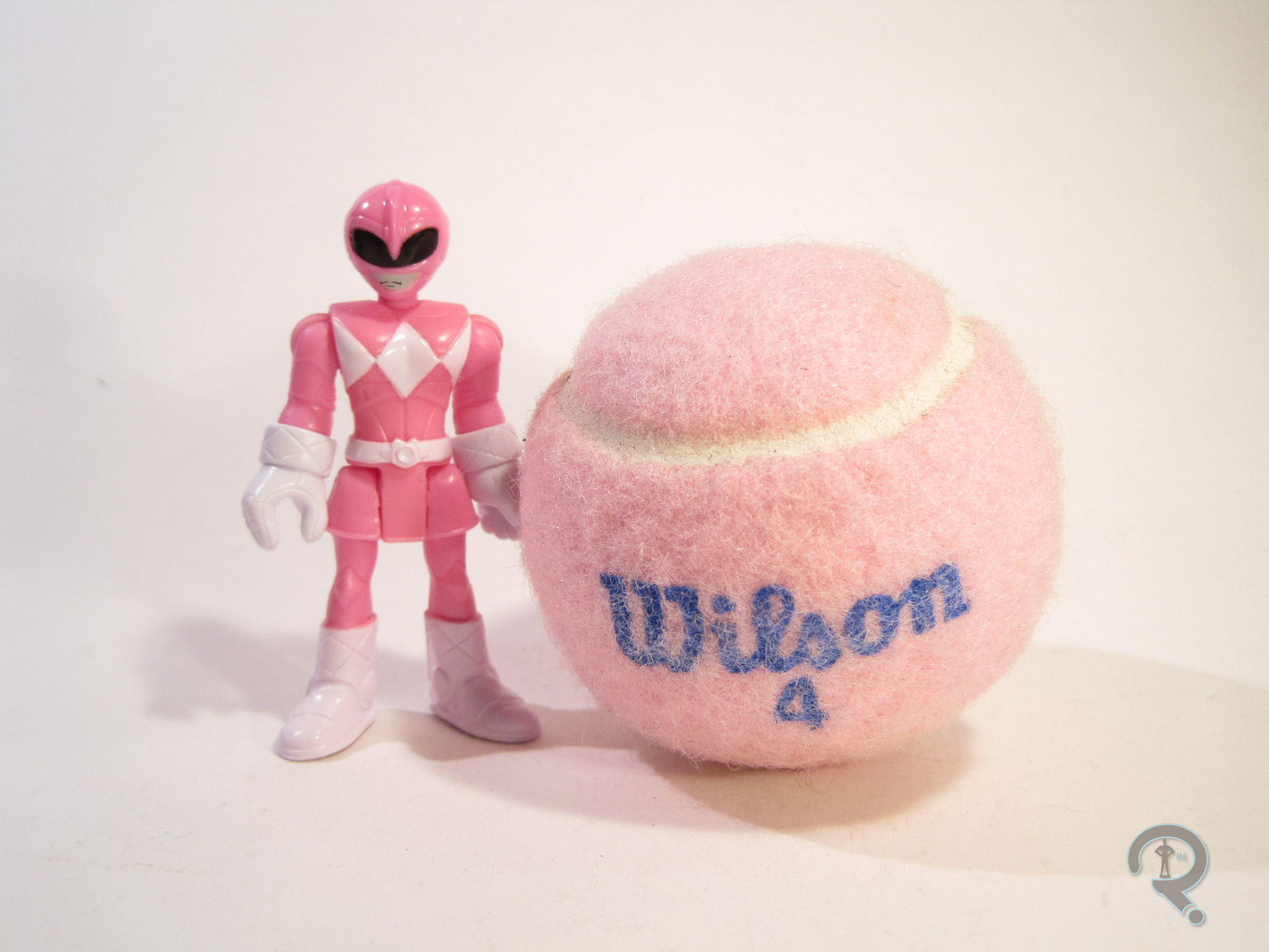 The Pink Ranger was actually one of the set’s main draws, at least initially, since it’s the only way to get her in the initial product release, and she is one of the original five, after all. Unlike Tommy, Kimberly would only be the Pink Ranger for one incarnation of the show, but she’s still the original, and that’s kind of important. The figure is a little under 3 inches tall and has the same 8 points of articulation as Tommy. She too is an amalgam of her show and movie designs, keeping the basic layout and the skirt from the show design, but still adding the stitching and armoring of the movie design. Due to the presence of the skirt (which the Yellow Ranger does not have), the Pink Ranger gets a mostly unique sculpt, apart from a re-used set of arms. Once again, the proportions have been slightly tweaked, so as to make her fit stylistically with the rest of the Imaginext line. I must admit, it’s refreshing to see one of these “kid-ified” lines not horribly under-sizing the female characters. It’s especially great when it comes to the Power Rangers, who should all be similarly sized. I’m not 100% sold on the head sculpt. It’s not bad, but it seems her helmet just didn’t translate as well to the style as the others. She kinda looks like one of those stereotypical aliens. Kimberly’s paintwork isn’t all that different from Tommy’s; it still lacks some of the extra details on the gloves, boots, and belt. She’s also missing the patch of white on the back of her helmet, which might actually be what’s throwing her head sculpt off for me. Also, the mouth on this one is mis-aligned, which makes her look a little wonky. She includes her Power Bow, which is once again up-scaled a bit for safety. She can’t really hold it, but it’s decently sculpted, and it includes clips so that you can assemble the Power Blaster if you get the other Rangers.
THE ME HALF OF THE EQUATION
I saw the various Imaginext Power Rangers stuff a few times before picking this set up, mostly due to this seemingly being the most difficult to obtain set. I wound up finding at a Target near a convention I was attending, and these two just really drew me in. The Green Ranger’s definitely the star here, even with his handful of inaccuracies, but both of these figures are just a lot of fun!