#0422: Tomar Re

TOMAR RE

DC UNIVERSE CLASSICS
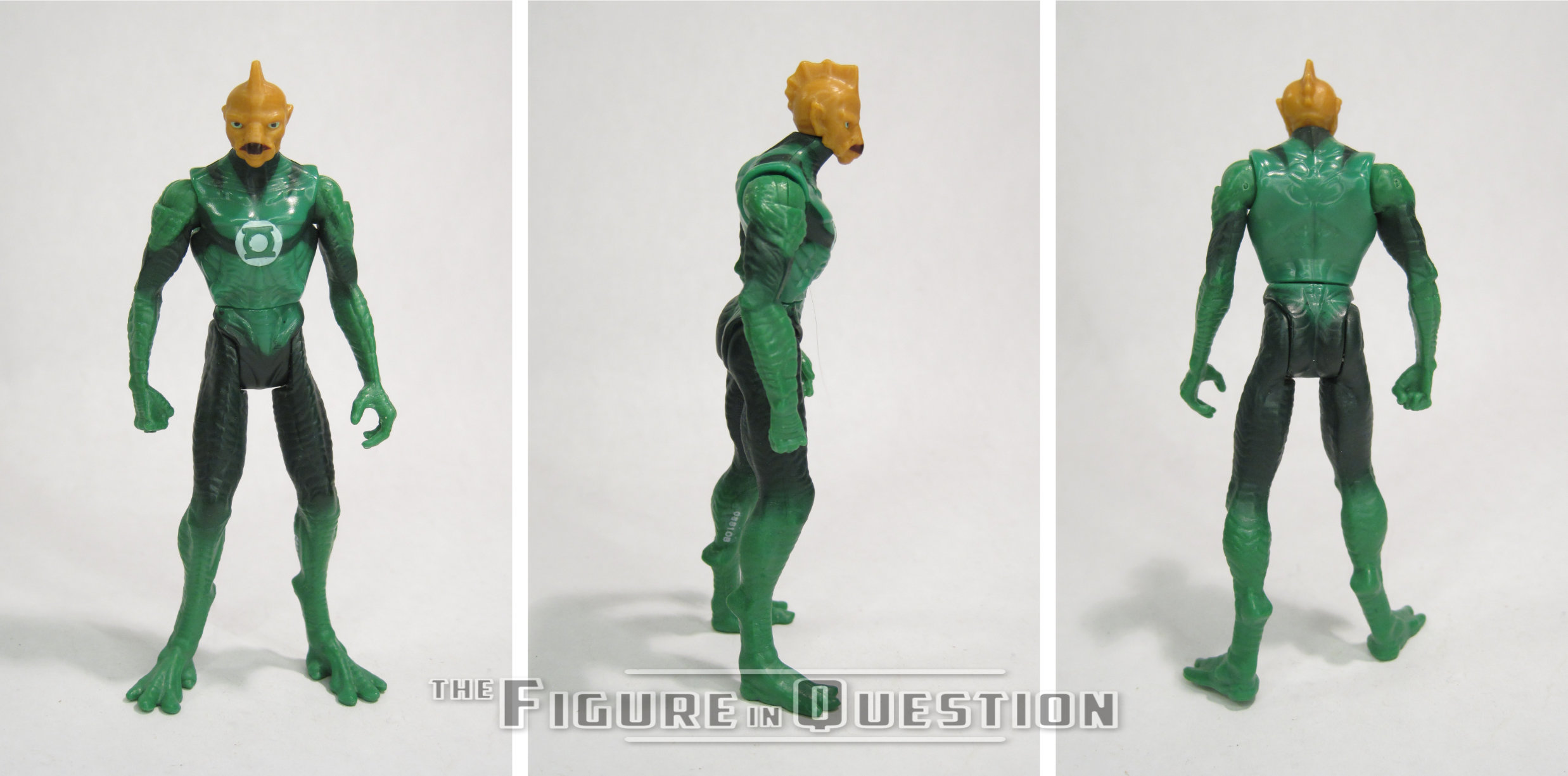
Although my interest in the character has waned a bit in the last few years, I’m still quite a bit of a Green Lantern fan. So, that means I find myself drawn to just about everything Green Lantern-related when it comes to toys. Some of it’s good and some of it’s bad. Today, I’ll be looking at the DC Universe Classics interpretation of Tomar Re, one of the many non-earth GLs. What’s interesting is that the last GL figure I looked at was ALSO a Tomar Re figure, from the movie line. I promise that this one’s better.

THE FIGURE ITSELF
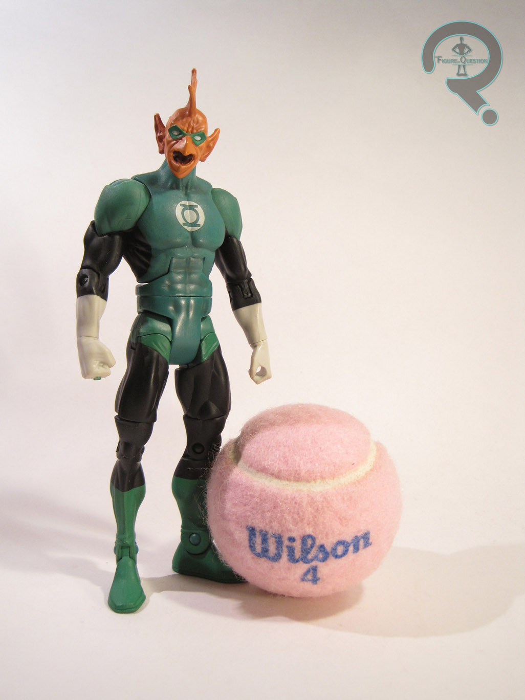
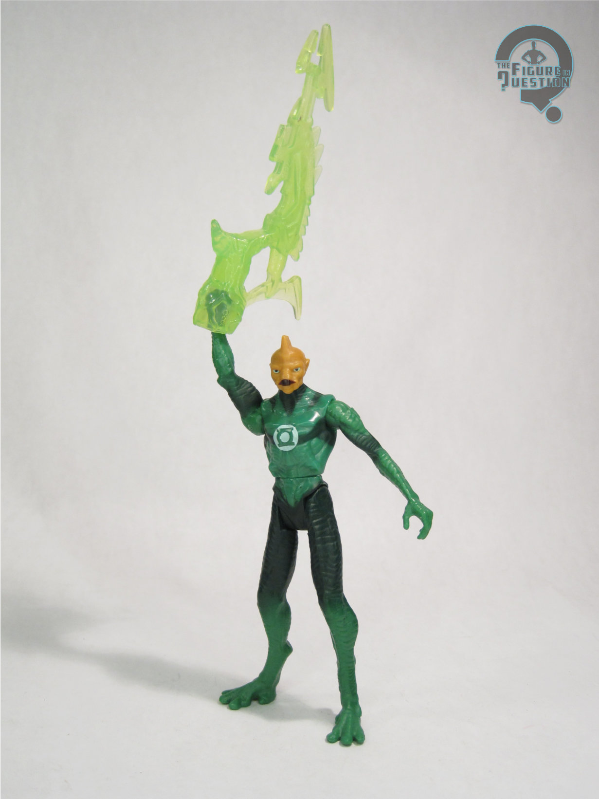
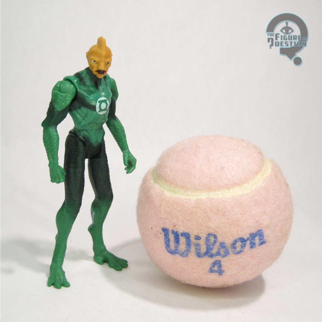
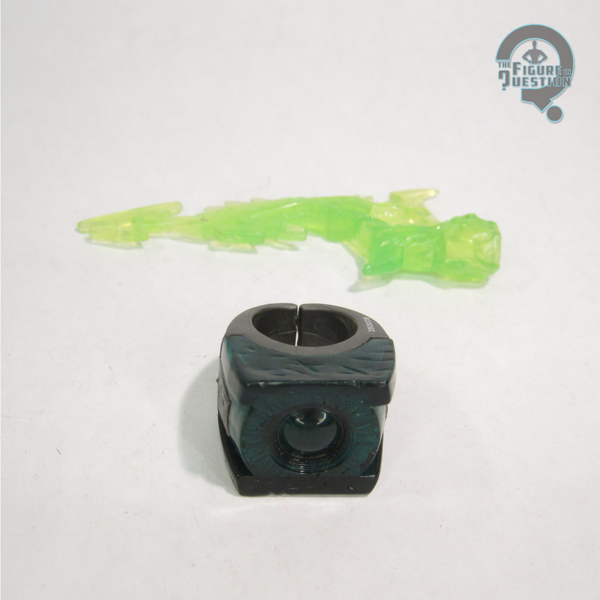
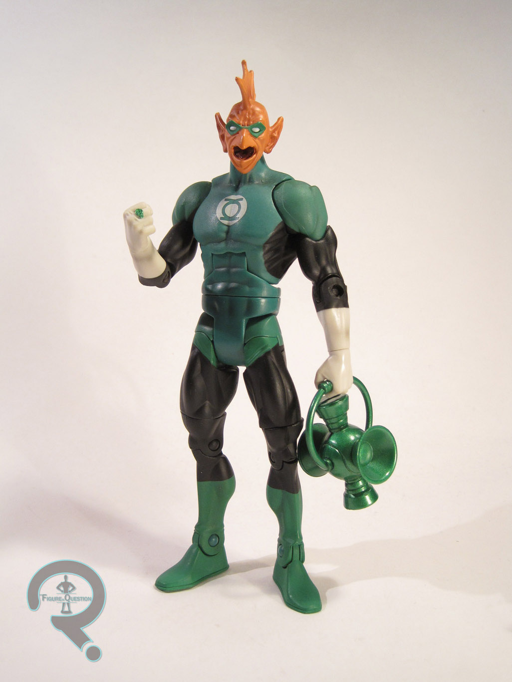
Tomar Re was released in the DC Universe Classics line as part of a Green Lantern themed 5-pack. He was one of two characters released exclusively in the set. Something that’s important to note about this figure is that while he’s called Tomar Re on the box, the figure actually seems to be a bit more in line with the look of Tomar’s son Tomar Tu. The differences are minor: Re was generally depicted with larger eyes with pupils and a less present mask. Ultimately, the two essentially look the same, and Tomar Re is the one more people know, so it’s a forgivable change. The figure is about 6 inches tall and he has 23 points of articulation. Tomar is built on the medium sized male buck, which is a good fit for the character. His right hand has a Green Lantern ring, and it’s been used on numerous GL figures. He has a new head, though it appears it uses the previously released Romat Ru’s head as a starting point. Romat’s scars have been filled in and a mask has been added, which is enough to sufficiently differentiate the two. The head is a truly beautiful sculpt, and it does a fantastic job of translating Tomar’s look into three dimensions. The paint work on Tomar is nicely done. Everything is very clean, and all of the details are sharp. It’s hard to tell from the pictures, but the green used here is slightly iridescent, which looks really cool and gives the costume the appropriate other-worldly vibe. Tomar includes his lantern-shaped power battery, which is a re-use of the one included with the Series 3 Hal Jordan figure. It’s been done in a darker green, which really makes it work.

THE ME HALF OF THE EQUATION

Like the last two figures I reviewed, Tomar was acquired from The House of Fun. The store is a really cool place, and I definitely need to go back soon. Unlike the last two, Tomar isn’t a figure I missed in stores, and he doesn’t command a huge aftermarket price. I just was iffy about buying the whole 5-pack when I really only wanted 2-3 of the figures included. So, when I found Tomar on his own I was very happy. Tomar has long been one of my favorite Lanterns. I’ve always thought he has one of the coolest looks. The figure showcases the character spectacularly. I can’t believe I passed him up for so long.
#0421: Gold

GOLD

DC UNIVERSE CLASSICS

DC Universe Classics, through all of its victories, was not without its flaws. When the line ended, more than one team of heroes was left incomplete. That being said, the line did manage to finish up a couple of teams. One of those teams, the Metal Men, hadn’t seen toy form ever before. That’s not a particularly shocking thing, truth be told. The Metal Men are far from one of DC’s more well-known properties. Still, they managed to all show up in this line, and they serve as an example of the line’s strength in rendering oft-forgotten characters in action figure form.

As a bit of backstory, the Metal Men are a team of robots, constructed by Dr. Will Magnus, who were each made out of a particular metal, animated by a “responsometer” which gave each of them a distinct personality. Today, I’ll be looking at the team’s field leader, Gold, who was the member of the team who best fit the traditional hero archetype.

THE FIGURE ITSELF

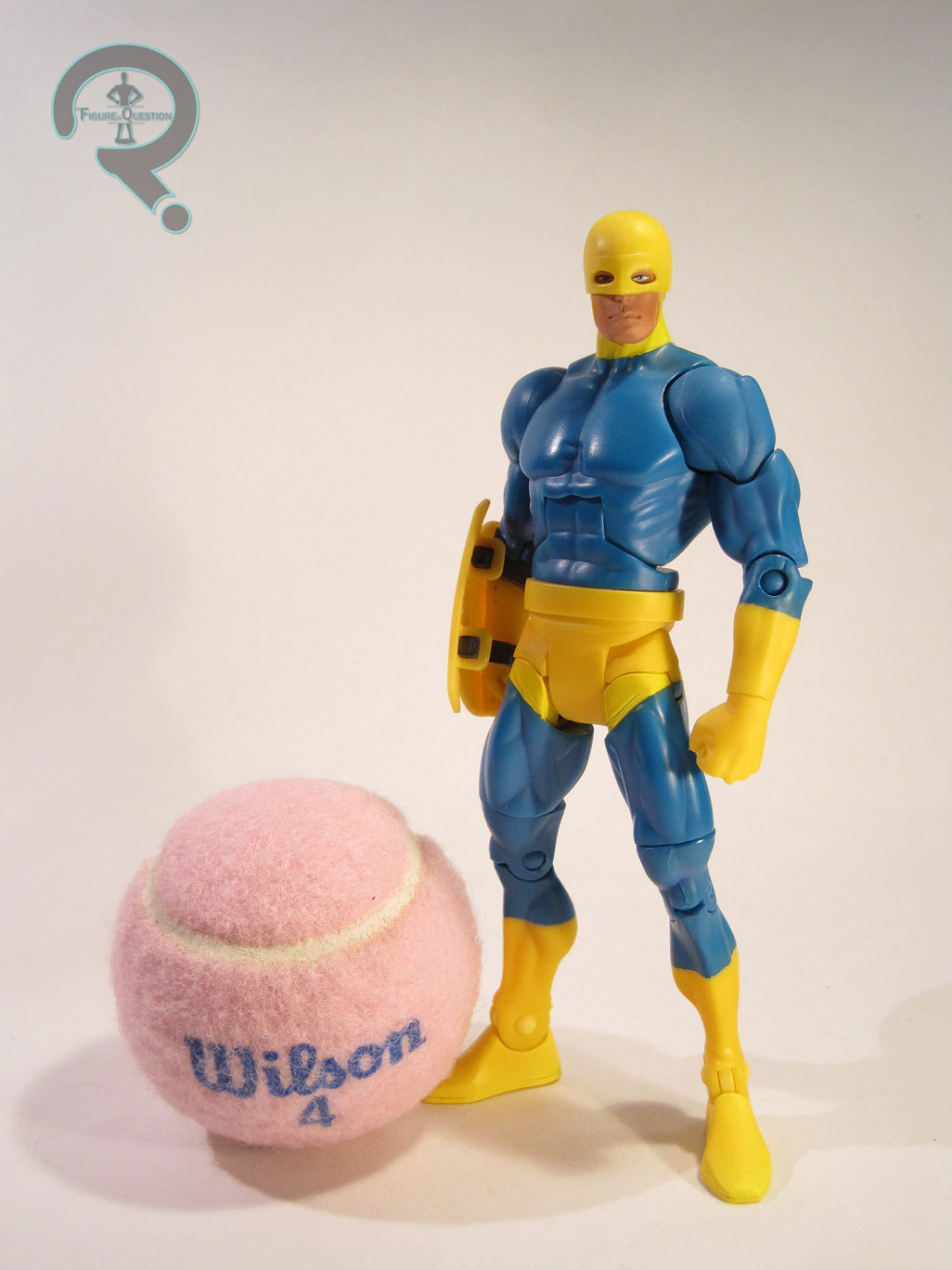
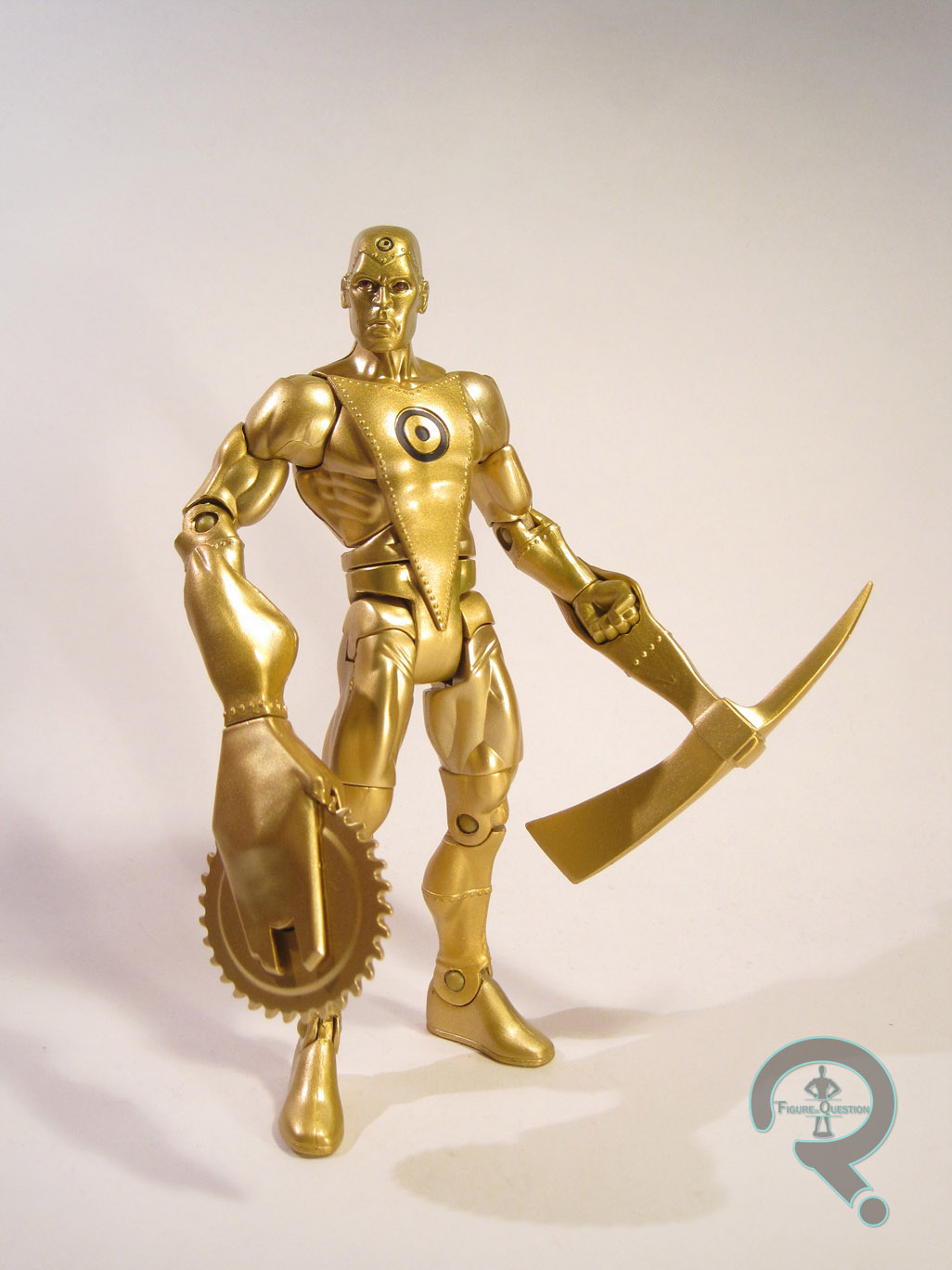
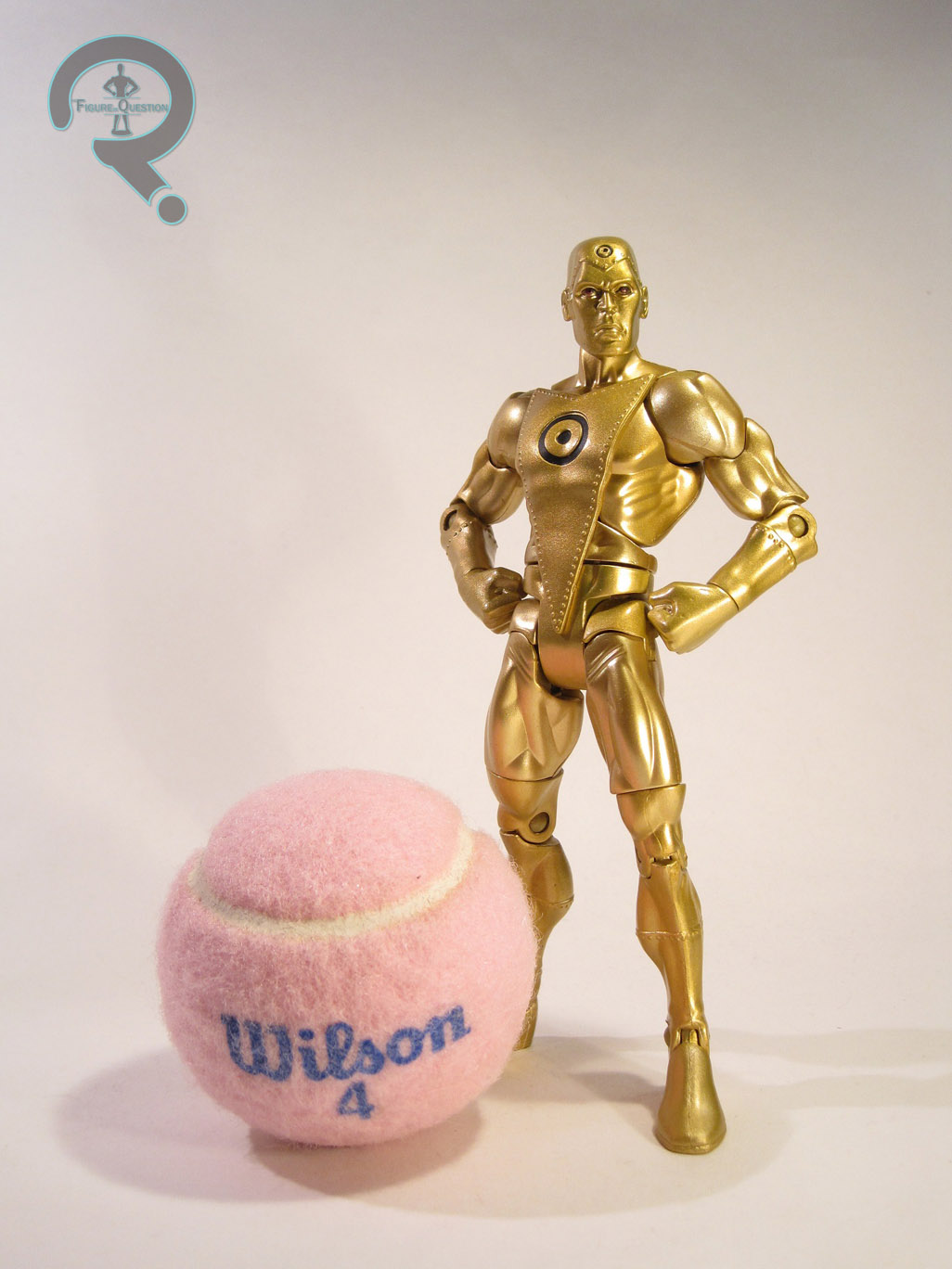
Gold was a figure in Series 14 of DC Universe Classics. Series 14 was the third Walmart exclusive series in the line, and it fell somewhere in between the impossible to find Series 5 and the rather plentiful Series 10 in terms of availability. Gold is a little over 6 inches in height and he features 23 points of articulation (he was released after Mattel removed the ankle rocker joints). He was the second Metal Man released in the line, following Series 12’s Iron. The figure makes use of the mid-size male buck as a starting point, with a new head, forearms, and calves, as well as a set of die-cast hands (first used on Iron), and an add-on for the front of his torso. The mid-size body is a good fit for Gold, so it was well chosen. The new pieces match up pretty well with the body, while giving him some individual flair. The head is the only piece to sport any flaws. It’s not a bad sculpt, but it doesn’t seem quite right for Gold; he should look more confident and self-assured. The hands being actual metal is cool, though the fact that they were originally sculpted for Iron means that they have some dings and things that aren’t quite right for Gold. Gold’s paint is rather straight-forward. He’s painted from head to toe with gold paint. The decision to use paint rather than gold plastic was a wise choice, as the end result is much cleaner. In addition, he also features a few details for his symbol on his head and torso, as well as his eyes. The eyes are rather clean, but the symbols are a slight bit off center. Gold included two hand attachments: a buzz saw and a pick axe. Both are well done, but the buzz saw really stands out, just for the sheer amount of imagination that went into it. If you look closely, you can see that it actually looks like a stretched out version of his hand is holding the blade. It’s a great touch. Gold also included the left leg of the series Collect-N-Connect, Ultra Humanite, who you can read about here.

THE ME HALF OF THE EQUATION

After finding Iron at a reduced price, I was all on board for getting Gold when he was released. My dad is a pretty big fan of the Metal Men, so this was one of those instances of both of us wanting a certain figure. So, when we finally came across a set of Series 14, the single Gold figure went to him. I didn’t mind, seeing as I got all the other figures I wanted, but I still hoped to find another. The figure’s price jumped and I figured I’d missed my shot. Fortunately, while checking out The House of Fun, I found a loose Gold amongst their large selection of DCUC figures. I’m happy to have the figure. He’s not perfect, but he’s pretty close, and he’s a key piece of one of DCUC’s greatest legacies.

#0420: Guardian

GUARDIAN

DC UNIVERSE CLASSICS

Ah, yes, DC Universe Classics. One of the most confusing lines I’ve ever collected. Purely viewing the figures offered, it’s easily the greatest DC toyline ever released (beating out Kenner’s Super Powers). The sheer breadth of the line is truly astounding. But, it was a Mattel toyline, which means the line was met with mismanagement, strange choices, and some of the worst distribution I’ve ever seen on a major toyline. An entire series of figures would be completely absent from store shelves in most areas of the country, leading to insane aftermarket prices. Because of this, I’m still filling holes in my collection two years after the line ended. One of my recent acquisitions is Guardian, DC’s resident shield wielding hero who is totally not Captain America. Let’s see how the figure turned out!

THE FIGURE ITSELF

Guardian was released in Series 9 of DC Universe Classics. He’s one of the line’s more odd-ball choices, but that’s never a bad thing. The figure is a little over 6 inches tall and he features 25 points of articulation. He’s based on the original Jack Kirby-version of the character. Early prototypes for the figure showed the 90s incarnation of the character, and comments from Mattel indicated that that version might surface as a variant, but such a figure never surfaced. Sorry Guardian fans. DCUC was primarily a “buck-system” line, and Guardian is no exception. He’s built on the mid-sized buck, with a belt add-on and a new head. The mid-size buck seems like it might be a bit too small for Guardian, but it doesn’t look terrible. One thing I’ve noticed is that since getting back into Marvel Legends, the shoulders on the DCUC bucks look larger than they should, but overall, the bucks were well done, so this is a good starting point. Guardian’s head is really nice. The helmet is a separate piece, so the face is actually below it, which gives the figure the appropriate amount of depth. Guardian’s paint is rather simple, but what’s there is cleanly applied for the most part. There is a tiny bit of slop on the neck line, but that’s about it. The work on the face is the highlight of the figure, mostly due to just how clean everything is. The colors on the costume are really bright, which is befitting of a character like Guardian. They really make him pop. Guardian included his trusty shield, which is sort of silly looking, especially given the size, but it’s actually quite well sculpted. He also included the right leg of Chemo, but my figure was purchased loose and therefore did not have that piece.

THE ME HALF OF THE EQUATION

I wanted a Guardian when he was released. In fact, I wanted pretty much all of Series 9. However, the series never really showed up in my neck of the woods. I was able to track down a few of the other figures from the series, but not Guardian.

The weekend before Thanksgiving, I accompanied my dad to Philcon. We decided to explore the surrounding area on Saturday and came across a very nice toy store, called The House of Fun. The store’s selection was actually a bit overwhelming, if I’m honest. Anyway, my dad and I decided to focus on the large selection of DCUC figures they had, and Guardian happened to be amongst them. I’m glad I finally found the figure. He’s often been referred to as the sleeper hit of this series, and I can see why. He doesn’t have the bells and whistles that some of the better DCUC figures had, but he’s a solidly put together figure who is just undeniably fun.

#0394: Tomar Re

TOMAR RE

GREEN LANTERN (MOVIE)

The 2011 Green Lantern was certainly not the greatest thing to be shown on the silver screen. That being said it’s far from the worst, and I personally found it to be about on par with the Tim Burton Batman films, which suited me just fine. One of the nice things about one of your favorite characters getting a movie is all the toys that are bound to be released to coincide. Sadly, while I found the Green Lantern movie to be inoffensive, the same can’t be said for the vast majority of the toys released for it. One of the few figures from the line I didn’t hate is Tomar Re, the subject of today’s review.

THE FIGURE ITSELF

Tomar Re was technically part of the first series of Green Lantern figures, but he was not amongst the initial assortment of figures. I think he came in the second wave of product. The figure is about 3 ¾ inches tall and he features 8 points of articulation. The articulation is one of the most annoying parts of this line, because it was about 10 years out of date at the time of release. It’s completely useless for anything outside of a standing pose, and in some cases it couldn’t even do that. Case in point, Tomar’s right leg is slightly warped, and the articulation is such that standing is not a thing that happens. Tomar’s sculpt is fine. There was a deluxe Tomar in wonky colors that was released first, so technically this one’s a re-use of that one. There’s some okay texture work on the body, which is nice, I suppose. However, the head is rather smooth, and definitely too squat for the character. In fact, the whole body is off when compared to the on screen character. He’s just too bulky. Were this figure 10-15 years older, the scale might be excusable, but come on, Hasbro’s Battle Droids from 1999 looked better than this. The paintwork is rather vaguely handled. In some places, lines are very sharp, but in others, everything just sort of runs together. That’s sort of what they looked like in the movie, but it wasn’t this bad. He just ends up being a bit of a mush of colors. Tomar included a construct of some sort, but I threw all the constructs together, so I don’t remember which was his. [EDIT 10/02/26 — I went to the trouble of finding out which construct was his, and even wrote an Addendum about it!]

THE ME HALF OF THE EQUATION

I got Tomar from a Walmart near where I was vacationing the year these were released. This was notably two days AFTER I broke down and bought the wonky colored deluxe Tomar because I hadn’t been able to find this one. Yay. It’s hard to say much about this figure that isn’t negative. I honestly don’t hate it, and I really think it was one of the better small scale figures Mattel offered in this line, but that isn’t saying much. There’s a reason this line didn’t sell well, and it wasn’t the poor performance of the movie.

#0381: Robin

ROBIN

DC COMICS MULTIVERSE

Just when I thought I was out, they pulled me back in! Frequent readers of the blog will probably be aware of my less than stellar opinion of Mattel. For those of you who have only recently joined us, let me ‘splain….no it is too much, let me sum up: Mattel has a tendency to make bad decisions and when said bad decisions fail like they should, they like to place the fault on their fans. It’s not a particularly endearing quality. I am also not a huge fan of the current output of DC Comics. So, it would seem that Mattel holding the DC License would be a perfect partnership for me to ignore. However, I am stubborn, and in spite of my issues with Mattel and DC, I still like the DC characters and Mattel occasionally stumbles their way into a decent action figure. Such is the case with today’s figure, Mattel’s latest version of Batman’s faithful sidekick Robin.

THE FIGURE ITSELF

Robin was released in the fourth assortment of Mattel’s DC Comics Multiverse line, which is their current “collector oriented” line of 3 ¾ scale figures. Robin is based on the character’s appearance in the upcoming Batman: Arkham Knight game, which seems to take fair bit of influence from the Damian Wayne Robin design. The figure clocks in at just about 3 ¾ inches tall and he features 18 points of articulation. Robin’s articulation scheme is the same as that seen on the Christopher Reeve Superman. It’s not bad, and it’s certainly better than what we saw on Zod, but he really would benefit from some ankle articulation, some sort of swivel in his upper arms, and maybe a mid-torso joint. As it is, the figure’s posing options are rather limited, which leaves him rather stiff looking. He’s good for a standing pose, but not much else. Robin appears to have a completely unique sculpt. Overall, it’s an okay sculpt, but it has some rather glaring faults. His head is a bit too small and his torso is too large, resulting in some serious pin-headedness. His torso is also rather flat, and his waist seems to sit too low, making the torso too long. All that being said, the sculpt does have some nice detail work, especially in the armor’s various engravings. The cape is not sculpted, but rather made of cloth. The material used for capes in this line seems to be inconsistent. They go back and forth between cloth and plastic with very little rhyme or reason. I personally prefer the sculpted capes, so the cloth isn’t a huge plus for me. This one’s not too bad, so there’s that. Robin’s paint is decently handled. It’s relatively straight-forward; there aren’t any washes or different finishes or anything. For the most part, it’s rather cleanly applied, but there are one or two areas, like the shoulders, where there is a bit of slop. Robin includes no accessories. His right hand looks as if it should hold a staff or something, so it would have been nice to get something, anything. As is, the figure feels light for the price.

THE ME HALF OF THE EQUATION

I swore I was done with the DC Comics Multiverse line once I got Superman and Zod. So, why then did I end up with this guy? Call it nostalgia. I was visiting some family in mountains in North Carolina. We were picking up a few things at the nearby Walmart, and as I am prone to do, I wandered over to the toy section. I saw this figure and remembered something: on my very first trip to NC, back in 1998, my Dad bought me a Nightwing figure from the Animated Series line of the time. With this in mind, I was drawn to this Robin figure (for those of you confused as to what the two have to do with each other: Nightwing is an older Robin). So, here I sit in my family’s NC house with no internet connection or cellphone service writing this review and feeling nostalgic. This is certainly not a perfect offering, but I feel like it’s better than most of what Mattel and DC are putting out these days.

#0337: Superman

SUPERMAN

DC COMICS MULTIVERSE

ReeveSuperman1

In 1979, Superman started a trend of superhero movies that has continued for over 30 years. There had been superhero movies before, such as the 60s Batman: The Movie, but Superman is important because it treated the source material seriously, while simultaneously making winks at the audience about some of the stranger aspects. It knew what it was. It may not be for everyone, but it’s the prototypical superhero movie without a doubt. Because of this, it’s remained one of my favorites. Until the recent round of Marvel Studios movies, it was my go to example of what a superhero movie should be. One of the movie’s greatest strengths was the casting of Christopher Reeve in the title role. He played both sides of the character with a lovability and sense of heroism that his performance serves as many people’s ideal Superman even to this day. In the late 70s, movies didn’t get toylines like they do today, leaving collectors lacking in a Christopher Reeve Superman for three decades. A few years back, Hot Toys released their own take on the character that was phenomenal, but the smaller scale was lacking a bit. With the announcement of their DC Comics Multiverse line, Mattel confirmed a Christopher Reeve Superman. Yes, I know, it’s Mattel. This is about the point where I warn you it’s gonna be rough. Well, this figure’s actually a bit of a surprise.

THE FIGURE ITSELF

ReeveSupermanWilsonSuperman was released in the third assortment of Mattel’s DC Comics Multiverse line. For those of you keeping track, yes that does put him an assortment later than the previously reviewed General Zod figure. I’m not sure what Mattel was trying for there, but it resulted in peg-warming Zod’s everywhere. Sound move, guys. Obviously, this figure is based on Christopher Reeve’s portrayal of the character. If you want to be specific, he’s based on Superman in the first movie, but there really wasn’t much change from film to film. The figure is a little over 3 ¾ inches tall and features 18 points of articulation. The articulation here is better handled than it was on Zod, though they have removed the bicep swivels in exchange for thigh swivels. He also gained a waist swivel that Zod was so sorely lacking. Superman is still a bit stiff looking, and he could really use some ankle movement, but he really isn’t bad. If Zod’s waist was too high, I’m gonna go ahead and say Superman’s waist seems to be too low. It’s not as bad, but it does seem a slight bit off. Aside from that, the sculpt is pretty great. The proportions seem pretty on mark, and the head bears a pretty decent likeness to Reeve, especially at this scale. Superman’s paint isn’t terrible, but I had to look through several figures to find one that didn’t have any immediately noticeable issues. I still didn’t find a perfect figure, as removing him from the package revealed a sizeable portion of missing paint of the logo on the cape. Other than that issue, the paint is pretty good, though there are few areas with some bleed over. Superman includes no accessories, which is really a shame, given the cost of the figure. It would have been cool to get the chunk of Kryptonite Luthor hangs on his neck, or something. Anything would be good.

ReeveSuperman3 ReeveSuperman2

THE ME HALF OF THE EQUATION

I picked up Superman from a boardwalk shop in Ocean City while I was there celebrating my friend Jill’s birthday. Surprisingly, I really like the figure. It’s not perfect, but it’s better than a lot of Mattel’s output these days. It’s a shame that Zod wasn’t quite as good, but the true tragedy is that many people will probably end up passing on Superman based on the lackluster Zod, thanks to Mattel’s odd release order.

#0289: General Zod

GENERAL ZOD

DC COMICS MULTIVERSE (MATTEL)

Zod1

The Birthday Reviews continue. We’re at Part 9, and we’re drawing quite close to the end. Today, I’m looking at a figure from one of Mattel’s recent DC lines, DC Multiverse. Frequent readers of the blog will have just cringed, cuz yeah, it’s a Mattel review. Be prepared. Anyway, Multiverse is Mattel’s new line of 3 ¾ inch DC figures, based on various movies and video games over the years. The most recent assortments have been focusing on the 70s-80s incarnations of Batman and Superman, and I’ll be taking a look at one of Superman’s nemeses, General Zod. KNEEL BEFORE ZOD!!!!! …..Sorry, the figure makes me do that sometimes…

THE FIGURE ITSELF

Zod2General Zod was released as part of the second assortment of Mattel’s DC Comics Multiverse line. He’s based on the version of the character as portrayed by Terrance Stamp in the first two Christopher Reeve Superman movies. He stands about 3 ¾ inches tall and features 17 points of articulation. It might seem like a decent count, but he’s lacking basics, such as thigh and waist swivels, or any kind of ankle articulation. This results I n the figure being rather stiff looking. The slightly odd posture and proportions of the sculpt don’t really help the stiff-ness. The legs are a bit too long, and definitely too thin, and his waist seems like it seems too high up. The head isn’t terrible. It does bear a passing resemblance to Terrance Stamp, though he’s kind of a bit generic. His face seems to be a little chubbier than Stamp, but it’s not bad for the scale. The paint on Zod is okay, but not amazing. The uniform is fine, and they’ve done a nice job differentiating between the sheen on the materials, so there’s that. The face paint isn’t the greatest. The beard is the worst; it looks a bit like it’s been drawn on his face. The eyes and eyebrows are pretty good work, and the hair is cleanly painted at the very least. He would certainly benefit from a few streaks of gray in his hair, though. Zod includes one accessory: the machine gun he destroys shortly after arriving on earth in Superman II.

THE ME HALF OF THE EQUATION

Zod was one of the gifts I received for my birthday this year, given to me by my parents. It was actually a slightly late addition to the Birthday haul, as my dad forgot he had gotten it for me. It’s not a terrible figure, and I feel certain I’ll like it a bit more once I have the accompanying Superman. That being said, he is a slightly disappointing figure, especially for the price and compared to what others have done with this scale. Most wounding is the fact that Mattel seems determined to stay behind the industry standards, moving to the 3 ¾ inch scale just as it’s been largely abandoned, even by Hasbro, king of 3 ¾ inch. Still, I guess if you’re a fan of this version of Zod (and who isn’t?) you could do worse than this figure.

ZodWilson

#0251: Kyle Rayner

KYLE RAYNER

GREEN LANTERN CLASSICS

KyleRayner

To the outside observer, the identity of Green Lantern can be a bit confusing. To date, there have been six humans to bear the name, not to mention the countless aliens that use the name throughout the universe! Which one of them you think of when you hear the name largely depends on when you were introduced to DC. Many DC fans learned about the character through Challenge of the Superfriends, which featured Hal Jordan (my personal favorite). People who were fans of Justice League consider John Stewart to be the definitive GL (with good reason). And people who got pulled into comics in the 90s, well they tend to be fans of a guy called Kyle Rayner. That’s the guy I’ll be taking a look at today.

THE FIGURE ITSELF

Kyle was released as part of the first series of Green Lantern Classics, which was a subset of DC Universe Classics intended to tie in with 2011’s Green Lantern. The figure stands a little over 6 inches tall and features 23 points of articulation. He’s based on Kyle’s post-Sinestro Corps War costume, which was the one he was wearing at the time of this figure’s release (I believe he’s still wearing it, though I don’t know for sure. I haven’t read a Green Lantern comicbook in almost two years.) Personally, I think it’s his best costume, so I don’t mind it’s inclusion here, but I can understand why some people were bummed we didn’t get Kyle’s main look from the 90s. Like DC Universe Classics, Green Lantern Classics was built on the buck system. Kyle makes use of the standard medium build body with a new head and a right hand borrowed from DCUC’s John Stewart. The head is a very nice piece, perhaps one of the finest head sculpts in the line. It very nicely captures Kyle’s look. The figure relies on paint to handle most of the costume’s details. The paint does pretty well, although there are a few fuzzy lines here and there, and a noticeable line of black plastic between the greens on the lower torso and the waist. All in all, it looks pretty good, though. Kyle includes a sword construct and a piece of the series’ C-N-C Arkillo. The construct is very impressive, and snaps easily over Kyle’s hand. It’s a great sculpt, and it’s nice to see include a fun accessory for a change.

THE ME HALF OF THE EQUATION

As a Green Lantern fan, I’m sure it’s no real surprise that I ended up with this figure. Even so, this is actually one of two figures from the first series of GLC I actually kept. This was another series where my brother and I split buying a series so that one of us could get the C-N-C. He wanted Arkillo, so I helped him finish the set. Not that it took too much pressuring to get me to buy Kyle. Even amongst all the versions of Hal Jordan offered, Kyle may well be my favorite DCUC-styled Green Lantern (although John does give him a run for his money). It’s a great figure, and I’m definitely glad I got one!

#0248: Nekron

NEKRON

DC UNIVERSE CLASSICS

Nekron

It’s not an uncommon thing to see Death personified as an actual character in a work of fiction. It’s actually really common to see such a character appear in comicbooks. DC Comics actually has five separate versions of death, for various different groups of people. Today, I’ll be looking at Nekron, who is sort of the Green Lantern version of death I suppose. Sadly, he’s not the version of death that rides around on cosmic skis. Lower your standards on this one, guys.

THE FIGURE ITSELF

Nekron was the Collect-N-Connect figure for series 20 of DC Universe Classics, which was themed around Brightest Day, a storyline kicked off by Blackest Night, which featured Nekron as the main antagonist. The figure is about 9 inches tall and has 26 points of articulation. He’s based on Nekron’s look during Blackest Night, which is slightly different from his original appearance. The figure features a completely unique sculpt, courtesy of the Four Horsemen. It’s pretty good, with lots of nice tattered and decaying textures. It does a decent job of conveying the corpse that Nekron is meant to be. The paintwork is actually quite nice. There’s no issues with slop or bleed-over, and he has some nice weathering to make him look like he’s been buried in the ground for a while. The figure features no accessories. Normally this isn’t an issue with a C-N-C, given that they’re packed with other figures in a series, but Nekron was initially shown with a scythe accessory that was dropped right before the series was released. It’s kind of important to the character, so the absence is kind of glaring.

THE ME HALF OF THE EQUATION

I got Nekron along with the rest of Series 20 from online retailer Big Bad Toy Store. My brother and I decided we wanted to split the figures in the series, and since he had no real attachment to Nekron, I got to have him. I gotta be honest, Nekron’s not one of my favorite characters either, but he’s a Green Lantern villain and I do have a rather impressive Green Lantern shelf…

#0209: Stargirl

STARGIRL

DC UNIVERSE CLASSICS

Stargirl

If you liked yesterday’s Aquaman review, you’ll be happy to know I’ll be taking a look at yet another DC Universe Classics figure today. This time around, it’s Stargirl, who is most commonly known for her association with the Justice Society of America. She’s one of DC’s better characters in recent years, and if you’d like to know more, you can check out her entry in the Backstories section, here.

THE FIGURE ITSELF

Stargirl was released in the 19th series of DC Universe Classics. The series was themed around the Justice Society, so her inclusion makes sense. Stargirl stands about 6 inches tall and features 25 points of articulation. Astoundingly for DCUC, Star Girl is almost an entirely unique sculpt. Only her forearms and boots are re-use, hailing from the 90s Supergirl from Mattel’s earlier line DC Super Heroes. The body sculpt is pretty decently done. She’s well-proportioned all around, and looks appropriate to the character. Sadly, the head doesn’t fair as well. They tried to give her a grinning expression, and she ends up looking a bit like the Joker. I’ll give them credit for trying something different, but it just didn’t work out. The paint work is all very clean, and I really like the metallic blue they used, but the head is once again hit the hardest. The paint on the teeth makes the sculpt look even worse, which is really sad. Stargirl includes her cosmic staff and a piece of series 19’s C-n-C, STRIPE. The staff is a nice piece, though it’s been molded in clear yellow for some reason, and she has a little bit of trouble holding it.

THE ME HALF OF THE EQUATION

Stargirl was picked up for me by my Dad. He found her in the store and knew I’d been looking for one, so he bought it for me. I know I kinda ragged on her, but I honestly don’t think Stargirl’s that bad a figure. Sure, the head sculpt leaves a bit to be desired, but I’ve seen worse and the rest of the figure is handled very well. Plus, it’s a character I like, so I’m just glad she got a figure at all.