CPL DWAYNE HICKS
ALIENS: COLONIAL MARINES (HIYA TOYS)

The post-Aliens video game Aliens: Colonial Marines had, amongst other things, a long path to its release, taking six years to finally make it to players. It was not well-received at all upon its release, which isn’t the sort of thing you generally want out of a game that took six years to make. It does, at the very least, undo one of Alien 3‘s more disliked elements, the death of Corporal Dwayne Hicks, albeit in a rather convoluted and awkward sort of way. Still, they got Michael Biehn to reprise his role, which was pretty cool, and there were also some cool figures, courtesy of Hiya Toys. I’m looking at their take on Hicks today!
THE FIGURE ITSELF
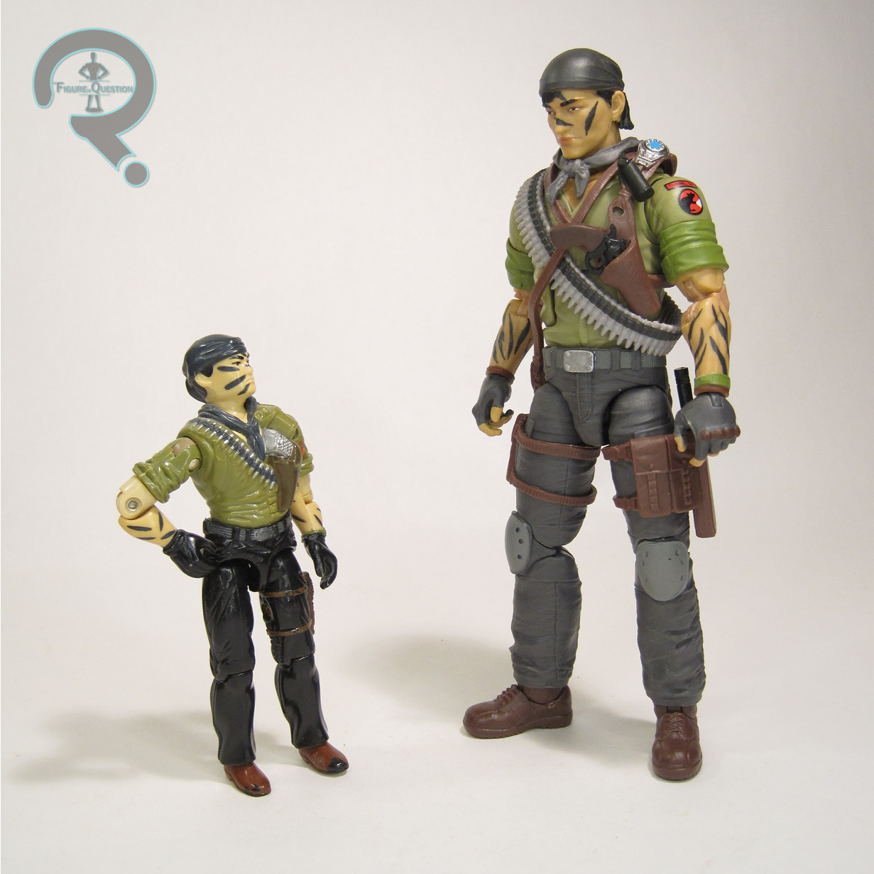
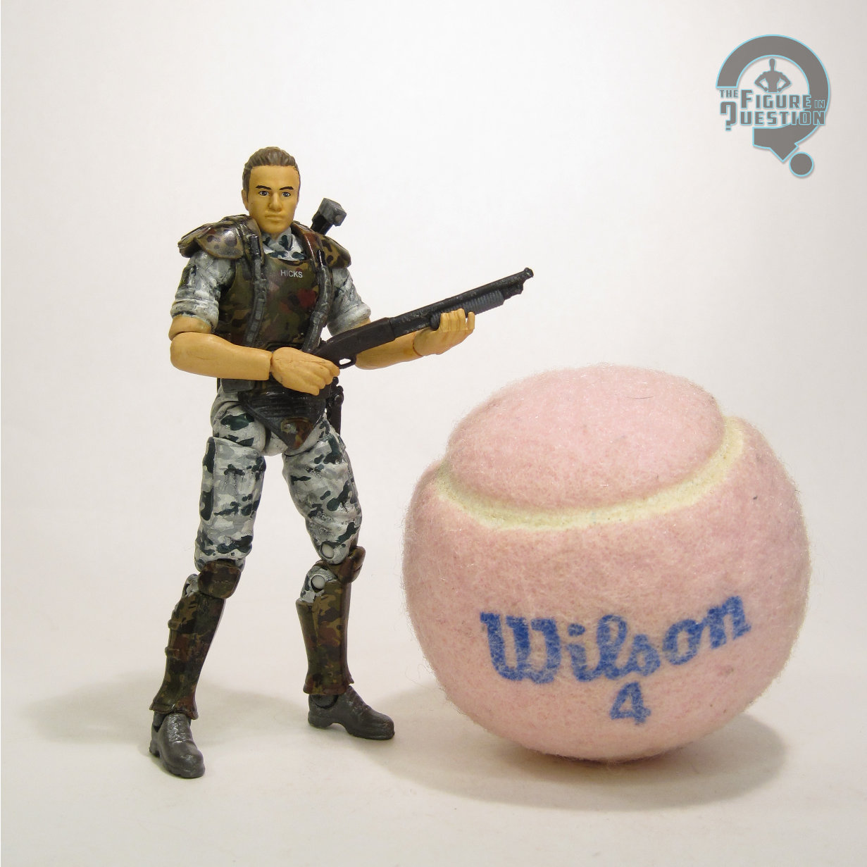 Cpl Dwayne Hicks was released in the initial run of Hiya Toys’ Aliens: Colonial Marines tie-in line, at the same time as game marine Quintero and fellow film marine Hudson. They hit in 2016, three years after the game’s release, which seems like a bit of time to wait, but it’s only half as much time as it took for the game to make it out, so, you know, perspective and all that. All of these figures, even the “movie” ones, were technically game-based, with the non-game characters being based on their multiplayer skins. Hicks technically exists in both capacities, but this figure, which lacks the scarring he received at the end of Aliens, seems to be the multiplayer/movie version. The figure stands 4 inches tall and he has 27 points of articulation. The articulation set-up is ultimately something of a mix between the 25th/30th era G.I. Joes and Hasbro’s Marvel Universe. Generally, not bad, but the hip pops off a lot, and one of the knees is a little gummy. Hicks’s sculpt had a lot of overlap with Quintero and Hudson, with them each just getting a unique head sculpt. The head’s…not great. It’s rather soft on the details, and the likeness just really isn’t there. You’d be forgiven for just not realizing this was meant to be Hicks at all. Below the neck, things are a little better. The proportions aren’t bad, and the armor detailing is all pretty solid stuff, with the torso armor in particular honestly being pretty strong. Because of the parts sharing with Quintero and Hudson, his sleeves come down way too far on the arms; Hicks’s sleeves aren’t visible under the armor in the film. He’s also missing his watch and wrist band, and the lack of wrist coverage also highlights how oddly misshapen the hands are at the base of the wrist. The color work on this figure
 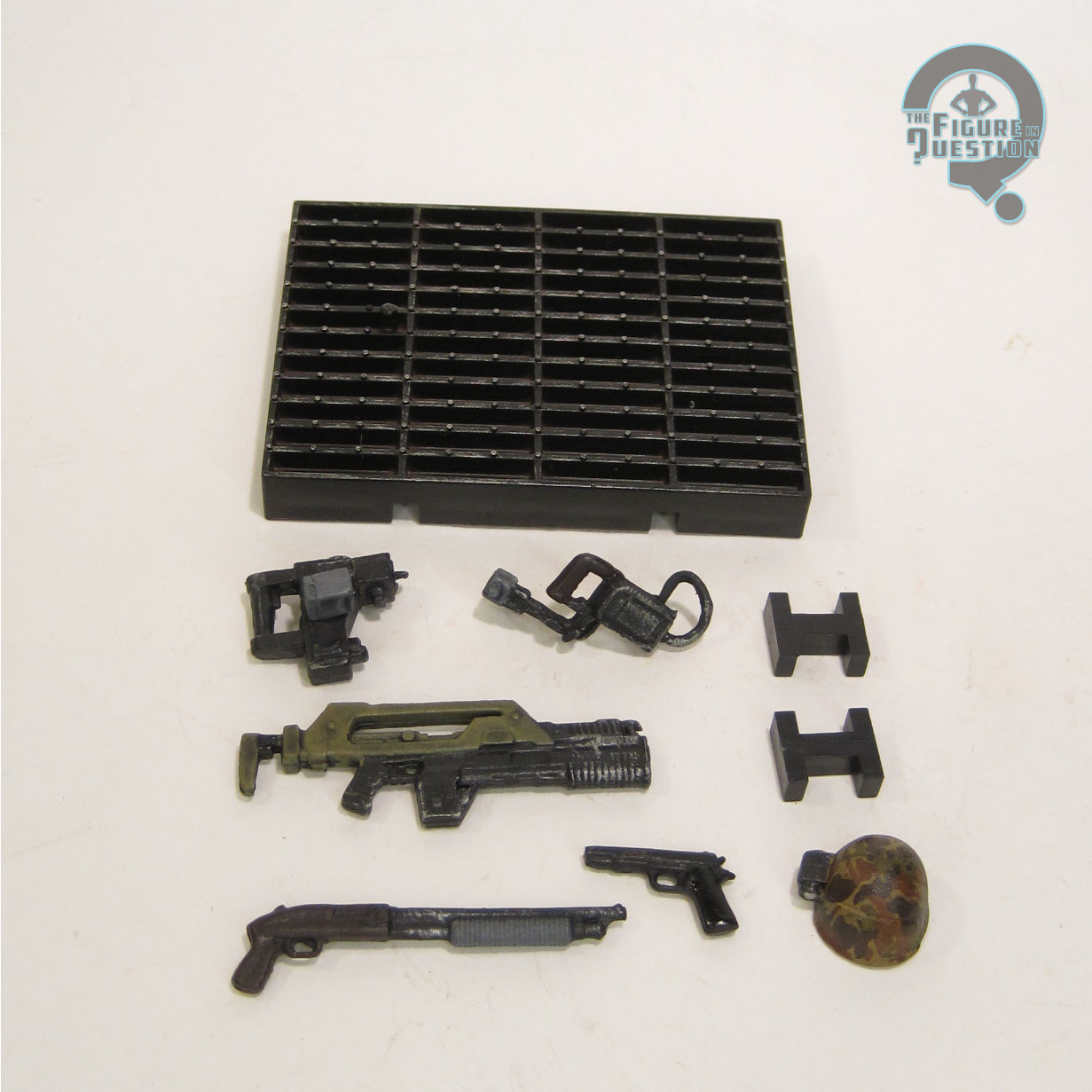 leans into the game colors, so his uniform is bluer than the film, and his armor is browner, which makes for rather an odd contrast. Like, it’s not terribly off, but it’s enough to throw you at first. The application’s a little thick, but otherwise not too bad. Hicks is packed with his helmet, shoulder lamp, shotgun, pulse rifle, a pistol, a motion tracker, and a display stand. The helmet is wildly inaccurate, missing the back neck cover, the ear covers, and the comm, removing the distinctive Colonial Marine silhouette when he’s wearing it, and generally throwing off his look. It’s a real shame, given how weak the likeness on the underlying head is. The gun sculpts aren’t bad, but the hands don’t hold any of them particularly well. Also, the pulse rifle gets no sling, and the shotgun and pistol have no holsters, so he just kind of has to throw them off to the side when not using them, I guess?
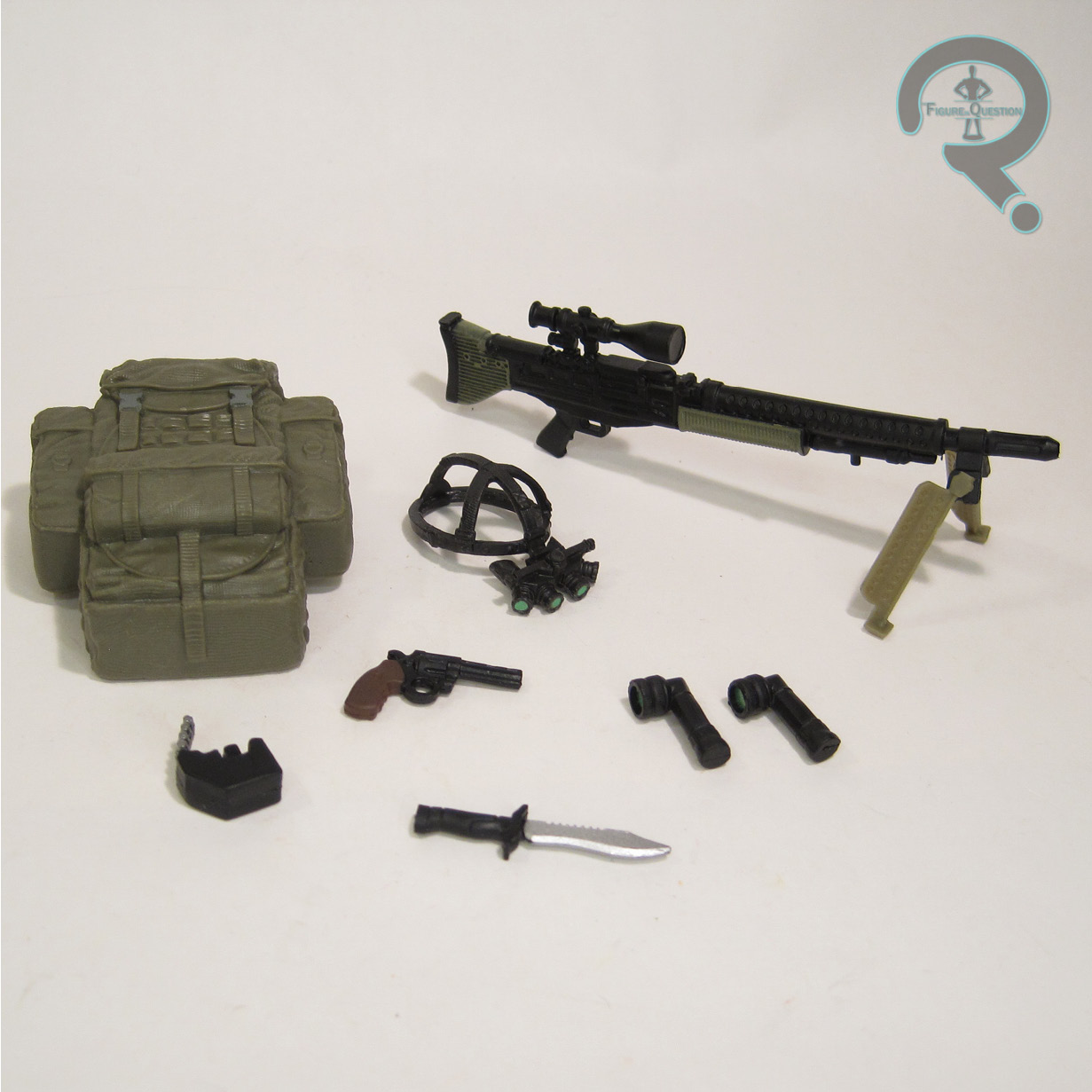

THE ME HALF OF THE EQUATION
I honestly did my best to avoid everything to do with Colonial Marines after it dropped and was so mediocre, and that included the tie-in stuff. I didn’t even know about these figures until after they’d dropped, and Hicks jumped in price rather quickly, so I never snagged him. He got traded into All Time a month or two back, missing the shotgun, so I was able to get him for a slightly better deal. Then the shotgun surfaced, and he was all complete again, which was pretty cool. Ultimately, he’s not great. I’m glad I didn’t pay the mark-up on him, because that really would have put me off. As it stands, he’s a Hicks I didn’t have, and it was very easy for me to snag him, so it was hard to say no. Sometimes, that’s just how it is.
Thanks to my sponsors over at All Time Toys for setting me up with this figure to review. If you’re looking for cool toys both old and new, please check out their website and their eBay storefront.