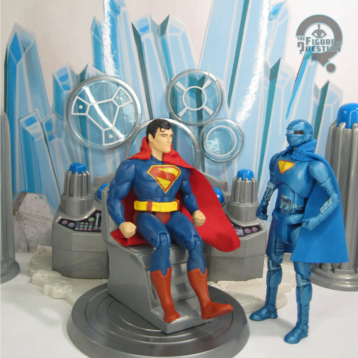
FORTRESS OF SOLITUDE with SUPERMAN ROBOT
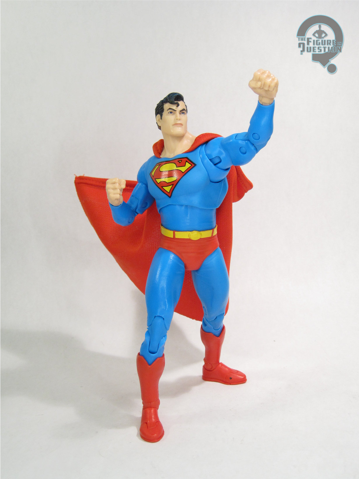
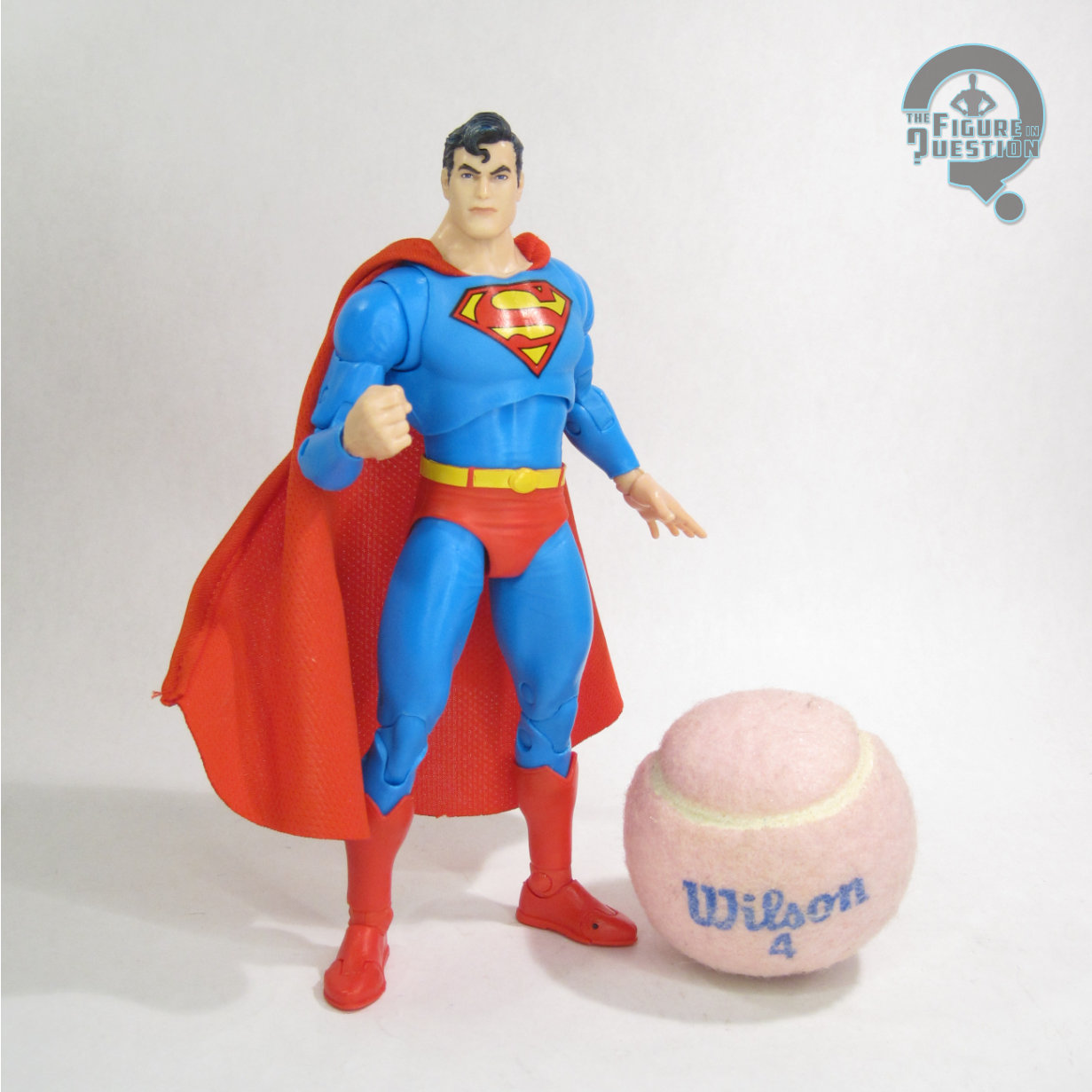
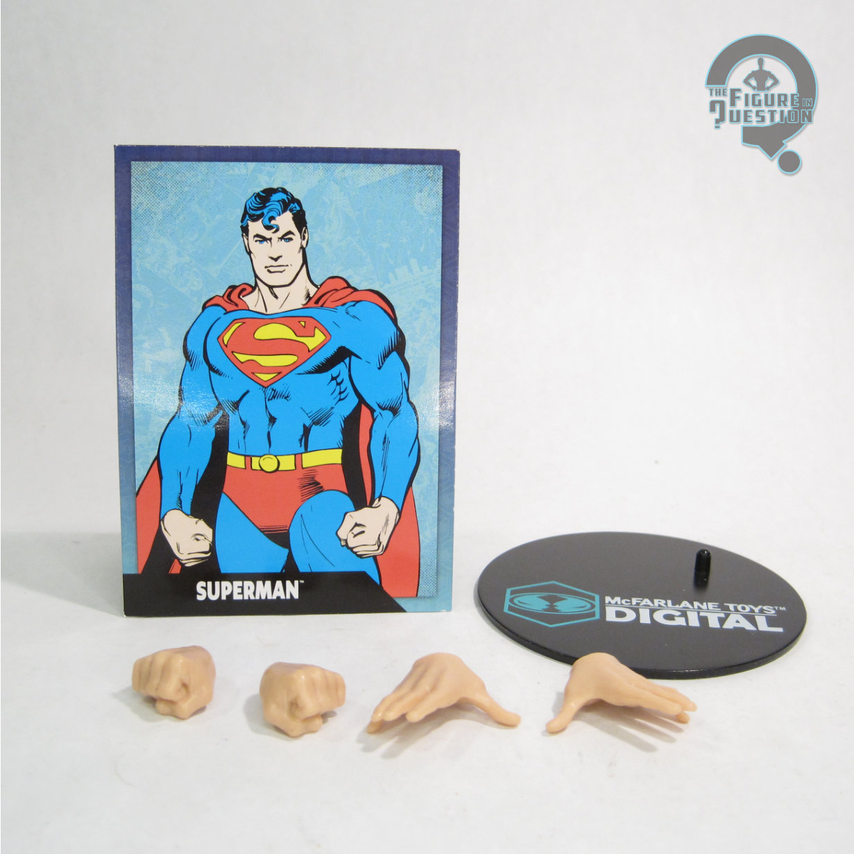
SUPER POWERS (McFARLANE)
Economies of scale and drifting interests in the world of action figures have almost entirely robbed us of playsets in this day and age. They just can’t justify themselves most of the time. Sure, we still get the odd TMNT lair, and there’s a bat cave every so often, but that’s really about it. McFarlane’s Super Powers continuation has aimed to recapture a lot of the vibes of the vintage line, which has included a decent helping of vehicles to go with the figures. The only thing they *hadn’t* gotten to was playsets, but they’re swinging for the fences on their last run before handing the license over at the end of the year. Taking advantage of the hype from the new Superman movie, we’ve gotten a new Fortress of Solitude playset, which I’m taking a look at today!
THE TOYS THEMSELVES
 The Fortress of Solitude Playset is part of the Superman movie tie-in portion of McFarlane’s Super Powers line. There are two different versions of the set available: a standard release and a McFarlane-exclusive Gold Label release that includes an exclusive Superman Robot figure. The one seen here is the Gold Label version.
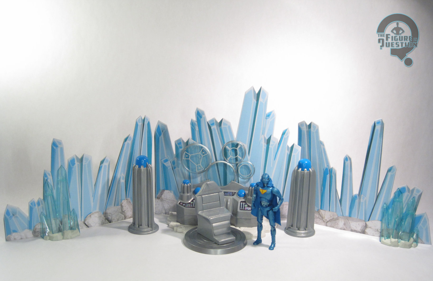
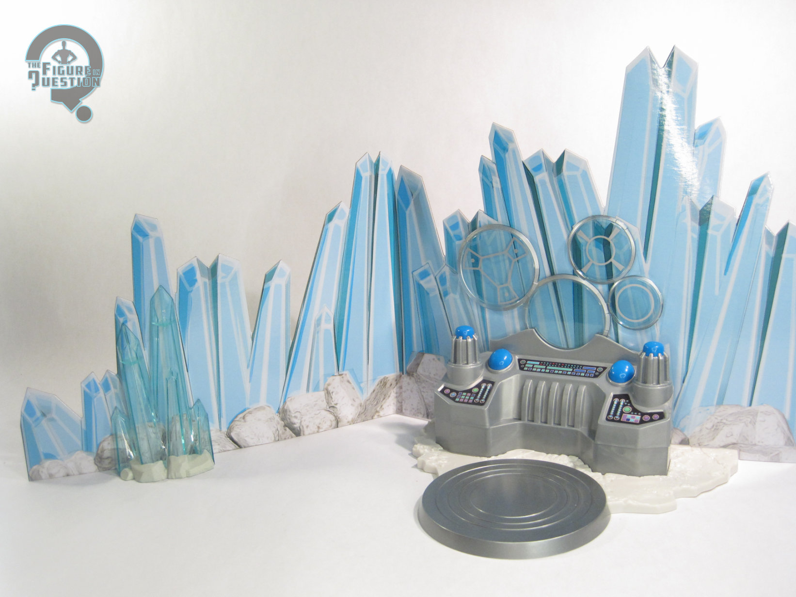
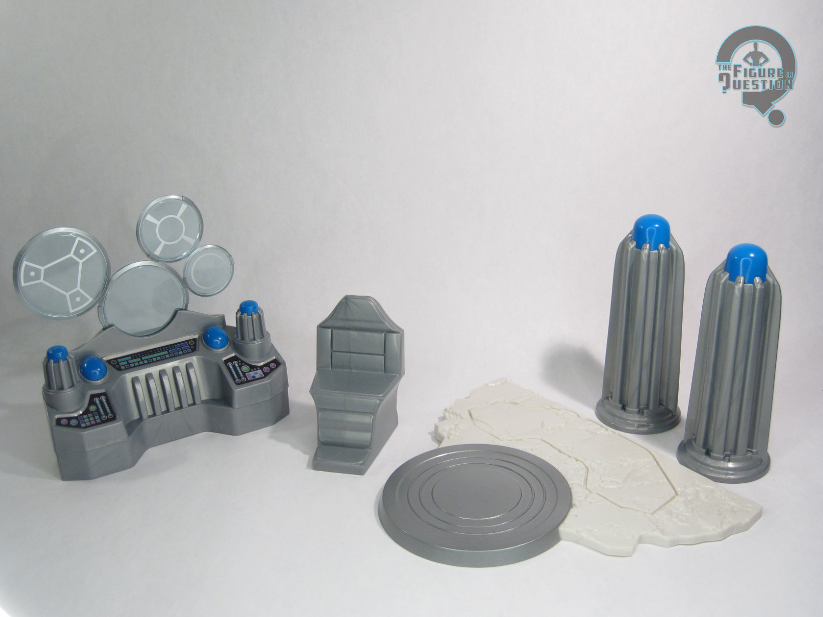
The Fortress is a rather large thing, both in the movie and the comics, so there’s obviously a scaled down approach taken here. We get sort of a slice of the Fortress’s main area, as seen in a number of the movie’s key sequences, mostly focusing on the computer area. There’s a mixed media approach, with some sculpted elements and some cardboard pieces 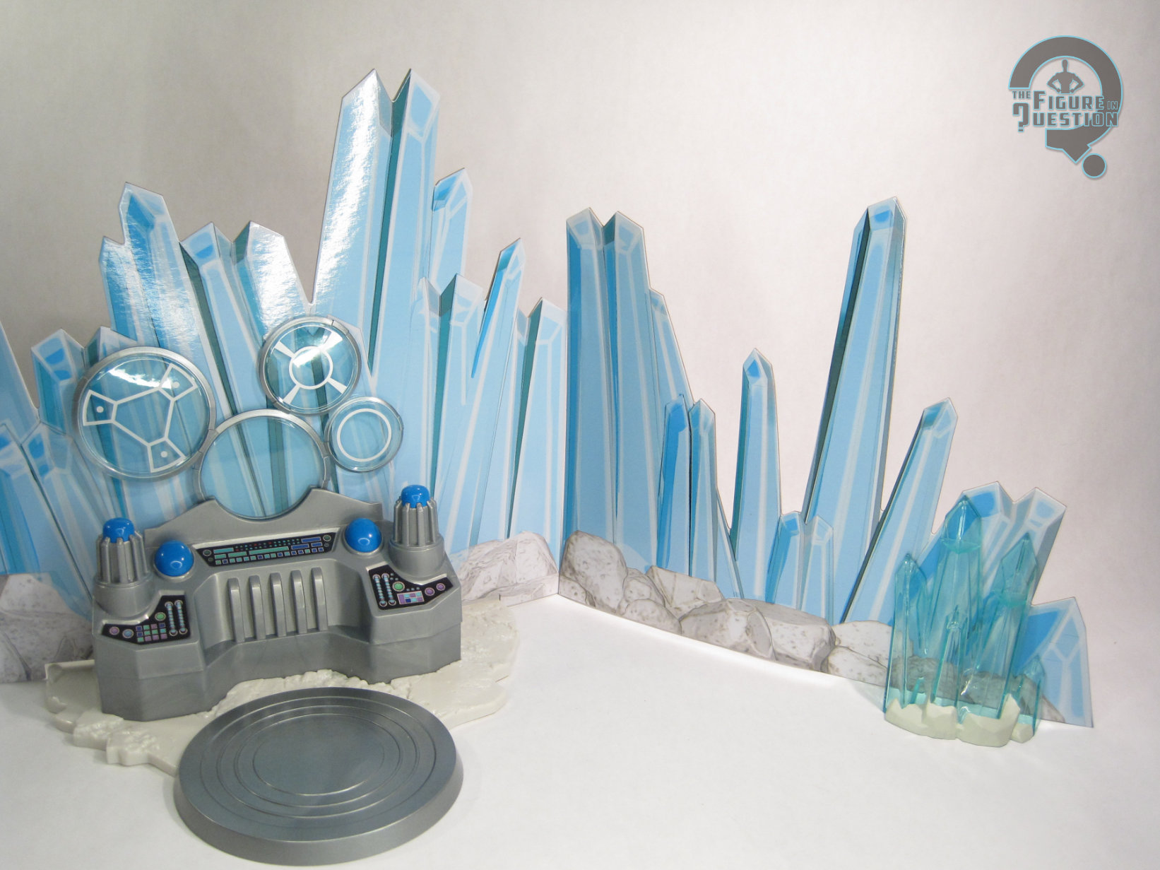 mixed in. While the bulk of the crystalline structure is just cardboard, a surprising amount of the rest of it’s sculpted. The whole central console, the base it plugs into, the chair, the two free-standing columns, and the two end crystals are all plastic. The central console is certainly the coolest part of the whole thing, with is various buttons and screens all detailed. The chair just sort of sits there, not actually attached, but I suppose that gives you a little more variety in how exactly you set it all up? There’s nothing gimmicky or particularly play-related about the set, though. It’s really just a large display for your figures, but it does that well enough.
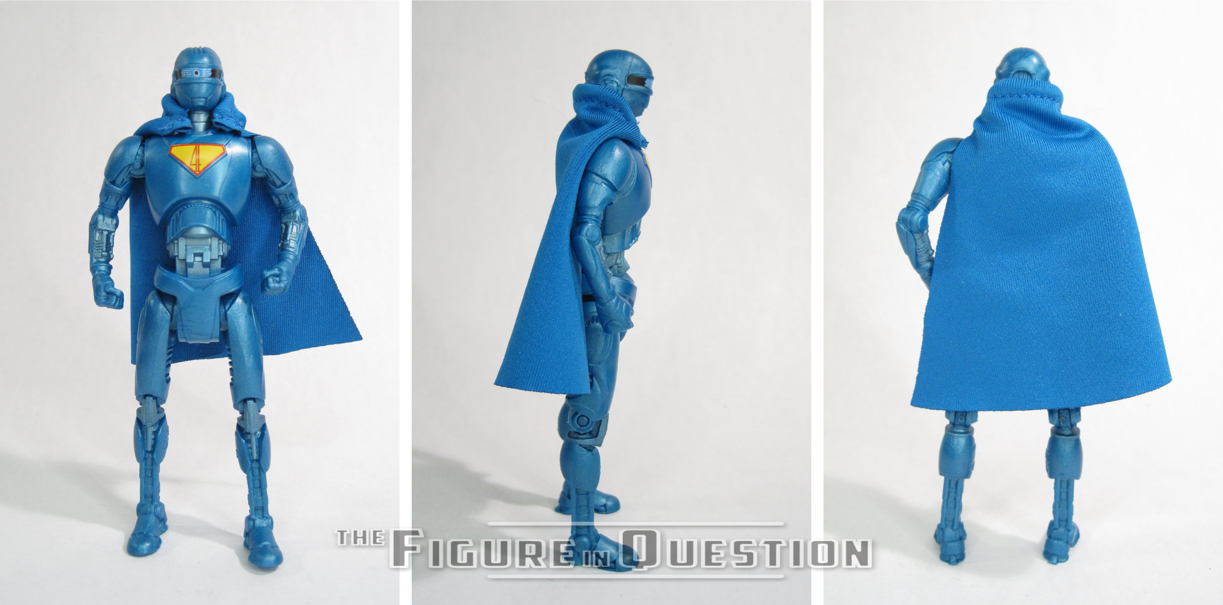
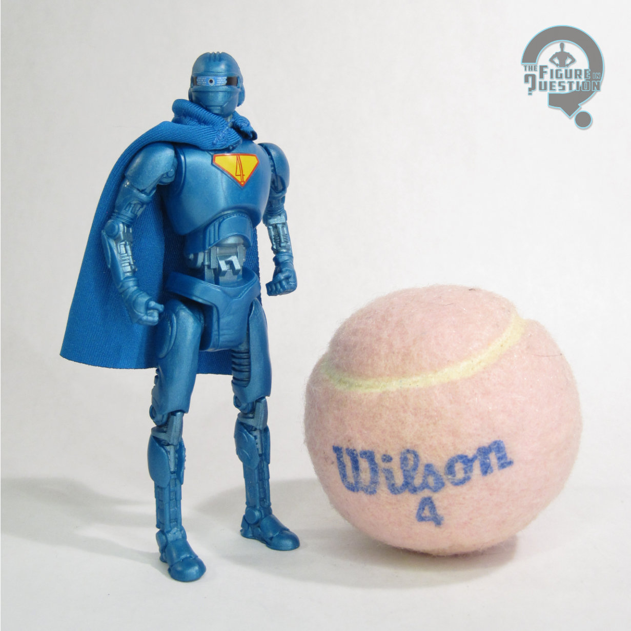 Available only with the Gold Label release is the Superman Robot figure. Specifically, it’s “4”, the Alan Tudyk-voiced robot that serves at the lead robot in the movie. He’s certainly a noteworthy character, and is present in all of the film’s Fortress scenes, so his inclusion makes a lot of sense. The figure stands just over 4 1/2 inches tall and he has 7 points of articulation. His sculpt is all-new, and it’s a decent recreation of the general vibe of the design from the movie. He’s definitely a little bit clunkier than the in-film design, but it works with the overall style of the line. The design lends itself to toy form quite nicely, and I love how sharp the detailing is. His paint work leans heavily into the metallic side of things, which is perhaps not truly “vintage,” since he would have almost certainly been vac metalized blue like the original Brainiac, but it does look pretty nice. I dig that there’s a variety of different shades of blue, and I quite like how the robotic eye has been rendered. His only extra is his little blue half-cape, which fits the vibe of the line well.
THE ME HALF OF THE EQUATION
I don’t do much with playsets these days, because space is a premium and all, but I’ll admit the standard Fortress *almost* got me when they showed it off. I came very close to pulling the trigger, but held off. I was pretty glad about that when the Gold Label version got leaked, because I absolutely needed a 4 figure, and this let me get him in my preferred style. The Fortress set-up is neat. Perhaps a bit pricey for what it is, which is just a large accessory, but that’s kind of where we are. 4 is super cool, though, and I’m glad to have him. Perhaps the only thing that could have made this set better is if they’d also included a Krypto.