SUPERMAN (GOLDEN AGE, SILVER AGE, & MODERN AGE)
THE HISTORY OF SUPERMAN COLLECTION (KENNER)
Fun FiQ Fact #0065: On April 1st, 2016, Superman was the subject of my third April Fools Day gag. Neat, huh? Anyway…
I don’t talk a *ton* about 1/6 scale figures here. I mean, sure, I’ve looked at a lot of higher end figures, but for base level 1/6, it’s not really hip and happening. That’s not to say that I don’t own any of them. Back in the day, I had a whole bin of 12-inch G.I. Joes, and a handful of other characters as well. Even some DC stuff. Today’s figures *weren’t* actually in my collection as a kid, but they did exist, so I suppose they could have been…theoretically. Isn’t that wild and crazy? No, not really. More just a factoid. Anyway…
THE FIGURES THEMSELVES
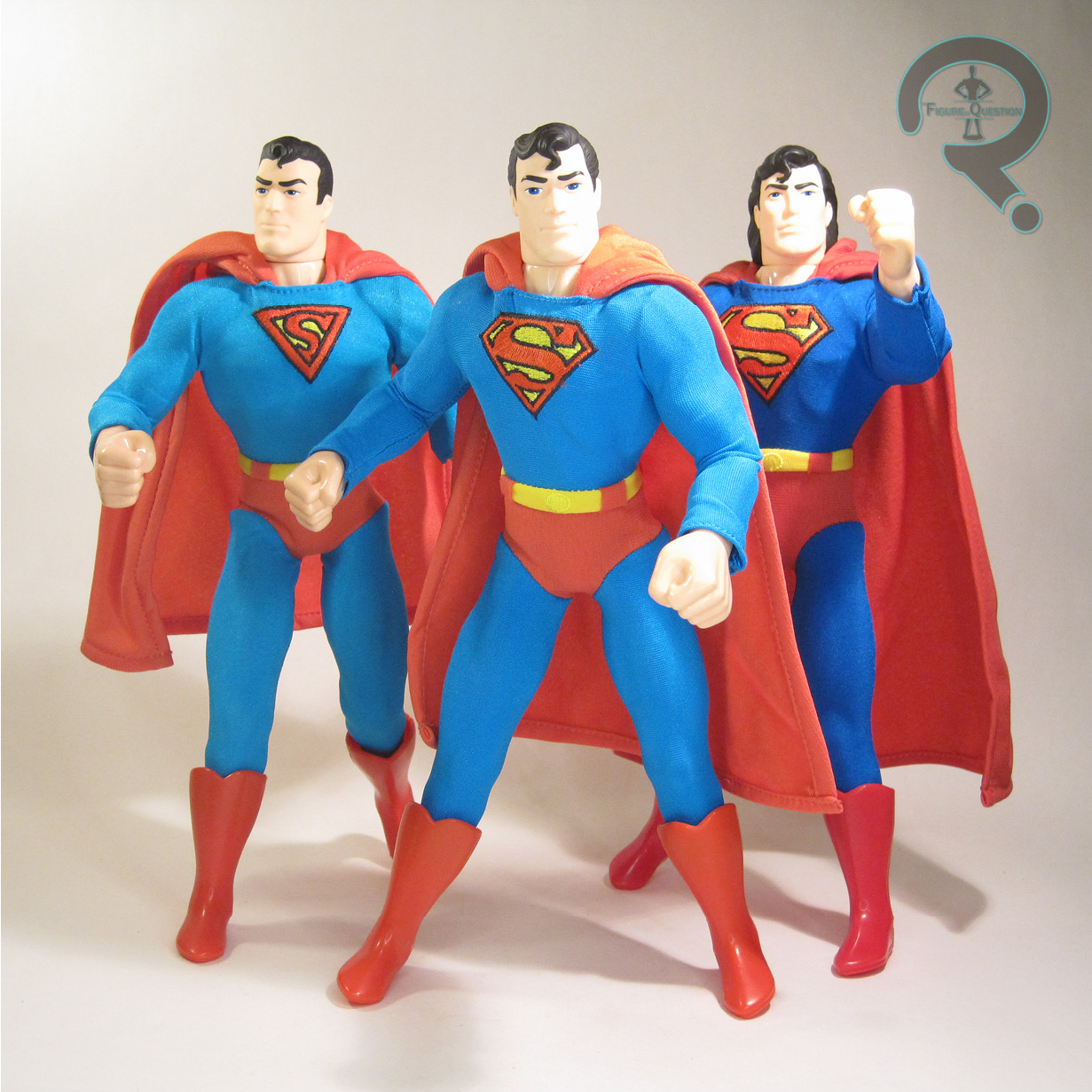
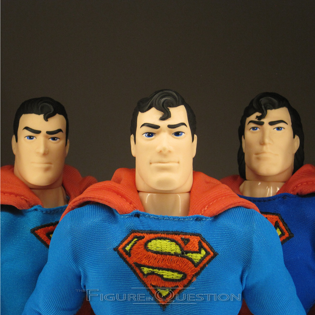
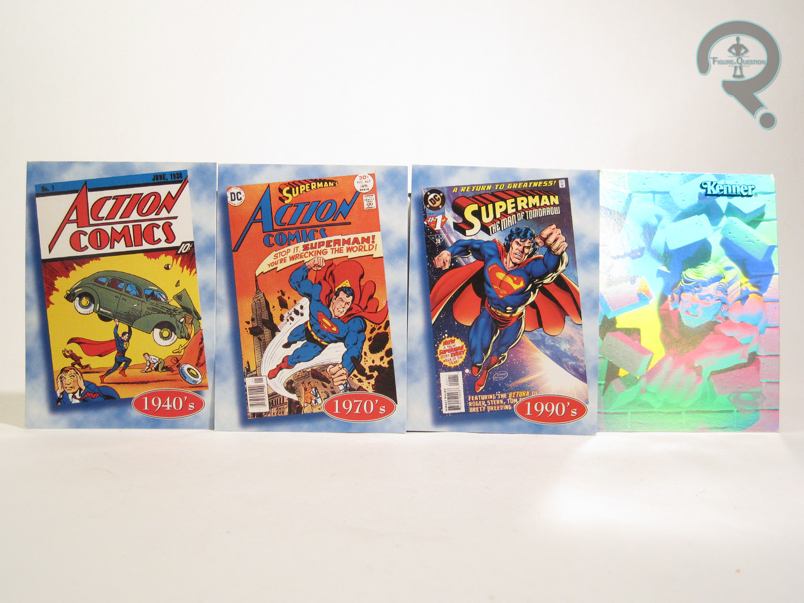 “The History of Superman Collection” was released by Kenner exclusively through FAO Schwarz in 1996. There was also a similarly-themed “History of Batman Collection” also released via FAO Schwarz that same year. The set included three versions of Superman, as well as four trading cards produced by Fleer/Skybox. Three of the four cards each give a cover that lines up with one of the figures, and the last one’s a holographic, chrome thing. Weird, but fun, I guess.
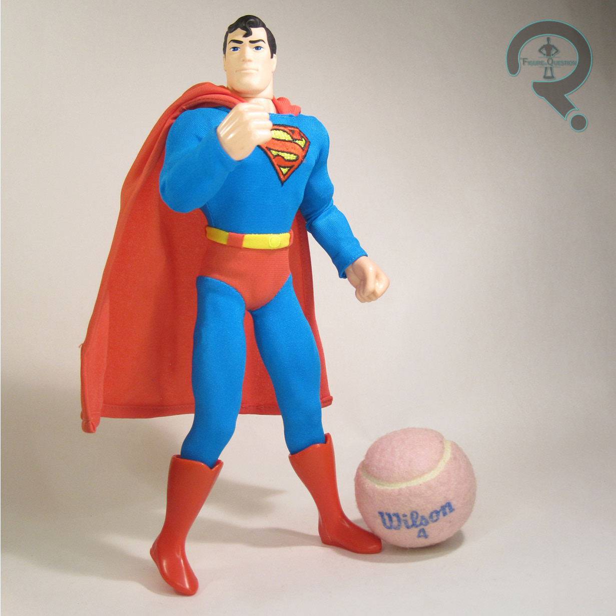
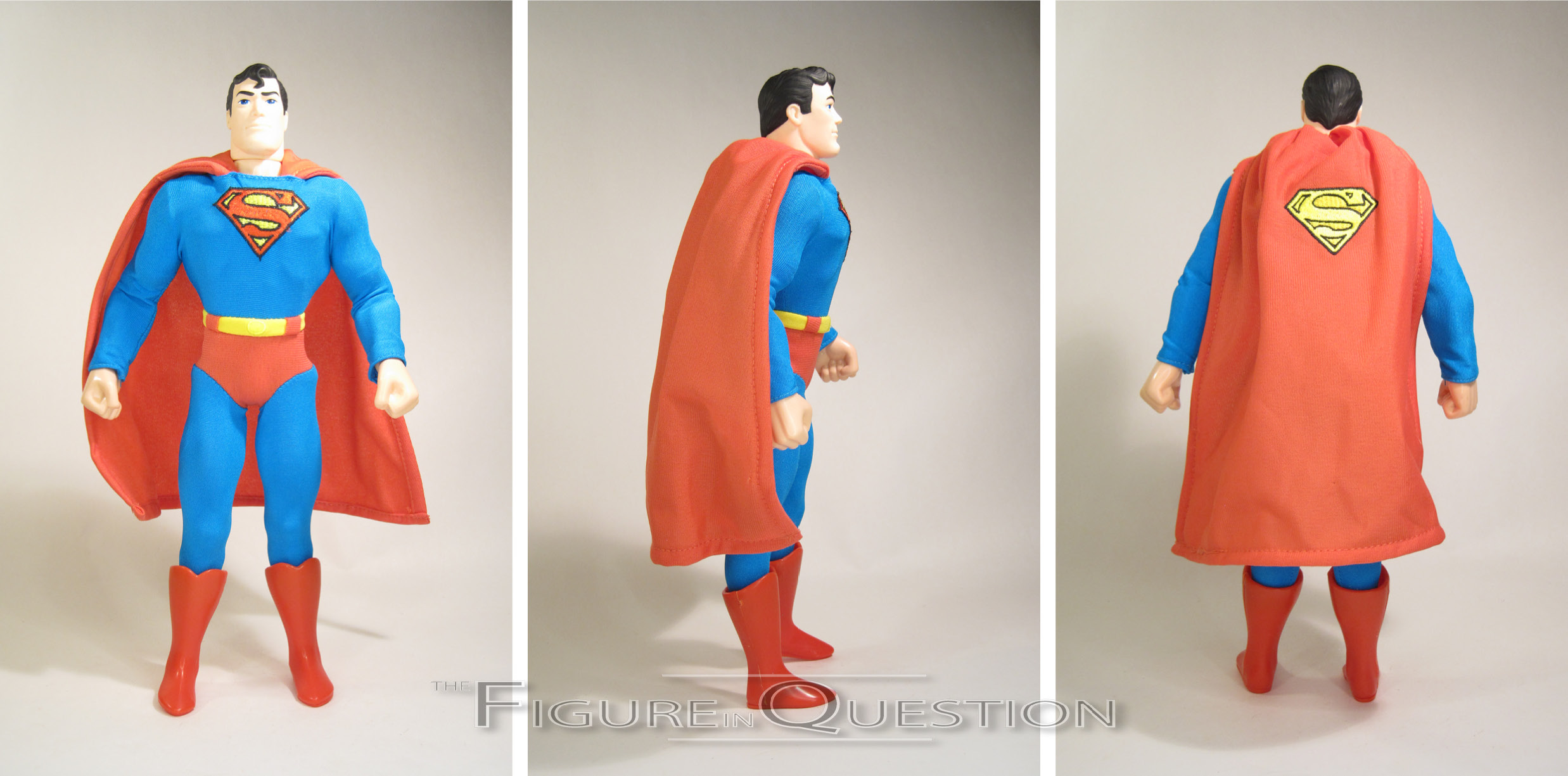
GOLDEN AGE SUPERMAN
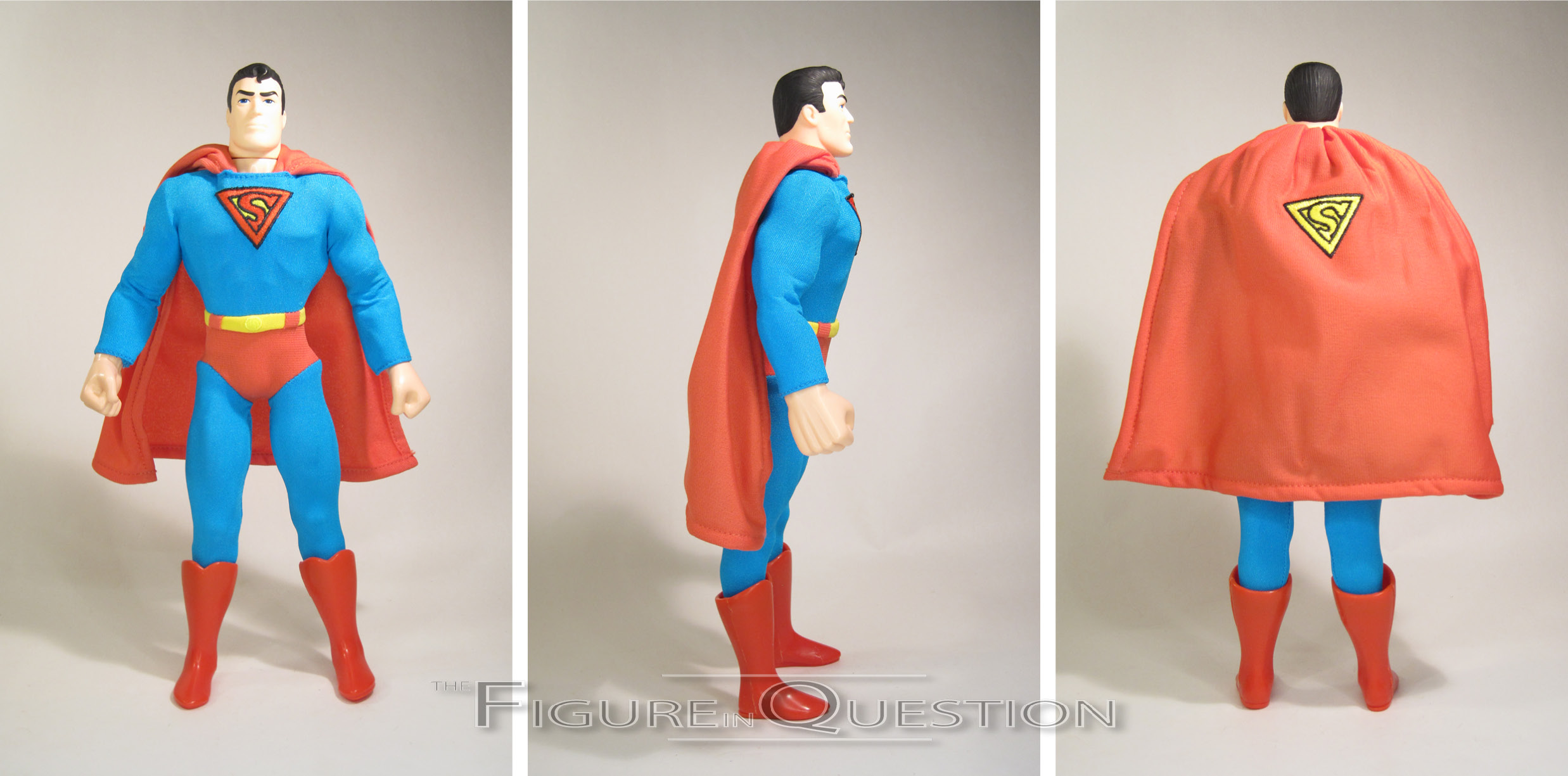
 The purpose of this set was to cover the major bases for Superman’s looks over the years, so they start, as you might expect, with some of his earlier appearances. Not his *earliest* appearances, as he had a slightly more drastically different look at the beginning, but more after his look had refined just a touch. This figure is clearly a ’40s Superman, which is really the heart of the Golden Age, so it’s sensible. The figure stands about 12 inches tall and he has 14 points of articulation. The construction here is…well, it’s very much a product of its time. The head sculpt is undoubtedly the strongest part here, doing a pretty strong job of capturing the essence of the early appearances of Superman, without getting too artist-specific. Obviously, this isn’t meant to be anything even close to Hot Toys quality, and it’s definitely on the softer side, but it works. His base body is definitely the most dated part of the whole thing; the articulation is a bit stiff and restricted, and those hands are just humungous. It does mean he fits right in with Hasbro’s very short-lived JLA line in the same scale, though, so that’s all pretty cool. The outfit is permanently attached to the figure, with a jumpsuit and cape, as well as a sculpted pair of boots/feet. He’s got an embroidered logo, which is the proper Golden Age one, and there’s a matching one on his cape.
SILVER AGE SUPERMAN
 Our next Superman moves to the “Silver Age”, which is generally late ’50s into the ’60s, though for this one, we’re definitely angling more towards the later end of the Silver Age, if not early Bronze Age. Ultimately, “classic” would probably be a more accurate description for the figure, but that wouldn’t really fit the set’s naming scheme, so I get it. He’s using the same basic set-up as Golden Age, so he’s the same height and has the same articulation set-up. He does get a new head, though. It’s not *drastically* different from the first sculpt, but the eyes are wider and the spit-curl is far more pronounced. I dig the subtle changes, and they really work to sell the later look. His outfit remains pretty similar as well, keeping more or less the same coloring. The cape is a little longer here, and his logos have been updated to the more standard S-logo.
MODERN AGE SUPERMAN
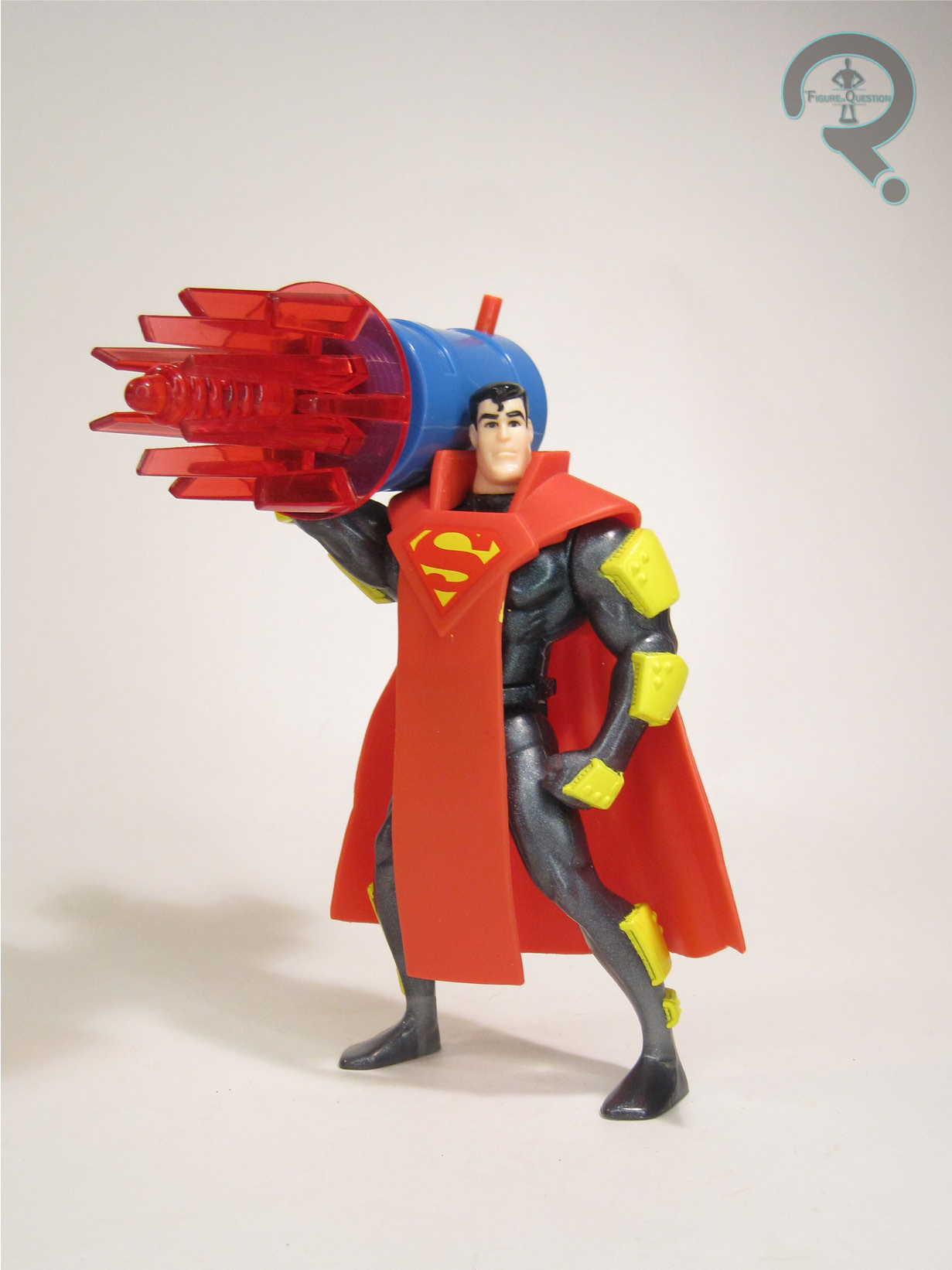
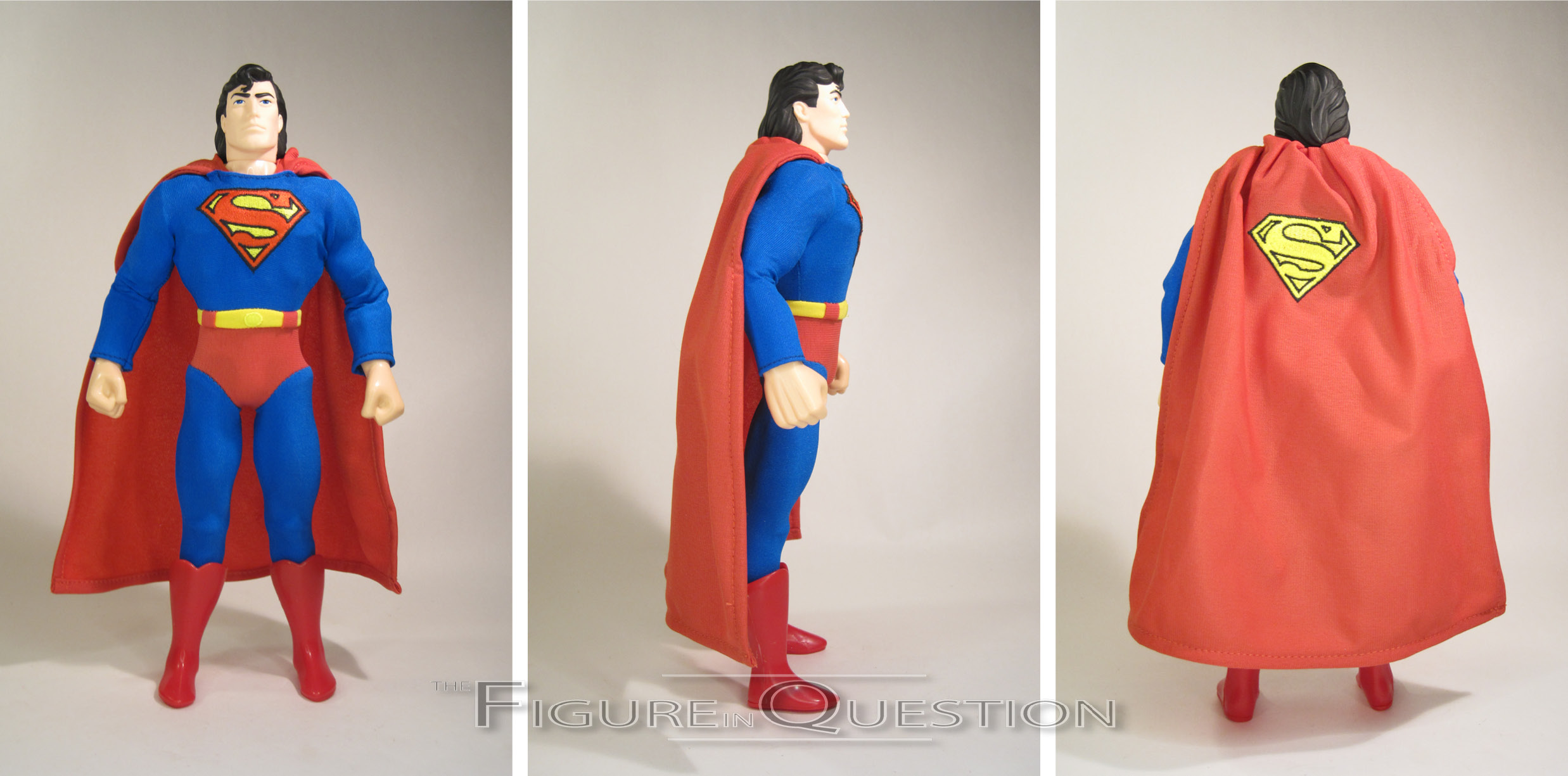
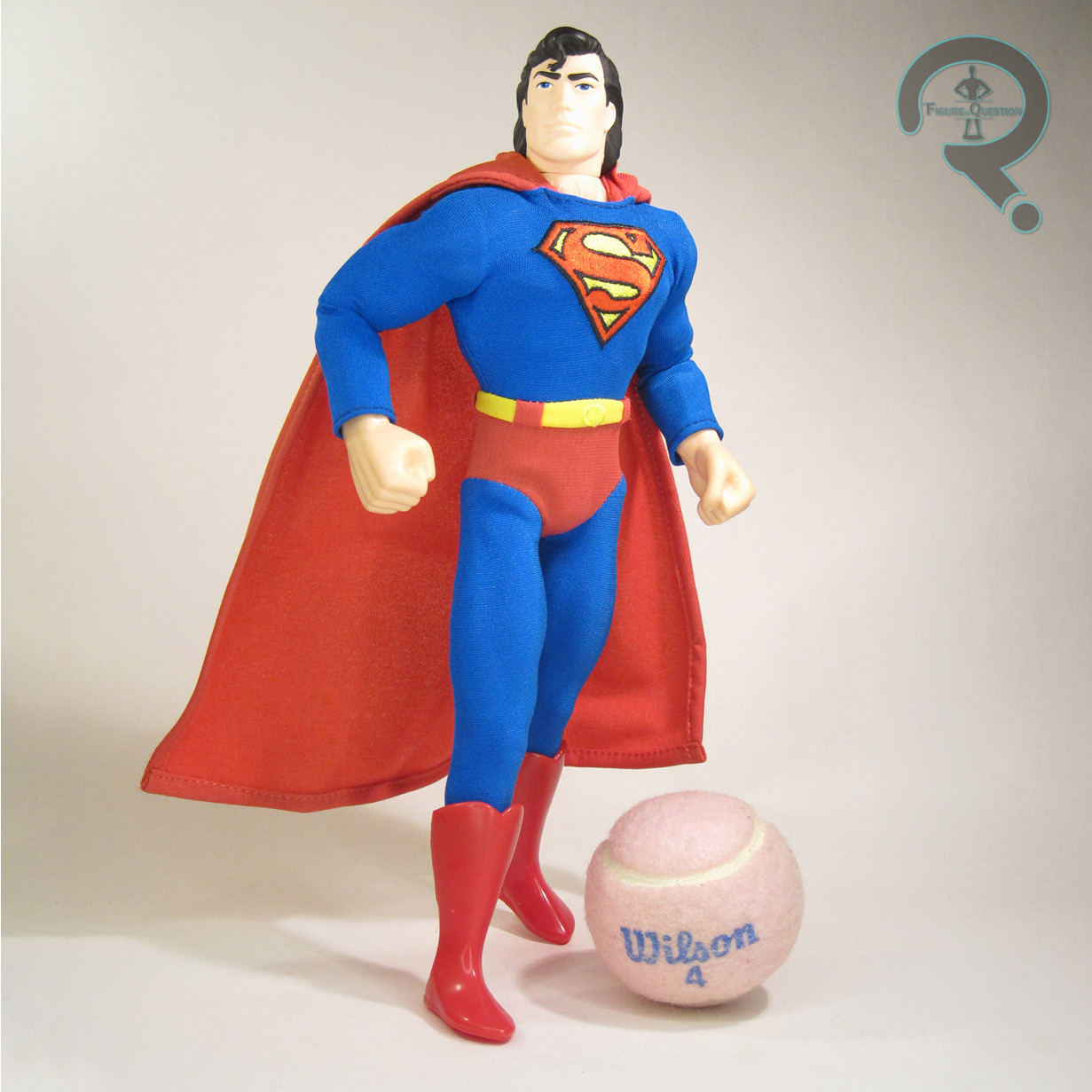 Last up, it’s the most mullet-tastic and least exclusive member of the set, Modern Age Superman….or at least as modern as you got in 1996. This one would actually get his own single release at mass retail, under Kenner’s Man of Steel banner. He’s using the same base body again, with another new head sculpt. This one’s all mullet-y, as it should be. It’s still got the same general features, though his chin is a little narrower, and he’s got the extra locks. His outfit adjusts the design even further, giving him an even longer cape than the Silver Age version, and his blue and red have been switched to much deeper hues. The single release had a silk-screened logo, but this one keeps the properly embroidered one to match the rest of the set.
THE ME REMAINDER OF THE EQUATION
I didn’t step foot into FAO Schwarz until I was a teenager, more than a decade after this set’s release, so I didn’t have one growing up. I did know of its existence, though, thanks to Raving Toy Maniac’s archives, and it’s one I’ve always been fascinated by. It’s not something I felt the need to track down, but when one landed in front of me last summer through a trade-in at All Time, it was hard to say no. So, umm, I didn’t? It’s hokey and goofy, and I probably didn’t need it, but that doesn’t mean I didn’t enjoy it.
Thanks to my sponsors over at All Time Toys for setting me up with this figure to review. If you’re looking for cool toys both old and new, please check out their website and their eBay storefront.
….oh, you guys weren’t expecting something April Fools-related, were you? Well, maybe this year the gag is the lack of a gag. Yeah, that’s totally it…