KITTY PRYDE
MARVEL LEGENDS (TOY BIZ)
Kitty Pryde is really a marker for change in the X-Men comics. She was the first new mutant to be added to the team following the All-New, All-Different change-up, and represents perhaps the only hopeful note to come out of the Dark Phienix Saga. Almost as soon as she joined, she became a focus point for the series. She’s also noteworthy for being one those rare instances of a comic character who was allowed to grow up, as her quest to become a full-fledged X-Man was one of her major story points. And, above all, she’s pretty consistently a fun character. Unfortunately, she’s had some rotten luck with action figures (if you don’t believe me just look at the last Kitty I reviewed). Toy Biz tried their hand at making her twice, with mixed results. I’ll be looking at that second attempt today.
THE FIGURE ITSELF
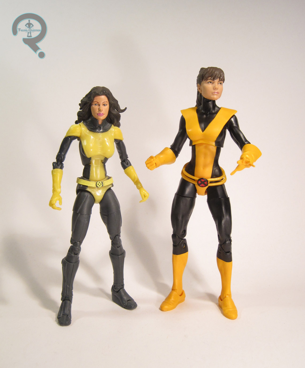
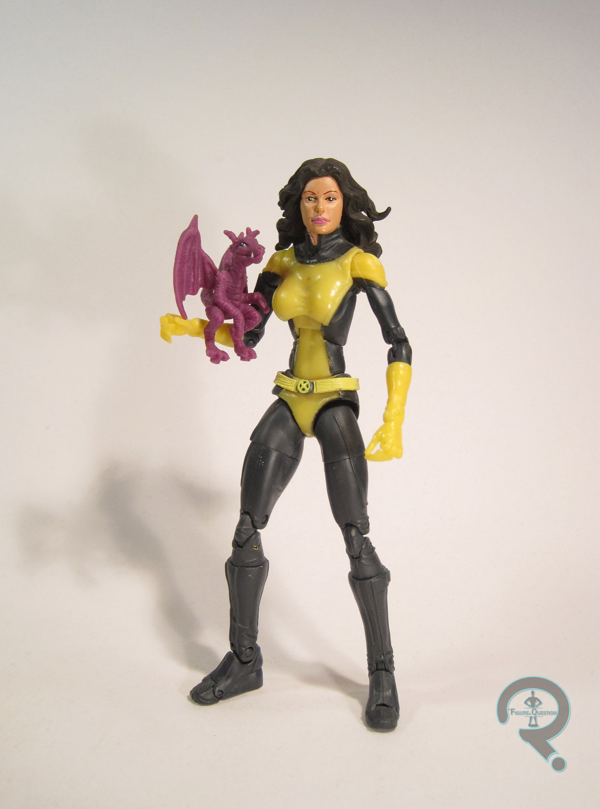
 Kitty Pryde was released in the Walmart-Exclusive Giant-Man series of Toy Biz’s run with Marvel Legends. She was based on Kitty’s then current Astonishing X-Men design. The figure stands a little over 6 inches tall and has 38 points of articulation. For the most part she’s the same figure as the Jessica Alba Invisible Woman that I reviewed a few months ago. That’s not great, because that body had some major issues, including, but not limited to: incredibly obvious joints, an impossibly small waist, and super fragile arms and legs. It’s not a particularly strong body. What’s worse, the details on the body don’t quite line-up with Kitty’s Astonishing design. It’s a weird body choice all around. I’m not really sure why they went with it, but I’m not Toy Biz. I’m also not out of business, so I think that I won this one! Kitty got a new head sculpt, which is okay, but hardly one of Toy Biz’s best. Like Hasbro’s smaller attempt, she feels a bit old for Kitty, and the total lack of ears weirds me out a bit. Also, her hair is pretty much completely wrong for this interpretation of Kitty, being all around too long and just too bushy. Were it not supposed to be this specific Kitty, that would be fine, but it stands out here. The paint work on Kitty is probably some of the weakest on any of the Toy Biz Legends. The face is alright, but the eyebrows are slightly off from the sculpt, which throws her whole look off. Also, the color scheme of the costume is totally off. In the comics, her costume was black and a warm shade of yellow. Here, it’s a dark grey/pale yellow combo that looks incredibly boring and drab. It’s not a fun look, and means she’ll tend to get lost in a group. Kitty included her pet dragon Lockheed, as well as the upper torso and head of Giant-Man.
THE ME HALF OF THE EQUATION
I didn’t find this figure at retail, due to the all-around difficultness of finding this series at Walmart. My dad bought her for me from a reasonably priced eBay auction. At the time, I was really excited to get this figure. I mean, she was my first Kitty Pryde figure, and I’ve always loved the character. That being said, I very quickly found the flaws in this figure, and she’s never been one of my favorites. She’s probably one of the older Legends most in need of an update.