#0819: Giant-Size X-Men #1 Boxed Set

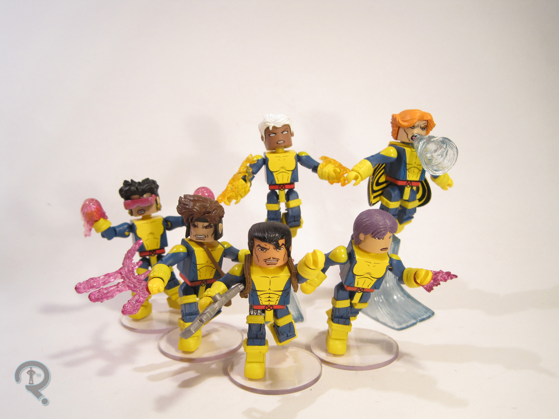
STORM, COLOSSUS, NIGHTCRAWLER, SUNFIRE, BANSHEE, & THUNDERBIRD

MARVEL COLLECTOR EDITIONS (TOY BIZ)

ANADXMenPack1

In the 1960s, when Marvel Comics was on fire with all sorts of new ideas, the X-Men were created. The team was Cyclops, Marvel Girl, Iceman, Beast, and Angel. While the series was a moderate success, it wasn’t as big as other titles of the time, and so the book eventually became solely a reprint series, before ending entirely. But, as anyone who has so much as thought about a Marvel comic in the last 30 years can tell you, that was far from the end of the X-Men. In 1975, the series was relaunched with Giant-Size X-Men #1, which featured an all-new, all-different cast of characters. This new cast proved far more successful than their predecessors, and the series went on to become one of Marvel’s most popular. In the 1990s, the X-Men were no strangers to toys, but most were based on the contemporary designs. To appease older fans, Toy Biz launched a line of special boxed sets, based on more classic incarnations of teams, including the All-New, All-Different X-Men, which I’ll be looking at today!

THE FIGURES THEMSELVES

ANADXMen1

These six figures were released as one of the three sets in the Marvel Collector Editions line. All six are based on their appearances in Giant-Size X-Men #1.

STORM

ANADXMen2Though she’s by far the most well-known of the figures in this set, this was the first time Storm’s original costume had seen plastic form, and only the second sculpt the figure had gotten in the expansive 5-inch scale. The figure stands 5 ¼ inches tall and has 13 points of articulation. Her sculpt is generally pretty good, and certainly much better than the Marvel Girl sculpt from this set’s X-Men #1 companion piece. The head is definitely the nicest piece here, as it captures Cockrum’s take on Storm quite well. The body is decently sculpted, but suffers from a few issues. First off, she seems to lack Storm’s usual imposing stature, which is sadly common with her figures. She’s also got these odd, claw-like hands, which are definitely too big for the rest of her body. To top it all off, she’s nearly impossible to keep standing for very long. I do like the way they’ve handled the cape, though; it’s cloth, but it’s multiple layers, which give it enough weight to keep it from hanging oddly, and it avoids cutting off articulation as well. Her paintwork is pretty much on par with the rest of what Toy Biz was doing at the time. The colors are nice and vibrant, and everything is pretty clean, if perhaps lacking in subtlety. The edge of her collar is missing some yellow in a couple of spots, but other than that, everything looks pretty good.
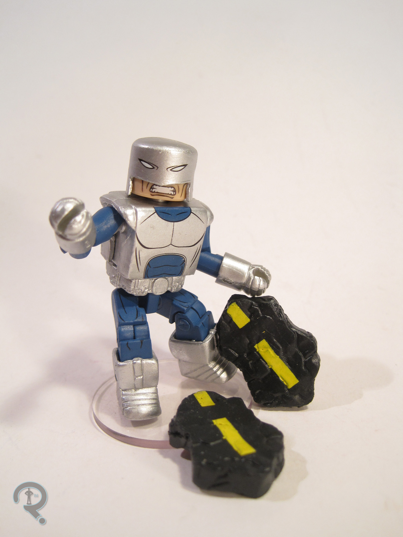
COLOSSUS

ANADXMen4This marked the third time Toy Biz made a Colossus figure. They had a bit of a Goldilocks thing going on with them, though. The first one was too small, the second one was too big, but this one was juuuuust right. The figure stands 6 inches tall and has 14 points of articulation. The decision not to give him any wrist movement is a little baffling, especially since he’s got a built-in way to mask the joints, but the rest of the movement is all pretty good. Colossus is probably my favorite sculpt in the set. He’s not saddled with any real pre-posing, and his proportions don’t get too wonky, apart from his hands being maybe a touch on the large side. The details here, especially on the exposed metal parts of his body are really stand-out, and he just looks really sharp. His head has an expression that’s intense, but not so intense as to make him look villainous. The paint on Colossus is pretty sharp too. He’s got no noticeable slop, and the details on his costume really look great. The red and yellow really just pop on this guy.

NIGHTCRAWER

ANADXMen3Nightcrawler received probably the best of the initial figures from Toy Biz’s X-Men line, but that didn’t mean there wasn’t room for improvement, especially since the original had sported odd suction cups on his hand and leg. It was also hard to get him into any of Nightcrawler’s distinctive crouching poses, which was the main thing this figure set to fix. The figure is 5 ¼ inches tall and has 16 points of articulation, as well as a bendable tail. If there’s one major issue with this figure, it’s that he’s just too tall. Nightcrawler should really be noticeably shorter than the rest of the team, but were the figure not crouching, he’d be taller than half the figures in the set. That’s kind of off. Aside from that glaring issue, the sculpt is generally pretty passable, though he’s more of an Excalibur-era Alan Davis-styled Nightcrawler than a GSXM Cockrum-styled one. The general quality of the sculpt is definitely nice, and he has some pretty sharp detailing. The shoulder pads are rather obviously separate pieces, which is frustrating, but not the worst thing. Paint is definitely this figure’s strongest suit, and he’s definitely got the strongest paint in the set. The colors of his costume are nice and bold, and everything is very sharp. What’s really cool is that his costume is all matte finish, while his skin/hair is much glossier, making an instant distinction between the two.

SUNFIRE

ANADXMen5The shortest-lasting (but not shortest-lived) member of the ANAD team was definitely Sunfire, who quit after just one issue. In addition, as he was not new to X-Men the series at the time of Giant-Size X-Men #1, having previously appeared as a “foe,” so he wasn’t even on the cover of that issue. This all ends up making him one of the least-remembered members of this team. Amazingly enough, it wasn’t his first 5-inch figure from Toy Biz (though it was his second of two, so he didn’t get anymore), but it is, to date, the only figure of his classic costume ever made. The figure stands 5 ¼ inches tall and has 16 points of articulation. Sunfire’s sculpt is kind of complicated. There are some really great parts, such as the brilliant texture work on the scaled part of his costume, and a very nice translation of his somewhat goofy-looking mask, but it’s all placed on an almost comically skinny body. Sunfire certainly wasn’t a body-builder, but he wasn’t scrawny either. Then there are his feet, which look to have been sized for the body he should have had, which creates this sort of clown shoe effect. The sculpt isn’t terrible, but it’s also not great either. The paint is good in theory, and decent in practice. The application is pretty solid, and aside from one tiny inaccuracy (having his neckline go all the way up to the mask when it should end just north of the collar bone) it looks pretty good. The only issue is the black wash they’ve used to bring out the details of the scaled parts. It works overall, and is especially good on the arms, but the coverage is inconsistent, and the top of the right leg on my figure is totally missing any painted detail, which sticks out quite a bit.
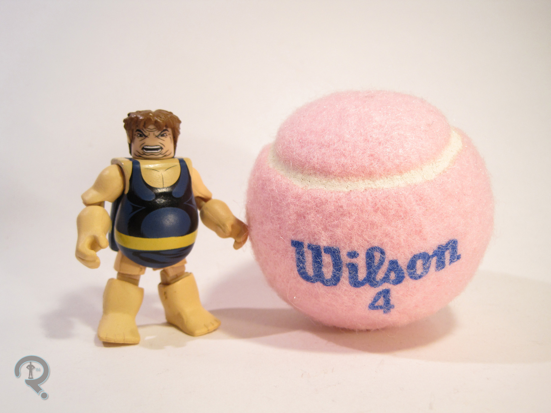
BANSHEE

ANADXMen7Banshee was the other “not new to the series” character, though he had shown up more than once before. He also stuck with the team a bit longer than Sunfire, and hung around as a supporting character even after leaving the team, which resulted in him being a fair bit more memorable than Sunfire (of course, one of them spent the last decade dead, and it wasn’t Sunfire, so maybe popularity isn’t always a great thing). This was his third figure from Toy Biz, but his first to sport his classic green and yellow, which is definitely my favorite of his looks. The figure stands 5 ¼ inches tall and has 16 points of articulation, just like the last two figures. Like Sunfire, his sculpt is a mix of good and bad. The general build isn’t bad, and he isn’t quite as scrawny as Sunfire. However, he’s fairly pre-posed, and the “wings” limit his posability a bit. Also, I get that his main thing is screaming, but I’m not sure how well it turned out on this head sculpt, where he looks like he’s just sort of opening his mouth kind of wide. I feel like an extra, non-screaming head should kind of be a requirement for all Banshee figures, but none of them have ever done such a thing. Banshee’s paint is pretty decently handled; the costume definitely fairs best, with some nice, subtle airbrushing to help highlight some of the sculpted musculature. The head has a passable paintjob, though I feel the colors end up looking a bit too muted.
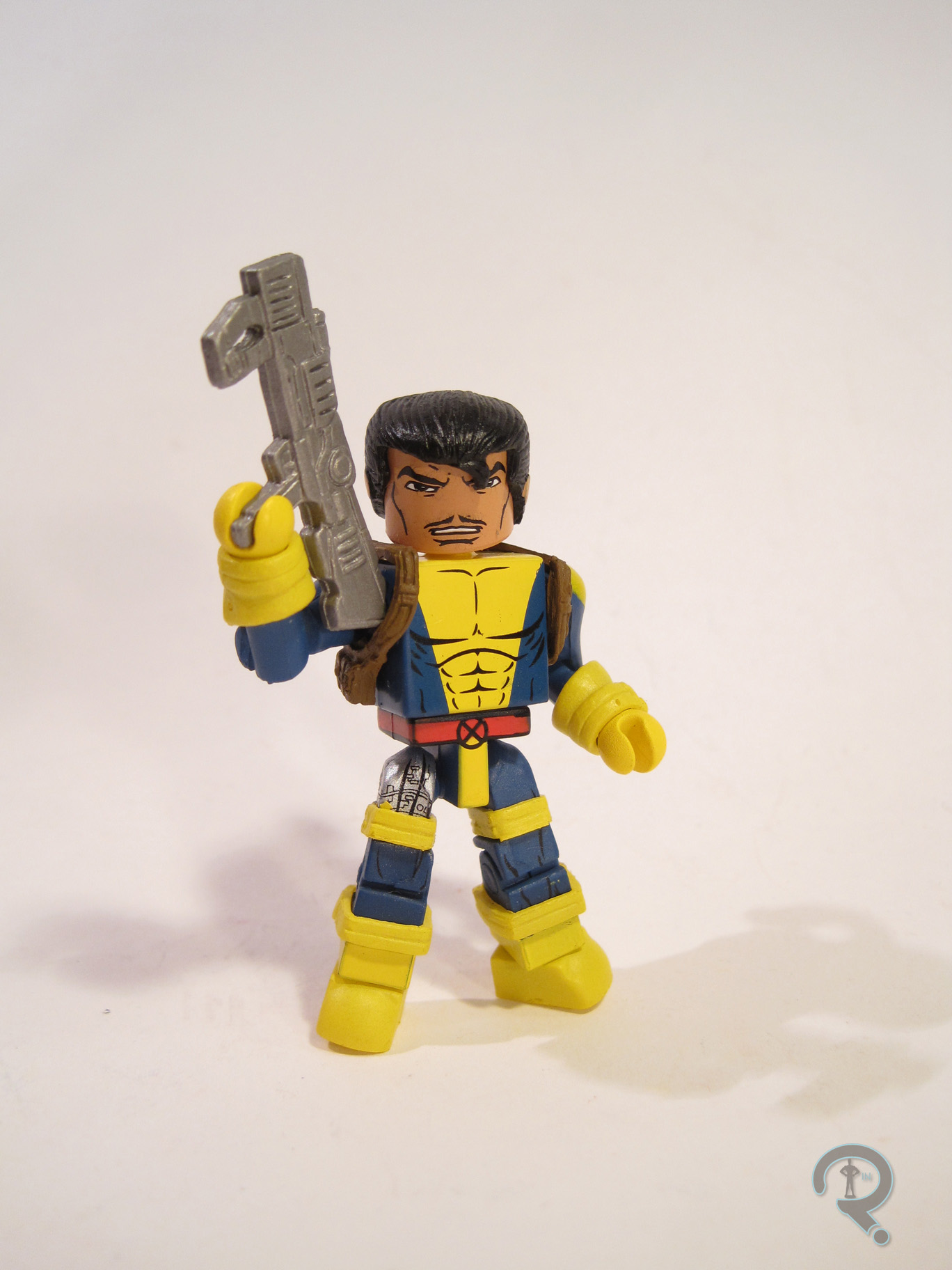
THUNDERBIRD

ANADXMen6Now, here’s a short-lived X-Man. See, cuz he died. Get it? Yeah, you get it. Yes, Thunderbird was officially the first X-Man to die in action, just to prove a point. According to writer Chris Claremont, it was actually a toss-up as to whether it would be him or Wolverine who died during the X-Men’s second mission. Thunderbird got the axe because his powers were more non-descript than the others, and also because he was just a tiny bit on the stereotype side of things, but could you imagine how different X-Men would be without Wolverine? Seeing as he was dead for most of the team’s run, this was actually the first Thunderbird figure ever made, though it wouldn’t be the last. The figure is 5 ½ inches tall and has 14 points of articulation. His sculpt is actually pretty good, overall. The head has some very nice detail work, and is probably the most realistic looking of all those in the set. The body is less realistic, with some slightly out-there proportions, but it’s not too bad, overall. The right hand is sculpt to hold something; I don’t know what it was supposed to be, since he included no accessories, and I can’t really think of anything Thunderbird would need to hold, but whatever. The paintwork on this figure is quite nicely done. Everything is nice an clean, and I love the slight accenting on the various parts of the costume.

THE ME HALF OF THE EQUATION

After getting the other two sets in this line as a kid, I bet you think I got this alongside them, don’t you. Well, you’d be wrong. My dad did have this set, and he even offered to buy me one of my own, at a discounted price, when the now defunct Ageless Heroes Comics was going out of business. I was feeling particularly silly that day and turned the set down, a decision I proceeded to regret for the next 18 years, after the set’s price jumped on the aftermarket. This past November, while attending Philcon, I stopped by the House of Fun, and pulled this set out from underneath several boxes. It was actually less than I would have paid for it back in the day, which made me doubly happy. This is by no means a perfect set, but there are some definite gems within, and I’m happy to have it at last.

#0769: Cable & Stryfe

CABLE VS STRYFE

X-MEN: STEEL MUTANTS

CableStryfe1

The X-Men were so popular in the 90s that they not only had two books of their own, but also a whopping three spin-off titles. Two of those, Excalibur and X-Factor, had been launched in the 80s, and the other, X-Force, was a rebranding of the New Mutants in order to make them more “extreme.” This included adding Cable, a dude who’s mutant power was apparently being a big dude with a gun, aka being the personification of 90s comics. Cable had a twin/clone, called Stryfe. Let’s look at some figures of those two today!

THE FIGURES THEMSELVES

This pair was released in the second series of Toy Biz’s X-Men: Steel Mutants line, because apparently the X-Men just weren’t 90s enough.

CABLE

CableStryfe2Oh man, here’s Cable. Why’s he called Cable? God only knows. Maybe he used to work for Comcast. That would certainly explain his surly nature. The figure stands 2 ½ inches tall and he has 4 points of articulation. Cable had quite a few figures in the 5 inch X-Force line, and this one uses Series 2’s Rapid Rocket Firing Cable as sort of a reference point. I don’t know if it’s based on a specific look, but it does present a slightly more subdued look for the character than usual. He doesn’t even have shoulder pads! His sculpt is generally pretty well handled. He’s got a good amount of detail, and his build does set him apart from the other figures in the line. Plus, I do dig that assymetry. His pose is pretty straight forward, with no real outlandish poising or anything, and he’s decently balanced, so there are no issues with getting him to stand. Cable’s paint is pretty much on par with the rest of the Steel Mutants. There’s a fair degree of bleed over around the edges, but he doesn’t look atrocious. The colors are pretty well chosen, and he looks pretty sharp.

STRYFE

CableStryfe3Yes, you read that name right. He’s named Stryfe. And it’s spelled with a “y.” Because 90s. Strule also stands roughly 2 ½ inches tall and has those same 4 points of articulation. Stryfe is presented here in full 90s glory. Check out that head gear. Seriously, that helmet looks like Liefeld deliberately set out to out-Wolverine Wolverine. I suppose they succeeded in that effort. Doesn’t make it look any less stupid, but more power to him. He appears to be inspired by the Stryfe figure in the 5-inch line, though he’s lost most of that figure’s interesting armor detailing, which has the unintended side effect of drawing more attention to just how goofy the main design of the character is. It doesn’t help matters that his sculpt is just markedly inferior to that of his pack mate. Cable is nicely sized, full of detail, and not in a super goofy pose. Stryfe is the opposite of those things. The size is particularly egregious, since he’s a clone of Cable, and should therefore be about the same size. That coupled with the long monkey arms, the strange lunging pose of the legs, and the ill-fitting cape makes for a really rough looking figure. The paint doesn’t really do him any favors either. He’s mostly a somewhat drab silver, which only further highlights the blandness of the sculpt. It is, at the very least, clean, which I suppose is a plus.

THE ME HALF OF THE EQUATION

This pair was purchased for me from Yesterday’s Fun, alongside the previously reviewed Cyclops and Mr. Sinister set, courtesy of my Super Awesome Girlfriend. Unlike the other set, I never had either of these guys growing up. In fact, this set represents the first, and to date only, Stryfe figure in my collection. So, there’s that. Cable is a pretty solid figure, but Stryfe is easily one of the weakest figures this line had to offer, resulting in an oddly balanced set.

#0759: Laser Blast Cyclops

LASER BLAST CYCLOPS

SPIDER-MAN & FRIENDS

CyclopsSF1

When they held the license for Marvel, Toy Biz tried applying the Marvel brand to everything. Literally everything. This was in part due to Toy Biz being a subsidiary of Marvel, and therefore not having any licensing fees to cover, so they had a certain degree of leeway to try out new stuff. In the early-to-mid-2000s, one of the better selling toy brands on the market was Rescue Heroes, a line of stylized, younger kid friendly action figures. This led to all sorts of imitators, including Toy Biz’s Spider-Man & Friends line, which presented some of the better known Marvel heroes in a near identical style. Despite being a Spider-Man line in name, the line actually covered a pretty decent subsection of the Marvel universe, including their resident Merry Mutants, the X-Men. That included founding member Cyclops, who we’ll be looking at today.

THE FIGURE ITSELF

CyclopsSF2Laser Blast Cyclops was part of Series 5 of Spider-Man & Friends, released in mid-2003. While some of the characters received an assortment of variants from the line, Laser Blast Cyclops was the only time Cyclops showed up. The figure stands about 6 inches tall and has 9 points of articulation. His design is based on Cyclops’s movie look from the X-Men and X2, which was relevant at the time. His color scheme has, unsurprisingly, been changed to something a bit brighter, since it was a kid-aimed line. Cyclops got his own, totally unique sculpt, done to match the style of the rest of the line. His face looks a fair bit younger, and the size of his head, hands, and feet are all above the norm. In general, the figure is just a lot stockier than the typical super hero figure, no doubt to boost stability a little bit. He’s also got the standard back port that all the figures had, which allowed for the attachment of the various backpacks included with each figure (and Cyclops’s conveniently houses his battery compartment). He may be a more kid-oriented toy, but Toy Biz certainly didn’t slack off on the sculpted details, though. His uniform has all the various stitching and padding of the film look, and there are even some nice technical details on the visor. Texturing and the like has been toned down a bit, but that doesn’t hold the figure back at all. As noted above, the color scheme for this figure is a lot brighter than the movie look that inspired the sculpt. He’s been given the more traditional blue/yellow scheme, though he does still keep the black for his boots, gloves, and visor. The end result looks pretty great, and fits in very nicely with the rest of the line. Cyclops was packed with a weird yellow backpack with a blaster/gun sort of thing attached to it. It almost looks like a Ghostbusters proton pack, to be honest. In addition, he also had a light-up feature. When his head was pushed down, his visor would light up red to simulate his optic blasts. This has the unfortunate side effect of making his neck joint more prone to breakage than his compatriots.

THE ME HALF OF THE EQUATION

This was the only figure I owned from this line, since I was a little out of its age range. My brother, on the other hand, was a pretty big fan, and had a sizeable collection of figures, as well as one of the playsets. So, I got a Cyclops so that I would have a figure for when he wanted me to play with them with him. My first Cyclops actually ended up breaking (at that pesky neck joint) while a friend’s daughter was playing with him. I recently picked up a replacement for that figure, courtesy of Yesterday’s Fun. These were actually some pretty awesome toys, and it’s a shame that Hasbro opted not to continue the line when they took over. At least we got the ones we did!

#0756: Cyclops & Mr. Sinister

CYCLOPS VS MR. SINISTER

X-MEN: STEEL MUTANTS

SinisterCyclops1

Last month, I took a look at one of Toy Biz’s many experiments with the Marvel license from the 90s, ­X-Men: Steel Mutants. They were a line of small scale versions of the X-Men, which featured a heavy dose of die-cast metal parts, hence the “Steel” part of the name. Toy Biz actually offered a pretty good selection of the X-Men in this line, including not one, but two versions of founding member Cyclops. Today, we’ll be looking at one of those, along with his pack-mate Mr. Sinister.

THE FIGURES THEMSELVES

Cyclops and Mr. Sinister were released in the second series of X-Men: Steel Mutants. Like all the others in the line, they work both as comic and cartoon versions of the characters.

CYCLOPS

SinisterCyclops2This is the second of the two Cyclopses released in this line. While Wolverine got three totally different looks for his three figures, Cyclops just gets a new pose. As opposed to the straight standing look, this one’s got a bit of a running start sort of a thing going. I guess that’s new and exciting. The figure stands roughly 2 ½ inches tall and has 4 points of articulation. Cyclops’s head and arms are plastic, and the torso and legs are metal, like all the other figures in the line. He uses the same head, torso, and left arm as the first Cyclops, along with a new right arm and legs, showing off that deep lunging thing he’s got going on. His sculpt, like that of the first Cyclops, is really a scaling down of the 5 inch Cyclops II figure. That was Toy Biz’s standard Cyclops, and it was a pretty good summation of the character, so it works. The torso’s a bit on the large side for Scott, but hey, it was the 90s, everybody was juicing. All in all, the figure’s pretty well detailed, and not terrible on the proportions, for the time at least. Cyclops’s deep stance makes him a little bit more difficult to keep standing than, say, Gambit, but not as much as you might think. Toy Biz clearly put a lot of effort into making sure these guys were properly balanced, which is good on their part. Cyclops’s paint work is decent for the scale, though there’s some noticeable slop on the changes from yellow to blue, which is slightly annoying. But, smaller details, such as the “X”s on his belt and chest harness are surprisingly clean, and the figure as a whole looks pretty good when viewed from a far.

MR. SINISTER

SinisterCyclops3Mr. Sinister is a pretty natural choice for this line, given his prominence in the cartoon, and he certainly makes sense packed with Cyclops, since they interacted a lot in both the comics and the cartoon. And, unlike Cyclops, this figure doesn’t feel redundant to anyone who had the first series of the line. Sinister was a new sculpt for the Steel Mutants line, though he was more or less just a scaled down version of the 5 inch Sinister from the main line, with the articulation scheme changed. Like that figure, this one feels a little on the small side for Sinister, who was usually depicted as being at least a little bigger than the average person. Aside from that, though, he does a pretty good job of capturing the character’s design. The cape is a separate, removable piece, made from plastic. It clips around the figure’s neck, and doesn’t quite sit right, but it’s close enough not to look too off at this scale. As far as paint goes, Sinister’s mostly painted in the same shade of dark blue, which seems to be a little thickly applied. The rest of the paint is pretty good, though he’s totally lacking Sinister’s usual facial hair. The prototype shows him sporting a full goatee, which is still not correct. Maybe the factory could only do goatee or clean shaven, with no in between? I suppose this would be the preferable choice in that case. There was actually a later single release of this figure that had the goatee, but never one with the character’s actual beard.

THE ME HALF OF THE EQUATION

Cyclops and Sinister were purchased for me by Super Awesome Girlfriend, when we visited Yesterday’s Fun this past summer. She recognized them as being from the same line as Gambit and Bishop and insisted on buying them for me. I actually had the later single releases of both of these figures, though I can’t say I know where they ended up. All in all, these are another fun little addition, and I’m happy to have them!

#0727: Gambit & Bishop

GAMBIT & BISHOP

X-MEN: STEEL MUTANTS

BishopGambit1

The 90s were a fantastic time for toy collecting. Admittedly, I’m a little biased, having begun my collection during that decade, but even without the bias, it was a pretty good time to get into things. Star Wars toys came back, virtually every cartoon got at least some sort of tie-in, and super heroes found themselves with a consistent presence on toy shelves. Toy Biz had the Marvel license (it was still just a license then. They hadn’t yet become a sub-division of Marvel), and they were offering the Marvel characters in just about every scale imaginable, with lots of different mediums, presumably to see what stuck. One of their more short-lived experiments were smaller scale, metal figures. They offered figures from several Marvel properties, but the X-Men definitely got the main focus, with their line of Steel Mutants. Now, let’s take a look at Gambit and Bishop, two characters who are very, very 90s.

THE FIGURES THEMSELVES

Gambit and Bishop were part of the second series of X-Men: Steel Mutants. While they function fine as figures from the comics of the time, they were definitely meant to be based on the cartoon of the time.

GAMBIT

BishopGambit3Hey! It’s everyone’s favorite sleezy, disreputable mutant, Gambit! Or is it Channing Tatum? Well, turns out they’re kind of the same thing now. Yay. Gambit is presented here in his 80s/90s costume, which is definitely his most Gambit-y costume to date. Also the only one he’d had at the time this figure was made, so not a shock. It’s a totally hideous design, but I love it so much. The figure stands 2 ½ inches tall and has 4-ish points of articulation. I say “ish” because the waist and neck are both fairly limited by the design of the costume. It should be noted that Gambit, like all of the Steel Mutants, is not totally metal. His torso and legs are diecast, but the arms and head are plastic. Metal isn’t the easiest thing to get fine detailing into, especially at a smaller scale, so the torso and legs are a little more simplified in terms of sculpt, really only getting the most basic details. He doesn’t even have the rippling chest muscles that were a signature of all the other X-Men of the time. Guy really needs to get back to his bowflex! Gambit is posed in a mid-step sort of thing (prevalent to this line) which looks like it should make him impossible to stand, but he actually is incredibly well-balanced, so kudos to Toy Biz there. The plastic parts have a bit more detailing, though not so much as to make them look out of place with the metal parts. He’s sculpted holding a charged card, which is permanently affixed to his hand. The paint work on Gambit is thickly applied, in pretty basic colors. There’s a fair bit of bleed over, but that’s more forgivable at this scale. The colors are, at the very least, nice and vibrant, which is a definite plus.

BISHOP

BishopGambit2Bishop. Because the X-Men just weren’t content with only one overly muscled, big gun toting, anti-hero from the future. We totally needed more of those. Bishop is also presented here in his 90s costume. Once again, not a huge surprise. It’s a less hideous design than Gambit’s I suppose, but I have less of a nostalgic tie to it. Bishop is roughly the same height as Gambit and has the same articulation. He’s got a bit more movement in the waist, but the neck is even more limited, due to the hair. The metal to plastic ratio is the same here as well. The metal parts seem a little more detailed here, though, and he definitely makes up for those rippling muscles Gambit lacked. He’s in an even deeper stance than Gambit, with looks a little dopey, but he’s still well-balanced, so I can’t really complain. The details on the head and arms are definitely a lot more involved on this guy, which certainly fits how the character was always portrayed. Paint-wise, he does seem to get better application that Gambit, overall. There’s noticeably less bleed over this time around. The colors are still nice and vibrant, as well. While Gambit had no extras, Bishop actually does get an accessory: a big gun. He’d hardly be complete without it, so it’s a good inclusion. As an added plus, he can even hold in either hand. Yay for ambidextrousness!

THE ME HALF OF THE EQUATION

This set’s actually been on the review docket for a while, just waiting for a good spot. I got it back in May, while at Balticon. I had spotted it at the table of a dealer whom I bought quite a few other things from, but decided to pass at the moment. Super Awesome Girlfriend (who could just as easily be called Super Attentive Girlfriend) took note of this and while I was doing a performance on stage she ran up and bought the set for me to present me with after the show.

Growing up, I only actually had a few of the Toy Biz Metal figures, mostly from the non-X-Men lines. My dad, however, had a nearly complete set of the X-Men ones, which he let me play with. Gambit was always one of my favorites, so I’m happy to have one of my own! Bishop’s not a bad figure, but I’m just not much of a fan of the character. Anyway, these are definitely a weird little item, but they possess a lot of charm.

#0718: Cyclops(es)

CYCLOPS

X-MEN (TOYBIZ)

Toy Biz may have become one of the most prominent toy makers in the industry in the late 90s, but less than a decade before that, they were just a small upstart company that was recovering from having totally tanked the DC Comics license. In a move baffling to pretty much everyone at the time, Marvel Comics decided to give them a second chance at the world of comics. They kicked off things with a line of figures based on Marvel’s premiere super-team at the time, the X-Men! And, why not take a look at their very first take on the very first X-Man, Cyclops.

THE FIGURE ITSELF

Cyclops was released as part of the first series of Toy Biz’s X-Men line. He was available in two different color schemes. He was originally released in his second X-Factor costume (which he had JUST replaced in the comics), and when the first series was re-released he was also available in his classic Dave Cockrum costume. I, of course, have both. Both figures stand right at 5 inches tall and feature 8 points of articulation. The heads don’t move, due to the inclusion of a light-up feature for the visor. Unfortunately, there was no way to remove and replace the batteries to this feature, so both of my figures lost this feature years ago. Also, this feature results in a rather noticeable lever on the back of both figures. But what about the actual sculpt? Well, there’s no denying that this figure shows its age. The proportions are somewhat cartoony, and the details are rather primitive and basic. He does have sculpted outlines for the white parts of his costume which is pretty neat (for the X-Factor version, at least). I don’t know if anybody else remembers the Dial M for Monkey segments from Dexter’s Laboratory, but I can’t help but see Monkey when I look at Cyclops’ head sculpt, and I feel like that wasn’t Toy Biz’s intention. It’s not a terrible sculpt; this guy just doesn’t have quite the presence of the comics version of the esteemed Mr. Summers. The paint is where these two diverge. The original X-Factor version is the one with the big white X on his chest, and it’s pretty decently painted, with most of the details staying where they’re supposed to. There’s some slop on the edges of the boots and gloves, but that’s really it. The second, Cockrum-based version adds a few more colors and gets rid of the white. He’s got the same issue with the boots and gloves, but is otherwise pretty well handled. However, he’s stuck by one issue that doesn’t hit the first Cyclops: his paint clearly doesn’t line up with the figures sculpted outlines. It’s not the most noticeable thing ever, and Toy Biz didn’t originally intend for this sculpt to be used for both costumes, so it’s pretty easy to overlook. Both Cyclops included a weird blaster thing that clipped over the figures’ hands. It was strange and completely made up for the toys.

THE ME HALF OF THE EQUATION

The X-Factor Cyclops is actually my very first Cyclops action figure, purchased for me by my Dad one of our many runs to the local KB Toys, just as I was getting into this whole collecting thing. I had the choice of either paint scheme, but I went with this one, I think due to it being closer to his look from the cartoon. The second version was a later addition to my collection, after the figures had left most retail stores. I picked him up from my local comicbook store, Cosmic Comix, who just happened to have one. Neither of these figures has aged very well, but I do still have a bit of a nostalgic love for both of them.

#0703: Death Archangel, Apocalypse, & Archangel

DEATH ARCHANGEL, APOCALYPSE, & ARCHANGEL

MARVEL MINIMATES

Archangel&Apocalypse1

Jeez, didn’t I just review a set of Minimates a few days ago? Is it already time for another one? <looks at randomized list from which I may not break> Yep, guess I’m reviewing Minimates again. Worse things have happened. Next year will see the release of the next installment in the X-Men movie franchise, X-Men: Apocalypse, which will feature, you guessed it, X-Men villain Apocalypse. It’s also set to feature Warren Worthington III as Archangel. And, would you look at that, they’re both in today’s review. How about that?

THE FIGURES THEMSELVES

This trio was released in the 19th Series of Marvel Minimates, way back in 2008. Death Archangel and Apocalypse were the standard, heavier packed set, and Archangel was the one-per case variant, also packed with Apocalypse.

DEATH ARCHANGEL

Archangel&Apocalypse2Following losing his natural, feather-y wings in a battle, Warren got a replacement pair of metal wings, courtesy of Apocalypse. Of course, he didn’t read the fine print and ended up becoming one of Apocalypse’s Four Horsemen, Death. And he got saddled with a hideous costume to boot. Rotten luck, right? This figure depicts him in said look, which was Warren’s primary look for a few years. He stands roughly 2 ½ inches tall and has a whole 16 points of articulation, thanks to the wings. The figure is constructed on the basic Minimate body, with add-on pieces for his wristbands, and, of course, his wings. The wing harness is the same piece we saw on the Avengers #1 Wasp ‘mate, though they did actually show up here first. The wings themselves are all-new pieces, shared between the two Archangels (and a third that came a few years later). They’re bigger than the figure himself, and give him quite an impressive presence on the shelf. They’re also quite accurate to the source material and sport some very nice, clean detail work. They do have an unfortunate habit of getting a bit warped over time, but they regain their shape pretty easily. A lot of Archangel’s design is dependent on paint, which is quite nicely handled, even if it is a hideous costume. The pink lines are nice and sharp, and I quite like his stern expression. It’s very in-character. The only drawback is the faint gold lines on his face, which are transfer lines from his death mask, which happens to be his one accessory. It’s an okay sculpt, but the paint really hasn’t stood the test of time.

APOCALYPSE

Archangel&Apocalypse4So, uh, this is the guy that turned Warren into Archangel. And gave him that hideous costume. Also, he’s tied to Kang the Conqueror, a guy from the future, but the two met in the past, and then Apocalypse turned out to be immortal and may or may not have been from the future, some of the time. It’s a little confusing, and, if I’m totally honest, I don’t care enough about the guy to sort it all out. Apocalypse is presented here in his original look, which has been his main design on and off for quite some time. The figure stands 2 ½ inches tall (thanks to some added height from the boots) and he has 12 points of articulation (also thanks to the boots). The movement is rather limited on this guy, due to the various sculpted parts interfering. The worst offenders are the tubes connecting his arms to his torso, which are just solid plastic, rather than something more flexible. Apocalypse has six sculpted add-ons, for his chest piece, gloves, belt, and boots. The pieces are all pretty well sculpted, with plenty of great detail work. It’s worth noting that this guy predates the move to bulk up larger characters, but he’s actually not too badly held back by it. Apocalypse does a bit of size-changing anyway. The paint on this figure is pretty decent. The leg muscles are somewhat ridiculously defined, but it works for the character. The head exhibits some excellent work, with tons of great detail. Apocalypse included no accessories.

ARCHANGEL

Archangel&Apocalypse3After getting past that whole being a henchman to ultimate evil bit, Archangel was still stuck with the blue skin and the metal wings. However, he had a choice in the whole costume manner, so he moved to get rid of that hideous thing that Apocalypse stuck him in. Truly a sign that he had returned to good. So, he started wearing a variant of one of his older costumes, which is what this figure is wearing. Structurally, he’s not far off from the Death Archangel. The wings and harness are the same setup, and they’re just as cool here as they were on the other figure. He ditches the wristbands and gains a hairpiece, which was all-new to this figure. It’s a pretty good piece, which does a decent enough job of capturing Warren’s hair of the mid-90s. The rest of Archangel’s detailing is done via paint. It’s, admittedly, not as good as the other two. The blue doesn’t continue onto the harness, which is quite distracting. Also, he’s got some serious muscle detailing on his torso, but nowhere else. To top it off, the face is oddly angled and set too high, which just makes it look really odd. Archangel included no accessories.

THE ME HALF OF THE EQUATION

I got Death Archangel and Apocalypse on their day of release, courtesy of my local comicbook store Cosmic Comix. I ended up picking up Archangel from a vendor at Comic Con a few years later, and gave the spare Apocalypse to my younger brother. These guys are a little dated (mostly just the basic Archangel), but they’re still pretty good, and they mark one of the earliest instances of what most would consider “modern” Minimates.

#0662: Jubilee & Destiny

JUBILEE – STRIKE FORCE & DESTINY

MARVEL MINIMATES

Jubilee&Dest1

Can’t stray from the Minimates reviews for too long, that would just be unorthodox, right? Right. I’ve actually fallen a bit behind on the ‘mate reviews as of late. I totally meant to have the Marvel Minimates Series 60 reviews done quite a while ago. Like, in June. But then I had other stuff going on and they just got away from me. Ooops…. So, let’s wrap this Series up by looking at the last set, Jubilee and Destiny.

THE FIGURES THEMSELVES

This pair was released as part of the 60th Series of Marvel Minimates, and follows the series’ general X-Men vs Brotherhood theme. This set was this particular series’ resident shortpack, and it’s also the only set in the series not to offer a second X-Man.

JUBILEE – STRIKE FORCE

Jubilee&Dest2This figure marks Jubilee’s third entry in the Marvel Minimates line, which is a surprising number for a character who was only in the public eye for a single decade. But hey, 90s X-Men, what are you gonna do? Jubilee, like the rest of this series’ X-Men, is presented here in her Strike Force uniform. It’s not really one of her standard looks, but she fits with the rest of the team. The figure stands 2 ½ inches tall and sports 14 points of articulation. She has sculpted parts for her hair/sunglasses, gloves, and leg straps. The uniform parts are the same as the rest of the X-Men; they’re good matches for the source material and are very nicely sculpted parts. At first glance, I thought the hairpiece might be re-used from X-Force’s Boom-Boom, but it’s all new. There are two pieces: one with the glasses down and one with them up. Jubilee wore them both ways pretty consistently, so the option is definitely appreciated. Both pieces are quite nicely sculpted. The glasses are straight and symmetrical and the hair has a nice dynamic flow to it. Jubilee’s paint is a bit on the spotty side. The detail lines are all clean, especially on the face, so that’s alright. The real issue is on the breaks between the yellow and blue portions of the costume, which are really sloppy. She also has the same belt buckle issue as the rest of this series’ X-Men, but at least their consistent. In addition to the spare hairpiece, Jubilee includes a pair of energy pieces to clip on her hands and a clear display stand.

DESTINY

Jubilee&Dest3Destiny was a longtime member of the Brotherhood of Evil Mutants, but she’s been entirely absent from the world of toys. So, this is not only her first ever Minimate, but also her first ever action figure, period. That’s pretty nifty. She’s built on the standard Minimate body, so she has the same height and articulation as Jubilee. Destiny features two additional sculpted parts: her mask and her cape. The mask s the same simple mask piece we’ve seen so many times before. It does the job alright, but I wouldn’t have minded getting a mask that replicated Destiny’s more distinctive head shape. The cape is the same as that seen on the AvX boxed set’s Scarlet Witch. It’s a nice piece with a simple but elegant flow to it. Destiny’s paint is much nicer than Jubilee’s. The colors are great, and everything stays where it’s supposed to. Under the mask, there’s a fully detailed face, which features a ton of line work, effectively conveying the elderly Destiny. Destiny is packed with a spare hairpiece (re-used from Series 45’s Maria Hill) and a clear display stand.

THE ME HALF OF THE EQUATION

These two are the last piece of the full set of Series 60 I purchased via Big Bad Toy Store. This set is pretty well handled. Jubilee has a few issues with paint, but otherwise she’s a pretty decent version of a fairly essential member of the 90s X-Men. Destiny steps things up in terms of quality, which is nice. She’s not the most exciting figure ever made, but it’s cool to finally have her.

90sXMenMates

#0648: Strike Force Storm & Avalanche

STORM – STRIKE FORCE & AVALANCHE

MARVEL MINIMATES

Storm&Avalanche1

Man, I’ve sure gotten a lot of new stuff lately. So much that certain things have gotten pushed to the side, sometimes for a lot longer than I intended. Case in point, Marvel Minimates Series 60. I’ve had them for two whole months, and I’ve still only reviewed half of the series. Sorry everybody! In an effort to fix that, I’ll be taking a look at Storm and Avalanche today.

THE FIGURES THEMSELVES

These two were released as part of Series 60 of Marvel Minimates, which was designed as an X-Men vs the Brotherhood of Evil Mutants set-up. As an added bonus, three of the four X-Men included an extra head to let them double as a second character.

STORM – STRIKE FORCE (PLUS PSYLOCKE)

Storm&Avalanche2Storm’s definitely one of the better known X-Men, so it’s no surprise to see her show up for another turn in the Minimate form. Like the rest of the X-Men in this particular series, Storm is presented here in her Strike Force uniform from the 90s. Like Wolverine before her, she didn’t wear it for very long, but she did wear it long enough to make it a valid variant. The figure is roughly 2 ½ inches tall and has 14 points of articulation. Storm has sculpted parts for her hair, gloves, and the two sets of straps on her legs. Everything is re-use, but this is an example of just how well it can work. The uniform pieces are the same as the rest of this series’ X-Men, and the hair is a traditionally male hairpiece, first used in the Platoon boxed set for Pvt Gator Lerner. Storm’s paintwork is decent, if not without issue. Storm&Avalanche3The colors are nice and bold and the detail lines are nice and sharp, so that’s good. She also has my personal favorite Storm face we’ve seen so far. That said, she still shares the same thin yellow paint on the shoulders and missing bit of red on the belt buckle with the rest of this set’s X-Men. It’s not really surprising, but it is a little annoying. Storm gets two distinctive sets of accessories: those for Storm and those for the alt character Psylocke. Storm includes a pair of electricity attachments and a flight stand, allowing for a nice representation of her abilities. Psylocke gets her extra head, which features a hairpiece first seen on the Marvel vs. Capcom 3 line’s Jill Valentine, as well as a Psi-Knife attachment and a basic clear display stand.

AVALANCHE

Storm&Avalanche4Avalanche is a longstanding member of the Brotherhood of Evil Mutants, but he always seems to get overlooked. He’s gotten a few toys before (but no Minimates), but he always seems to fade into the background. My only real exposure to the guy was on X-Men: Evolution, where he was merged with Rictor and played as something of an anti-villain, who was conflicted about being a bad guy. That was a cool take on the character, but the comics have always just played him as a rather generic thug. But, he’s important to the team, so here he is. The figure has 7 sculpted parts, for his helmet, chest piece, gloves, belt, and boots. All of these are parts we’ve seen before, but they’re all pretty good matches for the character’s design from the comics. The torso is just a basic powerhouse piece painted to match his armor, which is a little bit Storm&Avalanche5jarring next to the more highly sculpted parts elsewhere, but it looks okay in person. Avalanche’s paintwork is pretty decently handled. The colors are nice and bold, and the detail lines are pretty sharp. His face is a more extreme expression than a lot of others, which is nice to see for a change. Under his chest armor, there’s a fully detailed torso, with a big ol A on his chest, which makes for a neat alt look. For Accessories, Avalanche includes two chunks of road, which are a lot of fun, as well as a set of shoulder pads, should you want to display the giant A look, and a clear display stand.

THE ME HALF OF THE EQUATION

This set was part of the full series 60 set I got via Big Bad Toy Store. Storm/Psylocke doesn’t really represent a standard look for either character, but it’s a well-made figure, and it offers those who missed out on the first Jim Lee Psylocke another chance at the character. Avalanche is an important, if somewhat overlooked and underdeveloped part of the Brotherhood. He’s necessary to round out the team, and he’s a pretty well made figure to boot. This set is probably my least favorite of the four sets available, but it’s not a bad set by any means.

#0638: Wolverine & Blob

WOLVERINE –STRIKE FORCE & THE BLOB

MARVEL MINIMATES

Wolv&Blob1

Man, I haven’t reviewed many Minimates recently. There’s no denying that the X-Men, particularly the 90s incarnation of the team, have gotten quite a bit of love from DST. The latest comics-based series of Marvel Minimates has done its best to fill some important holes in the team (and give them a few more foes to fight) while also trying out a new way of distributing some of the characters. Today, I’ll be looking at the guy who’s easily the most well-known X-Man, Wolverine, as he faces of against Brotherhood of Evil Mutants member the Blob!

THE FIGURES THEMSELVES

These two were released as part of Marvel Minimates Series 60.

WOLVERINE (& FORGE!)

Wolv&Blob2Wolverine is no stranger to Minimates, with this being his 57th foray into the line. Hey, a heavy hitter’s a heavy hitter. There has to be at least one in every series, right? The figure depicts him in the standard Strike Force uniform that several of the X-Men wore during the 90s. Wolverine didn’t really stick with it, but he did wear it a few times. The figure is about 2 ½ inches tall and has 14 points of articulation. He has sculpted add-ons for his hair, gloves, and the two sets of straps on his legs, as well as a standard pair of clawed hands. The hair is a piece that’s been used several times before. It first showed up on the TRU Series 9 Brown Wolverine, and has been used fairly regularly since then. It’s definitely a good piece, and it’s accurate to that wacky hair of his from the comics. The leg straps are the same as those used on Series 34’s 90s Cyclops, which is fitting, seeing as they’re meant to be the same design in the comics. The gloves are the same as Banshee, released in this same series. They’re a good sculpt, and they sit nicely on the Wolv&Blob3figure. The paintwork on Wolverine is passable, but not the best. The detailing on the face is top notch; all the lines are nice and sharp and the facial expression feels perfect for the character. The torso detail is also pretty good, though it’s hampered a little bit by the sloppy edges on the change from blue to yellow. The real issues with the paint are on the shoulders, where the yellow hasn’t been consistently applied, resulting in the underlying blue bleeding through, and on the pelvis, where the red of the belt does not continue down through the whole buckle. The accessories are what sets this figure (and the rest of the series) apart. In addition to the standard clear display stand, the figure also includes an extra head, hair, hands, and right leg, as well as a shoulder harness and a large gun, allowing the figure to be re-configured as Forge, a previously un-released X-Man. The pieces are all nicely handled and match up well with the regular parts, resulting in a figure that is just as much Forge as it is Wolverine. Also, I really like that the skin tone on the head is different from Wolverine, thus properly denoting Forge’s Cheyenne ancestry, which is far too often overlooked.

BLOB

Wolv&Blob4Fred Dukes, aka the Blob, is actually one of the X-Men’s oldest foes, first appearing in X-Men #3. This isn’t the first time he’s appeared as a Minimate, however, his last figure was based upon his film appearance in X-Men Origins: Wolverine, which wasn’t the comics-inspired look most were hoping for.  Blob is no slouch when it comes to sculpted add-ons. He features pieces for his hair, torso, upper arms, lower arms/hands, thighs, and feet, as well as a torso extender hidden under that torso piece. The last Blob figure was somewhat on the small side, but this one moves to correct that, making use of a combination of pieces from the Marvel line’s various Hulks and the Street Fighter vs Tekken line’s Rufus. The pieces all mesh together quite well, resulting in a Blob that accurately represents him as the wall of mutant we know from the comics. One small issue with my figure: one of the shoulders on my figure has a chip missing out of it. It isn’t terribly noticeable, but it’s still annoying. Blob’s paintwork is generally pretty well handled, though it isn’t without issues. The colors are all of the proper shades for the character, which is always good, and the detail lines on his torso and face do a tremendous job of bringing the character to life. However, some of the more base level paint is a little off. The straps on the shoulders don’t quite line up with each other, and the gold bands on the wrists are rather uneven and sloppy, with gold paint ending up a few places it shouldn’t. For accessories, Blob isn’t quite as loaded as Wolverine, but he’s certainly no slouch. He includes a spare set of hands and feet, without wristbands or boots, allowing for the figure to be displayed as the Blob from some of his earlier appearances. This offers a nice bit of extra value, and gives the buyer two possible looks, should they end up with a second Blob while completing their Strike Force X-Men. He also includes the standard clear display stand, which is always appreciated.

THE ME HALF OF THE EQUATION

So, this is actually my second set of these two. When my full series set arrived from Big Bad Toy Store, I opened these two up first, and they seemed fine. Then I took a closer look at Wolverine’s torso and noticed he had…boobs. Seems my figure got a Storm torso by mistake. Hey, secondary mutation, right? Or maybe they were just easing us into X-23 taking over the title. Anyway, I ended up buying a second set from Cosmic Comix, so, there’s that!

IMAG0007